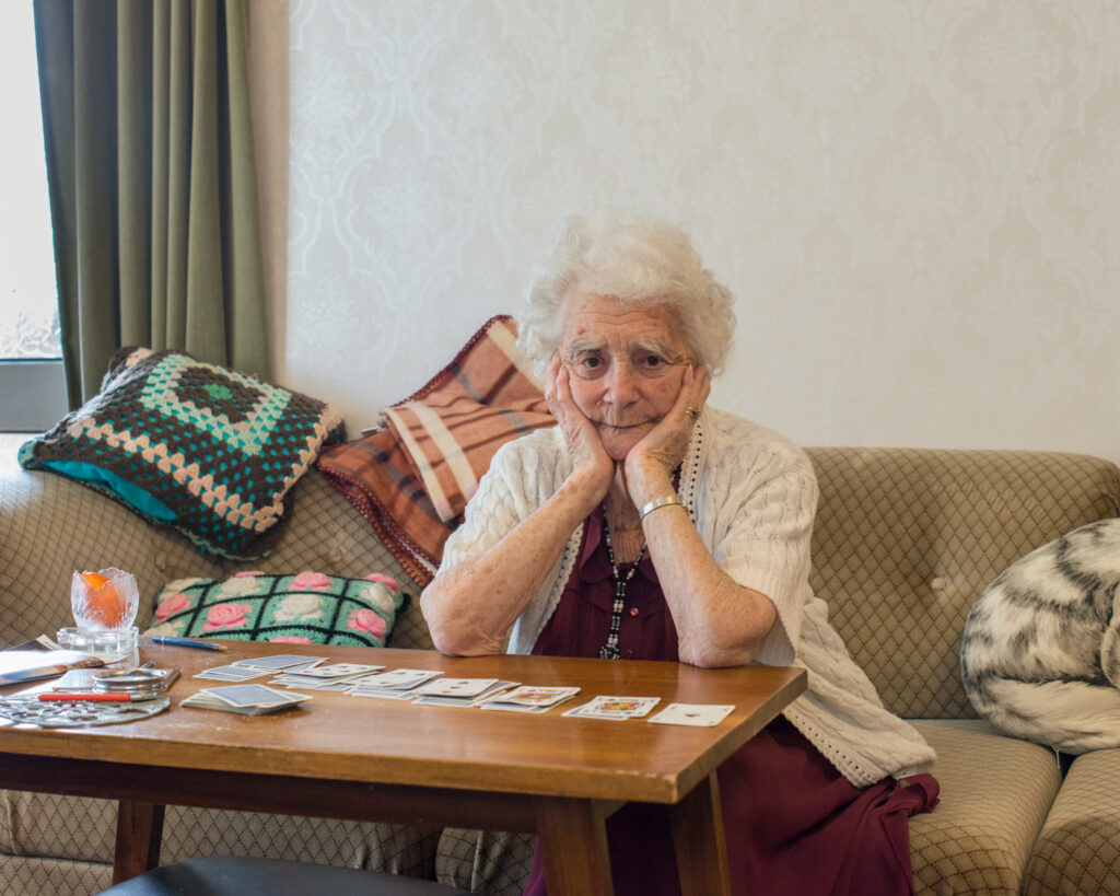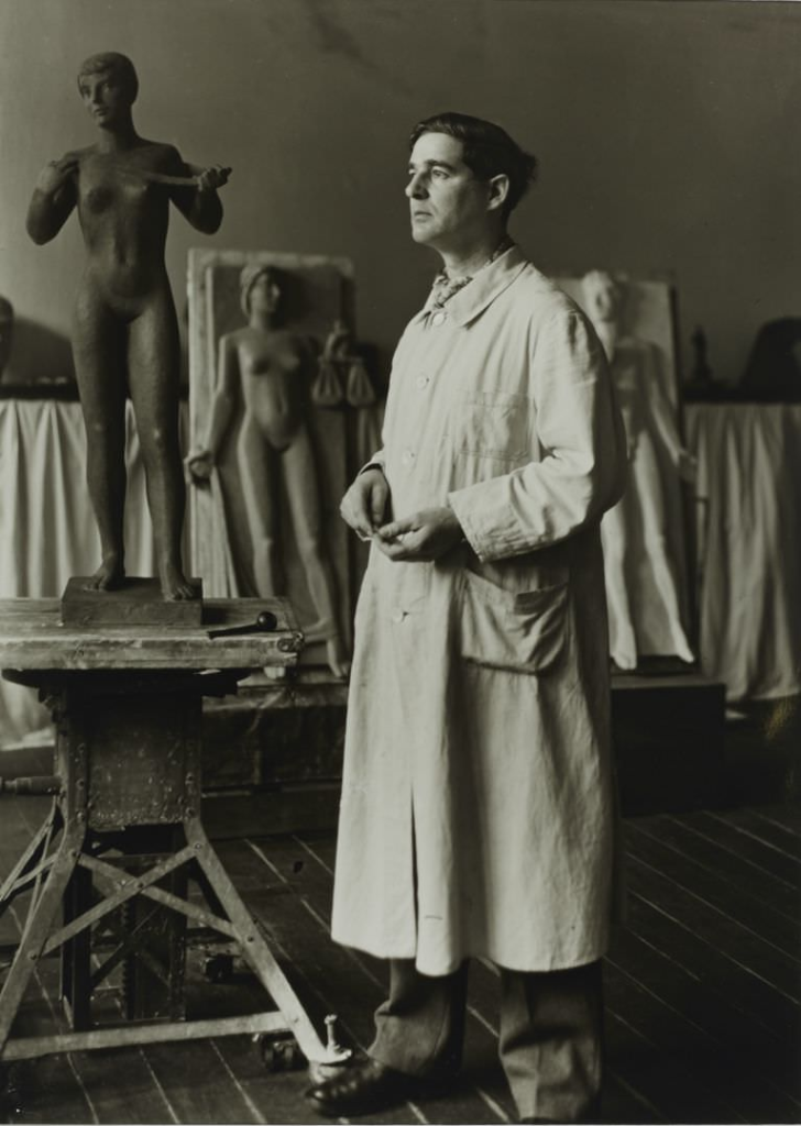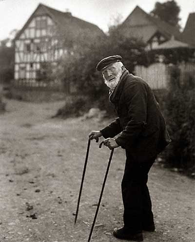
Environmental Portraits

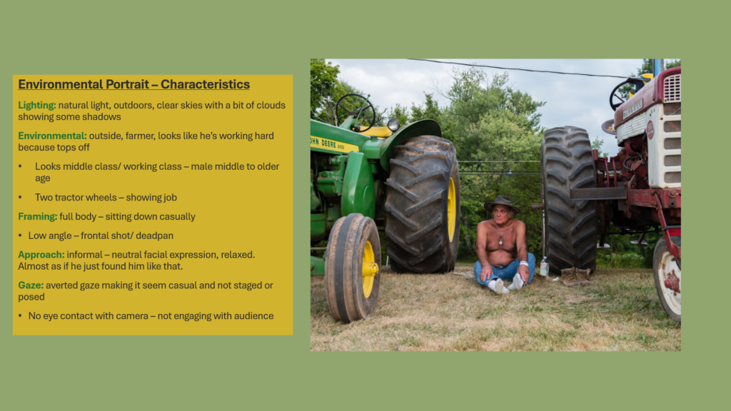
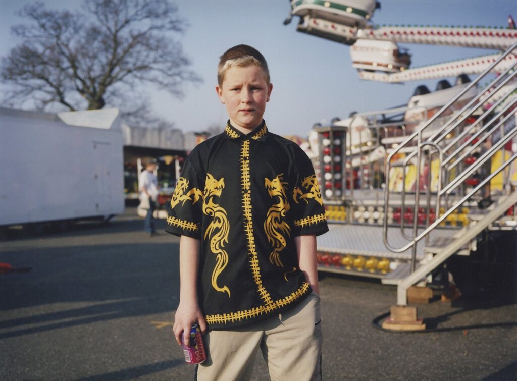
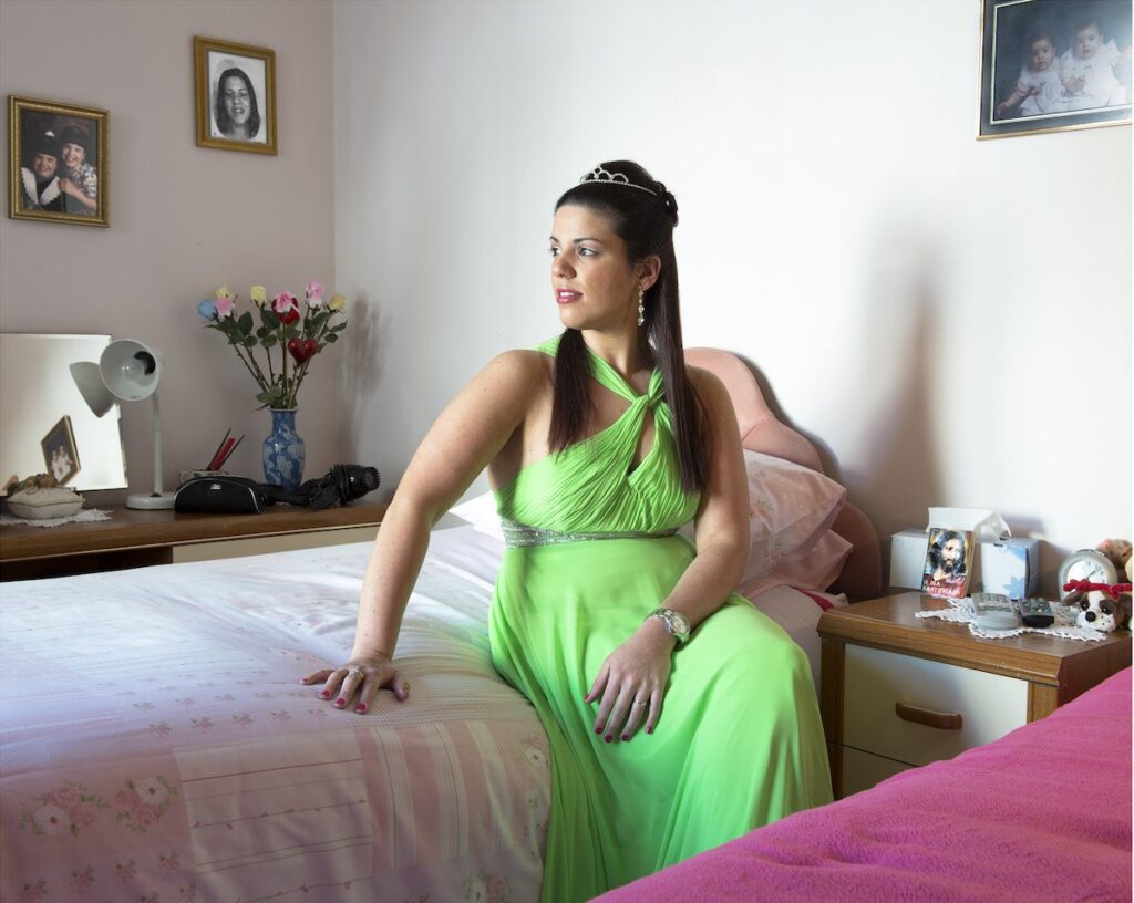
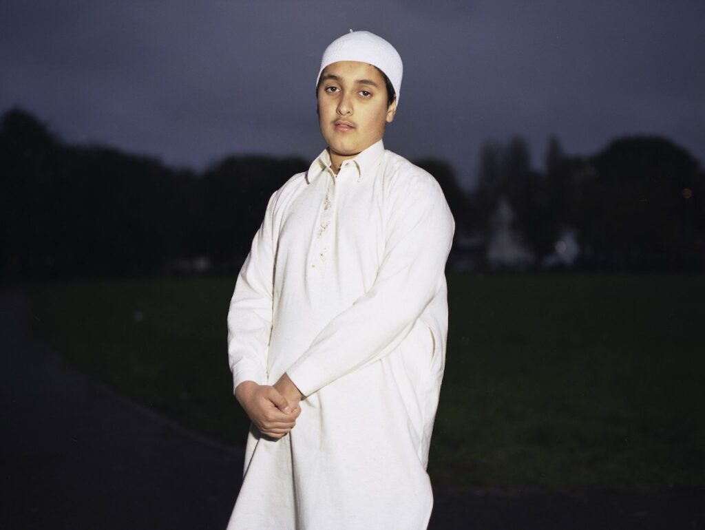
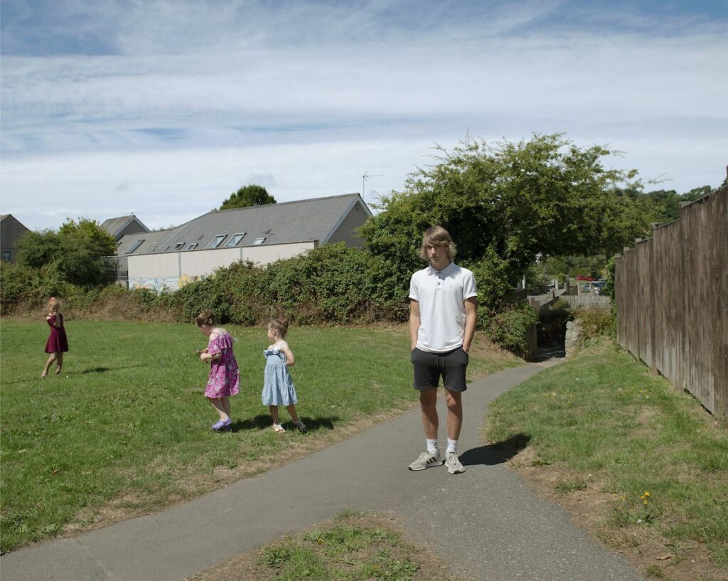
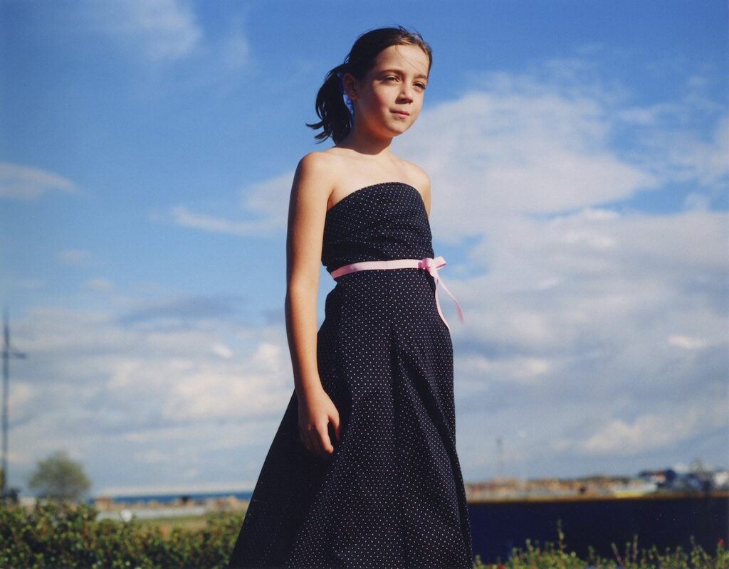
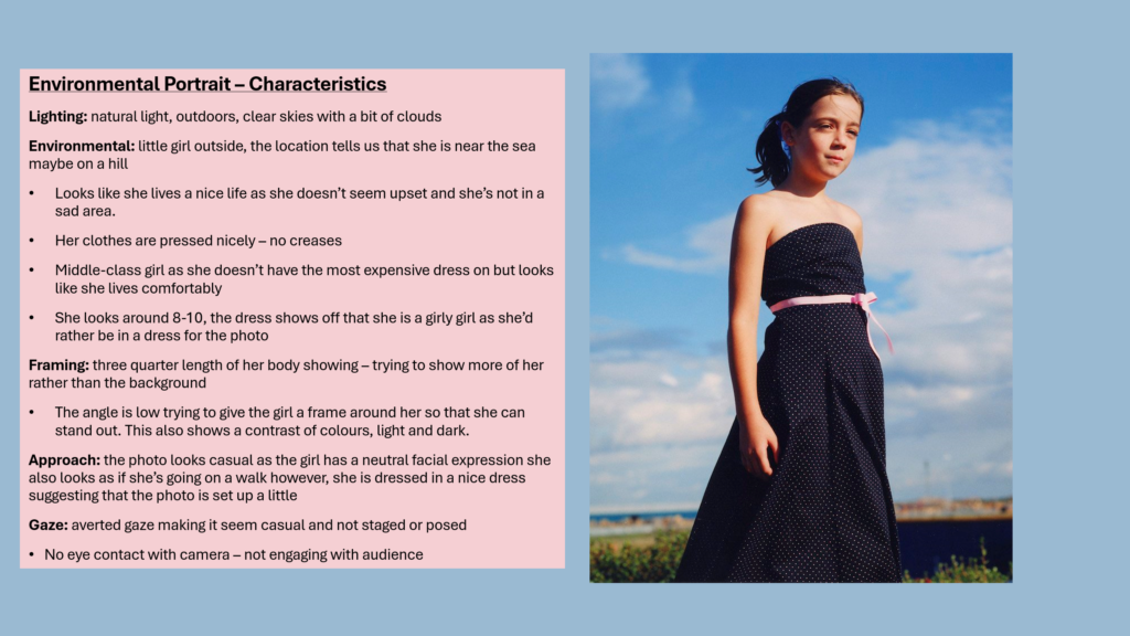
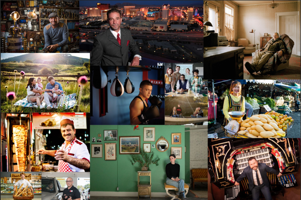
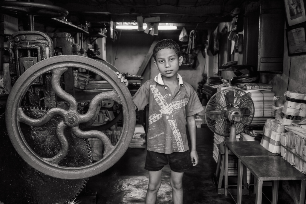
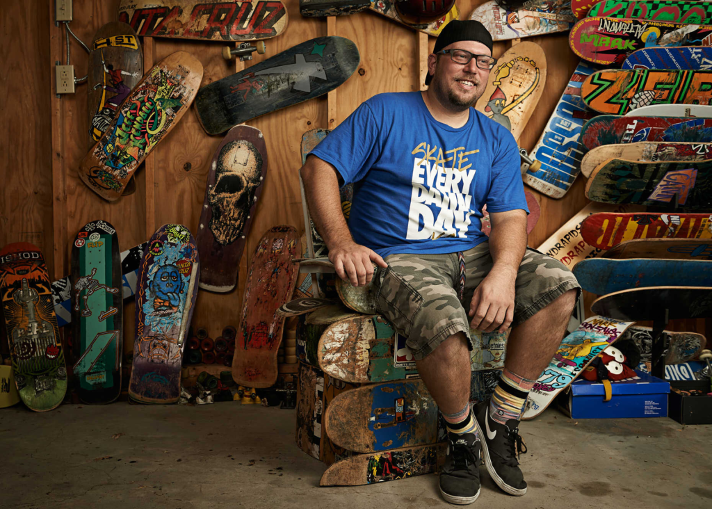
Environmental portraiture-An environmental portrait is a portrait executed in the subject’s usual environment, such as in their home or workplace, and typically illuminates the subject’s life and surroundings. The term is most frequently used of a genre of photography.

Technical-This photo is taken in natural lighting, you can see the sunlight shining on the cow. The direction of light is coming through the top that is creating shadows on the opposite side. The man is almost central to the composition.

The blue stands out from the brown background with it being on his overalls and on the milk bottle. The shadows are dark but the sun is creating highlights in the image. The hay and the cow have a slightly rough texture but the milk bottle and the walls have a smoother texture which creates a contrast. The natural items have curved line whether as the man made items are more straight lines. A sense of depth is created by the diagonal lines and this gives an illusion of space.

the concept of this image is to highlight the tradition of dairy farming in jersey. The Jersey breed of dairy cow originates from the Island and is quite distinct from all other breeds. Renowned for its beauty, ease of management and natural ability to produce rich creamy milk, the Jersey cow is a product of the Island, its soil and climate, the people and their history. Jersey milk is prized among dairy farmers everywhere because of its superior properties, with herds to be found in the UK and around the world.

August sander-

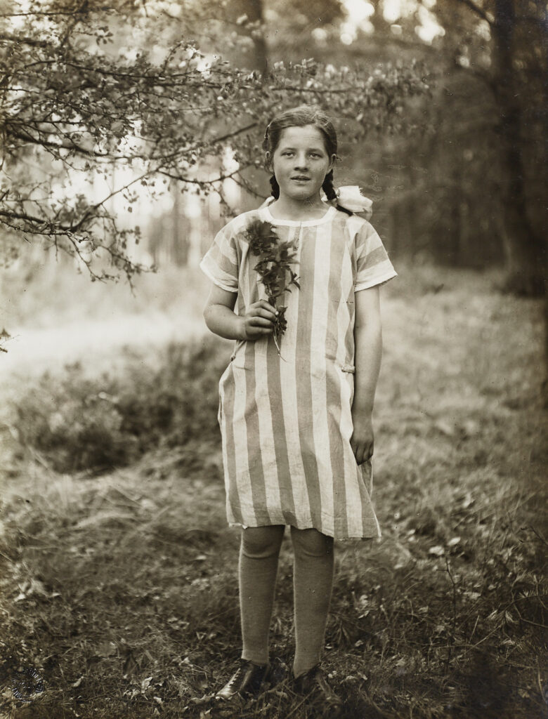
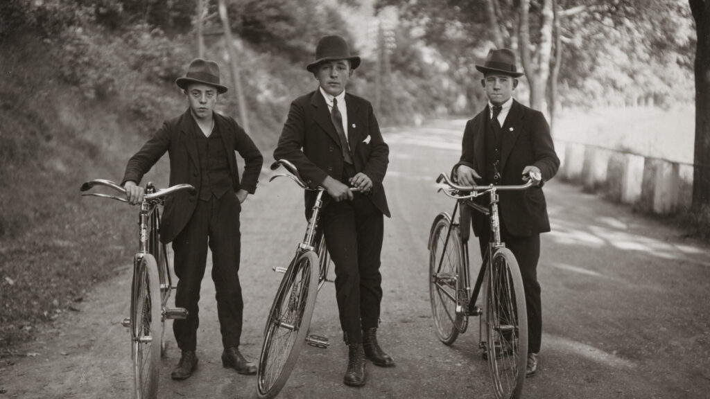
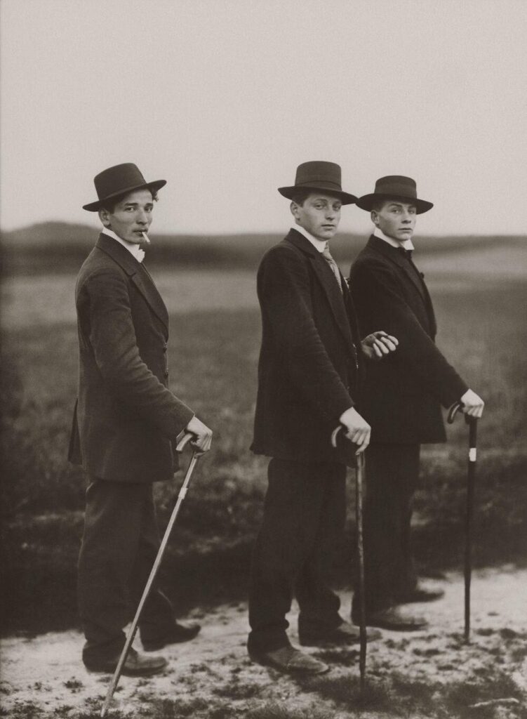
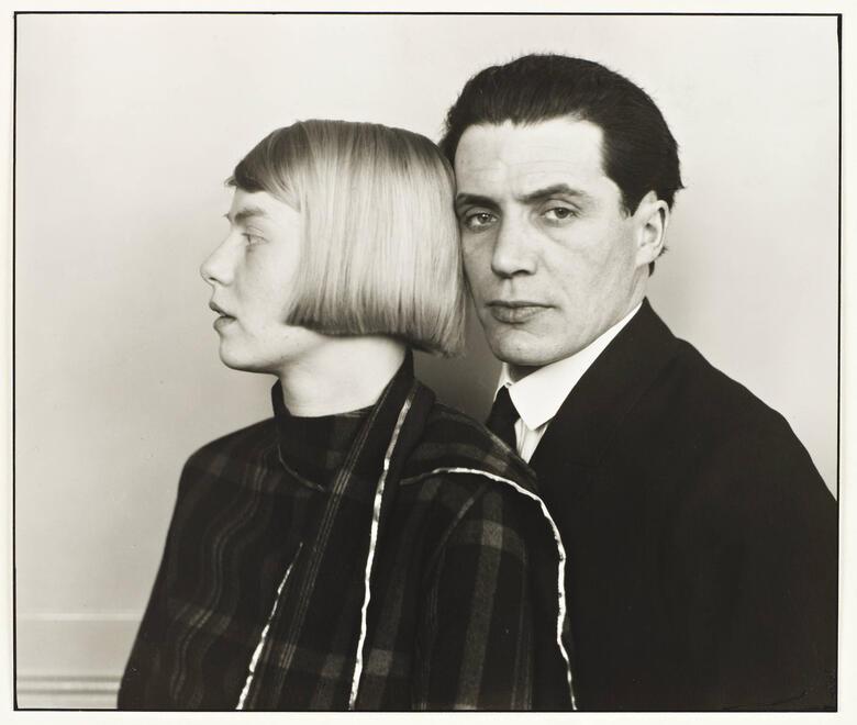
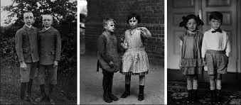
One of the first photographic typological studies was by the German photographer August Sander , whose epic project ‘people of the 20th century'(40,000 negatives were destroyed during WWII and in a fire) produced volume of portraits entitled ‘The Face of Our Time’ in 1929. Sander categorised his portraits according to their profession and social class. 

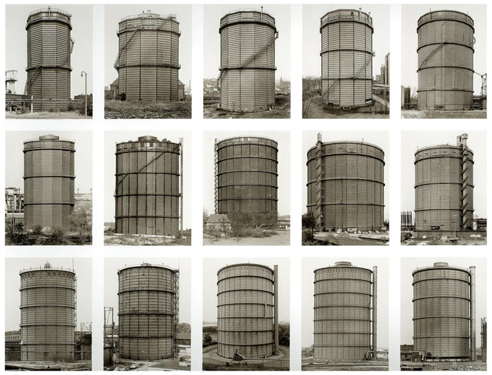
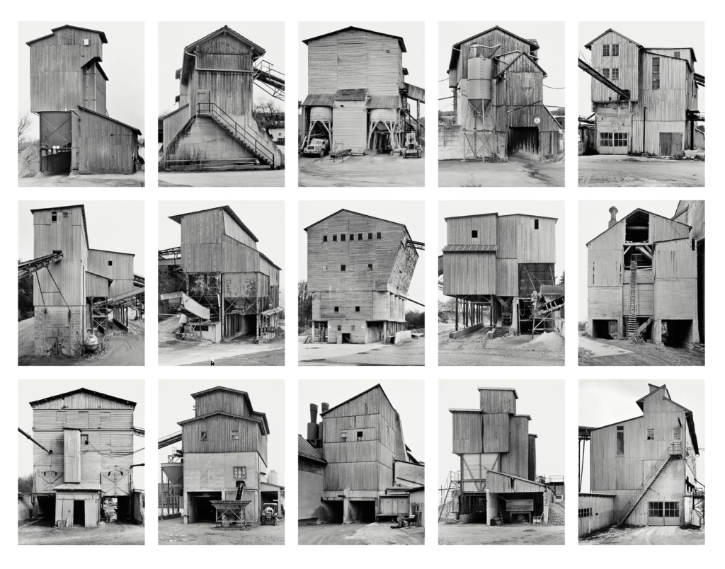
Sander’s methodical, disciplined approach to photographing the world has had an enormous influence on later photographers, notably Bernd and Hilla Becher.

This is an example of some of the photos Bernd and Hilla Becher have taken after being influenced.

This approach can also be seen in the work of their students Thomas Struth and Thomas Ruff. Other photographers who have explored this idea include Stephan Shore , Gillian Wearing , Nicholas Nixon , Martina Mullaney and Ari Versluis.

This photo was taken by Nicholas Nixon.

This is Ari Versluis’ version of Typology.

This is taken by one of Bernd and Hilla’s Students called Thomas Ruff.

These are my photos editing. I cropped them both and put one in black and white. In the first photo I increased the highlights and cropped the image to be more central. I did the same for both sets of photos.

Photoshoot And contact sheets (A03)

My Environmental Portrait Photoshoot

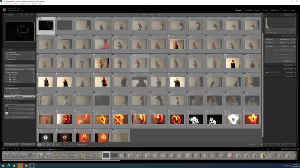
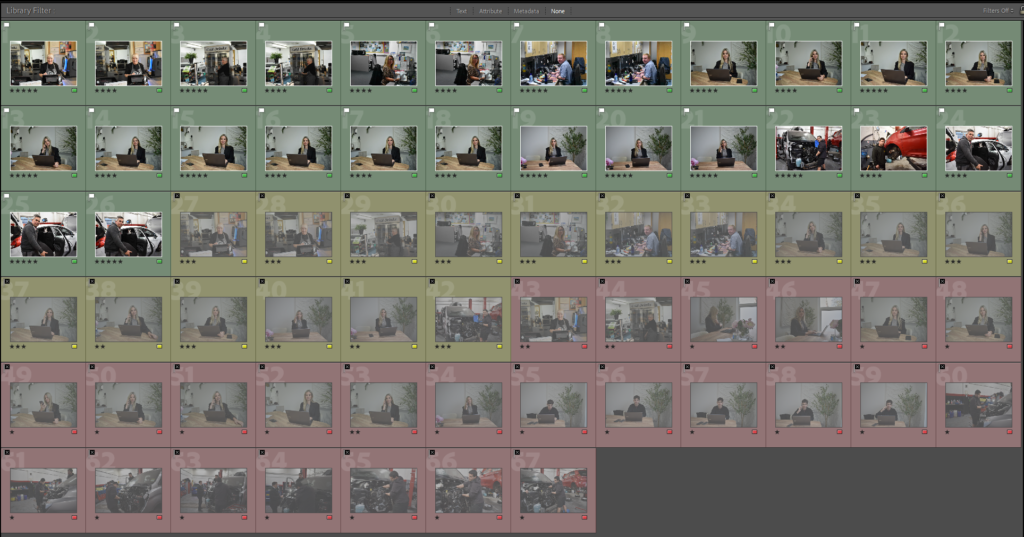
As you can see above I took 50 images from the camera of my sister and my mum. I took lots so I could experiment and pick my best photos and the one I wanted to use for my final piece. I then continued to take many of photos of my sister and my mum with many different camera settings and different lighting conditions to achieve the ideal result I wanted.

Photos I didn’t like

I didn’t like this photo due to lots of visual noise that has been taking part and will give the photo a degraded quality. This photo was taken at an ISO of 400. It also has a wide aperture of 7.1 and has a shutter speed of 1/6.

I also didn’t like this photo due to how dark it is and you can also barley see it. This is what happens when you don’t have enough light in your room, in the camera or in the photo. It gives no proper final image. It was also taken at a shutter speed of 1/80.
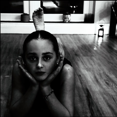
Lastly, I also didn’t like this photo due to extra light from the flash it has made the photo go extra fuzzy and made it to create a degrading quality. It also didn’t match the theme is was going for.

Selection Process

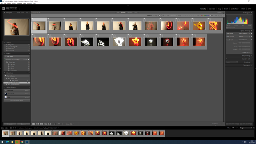
As you can see above I pressed P to keep the images I wanted to use for my final photos. I used X to get rid of the images i didn’t wanted to use for the future. Then I gave a rating for the images, they all had a rating out of 5.The images with 4 and 5 stars are the images I wanted to use for my final photos. The photos I didn’t like I rated 1-3 stars. Finally I gave them the colour yellow or green, green being the best and yellow being average . Red was for very bad photos. I will edit the images so I can present final photos.

Editing My Best Images

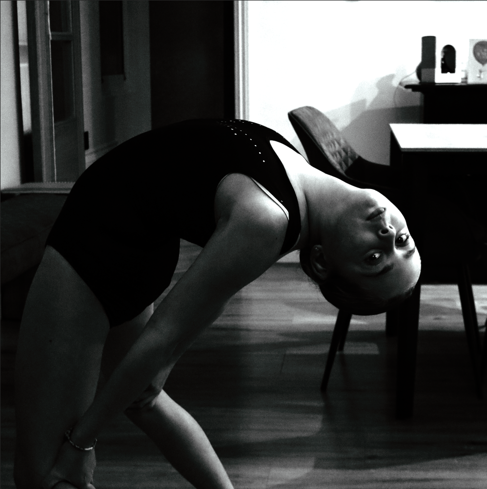
These are my three best images that have been edited.

This image started with more negative space on the left than on the right. To create a more balanced outcome, I cropped the image as above.

When cropping, I made sure to maintain an equal photo

For this image I also wanted to enhance the contrast and tone, to exaggerate the texture.

This image had lots of negative space on the left rather than the right. For the image to be more balanced I had to crop it to get the best result.

When cropping I mad sure that the photo was balanced on both sides, so the photo would look aesthetically pleasing to the eye and make people want ton look at it .

Also, I enhanced clarity and the dehaze setting on Lightroom to get the image to look like this.

In this image I had to get rid of most of the negative space on the left side on the photo rather than the right. I also got rid of negative space at the top and the bottom of the photo. To get the best result this photo need to be cropped.
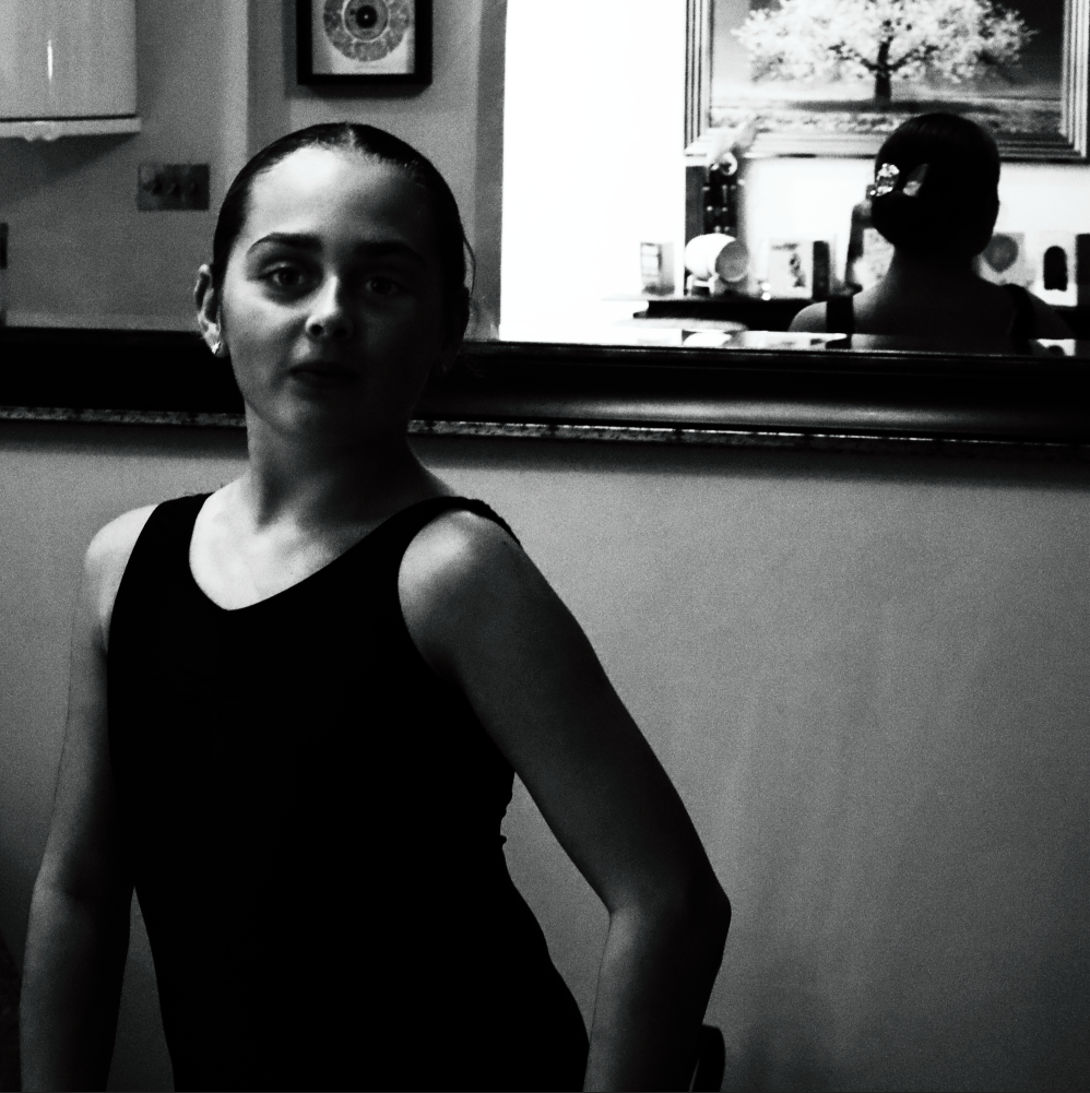
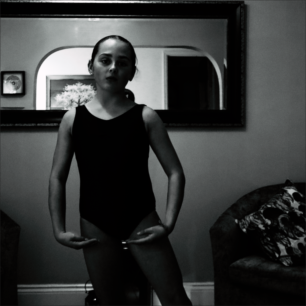
As I was cropping this photo I need to make sure that the photo was balanced and proportional , so the photo looks pleasing to the eye.

For this image I also had to enhance the contrast and tone, to exaggerate the texture. I also enhanced the shutter speed.

Black and White Final Images

These are my final images edited

In this photo I had to slightly crop it due to the sides of the photo not being balanced . If I hadn’t cropped the photo, the photo would look unbalanced and there would be too much negative on the background of the photo.

After being cropped the photo looks more visually appealing to look at.

For this image I also had to enhance the dehaze, clarity and the texture setting to achieve this type of image.

For the filter I used the style; Cinematic to create this type of photo.

This isn’t a white photo but i managed to brighten it up since it was dark. To brighten it up is used two filters called BW7 and F6 these filters are from Lightroom.

In this photo I had to slightly crop it due to the sides of the photo not being proportional. If I hadn’t cropped the photo, the photo would look unbalanced and there would be too much negative on the background of the photo.

After being cropped the photo looks more visually pleasing and nice to look at.

For this image I also had to enhance the contrast, exposure ,dehaze, clarity and tone to exaggerate the texture.

This isn’t a white photo but I managed to brighten it up since it was dark. To brighten it up is used three filters called BW07,FT06 and SP05 these filters are from Lightroom.

In this photo I had to slightly crop it due to the sides of the photo not being proportional. If I hadn’t cropped the photo, the photo would look unbalanced and there would be too much negative on the background of the photo.

After being cropped the photo looks more visually pleasing and nice to look at.

For this image I also had to enhance the exposure ,dehaze, clarity and tone to exaggerate the texture.

Editing Photos into a Black Filter

In this photo I had to slightly crop it due to the sides of the photo not being proportional. If I hadn’t cropped the photo, the photo would look unbalanced and there would be too much negative on the background of the photo.

After being cropped the photo looks more visually pleasing and nice to look at.

For this image I also had to enhance the dehaze, clarity and tone to exaggerate the texture.

In this photo I used the filter called BW11 this filter darkened the photo a bit, this is what a aimed for.

In this photo I used a black and white filter called BW09, this darkened my photo, this is what I achieved due to using this filter.

In this photo I had to slightly crop it due to the sides of the photo not being proportional. If I hadn’t cropped the photo, the photo would look unbalanced and there would be too much negative on the background of the photo.

After being cropped the photo looks more visually pleasing and nice to look at.

For this image I also had to enhance the highlights and the shadows to enhance the clarity on this photo.

In this photo I used a filter called BW11, this has made this image both light and dark, this has balanced out the highlights and shadows, so it means that the foreground is more in focus.

In this photo I had to slightly crop it due to the sides of the photo not being proportional. If I hadn’t cropped the photo, the photo would look unbalanced and there would be too much negative on the background of the photo.

For this image I also had to enhance the highlights and the shadows to enhance the clarity on this photo.

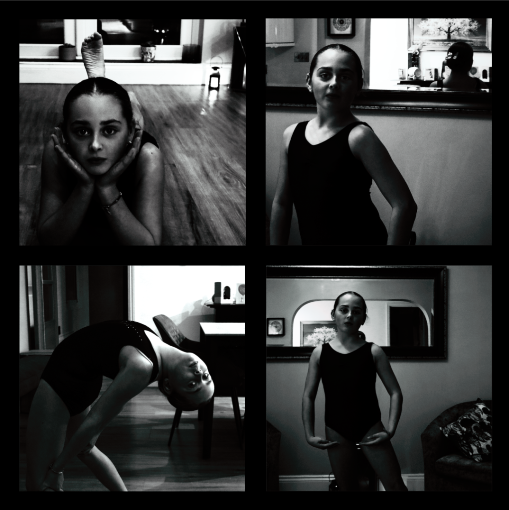
My Final 4 Photos With Analysis


These are my final 4 photos due to a mixture of a light and dark tone. By having a light tone it makes the photo produced have a sharp with a strong contrast. By having a dark tone many photographs seem to have less impact and less visual vibration. By having some straight lines in the photos it means these lines have geometric quality and also have centre of attention. . The images that I took had lots of negative space around it so I had to crop it to make the photos balanced on each side.

Arnold Newman

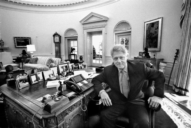
Arnold Abner Newman was an American photographer, known for his “environmental portraits” of artists and politicians. He was also known for his composed abstract and still life images. Newman was born March 3, 1918,  New York , United States and Died: June 6, 2006 (age 88 years), New York, United States.

Photo Analysis

Visual

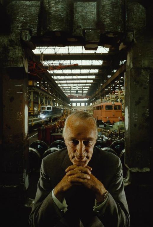
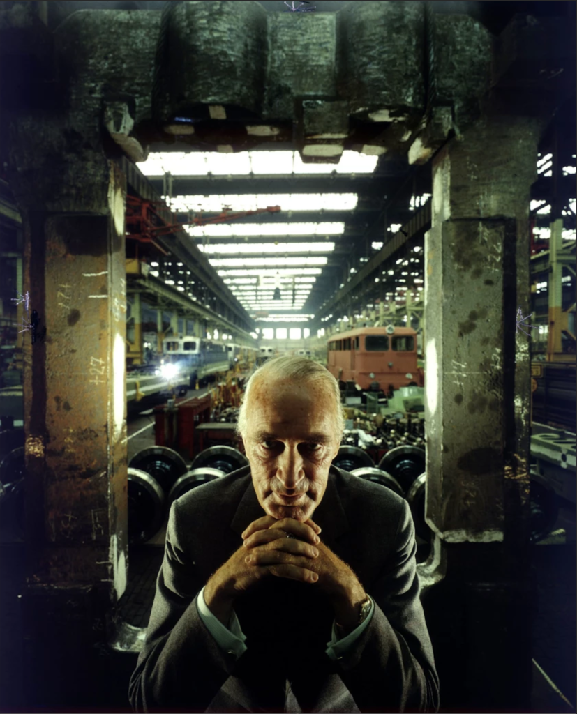
The person is the main focal point. Krupp is in-between the concrete pillars which create a cold and outdated effect, he is placed in the centre so the photo will create a line of symmetry. Krupp is leaning forward with hands which are interlocked in-between each other. Interlocking hands means that Krupp is connected to the place in the photo. Krupp shows lots of eye contact which creates a feeling of intimidation towards us, which also makes us scared and not want to go near him. Eye contact also shows a high level of confidence. The background of this photo is in an industrial environment, which shows that Krupp is in charge or owns the environment that he is in. Leading lines make the photo look balanced and proportional and position Krupp very central due where the lines start and finish.

Technical

The lighting may be artificial due to many different light that may be used and also due to the intensity of the light. Also the lights will create a powerful contrast on the sitters face. Which will make him more mysterious and darkening his gaze. The aperture is placed at a medium due to the amount of light the will want in the photo. This ha a very sharp foreground due to having a low ISO which makes the image look a lot clearer. Is placed at a medium aperture- very sharp foreground, slightly softer background . Able to identify environmental details, which means that easy to see. The Shutter speed- is quite a fast because Newman wanted to capture a very specific moment while the subject is in focus and also creates a balanced exposure. The angle is exactly eye level with the sitter which means we are immediately drawn tot him and also feels like we are extremely close to him.

Contextual

Alfred Krupp is the only subject in this photo which means he’s the main character. An Industrialist who ran war factories manufactured arms for the Nazi assault on Europe. Using slave labour from the concentration camps, is where the prisoners of war were literarily worked to death. The majority of the men and boys who perished were Jewish and Krupp holds a particular grudge amongst there people.​Arnold Newman was Jewish of origin. Krupp was reluctant to agree for the photo to be taken but he eventually agreed. He didn’t want the photo taken by Newman due to him being Jewish, Krupp disliked the Jews. When deciding what to do with the shot , Newman asked Krupp to lean forward slightly, when he did he interlocked his fingers together tightly under his chin. The light hit the face completely and when Newman saw this effect he said ‘That he felt the hair stand up on the back of his neck’. This image became one of the most famous images of Newman’s Career.

Conceptual

When Krupp saw the picture he was said to have been furious due to the artist being Jewish. For Newman this was a little bit of revenge for him. The photo captures Krupp in a serious, sincere and a menacing light. The flow of the photo brought Krupp out from the shadows and allowed Newman to share his envy for his man with the world.

August Sander

August Sander (1876–1964) was a German photographer , which was well known for his work documenting and capturing German community in the early 20th century.

August Sander’s photography is powerful for its organised approach to gathering people and securing a wide range of individuals from different parts of life in Germany, often attention on class, occupation, and social role.

Social and Class Structures: Sander’s portraits weren’t just about capturing the physical appearance of his subjects. They were important roles that people played within the larger framework of a community . He saw his work as a way to show the complexities of class, identity, and occupation, often seeing how social status and profession were reflected in a person’s appearance and lifestyle.

He gave respect to the people he photographed, regardless of their social standing and state . His photography gives a message that a sense of equality among the subjects in the photographs. He wanted to truly show the reality of life in Germany, from lower class life to high class.

Legacy

Sander’s most memorable series was , People of the 20th Century, was never fully accomplished in his lifetime, and much of his work remained unpublished during his career. However, the project has since been regarded as one of the most important photographic tasks of the 20th century.

Typologies

A photographic typology is a study of “types”. That is, a photographic series that prioritizes “collecting” rather than single or one image. It’s a powerful method of photography that can be used to reshape the way we see the world around us.

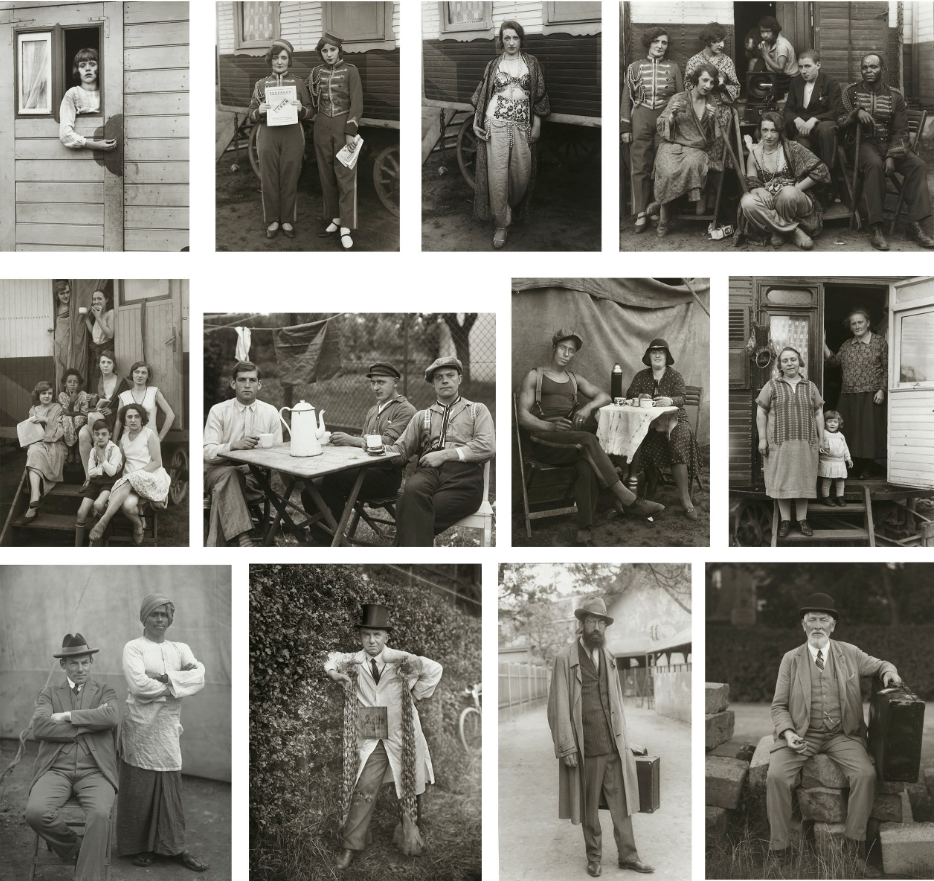
The concept of Photographic Typologies gets its origins from August Sander’s 1929 portrait series  from Face of Our Time, which captured the diverse social fabric of Germany between the two World Wars. Sander’s intent was to capture a cross-section of a community in Germany —its various types, classes, and the relationships that are linked them. He recognized that displaying his portraits as a collective series revealed much more meaning than displaying them individually. Unfortunately, his photography had such significance and power that just four years after its creation, the Nazi regime had the photographic plates which were demolished and then the book was banned.

typology in photography is a study of “types” , which is a collection of images put together to gather a meaning, rather than individual and isolated shots. This approach shifts the focus to “collecting” and categorizing, and has become a method for reshaping and how we think about the world around us . The term “typology” itself gotten exposure in photography in 1959, when the German artists Bernd and Hilla Becher began documenting the industrial architecture of Germany that was disappearing quickly . The Becher’s described their subjects as buildings where anonymity is the new style. Their objective was to document a fading landscape, and in doing so, typologies not only captured a moment in time but also invited viewers to reflect on the photographs in the broader context of history and community of Germany.

August Sanders Photography Analysis

TECHNICAL ASPECTS

Due to the black and white format and filter on this photograph , it is hard to see what lighting was used. However, upon further inspection I can able to conclude that the source of light could be natural, coming from a window in the middle of the day , This is because if you look into the metal bowl grasped by the chef, the lighting seems to be in the shape of a distorted rectangle, which closely comes from a window. Additionally , due to the lighting being softly diffused, and not having a hard tone and definition within the subject/ where the projection is giving heavy and contrasting shadows upon the subjects body and face ( Similar to how artificial light would create a hard light with little diffusion) It is fair to say that the lighting is natural due to it having very similar characteristics to it. Finally, due to the angle of the reflection on his head compared to the angle of the light on the bowl, we can also conclude that there many windows positioned to the right of the subject and in the foreground of the photo ( due many light sources within the reflections) , all working together to make the scene of lighting and the atmosphere.

The tonal range in this shot (the range of tones in-between the darkest and brightest areas of an image that are caught by your camera.) which is wide as they are clearly many points within the image with pure black and pure white , along with lots of shades of grey in-between, This in return creates a lot of contrast within the image which will highlight the key features of the subjects body and outline. Additionally its easy to tell that this image is perfectly exposed, because the detail is still clear and nothing is too dark or too bright, cutting out the glare within the shot, from reflections.

APERTURE

The Aperture Used to create this shot is most likely quite low in the ranges of f2-4.He used a low aperture to capture a great shallow depth of field. Low apertures are ideal foe capturing portraits , as seen in the photograph with the chef, the subject (chef) is in focus which is the foreground, whereas his background is out of focus.

SHUTTER SPEED

With the Low aperture , I predicted there will be a fast shutter speed that was in use in order to capture the amount of light being let in through the lens. ( at least 1/200th of a second handheld or 1/15th of a second on a tripod.)A tripod was used to keep the camera still while in use . What supports my prediction is that there is no minimal motion blur, Meaning either the subject stood very still or at a  high shutter speed was used to capture the moment in time without any blur.

ISO

The ISO used to take this photo was most likely quite low, as there is no visible grain or a degrading quality present in the photo and the image is very clear , additionally the image itself is extremely dark meaning a low ISO must have been used, which makes sense as the low aperture already lets in plenty of light into the camera , meaning that the light sensitivity of the camera wouldn’t need to be high, around 100-200 was probably used.

Photoshoot Action Plan

My Plan For My Photoshoot

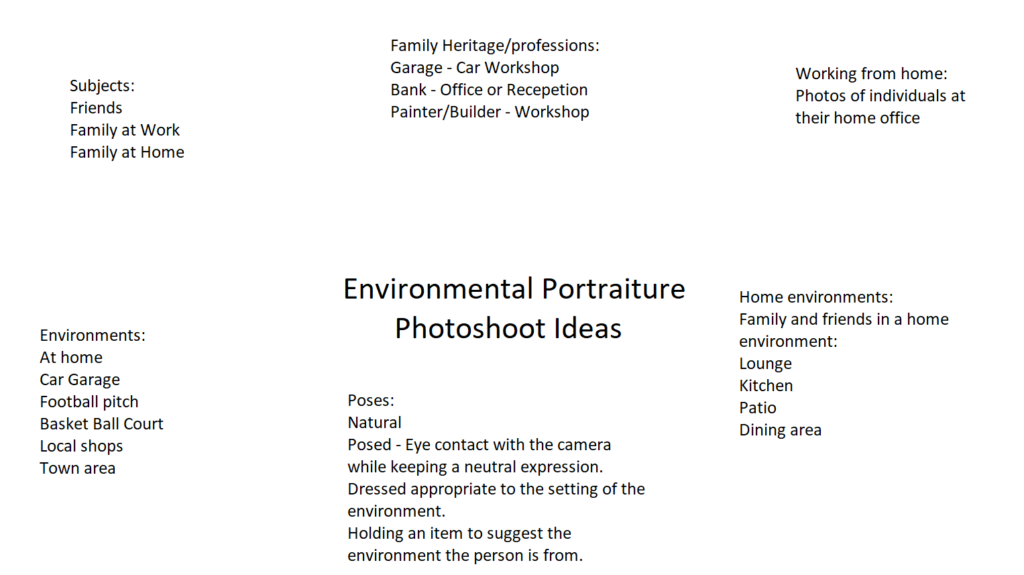
Environments

Subjects – I will take photos of my sister and my mum in the same environments.

For this I will take photos of my mum and my sister so both of them will feel connected.

Mum- Holding a ukulele

Sister – Kicking a ball, reading a book and roller-skating.

Poses

Will be quite natural and will be of their type of hobby. They will pose with a natural and stern face.

Gaze

I intend of all of my subjects to be look at the camera.

composition

I will experiment to with lots of different types of composition such as the rule of thirds .

Aperture

I will use most of the aperture numbers on the camera to get a wide range of experimentation and photos to show.

Framing

I will be using full body,1/2 and some headshot photos and I will crop but I wont use a tighter crop because I want the environment behind to have a visible picture. Examples are shown below.

Oriental

In my environmental portraits I will make a majority of landscape phots so is able to capture the environment and i will also incorporate some portrait photos.

Portrait environmental Portait

Landscape environmental portrait

Environmental Portraits

Guide To Environmental Portraiture
How to Take Better Environmental Portraits: 17 Tips - kevinlj.com
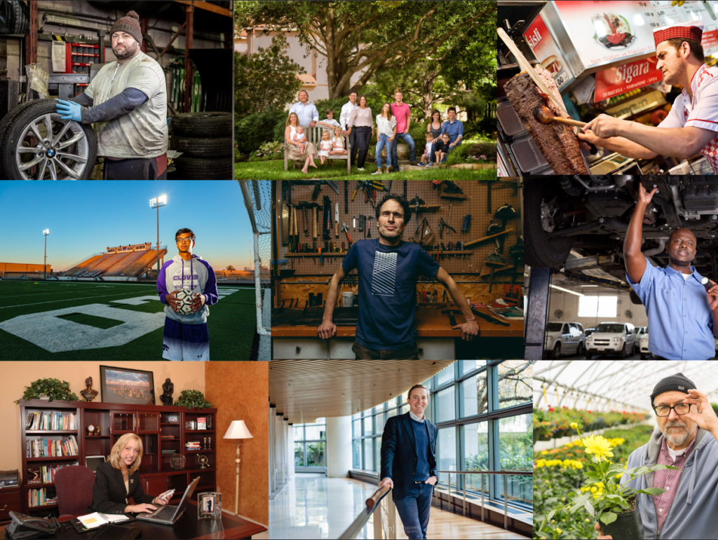
Fantastic Environmental Portraits
How to Take Better Environmental Portraits: 17 Tips - kevinlj.com
Portrait Photographer Chris Ridley helps you decide which style of portrait  photography is best — Freelance Editorial & Commercial Photographer Norwich  & Norfolk - Chris Ridley
10 Tips for Innovative Environmental Portrait Photos
Case Study on Annie Lebovitz – Site Title
Fantastic Environmental Portraits

What are Environmental Portraits ?

An environmental portrait is a type of portrait taken in the subject’s everyday setting, like their home or workplace. This style of photography aims to showcase not just the person but also their life and the environment around them. When you capture someone in their own space, it’s believed that you can reveal more about their character and truly reflect their personality, rather than just focusing on their physical appearance. Additionally, being in a familiar environment can help the subject feel more comfortable, allowing them to express themselves more naturally compared to the often intimidating atmosphere of a studio.

Artist Analysis

Arnold Newman

Who is he ?

Arnold Newman | Howard Greenberg Gallery

Arnold Abner Newman, born on March 3, 1918, and passing away on June 6, 2006, was a renowned American photographer. He gained fame for his “environmental portraits,” which captured artists and politicians in their own settings. Additionally, he was recognized for his skilful abstract still life photography. In 2006, he was honoured with induction into the International Photography Hall of Fame and Museum.

Newman’s work

Arnold Newman
Arnold Newman | Andy Warhol at the Factory (1973) | Artsy
Arnold Newman | Howard Greenberg Gallery
Arnold Newman @ Contemporary Jewish Museum - Squarecylinder.com – Art  Reviews | Art Museums | Art Gallery Listings Northern California
Lumiere » Blog Archive » Arnold Newman

Image Analysis

The '60s at 50: Saturday, July 6, 1963: Portrait of Alfried Krupp
Alfred Krupp by Arnold Newman – 1963

This image shows an almost villain looking old man staring directly into the camera, creating an uncomfortable atmosphere. The two pillars either side exaggerate the rule of thirds in this image and place Krupp in the centre bottom of the image. The lighting along the celling creates leading lines that take the viewer to the industrial, train station background.

Visual – The sitter ( Krupp ) is the main focal point of the image, he is leaning forward suggesting how he is confident he is and how he is probably the owner and not a worker. Krupp’s wrinkly face and hands highlights his age and worn appearance, it also shows how he has seen and been through a lot in his life. Krupp is fully centre with lights leading to him and pillars either side to show how he is the centre of attention. The relatively bland colours create a strong contrast between the dark and light patches of the image. The photo has little negative space and is extremely cluttered which could allude to how messy and cramped his past life was. Krupp seems raised from the background showing how he could be more important than average.

Technical – The dim lighting, probably artificial, creates and eerie atmosphere. Furthermore the cold tone of the lighting emphasises the serious, uncomfortable scene. Moreover because of this lighting technique, each side of his face is lit up whereas the front of his face is left in darkness, this reinforces how mysterious Krupp is. The background is blurred however some of the background details are still identifiable, Krupp is in focus, this is through using a medium to shallow depth of field and a middle to low f/stop. The shutter speed is most likely fast as he is fully in focus with a balanced exposure. The angle the photo was taken at is directly facing him at eye level which allows the view to connect better with him.

Contextual – Arnold Newman was a Jewish photographer who was asked by Newsweek to capture a photo of Alfred Krupp who was not a military man but an industrialist who owned and ran the war factories. Newman didn’t want to take the photo but then agreed to it in the end and saw it has his small bit of revenge for what Krupp did.

Conceptual – Newman didn’t want to take the photo but then agreed to it in the end and saw it has his small bit of revenge for what Krupp did. When Newman asked Krupp to lean forward for the photo he naturally without being asked put his hands together and put them to his chin. Newman seeing this took the photo without hesitation, however Krupp hated this photo that was now famous world wide. This was Newman’s revenge.

Further Artist Analysis

August Sander

Who is he ?

August Sander: the pioneering German documentary photographer who captured  the face of a nation – HERO

August Sander (November 17, 1876 – April 20, 1964) was a notable German photographer known for his portraits and documentary style. His first book, Face of Our Time, came out in 1929. Many consider Sander to be the most significant German portrait photographer of the early 1900s. While he also captured landscapes, nature, architecture, and street scenes, his portraits are what he is most famous for, especially in his series People of the 20th Century. This series was created to represent a diverse slice of society during the Weimar Republic.

Image Analysis

Photo by August Sander

The image shows an older man using two walking sticks, prominently featured in the foreground. He seems to have stopped for a moment while making his way up the lane in the background. You can tell he’s elderly by his hunched posture and the white hair on his face. In the photo, the man looks like he’s been walking down the road and has taken a break to look at the camera. He’s positioned on the right side of the frame, facing towards the centre and the empty space on the left. This composition leads our eyes to the building in the background, suggesting that this is his destination. His calm expression makes it feel like a candid shot, capturing him in a genuine moment rather than a posed picture.

Visual – All of Sanders’ photographs, including this one, are in black and white. This choice stems from the limitations of cameras back then, but it also gives a unique style that ties all his photos together, making them feel like part of a single collection. The black-and-white look really brings out the different shades in the image. The dark bushes on the right side stand out against the lighter path on the left, which naturally leads your gaze toward the house. The wild and rough texture of both the bushes and the path hints that this scene is set in a countryside area.

Technical – This picture makes great use of natural light, which adds to its authentic feel. The exposure is well-balanced and doesn’t rely on any fancy techniques. The wide aperture used here results in a shallow depth of field, which helps focus our eyes on the main subject in the foreground.

Context – This image comes from the book ‘Face of Our Time’ by August Sander. The book was originally published in 1929 and features a foreword by the German author Alfred Dublin. When it was first released, it was promoted with the following description: “The sixty photographs of Germans from the twentieth century included in Face of Our Time are just a small part of Sander’s larger project, which he started in 1910 and has been developing for twenty years. Sander didn’t take on this huge personal project from a scholarly perspective or with scientific tools, nor did he seek guidance from racial theorists or social scientists. Instead, he approached it as a photographer, relying on his own direct observations of human nature, appearances, and environments, guided by a strong sense of what is authentic and important.”

Conceptual – The book isn’t about the ‘faces’ of our time; it’s about a single ‘face.’ This implies that all these individuals together represent one unified identity. It seems like Sander’s idea was to bring these people together as a single representation of his era. There’s no deep theory behind the work; it’s simply an observation of that time, at first glance.

These red lines are strong leading lines that show how his walking sticks are used to frame his face in the image. Furthermore because of this framing the view is immediately drawn to the main subject, his face. The red line going across the image shows how the large amount of negative space below the red line is counter acted by the vast detail above the line.

Photoshoot plan

For my photoshoot I plan to photography my younger brother doing one of his hobbies. He plays airsoft so I plan to get him to dress up in his full gear and I’m going to use my garden and surrounding trees to frame him in the photo. I also want to capture photos of him from many different angles and him in different places and positions. I intend for him to have a serious, straight face for the photos as I think this would look the best. I want to use a mix of landscape and portrait orientated photos as I want to use the landscape photos to capture more of the environment and then portrait so all of the focus is on my subject.

Furthermore my brother also does gaming so I’m going to use him for a second photoshoot and capture him gaming. I want to get different angles and poses. I want to use the same mix of landscape and portrait photos when I’m taking them to include the environment and a focus on the subject. I intend for him to have a serious, straight face, almost like he’s concentrating on the game.

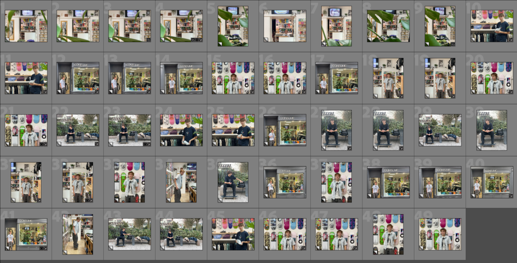
My Contact Sheet

Selection Process

I used three colours to grade which photos are good, okay and bad. It also gave me an idea of which photos I want to work with and edit.

My chosen photos

Second Photoshoot

Editing

Second Photoshoot

Edited Chosen Photos

Composition Experiments

Final Composition

Evaluation

In my opinion I think this photoshoot went really well and I’m super happy with the outcome. The photos I produced is exactly what I was aiming to do originally and in the photoshoot plan. I think the editing process went really well and really enhanced my already good photos. To improve my next photoshoot I might consider shooting photos in better light or cropping in while editing.

Art Steps

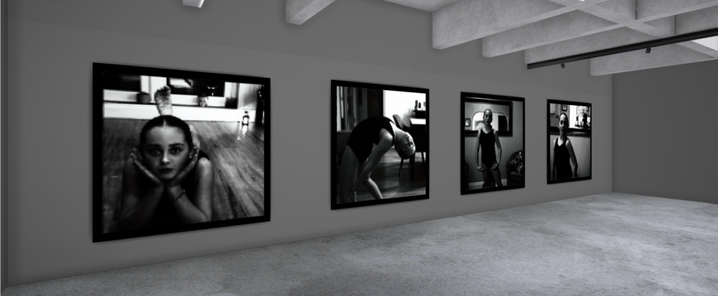
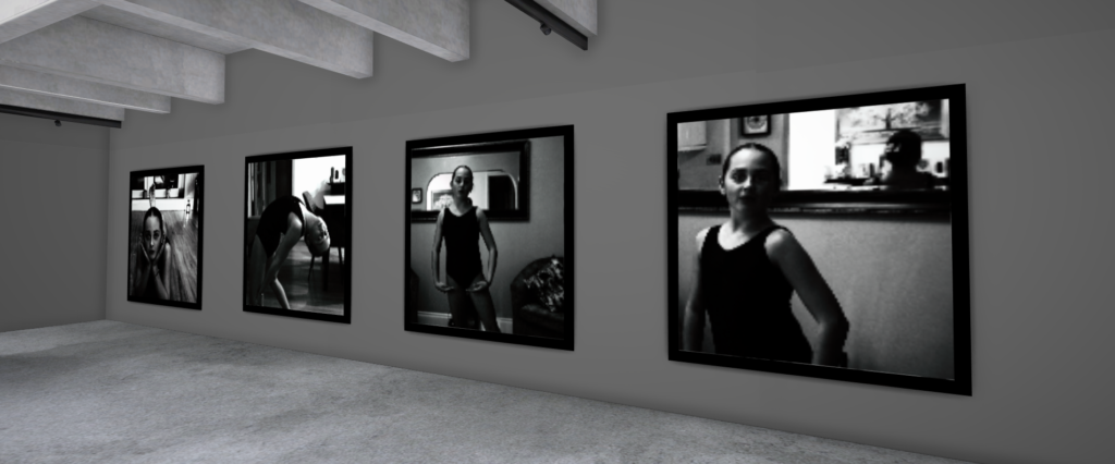
I used Art Steps to create a realistic gallery of my best, edited photos.

Environmental Portraiture

Mood-Board, Mind-map of ideas:

Definition and introduction:

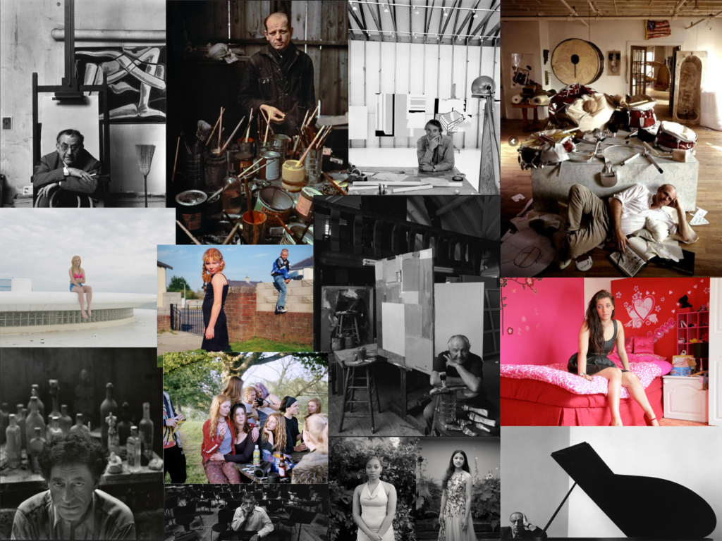
An environmental portrait is a photo of someone taken in their own space, like their home, office, or any place that’s meaningful to them. Unlike a traditional portrait where the focus is just on the person, in an environmental portrait, the surroundings are just as important. The place they’re in helps tell us something about who they are. The environment can reveal a lot about the person’s personality. For example, if someone is photographed surrounded by books, it might suggest they’re into reading or have an intellectual side. If they’re in a studio with art supplies, we might guess they’re creative. The space can show us what they care about or what they’re passionate about. It adds depth to the person’s identity, turning the portrait into a more complete picture of who they are.

Compare and contrast to artist reference:

Arnold Newman

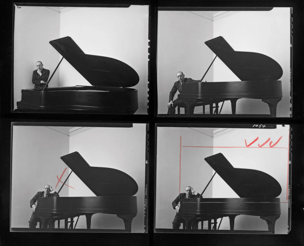
Arnold Newman (1918–2006) was a famous American photographer known for his portraits that told a bigger story about his subjects. Instead of just snapping a regular headshot, Newman’s portraits often included the subject’s surroundings places or objects that reflected who they were and what they did. This style became known as environmental portraiture. Newman started out in New York and studied photography at the University of Miami. He worked in commercial photography early on but soon developed his own artistic style. Rather than taking posed, studio photos, he preferred to shoot people in the places that defined them, like artists in their studios or musicians with their instruments. Some of his most famous photos include a shot of composer Igor Stravinsky at the piano and an image of Alfried Krupp. Newman’s portraits helped show not just what someone looked like, but who they were and what they cared about.

Visual:

The photo of Alfred Krupp, taken by Arnold Newman, puts him right at the center of the frame, making him the clear focal point. The concrete pillars in the background add to the cold, industrial vibe, giving the whole scene a harsh, almost intimidating feel. Krupp is leaning slightly forward, his hands clasped under his chin, and he’s making direct eye contact with the camera. His posture and gaze suggest confidence, but there’s also something sinister about it. The industrial backdrop makes it look like Krupp is in charge of everything around him, adding to his sense of power. The lines in the photo, especially those at the top, draw the viewer’s eyes directly to his face, which adds to the feeling that he’s the center of everything. The balance of light and dark in the image also plays a big role. The light at the top of the photo contrasts with the darker bottom, creating a sense of tension and drama. This contrast exaggerates the eerie feeling, making Krupp seem even more menacing. His elevated position in the frame makes him appear in control, almost as if he’s towering over the scene.

Technical:

Technically, the lighting in the photo seems to be artificial, casting sharp shadows across Krupp’s face and deepening the intensity of his gaze. The sharp focus on Krupp’s face suggests a medium aperture, which keeps him in clear focus while the background is a bit softer but still recognizable. The fast shutter speed used helps keep everything crisp, with no blur in the image, and it helps maintain a balanced exposure. The camera is at eye level with Krupp, which makes the viewer feel like they’re sitting right across from him. This angle not only draws us in but also makes the photo feel more confrontational and unsettling.

Contextual:

As for the context, Alfred Krupp was a German industrialist who ran factories that produced weapons for Nazi Germany during World War II. His factories relied on forced labor, including prisoners of war, many of were Jewish. These workers were often worked to death in brutal conditions, making Krupp a figure of hate. Arnold Newman, who was Jewish, didn’t want to take the photo at first but eventually agreed. During the shoot, Newman asked Krupp to lean forward a little, and when Krupp did, he clasped his hands under his chin. The way the light hit Krupp’s face in that moment was striking, and Newman said he got a chill down his spine when he saw it. That moment led to one of Newman’s most famous photos.

Conceptual:

When Krupp saw the photo, he was reportedly furious. For Newman, though, this was a bit of sweet revenge. The photo captured Krupp in a way that was both sincere and menacing, showing a side of him that was both powerful and unsettling. As the image circulated, it forced Krupp into the public eye, pulling him out of the shadows and exposing his true nature. For Newman, it was more than just a portrait, it was a way to share his own deep hatred for Krupp with the world, using the photograph as a tool to show the man’s cruelty and dark legacy.

August Sander

August Sander was a German photographer known for his groundbreaking portraits that captured the different people in German society during the early 20th century. He’s considered one of the most important portrait photographers of his time. Sander’s work aimed to document the variety of social classes, professions, and lifestyles in Germany, especially during the period between the World Wars. His most famous project, Antlitz der Zeit (Face of Our Time), was a collection of portraits of people from all walks of life, from farmers and factory workers to scientists and artists. Rather than just taking a photo, Sander tried to reveal something deeper about each person, showing who they were in their society and what their role in it was. His approach was direct and respectful, aiming to capture the personality and dignity of each subject.

Subject:

The photo shows an elderly man using two walking sticks, standing in the foreground. He seems to have paused while walking up the lane in the background. You can tell he’s old by his bent posture and white facial hair. The man appears to have been walking along the road and stopped to face the camera. He’s positioned to the right of the frame, looking toward the center and into the empty space on the left. This draws your eye to the building in the background, suggesting that he’s heading there. His neutral expression makes it feel like a natural moment, as if he’s just going about his day, not posing for the camera.

Sander’s photographic style helps us connect with the people he captures. The subjects’ direct eye contact with the camera draws us in without being forced or overwhelming. They seem natural and at ease, going about their everyday lives in familiar surroundings. His photos feel like a celebration of ordinary people, giving us a glimpse into who they are and inviting us to appreciate their essence.

The environment:

The house in the background looks like a classic Tudor style, with white stucco walls and decorative half-timbering, or a mix of dark brick and stone. This traditional building adds to the feeling of a cozy, simple setting where the subject likely lives.

Visual:

This photograph, like all of Sander’s work, is in black and white. While this was due to the limitations of cameras at the time, the monochrome style actually strengthens Sander’s typographical approach, giving all his photos a unified feel. The lack of color also brings out the tonal contrasts in the image. For example, the dark shrubbery on the right contrasts with the lighter pathway on the left, guiding your eye towards the house in the background. The rough, natural texture of both the shrubs and the path suggests this is a rural setting.

Leading Lines:

The main leading line directs your gaze from the bottom right corner, up to the subject, and then towards the house. Additionally, the angle of the walking sticks guides your eye straight to the subject’s face.

Balance:

The line formed by the shrubs in the background cuts through the photo, splitting it into two halves. The bottom half features the pathway, which is more open and empty, creating a contrast with the heavier details in the top half of the image.

Composition:

Upon closer inspection, it seems Sander has applied the rule of thirds in this composition. The subject is positioned at the intersection of the right third, while the house is placed within the top left third. The subject takes up two-thirds of the frame, making it the main focus of the image.

Angle: ​

The photo is taken from an eye-level perspective, which helps establish a sense of equality and connection between the subject and the viewer. By aligning the camera with the subject’s eye level, Sander creates a more personal, direct interaction. This perspective allows the viewer to engage with the subject in a way that feels natural, as if we are standing right there with them.

Technical:

The photo uses natural lighting, which adds to its authentic, unposed feel. The exposure is well-balanced, without any formal experimentation, allowing the scene to appear straightforward and true to life. The large aperture creates a shallow depth of field, focusing our attention on the subject in the foreground while softly blurring the background.

Context:

This photograph is part of Sander’s book Face of Our Time, first published in 1929 with a foreword by German writer Alfred Döblin. When it was first released, the book was advertised as follows: “The sixty portraits of twentieth-century Germans featured in Face of Our Time represent just a small selection from August Sander’s larger body of work, which he began in 1910 and spent two decades developing and refining. Sander did not approach this monumental project from an academic or scientific perspective, nor did he seek guidance from racial theorists or social researchers. Instead, he drew on his own direct observations of human nature, appearances, and the environment, guided by an instinct for what is authentic and essential.”

Conceptual:

The book is titled Face of Our Time, not Faces, which suggests that, together, these individuals form a single collective identity. It could be interpreted that Sander’s concept was to unite these people as a representation of his era. There is no underlying theory driving the work, just a straightforward examination of the period, capturing it in its purest form on the “face” of it.

Photoshoot Plan:

Mind map:

Action plan:

Photoshoot:

Photos inside of school:

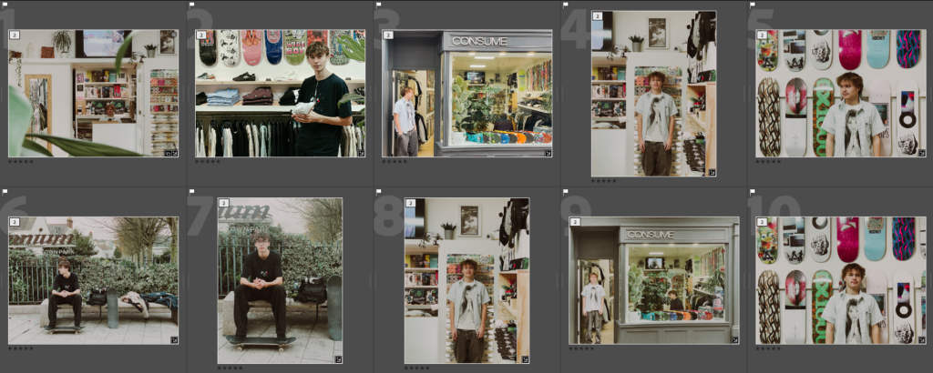
These are the photos i have taken inside of school, in which I have colour coordinated them in terms of how good I think they are as a photo in general. With green being good, yellow being decent and red being bad. The green colours also signify that they are ready to be editing. The yellow colours could signify what I should improve on in the photo to make it good/green.

Editing photos of inside school:

For this edit, I changed the colour to black and white to more relate to August Sander’s work and how most of his work is in black and white as well. After this, I experimented with the tone and presence sliders in which enabled me to tweak the photo to completely how i would want it. I then cropped it to then make the subjects more of the focus in the photo, getting rid of any negative space in the process.

Before:

After:

Before:

After:

Contact sheet inside school:

Photos outside of school:

Before:

After:

Contact sheet outside of school

photoshoot environmental portraits

each colour shows a different person

red is my sister, yellow is my step mum and greens is a yoga instructor and blue is my dad and purple is a couple of my brother.

with the ones for my sister there are a couple of things she is doing, such as dancing poses, gymnastics and reading. and here are some of the best raw examples.

for the ones with my step mum, she id drinking tea and doing trapeze yoga. here is some of the best raw photos.

plus connected to my step mum is the yoga instructor when volunteered to participate. here are some of the best raw photos.

for my dad of him at his work desk, here is some of the best raw photos. which of him at his work from home space.

August Sander and Typologies

August Sander

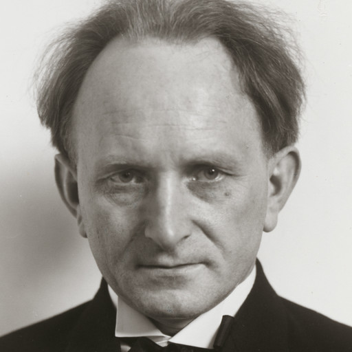
August Sander (17 November 1876 – 20 April 1964) was a German portrait and documentary photographer. His work includes landscape, nature, architecture, and street photography, but he is most well known for his portraits.

His most recognised series is titled People of the 20th century, and aims to show a cross-section of society during the Weimar Republic.

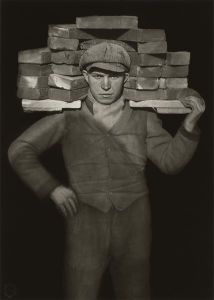
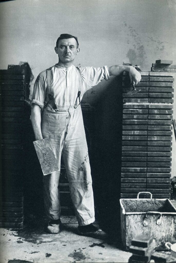
August Sander, Handlanger (Bricklayer), 1928 (printed 1960)

The picture shown above belongs to ‘The Skilled Tradesman’, which is one of the seven chapters in his ‘People of the 20th Century’ project. The title and focus of this image represent a typical example of Sander’s work documenting individuals from different jobs and social backgrounds. In terms of style, the way the portrait is centered, the plain background, and the traditional framing show Sander’s belief in photography as a way to reveal the truth; it captures reality as it is, without any fancy techniques, sticking to the established norms of portrait photography. Sander mentioned in his important lecture ‘Photography as a Universal Language’ that photography is the best medium to show the ‘physical path to demonstrable truth and understand physiognomy’.

August Sander, Sekretärin beim Westdeutschen Rundfunk in Köln (Secretary at West German Radio in Cologne), 1931 (printed ca. 1960)

Sander later expanded his project, People of the 20th Century, to feature a group called ‘The Woman’ (shown above). One of the subjects is ‘Sekretärin beim Westdeutschen Rundfunk in Köln’ (Secretary at West German Radio in Cologne), which he captured while working for the German public broadcasting organization ‘Westdeutscher Rundfunk’. This portrait can be compared to Otto Dix’s ‘Portrait of the Journalist Sylvia von Harden’, created five years earlier. Both artworks showcase a new wave of women in the workforce during that era—balancing both androgynous and feminine traits, and breaking free from traditional domestic roles. These portraits play a significant role in the emergence of the New Objectivity movement in German art, which was a response to the prevailing expressionist style, aiming for a more realistic and straightforward representation of the human form.

Typologies

A photographic typology is a study of “types”, typically a photographic series that prioritizes “collecting” rather than stand-alone images. By extracting visual elements and presenting them in a similarly consistent series, we can create a visual analysis of objects and the larger environment and its inhabitants – often without featuring the occupants themselves.

Examples of Typologies:

Environmental Portraits

| All original work taken by me|

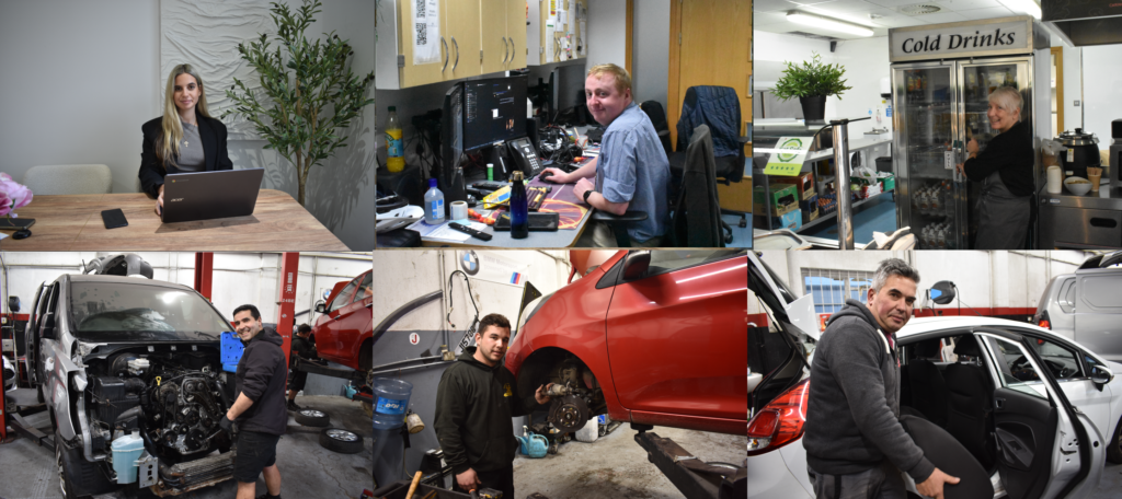
I took around 170 photos at the market and then used Lightroom to narrow down the selection. This process really helped me focus on the strongest shots, refining the collection to the ones that best captured the environment and energy of the market. In Lightroom, I also made some adjustments to enhance the images, bringing out details and improving the overall look to make each photo stand out. This approach let me transform a large set of images into a more cohesive and impactful series.

my favourite

I recently went to the market to capture photos of people within their working environments. The experience was both exhilarating and challenging—the constant rush of customers created a lively atmosphere, but it also made it difficult to find the right settings and angles quickly. I was very conscious of the fact that I was on *their* time, not mine, so I had to work efficiently, making adjustments without holding anyone up. Despite the challenges, I love how the shots turned out. Some images came out a bit blurry, so next time I’ll bring a tripod to improve stability and clarity in my photos.

Artists with similar ideas

Jeff wall

Jeff wall is a Canadian photographer who also utilised crowded spaces just how my photography does.