Environmental Portraits are images normally consisting of a singular subject in their usual environment (like work, or their hobbies). These images help to provide context to the person in the image, and give clues as to what they like to do/ do often. The reason I think photographers take images like this is to represent what the subject sees and what you don’t see in their lives. A lot of these photographers aim to tell a story to connect the people to the things they love most.
Mood Board
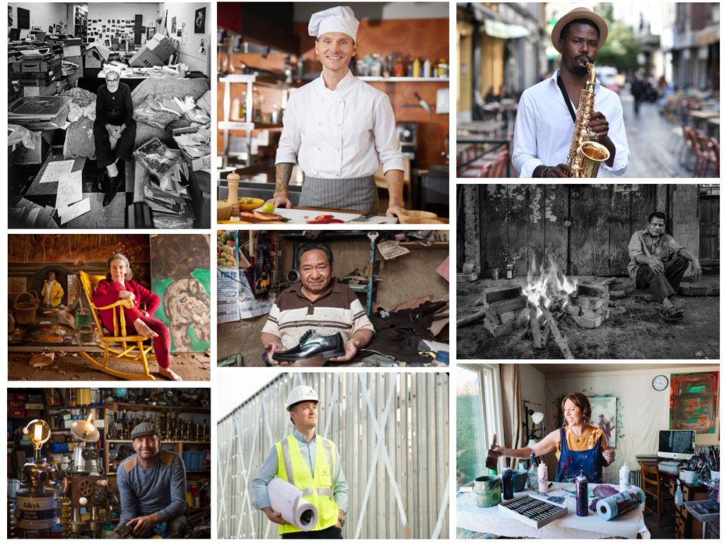
This is a generalised version of a collection of images that photographers have taken to represent an overall view on what environmental portraits are. A lot of these images have the subject facing the camera and looking into the lens, which is a known feature for this topic.
Arnold Newman
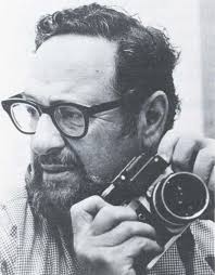
Arnold Abner Newman was an American photographer (1918-2006), known for his “environmental portraits” of artists and politicians. In 2006, he was inducted into the International Photography Hall of Fame and Museum. He is extremely well-known within the photography community, for his eerie images like the Alfred Krupp photograph.
Alfred Krupp
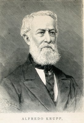
Alfred Krupp was a German industrialist and the owner of the Krupp family steelworks, one of the largest and most influential enterprises of the 19th and early 20th centuries. He was born in Essen, Germany. After becoming an infamous industrial inventor, he earned the nickname ‘The Cannon King’. Krupp’s employment and use of slave labour resulted in the ‘Krupp Trial’ which lasted from 1947-48, and was sentenced to 12 years in prison but only ended up serving 3 years and was released in 1951.
Alfred Krupp and Arnold Newman: Analysis
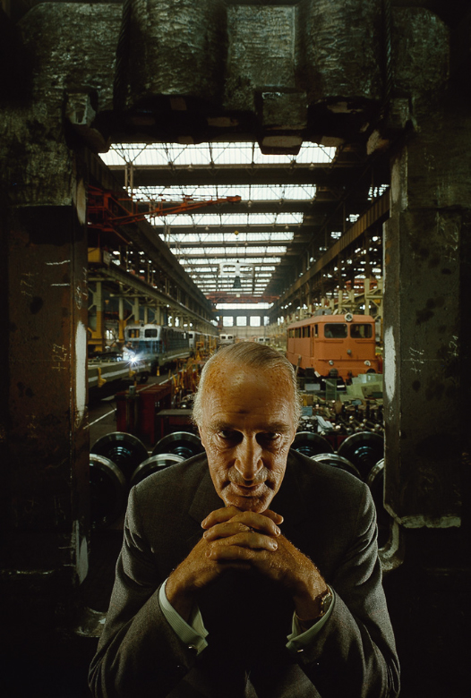
This portrait of Alfred Krupp was taken in 1963, with him as the central focus, taken by Arnold Newman (a Jewish photographer).
Visual
Alfred Krupp is the main focus point as he is placed in the centre of the image to draw all the attention to him. He is outlined by two concrete pillars either side of him to really get the point across that he is the focus of this image. As you can see, his facial expressions create a sinister feeling as he looks as if he is proud with his hands crossed to assert dominance and show that he is a confident man. To continue from this, Alfred is also more leaned forward and is slightly raised to give the impression that he is not scared. By making direct eye contact with the camera, he gives an demonic vibe to the image.
Technical
The lighting placed in the background/above Krupp’s head highlights a strong contrast on his face to make him look more serious and evil as it darkens his stare. In terms of the camera, Newman uses a medium aperture to create a clear and sharp foreground (to make the subject very visible) but a softer background where you can still identify the objects in the background, but they are less visible. Adding onto this, Arnold uses a faster shutter speed to capture this image as everything is in focus and has good lighting exposure in comparison to how a slow shutter speed would look. The viewers are directly in line with the subjects eye level to feel more connected with him.
Contextual
Alfred Krupp was a Nazi war industrialist who was infamous for allegedly using slave labour in his factories (which you can see closely in the background). Krupp contacted Newman for a portrait in 1963, and after finding out that Newman was a Jew, Alfred Krupp refused to let him make the photograph. Newman insisted to have Krupp look at his portfolio before making a final decision and after seeing Newman’s portfolio Krupp accepted. So on July 6, 1963, they both went into a factory in Essen which Krupp owned, where Newman decided to make Krupp look as evil as possible under the eerie lighting of the factory to represent the person he is known as.
Conceptual
I think that Newman took this image to highlight the true representation of Krupp, as there were speculations of his slave labour employment, and this image confirms the suspicions as the background is known to be involved with his accusations. I believe that Newman felt as though he should publish the image as it shows his intimidating nature and his look for superiority.
August Sander
August Sander (born in 1876 and died in 1964) is congratulated for his applaudable work that captures the diverse layout of the social groups in the early 20th century in Germany. His most significant project, “People of the 20th Century”, aimed to create a documentary of various German people, showcasing the different social classes, professions, and types that made up the society of his time. Many of his photos include different age groups to show their social status in Germany at that time.
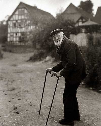
Visual
This image is in monochrome colours as it was taken in the early 20th century therefore they didn’t have the technology we do now to have images in colour. The use of the fragile man’s walking canes helps to guide the viewers eyes in his direction by starting at the bottom of the image and making our way up towards his outline through leading lines. We can see that the subject is making direct eye contact with the camera lens, which creates a connection between us and him, and the confused and concerned look on his face tells us that he wasn’t expecting a photo.
Technical
Sander has managed to use rule of thirds to align the old man towards the right side of the image to showcase the houses in the background. In terms of the aperture, you can see that the background is a bit blurred, meaning that Sander used a medium aperture and a medium depth of field to ensure that the subject will still be in focus. The lighting is natural, as the photo is taken outside and the contrast isn’t predominant like it would be with a studio light. Lastly, the man doesn’t have any motion blur, meaning the image had a short exposure time and was likely either a fast shutter speed to a medium shutter speed.
Contextual
This image is evidently old with the monochrome colours, showing the time difference then.
Conceptual
The message for this image is to represent the older generation, and to show their difference in comparison to the younger generations at the time. August Sander is known to do many images like this, where he focuses on various social classes in order to represent them in his images.
Typologies
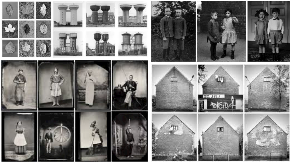
Like I briefly described before, the concept of typology in photography refers to the category of subjects based on shared characteristics or types. August Sander’s use of typologies in his photographic project ‘People of the 20th Century’ is a key and well known feature of his work. He aimed to create a visual idea of the German society by arranging his portraits into specific categories based on social roles, professions, and other attributes like age. These typologies provide insights into the structure of their 20th century society, highlighting both their own diversity and the larger social groups that show the typology.
Environmental Portraiture Photoshoot Ideas
Action plan:
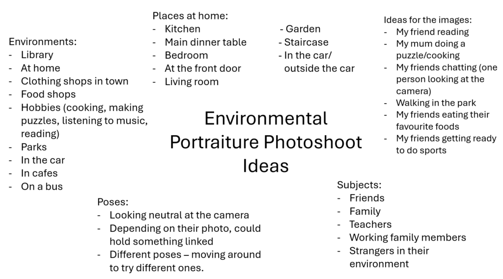
For this photoshoot, I am planning to go out and use my friends as models to present their daily routines and their natural environments where they show their hobbies and what they like to do. I will go to town and go in clothing shops to show that my model likes to shop by picking out outfits. I will also go to my subjects house to highlight the routines she does like doing her makeup and playing with her dog.
Contact Sheet:
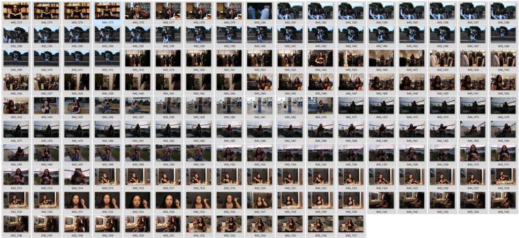
In total, I managed to take 165 photos for this photoshoot to present a wide variety of angles and poses to select the best images. I took multiple photos of the same action to capture the best photos by moving my position and directing my friends to increase the quality and to match the artist better by telling my friends to stay serious and to look into the camera lens.
Image Selection:
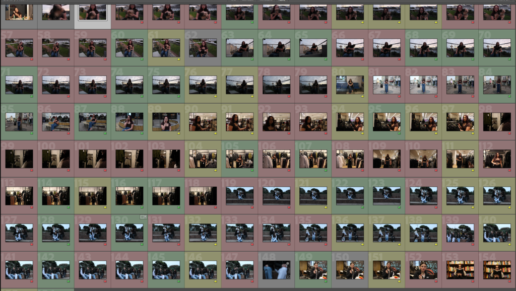
For this image selection, I ended up with a various amount of red images, yellow images and green, which help me to identify the better looking images from the bad ones. The reason why some of my images are red is due to using the wrong ISO, or shakiness causing the camera to not stay in focus. There were also a couple of photos where my models kept laughing and turning away from the camera, so I put them in red as it doesn’t match my artists work properly.
Rule of Thirds
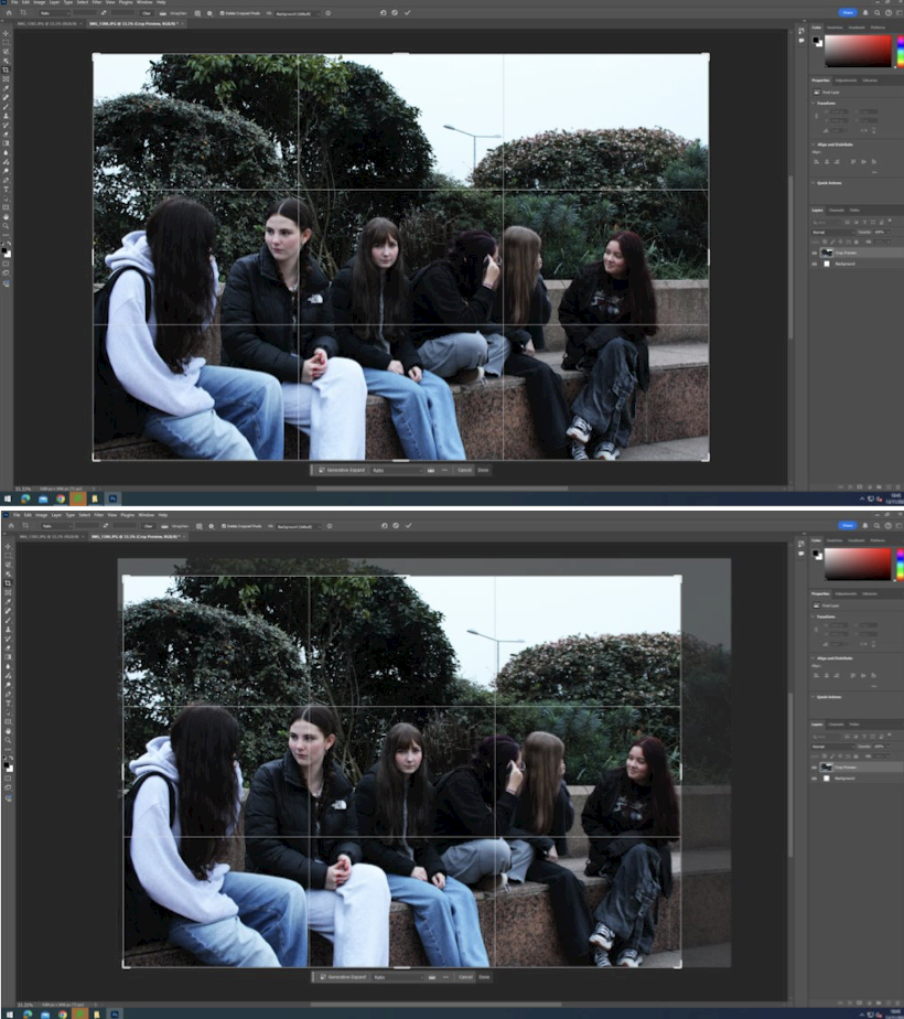
For this image, I decided to crop it to ensure that the main focus and model (the girl in the middle) was directly centred in the image by cropping some of the right side of the photo. When doing this, I also ensured to keep all the models still included in the image, as cropping one of them out could cause it to look strange as there wouldn’t be an even amount of models on each side. When I cropped this, it improved my image as it now looks more finalised and centred than it did before as shown below:
Problems with ISO
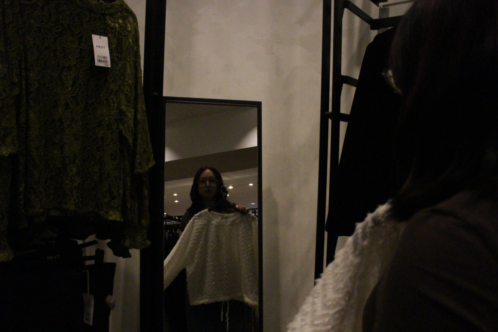
Whilst taking photos, I began having issues with the ISO levels where the image would become dark in certain dim-lit lighting as I had it on the wrong settings, so I had to change the ISO to develop and improve these images. With the ISO at the wrong level, the images looked noisy and fuzzy which made the quality of the image look bad as it made it so that you couldn’t see the models face well.
Best photos
These images below are my best photos as they have various poses in group settings and individually.

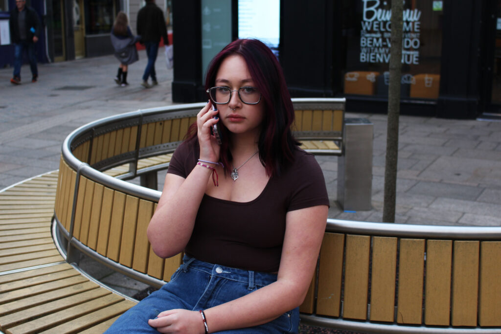
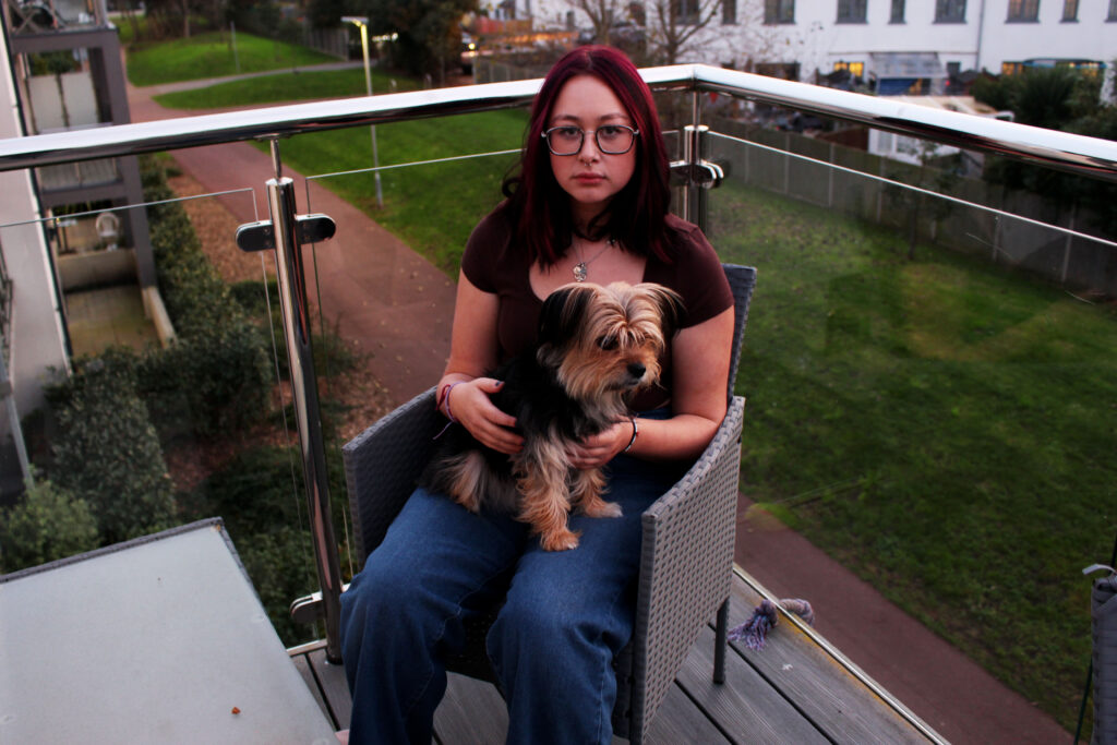
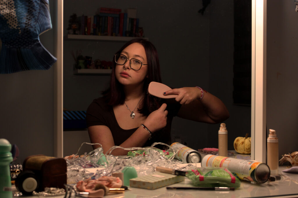
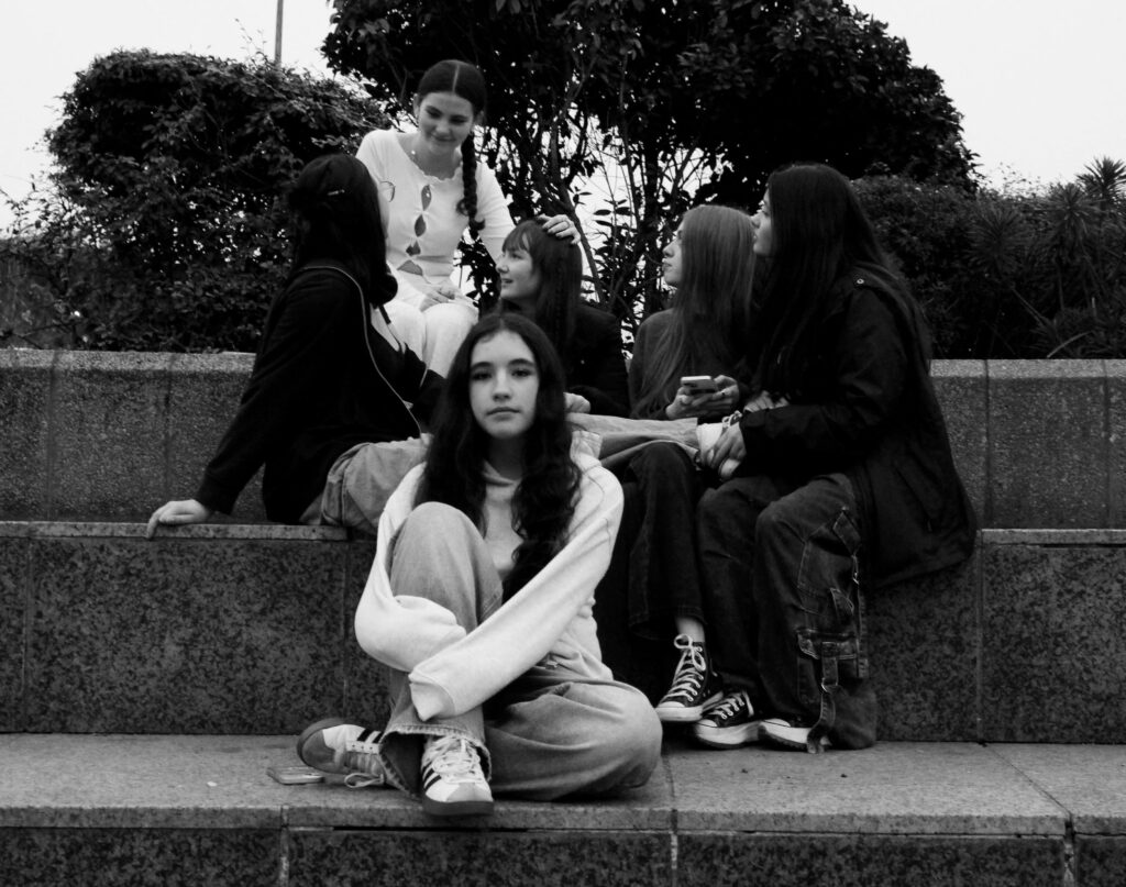
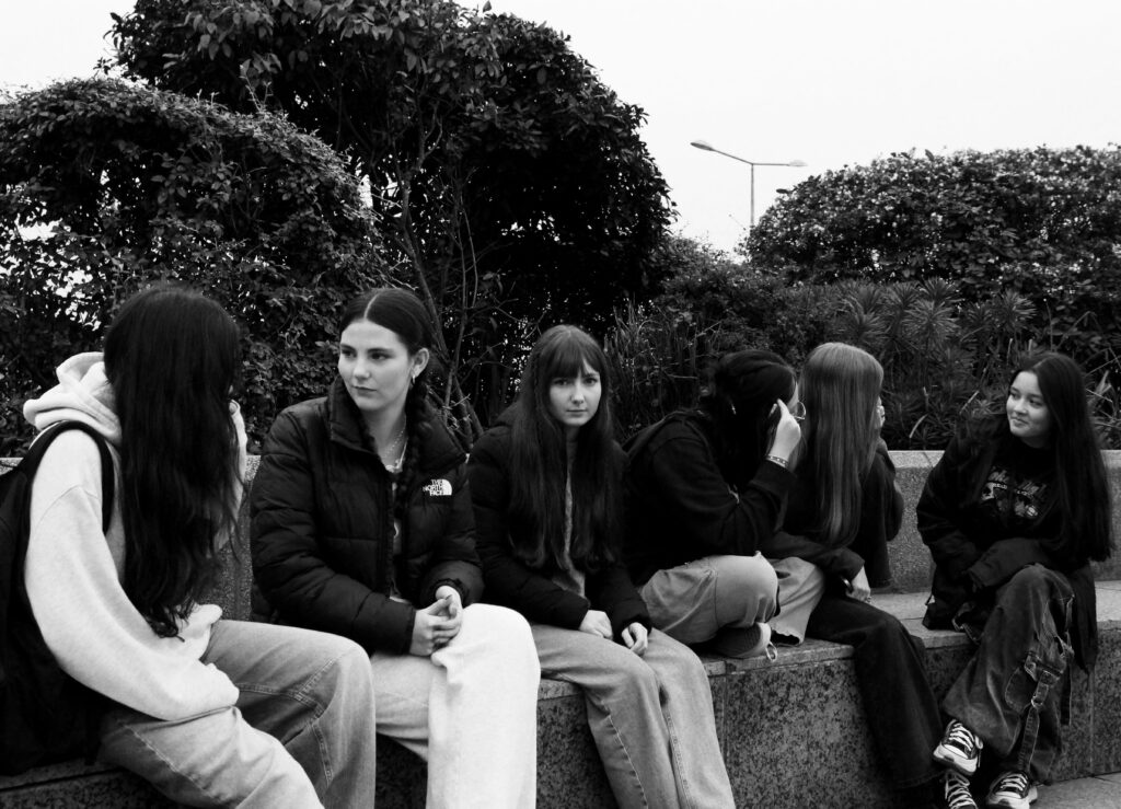
I really liked the group setting photos as it makes the subject looking at the camera stand out in comparison to the others, as it feels as though they are looking straight at us whilst everyone else is busy talking. I also liked the image where my model is brushing her hair, as the mess in front on her counter makes the image look more natural and less staged. The lighting also works really well in that image, because the background is less visible, making you focus more on her.
Art Steps Gallery
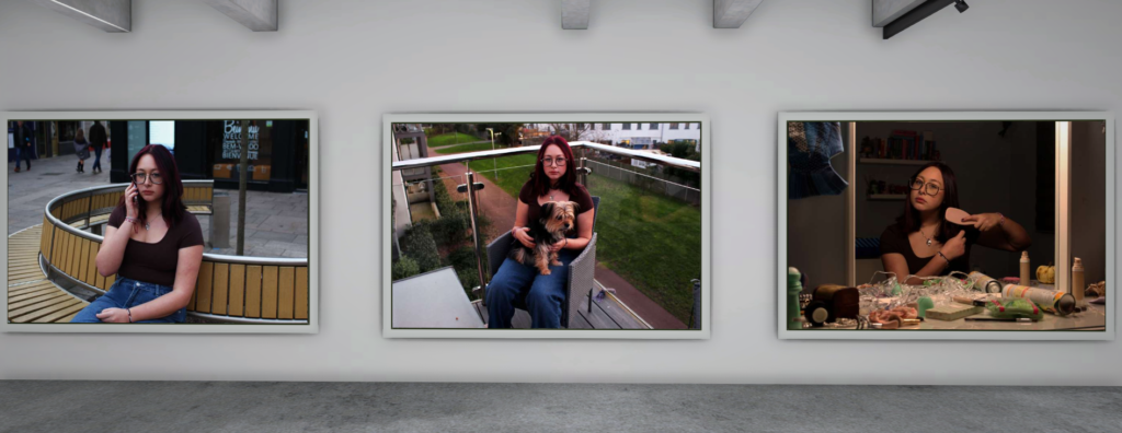
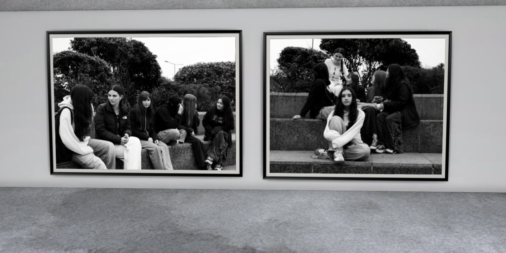
I uploaded my best images to art steps, to show the vision I had. A
Evaluation
I feel as though I made my first final piece match closely to Arnold Newman, as his images are in colour and he makes the subject look directly into the camera with a serious face, like I told my subject to do. Although, my second final piece is similar to August Sander where his images are in monochrome colours, however I decided to challenge myself and include multiple people in the image to give the essence that their environment is around their friends.

Please update your creative / studio portrait work with consistent and creative processes
Try different approaches…be curious and push your ideas further each time !
!!Don’t forget to publish a minimum of 1 x blog post per week!!