Image #1
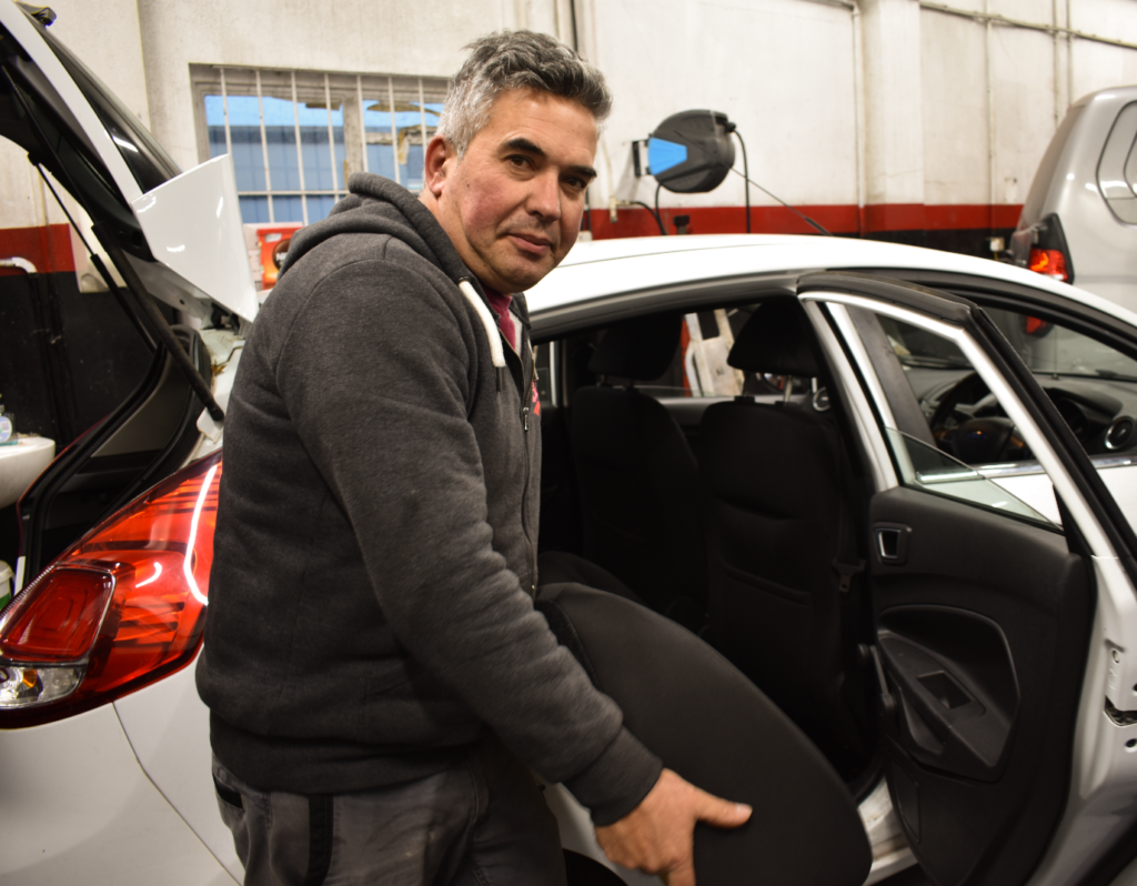
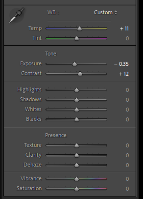
What I have done to this image is that I have decreased the exposure of the image in order to make it less brighter which will help capture some more detail around the bright areas as well as increasing the contrast to help reveal more detail all around, I have also increased the temperature of the image to reduce some of the bright white colours along the top of the image.
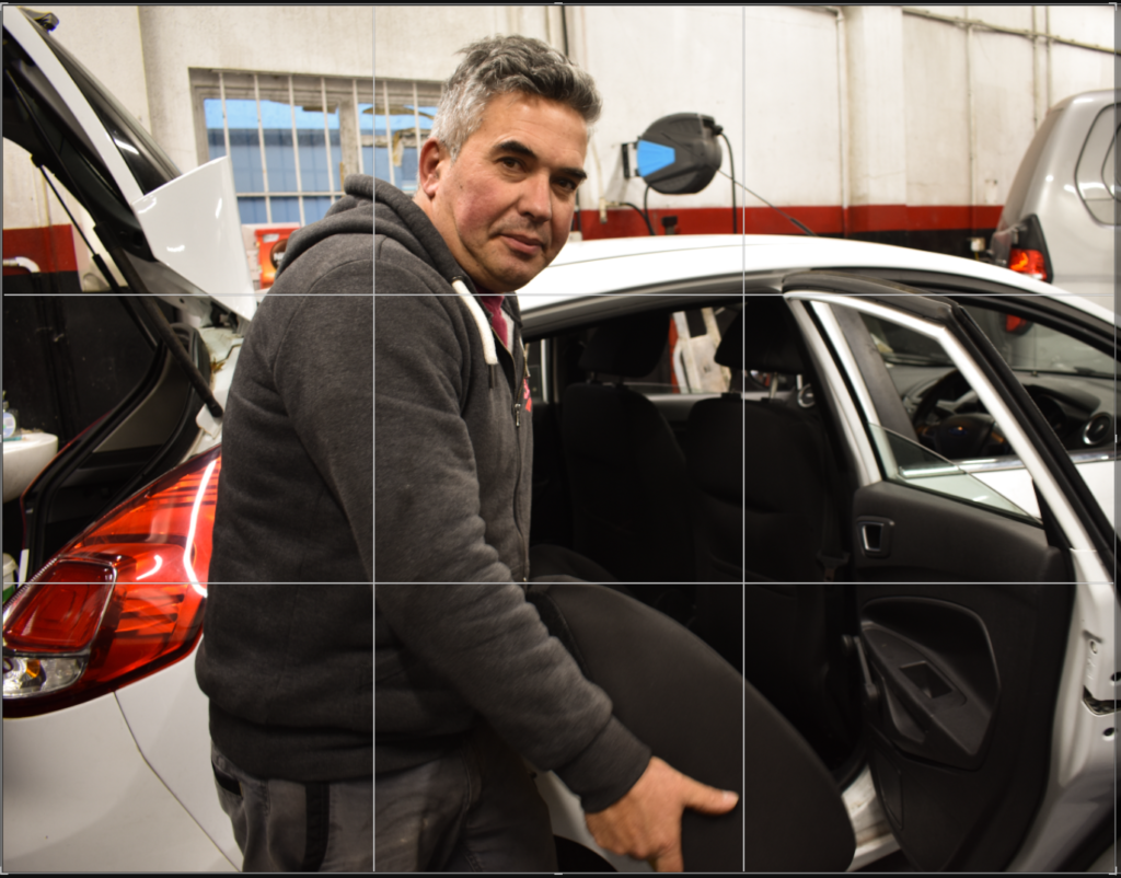
I have also cropped the image so it focuses more on the subject as well as also using composition mainly rule of thirds which has helped make the subject occupy most of the image making it the main focus which is what I want.
Image #2

What I have done to this image is that I have increased the exposure as the image before was dark especially the background, I’ve also increased the contrast which allowed for more detail to be seen and pop out.
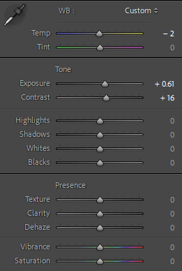
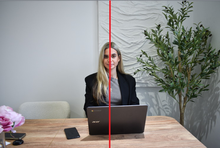
I did not crop this image as I wanted to retain the perfect symmetry of my subject being at the centre of my image. This helps the subject be the main focus of the image especially as they are right in the centre so its most likely the first thing you see when you view this image.
Image #3

With this image I adjusted the exposure slightly to brighten up the image and then I also increased the contrast in order to preserve more detail, however due to the high ISO this image was taken in, increasing both the exposure and contrast made some details in the image hard to view so to counter this I decreased the Highlights dramatically which helped restore the visibility of the details in this image.
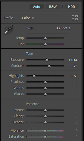
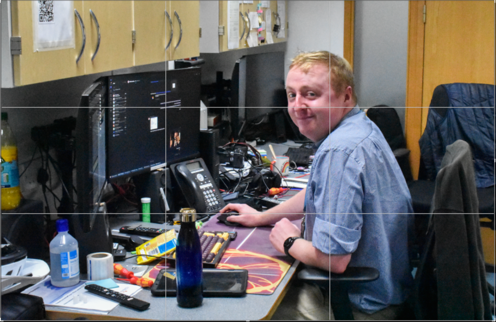
I have also cropped this image to use the rule of thirds which helps direct attention towards my subject first then their environment after. I have kept lots of things in frame in order to make it easier to identify my subjects usual environment.
Image #4
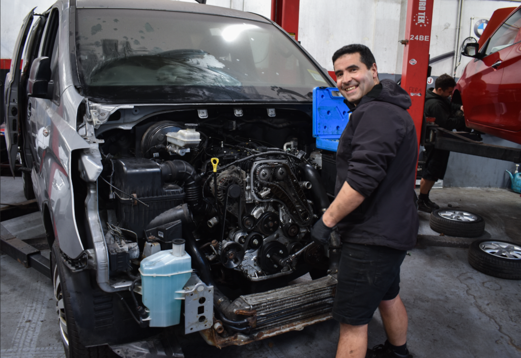
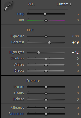
With this image I didn’t adjust the exposure as the image was already bright when I took it, I did adjust the contrast to bring out more detail in things like the engine or the texture on the floor and wall, I also decreased the Highlights a lot as it helped decrease places in the image where it was overexposed primarily in the wall so now it makes the texture on the wall much more visible compared to before I edited it. Last thing I did was decrease the image temperature to remove some faint yellow light that was present before.

I tried cropping my image to use the rule of thirds composition as this composition style was suited the best for this image however it is not as effective as my other images who utilise this style much better.
Image #5
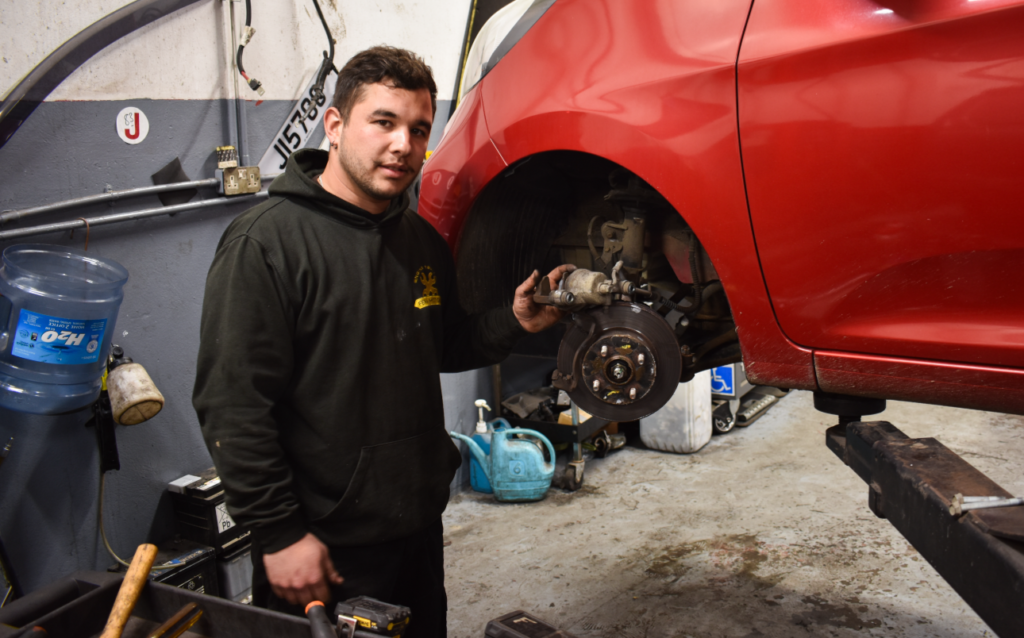
With this image I adjusted the exposure slightly to give some dark areas of the photos more light and also adjusted the contrast to bring more shadow and detail into the photo. I also decreased the Highlights as some areas of the photo were too bright especially around the face so decreasing the highlights helped reduce the bright areas and bring out some details. I also decreased the temperature slightly as it helped to remove the faint yellow tint you could see in the image due to the lighting.
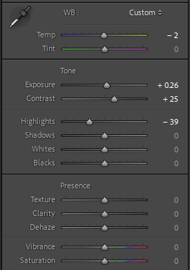

I cropped the image to ensure that the subject is the main focus of the image using the rule of thirds composition, its also cropped really nicely in a way where you can see not only the subject but what he is doing with the vehicle which helps identify what his usual environment is.
Image #6
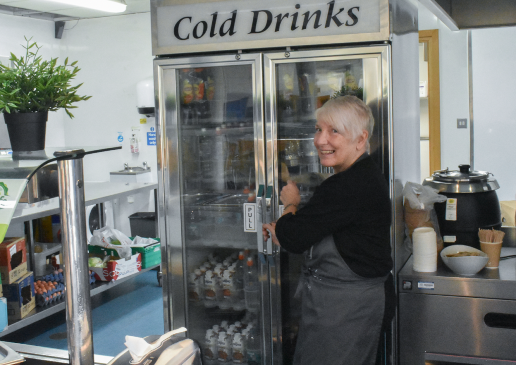
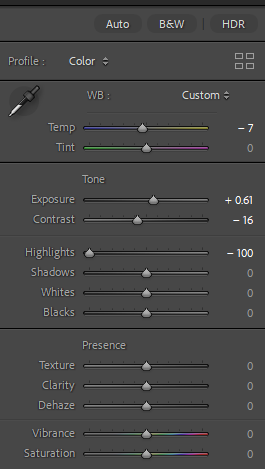
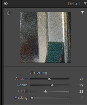
This image needed a lot of editing done to it as the image quality before the edits were quite grainy and dark due to me accidently leaving the ISO at a high value, to counter this I first made sure to increase exposure slightly to brighten the image and slightly reduce the contrast as adding more contrast to this dark image made it look darker and more grainy. To preserve as much visual detail as I could I turned the highlights all the way down which was needed for this image as it helped uncover the missing details in this image like the corner of the wall on the left side of the image, that was completely white until I adjusted the highlights. I also adjusted the image temperature by turning it down to remove the yellow tint in the image which helped to show more minor details that was missing.
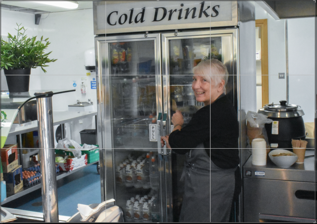
With how this image was taken, I was had to crop it to meet the rule of thirds composition which in return made this image not look too bad. We can clearly see the subject at her workplace interacting with the fridge which takes up around half the image so it makes it easy for the subject to be identified and seen.
