Contact Sheet:
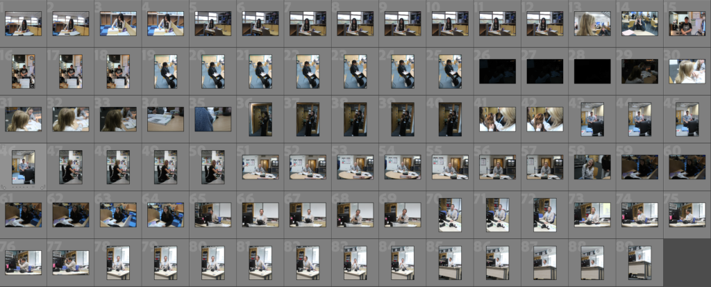
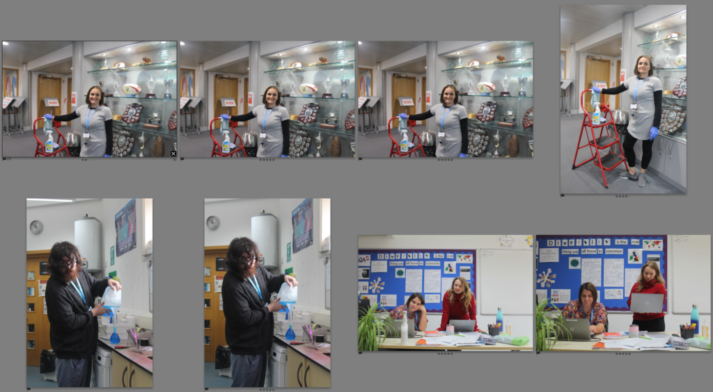
This is my school contact sheet where I went around school and found teachers and students to photograph. This gave me a range of ages and different looks to people as they were all doing something different. This also allowed me to get comfortable with asking people to pose as I started in a place I know.
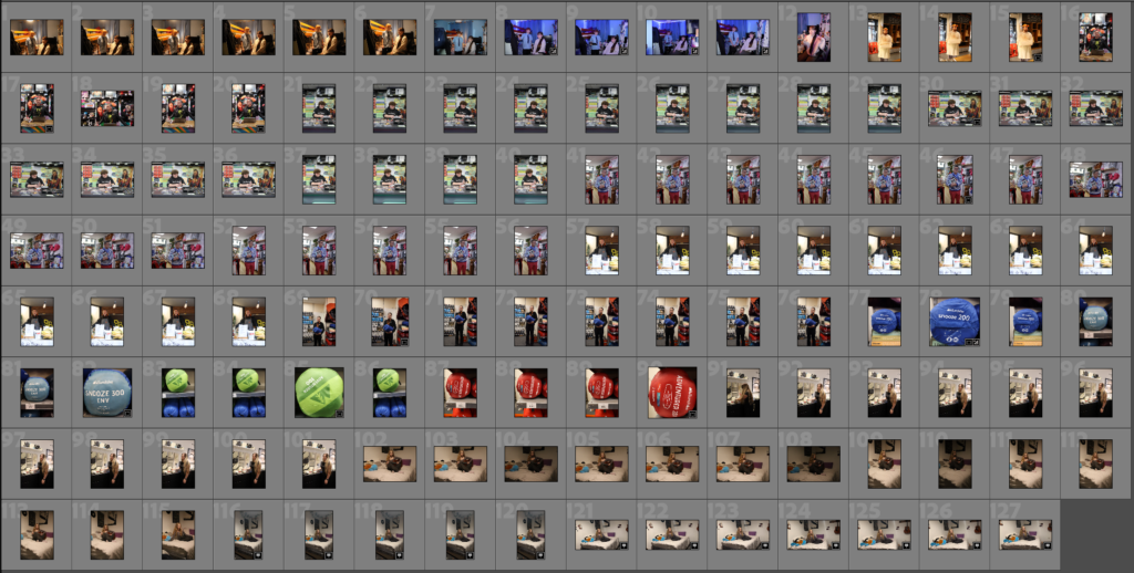
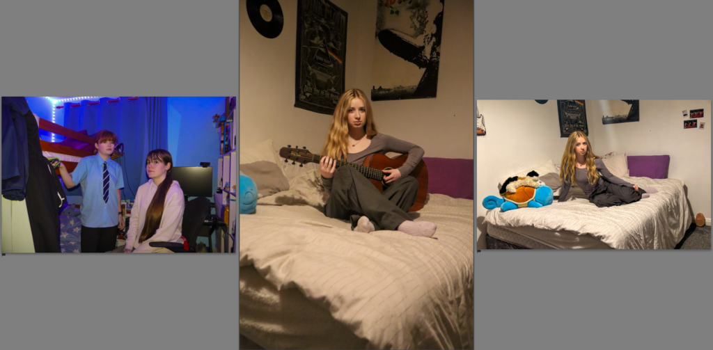
This is my out of school contact sheet where I was able to capture pictures of people in their work or doing their hobby. I went around town and managed to capture images of people in the market doing their everyday job. I also was able to get images of my friends in their bedrooms which helped me to get my inspiration photos.
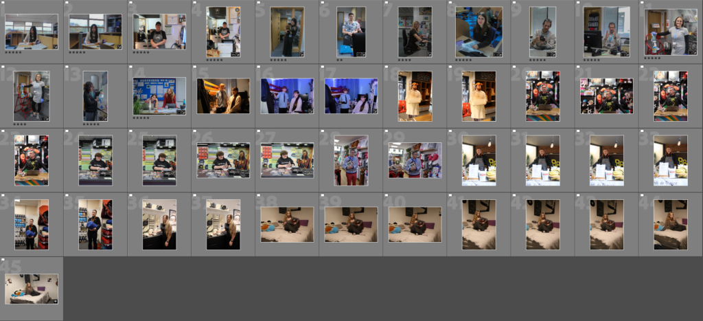
I went through and flagged which of the images I prefered this helped me choose which pictures would be in my finals choices. In doing that I also starred some images to help choose my final pieces.
Original Images
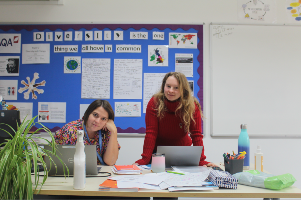
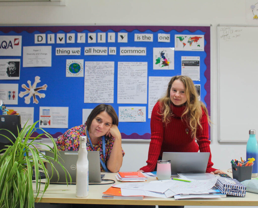
This image was able to capture two teachers in their natural area being a classroom. I managed to capture them in their original positions showing how neutral looking they are. They are engaging the audience by looking at the camera inviting them in.
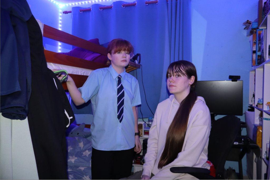
In this image I was able to photograph two sisters in their room where the lighting was more blue and calmer. The facial expressions are neutral and I made sure they had eye contact with the camera. I also posed them in a neutral position as if they just got stopped having a conversation. This created a very enclosed environment because it shows that they were turned inwards and are look at the viewer as if they’ve been interrupted.
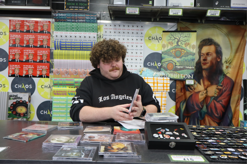
I was able to capture this photo by going in to town where I went to the shop ‘Chaos’ and took a photo of the man sorting out his cds. To switch it up I directed him to look away from the camera so it would be less personal. The chaotic background helps distinguish the man from his surroundings as he is in darker clothing.
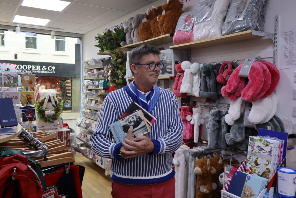
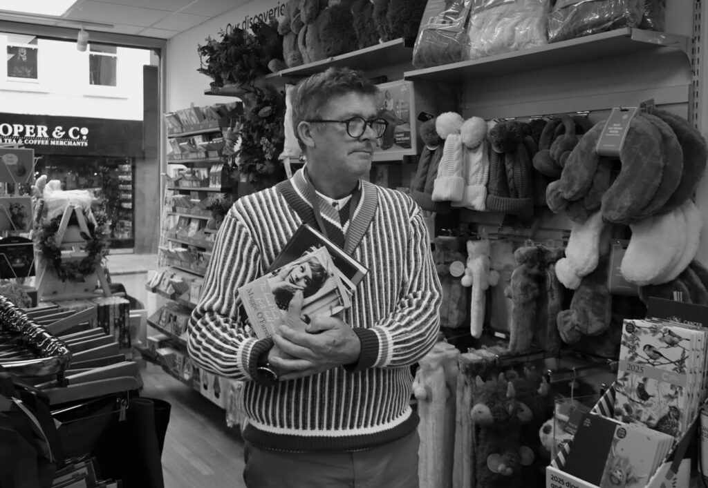
I managed to capture this photo by going into a charity shop where I posed the man in front of the clustered background. The blue jumper links the blue to his left which adds a nice cool tone to the picture instead of a warmer one like the pink is making in the back. For this image, I asked him to look away and hold a prop of a couple books to show what he was doing that day. When he stopped he was already holding the books in a very neutral position which was good as he didn’t have to act in a way he didn’t want.
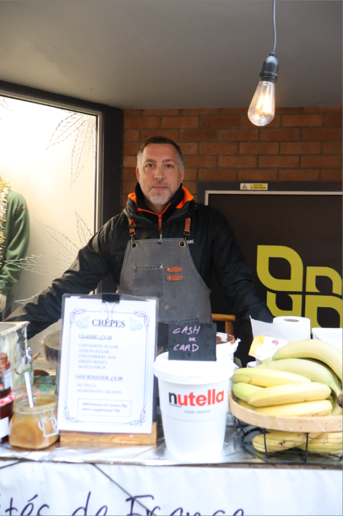
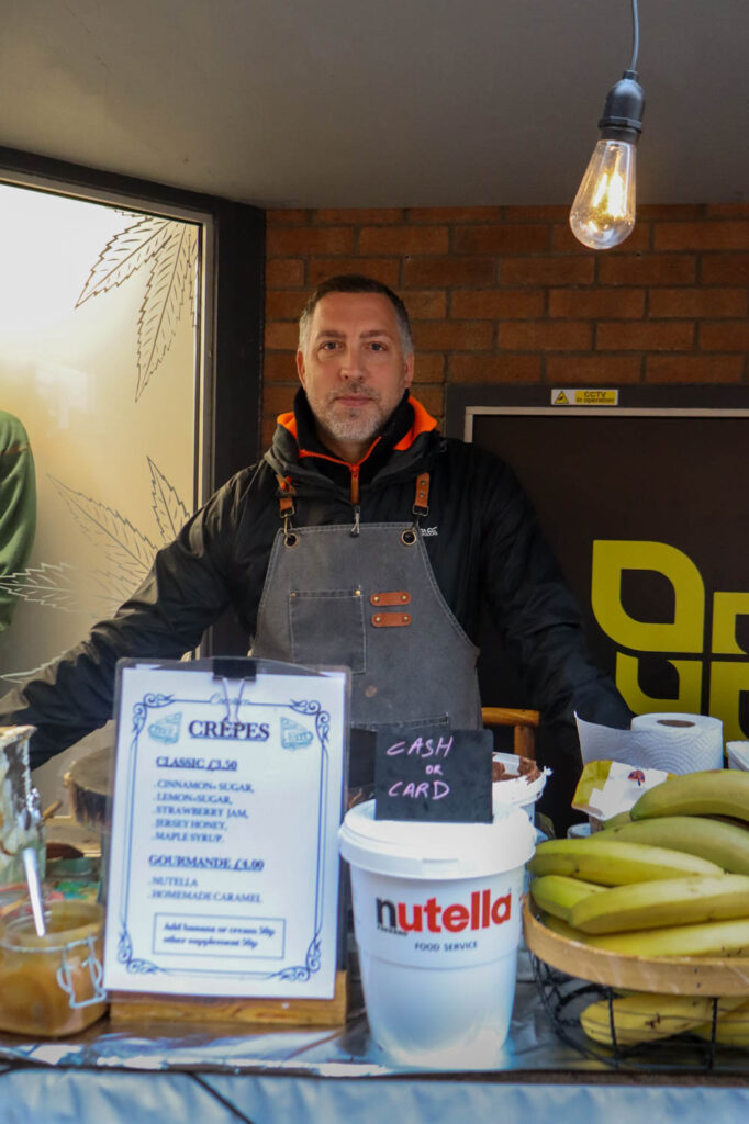
In this image i was able to link all the colours in the photo to something else in it. Like the yellow bananas with the yellow logo in the background. This image stands out from other images as its someone doing their job outside in town rather than a little shop. I directed him to have a neutral facial expression however, I didn’t have to do much as that’s how he naturally looks anyways, which helped when telling him how to act. I also asked him to pose neutrally as is he’s waiting for someone to come and order.
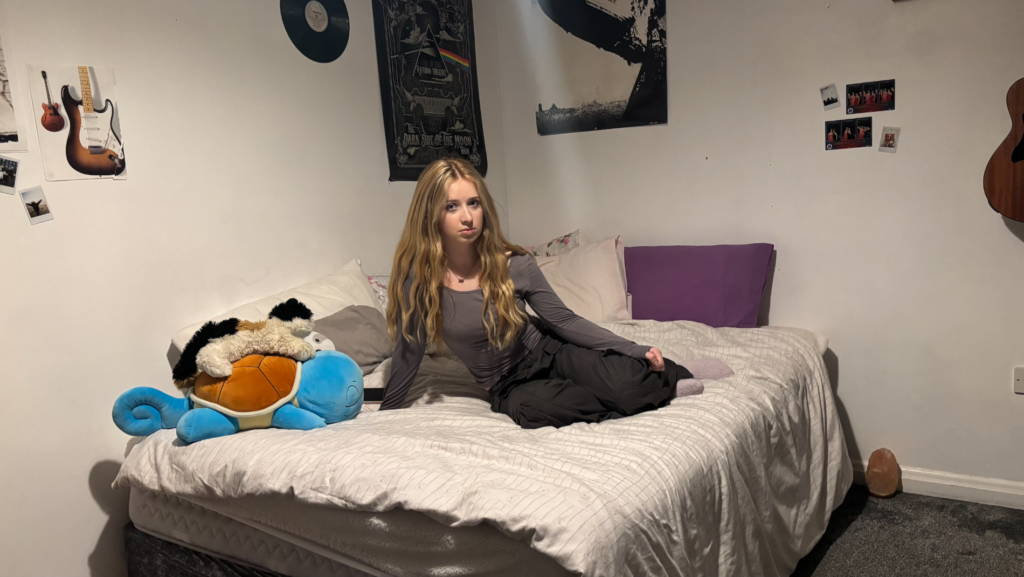
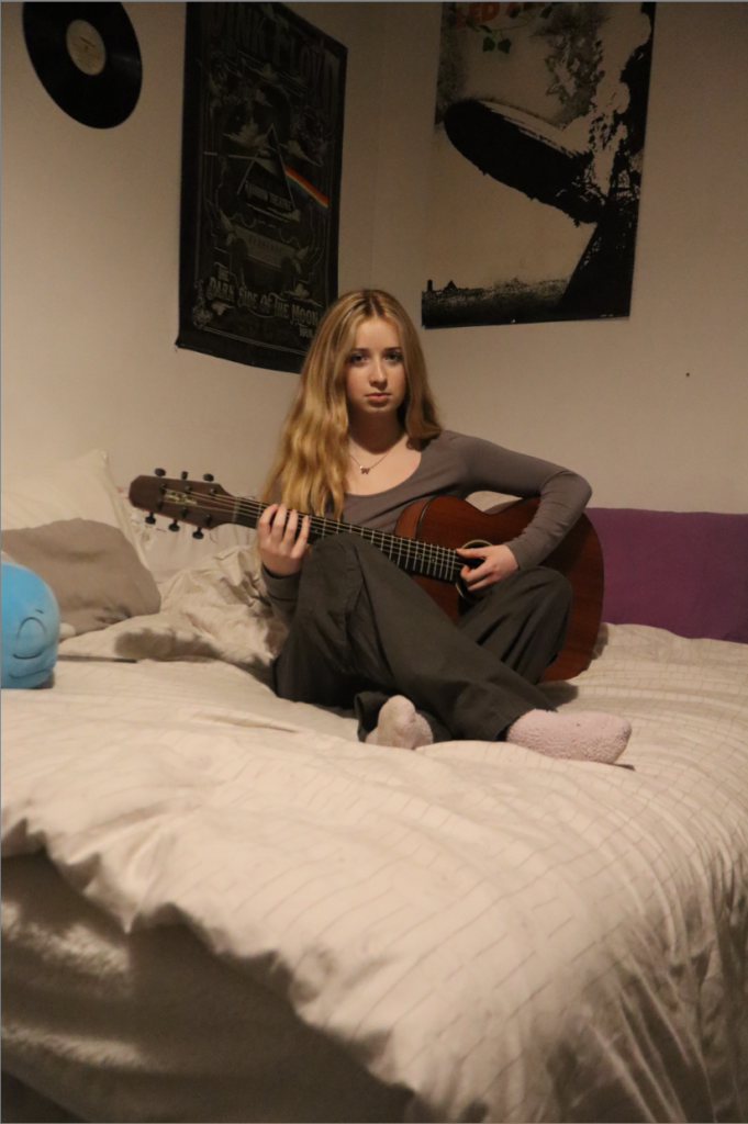
In these photos I decided to create a more ‘homely’ feel as the bedroom pictures are more personal and intimate as it shows off their personality and what they are interested in. I got two images of the same girl as she shows a neutral expression throughout the whole shoot these two images stood out to me because of how everything is positioned. In the 1st image I posed her neutrally as if she’s just relaxing on her bed this also allowed us to see the view of her room and how she’s decided to decorate it. Whilst in the 2nd photo I have her posed with her guitar showing what her hobby is. Again I have her in a neutral position with a neutral facial expression looking at the view almost like playing something to them.
Edited Images
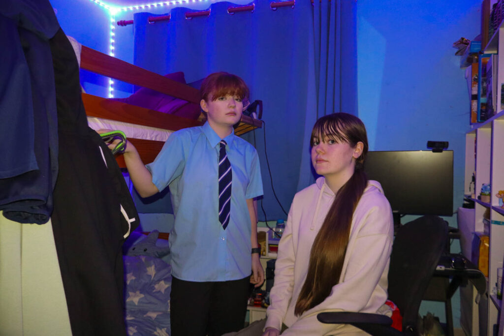
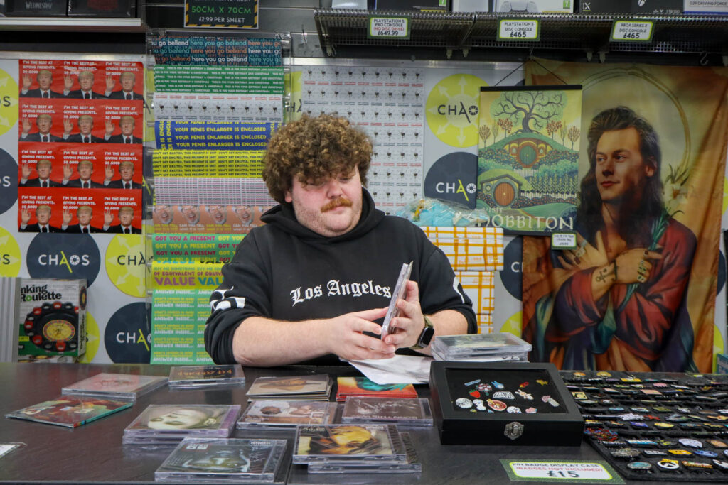
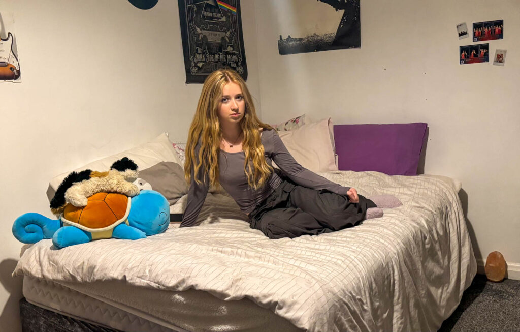
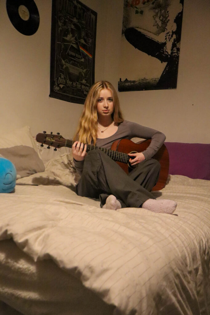
For the bedroom photos I decided to turn the saturation higher so it would match Michelle Sank’s style of editing as her photos are normally bright. She also gets them to pose naturally almost showing off the bedroom instead of the person.
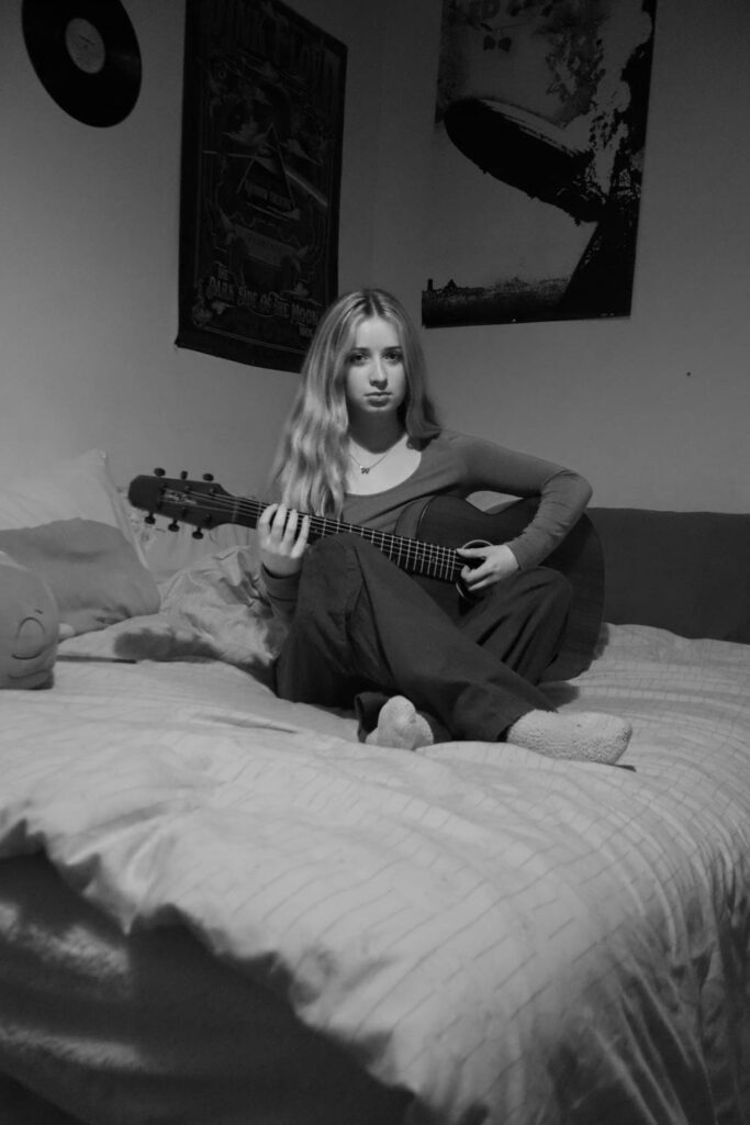
I tried putting this image in black & white however, I prefered how it looked in normal colour as it showed off more features of her and the room. I also edited it so she would be brighter than the room to create more emphasis on the model but it just made it look strange so that’s why I decided to stick with it in colour.

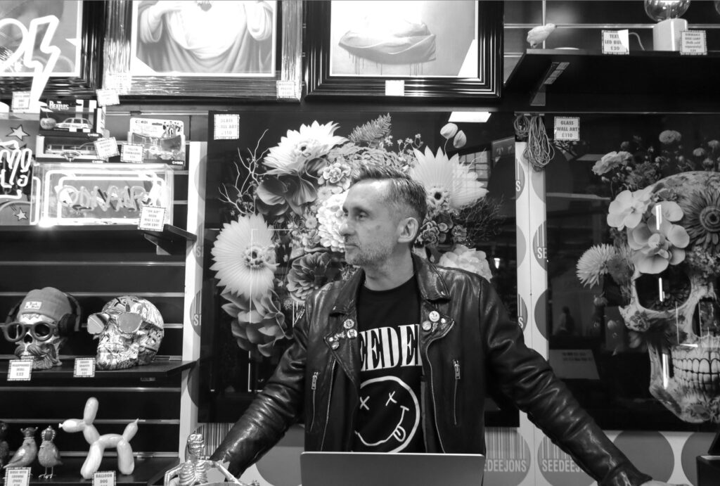
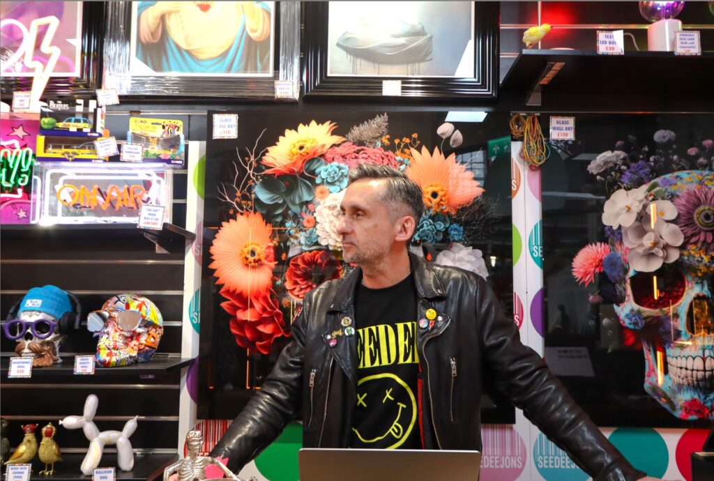
Whilst I didn’t use the bottom two I wanted to edit them just to see how they would look in the Arnold Newman style of being black and white. I put the top one in black and white to fit with the style and it so he would stand out from the noisy background however, it fits with Newman’s style of photography because in the photos he usually directs the person to have something in their arms/hand or stuff in the background that correlate to what the model does as a hobby or a job.
Overall I think I got pictures that were inspired by the two artists I chose and more abstract ones that I took in my own direction. However, next time I would prefer to get more angles to give more variety to my photoshoots. I’d also want to get some images of typology to give me another thing to post on the blog.
