
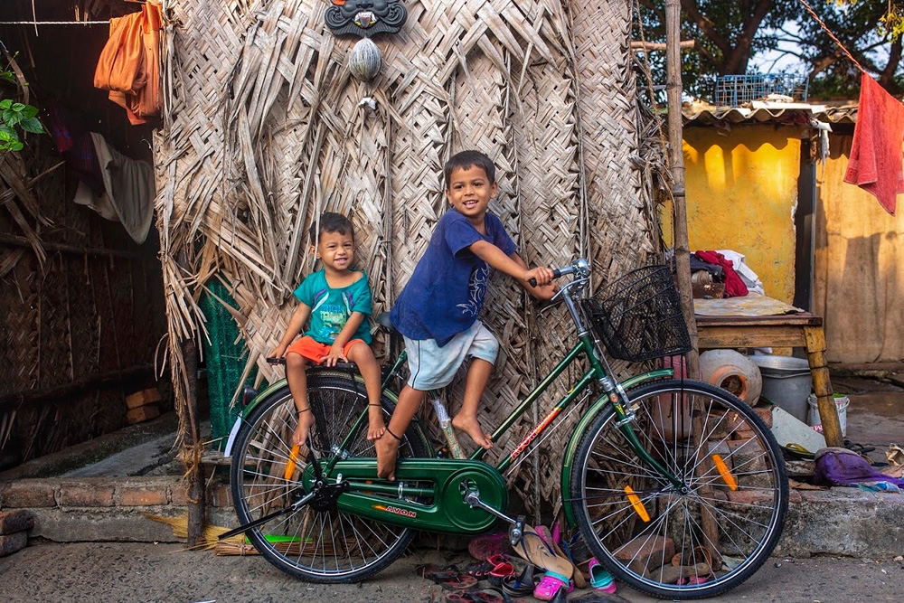
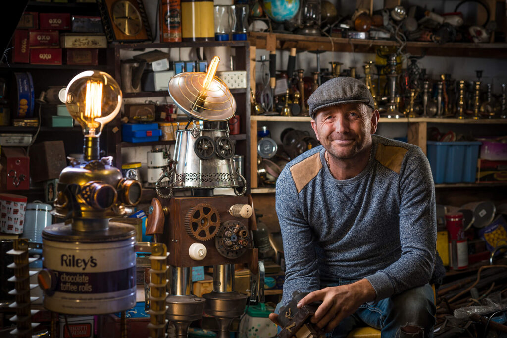
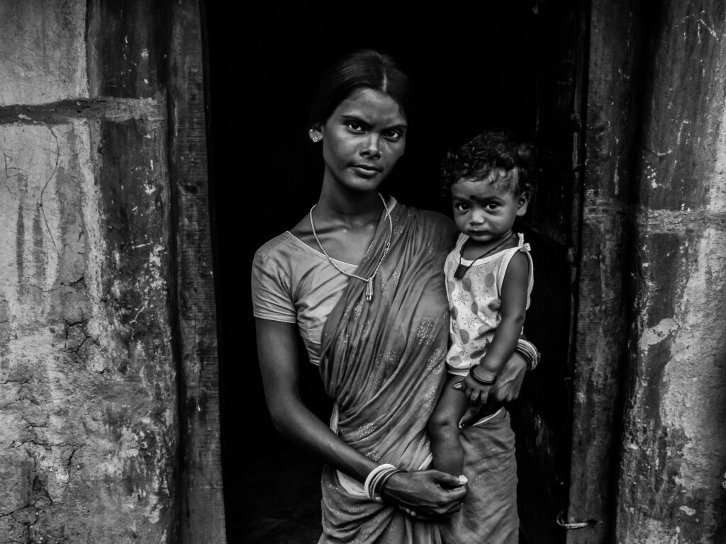
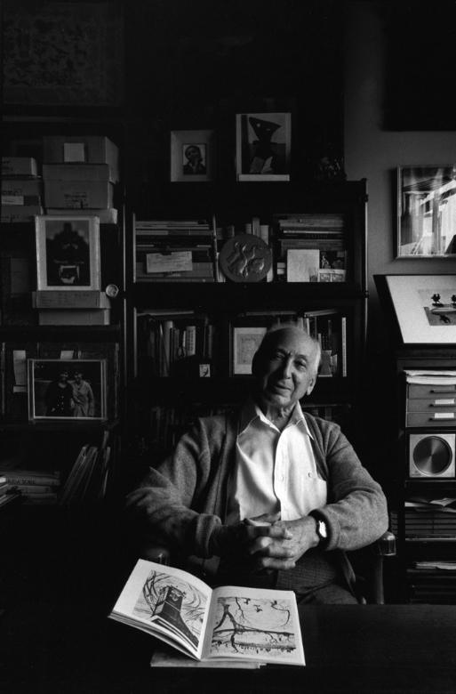

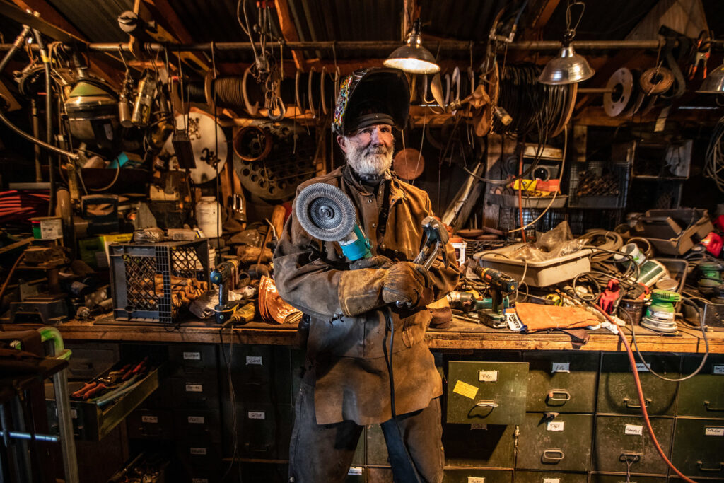
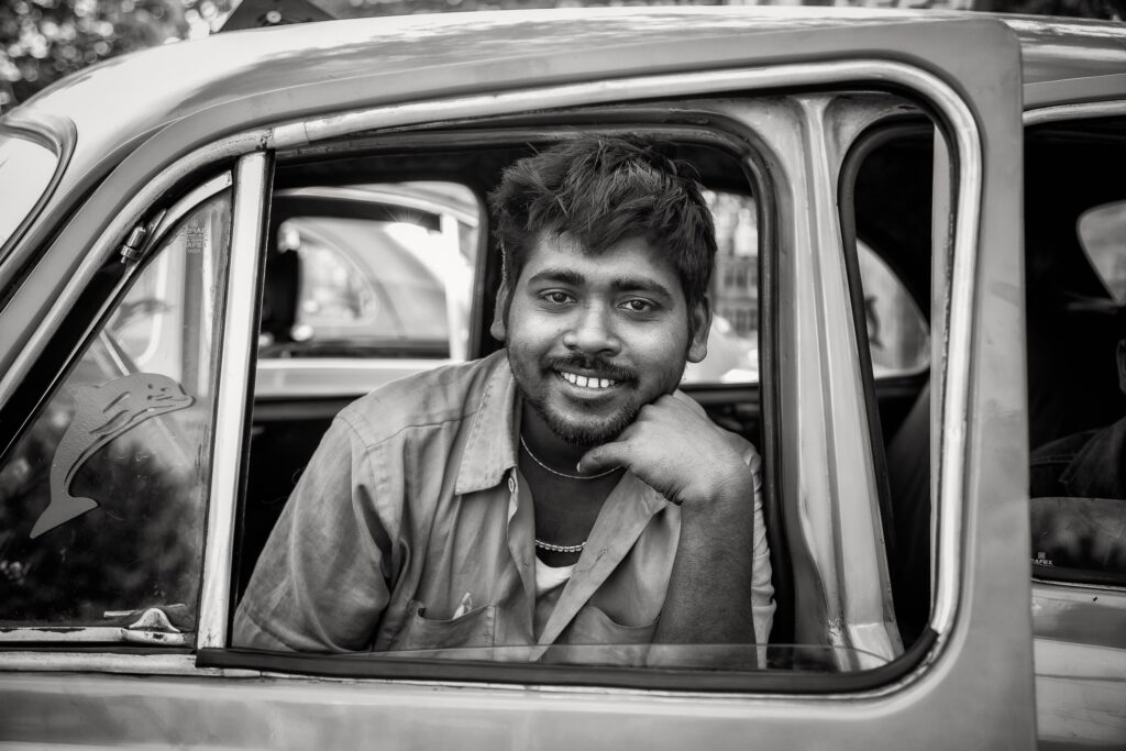
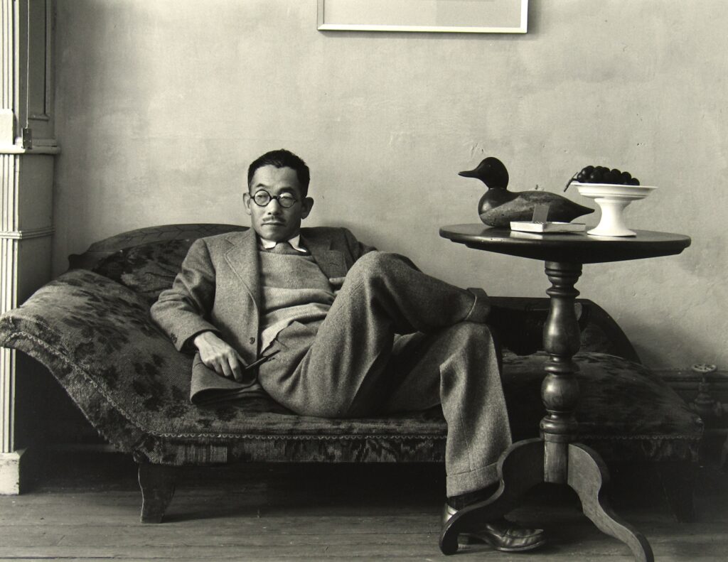
Environmental portraits are portraits that usually feature the person in their “natural environment” for example it could be in their bedroom or their work place. These portraits are a good way to convey a message and get people interested in the story behind the person.
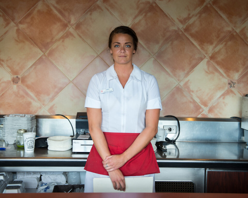
Lighting: Front facing natural soft light. I think this the lighting is coming from behind the photographer and I think the light is coming from a window so that its natural light, however I do think the window may be slightly to the left of the photographer based on the shadows of the image.
Environment: In a diner / restaurant the social class is probably working class. An American women in her place of work.
Framing: Three quarter length body shot, with the arms slightly crossed in front of her. The angle is straight on and deadpan. The dark colour of her hair helps frame her face from the colour and pattern of the wallpaper.
Approach: A formal (posed) image a neutral pose and slightly smiling but other than the slight smile its a neutral expression.
Gaze: The women in the image is making eye contact with the camera / viewer of the image., this shows that she is engaged.
Camera Settings ( predicted )
- Focal length – I think the focal length is 50mm and its a standard lens
- Depth of field – I think this image has a large depth of field as everything in the image is in focus probably, f/5.6-f/8
- ISO – it is an indoor image and everything is crisp so I think that the ISO is low
August Sander
August Sander was a German portrait and documentation photographer. Much of Sanders photography includes nature, architecture, and street photography, however he is most known for his portraits. Sander first learnt about photography whilst working in Herdorf iron-ore mine while he was assisting a photographer who was also working in the mine at the time.
Sander published his first book in 1929 and it was called Face Of Our Time which includes 60 portraits from his collection called people of the 20th century. In this series of images he aimed to show society during the Weimar Republic, and the series is divided up into 7 sections called: The Farmer, The skilled tradesman, Women, Classes and Professions, The Artists, The City, and the last people.
Twenty years after his unfortunate passing August Sanders work and entered into the International Photography Hall Of Fame and Museum in 1984.
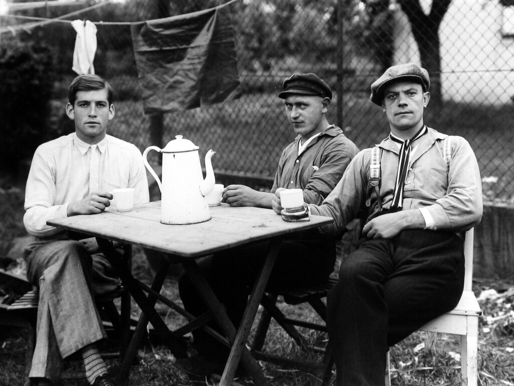
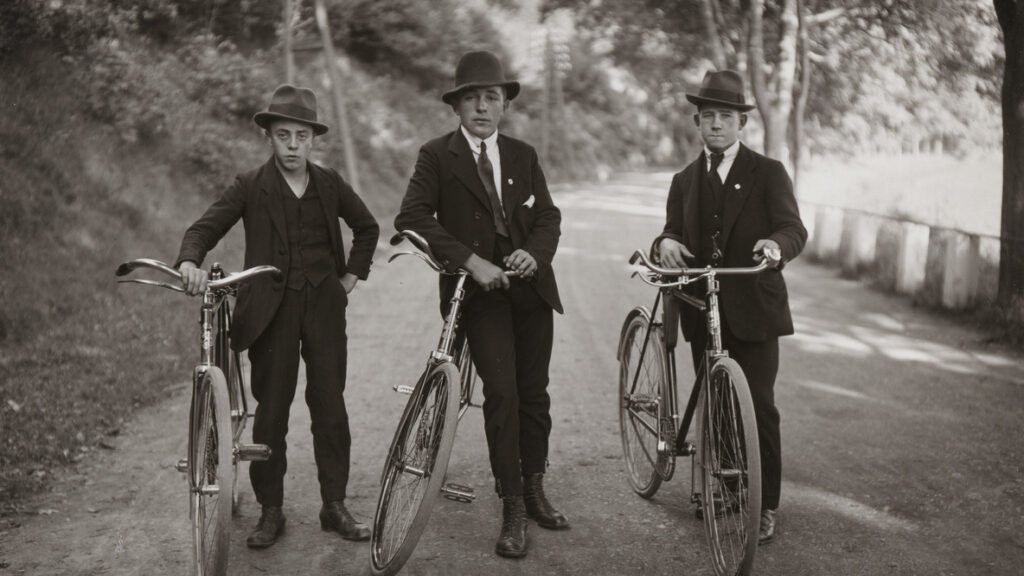
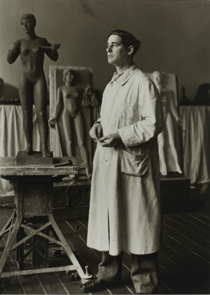
Images by August Sanders
Sanders Analysis
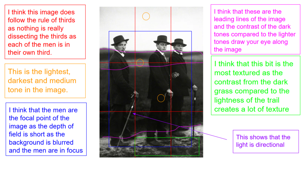
August Sanders takes his images using an old-fashioned large-format camera, glass negatives and long exposure times. The genre of this image is portraiture.
The mise-en-scene presents the portrait photo of three men in a field / walking path, they are looking straight in to the camera and they don’t look like they’re dressed for the environment they’re in. The tone of this image is quite dark, for example if you look at the colour of they’re suits are sort of blending into colour/ tone of the background, it may even be a little bit underexposed. The use of light in this image is very soft natural lighting as they’re outside, it looks as if its not even that sunny of a day outside and a bit cloudy. The focus distance is short as it is a close up photo and the depth of field is short as only the people are in focus in the image and the background is blurred. The photographer has used leading lines which would be the light colours of the sky and path to draw your eyes across the image.
I believe the ISO is 600 as most things are in focus however there is a bit of grain. I believe that the shutter speed is 1000 as everything is clear.
As August Sander states: “I hate nothing more than sugary photographs with tricks, poses and effects. So allow me to be honest and tell the truth about our age and its people” and I think this really comes across in his images as they are “plain” image of just people posed, however I think he has really managed to capture a story and cause intrigue in his images. As when I look at Sanders portraits I can’t help but wonder about the person in the images life, what the job is ?, how are they feeling in that moment? I think to be able to convey this from such simple images is just incredible and is an enormous amount of talent and skill.
Typologies
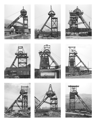
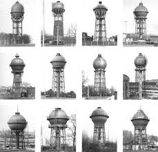
Images by Bernd and Hilla Becher
Bernd and Hilla Becher started photographing together in 1959. Most of their work included architecture and had extensive images on water towers, blast furnaces, coal mine tipples, industrial facades and many other industrial architecture pieces.
Typologies are a body of photographs ( more than one or two ) that share a high level of consistency, so they are often placed next to each other to create a series of similar looking images. And grouping them together based on similar characteristics, often showing repetition and patterns. Typologies can be used to explore how small variations within a group can create meaning or convey information about the subject.
photoshoot plan
For my photoshoot I thought that I would use some of my family members and partners. My first idea was to go to my dads karate club that we runs and take some photos of him with his GI and doing some poses such as punches. Then I thought I would take some photos of my friends that would relate to Sian Davey although her images are of her family i thought some of the images relating to her older daughter Martha and her life would be cool to take.
photoshoot 1
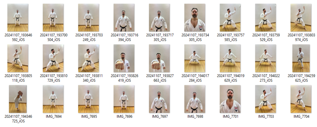
edited images
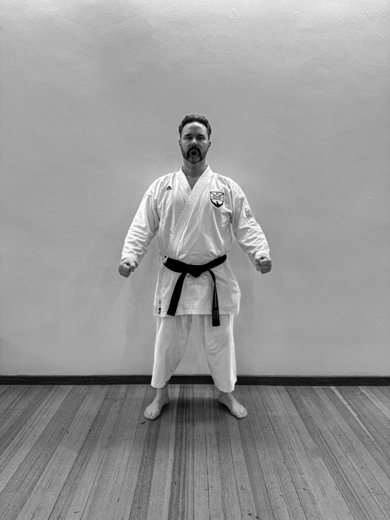
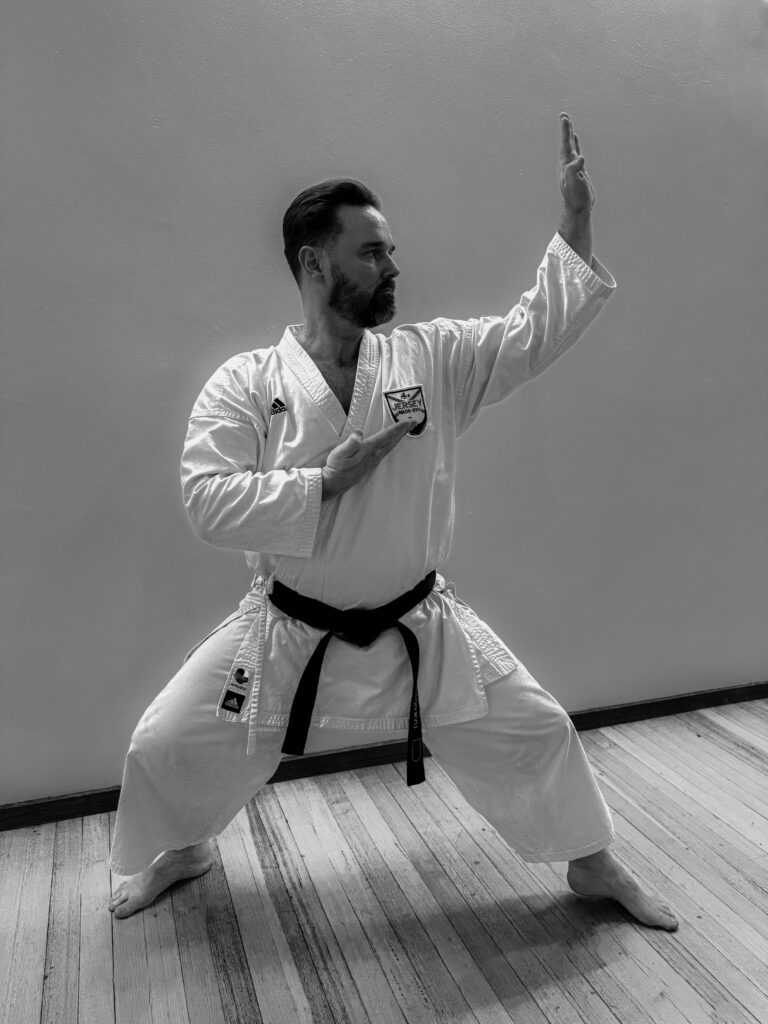
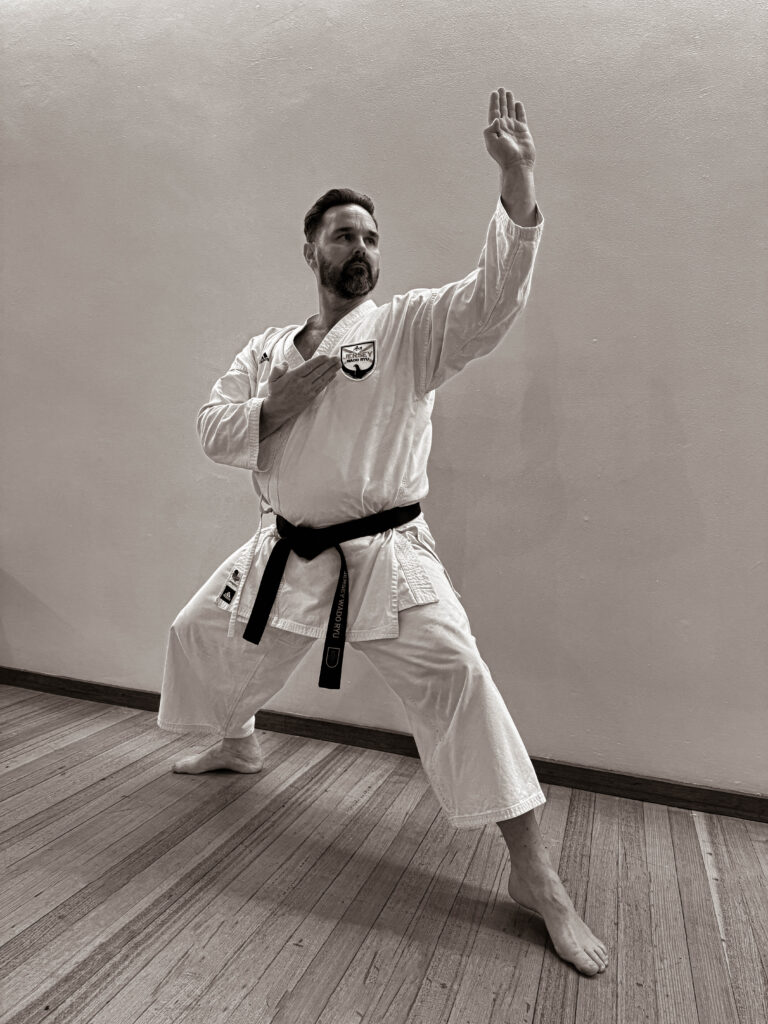

To edit these images in light room classic, I first used the remove toll as there were some scuffs on the floor that I wanted to get rid of. Then for this image specifically I used the
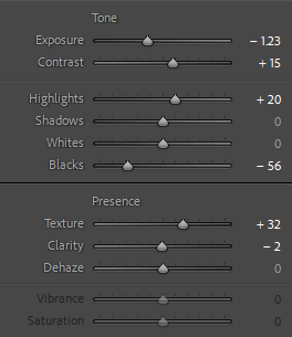
B&W selenium tone for the monochrome, to get the base colour then changed the individual items, for example I increased the contrast by 15%.

For this image I used the B&W sepia to get the old image sort of look. Personally, I really like the warmer tone of this image as I think it really compliment the tones of the wood and the scenery of the dojo. As well as the colour of the black belt against the white GI is good contrast a long with the dark colour of the hair against the light colour of the wall.
The reason I have put my images into these tones is to try and relate it to August Sanders as all of Sanders images were monochrome of slightly warmer monochrome such as this image above.
Overall, I’m really happy with the way that my first photoshoot has turned out as the images are really plain and simple however they are moody and dramatic.
Siân Davey
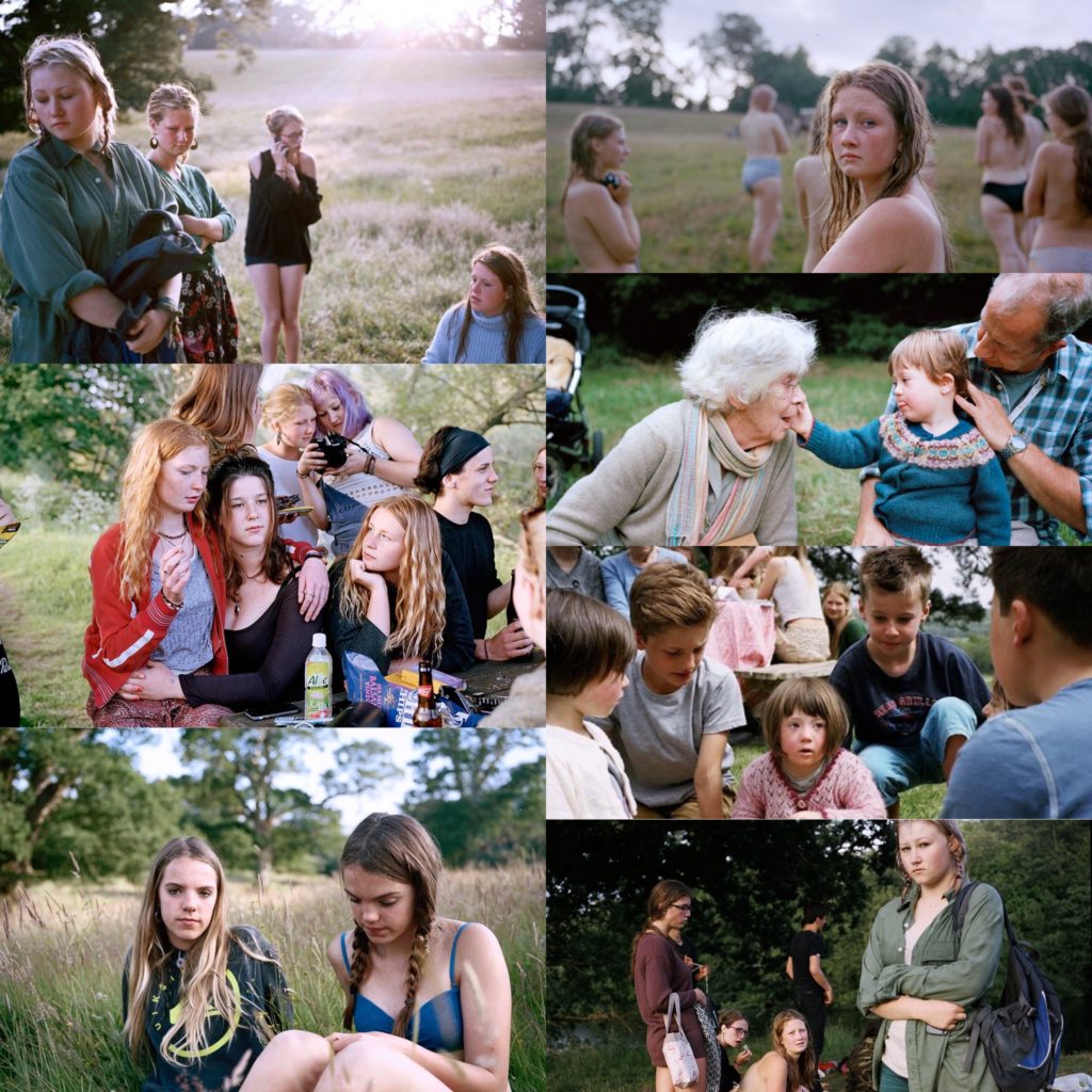
images by Sian Davey
Sian Davey is a British photographer, much of her work focusses on family and friends and is informed by her background in psychology. Davey was a psychotherapist for 15 years before starting photography in 2014
In 2015 Davey created a series of images titled Looking For Alice which is a series of portrait images focussed around her younger daughter Alice who was born with down syndrome, which was published by Trolley Books in 2015. This series led on to the particular image I like which are about her teenager daughter’s (Martha) life. Two of the images in her series about Martha’s teenage life were selected for the 2016 Taylor Wessing photographic Portrait Prize Exhibition.
Davey held a solo exhibition for her series of images called Together in the National Portrait Gallery London. This was a series of images based on her family and her family life in 2017.
I really like the series documenting Martha’s life as it reminds me of a similar photographer which I like called Elaine Constantine who also document teenage life.
Davey Analysis
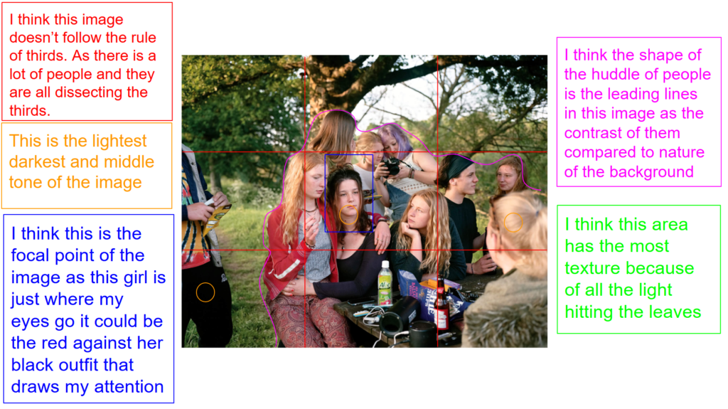
This is image is taken using a digital camera and the genre of this photography is portraiture.
The mise-en-scene presents the portrait photo of a group of teens sat on a bench in the park. The tone of this image is quite bright, as they are outside of what looks like a bright day with fairly clear skies. The use of light in this image is very soft natural lighting as they’re outside, it looks as if it is a a little bit cloudy, however you can see where there could be gaps in the clouds with the soft warm light coming through. The focus distance is short as it is a close up photo and the depth of field is short as only the people are in focus in the image and the background is slightly blurred. The photographer has used leading lines which would be the dark coloured clothes of the teens against the bright background.
I believe the ISO is 100 as everything is in focus and not grainy. I believe that the shutter speed is 1000 as everything is clear.
photoshoot 2
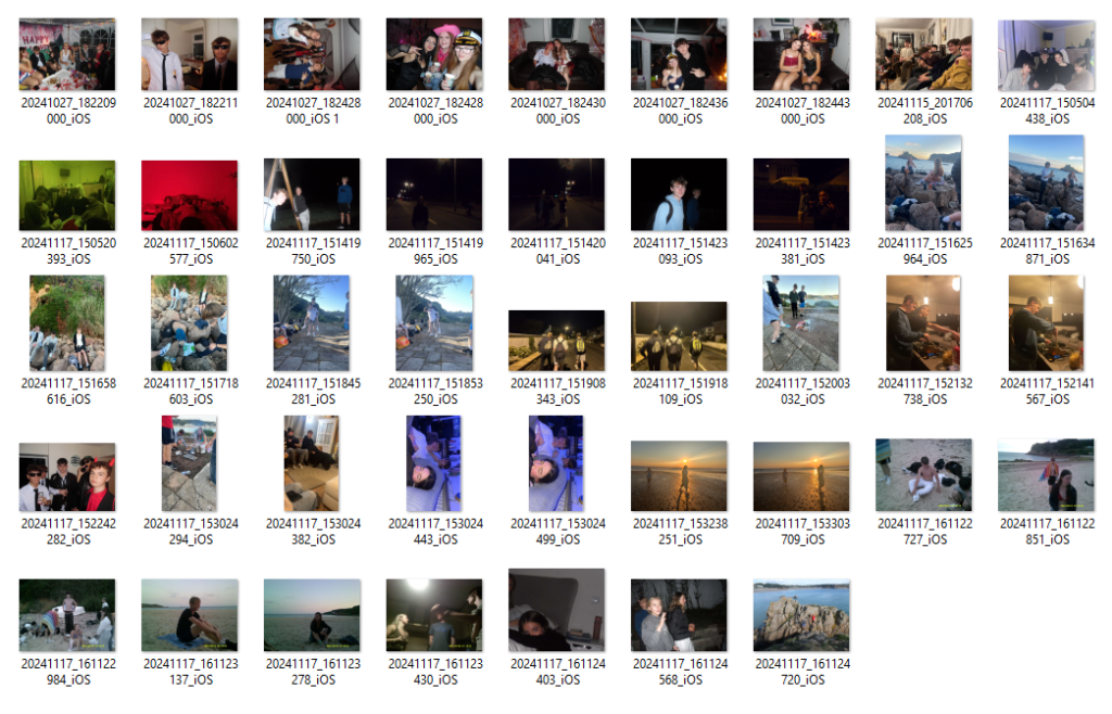
edited images
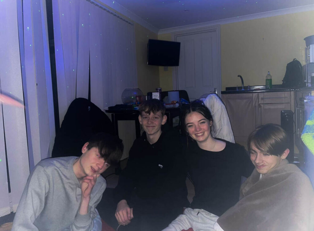
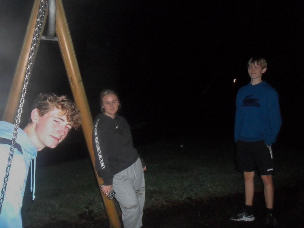
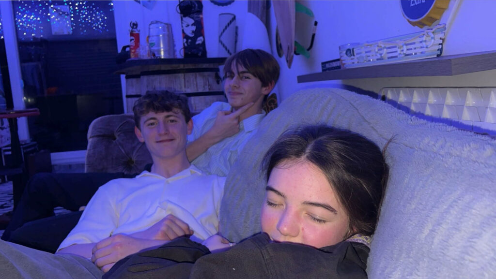

This image from the photoshoot is one of my particular favourites as I think it relates the most to Sian Davey’s images of Martha, this is an image I took on my digital camera of my friends on the beach after we had gone for a swim. This image looks a bit blurry due to the motion blur of the people moving around so in my editing I tried to make the image as clear as possible.
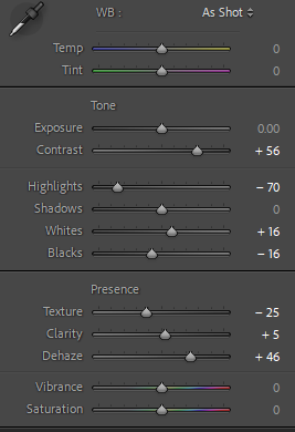
This is a screen shot of the editing that I have done on Lightroom classic to the above image
Virtual Gallery
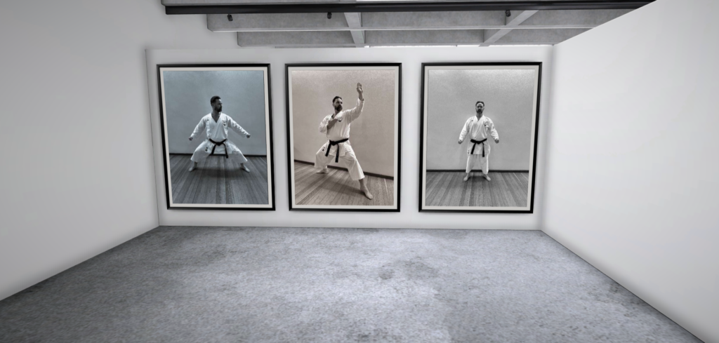
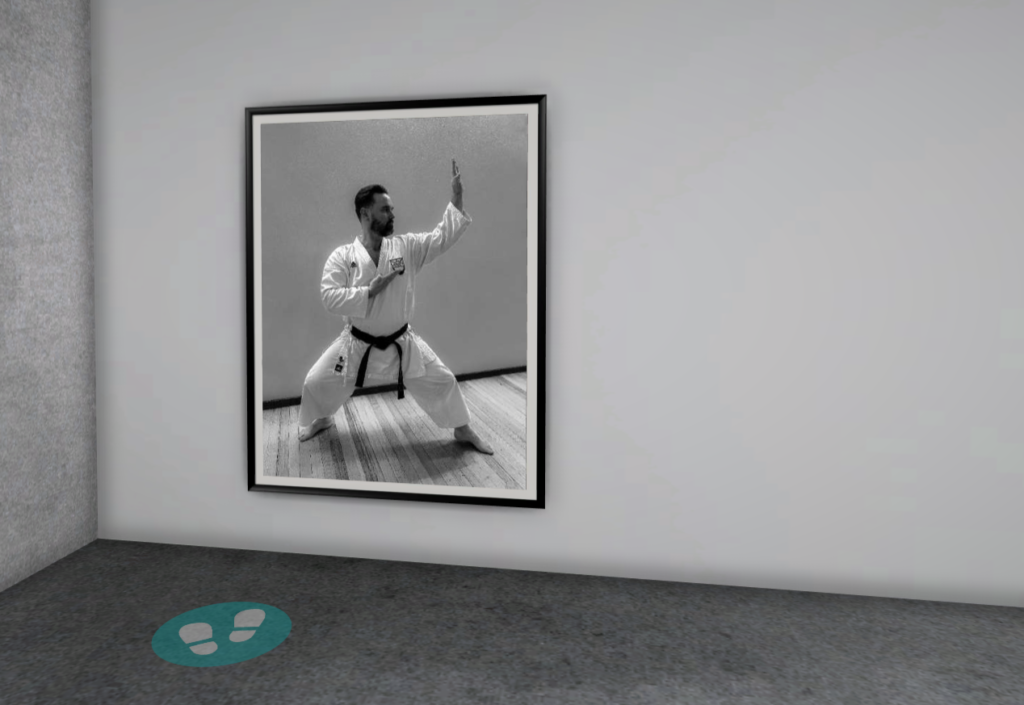
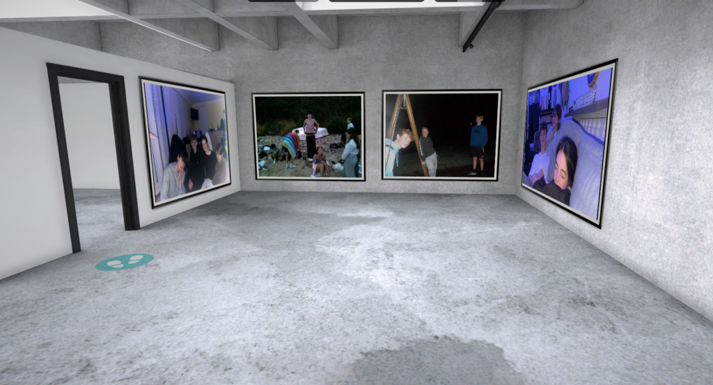
The way I have laid out the images in the gallery I have done for specific reasons. with my images I took for Sian Davey, two of the images have a blue colour so I have put them opposite each other whilst having the two darker images in the middle.
The way I have laid out the images of my dad I decided to have the images with the 3 different tones of black and white together and I thought although they aren’t the same tone they complimented each other well. So I thought that the other image should be able to have it’s own wall.
