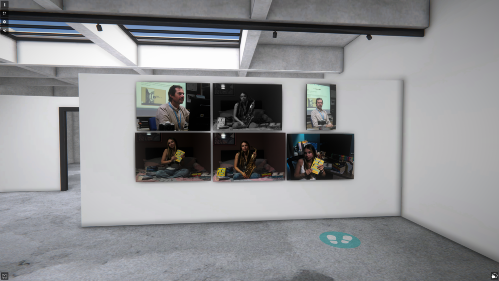
Mood board
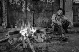
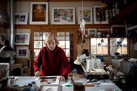
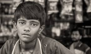
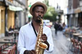

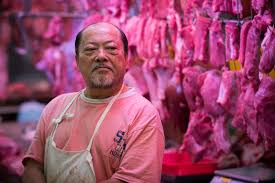
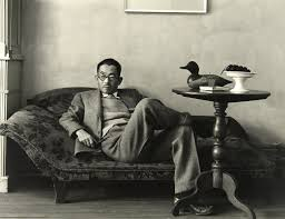
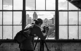
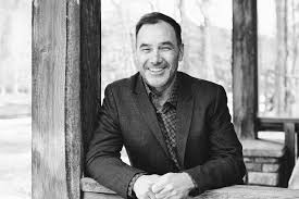
What is environmental portraiture
An environmental portrait is an image take of one or more person / people in there natural environment doing things like there job, a hobby or there lifestyle. It is represented through the background of the image or items shown in the image that have something to do with their lifestyle.
Example environmental portrait with evaluation
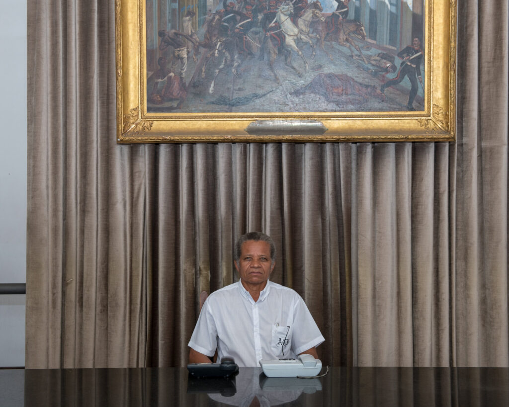
Lighting –
– Lighting used is artificial
– Shining from above him
– Possibly studio lights used
Environment –
– At a reception desk
– Most likely his job
– African American Ethnicity
– Taken in Brazil
– Male
– Most likely in his 60’s
Framing –
– Half-body angle used
– Dead pan
Approach –
– Neutral pose
Gaze –
– Eye contact
– Engagement with camera
Camera settings –
– Wide lens
– Mid-range F-stop
– No Tripod
– Medium shutter speed
– Medium shutter speed
Image info –
In this photo we can see the gold picture frame placed above the subject in the image, we can tell that he is in a place with money, this was most likely done by the photographer to fully capture this mans life style and give us incite into his place of work. This photo was taken in Brazil but there was no date for when it was taken, we can interpret that he works in a reception because of the two phones on his desk and the clean desk which is what you would expect at a front entrance for a more appealing look. I believe the idea behind this image was to capture an everyday person doing there job to capture there mood and lifestyle. With the visual elements of this photograph we can see that colour has been used with the gold frame for insight into the mans life, texture is also represented in this image along with Form (3D) with the curtain behind them.
August Sander
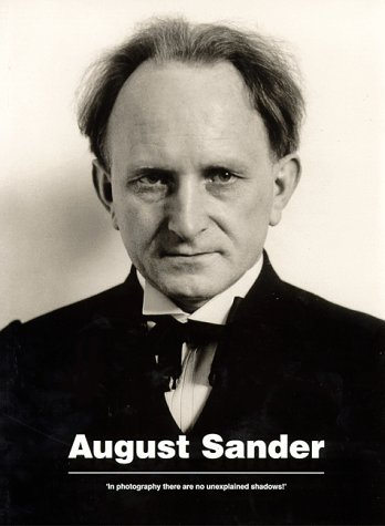
His life – August Sander (17 November 1876 – 20 April 1964), was a German portrait photographer, he wasn’t born into a family of photographer but found it through working in a local mine which was his full time job. His images consisted of a variety of different ages, religions, ethnicities and genders helping to shape environmental portraiture for years to come. He created some notable pieces of work such as, ‘The Farmer’, ‘The Skilled Tradesman’, ‘The Woman’, ‘Classes and Professions’, ‘The Artists’, ‘The City’ and ‘The Last People’.
His technique –
August Sander liked to use Shallow depth of field. generally full body shots to create an idea of model’s job and to include more of background in shot. As we can see in the images below he liked to take pictures of his subjects in a natural position representing there job and/or lifestyle.
——
“I never made a person look bad.” – August Sander
——
Examples of his work –
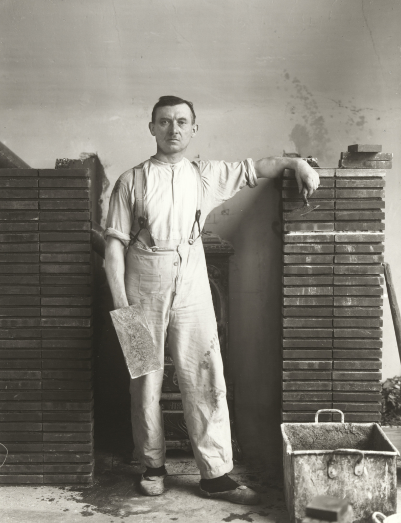
Who is in the photo?
– August Sander – Master Mason – 1926
how are they posed?
– neutral pose and facial expression
how are they framed?
– Full length body
– Deadpan angle
what is their gaze?
– Eye contact > engagement with the camera
Colour
– Black and white
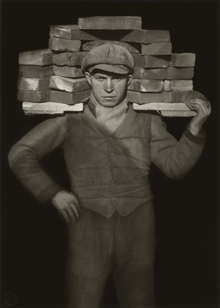
Who is in the photo?
– August Sander – Handlanger (Bricklayer) – 1928
how are they posed?
– formal (posed) with relaxed facial expression
how are they framed?
– Full body
– Deadpan angle
what is their gaze?
– Eye contact > engagement with the camera
Colour
– Black and white
What is typology?
———–
Typology is a a term that we use in photography that, in simple terms, is the study of types. It can be used to see and represent similarities and differences in images.
——-
Here are some examples –
——-

———–
Analysis of Arnold Newman Photography
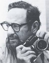
His life – Arnold Newman (3 March 1918 – 6 June 2006), was an American portrait photographer, in his early life he studied art in school, however, later in life he opened a business and stared a freelance photography business, most likely getting his creativity from art in school. He created some notable pieces of work such as, ‘Pablo Picasso, Spanish Painter and Sculptor’, ‘Max Ernst, German Painter and Sculptor’, ‘Marc Chagall, Russian/French Painter’, ‘Isamu Noguchi, Japanese American Artist and Landscape Architect’, ‘Man Ray, American Surrealist Painter’ and ‘Josef Albers, German-American Painter’.
His technique –
Arnold Newman liked to use a variety of different lighting such as natural light, as well as studio lighting setups generally half body shots to have more focus on the background of the image. He also liked to take pictures of the subjects of the image in there natural environment to capture their lifestyle.
——————–
“The photographer must be a part of the picture.” – Arnold Newman
—————-=
Examples of his work –
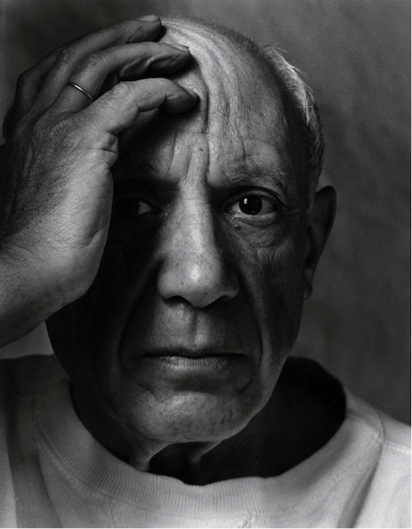
Who is in the photo?
– Pablo Picasso, Spanish Painter and Sculptor, 1954
how are they posed?
– Formal pose and facial expression
how are they framed?
– Half body
– Deadpan angle
what is their gaze?
– Eye contact > engagement with the camera
Colour
– Black and white
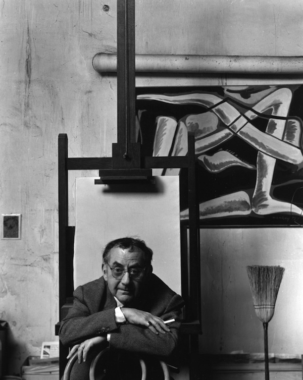
Who is in the photo?
– Isamu Noguchi, Japanese American Artist and Landscape Architect, 1947
how are they posed?
– formal (posed) with relaxed facial expression
how are they framed?
– half body
– Canted angle
what is their gaze?
– Eye contact > engagement with the camera
Colour
– Black and white
Photoshoot plan
I plan to take photos inside and outside of school and take inspiration from August Sander in doing so. I plan to use props in all of my images to give a greater insight into the persons lifestyle or profession.
Photo Shoots
Contact sheet –
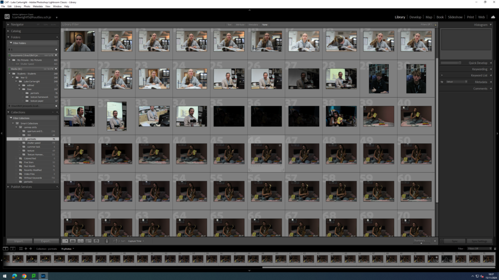
Selection process –
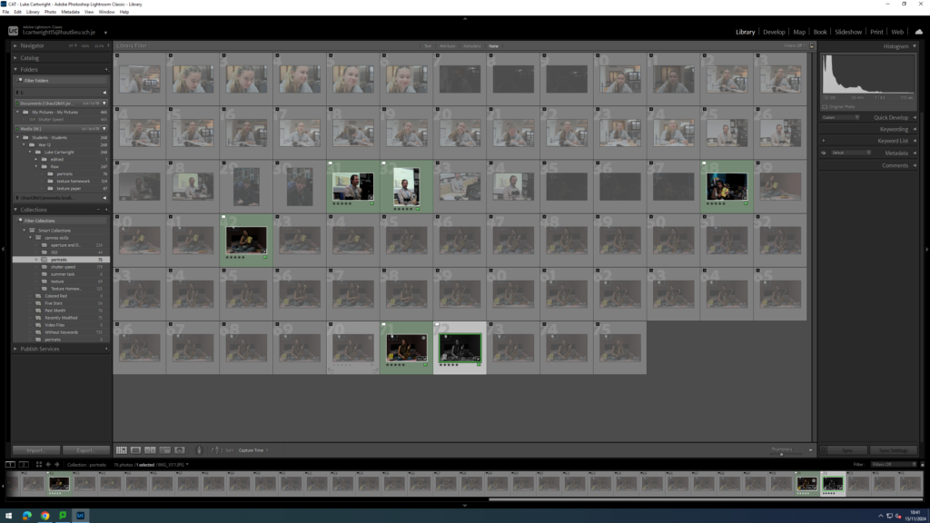
as you can see above I used P and X to flag my images to filter out the bad ones from the ok and good ones, next I rated these images 4 or 5 stars as 4 being ok ones and 5 being good ones, finally I gave them the colour yellow or green, green being the best and yellow being good. I will now edit these images that I selected and present them bellow along with the raw images.
Editing
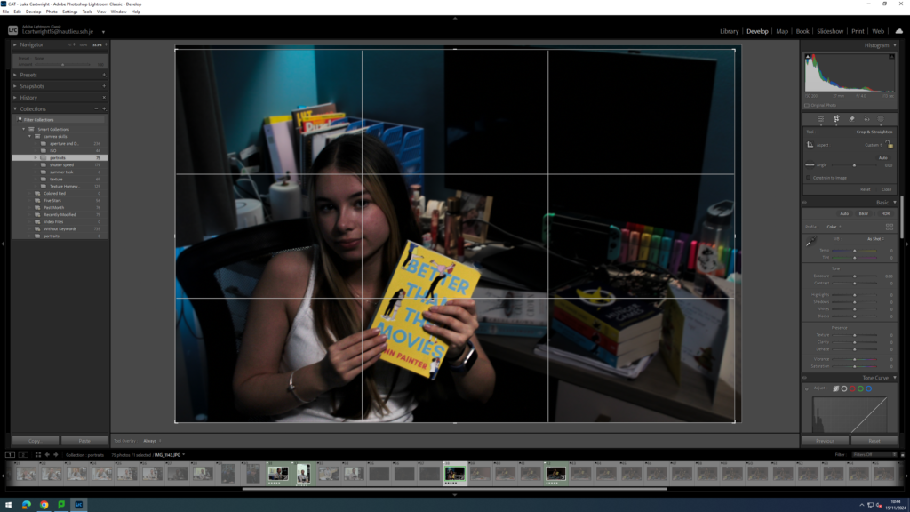
As you can see above I have used cropping to make the image a little smaller, I have done this so the subject is just a little bit closer to the camera in the image to make it more obvious that she is the main subject of the image.
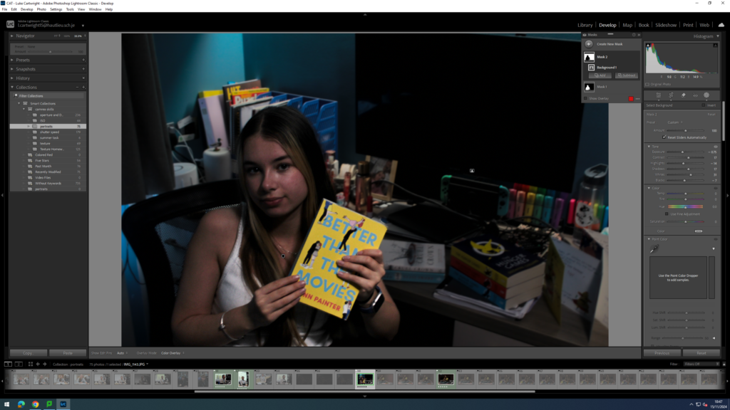
As you can see above I have used two masks to sperate the subject from the background of the image, the reason I did this is because I wanted to have a slight but visible discrepancy between the two to make it even more obvious what the subject of the image is.
Adding to this I decided to keep this image in colour as to me it looked better but I did change one of my edited images to black and white.
Final images And evaluation
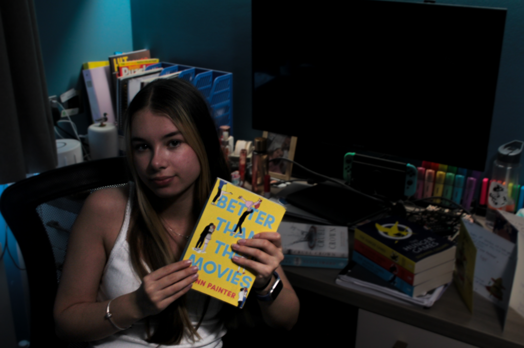
Who –
– The person in the image is Beth – 2024
Lighting –
– Taken indoors
– Artificial light used which is shining down from above
Environment –
– The location is her house in jersey channel islands
– They live a middle class life style
– Female, from Jersey and family history of Jersey, 17 years old
– Books used as props to represent her hobby
Framing –
– Full body
– Canted angle
Approach –
– Neutral pose and facial expression
Gaze –
– Eye contact and engagement with camera
Technical –
– ISO 200, 27mm , f / 4.0, 1/13 sec SS and no tripod used
B&W or colour –
– Colour
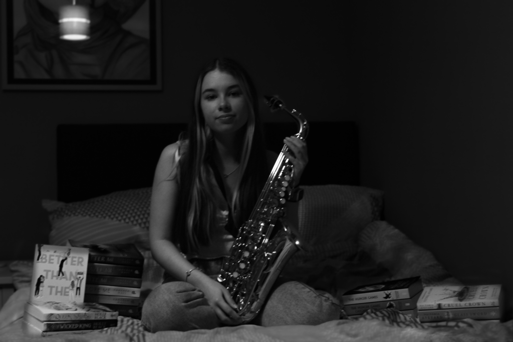
Who –
– The person in the image is Beth – 2024
Lighting –
– Taken indoors
– Artificial light used which is shining down from above
Environment –
– The location is her house in jersey channel islands
– They live a middle class life style
– Female, from Jersey and family history of Jersey, 17 years old
– Books and saxophone used as props to represent her hobby
Framing –
– Full body
– Deadpan angle
Approach –
– Neutral pose and facial expression
Gaze –
– Eye contact and engagement with camera
Technical –
– ISO 200, 30mm , f / 4.5, 1/13 sec SS and no tripod used
B&W or colour –
– B&W
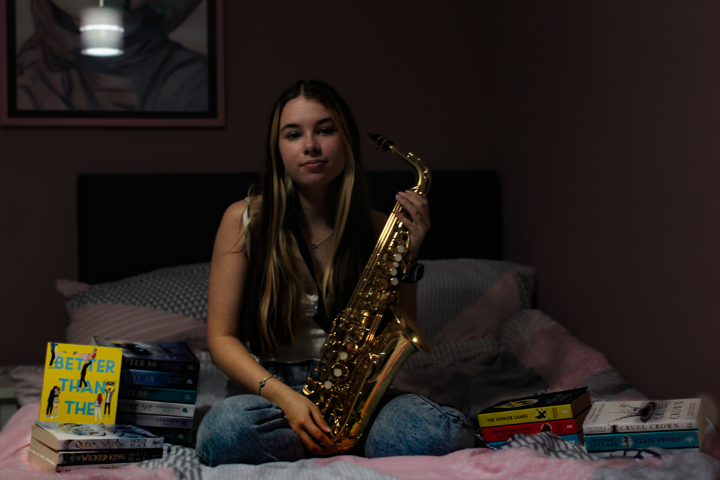
Who –
– The person in the image is Beth – 2024
Lighting –
– Taken indoors
– Artificial light used which is shining down from above
Environment –
– The location is her house in jersey channel islands
– They live a middle class life style
– Female, from Jersey and family history of Jersey, 17 years old
– Books and saxophone used as props to represent her hobby
Framing –
– Full body
– Deadpan angle
Approach –
– Neutral pose and facial expression
Gaze –
– Eye contact and engagement with camera
Technical –
– ISO 200, 30mm , f / 4.5, 1/13 sec SS and no tripod used
B&W or colour –
– Colour
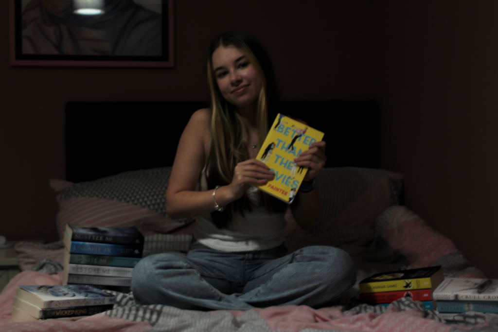
Who –
– The person in the image is Beth – 2024
Lighting –
– Taken indoors
– Artificial light used which is shining down from above
Environment –
– The location is her house in jersey channel islands
– They live a middle class life style
– Female, from Jersey and family history of Jersey, 17 years old
– Books used as props to represent her hobby
Framing –
– Full body
– Deadpan angle
Approach –
– Neutral pose and facial expression
Gaze –
– Eye contact and engagement with camera
Technical –
– ISO 200, 32mm , f / 4.5, 1/13 sec SS and no tripod used
B&W or colour –
– Colour
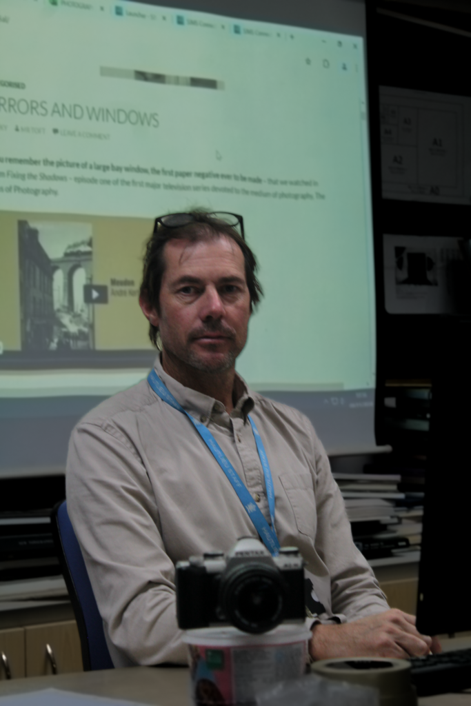
Who –
– The person in the image is Mr Cole – 2024
Lighting –
– Taken indoors
– Artificial light used which is shining down from above
Environment –
– The location is Hautlieu school in jersey channel islands
– Male, Work as a teacher in Hautlieu school, not sure how old
– Camera used as prop in the image to represent his profession
Framing –
– Half body
– Deadpan angle
Approach –
– Formal pose and facial expression
Gaze –
– Eye contact and engagement with camera
Technical –
– ISO 400, 55mm , f / 5.6, 1/40 sec SS and no tripod used
B&W or colour –
– Colour
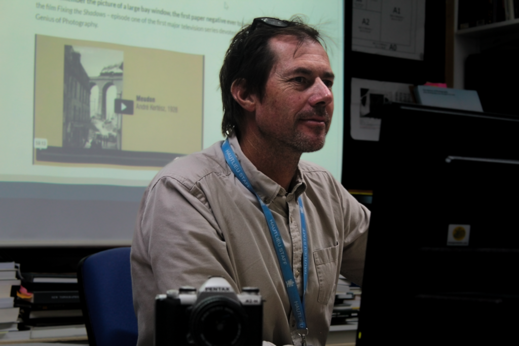
Who –
– The person in the image is Mr Cole – 2024
Lighting –
– Taken indoors
– Artificial light used which is shining down from above
Environment –
– The location is Hautlieu school in jersey channel islands
– Male, Work as a teacher in Hautlieu school, not sure how old
– Camera used as prop in the image to represent his profession
Framing –
– Half body
– Deadpan angle
Approach –
– Formal pose and facial expression
Gaze –
– Eye contact and engagement with camera
Technical –
– ISO 400, 55mm , f / 5.6, 1/40 sec SS and no tripod used
B&W or colour –
– Colour
Overall evaluation –
In these images I planned for it to be simple while using props such as the saxophone and the camera used in the different photos taken. With these images I took inspiration from August Sander taking ideas such as the props and the simplicity of the images, he also frequently used black and white in his image so I decided to do the same with one of mine to get a greater idea of what my images could look like. I will now represent these 6 images in art steps as a typology.
Typology representation –
