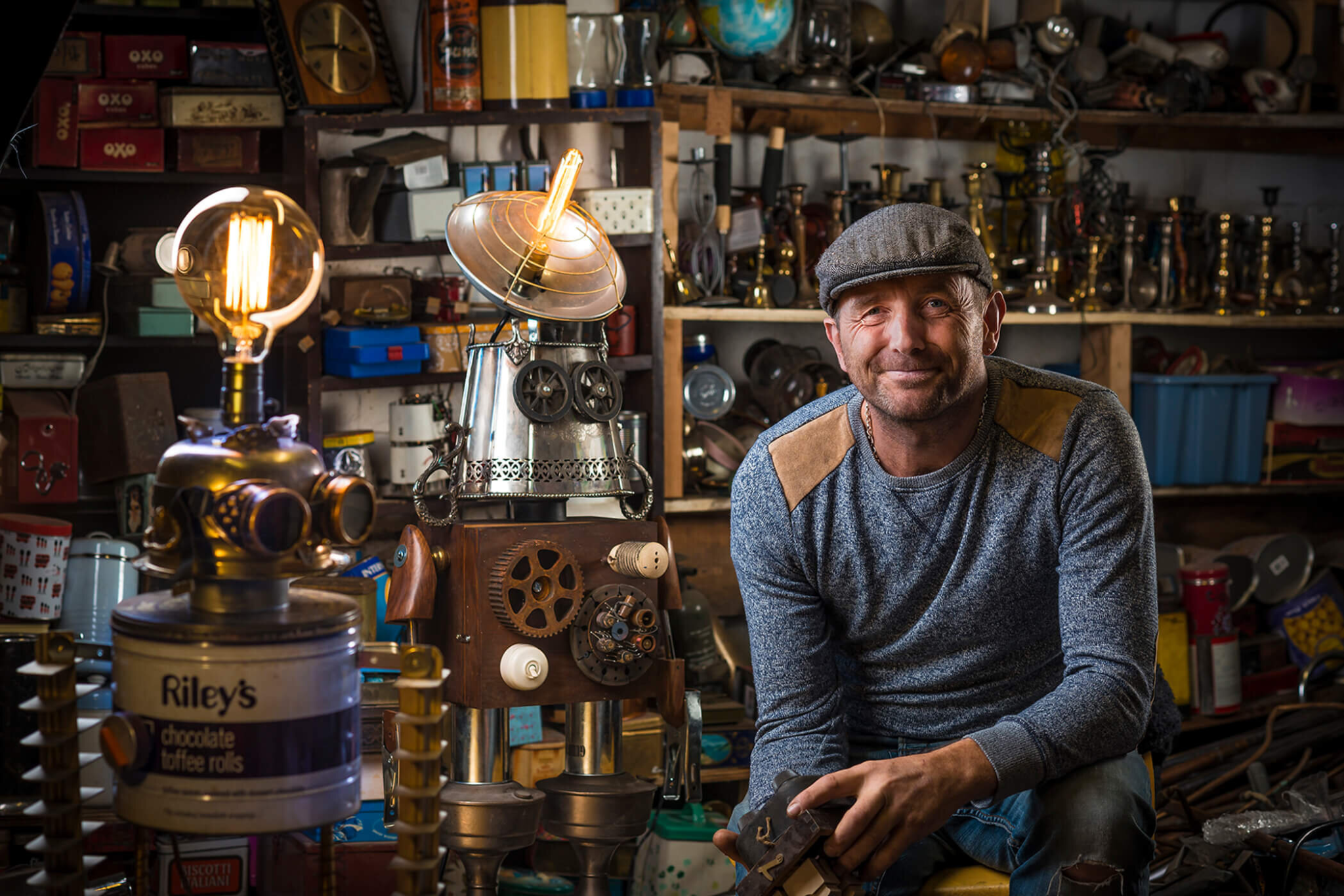

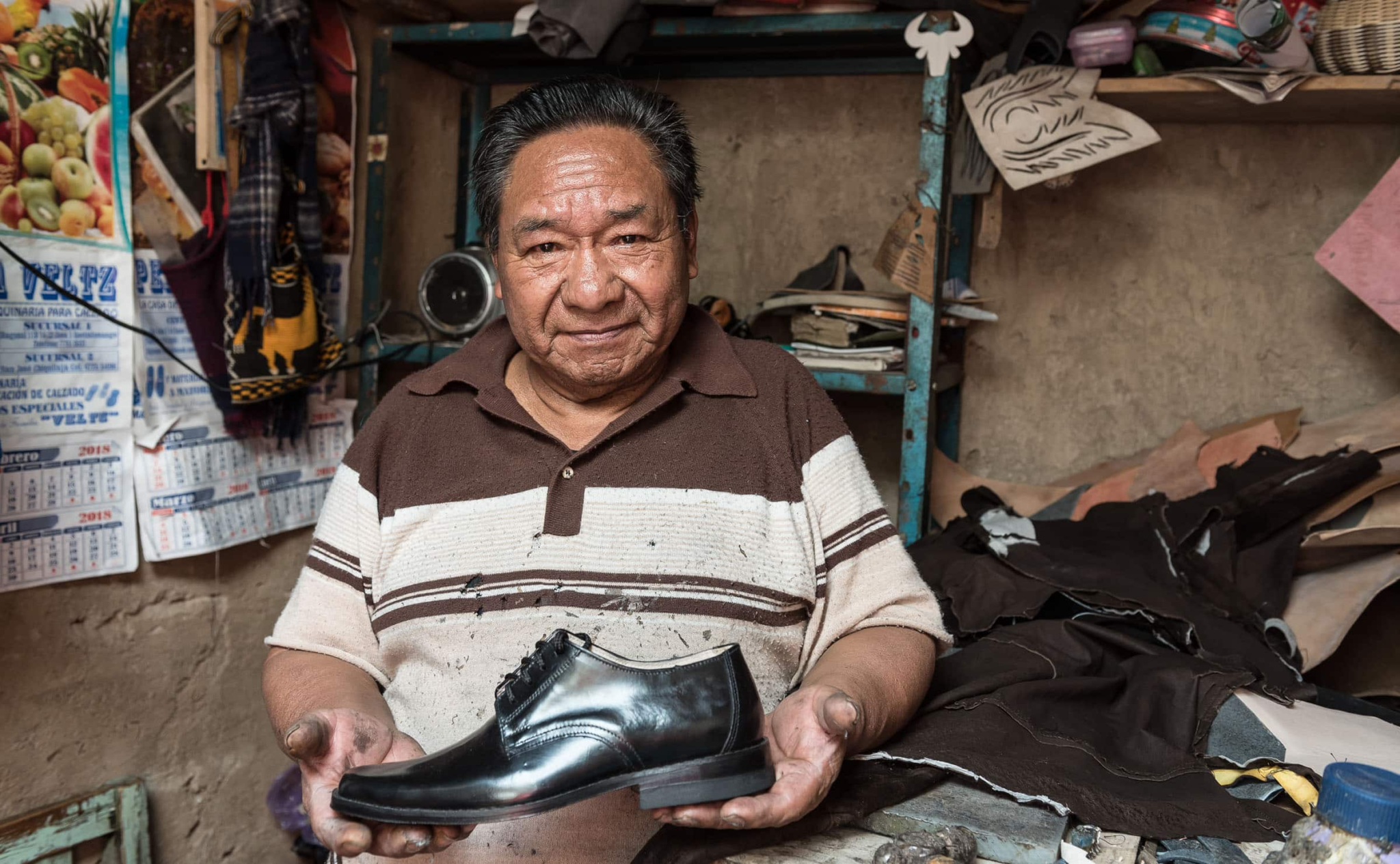

An environmental portrait is a portrait typically done in a usual environment of the subject, such as in their home or workplace, and typically illuminates the subject’s life and surroundings.
By photographing a person in their natural surroundings, it shows more of their character, and therefore portrays the essence of their personality, rather than merely a likeness of their physical features. Also, by photographing a person in their natural surroundings the subject will be more at ease, and so be more conducive to expressing themselves – as opposed to in a studio, which can be a rather intimidating and artificial experience.
Artist References/Case Studies
Arnold Newman (March 3, 1918 – June 6, 2006) was a Jewish American photographer credited with being the photographer who most contributed to the rise of the photographic style of environmental portraits. Some of his most famous portrait photographs include celebrities such as John F. Kennedy, Pablo Picasso and Marilyn Monroe.
A well known example of one of his portraits is of Igor Stravinsky in which the lid of his grand piano forms a musical note representative of the melodic structure of the composer’s work. Newman normally captured his subjects in their most familiar surroundings with representative visual elements showing their professions and personalities. A musician for instance might be photographed in their recording studio or on stage, a Senator or other politician in their office or a representative building.
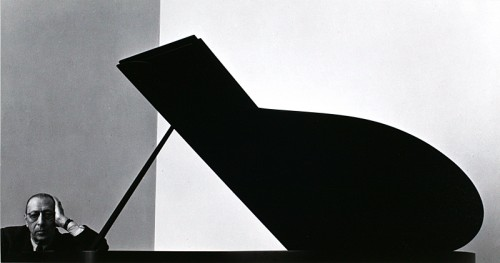
“I didn’t just want to make a photograph with some things in the background,” Newman once told American Photo magazine in an interview. “The surroundings had to add to the composition and the understanding of the person. No matter who the subject was, it had to be an interesting photograph. Just to simply do a portrait of a famous person doesn’t mean a thing.”
Alfred Krupp by Arnold Newman, 1963
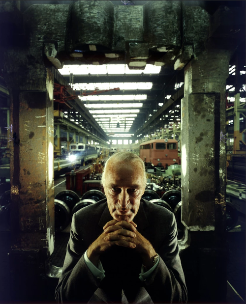
Image Analysis
Initial Emotional Response – Krupp comes off as sinister and villainous due to his facial expression, pose and placement in the image creating an uncomfortable atmosphere, with Krupp having somewhat of a look of superiority to him.
Technical – Dim, artificial lighting creates a cold mood to the image further reinforcing the serious tone of the image initially introduced by Krupp and his sinister appearance. A cold colour scheme is present throughout the image which emphasises this uncomfortable atmosphere, contrasting with the trains in the background which are the only real warm-toned objects present in the image which lead to them standing out to viewers of the image (which has been done intentionally, linking to context). Finally, a shallow depth of field has been used to maintain most of the image’s focus on Krupp to highlight his importance and appearance of superiority.
Visual – There is clearly use of texture in the image, primarily in Krupp himself with a subtle emphasis on the wrinkles seen in his face and hands, showing how he experience with life itself which when combined with his egotistical and superior manner implies he has used this against those he deems inferior to him. Moreover, the pattern of the lights on the ceiling as well as the leading lines they create which bring attention inevitably towards Krupp once more creates a sense of ever looming dread and no escape (linking to the context of past of the photographer and his people, especially what they have suffered).
Contextual – Arnold Newman (a Jewish photographer) was commissioned by Newsweek to take a portrait of Alfred Krupp, who was a convicted Nazi war criminal. Initially, Newman refused, but eventually he decided to take the assignment as a form of personal revenge.
Conceptual – The idea behind the image was a form of personal revenge on Krupp for his crimes against Jews during WW2, exploiting them and working them until death, which Newman has done with his presentation of Krupp as sinister and evil. After seeing the photograph, Krupp was outraged, but Newman was satisfied saying after the photograph was taken he felt the hairs on the back of his neck stand up.
Photoshoot Plan
Subjects: Family (mum dad and sister), Katie, friends.
Environments: Around home, hobbies, outside environments (places that I associate with them).
Poses: Natural/relaxed, central/on a third of the image with a neutral position, clothes and objects in image relate to person. Trying to capture them like they are doing their normal activities in their usual environments.
Home environments: Sister in her bedroom/living room.
Gaze: Directly at camera to create relation between viewer and image, although I will experiment with subject not facing camera to create a more authentic effect.
Composition: I will try use a central framing to highlight my subject, but I will also try use rule of thirds to try and have more focus on elements of the background showing personality and life of the person being photographed.
Framing/orientation: I will take full body images, and in editing avoid over cropping to keep the subject and their environment in full view to tell a story. I will also take images in landscape to show more of the subject’s environment.
Initial ideas: Sister in fancy dress in bedroom with dolls, friends in typical environments etc.
Camera settings: High f/stop to capture more of the background in focus since the environments will play a significant part in the intention behind my images and help to tell a story about the person, adjust ISO according to lighting (e.g. outside/inside images).
My Photoshoot
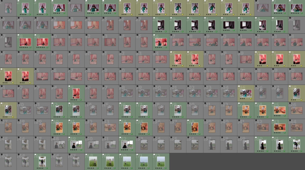
After importing my photos into Lightroom, I went through them all and flagged them as either an X (ones I wasn’t pleased with and wasn’t going to use) or a yes (photos I was satisfied with and would go over further to see if I would use them for my finals). Once I had filtered images by the unsuccessful and successful ones, I went through the ones flagged as good and colour coded them (yellow being good images but with improvements that could be made with editing, and green being images I found really successful and I will consider editing for my final images) – finally, I star rated each colour coded image to show what I thought of each one, giving yellow ones 3 stars and green ones 4 or 5 stars.
Selected Final Photos
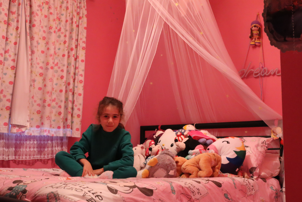
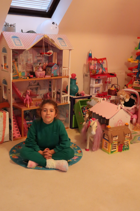
I chose this image as one of my finals because I really like the composition and how so much of the environment has been captured which tells more of a story about the subject. Furthermore, I am pleased with the lighting since it helps illuminate the environment making it seem more vibrant which reflects the subject’s bubbly personality.
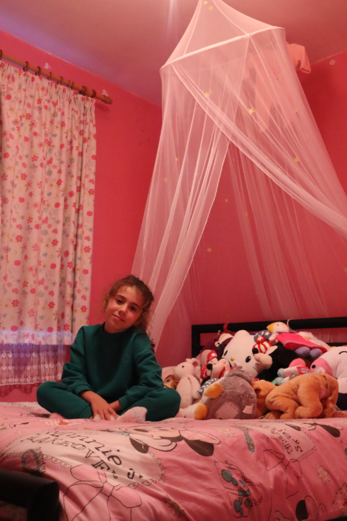
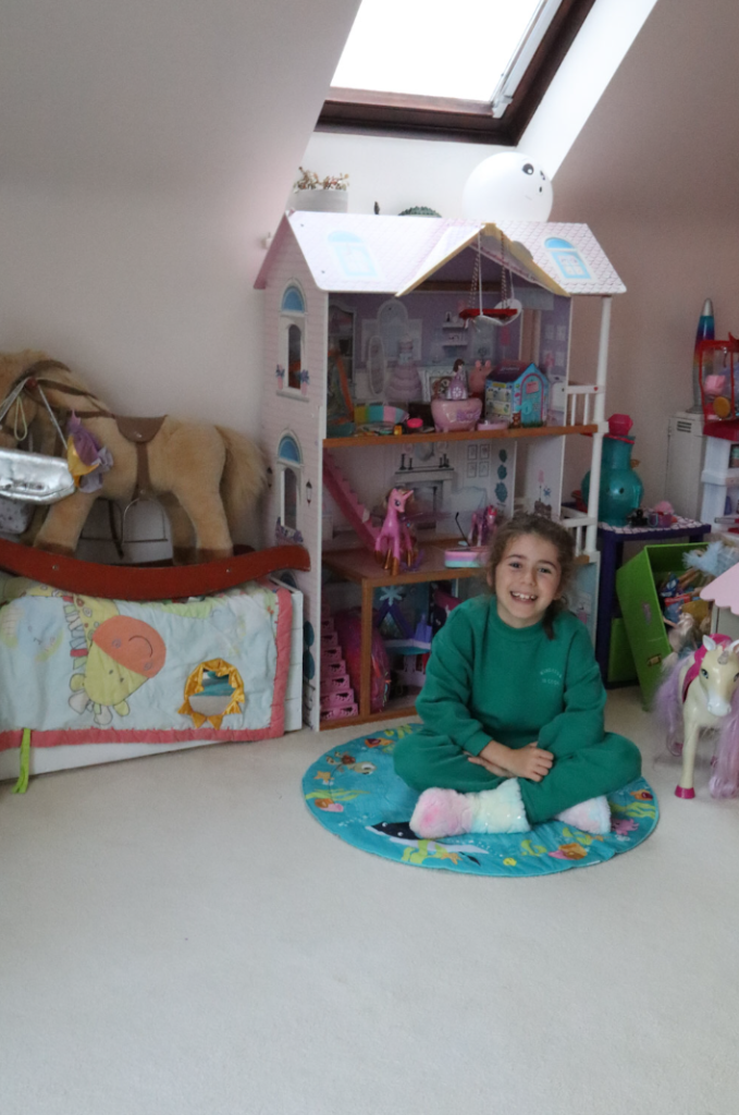
I chose this image as one of my finals because I found the rule of thirds to be really effective as it still clearly highlights the subject whilst still allowing the viewer to explore the natural background and environment she is placed in. Moreover, I have used leading lines which direct the viewer’s gaze from the environment back down to the subject which I find to be very effective.
I decided to choose this one as one of my finals because I like how although the environment is different the subject is in a similar pose to the previous image so I can juxtapose the two images’ environments by displaying them side by side in my final presentation, and I also found the colour contrast between the subject’s clothing and the surrounding environment to be extremely effective since it creates a clear contrast while still keeping both as focus points – however, I feel like there is too much negative space near the bottom so when editing I will adjust the composition by cropping out some of the bottom.
I selected this image for my final because I was experimenting with natural lighting and found it really effective since it creates more of a cooler colour scheme which I find really suits the environment and the clothing of the subject. I also like the use of rule of thirds again since it allows the viewer to explore more of the environment without the subject being the full focus of the image due to them being off centre.
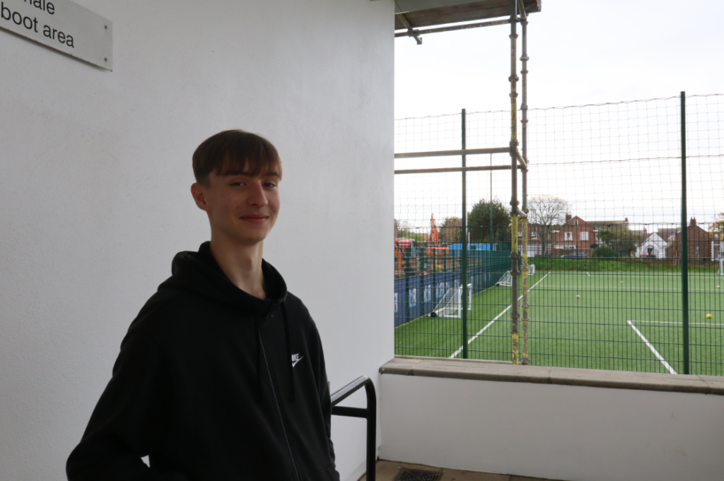
I chose this image for my final presentation because I find the composition really effective, showing the subject on one half of the image and the environment in the background on the other split clearly in the middle by the white concrete wall. I also like how the environment colour contrasts with the subject and his surroundings, telling more of a story to the viewer about the subject’s personality and interests. For editing, I will experiment with slightly cropping out the left part of the image since I think there is an excess of negative space and I want to create more of a focus on the subject.
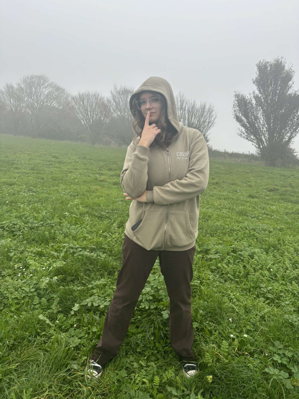
Finally, I have selected this image because I like how in contrast to the other images the subject fills up more of the frame so I can juxtapose it to other photos. I also found the subject’s gaze towards the camera really effective since it creates a clear sense of connection between the viewer and the photo and I think the clothes of the subject match really well with the environment she’s placed in which tells more of a story of her character.
Editing/Experimentation
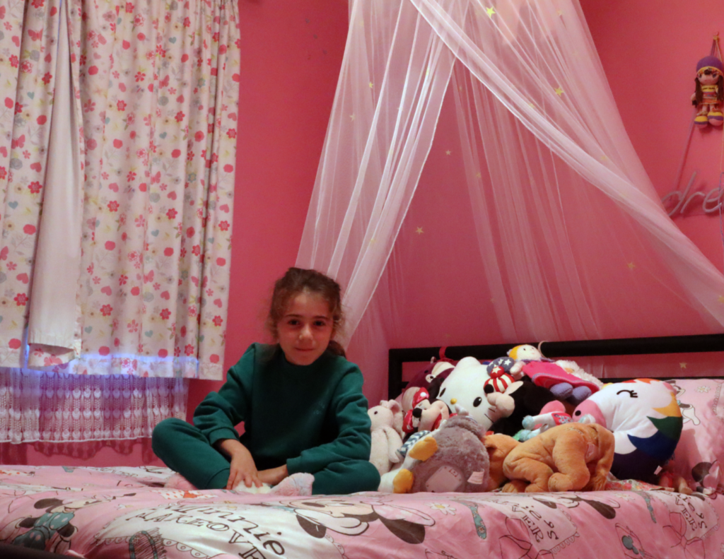
I decided to keep editing for this image simple since I like the original iteration, so I cropped the image to remove distracting negative space on the right and frame the subject more towards the left third which draws more attention from the view towards them as well as still displaying lots of items in the background which tells a story about her personality and hobbies. I also adjusted the colours and toning of the image since I felt the lighting was significantly warmer than I wanted it to be which was distracting since the vibrant colours of the walls would immediately draw attention of the viewer.

For this image, I cropped a bit off the top to remove excess negative space I found took focus away from the subject’s environment and adjusted the colours and tones to be slightly colder since the lighting was too warm. I think this edit really improved the image overall since initially there were too many distractions taking away focus from the subject, but now with less negative space and slightly less vibrant colours it allows other techniques such as the leading lines going from the top of the photo down to the subject to maintain her as the focal point of the image whilst still having the surrounding environment be colourful and full enough to showcase parts of her personality and life.
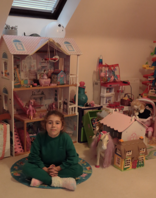
For this photo, I first cropped out the bottom to remove excess negative space to direct more focus onto the subject as well as the surrounding environment – I then adjusted the colour and brightness slightly since I found the lighting in the original image to be too warm which contrasted poorly with the colder natural lighting coming in from the skylight, and I think this edit was very successful because now there’s less distractions which direct more focus towards the subject and the environment whilst again still clearly telling a story about her personality and hobbies with the toys shown in the background.

I decided to not experiment too much with this image since I thought the original iteration was already very effective with the subject positioned on the right third allowing focus to be distributed between her as well as the environment and the natural lighting not being too warm meaning there was little distractions – however, I did crop the image slightly to remove some negative space which again helps to clear unintentional distractions and improve the photo overall. I will experiment more with colours and different compositions in my second edit but if that doesn’t help highlight the subject or the surroundings better then I will use this photo as one of my finals since I am pleased with how it is simple but still clearly shows a lot about the subject and her daily environments/activities.
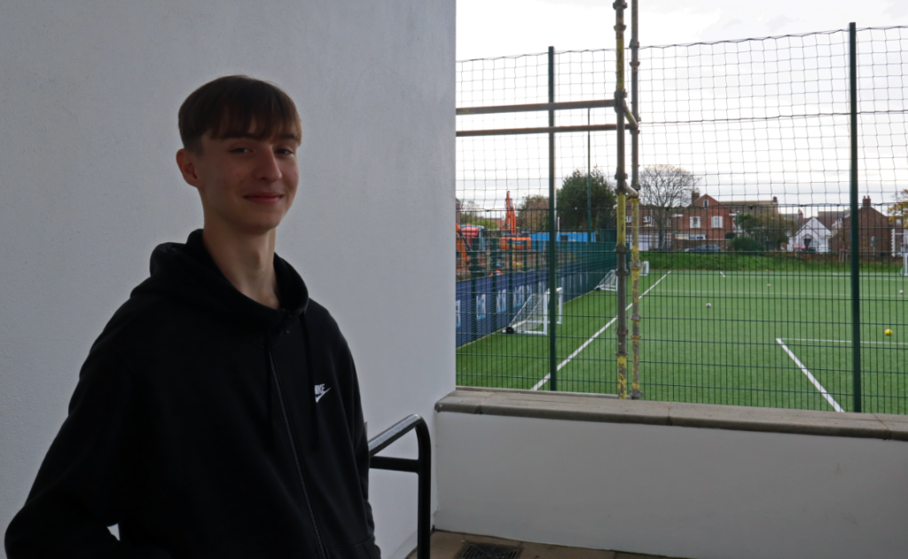
For my edits of this image, I cropped to remove the sign in the top left which stood out in the negative space behind the subject which was distracting and made the image split in half, with one half showing the subject and the other colour contrasting and showing his usual environments. I also decreased brightness and increased highlights to reduce the strength of the natural lighting coming from the top right so more details are visible in the surroundings, which helps to paint a clearer picture of the subject’s typical hobbies and surroundings and overall creates more focus and intrigue from the viewer towards the subject.

For this image, I cropped it so the subject is perfectly centred which combined with the subject’s gaze directly towards the camera creates a personal connection between her and the viewer. I also increased highlights so more details are visible in the surroundings which when combined with the subject’s clothes being appropriate for the environment she is pictured in starts telling a story about her hobbies and usual environments – furthermore, I adjusted tone and colour to ensure the colours used are colder which goes well with the surroundings and overall helps create a clearer sense of the background the subject is placed in and why she’s been pictured there.
Final Images and Evaluation

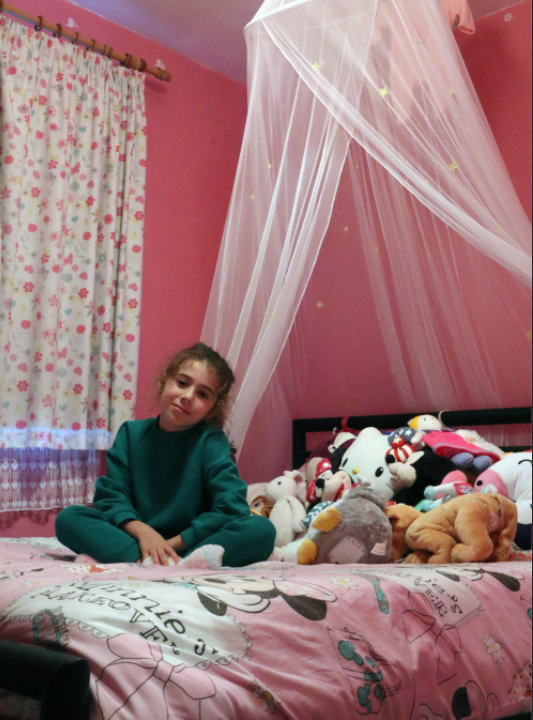
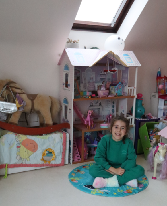
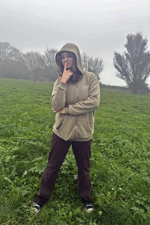


Overall, I think my photoshoot was very successful since each photo clearly meets my intention of capturing people in their usual environments as well as telling stories about them and their personality/hobbies with details and objects in the surrounding environment – I did minimal editing for each one because I felt each photo was already effective and just needed small tweaks to reduce distractions and improve composition to highlight the subject further. I also found each image makes great use of formal elements and other techniques, with every image making effective use of lines, colour, space and composition techniques such as rule of thirds to highlight/contrast certain aspects of the photos to help tell more of a story about each individual subject and their respective environments.
Presentation of Final Images

My final images presented in artsteps – I decided to arrange from warmer colours/tones and indoor environments on the left leading to cooler colours/tones and outdoor environments on the right since I like how there is a clear contrast between the first half and the second half of the images, whilst still making each one catch attention from the viewer.
