My Environmental Portrait Photoshoot
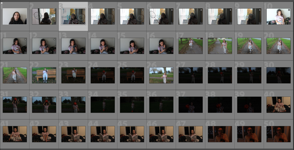
As you can see above I took 50 images from the camera of my sister and my mum. I took lots so I could experiment and pick my best photos and the one I wanted to use for my final piece. I then continued to take many of photos of my sister and my mum with many different camera settings and different lighting conditions to achieve the ideal result I wanted.
Photos I didn’t like

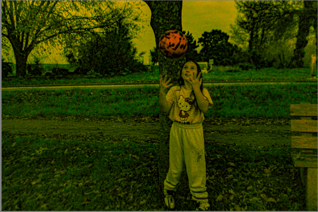
I didn’t like this photo due to lots of visual noise that has been taking part and will give the photo a degraded quality. This photo was taken at an ISO of 400. It also has a wide aperture of 7.1 and has a shutter speed of 1/6.
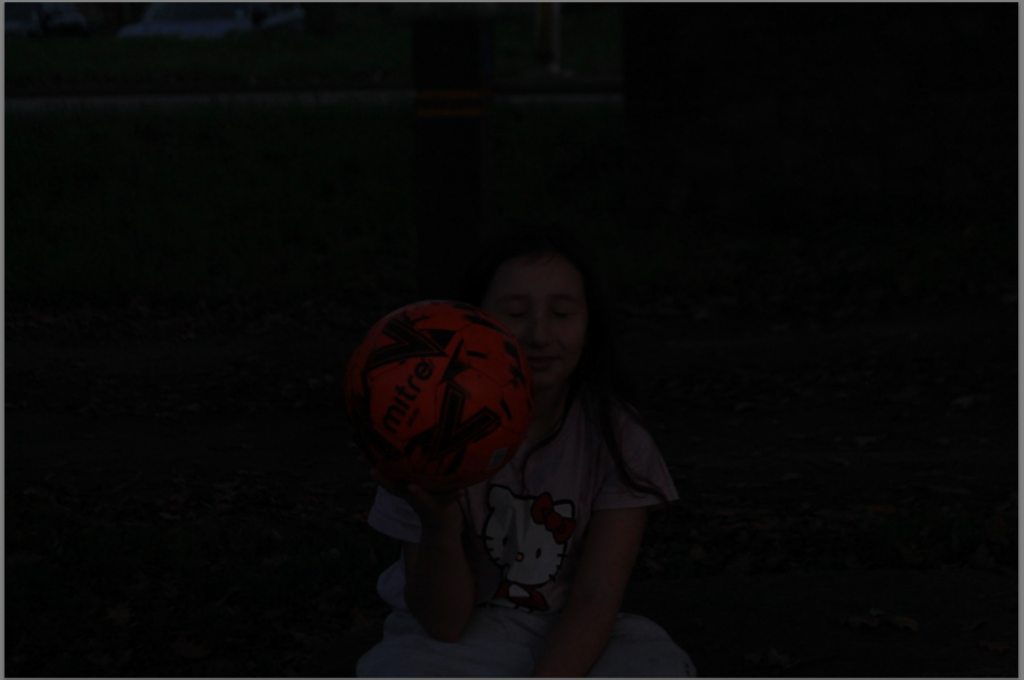
I also didn’t like this photo due to how dark it is and you can also barley see it. This is what happens when you don’t have enough light in your room, in the camera or in the photo. It gives no proper final image. It was also taken at a shutter speed of 1/80.
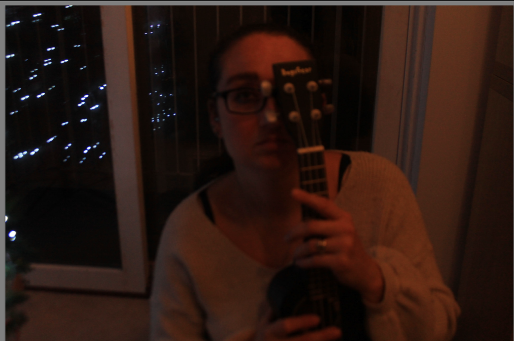
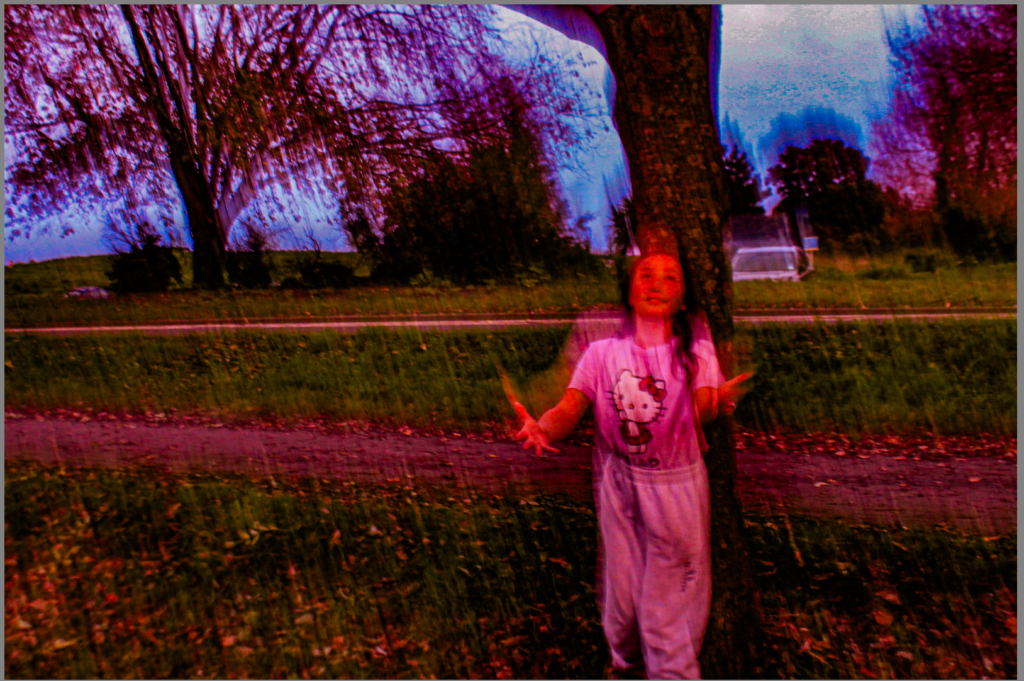
Lastly, I also didn’t like this photo due to extra light from the flash it has made the photo go extra fuzzy and made it to create a degrading quality. It also didn’t match the theme is was going for.
Selection Process
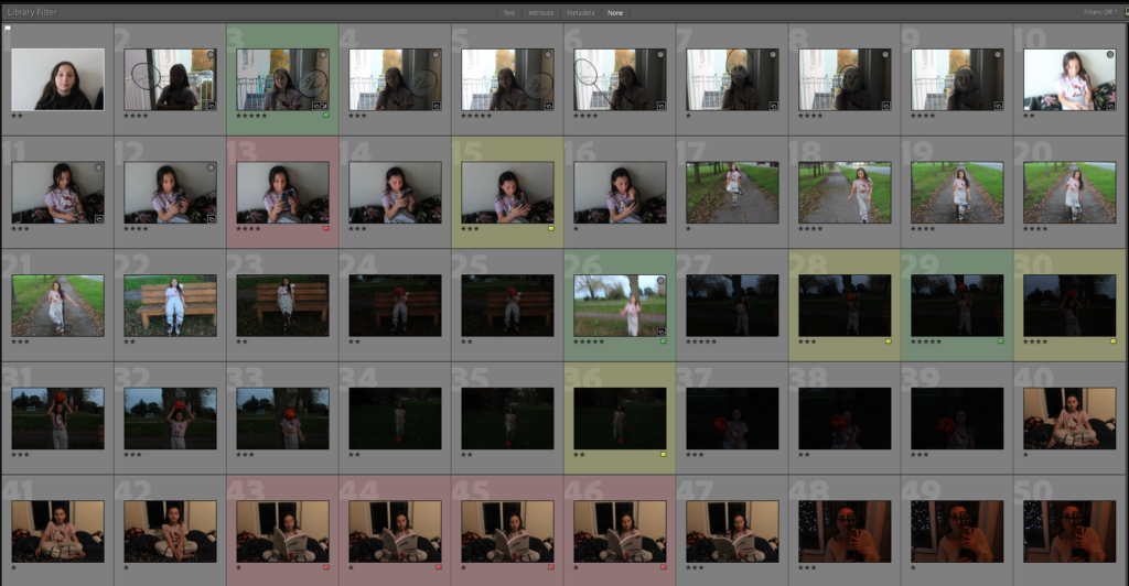
As you can see above I pressed P to keep the images I wanted to use for my final photos. I used X to get rid of the images i didn’t wanted to use for the future. Then I gave a rating for the images, they all had a rating out of 5.The images with 4 and 5 stars are the images I wanted to use for my final photos. The photos I didn’t like I rated 1-3 stars. Finally I gave them the colour yellow or green, green being the best and yellow being average . Red was for very bad photos. I will edit the images so I can present final photos.
Editing My Best Images
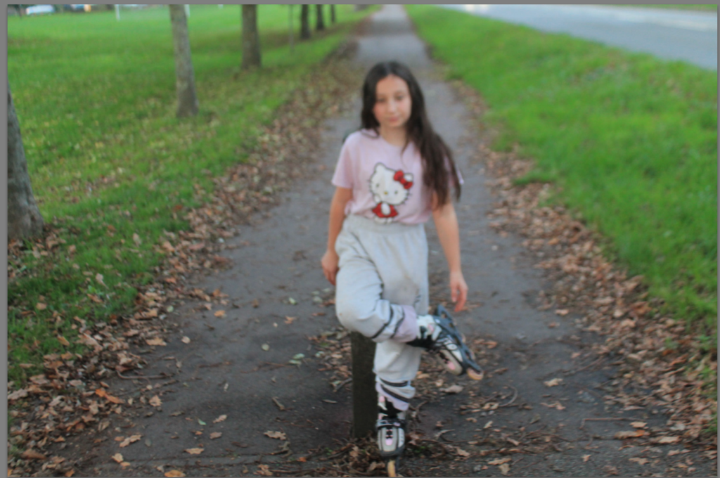
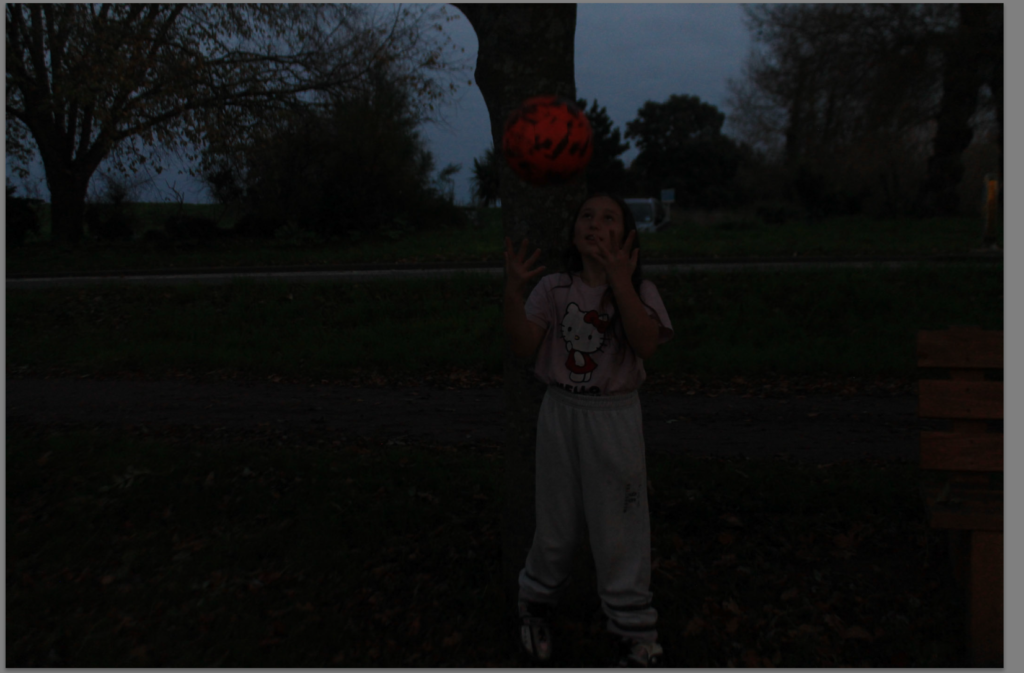
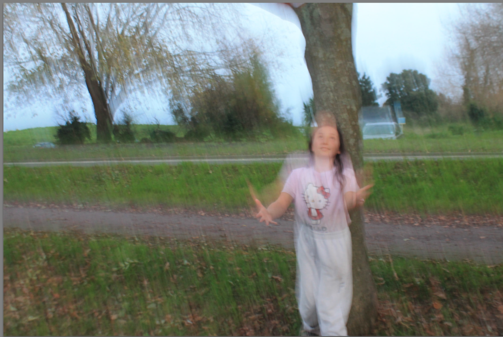
These are my three best images that have been edited.
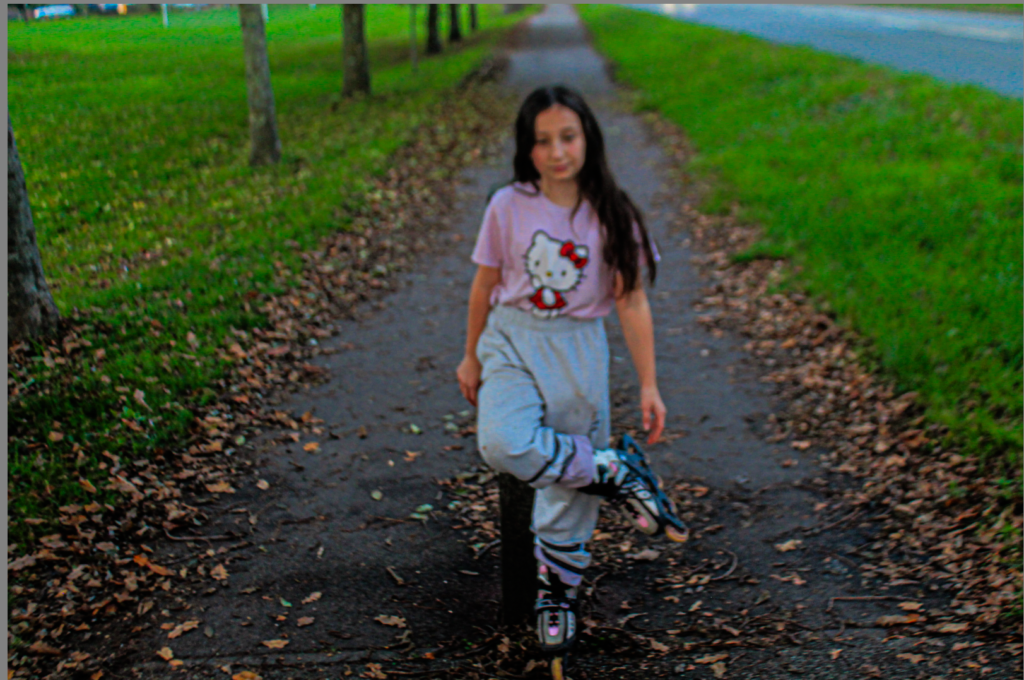
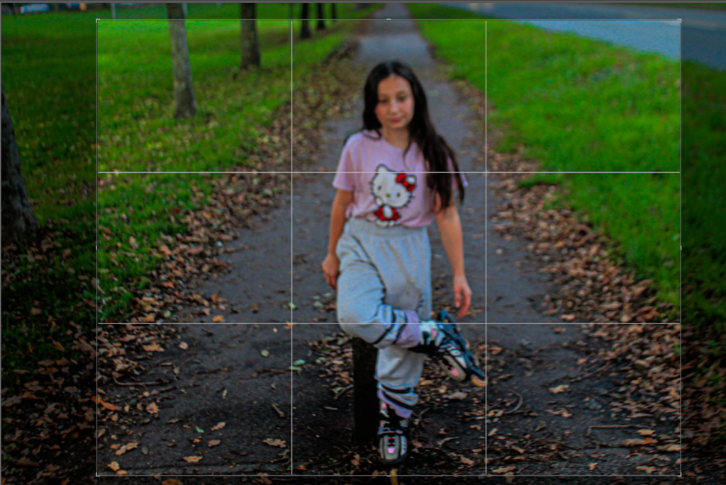
This image started with more negative space on the left than on the right. To create a more balanced outcome, I cropped the image as above.
When cropping, I made sure to maintain an equal photo
For this image I also wanted to enhance the contrast and tone, to exaggerate the texture.
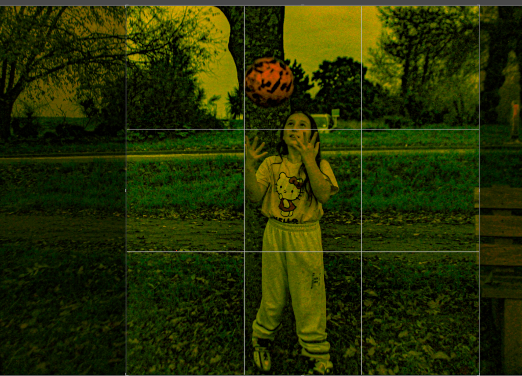
This image had lots of negative space on the left rather than the right. For the image to be more balanced I had to crop it to get the best result.
When cropping I mad sure that the photo was balanced on both sides, so the photo would look aesthetically pleasing to the eye and make people want ton look at it .
Also, I enhanced clarity and the dehaze setting on Lightroom to get the image to look like this.
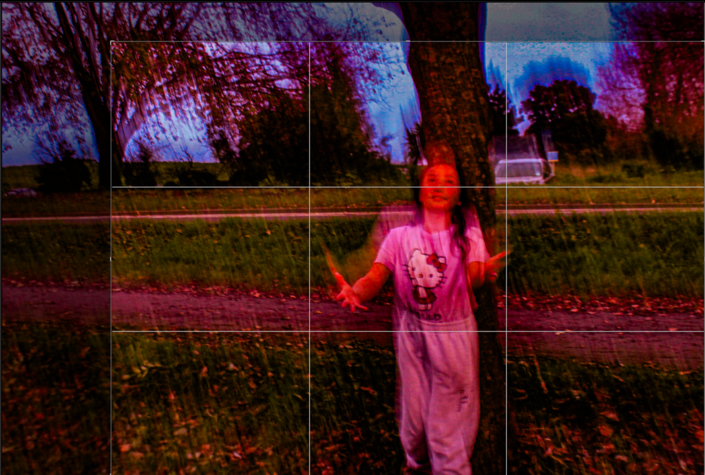
In this image I had to get rid of most of the negative space on the left side on the photo rather than the right. I also got rid of negative space at the top and the bottom of the photo. To get the best result this photo need to be cropped.
As I was cropping this photo I need to make sure that the photo was balanced and proportional , so the photo looks pleasing to the eye.
For this image I also had to enhance the contrast and tone, to exaggerate the texture. I also enhanced the shutter speed.
Black and White Final Images
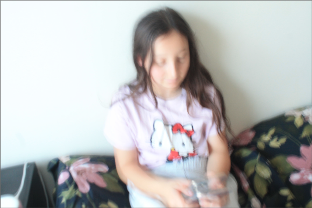


These are my final images edited
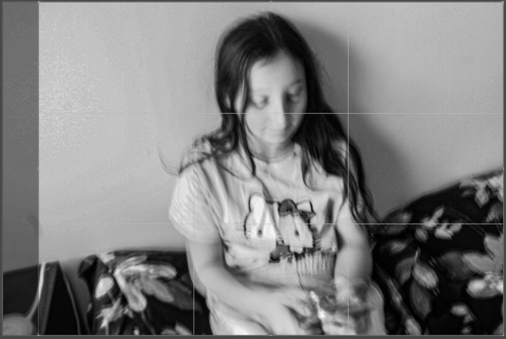
In this photo I had to slightly crop it due to the sides of the photo not being balanced . If I hadn’t cropped the photo, the photo would look unbalanced and there would be too much negative on the background of the photo.
After being cropped the photo looks more visually appealing to look at.
For this image I also had to enhance the dehaze, clarity and the texture setting to achieve this type of image.
For the filter I used the style; Cinematic to create this type of photo.

This isn’t a white photo but i managed to brighten it up since it was dark. To brighten it up is used two filters called BW7 and F6 these filters are from Lightroom.
In this photo I had to slightly crop it due to the sides of the photo not being proportional. If I hadn’t cropped the photo, the photo would look unbalanced and there would be too much negative on the background of the photo.
After being cropped the photo looks more visually pleasing and nice to look at.
For this image I also had to enhance the contrast, exposure ,dehaze, clarity and tone to exaggerate the texture.
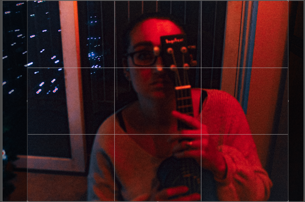
This isn’t a white photo but I managed to brighten it up since it was dark. To brighten it up is used three filters called BW07,FT06 and SP05 these filters are from Lightroom.
In this photo I had to slightly crop it due to the sides of the photo not being proportional. If I hadn’t cropped the photo, the photo would look unbalanced and there would be too much negative on the background of the photo.
After being cropped the photo looks more visually pleasing and nice to look at.
For this image I also had to enhance the exposure ,dehaze, clarity and tone to exaggerate the texture.
Editing Photos into a Black Filter
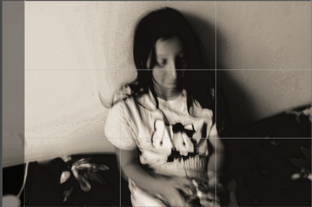
In this photo I had to slightly crop it due to the sides of the photo not being proportional. If I hadn’t cropped the photo, the photo would look unbalanced and there would be too much negative on the background of the photo.
After being cropped the photo looks more visually pleasing and nice to look at.
For this image I also had to enhance the dehaze, clarity and tone to exaggerate the texture.
In this photo I used the filter called BW11 this filter darkened the photo a bit, this is what a aimed for.
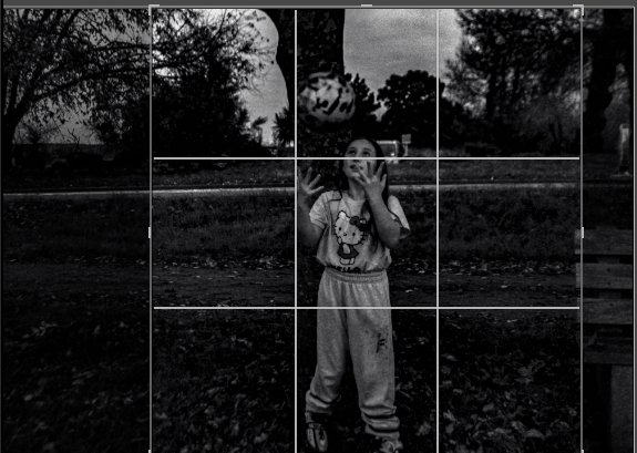
In this photo I used a black and white filter called BW09, this darkened my photo, this is what I achieved due to using this filter.
In this photo I had to slightly crop it due to the sides of the photo not being proportional. If I hadn’t cropped the photo, the photo would look unbalanced and there would be too much negative on the background of the photo.
After being cropped the photo looks more visually pleasing and nice to look at.
For this image I also had to enhance the highlights and the shadows to enhance the clarity on this photo.
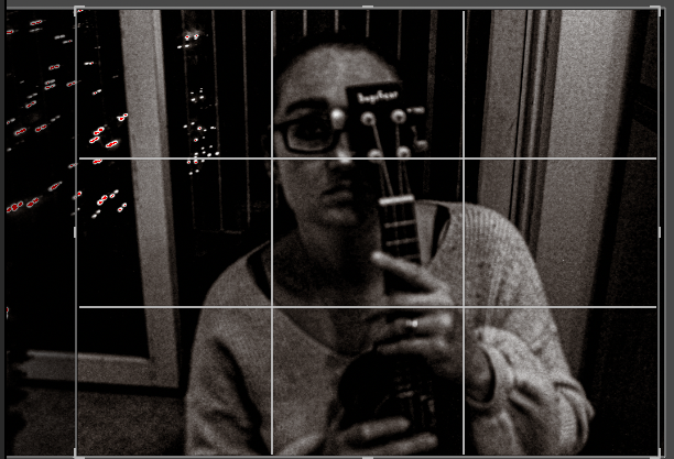
In this photo I used a filter called BW11, this has made this image both light and dark, this has balanced out the highlights and shadows, so it means that the foreground is more in focus.
In this photo I had to slightly crop it due to the sides of the photo not being proportional. If I hadn’t cropped the photo, the photo would look unbalanced and there would be too much negative on the background of the photo.
For this image I also had to enhance the highlights and the shadows to enhance the clarity on this photo.
My Final 4 Photos With Analysis

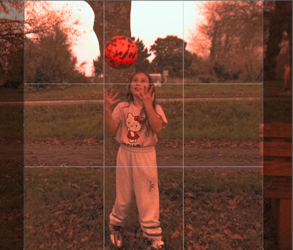


These are my final 4 photos due to a mixture of a light and dark tone. By having a light tone it makes the photo produced have a sharp with a strong contrast. By having a dark tone many photographs seem to have less impact and less visual vibration. By having some straight lines in the photos it means these lines have geometric quality and also have centre of attention. . The images that I took had lots of negative space around it so I had to crop it to make the photos balanced on each side.
