Francis Bruguière
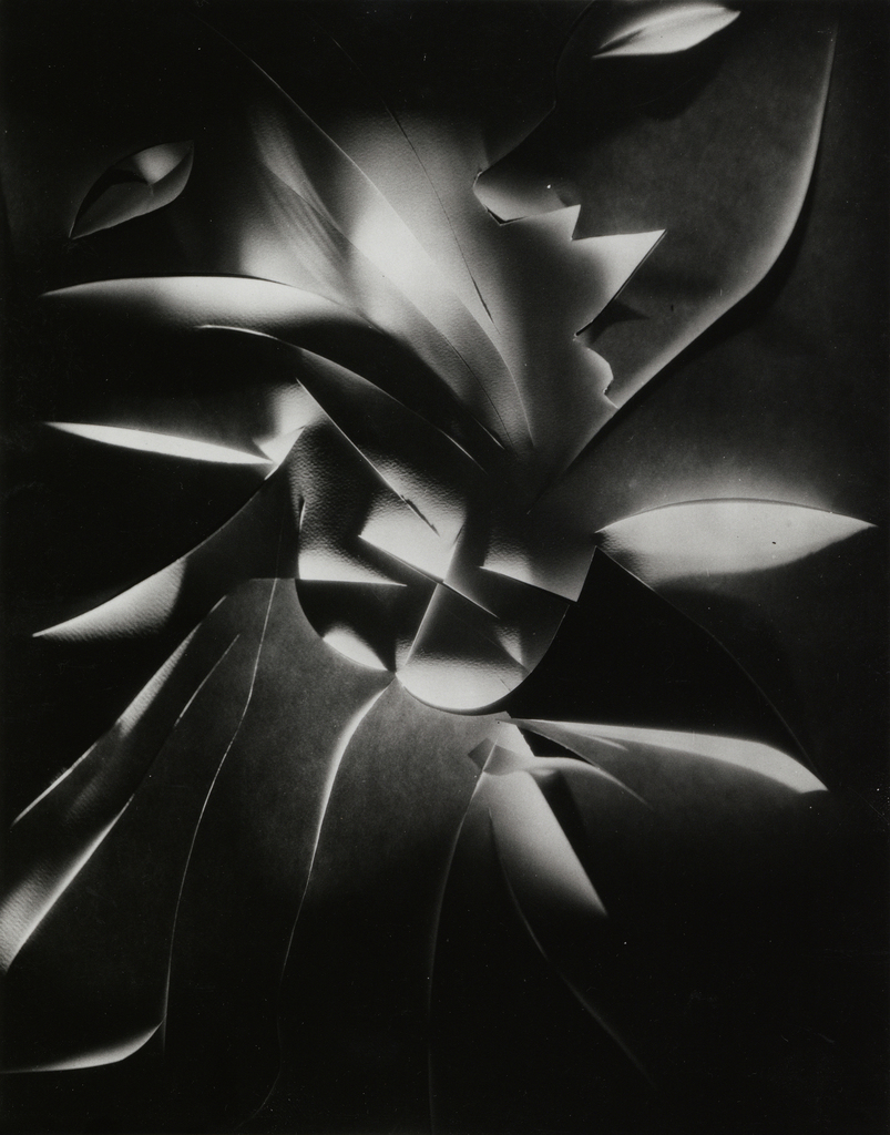
Bruguiere had a pretty impressive career, shooting for famous magazines like Vogue and Vanity Fair. He got into photographic abstraction and even made some cool cut paper designs, which really leveled up his art. In 1928, he showed his work at the der Strum gallery in Berlin and got a lot of praise. That same year, he moved to London, where he started playing around with light, which became a big part of his style. In 1930, he teamed up with Oswell Blakeston to create Light Rhythms, England’s first abstract film, inspired by his light experiments. Later on, he wanted a more laid-back lifestyle, so he moved to Northamptonshire and kept creating art until he passed away.
My response to Francis Bruguière:
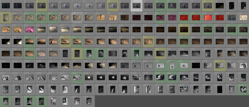
These are all the photographs I’ve taken that focus on paper photography and my interpretation of Francis Bruguiere’s work. To organize these images, I created a color-coding system. Green indicates photos that meet a pretty good standard, meaning they are clear and well lit, which enhances their quality. Yellow signifies images that aren’t quite as good but still have editing potential. These yellow-coded photos may have issues like being slightly out of focus or poorly lit. I believe both the green and yellow photos are still useful and can be improved through editing to highlight their best features.
Paper editing:
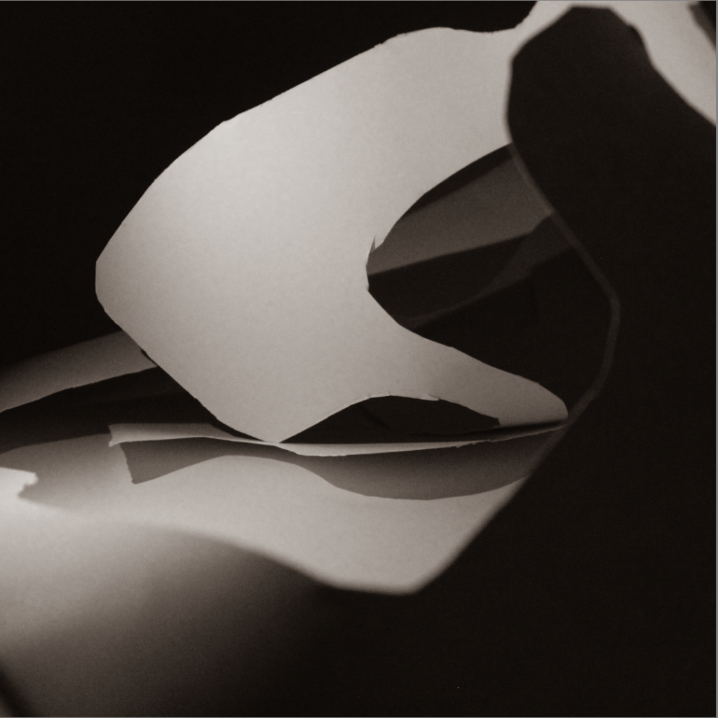
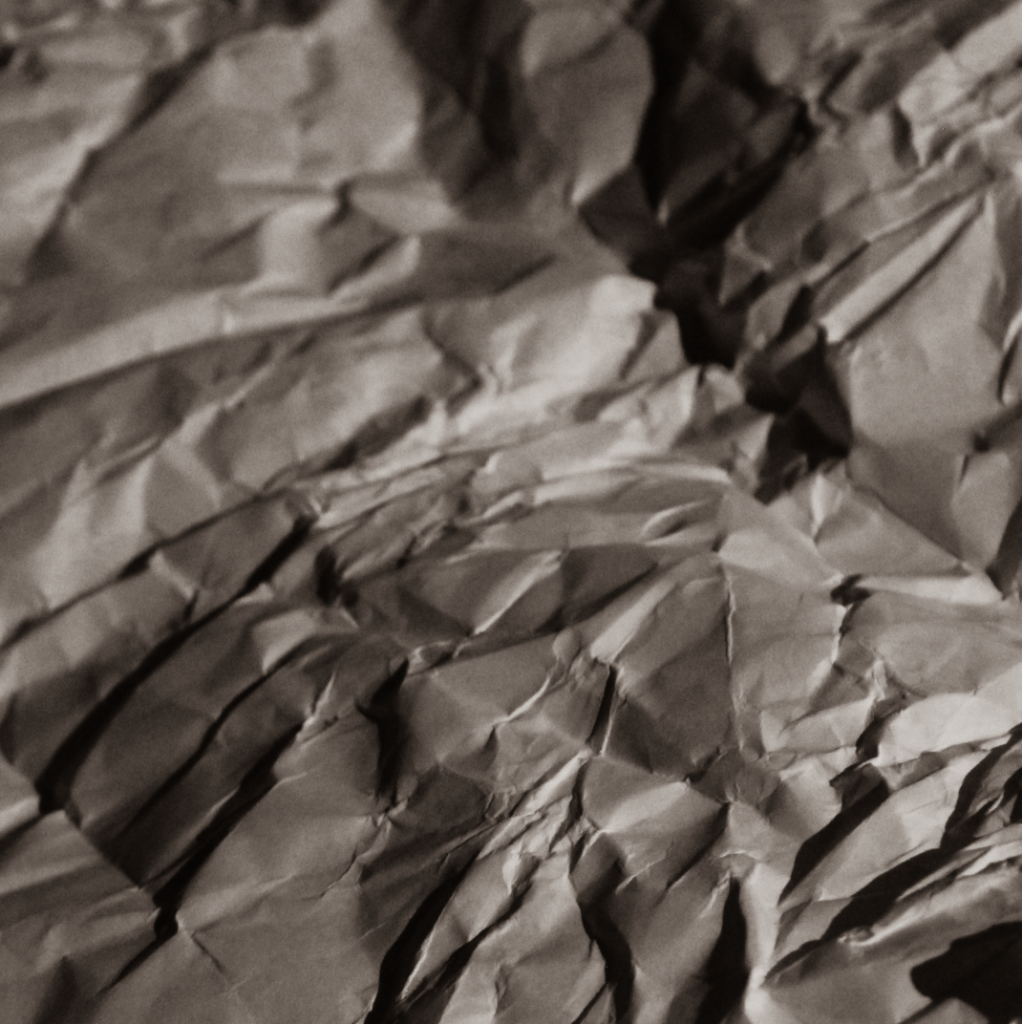
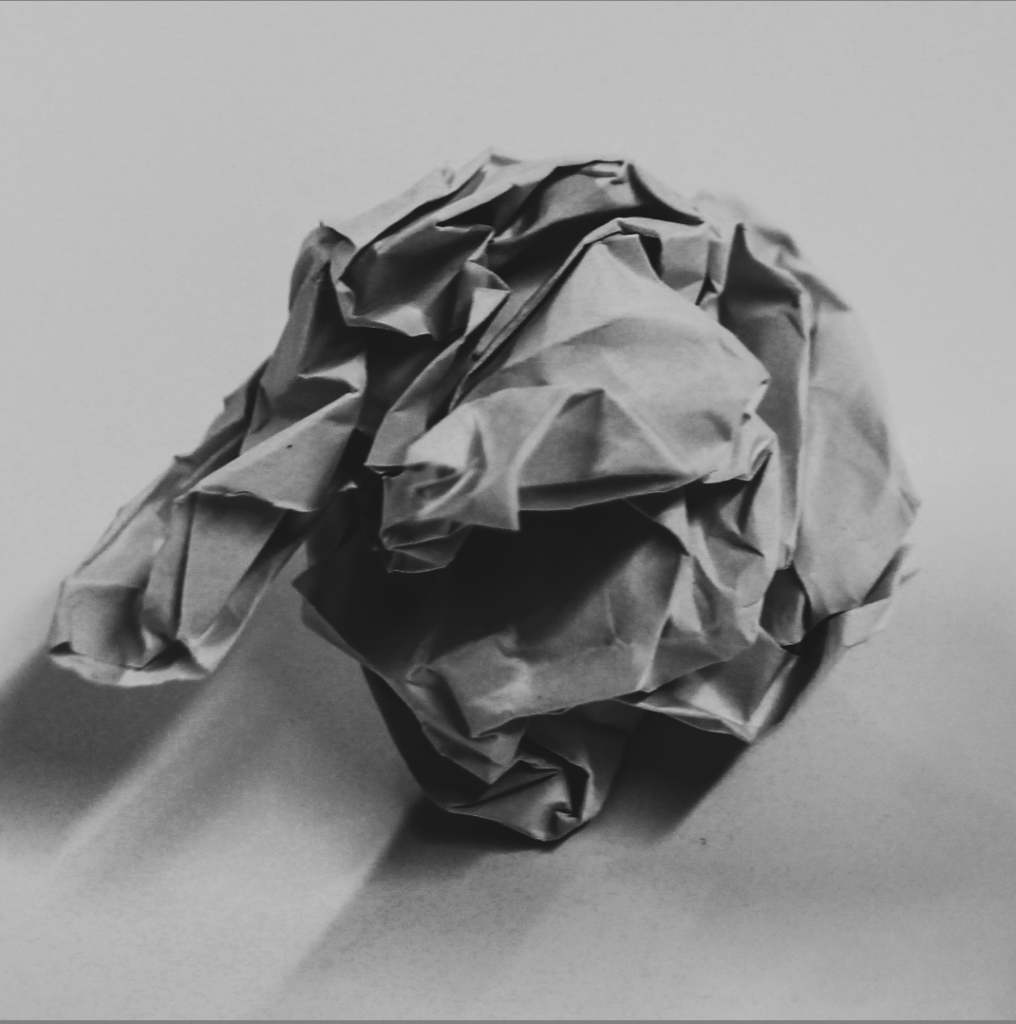
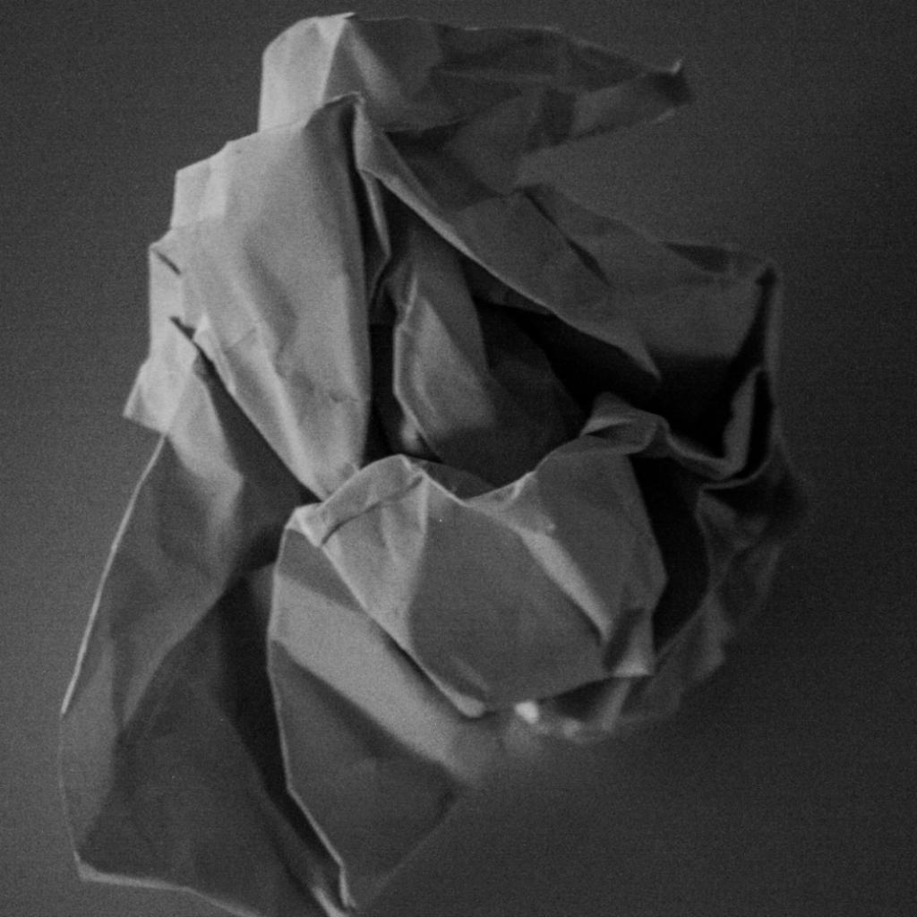
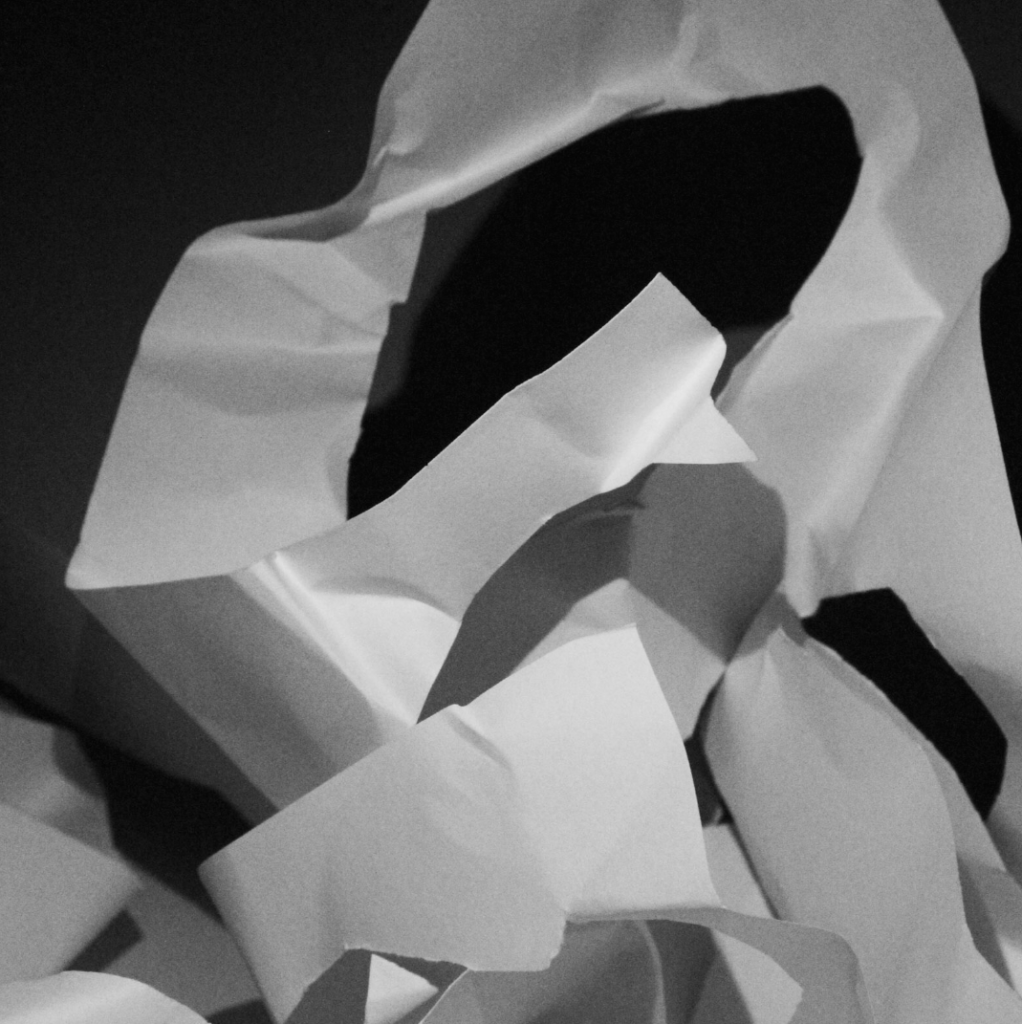
For editing, I used the develop tab to explore the black and white presets. There were many options, and I chose a sepia filter for some images. I also adjusted the exposure to create a darker look in certain photos, making the shadows more noticeable. I made slight changes to the contrast as well to emphasize the dark areas and enhance the shadows. These adjustments improved the visual impact of each photo and contributed to the mood I wanted to achieve.
