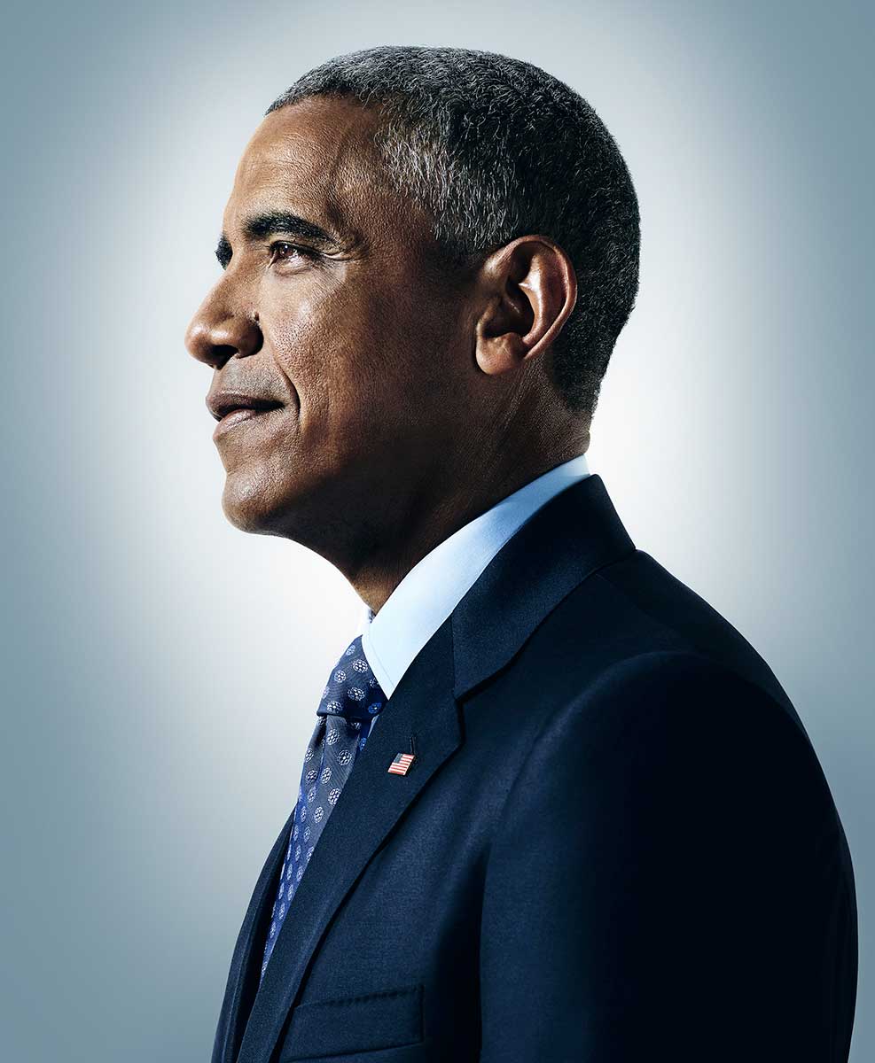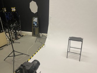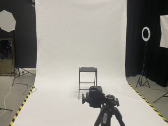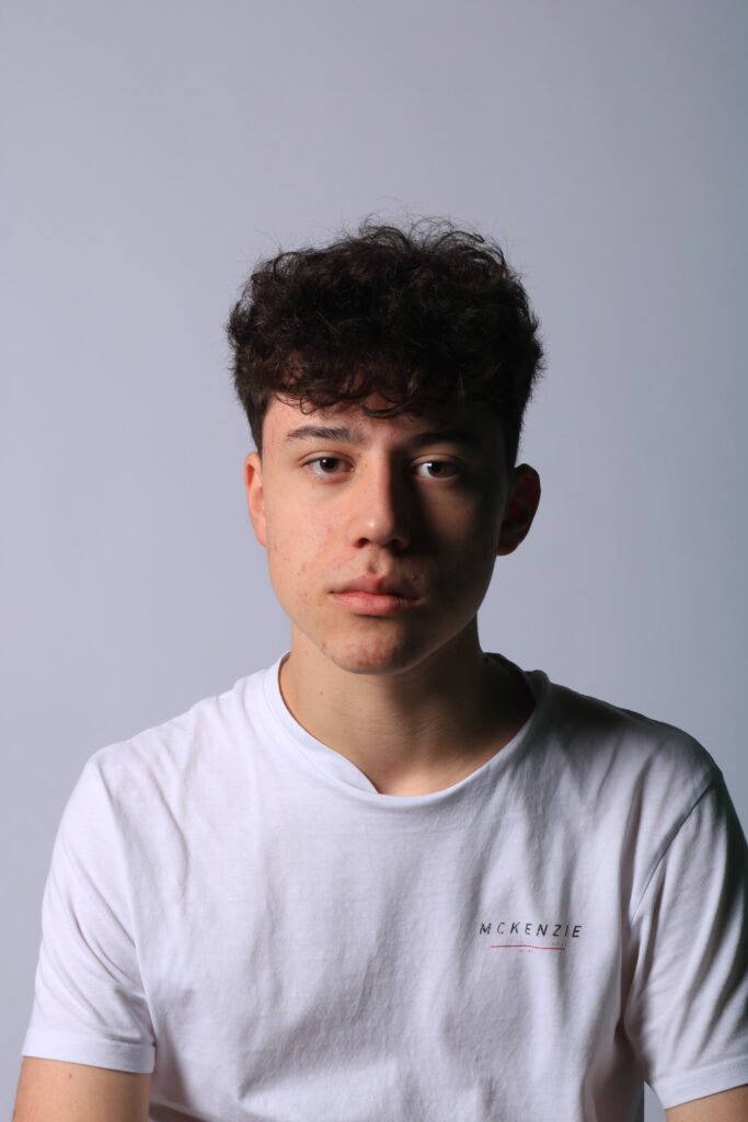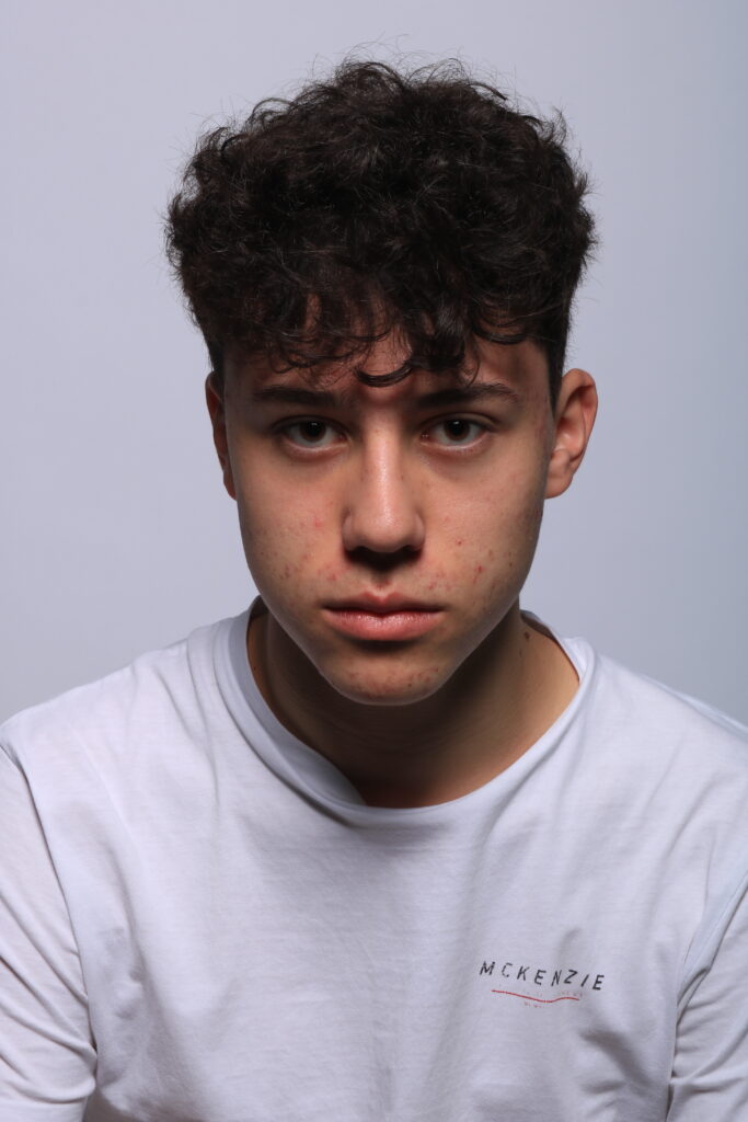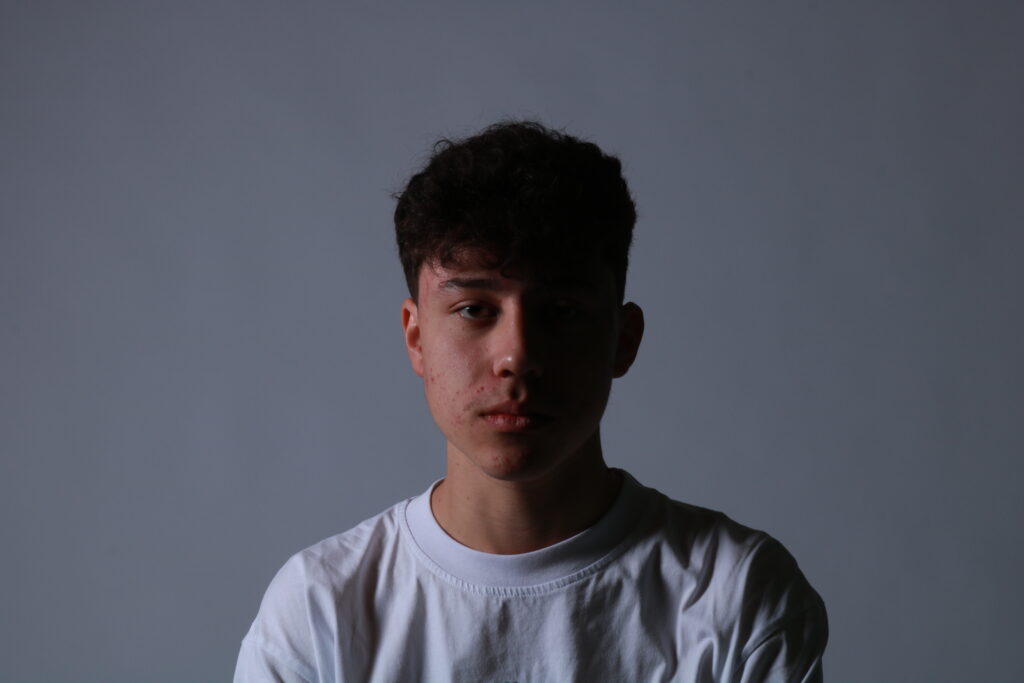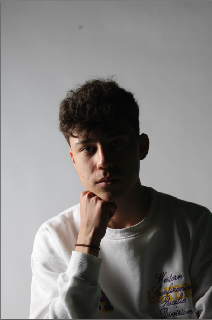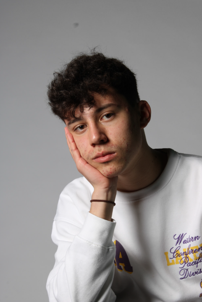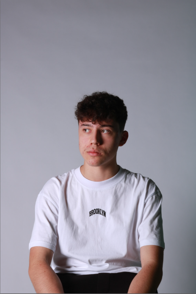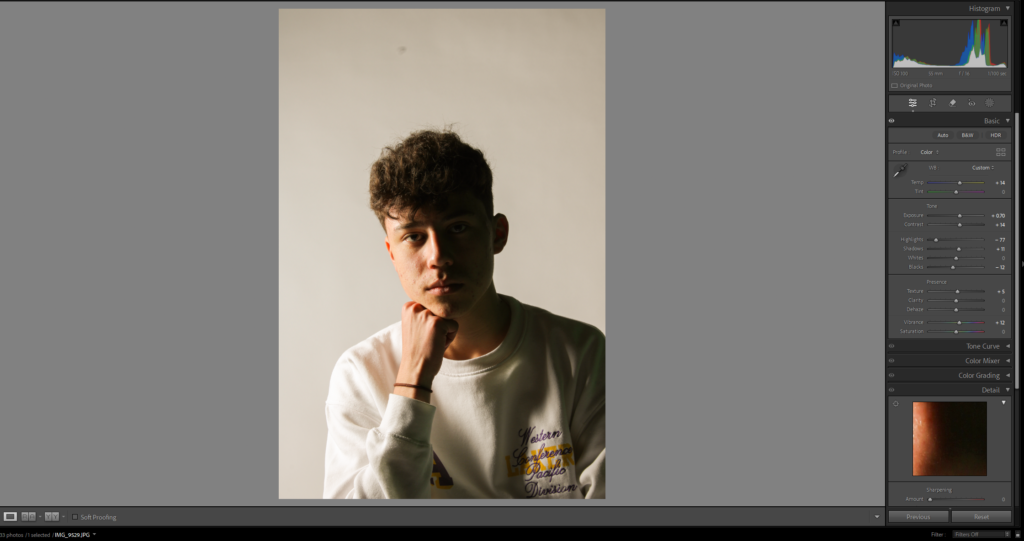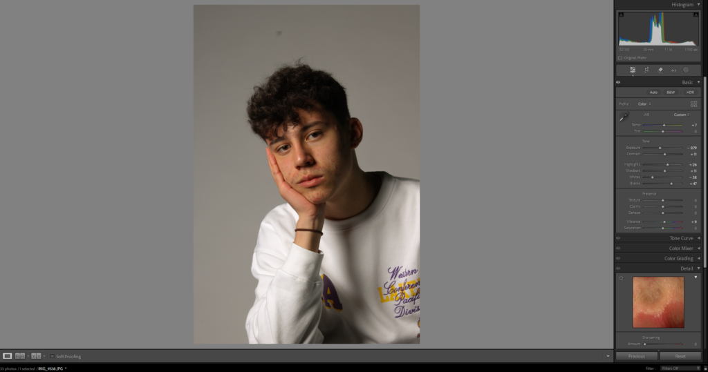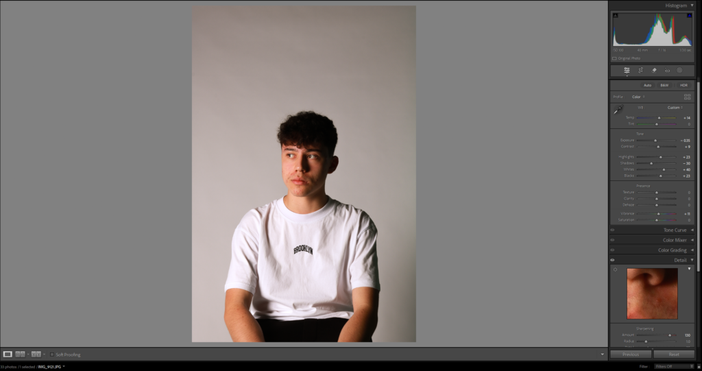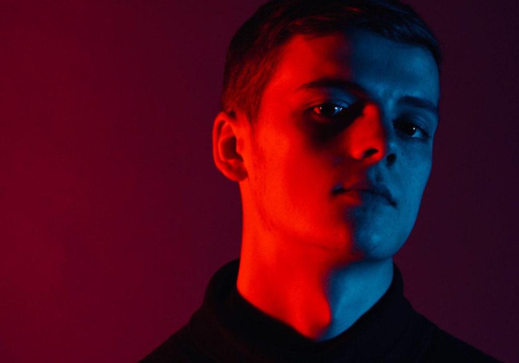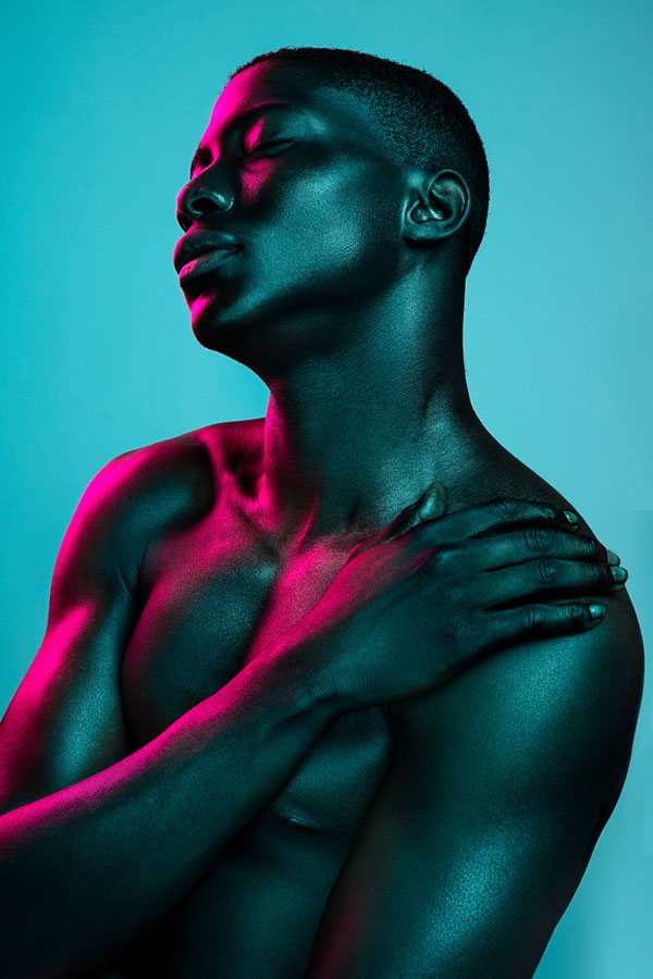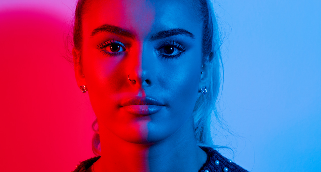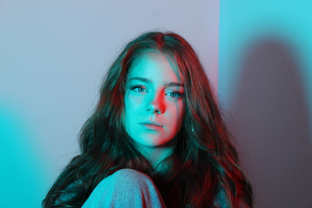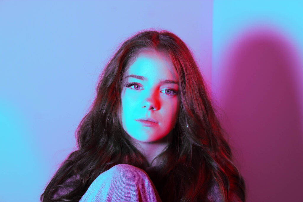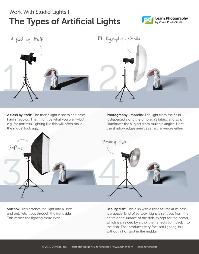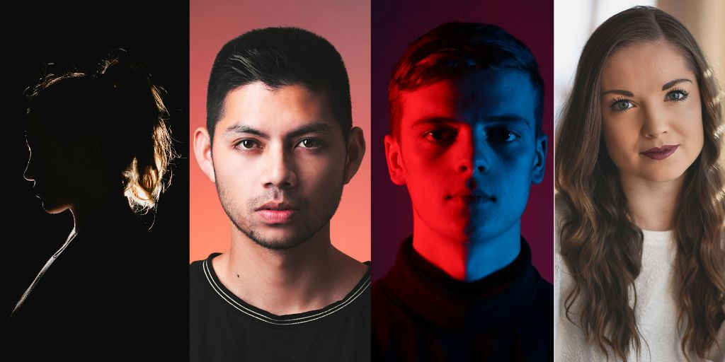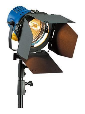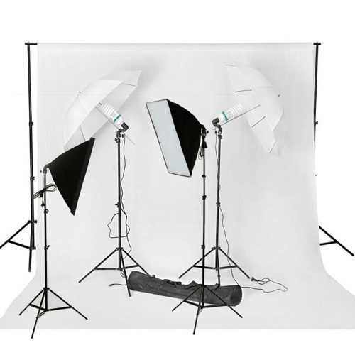
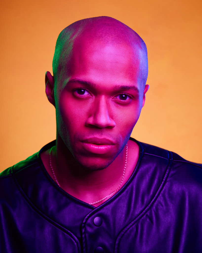
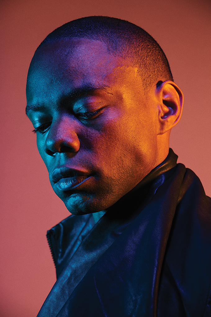
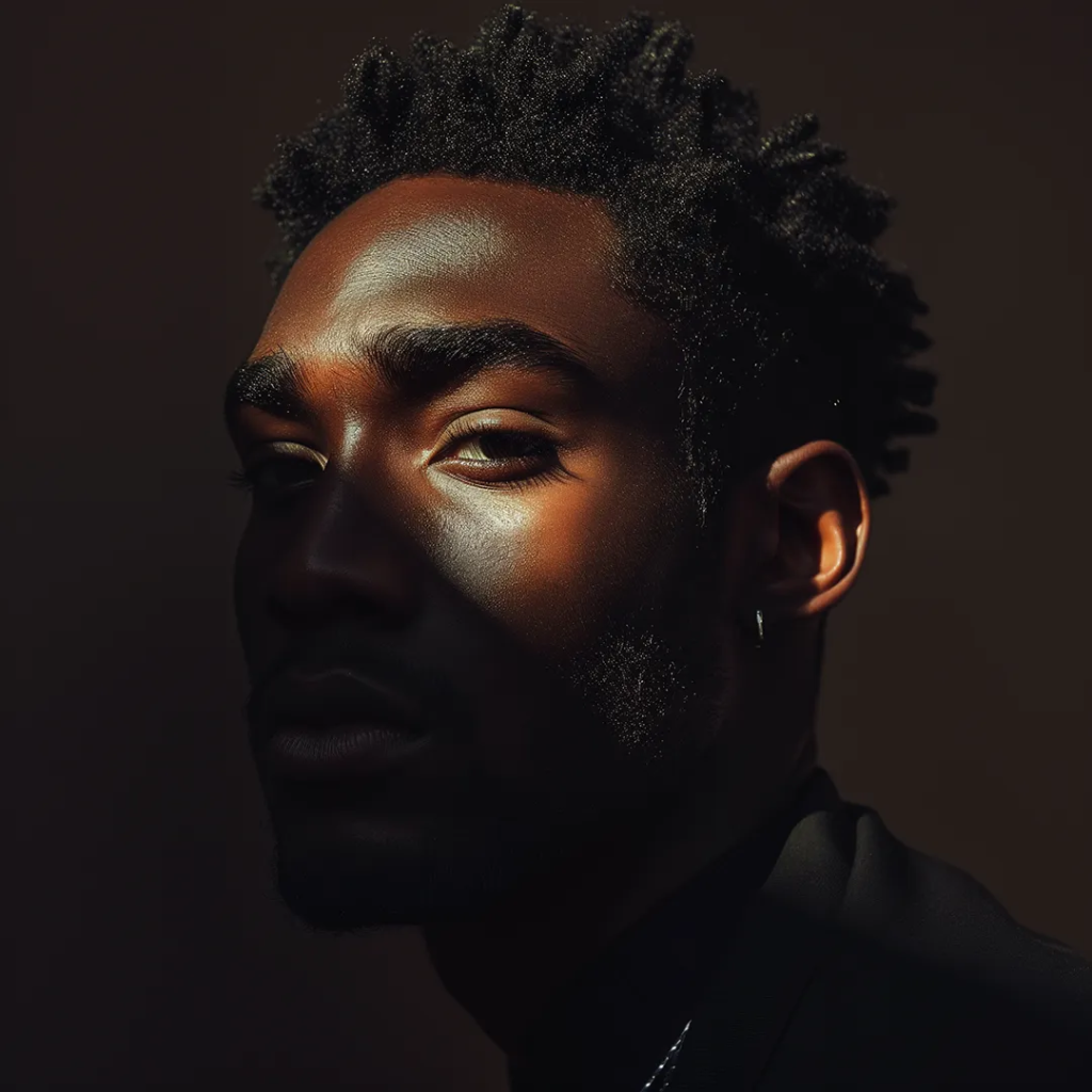
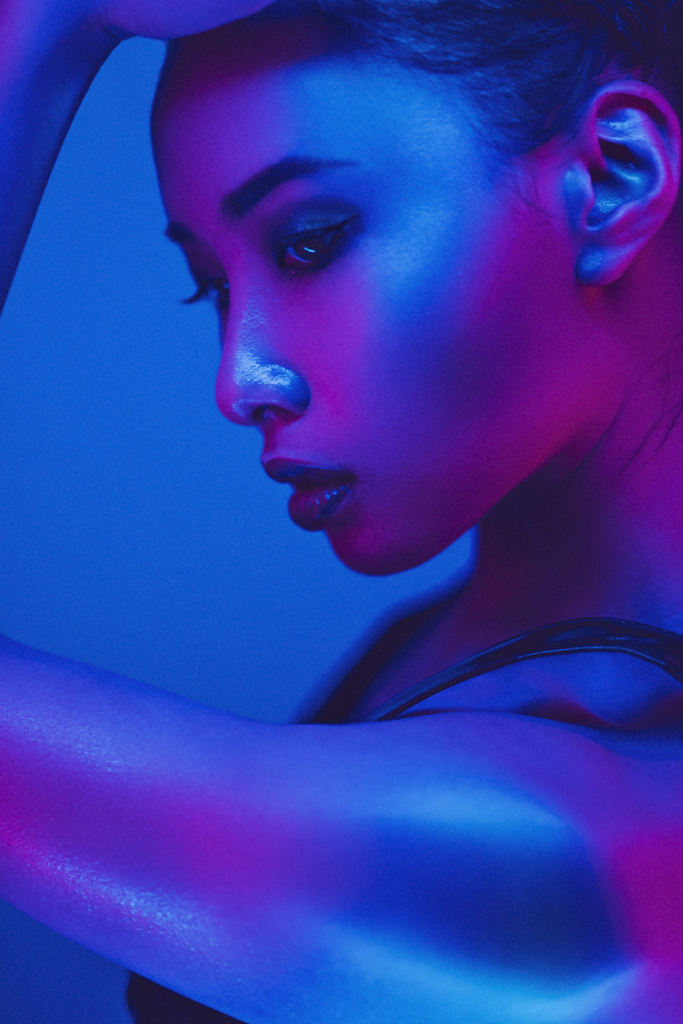
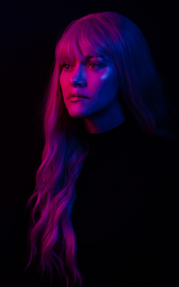
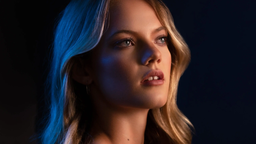
Studio lighting refers to how a light source (typically artificial), illuminates the subject that is being photographed in a studio environment. It is often used to change aspects of the photograph such as clarity, tone and saturation to create an accurate rendition of the scene.
1-Point Lighting
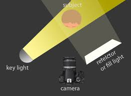
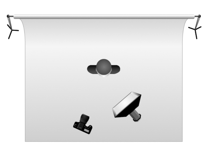
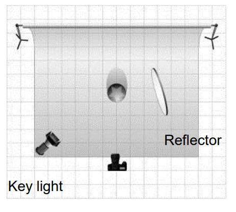
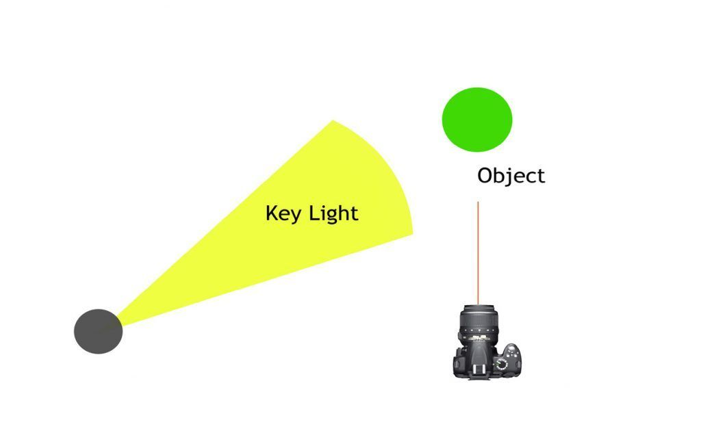
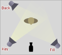
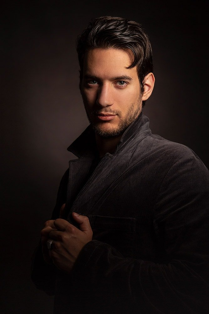
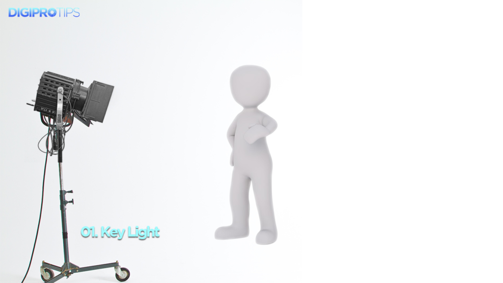
If you only have one light available to you then this will become your key light. This is the principal (and most important) light in the setup, as it illuminates the subject within your shot.
It is usually the strongest and has the most influence on the look of the scene. It is placed to one side of the camera/subject so that this side is well lit and the other side has some shadow.
2-Point Lighting
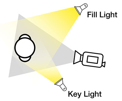
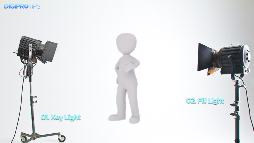
If you have two lights in your kit then the second light after setting up your key light will be your fill light.
This is placed on the opposite side of the key light. It is used to fill the shadows created by the key light. The fill will usually be softer and less bright than the key (up to half the intensity/brightness of the key). To achieve this, you could move the light further away or use the intensity settings on your lights if you have some.
3-Point Lighting
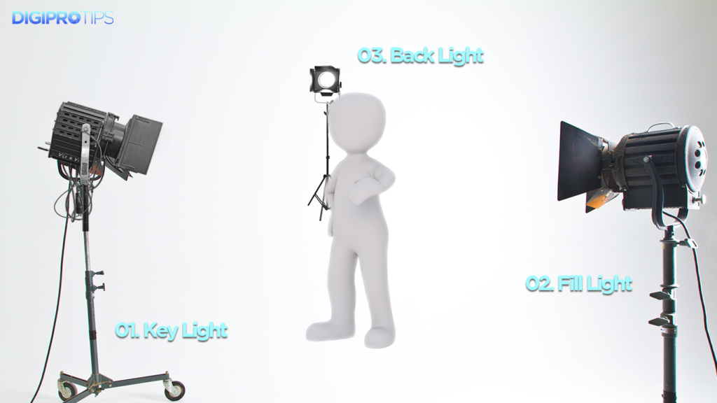
The third light after setting up the key and fill will become the back light which is placed behind the subject and lights them from the rear.
Rather than providing direct lighting (like the key and fill), its purpose is to provide definition and subtle highlights around the subject’s outlines. If setup correctly there should be a subtle rim of light around the subject. This helps separate the subject from the background and provide a three-dimensional look.
Rembrandt Lighting
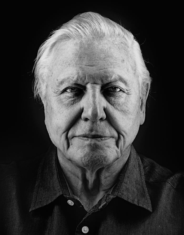
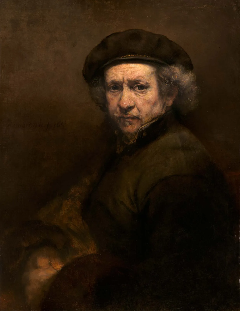
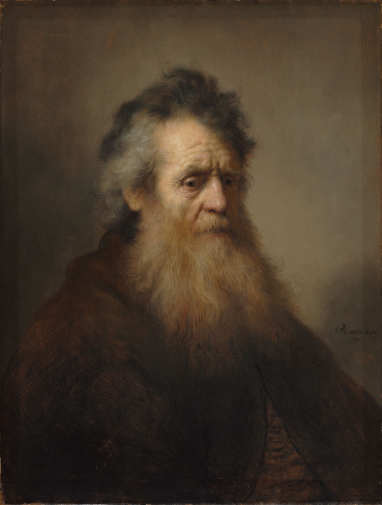
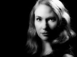
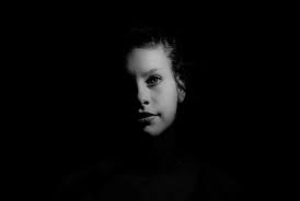
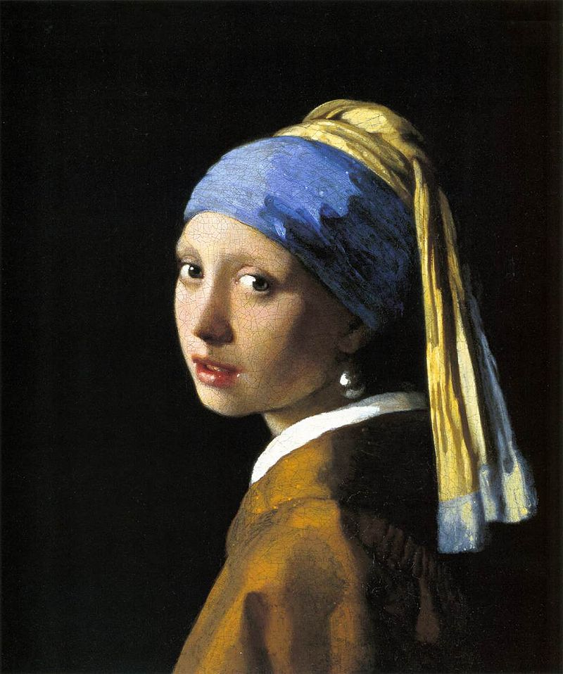
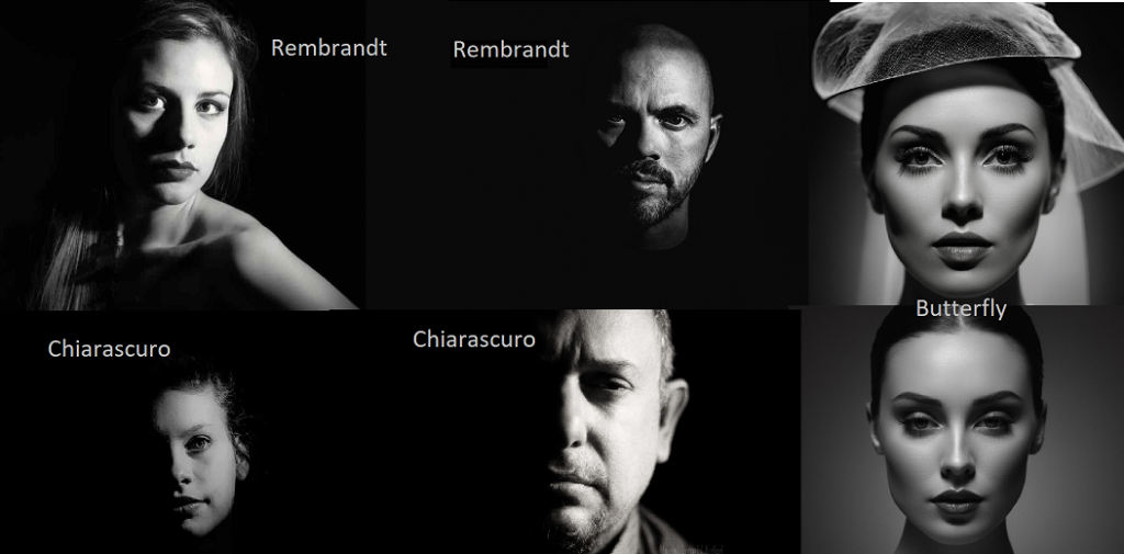
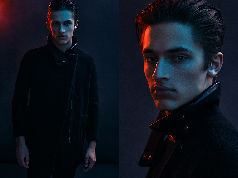
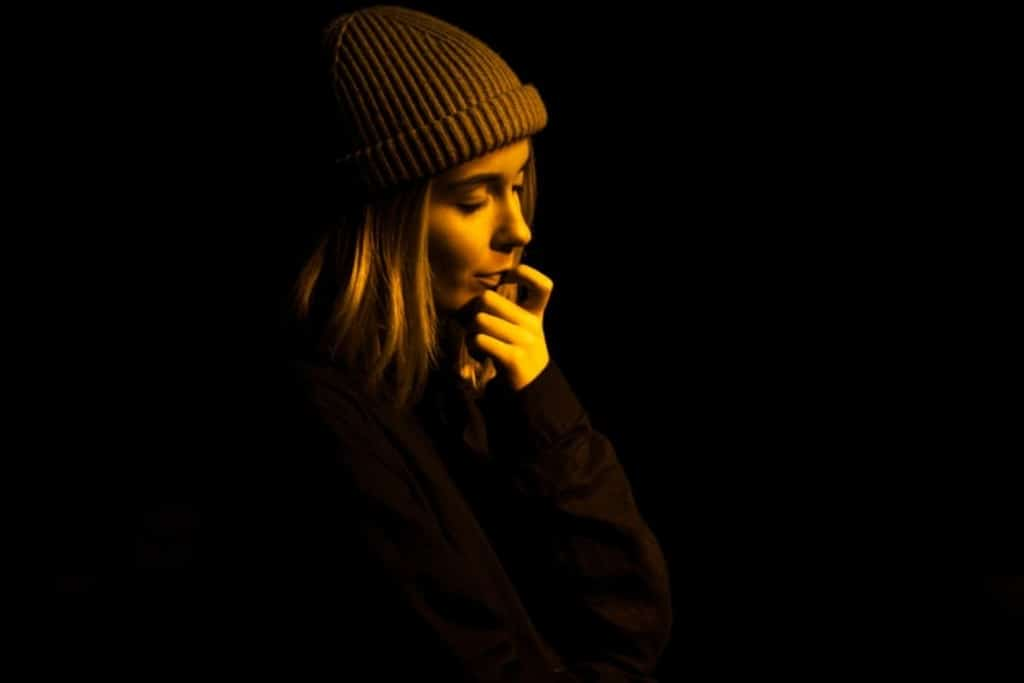
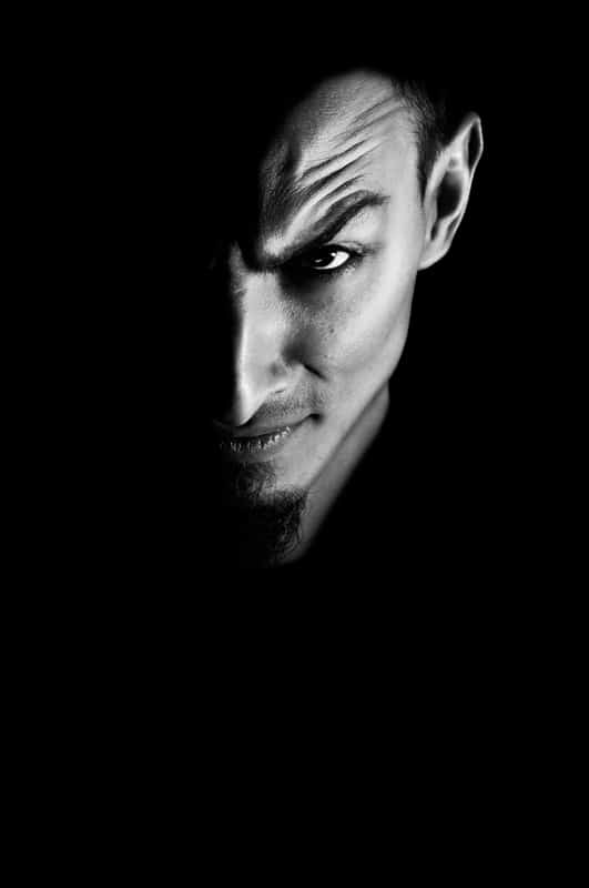
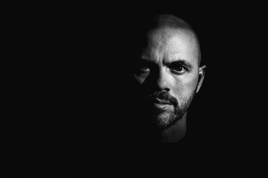
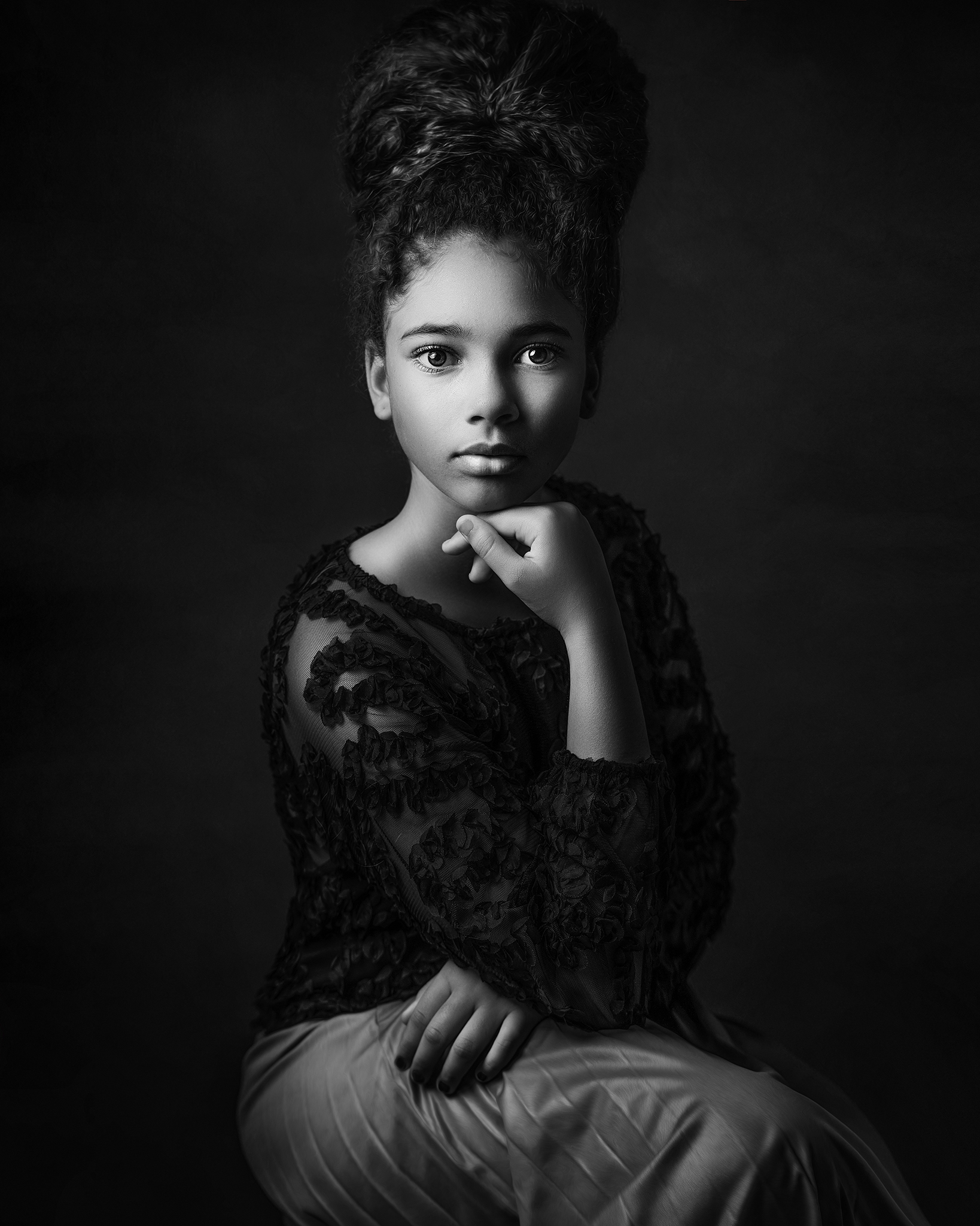
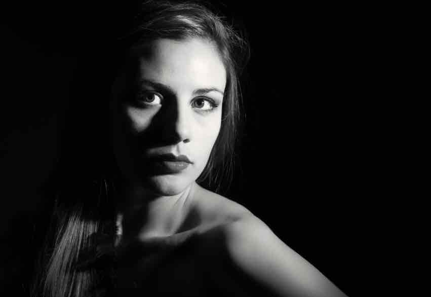
Rembrandt lighting results in one half of the subject’s face is fully illuminated, while the other half is in partial shadow (similar to chiarascuro/split). What differs when comparing this to other methods of lighting is the presence of a small inverted triangle of light below the subject’s eye, usually along the cheek, which is a result of the lighting setup. For perfect execution of this type of lighting, the triangle of light shadow must be no wider than the length of the eye, and no longer than the subject’s nose.
The Rembrandt lighting technique results in a moody and dramatic effect. This type of lighting technique often features a dark or black background behind the subject, putting the subject front and centre.
Butterfly Lighting
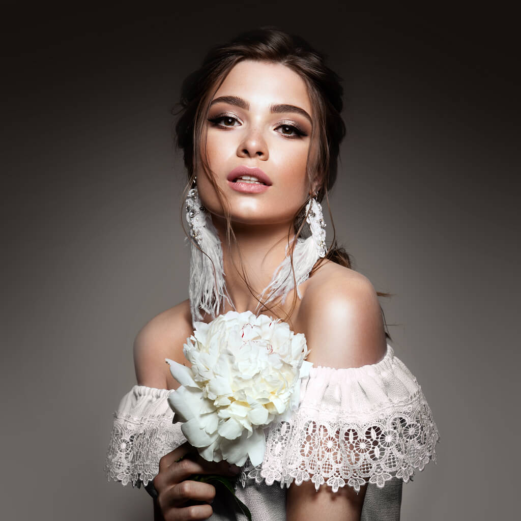
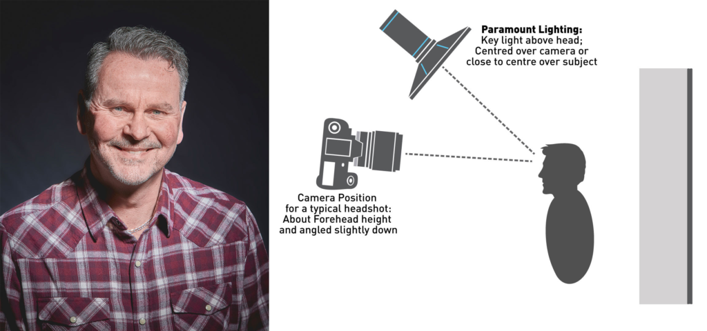
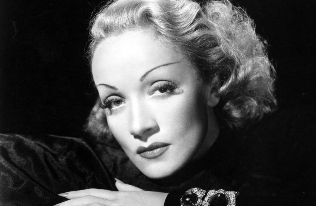
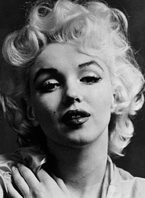
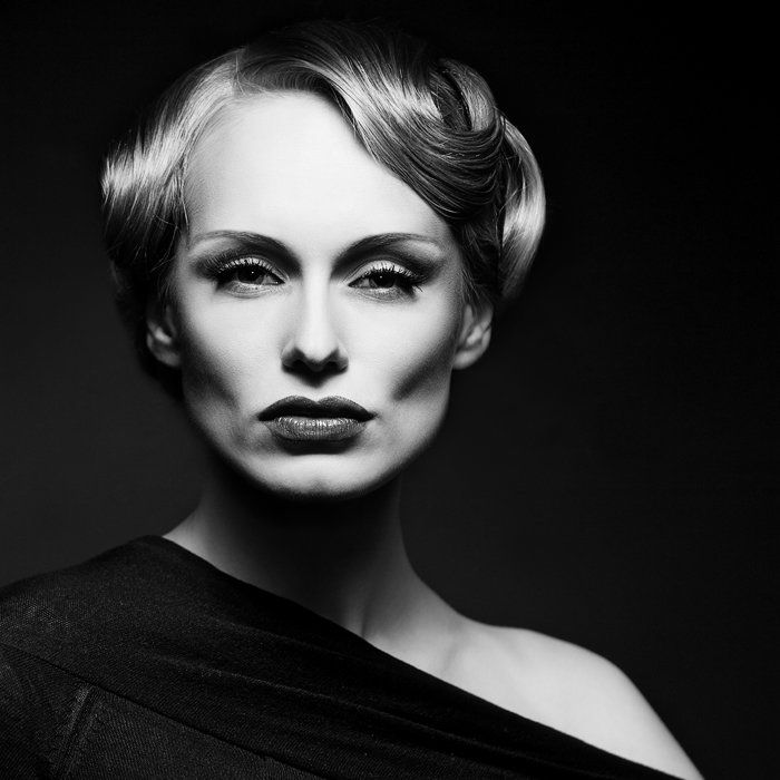
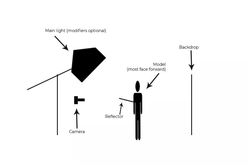
Butterfly lighting is a basic and popular lighting technique in which the main light is above and in light with the subject’s face and the camera.
A clear sign of butterfly lighting being used is the shadow under the nose with a butterfly shape that is created as a result of the lighting.
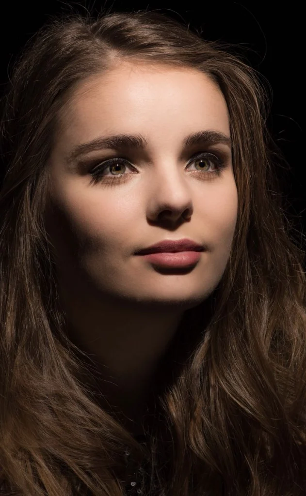
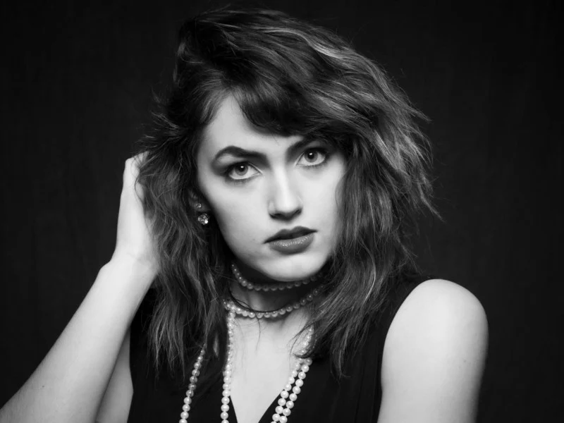
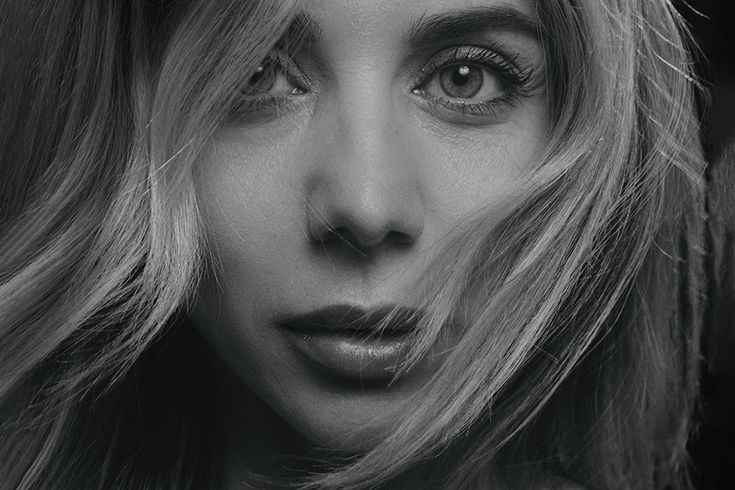
In some images, the butterfly shape created is more subtle (like the second image above) but in others the position and intensity of the lighting can be altered to make it more noticeable and this is used to highlight cheekbones and create shadows under them as well as under the neck – which makes the model look thinner.
Chiarascuro/Split Lighting
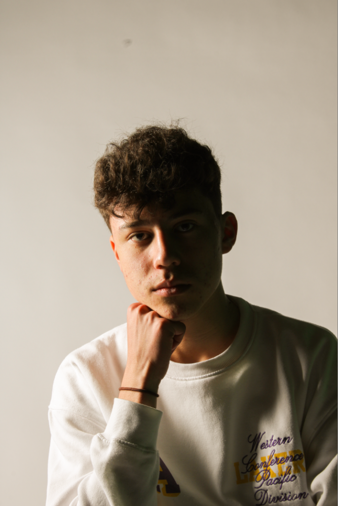
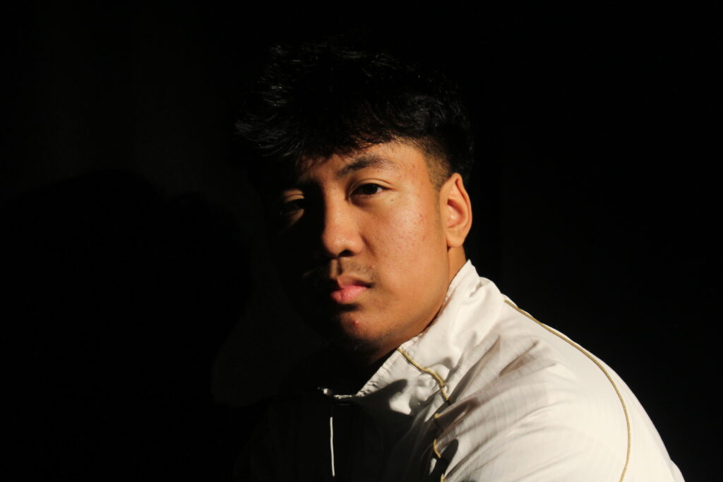
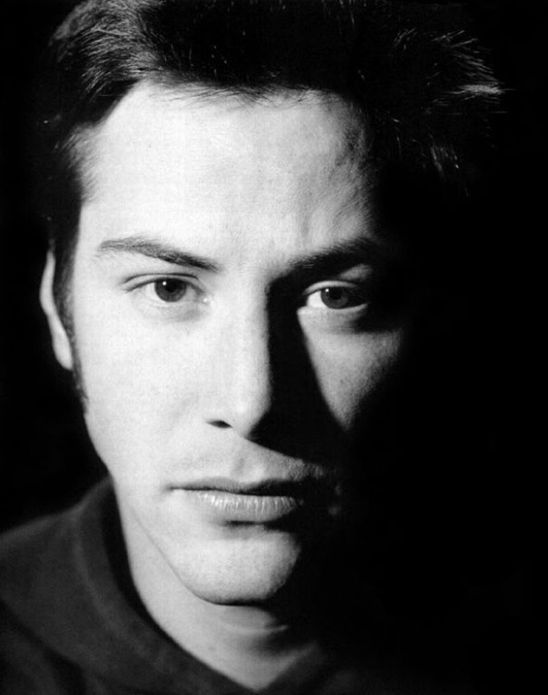
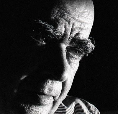
Chiarascuro literally translates to “light/dark”, and refers to a technique where a light source is shone onto a side of the subject’s face, juxtaposing light and dark tones due to half of their face being illuminated and the other half being darker and more coated in shadow. It shares many similarities with Rembrandt lighting, but without the triangle cast on the subject’s cheek.
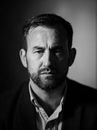
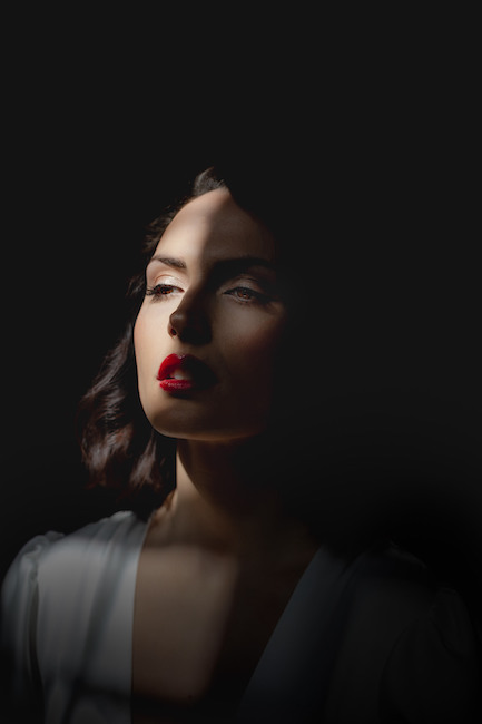
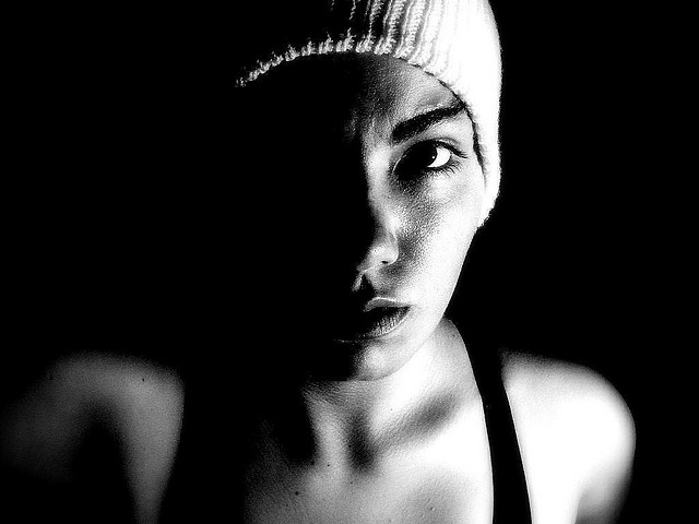
Images captured using chiarascuro lighting typically aim to create visually intriguing pictures with a strong sense of depth and mood. A soft second light can be shone on the darker side of the face to alter how dark the shadows are which can be used to strengthen/weaken the contrast between light and dark tones.
Photoshoot Plan + Contact Sheet
After researching different types of lighting in a studio environment, I then decided to try and capture a wide variety of portraits (e.g. head shots, full body etc) showcasing these lighting techniques and my understanding of them.
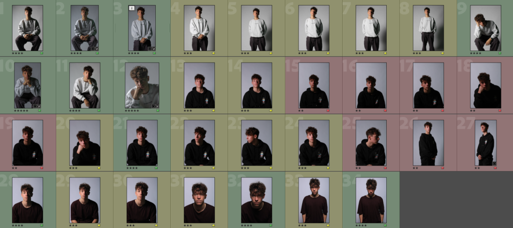
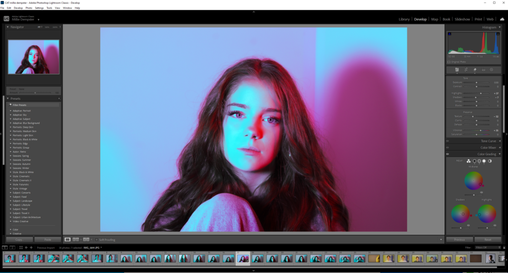
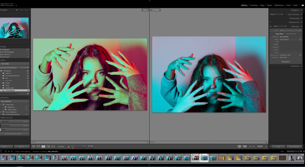
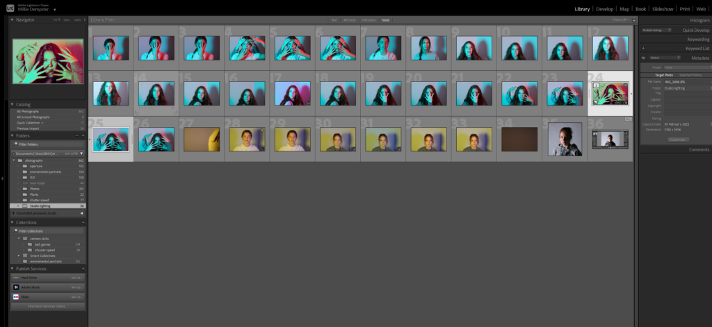
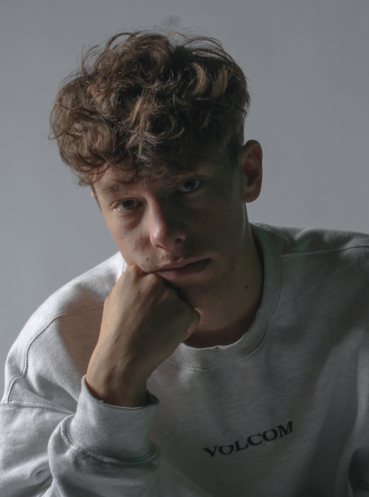
After the first two sessions in the studio, I imported my photos into Lightroom and colour coded them as well as star rated them to go through them and see which ones I found most effective – these were typically the ones where I managed to make better use of chiarascuro or Rembrandt lighting which added a gloomy feel to the images.
My Best Chiarascuro/Split Images
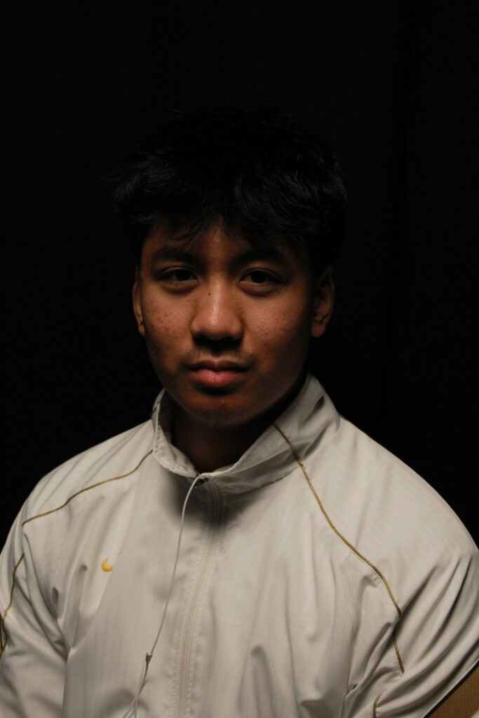
I first tried experimenting with trying to achieve a chiarascuro effect by adjusting the position of my main light to see how it would affect the light and shadows created on Finn’s face.
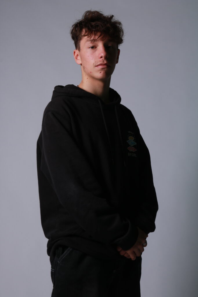
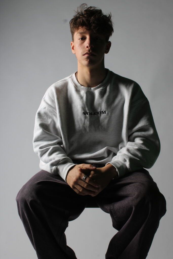
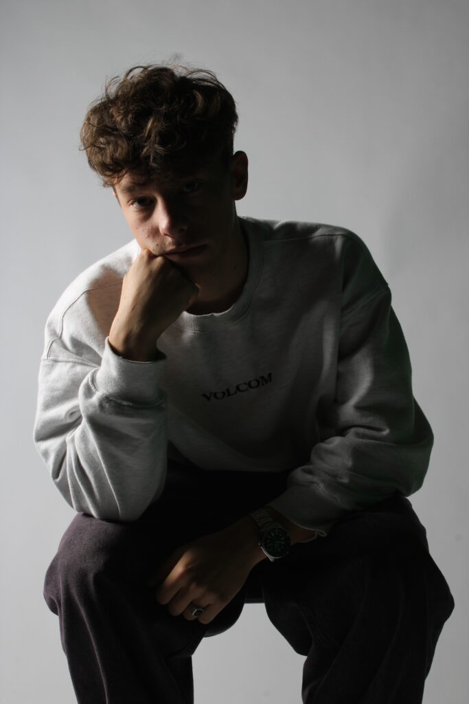
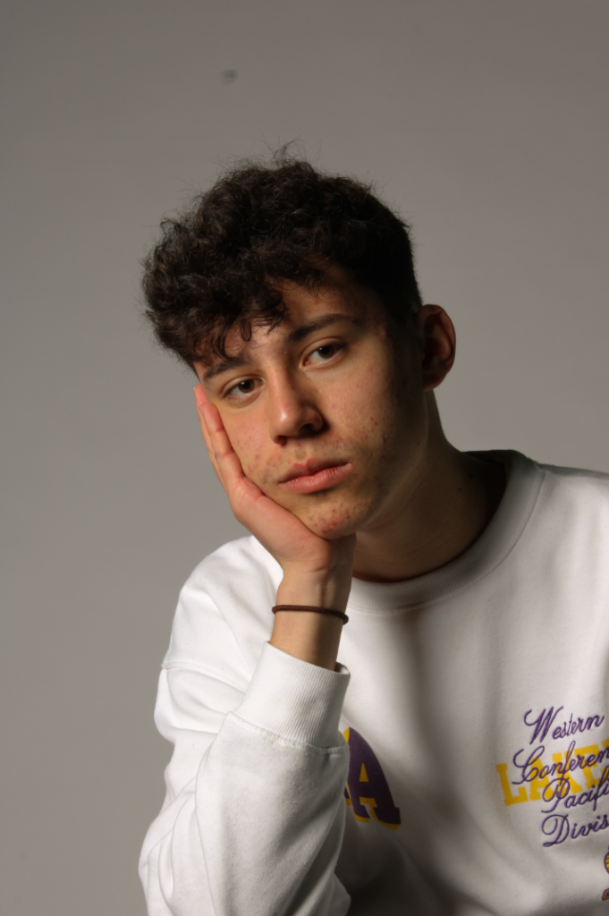
In the images above, I experimented with different positions and strengths of light to see how it would affect the amount of shadow on the side of Finn’s face and manipulated this to create some images I find effective. Although some are extremely underexposed, I can later adjust brightness and contrast in editing to fix this.
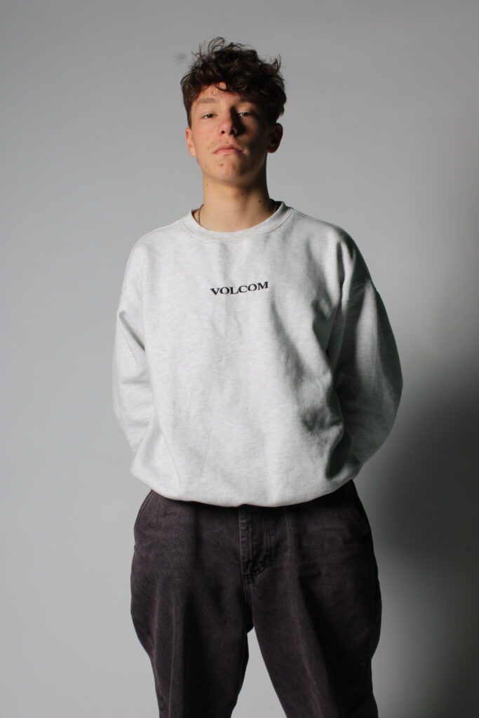
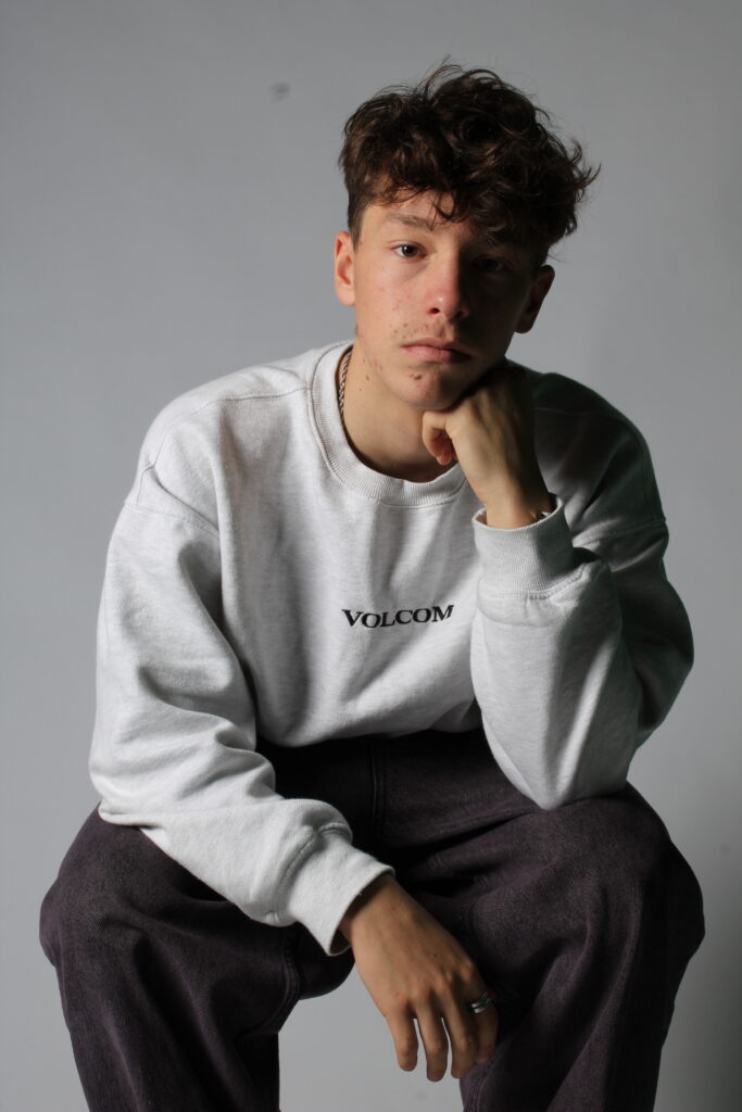
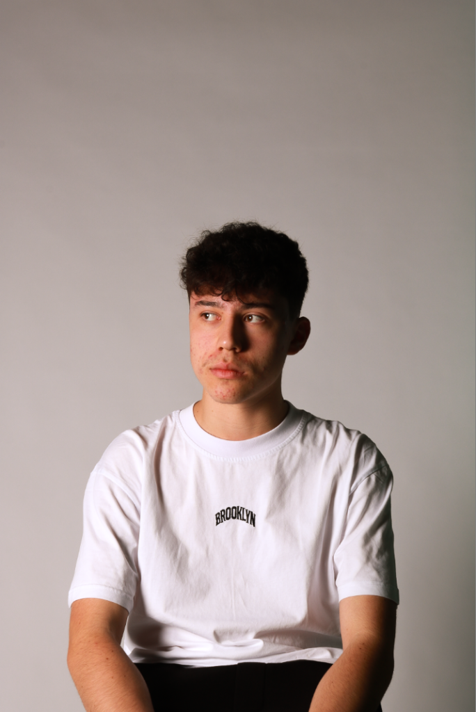
I then tried adding a fill light and adjusting its strengths to decrease the amounts of shadow present as well as trying different poses standing/sitting to see what I liked most.
My Best Rembrandt Images
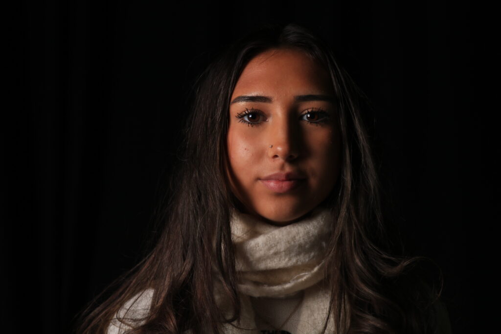
I then tried replicating Rembrandt lighting by trying first setting up lighting to achieve a chiarascuro effect and then moving the position of the light and trying different angles to achieve the triangle under the subject’s eye.
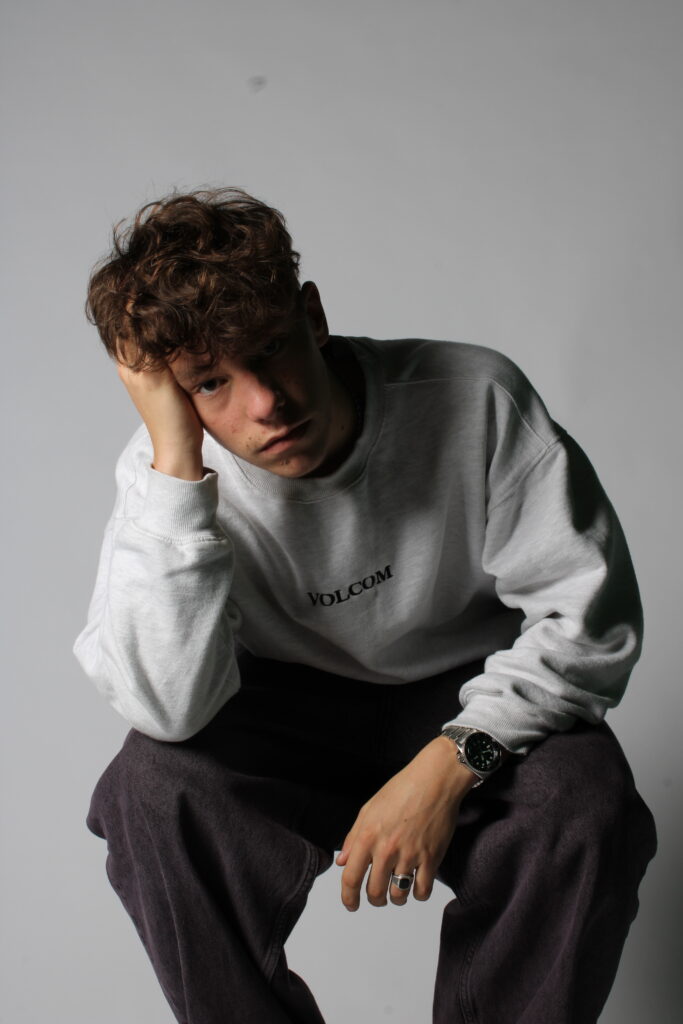
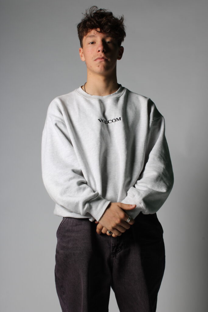
The images above are some where I nearly managed to achieve this effect, but the position of the subject and/or the positioning of the studio lights wasn’t optimal for this so I instead ended up with streaks of light in the darker side of Finn’s face just under the eye, but not in a triangular form.
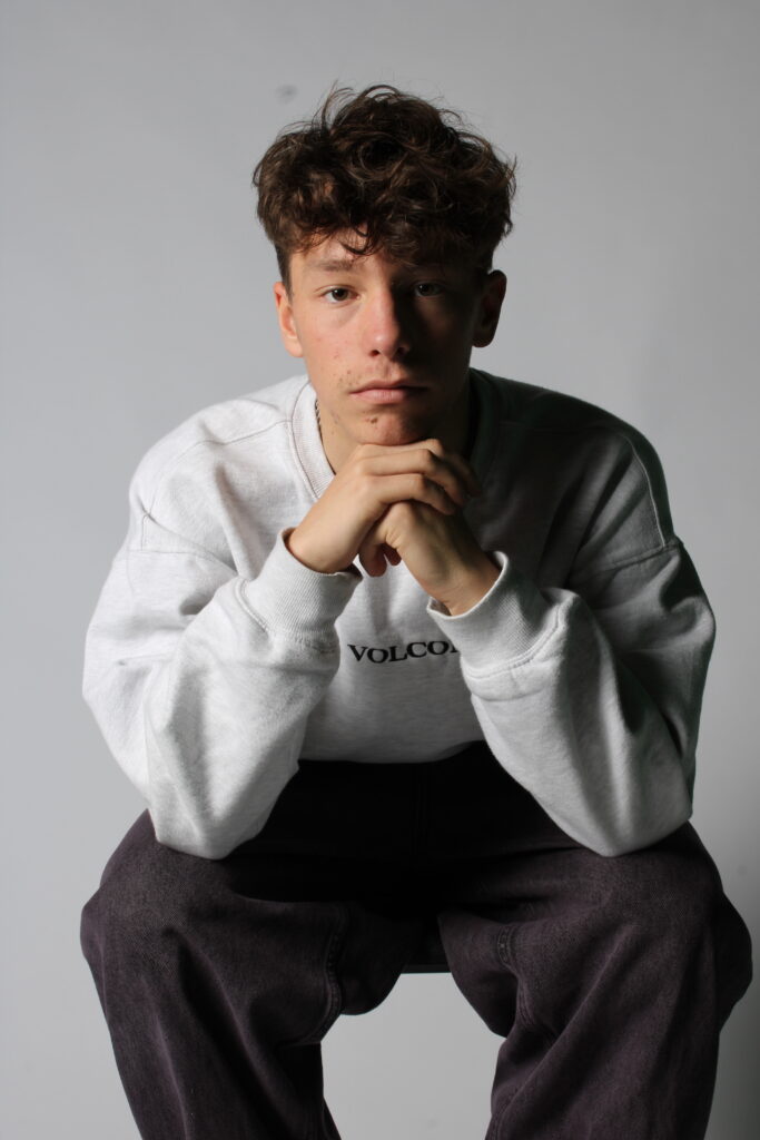
After lots of experimenting with different positions and strengths of lights I was able to come closer to achieving the triangle under the eye. Although I wasn’t able to perfectly replicate a triangle, the light is much more visible and creates a focal point amidst the shadow covering his face.
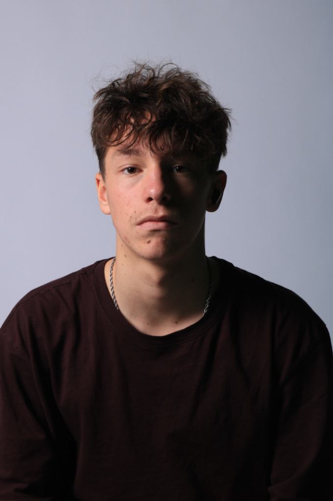
This was my best result from all my experimenting with Rembrandt, clearly showing streaks of light under Finn’s eye on the darker half of their face although the light isn’t a perfect triangle.
My Best Butterfly Images
To try and achieve the butterfly lighting effect, I positioned the light directly in front of my subject high up pointing down so there would be a slight shadow cost under the nose.
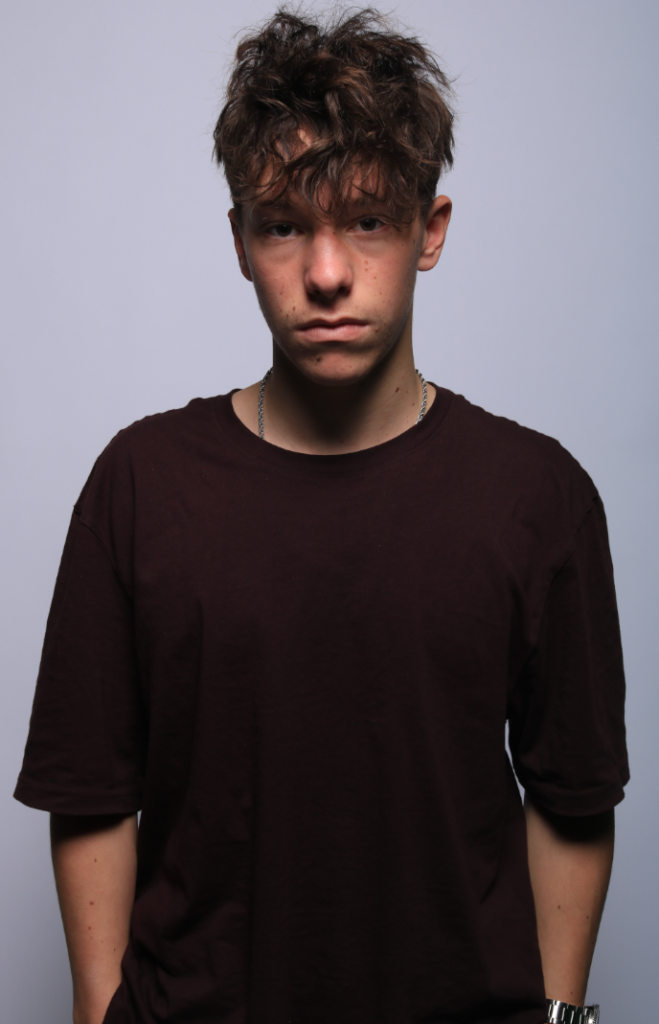
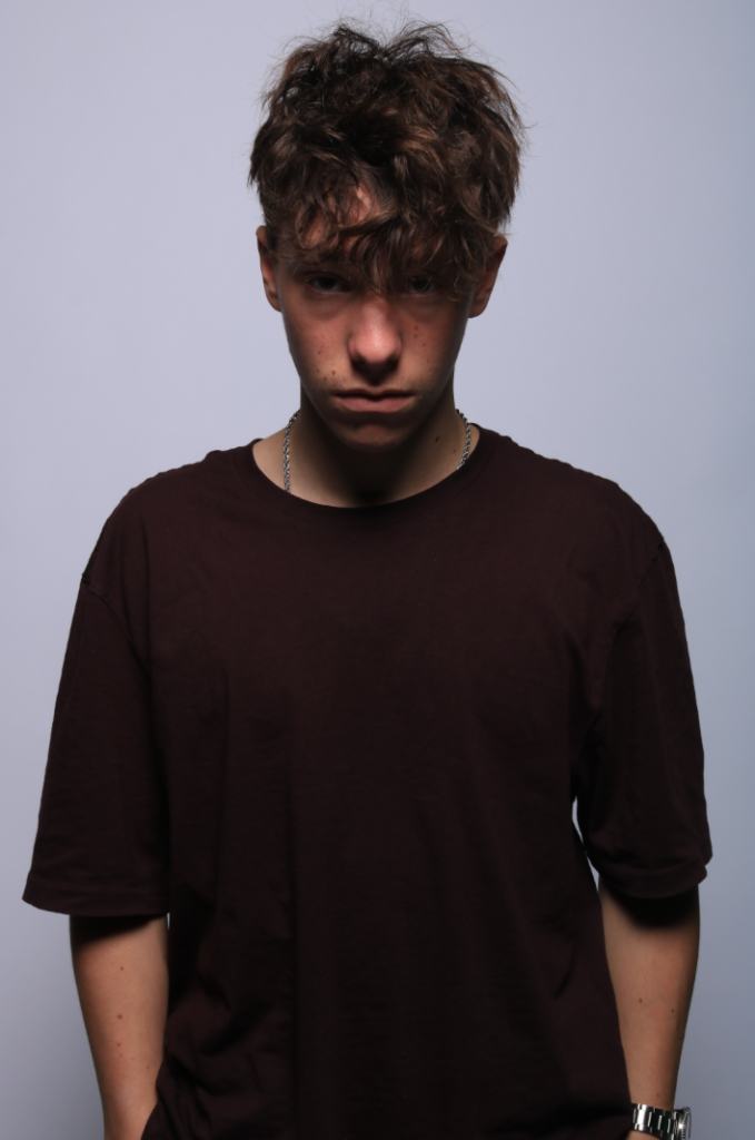
I first tried using this technique with a half body composition, and in both photos the shadow under the nose is clearly visible although in the second one Finn’s head being leaned forward created more shadow around the eye area as well.
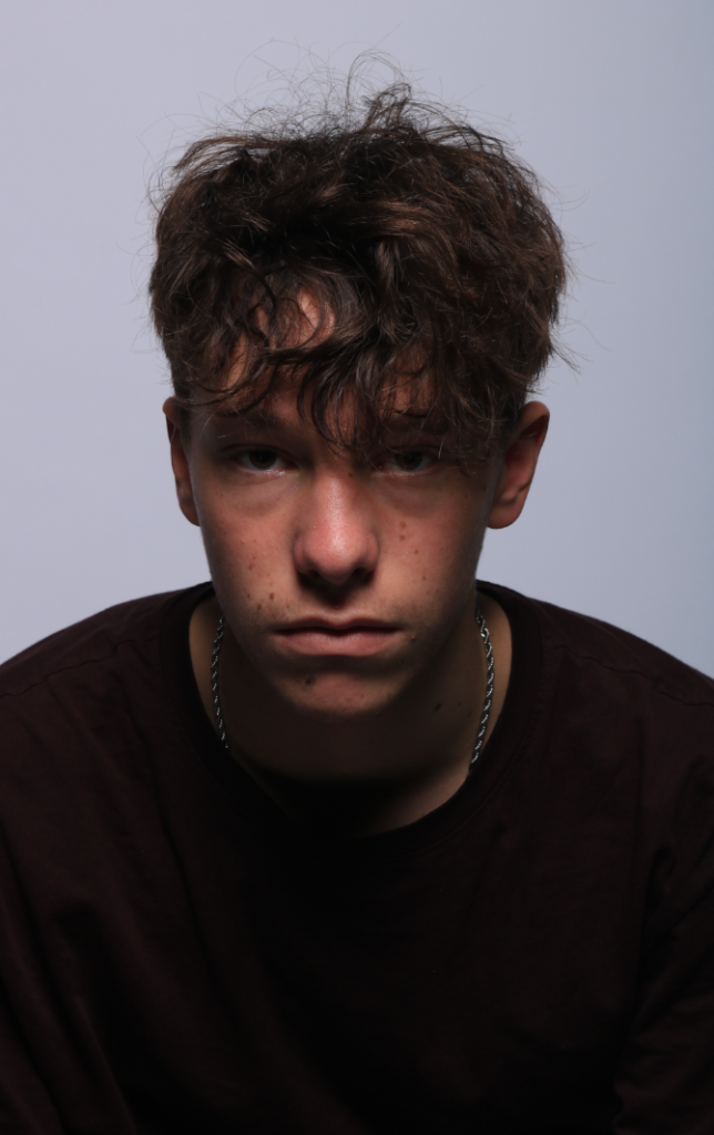
I then tried using this technique with a head and shoulders shot so it’s more zoomed in on the face, and this worked very effectively since you can now more clearly see the shadow under the nose as well as the softer shadows around and below the eyes.
Image Manipulation/Experimentation
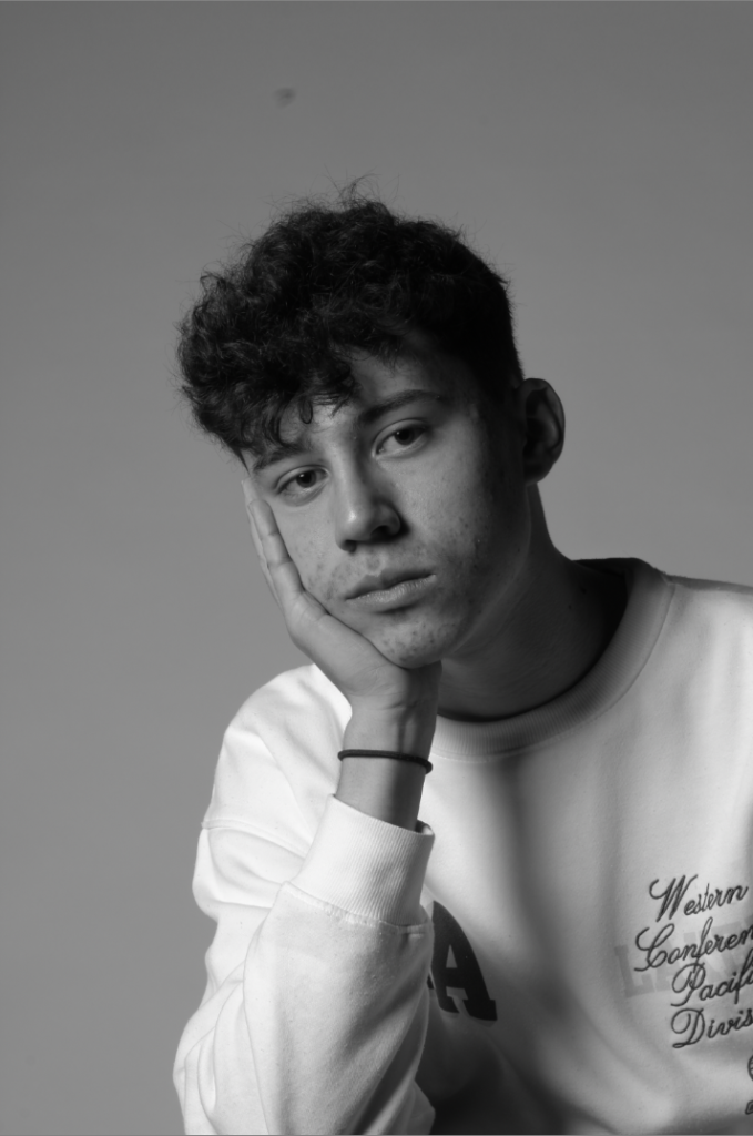
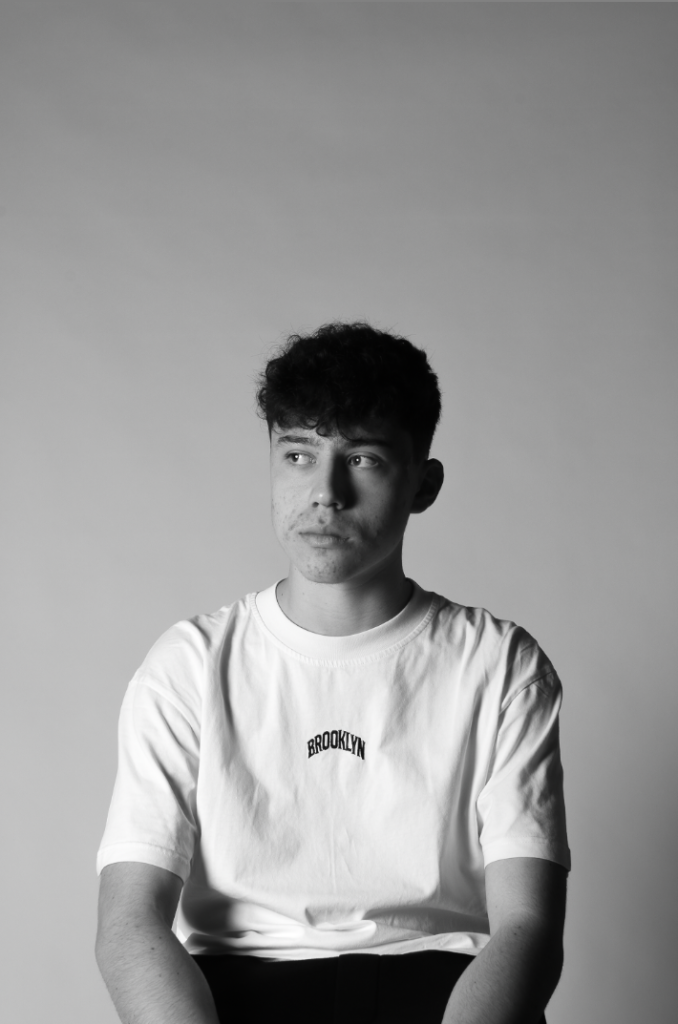
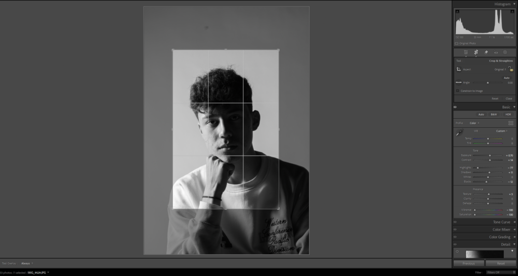
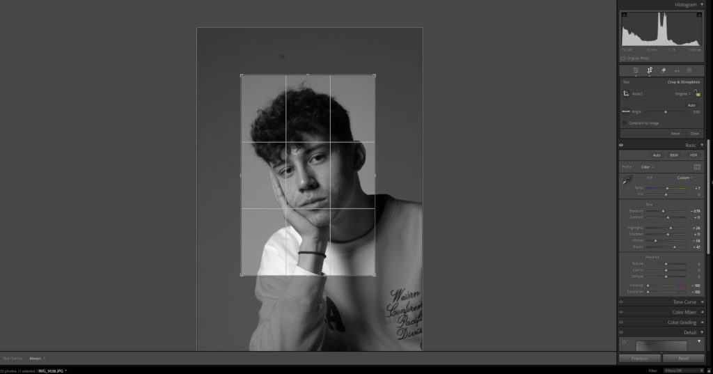
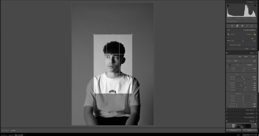
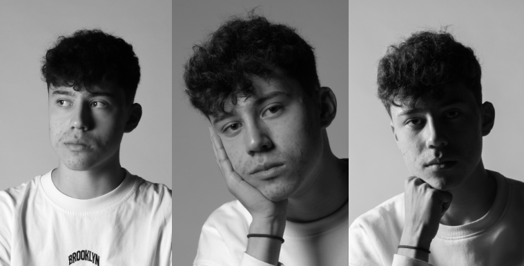
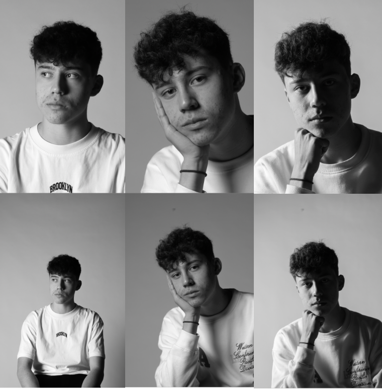
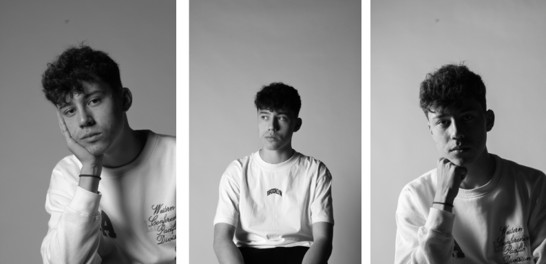
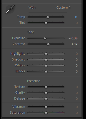
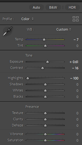
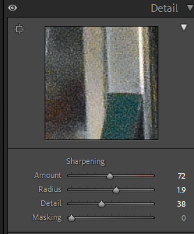
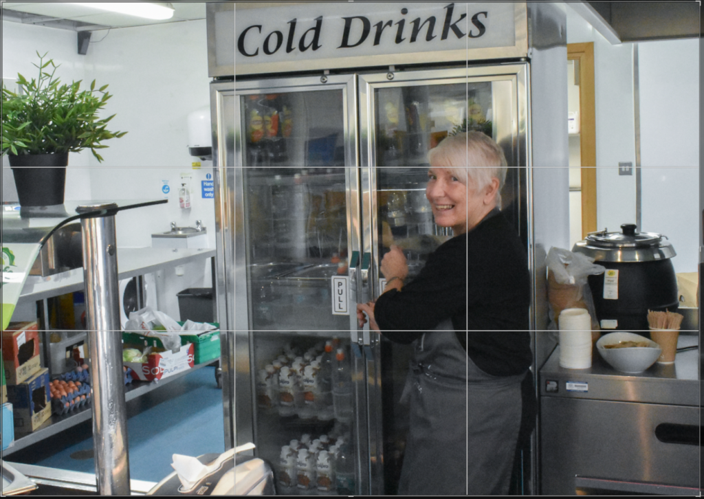
After experimenting in the studio I took some of my best photos and made minor tweaks to them in Lightroom such as cropping them to improve composition and changing the brightness to explore how it affects the lighting and shadows as well as the intention behind the image.
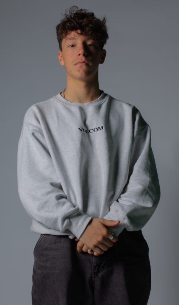
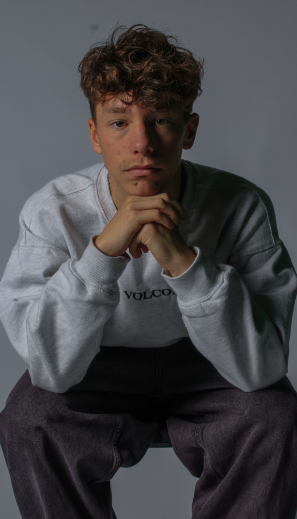
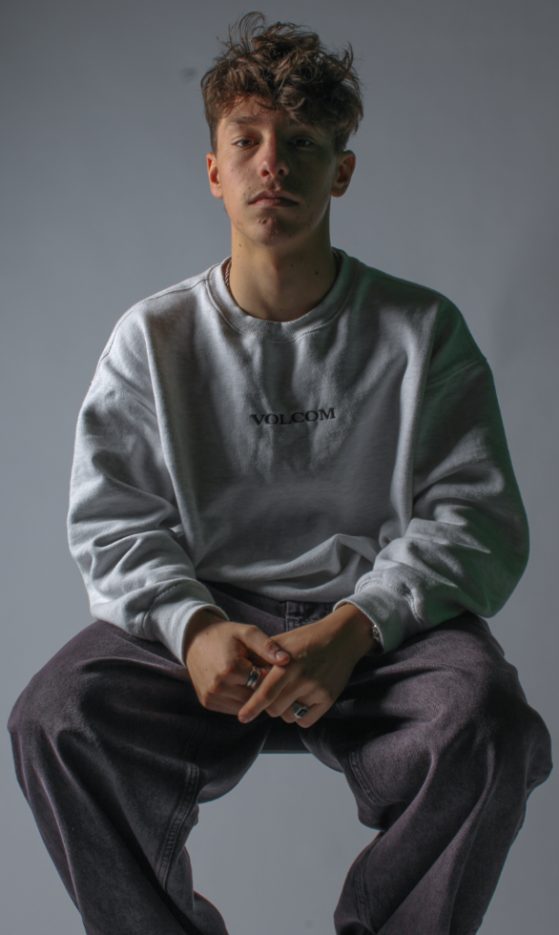
I really liked how these images turned out since after adjusting brightness and contrast it still clearly displays different lighting techniques without being too underexposed or overexposed, and by experimenting with altering the composition via cropping I was able to drastically change some of my images whilst still keeping them interesting and dramatic (such as the bottom right image, which was originally a full body shot that has been zoomed in to turn it into more of a head shot).
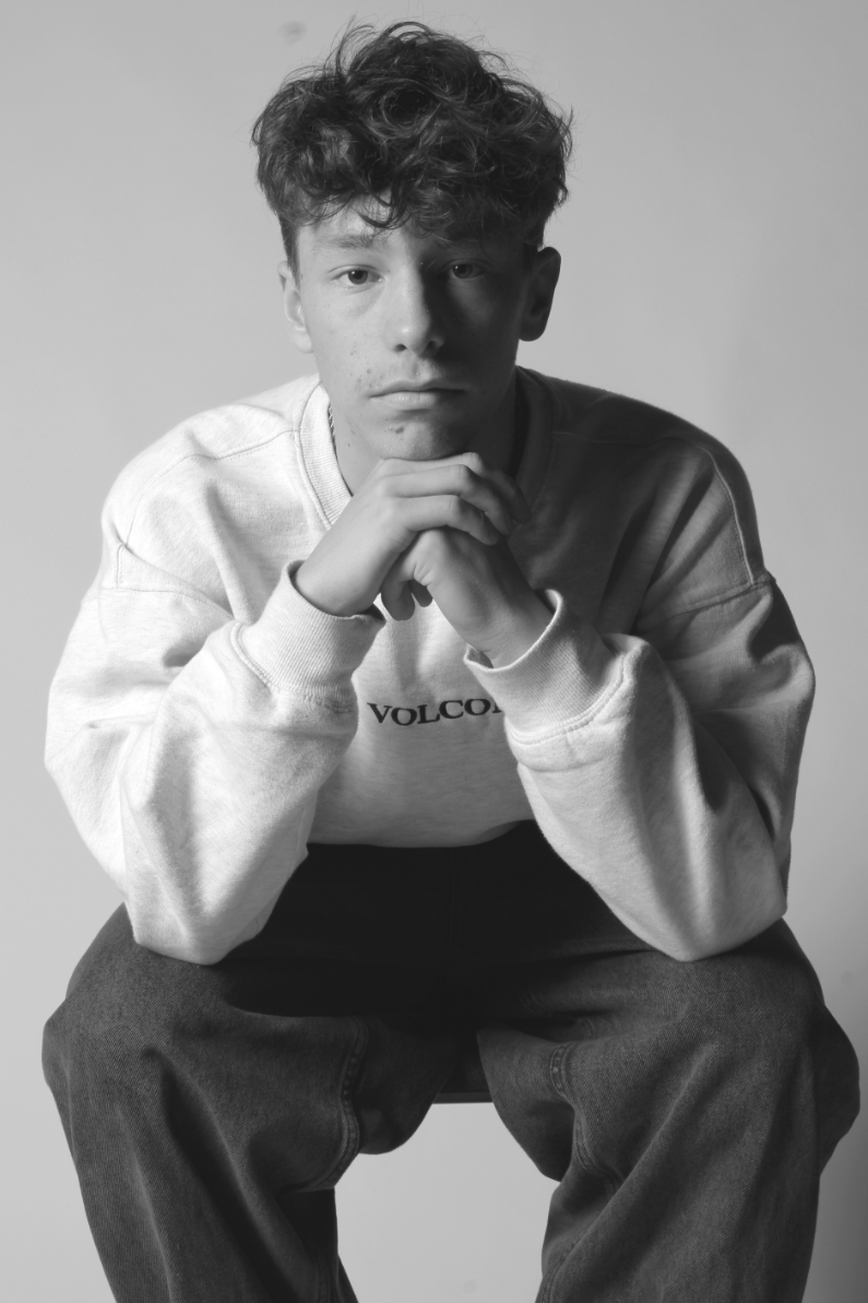
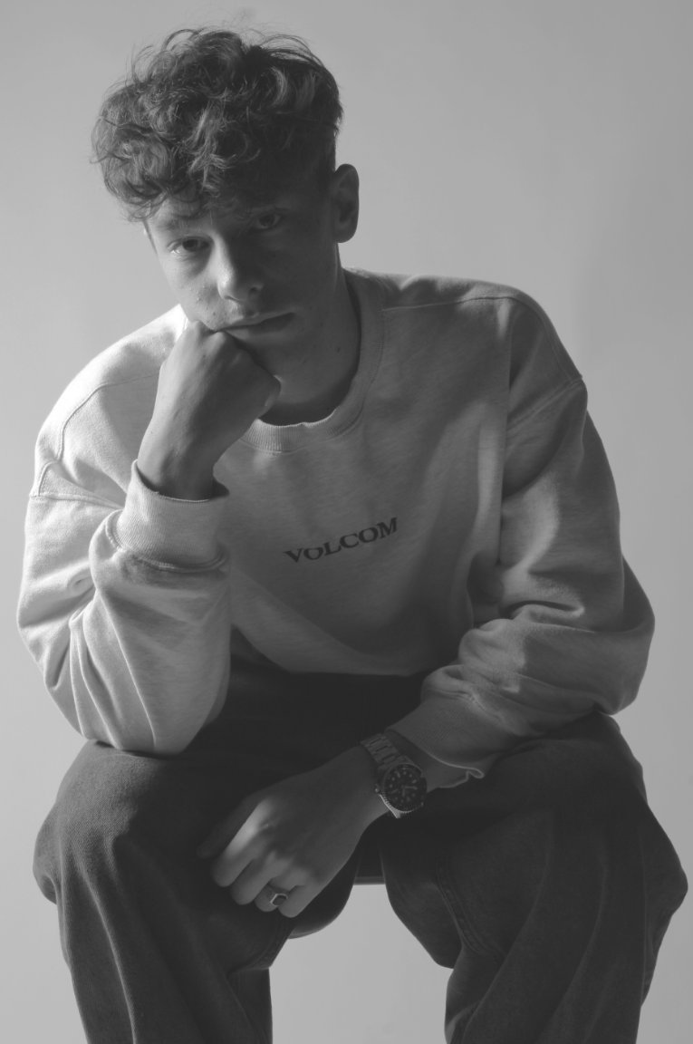
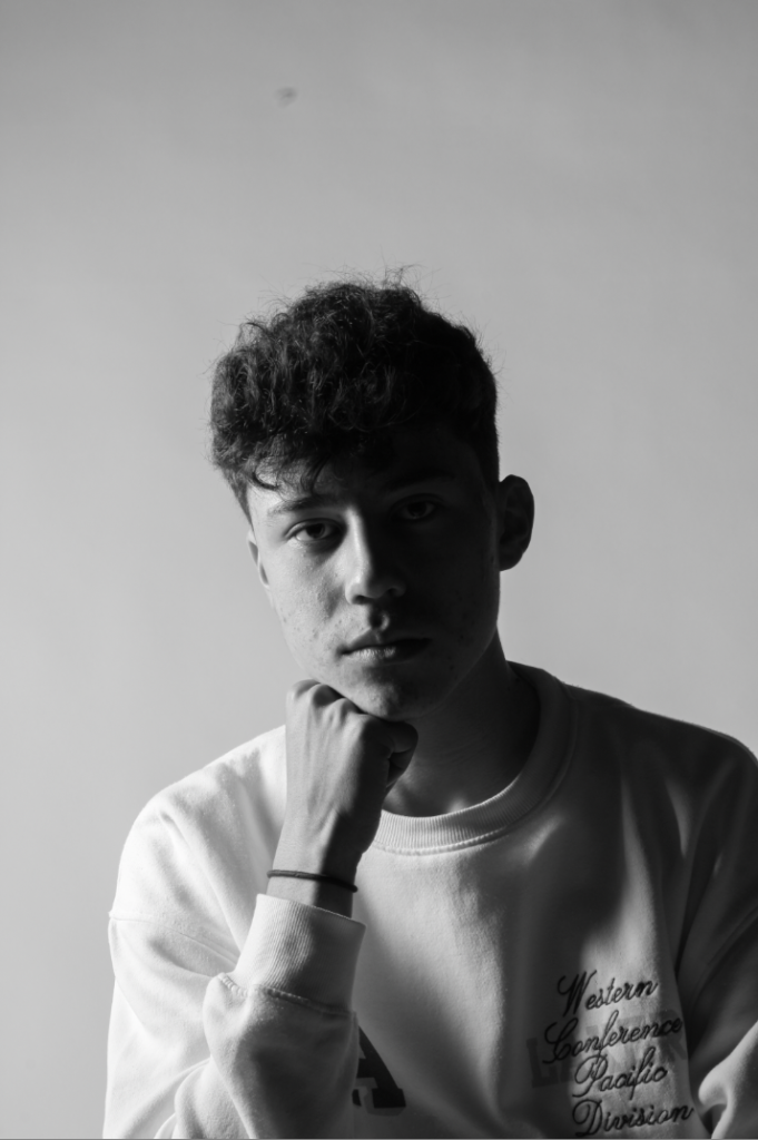
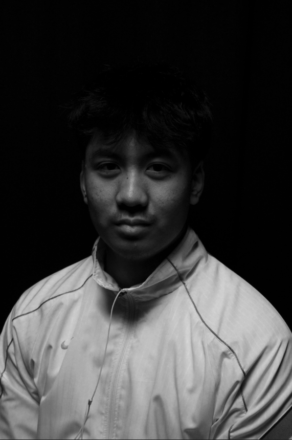
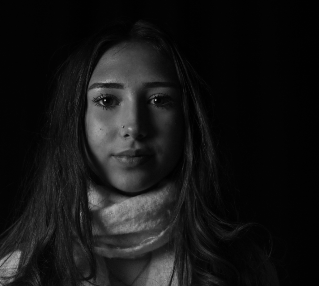
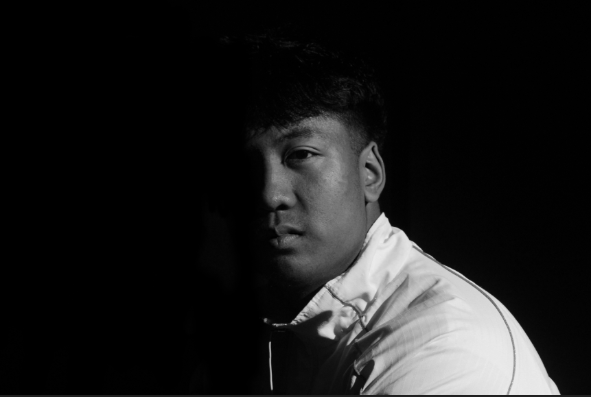
I then experimented with making the images black and white, and found that it really adds to the moody atmosphere initially created with chiarascuro and Rembrandt lighting which helps to build further on the intention behind my photos.
Final Photos
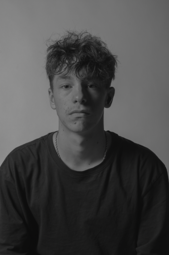
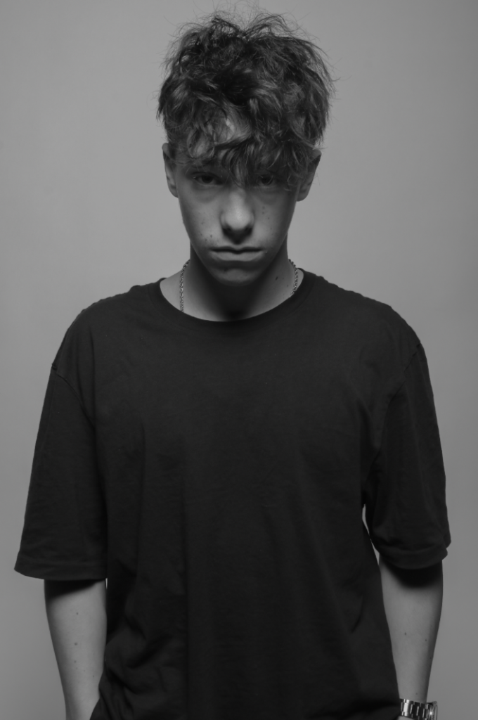
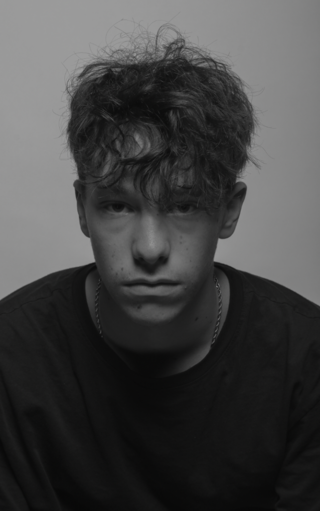
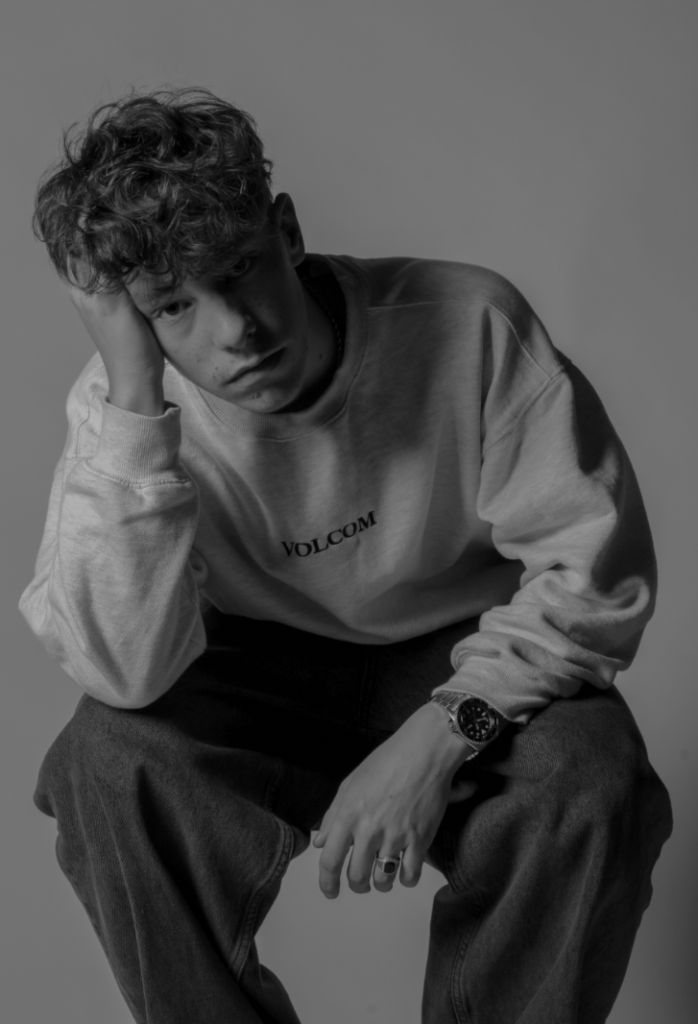
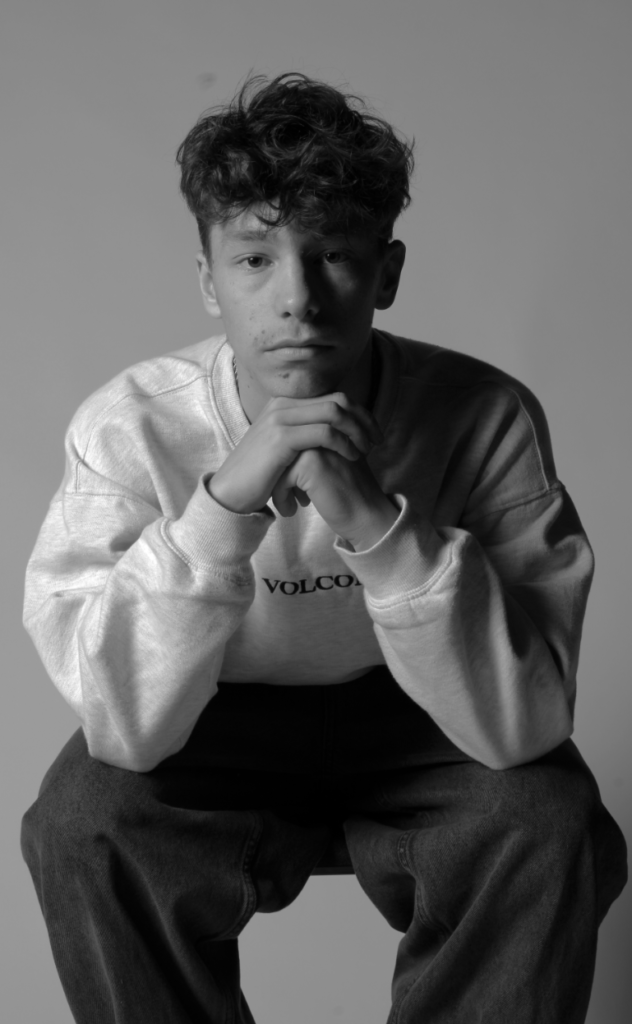
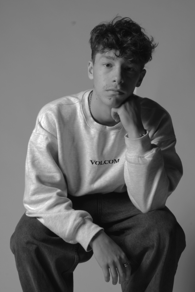
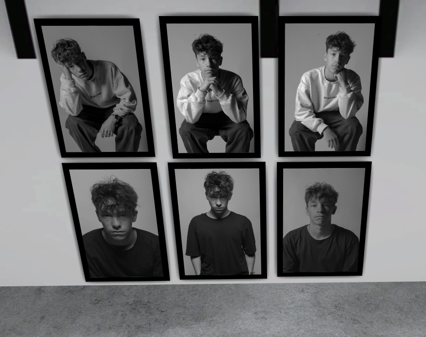
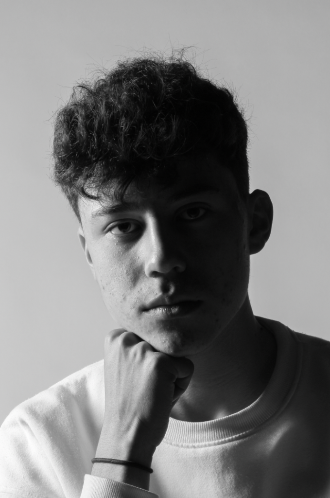
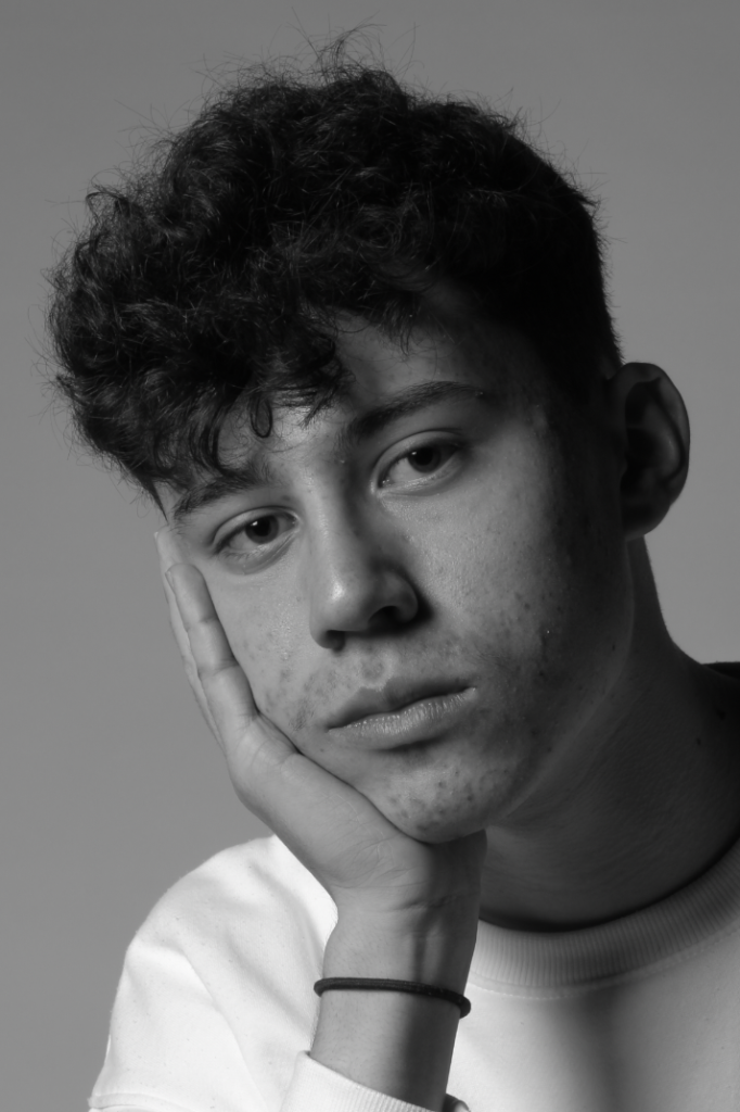
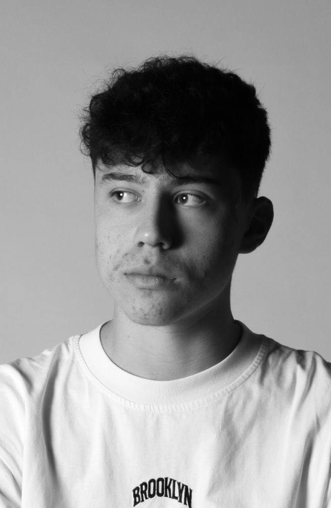
After experimenting with image editing, I decided to keep all the images black and white since I like the dramatic and moody atmosphere it creates when combined with the shadows from the lighting techniques. I also like how the photos are laid out since the top 3 shows a half body butterfly shot in between two head shots, and the bottom three showing different poses and movements as well as having the Rembrandt clearly present in the middle.
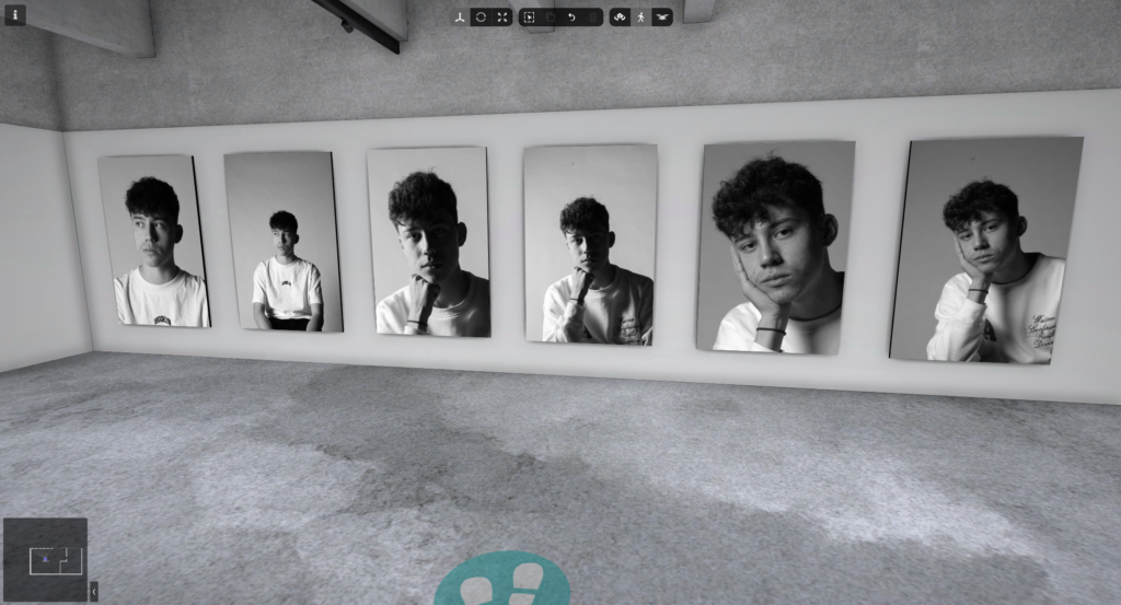
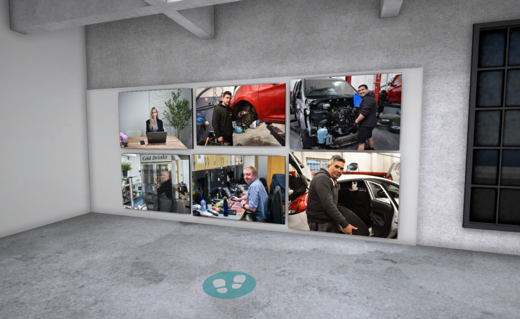
Presentation in Artsteps
