Texture – Homework

Edward Weston (1886–1958) was an American photographer who played pivotal role in the development of modern photography. He took pictures of landscapes and objects in black-and-white, transforming them into modern images that were ahead of their time. His technical and photographic skills were wide-ranging, but he was known to many as a professional of black-and-white images.

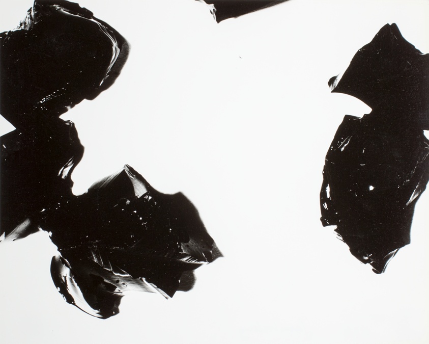
Texture was key to Weston. Using large format cameras, he took pictures of objects and landscapes that had shape, tone and colour depth which are key for a good texture photo, such as, bell peppers or ridges in a seashell. His use of lighting and contrast brought out every subtle detail, giving his photographs a textured but almost three-dimensional quality. The focus on texture made bland, regular objects abstract and pleasing. I will put some of his pictures below.

I plan to take inspiration from the use of depth and shadows from what would otherwise be a normal every day object and turn it into something abstract and visually pleasing.

As you can see above I took over just over 100 pictures of some objects until I found the one that I wanted to use, I then proceeded to take lots of photos of one object with different camera settings and different lighting conditions to get the ideal photo I was looking for. I will now show some of the first objects that I didn’t like the look of and explain why and what I wanted to be different.

Flower Outside –

ISO 200, 3.58 mm, f / 4.0, 1/100 sec

Although this was a good image and did have good texture, it didn’t align with exactly what I was looking for, such as the lighting conditions and it wasn’t what I had in mind from my inspiration from Edward.

Bush Outside –

ISO 100, 6.61 mm, f / 4.0, 1/15 sec

Again, although this was a good image and did have good texture, it didn’t align with exactly what I was looking for, such as the lighting conditions and it wasn’t what I had in mind from my inspiration from Edward.

Bubbles –

ISO 200, 24.7 mm, f / 5.3, 1/30 sec

Although this one was closer with more black-and-white colours, it wasn’t what I had in mind and again it didn’t quite fit in with my inspiration from Edwards work.

Lamp Shade –

ISO 200, 11.21 mm, f / 4.2, 1/60 sec

This one I liked quite a lot and could have been quite versatile to take pictures of but I decided to keep looking after this and found something that was more what I was looking for.

as you can see above I used P and X to flag my images to filter out the bad ones from the ok and good ones, next I rated these images 4 or 5 stars as 4 being ok ones and 5 being good ones, finally I gave them the colour yellow or green, green being the best and yellow being good. I will now edit these images that I selected and present them bellow along with the raw images.

Without Visual Noise –

ISO 200, 3.58 mm, f / 5.0, 0.4 sec

ISO 200, 3.58 mm, f / 5.0, 0.4 sec
ISO 400, 3.58 mm, f / 5.6, 1/3 sec

ISO 100, 3.58 mm, f / 5.6, 0.8 sec
ISO 100, 3.58 mm f / 5.6, 1.3 sec

With Visual Noise –

ISO 800, 3.58 mm, f / 4.0, 2.0 sec

ISO 800, 3.58 mm, f / 4.0, 2.0 sec

As you can see in the images above I have taken pictures of a rubber band ball with and without visual noise. I took the idea from Edwards images of using the randomness of the lines in an object and the depth that it creates to represent texture in my images, I will now edit and represent them in black-and-white and not in black-and-white and show them below.

Edited Not In Black-And-White –

ISO 200, 3.58 mm, f / 5.0, 0.4 sec

ISO 200, 3.58 mm, f / 5.0, 0.4 sec
ISO 400, 3.58 mm, f / 5.6, 1/3 sec

ISO 100, 3.58 mm, f / 5.6, 0.8 sec
ISO 100, 3.58 mm f / 5.6, 1.3 sec

With Visual Noise –

ISO 800, 3.58 mm, f / 4.0, 2.0 sec

ISO 800, 3.58 mm, f / 4.0, 2.0 sec

Edited In Black-And-White –

ISO 200, 3.58 mm, f / 5.0, 0.4 sec

ISO 200, 3.58 mm, f / 5.0, 0.4 sec
ISO 400, 3.58 mm, f / 5.6, 1/3 sec

ISO 100, 3.58 mm, f / 5.6, 0.8 sec
ISO 100, 3.58 mm f / 5.6, 1.3 sec

With Visual Noise –

ISO 800, 3.58 mm, f / 4.0, 2.0 sec

ISO 800, 3.58 mm, f / 4.0, 2.0 sec

As you can see above I used a black and white filter on these images which I got inspiration from Edward to do, in doing this I can see why he used this effect on his work. From this i completed the goal I set myself at the beginning which was to use of the two most simple colours on a simple everyday object and turning it into something that is abstract and visual pleasing which I believe I did successfully.

shutter speed and movement

Shutter speed is essentially how long the shutter in your camera is open for, therefore the longer its open the more light it will let in. So it can be useful in a dark environment, however, as it is open the camera uses that light to create the image so it can end up appearing blurry, sometimes we can use this to our advantage. I will represent this bellow through photographers who have used both fast and then slow shutter speed in their images and then some of my own images.

As you can see on the left the numbers are representing the amount of time the shutter is open, this image better represents the outcome of the shutter being open for longer.

I will switch my camera to the TV setting which is shutter priority shooting mode where I can change the shutter speed and the camera changes ISO and aperture for me, I will show this in the image below.

Eadweard Muybridge is remembered today for his pioneering photographic studies of motion, which ultimately led to the development of cinema. He was hired to photograph a horse’s movement to prove that a horse’s hooves are clear of the ground at a trot.

As you can see above I have taken images with a fast shutter speed and taken inspiration from Eadweard Muybridge, next I will go through the selection process and represent my final images as raw and edited.

as you can see above I used P and X to flag my images to filter out the bad ones from the ok and good ones, next I rated these images 4 or 5 stars as 4 being ok ones and 5 being good ones, finally I gave them the colour yellow or green, green being the best and yellow being good. I will now edit these images that I selected and present them bellow along with the raw images.

ISO 200, 5.04 mm, f / 8.0, 1/320 sec
ISO 200, 13.94 mm, f / 4.5, 1/320 sec

ISO 200, 9.92 mm, f / 4.0, 1/1000 sec

ISO 200, 17.43 mm, f / 4.0, 1/1000 sec
ISO 200, 11.76 mm, f / 4.2, 1/500 sec

As you can see above I have taken inspiration from his work and produced 6 final images, we can see that with a fast shutter speed we get a sharper more detailed image of a moving object.

ISO 200, 5.04 mm, f / 8.0, 1/320 sec
ISO 200, 13.94 mm, f / 4.5, 1/320 sec

ISO 200, 9.92 mm, f / 4.0, 1/1000 sec

ISO 200, 17.43 mm, f / 4.0, 1/1000 sec
ISO 200, 11.76 mm, f / 4.2, 1/500 sec

Francesca Woodman’s family spent their summers at her parents’ farmhouse in the countryside near Florence in Italy and many of her Photographs were taken there. European culture and art had a significant impact on her artistic development. The influence of Surrealist Art, particularly the photographs of Man Ray and Claude Cahun can be seen in the themes and style of her work. She developed her ideas and skills as a student at Rhode Island School of Design.

Her importance as an innovator is significant, particularly in the context of the 1970s when the status of photography was still regarded as less important than painting and sculpture. She led the way for later American artists who used photography to explore themes relating to identity such as Cindy Sherman and Nan Goldin

As you can see above I have taken images with a slow shutter speed and taken inspiration from Francesca Woodman, next I will go through the selection process and represent my final images as raw and edited.

as you can see above I used P and X to flag my images to filter out the bad ones from the ok and good ones, next I rated these images 4 or 5 stars as 4 being ok ones and 5 being good ones, finally I gave them the colour yellow or green, green being the best and yellow being good. I will now edit these images that I selected and present them bellow along with the raw images.

ISO 200, 14.74 mm, f / 8.0, 1/200 sec

ISO 100, 14.74 mm, f / 8.0, 1/4 sec
ISO 100, 10.77 mm, f / 8.0, 1/4 sec

ISO 200, 11.76 mm, f / 4.2, 1/80 sec
ISO 100, 11.76 mm, f / 4.2, 1/30 sec

As you can see above I have taken inspiration from her work and produced 6 final images, we can see that with a slow shutter speed we get a blurry image of a moving object, however, you can use this to your advantage to better the image rather than worsen it in the correct circumstances.

ISO 200, 14.74 mm, f / 8.0, 1/200 sec

ISO 100, 14.74 mm, f / 8.0, 1/4 sec
ISO 100, 10.77 mm, f / 8.0, 1/4 sec

ISO 200, 11.76 mm, f / 4.2, 1/80 sec
ISO 100, 11.76 mm, f / 4.2, 1/30 sec

The History of Photography

What is it –

A camera obscura captures the world by letting light enter through a lens and project an image onto a surface. It requires no power source, relying purely on natural light. Light from the outside scene enters through a lens, hits a mirror at a 45-degree angle, and reflects onto paper or canvas inside. To view the image, one must cover themselves with a dark cloth to block outside light. This setup produces a sharp, colourful image. This can be seen below.
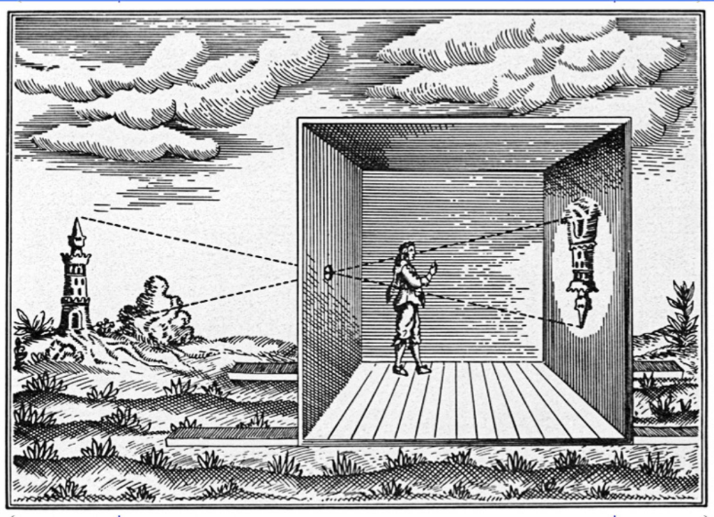
The camera obscura was used for centuries as a drawing aid, allowing artists to project images of the outside world onto a surface. This use predates photography by hundreds of years, leading to debates about whether it should be considered an early form of photographic technology.

Its history –

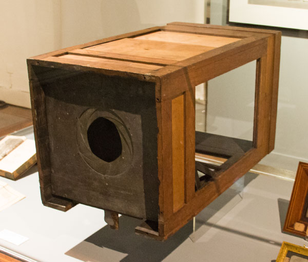
pinhole cameras have existed for centuries, the camera obscura became more effective in the early 1600s with the invention of better lenses, allowing for brighter and clearer images. Artists used it to create detailed sketches, accurately depicting perspective.

How it was used in Photography –

The breakthrough came in the 1800s when combining it with light-sensitive materials allowed for permanent image capture, leading to the first photograph by Nicéphore Niépce in 1826/27. In essence, the camera obscura, though not magical, laid the groundwork for all photography, including modern smartphone cameras.
Who was he –

Nicéphore Niépce is a pivotal figure in the history of photography, often credited as one of the inventors of the medium. He is best known for creating the first permanent photograph in 1826 or 1827, titled “View from the Window at Le Gras.” This image was produced using a process called heliography, which involved a bitumen-coated plate that hardened in proportion to light exposure.

Why wasn’t he always considered the first photographer –

Niépce worked closely with Louis Daguerre, who developed the daguerreotype process, which produced clearer and more practical images. Daguerre’s contributions often overshadow Niépce’s pioneering work, leading many to credit him as the true originator of photography.

His first photograph –
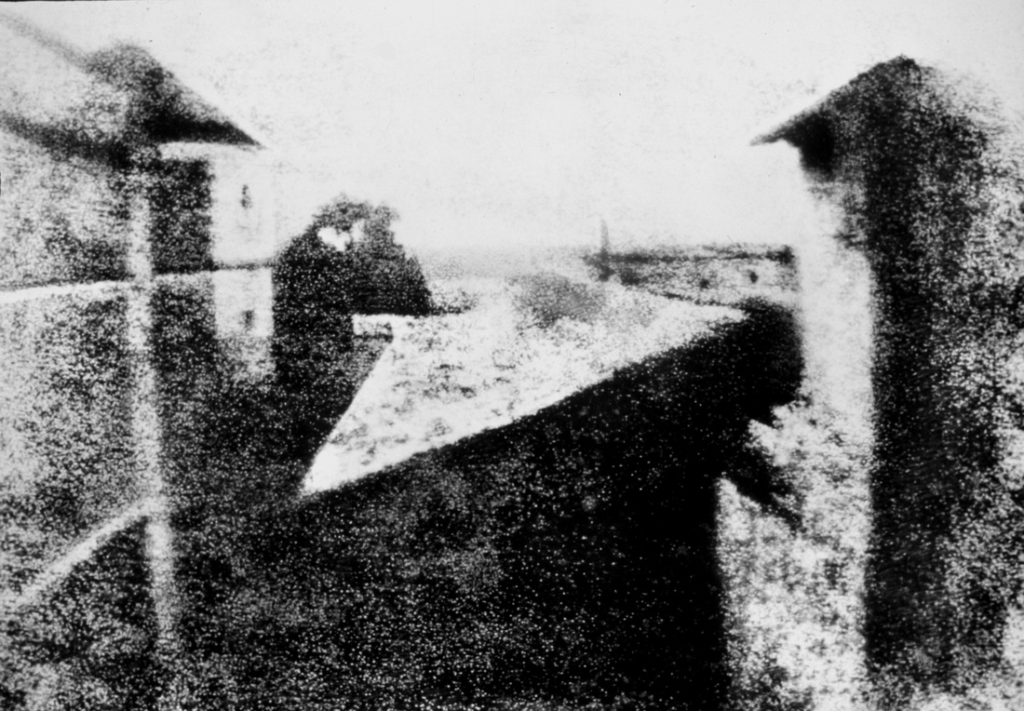
Known as ” View from the Window at Le Gras “

What is Photogenic Drawing

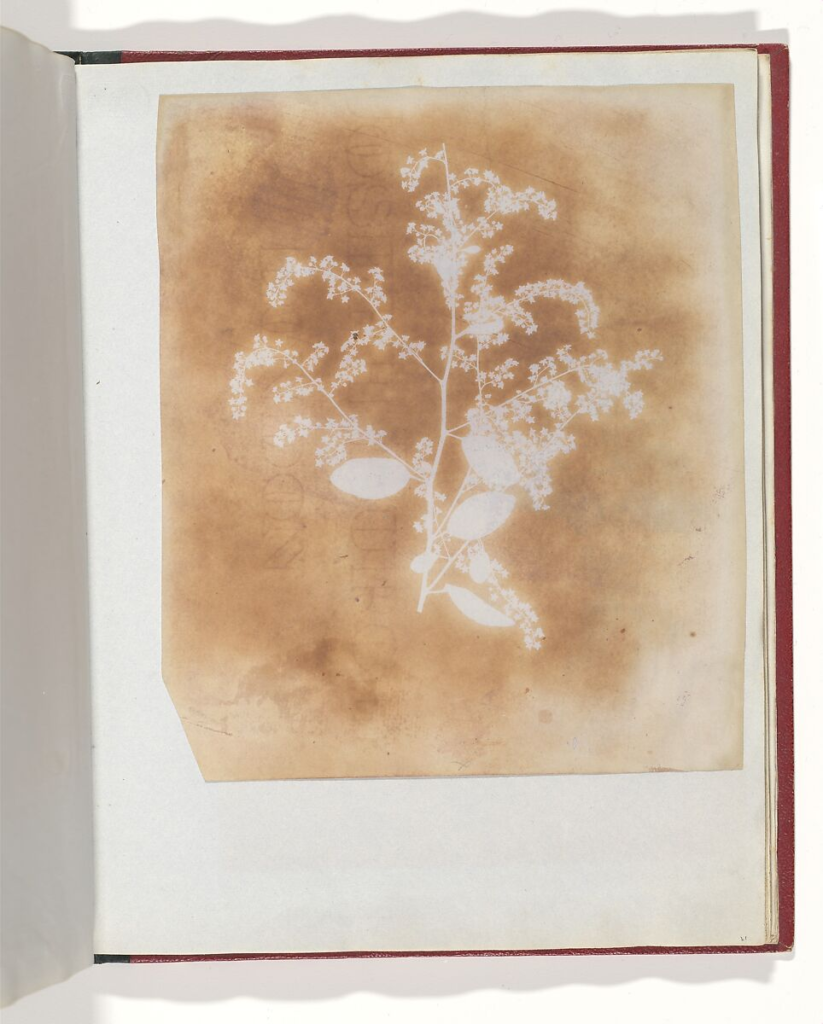
Photogenic drawing, a term created by William Henry Fox Talbot in the 1830s, refers to an early photographic process that involved creating images on light-sensitive paper. He did this by coating paper with silver chloride, which darkened when exposed to light. He would place objects directly on the paper or use a negative image, exposing it to sunlight to create a shadow image. This is an example of his shown below.
How did Talbot’s Mousetraps work –

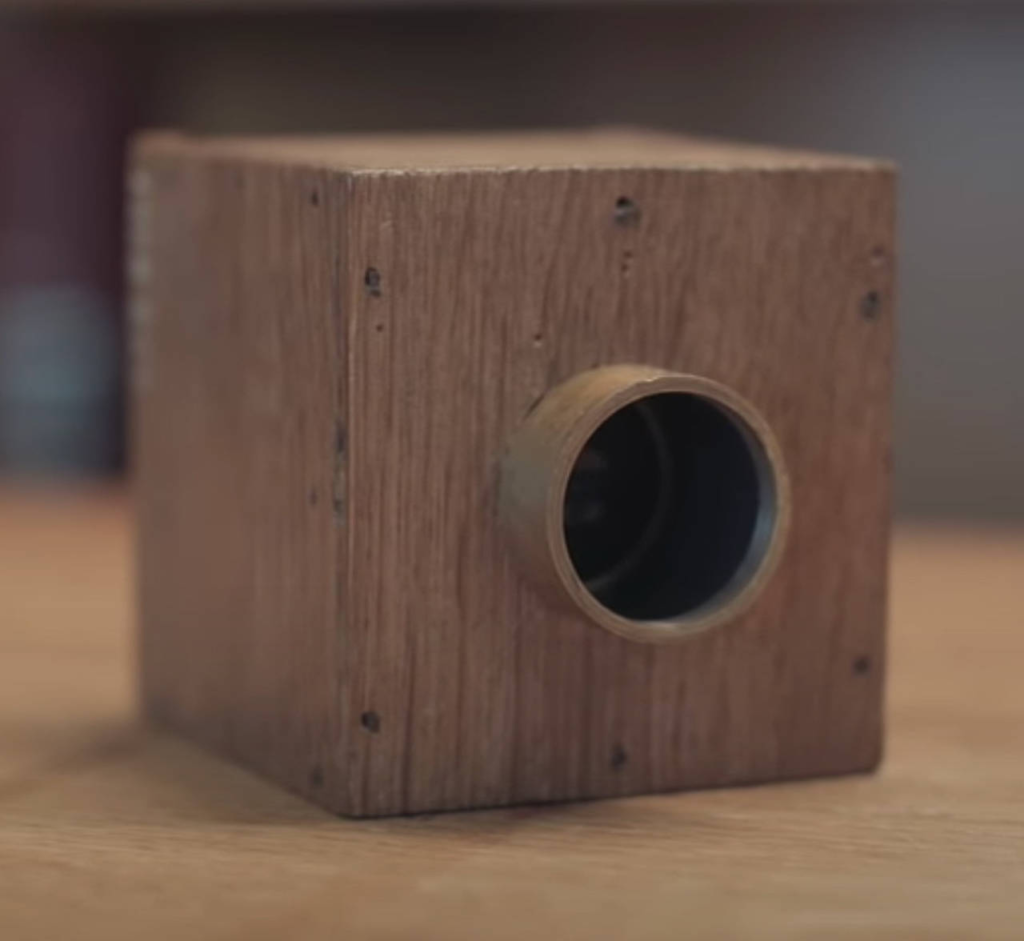
The trap consisted of a baited platform with a spring- loaded lever. When a mouse triggered the lever by attempting to access the bait, the spring would snap, capturing the mouse within a confined space. The design aimed to be both humane and efficient. One of the mouse traps can be seen below.
What is a Daguerreotype –

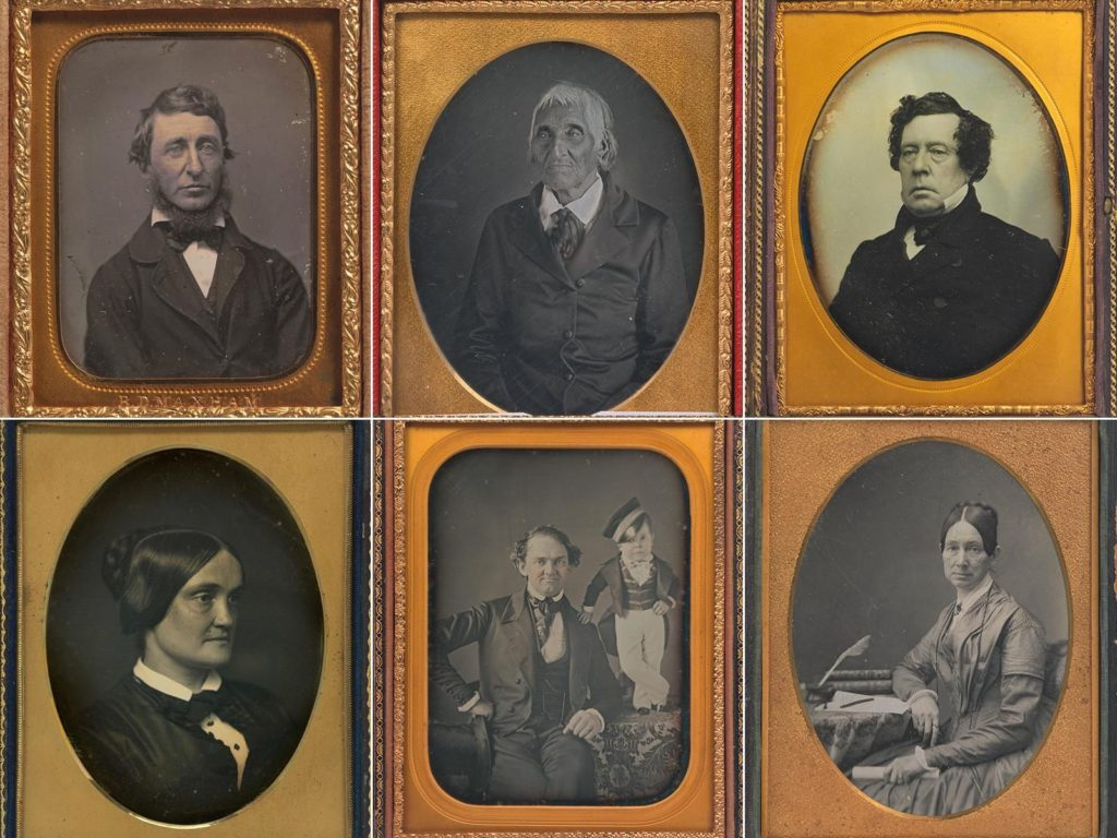
A daguerreotype is an early type of photograph created using a process developed by Louis Daguerre in the 1830s. It involves exposing a polished silver-plated copper sheet to iodine vapor, which forms a light-sensitive layer of silver iodide. After exposure in a camera, the plate is developed using mercury vapor and then fixed with a salt solution. Some of these are seen below.
Why was the daguerreotype not as successful as Talbot’s system –

The daguerreotype process required careful handling and was relatively complex, involving toxic materials like mercury. The calotype process was more straightforward and involved less hazardous chemicals, making it more accessible for amateur photographers.

What did Richard Maddox Invent –

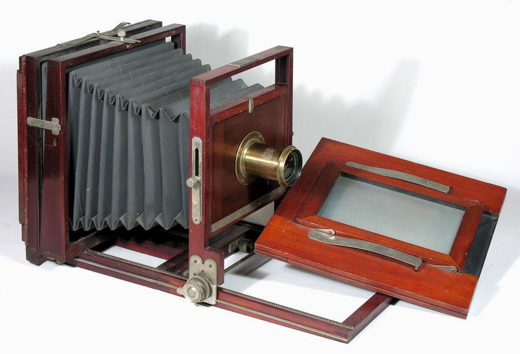
Richard Maddox was a British photographer and inventor known for developing the dry plate process in photography. In the 1870s, he introduced a new type of photographic plate that was more convenient than the wet plates previously used. This was known as the dry plate and it can be seen in the image below.
Why was his invention so pioneering for photography –

Unlike wet plates, which had to be coated, exposed, and developed immediately, dry plates could be prepared in advance and stored for later use. This flexibility allowed photographers to carry plates without the need for cumbersome darkroom equipment on-site.

How did Muybridge work with Stanford –

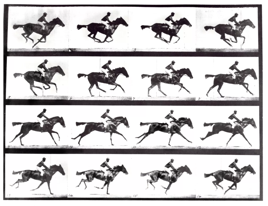
Eadweard Muybridge worked with Leland Stanford, a prominent businessman and founder of Stanford University, in a significant collaboration that focused on motion studies. In the late 19th century, Stanford was interested in whether all four hooves of a galloping horse leave the ground simultaneously. To settle this debate, he hired Muybridge, who was a pioneering photographer known for his expertise in capturing motion. This can be seen below
Why is Muybridge considered the precursor of cinema –

His work inspired later inventors and filmmakers, including Thomas Edison and the Lumière brothers, who built upon Muybridge’s concepts to develop early motion picture technology.

How did he make photography available to the masses

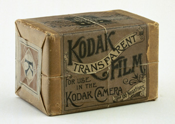
Eastman’s focus on mass production helped lower the cost of cameras and film, making photography financially accessible to a broader audience, on top of this, he developed flexible roll film, which replaced the bulky glass plates used in traditional photography. This made cameras lighter and easier to handle. This can be seen below.
What company did he form –

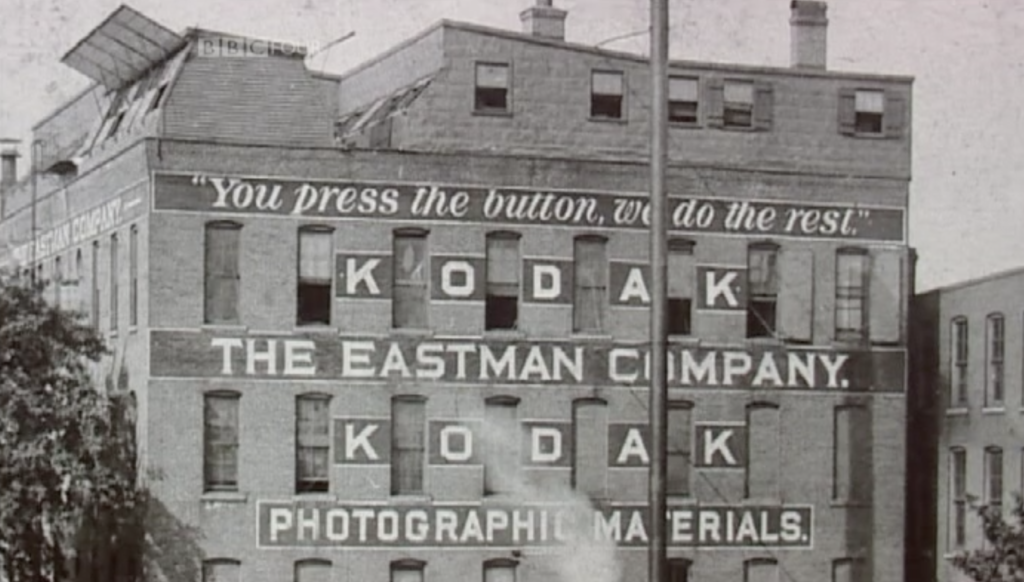
George Eastman founded the Eastman Kodak Company in 1888. The company became a major player in the photography industry, known for its innovative products, including cameras, film, and photographic supplies.

What is Kodak (Brownie) –

The Kodak Brownie is a series of simple, inexpensive cameras introduced by Eastman Kodak in 1900. The Brownie was designed to make photography accessible to everyone, particularly amateurs.
The First Digital Image –

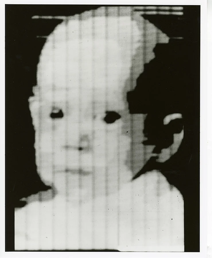
The first digital image is often credited to a photograph created by computer scientist Russell Kirsch in 1957. Kirsch scanned a picture of his infant son. The original image was a 176×176 pixel representation, and it was saved as a binary file. This pioneering work laid the foundation for digital imaging, as it demonstrated how photographs could be digitized and manipulated using computers. This image can be seen below.
How was it done –

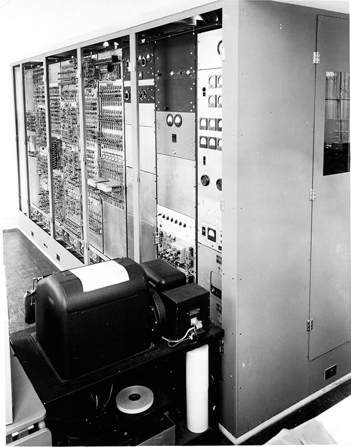
the first digital image was called a drum scanner. This device scanned the photograph by rotating the image on a cylindrical drum, capturing it line by line and converting it into a grid of pixels, which could then be processed and stored digitally. The drum scanner was an early example of how analogue images could be digitized for use in computing. It is shown below.
Artist research – ( Henry Mullins ) –

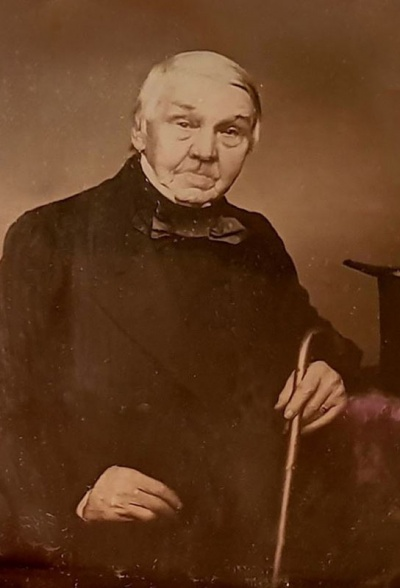
Henry Mullins was a notable photographer in the mid-19th century who worked in Jersey, one of the Channel Islands. He is particularly recognized for his use of the daguerreotype process, one of the earliest forms of photography.

Mullins set up a daguerreotype studio in Jersey around the 1840s, where he captured portraits and landscapes. His work contributed to the popularization of photography on the islands and reflected the artistic and technological trends of his time.

The daguerreotype process, known for its sharp detail and clarity, allowed Mullins to create high-quality images that were highly sought after. His contributions are part of the broader history of photography, showcasing how the medium evolved and became integrated into everyday life. Below we can see an image taken by him.
Focus control and aperture

AF –

AF or auto focus automatically does it for you so you don’t need to worry about it and can make it quicker and easier to take photos.

MF –

MF or manual focus means you have to do this yourself and can take more time, however, if you are good at doing this then you may come out with a better outcome than the camera would for you.

The focal length of a lens is the optical distance (usually measured in mm) from the centre of a lens and its focus. This determines what you “see” when using a camera. This can be visualized in the image below.

Aperture in photography is the opening of the camera lens, which is related to the amount of light that passes through the camera lens to the image sensor. The aperture mechanism in the lens that allows more or less light to come in. This can be seen below.

Depth of field is the distance between the closest and farthest objects in a photo that appears acceptably sharp. This is represented below.

Ralph made his living as an optician, born in 1925 and died in 1976. He was a member of the Lexington Camera Club and pursued his passion for photography outside the mainstream. He experimented with various strategies including multiple exposures, motion blur, and other methods of photographic abstraction. Two of his series are particularly concerned with focus and depth of field, both stretching the expressive potential of photography, film and cameras when looking with the ordinary world. Some of his work can be seen below.

You can see here with an aperture of 2.8 everything but the plane appears to be blurry.

You can see here with an aperture of 5.6 everything is still blurry but less so than before, but the image is still focused on the plane.

You can see here with an aperture of 11 the image is now much more sharp and clear and everything is coming into focus, however, the plane is still more focused than everything else.

You can see here with an aperture of 22 the whole image is now clear and sharp, on top of this, the background is now the same as the plane.

This experiment clearly represents how aperture effects an image.

Paper Experiments

I have taken images using paper to try create some unique abstract images. The artist who has inspired my images is named Francis Bruguière.

Francis Bruguière

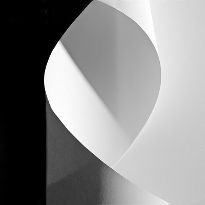
Francis Bruguière is an American photographer who was famous for creating amazing images using only paper and light. He was introduced to photography by Alfred Stieglitz (Photographer and modern art promoter) in 1905 where after studying painting in Europe he became acquaintances with Stieglitz who accepted him as part of the photo-secession. He experimented with many different options with his photographers and in 1927 he created the Cut-paper abstraction piece which became really popular. He was able to capture this image by cutting up the paper and folding it in a way which is used to make unique details and make it look 3D, he would then use light to shine through the paper which would then result in shadows being created against the paper which resulted into making some amazing images.

Cut-paper abstraction – 1927 by Francis Bruguière

My Texture Photoshoot:

As you can see there is a lot of images that weren’t selected as I felt like they weren’t really up to quality compared to Francis Bruguière’s work. Some of these images also didn’t contain the 3D appearance I was looking for.

My Favourite Images

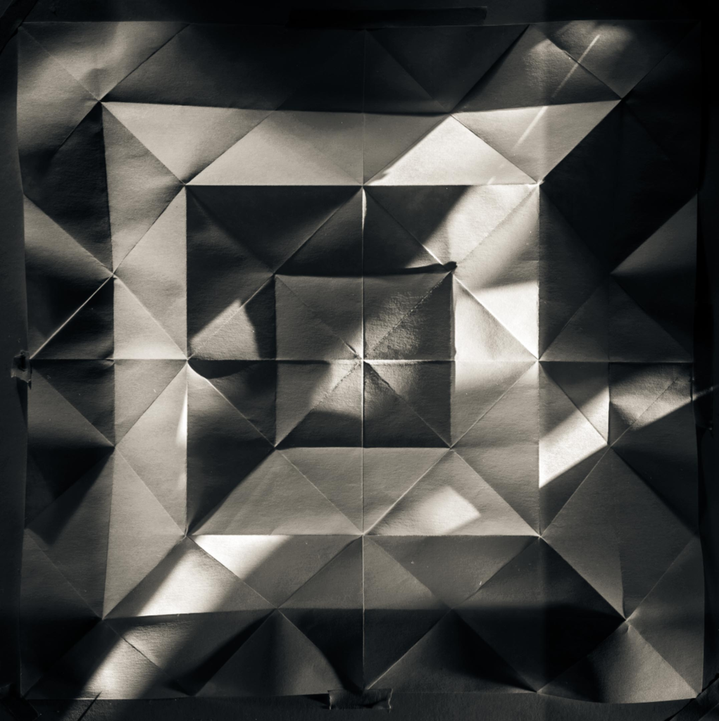
I selected these images as they looked the most appealing compared to the rest, you can also see how they’re structured in a way that gives it that 3D look and you can also see the amount of shadows it creates against the paper and floor.

My Favourite Images Edited

With these images I edited them by changing the image temperature up to around the mid 20s which gives it this yellow tint which brings out more detail in the image and also matches the kind of colour Francis Bruguière’s photo uses, I also turned up the contrast high in order to get a better visuals with the shadows, as well as slightly increasing the exposure to give the image more light. I also lowered the highlights of the photo to make it less bright in some areas to increase detail. The final results after applying these changes are these images where its easy to identify the shadows in the image as well as preserving the detail of the paper pattern.

Focus, Control and Aperture

Aperture

The aperture is the opening in the lens that allows light to enter the camera and onto the sensor or film. The size of this opening can be adjusted by changing the aperture settings. Take a look at the picture of a lens aperture above. Notice the adjustable blades that can move to adjust the size of the opening.
Focusing on a camera

Manual focus (MF) is the function to let the photographer adjust the focus manually instead of the camera. Although autofocus (AF) shooting is more typical in digital cameras, MF is effective when focusing is difficult with autofocus, such as in macro shooting.

Focal length

Focal length is the distance (measured in millimetres) between the point of convergence of your lens and the sensor or film recording the image. The focal length of your film or digital camera lens dictates how much of the scene your camera will be able to capture.

Depth Of Field

Depth of Field refers to the distance between the closest and farthest objects that appears acceptably sharp in a photograph. In other words, it’s the area in front of and behind the subject that appears in focus. It helps distinguish the foreground from the background to create a focal point that draws the eye and tells it where to look.

Ralph Eugene Meatyard

Ralph Eugene Meatyard was a visionary photographer known for his dreamlike black & white photographs of family members in masks, elegant portraits of bohemian friends and radical experiments in abstraction. Meatyard liked to experiment with ‘No focus photos’ which are blurry photos.

These would mean that he had probably used manual focus on his camera to capture these blurry photos. He also took quite a few photos of ‘Zen Twigs’. With his study of “Zen Twigs” Meatyard examined the mysterious forms of tree branches photographed close-up with a low depth of field. The camera’s focus on the twig detail contrasts with the obscured shapes of the background.

Texture

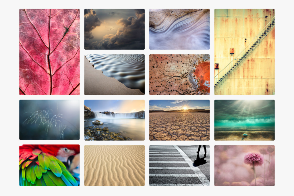
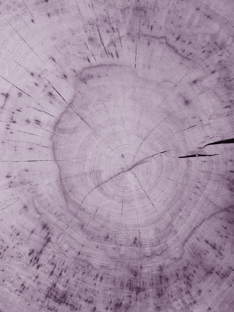
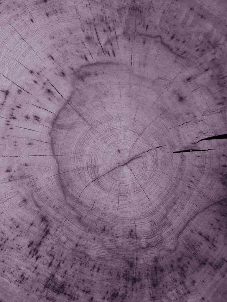
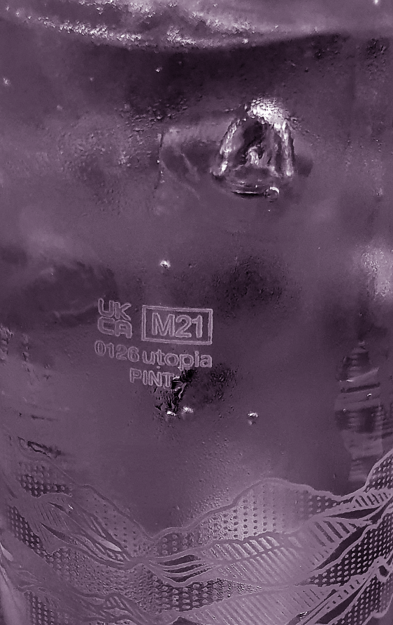
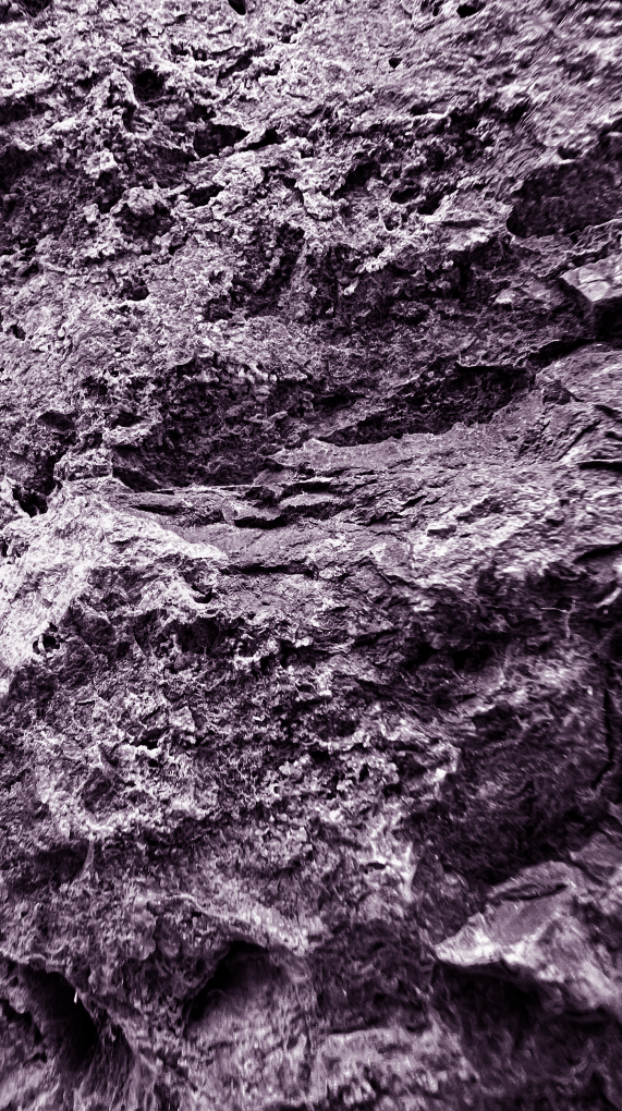
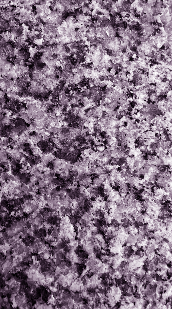
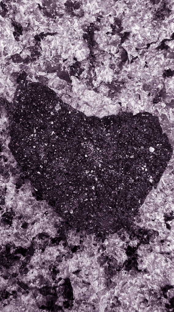
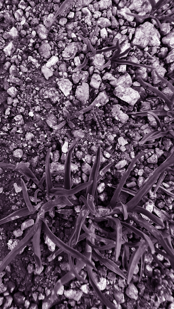
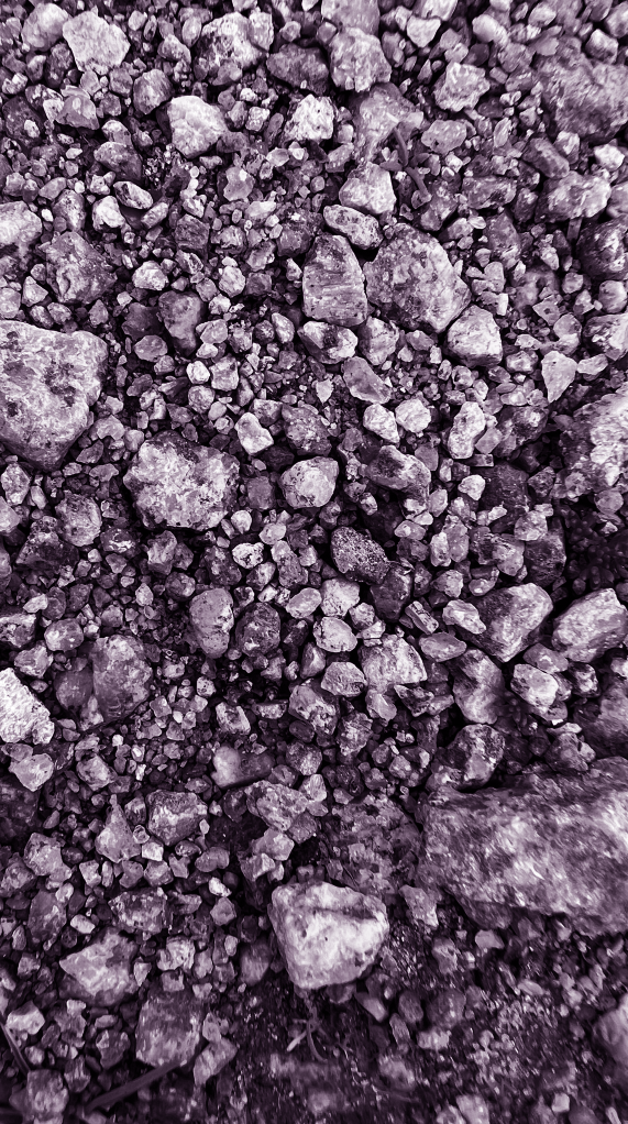
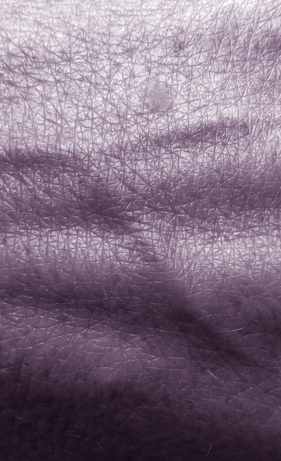
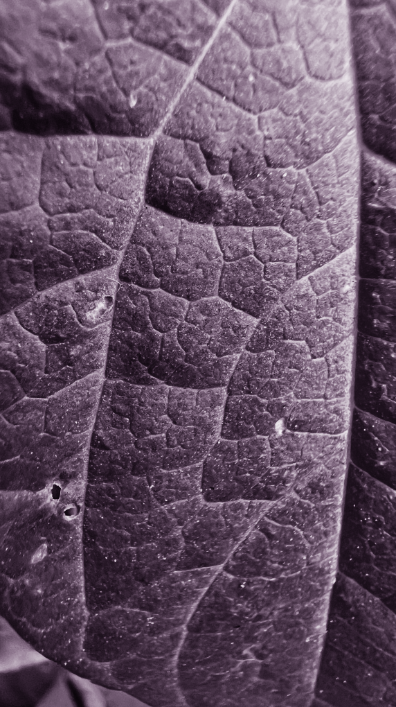
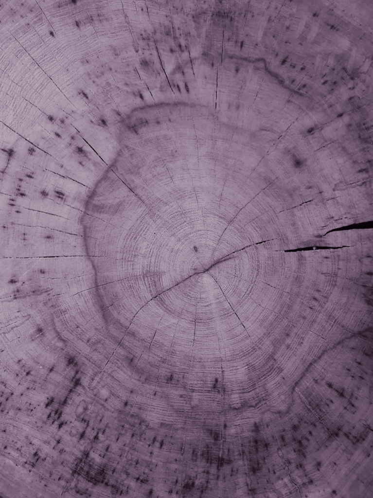
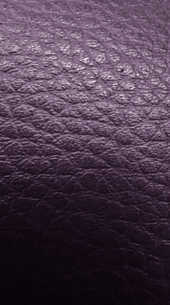
Everywhere we look there are textures, no matter if the object itself looks bland from far away or up close. But if we use a digital camera or smartphone, we are able to see all the intricate details hidden away from our very eyes. This is achieved by using a zoom range of around 3X to 10X which is quite is common and can be suitable for general photography. For more specialized purposes, such as wildlife or sports photography, a camera with a higher zoom range, such as 20X or more, might be preferable. These Zoom ranges can help us achieve photographs like these…

Visual Elements (Formal)

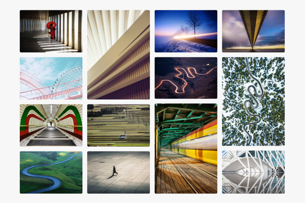
Visual elements are the devices and techniques applied by photographers when taking a photograph to ensure that the outcome is pleasing both aesthetically and meets the photographers intentions. The visual elements are like a set of tools that can be used to construct a great image. There are a total of 7 elements that we tend to use in Photography; Line, Shape, Space, Repetition, Texture, Colour, and Value/Tone

Line

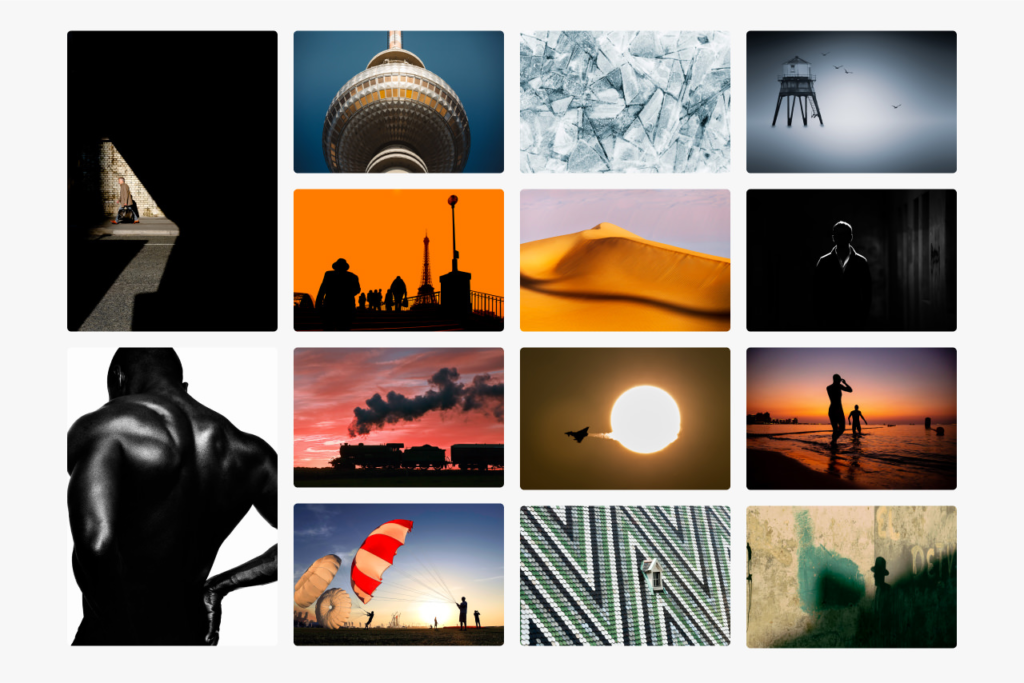
Shape

Regarding Shape in photography, this usually means a 2D subject outline. In contrast, form refers to a shape with a more 3D appearance. We’ve put these two together for this video as one formal element. Effectively representing shape and form in your compositions can turn objects, landscapes and figures into defined, striking focal points. Using various lighting techniques, such as backlighting, silhouettes, and paying attention to shadows, will help elevate the shapes and forms in your shot.

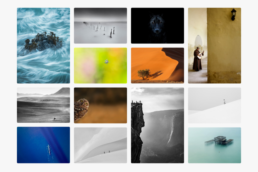
Space

Building Space into your compositions creates a sense of scale and brings added depth to your shot. It can also provide breathing room for your image’s main subject, allowing the viewer to focus on the scene’s primary features. Adding space to your compositions is particularly useful with outdoor photography, where you may want to emphasise the scale of geographical features, such as mountains and bodies of water. However, you can add space effectively when shooting almost any photographic subject.

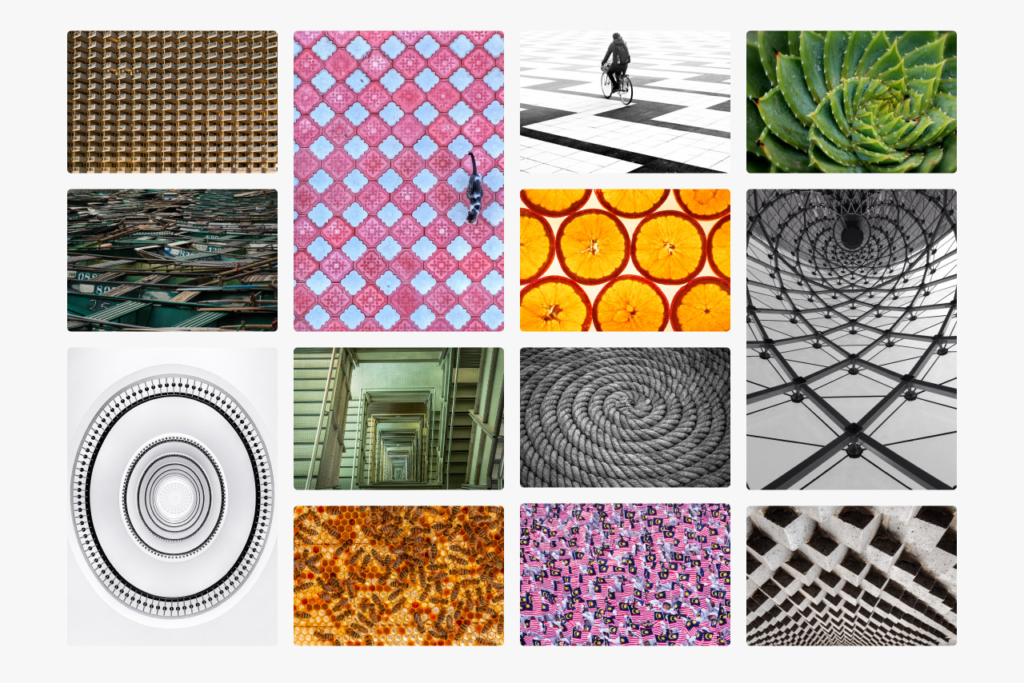
Repetition

Symmetry and Repetition make interesting photographic subjects. And when you start looking, you’ll see a surprising amount of patterns around you in the natural and built environment. Often flat, even light works well for patterns as it emphasises its repetitive nature equally throughout the shot. But for some patterns that are more 3D in nature, you may want to experiment with a range of lighting setups to help bring them out. Some of the most striking patterns, such as aerial shots or extreme macro photography, can be those not usually visible to the human eye. But you don’t need to invest in a drone or a fancy macro lens to shoot patterns.

Texture

Texture in your composition can bring your image to life by giving the viewer a tangible connection with it, and is particularly popular in macro photography. You can draw textures out of all kinds of surfaces and environments. And to do this, you can use a wide range of lighting setups and shoot with a variety of depth-of-field. Textures are ideal for experimenting, try different setups and see what you like. You can use flat light with the camera head-on to bring out the surfaces of a weathered wall. Or, use backlighting for ripples in dunes, shallow depth-of-field for intricate materials, and long-exposure to get the silky-smooth look of flowing water.

Colour

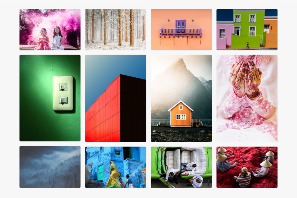
A prominent Colour in your image – whether it’s a concrete colour block or a set of similar colours that form a palette can make a bold statement in your shot. Colours can also convey a mood to your image that will be emotive to the viewer. And you could also single out one particular colour to make a striking statement and have it ‘pop out’ of your shot.

Value/Tone

Focusing on Tone in your image means using variables of contrast and light and dark areas to bring depth to your image.
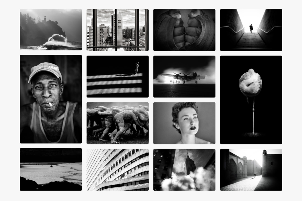
The tone is fundamental in black-and-white photography, where it should be used to guide the viewer through your image where there is no colour present to focus their attention. Practice makes perfect when it comes to tone, and we recommend trying different lighting scenarios and contrast levels for your preferred aesthetic.

Exploring abstraction in photography with Francis Bruguière, Jaroslav Rössler and others.

Many Photographers focus on texture in their images as capturing texture in a photograph can add visual interest, highlight unique patterns, or even evoke emotions. Texture photography overlaps with many kinds of photography, including everything from fine art to classic portraiture.

Here are a few Photographers that focus primarily on texture in their images that I will be looking deeper into…

Francis Bruguière

Bruguière was an American photographer who moved to London in 1928 where he began to experiment with non representational photography. Of these, the cut paper abstractions are particularly beautiful. The photographer exploits the endlessly subtle qualities of both paper and light, manipulating both in order to create complex patterns of texture and form.

Jaroslav Rössler

Rössler was a Czech avant-garde photographer who became known for combining different styles of modern photography including cubism, futurism, constructivism, new objectivity, and abstraction. His photographs often reduced images to elementary lines and shapes, exploring the contrast of light and shade. He experimented with a wide range of techniques and processes including photograms and double exposures

Jerry Reed

Jerry Reed is an English photographer who claims his objective is to sustain the interest of the viewer through his photographs. He focuses heavily on a contrast in the shadows from the light on the paper, giving a very two-toned effect.

Brendan Austin

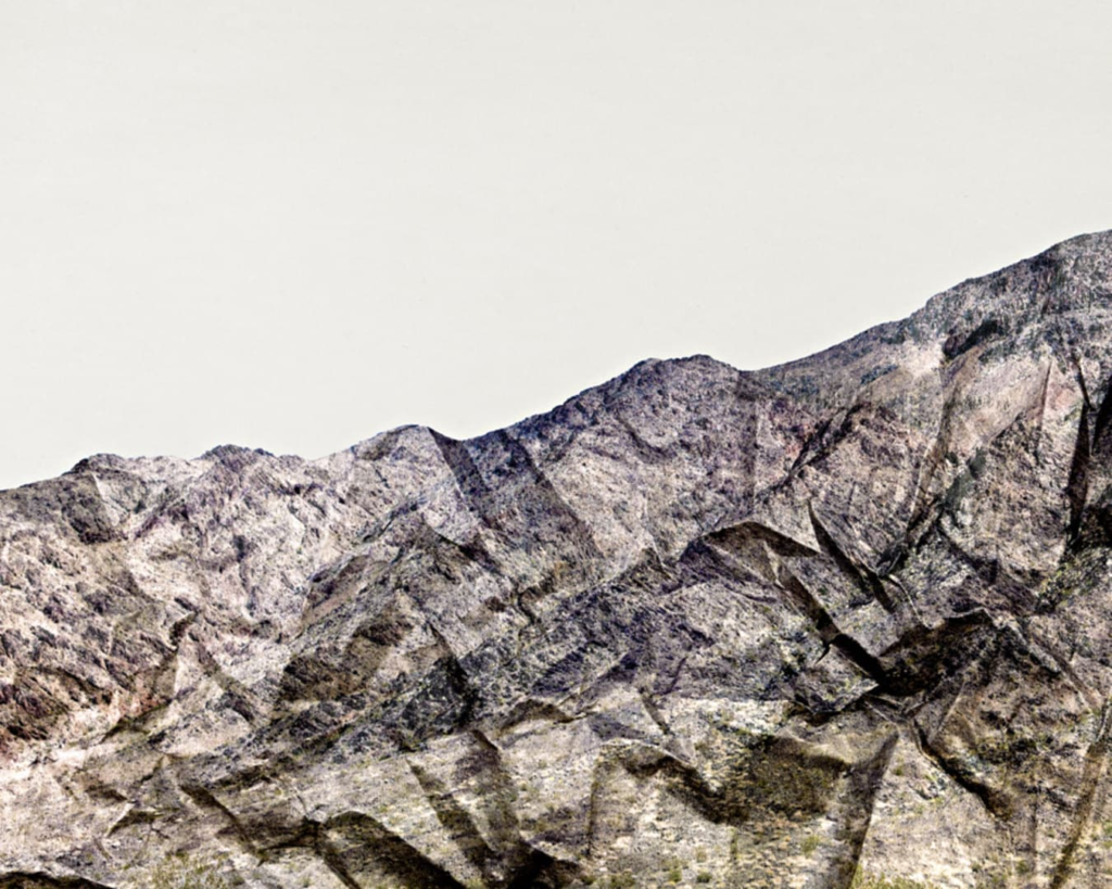
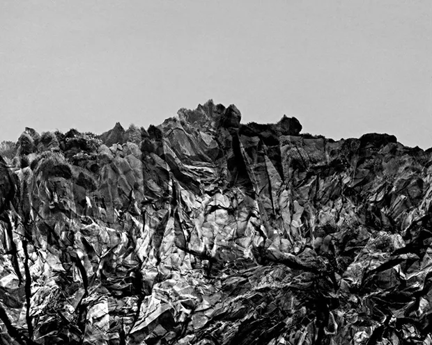
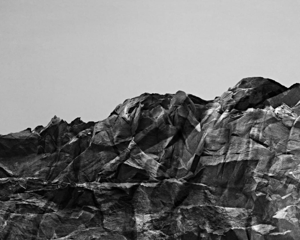
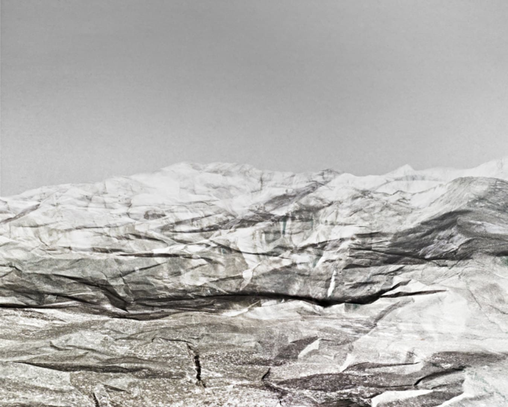
Brendan Austin creates imaginary landscapes out of crumpled pieces of paper. He calls them ‘Paper Mountains’. Austin examines what we mean by nature and the way humans have impacted upon it. “The isolated desert city running on oil generators, the mars like landscapes of a volcanic environment and the mountains made from paper all attempt to start a conversation concerning the loss of meaning and reality.” The resulting images appear both recognisable as landscapes but also suggest a sense of artifice. Humble materials are made to carry an important message

Howard Lewis

Howard Lewis is a New York based artist whose artwork explores the concepts of light, form and the perception of time. Through his camera, Lewis strives to capture the dimensional qualities of form as rendered by light, illuminating the texture and age of each subject through the synthesis of photographic elements.

My Paper Experiments

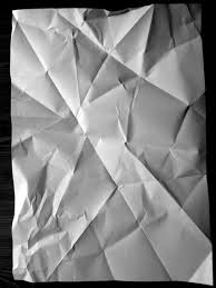
I decided to use Origami in my Photos as I quite liked the texture that they produced and because scientifically Origami can help reduce stress, improve hand-eye coordination, boost creativity, enhance patience and persistence. It also symbolizes hope, healing and good fortune.

Knowing these facts about Origami it can create a hidden meaning behind my Photographs which I liked very much.

Contact Sheet

My Texture Experimentation

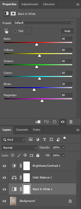
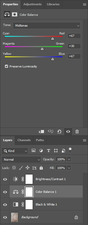
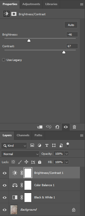
I used Adobe Photoshop for editing my Photographs and instead of just making my Photographs black and white, I decided to play around a bit with the settings to create these Monochrome based images. The settings that I used was…

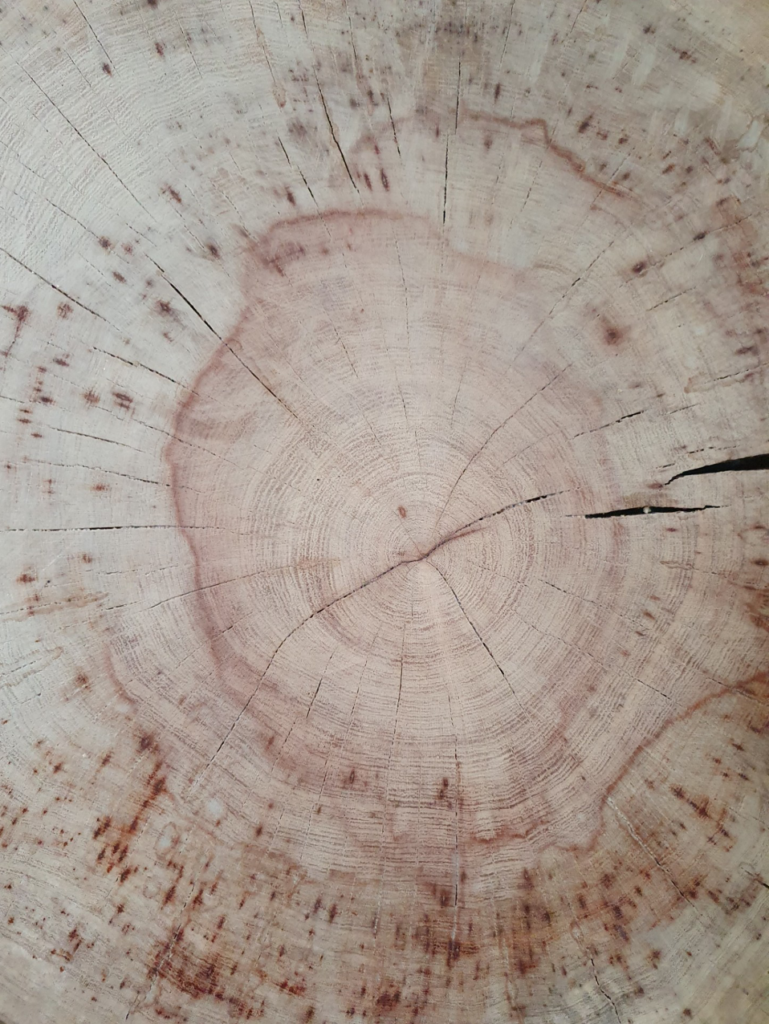
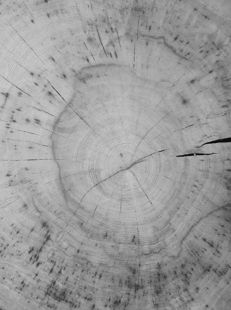
This is the Before and After of the Original Image, and then the Black and White Filter applied.

This is the Before and After of the Black and White Image, and then the Colour Balance Filter applied.

This is the Before and After of the Colour Balance Image, and then the Brightness/Contrast Filter applied.

Combining all these filters together created a Blue cooling effect, used to convey a sense of cold or a depressing atmosphere which was my intention when editing these photographs. This effect can also enhance shadows as seen in the Photos above, adding depth to an image.

Scientifically, the colour blue can represent or be associated with open spaces, freedom, intuition, imagination, inspiration, and sensitivity. Blue also represents meanings of depth, trust, loyalty, sincerity, wisdom, confidence, stability, faith, and intelligence.

These might be some things to note when editing my Photographs in the near Future.

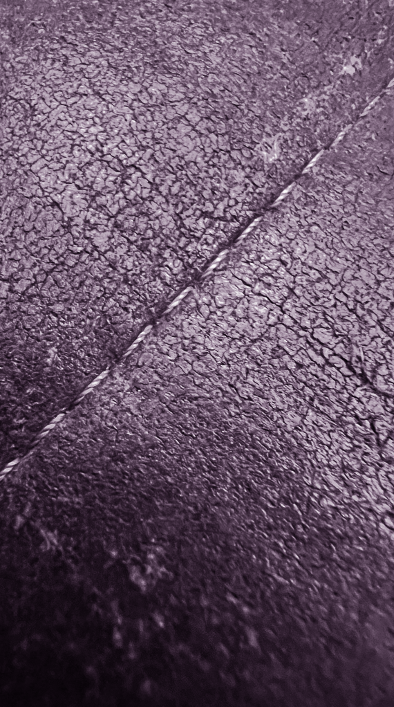
My Final Texture Photographs

ArtSteps: Virtual Gallery

Adobe Lightroom

Adobe Lightroom is a photo editing and storage application available through the Adobe Creative Cloud. This program allows users to quickly and easily edit their photographs with tools to alter contrast, balance colour, and change brightness on mobile devices immediately after taking the picture.

Are Photoshop and Lightroom similar?

Although the two digital photography editing apps are similar, the main difference between Photoshop and Lightroom is that Photoshop is ideal for more intense, detail-oriented photo editing and specializes in image manipulation, creation, and enhancement, while Lightroom is great for day-to-day workflows as it focuses on editing, organizing, and processing photos.

Adobe Lightroom Modules

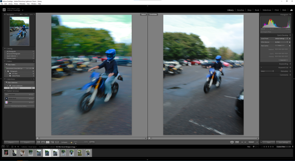
Each module In Adobe Lightroom focuses on a specific portion of the photographic workflow. For example; the Library module is for importing, organizing, comparing, and selecting photos. The Develop module is for adjusting colour and tone, or creatively processing photos and lastly the Slideshow, Print, and Web modules are for presenting your photos.

Adobe Lightroom: Library

In the Library module you can review and organize the images in your photo library. The work area offers several different viewing modes so you can browse, inspect, compare, or select images with ease.

Adobe Lightroom: Develop

Although the Quick Develop panel in the Library module offers some basic image editing options, you’ll work in the Develop module when you wish to make more detailed adjustments and modifications to your photos. You can correct the colour balance or tonal range, crop or straighten an image, remove red eye, and apply a range of selective local adjustments—all non-destructively

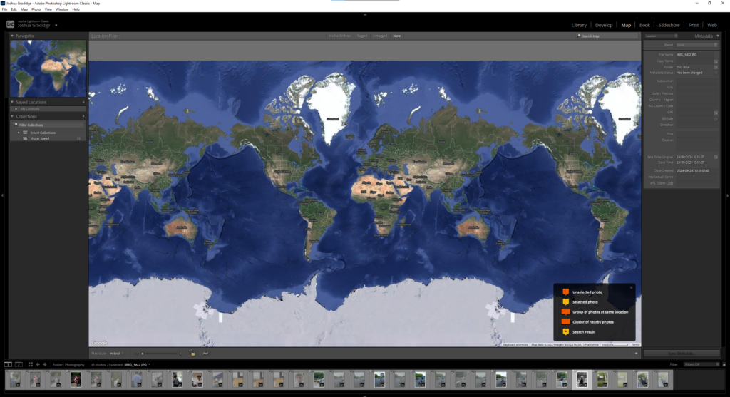
Adobe Lightroom: Map

Lightroom Classic consists of a geotagging feature in the new Map module, where you can see or mark where your photos were taken. Photos already tagged with GPS coordinates will automatically appear on the map. You can drag images captured without GPS information directly onto the map from the Filmstrip, and edit location details and other metadata in the panel at the right. The Filter bar above the map view lets you highlight just those photos at locations currently visible on the map or filter for tagged or untagged shots. In the Saved Locations panel at the left, you can save a list of your favourite places for easy access.

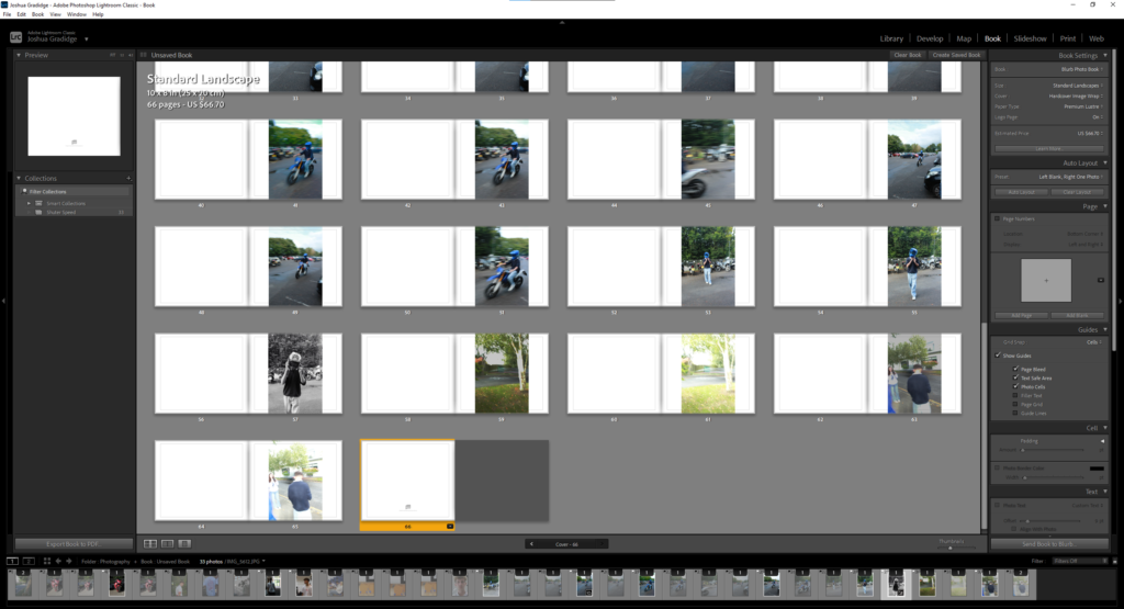
Adobe Lightroom: Book

The Book module, delivers a suite of layout and type tools to help you create sophisticated photo book designs that can either be uploaded directly from Lightroom for printing through the online book vendor Blurb, or saved to PDF and printed on your own printer.

You can work with a multi-page preview of your book layout, focus on your design spread-by-spread, or view single pages in the Book module’s central work area, switching between these viewing modes and moving through the pages of your book using the controls in the Toolbar.

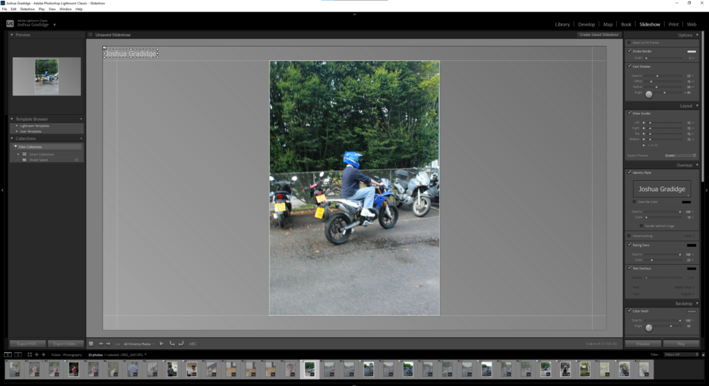
Adobe Lightroom: Slideshow

In the Slideshow module you can easily create stylish presentations from any image collection in your library. The images in your collection are displayed in the Filmstrip, where you can choose which photos you wish to include in your slideshow, and drag their thumbnails to change the order in which they will appear. The work area shows one image at a time in the Slide Editor view, where you can work on the slides individually, or preview your slideshow as a whole.

Adobe Lightroom: Print

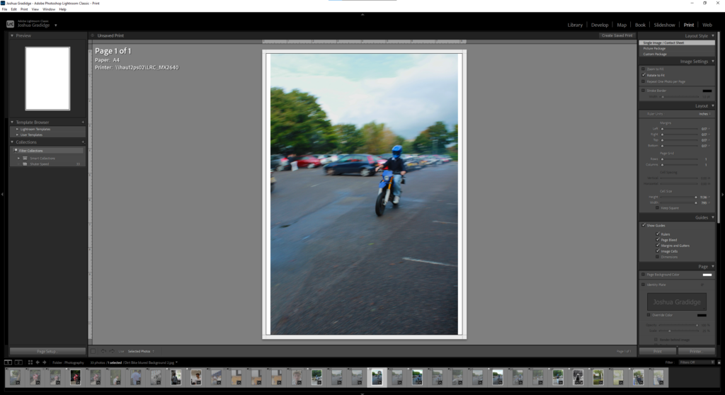
The Print module offers a range of preset templates and all the layout tools you’ll need to quickly prepare any selection of images from your library for printing.

The photos in your collection are displayed in the Filmstrip, where you can select the images you want to print. You can drag the thumbnails in the Filmstrip to change the placement of your photos in the layout. The work area—the Print Editor view—shows your print layout, which may include only one image, a single image repeated at a variety of sizes, or multiple images.

Adobe Lightroom: Web

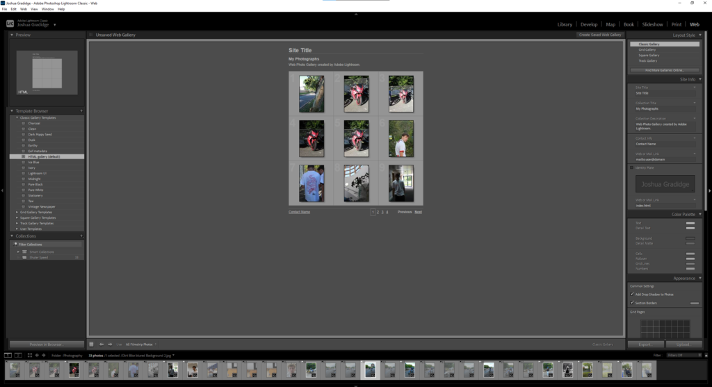
In the Web module you can build, preview, and then export or upload your own website to showcase your photos interactively.

As in the Slideshow and Print modules, the Template Browser in the left panel group offers a wide range of preset gallery templates which can be previewed in the Preview panel at the top of the group. The Collections panel provides easy access to your images and saved gallery designs. The panels in the right panel group contain settings and controls that enable you to choose between HTML and Flash gallery styles, customize the appearance and functionality of the preset templates, add titles, captions, information, links, and graphics, and manage output.

Texture / Paper Experiments / Final Photos

Jerry Reed

Jerry Reed is an English photographer who claims his objective is to sustain the interest of the viewer through his photographs. He focuses heavily on a contrast in the shadows from the light on the paper, giving a very two-toned effect.

The series is based on paper sculptures meticulously crafted by Reed, explorations in architectural forms and spatial relationships. Reed makes his photos black and white to remove the distraction of colour and to help the viewer focus on other aspects of the photo, such as the subject, the textures, shapes and patterns, and the composition.

In his series, “Paper Work”, Jerry Reed’s B&W photographs of close-up paper arrangements become abstract designs through careful directional lighting.  His constructions are sensually textured, elegant studies of form and tonality.

Paper experiment photoshoot

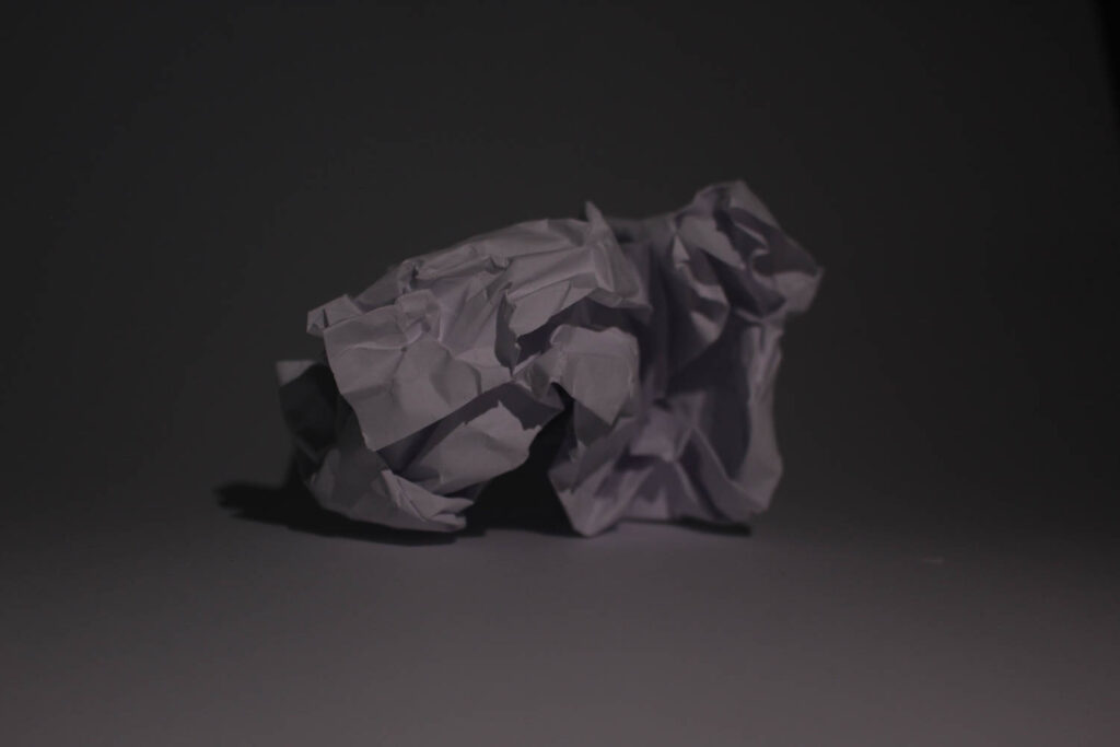
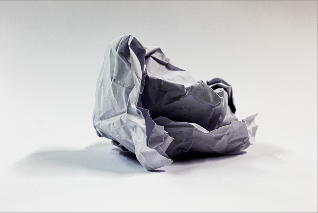
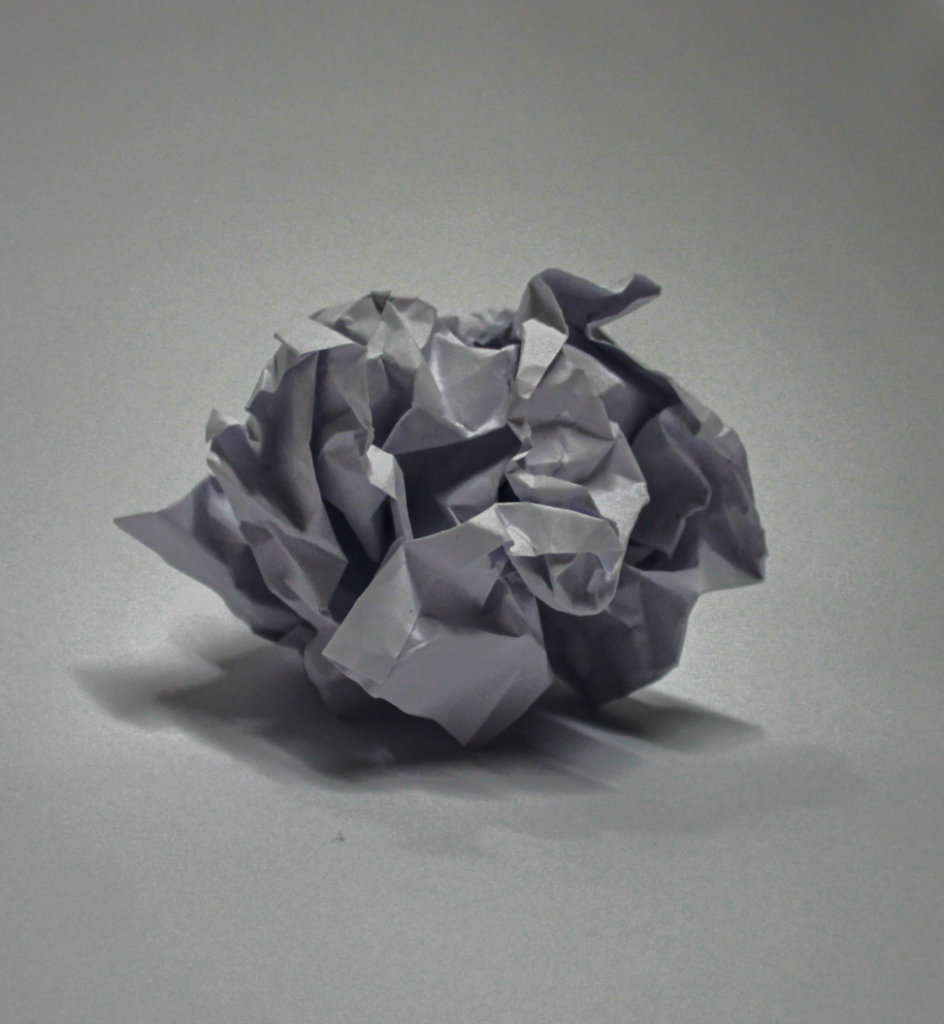
This is my contact sheet for all of my paper experiment photos. I tried to use different shapes and sizes of scrunched up paper to create different textures. I used the studio to take these pictures using the ring lights at different angles. The only thing I kind of struggled with taking these photos is the aperture and what ISO to use for my photos. These photos are just scrunched up pieces of paper, or cut up paper shaped into different forms to create dimension and let the light go in in different areas of the paper.

Edited (before and after)

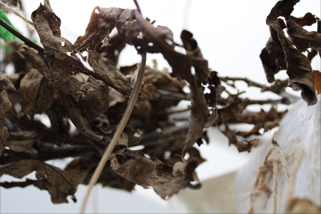
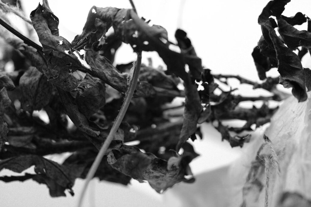
For this photo I turned it black and white to get rid of distractions of colours to get the viewer to focus on the texture of the dried up leaves and the form of it.

This is a before and after of a texture photo I took. I decided to enhance the colour to really bring out the texture in it. It isn’t easy to see here but I also cropped the photo so it was a square so that it could be more focused on one area of the photo only. I turned the brightness and contrast up to make it more clear.

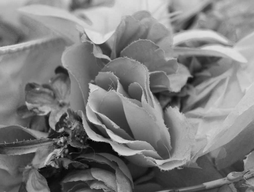
In these photos that I took of some fake flowers and leaves, I decided to make the photo black and white as I thought there was too much going on which all the colour and now the viewer can just be focused on the main aspects of the image. I made the hue and saturation higher. I also cropped my image so that it didn’t have as much negative space and the viewers would be able to focus on only the main aspect of the image.

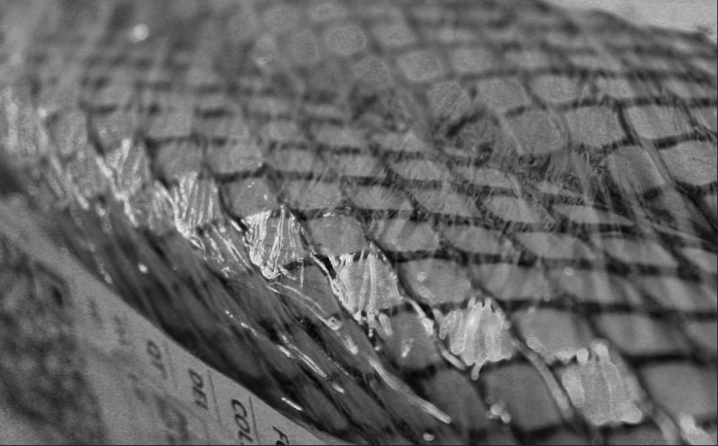
This photo that I took represents many of the formal elements, for example:

Line: This is included to divide the space and suggest patter, form, depth, distance and rhythm.

Shape: This makes the photo stand out as it captures the viewers attention as it has sharp edges and well-defined corners.

Repetition: The same shape is used repeatedly which creates a sense of rhythm and balance in the image.

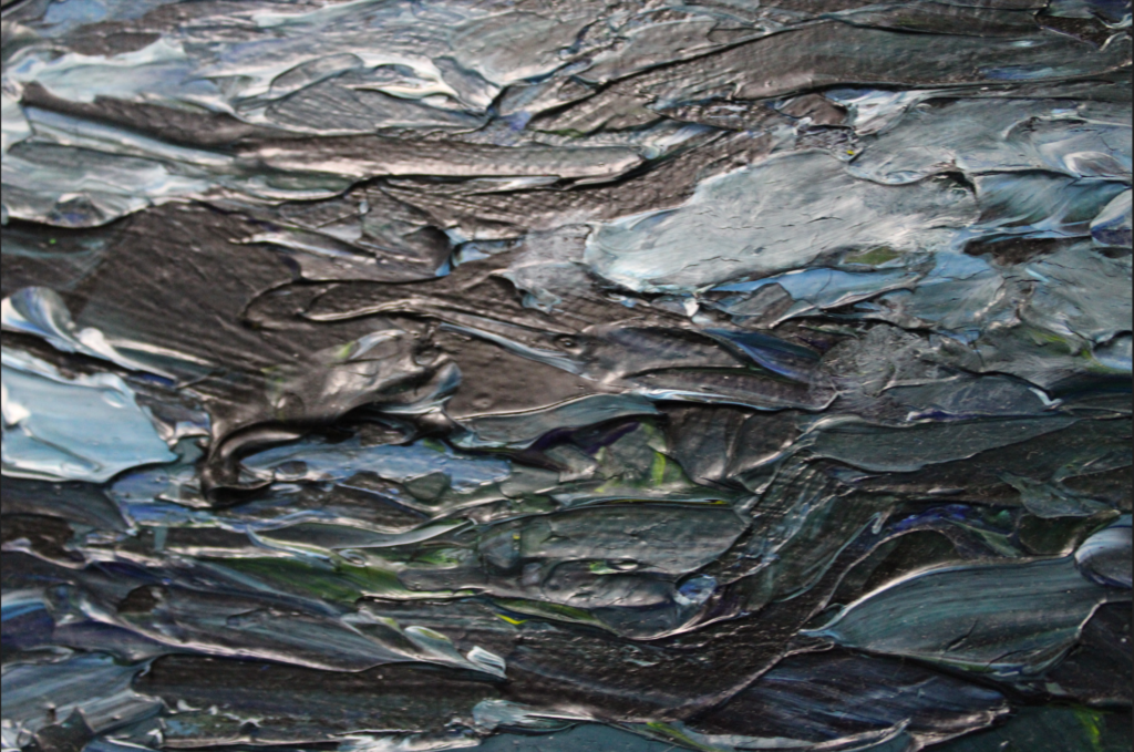
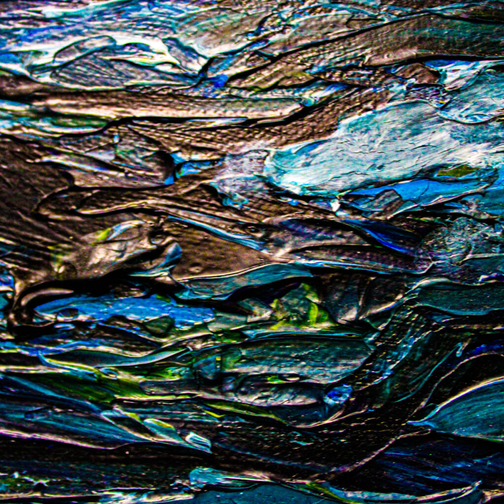
Texture: The texture on the film around the shapes brings life and vibrancy to the image so it doesn’t appear flat and uninspiring.

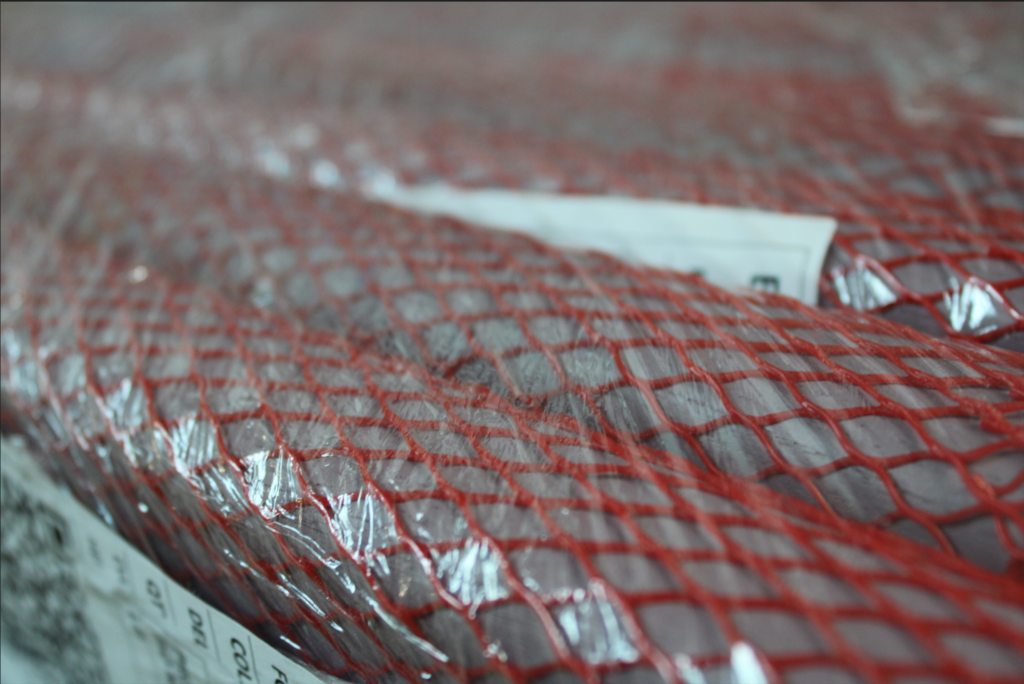
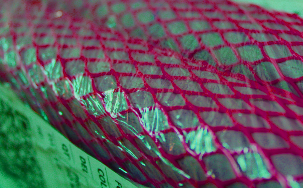
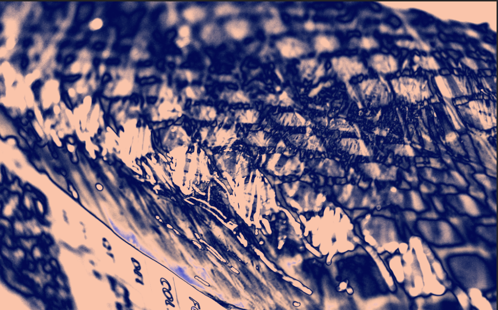
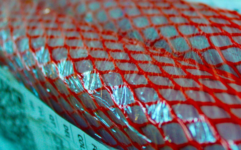
In these 3 photos, I had edited the first one in 3 different ways. The first photo I increased the saturation, vibrancy and the hue to make the colours really stand out more. In the second one, I added a gradient map over the top of it and used a mixture of blue and a pale pink to show the contrast between the colours and shadows. These colours also bring out more texture than you could see in the original photo. In the last photo, I decided to make it black and white to remove the distraction of colour so that the viewer could focus on the other aspects of the photo, like the texture and the shapes.

My Final Photos

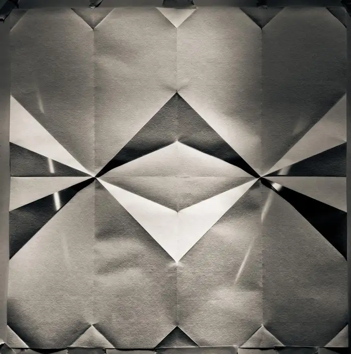
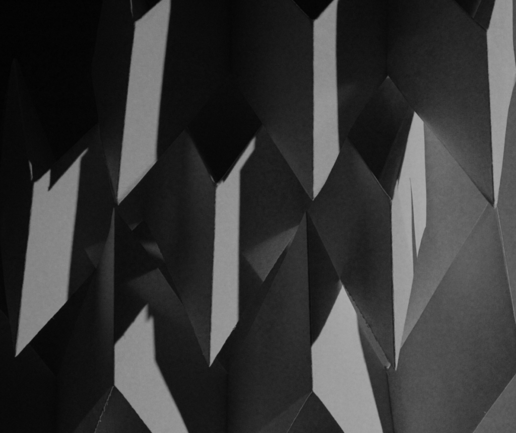
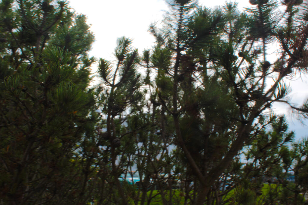
These are my favourite final photos. I think they create a good variation of the formal elements. The texture in all of them creates a sense of dimension in the photos and the ones in black and white make sure that the viewer isn’t distracted by the bright colours and takes more time to notice the little features of the photos to get it more in depth. In the photos which are not black and white, I decided to enhance the colour as it makes the texture of them come out even more. The photo in the top right and the photo of the trees have a lot of shape which stands out and captures the viewer’s attention, along with repetition to produce a sense of rhythm and balance.

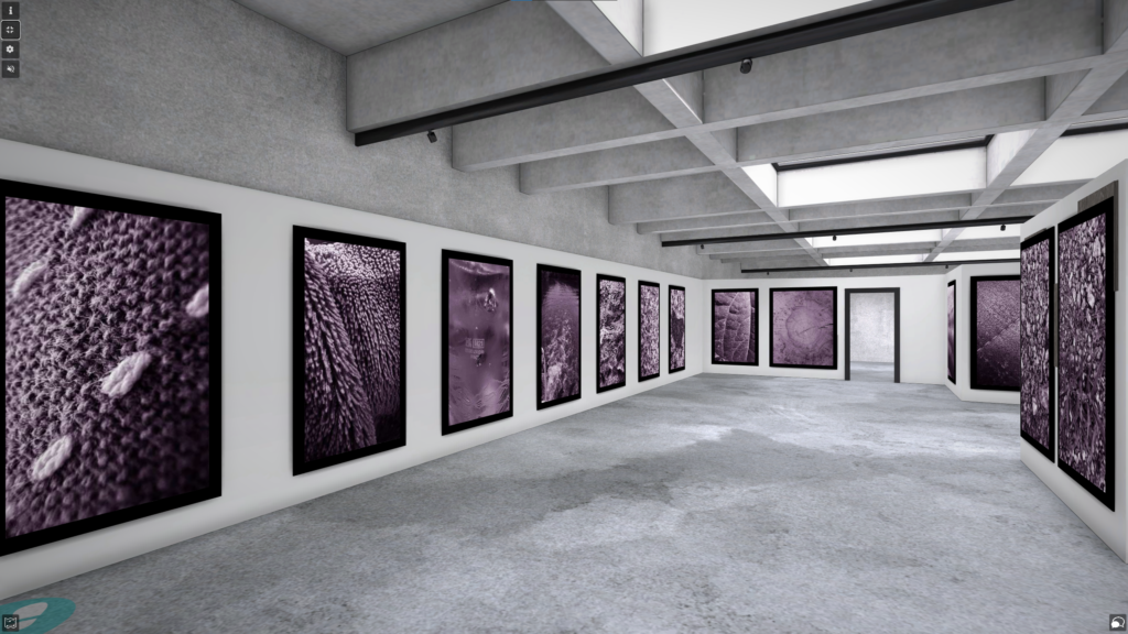
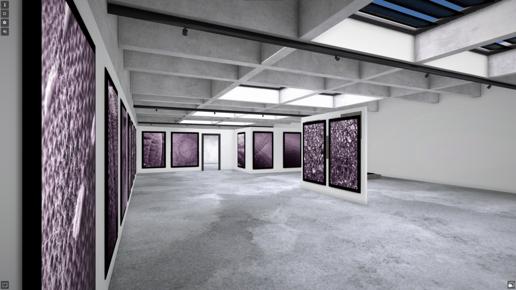
ArtSteps Gallery

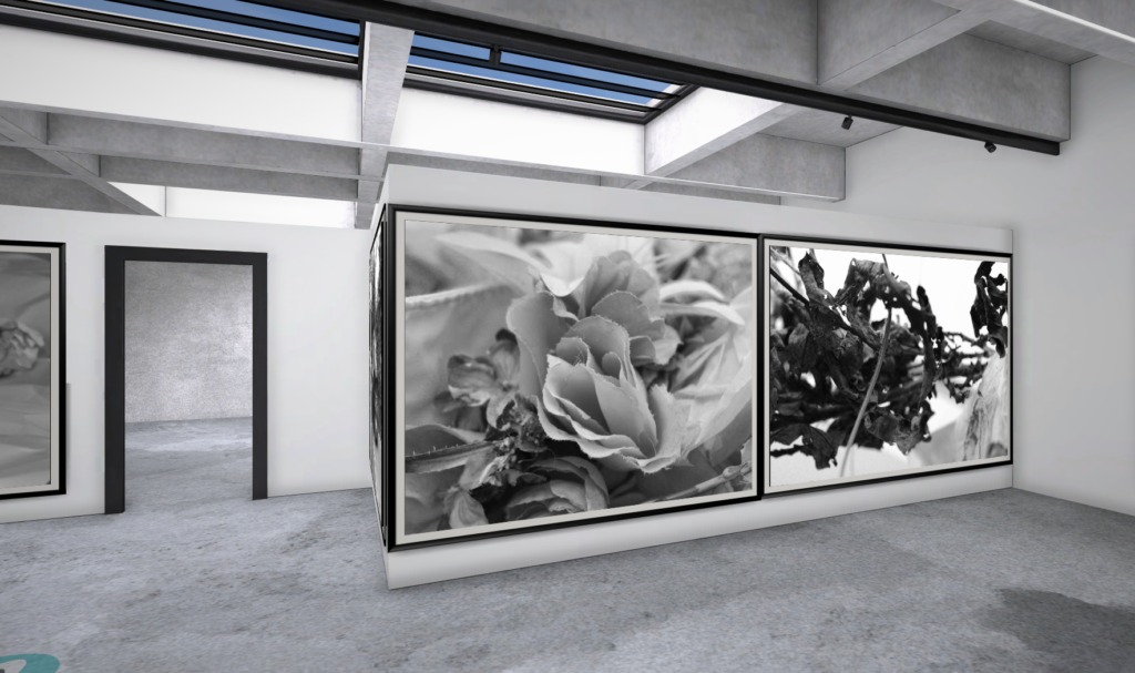
I decided to put these photos together as they kind of give off the same concept and are both in black white so the viewer is not distracted by the colour of the photo. both these photos are based off of nature which makes them look good together. The two photos together really compliment each other and all the dark lines makes the images stand out to the viewers. I decided to get three different types of leaves to really show the difference between them but how well they work together. The dark tones bring out the texture in each photo and can really grab the viewers eye.

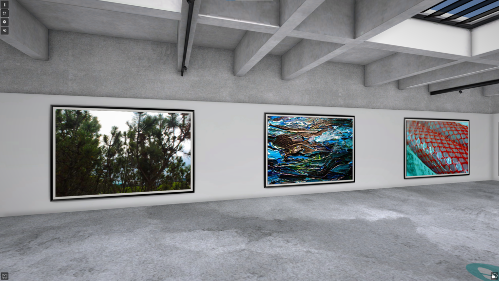
I believe that these three photos work really well with each other as they are all in colour and they all give off the same vibe. All have a lot of repetition within them which creates a sense of balance and rhythm. I think the colour in each of them enhances the amount of texture in each photo which can really grab the viewers eye and make them more intrigued in the photo. The green and blue tones in all photos give off a sense of calmness and relaxation which is another reason why I think these photos work really well with each other.

Adobe Lightroom

Purpose Of Lightroom

Adobe Lightroom is a photo editing and storage application available through the Adobe Creative Cloud. This program allows users to quickly and easily edit their photographs with tools to alter contrast, balance colour, and change brightness on mobile devices immediately after taking the picture.

Catalogue

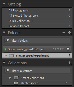
When I had first opened Lightroom, I had to create a personal catalogue that I named after my name and it was saved in the video data drive.

This is where everything for my images in Lightroom are stored.

Importing Images

After creating my catalogue, I had to import some of my own images into Lightroom. I did this by pressing the ‘Import’ button in the left-hand corner.

Collections

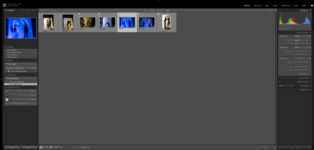
I then had to create a collection which would store all of my shutter speed experiment photos. This helps as it will be much easier to find all of my edited shutter speed photos and I can store all of my photos into separate collections so they are all sorted out and easier to find.

Selection

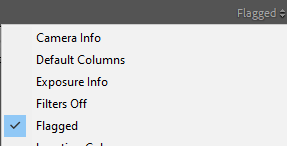
After creating a collection with all my photos in it, I had the option to rate all of my photos in different ways. I was able to flag my selected images, by either using the X key (bad) or the P key (good), these could be filtered out by pressed the flagged button to see which ones you chose for good. Another option was rating all the photos out of 5 stars.

(Images with white flags are the ones I chose for good with ratings underneath)

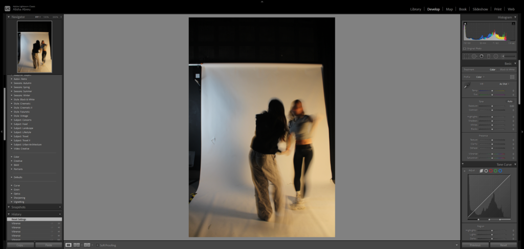
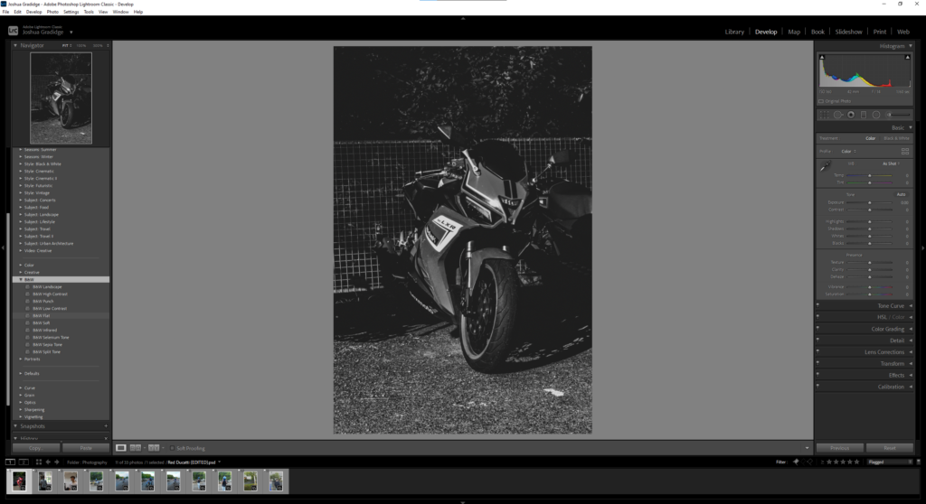
Develop Mode

Develop mode is used when needing to do very specific editing on only one image, this is different to library mode as it would only allow you to make small adjustments to more than one image.

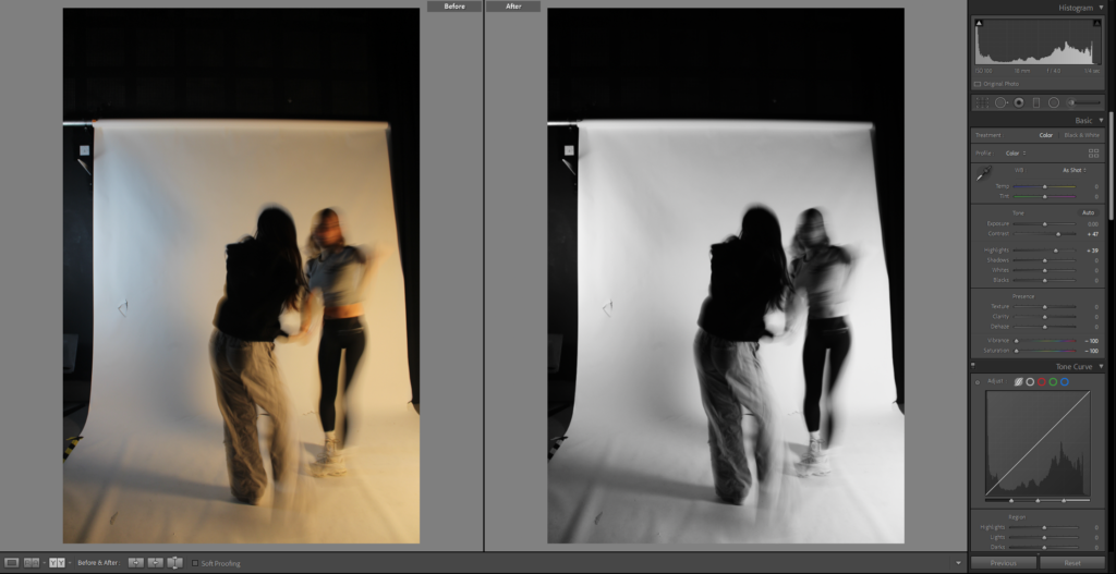
At the bottom of the screen there is an option to see your photo before and after you make changes to it. This could help me identify what still needs to be changed and what I should keep the same to make the photo better.

As you can see in my before and after photos, I had changed my photo to a black and white scheme. Develop mode includes many pre-sets which are used to make fast edits of your photos or you can just edit the photos manually with the tabs on the right-hand side.

Contact Sheets

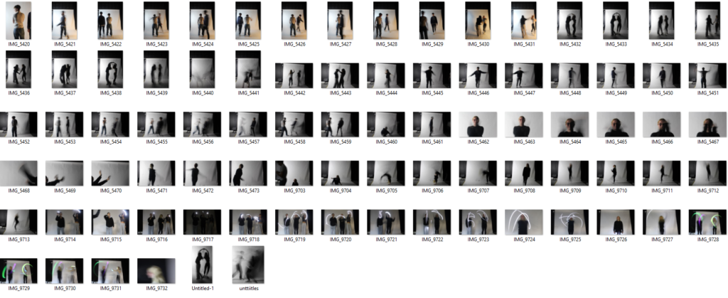
This is my contact sheet which has all of my photos from my shutter speed experiment.

William Klein

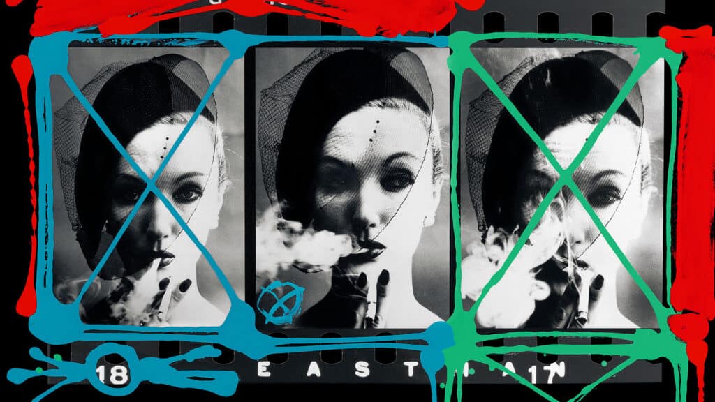
William Klein was an American-born French photographer and filmmaker noted for his ironic approach to both media and his extensive use of unusual photographic techniques in the context of photojournalism and fashion photography. He was well-known for his unique contact sheets where he drew over and colour coded images to identify and group them, showing his thought process behind his pictures and clearly identifying what he considered his strongest work.