Francis Bruguière
Francis Joseph Bruguière was an American photographer. He was born on October 15, 1879, San Francisco, California, United States and he died on May 8, 1945 (age 65 years), Middleton Cheney, United Kingdom.
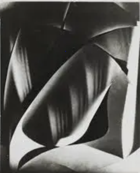
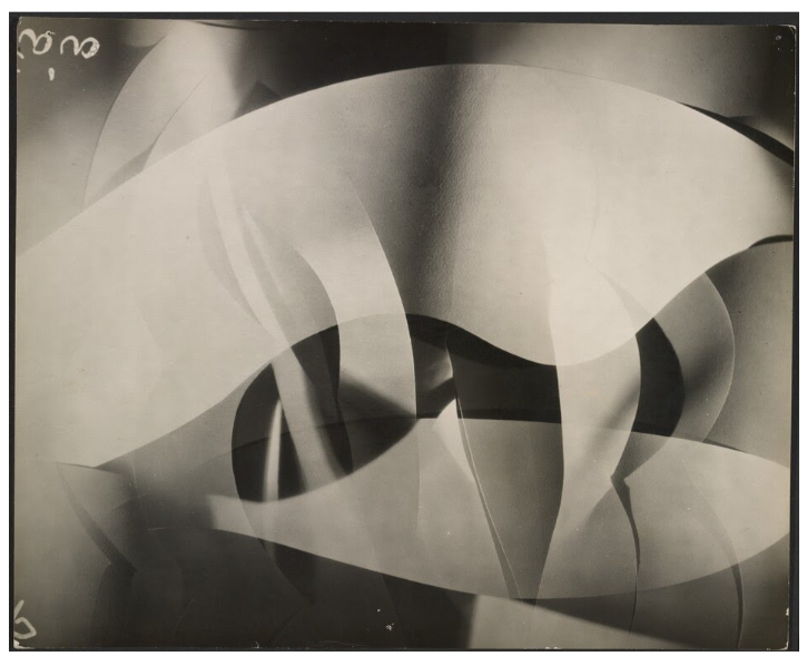
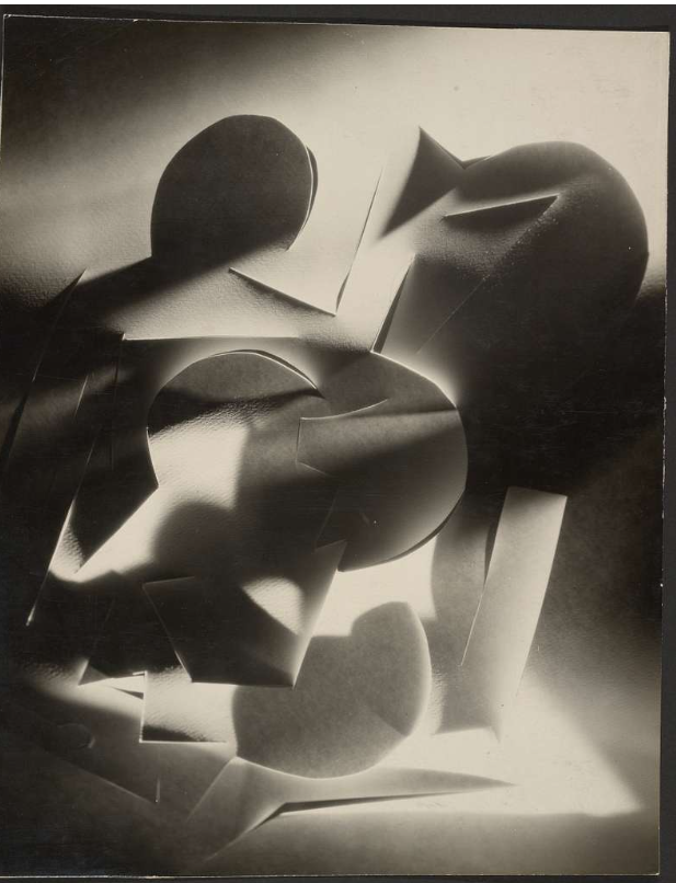
Photos of his work.
My Paper Photoshoot
Contact Sheet
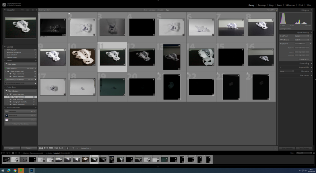
As you can see above I took 24 images from the camera of some different angles and shape of the paper until I found the one that I wanted to use, I then continued to take many of photos of one one type of paper style I liked with different camera settings and different lighting conditions to achieve the ideal result I wanted.
Photos I Didn’t Like
I didn’t like this photo due too lots of darkness, with having lots of darkness means it wont attract people to look at them and like them. It also gives no proper final image. This photo taken with a shutter speed of 1/800 of a second and an aperture of 4.
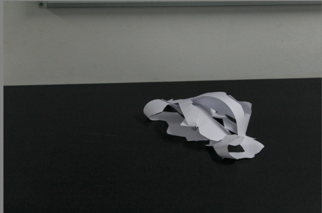
I didn’t like this photo due the balance of the photo on both sides. the left side has more negative space rather than the right side. There is no rule of 3rds present in this photo. This photo has a shutter speed of 1/100.
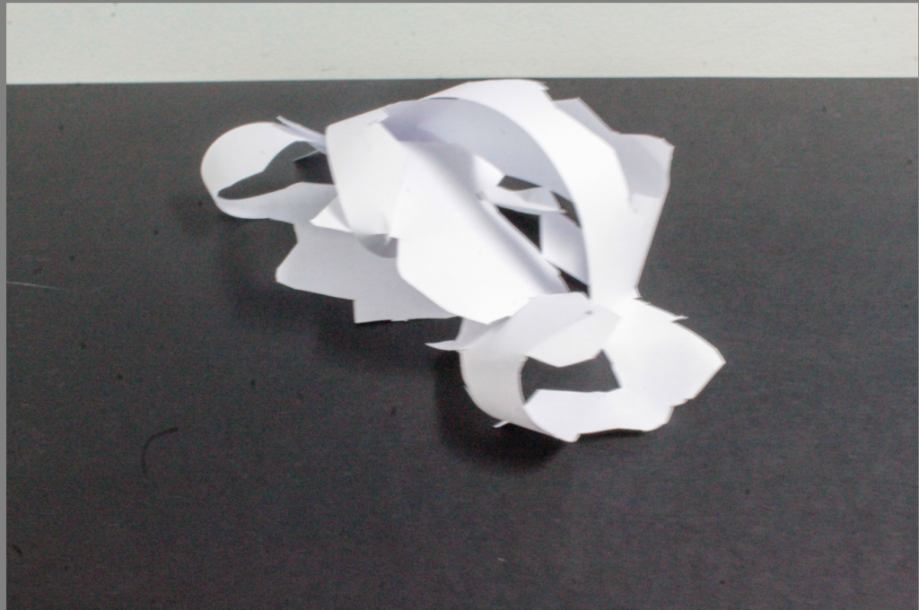
Lastly, I didn’t like this photo because of due to being blurry, which also gives it a degrading quality. This photo had an aperture of 25 which means not a lot of light has been let through to create a perfect image. It also had a shutter speed of 1/5, which is low.
Selection Process
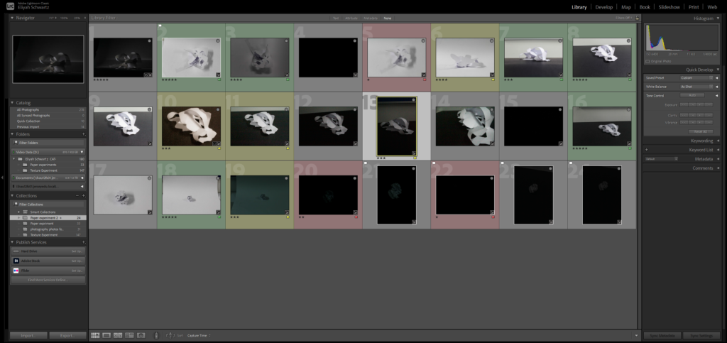
As you can see above I pressed P to keep the images I wanted to use for my final photos. I used X to get rid of the images i didn’t wanted to use for the future. Then I gave a rating for the images, they all had a rating out of 5. With a rating of 5/5 means they are my best images that I love. The images with 4 and 5 stars are the images I wanted to use for my final photos. The photos I didn’t like I rated 1-3 stars. With a rating 1-3/5 means these where the photos I hated. Finally I gave them the colour yellow or green, green being the best and yellow being average . Red was for very bad photos. I will edit the images so I can present final photos.
Editing my Best Images
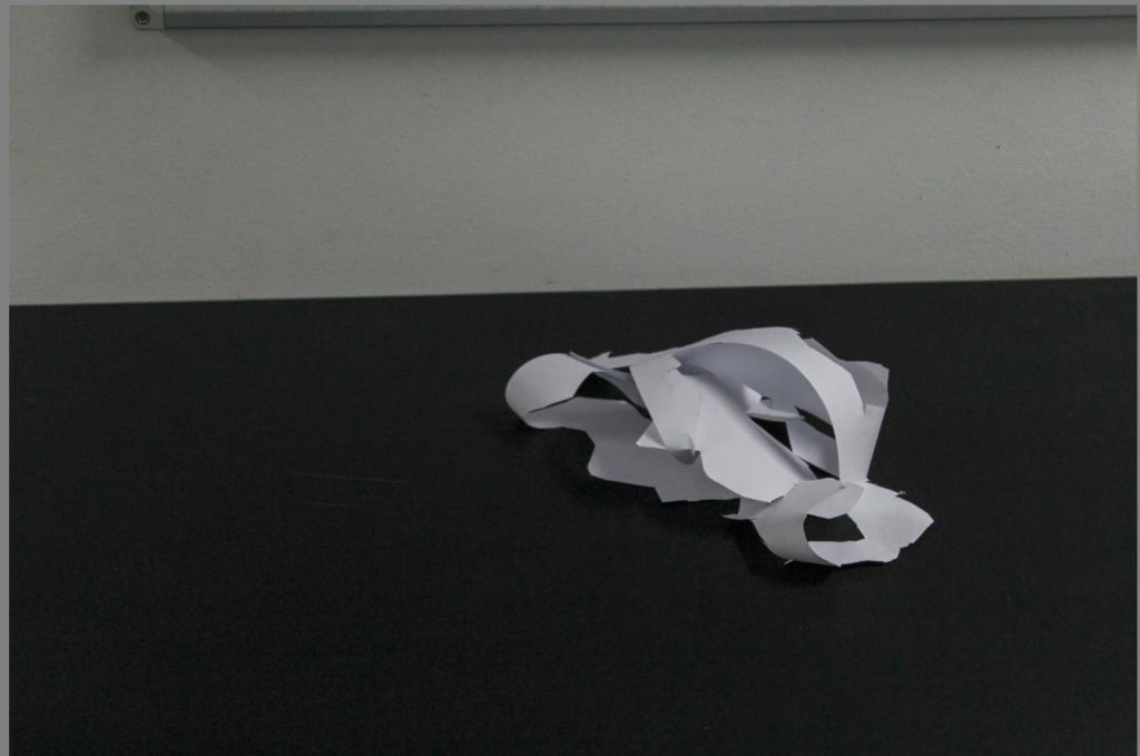
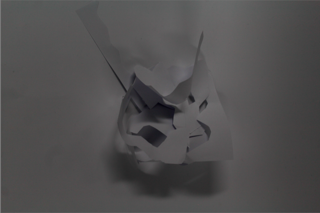
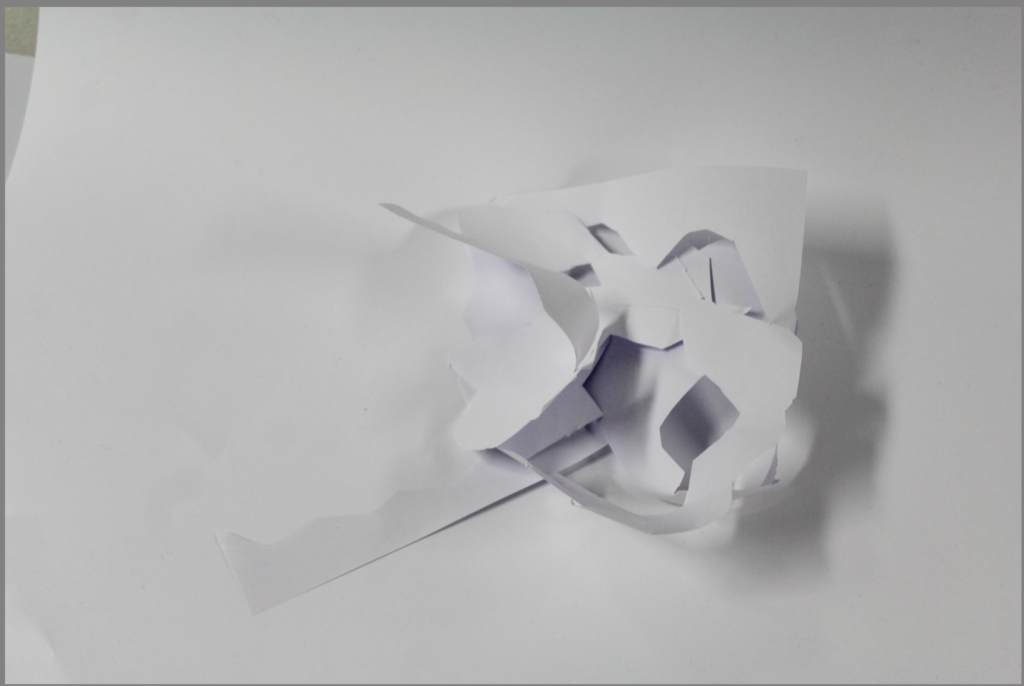
These are my three best images that have been edited.
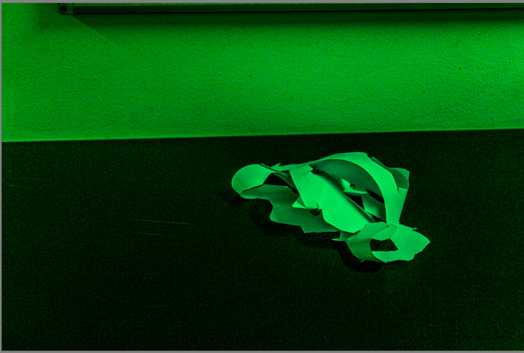
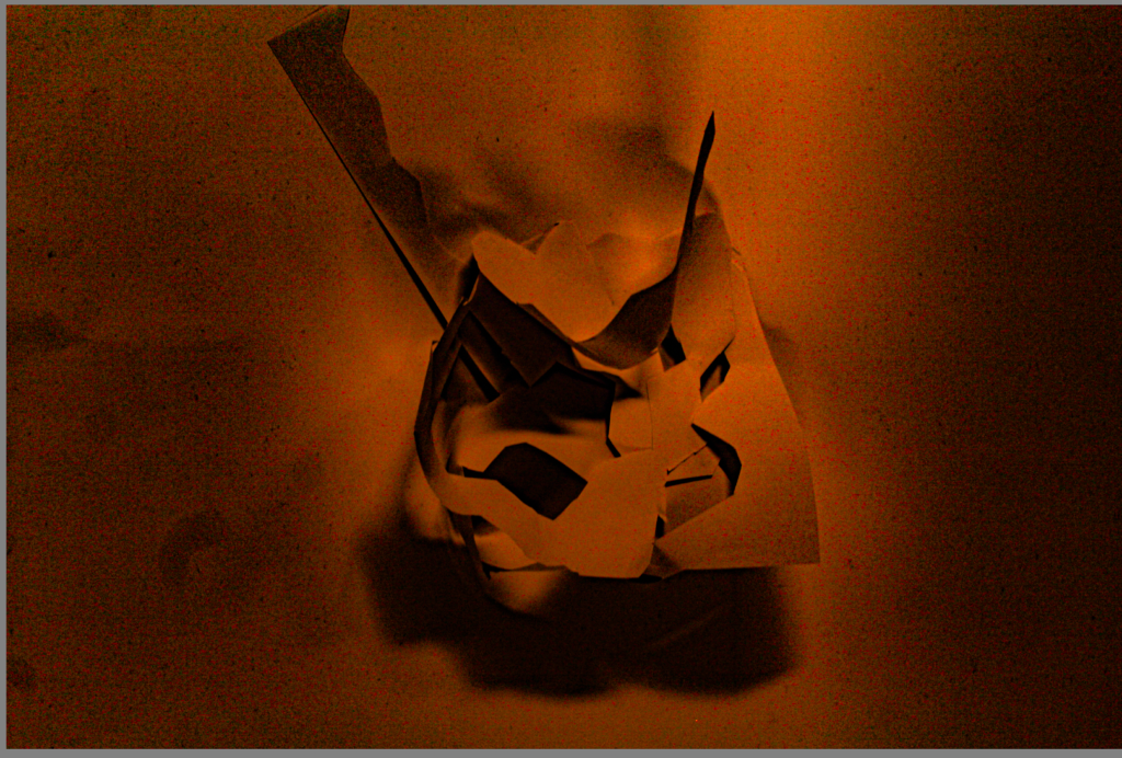
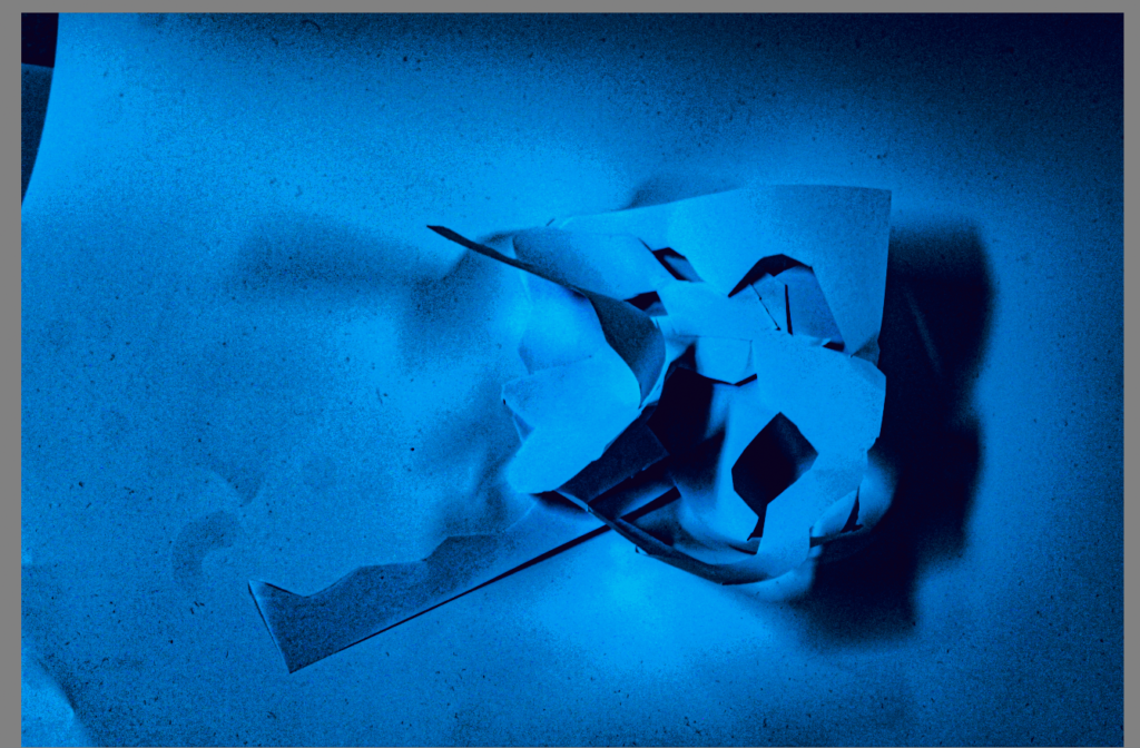
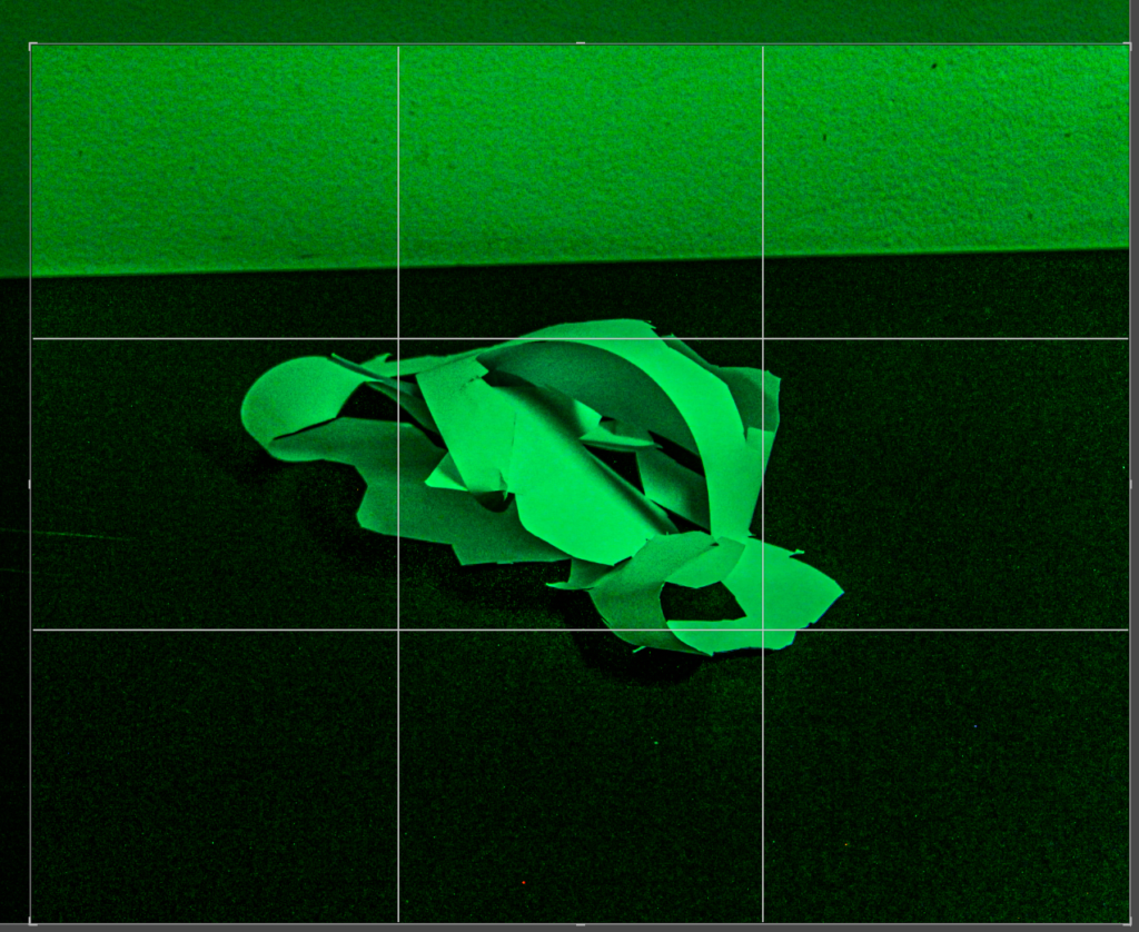
This photo had to get rid of some of the negative space due to be being unbalanced on the foreground and the in the background. This means the photo is not equally distributed on each side that is the reason I had to crop it. I originally started with lots of negative space in background, rather than the foreground.
When cropping, I made sure the photo was balanced on each side from the background to the foreground.
I put the texture on this photo 100 to enhance the material of the paper.
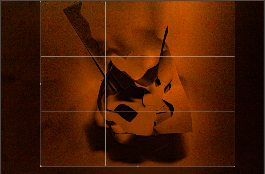
In this image I had to crop a bit of the photo due to the sides of the photo not being proportional. If I hadn’t cropped the photo, the photo would look unbalanced and there would be too much negative space on the left side side of the photo rather than the right side of the photo.
After being cropped the photo looks more visually pleasing.
The space in the photo appeared very big to begin with but after I cropped it the space has decreased, so you can’t see the whole of the photo.
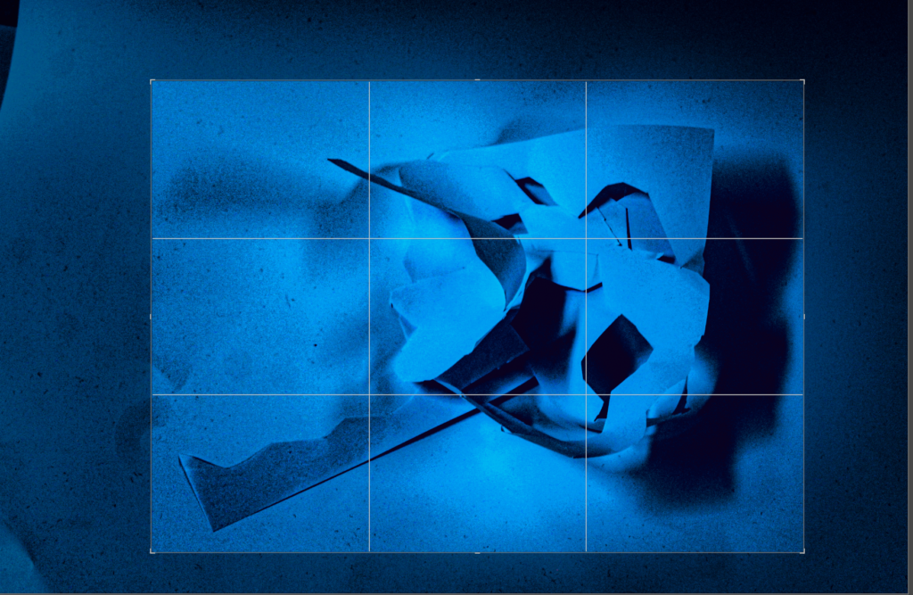
In this photo I had to crop lots of it due to the sides of the photo not being proportional and not being balanced enough. If I hadn’t cropped the photo, the photo would look unbalanced and there would be too much negative space on the left side rather than the right side of the photo.
After being cropped the photo looks more aesthetically pleasing and good to look at.
For this image it had two main textures which is the black card underneath to being smooth and the white paper being rough due to being cut out.
Photos Edited Into A White Filter


My Edited Photos into a White Filter.
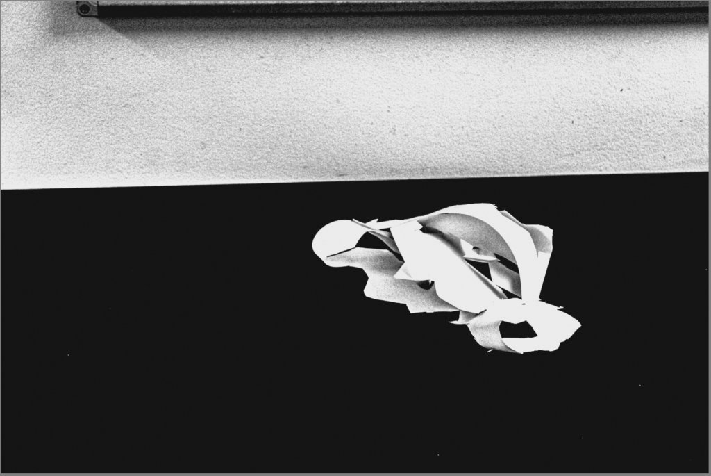
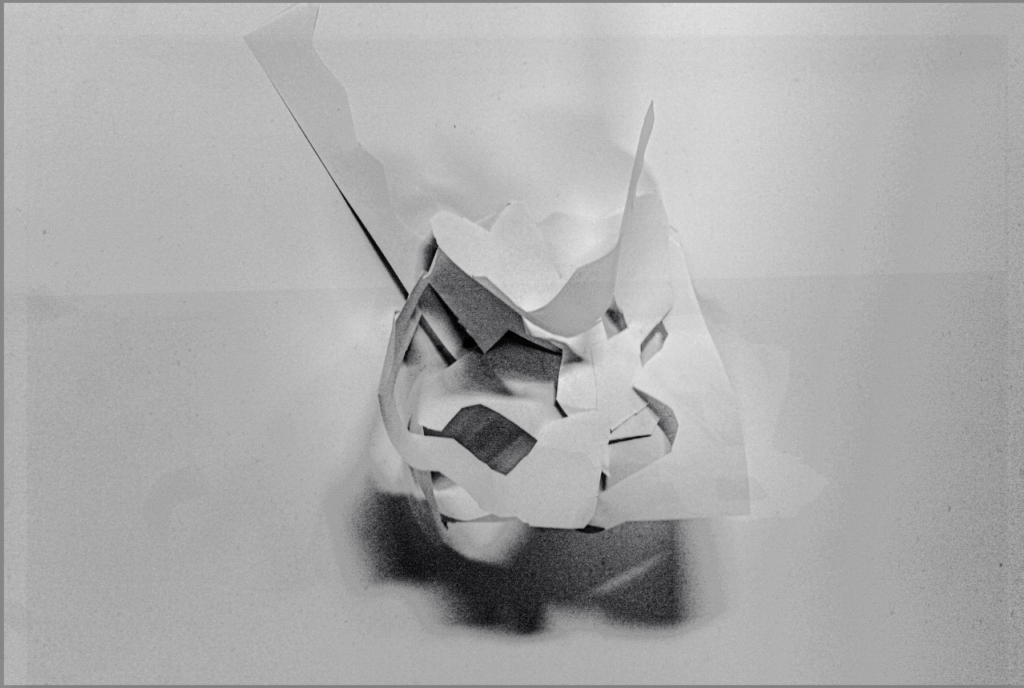
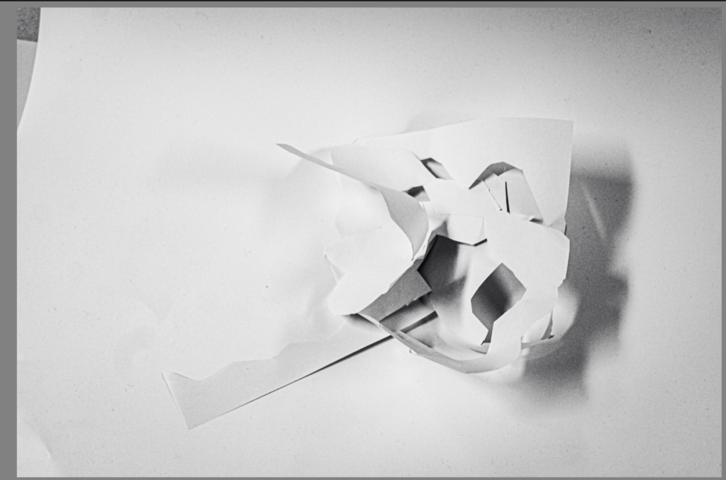
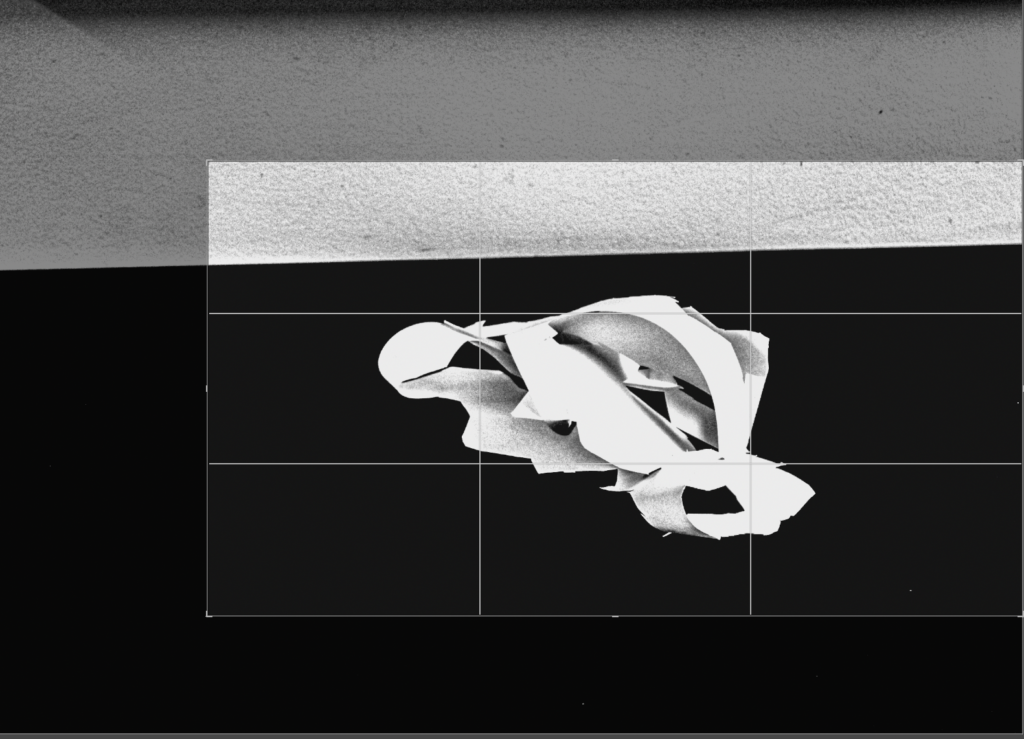
In this photo I had to slightly crop it due to the sides of the photo not being proportional. If I hadn’t cropped the photo, the photo would look unbalanced and there would be too much negative space on the background of the photo.
The space in the photo appeared very big to begin with but after I cropped it the space has decreased, so you can’t see the whole of the photo.
The image appears to have a range of textures from the black card underneath to being smooth and the white paper being rough due to being cut out.
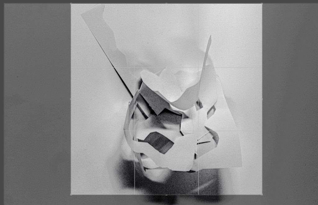
This photo had to be slightly cropped it due to the sides of the photo not being proportional and balanced . If I hadn’t cropped the photo, the photo would look unbalanced and there would be too much negative space on the background and the foreground of the photo.
The space in the photo appeared very big to begin with but after I cropped it the space has decreased, so you can’t see the whole of the photo.
The image appears to have a texture of the white paper being rough due to being cut out. Another texture in this photo is white card underneath which is smooth to touch.
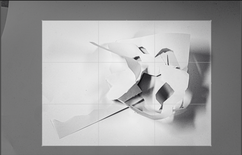
This photo had to be slightly cropped it due to the sides of the photo not being proportional and balanced . If I hadn’t cropped the photo, the photo would look unbalanced and there would be too much negative space on the background and the foreground of the photo.
The image appears to have a texture of the white paper being rough due to being cut out. Another texture in this photo is white card underneath which is smooth to touch.
The white filter I used on this photo is BW09 which is on Lightroom. In this photo is also enhanced shadows and the texture.
Photos Edited Into A Black Filter


My Edited Photos into Black
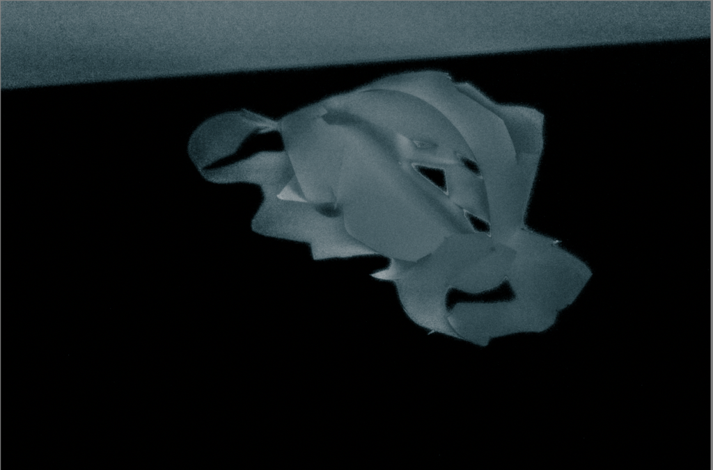
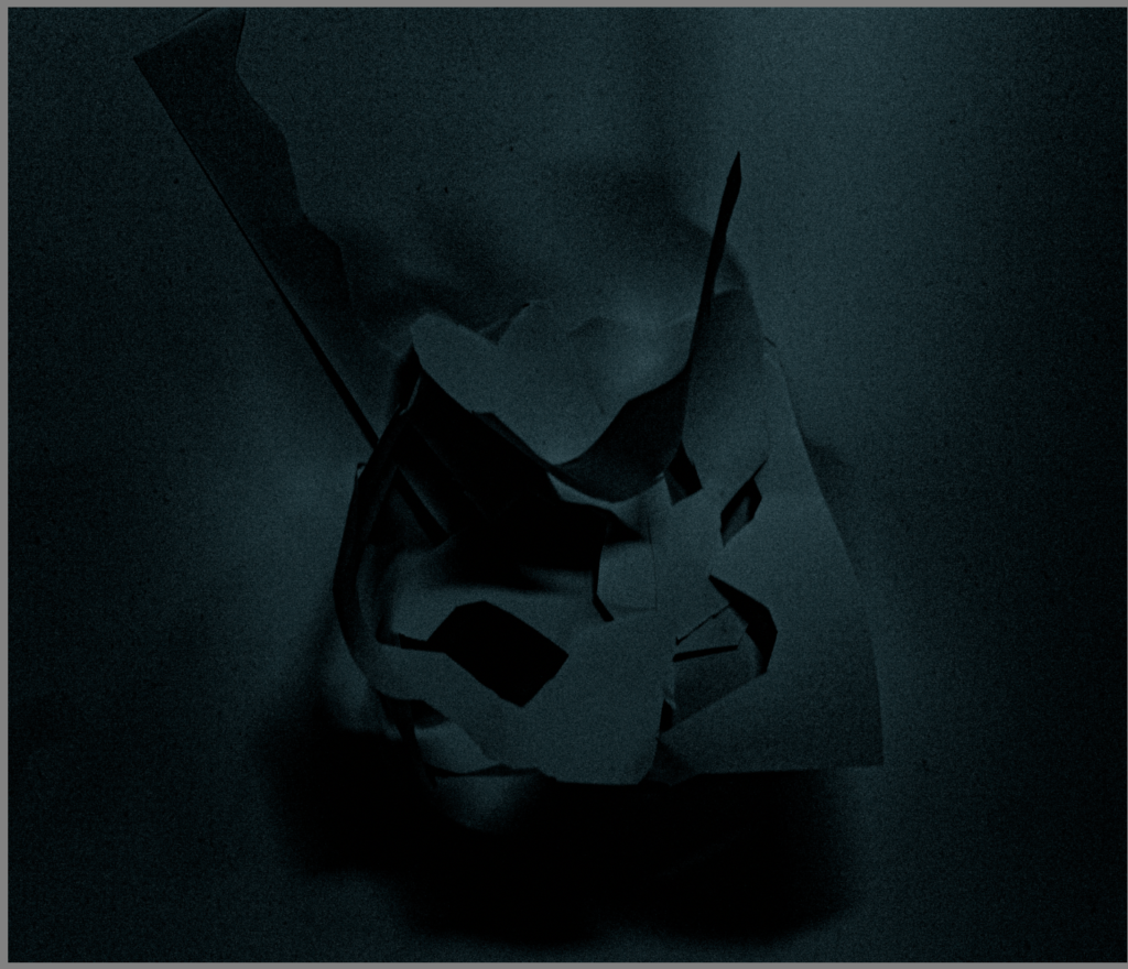
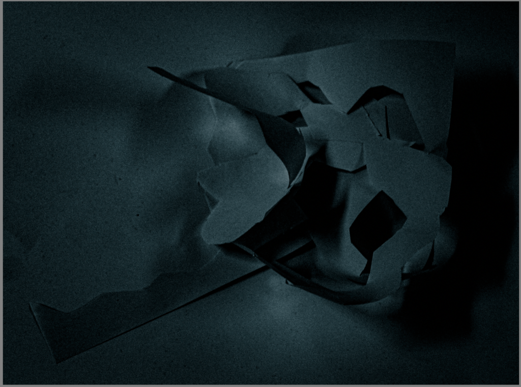
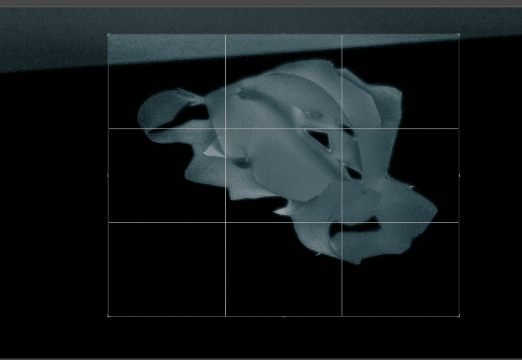
This photo had to be slightly cropped it due to the sides of the photo not being proportional and balanced . If I hadn’t cropped the photo, the photo would look unbalanced and there would be too much negative space on the background and the foreground of the photo.
The space in the photo appeared very big to begin with but after I cropped it the space has decreased, so you can’t see the whole of the photo.
The image appears to have a texture of the white paper being rough due to being cut out. Another texture in this photo is white card underneath which is smooth to touch. Also on this photo the paper appears to have a bit of a fuzzy texture due to +100 on the dehaze setting on Lightroom, this makes it have an interesting texture.

This photo had to be slightly cropped it due to the sides of the photo not being proportional and balanced . If I hadn’t cropped the photo, the photo would look unbalanced and there would be too much negative space on the background and the foreground of the photo.
The space in the photo appeared very big to begin with but after I cropped it the space has decreased, so you can’t see the whole of the photo.
The black filter I used on this photo is BW12 which is on Lightroom. In this photo is also enhanced shadows and the texture. It has also made the paper shadows pop out more and to be more present.
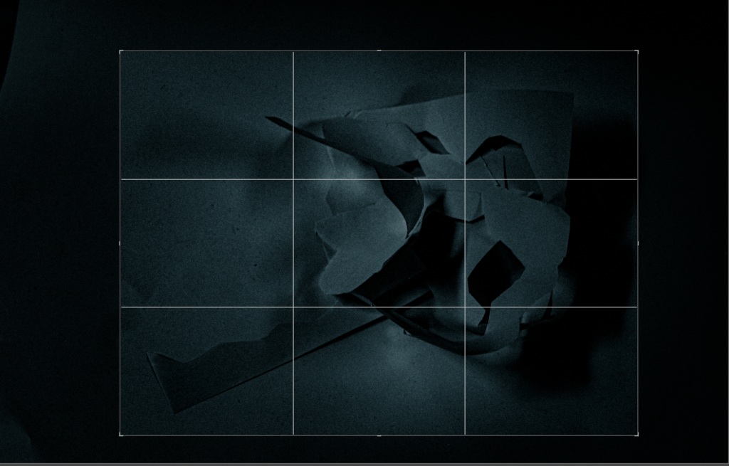
This photo had to be slightly cropped it due to the sides of the photo not being proportional and balanced . If I hadn’t cropped the photo, the photo would look unbalanced and there would be too much negative space on the background and the foreground of the photo.
After being cropped the photo looks more visually pleasing.
The space in the photo appeared very big to begin with but after I cropped it the space has decreased, so you can’t see the whole of the photo.
The black filter on Lightroom I used on this photo is BW11 which is located on Lightroom. In this photo is also enhanced shadows and the texture. It has also made the paper shadows pop out more and to be more present.
My Final 6 Photos


These photos are my favourite 6 photos, I have created. At the start I started with 12 photos then narrowed it down to 6 final photos. These photos have a mix of colour and black and white. By having colourful photos artists will use the desired mood and it will enhance their feelings. Also by using black and white the photographer will find it a way of concentrating on the viewer’s attention of a particular subject and also the photographer will feel it is more emotive. By having some straight lines in the photos it means these lines have geometric quality and also have centre of attention. The texture on all of these photos means that the paper looks quite rough to touch and feel. The images that I took had lots of negative space around it so I had to crop it to make the photos balanced on each side.
Art Steps Photos
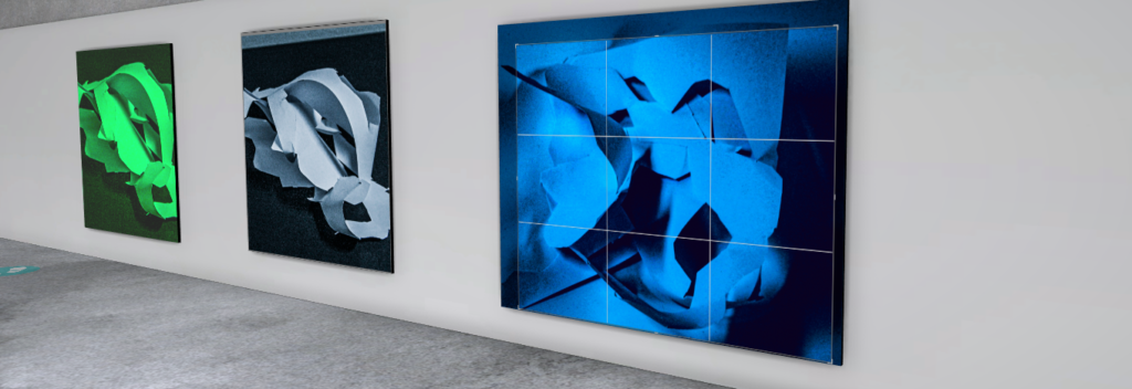
I think Art Steps is a great way to showcase your photos on a display.

JAC 3 NOV some clear signs of development here, but you must ensure that you are reviewing and refining your work as you move forward