In photography, texture is the visual quality of the surface of an object, revealed through variances in shape, tone and colour depth. Texture can add vibrance and create intrigue in images which otherwise would be bland and uninspiring – it is also one of the formal elements.
The Formal Elements
The formal elements are characteristics or information displayed in photographs which creates interest in photographs, and including these in your work typically increases quality and leads to production of better images overall. These are as follows:
Light: This is used in images to highlight certain areas of an image to create a sense of importance on certain aspects, whereas a lack of light can be used creatively to create intrigue in photos. Whether or not the light is natural or artificial can also be used to show clear artistic intent in images.
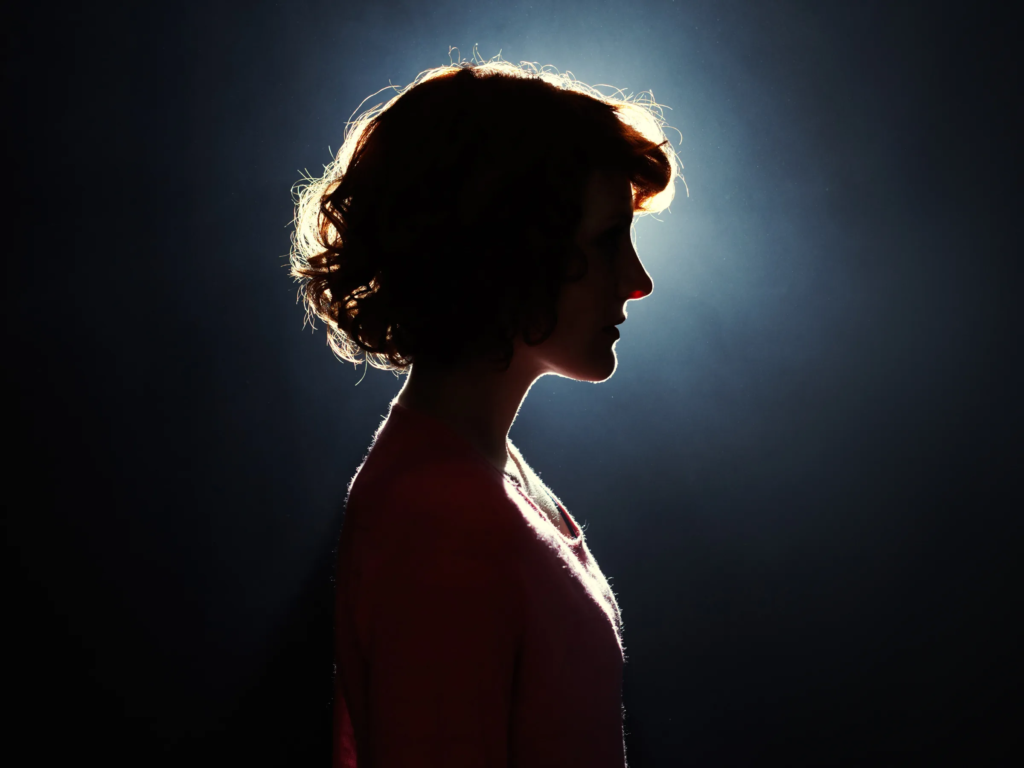
Line: Objects or parts of an image that act as lines can create direction in a photograph to highlight certain areas, or they can be used to outline and highlight important parts as well as showing movement or energy.
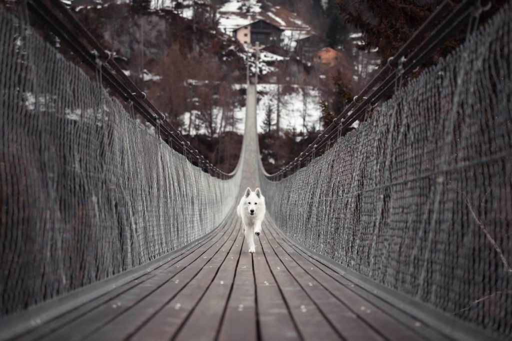
Repetition: Objects, shapes or lines in a photo can be repeated to create rhythms or patterns in an image.
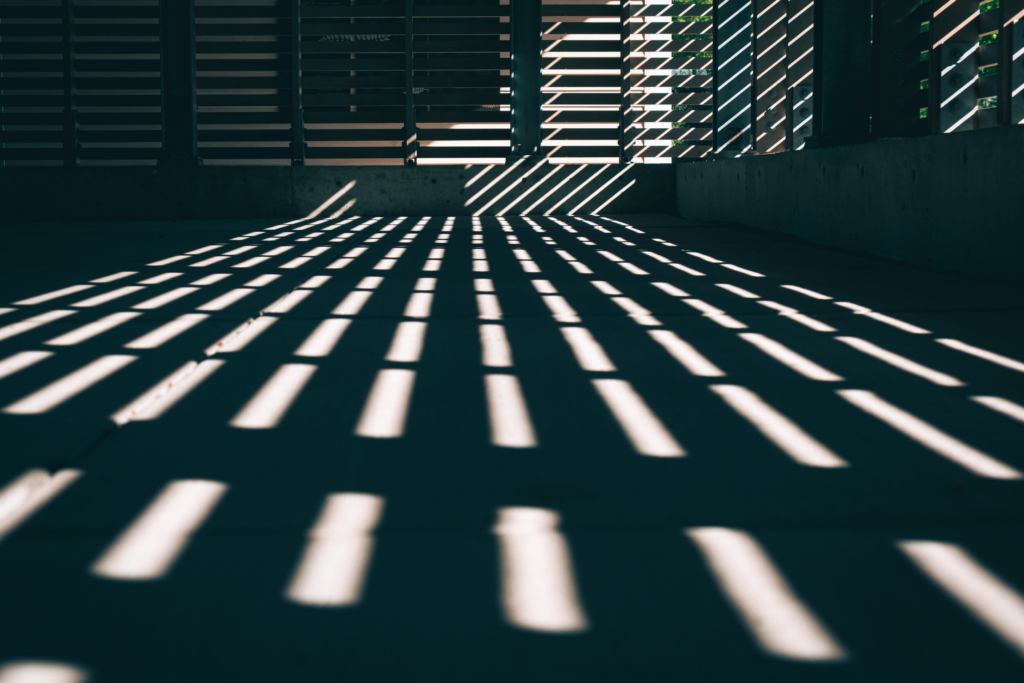
Shape: Geometric or organic shapes can be used in an image which will stand out due to being easily identifiable, which can be used in conjunction with repetition to create simple but effective photos.
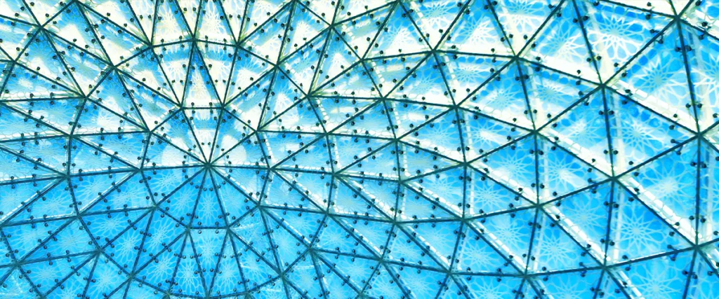
Space: Negative (empty) space can be used alongside positive (full) space to add depth to a photograph or make it more shallow, which could be used to highlight objects in the foreground or background.
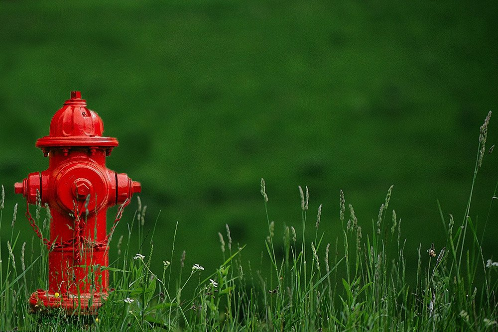
Tone: A range of tones (light to black) can be used similarly to light to highlight parts of an image as well as affecting the mood or atmosphere as an image; for example, darker tones create a dull mood which when intentional can be used to capture a strong effect in photographs.
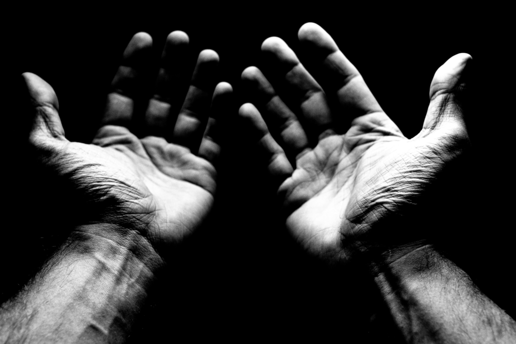
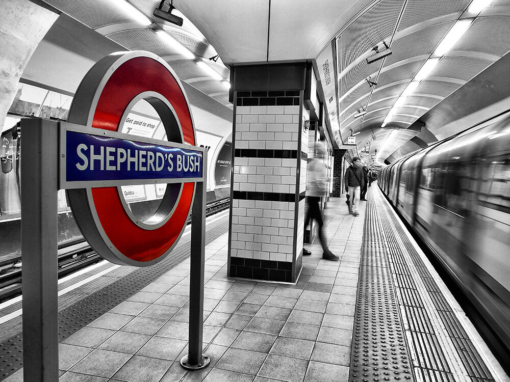
Colour: Colours can be used to add life to images and create vibrant moods, and can also be used to highlight certain aspects due to some colours being more dominant than others.
Photographer Research – Francis Bruguière
Francis Bruguière (15 October 1879 – 8 May 1945) was an American photographer who experimented with multiple-exposure, solarization, original processes, abstracts, photograms, and the response of commercially available film to light of various wavelengths. Some of his most famous photos are experimenting with light and the texture of paper to manipulate the image into being abstract.
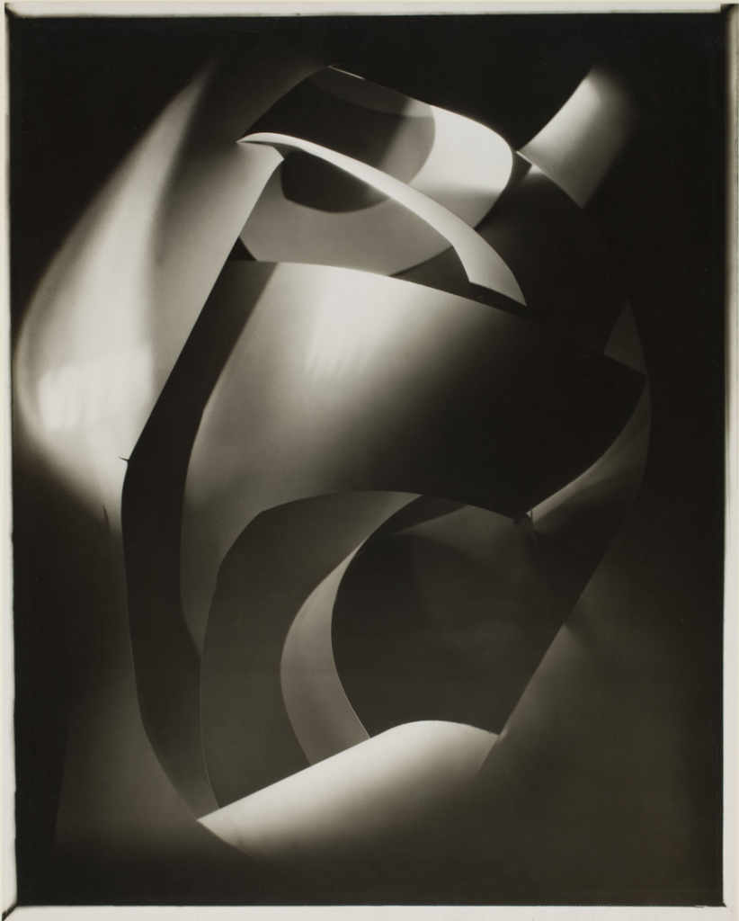
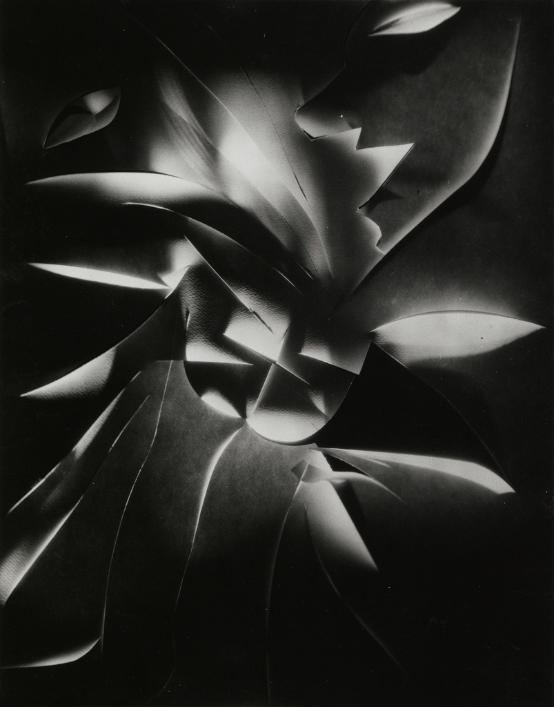
Above are two of Bruguière’s images which I find to be effective. He has created shapes with paper and experimented with different levels/angles of light onto the paper to explore how it will affect the presentation of the images in terms of its texture – these images also make very effective use of the formal elements, for example there is a wide variety of dark and light tones which blend together nicely alongside the low aperture softening the focus on the background to create an abstract effect as well as a sense of intrigue to the image. Furthermore, there is clear use of lines but they are slightly out of focus and instead of directing focus or highlighting certain regions of the image they are present all over the image whilst simultaneously not being overused which helps strengthen the abstract effect further as everything mixes together smoothly to make it hard to pinpoint one clear subject in both of these photographs.
Photoshoot Plan:
I decided to focus my photoshoot on the texture of paper, taking inspiration from Bruguière’s work to try and create paper shapes and using the lighting of the photography studio to explore how manipulating the light will affect the quality as well as the degree of abstraction in the image produced. I also wanted to try include aspects of the formal elements into my images to try and produce more effective and fascinating final images.
Post-Photoshoot Refining and Selecting
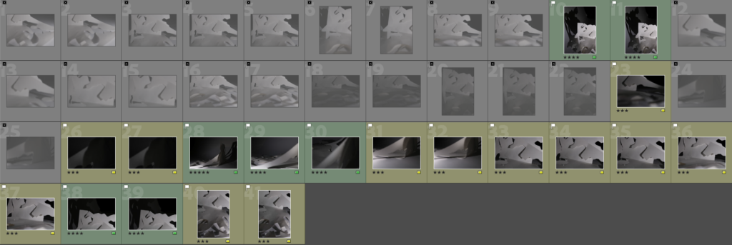
After the photoshoot, I imported my images into Adobe Lightroom so I could begin my review and selection process to identify poor photos (flagged as X), good photos with improvements to be made (yellow and 3 stars) and photos which I found were most effective and wanted to edit and refine for my final piece (green, 4 or 5 stars).
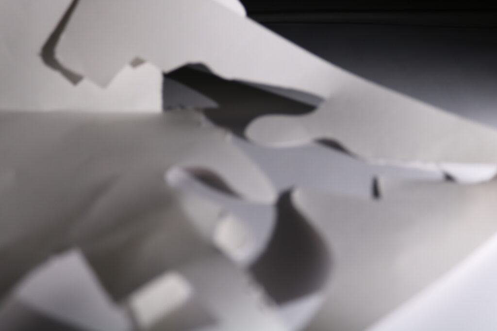
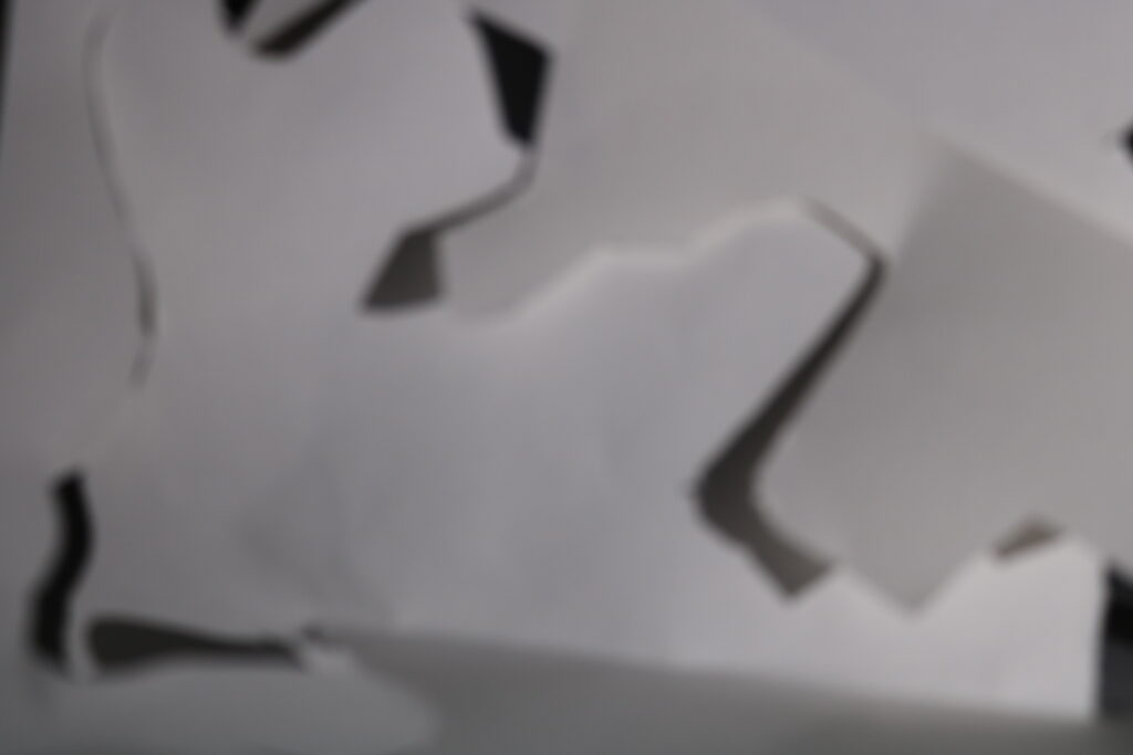
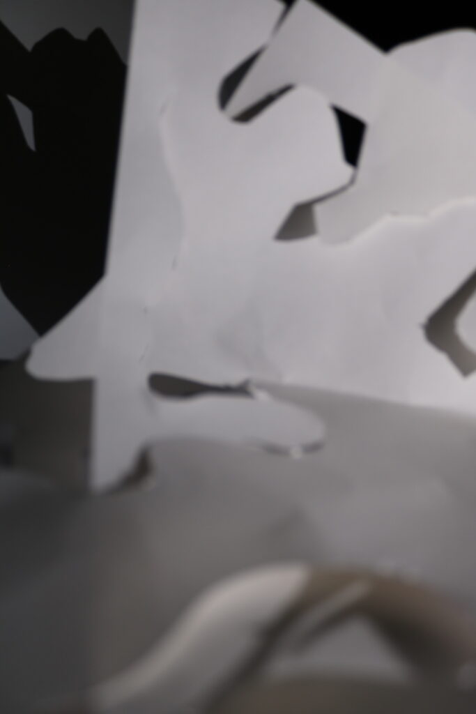
Above are 3 images I found weren’t effective and flagged as X. I feel these photos aren’t great since I didn’t properly adjust aperture the way I planned to in order to highlight texture, and it turned out to be out of focus too – furthermore, I feel these don’t use the formal elements effectively since for example the texture which was my main focus of this photoshoot hasn’t been shown clearly and the lines of the paper don’t highlight some regions and instead are just present without really contributing to the mood these images are trying to build.
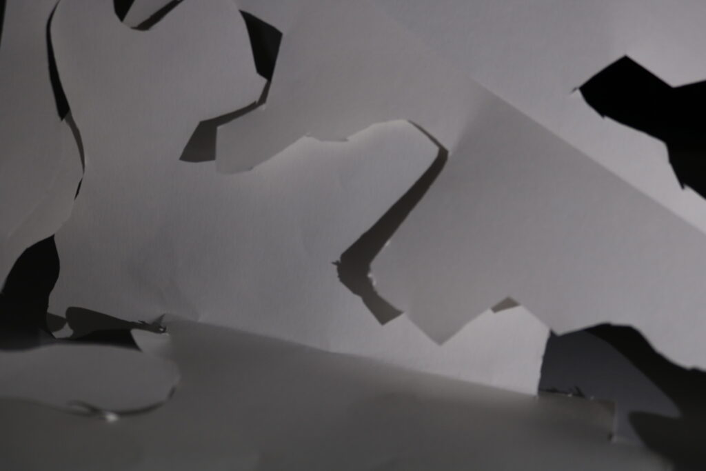
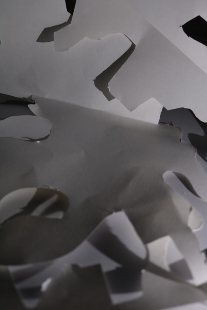
Above are 3 images I found were improvements compared to others, but at the same time weren’t my best images – after experimenting with settings and identifying weaknesses in previous photos, I adjusted settings further and found that it was producing more of the effect I wanted it to (the 3 photos above were all taken at ISO 200, f/stop 4 and shutter speed 1/20 sec) and also managed to capture these images more in focus which improves the overall quality. I also found the formal elements were being displayed more clearly here, since in the first and last image displayed I used a light from a phone to manipulate the shadows and dark tones into highlighting the texture and in the middle image I experimented more with lighting to try and achieve an abstract effect and although it was semi-successful I found it to be too underexposed and out of focus to use it as one of my final best images.
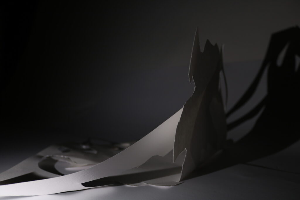
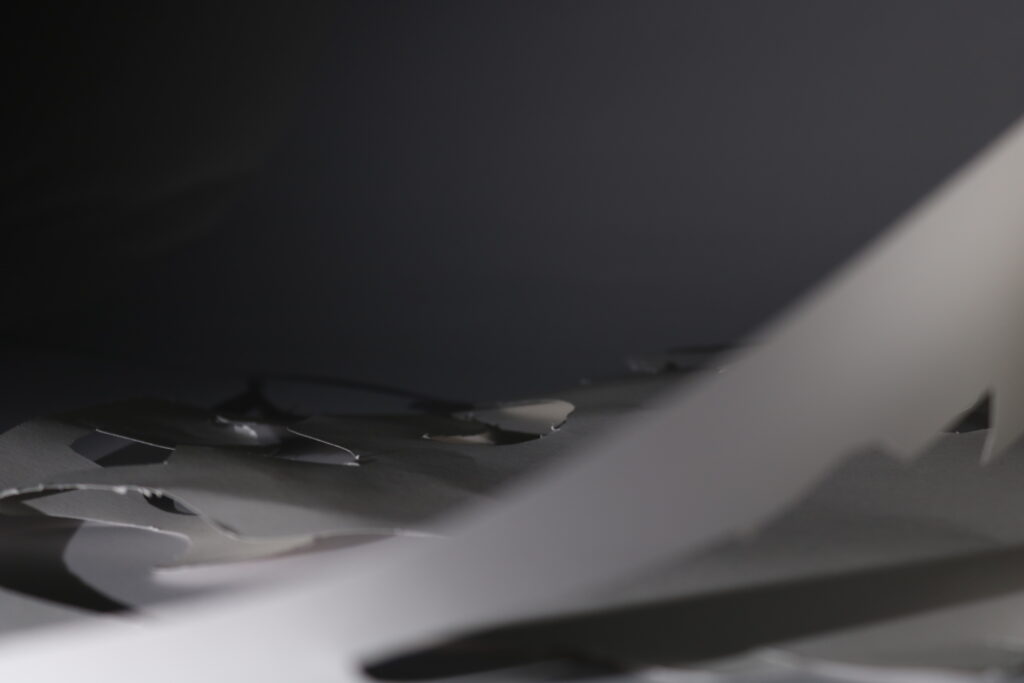
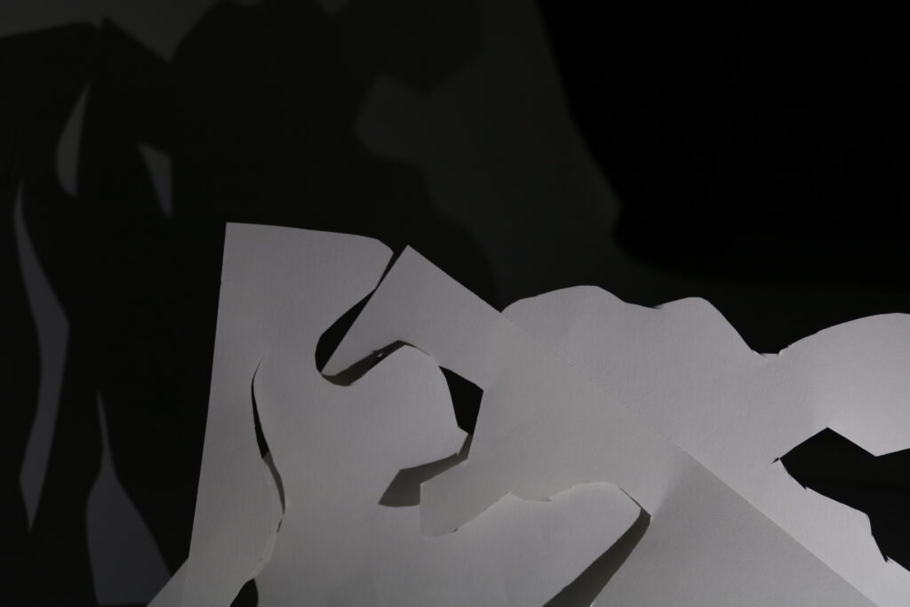
Above are 3 images I found to be some of my most effective and selected to edit and present in my final piece. By this point I had done lots of experimenting with the settings and lighting so I was able to capture these images exactly how I wanted to in my pre-photoshoot plan, and also captured them in focus (except for the middle one which has some intentional line blurring to highlight texture in the background). I believe these images are ones that use the formal elements most effectively out of all my images.
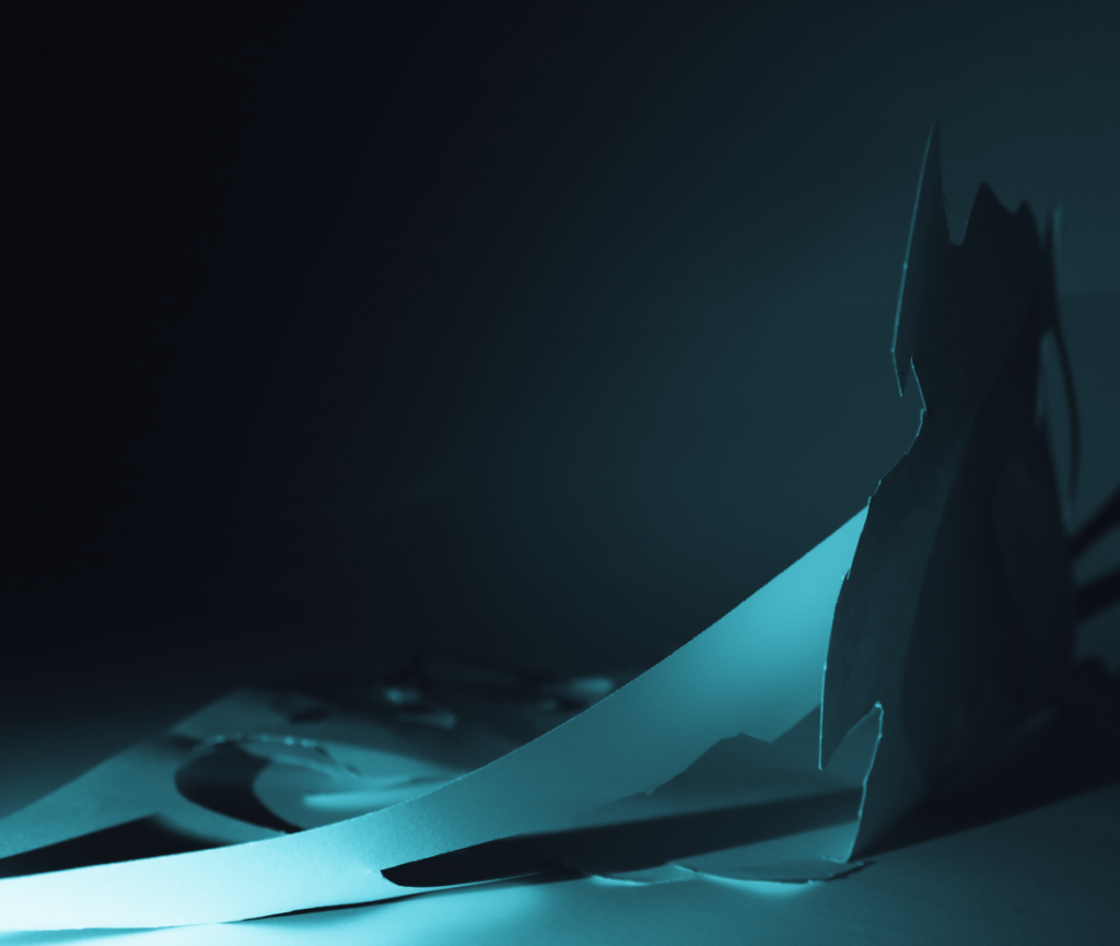
In the first image, I decided to use my phone light rather than the studio light after some experimentation to cast a shadow of the paper onto the wall as well as using this light to highlight the texture of the paper itself, and I also captured the paper in a way where it acts as a leading line to the part of paper sticking up which acts as the subject of the photograph due to most of the photograph being 2D and flat whereas this aspect of it is sideways to show dimension and depth. In editing I will crop the image to focus more on the right half since that’s where the subject and main focus of the photo is as well as adjusting shadows and brightness to explore the effect this will have on the lighting and texture.
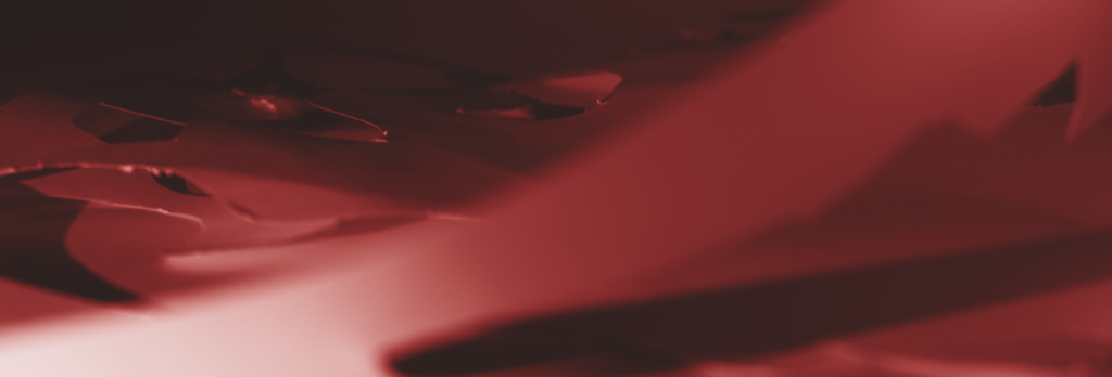
In the second image, I used a line of paper in the foreground but also intentionally captured it out of focus so the main subject of the image is still on the texture of paper in the background, which stands out due to me positioning the lighting in a certain way to clearly highlight it. In editing I will crop the image to focus further on the texture as well as experimenting with gradient overlays and contrast to see what effect this will have on my photo and the intention behind it.
In the third image, I aimed to focus more on capturing the formal element of lighting effectively by positioning my artificial lights and paper in a way where there would be a range of light and dark tones due to the projection of the paper’s shadow. I also found there was effective display of texture on the paper as well as lines from the bottom right towards the top left which lead to the shadow, clearly contrasting the dark and light tones. In editing I will experiment with cropping, because even though I like the raw photo as presented above I want to see if manipulation of the image in terms of cropping and composition will strengthen the atmosphere created by the other formal elements.
Image Editing and Manipulation
Below is the first set of my edited images after experimenting:
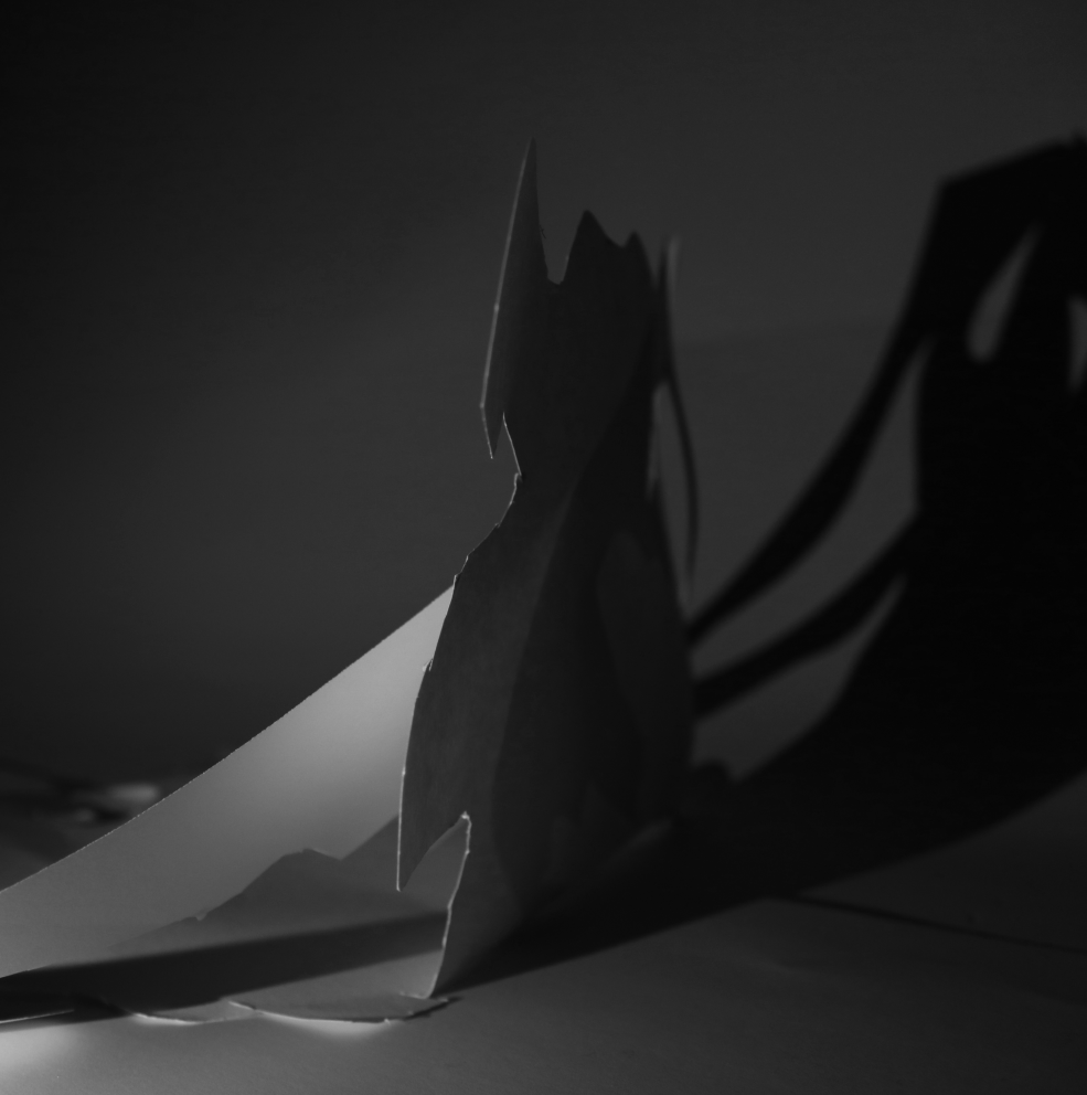
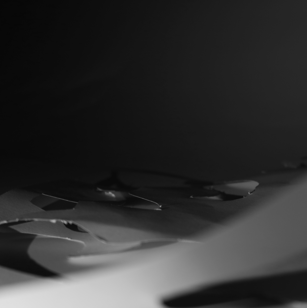
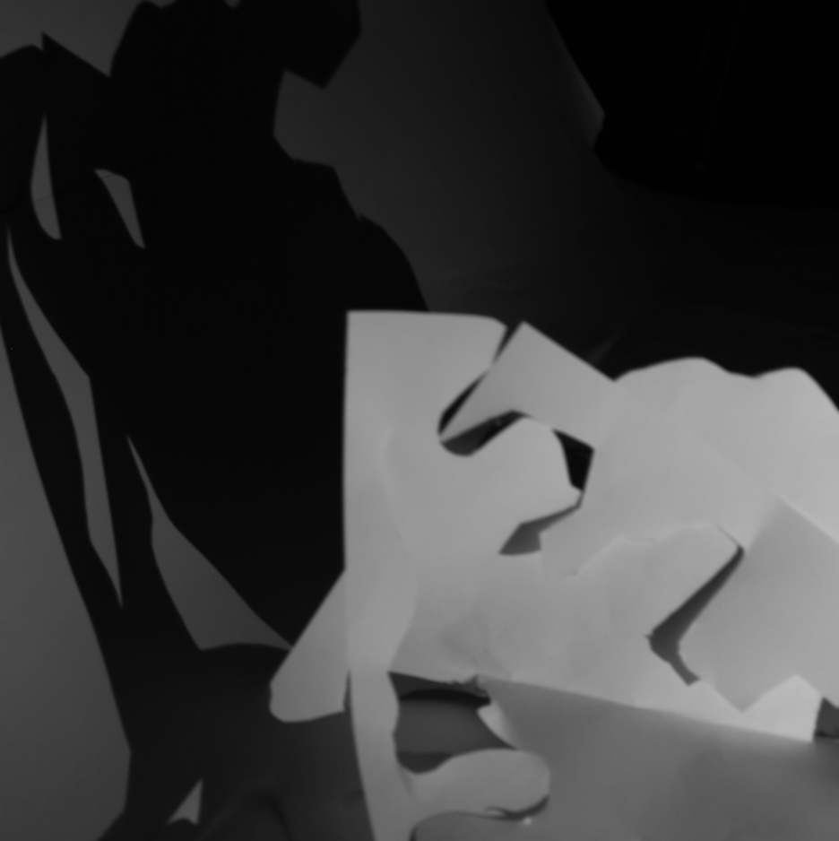
After this, I decided to manipulate my images taking an alternative approach with gradients to see what effect it would have on the photos, the formal elements as well as the ideas behind each photo.
Below is my second set of edited images:
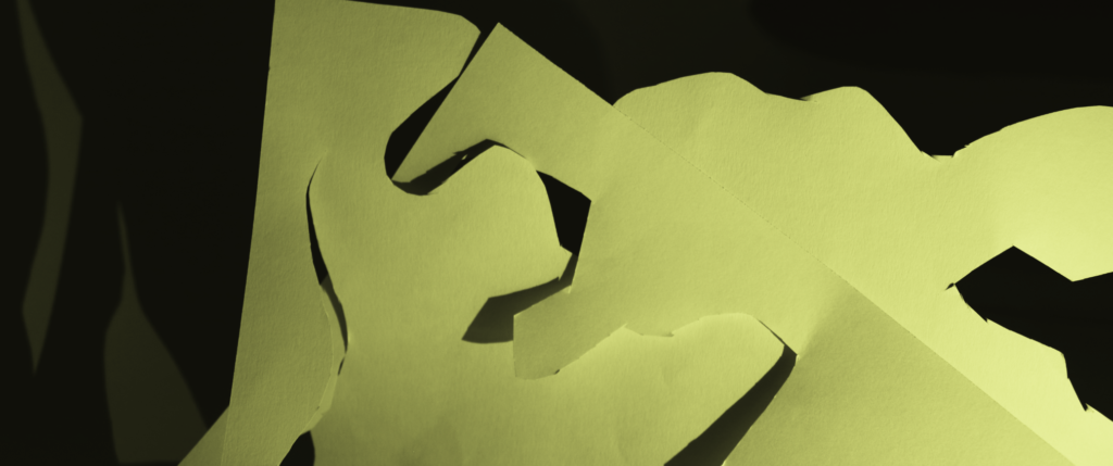
Final Images – Creation
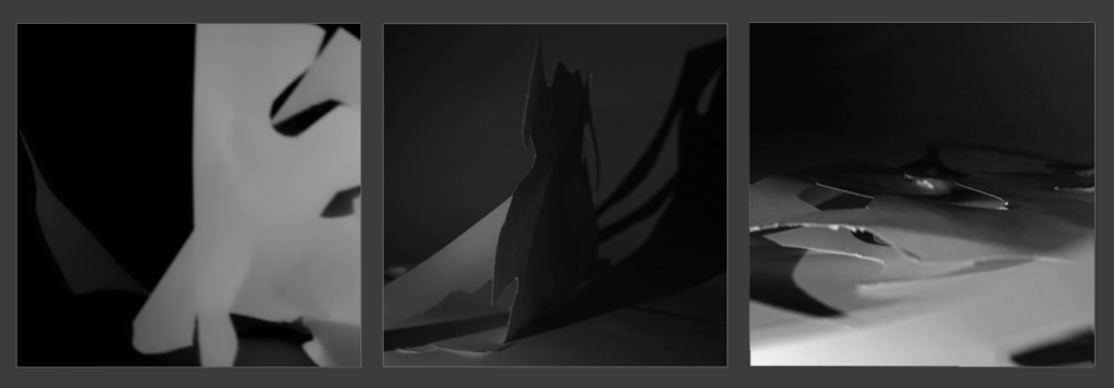
Below is my final set of edited images:
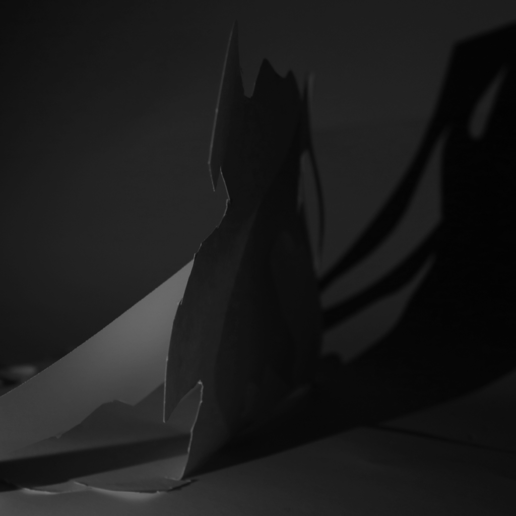
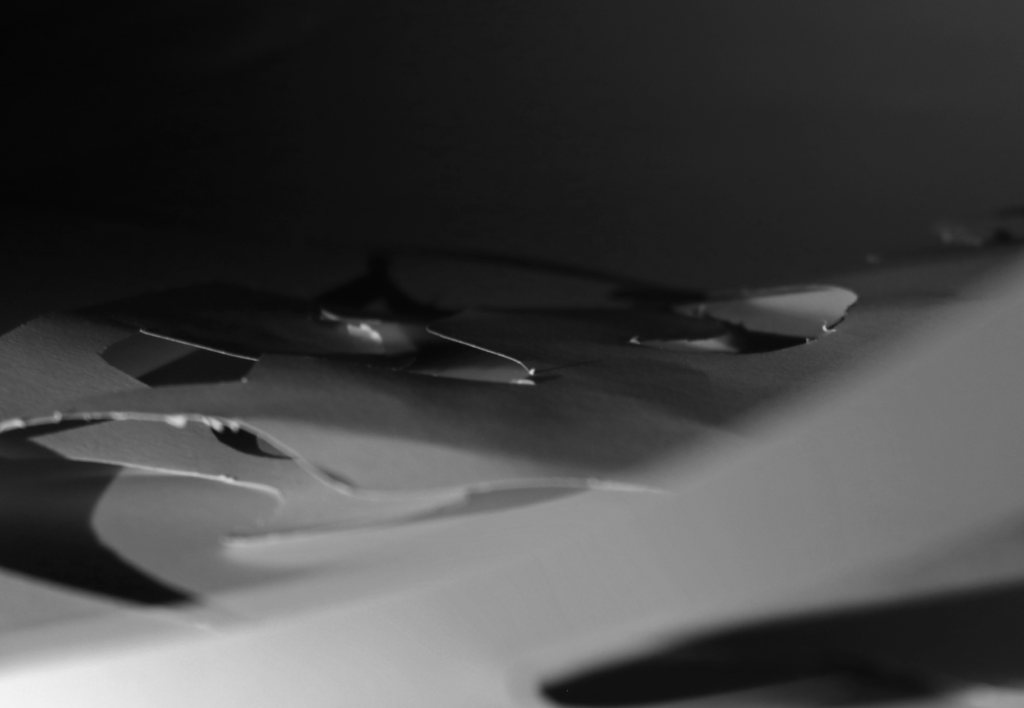
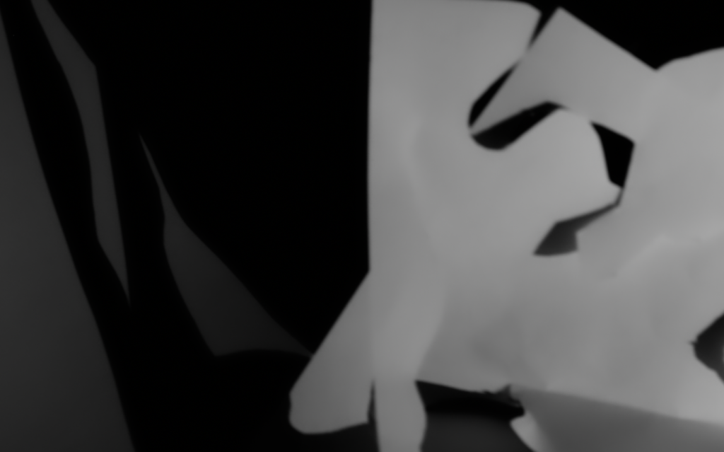
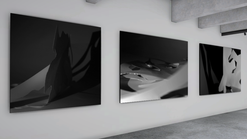
Final Presentation
Evaluation


On the left is a photo from Francis Bruguière and on the right is one of my final images. I think I was able to replicate Bruguière’s use of the formal elements, most notably the visible differences between dark and light tones and subtle lines which create space and contribute to the composition – however, unlike Bruguière, I have used mostly negative space to present my dark tones which means the paper doesn’t fully fill the frame and therefore it does take away from the abstract effect.

JAC 3 NOV confident and explorative approach – well done!
Please add a virtual gallery to showcase your images !