Brendan Austin
My Response:
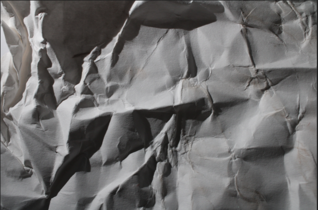
This was my first photo but I don’t think it matched his style enough so I took a few more at different angles.
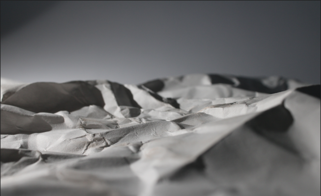
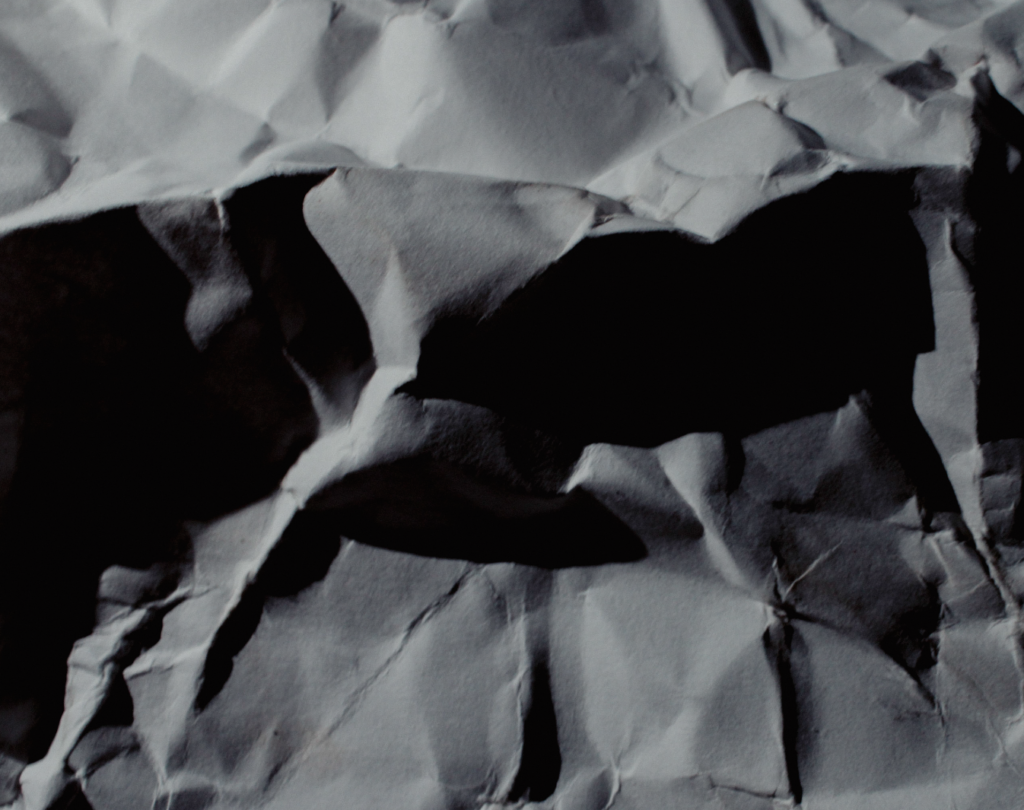
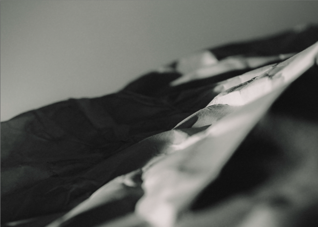
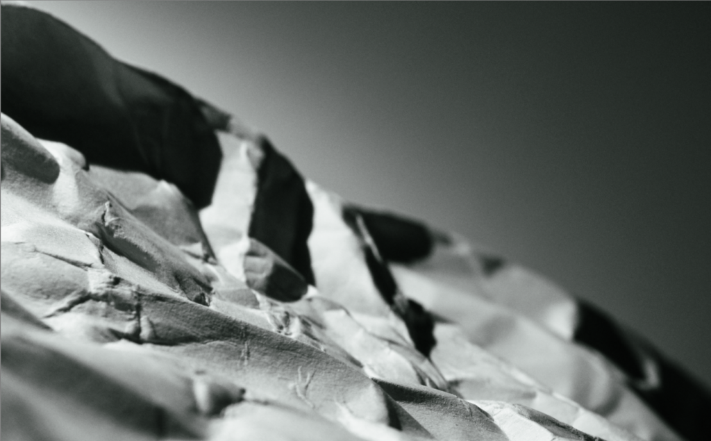
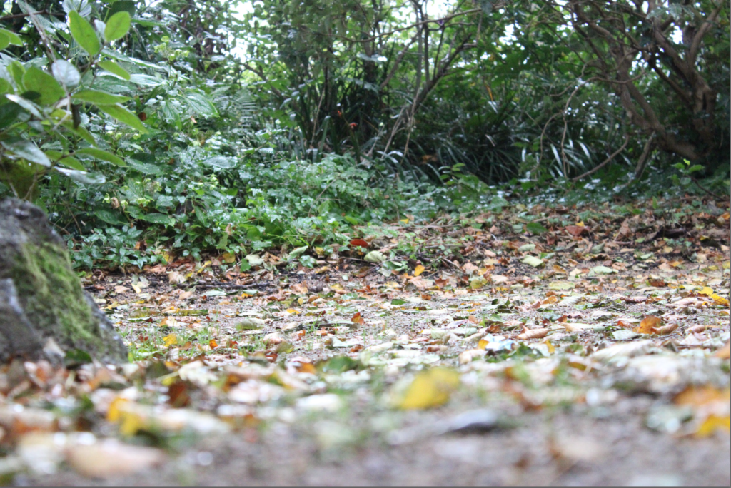
These photos were better as they matched his style more and looked like a terrain sort of thing.
Editing:
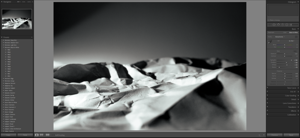
Final Photo:
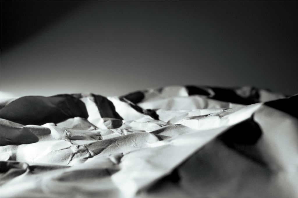
Francis Bruguiere
Bio
Born the youngest of four sons into a wealthy San Francisco family, Francis Bruguière was interested in painting, poetry, and music, and became an accomplished pianist. Upon his return from Europe, where he studied painting, he met Alfred Stieglitz at the 291 Gallery in New York and soon took up photography. While studying with Frank Eugene (Smith), Bruguière joined the Photo-Secession. Although he returned to San Francisco, Stieglitz published one of Bruguière’s photographs in Camera Work and included several in the ground breaking 1910 Photo-Secessionist exhibition at the Albright-Knox Gallery in Buffalo, New York.
Around 1912 Bruguière began to experiment with multiple exposures. In 1918 he published a book of Pictorialist views of his hometown, titled San Francisco. Soon thereafter, he returned to New York, where he opened a new studio, and began his famous series of cut-paper abstractions. In 1928 he moved to London where he designed stage sets and photographic murals. The later years of his life were spent mostly in New York, where his attention turned increasingly to painting and sculpture.
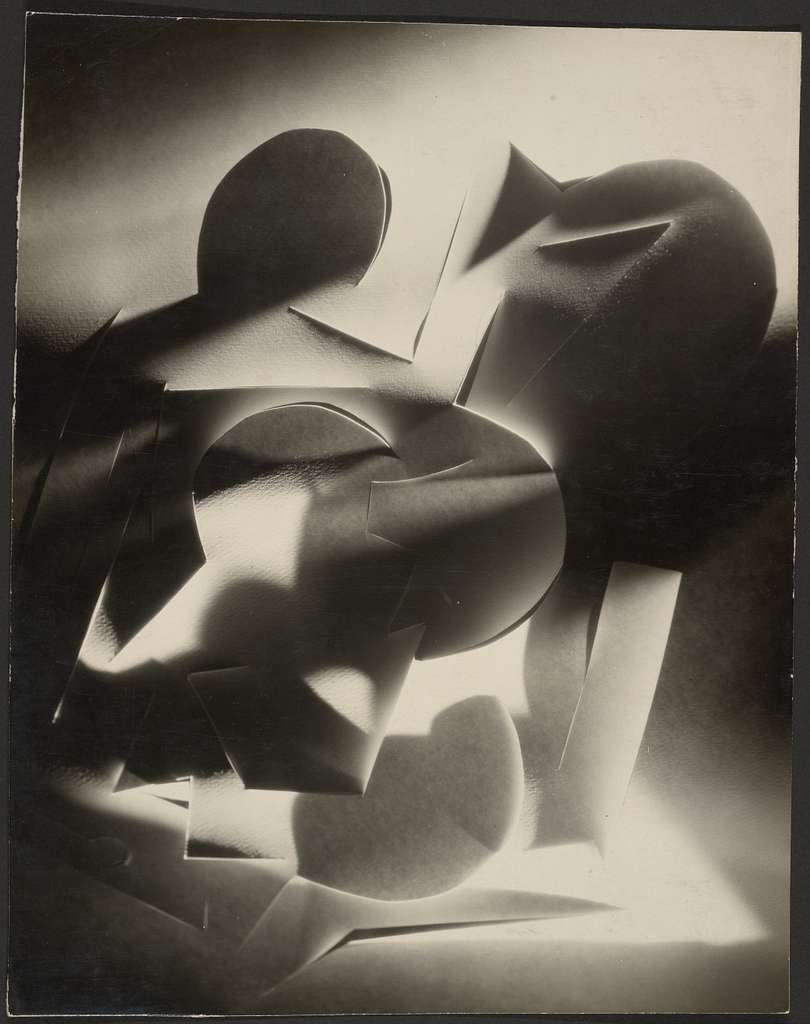
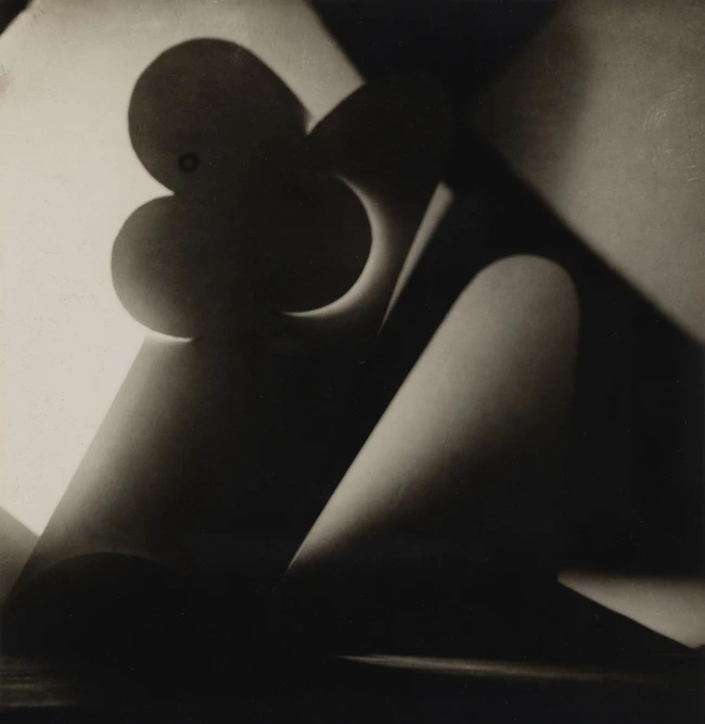
image 1 image 2
Overview of the photos
I like these photos because of there abstractness. The cuts in the paper are so random and the cropping she has done to the photos are so effective in hiding what the photos actually are.
Light
With the use of light, which travels through the cuts and folds of the paper, Bruguière has managed to create two alluring abstract photos and it is difficult to formulate what the image is. In both the photos, it’s the light catching the paper that creates patterns and textures that travel across the photo in the form of light and shadows.
Colour / Value & Tone
The monotone prints remove any distractions of colour and draw your attention to the tonal values created by the light and shadows.
Balance / composition
Within the first image, you can see the darkest shadows through out the frame. The random shapes in the photo creates diss balance to the image and draws your attention to the mess of textures and tones in the centre. The sharp, cuts and decorative detail of the paper sits largely in the centre of the frame, with softer light travelling to the top right and bottom left corners of the frame.
Camera techniques
The aperture of the camera allows for a sense of depth through the image, particularly in the photograph. Your eyes are drawn to the sharp folds of paper in the foreground, in contrast to the soft multi tonal background
My Response:
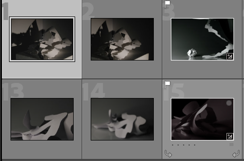
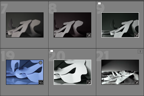
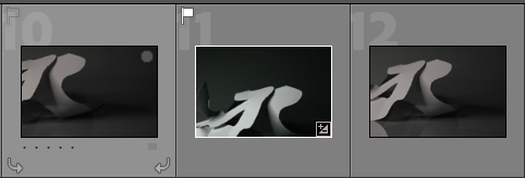
Strongest Photo Selection:
I took the image into Lightroom and did some editing and this is how it came out.
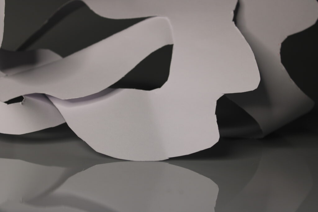
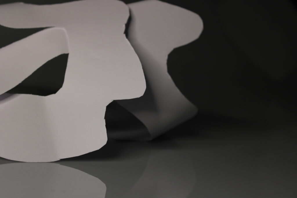
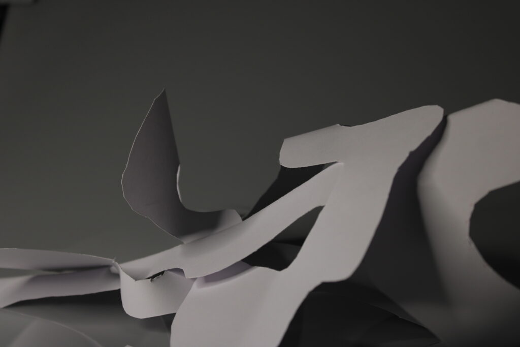
Further Editing
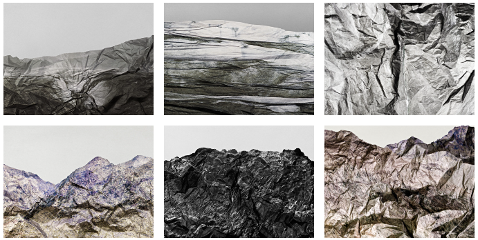
I then cut and cropped my favourite 8 photographs and edited them this is the sheet of them.
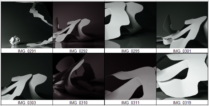
This is the images separately:
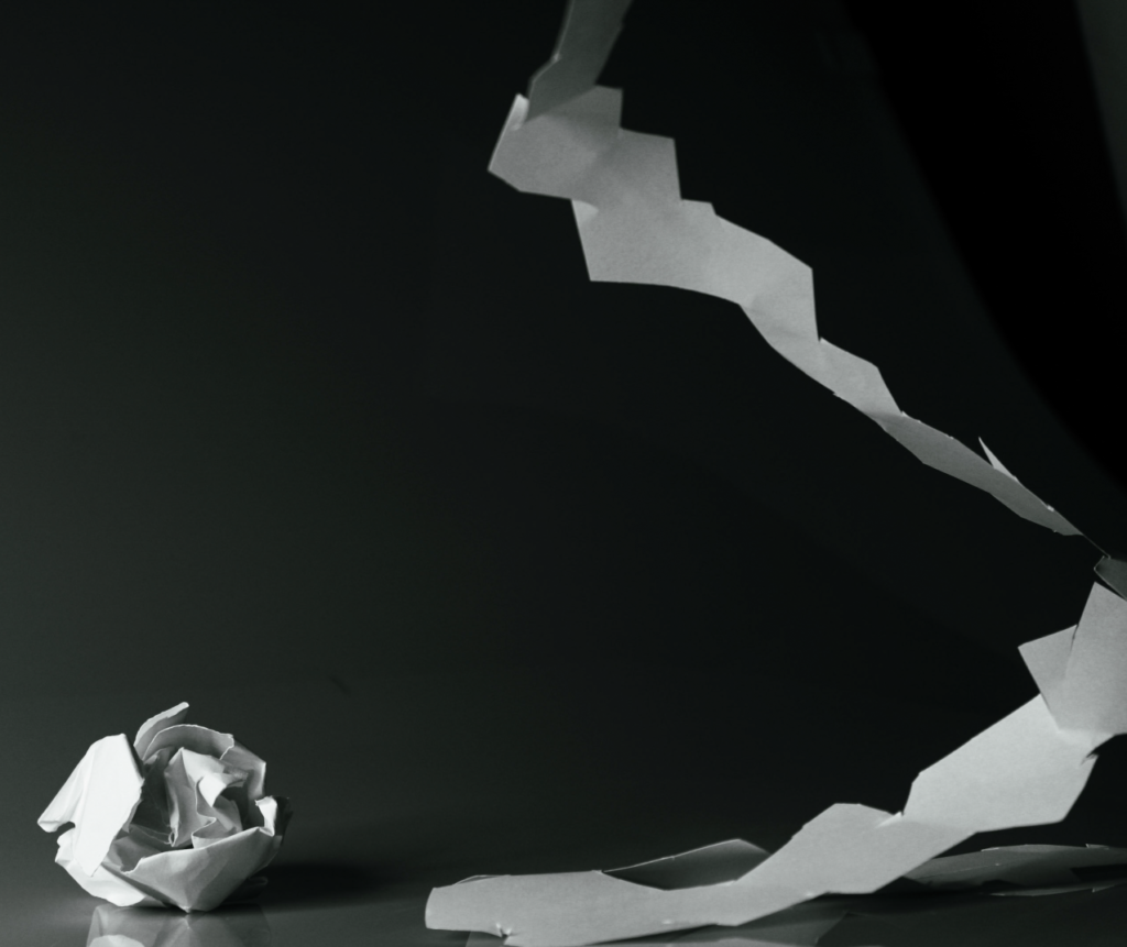
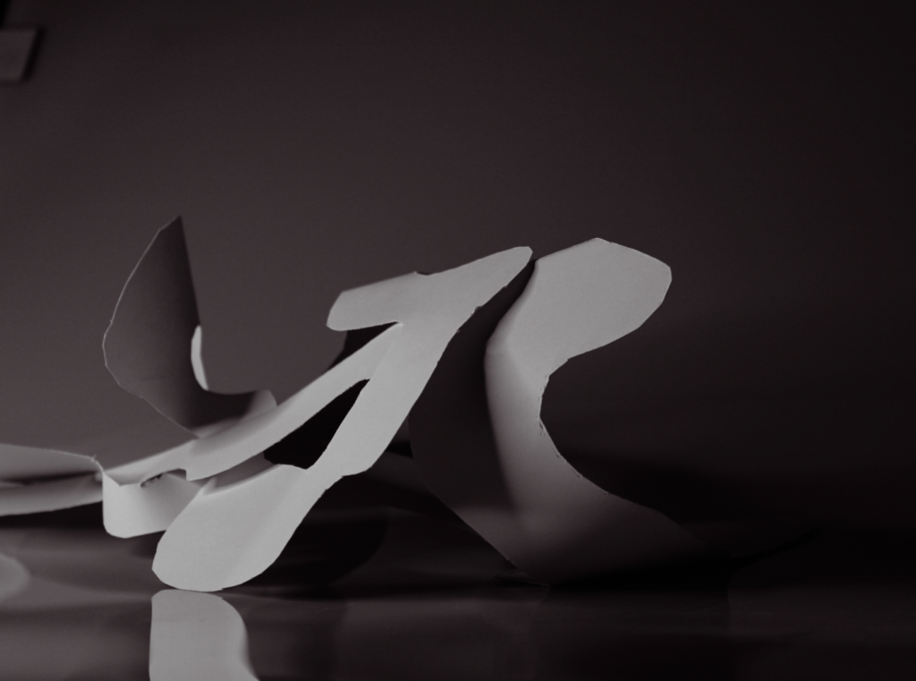
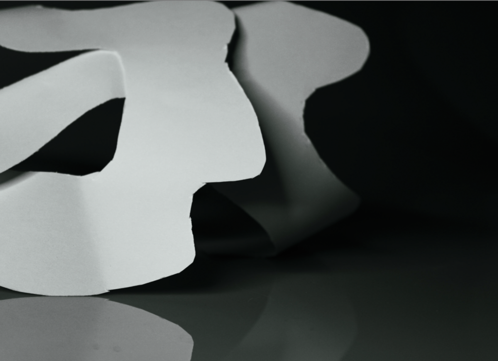
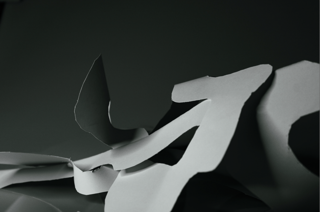
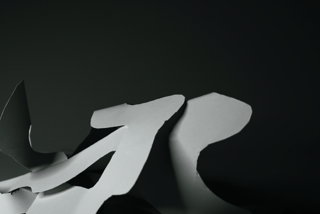
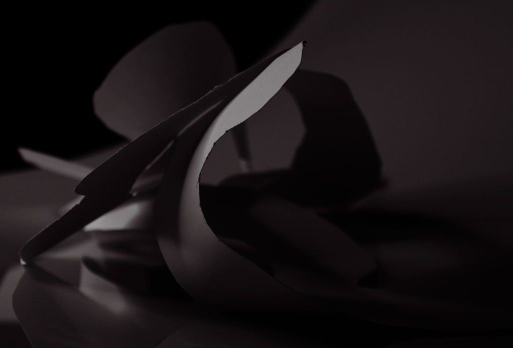
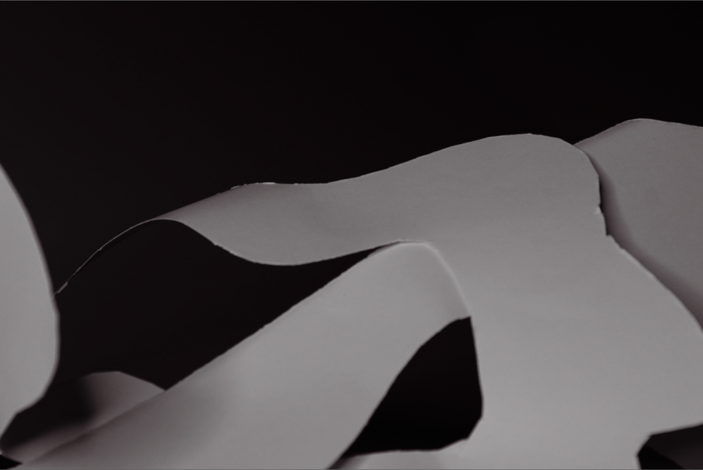
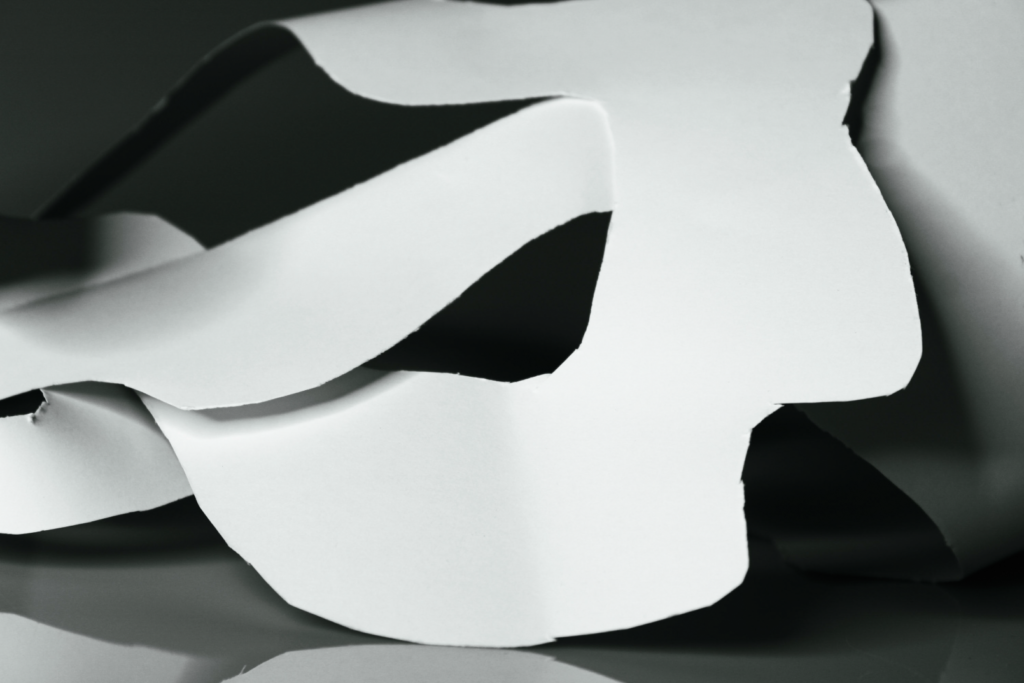
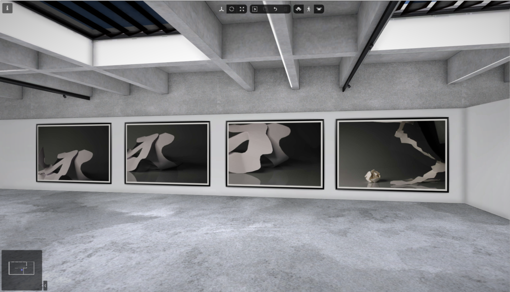
I used art steps to see my photos in a gallery in real life this was a final step to presenting my photos.
Photoshoot 2
Aaron Siskind
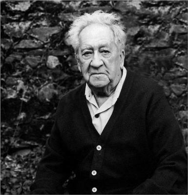
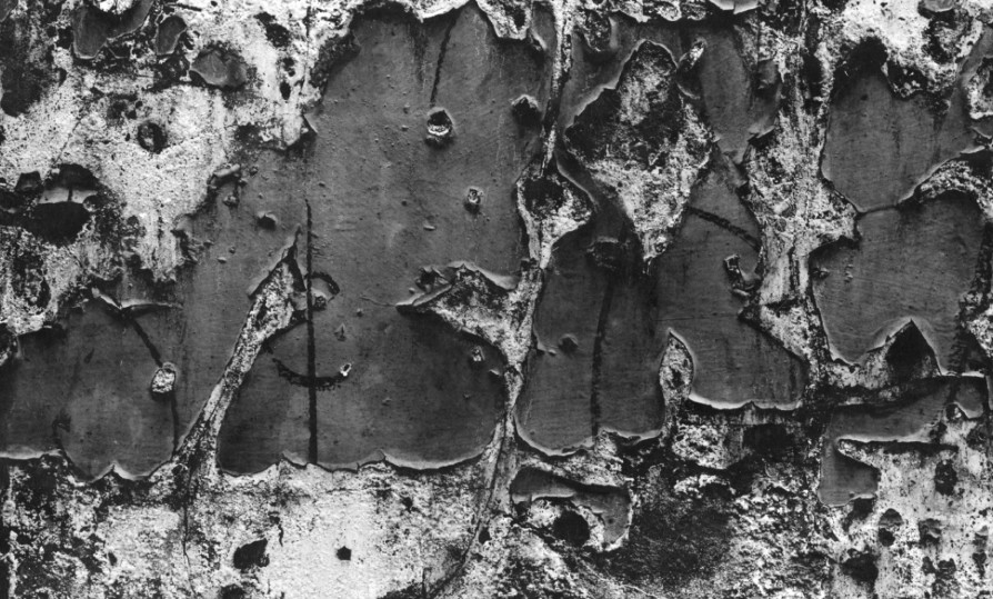
This one of his photos helped inspire me to take similar photos with paper the amazing textures of the rotting wood make the photo really amazing. The photo is taken with a dead pan angle which makes it look unreal, you cant tell what the photo is. The fact its in black and white also pulls out the dark and light tones.
Aaron Siskind was an American photographer whose work focuses on the details of things, presented as flat surfaces to create a new image independent of the original subject.
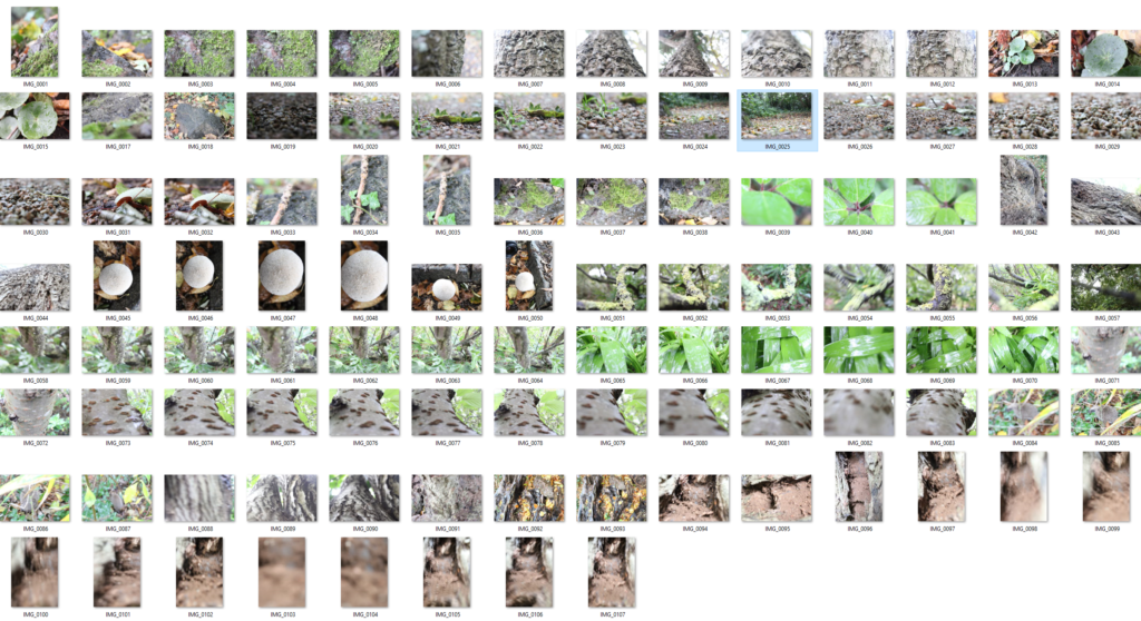
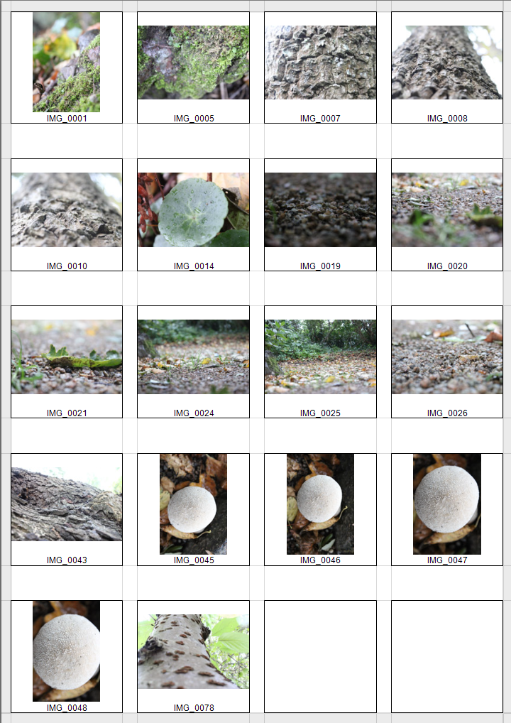
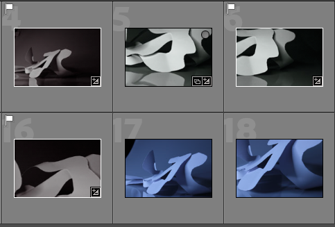
These are my best 6 photos:
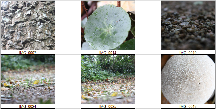
Here is them separately:
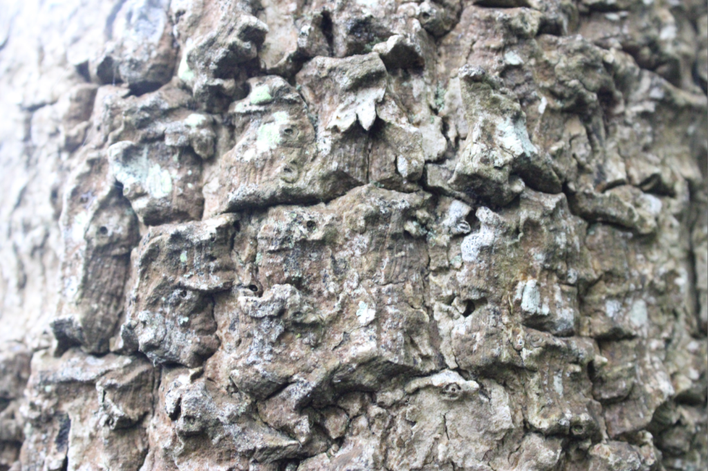
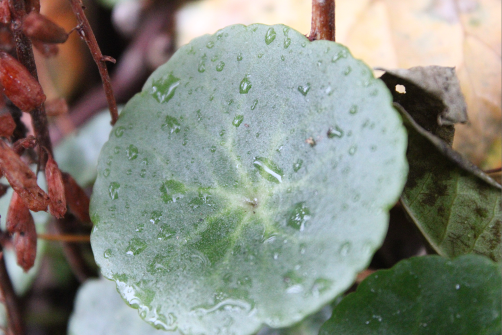
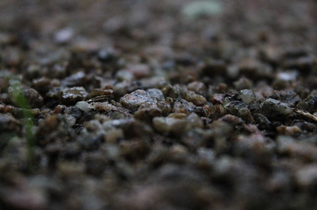
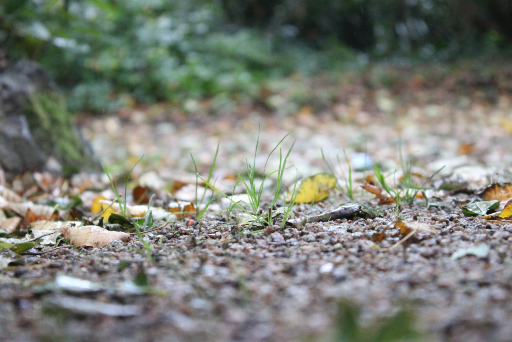


JAC 3 NOV effective imagery is being created by responding closely to artist references — much better