Jaroslav Rössler
Jaroslav Rössler was a Czech photographer. He was a pioneer of Czech avant-garde photography and a member of the association of Czech avant-garde artists Devětsil. Today he is considered an important exponent of Czech modern photography and avant-garde art. He often photographed objects against stark backgrounds, or used long exposures, to reduce subjects to their elementary lines and geometric shapes.
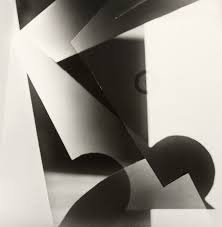
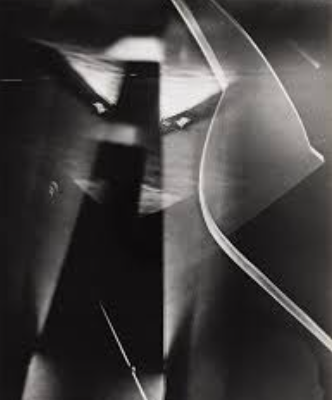
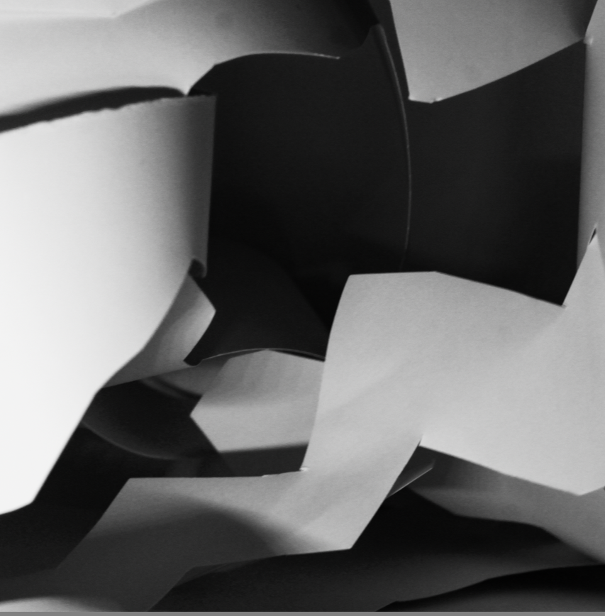
In the first photo he uses paper to create geometric shapes using the shadows and the light. the lines are straight and sharp causing the photo to look neat and put together by him.
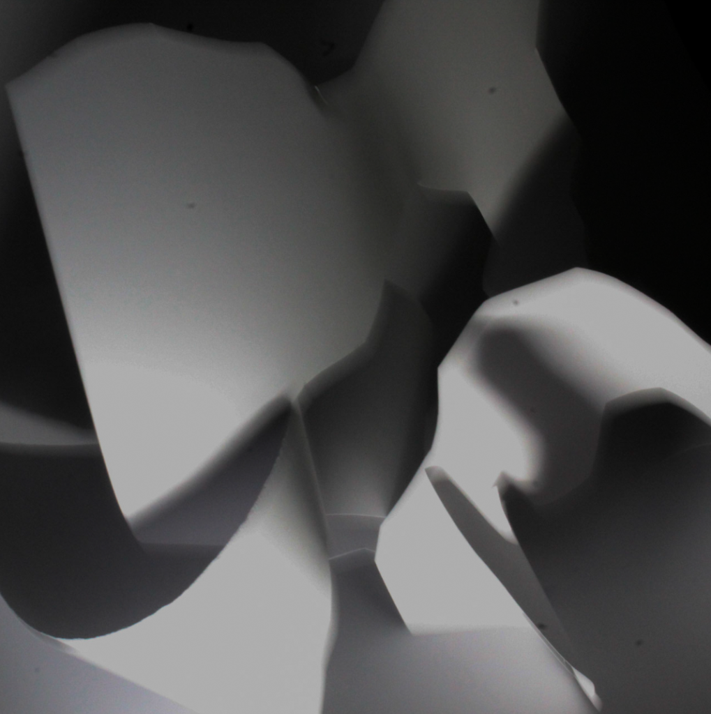
However the second photo looks more natural and has no significant shape, you wouldn’t be able to tell what it is unless someone told you.
Formal elements.
LINE:
Objects in the photograph that act as lines, they could be straight curvy, thick or thin. They could create different effects on the photograph.
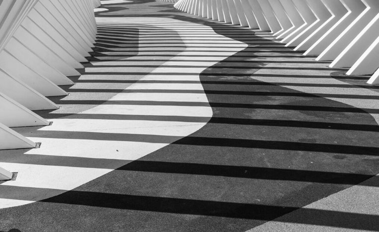
SHAPE:
Shape elements are often found in photography in the form of patterns. There are two basic types of shapes: geometric or regular and organic. Geometric shapes are – circle, square, triangle ect.
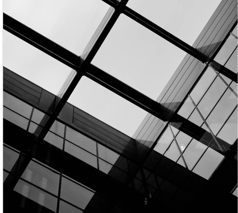
SPACE:
positive space is the actual subject while negative space (also called white space) is the area surrounding the subject. E.G a boat in the middle of the sea.
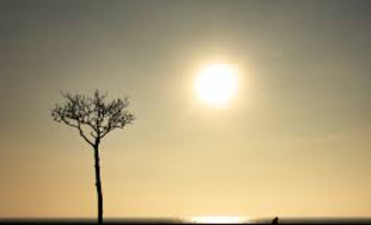
This is an example of when space is used in a photo, it highlights the tree as that is the boldest part of the photo
REPETITION
Repetition in photography refers to the technique of integrating recurring elements, patterns, or themes in a composition to produce a sense of rhythm and balance in an image.
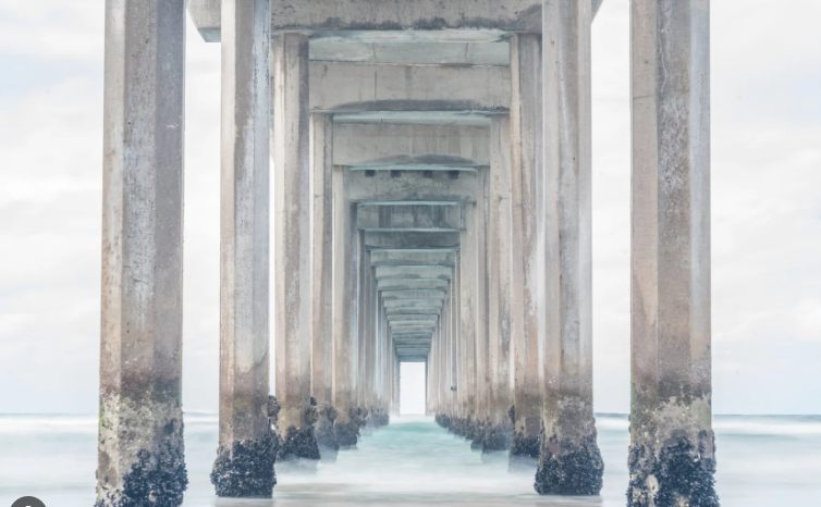
In this photo, the repetition of the pillars helps makes dramatic rhythm
TEXTURE
texture helps role in adding depth and a tactile dimension to images by emphasizing the surface quality of the subject.
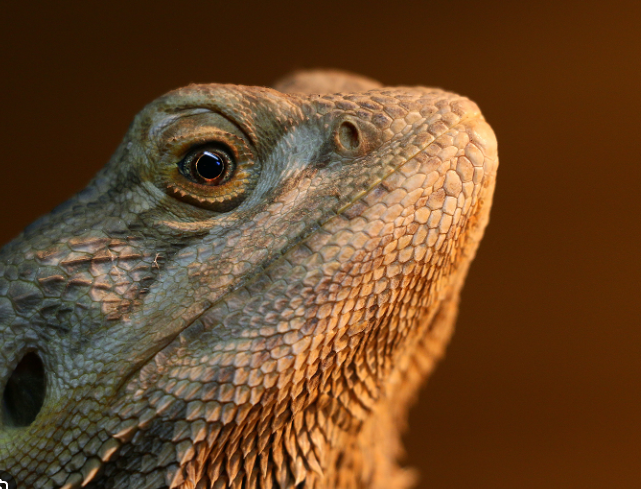
The detail/texture of the lizards skin makes the photo have more depth, as the image is highly focused.
COLOUR
Colour in photography plays a major role in composition, affects balance, and determines the weight of visual elements. Bright colours, for example, are perceived as happy, fresh, and joyful. Dark colours may evoke sadness, fear, or repulsion.
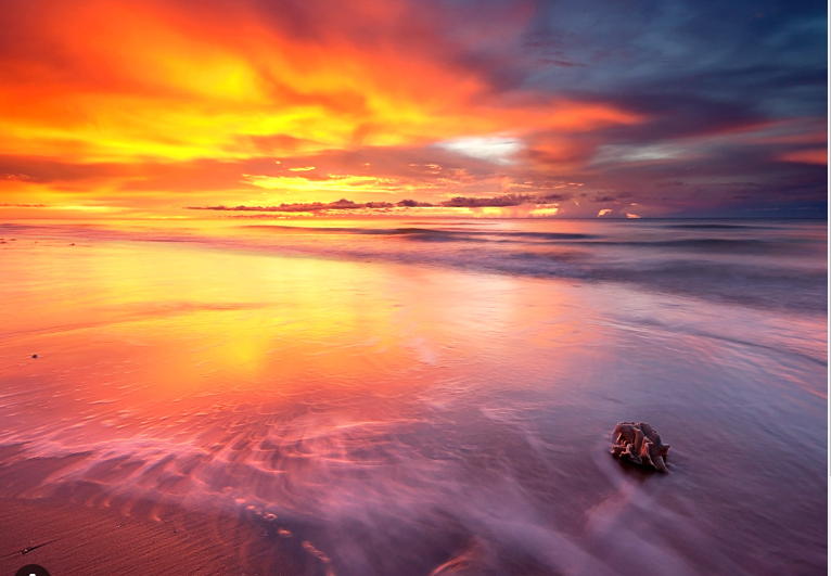
This photo of a sunset is really nice to look at as the many different colours energise the photo. The composition in this photo helps create the mood. it also creates a lot of visual contrast.
VALUE/TONE
In any painting, photograph or design, the area of highest contrast between light and dark will always demand maximum attention.
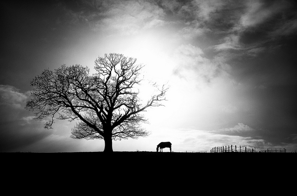
As this photo would also look good in colour, the tone makes a nice silhouette of the horse and the tree, it helps highlight them in the photo. The tone also creates visual interest to engage the viewer.
My paper photoshoot
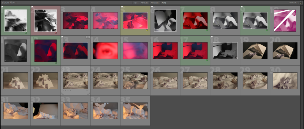
This is my contact sheet. I’ve colour coded it so I can easily find the photos which I prefer. All of these photos are taken by myself. I went into the studio and used the ring lights to help create the shadows which helps add effect to the photo. I used a table with a white background and placed my cut up paper and put it into different shapes.
This is the presets, which helped me quickly auto edit my photos.
Strongest Images:
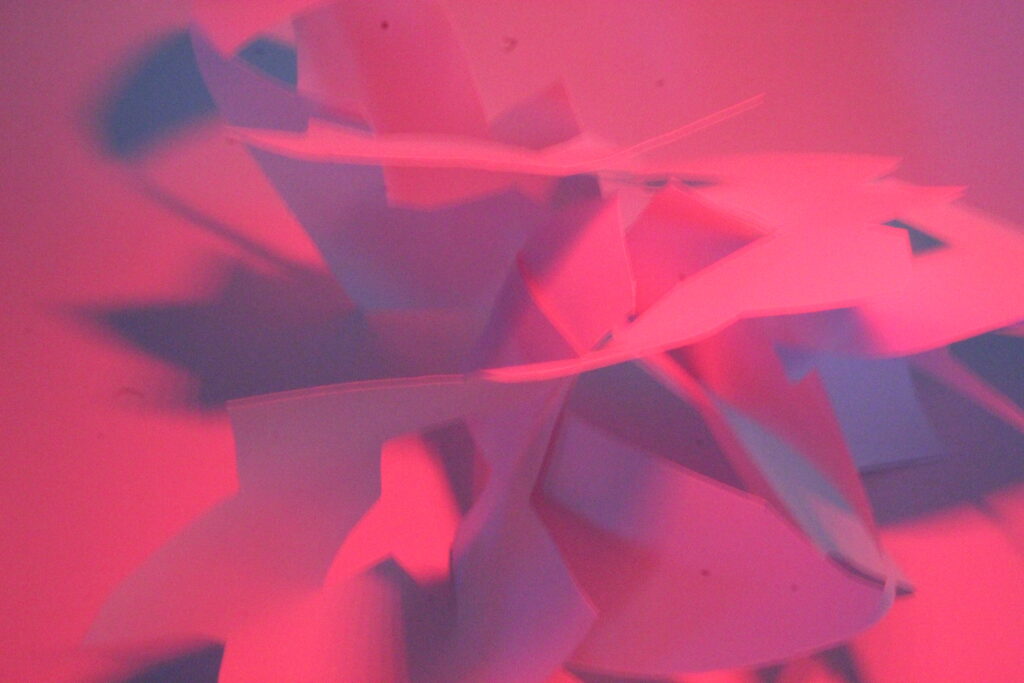


Soft focus / Long exposure photos:
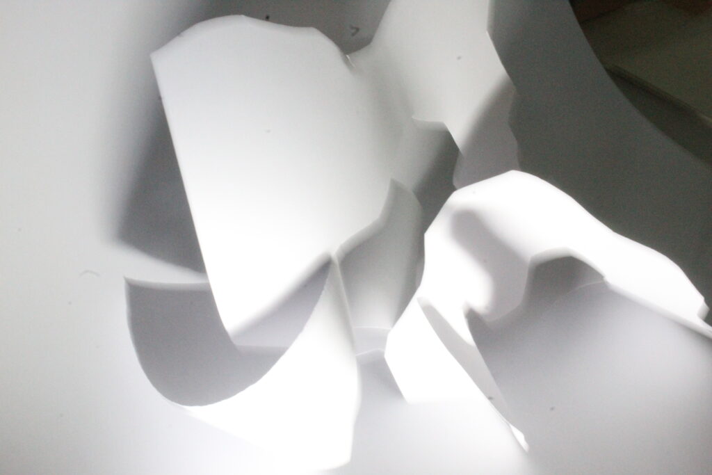
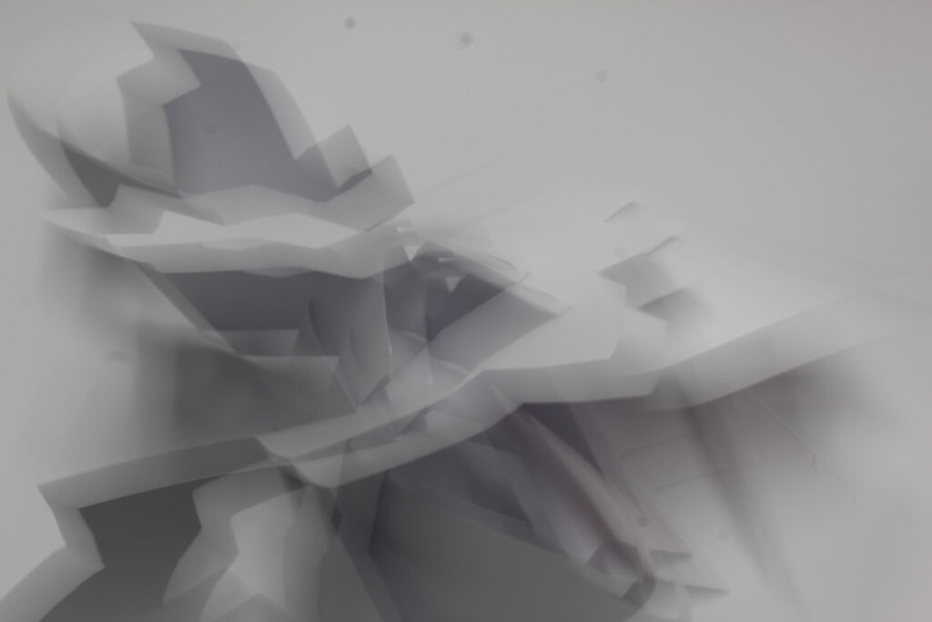
This is my photos before editing
Editing:
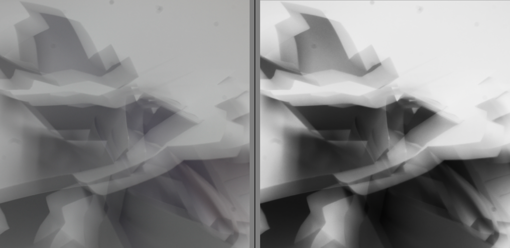
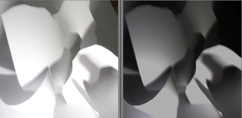
This is the before and after of my soft focus photos. I cropped both of the photos and enhanced the contrast and the tone to make it look better. the tone helps create visual interest and helps set the mood of the photo.
Sharp Focus:
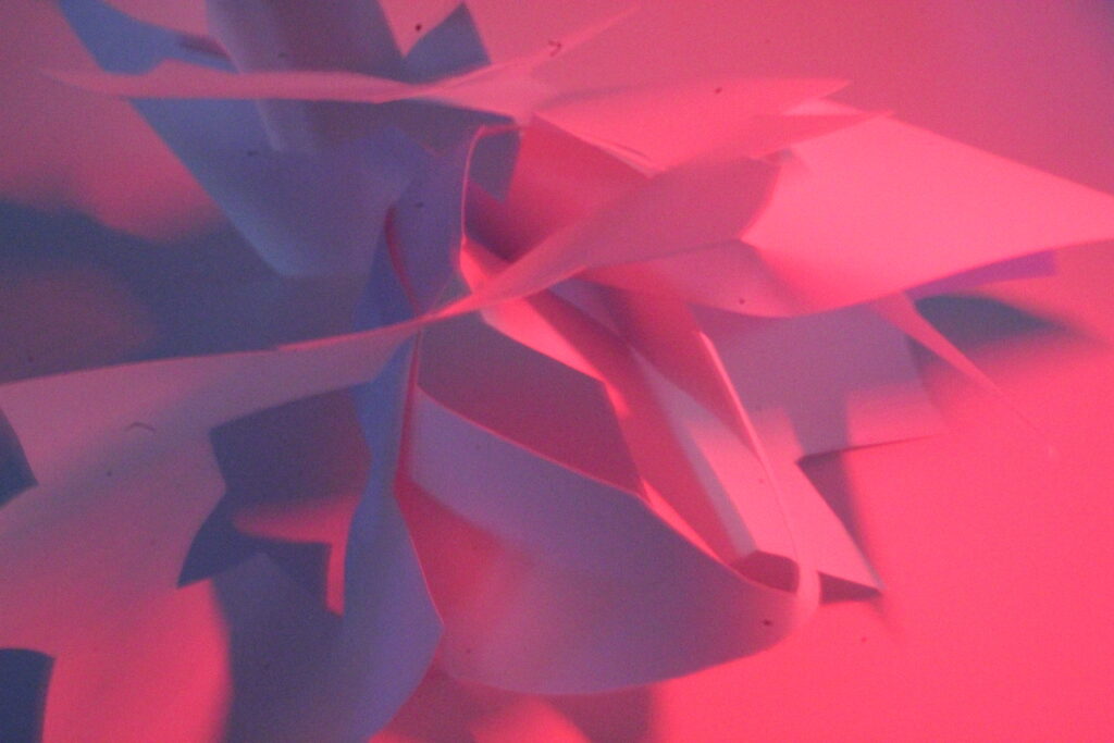
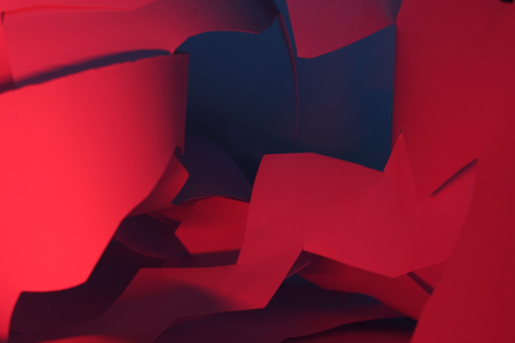
Editing
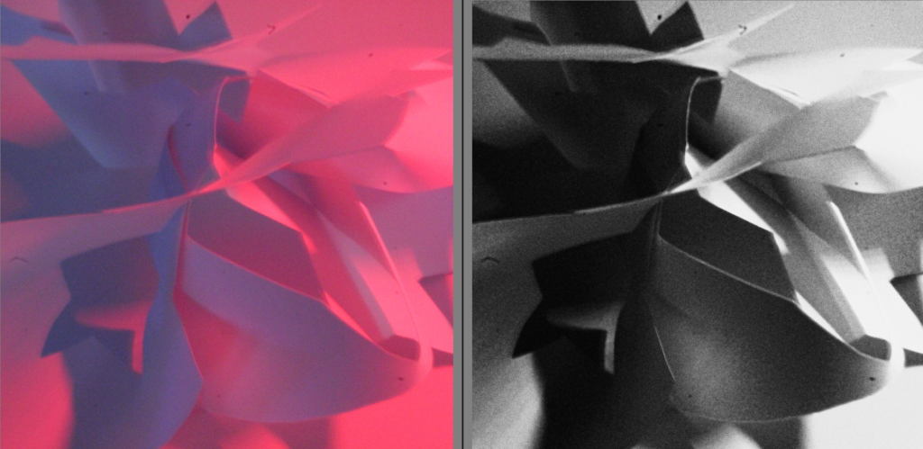
I edited this photo however I don’t like it as the ISO was too high, making the photo too grainy / too much noise.
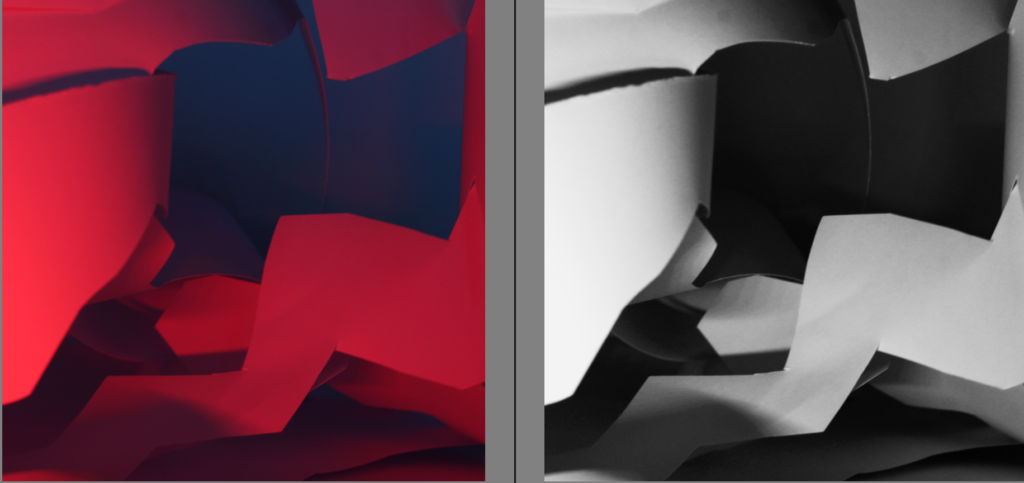
I edited this photo into black and white, therefore next to my other photos they will look neat.
My favourite photo
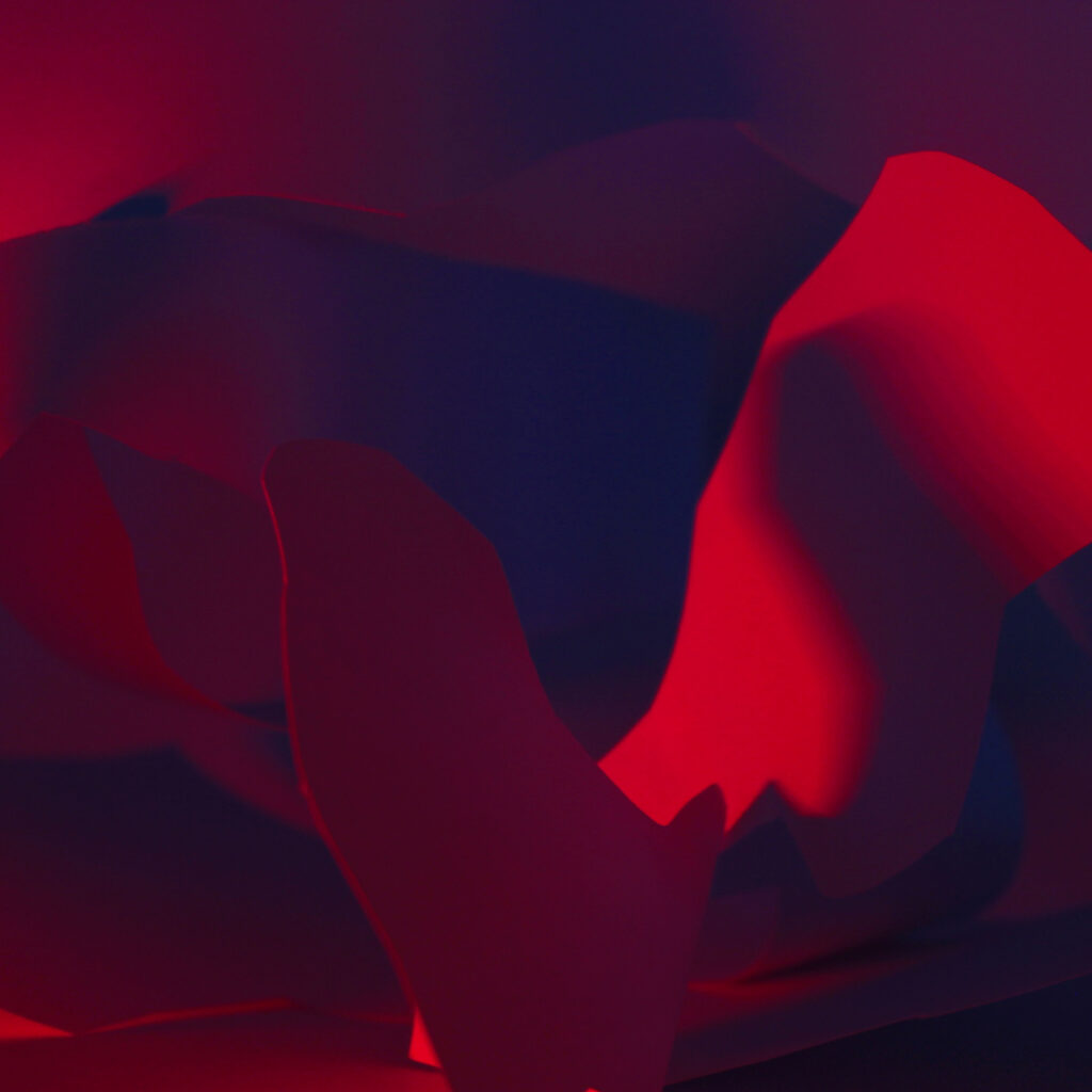
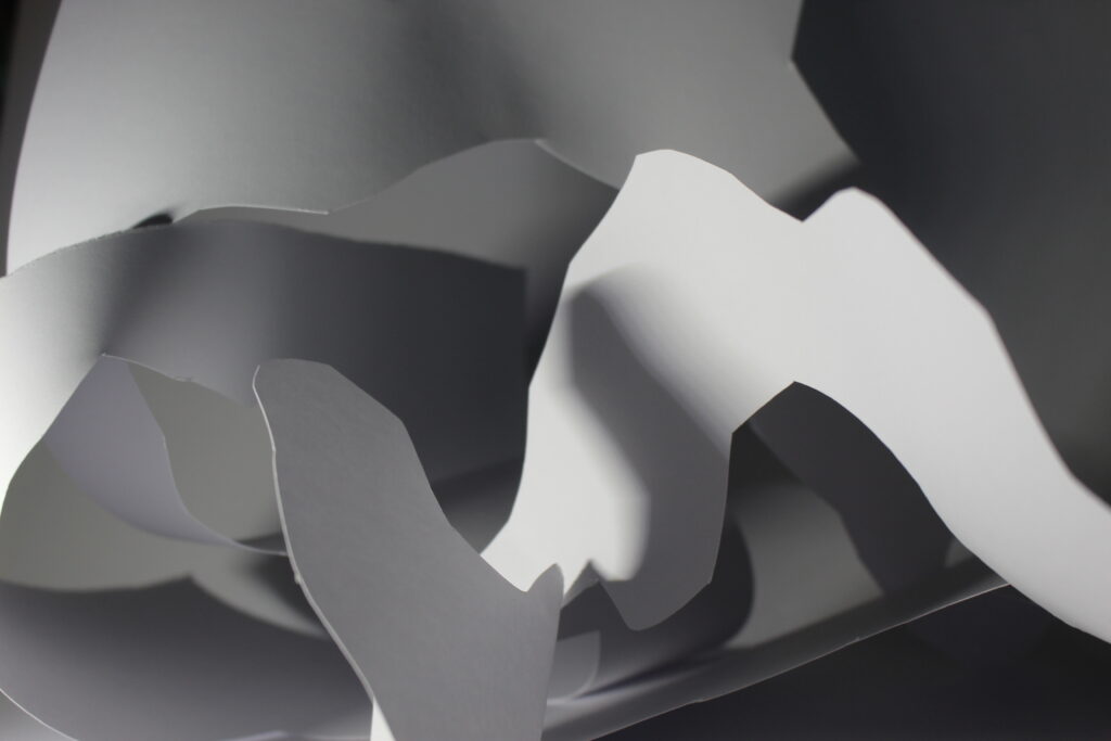
I really like this photo as its clear and has no photo noise. This is before and after editing one of my photos. I have changed the colour of this photo to black and white. The variations in tone in this image also allows the elements of shape, texture, and pattern of objects to be distinguished.
My Final Photos.
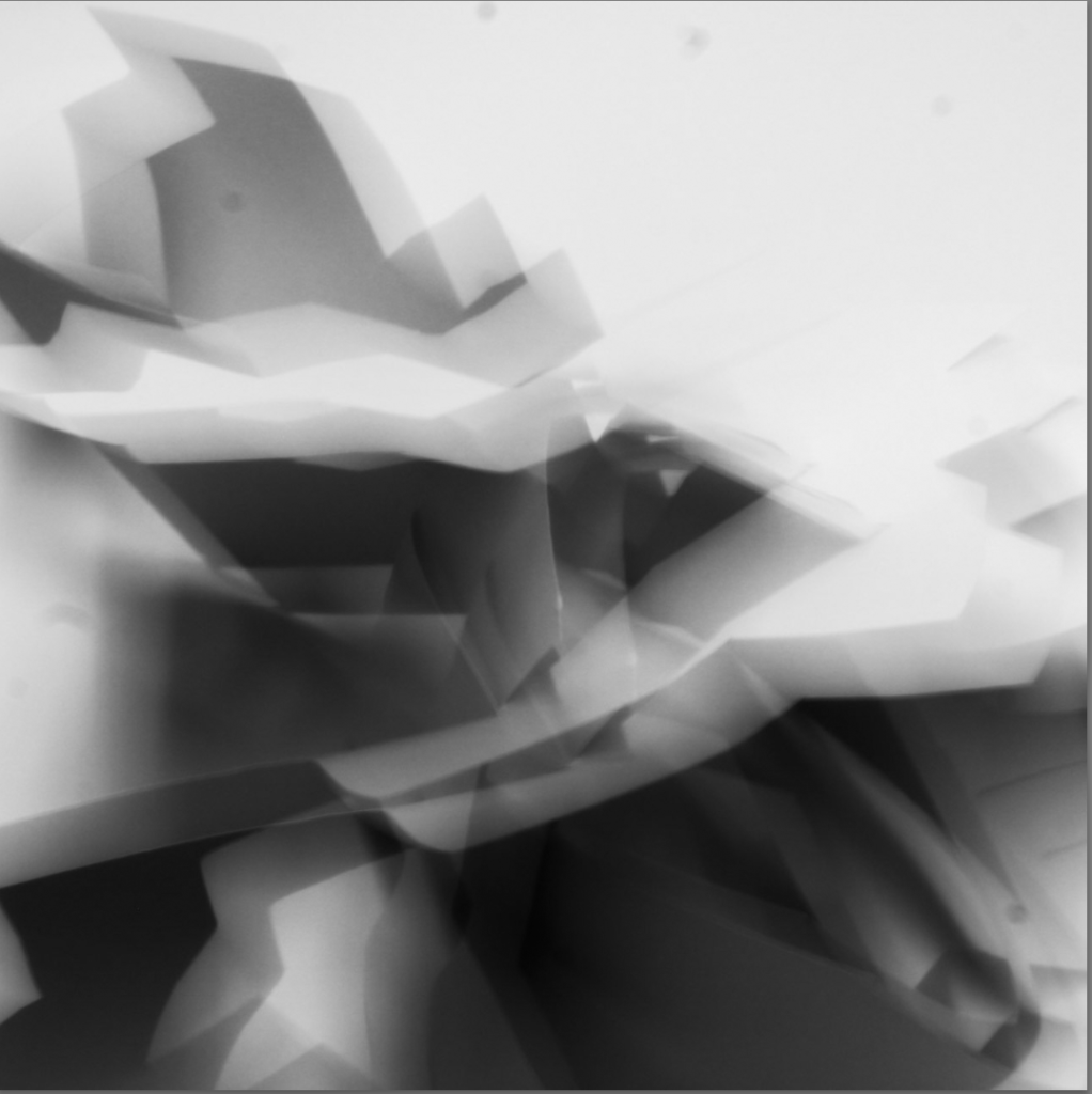
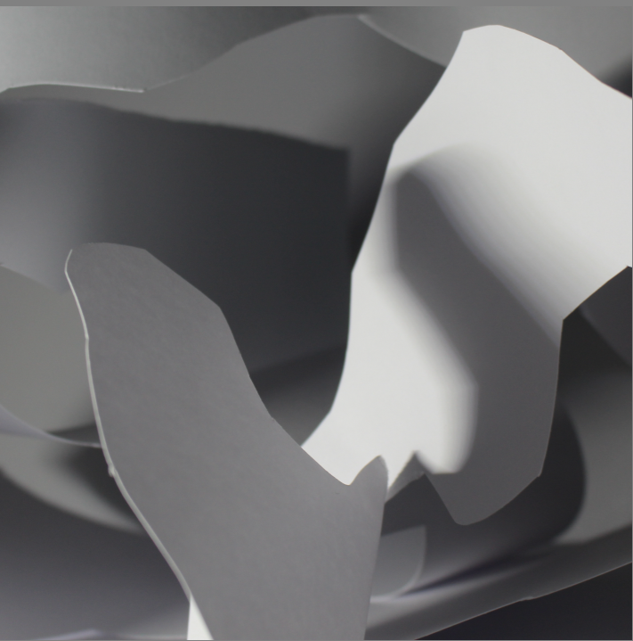
TEXTURE
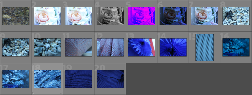
This is my contact sheet for texture, i added them all into Lightroom and edited my favourite ones.
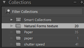
Ive added a collection on Adobe Lightroom and called it natural forms texture.

This is the presets, which helped me quickly auto edit my photos.
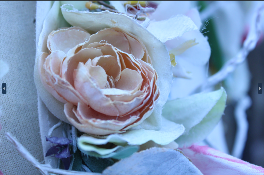
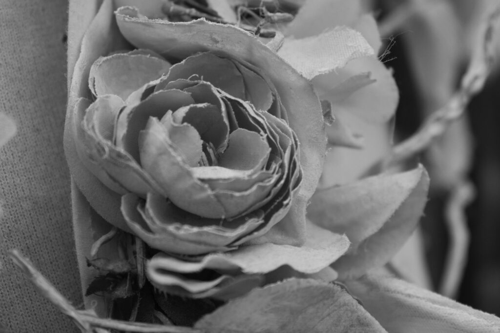
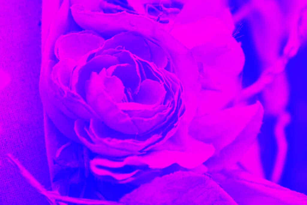
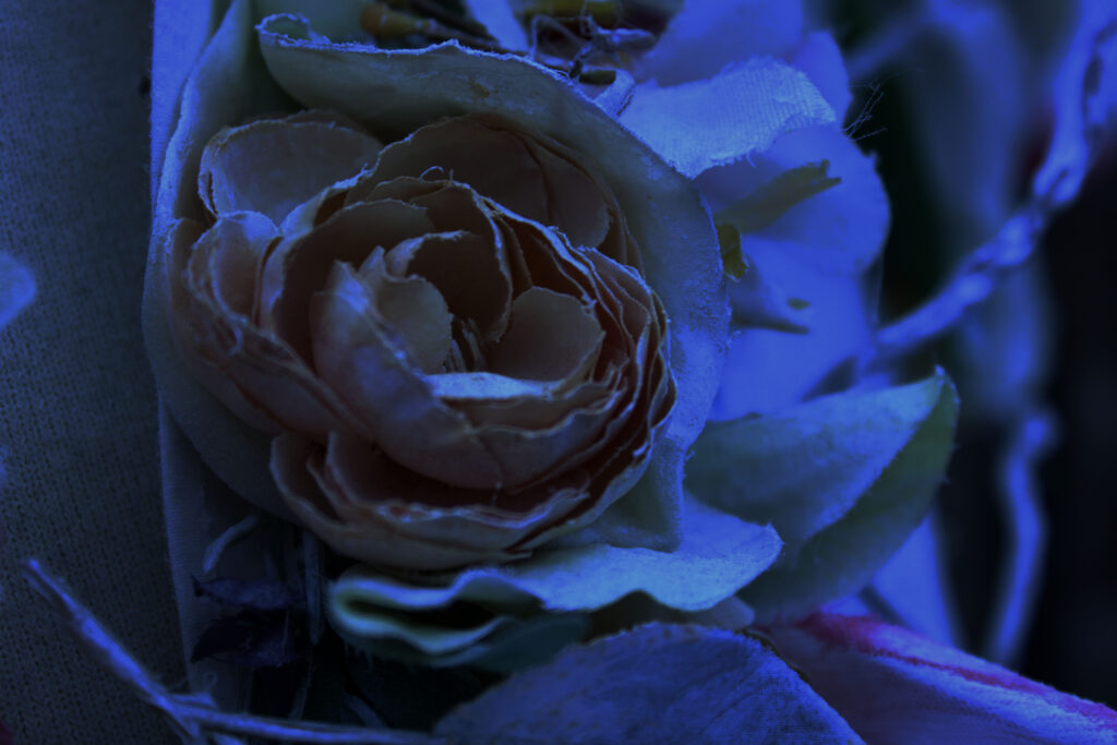
I edited this photo 3 different times.
- the first photo I added a monotone overlay and then adjusted the brightness and saturation. The black and white stops people from getting distracted by the colour of the photo
- I added a gradient map, colour overlay then adjusted the contrast, brightness and saturation.
- On the third photo I changed the colour balance and added some blue tones, however it looks quite dark and hard to see the details.
before editing
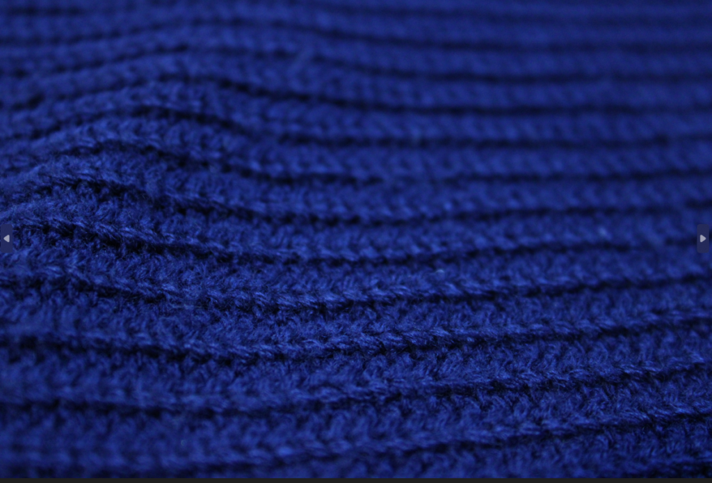
After editing.
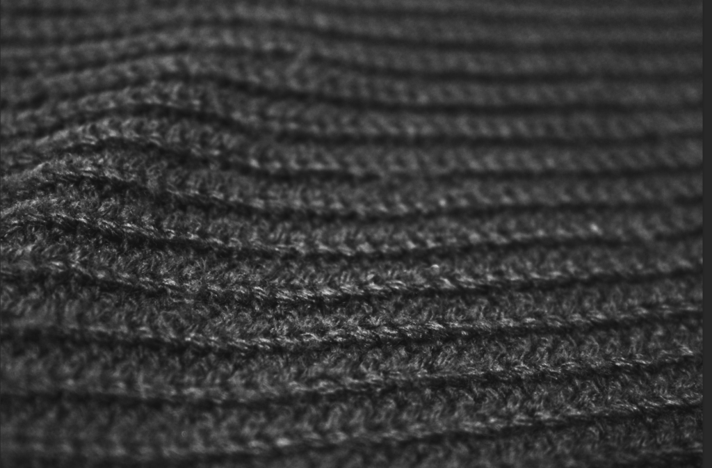
The line and repetition in this photo. The black and white gives the photo lots of depth and doesn’t distract the photo by the colour. however I could have made the ISO a bit too high so I could have lowered it to make the photo more clear. the texture in this photo makes the geometric shapes come more to life.

Good signs of progress here…but please ensure you are making critical and creative decisions throughout…be reflective and then refine your outcomes.
Your presentation methods are also important !
Aim to highlight key words and technical vocab – this highlights your understanding and can improve your marks…
JAC 3 NOV some effective imagery evidenced here, with a good level of control – to improve your marks you must aim to connect artists and concepts to your own work more thoroughly