For my homework I decided to use my house as my textural theme. I was able to find items with lots of texture which was good as it made the shadows look crisp.
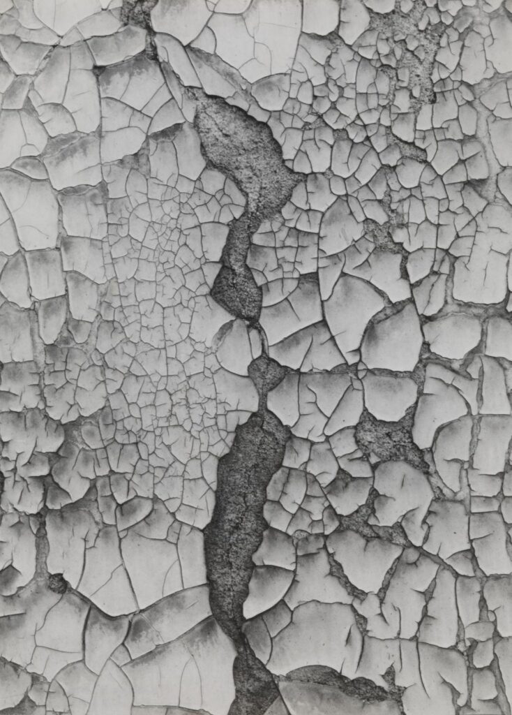
For one of my images I took inspiration from Guy Bourdin. Bourdin was a French artist and photographer he was well known for his highly stylized and provocative images. From 1955, Bourdin worked mostly with Vogue as well as other publications including Harper’s Bazaar. He shot ad campaigns for Chanel, Charles Jourdan, Pentax and Bloomingdale’s.
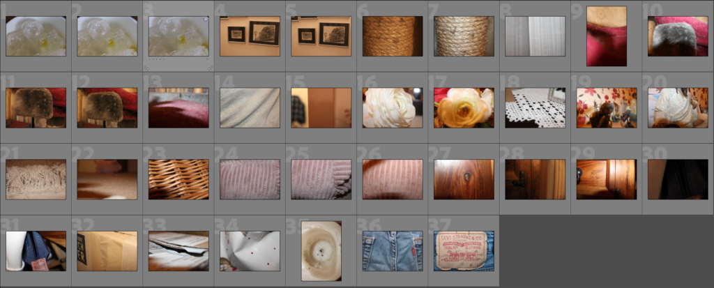
My Contact Sheet
jh
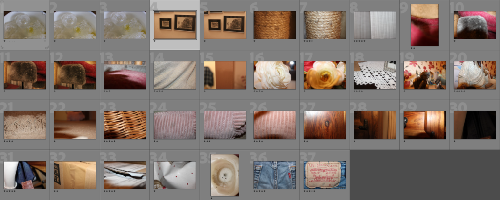
I added my images on Lightroom to see how they looks on a computer screen. Through this I then starred which photos I preferred, this helped me decide what photos to flag/reject and what photos to edit. However, most photos didn’t have enough texture or they looked too blurry, so this helped choosing.
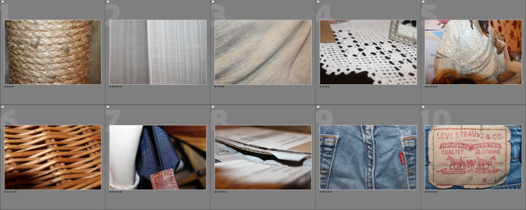
This allowed me to choose my final images to edit.
Original Photos:
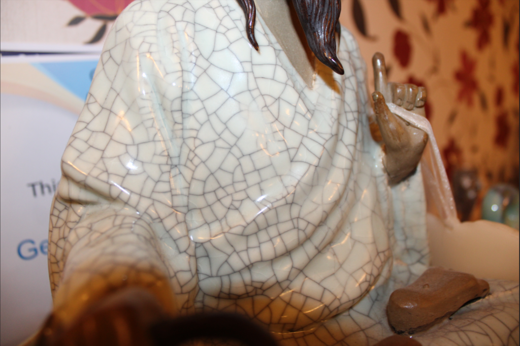
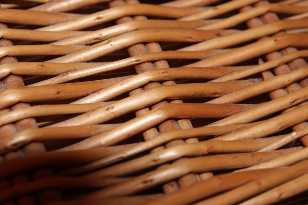
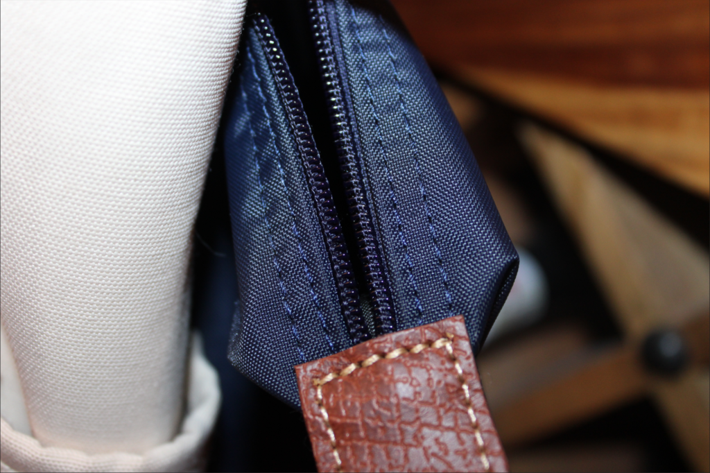
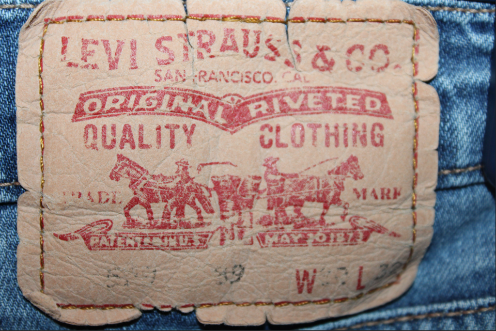
Edited Photos:
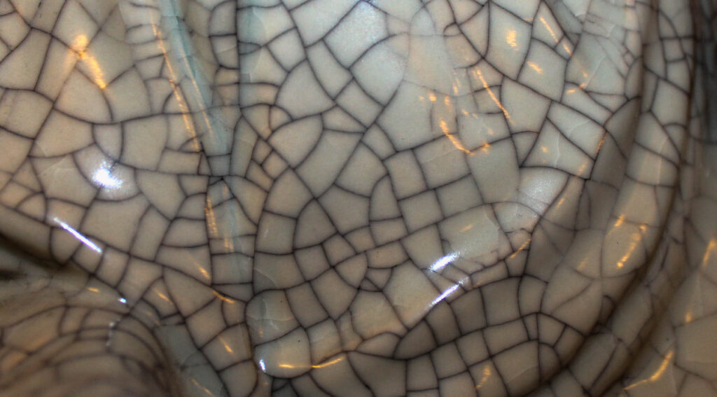
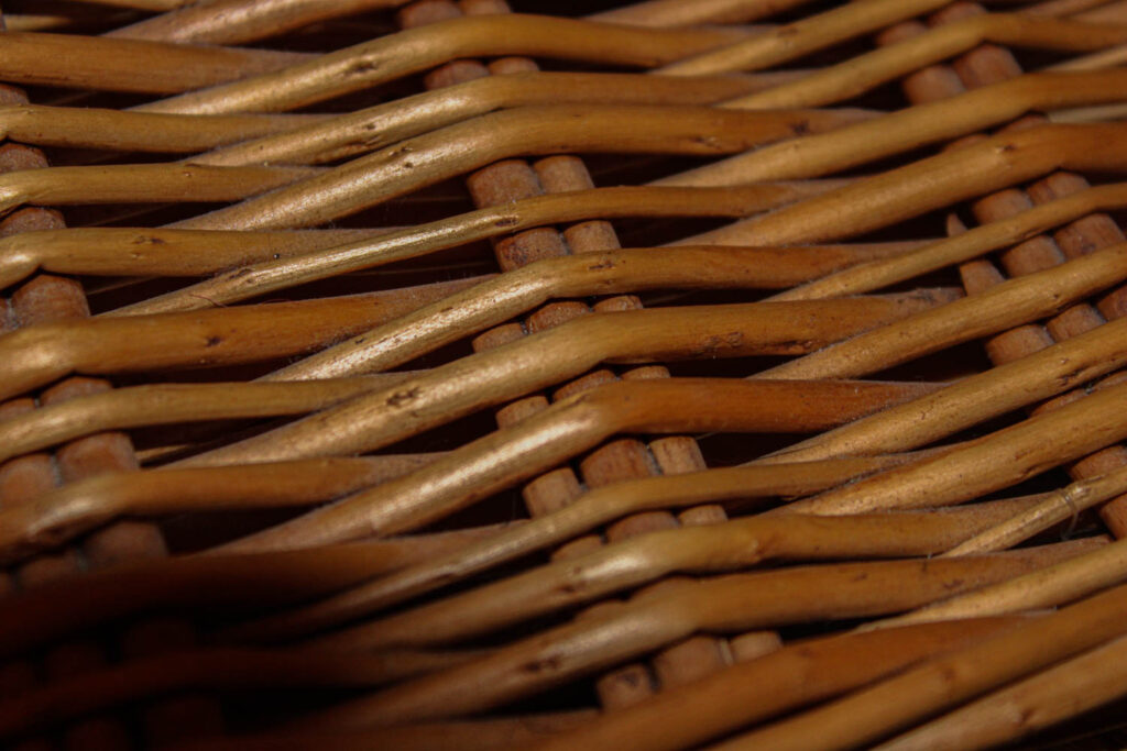
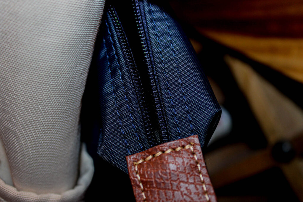
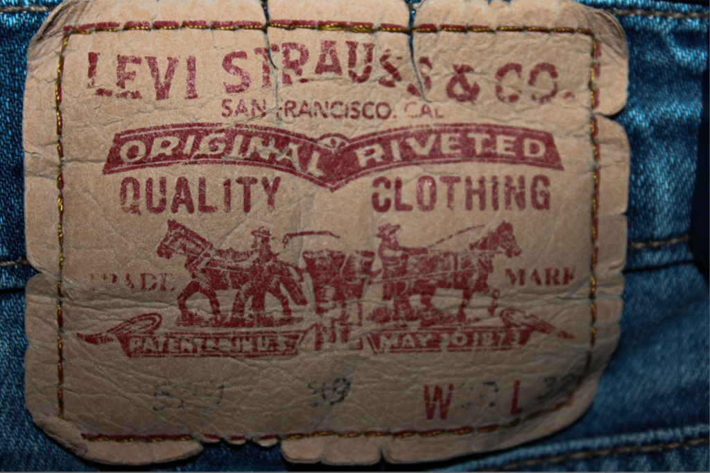
Technical:
I used the flash to take the photos as the lighting that day wasn’t the best this meant I used artificial lighting to achieve all my images. For the first image I took the picture head on meaning the flash was just straight on the item, this created less shadows and more reflection. However, with the second image I took it more on an angle which gave it more shadows and more depth. The two last images were also taken head on which meant there wasn’t a lot of shadows just more light. I used a fast shutter speed to take the images so the photos wouldn’t end up blurry and the texture would be crisp.
Visual:
I used a range of colourful and shaped items to show the different textures on each item. Tone was used in the second image to show the contrast of the wood and the shadows. The white juxtaposes with the dark shadows giving the image a sleek look. I showed a range of textures through all four images this gave me a good variety to edit. Most lines were curved as that gave the best shadows or pattern like image 1 and 2. This is good because it made the image look more interesting and more unique.
Contextual:
I wanted to use my house as the topic of this photoshoot as I thought it showed the best texture. This also allowed me to follow an artists image in my own way by using an object that looked most to the concept. I chose to take the images in the late afternoon to use the artificial light instead of the natural light this was because I was able to use the flash and create deeper shadows.
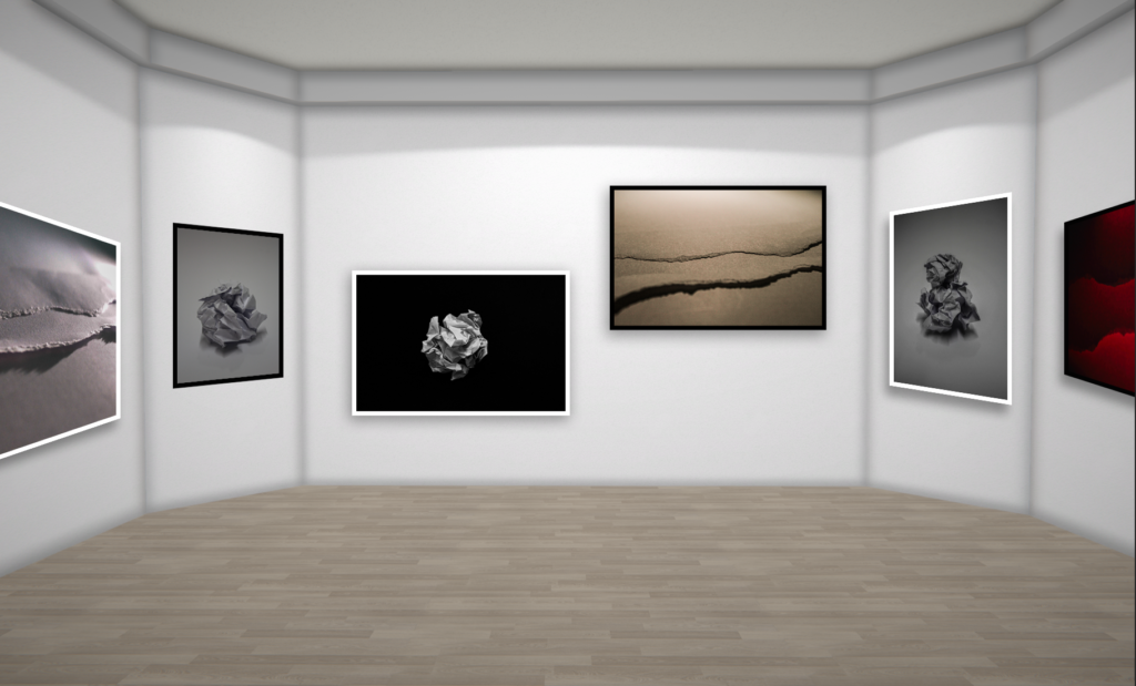
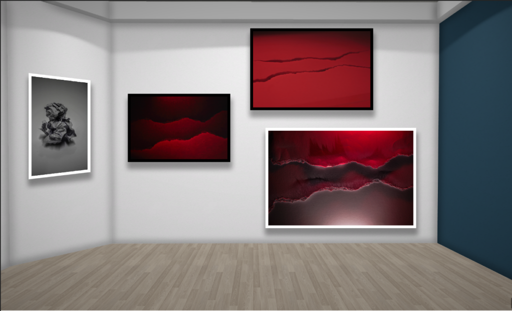
I created a virtual gallery to show off the pictures I thought were the best. This also allowed me to arrange them how I would like and choose different borders for each image, interchanging the black and white frames. I chose images with different lighting and texture to show my range of skills, I made sure to put three images of each subject: paperballs and ripped ripped paper. I also made two perspectives to show the different colours and how lighting can affect how the shadows can look.
Overall, I think I interpreted the paper balls theme well as i showed texture and a range of different backgrounds which allowed me to use different ISO’s and shutter speed. However, I wish I used different lighting instead of white or red as it would of been good to see other colours and how the shadows would be.

JAC 3 NOV good progress being made, with scope for clearer planning and presentation