Texture is the visual quality of the surface of an object, seen through tone colour and depth.
James Welling
James Welling was born in 1951 in Connecticut, Welling is an artist photographer and educator currently living in New York. He began taking photographs in 1976, His first body of work consisted of LA architecture and portraits. 1978 is when he moved to New York and started straying away from more traditional forms of photography such as portraiture and landscapes and moved more towards abstract photography by using tin foil, drapes and jelly, these images were later exhibited in New York exhibitions throughout 1981, 1982 and 1984.
Welling joined UCLA in 1995 as a faculty member and began working with digital technology and colour.
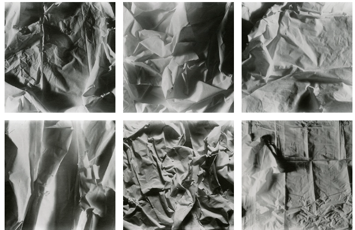
images by James Welling ( fire of mind )
For texture we used scrunched up paper for our paper experiments. Paper is a good thing to use when experimenting with the theme of texture as the wrinkles in the paper when it is scrunched up, which was somewhat inspired by James Welling’s images.
James Welling Analysis
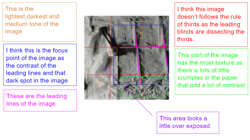
This is a digital photo of a crumpled piece of paper. The genre of this style of photography is abstract.
The mise-en-scene presents the abstract photo of a crumpled piece of paper which had been scrunched folded up then layed flat again, the tone of this image is quite light, for example if you look at the really bright area it even looks a bit over exposed. The use of light in this image is quite harsh artificial light as well as being lit from the side. Evidence of this is on the dark areas / shadows of the image which you can see are directional. The focus distance is short as it is a close up photo and the depth of field is large as everything is in focus. The photographer has used leading lines is the folds of the paper to lead your eyes through out the image. The photographer has clearly not used the rule of thirds as the leading lines are dissecting the thirds.
I believe the ISO is 100 as everything is in focus and not grainy. I believe that the shutter speed is 1000 as everything is clear.
contact sheet

for these images I tried in a range of different coloured lights and different lighting angles to be able to create
Final Edited images
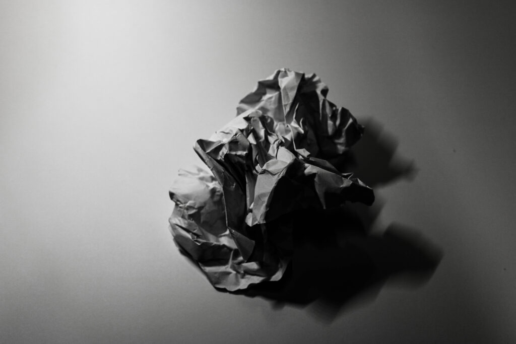
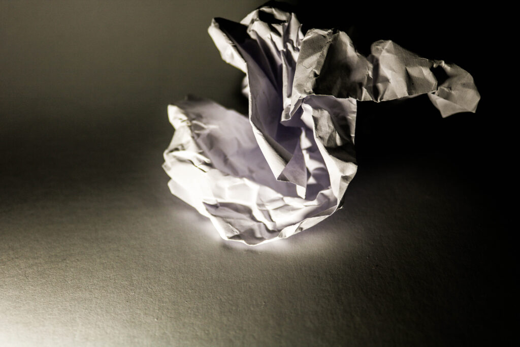
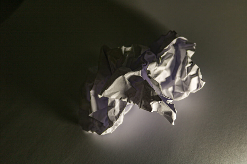
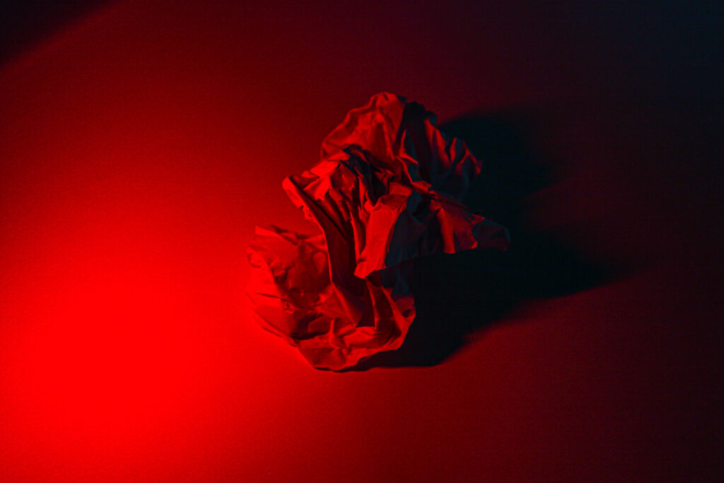

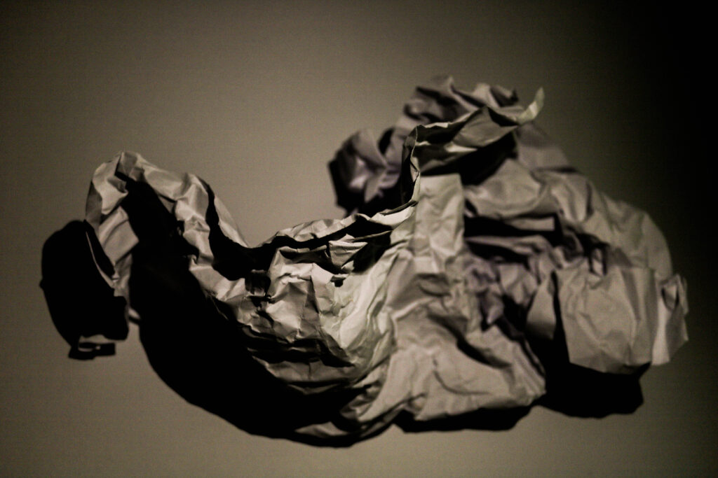
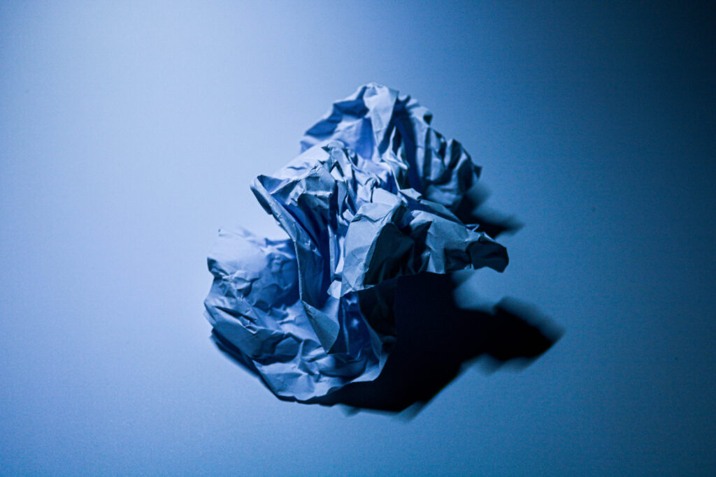
I edited each of these images differently, as I used different coloured lights, and different lighting angles. All these images had an ISO of 100.
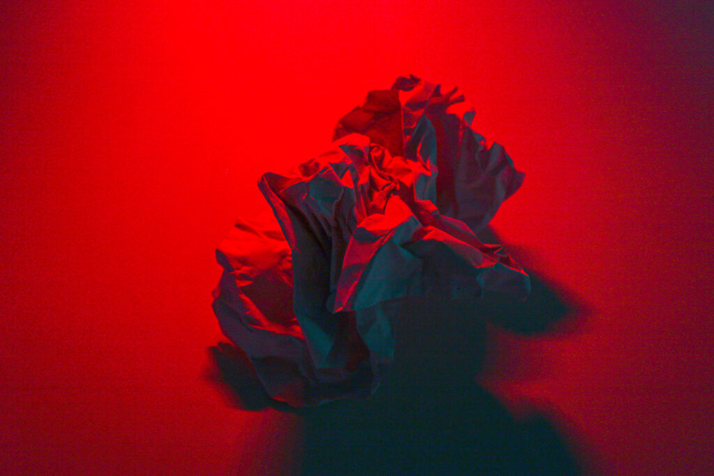
This image that I have edited is one of my particular favourites as the shadows of the paper have a sort of blue tint on them, and I think this contrasts really well with the red lighting I’ve used in the image, this helps to create depth in the image.
Photoshoot 2
I decided to take some more images of the paper trying out have multiple lights and different angles, as well as thing image my ISO was 6400 as all my other images were ISO 100 I thought I’d change the ISO and see how they come out.
Contact sheet

Edited images

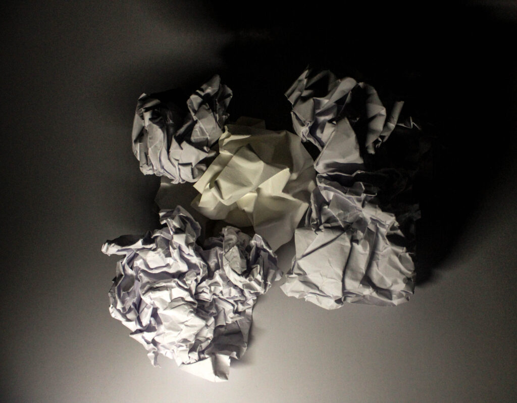

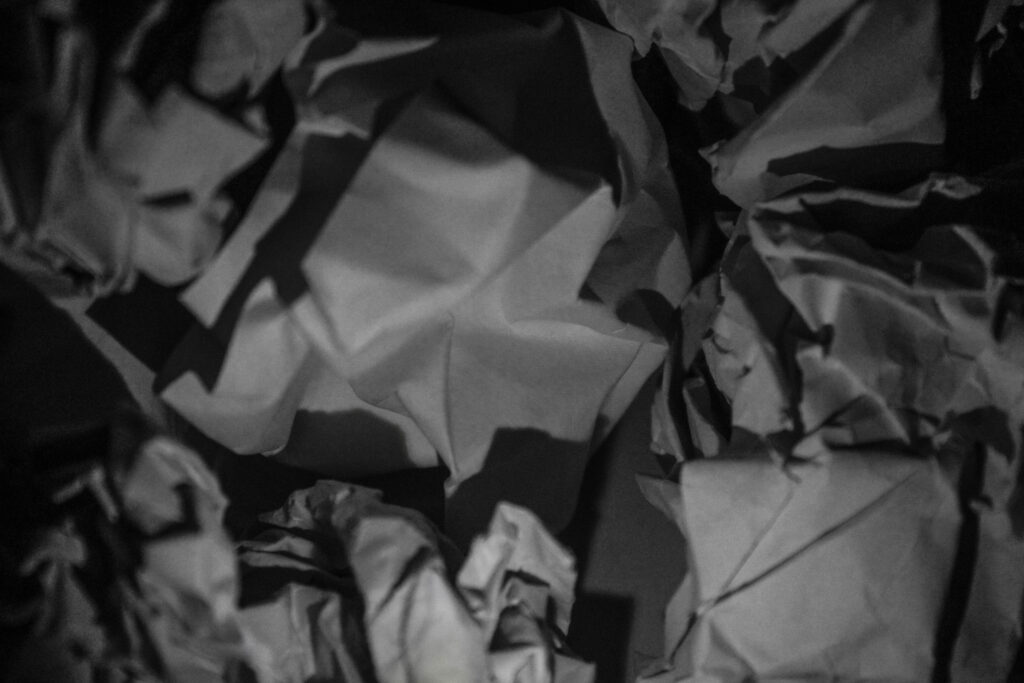

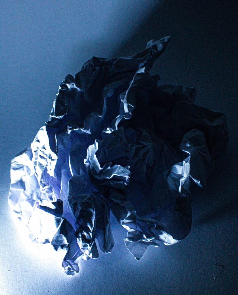
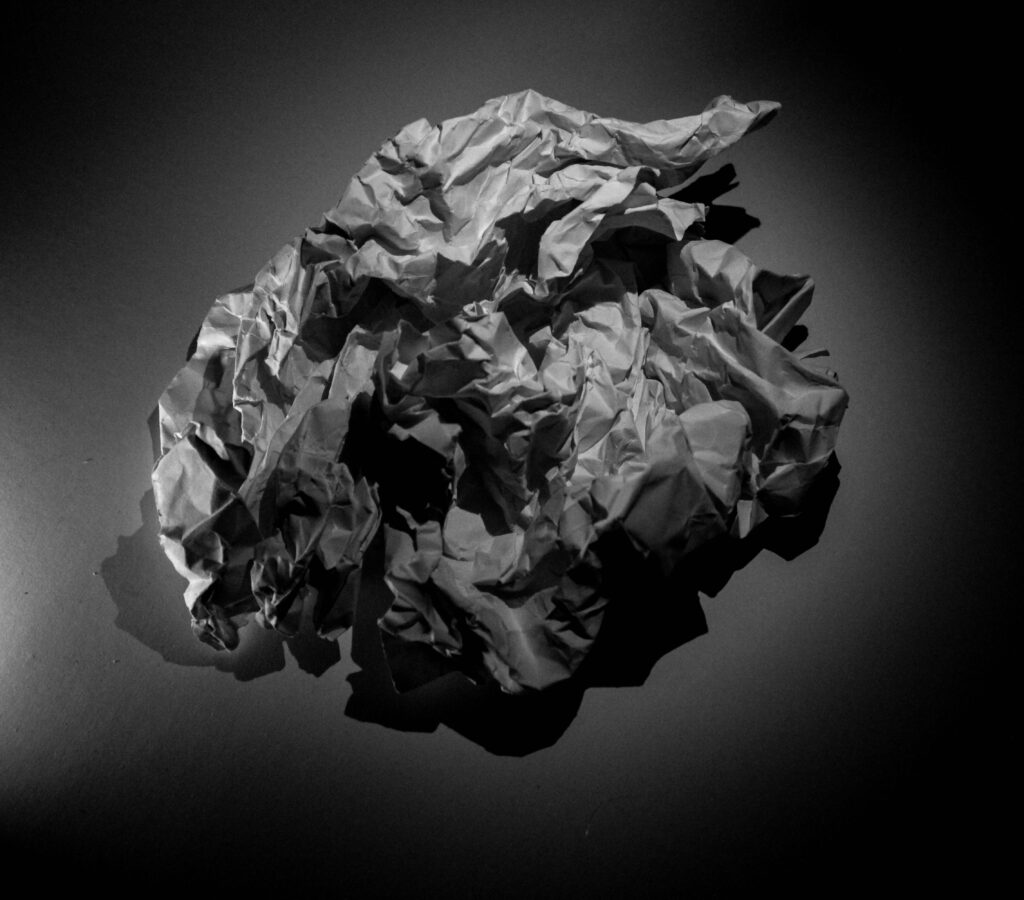
When taking these images I really thought about experimenting more with the paper, such as making the paper flat again, using different kinds of paper to get different crumpled effects. As well as using multiple balls of paper.
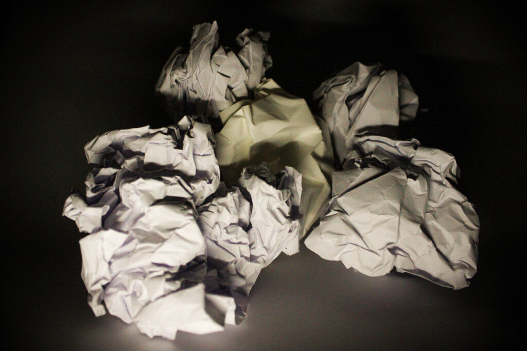
This particular image I took is one of my favourites from my shoot, as I like the warm tint this images as I think compliments the different variety’s of paper that I’ve used.
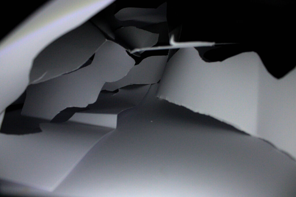
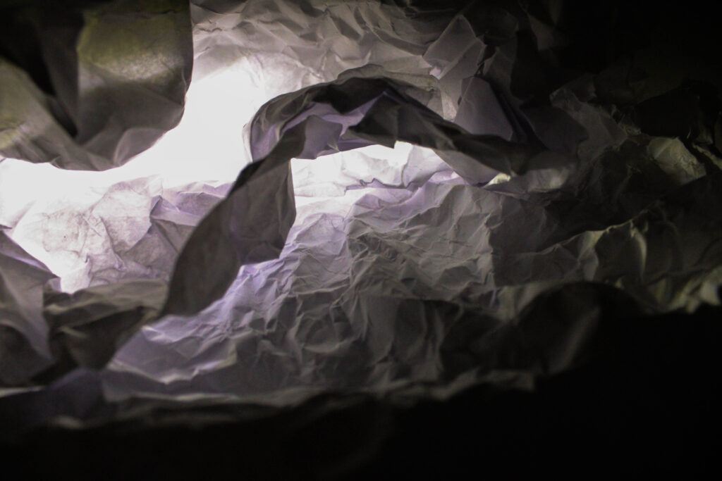
These are images I also really like as I think they are a very creative way to show the paper, as they aren’t just paper balls I’ve then layed the out and cut them / displayed them in a unique way that I think it really appealing to the eye.
Photoshop experimentation
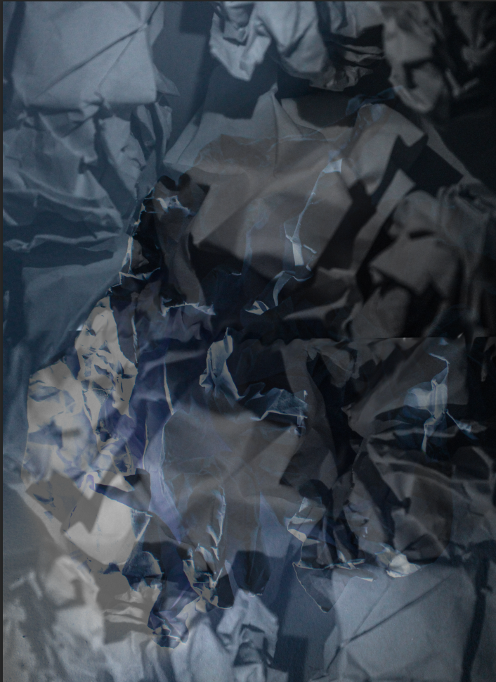
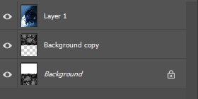
To create this above image I started with one on my images and copied it and flipped it so that it was on top of the previous image and use the smudge tool to kind of blend them together a bit better. I then opened a different one of my images and placed it on top the flipped image and turn the opacity down so that you were still able to see the original flipped image underneath.
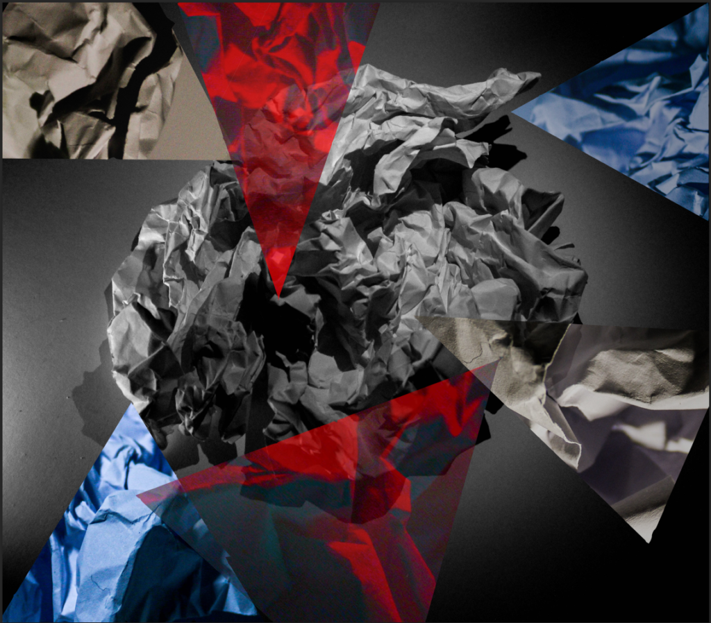
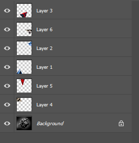
To create this image I picked which of my photos I wanted as my background photo, I knew I was going to add the cut outs so I chose a monochrome photo so that the colours of the triangles would pop a bit more. To create the cut out triangles I opened a few other of my images and used the shape tool to draw a triangle on the image. I then used the magnetic lasso tool to trace around the triangle, when doing this make sure your on the background layer, once I have traced around my triangle right click and select “layer via cut” I then rearranged the layers depending on what triangles I wanted to overlap, as well as changing the opacity of some of the triangles.
Aaron Siskind
Aaron Siskind was an American photographer, his photography focuses on detail of surfaces that present as flat surfaces. Siskind was part of the abstract expressionist movement. Siskind was born in New York and shortly after graduating from City college, to which he then became an English teacher in a public school in New York for 25 years. He began his photography career after receiving a camera as a wedding present. In 1981 Siskind published a book featuring 52 photographs, which included portraits of local residents and about their lives. The book also included interviews and stories from the residents featured in the book, the purpose of the book was to document the reality of urban life in New York.
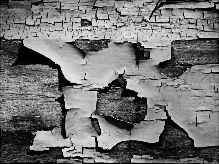
Image by Aaron Siskind
Siskind Analysis
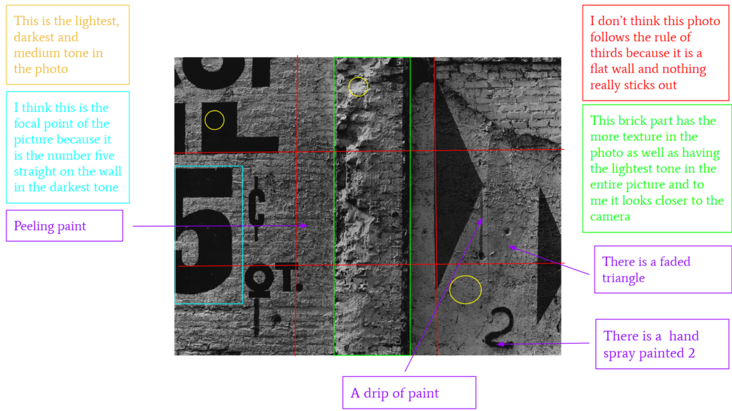
This is a film photo of a brick wall. The genre of this style of photography is abstract.
The mise-en-scene presents the abstract photo of a crumbling brick wall which had been painted on and graffitied the tone of this image is quite dark, for example if you look at the stencil paint work of the 5 that is an extremely dark tone. The use of light in this image is very subtle natural light as well as being directional as the light is only gently coming from one side of this image, evidence of this is on the top of the pillar you can see the lightest tone of the picture clearly where the light is hitting the focus distance is short as it is a close up photo and the depth of field is large as everything is in focus. The photographer has used leading lines which you can see as the very dark arrow and the dark 5 lead your eyes. The photographer has clearly not used the rule of thirds as it is a flat wall and nothing really sticks out.
I believe the ISO is 100 as everything is in focus and not grainy. I believe that the shutter speed is 1000 as everything is clear.
As Aaron Siskind states; ” photography is a way of feeling, of touching and loving. Whatever you have caught on film is captured forever… it remembers little things, long after you have forgotten everything. We look at the world and see what we have learned to believe is there” You can tell in this photograph as Siskind says it’s about the little things and he cares about the little things that others may not see and I think this really comes through in his photography, as he’s looking at a crumbling wall that most people would just walk past everyday and not pay any attention too. I think Siskind has an amazing talent to capture something so average with such beauty and skill is brilliant.
Home photoshoot
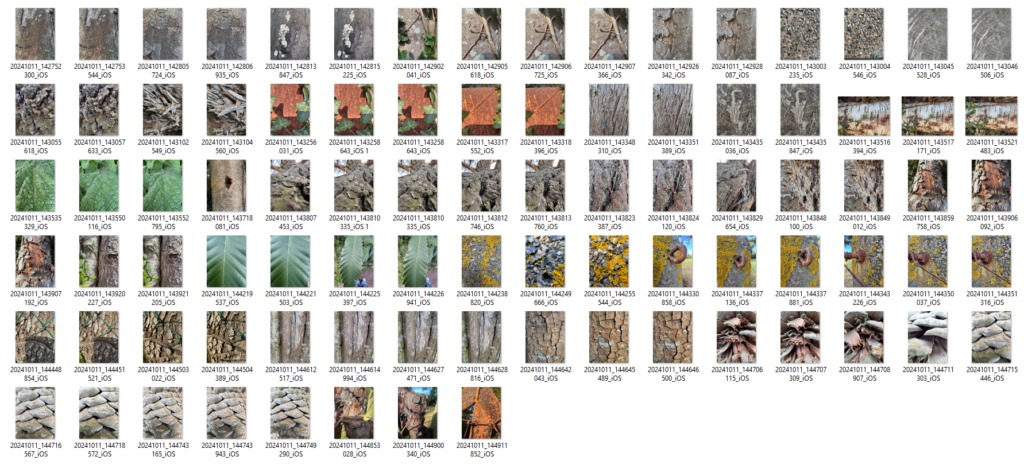
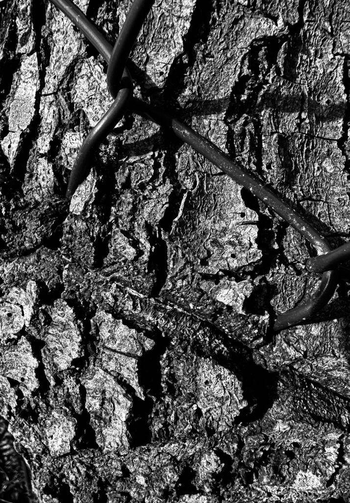
To take these images I went for a walk in the woods by my house, as I thought a good way to display texture would be trough the bark of trees. And whilst on my walk there were some rusty fences with the paint flaking and peeling so I also thought those would be good to take picture of.
Edited images
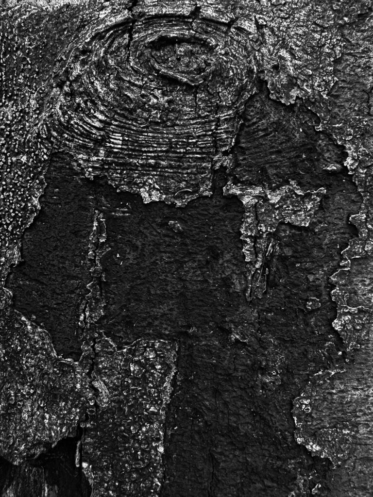
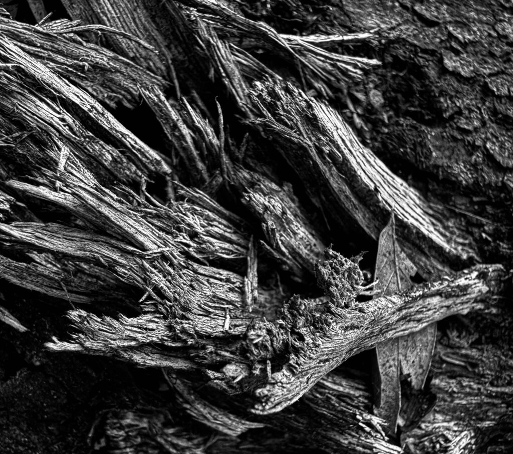
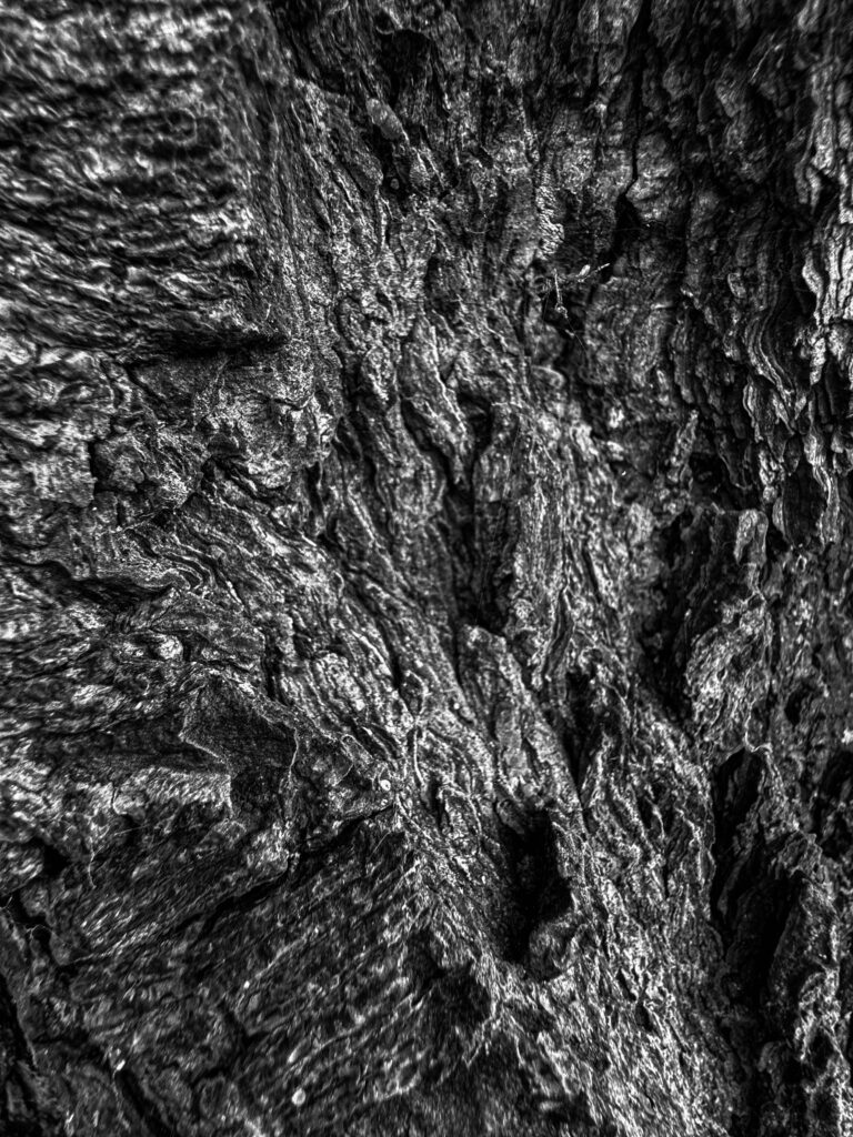
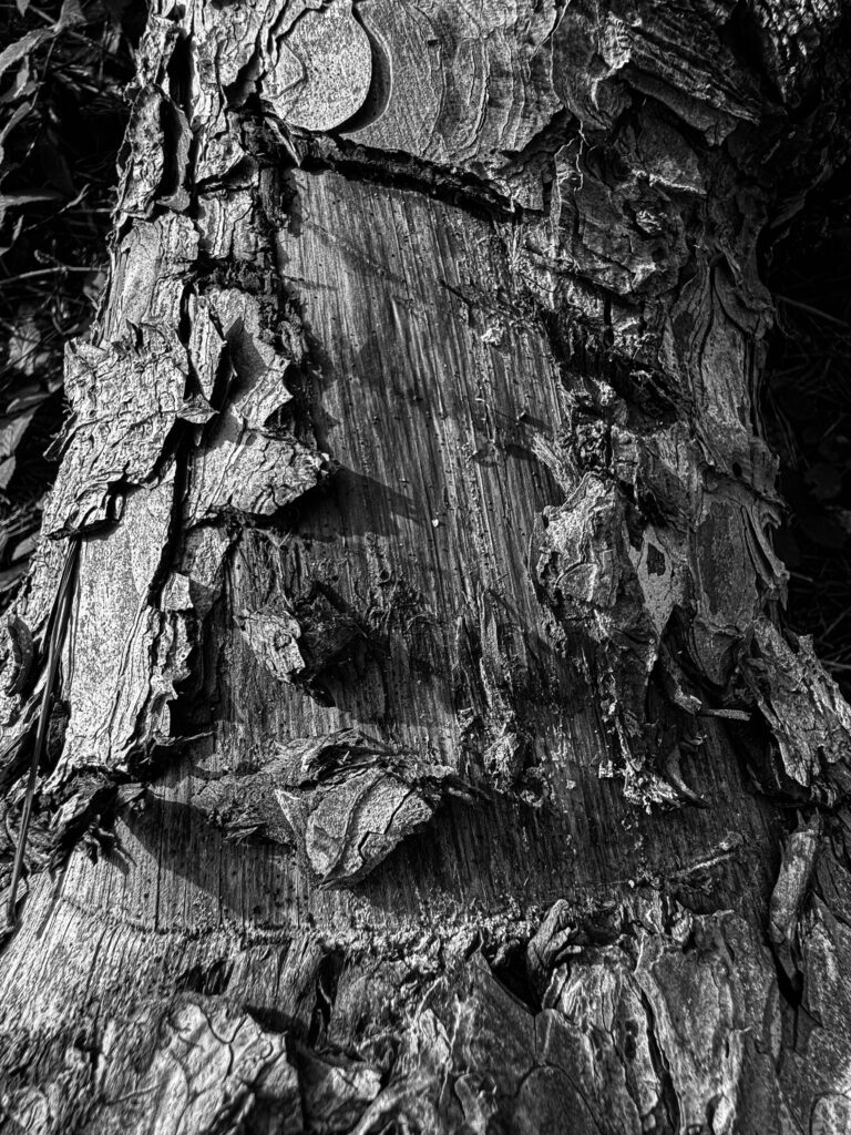

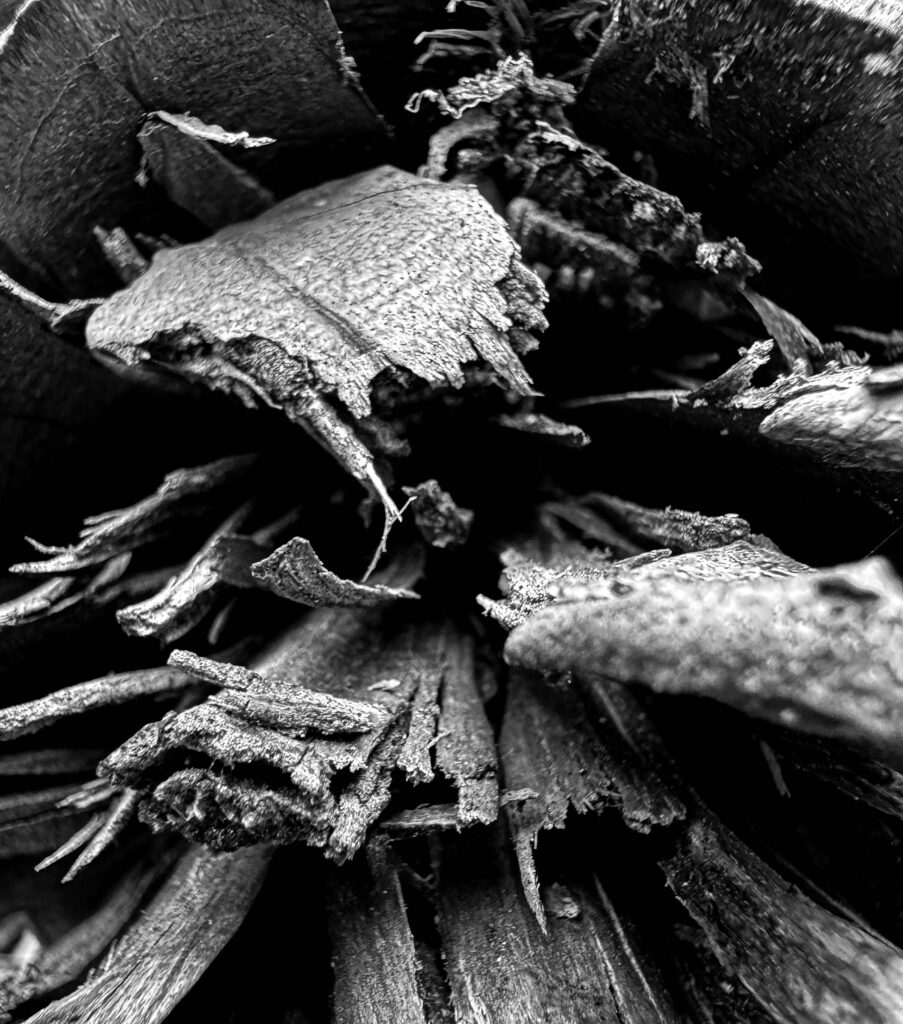
This image that I have taken is of a pinecone I found on my walk, and i thought that it would be a really good way to display texture, as well as it being a unique angle.
I have made these images monochrome to link my images back to Aaron Siskind’s , as all of Siskind’s images are monochrome.
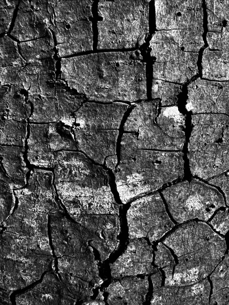
I think out of all my images that I have taken this one relates to Aaron Siskind the most and it is close up and the moss on the trees that has turned white looks like some of Siskind’s peeled paint images, as well as the dark cracks kind of remind me of a desert.
Experimentation
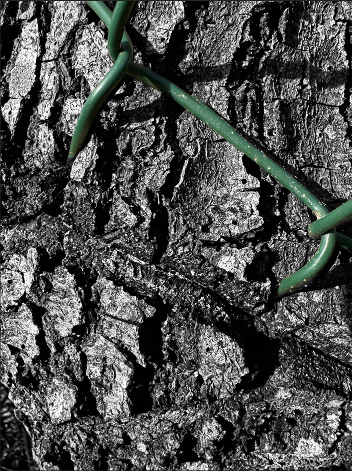
To create this experiment image I went into photoshop and opened my monochrome image I edited and opened the colour version and used the polygon lasso tool and cut out the green wire and placed it onto the monochrome image for a pop of colour which contrasts really well and personally I think really goes.
A reason I chose to make the wire the original colour is because in the original image that I had made monochrome I felt like the wire was getting lost in the texture of the bark, so I thought that if I made it green it wouldn’t get lost and you still get the contrast of the texture.
My virtual gallery
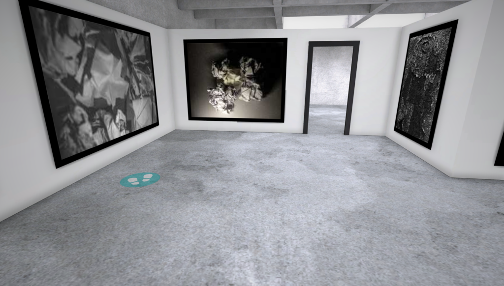
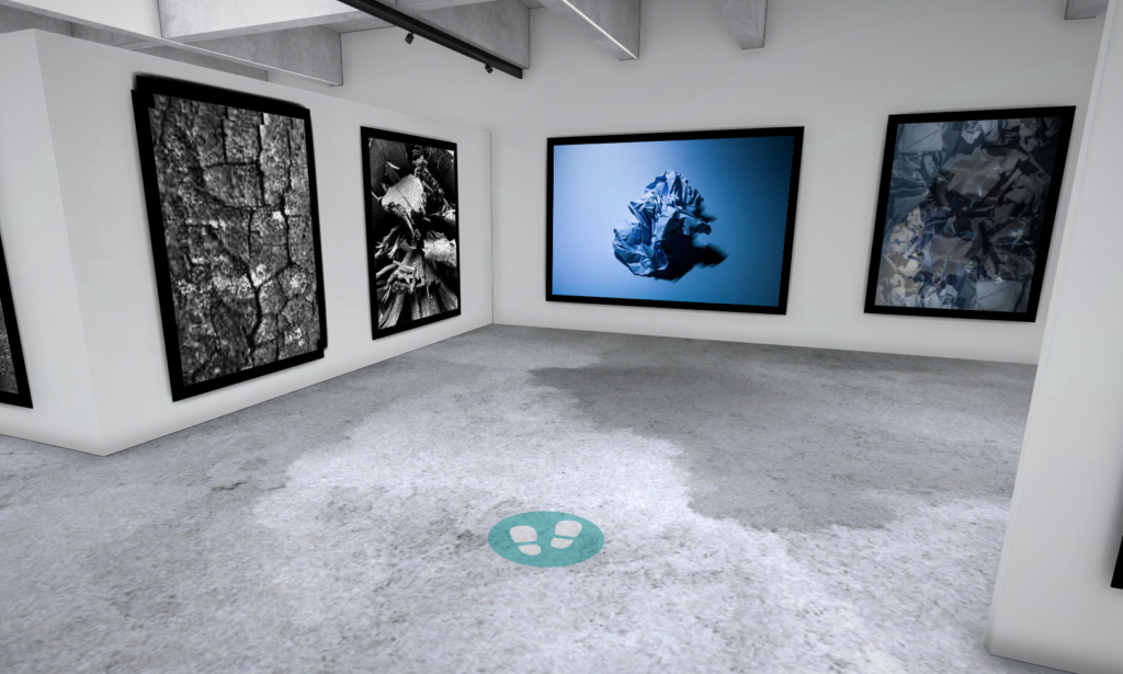
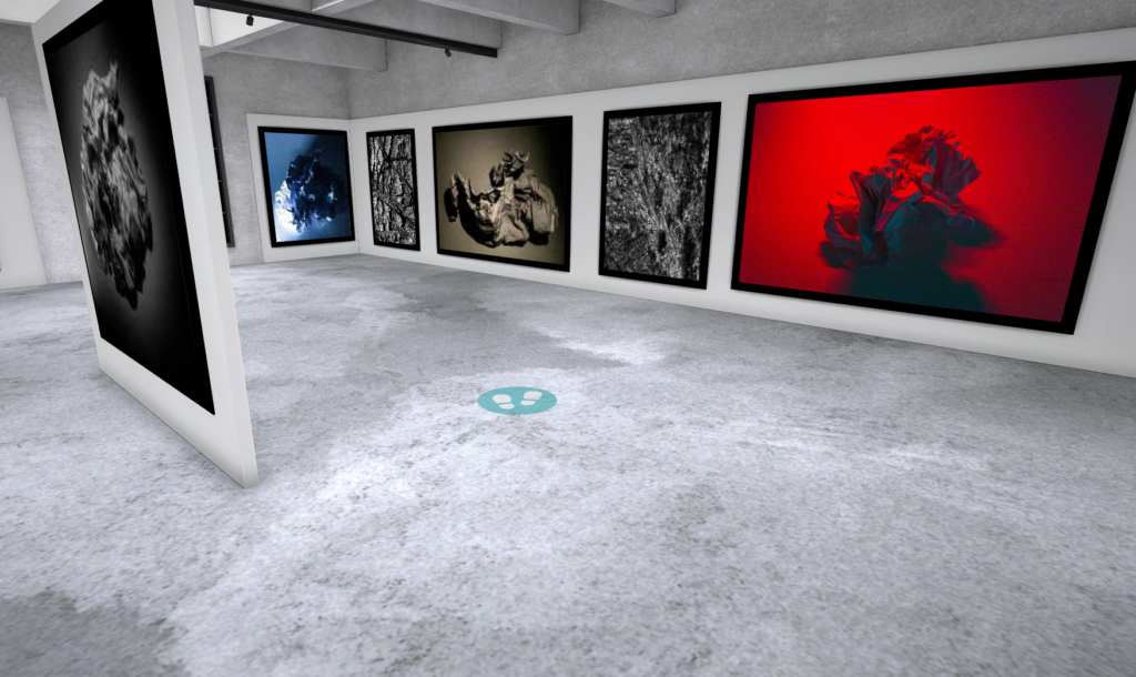
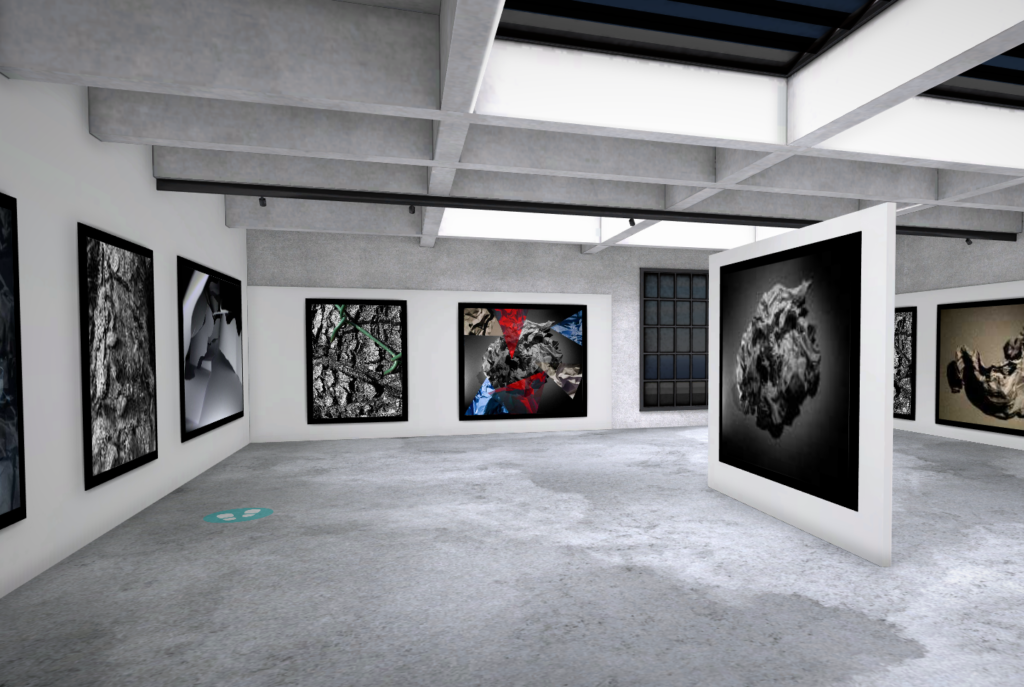
To make this gallery I used the website artsteps and entered my images, and I decided to make them all a bit more uniform. Most of my images are in black and white ( monochrome ) however I have chosen certain images with more colour and scattered them around to try and contrast the monochrome images.

JAC 3 NOV consistent and confident throughout, with scope to explore more ambitious ideas and earn extra marks