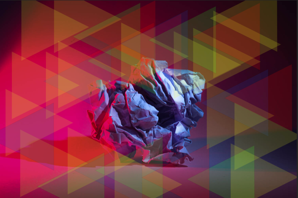
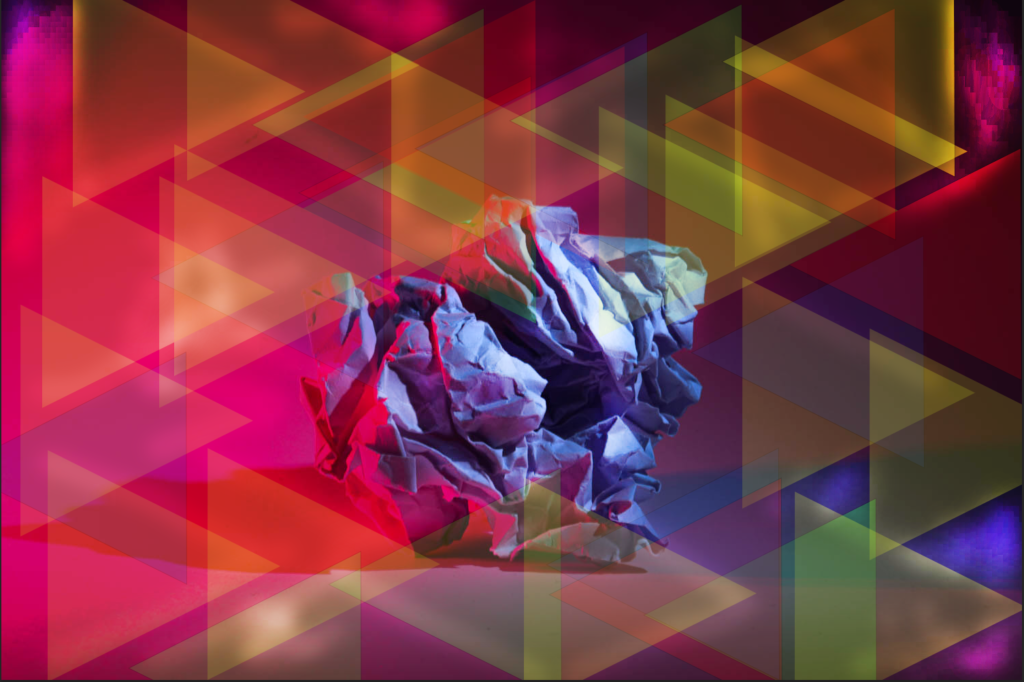
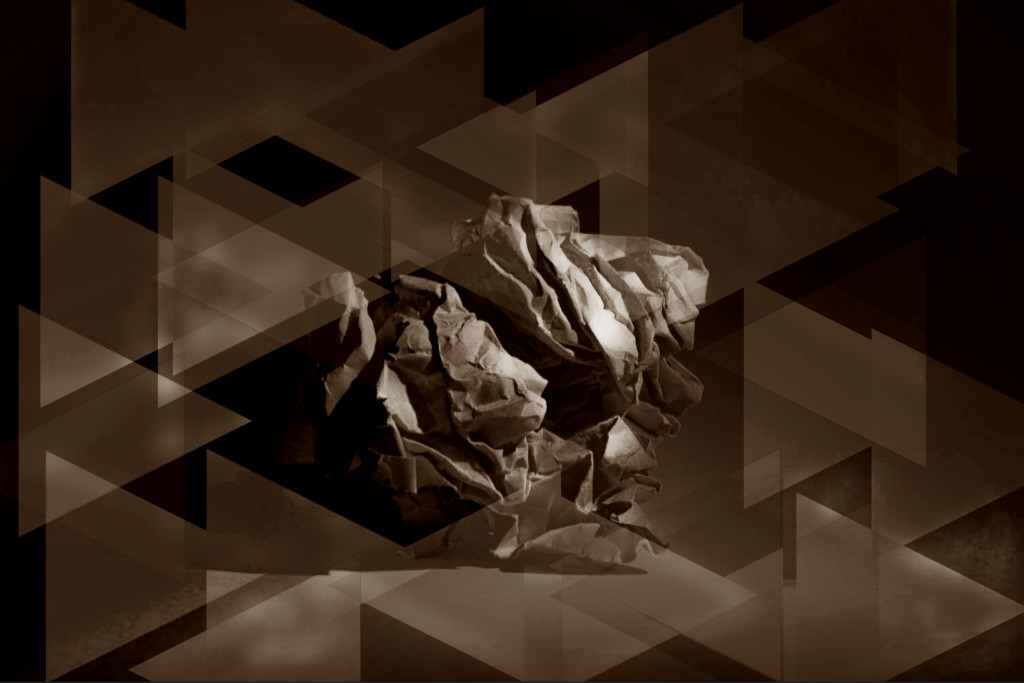
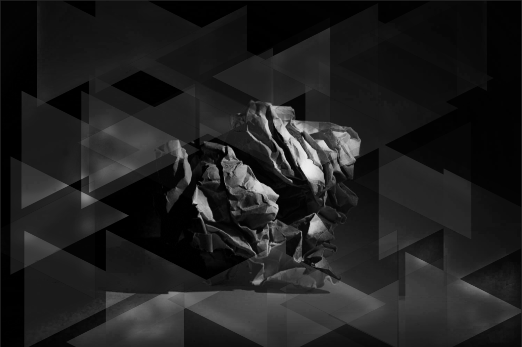
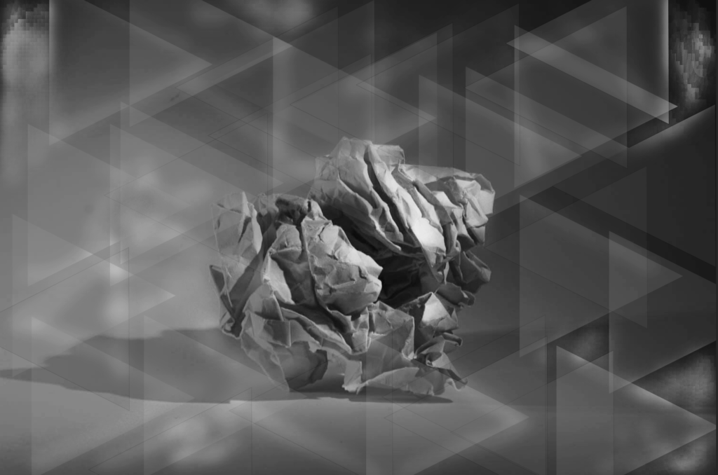
Visual Elements
Visual elements in photography are a key factor in creating a well composed, eye catching and successful image in photography. These elements include ;
- Line: Lines can guide the viewer’s eye through the image, create depth, and emphasize specific areas. They can be straight, curved, horizontal, vertical, or diagonal, each conveying different feelings and movements.
- Shape: Shapes are formed by the lines in the image and can create visual interest. They help to establish a focal point and can be geometric or organic.
- Space: The use of negative space (the area around the subject) can enhance the composition by providing breathing room and emphasizing the subject. It can also convey isolation or create a sense of balance.
- Repetition: Repeating elements can create rhythm and harmony within a photograph. This can include patterns, shapes, or colours that draw attention and create unity.
- Texture: Texture adds depth and interest. It can evoke a tactile response and make the viewer feel a connection to the subject. Highlighting texture can also enhance the overall mood of the image.
- Colour: Colour influences mood, emotion, and attraction. It can draw the viewer in or create contrast and tension. Understanding colour theory can help in making more impactful choices.
- Value/Tone: The use of light and dark tones helps in defining shapes and adding depth. High contrast can create drama and clear separation, while softer tones can embrace calmness and mood
James Welling
James Welling is a prominent American photographer known for his innovative exploration of texture, color, and abstraction. His work often blurs the boundaries between photography and other art forms, reflecting his deep engagement with the medium.
Welling’s approach to texture is particularly notable in several series, where he uses various techniques to emphasize surface qualities. For instance, in his “California” series, he captures the textures of natural landscapes, highlighting the interplay of light, shadow, and color. This creates a sensory experience, inviting viewers to engage with the physicality of the images.
In other works, like his “Glass” series, Welling uses transparency and reflections to explore the texture of glass itself, playing with the viewer’s perception. His use of layering and digital manipulation further enhances the tactile qualities, making the viewer aware of the medium’s limitations and possibilities.
Overall, Welling’s exploration of texture serves not only as a visual element but also as a means of challenging traditional notions of photography, inviting contemplation about the relationship between image and reality. His work encourages viewers to engage with the physical and conceptual aspects of texture in new ways.
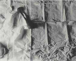
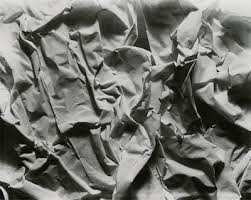
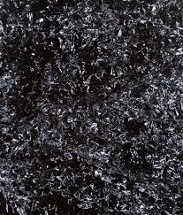
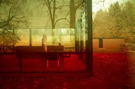
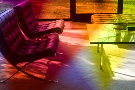
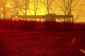
Photoshoot 1
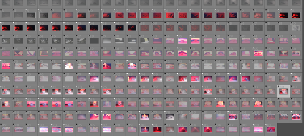


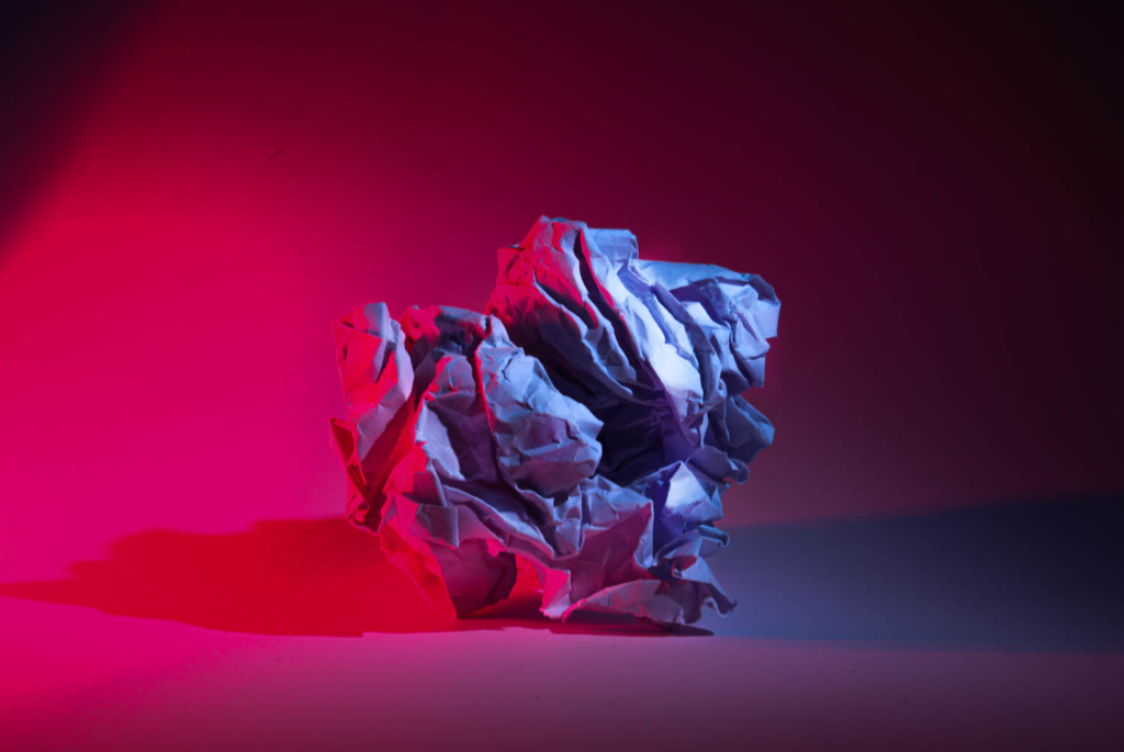
I approached this project by experimenting with various lighting setups on paper to explore how light affects its texture and form. I used different angles, intensities, and even colors of light to create a variety of visual effects. Each shot offered a unique interplay of highlights and shadows, allowing me to capture different moods and visual textures.
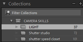
Once I had taken the photos, I exported them into Lightroom to begin the sorting process. I used the PNX process to streamline my collection. This method helps me quickly narrow down the shots, highlighting the ones that stand out and removing any that don’t fit vision.
To make things more organized, I also applied Lightroom’s star rating system, assigning ratings to my favourite shots. This makes navigating through my best photos much easier, ensuring I focus on the strongest images as I move forward in editing for the final selection. It’s a practical and efficient way for me to manage a large batch of images and stay focused on my vision.
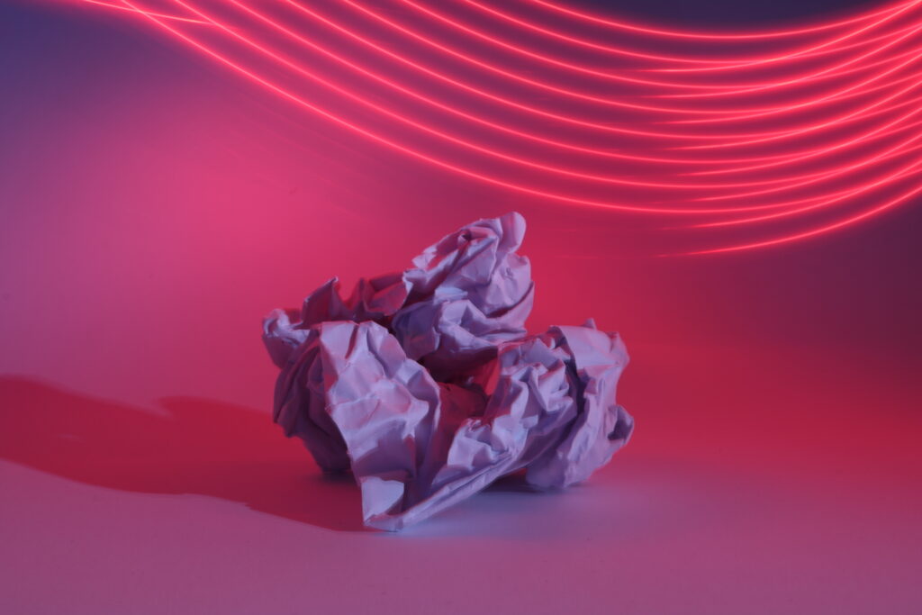
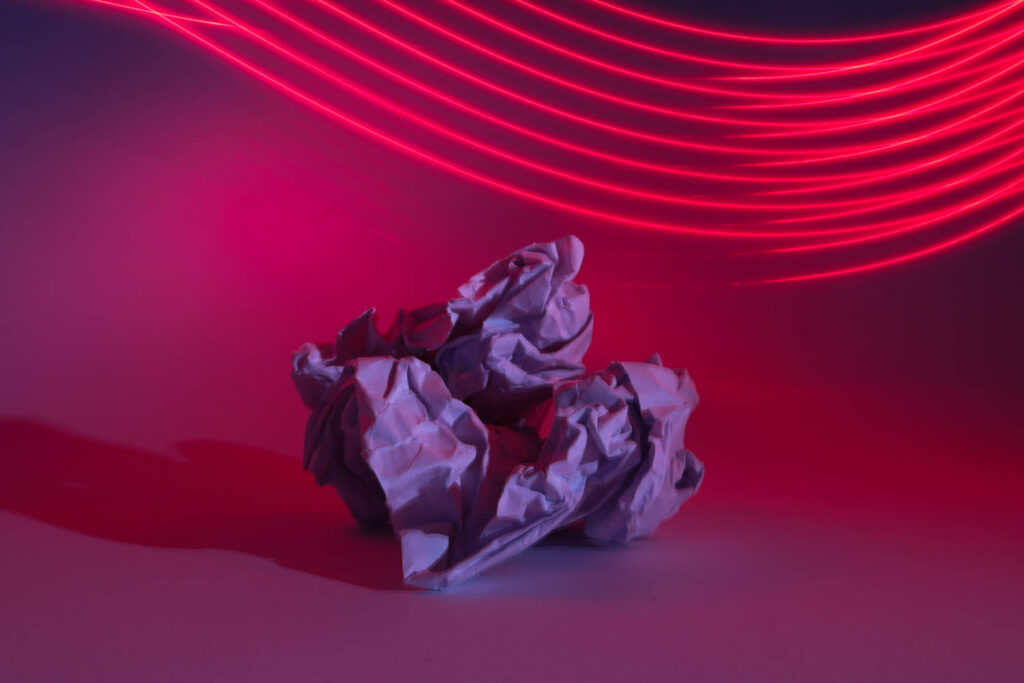
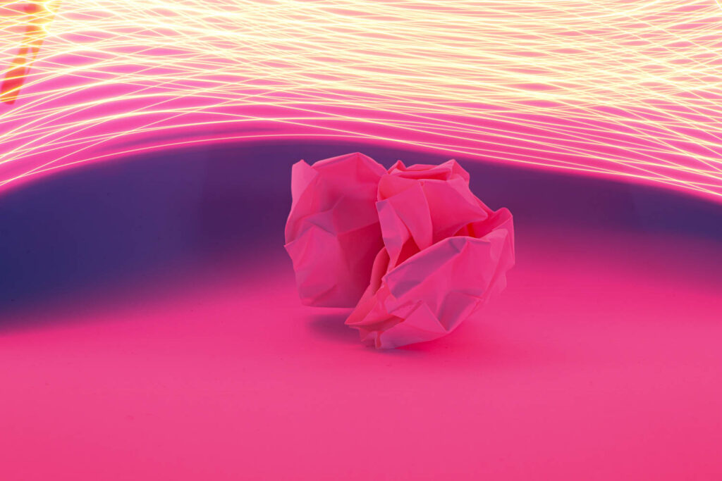
For this shot, I used a long shutter speed and a low ISO to maintain the image’s quality while allowing sufficient time for the light to fully interact with the subject. The low ISO setting helped avoid introducing noise into the image, ensuring the paper texture remained sharp and clean.
The extended shutter speed was crucial here, as it allowed the camera to capture all the available light. This technique ensured that the image was perfectly exposed, balancing both the highlights and shadows in the frame. The crumpled paper was illuminated beautifully, while the long exposure helped enhance the depth and richness of the colors.
What really makes the image stand out is how the long shutter speed also created the neon red glow above the paper. As I moved a light source—or perhaps used a continuous light like LEDs—over a longer period, the camera captured the movement, which resulted in those dynamic light trails. This not only added a sense of motion but also emphasized the futuristic and abstract feel of the photo. It’s a technique that blends still life with light painting, creating a dramatic yet controlled effect.
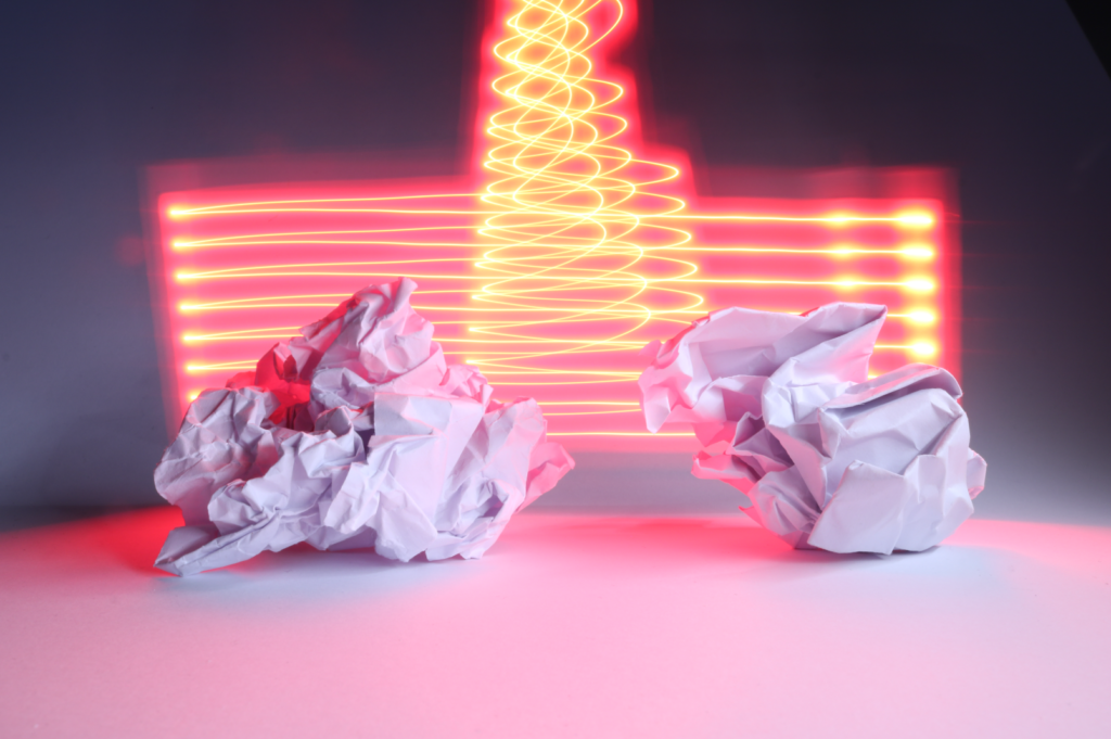
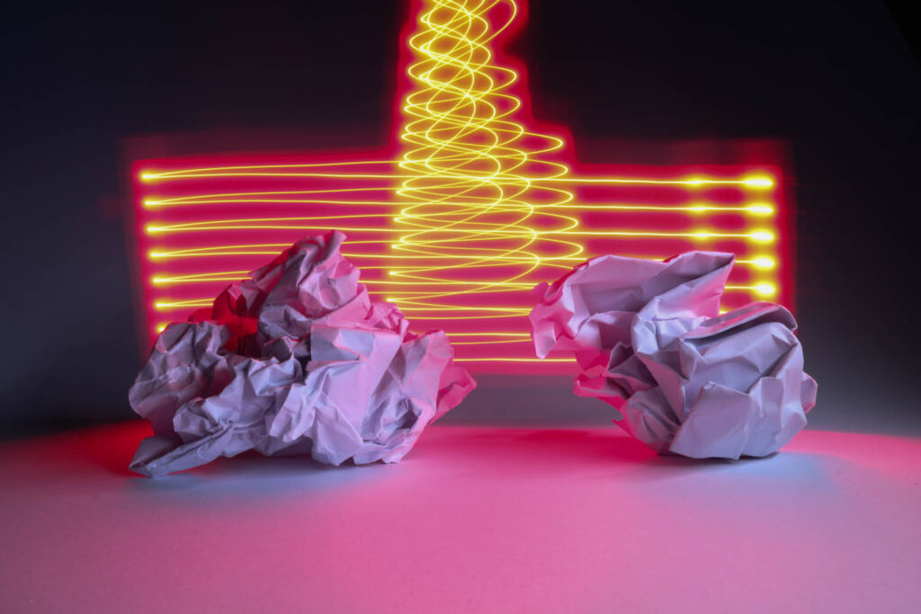
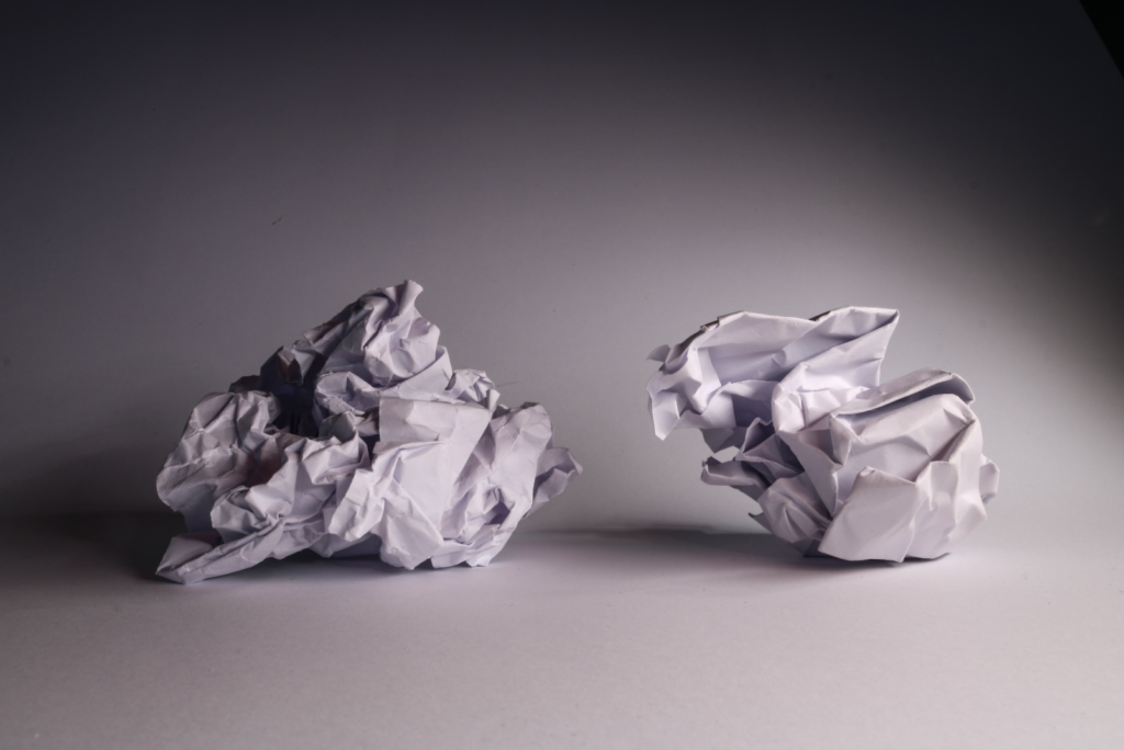
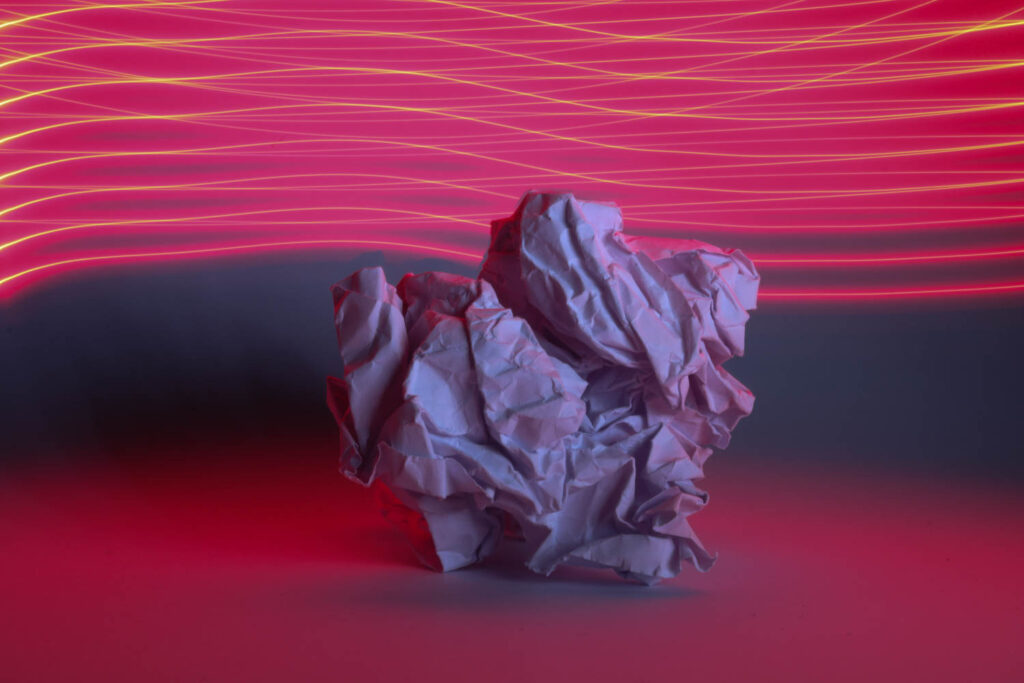
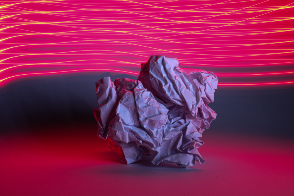
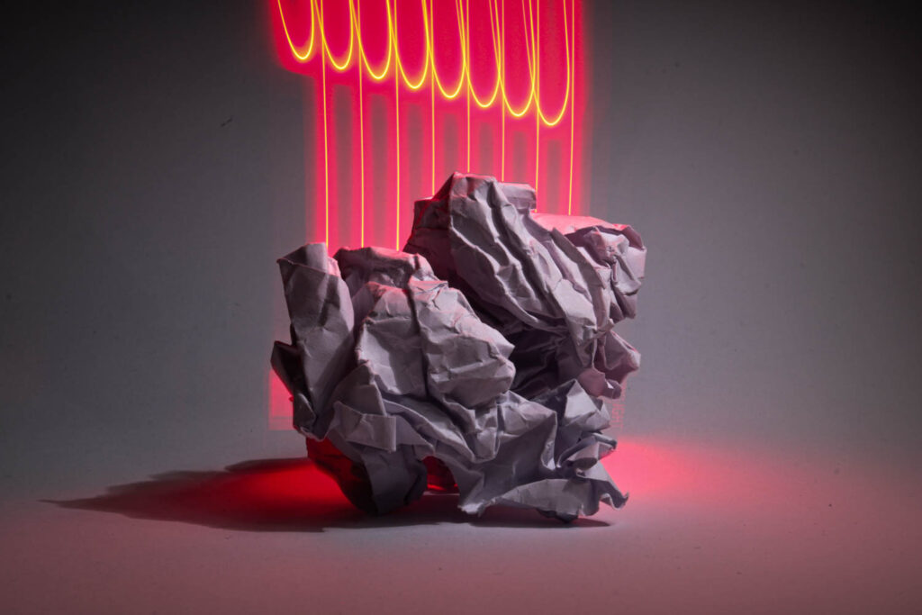
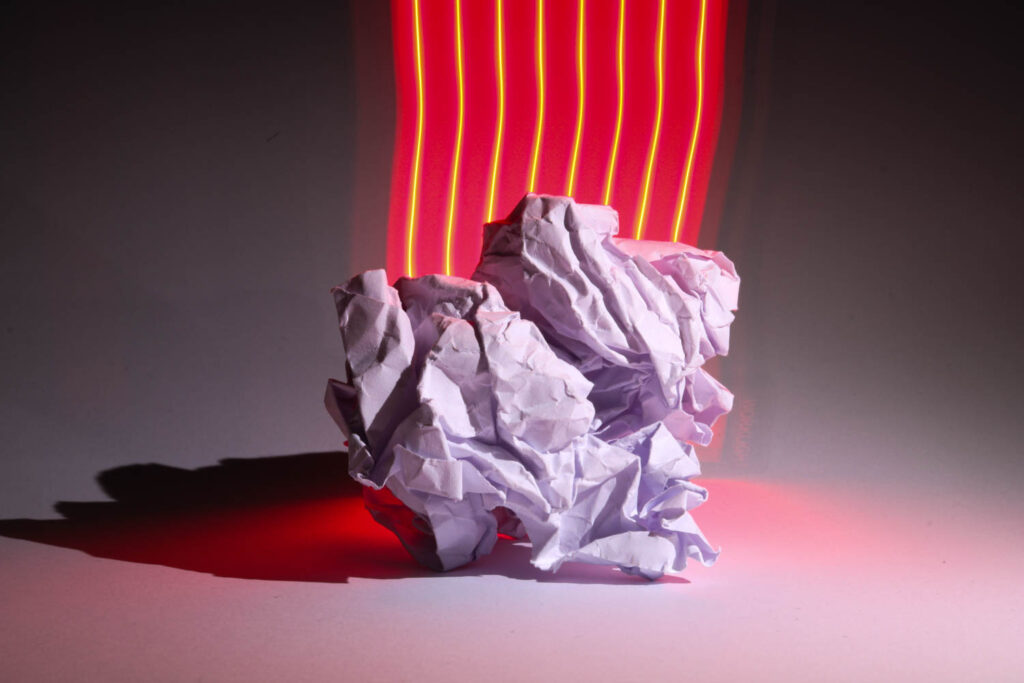
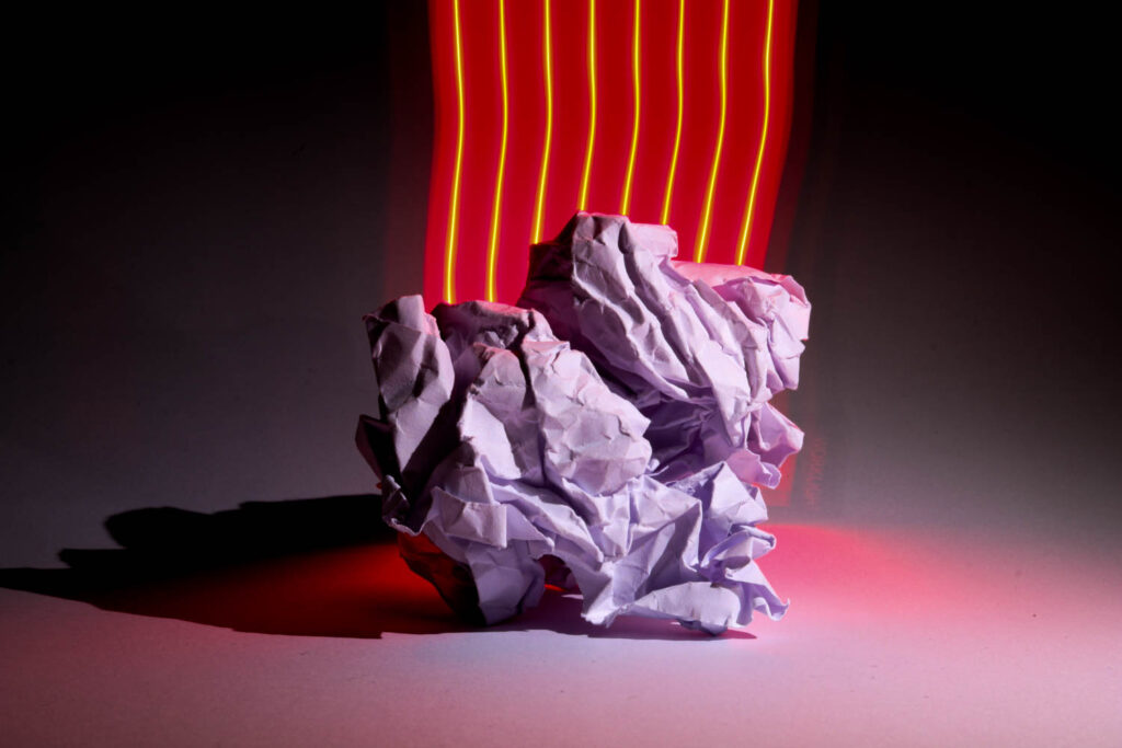
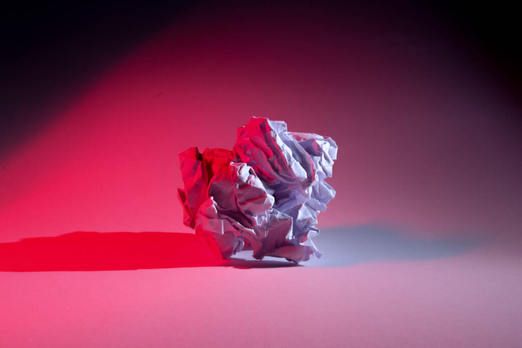
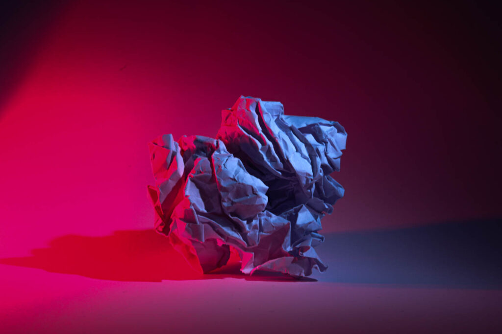
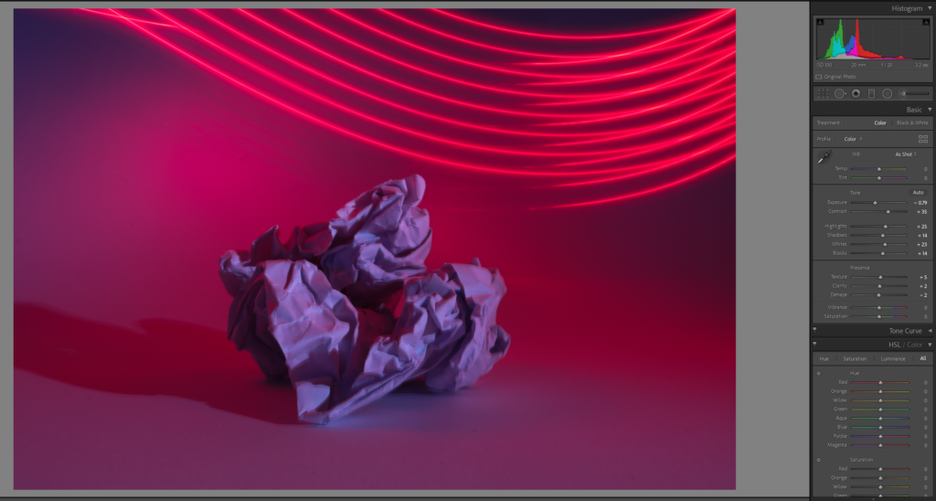
In Lightroom, I further enhanced the images by making key adjustments to emphasize the lighting effects. I raised the contrast to create more separation between the highlights and shadows, which brought out the textures of the paper and made the light trails more striking. Lowering the exposure helped deepen the darker areas, creating a moody atmosphere while keeping the lighting sharp and vibrant.
I also increased the white balance, which enhanced the warmth and intensity of the lights, particularly in the red and neon tones. Finally, I deepened the blacks, which made the lights stand out even more against the dark background, creating a stronger visual impact. These adjustments allowed the photos to feel more polished, with the lighting effects taking center stage while still retaining the crisp details of the paper.
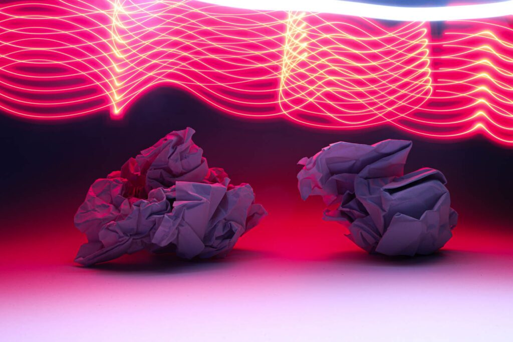
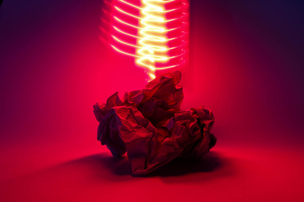
In this series of photos, I explored the interaction between light and paper, using long shutter speeds to blend creative lighting effects with crisp, detailed images. Each photo allowed me to play with different lighting setups, whether it was coloured lights, moving light sources, or a combination of both. By using a long exposure, I captured not just the stationary subject ( crumpled paper, in this case) but also the movement of light around it.
The long shutter speeds gave me the flexibility to introduce dynamic lighting effects, such as light trails or glowing neon tones, while keeping the paper itself sharp and textured. The extended exposure times allowed the camera to fully process the movement of light, creating ethereal and abstract patterns that contrasted beautifully with the stillness of the paper.
The key was balancing the technical settings. I used a low ISO to retain image quality and minimize noise, while adjusting the shutter speed to capture the perfect amount of light for each shot. This combination allowed me to achieve a unique blend of crisp textures and flowing light effects, resulting in visually striking images.
Virtual Gallery
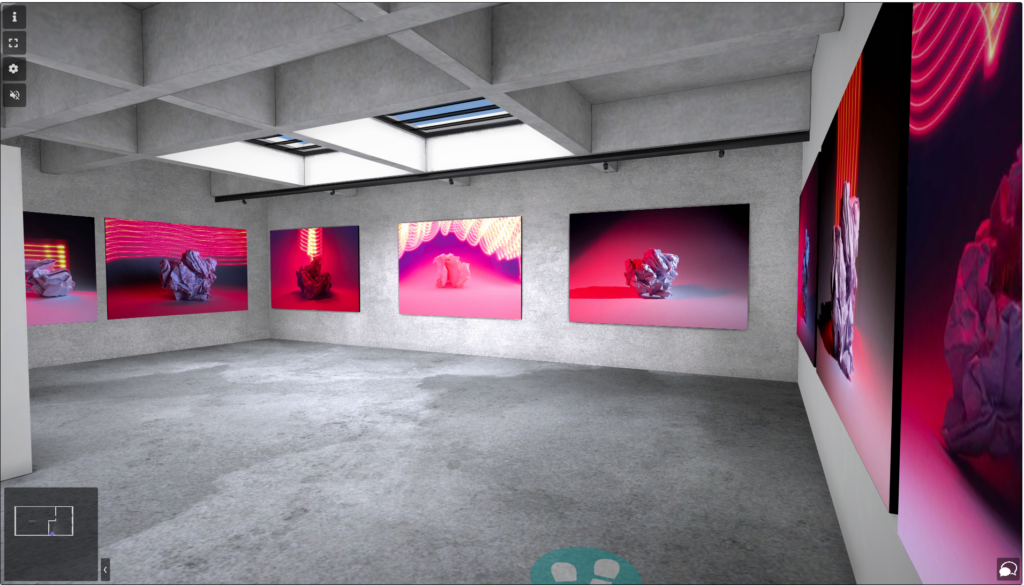
I recently created a virtual gallery on Art steps to showcase my photography of paper and lighting. It was exciting to curate a selection of my images that explore the unique interplay between textures and light. Using the platform, I designed an immersive experience that allows viewers to navigate through my work, which feels like a personal journey into my artistic vision.
As I arranged the images, I focused on creating a harmonious visual flow throughout the gallery. For example, I grouped photos with similar colour palettes together, which helped create a cohesive look. This intentional matching not only draws the viewer’s eye across the space but also enhances the overall mood of the exhibition.
GIF!
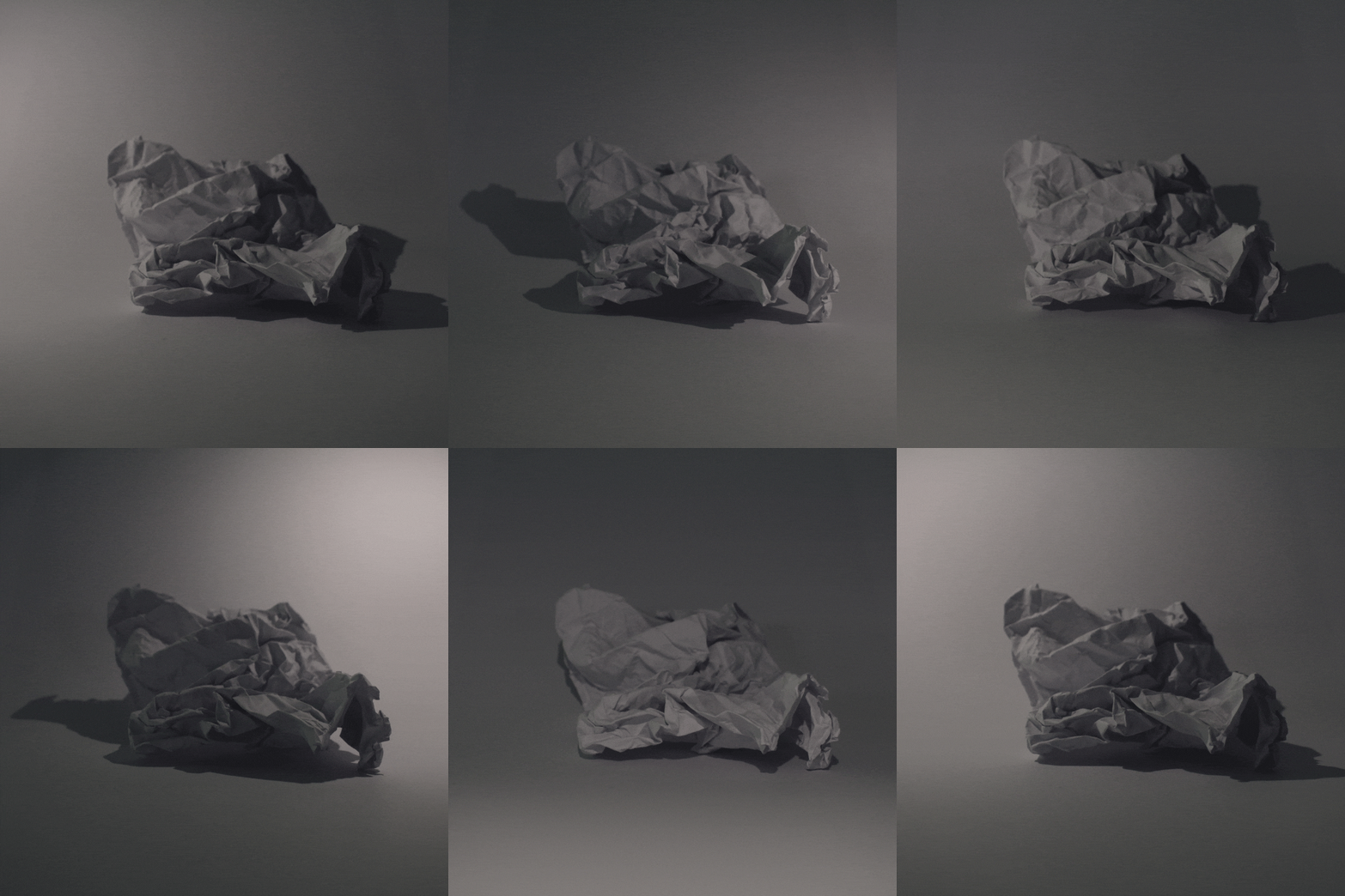
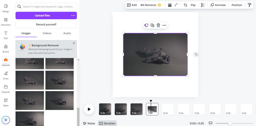
I decided to create a dynamic GIF featuring a paper ball illuminated by light in motion. To start, I took a series of burst photos while rotating a light stick around the paper ball. This technique allowed me to capture the movement of the light when putting the photos in a repetitive sequence.
Once I had my burst photos, I turned to Canva.com for the editing process. I uploaded all the images into a new project, carefully arranging them in sequence to create a smooth transition. Canva made it easy to adjust the timing between frames, allowing me to fine-tune the speed of the GIF to emphasize the swirling light effect.
After finalizing the design, I exported it as a GIF, and the result was a smooth animation that effectively conveyed the interplay of light and texture.
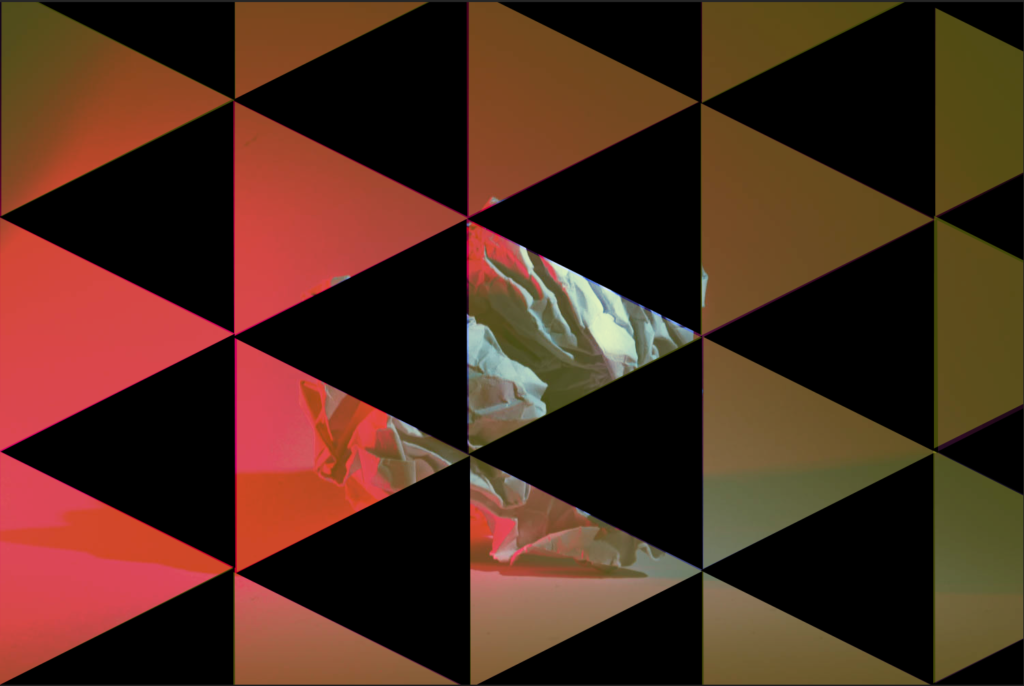
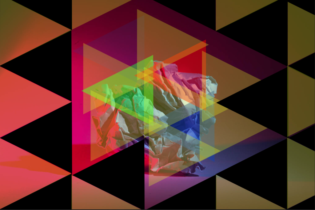
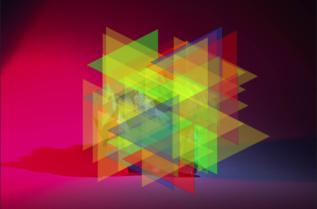
PHOTOSHOP
