Jerry Reed
Jerry Reed is an English photographer who claims his objective is to sustain the interest of the viewer through his photographs. He focuses heavily on a contrast in the shadows from the light on the paper, giving a very two-toned effect.

The series is based on paper sculptures meticulously crafted by Reed, explorations in architectural forms and spatial relationships. Reed makes his photos black and white to remove the distraction of colour and to help the viewer focus on other aspects of the photo, such as the subject, the textures, shapes and patterns, and the composition.
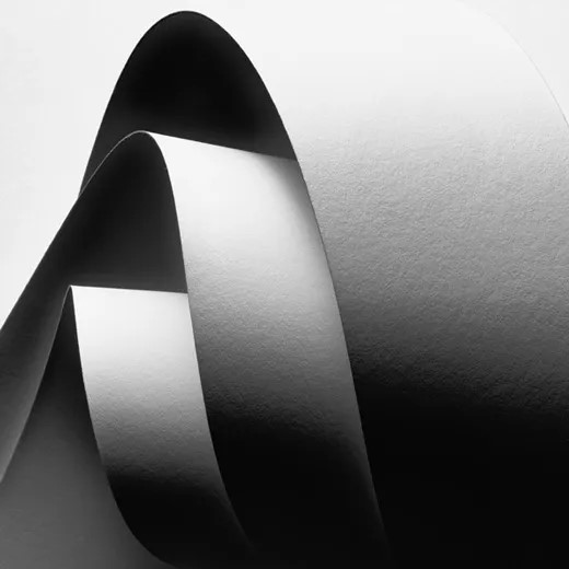
In his series, “Paper Work”, Jerry Reed’s B&W photographs of close-up paper arrangements become abstract designs through careful directional lighting. His constructions are sensually textured, elegant studies of form and tonality.
Paper experiment photoshoot

This is my contact sheet for all of my paper experiment photos. I tried to use different shapes and sizes of scrunched up paper to create different textures. I used the studio to take these pictures using the ring lights at different angles. The only thing I kind of struggled with taking these photos is the aperture and what ISO to use for my photos. These photos are just scrunched up pieces of paper, or cut up paper shaped into different forms to create dimension and let the light go in in different areas of the paper.
Edited (before and after)
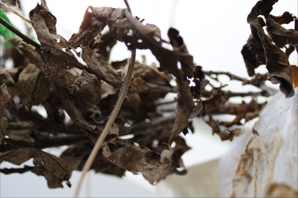
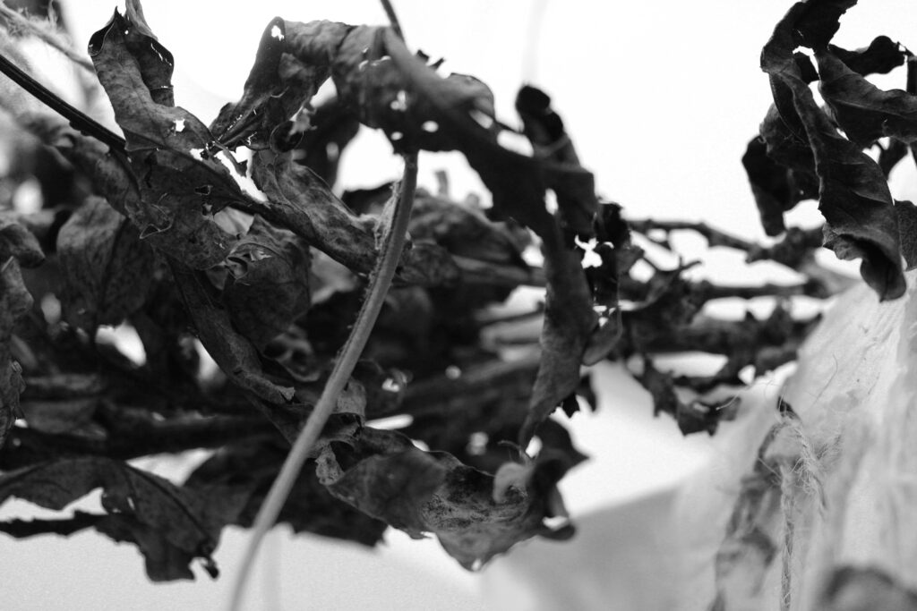
For this photo I turned it black and white to get rid of distractions of colours to get the viewer to focus on the texture of the dried up leaves and the form of it.
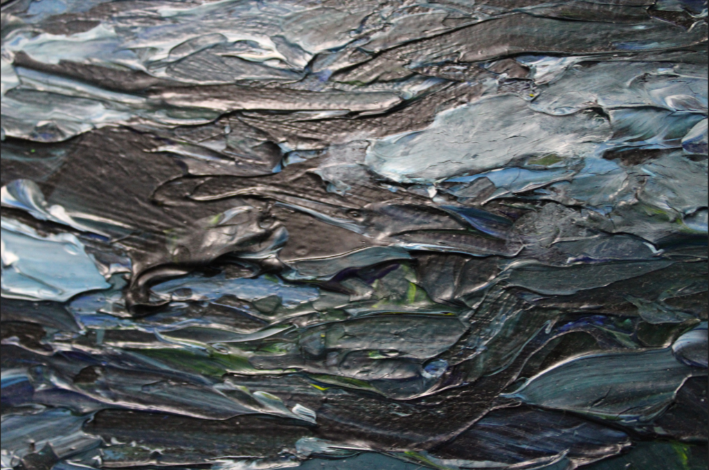
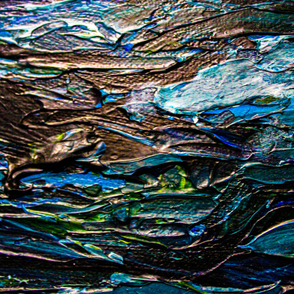
This is a before and after of a texture photo I took. I decided to enhance the colour to really bring out the texture in it. It isn’t easy to see here but I also cropped the photo so it was a square so that it could be more focused on one area of the photo only. I turned the brightness and contrast up to make it more clear.
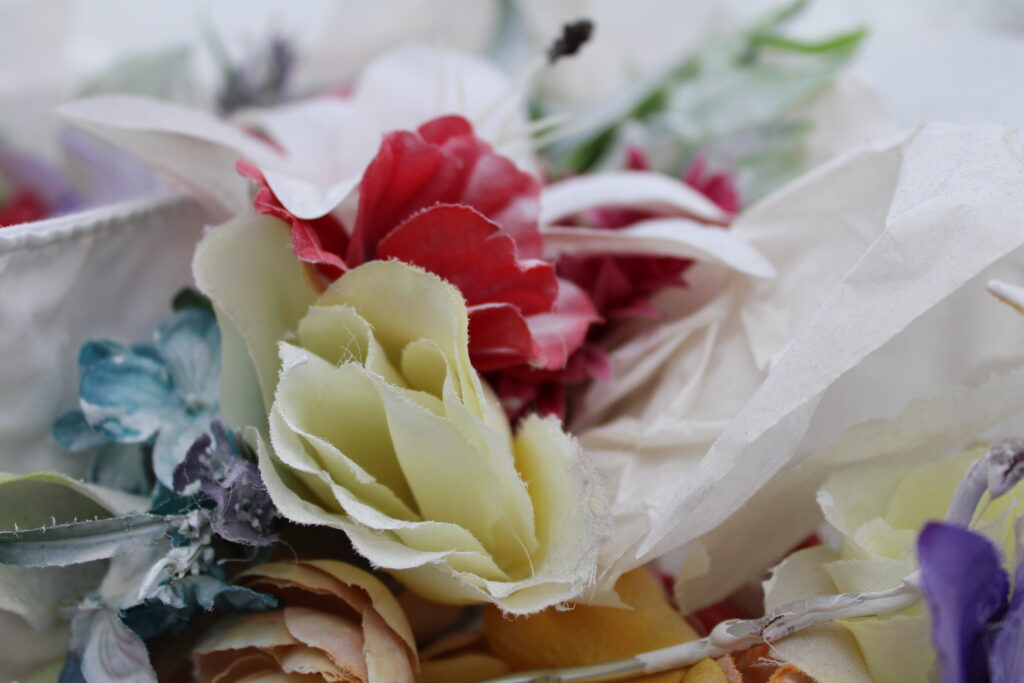

In these photos that I took of some fake flowers and leaves, I decided to make the photo black and white as I thought there was too much going on which all the colour and now the viewer can just be focused on the main aspects of the image. I made the hue and saturation higher. I also cropped my image so that it didn’t have as much negative space and the viewers would be able to focus on only the main aspect of the image.
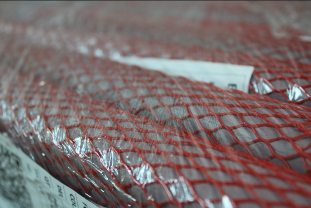
This photo that I took represents many of the formal elements, for example:
Line: This is included to divide the space and suggest patter, form, depth, distance and rhythm.
Shape: This makes the photo stand out as it captures the viewers attention as it has sharp edges and well-defined corners.
Repetition: The same shape is used repeatedly which creates a sense of rhythm and balance in the image.
Texture: The texture on the film around the shapes brings life and vibrancy to the image so it doesn’t appear flat and uninspiring.
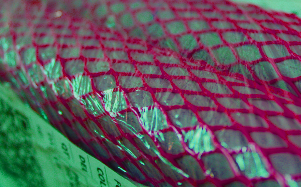
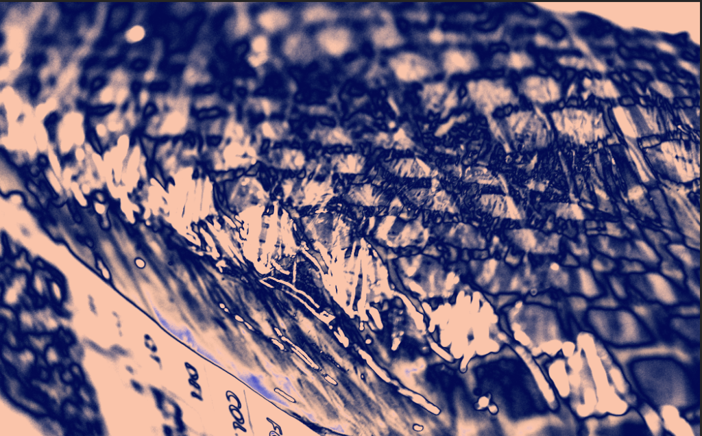
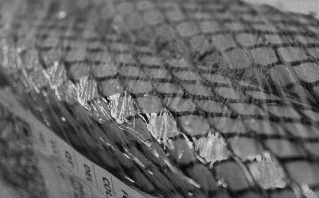
In these 3 photos, I had edited the first one in 3 different ways. The first photo I increased the saturation, vibrancy and the hue to make the colours really stand out more. In the second one, I added a gradient map over the top of it and used a mixture of blue and a pale pink to show the contrast between the colours and shadows. These colours also bring out more texture than you could see in the original photo. In the last photo, I decided to make it black and white to remove the distraction of colour so that the viewer could focus on the other aspects of the photo, like the texture and the shapes.
My Final Photos
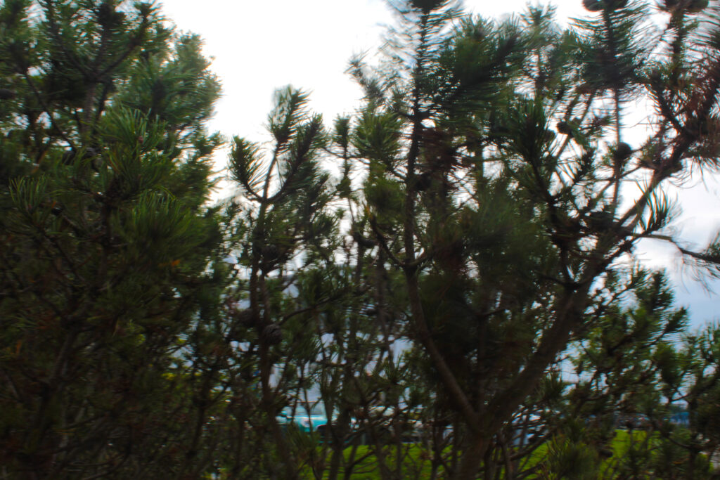

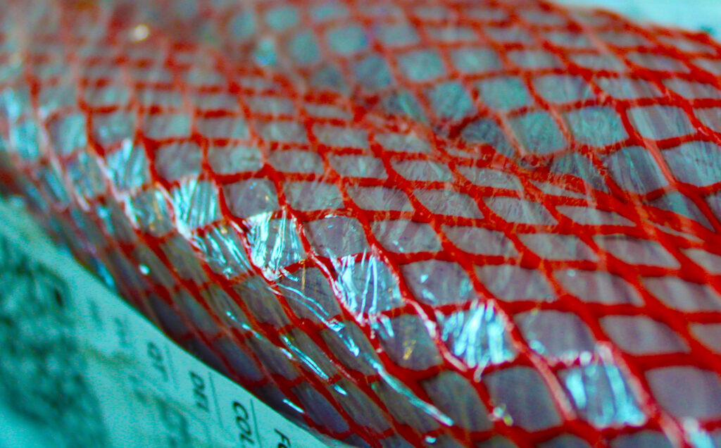

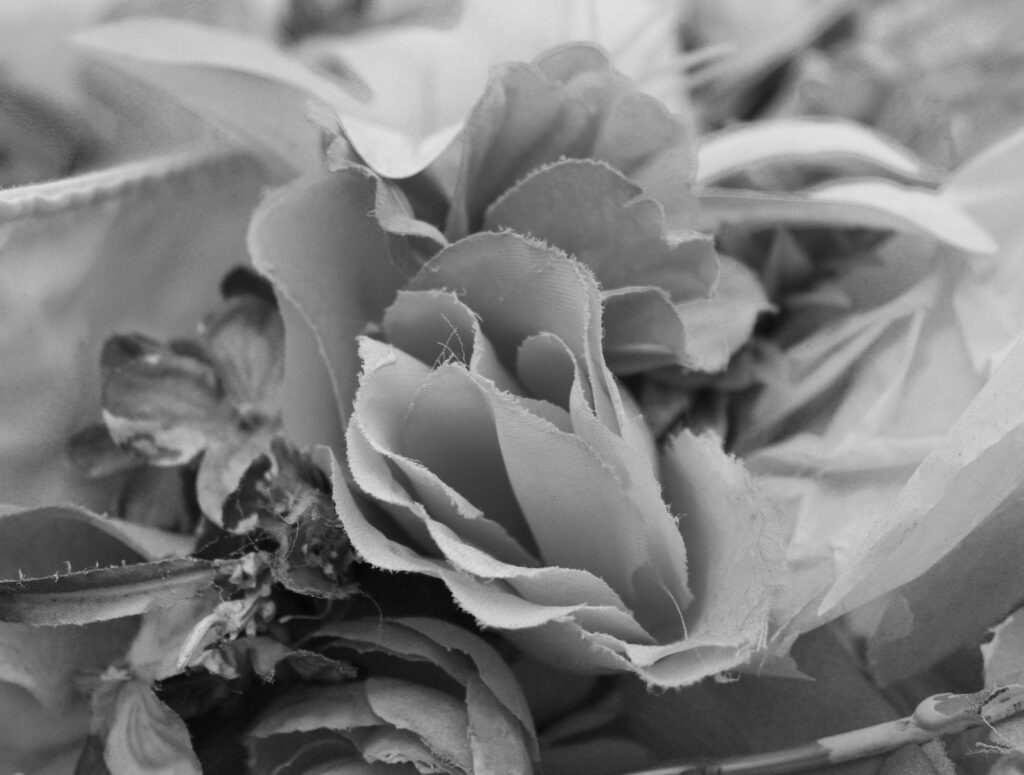
These are my favourite final photos. I think they create a good variation of the formal elements. The texture in all of them creates a sense of dimension in the photos and the ones in black and white make sure that the viewer isn’t distracted by the bright colours and takes more time to notice the little features of the photos to get it more in depth. In the photos which are not black and white, I decided to enhance the colour as it makes the texture of them come out even more. The photo in the top right and the photo of the trees have a lot of shape which stands out and captures the viewer’s attention, along with repetition to produce a sense of rhythm and balance.
ArtSteps Gallery
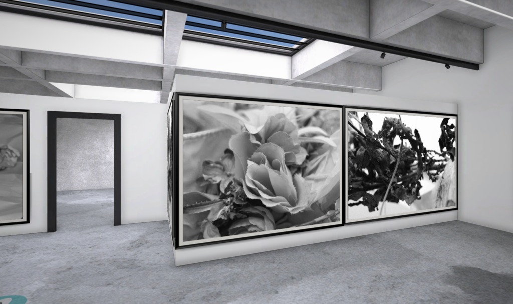
I decided to put these photos together as they kind of give off the same concept and are both in black white so the viewer is not distracted by the colour of the photo. both these photos are based off of nature which makes them look good together. The two photos together really compliment each other and all the dark lines makes the images stand out to the viewers. I decided to get three different types of leaves to really show the difference between them but how well they work together. The dark tones bring out the texture in each photo and can really grab the viewers eye.
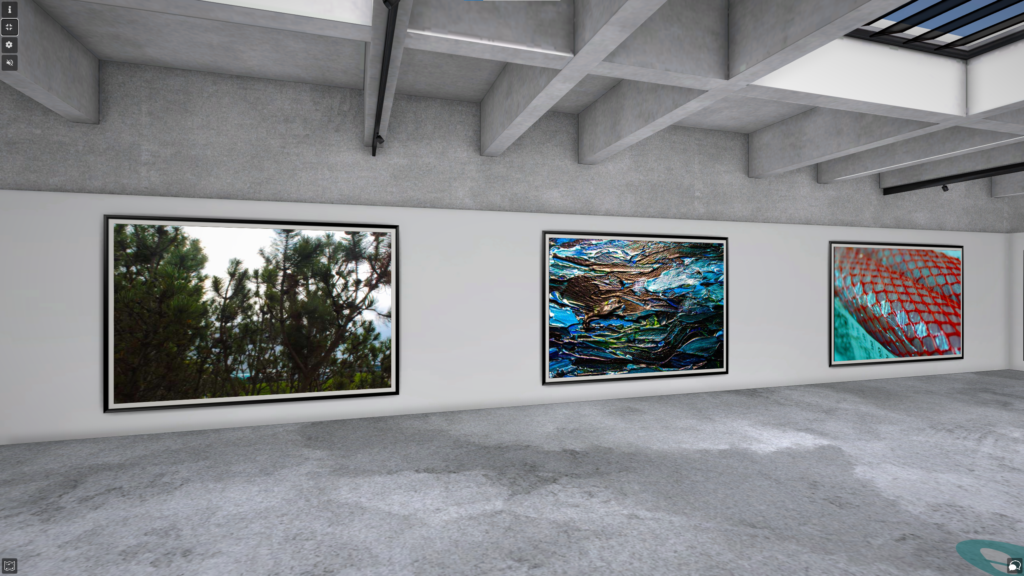
I believe that these three photos work really well with each other as they are all in colour and they all give off the same vibe. All have a lot of repetition within them which creates a sense of balance and rhythm. I think the colour in each of them enhances the amount of texture in each photo which can really grab the viewers eye and make them more intrigued in the photo. The green and blue tones in all photos give off a sense of calmness and relaxation which is another reason why I think these photos work really well with each other.
