in photography is the visual quality of the surface of an object revealed through variances in shape, tone and colour and depth
Artist
Minor White
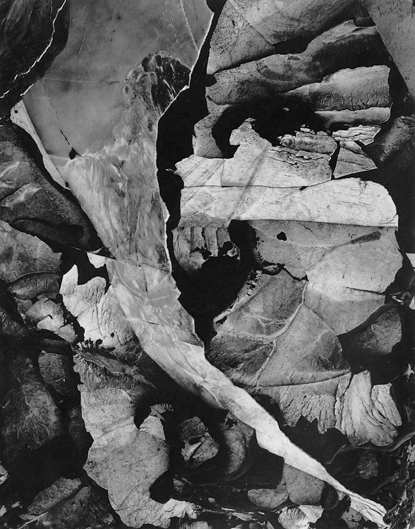
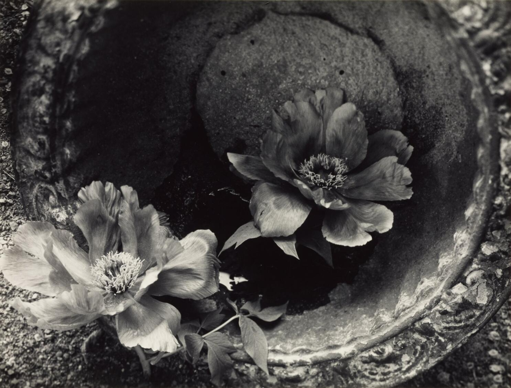
examples of his work
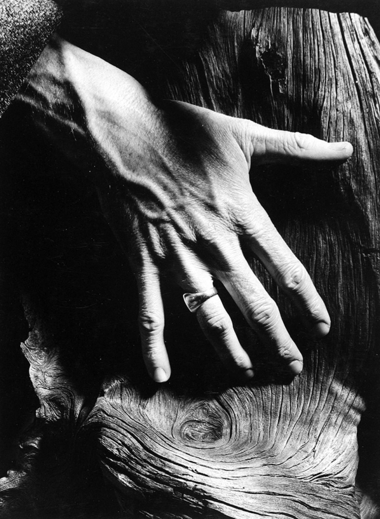
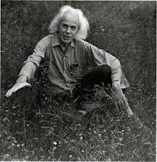
Minor White, born in Minneapolis in 1908, earned a B.S. in botany from the University of Minnesota in 1933. He moved to Portland in 1937, working as a WPA photographer and teaching photography until his military service in 1942. After the war, he studied art history in New York and was influenced by notable photographers like Edward Weston and Alfred Stieglitz. In 1946, he joined the California School of Fine Arts, where he became friends with Ansel Adams and co-founded Aperture magazine in 1952. White later taught at the Rochester Institute of Technology and MIT, co-founded the Society for Photographic Education, and edited Aperture until 1970. His mystical approach to photography, particularly in landscapes, emphasizes abstract images and spiritual self-knowledge, making him a significant figure in postwar photography. His work has been exhibited widely and includes notable publications.
Some of my own work similar to him
and first the raw photos, which are the best in my opinion
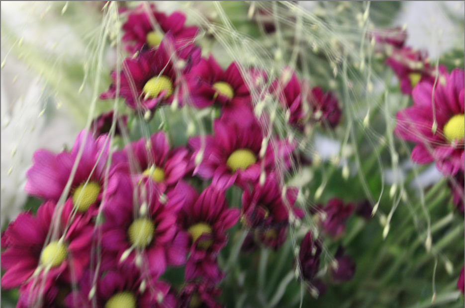
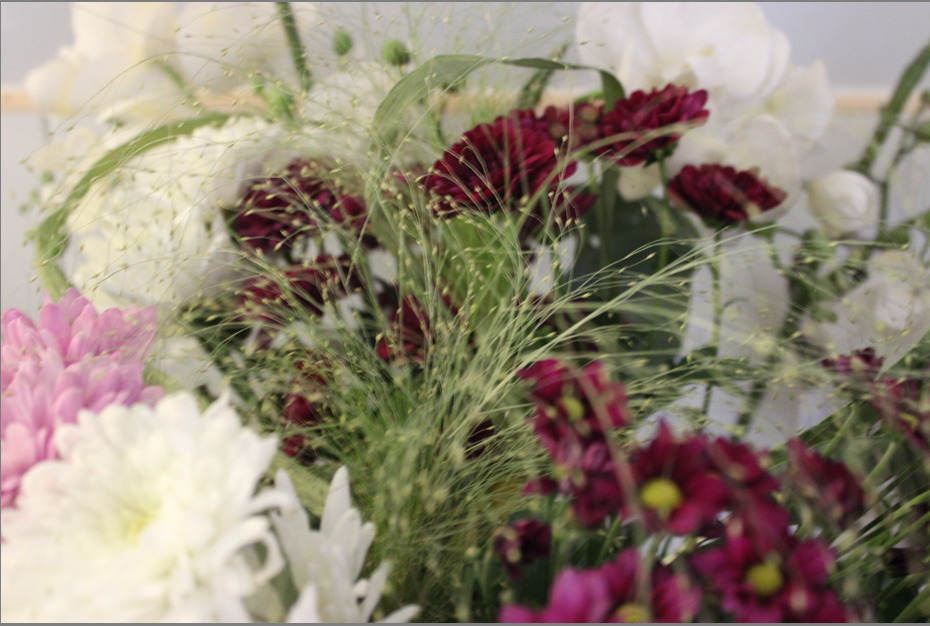
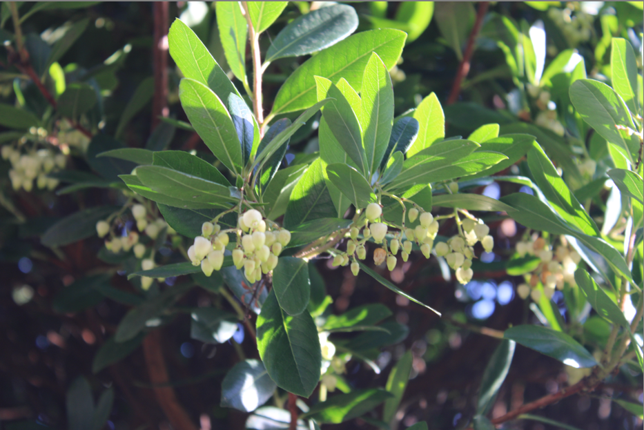
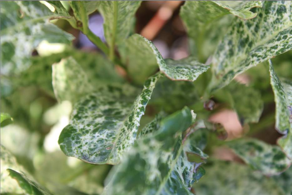
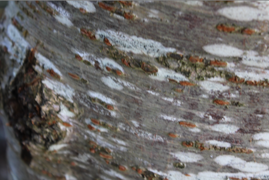
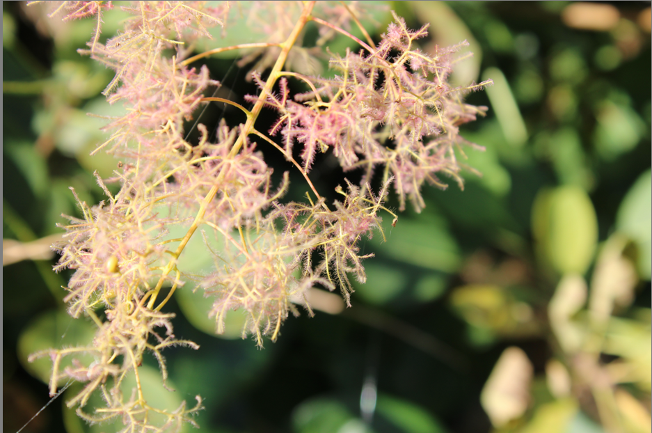
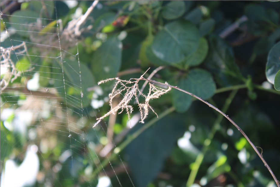
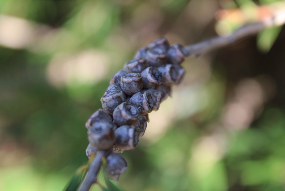
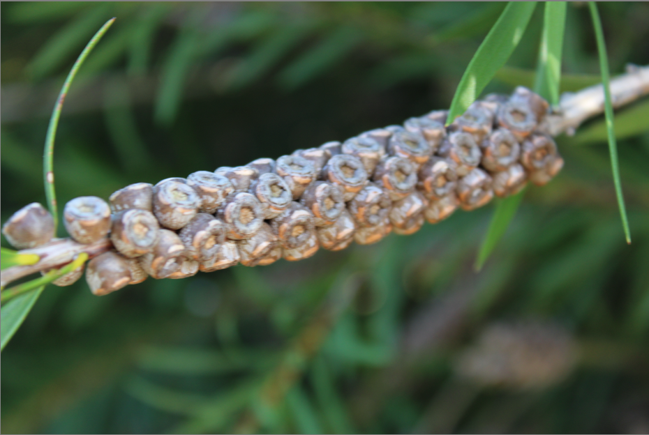
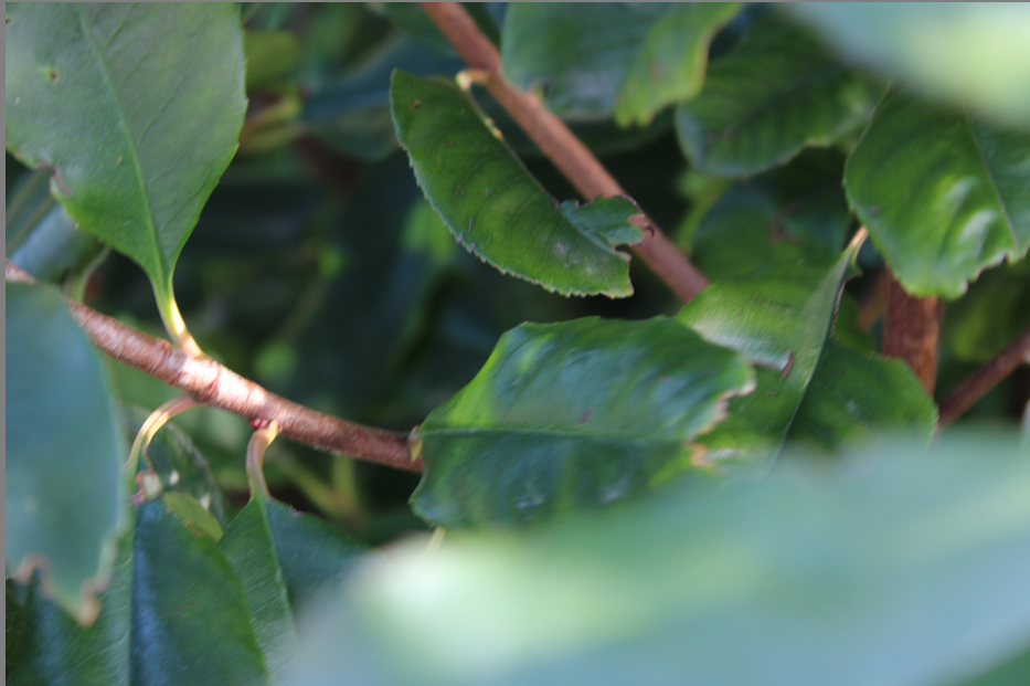
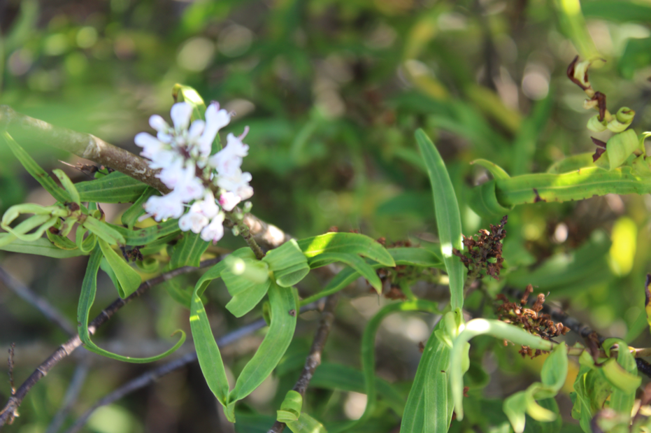
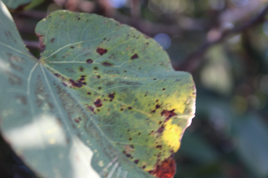

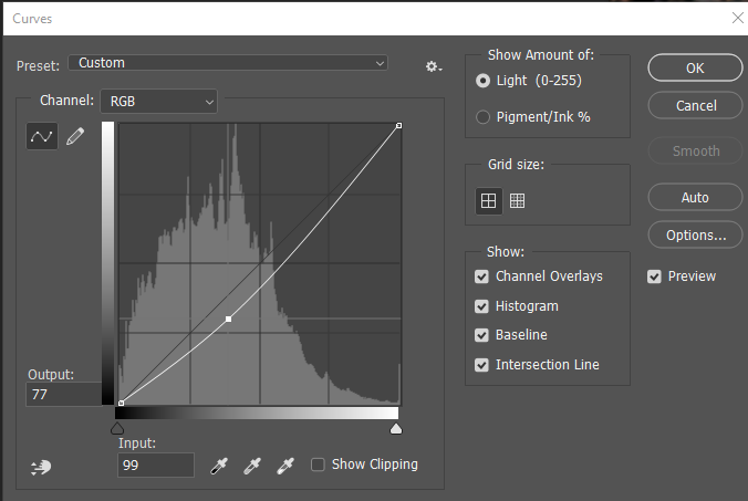
contrast sheet
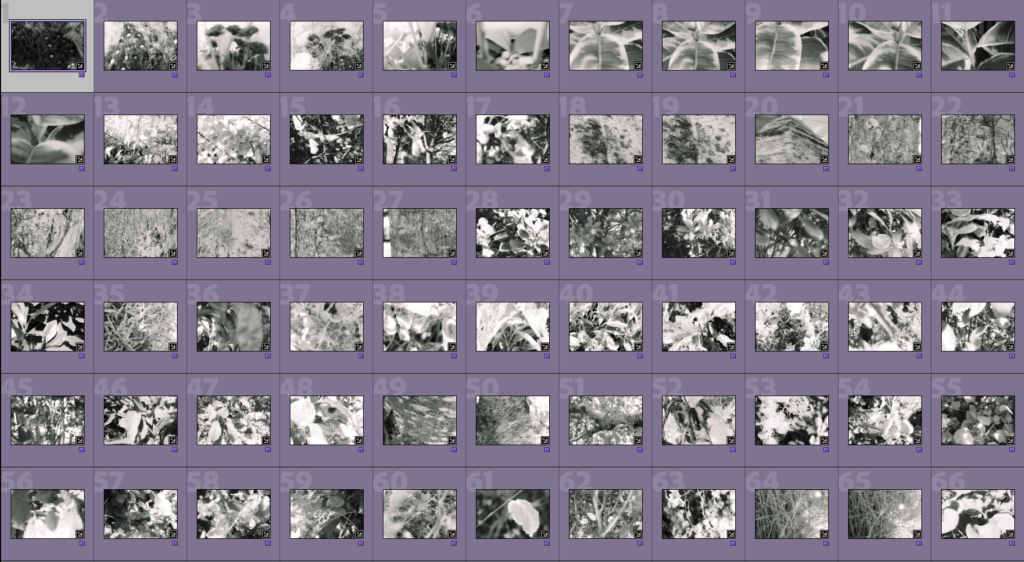
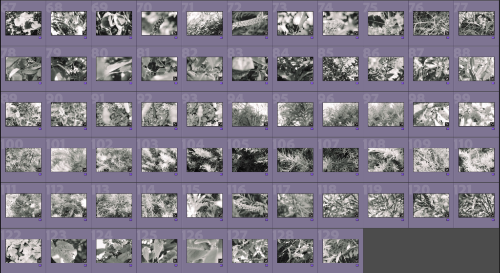
edited in colour
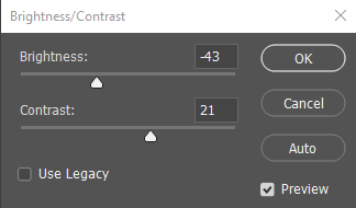
most of the photos will be edited in a similar style
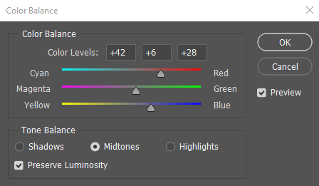
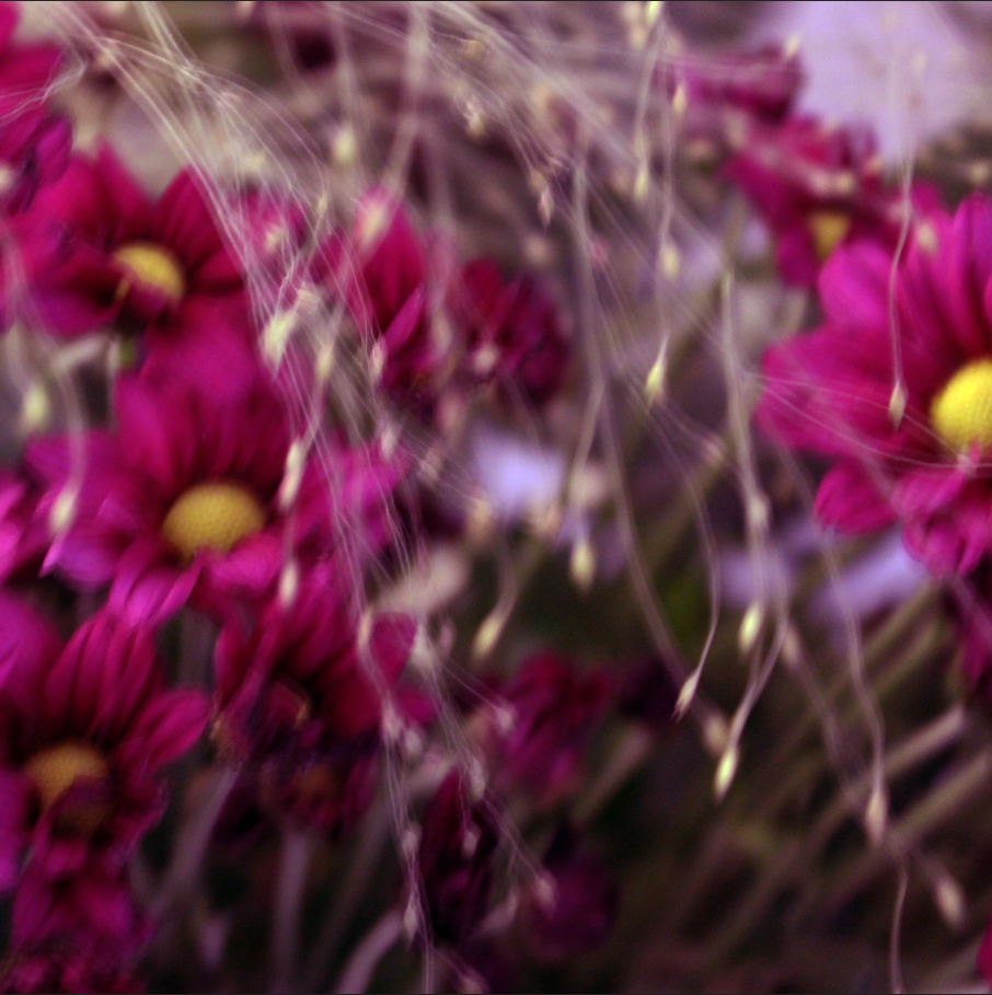
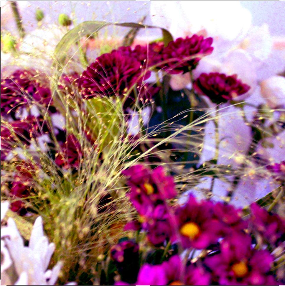
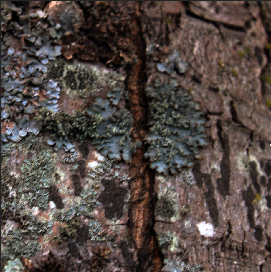
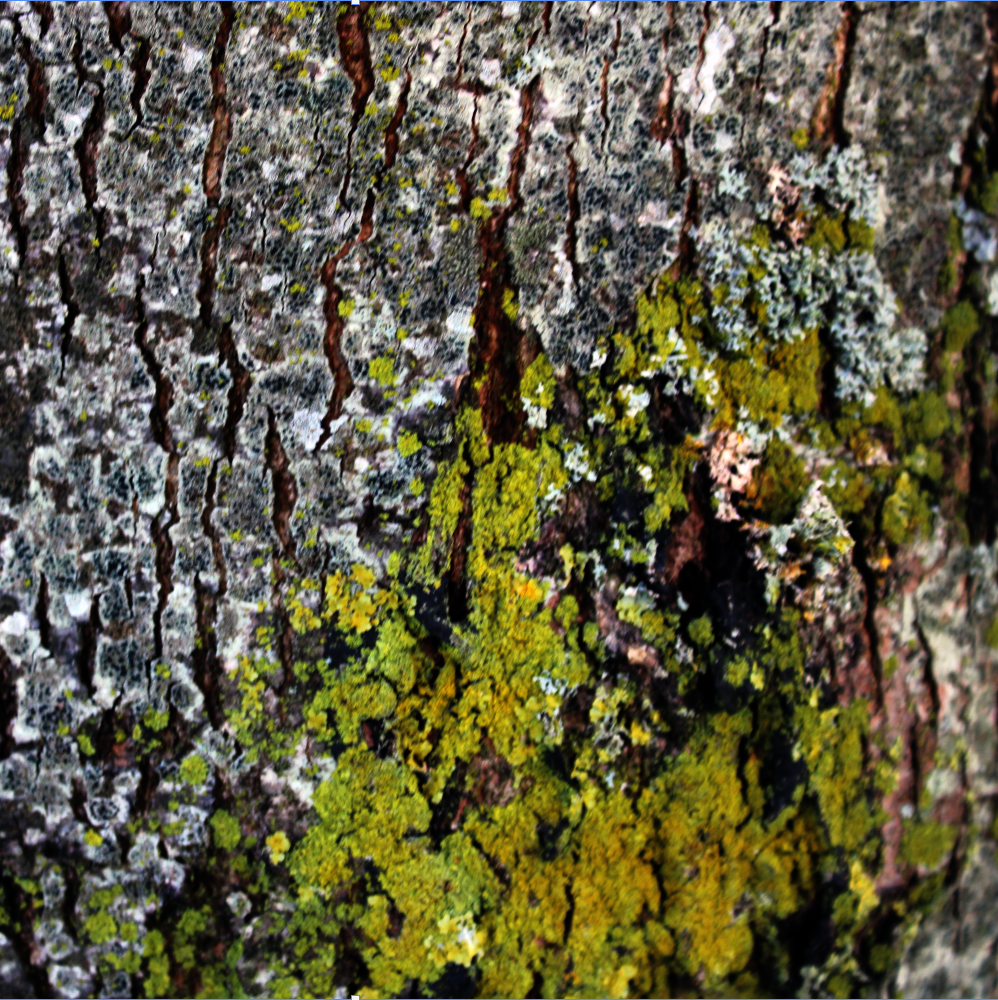
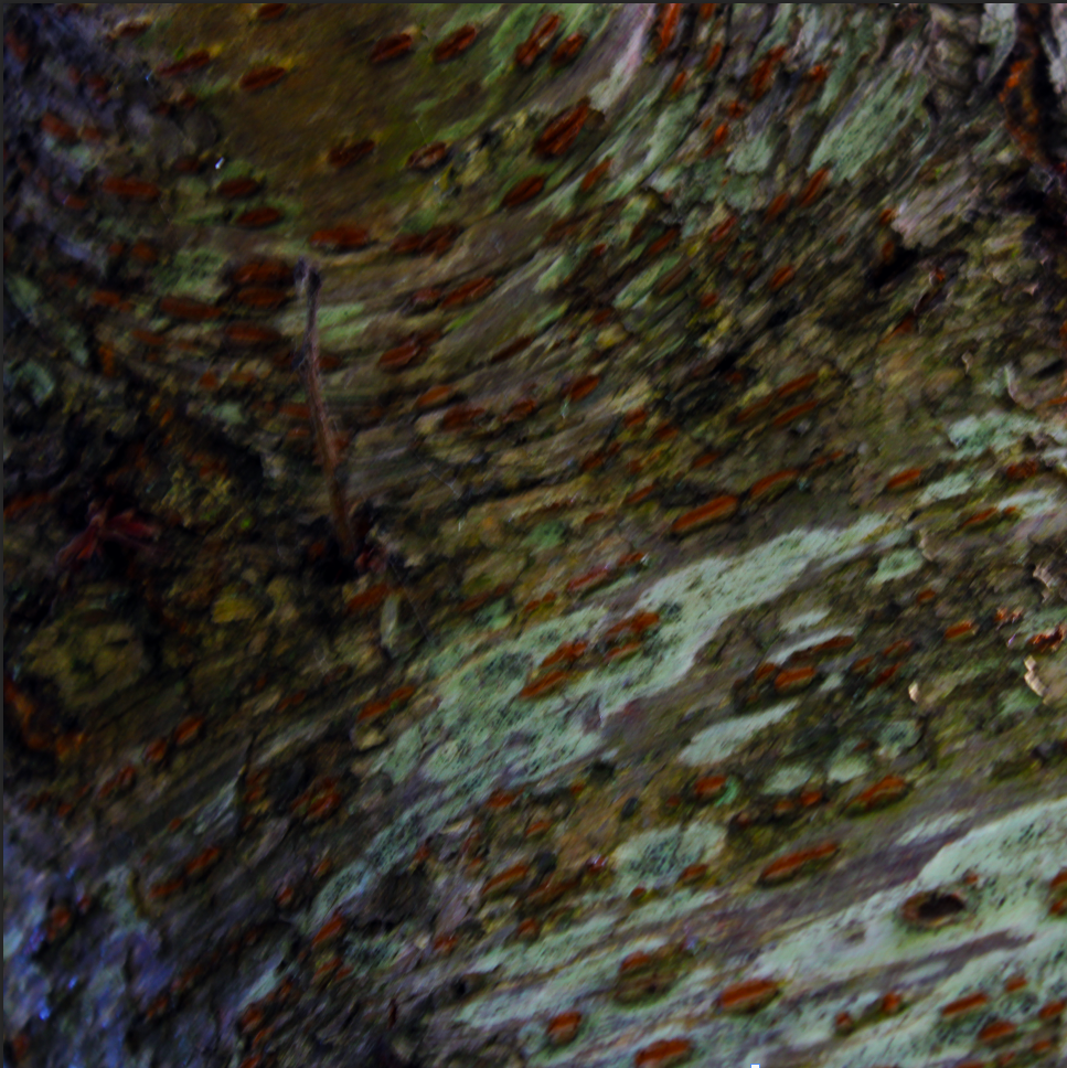
these were edited in colour however preferable it looks best and captures the texture best in the black and white versions and they are more similar to the artist.
edited photos
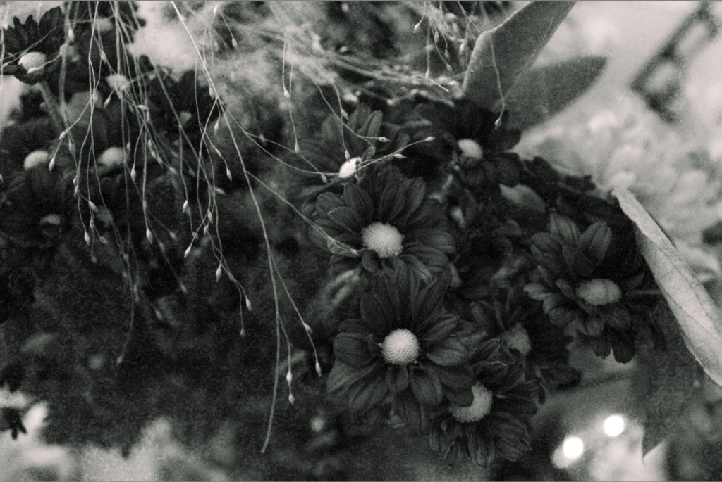
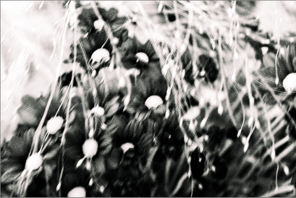
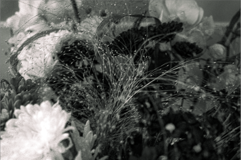
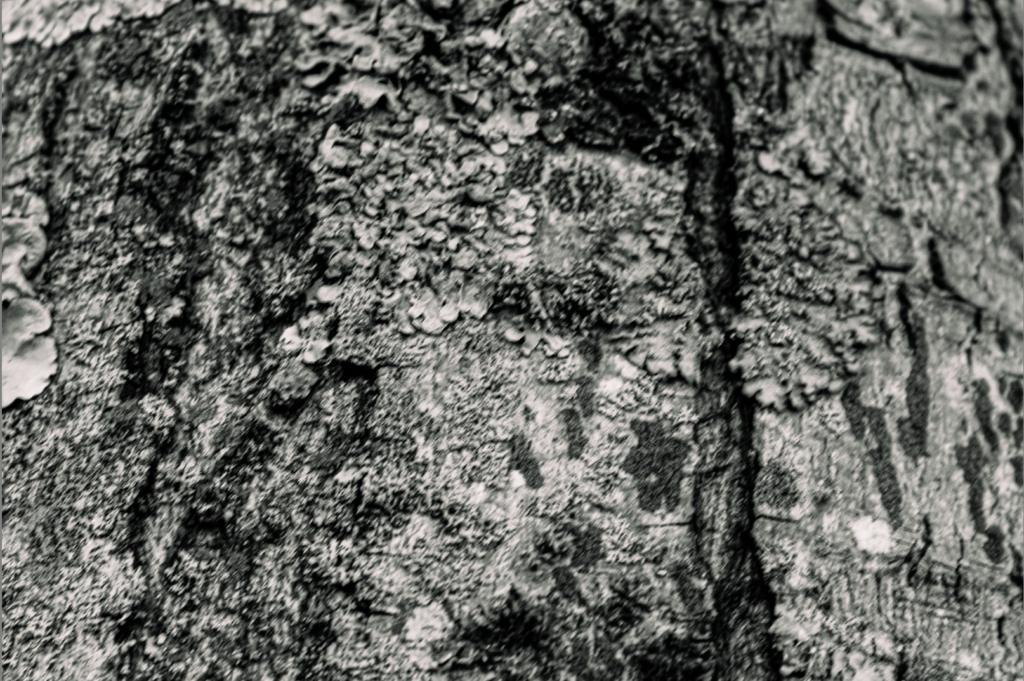
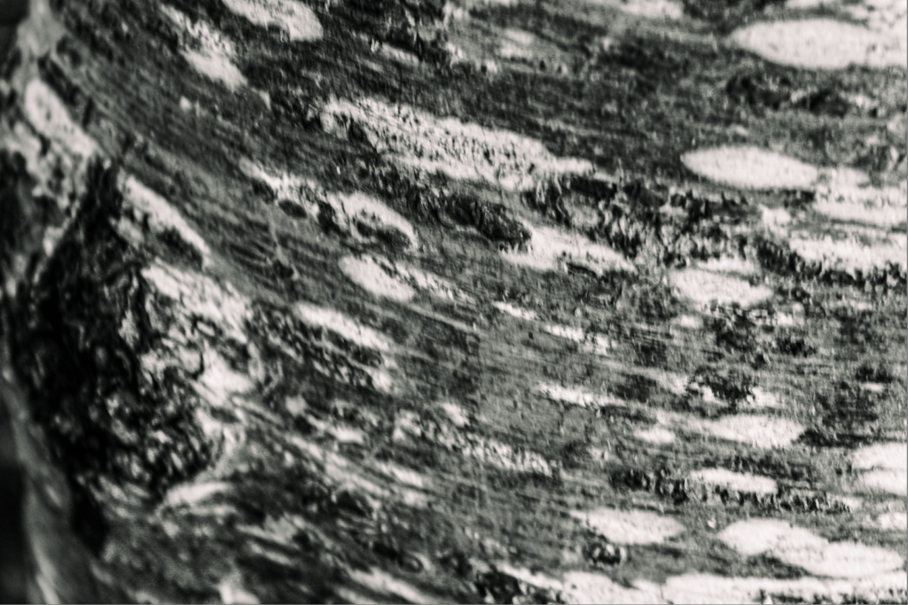
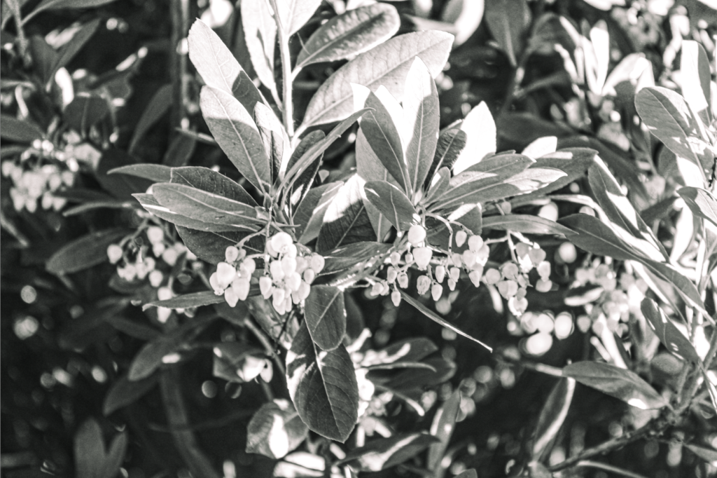
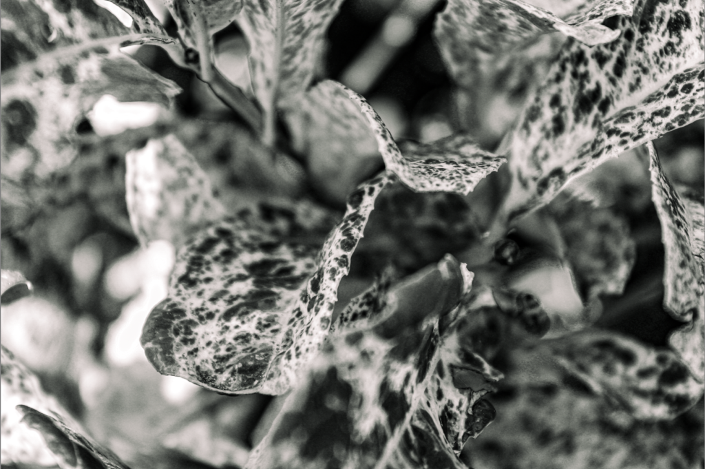

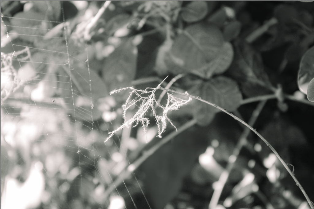
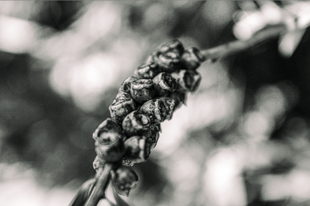
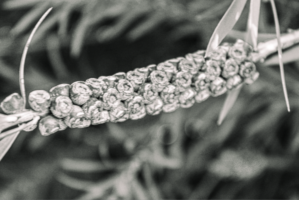
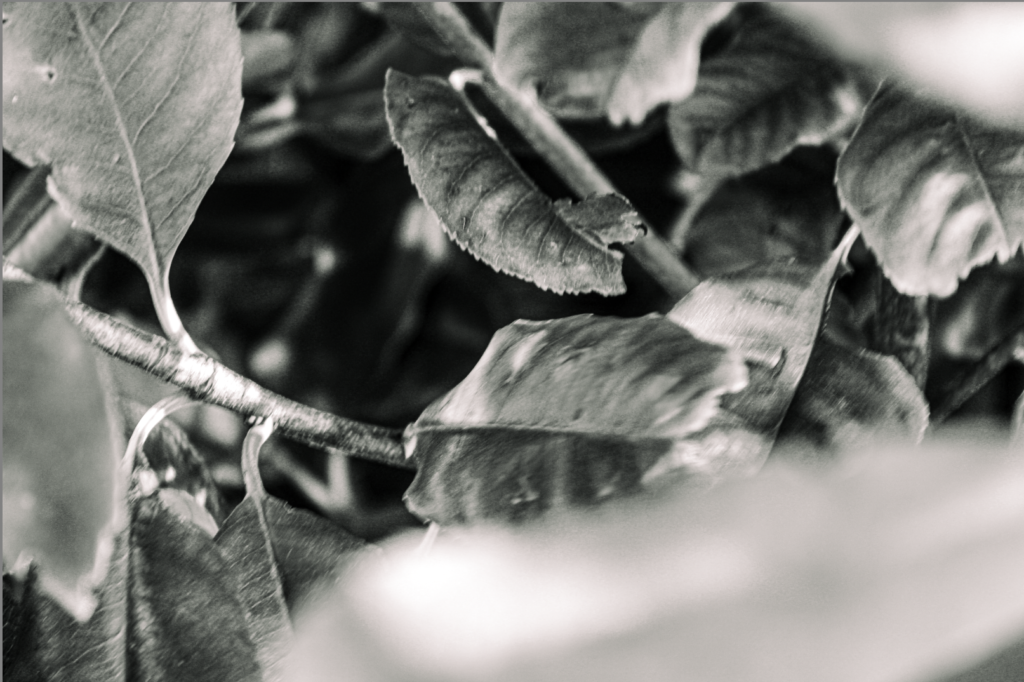
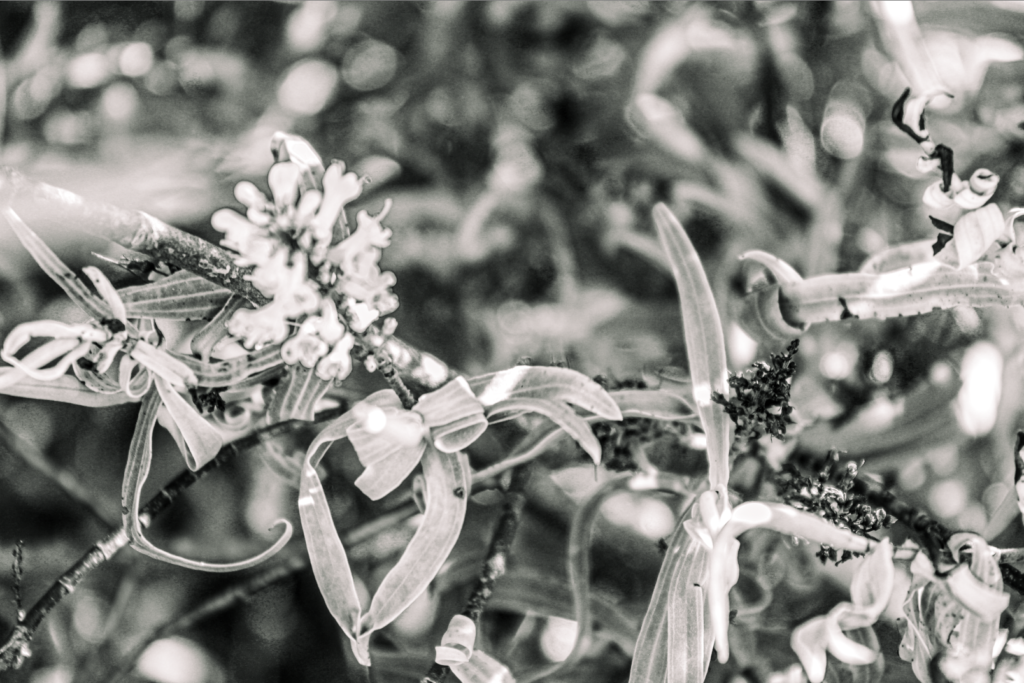
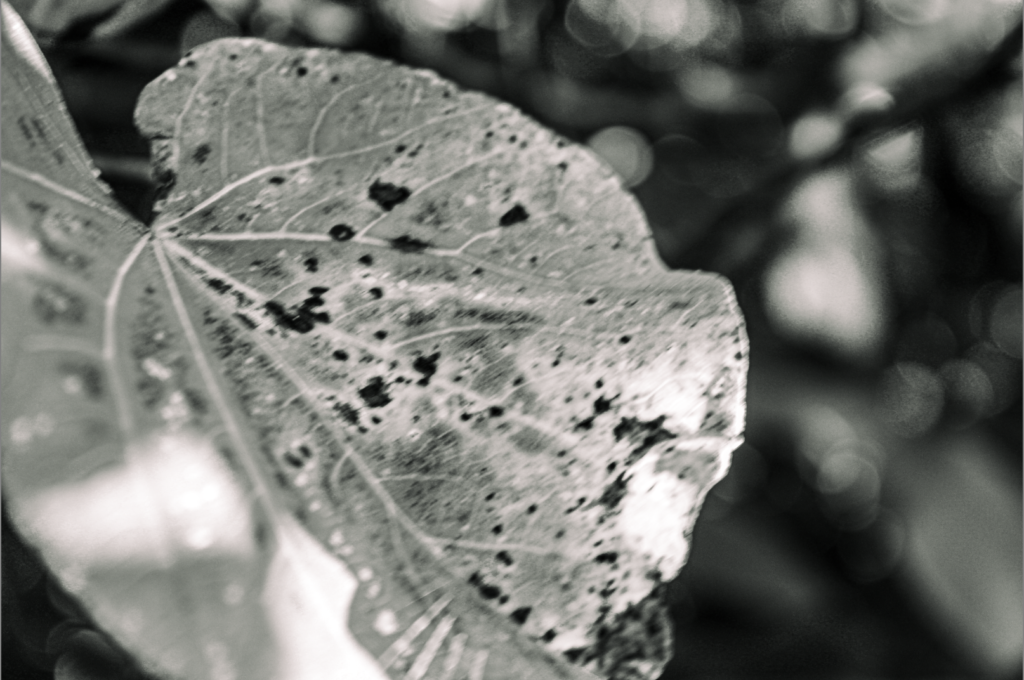
edited on light room ^
these are edited to make the texture more noticeable and into black and white to Mach the artist and all of the photos similar to this artist were taken of plants and mostly close up.
with all of these photos I made it so they were in black and white and the texture was increased to improve the affect and make texture more visible.
editing experiments
gradient overlay
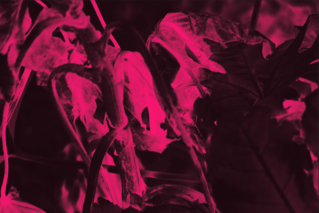
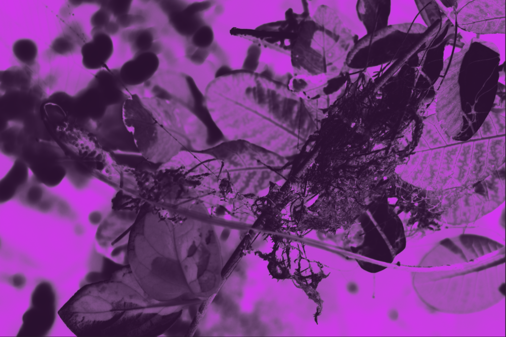
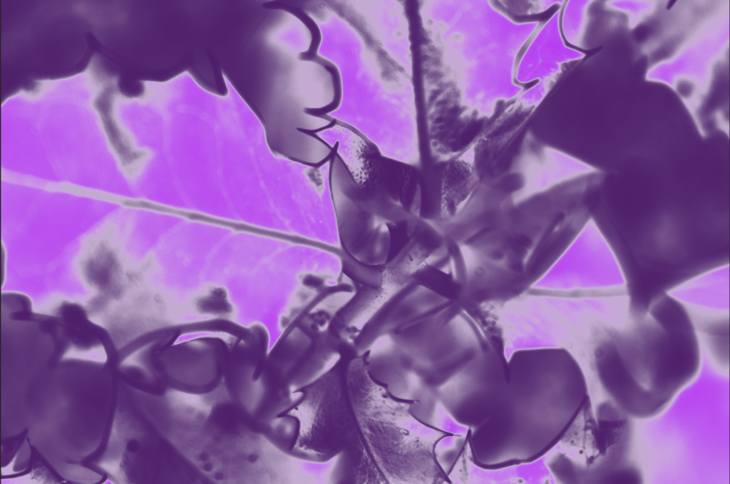
in these there are the formal element other then texture, is colour cause of the unnatural colours that are in these edited photos of greenery.
invert
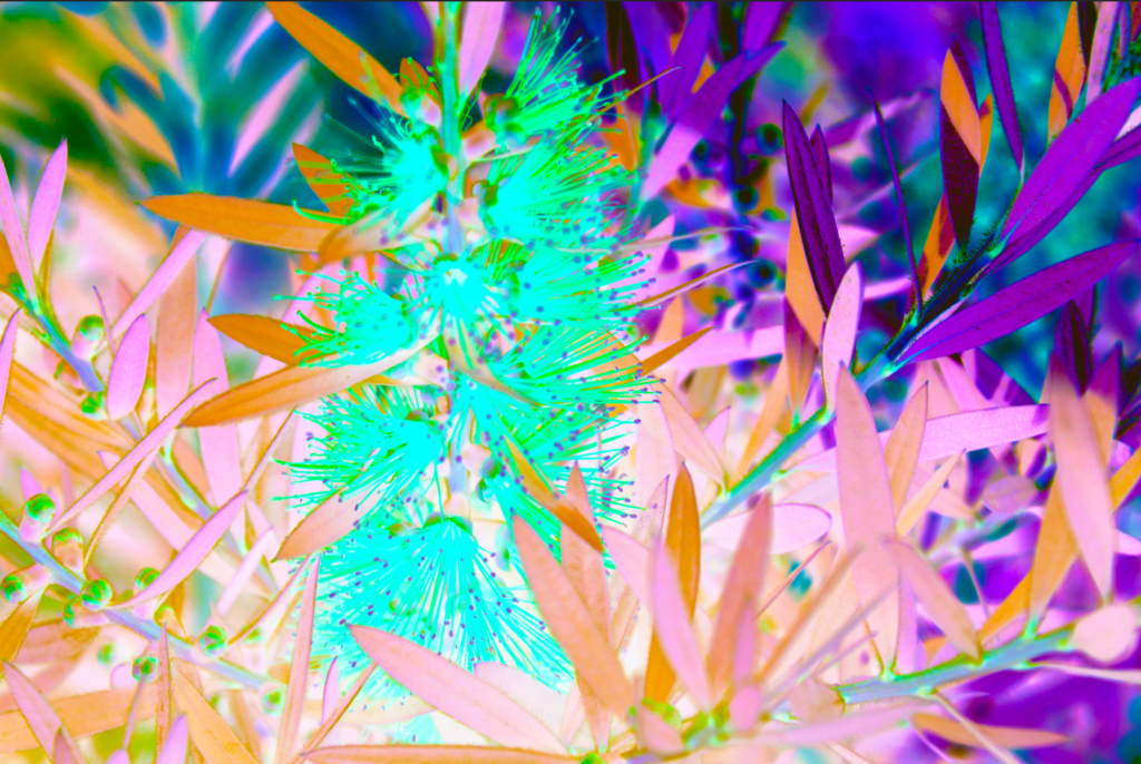
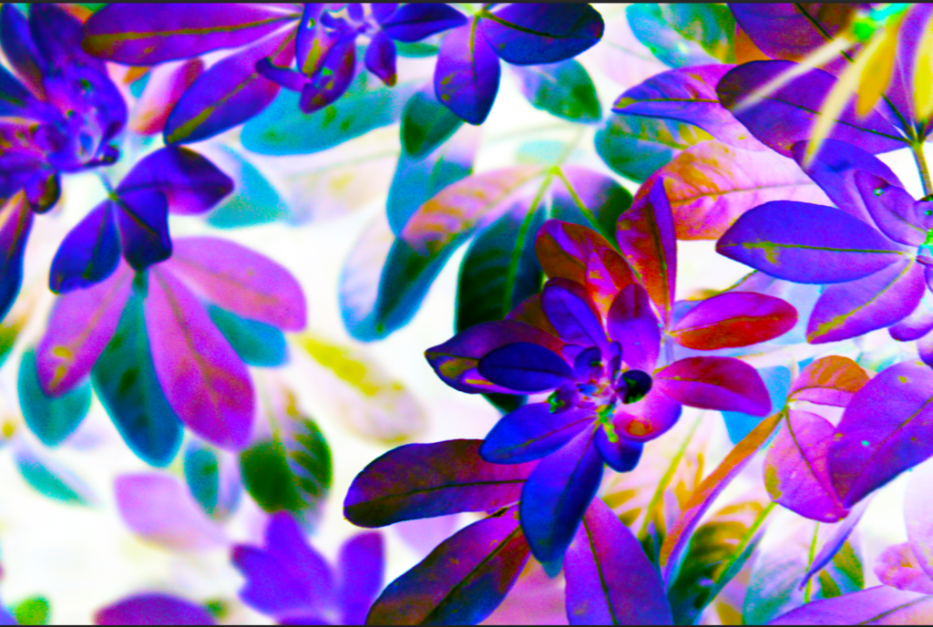
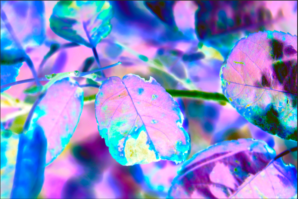
in these there are the formal element other then texture, is colour, which have lots of vibrant colours from editing them into inverted.
final outcome


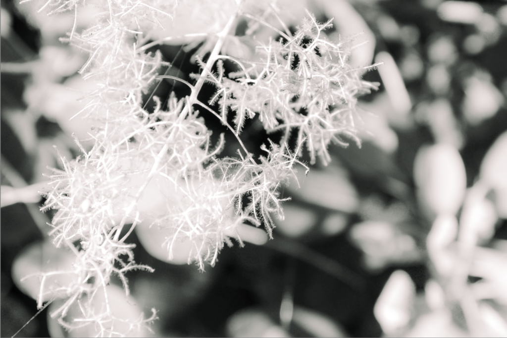
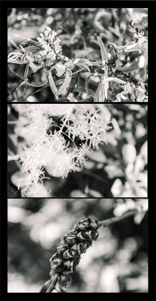
I chose this as my final out come because its the most similar to the artist and the way its been edited the texture is most visible compared to the others ones edited in colour and since its in black and white it allows you to focus on the texture within the photos. With the simplistic layout it also makes it easier to focus on the photos.
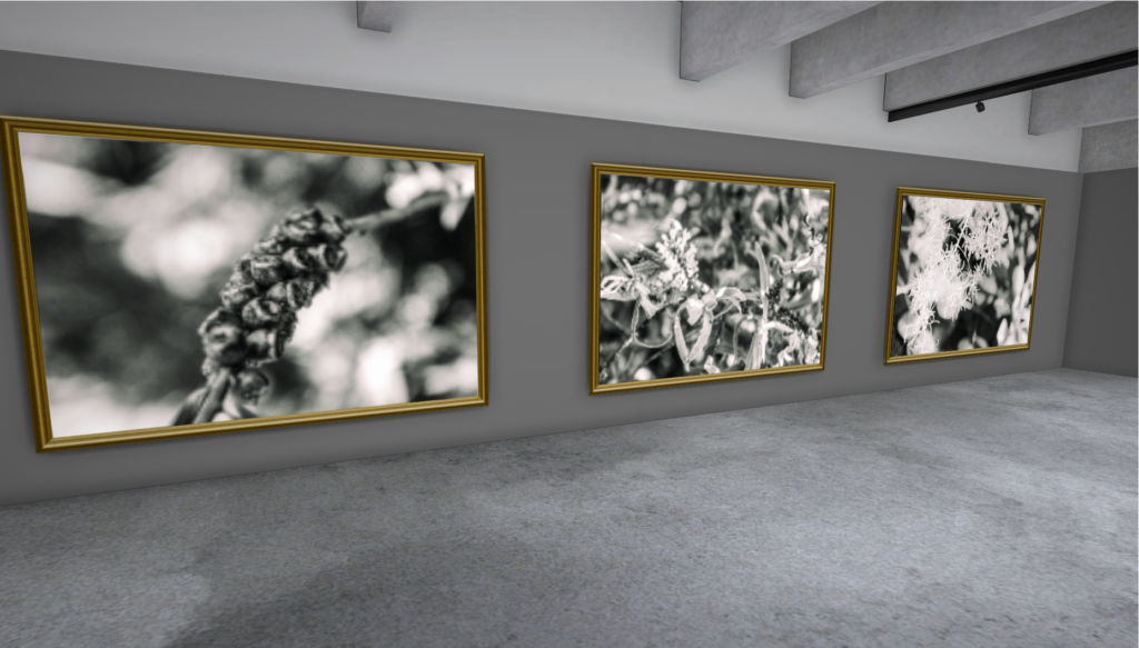
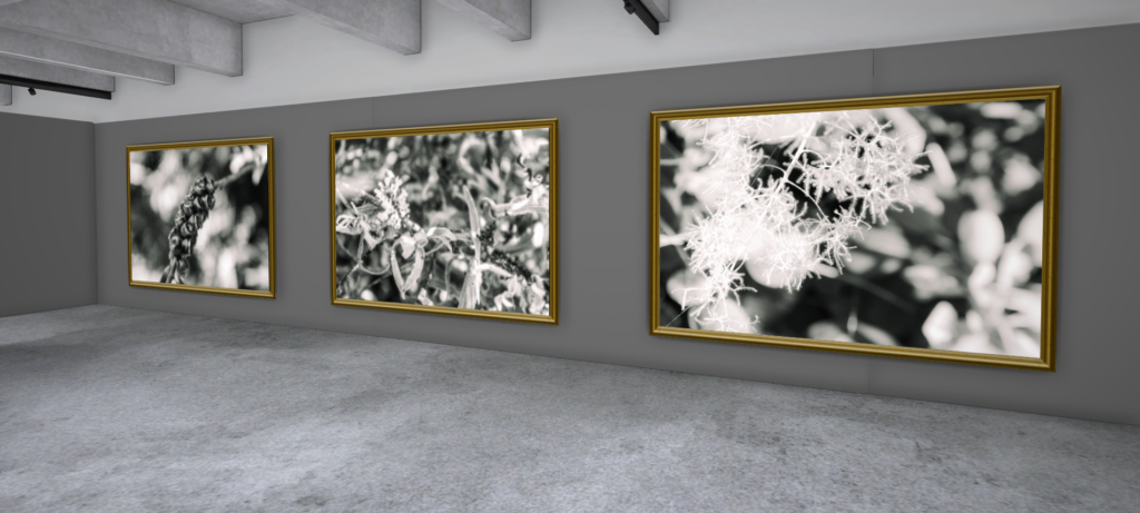
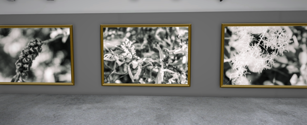
these are my final images presented into the gallery, which were done in artsteps. which shows how you would view them in an gallery and can see that all of my final photos defiantly connect together. and show a similar effect the the photos the the artist produced.
