Paper Ball Photoshoot

These images were inspired by Paul Jackson who was an artist from north of England. Jackson claims to have “been a fan of photography since he could walk”. He is currently studying for a BA in Photography and has trained in the New York Film Academy. Before his career in photography Jackson used to serve in the British Military. He is also a performer and enjoys travel and playing rugby. Here are some of his original works:



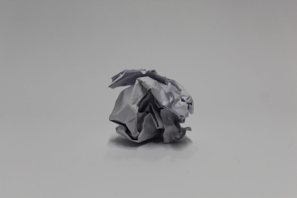
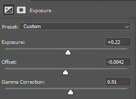
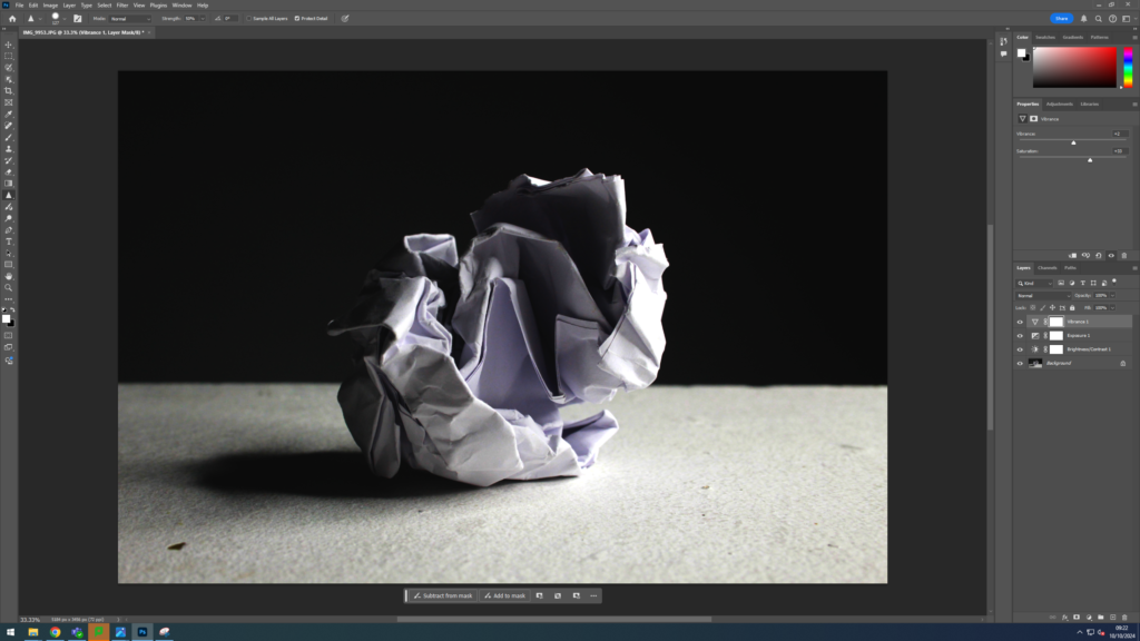
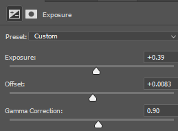
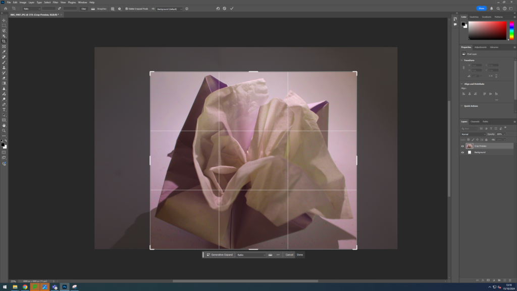
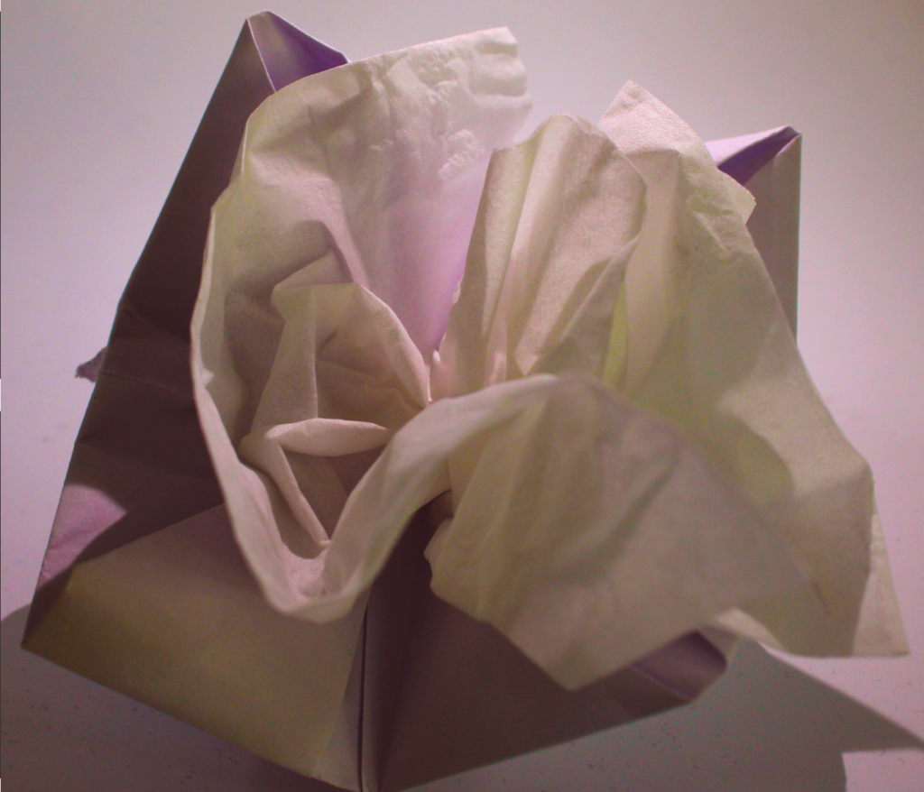
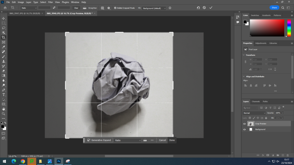
I then edited the Original Image using these settings on Photoshop:
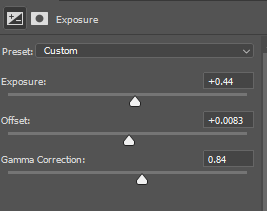
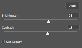
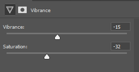
I then used an auto B&W filter from photoshop.
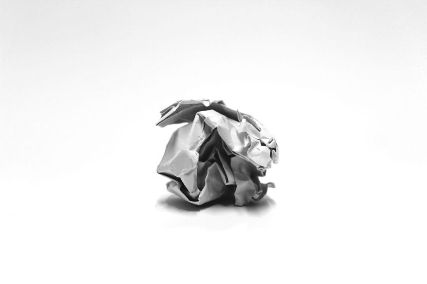

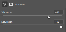
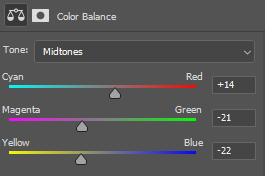
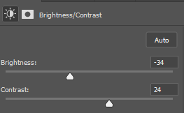
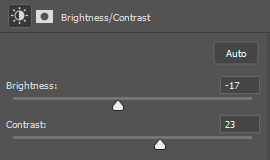
I then edited the image using these settings on Photoshop:
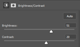


I then edited the image using these settings on Photoshop:
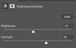
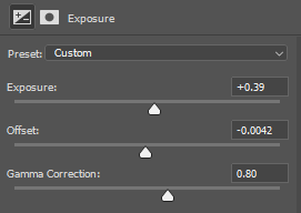
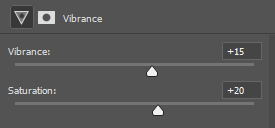


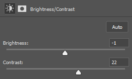
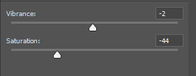
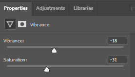
I used drastic settings when changing the vibrance to create a Black and White effect
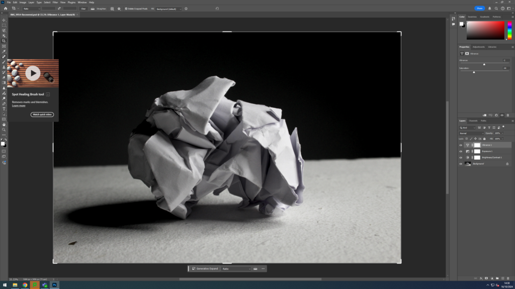
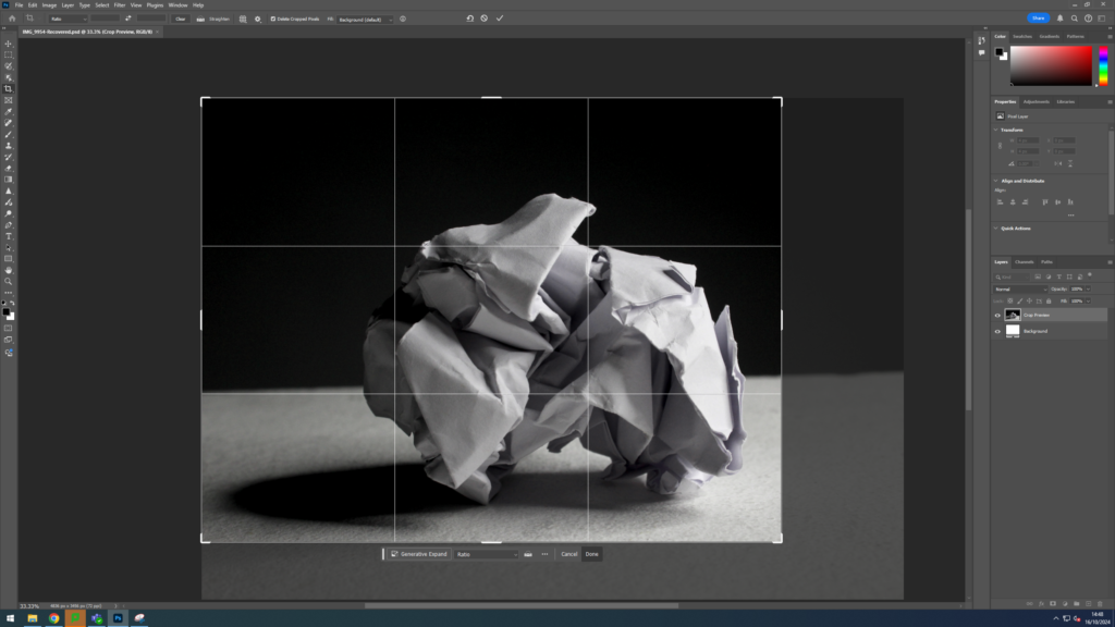


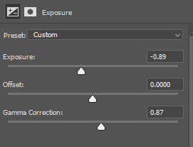
I then edited the image using these settings on Photoshop:
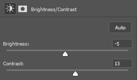
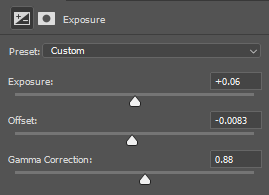
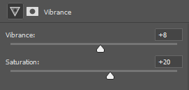
I also hanged the image to black and white and manually changed the settings
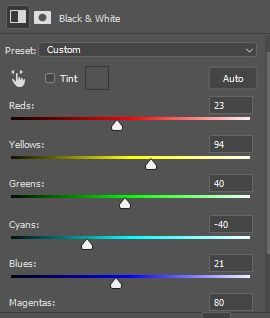
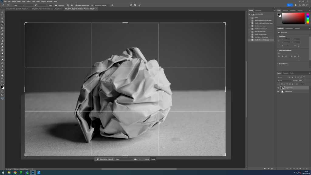


I then edited the image using these settings on Photoshop:
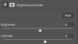
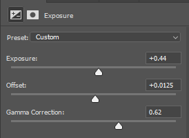
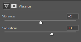
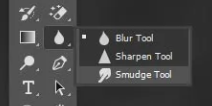
I also used the “Sharpness Tool” to help keep the focus on some specific areas.

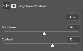
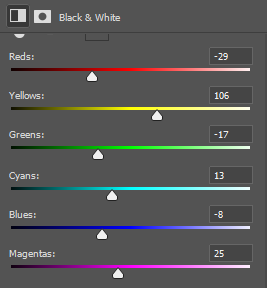
I then edited the image using these settings on Photoshop:

I also did some texture images outside using nature to show detail with my own ideas rather than artist research.
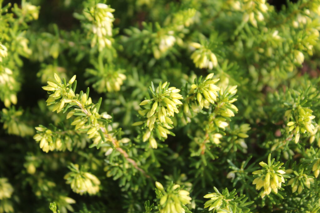
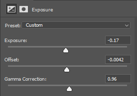
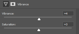
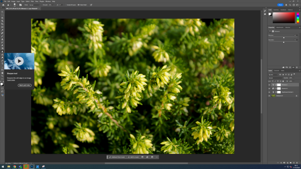
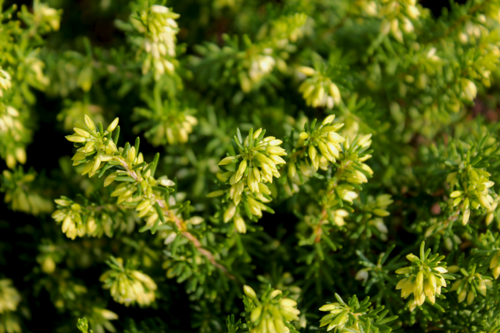
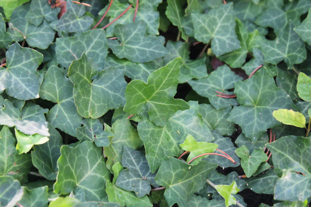
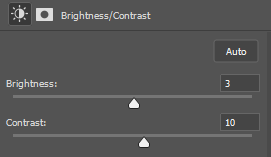

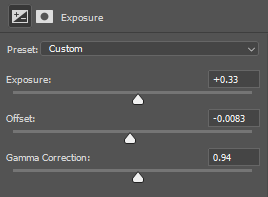
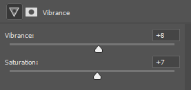
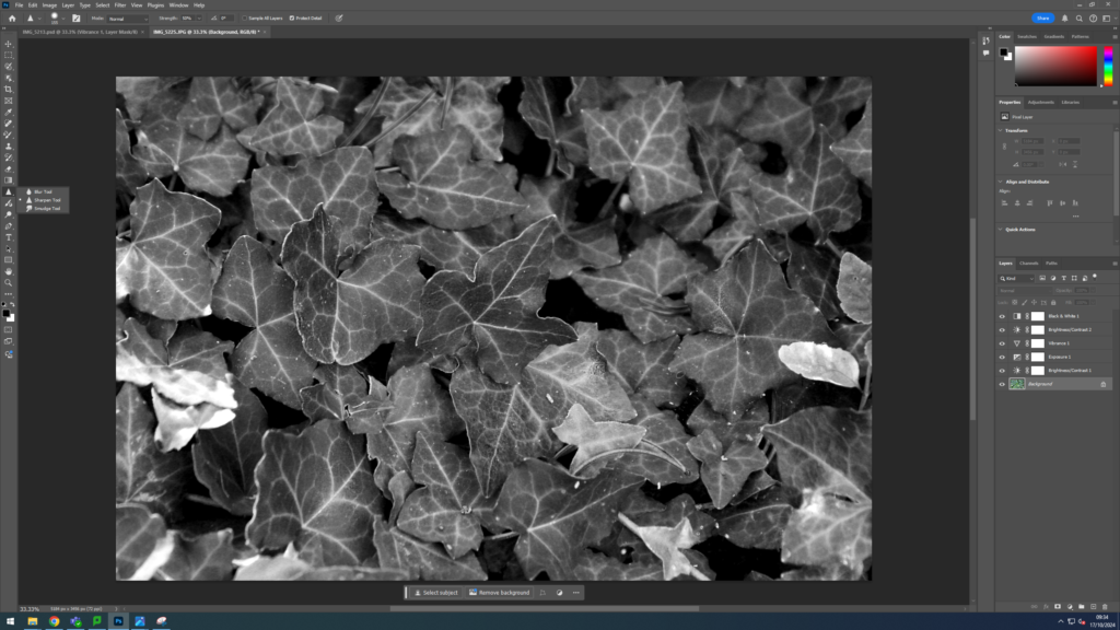
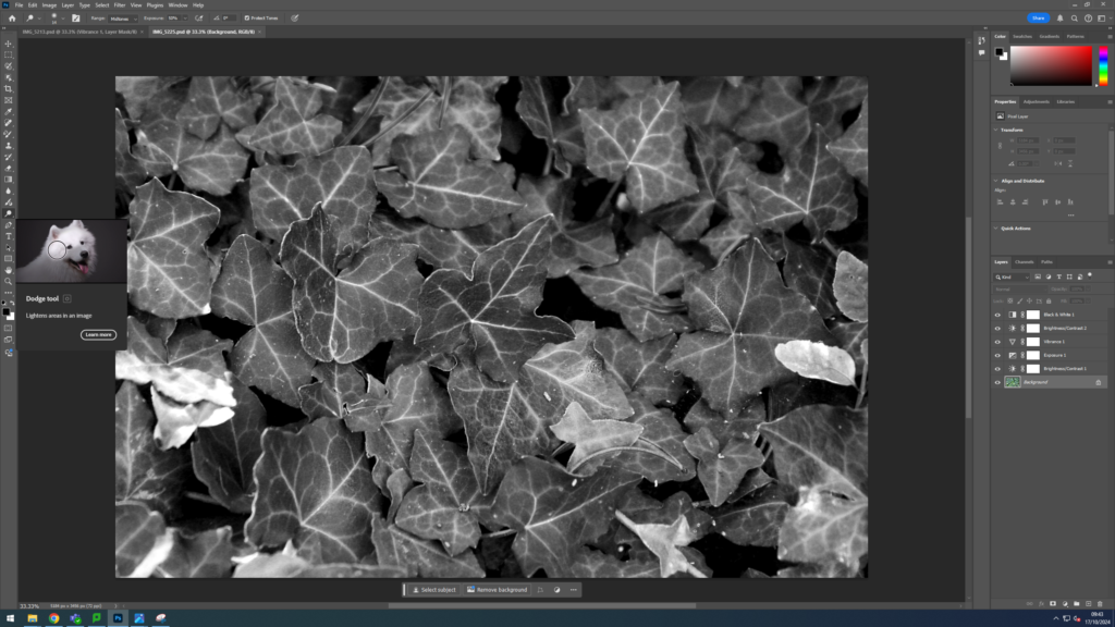
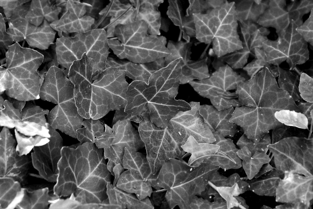

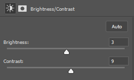
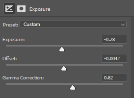
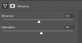
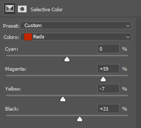
I also used “Sharpness Tool” on the two leaves in focus.

In all my images I tried to use the formal elements. For example in this specific image I showed lines within the overlapping leaves and the lines of colour that run through them. Also, I used shape with the unusual long and twisting shapes the leaves make when they wind over each other. Space is used in the way the photo is layered and that the horizontal leaf is closest to the camera and then the others behind it are further back in the depth of field and there is more shadows in the background. I’d like to argue that repetition is used when the pattern of multiple leaves going vertically through the frame is repeating. Texture is used in which the texture of the leaf is in macro focus showing how its smooth. Colour is used as the leaf is very colourful in general especially in the bright sunlight however I have also heightened the colours significantly using photoshop to give it an almost neon green look. Tone is used in the difference of the brightness the closest leaf is in almost like a spotlight however the rest of the bush/plant is in a deep green darkness/shadow behind it. Therefore all of the formal elements have been used within this image and I’d like to say also the other images.
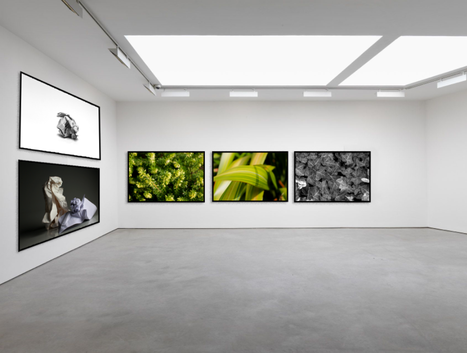
Comparison


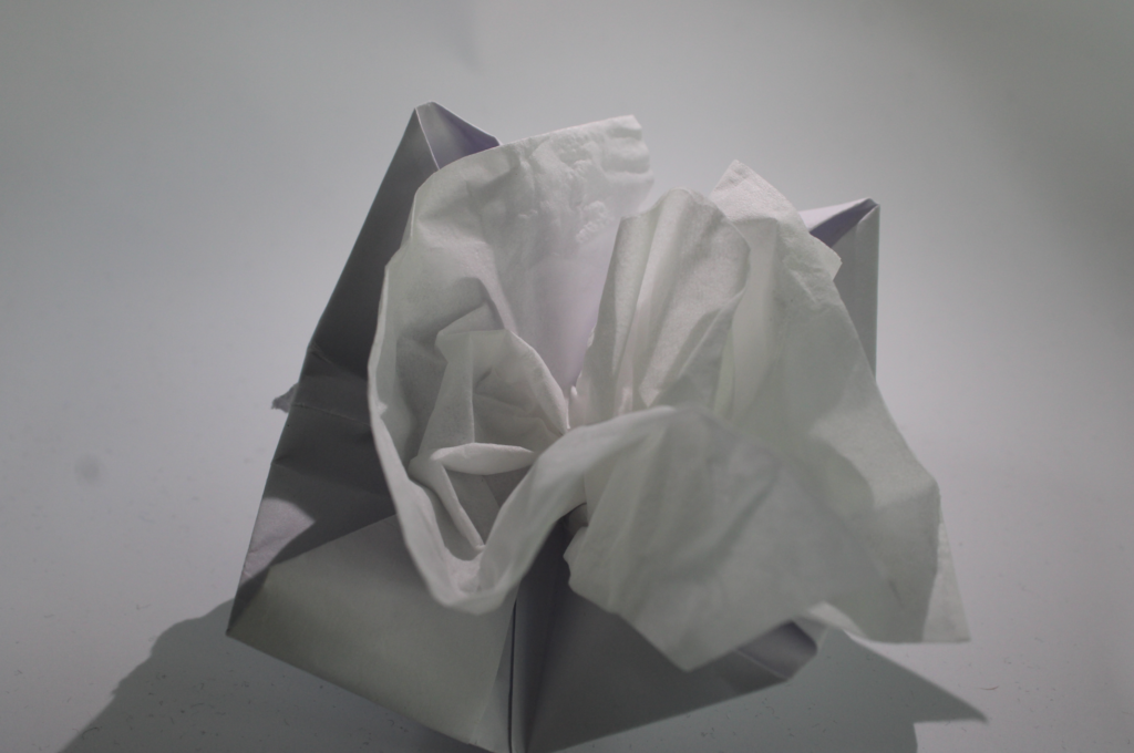
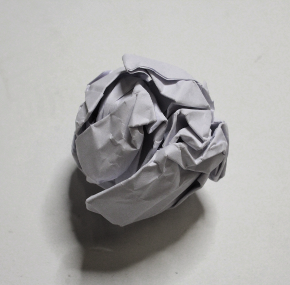
A similarities between these images is the lighting is from the same direction casting a shadow on the right side of the paper sculptures. also the background is similar as there is a blend between the background wall and the floor with a grey shadow. A difference between the two is Paul Jacksons work looks to be in black and white as there is no hint at any blue shadows in the image that the white light casts and everything is on a greyscale where as my photo is in colour and you can see the different shades of the paper, the blue shadows and the yellow shade of the other papers.
Evaluation
Overall, I think the the photoshoots and editing went well especially the paper ones with multiple structures within the image as I felt there was the most depth of field used including different heights of the subjects. I also like the outdoors ones and use of colour. in my next shoot I’d like to focus even more on colour use as I felt the colour you could create with the paper ball project was limited. I’d also like to experiment more with cropping and depth of field looking at different subjects. I struggled mostly with finding the correct lighting to use for the paper balls to create enough shadow to make it interesting with out it being low quality image due to being dark, but also not having too much light or exposure to make the paper create a white glare.

Some effective imagery being produced here!
Remember to add more description, explanation and justification for your creative decisions as you progress and make connections with the key artists too.
You are clearly working hard, so keep it up!