Guy Bourdin
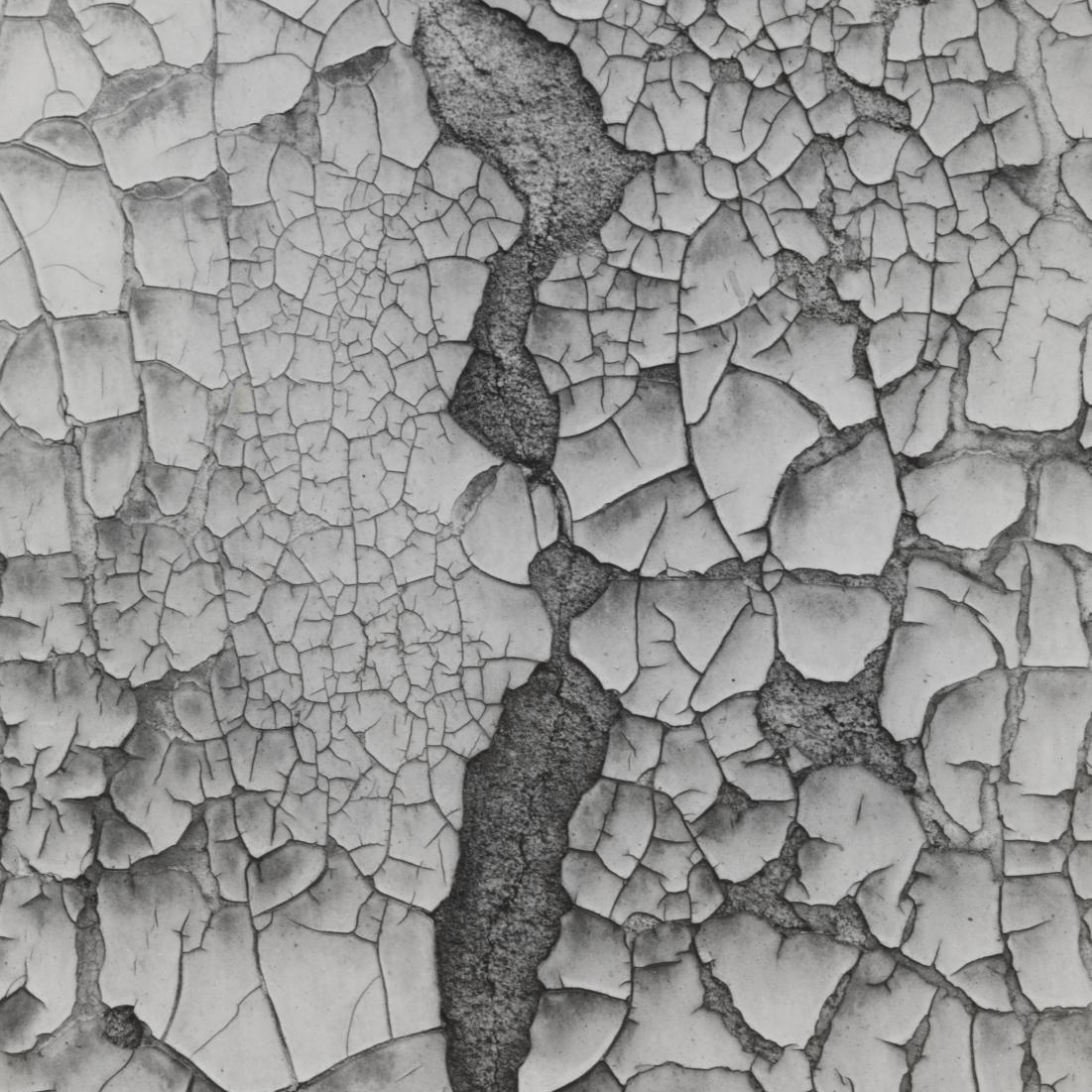
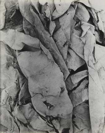
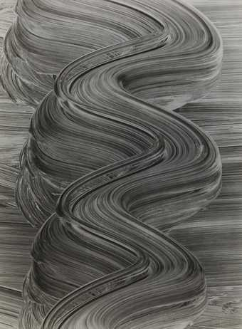
Guy Bourdin was a French artist and fashion photographer known for his highly stylised and provocative images. His work focusing on unique and detailed texture is interesting due to the visual noise and desaturated effects it presents.
My Texture Photoshoot
Best and Edited Photos
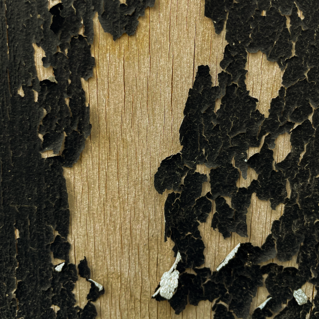
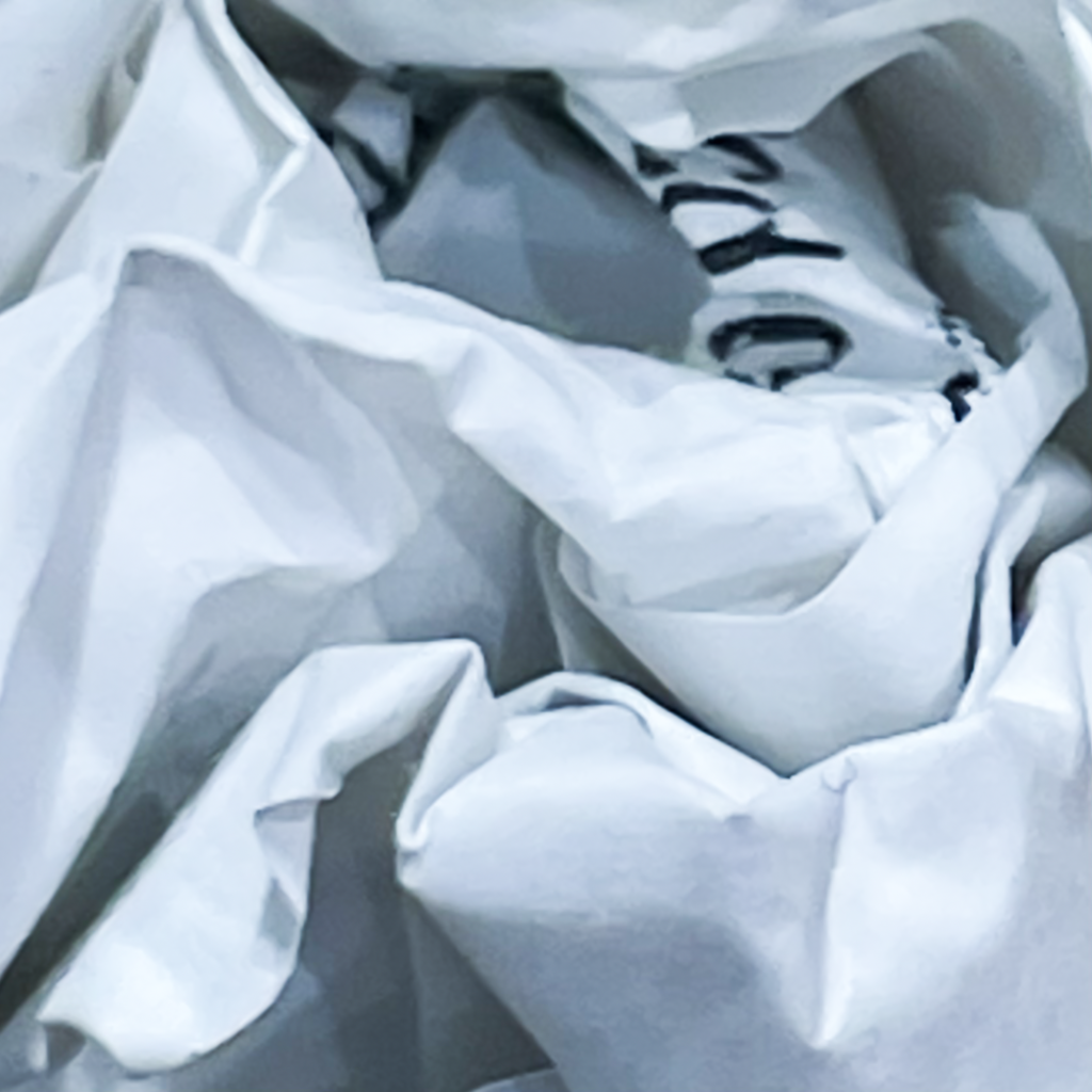
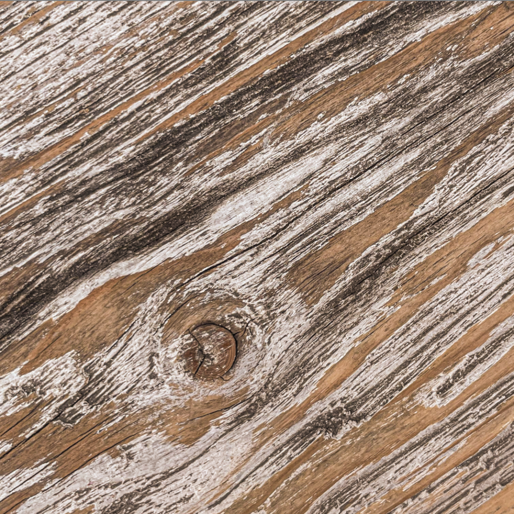
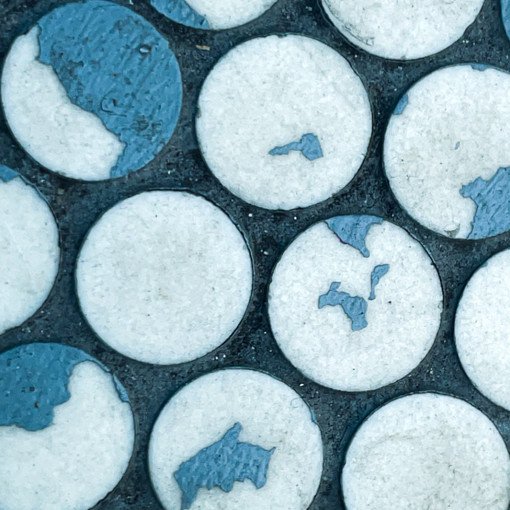
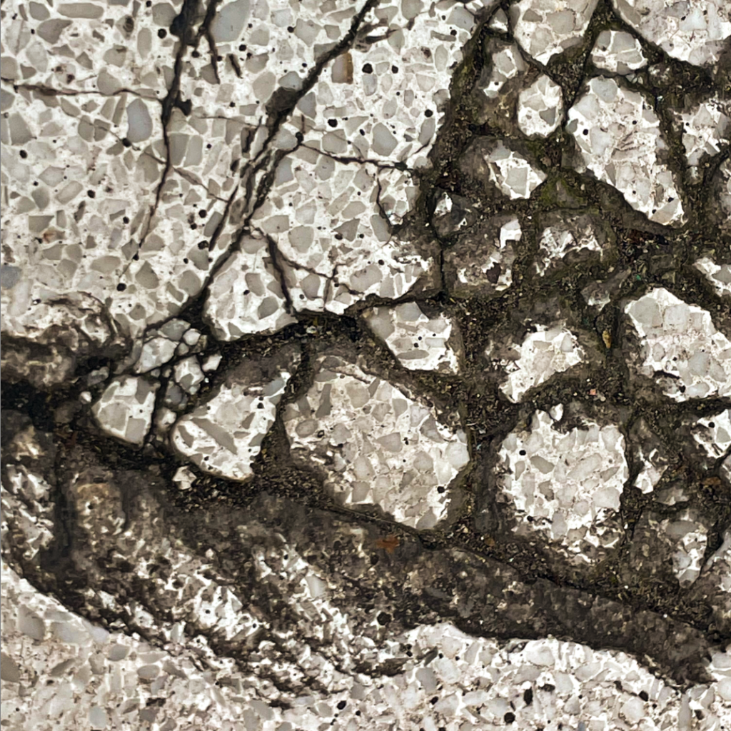
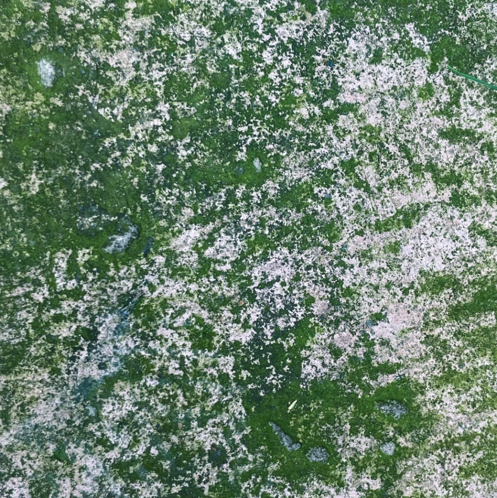
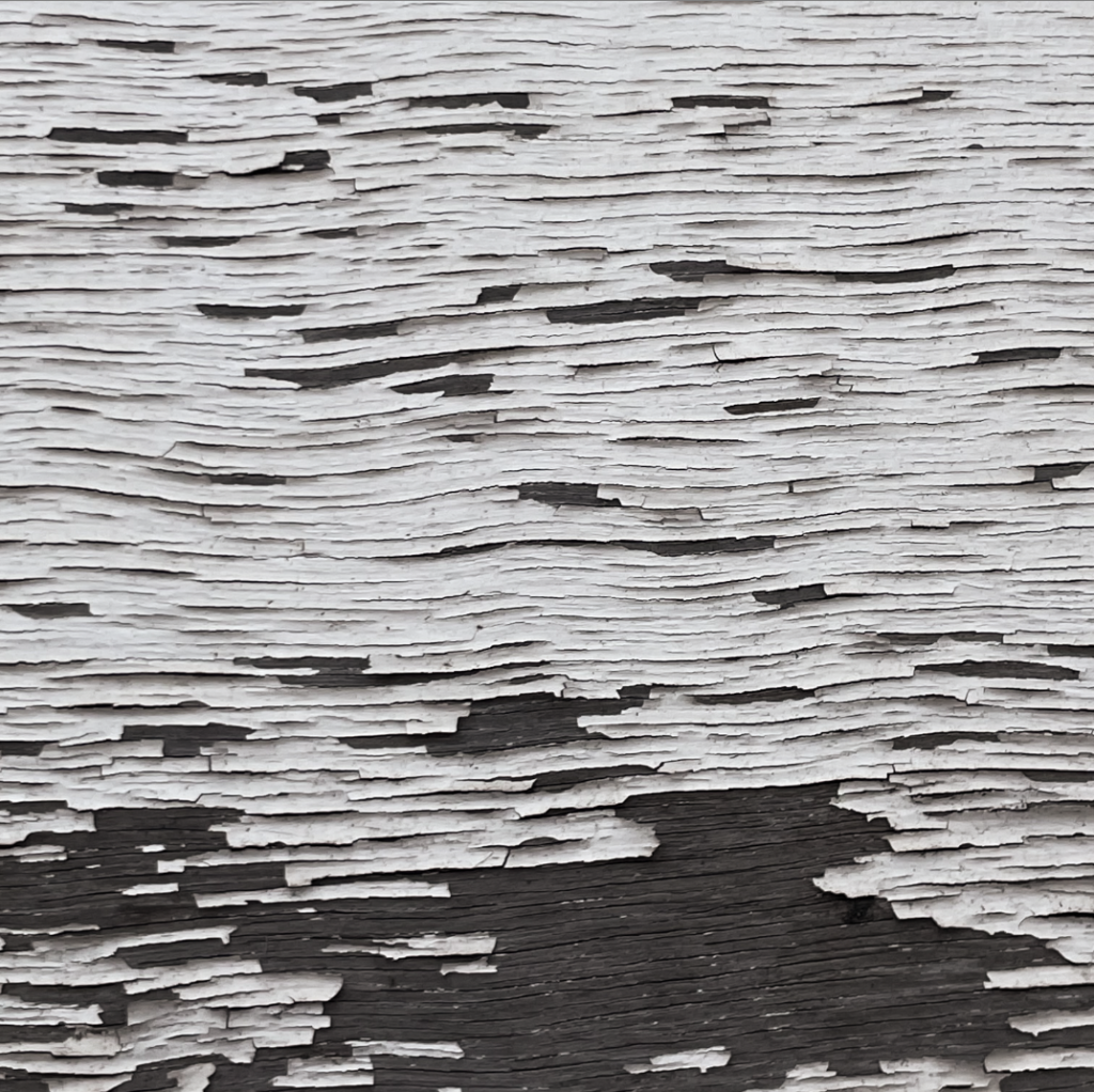
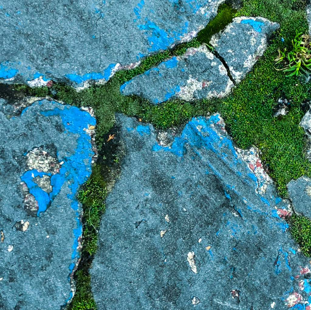
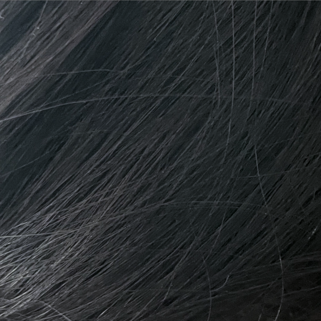
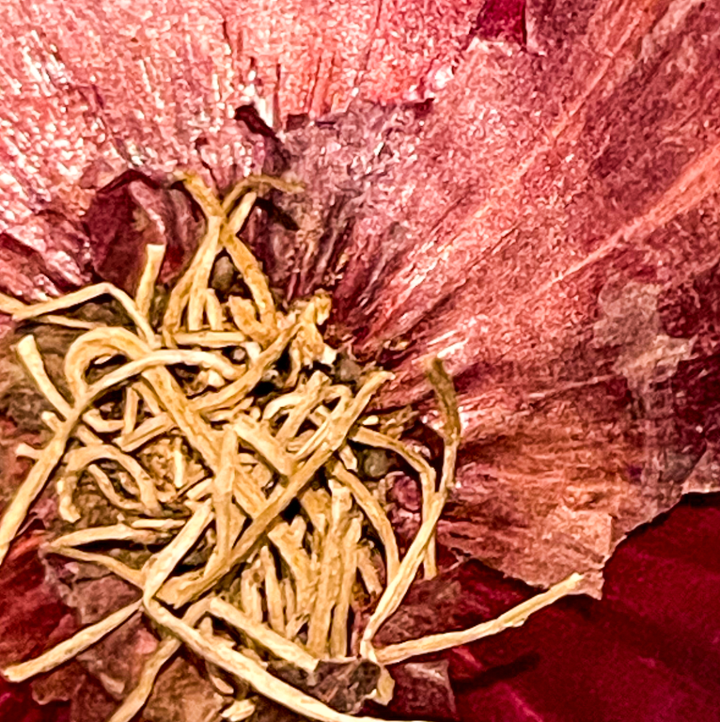
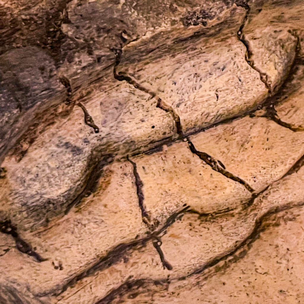
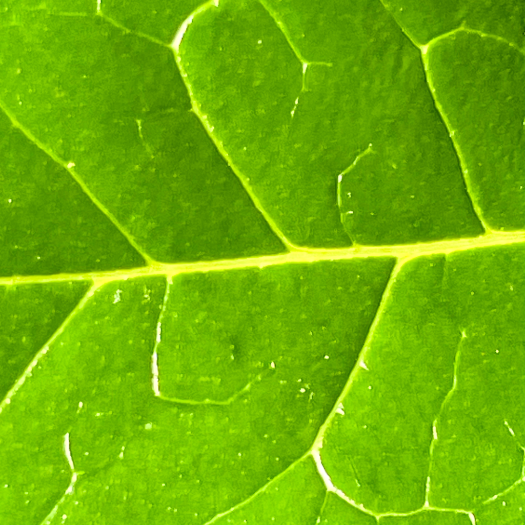
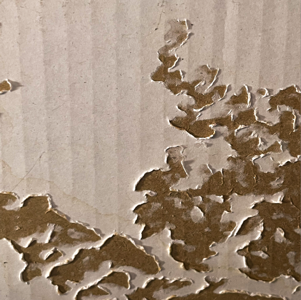
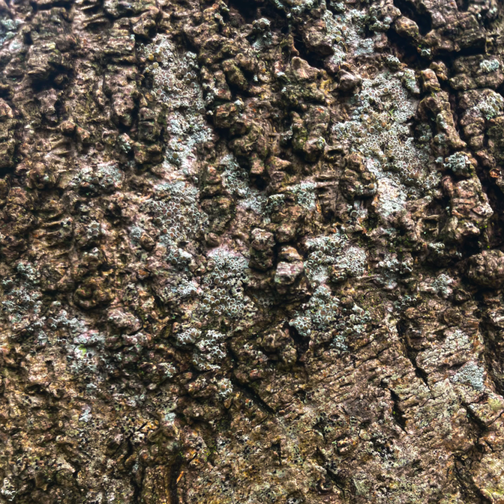
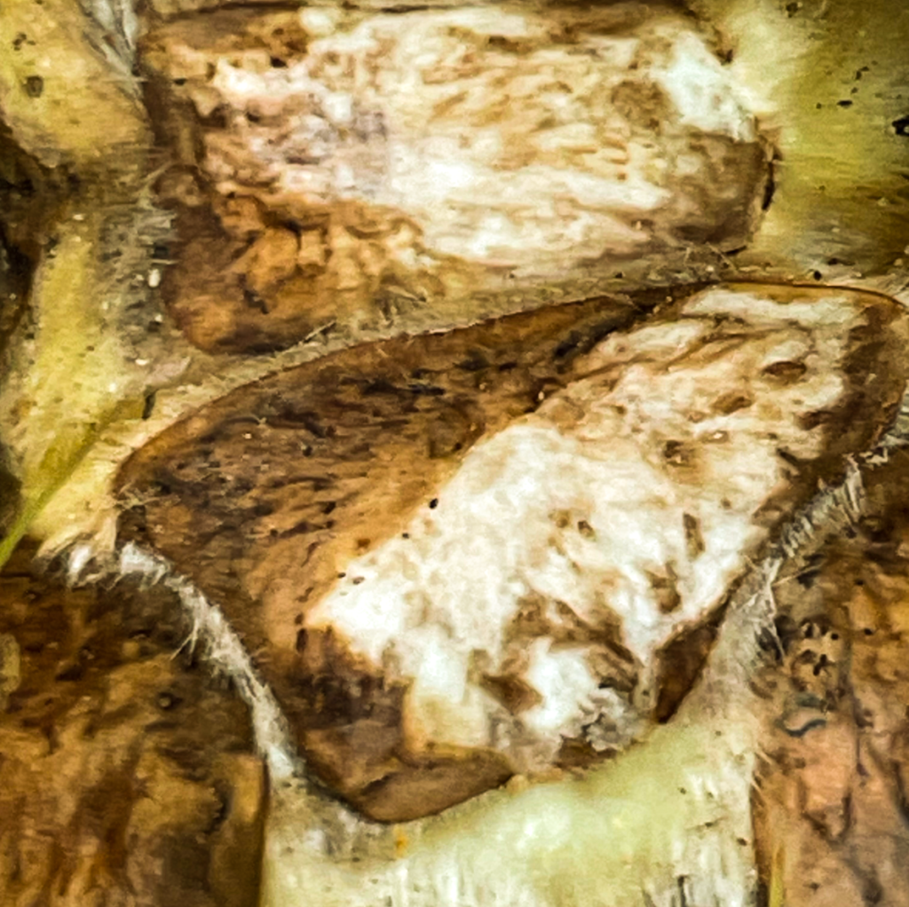
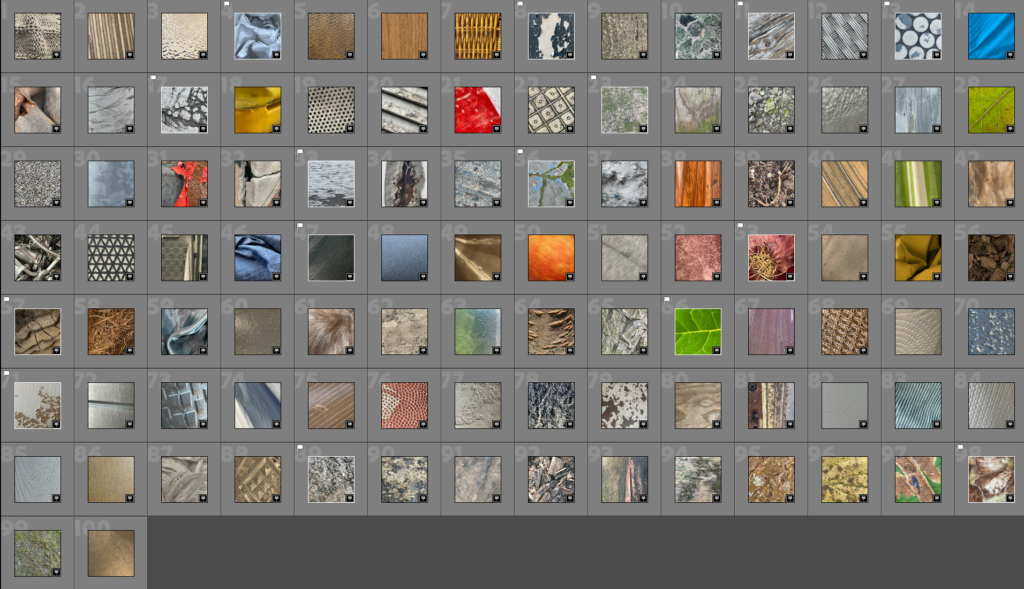
For my photographs, I tried to include some aspects of Bourdin’s composition including zooming into interesting textures to where an object becomes unrecognisable. With a few of my images, I focused on creating the broken effects that are shown in his work as I believe this visual is effective. I mostly focused on photographing natural forms and street found objects in order to show a variety of colour in my contact sheet. I also cropped my images into squares to really bring attention to the formal elements within my photographs. These elements were also highlighted in my edits of my best photos. This was mainly due to the contrast and clarity adjustments that helped to show shape within the photographs.
Photo Manipulation
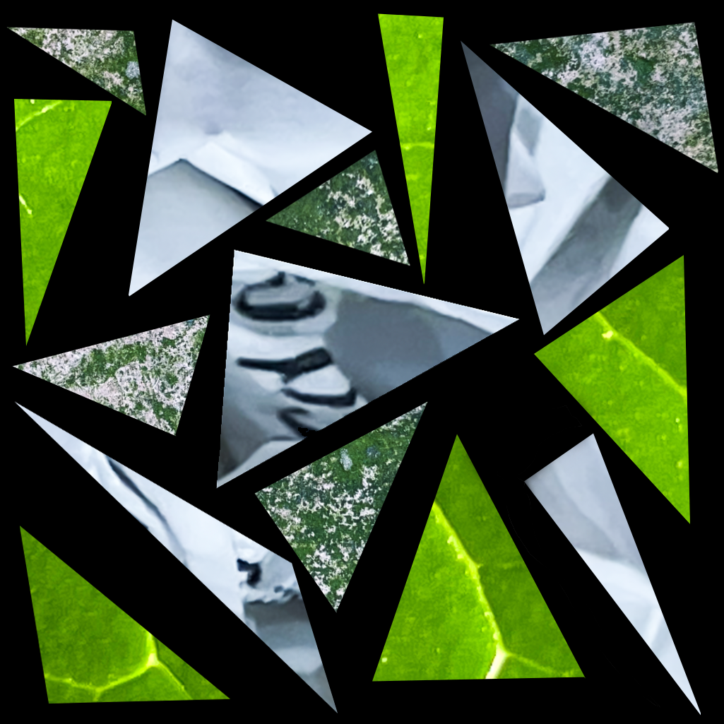
In this phase of experimentation, I used the polygonal lasso tool on photoshop to manipulate my images into various triangular shapes where I then contrasted them against a dark background to show negative space. Furthermore, I stuck with a specific and light toned colour palette to make the image fragments harmonious with each other. The repetition of shape compliments the three photos I have worked with and further emphasises the formal elements of the composition. The sharp lines also help to create a contrasting abstract visual to the original subjects.
Final Presentation
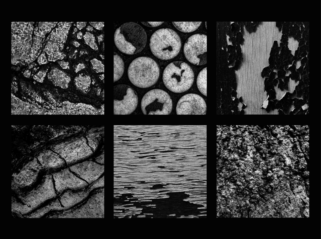
I decided to display 6 photographs together in a grid as I discovered that these few worked nicely together as a collection. While editing the pictures individually, I chose to edit them in a black and white filter which I pulled from the desaturated effects of Bourdin’s work. I focused on creating harsh shadows and definition in my photos in order to make the contrast and texture of the images really dramatic. For the display, I stuck with the monotone visuals and went for a plain black background. This allows for a simple and non-distractive presentation where the photos can be focused on and attention is not drawn away from them. I chose to display pictures that created a sense of decay and wreckage due to the visual elements that are shown; this is also in reference to Bourdin.

Some effective imagery being produced here!
Remember to add more description, explanation and justification for your creative decisions as you progress and make connections with the key artists too.
You are clearly working hard, so keep it up!