Jaroslav Rossler was a notable Czech photographer who played a significant role in the modernist movement in Czechoslovakia. He was born in 1902 and gained fame for his creative blending of artistic expression with avant-garde photography techniques. Rossler was a key member of the influential art collective Devetsil, aiming to incorporate a range of artistic fields. His art frequently delved into abstract and geometric themes, challenging the limits of traditional photography. Rossler’s influence in the field has endured, and his photos are admired for their distinctive viewpoint and skillful craftsmanship. He died in 1990, leaving a valuable legacy in the field of visual arts.
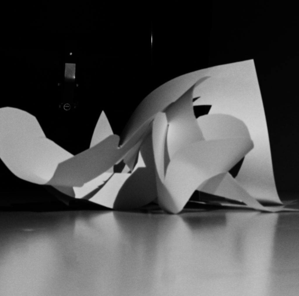
My Paper Photoshoot:
Best Image Selection:
Editing:
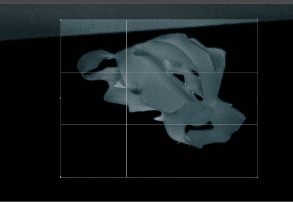
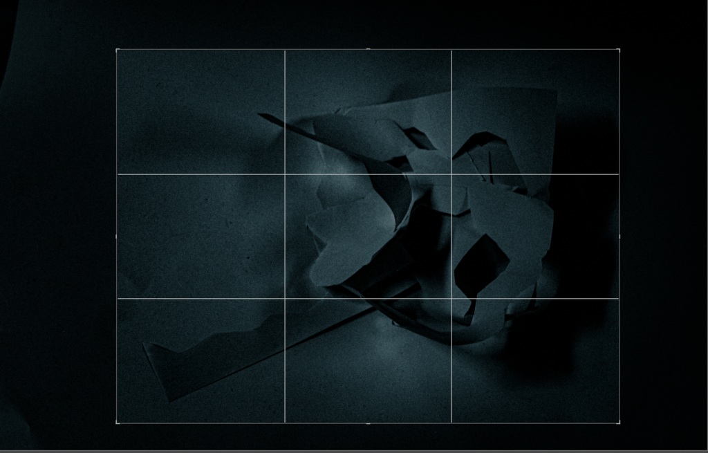
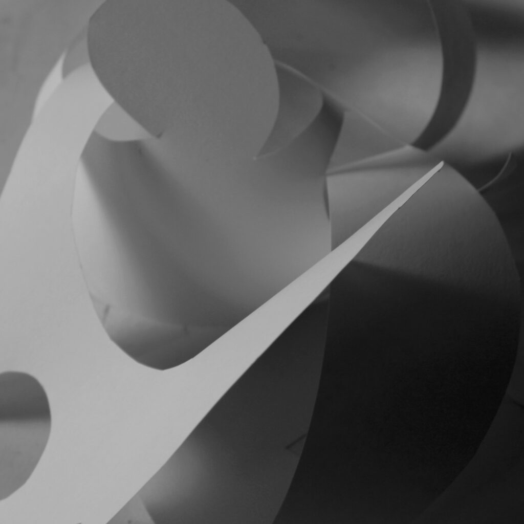
I used photoshop and changed the images into black and white to emphasise the shadows and then contrast and sharpness to define the futures within the photo which made the dark parts have more depth and the lighter bits brighter. In the end I cropped the image to make the subject of the photo more prominent.
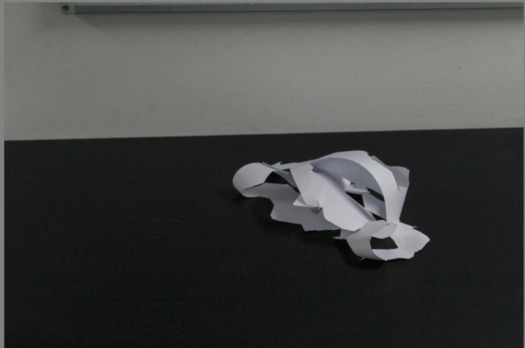
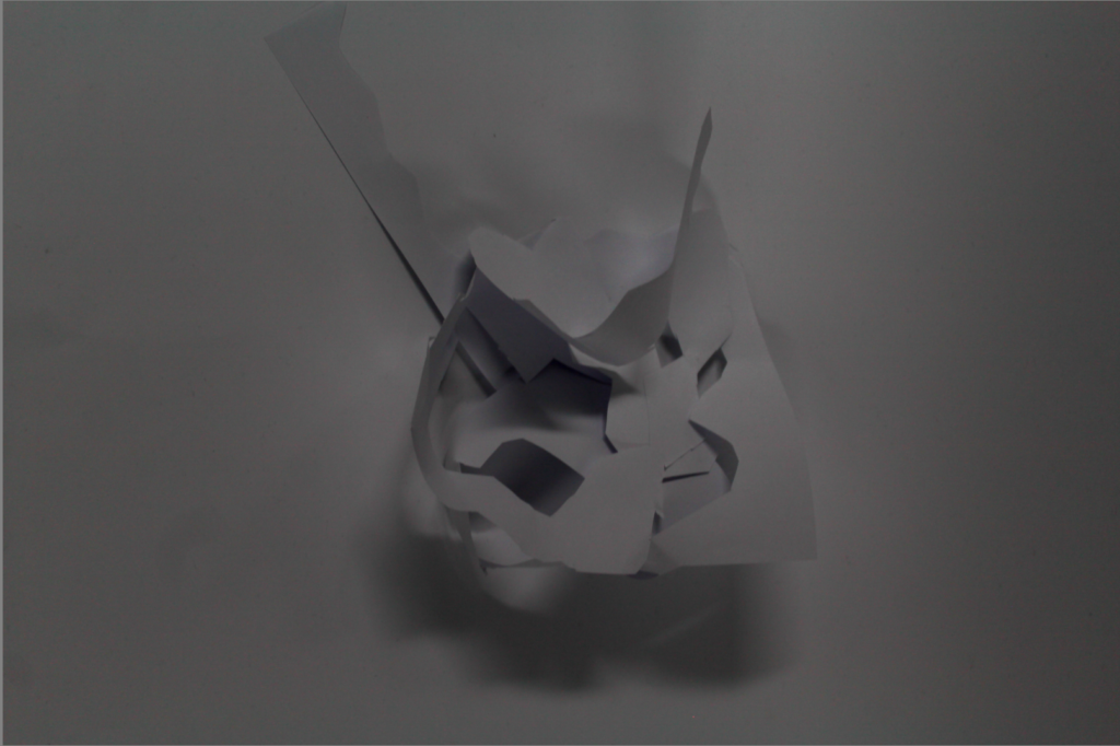
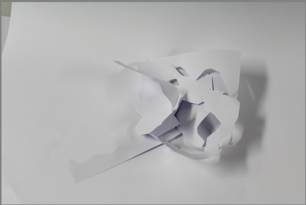
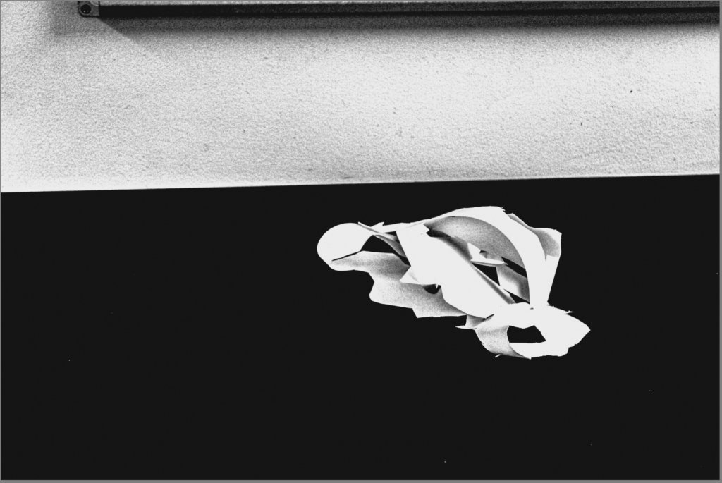
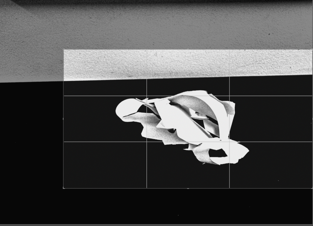
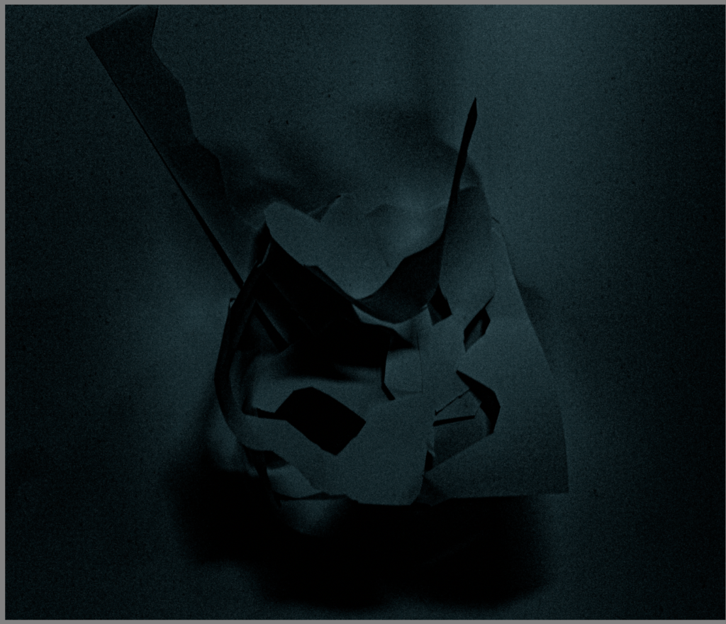
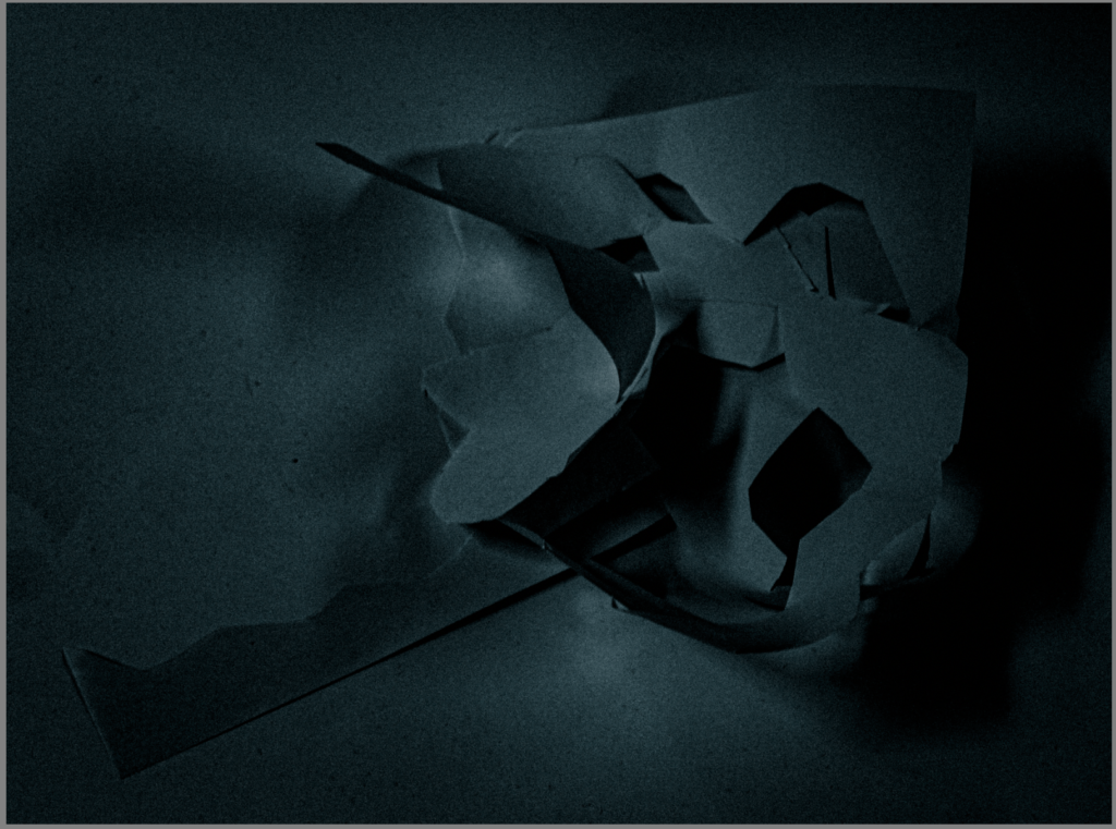
Before Editing
After Editing
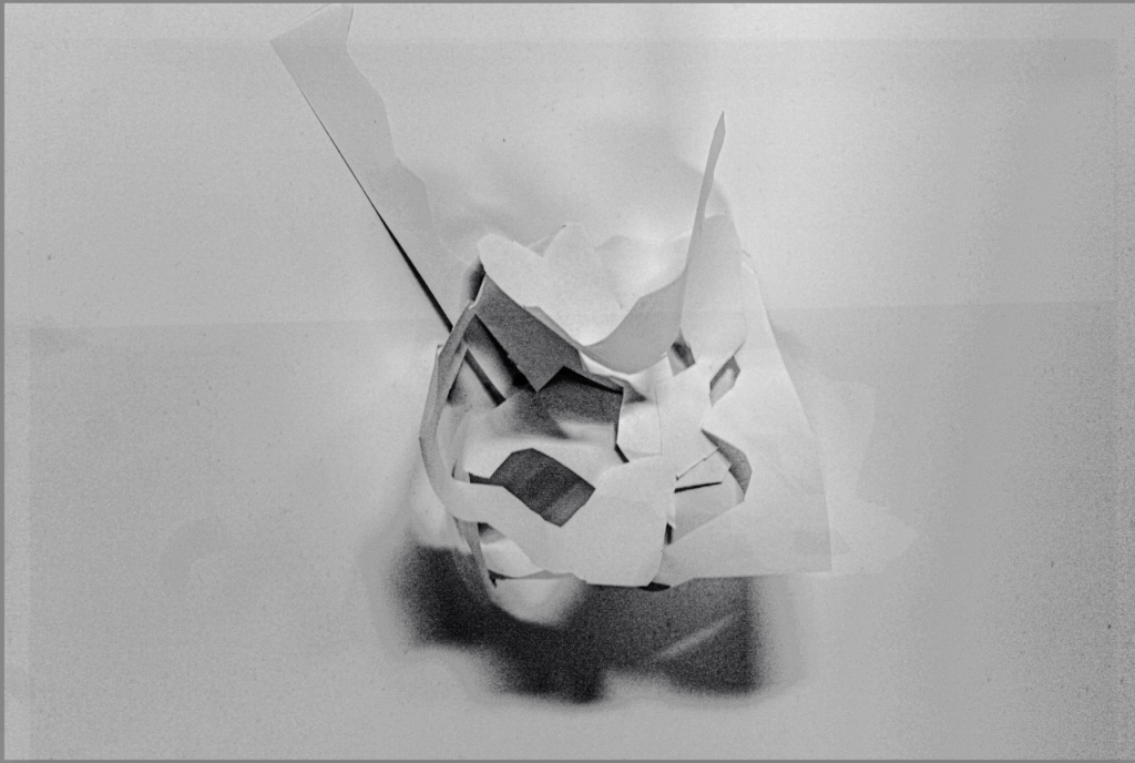
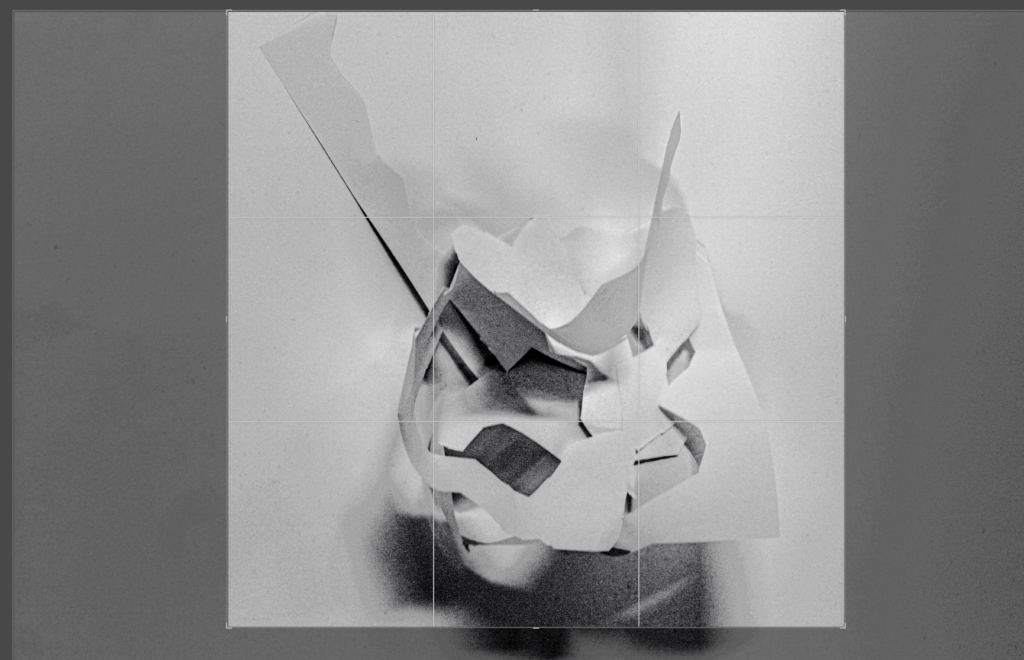
Before editing
After editing
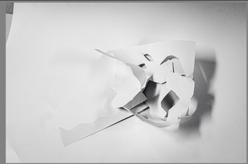
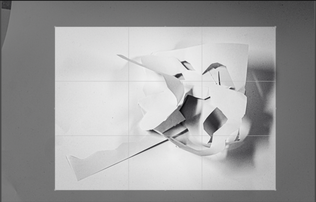
Before editing
After editing
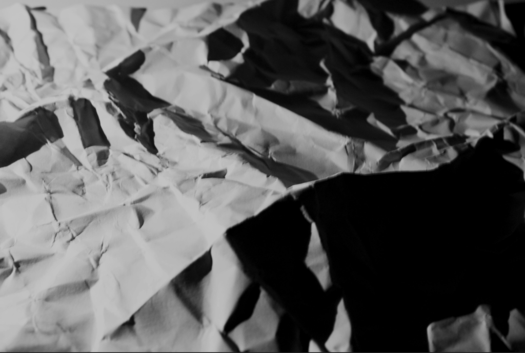
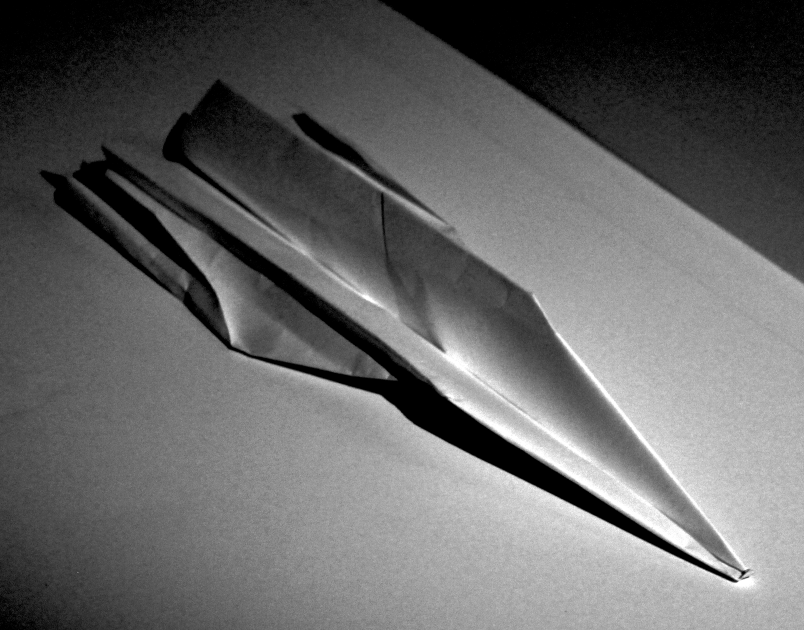
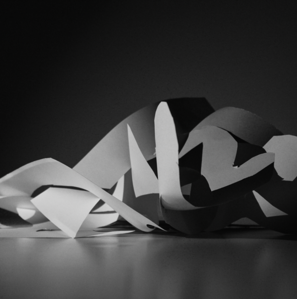
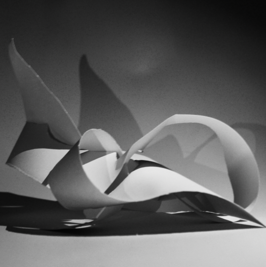
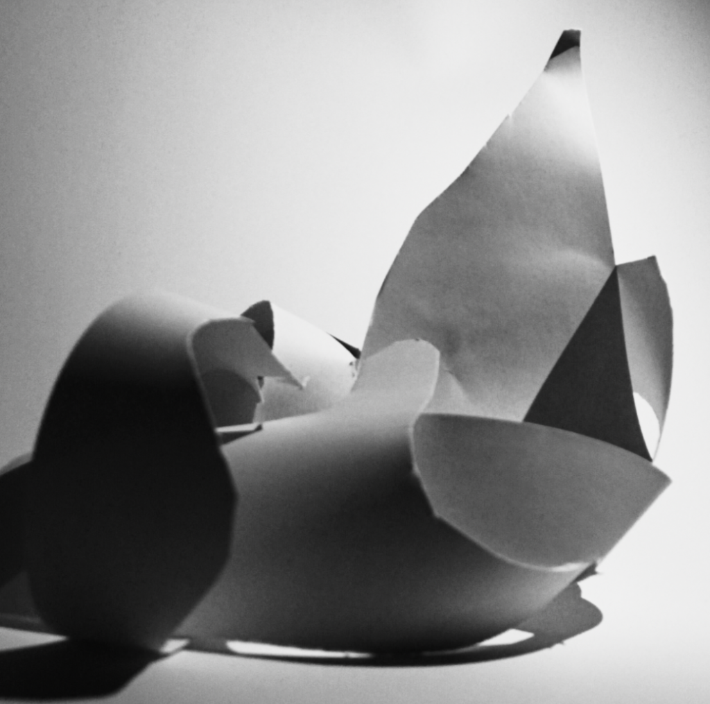
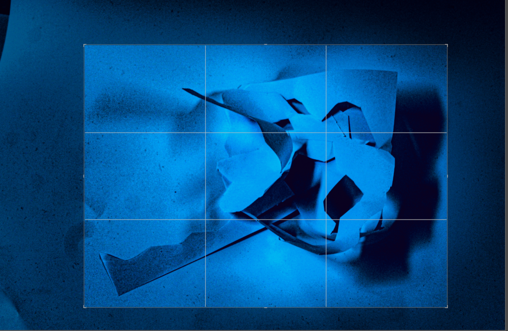
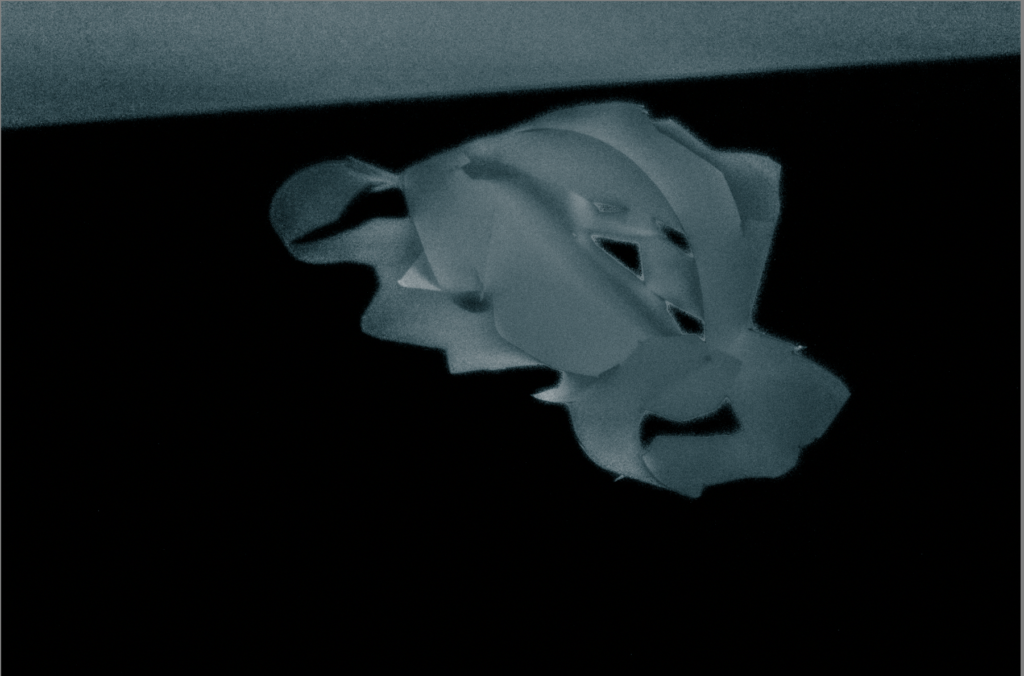
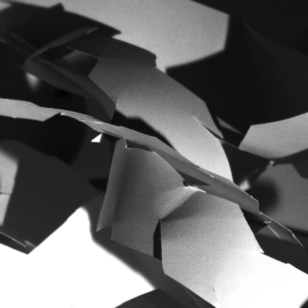
This composition of photos work well together because they have all been edited in similar ways. The tonal value of the photos has been increased due to the changing of contrast and sharpness creating darker shadows and brighter highlights. It is clear in all photos the papers have asymmetrical lines which incorporates formal elements generating a visual appeal and guides the viewers focus throughout the presentation of the images.
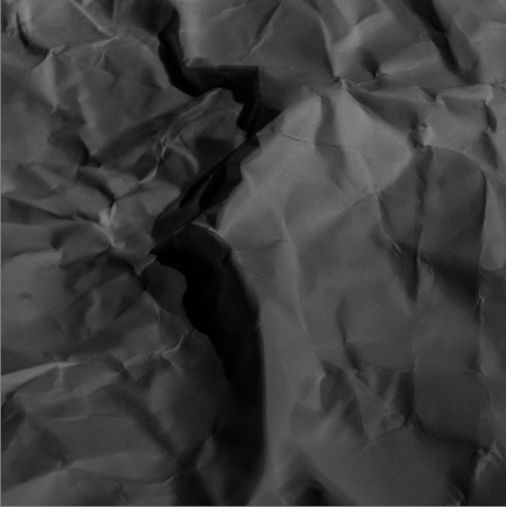
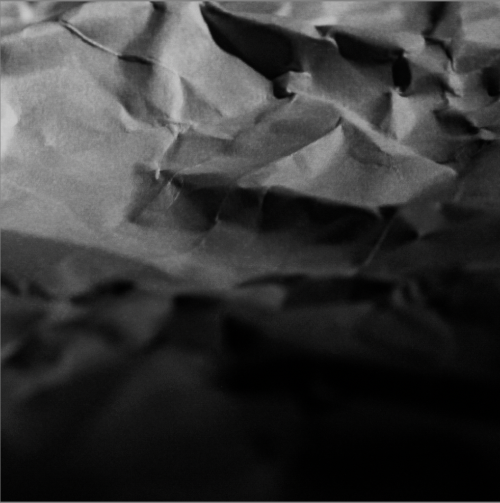
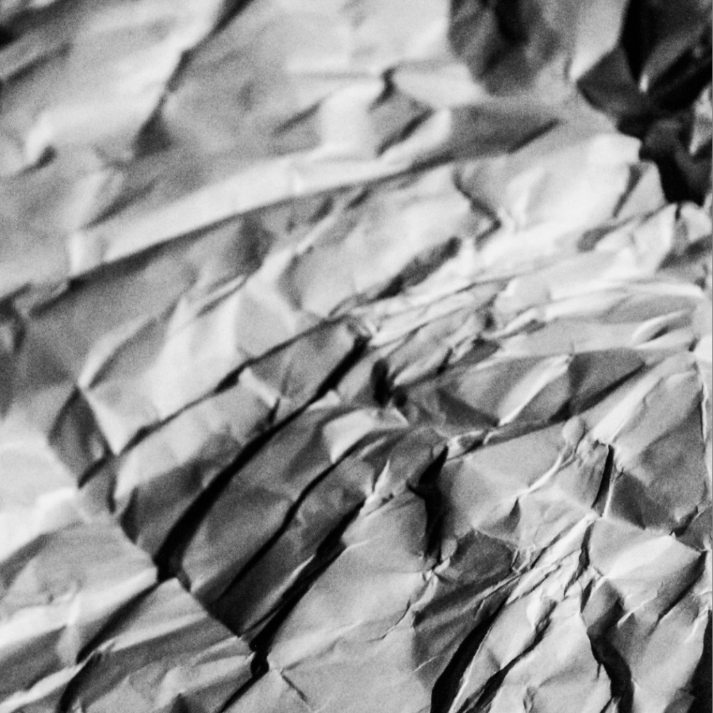
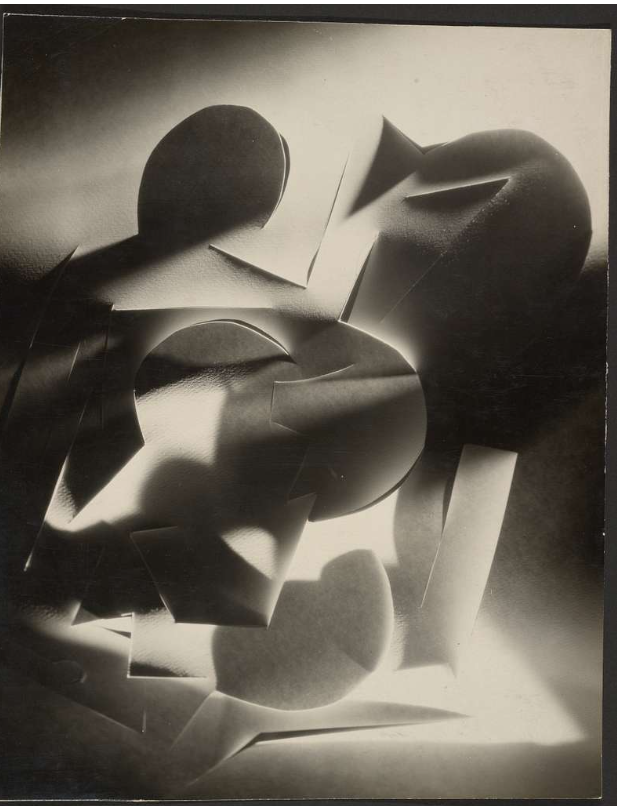
In this composition of photos I scrunched up pieces of paper and laid them out and took close up photos of the creases within the paper. When editing all the photos I used Lightroom with the pre made settings , B&W punch, which emphasises the textures, showcasing the forms and shades.
Subject/s: I intend to take photos of my family members.
Environments: Each person will be photographed within an environment that connects to them. E.g: – Father: will be photographed in his car workshop. – Mum: will be photographed in her vegetable garden. – Sister: Will be photographed in her workplace laboratory. – Cousin: Will be photographed at the rowing club – Cousin 2: Will be photographed in her band – Uncle: Will be photographed on his farm
Poses: I intend for the poses to be quite neutral, as if the subject has just paused while in their natural environment.
Gaze: I intend for the subjects to make eye contact with the camera to connect with the viewers more. However, I will also experiment with various different gazes.
Composition: I intend to experiment with various compositions, including central framing and the rule of thirds.
Framing I will experiment with full body, 1/2 and 3/4 headshots. I will avoid a tighter crop, to ensure that more of the environment is visible.
Orientation:
I intend for most of my portraits to be landscape to show more of the environment.
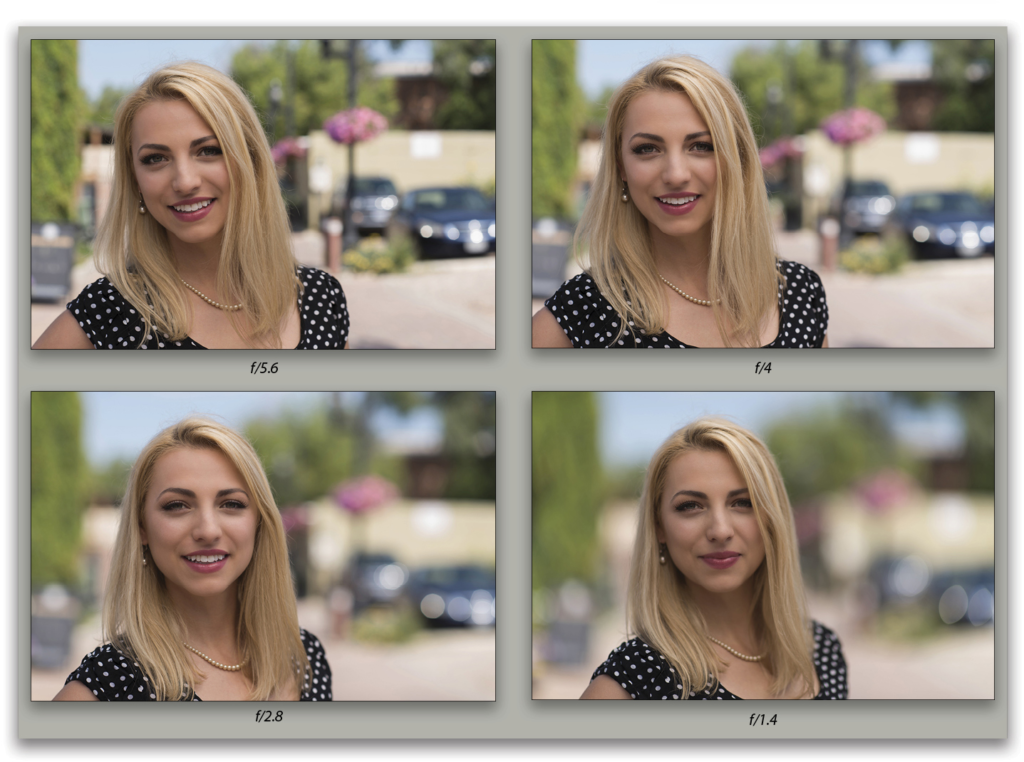
Aperture. I will experiment with a small / medium aperture to create a long and medium depth of field. This will allow the background to be recognisable and connect people with the environment more.
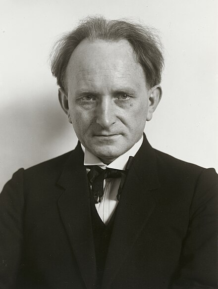
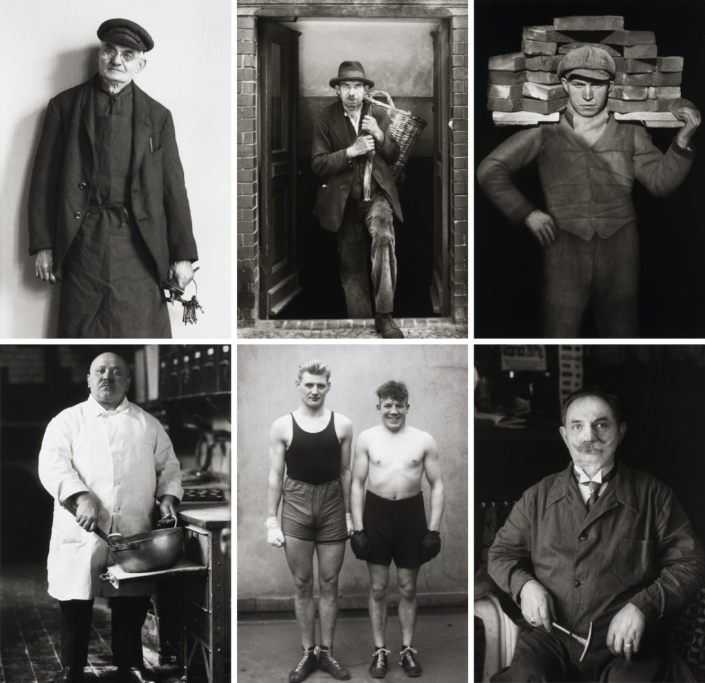
August Sander was a German photographer whose work documented the society he lived in. He was one the most-important portrait photographers of the early 20th century.
Short Bio:
The son of a mining carpenter, Sander apprenticed as a miner in 1889. Acquiring his first camera in 1892, he took up photography as a hobby and, after military service, pursued it professionally, working in a series of photographic firms and studios in Germany.
By 1904 he had his own studio in Linz, and, after his army service in World War I, he settled permanently in Cologne, where in the 1920s his circle of friends included photographers and painters dedicated to what was called Neue Sachlichkeit, or New Objectivity.
His Photographs:
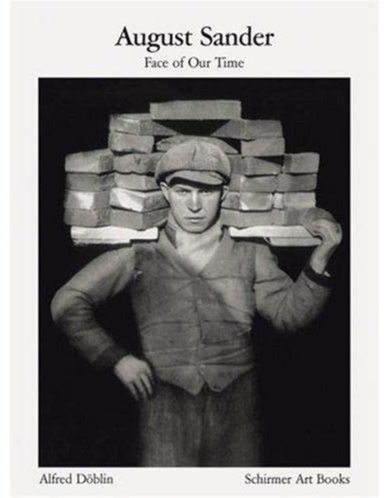
After photographing local farmers near Cologne, Sander was inspired to produce a series of portraits of German people from all strata of society. He was committed to ‘telling the truth’. His portraits were usually stark, photographed straight on in natural light, with facts of the sitters’ class and profession alluded to through clothing, gesture, and backdrop. At the Cologne Art Society exhibition in 1927, Sander showed 60 photographs of “Man in the Twentieth Century,” and two years later he published Antlitz der Zeit (Face of Our Time), the first of what was projected to be a series offering a sociological, pictorial survey of the class structure of Germany.
Typologies:
Sanders was one of the first portrait photographer to produce a series of typological studies. ‘The Face of Our Time’ categorised his portraits according to their profession and social class, or ‘types’. As a typology, these photographs prioritized “collecting” rather than stand-alone images. They became a powerful method of revealing a photographic record of the people of his time.
The portraits:
Sanders’ photographs are mostly black-and-white portraits of Germans from various social and economic backgrounds: aristocrats and gypsies, farmers and architects, bohemians and nuns. The portraits often include familiar signifiers (a farmer with his scythe, a pastry cook in a bakery with a large mixing bowl, a painter with his brushes and canvas, musicians with their instruments, and even a “showman” with his accordion and performing bear), but sometimes the visual clues to a subject’s “type” are not so obvious, leaving the title of the work and its placement in one of Sander’s categories to illuminate the subject’s role. The titles Sander assigned to his photographs do not reveal names, and capture one of the project’s many contradictions: Each photograph is a portrait of an individual, and at the same time an image of a type.
“Nothing seemed to me more appropriate than to project an image of our time with absolute fidelity to nature by means of photography,” he once declared.
“Let me speak the truth in all honesty about our age and the people of our age.”
During the war
When the Nazis came to power in 1933, however, Sander was subjected to official disapproval, perhaps because of the natural, almost vulnerable manner in which he showed the people of Germany or perhaps because of the diversity it revealed. The plates for Antlitz der Zeit were seized and destroyed. (One of Sander’s sons, a socialist, was jailed and died in prison.) During this period Sander turned to less-controversial rural landscapes and nature subjects. Late in World War II he returned to his portrait survey, but many of the negatives were destroyed either in bombing raids or, later in 1946, by looters.
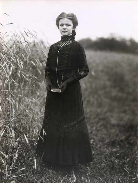
Konfirmandin
In the early portraits such as ‘Konfirmandin (Confirmation Candidate)’, Sander portrays pastoral families in their Sunday-best, an insight on how these communities chose to present themselves to the camera.
August Sander, Konfirmandin (Confirmation Candidate), 1911 (printed 1959)
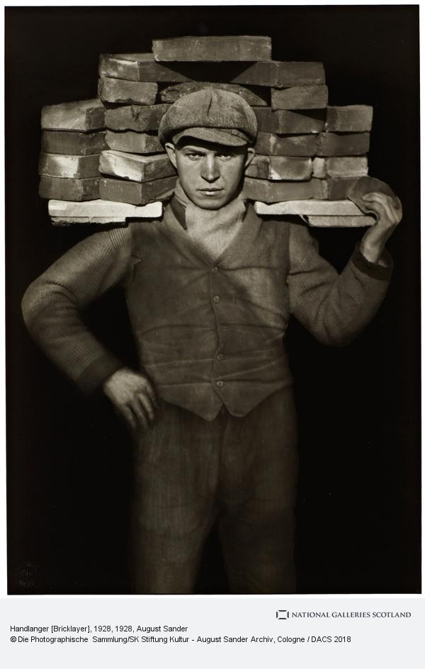
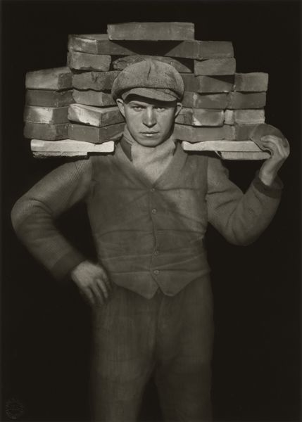
‘Handlanger (Bricklayer)’.
This photograph belongs to ‘The Skilled Tradesman’, one of seven chapters within his ‘People of the 20th Century’ project. The title and subject of this photograph form an archetype of Sander’s sociological documentation of people from a variety of occupations and social classes. Formally, the portrait’s centrality, flat background and conventional framing demonstrate Sander’s investment in photography as a ‘truth-telling’ device; one which represents reality as it is, without formal experimentation and within the boundaries of the history of photographic portraiture. Sander wrote in his seminal lecture ‘Photography as a Universal Language’ that photography was the medium most able to best reflect the ‘physical path to demonstrable truth and understand physiognomy’.
August Sander, Handlanger (Bricklayer), 1928 (printed 1960)
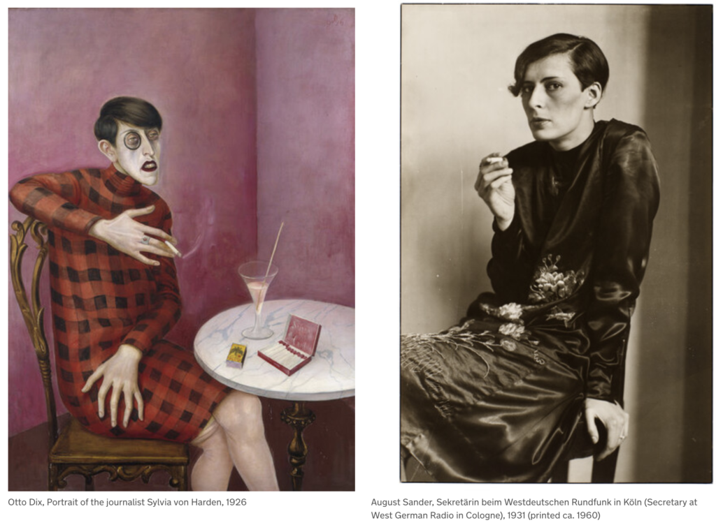
‘Sekretärin beim Westdeutschen Rundfunk in Köln (Secretary at West German Radio in Cologne)’,
When Sander developed People of the 20th Century, he included the group ‘The Woman’. Among these subjects is ‘Sekretärin beim Westdeutschen Rundfunk in Köln (Secretary at West German Radio in Cologne)’, photographed during his work for the German public broadcasting institution ‘Westdeutscher Rudfunk’. The portrait draws comparison to Otto Dix’s ‘Portrait of the Journalist Sylvia von Harden’ painted five years earlier. They both depict a new movement of women at work during the time—simultaneously androgynous and feminine, liberated from the domestic sphere. The portraits are important within the rise of the New Objectivity movement in German art—a reaction against the dominant style of expressionism—seeking a more objective and unsentimental portrayal of the human figure.
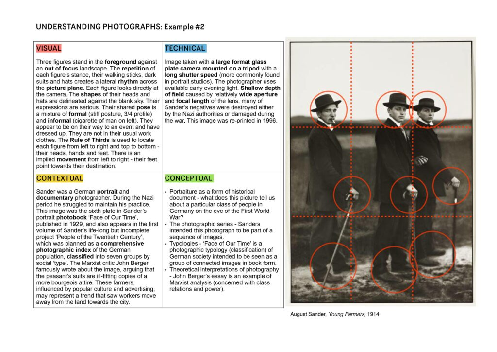
Image Analysis
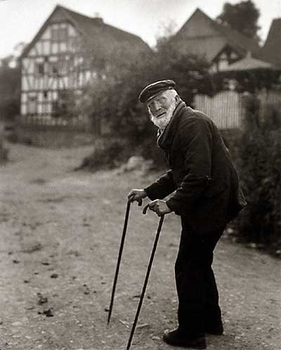
Untitled image, from book: The face of our time, published in 1929
Subject:
This photo consists of an elderly man using his two walking sticks seen in the foreground. He appears to have paused while walking up the lane in the background. We can tell the man is old by his posture, bent and twisted around stiffly to face the camera, as well as the white facial hair.
The subject of the photo looks as if he has been walking along the road and has paused to face the photographer. The subject is positioned to the right of the frame, facing the centre of the frame and towards the negative space to the left. This draws our attention through the photograph to the building in the background, and gives a sense that this is where the man is walking to. His neutral expression gives a sense that this is a natural pose. As if this is not staged, but a photo of a man in his natural environment.
For me, I feel like Sander’s photographical types allow us to connect with the subjects. The eye contact with the camera lures us into the photo, in a neutral and unimposing manner. The subjects seem real, relaxed in their daily routine, and at home in the environment that surrounds them. The photo seems to celebrate everyday types of people, inviting us to get to know the essence of the person in the photo.
The environment:
The house in the background appears to be a traditional Tudor building featuring a façade with white stucco exteriors punctuated with decorative half-timbering or a dark brick-and-stone construction. The traditional building gives a sense that this is a charming and humble environment where the subject lives.
Visual:
This photograph, and all of Sanders’ photographs are black and white. While this is a result of camera limitations of the time, the monotone aesthetic contributes to Sanders’ typographical approach, making each photo appear like it belongs to the same colletion.
The monochromatic aesthetic also enhances the tonal values in the photograph. The dark tone of the shrubbery that sits to the right of the photo with the subject, contrasts the lighter pathway to the left, drawing your eye into the photo and towards the house.
The unkept and rustic texture of the shrubbery and pathway suggests that this is a rural area.
Leading Lines
The main leading line draws your attention from the bottom right corner of the page, up to the subject and then through to the house.
Furthermore, the angle of the walking sticks lead the eye directly to the subject’s face.
Balance:
The line created by the shrubs in the background and cut through the photo, divide the photo into two halves. The bottom half consists of the pathway, a more empty or negative space, to contrast the weight of the details in the top half of the photo.
Composition:
Looking closely it could appear that Sander has used the rule of thirds to construct this image. The subject sits on the intersection of the right third, while the house sits within the top left third. The subject occupies 2 thirds of the photo, making it the primary focus.
Angle:
The photo is taken from an eye-level direct perspective. This creates a more intimate connection between the subject and the viewer, it gives a very neutral eye.
Technical
This photo uses natural lighting, contributing to the genuine nature of the photograph. The balanced exposure is free from formal experimentation.
The large aperture in this photo creates a shorter depth of field, bringing our attention to the foreground of the photo – the subject.
Context:
This photograph is from Sanders’ book ‘Face of our time’. The book was first published in 1929, with a foreword by German writer Alfred Dublin. On its first publication, it was advertised as follows: “The sixty shots of twentieth-century Germans which the author includes in his Face of Our Time represent only a small selection drawn from August Sander’s major work, which he began in 1910 and which he has spent twenty years producing and adding fresh nuances to. The author has not approached this immense self-imposed task from an academic standpoint, nor with scientific aids, and has received advice neither from racial theorists nor from social researchers. He has approached his task as a photographer from his own immediate observations of human nature and human appearances, of the human environment, and with an infallible instinct for what is genuine and essential.
Conceptual:
The book is not ‘faces’ of our time, but ‘face’, singular. Suggesting that collectively, these people make one. It could be suggested that Sander’s concept was to unite these people as one collective representation of his time. There is no theory behind the work, just a look at the this period of time, on the face of it.
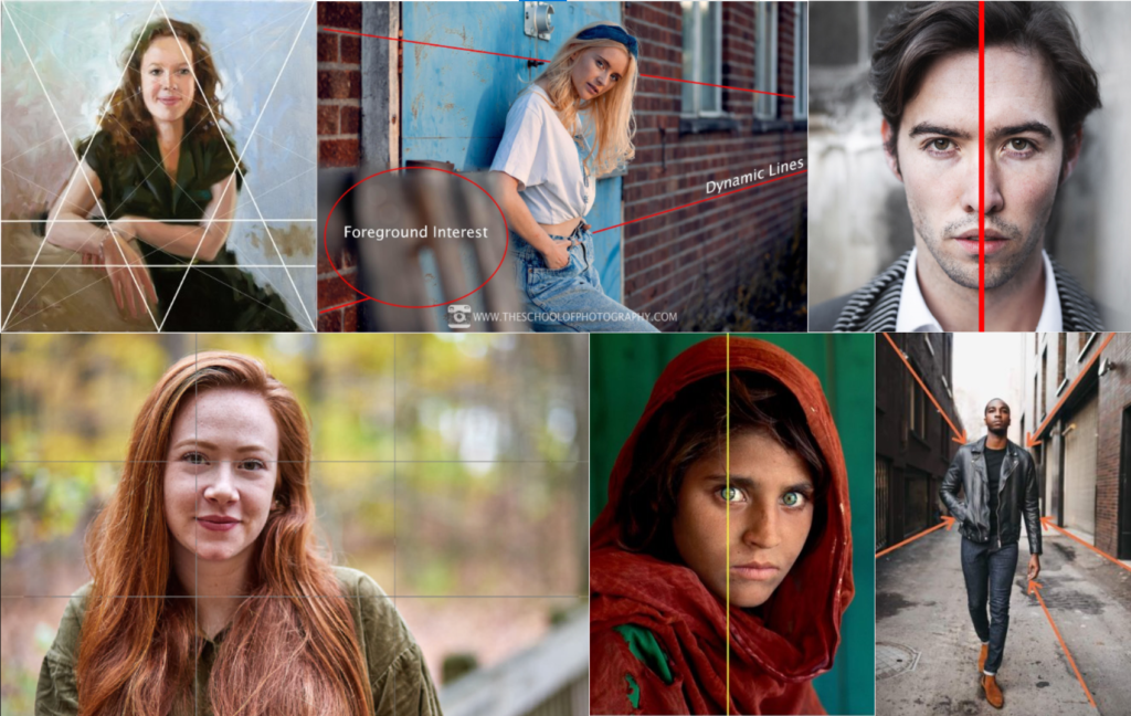
Use the template below to help you analyse photos:
Research the photographer
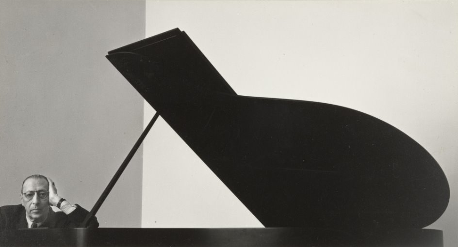
About Arnold Newman:
One of the most important photographers of the 20th century, Arnold Newman is known for his portraits of major cultural figures, such as Pablo Picasso, Aaron Copland, Marilyn Monroe, Donald Judd, and Josef Albers.
Newman was credited with popularising environmental portraiture, a style that captures subjects in their surroundings and uses significant details to communicate their profession and personality.
Newman’s famous photograph of Igor Stravinsky, for example, is dominated by a grand piano silhouetted against a white wall, with the composer confined to the corner.
2. Analyse a chosen photo in depth:
Expand on the below bullet points, turn into full paragraphs.
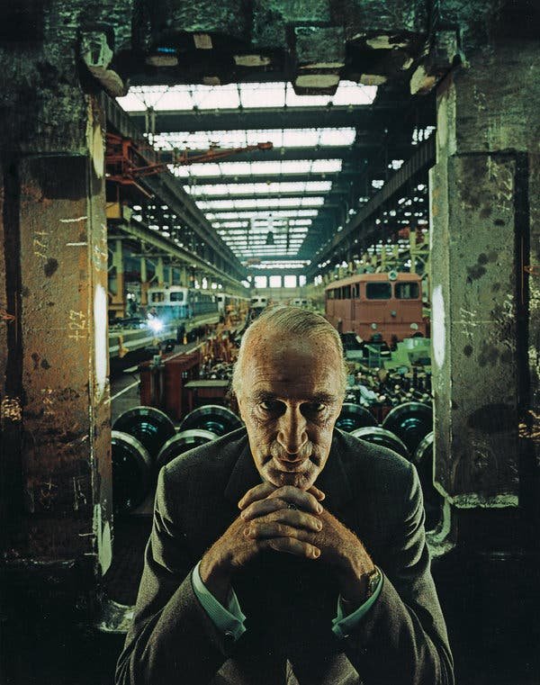
Visual:
Sitter is the main focal point
Central
Framed by concrete pillars – cold – industrial
Sitter is leaning forward into the photo – with clasped hands and strong eye contact- confident – sinister
Background is industrial… it looks as though the sitter is in ownership or in charge of the environment
Leading lines – from the top of the image, lead to the sitter’s portrait
Balance – Light on the top of the photo, contrasts the dark on the bottom – creating balance
Contrast- strong contrast…. exaggerates the sinister atmosphere
The sitter appears raised / elevated above the background – he’s in charge
Technical
Lighting – Could be artificial – creates strong contrast on the sitter’s face. Making him look more sinister and darkening his gaze
Aperture – Could be medium aperture – Sharp foreground, slightly softer background. Still able to identify some of the environmental details.
Shutter speed – could be quite a fast shutter speed as the subject is in focus, with a balanced exposure
Angle – Eye level with the sitter – feels like we are sitting opposite them. We connect with them more. Maybe we feel more intimidated…. Sitter looks more confrontational.
Contextual
Use the internet to help you unpack more about the subject
Who is the subject? – Alfred Krupp
Industrialist who ran war factories manufacturing arms for the Nazi assault on Europe.
Using slave labour from the internment camps, where the prisoners of war were literarily worked to death.
The majority of the men and boys who perished were Jewish and Krupp holds a particular place of hatred amongst its people.
Arnold Newman was Jewish himself
Reluctant to take photo but eventually agreed
When composing the shot, Newman asked Krupp to lean forward slightly, when he did he clasped his fingers together under his chin.
The light hit the face perfectly and when Newman saw this effect he said ‘That he felt the hair stand up on the back of his neck’.
He took the photo which became one of Newman’s most iconic images.
Concept:
When Krupp saw the picture he was said to have been furious
For Newman this was a little bit of revenge.
The photo captures Krupp in a sincere and menacing light
The circulation of the photo brought Krupp out from the shadows and allowed Newman to share his hatred for his man with the world.
The formal elements – line, shape, space, colour, pattern and texture – are necessary for creating visually captivating images. Each one of these elements plays a particular role in photography to intrigue the viewer and make them fascinated with the image. This could be from any of the categories below:
Line
Line in photography is often used to guide the viewers eye throughout the image. There are various lines that could be shown in an image, for example, there are leading lines and curved lines to create structure and balance within an image. They also enhance depth to make some images have the 3D feel to them. Finally, they also frame certain parts of the image to highlight the main subject focused in the image.
Shape
The use of unique shapes in photography helps to define subjects and can lead to interesting compositions within the image. Shape can help to define an image portrayed by using lines and boundaries to outline them. Shape also has the possibility to contrast the shape from the surrounding image, making the viewer intrigued.
Space
There are two main types of space used in photography; positive and negative space. These types of space can impact the viewers focal point of the image. In negative space, the space around the object can cause the viewer to look more towards the void which also highlights the importance of the subject being shown.
Colour
Colour influences the viewer’s emotions from which selection they use. The colour theory is useful to determine which colours would work best in an image, and which would instead give bad contrasting colours. By choosing a good selection, this can enhance the visual appeal towards the image.
Pattern
Pattern is a significant and important element that can enhance visual interest in the image. The use of pattern can produce an overall satisfying look, especially if the pattern is repeated many times throughout the image. This element forces your eyes to scan the image as a whole, and see it all together unlike the other formal elements.
Texture
Lastly, texture is used to emphasise the quality of the surfaces, making the image feel more tactile and versatile to other textures. Images of texture add more depth and detail, to engage the viewers and allows them to quickly analyse every aspect of the texture being presented. It also creates a contrasted look, as it draws attention to various areas.
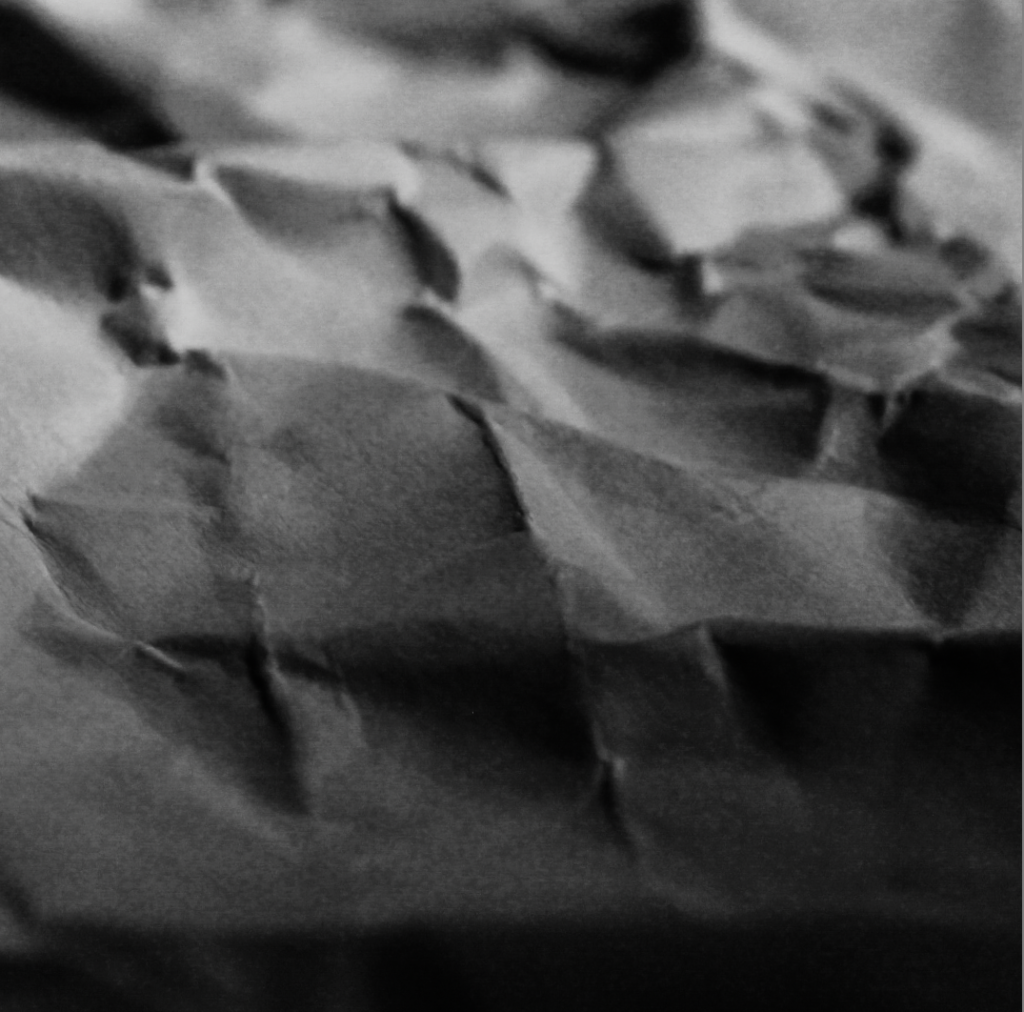
Texture in photography refers to the quality of the surface of an image. It conveys depth and detail in each image you take. The textures can be emphasised through the lighting and focus which can enhance the surfaces to appear more smooth, rough, and hard.
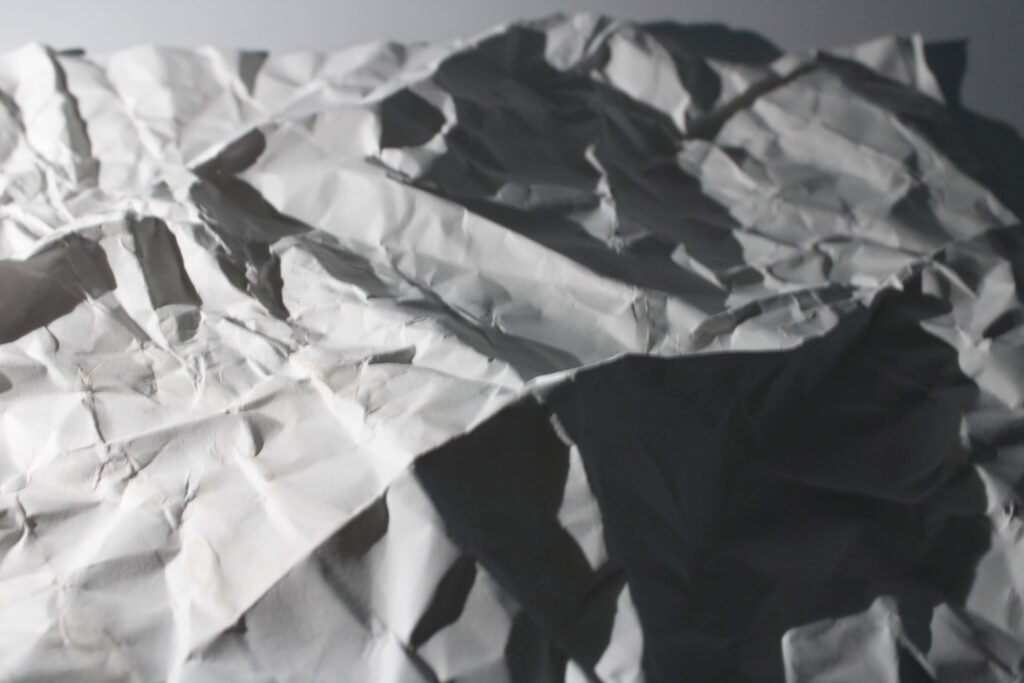
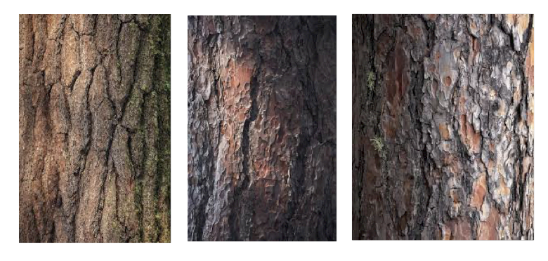
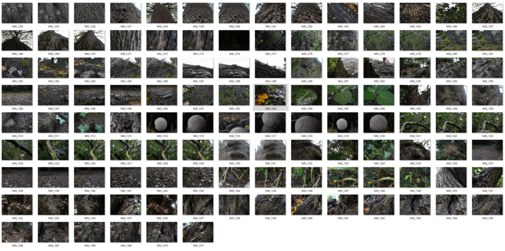
This texture photoshoot includes different textures I could find in nature, including objects like bark, mushrooms, leaves, moss, twigs, rocks, and wood chips. I decided to take these images as I thought it was a creative way to present texture in objects around us.
Artist Research
Ernesto Ruiz
Ernesto was born and raised in Puerto Rico and moved to Minnesota to study and learn more about architecture, where he discovered his passion for photography. In his photos, there is a strong sense of natural light used to shine on mainly the centre of the images. This encourages the viewer to focus on the centre, where the most details are. The space surrounding the image is very compacted, which produces a busy focus for the viewer.The colours featured in these images are enhanced, but still the same shades of bark you would expect to see. Ruiz captures texture well by zooming into his images from straight ahead, which enables us to see the outlines of bark.
Photoshoot Plan
To do this photoshoot, I will need to go out to a park and take images of the natural surroundings, such as bark to replicate Ruiz’s work. I will also take photos of other natural objects I find, but my main priority is taking images of bark from the trees. In order to do this photoshoot, I need to make sure the lighting is bright and that I zoom in to get the effects of the bark like he does.
Contact Sheet
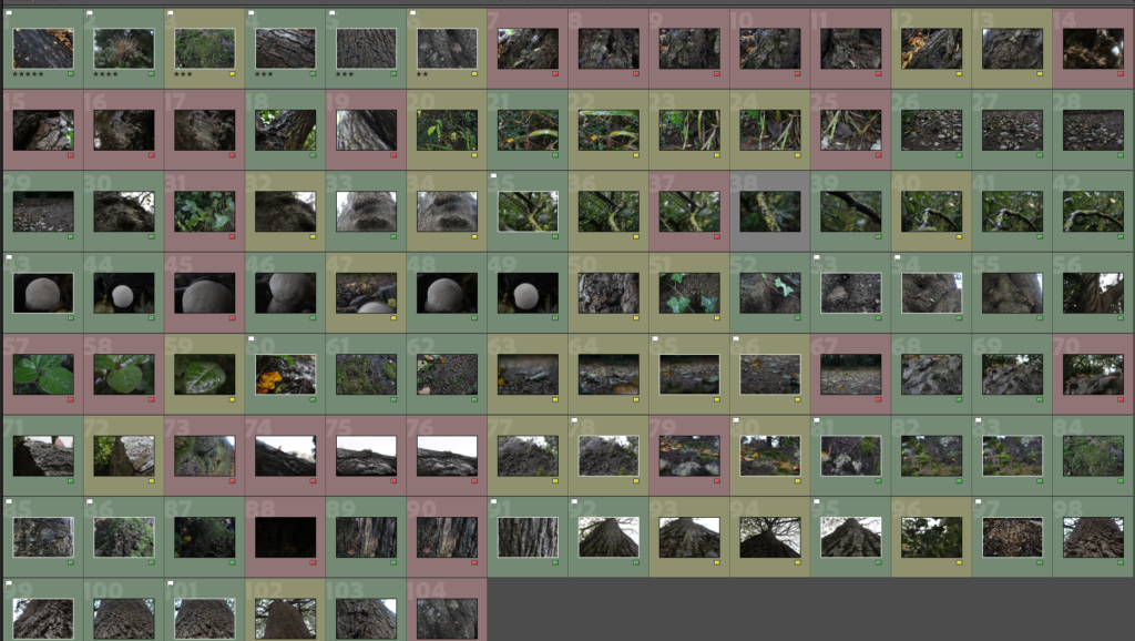
Best Photos
I imported all of my texture images onto Lightroom and individually highlighted each one to make it more clear. As you can see, there is a range of images that I selected that I would like to use (green). This colour coded method helps me to identify which images to use on photoshop more effectively as it takes less time since I don’t have to go through each one to select a good image.
After discovering my favourite images, I went into photoshop to edit the best photos I have and make edits of them to present as my final piece.
Reflection on the photoshoot:
A lot of these images I really like, as they represent texture in various ways. However, towards the end of the photoshoot, it began to rain, which meant that the camera lens had raindrops on it. This made a lot of my end images look blurry which made it difficult to get the accurate representation of the texture.
Editing
To improve my images, I concluded that I would upload the green selected ones from Lightroom into Photoshop so I was able to edit them. By doing this, it allows me to be able to present my work in the best form as they need to be edited in order for them to be presented. For my three edits, I marked the images I liked best and wanted to up level them by changing the hue and saturation, making a mirror image, and circles in my work as shown below.
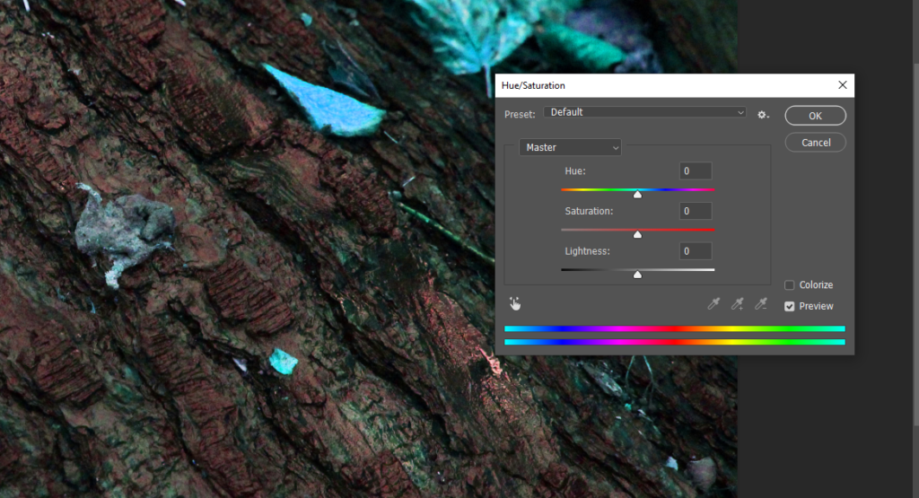
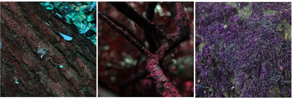
Edit 1 – Hue/saturation
For this edit, I decided to enhance the colours to create a unique and attention-grabbing effect, by making the colours unusual to what they would actually be.
I did this by first cropping my images, then pressing ‘image’ then ‘adjustments’ then ‘hue/saturation’ to play around and change the colours so they still look somewhat natural.
Below is my final product of this edit, and as you can see they all fit nicely together. I decided to do three images in one piece as it gives you an idea of the edit I am creating, and the overall theme of it (which is the use of the different colours).
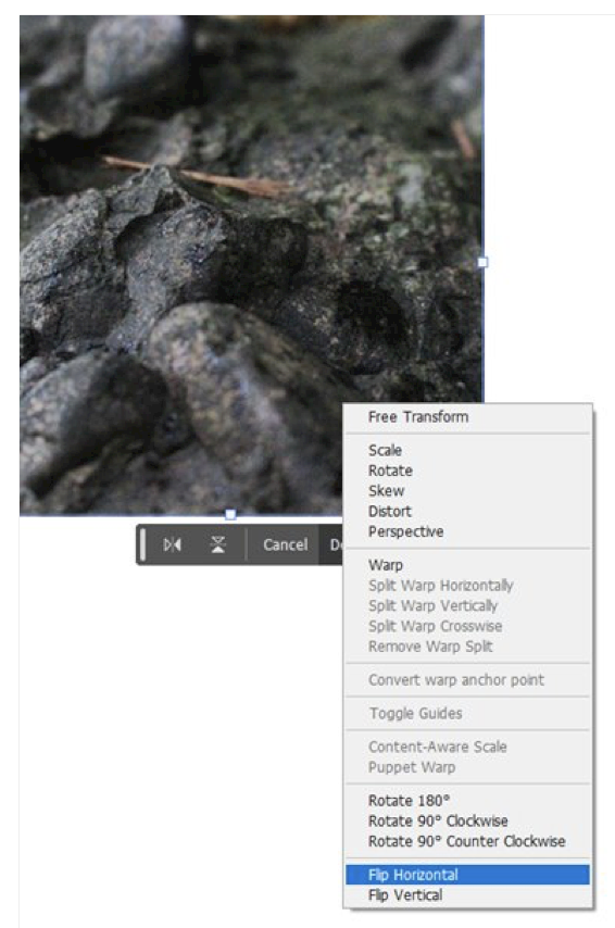
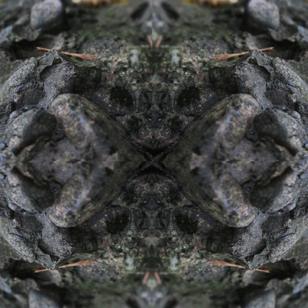
Edit 2 – Mirror Image
My second edit is the mirror image, where your image is reflected on the other side to make an intriguing pattern from your photograph. I began by opening my image and adding a background layer so I could flip the image both horizontally and vertically as you can see below.
After achieving this, I repeated these steps 2 more times to have the finished look. I cropped the image to ensure the background wasn’t in my edit. This image generates patterns that weren’t originally in the image, so it attracts the viewer as each edit you do of this will look completely unalike.
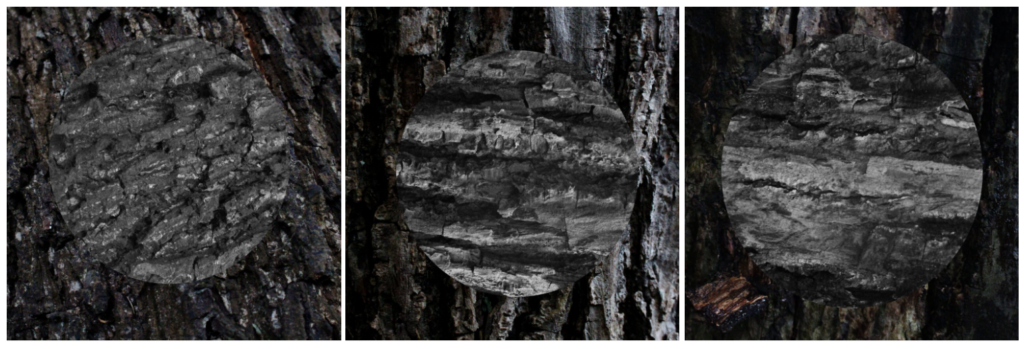
Edit 3 – Circles
For my last edit, I cropped each image to become a square shape, and engraved a large circle in each of the images. Once I achieved that, I rotated the circles so they were facing different directions to the original image, and then edited the circle to become a monochrome tone. This helps catch the viewers attention as the change of direction through the lines creates a saddened tone paired with the dark colours. Then, I edited the background to match the vibe and made it a darker tone. By doing this, I created a dark tone to the images overall.
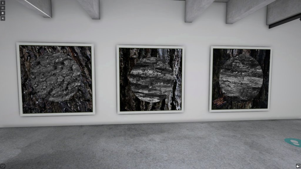
Final Piece:
For my final piece, I decided to go with my third edit, as I feel as though it resinated with the artist the most in terms of him taking images of bark. It is also a creative design to present, as it has elements of line, texture and pattern which are all included in the formal elements.
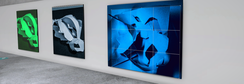
Art Gallery
Lastly, I uploaded my final images to the art gallery which enables you to walk around and view your photography work like it is in a gallery. I spaced these images out to individualise them but still have the effect of them being united as similar pieces.
Evaluation
Overall, I believe my work somewhat connects to Ruiz’s work as he takes images of the bark from close up like I did. Unlike him, I shifted my work to monochrome colours to highlight the details scattered throughout the bark trees, whereas he kept the colours shown and did not edit it like mine. I also took other images of the natural textures, but mainly focused on the bark trees. To improve my work I would stick to his style and make the colours more warm toned without making it black and white, and zoom in more to really capture the small outlines in the bark like he does.
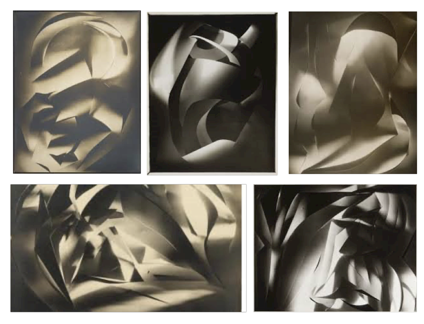
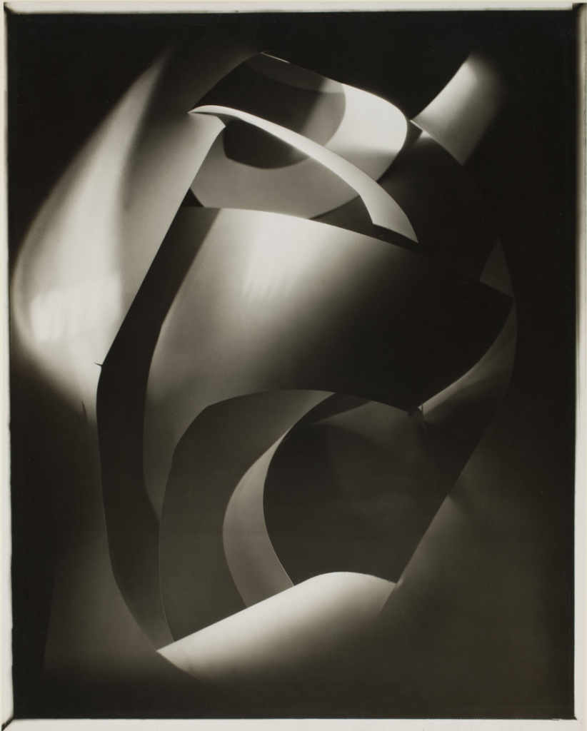
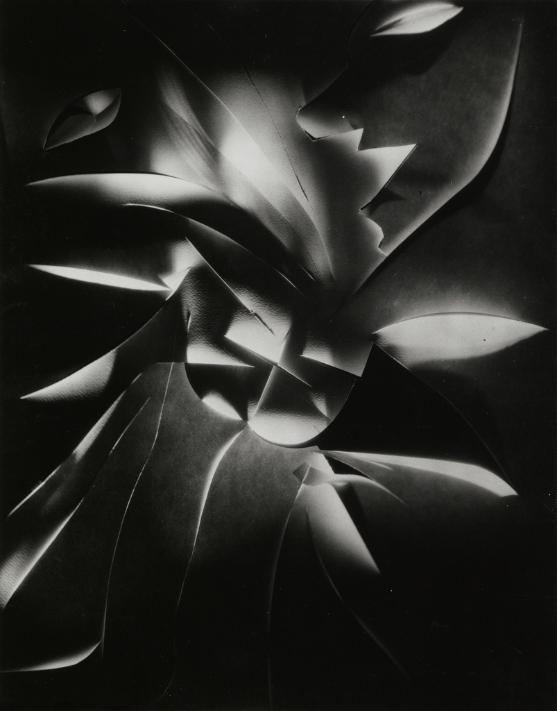
Francis Joseph Bruguière was an American photographer. He was born on October 15, 1879, San Francisco, California, United States and he died on May 8, 1945 (age 65 years), Middleton Cheney, United Kingdom.
Photos of his work.
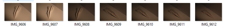
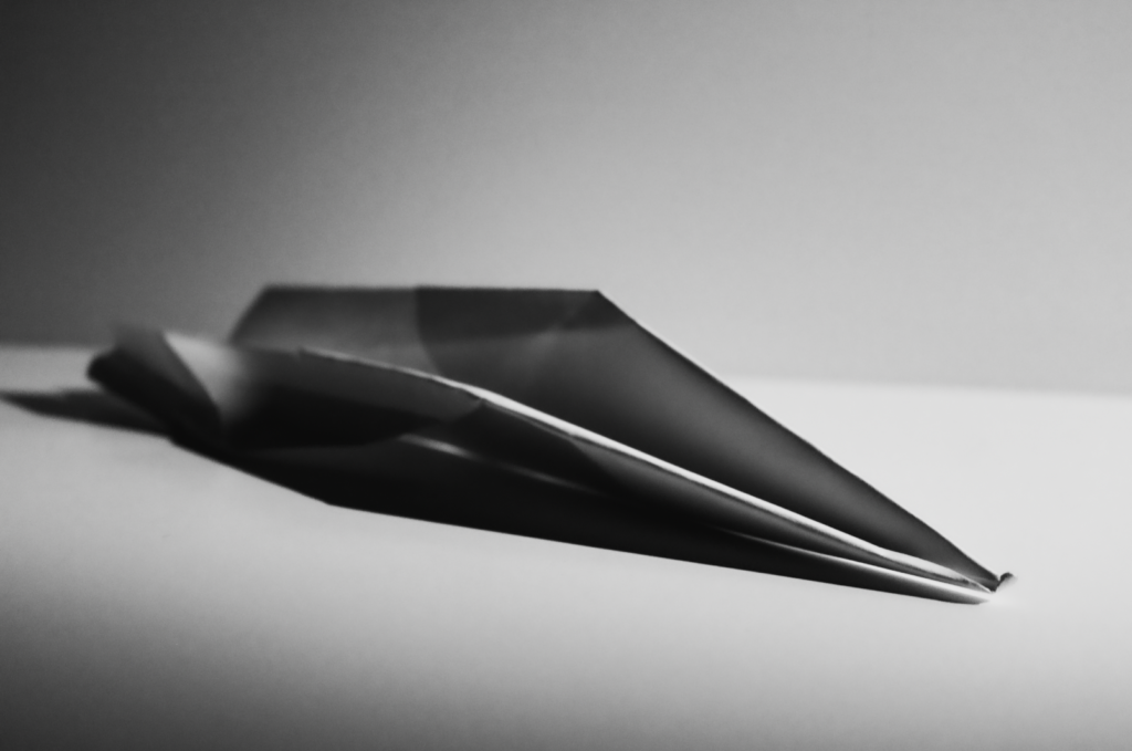
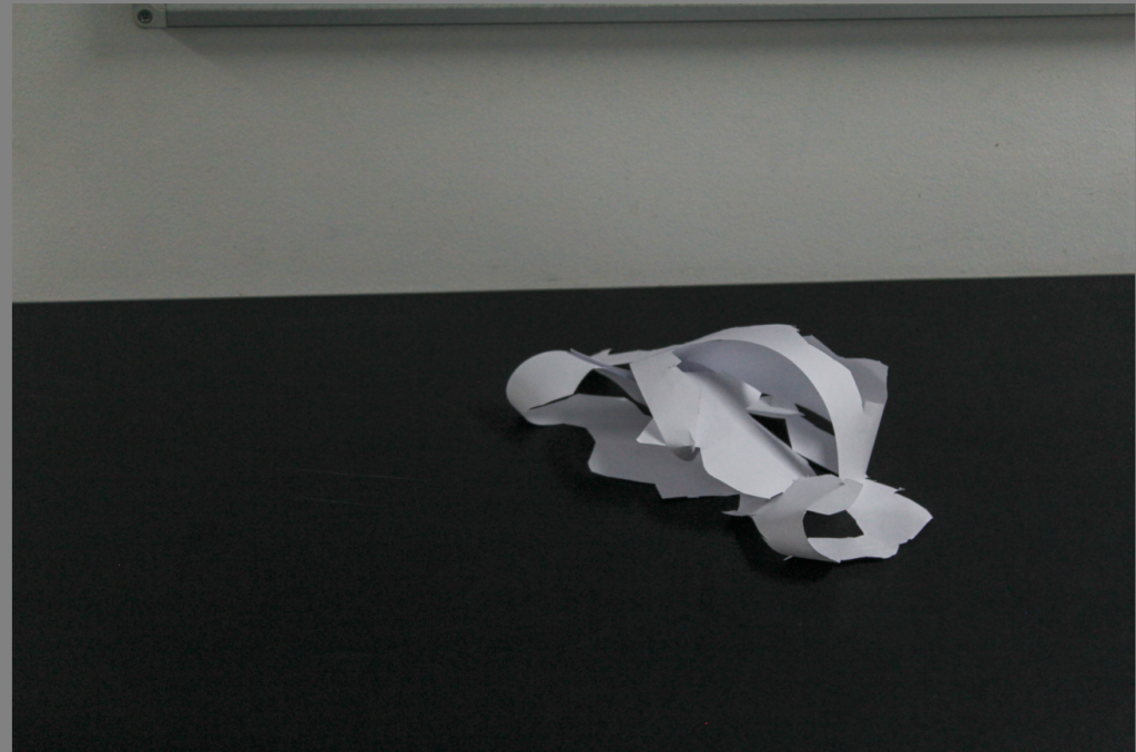
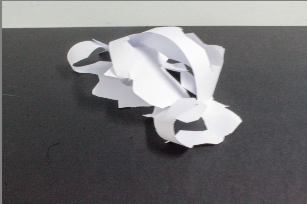
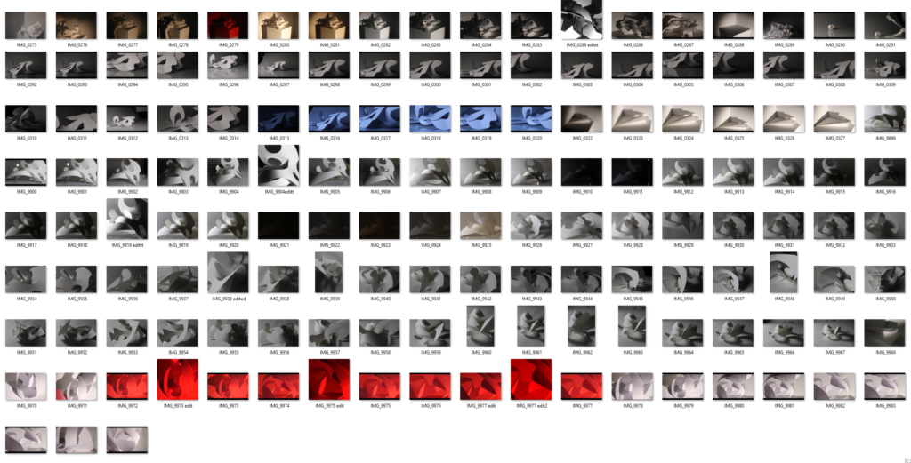
My Paper Photoshoot
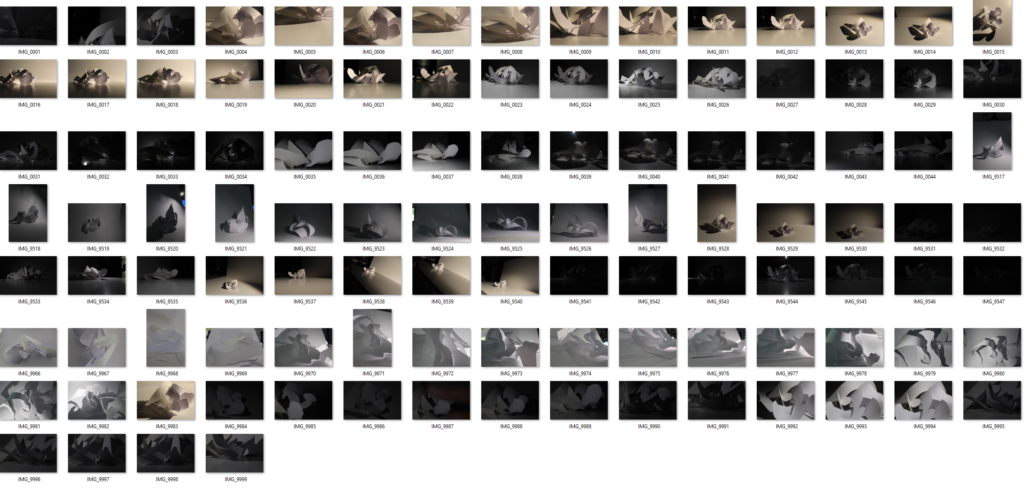
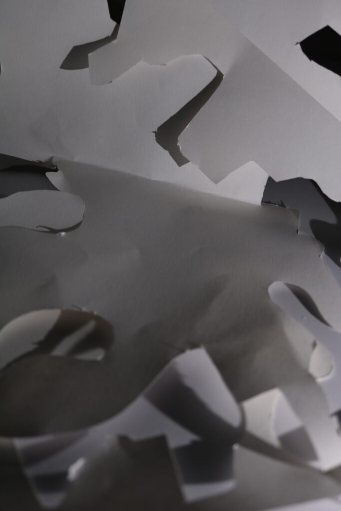
Contact Sheet
As you can see above I took 24 images from the camera of some different angles and shape of the paper until I found the one that I wanted to use, I then continued to take many of photos of one one type of paper style I liked with different camera settings and different lighting conditions to achieve the ideal result I wanted.
Photos I Didn’t Like
I didn’t like this photo due too lots of darkness, with having lots of darkness means it wont attract people to look at them and like them. It also gives no proper final image. This photo taken with a shutter speed of 1/800 of a second and an aperture of 4.
I didn’t like this photo due the balance of the photo on both sides. the left side has more negative space rather than the right side. There is no rule of 3rds present in this photo. This photo has a shutter speed of 1/100.
Lastly, I didn’t like this photo because of due to being blurry, which also gives it a degrading quality. This photo had an aperture of 25 which means not a lot of light has been let through to create a perfect image. It also had a shutter speed of 1/5, which is low.
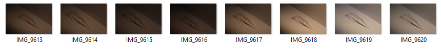
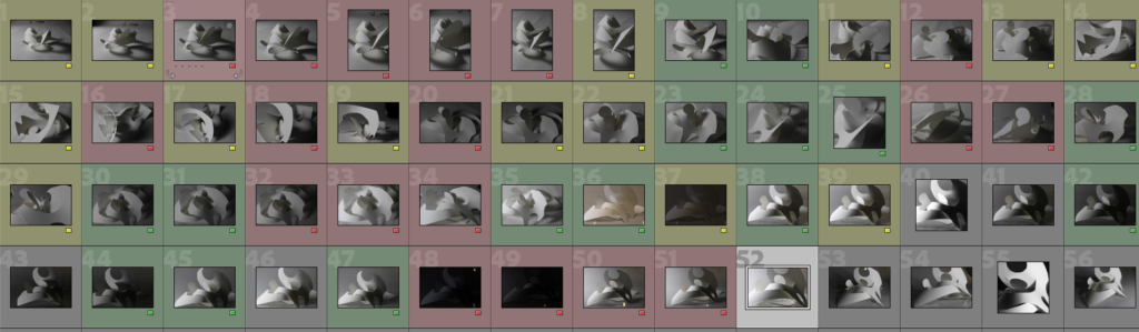
Selection Process
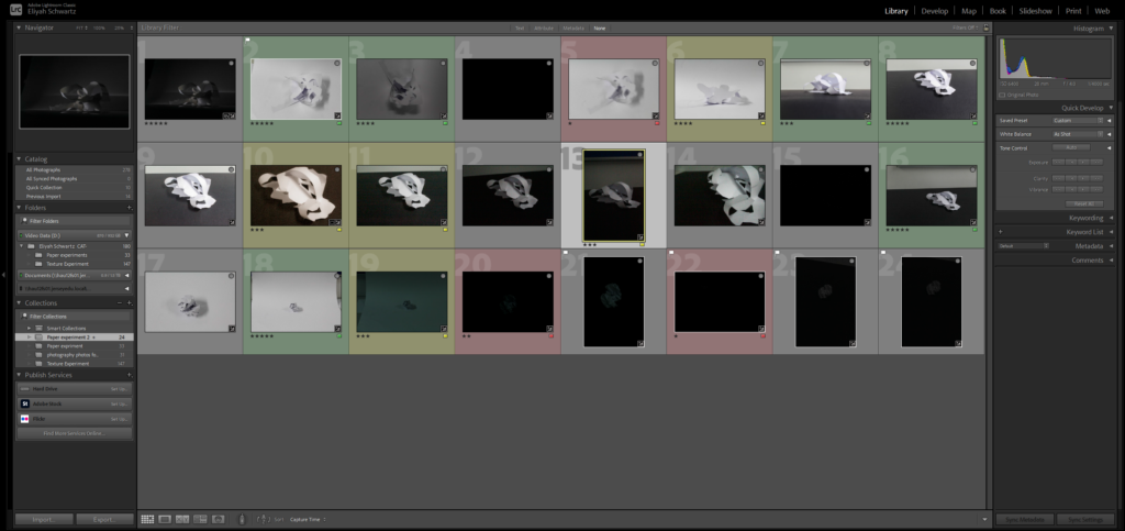
As you can see above I pressed P to keep the images I wanted to use for my final photos. I used X to get rid of the images i didn’t wanted to use for the future. Then I gave a rating for the images, they all had a rating out of 5. With a rating of 5/5 means they are my best images that I love. The images with 4 and 5 stars are the images I wanted to use for my final photos. The photos I didn’t like I rated 1-3 stars. With a rating 1-3/5 means these where the photos I hated. Finally I gave them the colour yellow or green, green being the best and yellow being average . Red was for very bad photos. I will edit the images so I can present final photos.
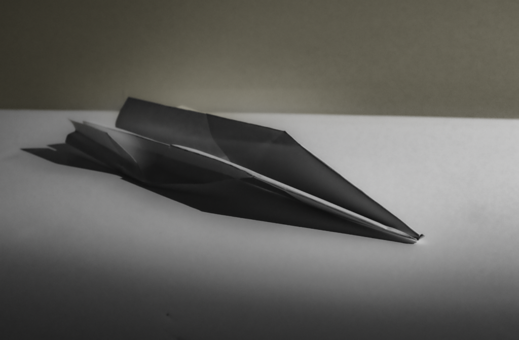
Editing my Best Images
These are my three best images that have been edited.
This photo had to get rid of some of the negative space due to be being unbalanced on the foreground and the in the background. This means the photo is not equally distributed on each side that is the reason I had to crop it. I originally started with lots of negative space in background, rather than the foreground.
When cropping, I made sure the photo was balanced on each side from the background to the foreground.
I put the texture on this photo 100 to enhance the material of the paper.
In this image I had to crop a bit of the photo due to the sides of the photo not being proportional. If I hadn’t cropped the photo, the photo would look unbalanced and there would be too much negative space on the left side side of the photo rather than the right side of the photo.
After being cropped the photo looks more visually pleasing.
The space in the photo appeared very big to begin with but after I cropped it the space has decreased, so you can’t see the whole of the photo.
In this photo I had to crop lots of it due to the sides of the photo not being proportional and not being balanced enough. If I hadn’t cropped the photo, the photo would look unbalanced and there would be too much negative space on the left side rather than the right side of the photo.
After being cropped the photo looks more aesthetically pleasing and good to look at.
For this image it had two main textures which is the black card underneath to being smooth and the white paper being rough due to being cut out.
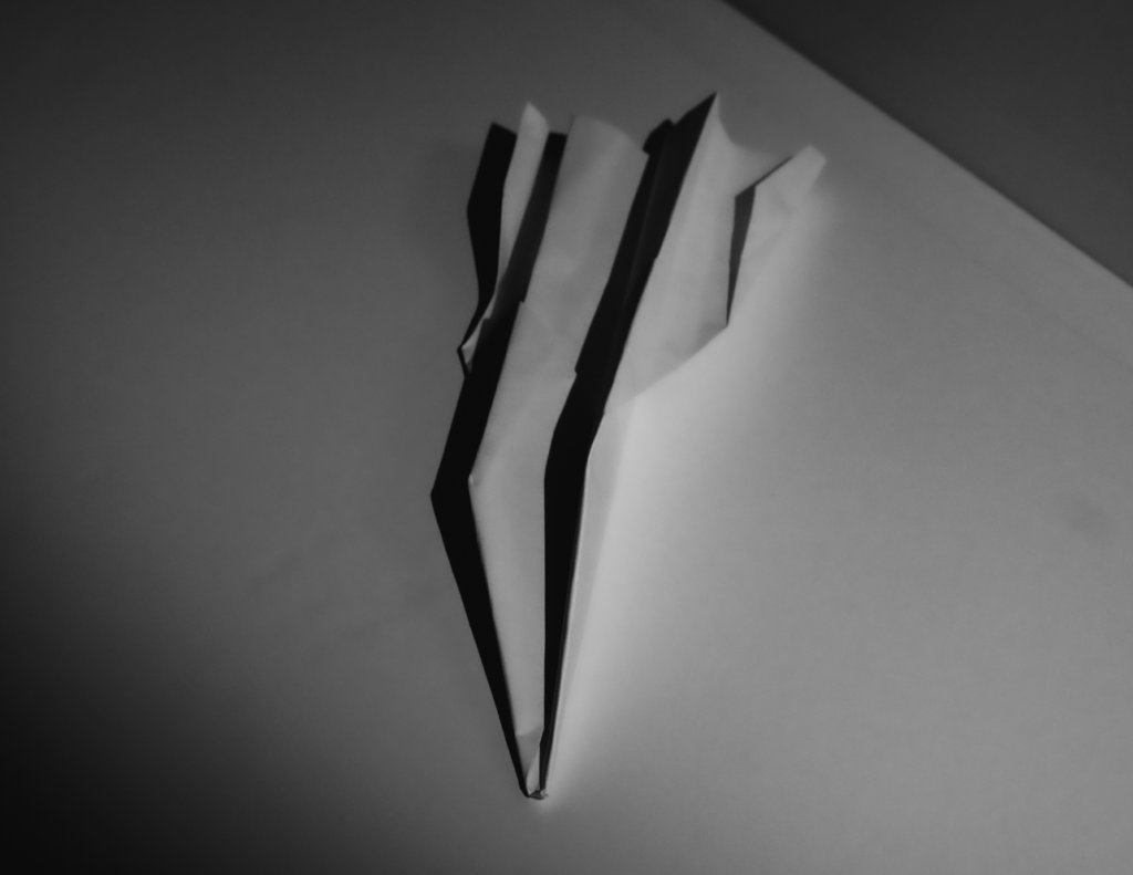
Photos Edited Into A White Filter
My Edited Photos into a White Filter.
In this photo I had to slightly crop it due to the sides of the photo not being proportional. If I hadn’t cropped the photo, the photo would look unbalanced and there would be too much negative space on the background of the photo.
The space in the photo appeared very big to begin with but after I cropped it the space has decreased, so you can’t see the whole of the photo.
The image appears to have a range of textures from the black card underneath to being smooth and the white paper being rough due to being cut out.
This photo had to be slightly cropped it due to the sides of the photo not being proportional and balanced . If I hadn’t cropped the photo, the photo would look unbalanced and there would be too much negative space on the background and the foreground of the photo.
The space in the photo appeared very big to begin with but after I cropped it the space has decreased, so you can’t see the whole of the photo.
The image appears to have a texture of the white paper being rough due to being cut out. Another texture in this photo is white card underneath which is smooth to touch.
This photo had to be slightly cropped it due to the sides of the photo not being proportional and balanced . If I hadn’t cropped the photo, the photo would look unbalanced and there would be too much negative space on the background and the foreground of the photo.
The image appears to have a texture of the white paper being rough due to being cut out. Another texture in this photo is white card underneath which is smooth to touch.
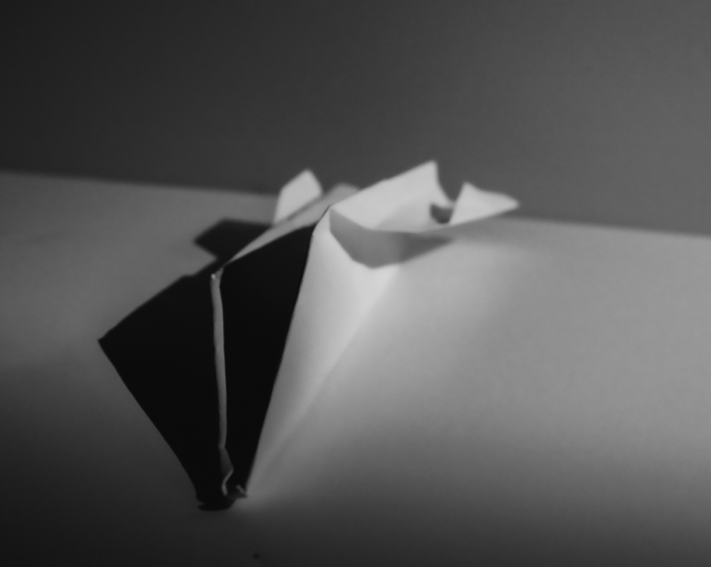
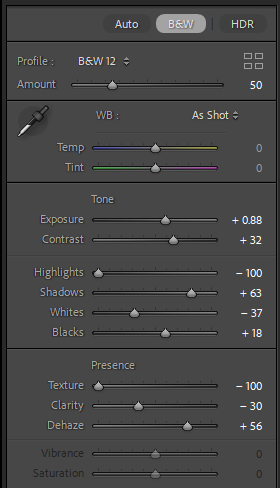
The white filter I used on this photo is BW09 which is on Lightroom. In this photo is also enhanced shadows and the texture.
Photos Edited Into A Black Filter
My Edited Photos into Black
This photo had to be slightly cropped it due to the sides of the photo not being proportional and balanced . If I hadn’t cropped the photo, the photo would look unbalanced and there would be too much negative space on the background and the foreground of the photo.
The space in the photo appeared very big to begin with but after I cropped it the space has decreased, so you can’t see the whole of the photo.
The image appears to have a texture of the white paper being rough due to being cut out. Another texture in this photo is white card underneath which is smooth to touch. Also on this photo the paper appears to have a bit of a fuzzy texture due to +100 on the dehaze setting on Lightroom, this makes it have an interesting texture.
This photo had to be slightly cropped it due to the sides of the photo not being proportional and balanced . If I hadn’t cropped the photo, the photo would look unbalanced and there would be too much negative space on the background and the foreground of the photo.
The space in the photo appeared very big to begin with but after I cropped it the space has decreased, so you can’t see the whole of the photo.
The black filter I used on this photo is BW12 which is on Lightroom. In this photo is also enhanced shadows and the texture. It has also made the paper shadows pop out more and to be more present.
This photo had to be slightly cropped it due to the sides of the photo not being proportional and balanced . If I hadn’t cropped the photo, the photo would look unbalanced and there would be too much negative space on the background and the foreground of the photo.
After being cropped the photo looks more visually pleasing.
The space in the photo appeared very big to begin with but after I cropped it the space has decreased, so you can’t see the whole of the photo.
The black filter on Lightroom I used on this photo is BW11 which is located on Lightroom. In this photo is also enhanced shadows and the texture. It has also made the paper shadows pop out more and to be more present.
My Final 6 Photos
These photos are my favourite 6 photos, I have created. At the start I started with 12 photos then narrowed it down to 6 final photos. These photos have a mix of colour and black and white. By having colourful photos artists will use the desired mood and it will enhance their feelings. Also by using black and white the photographer will find it a way of concentrating on the viewer’s attention of a particular subject and also the photographer will feel it is more emotive. By having some straight lines in the photos it means these lines have geometric quality and also have centre of attention. The texture on all of these photos means that the paper looks quite rough to touch and feel. The images that I took had lots of negative space around it so I had to crop it to make the photos balanced on each side.
Art Steps Photos
I think Art Steps is a great way to showcase your photos on a display.
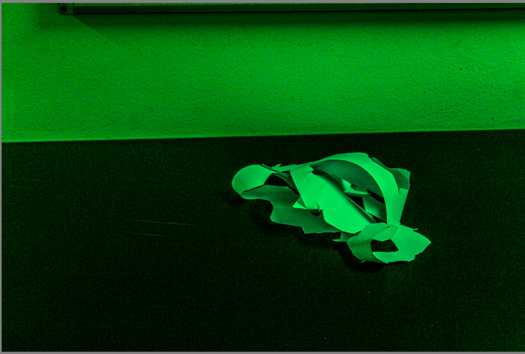
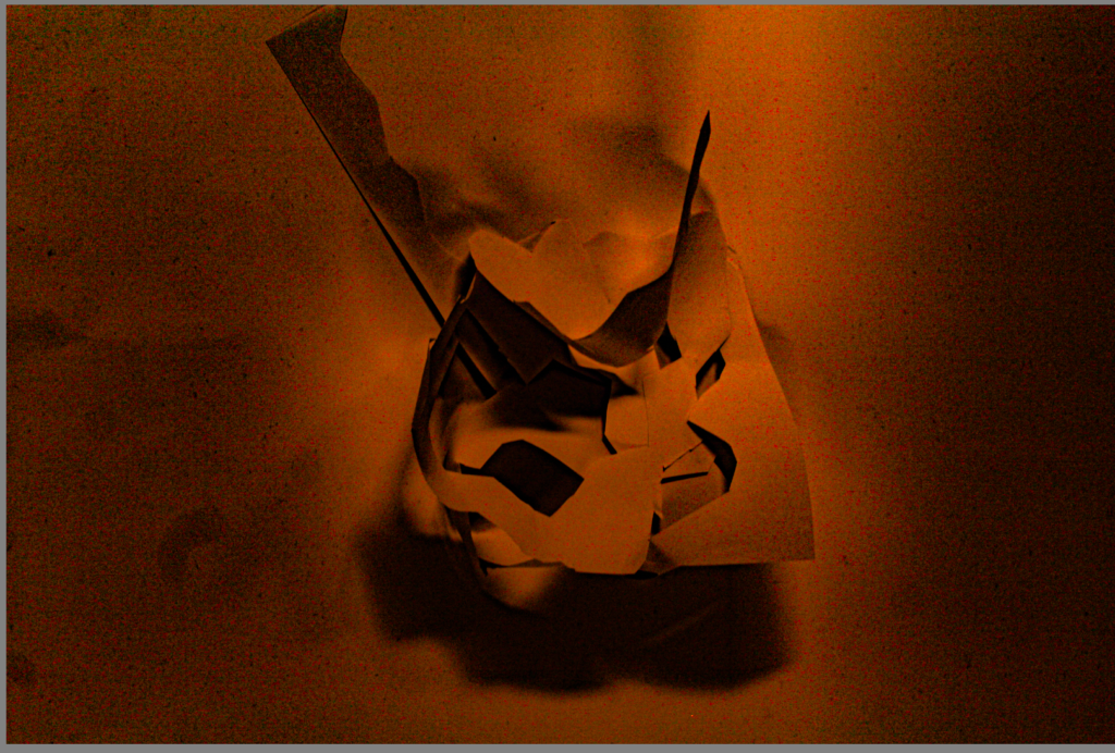
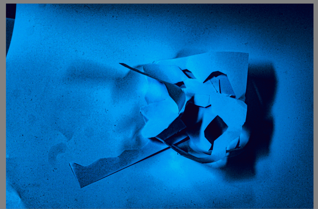
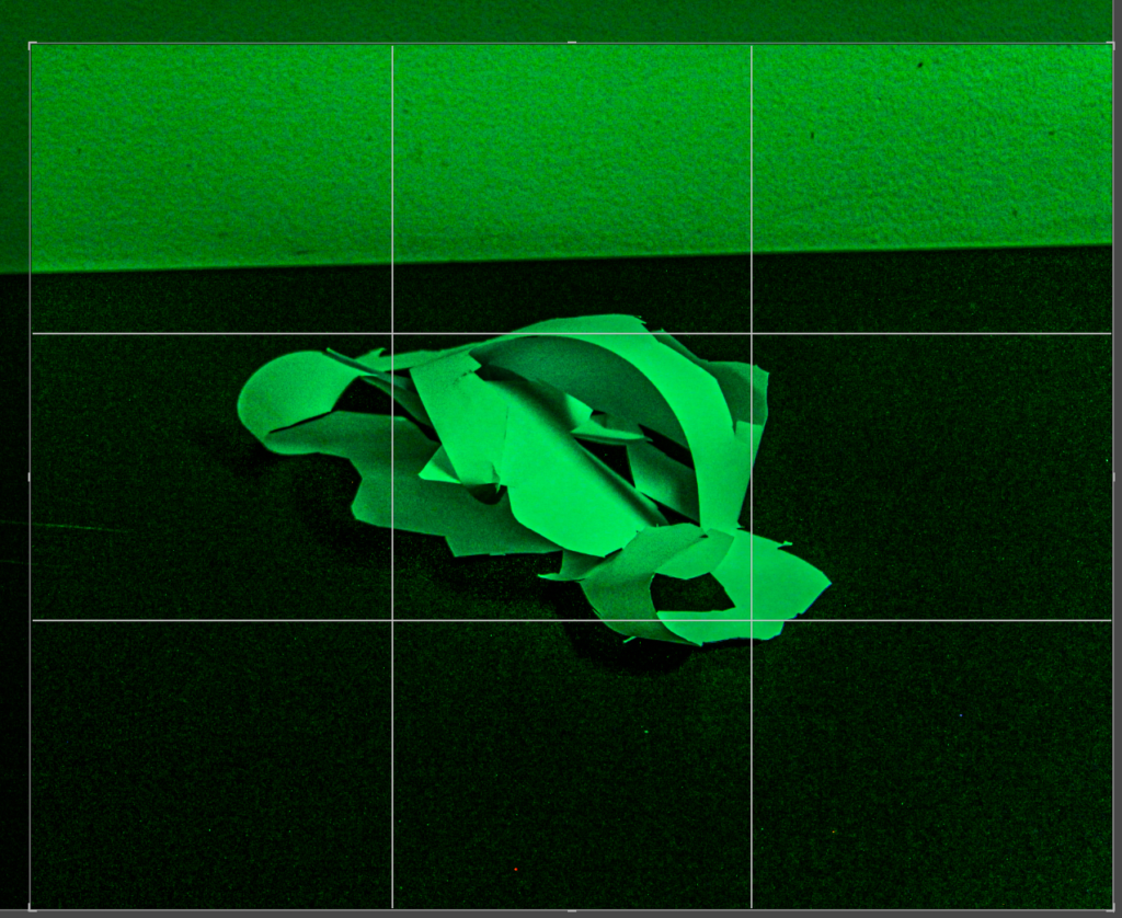
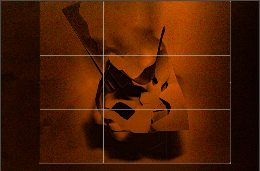
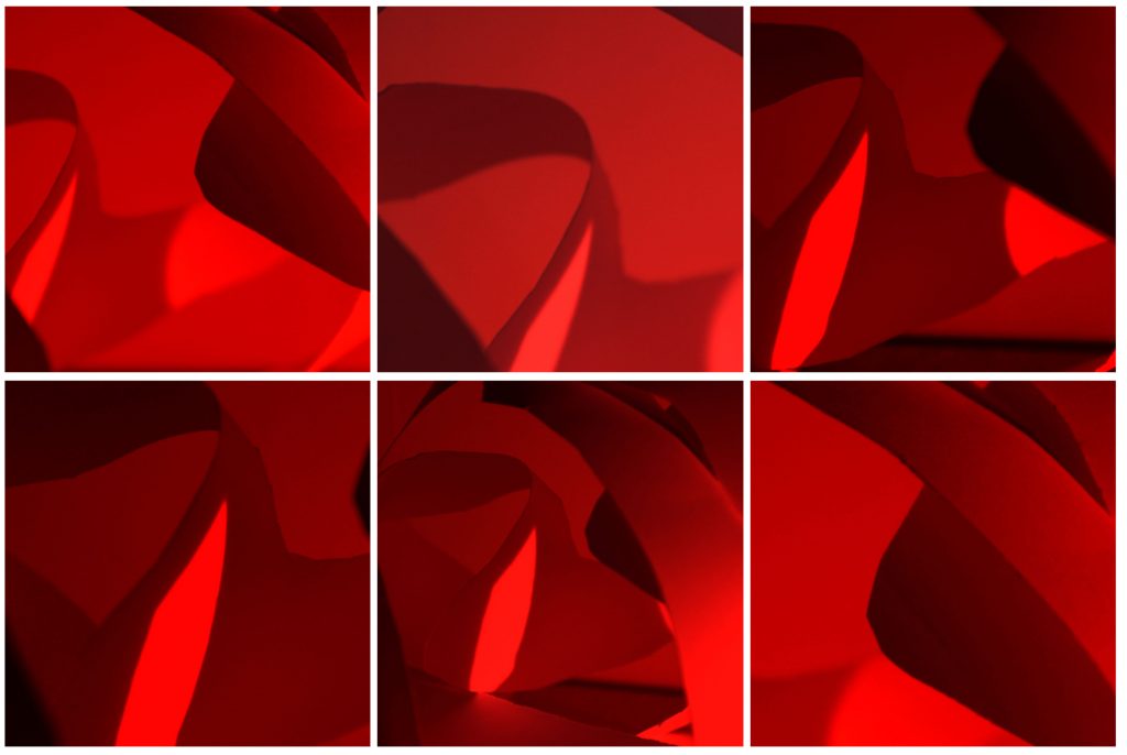
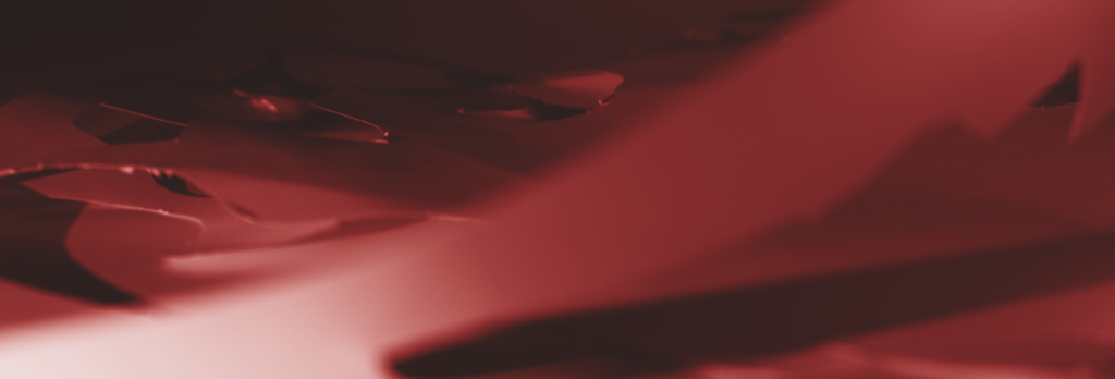
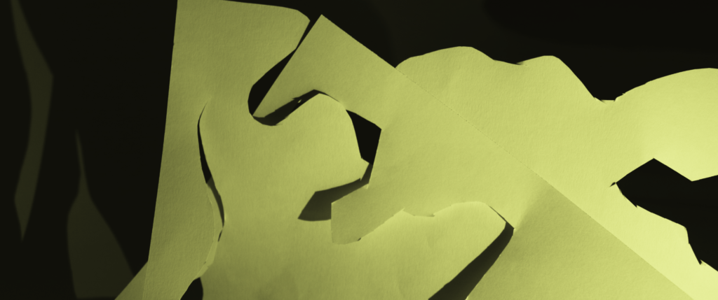
For this paper photoshoot, I tried multiple techniques to add dimension and dark contrasts by using a torch, a bright light, and multiple different coloured lights like blue and red. This all helped to link my work to my artist research as their photos also have that contrast to make the light brighter.
Artist Research
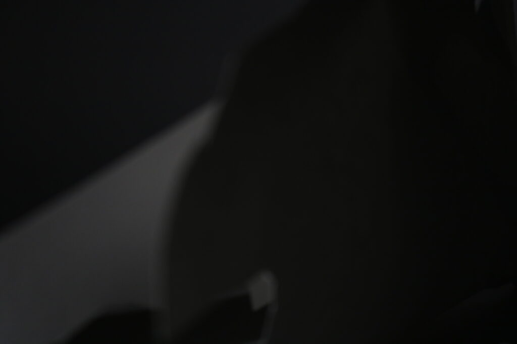
Francis Brugiére
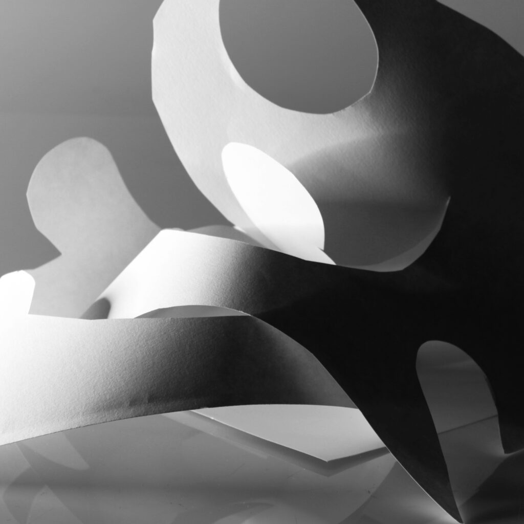
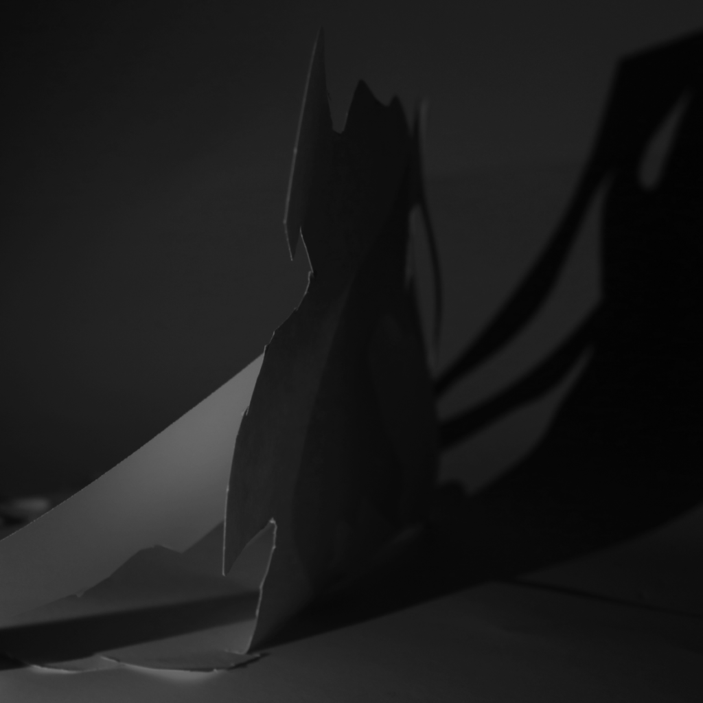
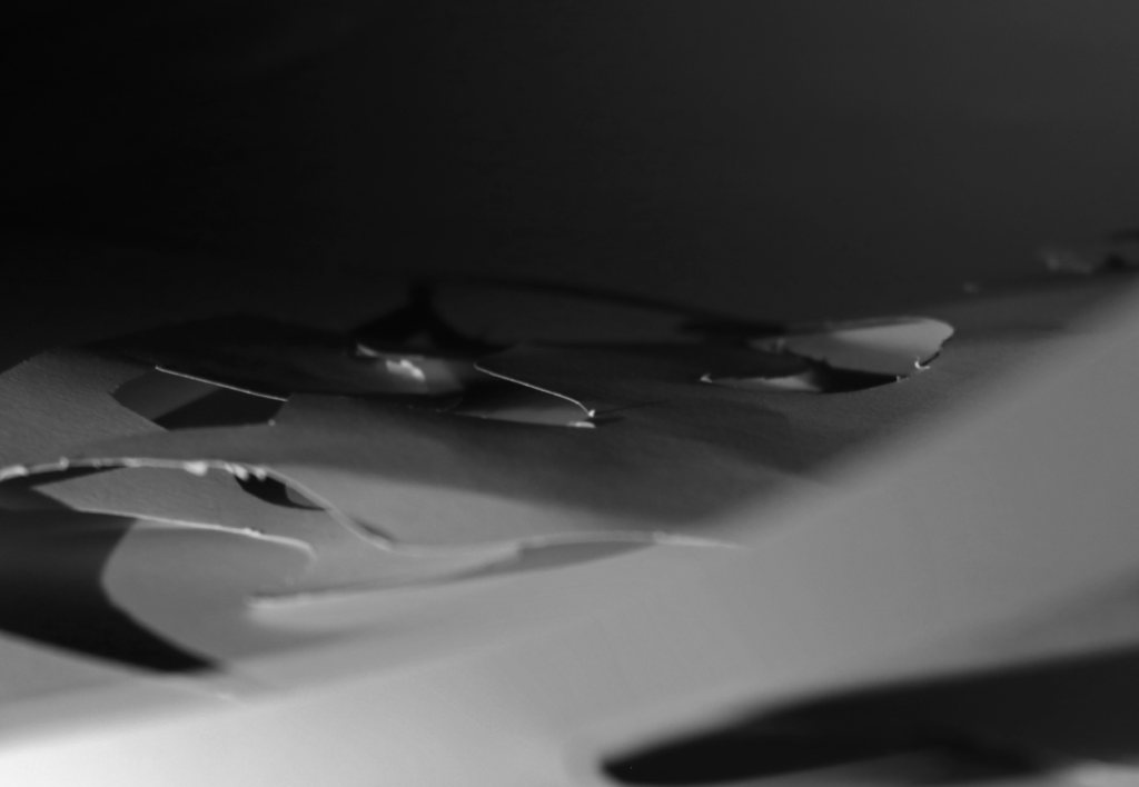
Francis was an American photographer, born in 1879, and died on the 8th of may 1945. He was born in San Francisco, and became a photographer along side also being a painter and a musician. Later in life, Brugiére moved to London to start a new film. His work can be summarised as a plain piece of paper folded and cut to create a unique pattern of interesting shapes and forms. With the use of light, his work is seen to have a contrast of both light and dark pieces featured. The colour is edited to be a monochrome tone, to make the main focus on the contrast and to take away any of the other distractions. The use of line is highlighted in his images as the paper creates various lines heading in all sorts of directions, which creates a detailed effect. Lastly, Francis uses a zoomed in camera technique to capture the curves of the paper without including the background of the images. By not including this, it helps present the work as a sole focus on the paper design and no other distractions.
Photoshoot plan
In order to do this, I will use a dim-lit room where I will be able to take images using a bright torch to show the contrast of light. I will also need to cut up some paper to create the same effect Brugiére does as his paper is full of various shapes and patterns to create a unique look. I will also make sure to have a backdrop so nothing in the background will be seen when taking these images.
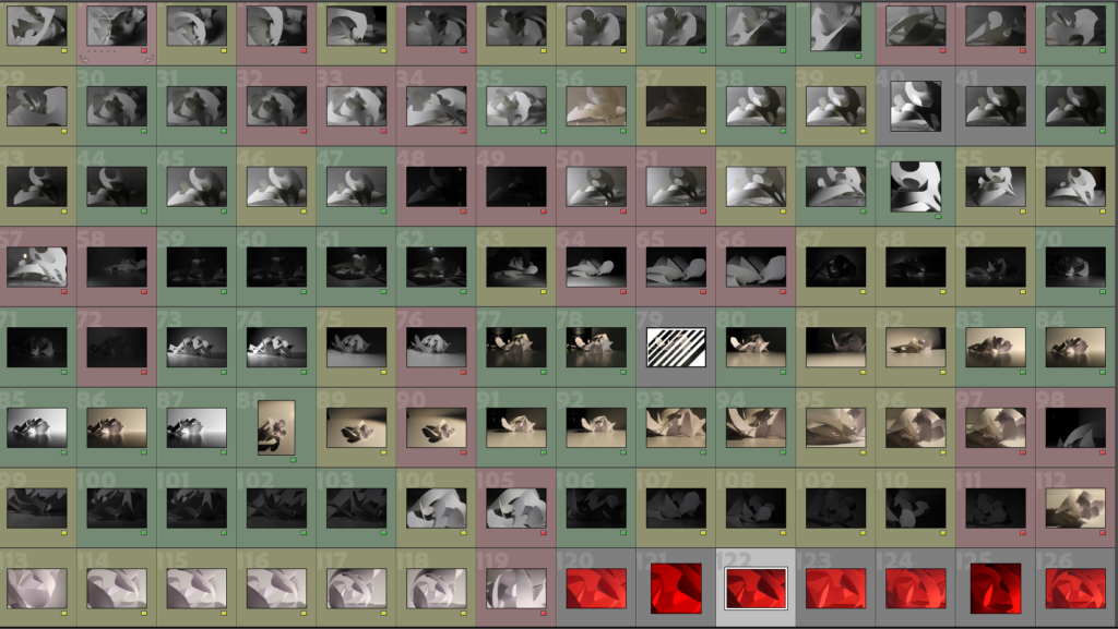
Contact Sheet
My Best Photos
For my best photos, I uploaded my images onto Lightroom and colour coded the ones I thought were the best (green), the ones that were okay (yellow) and the ones I wouldn’t use (red). As you can see, there ended up being a wide variety of images with different colour codes. This makes it easier to figure out which ones I like, and which ones I don’t so I can edit the good ones on photoshop.
Reflection on the photoshoots:
Overall, I think these photoshoots were a great way to experiment and discover which lightings were the best, and which images accurately matched the artist research’s work. Although, I took multiple photoshoots as some of the images turned out blurry the first time since the camera movement was shaky, making the image also look shaky. The use of the different coloured lighting made the vibe of the image completely different, as the bright white light made the images look neat, whereas the red lighting made the images look dark.
Editing
I demonstrated 3 different ways to edit these images, as there are various ways to upgrade your images to enable them to look the best they can be. My first edit is black and white, my second edit is different ways of cropping, and my third way is slicing the image.
Edit 1 – Black and white
The first technique I decided to try was making all the images monochrome, to match the artist research. Like the artist, I ensured the white areas were bright when I adjusted the levels of the image, and I made sure the dark areas were pitch black. I like this editing style as it showcases the contrast very well, and it creates a neat overall look to the three images.
Edit 2 – Cropping
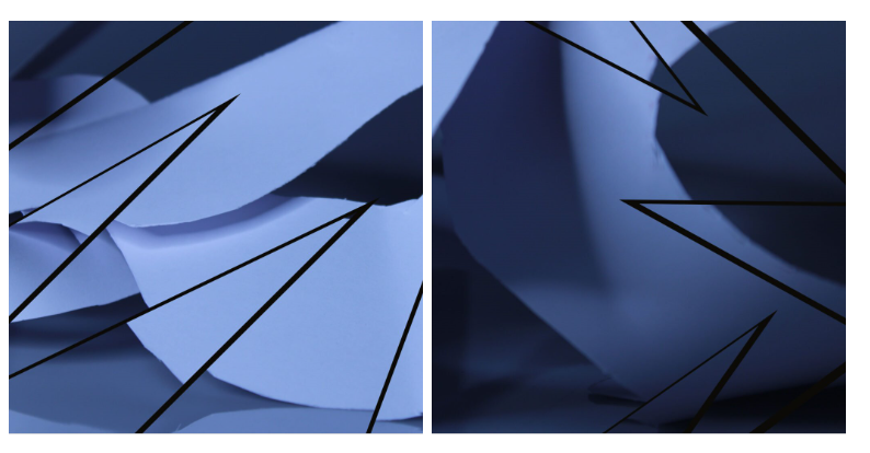
For my second edit, I decided to make a collection of different ways of cropping my images to present the most interesting section of them. I like this edit as it presents different forms of the images I took, to capture the different textures of the paper. The element of leading lines is strongly shown in these images as they guide your eyes from one side of the image to the other side.
Edit 3 – Slice
My last edit is slicing the image. I like these two examples of this technique, as they add a distraction to the image and they make the focal point based around the slices. Additionally, it adds an element of negative space as the focus is on the black lines, making the other sides of the image more toned down and muted.
Final Images
My final image is the first edit I created, as I feel as though it aligned with Brugiére’s work the best. On top of this, I also chose it as I feel like simple is better, as it doesn’t look crowded and chaotic.
Art Gallery
I uploaded my images into the art gallery where I was able to include these three images in a neat order. I like these three images as they represent contrast between light and dark very well, as you can the areas where the light was shining and where it was not. I also like the texture it shows as they have unique shapes in each image, but they still overall give the same vibe of contrast and texture.
Evaluation
Overall, I think I implemented Brugiére’s work into my own quite well, as typically his work is made from cut up pieces of paper – like mine. His work is more intricate, whereas mine isn’t as much as his is more cut up and set. However, the difference between mine and his work is that my work is more cool toned unlike his where his has more warm tones so to. improve my work, I would edit the colours to be more warm toned.
In photography, texture is the visual quality of the surface of an object, revealed through variances in shape, tone and colour depth. Texture can add vibrance and create intrigue in images which otherwise would be bland and uninspiring – it is also one of the formal elements.
The Formal Elements
The formal elements are characteristics or information displayed in photographs which creates interest in photographs, and including these in your work typically increases quality and leads to production of better images overall. These are as follows:
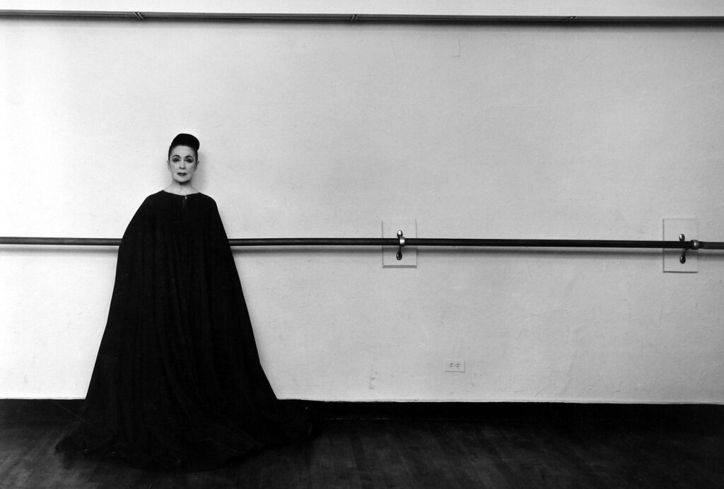
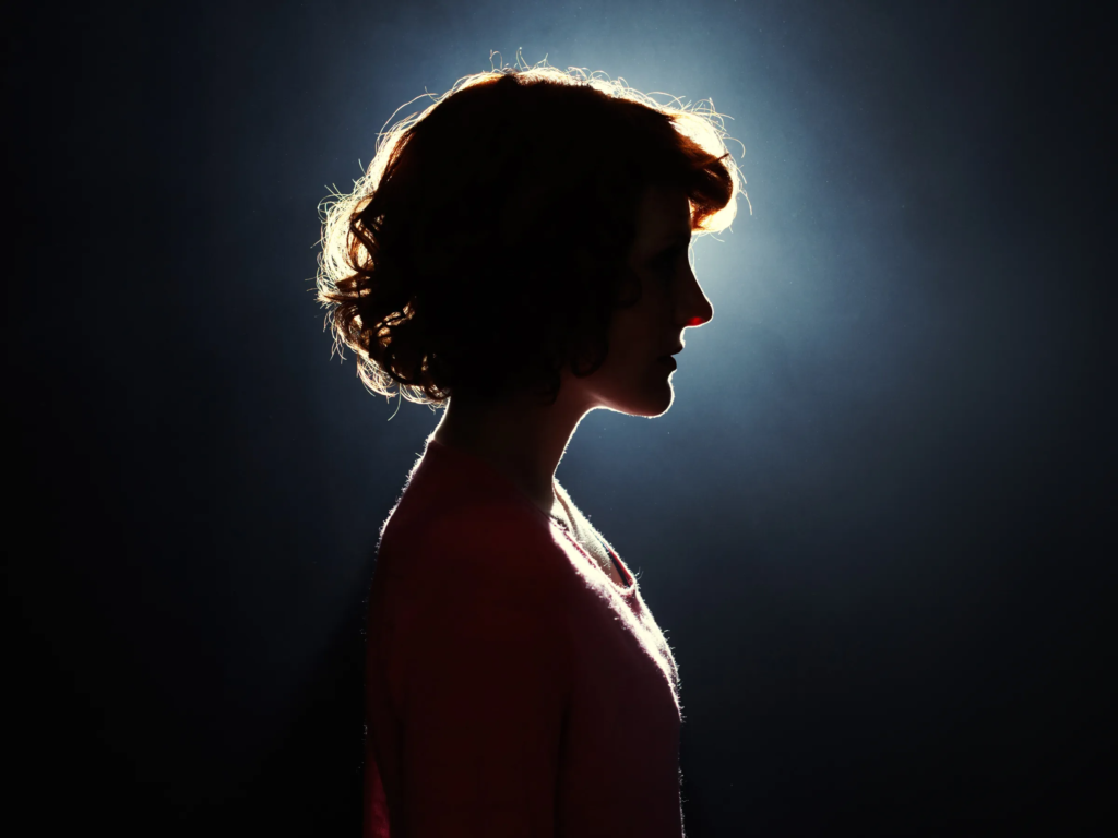
Light: This is used in images to highlight certain areas of an image to create a sense of importance on certain aspects, whereas a lack of light can be used creatively to create intrigue in photos. Whether or not the light is natural or artificial can also be used to show clear artistic intent in images.
Light example – in this image, the light source is out of view from behind the woman which consequently displays her whole face in darkness, creating a sense of mystery and intrigue
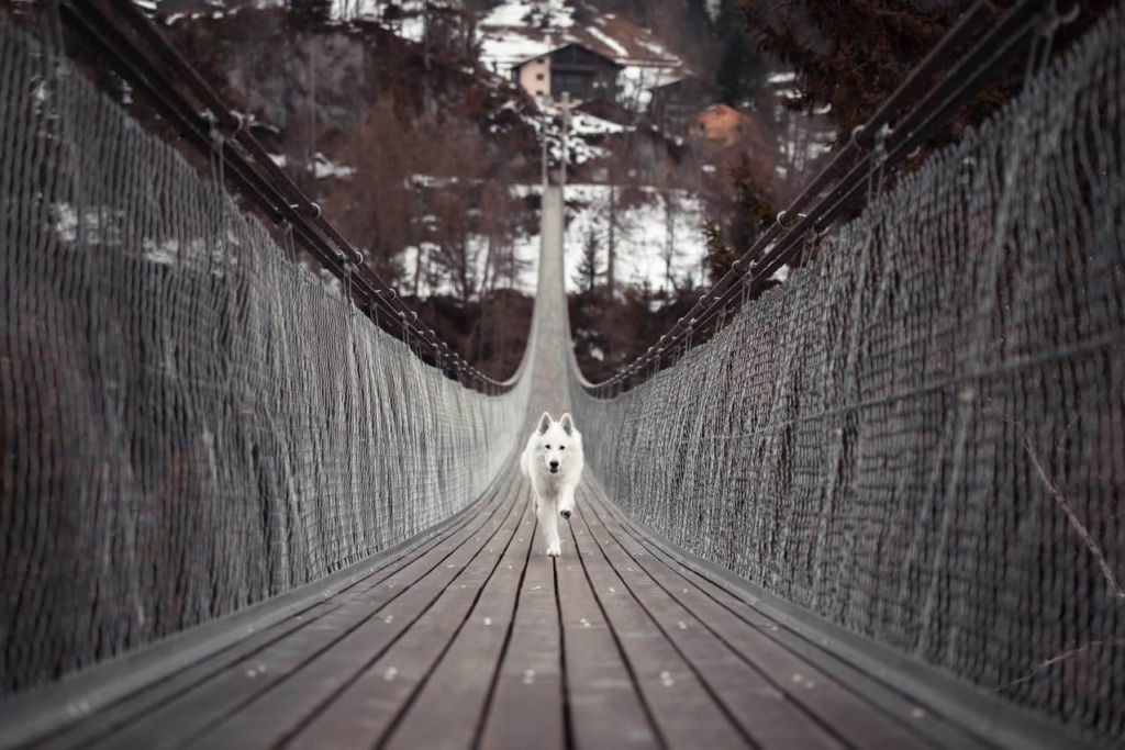
Line: Objects or parts of an image that act as lines can create direction in a photograph to highlight certain areas, or they can be used to outline and highlight important parts as well as showing movement or energy.
Line example – in this image, the lines of the bridge all lead the viewer’s focus towards the dog, highlighting its importance as the subject of the image
Repetition: Objects, shapes or lines in a photo can be repeated to create rhythms or patterns in an image.
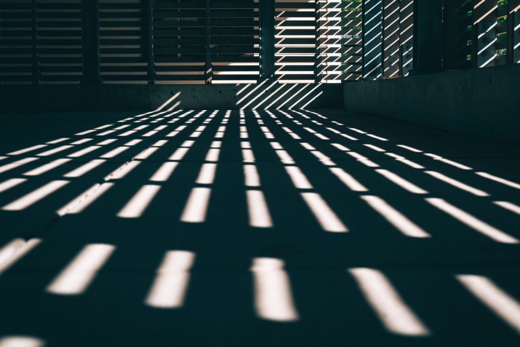
Repetition example – in this image, the repeating patterns of light along the floor and walls create a consistent rhythm throughout the image which build on atmosphere
Shape: Geometric or organic shapes can be used in an image which will stand out due to being easily identifiable, which can be used in conjunction with repetition to create simple but effective photos.
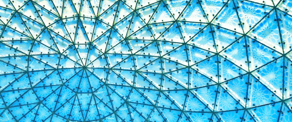
Shape example – in this image, there is very clearly a use of geometric shapes (triangles) alongside repetition to create a simple yet intriguing photograph
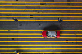
Space: Negative (empty) space can be used alongside positive (full) space to add depth to a photograph or make it more shallow, which could be used to highlight objects in the foreground or background.
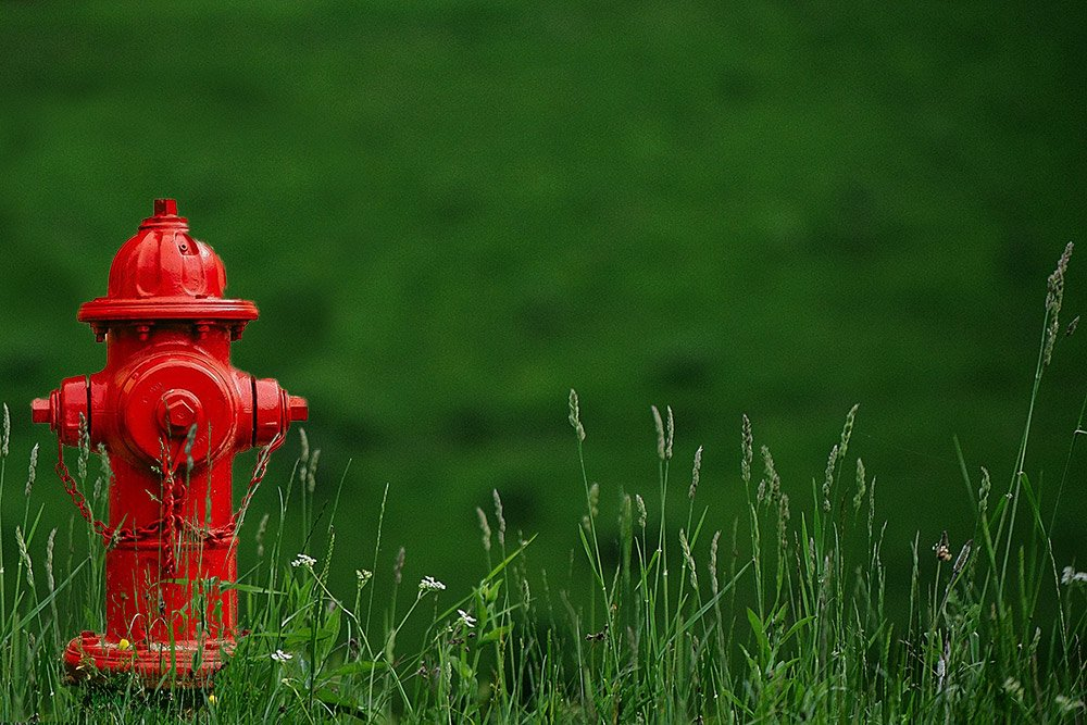
Space example – in this image, the use of negative space in the background combined with a low aperture very clearly highlights the fire hydrant as the subject in this photograph and adds a sense of importance as well as intrigue as to why it is considered to important
Tone: A range of tones (light to black) can be used similarly to light to highlight parts of an image as well as affecting the mood or atmosphere as an image; for example, darker tones create a dull mood which when intentional can be used to capture a strong effect in photographs.
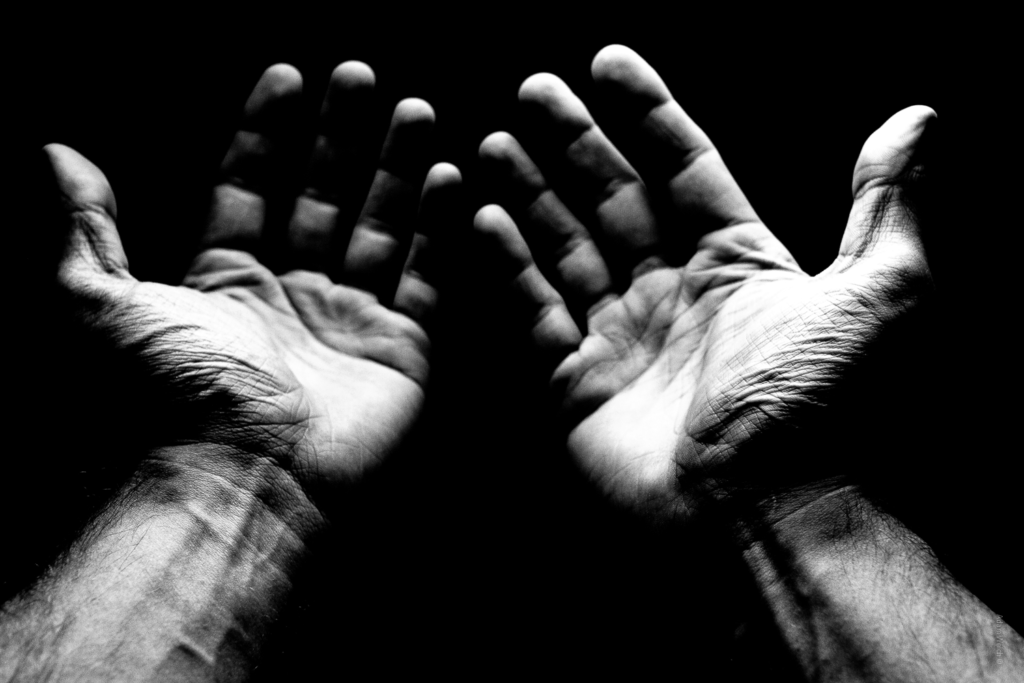
Tone example – in this image, the dark tones highlight the importance of the hands and the light tones clearly showing the wrinkles and texture of the hands imply that whoever this is has been through struggles/hard work
Colour: Colours can be used to add life to images and create vibrant moods, and can also be used to highlight certain aspects due to some colours being more dominant than others.
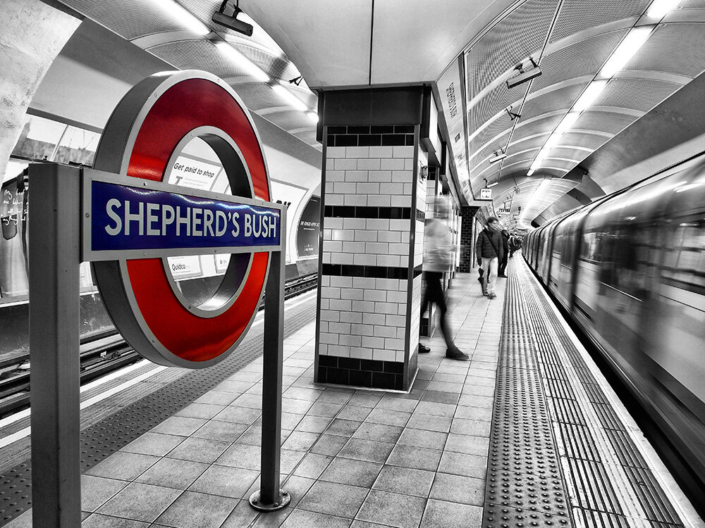
Colour example – in this image, the dull atmosphere created by the black and white surroundings and out of focus trains and people is contrasted by the vibrant colours of the sign which clearly stands out
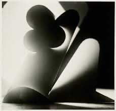
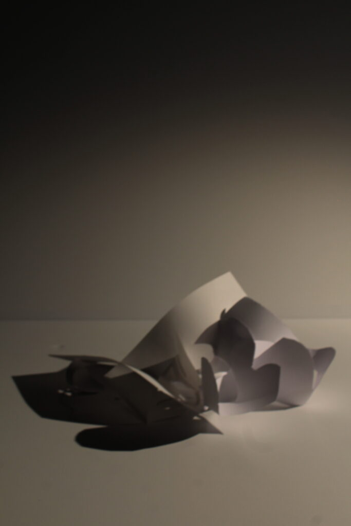
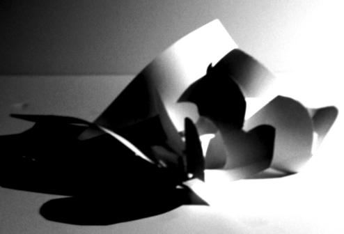
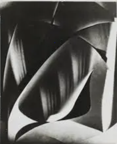
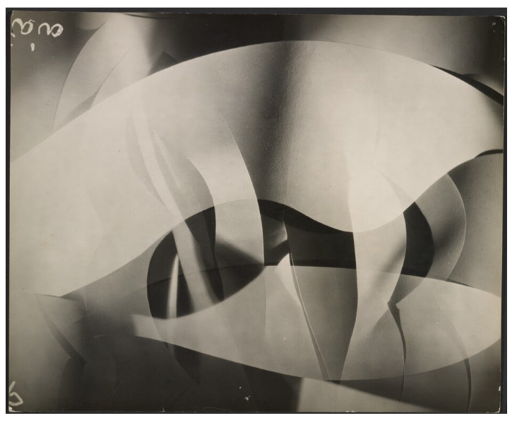
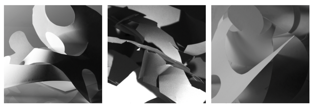
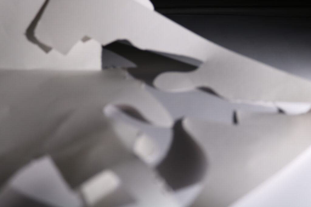
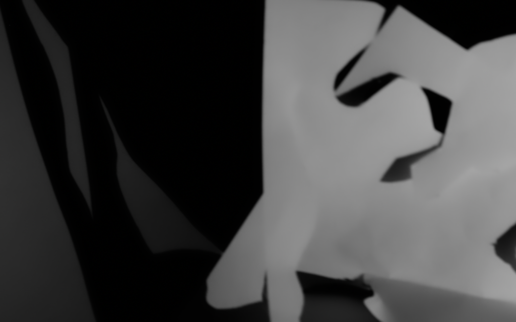
Photographer Research – Francis Bruguière
Francis Bruguière (15 October 1879 – 8 May 1945) was an American photographer who experimented with multiple-exposure, solarization, original processes, abstracts, photograms, and the response of commercially available film to light of various wavelengths. Some of his most famous photos are experimenting with light and the texture of paper to manipulate the image into being abstract.
Above are two of Bruguière’s images which I find to be effective. He has created shapes with paper and experimented with different levels/angles of light onto the paper to explore how it will affect the presentation of the images in terms of its texture – these images also make very effective use of the formal elements, for example there is a wide variety of dark and light tones which blend together nicely alongside the low aperture softening the focus on the background to create an abstract effect as well as a sense of intrigue to the image. Furthermore, there is clear use of lines but they are slightly out of focus and instead of directing focus or highlighting certain regions of the image they are present all over the image whilst simultaneously not being overused which helps strengthen the abstract effect further as everything mixes together smoothly to make it hard to pinpoint one clear subject in both of these photographs.
Photoshoot Plan:
I decided to focus my photoshoot on the texture of paper, taking inspiration from Bruguière’s work to try and create paper shapes and using the lighting of the photography studio to explore how manipulating the light will affect the quality as well as the degree of abstraction in the image produced. I also wanted to try include aspects of the formal elements into my images to try and produce more effective and fascinating final images.
Post-Photoshoot Refining and Selecting
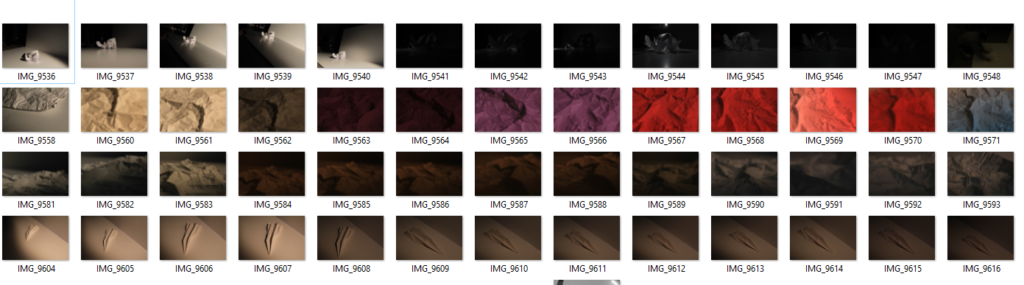
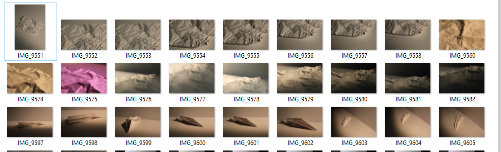
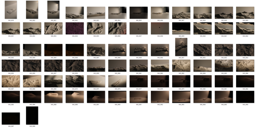
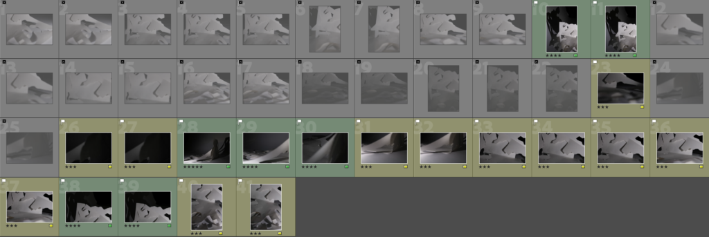
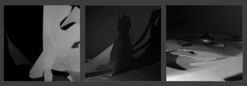
My paper texture photoshoot contact sheet
After the photoshoot, I imported my images into Adobe Lightroom so I could begin my review and selection process to identify poor photos (flagged as X), good photos with improvements to be made (yellow and 3 stars) and photos which I found were most effective and wanted to edit and refine for my final piece (green, 4 or 5 stars).
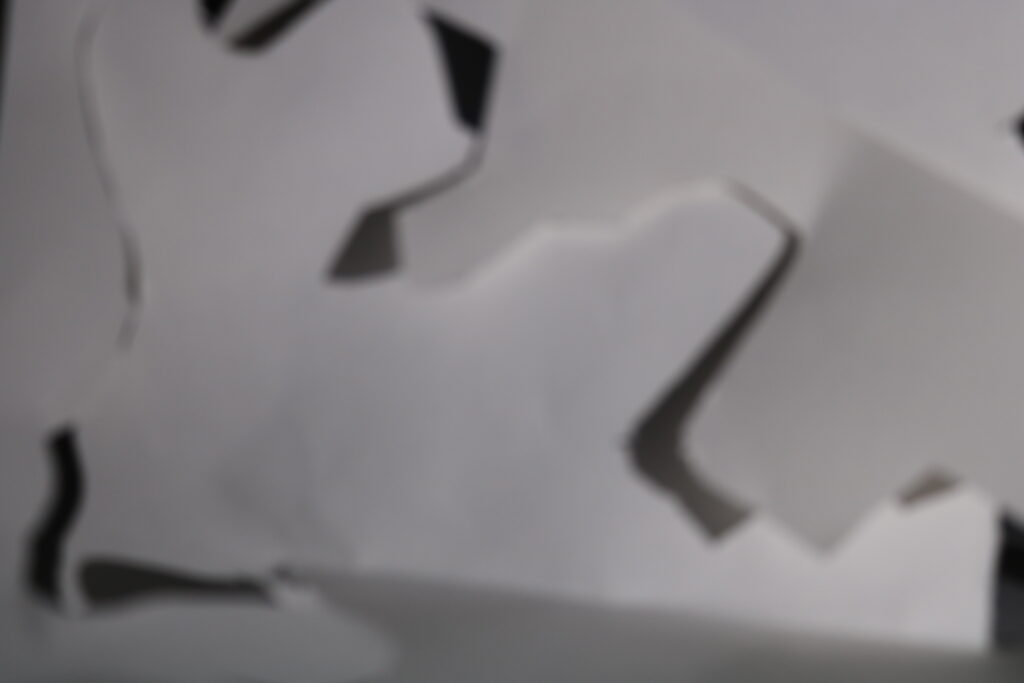
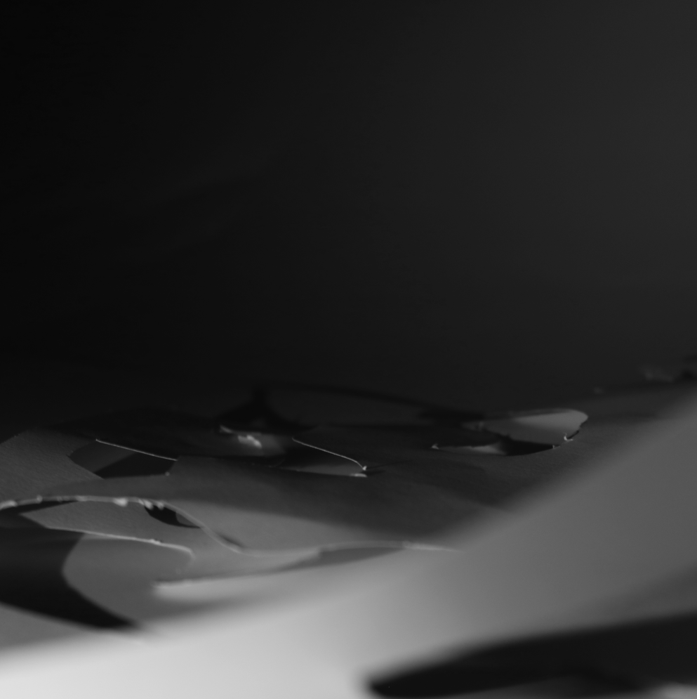
Above are 3 images I found weren’t effective and flagged as X. I feel these photos aren’t great since I didn’t properly adjust aperture the way I planned to in order to highlight texture, and it turned out to be out of focus too – furthermore, I feel these don’t use the formal elements effectively since for example the texture which was my main focus of this photoshoot hasn’t been shown clearly and the lines of the paper don’t highlight some regions and instead are just present without really contributing to the mood these images are trying to build.
Above are 3 images I found were improvements compared to others, but at the same time weren’t my best images – after experimenting with settings and identifying weaknesses in previous photos, I adjusted settings further and found that it was producing more of the effect I wanted it to (the 3 photos above were all taken at ISO 200, f/stop 4 and shutter speed 1/20 sec) and also managed to capture these images more in focus which improves the overall quality. I also found the formal elements were being displayed more clearly here, since in the first and last image displayed I used a light from a phone to manipulate the shadows and dark tones into highlighting the texture and in the middle image I experimented more with lighting to try and achieve an abstract effect and although it was semi-successful I found it to be too underexposed and out of focus to use it as one of my final best images.
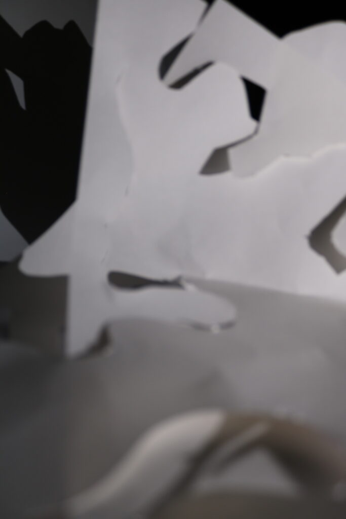
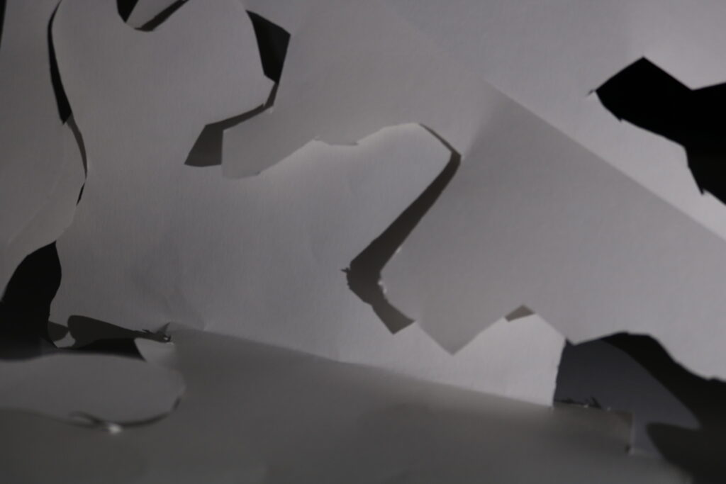
Above are 3 images I found to be some of my most effective and selected to edit and present in my final piece. By this point I had done lots of experimenting with the settings and lighting so I was able to capture these images exactly how I wanted to in my pre-photoshoot plan, and also captured them in focus (except for the middle one which has some intentional line blurring to highlight texture in the background). I believe these images are ones that use the formal elements most effectively out of all my images.
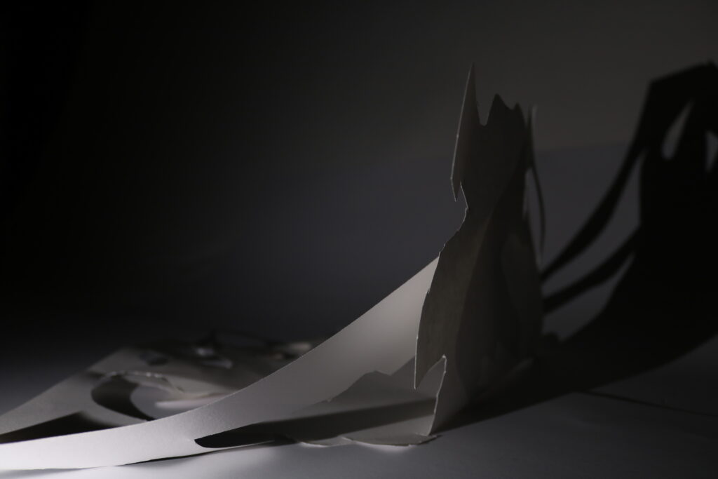
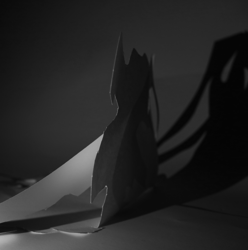
In the first image, I decided to use my phone light rather than the studio light after some experimentation to cast a shadow of the paper onto the wall as well as using this light to highlight the texture of the paper itself, and I also captured the paper in a way where it acts as a leading line to the part of paper sticking up which acts as the subject of the photograph due to most of the photograph being 2D and flat whereas this aspect of it is sideways to show dimension and depth. In editing I will crop the image to focus more on the right half since that’s where the subject and main focus of the photo is as well as adjusting shadows and brightness to explore the effect this will have on the lighting and texture.
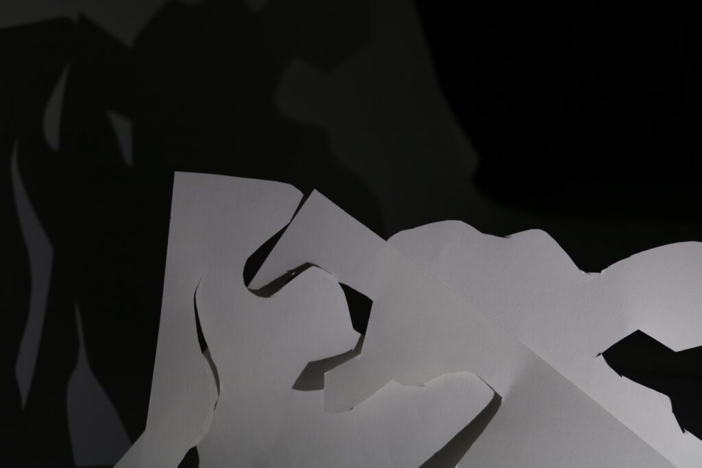
In the second image, I used a line of paper in the foreground but also intentionally captured it out of focus so the main subject of the image is still on the texture of paper in the background, which stands out due to me positioning the lighting in a certain way to clearly highlight it. In editing I will crop the image to focus further on the texture as well as experimenting with gradient overlays and contrast to see what effect this will have on my photo and the intention behind it.
In the third image, I aimed to focus more on capturing the formal element of lighting effectively by positioning my artificial lights and paper in a way where there would be a range of light and dark tones due to the projection of the paper’s shadow. I also found there was effective display of texture on the paper as well as lines from the bottom right towards the top left which lead to the shadow, clearly contrasting the dark and light tones. In editing I will experiment with cropping, because even though I like the raw photo as presented above I want to see if manipulation of the image in terms of cropping and composition will strengthen the atmosphere created by the other formal elements.
Image Editing and Manipulation
Below is the first set of my edited images after experimenting:
In Photoshop, I have cropped this image to a 1×1 (square) resolution focused on the right half of the image which I find effective as it focuses more on the tonal differences between the paper texture in light and the one in darkness – it also contains a lot of negative space with soft focus which helps further highlight the focus of the image on the texture of the paper as well as the clear contrast between light tones on the left and darker tones on the right.I once again cropped this image to a square resolution, although I think it is significantly less effective in this particular photo since there is a clear excess of negative space with too much focus on dark tones rather than contrasting the two whilst keeping texture as the main subject. Furthermore, I also found adjusting the brightness and contrast as well as making it black and white still didn’t help create more of a focus on the texture so for my next edits I will try crop this in a different manner as well as manipulate the image to create more of a balance between the texture and tones.I found that the square cropping works particularly well for this image since it creates an effective composition with light tones on one side and the darker tones of the shadows being projected onto the other. It also helps maintain the balance between focusing on the contrast of these tones as well as the texture since the intentional blurring on the texture is more noticeable which means the image has no real subject which helps with the abstract effect (although you can still clearly identify it is paper, so I will try crop it in different ways to try and better achieve this effect).
After this, I decided to manipulate my images taking an alternative approach with gradients to see what effect it would have on the photos, the formal elements as well as the ideas behind each photo.
Below is my second set of edited images:
This time, I tried cropping the image manually without a set resolution to experiment and tried focusing more on the left half of the image whilst cropping out the projection of the shadow. I found this strengthens the balance between light tones and dark tones, since they are clearly contrasting and work well with the line which leads the eye from the light to the dark – however, I also think there is excessive negative space on the top left corner which is distracting and weakens the intention behind the image as well as weakening the strength of the composition (unlike my previous edit, which created very effective composition).I also experimented with a light blue gradient overlay to see how it would affect my image, and although it works well with contrasting the dark and light tones it hurts the effectiveness of texture since the blue makes it harder to see, consequently damaging the effectiveness of the formal elements overall.Similarly to the previous image, I cropped this manually and focused on more of a horizontal cropping since an issue I found before is the excessive negative space in the top left of the image which has now been removed – I found this has slightly improved the composition as there is still traces of negative space slightly out of focus which highlight the texture of the paper on the left, although the red gradient has also made it harder to frame this texture as being of importance in the image. Instead now with this cropping the blurred leading line takes up most of the image, almost being the subject despite that not being my intention so overall I think I should use elements from both the first edit of this image and the second to try and create an effective final product.In contrast to my previous editing of this image, I tried cropping it horizontally (similarly to the image above) to explore how this would affect the composition of the image – I found it was somewhat effective since there is a clear contrast between the darker tones on the left and top right and the lighter tones on the right (also clearly separated with use of lines), as well as still highlighting the texture of the paper with the yellow gradient overlay. I think for my final edit of this image I will try a composition which is a mix of my first and second edit, but keep it in black and white to create a further emphasis on the contrast between tones.
Final Images – Creation
Below is my final set of edited images:
For my final edit of this image, I decided to edit it very similarly to my first edit since I believe this is creates the most effective composition in order to make successful use of the formal elements – firstly, this composition clearly shows a contrasting split in the image where the left half focuses more on light tones and soft texture whereas the right focuses more on 3D space and shadows (emphasised further by me reducing the brightness slightly), as well as leading lines from the paper which lead to the dark-toned shadow being projected in the background. Overall, I am satisfied with the final results of this image since Iachieved some of the goals set in my photoshoot plan such as light manipulation and composition to enhance the formal elements.For my final editing, I cropped to make the composition be a blend of my composition from the first edit and the second edit, having some negative dark toned space to contrast with the light tones but also not having too much. I also found this composition to be more effective since now unlike my second edit most of the image is no longer focused on the out of focus paper lines, which now instead act to divide the lighter tones in the middle which highlight texture and the darker tones under the paper in the bottom right of the image as a result of the lighting I used – furthermore, to make the final presentation of my images consistent, I avoided using a gradient overlay and instead opted to keep the image black and white which consequently also improves contrast between tones. Overall, I found my final edits of this image to significantly strengthen the use of the formal elements since now there is a visible wide range of tones as well as some focus on texture towards the left side of the photo.For the final edits of this image, I first cropped it to split the image into two halves where the left half focuses on dark tones and negative space to contrast with the curved lines and light tones on the right half which I found created a very effective composition. Afterwards, I experimented with importing the image into Lightroom too where I then turned down the presence of texture in order to try focus more on emphasising the other formal elements which I found to be very effective since this also creates an abstract atmosphere to the image due to less creases and texture being present on the paper.Overall, I am satisfied with the final variant of this image as I believe it makes excellent use of formal elements such as space, tones and lines to create an effective image.
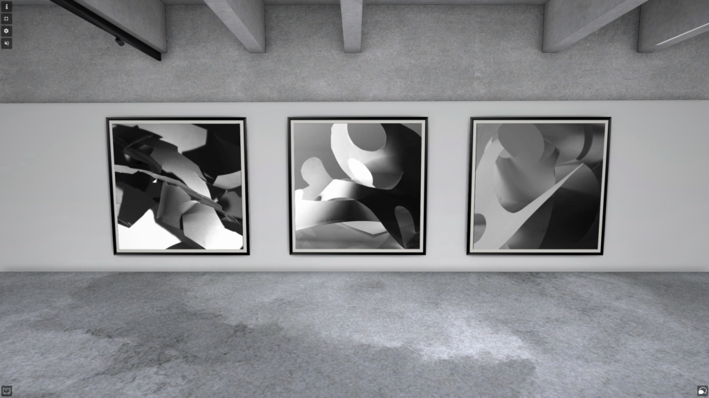
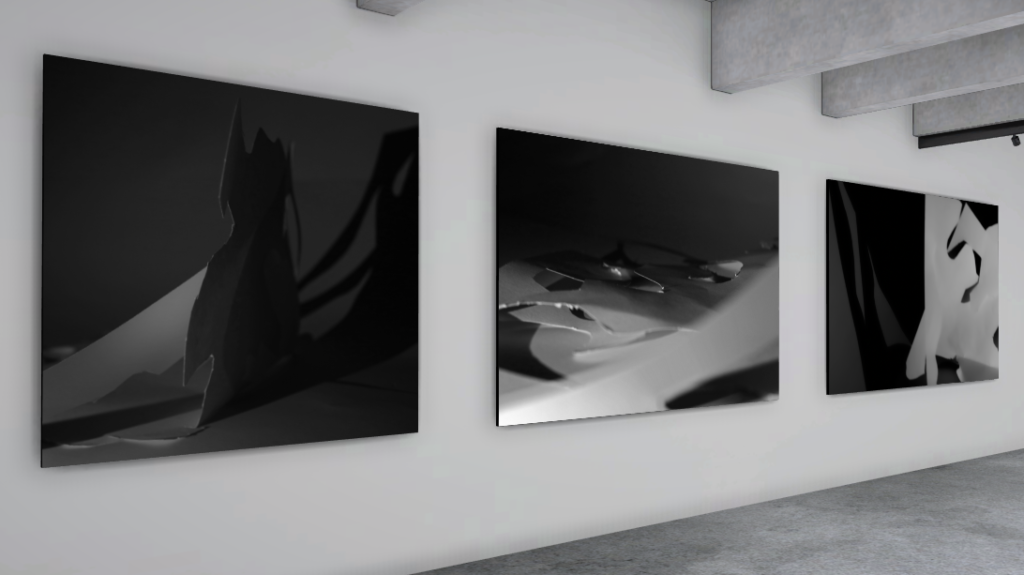
Final Presentation
The presentation of my final images, all cropped in a 1:1 square ratio for uniformity and a clean final presentation. I chose a triptych presentation since this shows all my images evenly and allows the formal elements to be clearly identified in each one.Experimenting with presentation in artsteps.
Evaluation
On the left is a photo from Francis Bruguière and on the right is one of my final images. I think I was able to replicate Bruguière’s use of the formal elements, most notably the visible differences between dark and light tones and subtle lines which create space and contribute to the composition – however, unlike Bruguière, I have used mostly negative space to present my dark tones which means the paper doesn’t fully fill the frame and therefore it does take away from the abstract effect.
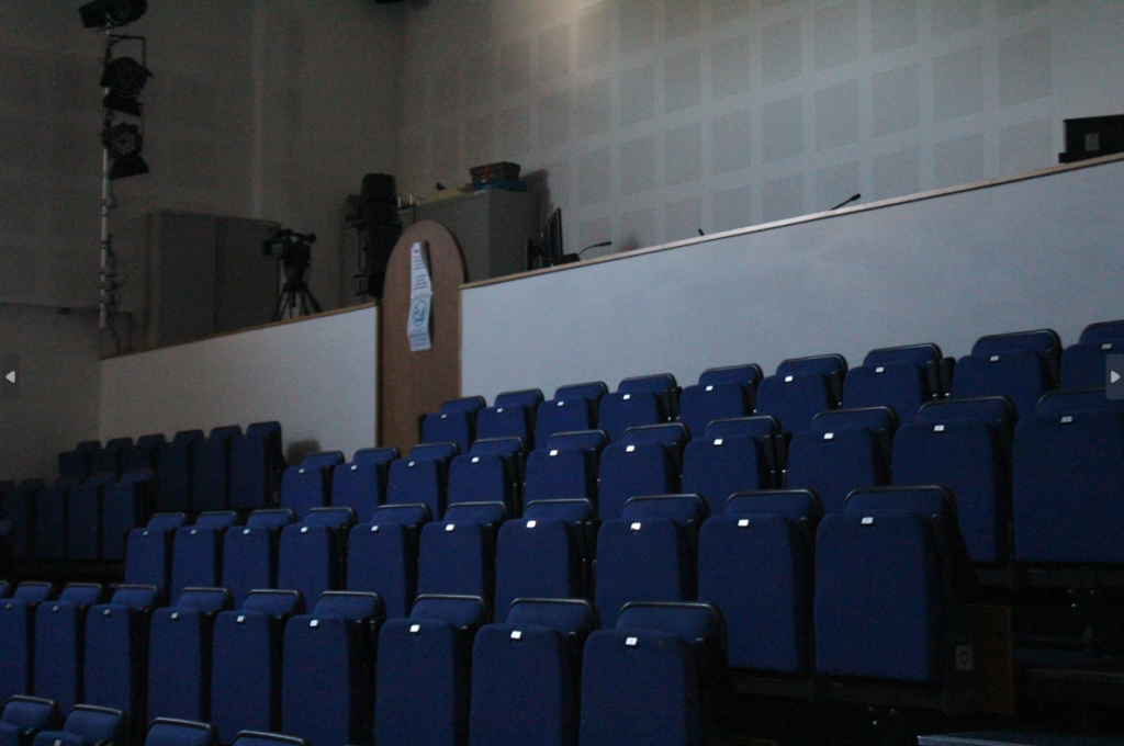
ISO is used to determine how much light is let into your camera, and is useful when trying to make your images look neat. A high ISO is typically used for low lighting, as it can make your image look more clean, but can also make your image look noisy if you aren’t on the correct ISO needed for the image. Whereas, a low ISO is usually used for a light lit image, so it doesn’t look noisy. An image can end up looking noisy if you are using a high ISO when it’s not needed (like if your image doesn’t have low lighting).
In the image above, you can see that the high ISO makes the image look grainy and noisy, which isn’t ideal when you want a clean look for your image. To prevent this, you need to ensure the lighting is good and that you are using the right ISO.
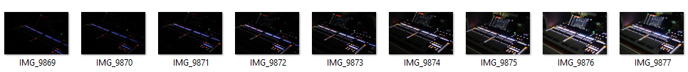
My Contact Sheet
These are the images I took to show the contrast in lighting and the ISO difference by increasing and decreasing the ISO number.
I put the two images above to present a change in ISO and the lighting, so you can see each stage of the process.
I also decided to include this image above as I feel as though it represents the noisy ISO that we are usually trying to avoid in our images. As you can see, the lighting isn’t the best in this image, and the ISO number is on the lower side making the image not look the best it can.