
Next academic year we will explore the theme of ‘UNION’, especially in relation to the unit Personal Study where students develop a personal photographic project. In the past students have derived ideas based on family history and this summer task is developed with that in mind as you may visit near or distant family relatives, which gives you an opportunity to have conversations with members, such as grand parents, uncles/ aunties and siblings etc. These conversations could lead to learning about their past and uncover ‘stories’ you may want to explore as a photography student.
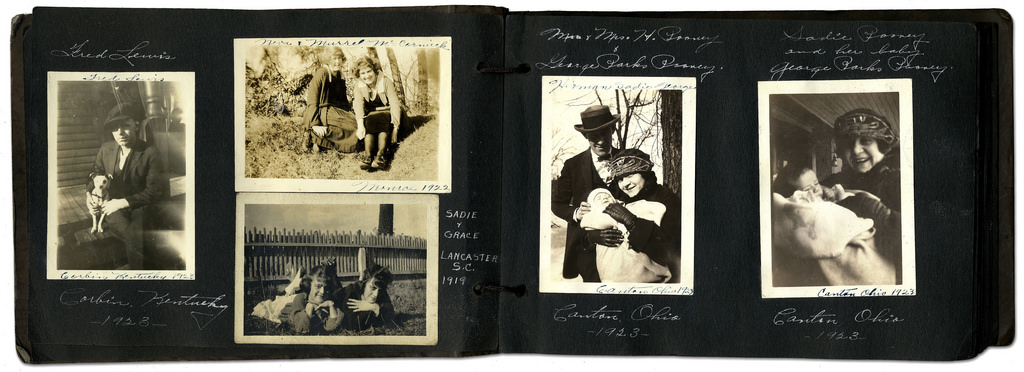
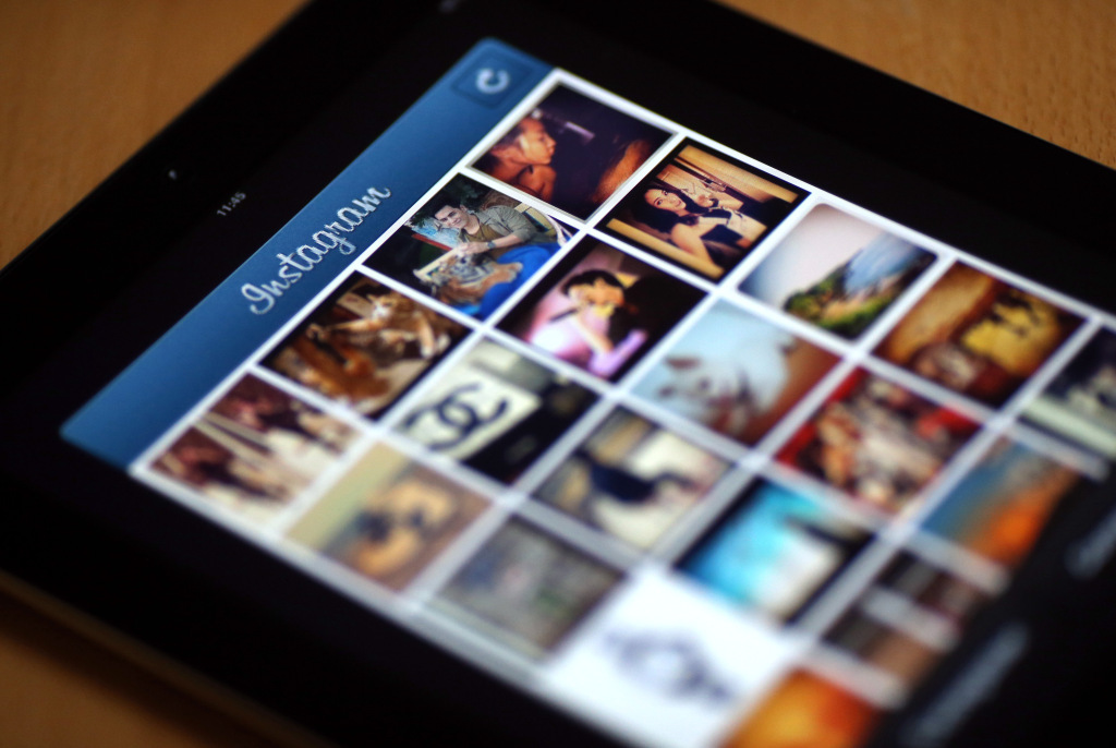
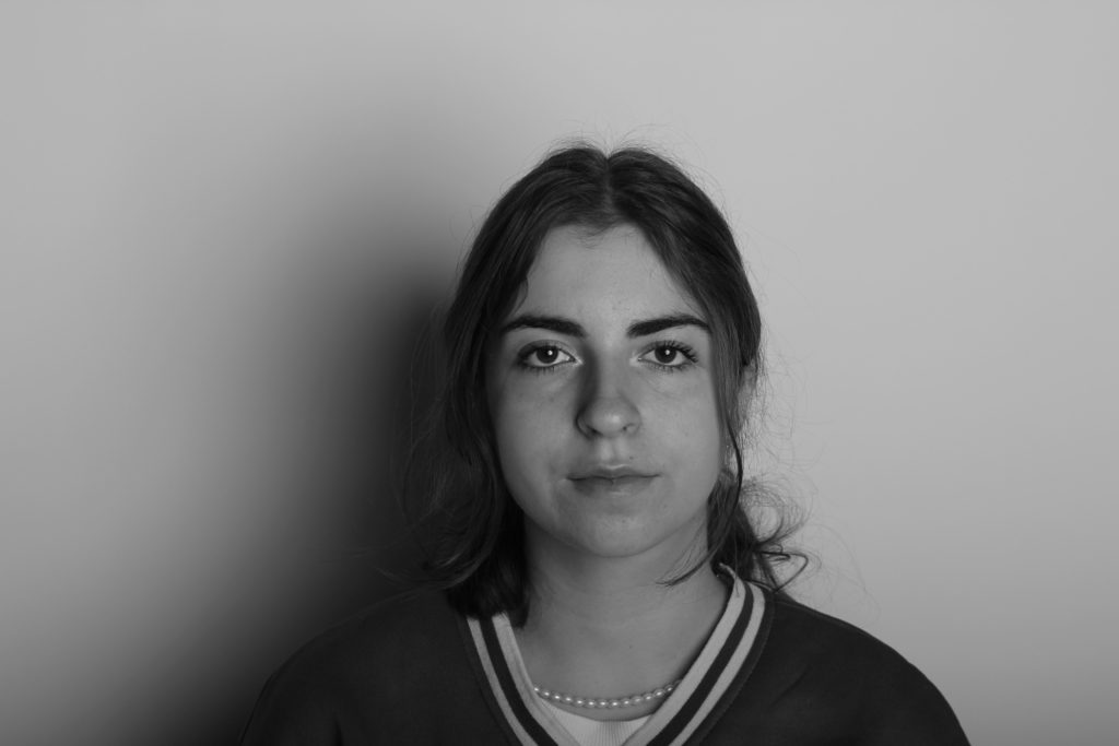
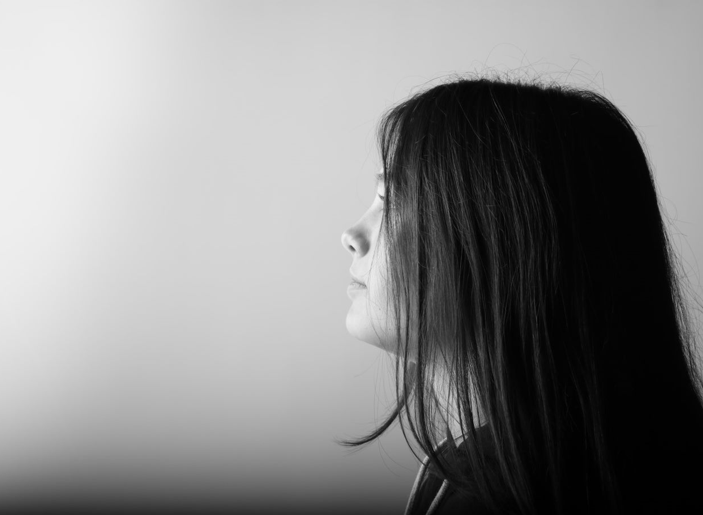
MY FAMILY: Explore your own private archives such as photo-albums, home movies, diaries, letters, birth-certificates, boxes, objects, mobile devices, online/ social media platforms and make a blog post with a selection of material that can be used for further development and experimentation using a variety of re-staging or montage techniques .
Archives can be a rich source for finding starting points on your creative journey. This will strengthen your research and lead towards discoveries about the past that will inform the way you interpret the present and anticipate the future. See more Public/ Private Archives
For example, you can focus on the life on one parent, grand-parent, family relative, or your own childhood and upbringing. Ask other family members (parents, grand-parents, aunties, uncles) if you can look through their photo-albums too etc.
TASKS STEP-BY-STEP GUIDE:
- Either scan or re-photograph archival material so that it is digitised and ready for use on the blog and further experimentation.
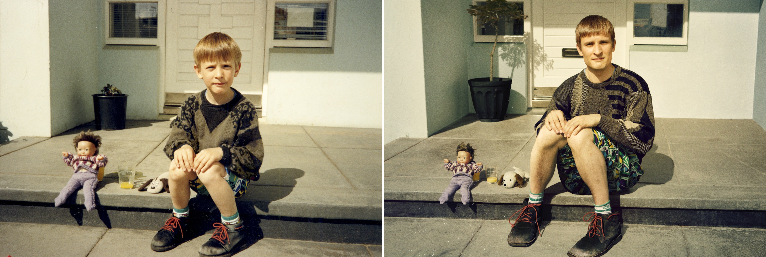
- Plan at least one photo-shoot and make a set of images that respond to your archival research. This can be re-staging old photos or make a similar set of images, eg. portraits of family members and how they have changed over the years, or snapshots of social and family gatherings.
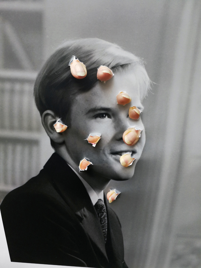
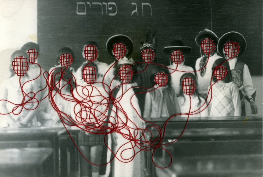
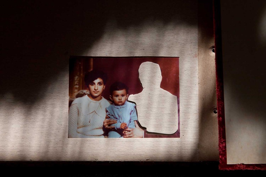
- Choose one of your images which relates to the theme of family (e.g. archive, family album, or new image you have made) and destroy the same image in 5 different ways using both analogue and digital method techniques. Eg. Reprint old and new photos and combine using scissors/ tearing and glue/ tape. In Photoshop use a variety of creative tools to cut and paste fragments of images to create composites.
- Produce appropriate blogposts with both family research, archival material and new photographic responses and experiments.
Extension: Choose a second image and destroy it in 5 new or other ways.
Jonny Briggs: In search of lost parts of my childhood I try to think outside the reality I was socialised into and create new ones with my parents and self. Through these I use photography to explore my relationship with deception, the constructed reality of the family, and question the boundaries between my parents and I, between child/adult, self/other, nature/culture, real/fake in attempt to revive my unconditioned self, beyond the family bubble. Although easily assumed to be photoshopped or faked, upon closer inspection the images are often realised to be more real than first expected. Involving staged installations, the cartoonesque and the performative, I look back to my younger self and attempt to re-capture childhood nature through my assuming adult eyes.


Thomas Sauvin and Kensuke Koike: ‘No More, No Less’
In 2015, French artist Thomas Sauvin acquired an album produced in the early 1980s by an unknown Shanghai University photography student. This volume was given a second life through the expert hands of Kensuke Koike, a Japanese artist based in Venice whose practice combines collage and found photography. The series, “No More, No Less”, born from the encounter between Koike and Sauvin, includes new silver prints made from the album’s original negatives. These prints were then submitted to Koike’s sharp imagination, who, with a simple blade and adhesive tape, deconstructs and reinvents the images. However, these purely manual interventions all respect one single formal rule: nothing is removed, nothing is added, “No More, No Less”. In such a context that blends freedom and constraint, Koike and Sauvin meticulously explore the possibilities of an image only made up of itself.
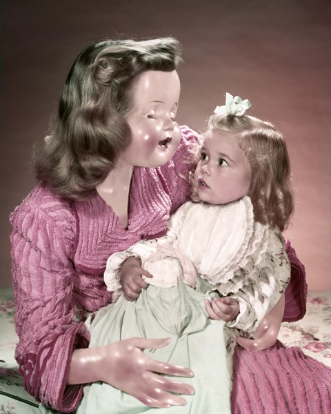

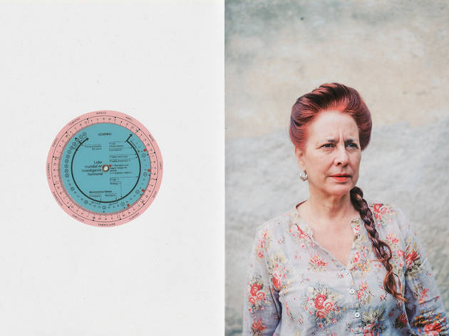
Veronica Gesicka Traces presents a selection of photomontages created by Weronika Gęsicka on the basis of American stock photographs from the 1950s and 1960s. Family scenes, holiday memories, everyday life – all of that suspended somewhere between truth and fiction. The images, modified by Gęsicka in various ways, are wrapped in a new context: our memories of the people and situations are transformed and blur gradually. Humorous as they may seem, Gęsicka’s works are a comment on such fundamental matters as identity, self-consciousness, relationships, imperfection.
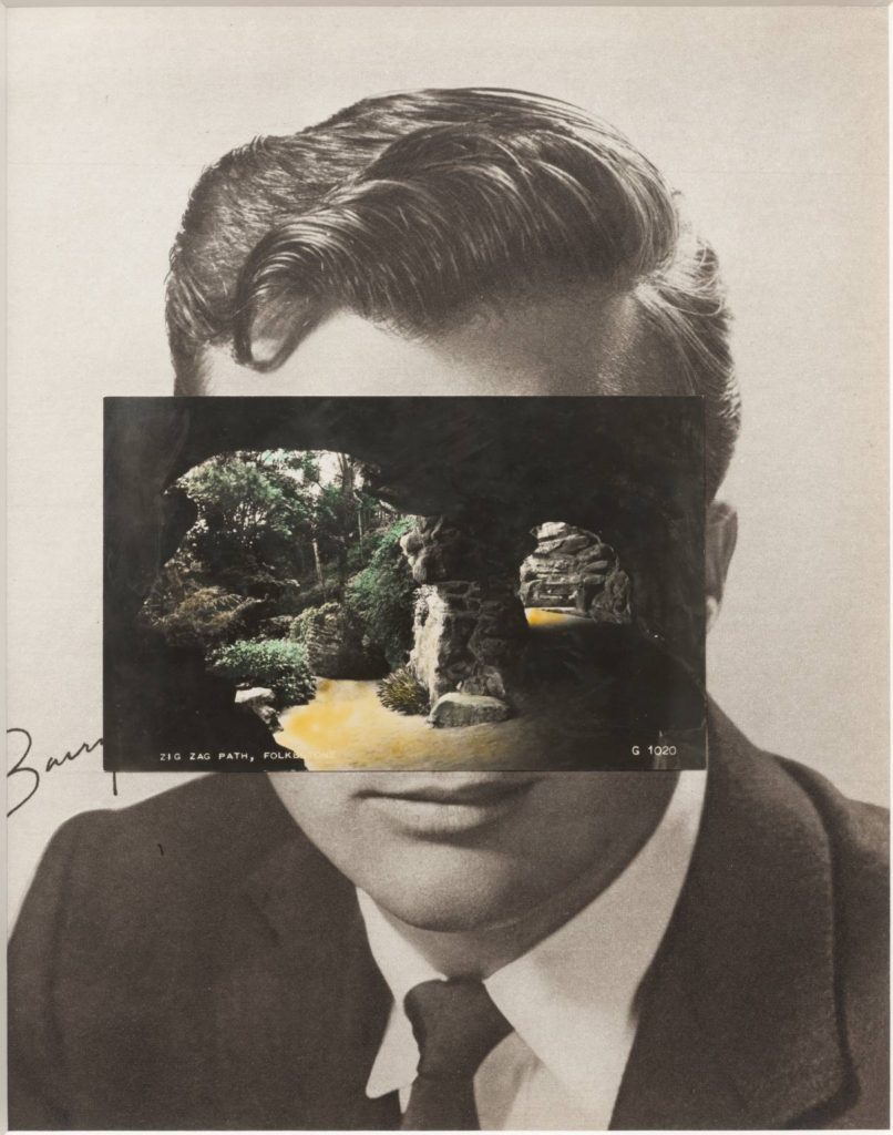
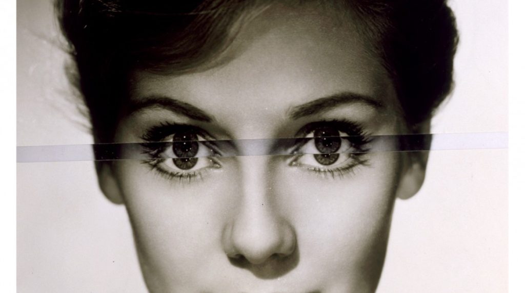
John Stezaker: Is a British artist who is fascinated by the lure of images. Taking classic movie stills, vintage postcards and book illustrations, Stezaker makes collages to give old images a new meaning. By adjusting, inverting and slicing separate pictures together to create unique new works of art, Stezaker explores the subversive force of found images. Stezaker’s famous Mask series fuses the profiles of glamorous sitters with caves, hamlets, or waterfalls, making for images of eerie beauty.
His ‘Dark Star’ series turns publicity portraits into cut-out silhouettes, creating an ambiguous presence in the place of the absent celebrity. Stezaker’s way of giving old images a new context reaches its height in the found images of his Third Person Archive: the artist has removed delicate, haunting figures from the margins of obsolete travel illustrations. Presented as images on their own, they now take the centre stage of our attention
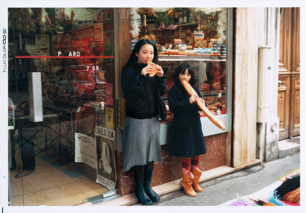
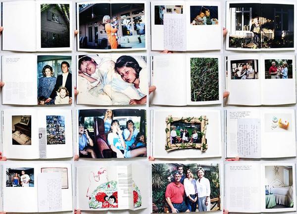
There are different ways artists and photographers have explored their own, or other families in their work as visual storytellers. Some explore family using a documentary approach to storytelling, others construct or stage images that may reflect on their childhood, memories, or significant events drawing inspiration from family archives/ photo albums and often incorporating vernacular images into the narrative and presenting the work as a photobook.
Rita Puig-Serra Costa (Where Mimosa Bloom) vs Laia Abril (The Epilogue)> artists exploring personal issues > vernacular vs archival > inside vs outside
Carole Benitah (Photo Souvenirs) vs Diane Markosian (Inventing My Father) > family > identity > memory > absence > trauma
Ugne Henriko (Mother and Daughter) vs Irina Werning or Chino Otsuka > re-staging images > re-enacting memories
Read article in The Guardian