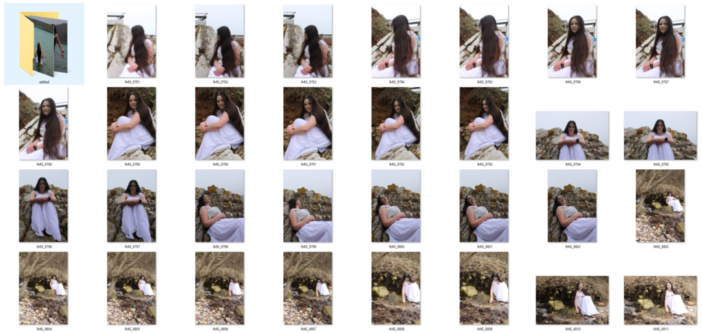
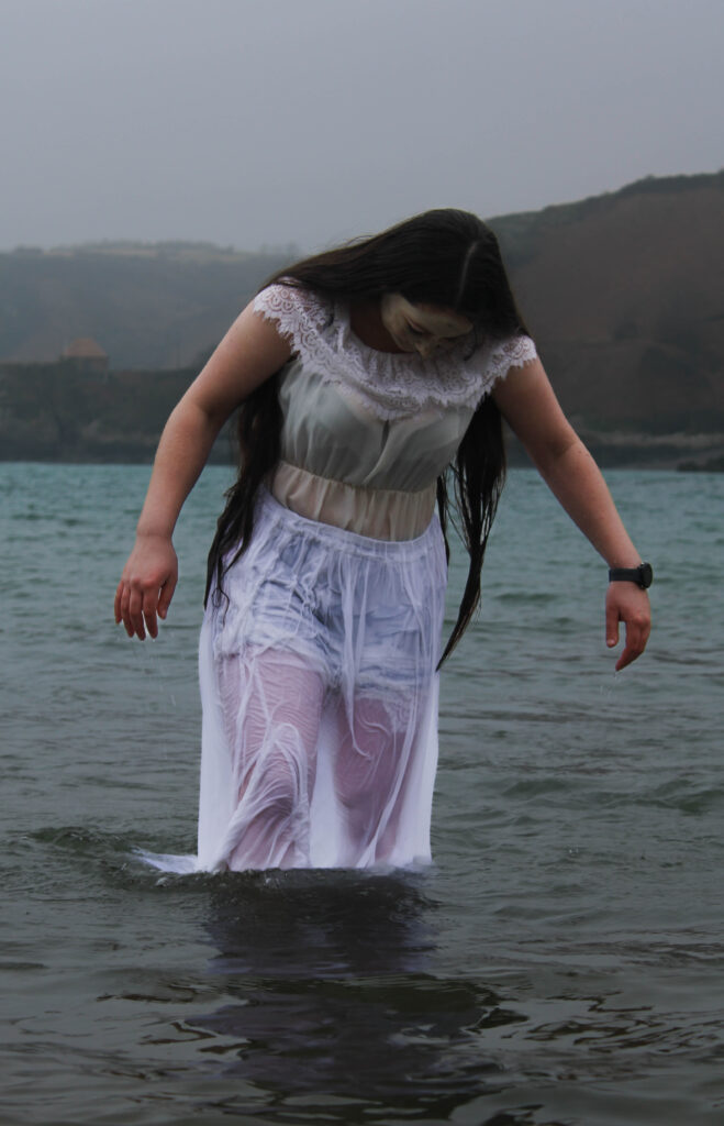
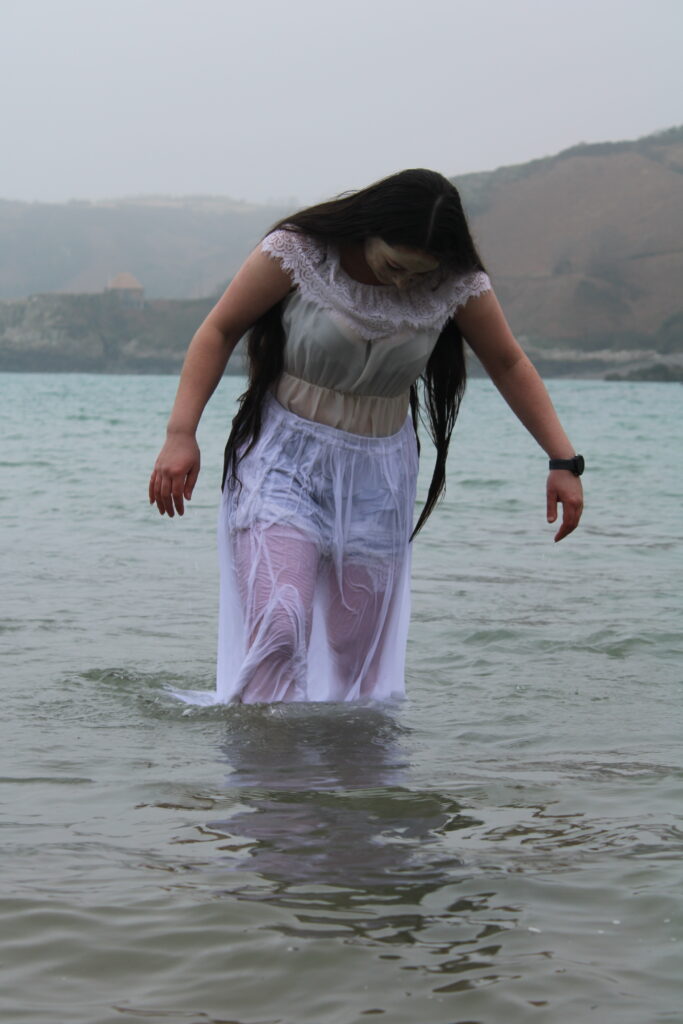
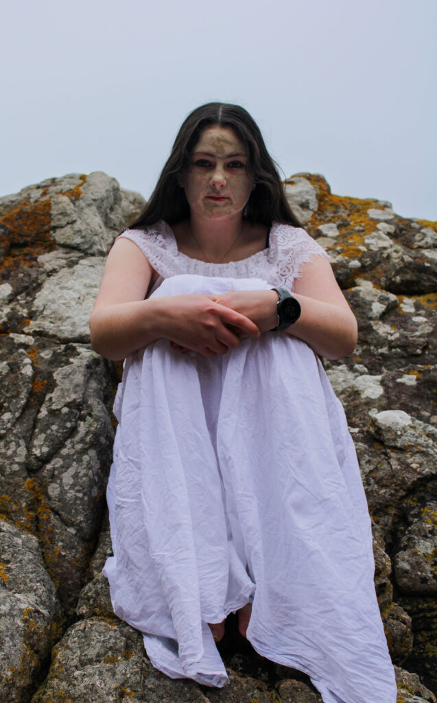
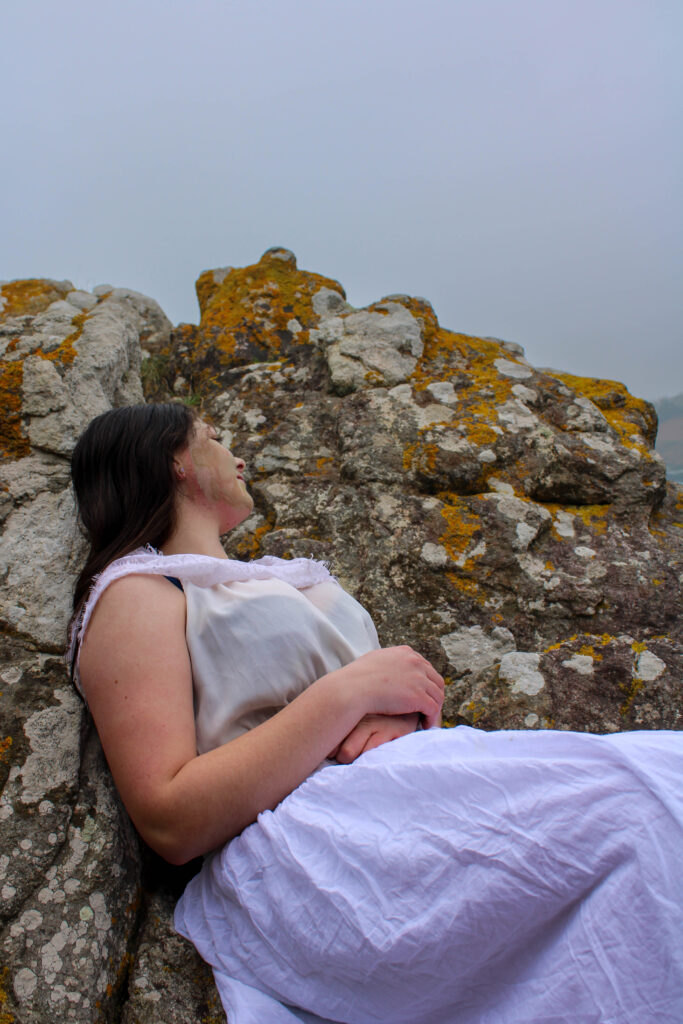
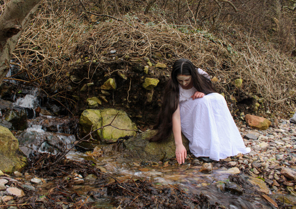
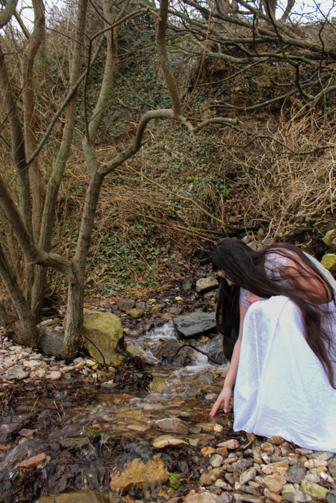
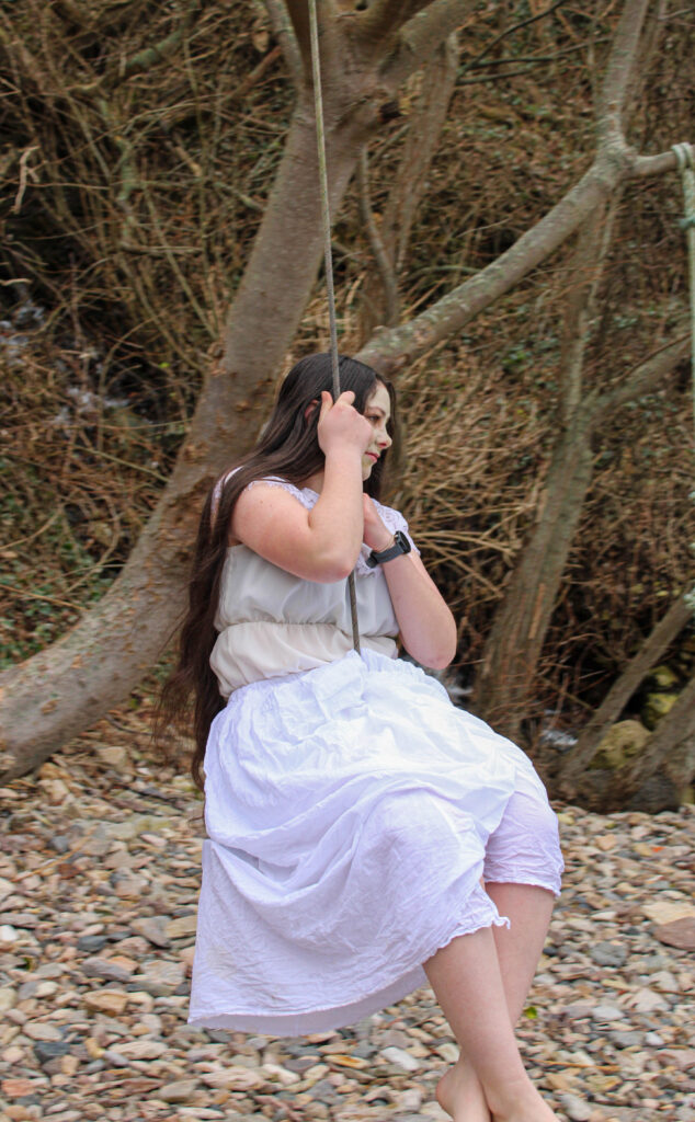
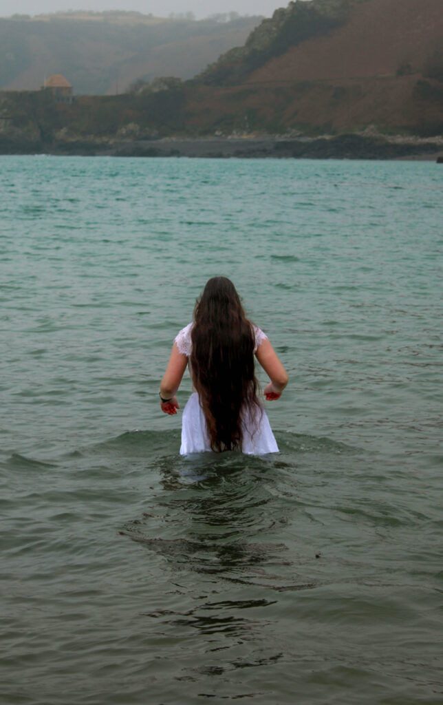
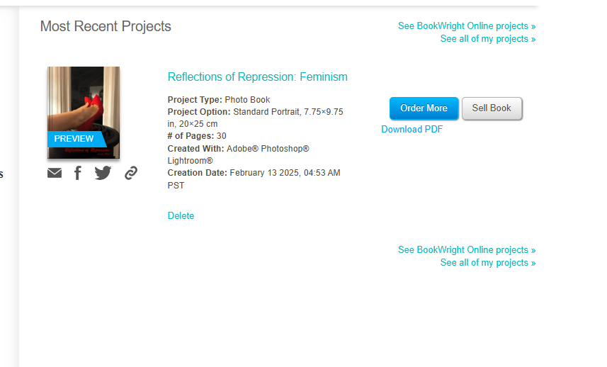
For this photoshoot I went to Bon Qui this is because this location contains many different sections within it. This means I am able to go to the woodland area, rocky area and then the sea and have everything look more cohesive as variables like lighting will be the same due to the fact the photos will be taken within a short time frame. Similarly to my other photoshoots i will be using the Aztec face mask to create the cracking effect on my models face.
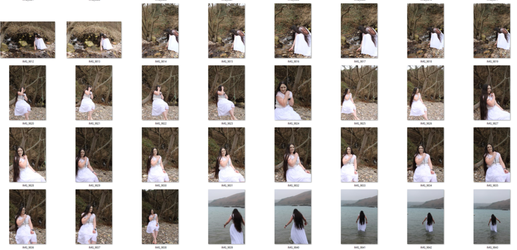
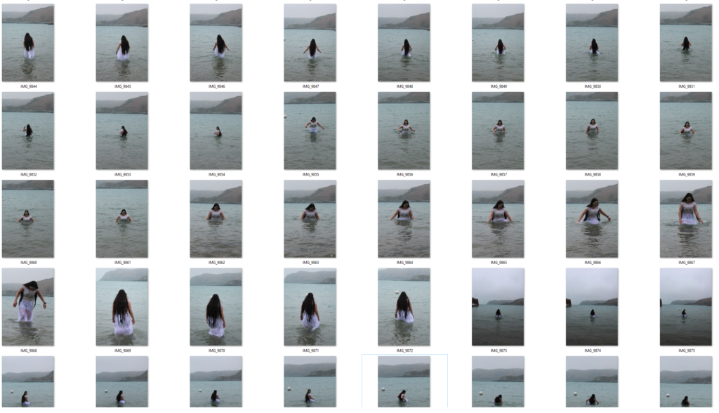
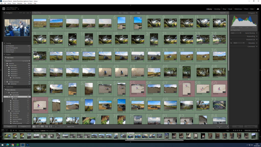
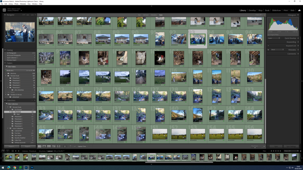
Contact sheet
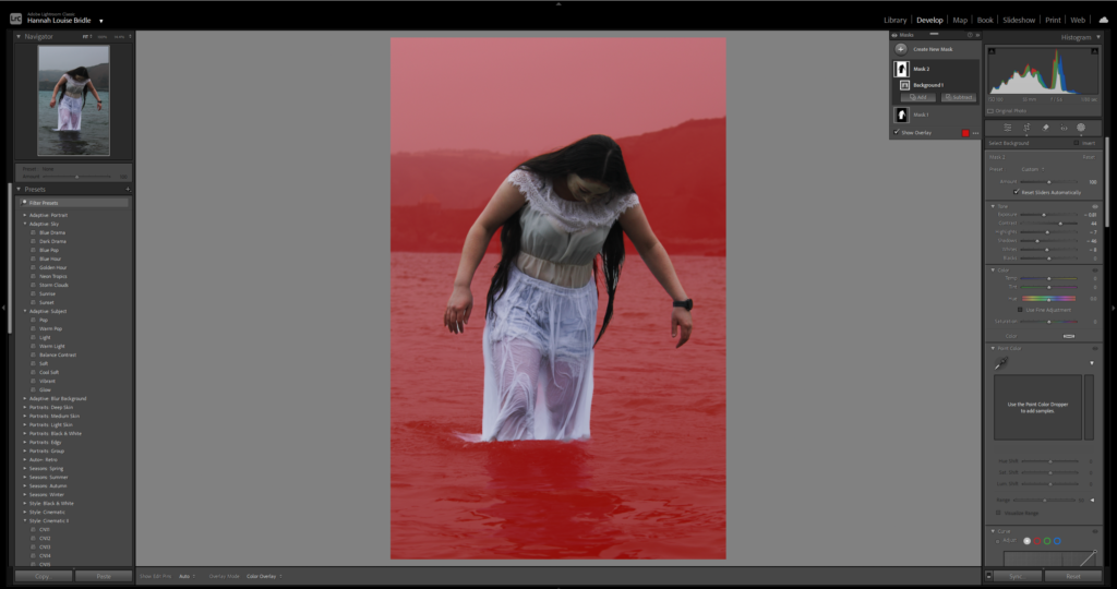
Editing process
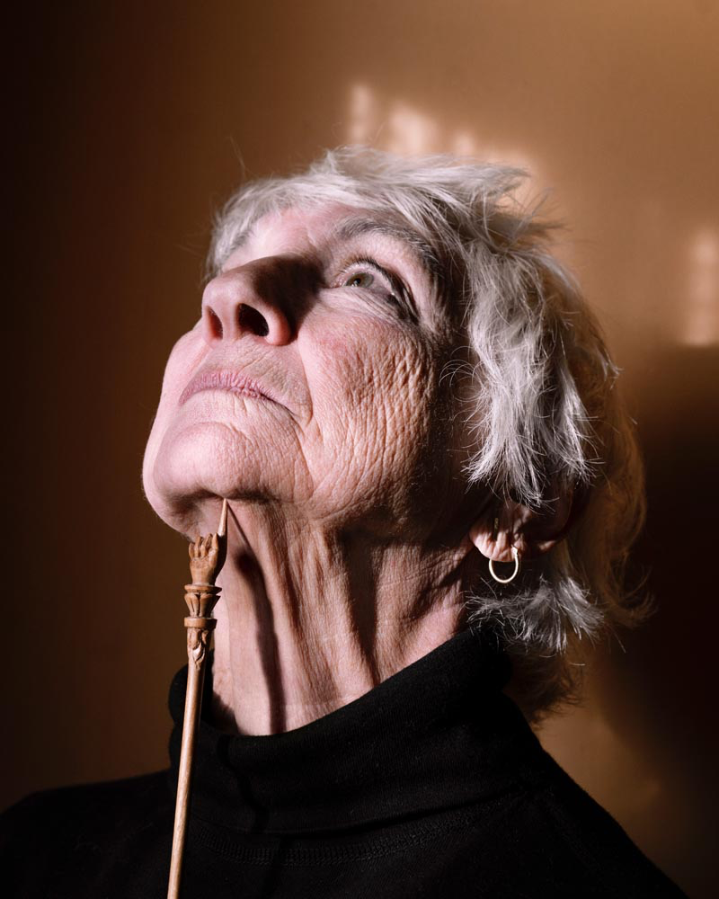
For this photoshoot I wanted to make the picture appear darker and have higher contrast levels. However when trying to achieve that it make the model appear too dark. Therefore, I used the mask tool in order to separate the model and the background so that I could darken the background without effecting her. By doing this i was able to create this eerie effect to the image.
Final images
Evaluation
Overall I’m pleased with how this photoshoot came out. I wish that I had spent a little bit more time in order to properly frame each shot in order to try and achieve more symmetry through the shoot. I think the images of the model on the rocks came out very successful what helped was the models facial expression, she appeared to have quite a serious and sombre look on her face. Similarly, the clothes that I put the model in were appropriate and did an excellent job of helping portray the message of the model representing purity and perfection. I really like the photos of the model emerging out of the water I think efficiently demonstrate the concept of someone being washed away spiritually. Additionally, the image of her walking into the water I wanted to represent her losing her self.
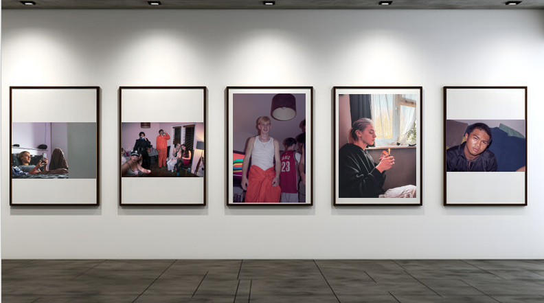
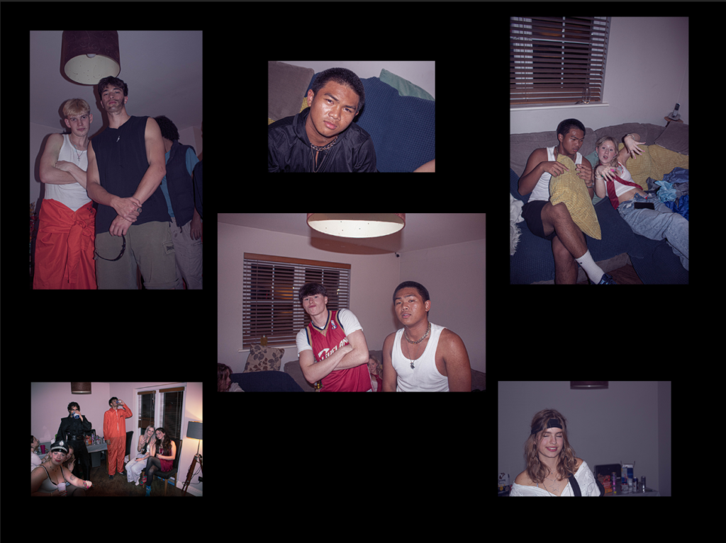
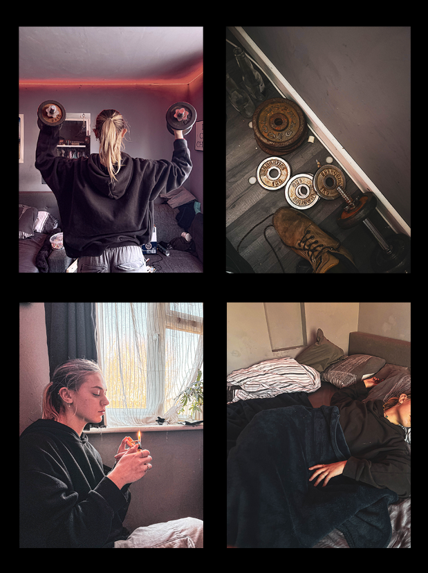
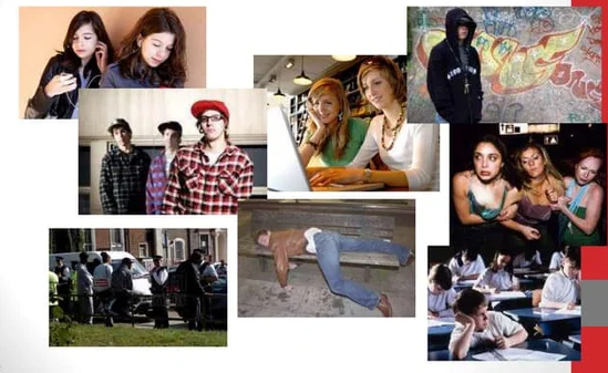
This is my virtual gallery of my teenage stereotypes photoshoot. I selected 5 of my favourite images out of the whole shoot. I picked these images as i believe they have depth and meaning to them, and you can really tell a story through the picture. I wanted to show teenage stereotypes in different light through these pictures, showing positives and negatives. I wanted to share emotion through these images as well.
A story line consisting of current teenage stereotypes.
A paragraph
A look in to teenage lives, thinking about the stereotypes made. Consists of bad habits, partying and normal life, like makeup, sleep and working out.
Design:
Consider the following
How you want your book to look and feel
I want my book too look consistent by using a sequence within my imagery, and I want it to feel shiny.
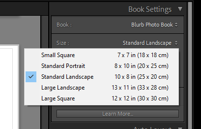
Format, size and orientation
I want a smaller square book as they are easier to handle, and will keep my pictures in tact.
Title
My title is a short description of my book, giving as much detail as I can.
Structure and architecture
My book will have a structure which goes into the personality and meaning of each photo.
Design and layout
I want to have some smaller images and some images that are full bleed to create attention and effect to my favourite more effective photos.
Editing and sequencing
I have edited my images to contain full texture with a filter over the top of all photos to create a sort of party and fun effect.
Mood Board.
Key words.
Aesthetic
To be concerned with beauty. A set of principles underlying the work of a particular artist or artistic movement.
2. The cubist aesthetic
Cubism was a revolutionary new approach to representing reality invented in around 1907–08 by artists Pablo Picasso and Georges Braque. They brought different views of subjects (usually objects or figures) together in the same picture, resulting in paintings that appear fragmented and abstracted.
3. Indexicality
Guide signs and symbols memory. In photography, indexicality refers to the direct relationship between the photographer, the photograph, and the subject. This concept emphasises that photographs are inherently linked to the physical reality they capture, serving as an imprint of the real world.
4. Formalism
Formalism describes the critical position that the most important aspect of a work of art is its form – the way it is made and its purely visual aspects – rather than its narrative content or its relationship to the visible world. Structure over content ,no emotion or context.
5. Representation
Ideas are depicted. To understand representation in photography is to understand how you are interconnected to the thing in which you photograph. It is to accept the responsibility for how you depict a particular subject. Understanding the deep impact images have in our society is the reason for teaching representation in any capacity.
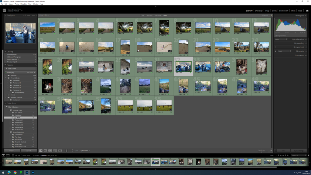
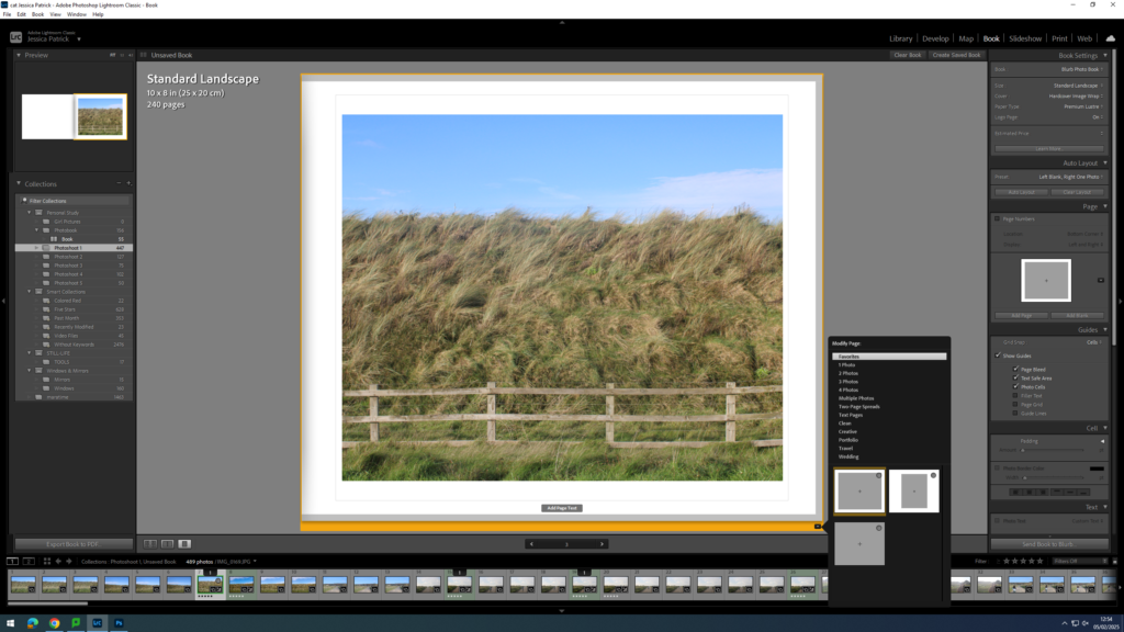
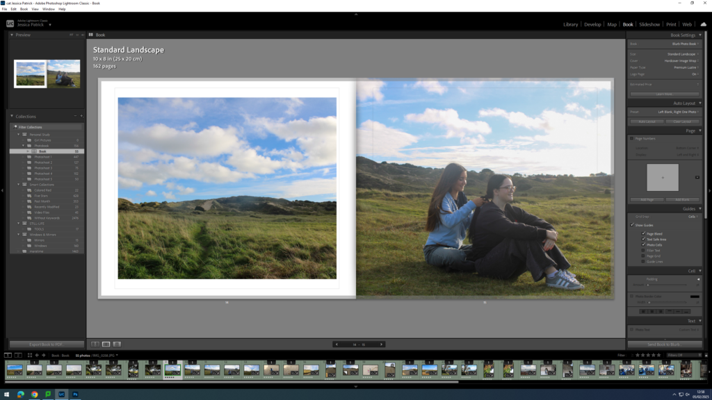
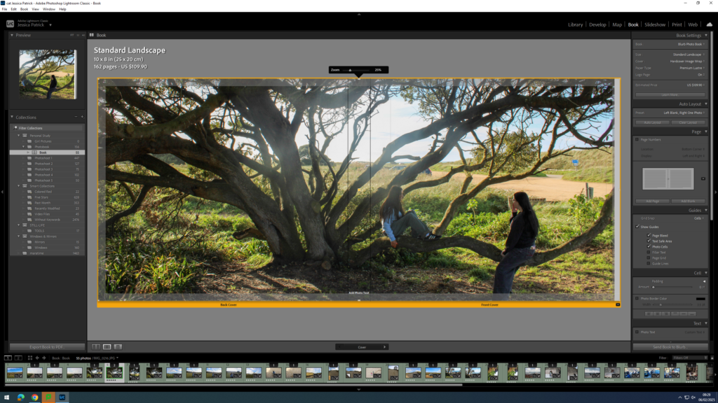
For my photobook, i made it in lightroom classic. To make this, you go to the personal study folder, then select all using ctrl A. Go back into top collections, create collection inside of personal study, in a separate folder. Click book, then create. Drag in new images and create save book. Images are at the bottom can drop and drag them in, use zoom button and favourite different templates. Use right click too add pages.
I then played around wit the sizes of the photos on the book to see what i liked. I did this until i got the layout that suited me.
I colour coded all my images so that i could put them all in to one folder where all my best images were. All my green images were the ones i wanted to include in the book.
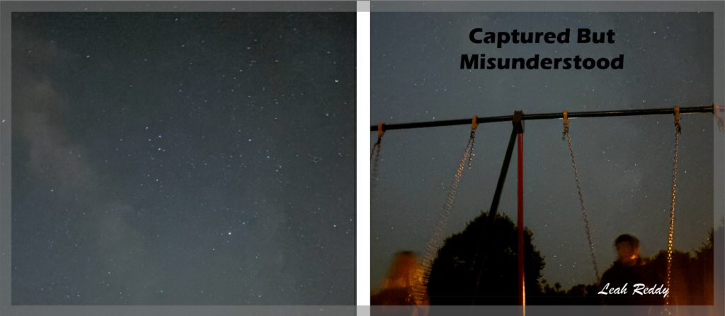
For my title. it took me a while to decide. I picked Captured and Misunderstood, as I wanted to emphasise that teenagers are NOT who they hang around with, nor what they do. I wanted to show how a lot of us are misunderstood all down to stereotypes of the wrong type of teenagers.
Evaluation.
How successful was your final outcomes (book, film, prints etc)?
I like the way my book turned out. The pictures were what i was going for and I like the way they are edited. I also really like my title as I believe it created meaning.
Did you realise your intentions?
At the start no, but as I started gathering pictures it all became clear to me.
What references did you make to artists references?
I have looked at Nick Haymes photographs, and decided I really liked his work. I tried to stick with his style of photography with a lot of texture making it look as realistic as possible.
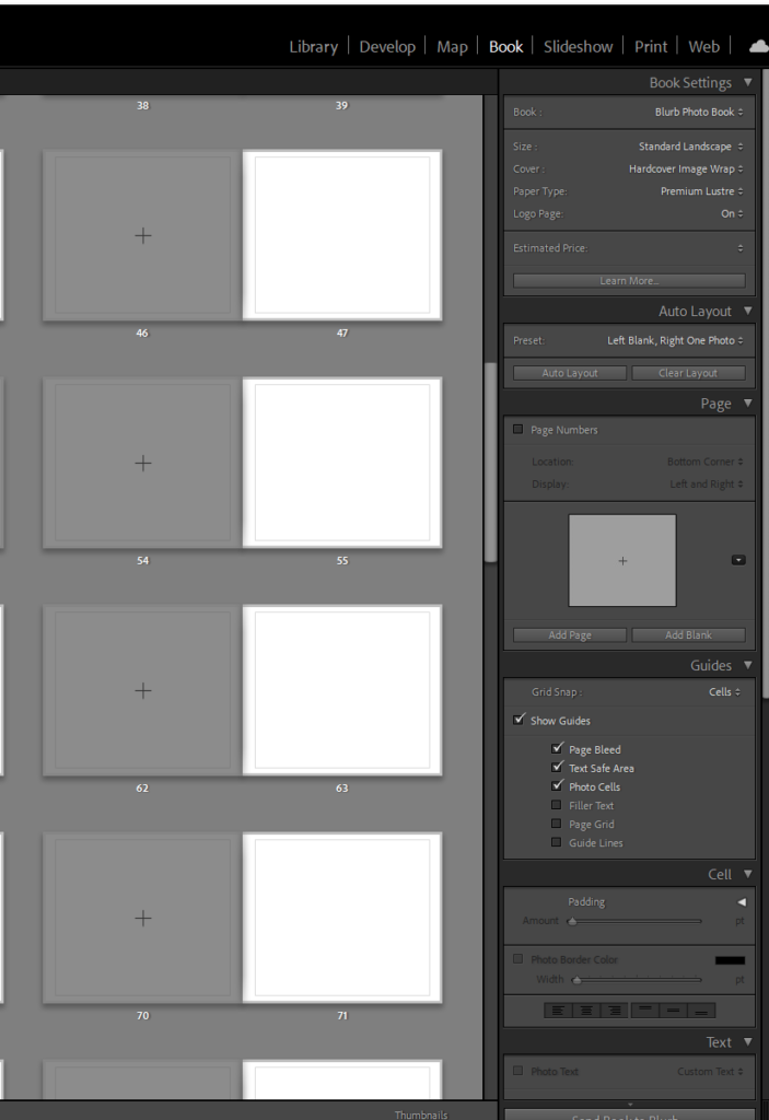
To create my photobook, I used the book mode in Lightroom Classic.
Image Selection
First, I selected all the images, which I have highlighted green and edited in all my photoshoots under this personal study and put them in a new folder called photobook, as they are my best images and the ones I have chosen to use for my book.
Next, I went through my images a removed the images which weren’t in my top 50, as I had selected over 150 images, and this would be way too many pages for my photobook, so instead I aimed for 50 pages.
Setting up my Book
Once I had my finished selection of images, I went into the book setting in Lightroom.
Next, I selected the size and orientation that I wanted my book to be.
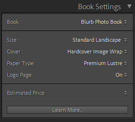
Then, I chose whether I wanted a hard cover or soft cover book, as well as choosing what paper I wanted to use for my book.
I chose a hardcover book, as I feel this would be more aesthetically pleasing for my book. I also chose glossy premium lustre for my paper, which is a glossy paper made for photographs, as I also felt this would be more aesthetically pleasing.
Experimentation
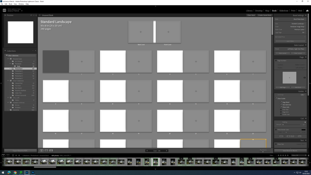
The first thing I did for my photobook, was that I deleted each photo, so that I could start with a blank slate.
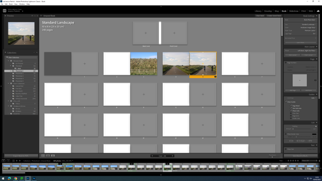
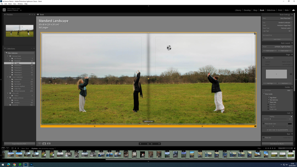
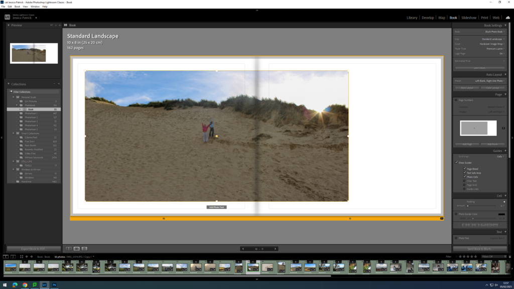
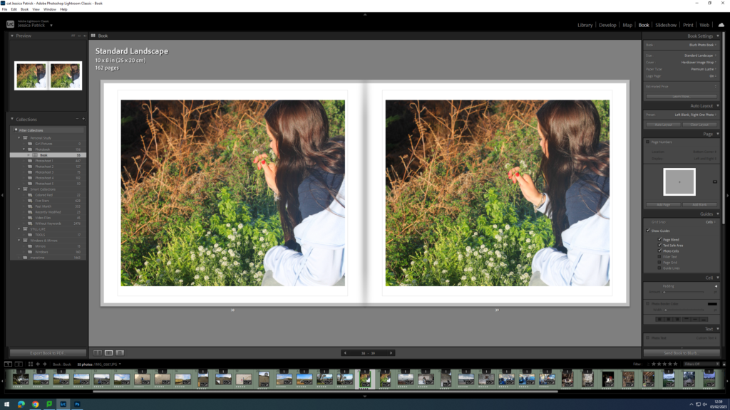
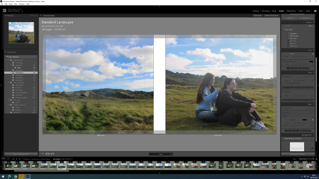
Then, I started experimenting with the layout of my images.
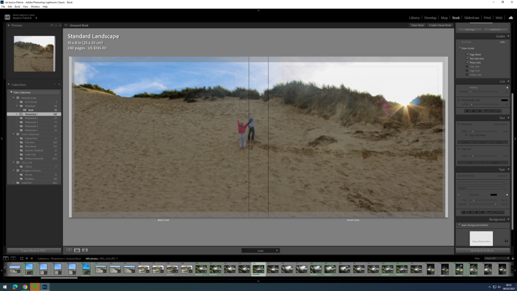
Next, I started experimenting with whether I would like my images to be full bleed, or not.
I also experimented with double page spreads.
I also experimented with having a three quarter page spread for a specific photo, because the main viewpoint in the image, which was the subjects, were sat in the gutter, which is not aesthetically pleasing, or what I wanted.
I also experimented with the differing the layout of some of my images and having some of my images with a similar layout.
At the back of my photobook I am also going to include my essay, which I have written based on this study.
Experimenting with Front Cover, Back Cover and Title
First, I experimented with having a single front cover and a different single back cover.
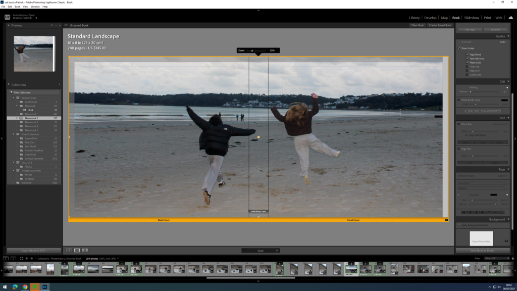
However, I didn’t really like this and I thought a double page spread for my front and back cover would work a lot better, so I started experimenting with the different images I could use.
I liked this image, but it didn’t work well as a double page spread, because the main viewpoint of the image is on the spine of the book.
I liked this photo as a double page spread, but thought the front cover may be too boring on it’s own.
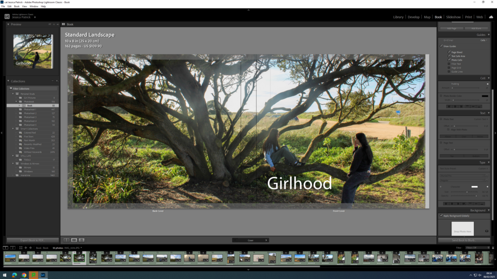
The final image above is the one I have chosen to use, because it works well as a double page spread, and the front cover of the book has the main viewpoint on it, so it isn’t so boring.
Once I was happy with the front and back cover image I could start experimenting with my title.
Some title options:
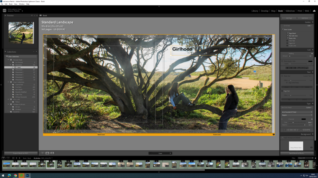
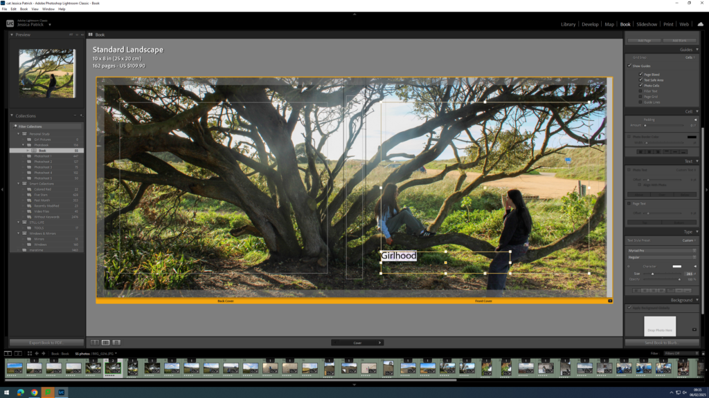
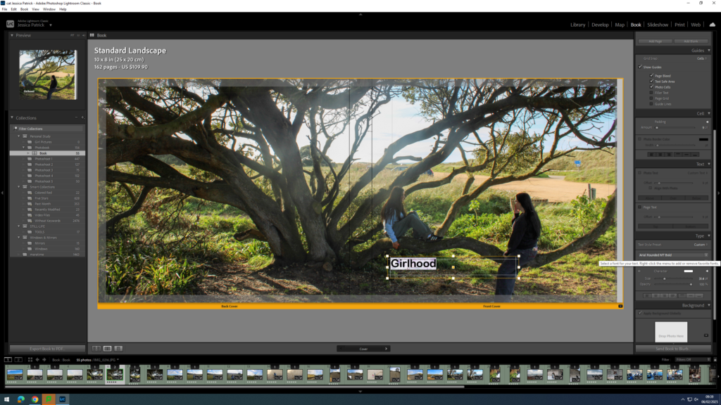
Girlhood
My Girlhood
Girl
The Girlhood
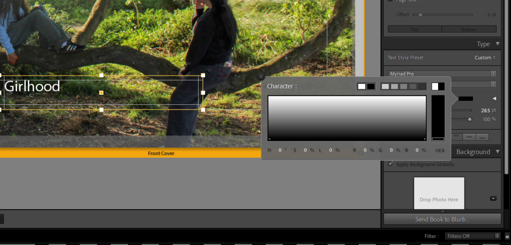
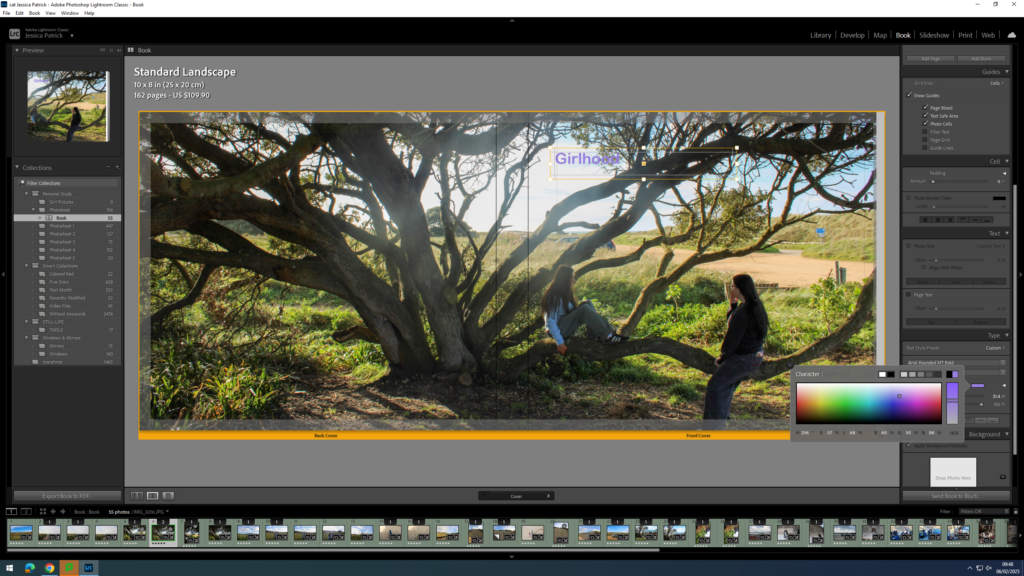
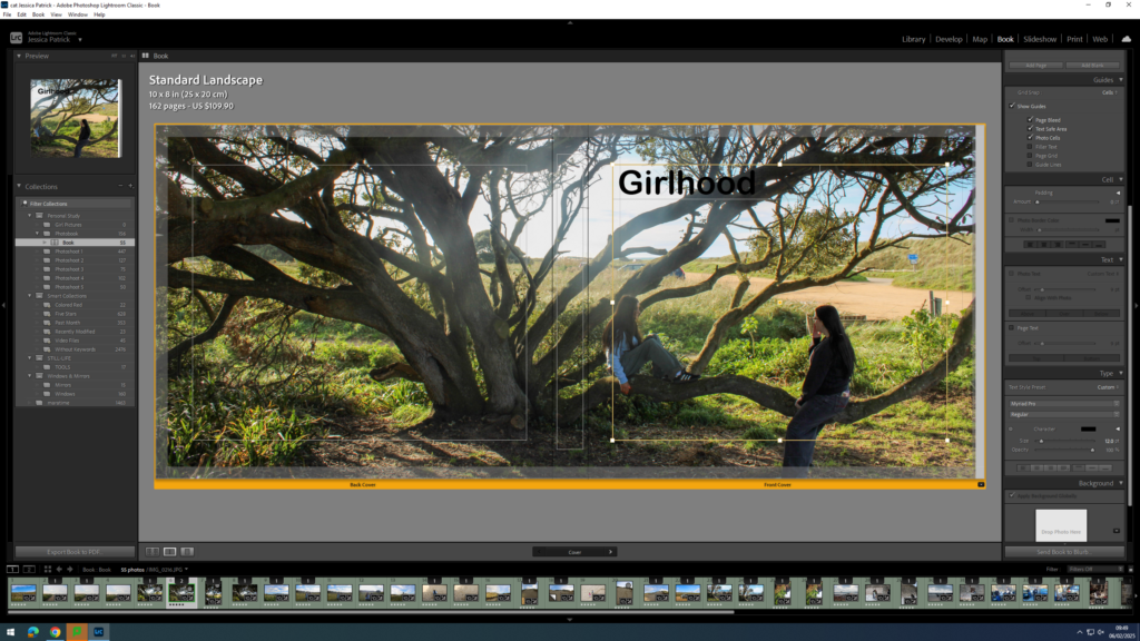
Once I had decided on Girlhood as my title I could start experimenting with the font, size and colour.
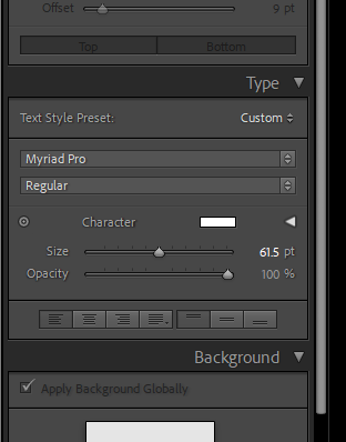
The tools were on the right hand side of the screen and the options were to change the size, opacity, colour and font.
First, I experimented with the placement of my title.
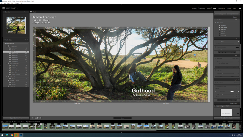
Then, I experimented with the colour of my writing, because depending on my placement the writing couldn’t be seen that well. If my writing was placed at the top of the page black text was better, but if the text was at the bottom of the page the white writing was better.
Next, I started experimenting with coloured writing, but ultimately decided on white text.
Next, I experimented with the size of the text.
Finally, I experimented with the font and decided on Ariel Rounded MT bold.
Now, I think the title and my name is too bright with the white ink, so I decided to experiment with the opacity. I set all my writing opacity to 70%.
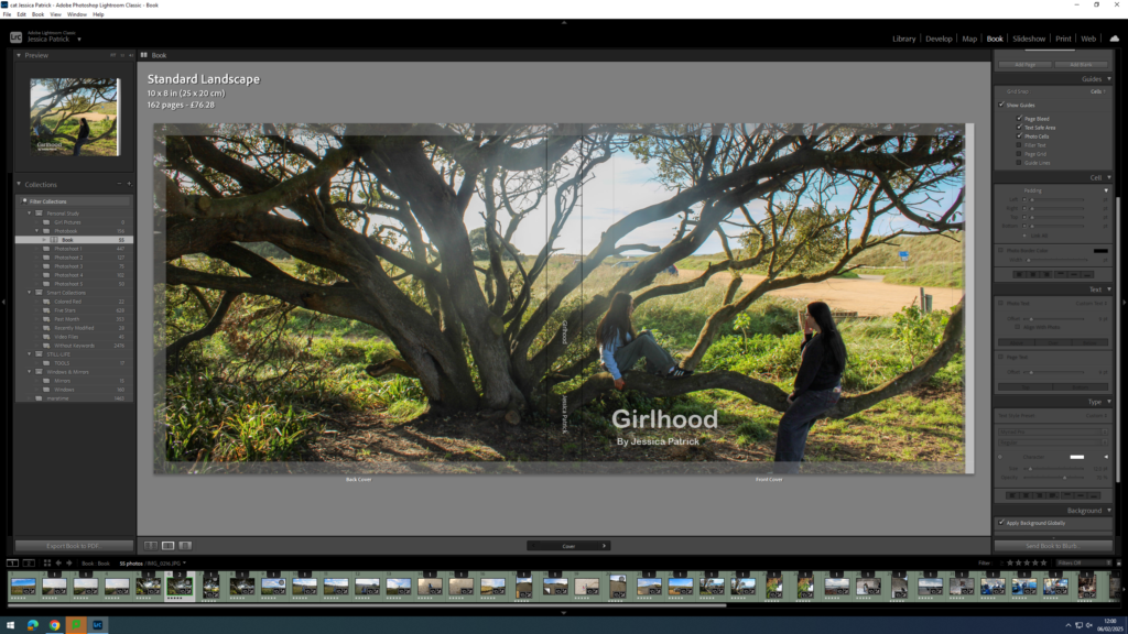
Next, I needed to add my title and name to the spine of my book.
I had to position my title and name where I did on the spine, so that the writing could be seen.
The sky in the centre of my image was too bright, due to shooting facing the sun, so I had to go back into develop mode and select the tool on the very right at the top.
Then, I had to select the sky and lower the highlights and exposure, so the sky was less bright and had some more blue in it.
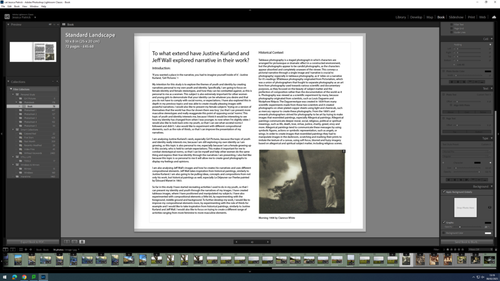
Adding my Essay
Next, I had to copy and paste my essay in. I used the same font as I used for my title and I had the size on 8pt. My subtitles however are on 10pt and my title is on 17pt.
Then, I had to import the photographs I have used in my essay onto my book in the correct place.
Write a book specification and describe in detail what your book will be about in terms of narrative, concept and design with reference to the same elements of bookmaking as above.
Narrative:What is your story? Describe in:
3 words – representing teenage stereotypes.
A sentence – showing how teenagers are portrayed by the older generation.
A paragraph – in my photobook, I want to show the stereotypes people make, as well as the opposite. For example, how teens can represent the negatives, but also go against these negatives, and prove them wrong. I want my photobook to display that not all teenagers are the same, and certainly not bad.
Design: Consider the following
i want my book to look intriguing. i want it to make people want to open it. Im not too bothered about hard/soft back. i want the size of my photobook to be 20×25. i want the Title to be ‘Captured And Misunderstood’, meaning teenagers are caught doing actions in the moment, and completely misunderstood and painted out in a wrong light. For the structure of my photobook, i tried being as brief as i can. I like being simple as i believe less can be more. For the design and layout, i put the pictures all different sizes on the paper to mix it up a bit, i laid it all out in a sort of story telling way. for e.g, i started off with one model, showing stereotypes by wearing makeup, addicted to the phone and bad habits. it then goes on to a party showing the rebellious most open and fun side of teenagers, then back to my model one representing stereotypes, again. I decided to add no text really as i didn’t want it, i thought it looked too much.
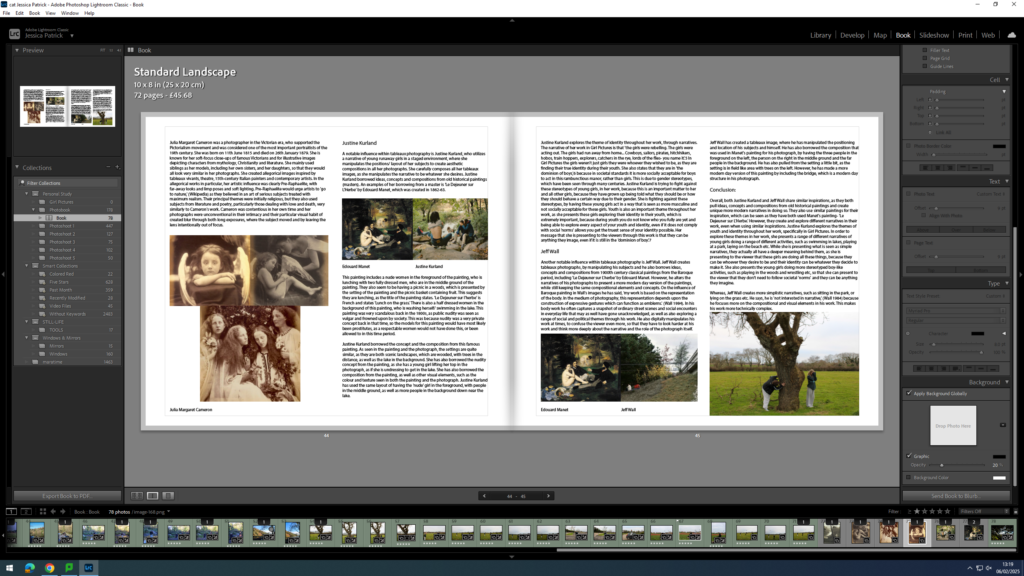
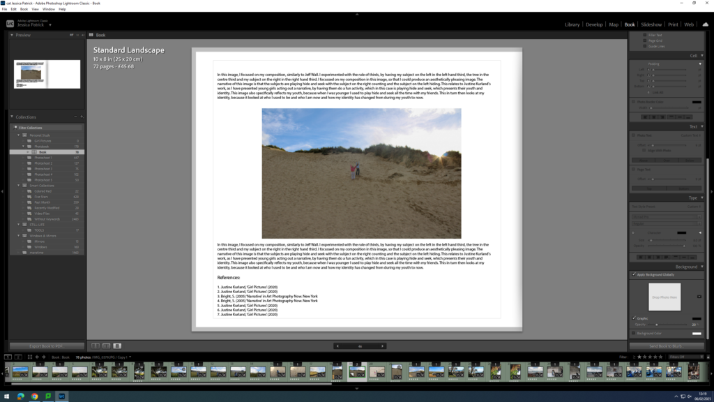
‘Justine Kurland’s take on the classic American tale of the runaway takes us on a wild ride of freedom, memorializing the fleeting moments of adolescence and its fearless protagonists.’ –Photographs by Justine Kurland Book review by Emily Shapiro
The story communicates the idea of girlhood as complicated and powerful It resists stereotypical or overly idealized portrayals. Kurland’s work often reflects an exploration of female unity, rebellion, and the joy of friendship, with a focus on how young girls form their identities in environments that are sometimes isolated. Her images also evoke a sense of nostalgia, looking back at girlhood as a time of possibility, complexity, and unfiltered expression.
Overall, “Girl Pictures” challenges traditional notions of gender roles and the ways that femininity is portrayed in visual culture. It offers a more nuanced and empowering view of girls’ lives, showing them as active, complex individuals navigating their world on their own terms.
Hannah Altman is an American photographer from New Jersey whose work mainly explores the themes of lineage, memory, ritual and storytelling, known for her use of natural light and intertwining of her Jewish culture. Altman has practiced photography since she was a 19-year-old student at Point Park University, practicing as an amateur on her Tumblr page.
As a 29-year-old, Altman has been involved in numerous solo exhibitions throughout America:
We Will Return to You – 2023, Akabus Projects, Boston
With Rifts and Collapses – 2022, Gallery 263, Cambridge
A Permanent Home in the Mouth of the Sun – 2021, Filter Space, Chicago
A Permanent Home in the Mouth of the Sun – 2021, AAP Exhibition Space, Pittsburgh
Kavana – 2020, Blue Sky Gallery, Portland
Construct of Viewpoint– 2018, Union All Gallery, Pittsburgh
Construct of Viewpoint– 2017, Junior High Gallery, Los Angeles
Humanism – 2017, The Temple Judea Museum, Elkins Park
Intimate Threat – 2016, Trust Arts Education Center, Pittsburgh
She has delivered many lectures on her images and research across the US in venues such as Yale University and the Society for Photographic Education Natural Conference, with her first monograph in the permanent collection of the Metropolitan Museum of Art Thomas J Watson Library.
Her Work:
Yad (You), 2023, We Will Return to YouGrandma’s Bathroom, 2016, Indoor VoicesShabbat Candles, 2019, KavanaAnd Everything Nice And Everything Nice
The body of work which I find most relevant to my exploration of Feminism in photography is ‘And Everything Nice’, curated by Altman at just 19 years old as a student posting on Tumblr. Altman did this in the absence of the expectation that this would have global reach, beginning in her dorm room as a personal photo project at Point Park University.
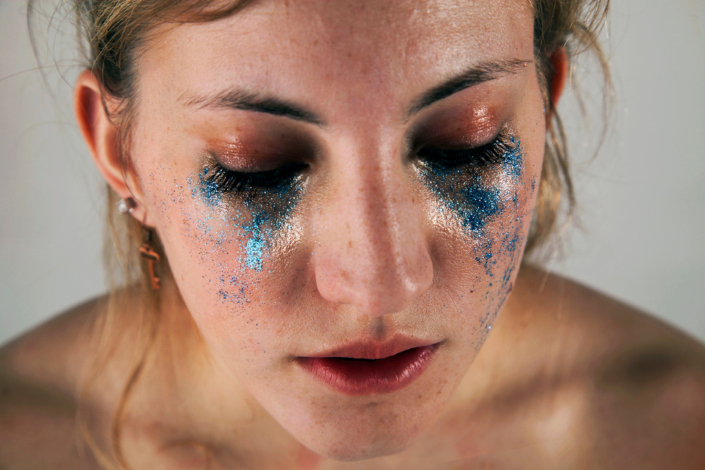
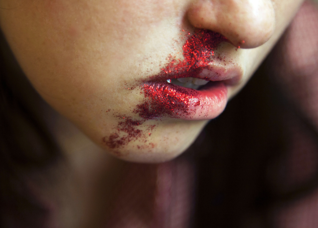
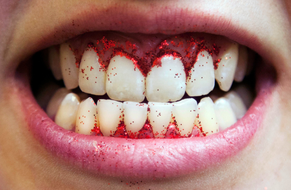
“‘And Everything Nice’ is an unflinching analysis of the standard for female beauty. The ongoing series consists of women in states of affliction; the body fluid of the models have been replaced with glitter to visualize the concept of girls invariably needing to seem attractive regardless of the actual situation” – Altman via her Tumblr post
And Everything Nice:
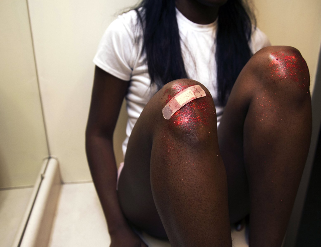
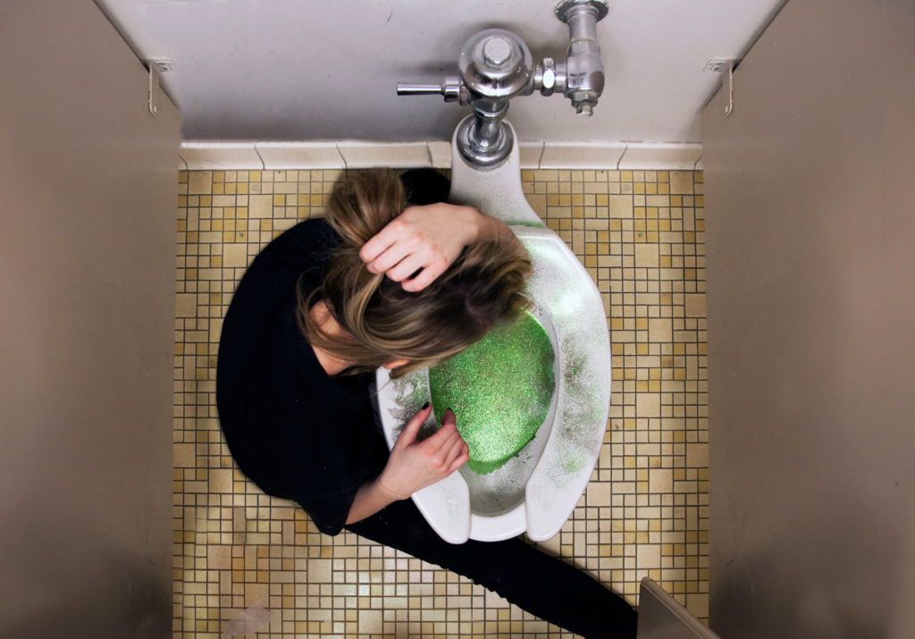
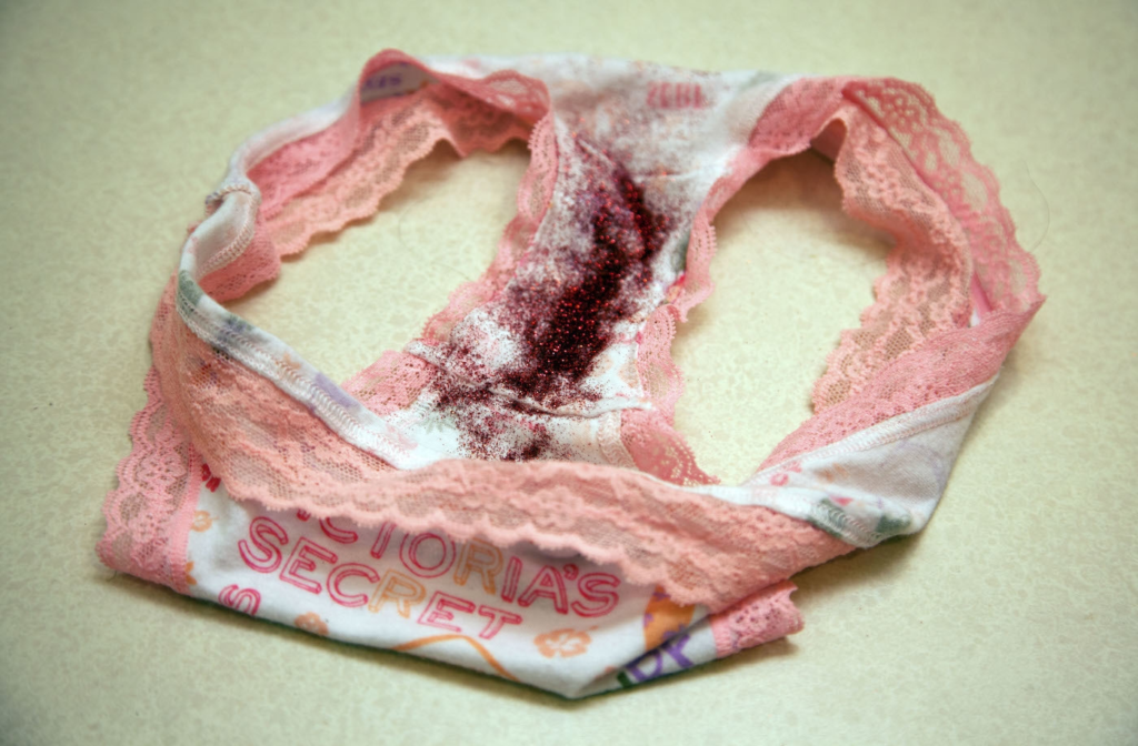
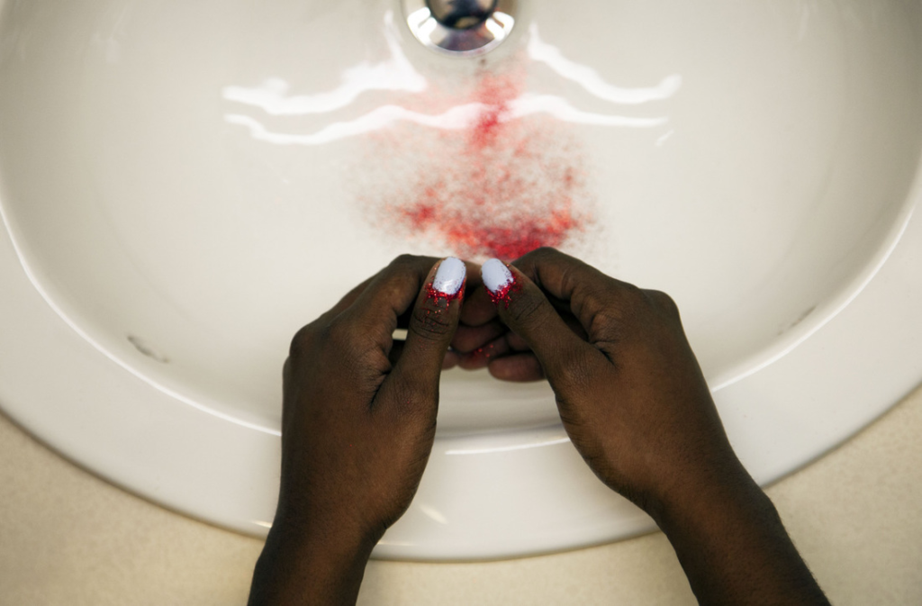
In these eight images within the series, Altman shoots images with bodily fluids such as blood, tears and vomit replaced by glitter in an act to challenge and visually represent the female beauty standard.
This minimalistic viewpoint of breaking down the standard of female beauty in a detached way allows the viewer to objectively infer how there is a consistent pressure to present themselves as attractive, without thought to the situation at hand. This alternative criticism to the societal expectation of what a woman should be like dives deeper into this concept than others because it pays attention to how even processes of the anatomy are accounted for in the beauty standard, instead of just exploring the stereotypes of ‘what a woman should be like’ at face value.
Altman also uses glitter in replacement of vomit as a young girl lays over the toilet which could be used to target the teenage culture, being going out and drinking with friends (underage or legally) to the point of sickness – something that is normalised when reaching teenage years and wanting to try new things. However, I find that this is highly applicable to the millions of girls who experience eating disorders at such a young age. Bulimia nervosa is a condition where the subject typically purges themselves, this being the self-induction of vomiting to forcefully evacuate the body of stomach matter. This is also down to the misuse of laxatives or dieting pills. I feel that this is highly relevant to the image because many young girls gain a distorted perception of themselves due to a constant reminder in the media of a false image of a woman. This is an extremely common issue and repercussion of the beauty standard being set against young women that psychologically restricts them from feeding their body and mind, resulting in extreme issues and even death. This image is so important because this is an issue that mostly arises during teenage years, with the prediction that 28.8 million Americans will suffer from an eating disorder in their lifetime, with an estimate that 3.4 million people are suffering from eating disorders around the UK too. With an issue that may be seen as normalised by young girls by wanting to be severely underweight in hopes that it may better their self-esteem, images like this are so important because this is something that occurs behind closed doors and by explicating the symptoms of it, it may be a ‘wake-up’ call for young girls and even women who have carried this into adulthood. Misogynistic viewpoints are a factor at the centre of the development of eating disorders which is something I aim to challenge in my work through this photoshoot.
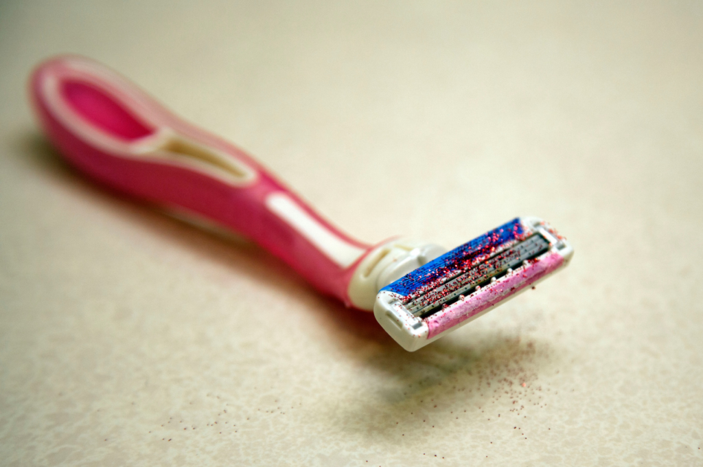
Using this as a replacement of blood too could be seen as symbolic of domestic abuse and male violence, where Altman uses nosebleeds and cuts on knees with plasters on them, and this ‘blood’ smeared. This could be representative of the risk of young girls getting into toxic relationships or situations due to being so vulnerable and impressionable. However, this is also applied in the form of period blood and blood on a razor, crucial in reinforcing Altman’s idea on the pressures, both internal and external, in applying this beauty standard in all situations regardless of what they are down to an anatomical scale.
I feel that this is such a unique viewpoint on the perceived beauty standard because it leads into the extremities that young girls go to in order to feel beautiful. For example, the blood on the razor points towards over-shaving continually in order to be completely hairless to feel desirable, setting an unrealistic expectation as hair is an entirely normal thing that everyone has, however there is a double standard for men and women. This is challenged as it shows the severity of what these ideas can do, and how the normalisation for one gender but not the other can be extremely damaging for women, specifically young girls who grow into their teenage years and begin to see air-brushed fashion magazines that aren’t actually achievable in real life, they are actually just extremely edited.
I also find that the replacement of period blood with red glitter is such a core image within this selection due to the ‘disgust’ portrayed in the media against women’s menstrual cycle even though this is a regular bodily function that is out of an individual’s control. This autonomic process is something that allows a woman to carry a child, however it is suggested that it should not be spoken about in society due to judgement. I feel that this is very relevant to the beauty standard in teens because thousands of young girls don’t even understand the actual biological process behind this due to this stigmatised perception against periods. This also combats the saying of ‘someone’s on their period’ that is commonly used when a woman is expressing feelings of anger or sadness, a way of demeaning the female sex for reacting to situations that they do not feel comfortable with. By curating a scene like this, it leans towards the normalisation of the menstrual cycle, instead of women being judged for a process that is completely out of their control and allows them to carry a child into the world.
For example, when these images were released, there was a large swarm of men (and even some women) with uninformed criticism towards Altman’s work, calling the images ‘gross’. It is evident through this that society has been conditioned to think within a certain frame of stereotypical views, here being that the period cycle should be kept almost like a secret, leaving many young girls uncertain of how their bodies work and what it actually is. Images like these create large reactions out of people because they consist of things so unnormalised in society when knowledge and information on these things is incredibly important.
These images convey messages of violence, teen girl culture and emotionality which overall contributes to the challenging of the beauty standard set against women. They reach out to the younger generation through social media, here being a Tumblr page, to actively represent issues through a different medium rather than simply words. This visual aspect can be empowering and ensures that, specifically young girls getting their period for the first time, shouldn’t be afraid of the reactions of those around them or to be judged for being ‘gross’ when this is a regular thing.
Analysis:
The image uses a short depth of field to force the viewer to be drawn in by the smudge of red glitter across a young girls face. Altman uses natural lighting to create shadows that have not been manipulated, making the composition without the glitter look as realistic as possible. The subject sits with her face turned towards the source of the lighting as the shadows stem from the left side of the image which reinforces the focal point into being the subjects face. This use of natural lighting also contributes to Altman’s intention of targeting the beauty standard against women as it makes the image look more organic and raw, instead of leaning towards the aesthetics of fashion magazines for example. Skin texture is also more visible by using this lighting which contributes again to the truthful portrayal of actual women’s beauty. The subject turns to the side with a facial expression of what seems to be discomfort as her mouth hangs open as if she is in pain, going hand in hand with the use of glitter to replicate a nosebleed. This leaves the symbolic aspect of the image open to interpretation to the viewer due to the subjectivity of it. I feel that this image could be an excellent metaphor for male violence, specifically in teenage girls, as the idea of being in a ‘toxic and controlling relationship’ is more romanticised now in the younger generation rather than being perceived as something unwanted. The girl in the image grits her teeth shut slightly which could be symbolic of feeling as if she cannot speak up about what has just occurred and even feelings of shock due to the diagonal angle Altman has used which opposes the direction of the subjects face. As Altman produced this set of images at the age of just 19-years-old, this could be used to reach out to her age group at the time to show a darker side of this idea of controlling and jealous relationships that may be desired by young girls as they may believe this would make them feel wanted more like they are the only person that matters to their significant other. However, this image is displaying the progression of these kinds of relationships, and how they can quickly grow from something that may be perceived danger less. The ‘blood’ being in the form of glitter can resemble that romanticised idea that young girls have, having relation to the phrase of ‘all that glitters is gold’, suggesting that whilst the concept behind jealousy may be exciting at the time, relationships like this are extremely unstable and can easily turn violent due to the high control over impressionable young girls who may not have a predetermined perception of love.
I would like to utilise this use of glitter in my own work to represent emotionality, domestic violence in young girls, the teenage culture and overall, the set beauty standard towards women that young girls grow up encapsulated in.
I am going to organise a photoshoot using different colours of glitter and use a group of girls to represent each of these things in different ways. I would like to recreate some of Altman’s images such as the image of the girl with bleeding knees because this is such a subjective image that I can use to nod towards male violence in young girls during toxic relationships to show the reality to something that may be desirable to the younger generation as the progression of abuse is often ignored at the beginning which leads into entrapment. However, I would like to use inspiration from some of the images but incorporate different factors. For example, I feel that the image of the young girl leaning over a toilet bowl filled with glitter, however I would like to use this to compile different images looking into the normalisation of eating disorders within young girls due to the feeling of never being skinny enough, and in turn believing that they don’t deserve anything due to the lessening of their self-esteem. With pro-ana websites being easily accessible to young girls (pro-anorexia websites which push the idea that this is a healthy lifestyle) and with unrealistic images being produced for ‘Thinspo’ (extremely unhealthy bodies being pushed towards young girls online to make them believe this is what they must look like in order to be beautiful, and highlighting how to achieve it), it is very important that the dangers and hardships that come with this are highlighted to the viewer because to such an impressionable mind, the realisation that your brain, body and mind needs food to be able to develop and grow.
I will be using glitter to specifically look into the beauty standard set against young girls, and try to actively show the distorted perceptions that young girls face due to misogyny specifically in the media.