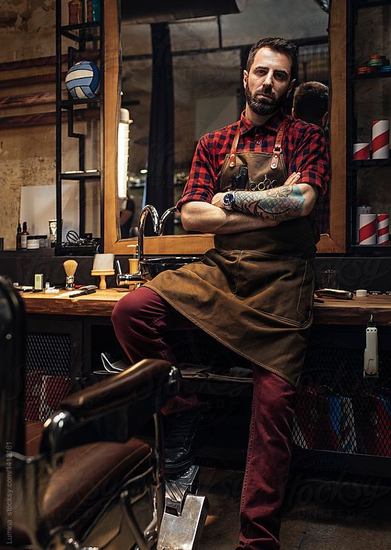
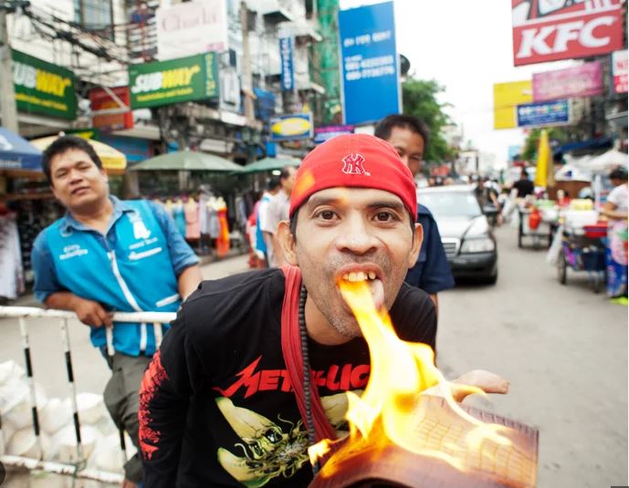
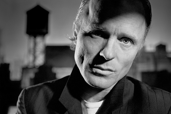
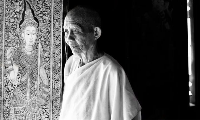
Environmental portraits are photos of people in their environment instead of being them with a blank background it could be them in their workplace or their home.
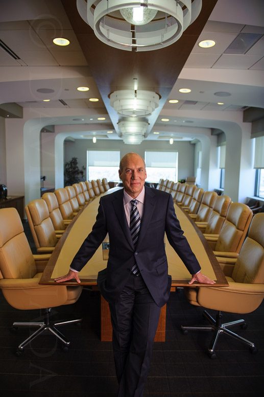
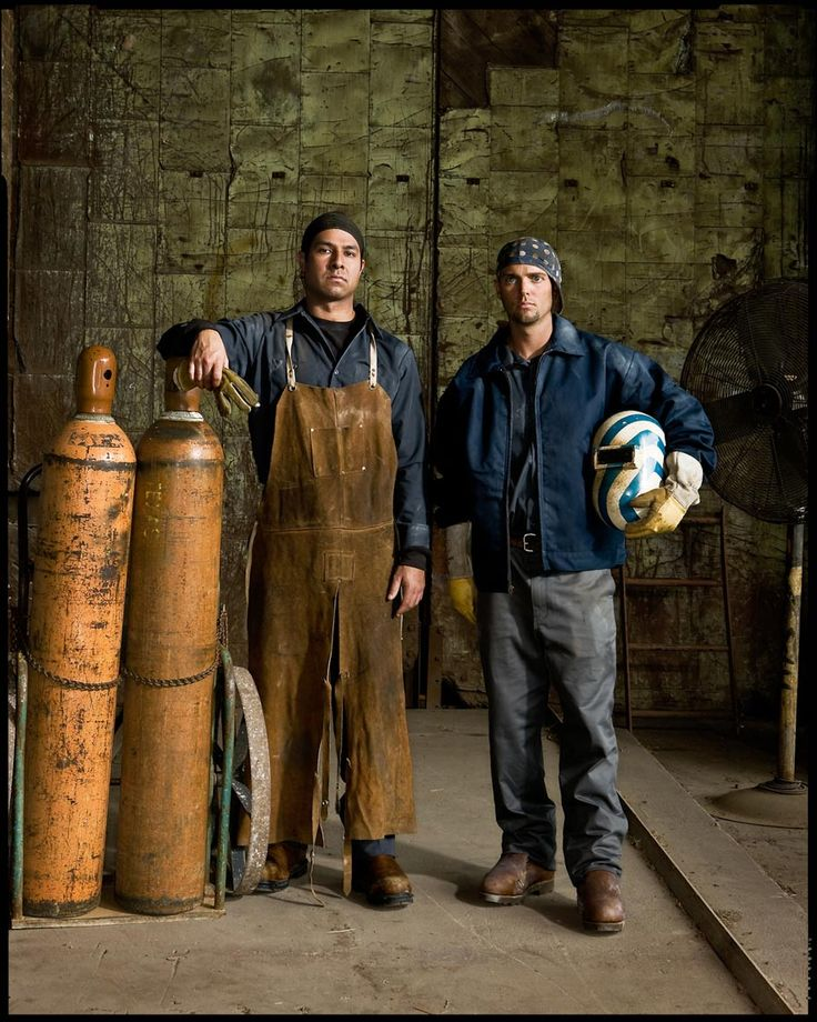
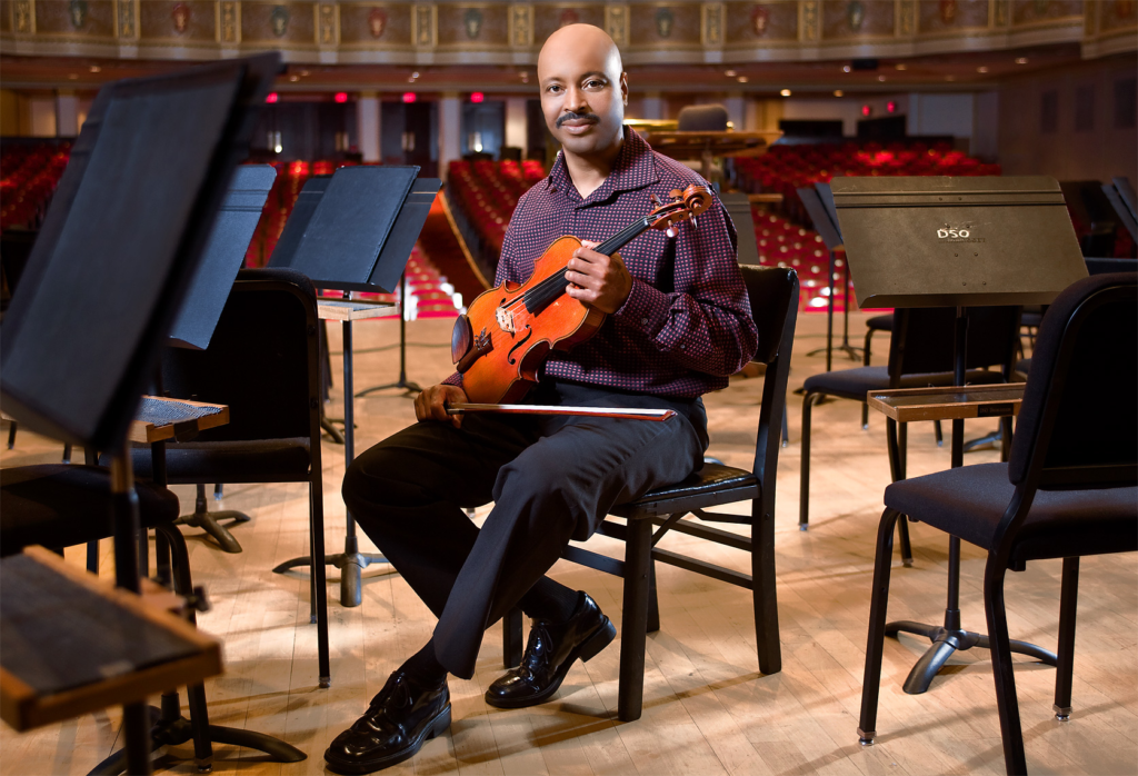
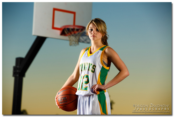
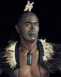
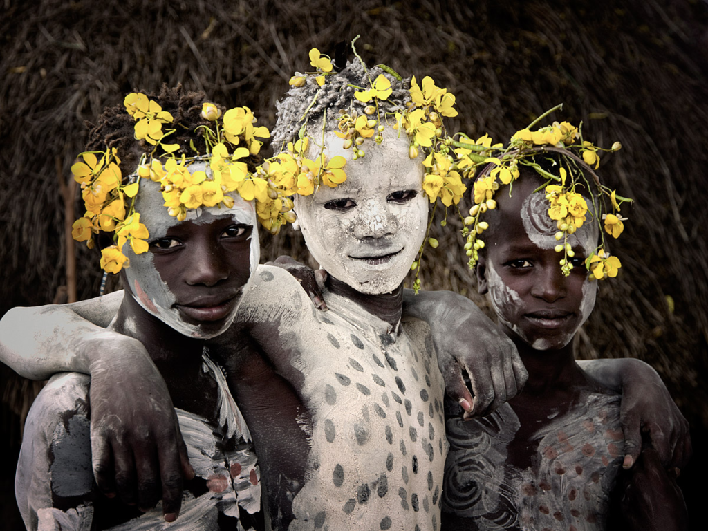
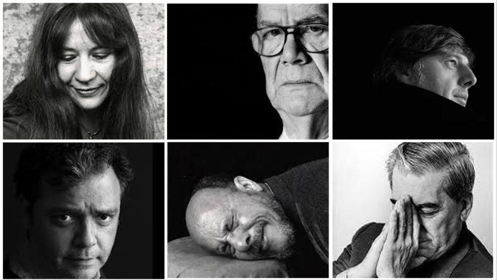
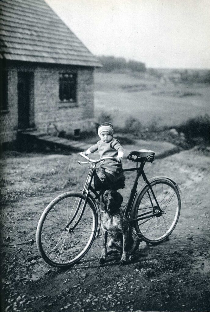
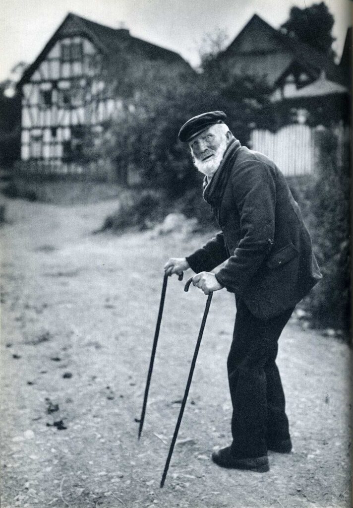
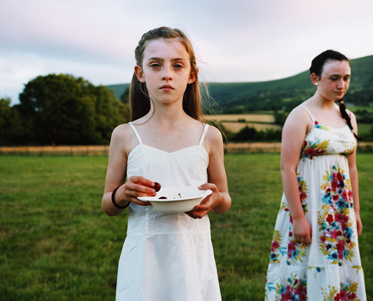
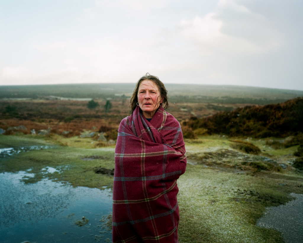
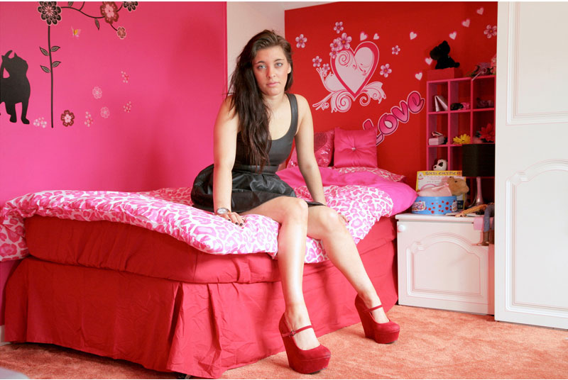
Some examples of Environmental portraits…
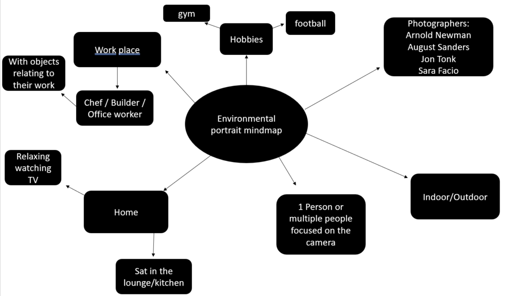
A brainstorm about environmental portraits I created
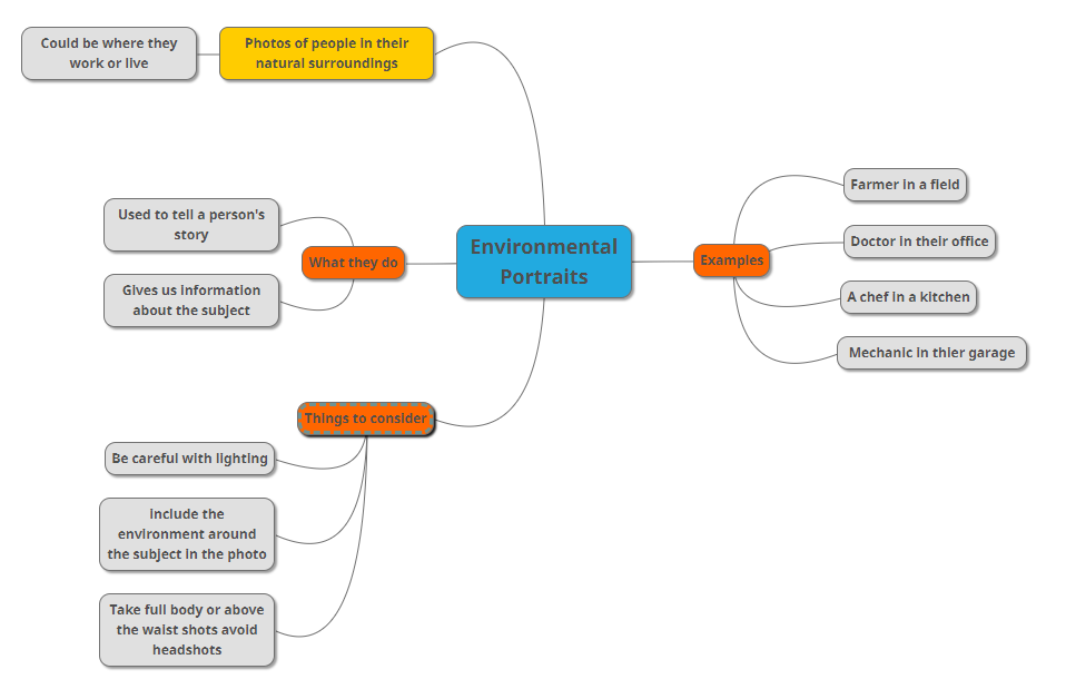
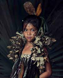
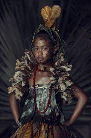
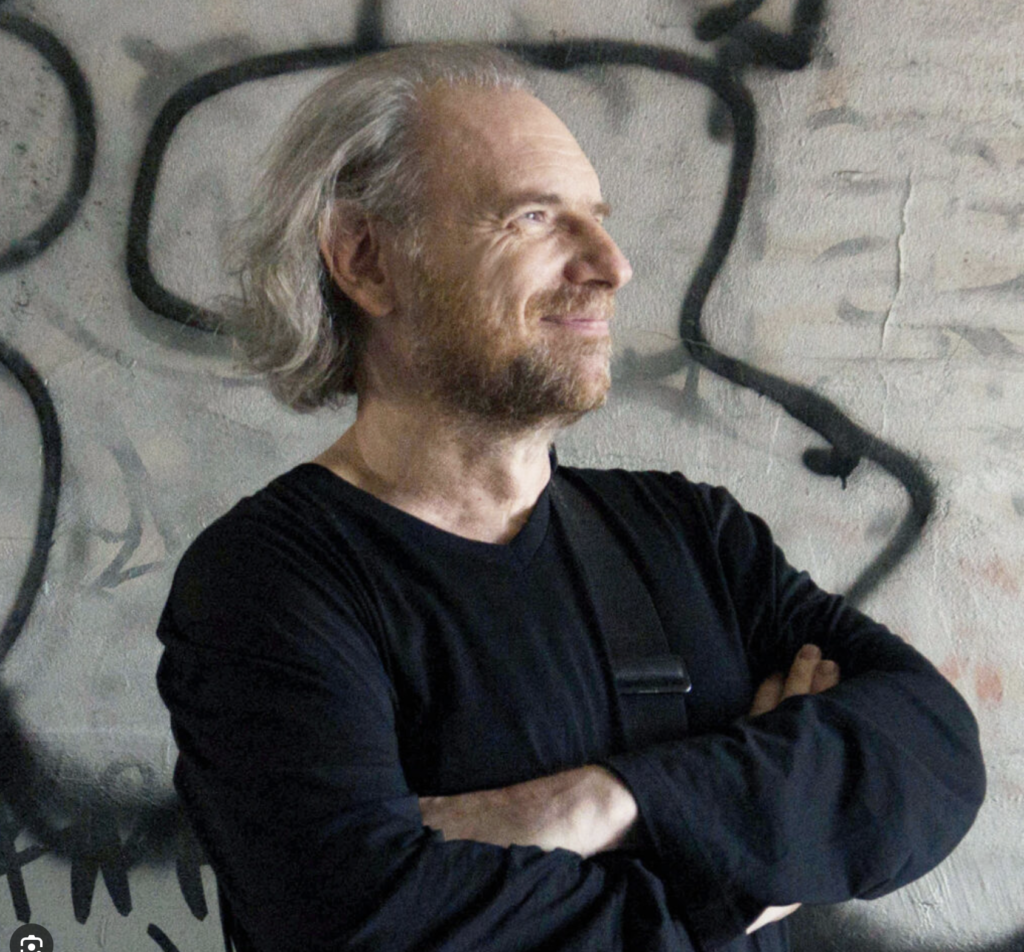
Jimmy Nelson is an acclaimed British photographer known for his striking portraits of indigenous people and documentation of vanishing cultures and traditions. His visually stunning images have captivated audiences worldwide, highlighting the beauty and diversity of cultures that are often overlooked or marginalized.
The Jimmy Nelson Foundation is a nonprofit organisation founded in 2016 to stimulate cultural expression by facilitating projects that promote the heritage of indigenous cultures.
Nelson says, “The foundation has evolved into teaching indigenous peoples’ pride. I’m creating many teams to go off around the world and do what I do. We’re gathering pictures, video and other information] and creating a digital fireplace, sort of like a library in the sky, of all this heritage for future generations.”
jimmy nelson seems to take photos of very cultural portraits, he shows that he has a true passion for him and the people around him, he is inspiring people to become who they deserve to be the most and who they desire the most. He is showing us what different religion’s or cultures look like by showing us his, his photographs look really old and ancient which could represent that his culture has been round for a very long time and he wants people to know what it was like back in the day. What I really like about his work is that he involves different aged people to help us understand the culture more, we can see that children are involved as well as older people.
“Together we can love, and when we love we thrive. They are our guides, custodians of ancient knowledge. They celebrate life, free in every waking moment. Within your true identity, your heart is open to others”- jimmy Nelson.
I can see that Nelson talks about love and loving together, its almost a safe space around him, he’s protecting and supporting people, its almost a way of saying that everyone is different but in their own unique way, and we are allowed to express ourselves differently. Each photo has different emotions which can change the photos mood completely. For example a sad expression could represent fear or ashamed that feeling different is a bad thing. However having a person look more relaxed shows that they feel safe and comfortable whether its in themselves to their surroundings. Nelson also refers to your heart being open to other which cold suggest that sometimes you need to let people in to have a special bond and connection with someone but also to help express yourself and heal your inner soul. He could also mean different things such as opening your heart is away of expressing who you are and don’t hide yourself from reality. I personally believe that he is trying to say that no matter what, you always have your heart open for people even if you don’t intend to, which can lead to heartbreaks or happiness.
His photographs tend to have a dark background and the models are also wearing darker colours, there isn’t a bright colour is shown. This also changes the mood of the photographs and makes me feel more calm instead of happy and joyed.
“With my first photograph a story of love towards photography and literature was born, I don’t know if these portraits have more of photography or literature, but I’d say it has a lot of both and I like to believe that this love story was born as a way of narrating, telling, proposing, suggesting and invite to read too”
Mordzinski is a photographer with a very specific niche in black and white portrait photography of latin American authors.
Each photo is very individual and impactful in his portal of the authors, because he is so consistent in his style and niche he is extremely specialised and talented in this style of photography, he always manages to produce an image that invokes emotion and create a sense of personal undertanding towards the author he is potraying.
Although more renowned photographers such as Arnold Newman and woody Allen are extremely talented and in the world of portrait photography considered the best in the game, with some very thought provoking and emotion enduring work i personally find Mordinzski’s work and commitment to his very specialised area more impressive in many capacities, not only is his ability to stick to such a specific personal style a clear representation of his love and personal devotion to his project the ‘Human Atlas’ that love and devotion always shows through his work.
All of his photographs have a depth of personal character and emotion that is very hard to capture without a long personal history with the model this is inspiring to me for many reasons not only is he extremely talented and consistently produces high quality photography but he also evokes deep thought and consideration in his audience.
For the route i want to take in my experiments with environmental portraits photography i believe he is the best photographer for me to draw inspiration from.
The Human Atlas
Known as “the writers’ photographer,” Daniel Mordzinski has been working on his ambitious “human atlas” of Iber-american literature for 38 years. The Argentine photographer, who lives between Paris and Madrid, has created portraits of the most important figures in Latin-American literature. The author of numerous books, Mordzinski’s works are continuously exhibited in Latin America’s most important museums and are included in the best collections of contemporary photography. He is an important literary festivals photographer.
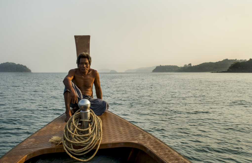
An environmental portrait is a portrait executed in the subject’s usual environment, for example their home or workplace, and typically illuminates the subject’s life and surroundings. The term is most frequently used of a genre of photography.
The surroundings or background is a key element in environmental portraiture, and is used to convey further information about the person being photographed.
While it is often true that the background may dominate the subject, this need not necessarily be so. In fact, the details that convey the message from the surroundings can often be quite small and still be significant. It can be used as a way to tell a story.
Two good rules of thumb when attempting to photograph people in their surroundings:
1. “Half of all location photography is moving furniture.”
2. “‘Available light’ means any light that’s available.”
Both sayings have been attributed to the great location portraitist Arnold Newman. More importantly, each can help spell the difference between a good environmental portrait and a great one.
Why shoot environmental portraits?
they give context to the subject you’re photographing
they give points of interest to shots (something you need to watch as you don’t want to distract from your subject too much)
they help your subject relax
they often give the viewer of your shots real insight into the personality and lifestyle of your subject
These shots sit somewhere between the purposely posed shots of a studio portrait (they are posed and they are unmistakably ‘portraits’) and candid shots which capture people almost incidentally as they go through their daily life.
Some important objectives are:
Spend time getting to know your subject.
Choosing a Location- Your person needs to associate with the background or location.
Props
Posing- This can depend on the mood/tone of your image.
Camera Settings
Typologies- A body of work with a consistent style. Often portrayed in many different forms, some being in a structured group with equal spacing in-between or a particular style in general like the style of environmental portraits. Environmental portraits are often associated with the style of typology as they are always structed images with the same idea of the subject looking into the camera and often centred.
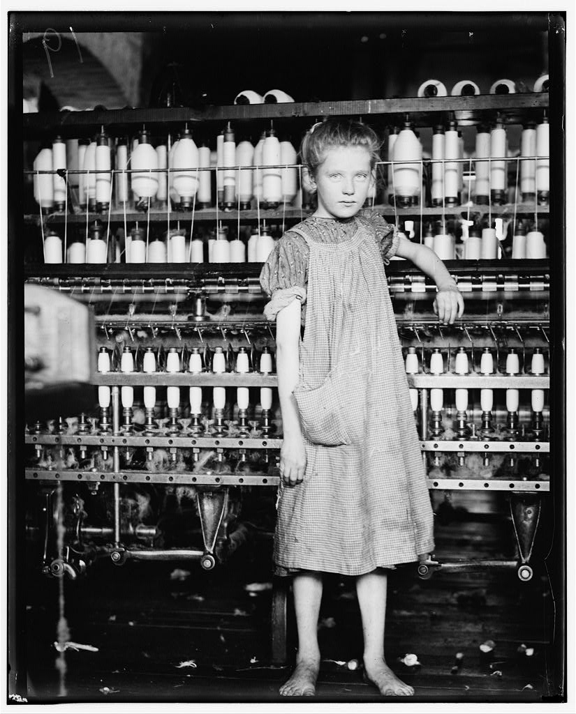
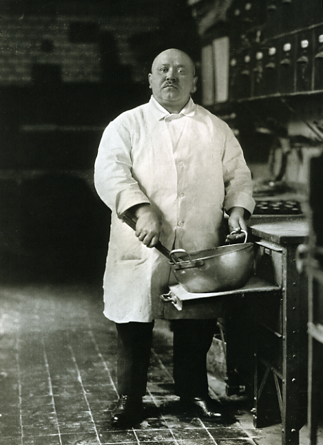
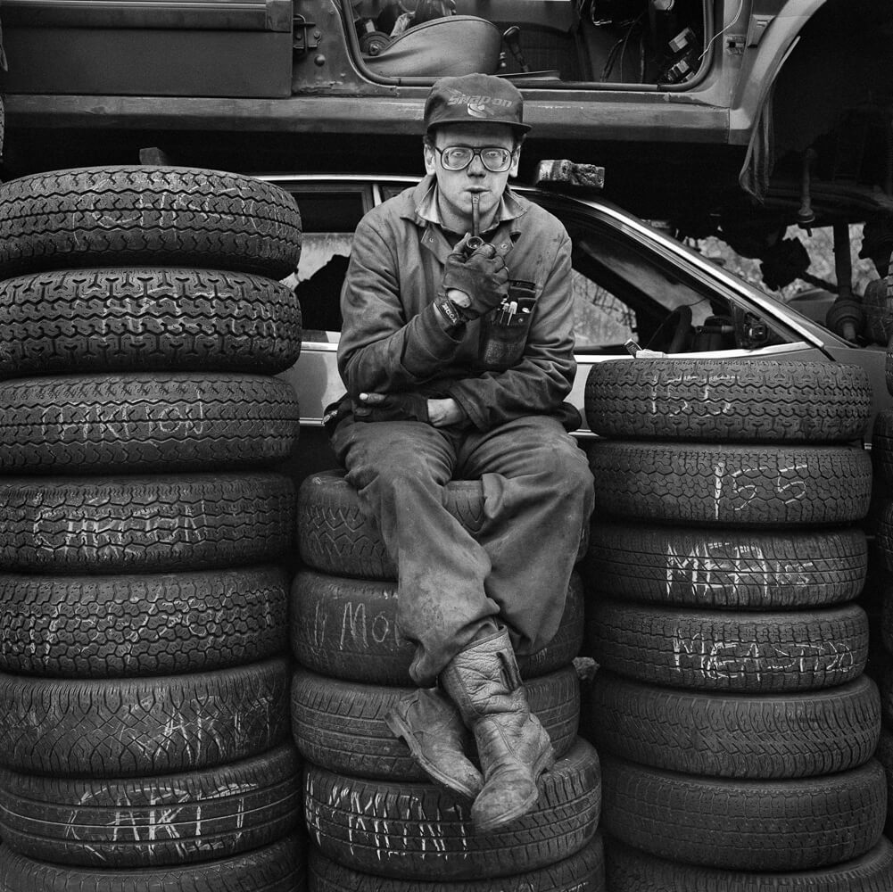
An Environmental photo is a photo taken of a person, usually head on, of them in their ‘natural environment’ ( place of work etc.. )
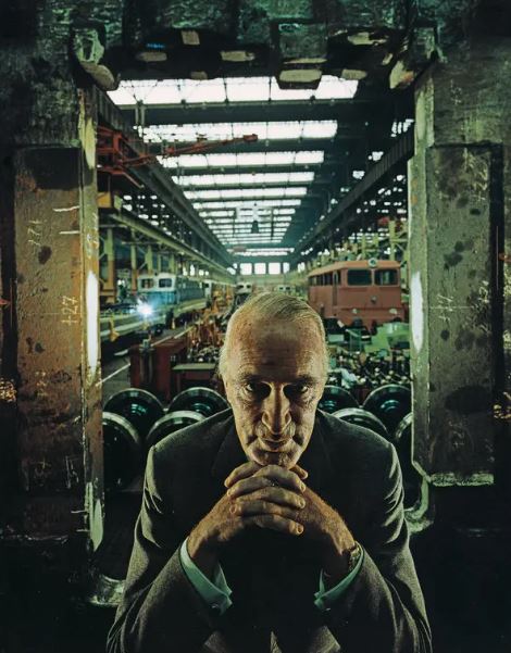
The first Environmental portrait was first created by a man named Arnold Newman ( 1918 – 2006 ). He was known for pioneering and popularising the environmental portrait.
He placed his ‘models’ in their normal work environment when he took the photo so he could represent their professions, aiming to capture the essence of an individuals life and work.
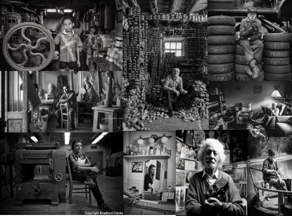
Environmental portrait mood board –
To me, these photos represent a lot more then just people at their work, they represent peoples lives and how they live and what they do. It gives a picture of the personal part of someone’s life, and almost gives us a window to understand people in a different way then just what is on the surface and what we can see first hand.
Typology–
Typology is basically a fancy word for a group of photos or a certain ‘photoshoot’ that are all themed together that give the same ‘feel’ or ‘idea’.
Some environmental portraits are also typologies, taken in a similar way. The photos all have similarities even though they are completely different and show different people and lives in completely different ways.
Environmental Portrait – a portrait executed in the subject’s usual environment, such as in their home or workplace, and typically illuminates the subject’s life and surroundings. They are normally used to reveal something about the subject in the photo particularly in relation to the background. This does not mean it has to be a positive association like the photo Arnold Newman took of Alfried Krupp and the way Newman has framed Krupp to represent the person he is and what he has done.
Typologies – A body of work with a consistent style. Often portrayed in many different forms, some being in a structured group with equal spacing in-between or a particular style in general like the style of environmental portraits. Environmental portraits are often associated with the style of typology as they are always structed images with the same idea of the subject looking into the camera and often centred.
An environmental portrait is a portrait executed in the subject’s usual environment, such as in their home or workplace, and typically illuminates the subject’s life and surroundings.
The surroundings or background is a key element in environmental portraiture, and is used to convey further information about the person being photographed.
While it is often true that the background may dominate the subject, this need not necessarily be so. In fact, the details that convey the message from the surroundings can often be quite small and still be significant. It can be used as a way to tell a story.
Mood board
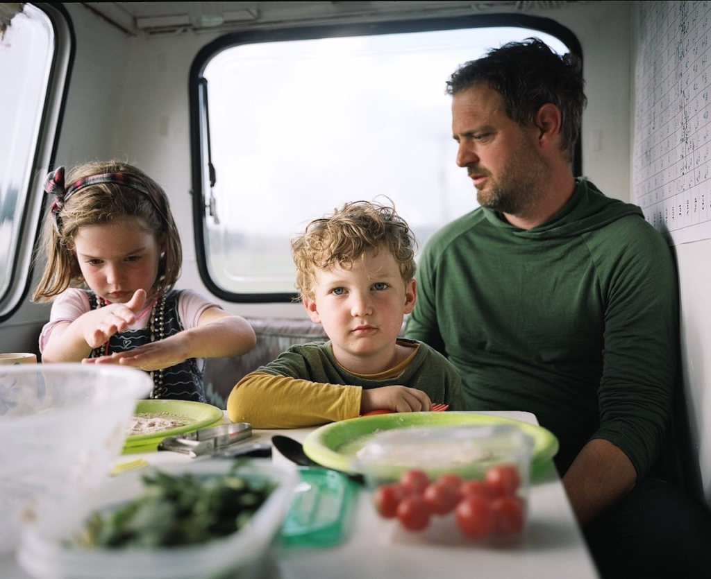
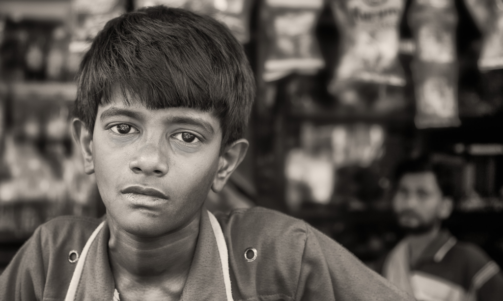
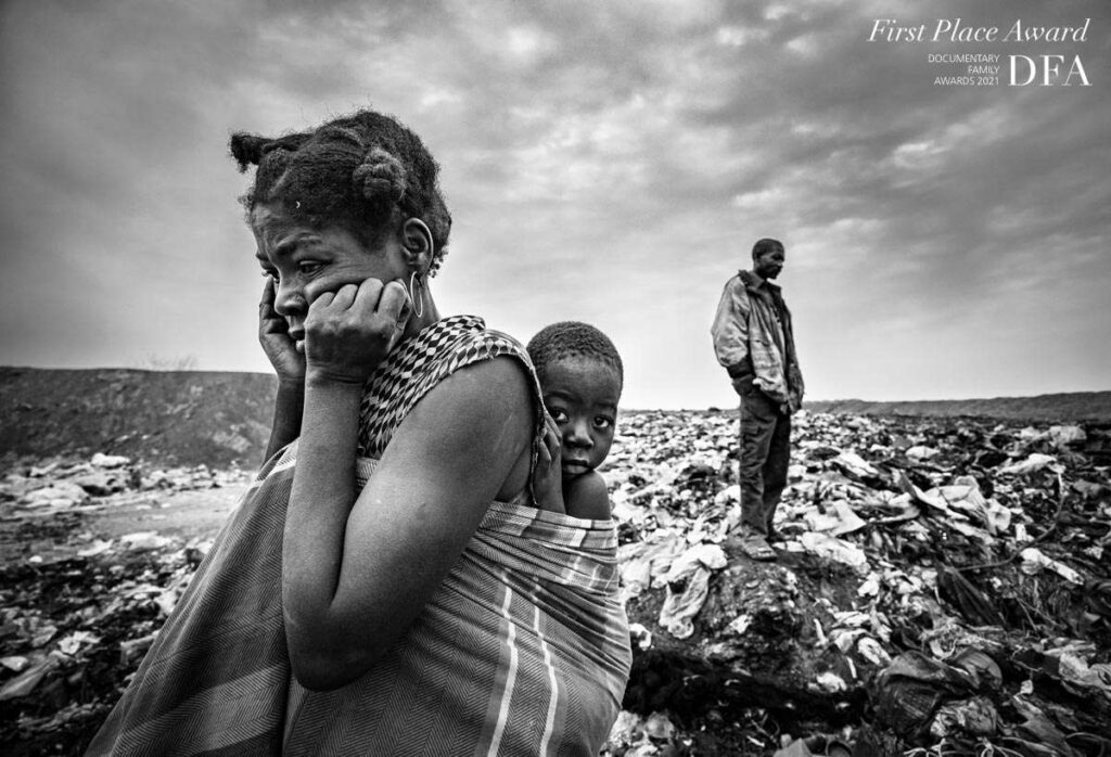
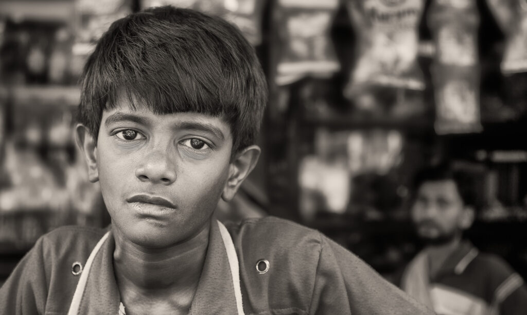
1st Place Award in the “Environmental Portrait” category (Fall 2021). Photo by João Coelho (Portugal).A portrait of a young boy with his father watching on in front of their store in Kolkata, India.
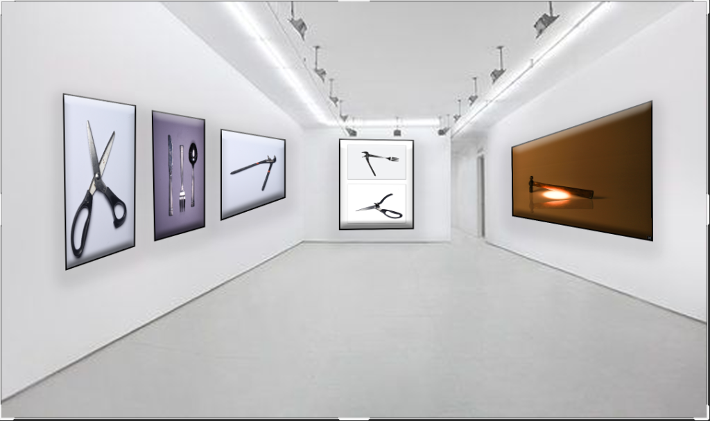
All these images are very unique and tell very different stories. Some portray sadness while others are more lively and happy. Some images are linked to there workplace and others are to do with there current situation. They are some similarities (topology’s are similar photos) like how they all have there subject in the centre, most look into the camera, and they all have lots of contrast.
The bottom right has the basketball net as the main focus of the image. However, this does not exclude the person from the image, its almost used as a way to lead the eyes to the neutral face of the guy.
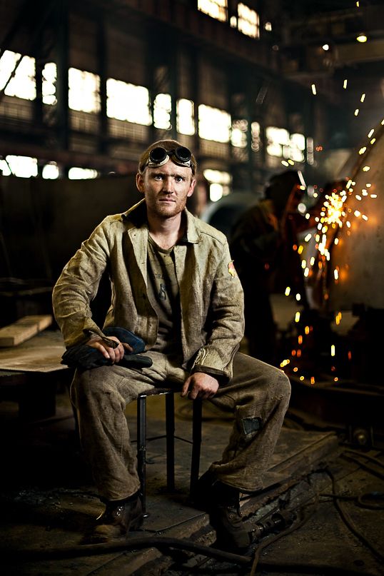
The top left is quite different as the main focus is clearly the guy sitting there seriously. It looks very planned out allowing cool details in the background to happen like the sparks.