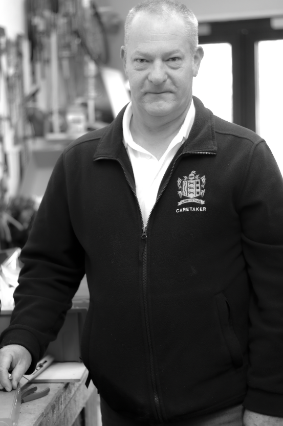
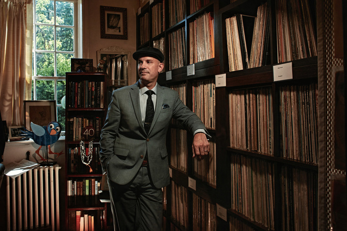
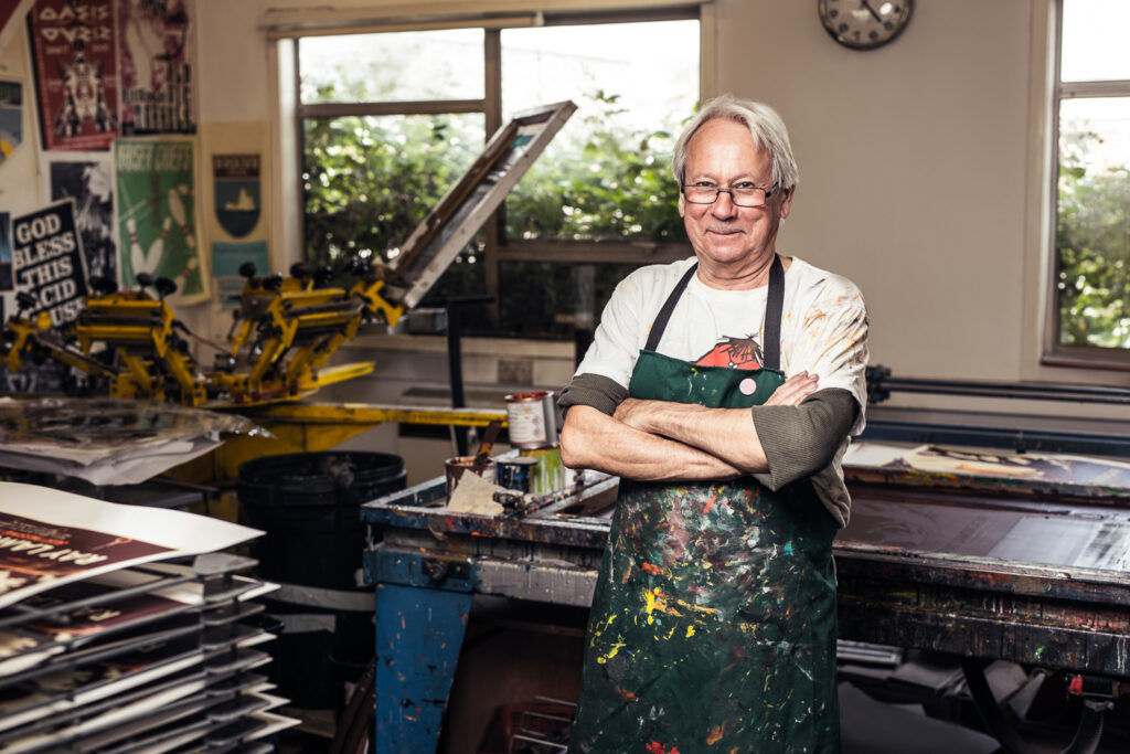
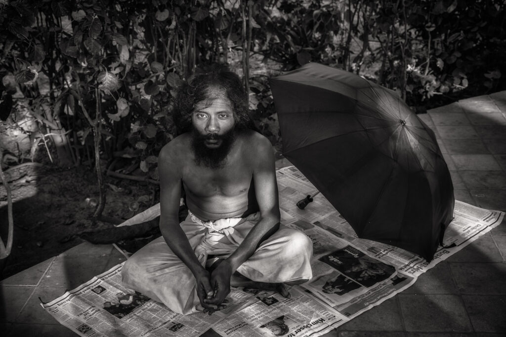
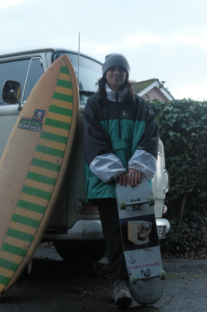
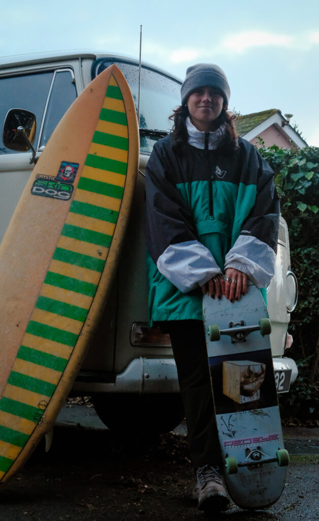
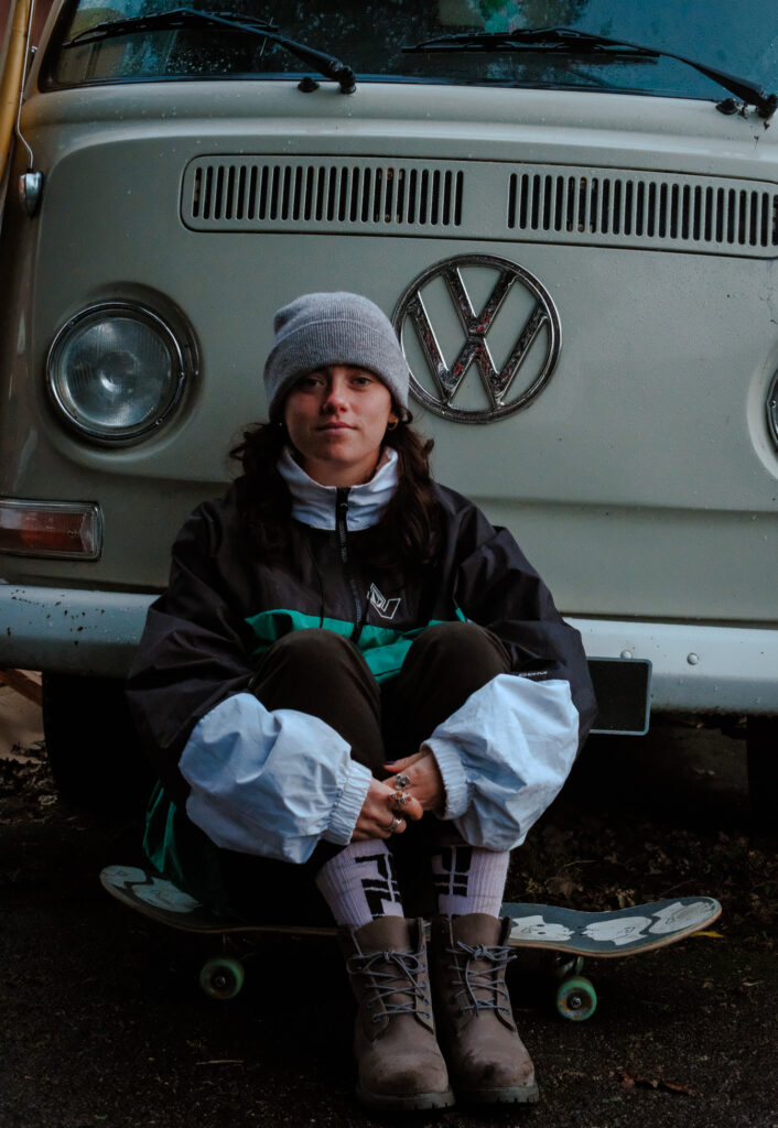
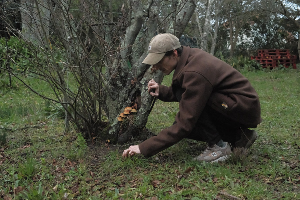
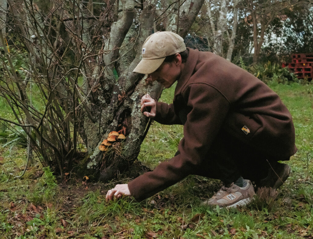
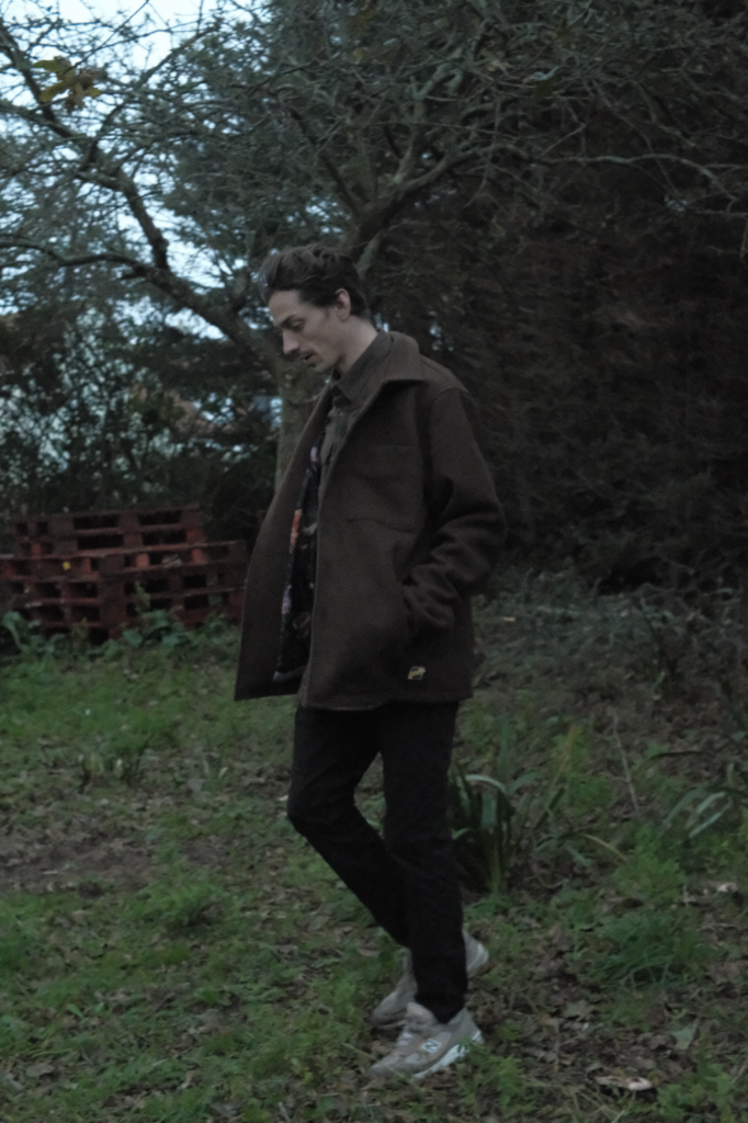
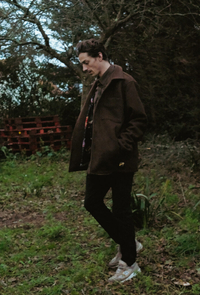
ENVIRONMENTAL PORTRAITS usually depict people in their…
working environments
environments that they are associated with…
“An environmental portrait is a portrait executed in the subject’s usual environment, such as in their home or workplace, and typically illuminates the subject’s life and surroundings. The term is most frequently used of a genre of photography”
TASK 1 Introduce and define Environmental Portraits
Choose a range of portraits to develop a grid of images (minimum of 9) to show your understanding of what an environmental portrait can be…
You must include a range of approaches to the portraits in your mood-board…
We will be studying the history, theory and concept of environmental portraits…their purpose and role in our day to day lives too.
Design a mind-map / mood-board / spider-gram / flowchart of environmental portrait ideas
Think about the ways in which we use these portraits, and what they can say about us / reveal / conceal
define what an environmental portrait actually is
Add your mind-map to your blog post
Choose a photographer from the list below to research and write about…include specific examples of their work and show that you can analyse and interpret their image(s).
Arnold Newman 1963.
>>You can find resources here<<
M:DepartmentsPhotographyStudentsResourcesPortraitureTO DO
and here : M:DepartmentsPhotographyStudentsPlanners Y12 JACUnit 2 Portrait Photography
August Sander – The Face of Our Time
One of the first photographic typological studies was by the German photographer August Sander, whose epic project ‘People of the 20th Century‘ (40,000 negatives were destroyed during WWII and in a fire) produced volume of portraits entitled ‘The Face of Our Time’ in 1929. Sander categorised his portraits according to their profession and social class.
The art of Photographic Typologies has its roots in August Sander’s 1929 series of portraits entitled ‘Face of Our Time’, a collection of works documenting German society between the two World Wars. Sander sought to create a record of social types, classes and the relationships between them, and recognised that the display of his portraits as a collection revealed so much more than the individual images would alone. So powerful was this record, the photographic plates were destroyed and the book was banned soon after the Nazis came into power four years later.
The term ‘Typology’ was first used to describe a style of photography when Bernd and Hilla Becher began documenting dilapidated German industrial architecture in 1959. The couple described their subjects as ‘buildings where anonymity is accepted to be the style’. Stoic and detached, each photograph was taken from the same angle, at approximately the same distance from the buildings. Their aim was to capture a record of a landscape they saw changing and disappearing before their eyes so once again, Typologies not only recorded a moment in time, they prompted the viewer to consider the subject’s place in the world.
The Becher’s influence as lecturers at the Dusseldorf School of Photography passed Typologies onto the next generation of photographers. Key photographic typologists such as Thomas Struth, Thomas Ruff, Thomas Demand and Gillian Wearing lead to a resurgence of these documentary-style reflections on a variety of subject matter from Ruff’s giant ‘passport’ photos to Demand’s desolate, empty cities.
Typologies has enjoyed renewed interest in recent years, thanks partly to recognition from galleries including the Tate Modern who hosted a Typologies retrospective in London in 2011. With it’s emphasis on comparison, analysis and introspection, the movement has come to be recognised as arguably one of the most important social contributions of the 20th century.
Karen Knorr produced a series of portraits, Belgravia and Gentlement of the wealthy upper classes in London
Jon Tonks, from his celebrated book, Empire – a journey across the South Atlantic exploring life on four remote islands, British Overseas Territories, intertwined through history as relics of the once formidable British Empire.Alec SothAlec Soth
Listen to Alec Soth talk about the story behind the portrait of Charles.
Vanessa Winship is a British photographer who works on long term projects of portrait, landscape, reportage and documentary photography. These personal projects have predominantly been in Eastern Europe but also the USA.
Vanessa Winship: In her series Sweet Nothings she has been taking photographs of schoolgirls from the borderlands of Eastern Anatolia. She continues to take all photographs in the same way; frontal and with enough distance to capture them from head to toe and still include the surroundings.Michelle Sank: from her series Insula – a six month residency in Jersey
Michelle Sank: Maurice from Sank’s series My.SelfSian Davey and her project Martha capturing her teenage daughter’s life on camera
Read about Siân Davey on the ways psychotherapy has informed her photography here
Sian Davey’s first book Looking for Alice explore all the tensions, joys, ups and downs that go with the territory of being in a family—and finding love for a child born with Down syndrome.
Laura Pannack is a British social documentary and portrait photographer, based in London. Pannack’s work is often of children and teenagers. Explore more of her work here
callum on the lawns – 2The Cracker – Laura Pannack
Read Laura Pannack’s best photograph: four teenagers on a Black Country wasteland here
Alys Tomlinson is an editorial and fine art documentary photographer based in London. See more of her work here
Lost Summer: These images were taken between June and August 2020. With school proms cancelled due to the Covid-19 pandemic, I photographed local teenagers dressed in outfits they would have worn to prom. Instead of being in the usual settings of school halls or hotel function rooms, I captured them in their gardens, backyards and local parks.
Look at these influential photographers for more ideas and information…
August Sander (1876 – 1964)
Paul Strand (1890 – 1976)
Arnold Newman (1918 – 2006)
Daniel Mordzinski (1960 – )
Annie Leibovitz (1949 – )
Mary Ellen Mark (1940 – 2015)
Jimmy Nelson (1967 – )
Sara Facio (1932 – )
Alec Soth
Vanessa Winship
Karen Knorr (Gentlemen, Belgravia)
Rob Hornstra
Michelle Sank
David Goldblatt
Sian Davey
Laura Pannack
Alys Tomlinson
Deanne Lawson
Thilde Jensen
Jon Tonk
Bert Teunissen
Key features to consider with formal / environmental portraits…
formal (posed)
head-shot / half body / three quarter length / full length body shot
high angle / low angle / canted angle
colour or black and white
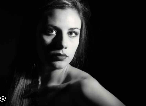
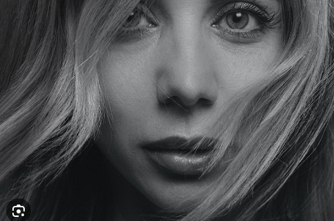
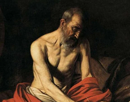
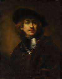
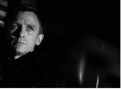
high key (light and airy) vs low key (high contrast / chiarascuro)
Technical > Composition / exposure / lens / light
Visual > eye contact / engagement with the camera / neutral pose and facial expression / angle / viewpoint
Conceptual > what are you intending to present? eg : social documentary / class / authority / gender role / lifestyle
Contextual >add info and detail regarding the back ground / story / detail / information about the character(s) / connection to the photographer eg family / insider / outsider
Classroom activity: Environmental portrait of a student
Photo-Shoot 1– homework –due date = Mon 6th November
Take 100-200 photographs showing your understanding of ENVIRONMENTAL PORTRAITS
Remember…your subject (person) must be engaging with the camera!…you must communicate with them clearly and direct the kind of image that you want to produce!!!
Outdoor environment
Indoor environment
two or more people
Then select your best 5-10 images and create a blog post that clearly shows your process of taking and making your final outcomes
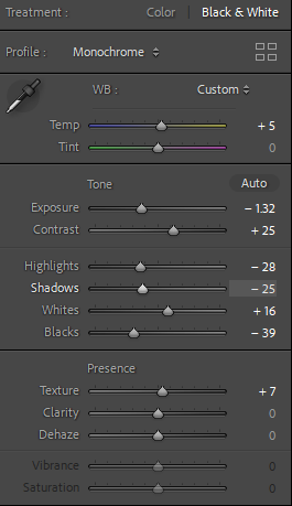
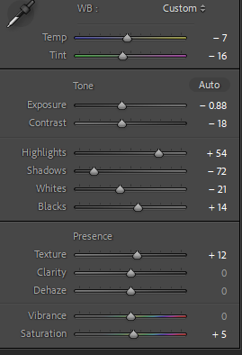
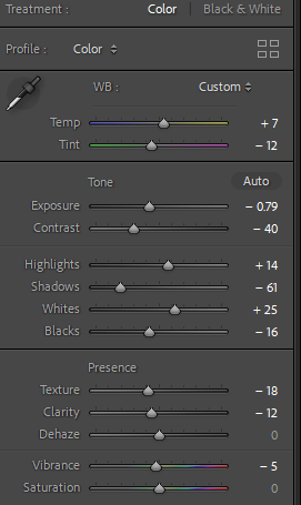
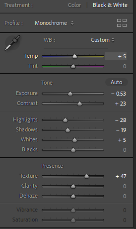
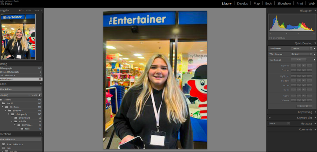
Remember not to over -edit your images. Adjust the cropping, exposure, contrast etc…nothing more!
Remember to show your Photo-Shoot Planning and clearly explain :
who you are photographing
what you are photographing
when you are conducting the shoot
where you are working/ location
why you are designing the shoot in this way
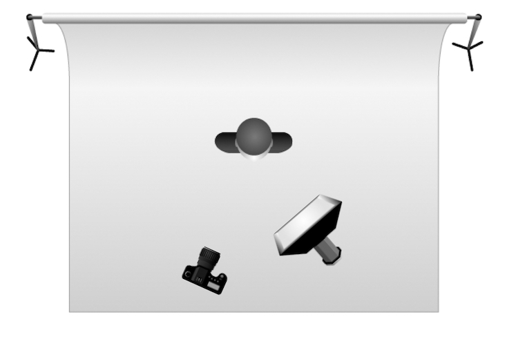
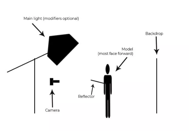
how you are going to produce the images (lighting / equipment etc)
More Examples
Environmental portraits mean portraits of people taken in a situation that they live in, work in, rest in or play in. Environmental portraits give you context to the subject you are photographing. They give you an insight into the personality and lifestyle of your subject.
Portrait 1: This particular image was photographed by Jane Bown of Quentin Crisp at home in Chelsea in 1978. Quentin Crisp was an English writer, famous for supernatural fiction and was a gay icon in the 1970s. This image was taken in his “filthy” flat as Bown describes. In the back ground we can see piles of books on top of the fireplace shelf which represents his career as a writer and a journalist. It looks as though he is boiling water on the stove which looks out of place because the room looks as if it is in the living room. As you would not normally place a stove in your lounge. He was living as a “Bed-Sitter” which means he had inadequate of storage space, this explains why his belongings were cramped in one room.
Portrait 2: This image was captured by Arnold Newman. He is also known for his “environmental portraiture” of artists and politicians, capturing the essence of his subjects by showing them in their natural surroundings. Here is a portrait of Igor Stravinsky who was a Russian pianist, composer and musician. In this photograph, the piano outweighs the subject which is him and depicts the fact that music was a massive part of him and his life. His body language looks as if he is imitating the way the piano lid is being held up, he is using his hand as a head rest. Another element in the photograph, is that the shape of the piano looks like a musical note which again symbolises his love of music.
Portrait 3: This photograph was also taken by Arnold Newman of John F. Kennedy, an American politician who served as the 35th President of the United States of America. This pictures was taken on a balcony at the White house. Mr. Kennedy isn’t directly looking into the camera, he is looking at the view outside which suggests his role as a president because at the time he was one of the most powerful man in the world. He is looking at the scenery, people and his surroundings. The image was taken at a low angle to depict the huge building and the horizontal lines symbolise power, dynamism and control.
Ideas for your environmental photo shoot
Who
Barber/Hairdresser
Dentist/Doctor
Postman
Market trader
Florist
Tattooist
Musician
Barista
Fishmonger
Butcher
Baker
Farmer
Cleaner
Chef/Cook
Stonemason
Blacksmith
Fisherman
Builder/Carpenter
Sportsman/Coach
Taxi driver
Where
Central Market
Fish Market
St Helier Shops
Hair salons/barbers
Coffee shop
Farms
Building Sites
Harbour
Sport centres/fields
Taxi Ranks
Offices
WHEN
You will have to think ahead and use your photo shoot plan. You may have to contact people in advance, by phone, or arrange a convenient time. (Ask if you can return later in the day).
Remember to be polite and explain what your are doing and why!
It may surprise you that most people will be proud of what they do as it is their passion and profession and will be happy to show it off!
Don’t be scared. Be brave. Be bold. Be ambitious!!!
Essential Blog Posts
Mood-board, definition and introduction (AO1)
Mind-map of ideas (AO1)
Artist References / Case Study (must include image analysis) (AO1)
Your next project will be largely based on Landscapes. We will study…
The history and traditions of Landscape Photography
Methods and Techniques used
The impact of Landscape Photography on our psyches and understanding of the world…the Jersey Island Geopark and Sites of Special Interest, as well as evidence of Storm Ciaran.
So, to kickstart the project you have a new Photo-Assignment…
Choose a range of locations that are predominantly natural / rural / coastal
Go for a walk in the location(s) and photograph what you experience along the way.
Photograph up, down, sideways and along
Consider how you can use the light, shadows and sense of scale too…
Areas to visit and document…
cliff-paths
beaches
sand dunes
fields
country lanes and paths
woods
valleys
SSIs
What is the difference between bucolic and pastoral?
As a noun, a bucolic may be either a person who lives in the country (cf.rustic below) or a poem celebrating the pleasures of country life, i.e., a pastoral: the Eclogues of the Latin poet Virgil (70-19 BCE) are sometimes referred to as his Bucolics
We will be looking at Romanticism and The Sublime as a starting point and if you click here you will have a better understanding of some of the roots of landscape as a genre in contemporary photography….
The focus of your study and research is natural landscapes and the impact of ROMANTICISM and The Sublime in Landscape painting and then later, photography.
Working Title/Artist: Stormy Coast Scene after a Shipwreck Department: European Paintings Working Date: (1830)
Watch this film about the history and influence of Romanticism.
“Writers and artists rejected the notion of the Enlightenment, which had sucked emotion from writing, politics, art, etc. and focused too much on science, logic and reason. Writers and artists in the Romantic period favored depicting emotions such as trepidation, horror, and wild untamed nature.”
“The ideals of these two intellectual movements were very different from one another. The Enlightenmentthinkers believed very strongly in rationality and science. … By contrast, the Romantics rejected the whole idea of reason and science. They felt that a scientific worldview was cold and sterile.”
The Industrial Revolution 1760-1840 was based upon the efficient exploitation of nature’s raw materials and labour as new scientific theories developed by the Enlightenment thinkers were quickly transformed into practical, money-making applications.
The industrial revolution changed the landscape dramatically
JMW Turner- Hannibal Crossing The Alps 1835Caspar David Friedrich 1832 Germany
Romanticism in the Visual Arts
Both the English poet and artist William Blake and the Spanish painter Francisco Goya have been dubbed “fathers” of Romanticism by various scholars for their works’ emphasis on subjective vision, the power of the imagination, and an often darkly critical political awareness.
Social Commentary
The Romanticist often had “something to say” with their art…with plenty of discussion points, observations and interpretations.
Use the prompts below to show your understanding of John Constable’s vision of a changing countryside in early 19th England.
The video below looks closely at the Hay Wain. It includes everything you need to analyse this artwork.
PAINTING VS PHOTOGRAPHY – pictorialism
Roger Fenton, inspired by nature and romanticism revisited a spot in Wales where previously the painter Samuel Palmer had been inspired by the natural beauty of this river valley.
Aspects of pictorialism are evident here too…an approach to photography that emphasizes beauty of subject matter, tonality, and composition rather than the documentation of reality.
Roger Fenton c. 1852-62
Valley of the Shadow of Death is also a photograph by Roger Fenton, taken on April 23, 1855, during the Crimean War. It is one of the most well-known images of war…most likely staged too and is in stark contrast to the example above. Exaggerating and exploiting the surroundings are a key part of creating dramatic imagery and opens up the question of truth in photography
Carelton E. Watkins (1829–1916)
“…it is hard to consider the birth of the environmental movement without mentioning Watkins and the rippling, far-reaching influence of his 1861 images of Yosemite. All that came after – Lincoln’s signing of the Yosemite grant, Muir’s nature writing, the founding of conservation groups such as the Sierra Club – can be traced back to the intake of breath when his images were seen for the first time.”
Fernando Maselli
Drawing inspiration from Edmund Burke’s romantic conception of the sublime and its connection to nature, Madrid-based photographer Fernando Maselli creates photomontages of infinite mountain ranges that speak of the emotions elicited by nature and their connection to creation and reality.
Ansel Adams was an American landscape photographer and environmentalist known for his black-and-white images of the American West. He helped found Group f/64, an association of photographers advocating “pure” photography which favored sharp focus and the use of the full tonal range of a photograph…even creating a Zonal System to ensure that all tonal values are represented in the images. Ansel Adams was an advocate of environmental protection, national parks and creating an enduring legacy of responses to the power of nature and sublime conditions…Other members in Group f/64 included Edward Weston, Dorothea Lange, Imogen Cunningham among other female photographers who has been overlooked in the history or photography.
IMAGE ANALYSIS: For your analysis of Adams’ work and practice, try and find the story behind the image – as an example, see Monolith, the face of Half Dome, 1927
Monolith, the face of Half Dome, 1927
Pixelation of Halfdome image in Photoshop
Edward Weston
EXTENSION > COMPARE & CONTRAST: Compare and contrast the work of Ansel Adams and Edward Weston using Photo Literacy Matrix. Find 3 quotes that you can use in your analysis, that either supports/ disapprove your own view. Make sure that you comment on the quote used.
For example, you can use quotes: 1. a quote from Adams’ on Weston’s influence 2. a quote from Adams’ on his own practice, eg. technique, pre-visualisation (zone system), subject (nature), inspiration etc. 3. a quote from Weston on Adams’ images. 4. a quote from someone else, for example a critic, historian that comments either on Adams’ or Weston’s work.
I can’t tell you how swell it was to return to the freshness, the simplicity and natural strength of your photography … I am convinced that the only real security lies with a certain communion with the things of the natural world
— A letter from Edward to Ansel in 1936
Starting points…
Who – were they ?
What – did they do ?
When – was this taking place and what else was happening at the time
Where – was this happen
How – did all of this become synthesised ?
Why – what was driving these changes / developments
RURAL LANDSCAPE PHOTOGRAPHERS
Don McCullin 2000 UK
Fay Godwin 1985 UK
Wynn Bullock
Fay Godwin
Edward Weston
Minor White
Don McCullin
Jem Southam
Whale Chine, 1994, Jem Southam
BLOG POSTS to complete…
An introduction to rural landscape photography, including a definition and mood-board of influential images
Create anin-depth case study that analyses and interprets the work of a key landscape photographer…EG: Ansel Adams or Edward Weston or Fay Godwin or Don McCullin (or similar)
Create a blog post that defines and explains what Romanticism is in Landscape Photography…include examples and make reference to Romanticism in other art-forms eg painting. Discuss the notion of the sublime and the picturesque.
4. Create a mind-map / mood-board of potential locations around Jersey that you could record and create romanticized landscape photographs of….look for extremes (either calm or wild, derelict, desolate, abandoned or stormy, battered and at the mercy of nature)
AIM to photograph the coastline, the sea, the fields, the valleys, the woods, the sand dunes etc. USE the wild and dynamic weather and elements to help create a sense of atmosphere, and evoke an emotional response within your photo assignment. PHOTOGRAPH before dark, at sunset or during sunrise…and include rain, fog, mist, ice, wind etc in your work LOOK for LEADING LINES such as pathways, roads etc to help dissect your images and provide a sense of journey / discovery to them.
5. Take 150-200 photos of romanticisedrural landscapes. . Add your edited selective contact sheets / select your best 6-10 images / include edits and screen shots to show this process. Ensure you include both monochrome and colour examples and show experimentation of producing HDR images from your bracketed shots using techniques both in Lightroom and Photoshop.
Photo-assignment
Monday 26th Feb – Monday 4th March due date
6. Produce comparative analysis between one of your images and a landscape photographer you have looked at for inspiration, such as Ansel Adams – discuss similarities and differences and comment on aesthetic connections with Romanticism and The Sublime.
REMEMBER you MUST use PHOTO-LITERACY (TECHNICAL / VISUAL / CONTEXTUAL / CONCEPTUAL) to analyse effectively.
Ensure that you include the following key terms in your blog posts…
Composition (rule of thirds, balance, symmetry)
Perspective (linear and atmospheric, vanishing points)
Depth (refer to aperture settings and focus points, foreground, mid-ground and back-ground)
Scale (refer to proportion, but also detail influenced by medium / large format cameras)
Light ( intensity, temperature, direction)
Colour (colour harmonies / warm / cold colours and their effects)
Shadow (strength, lack of…)
Texture and surface quality
Tonal values ( contrast created by highlights, low-lights and mid-tones)
Leading Lines
Composition : The Rule of Thirds Grid
Composition : Fibonacci Curve / Golden ratio
EXPOSURE BRACKETING
Exposure bracketing means that you take two more pictures: one slightly under-exposed (usually by dialing in a negative exposure compensation, say -1/3EV), and the second one slightly over-exposed (usually by dialing in a positive exposure compensation, say +1/3EV), again according to your camera’s light meter.
TASK : try a few variation of exposure bracketing to create the exposures that you want…you may already have pre-sets on your phone or camera to help you do this, but experimenting manually will help your understanding!
Many digital cameras include an Auto Exposure Bracketing (AEB) option. When AEB is selected, the camera automatically takes three or more shots, each at a different exposure. Auto Exposure Bracketing is very useful for capturing high contrast scenes for HDR like this…
…by taking the same photograph with a range of different exposure settings
You can use Exposure Compensation to quickly adjust how light or how dark your exposure will be using these controls…
Or set the amount of “bracketing” like this…
HDR photography is a technique where multiple bracketed images are blended together to create a single beautifully exposed photograph with a full dynamic range of tones from the very dark to the very brightest.
Your camera can only capture a limited range of lights and darks (i.e., it has a limited dynamic range). If you point your camera at a dark mountain in front of a bright sunset, no matter how much you tweak the image exposure, your camera will generally fail to capture detail in the mountain and the sky; you’ll either capture an image with a beautiful sky but a dark, less detailed mountain, or you’ll capture an image with a detailed mountain but a bright, blown-out sky. High dynamic range photography (HDR) aims to address this issue. Instead of relying on the camera’s limited dynamic range capabilities, you take multiple photos that cover the entire tonal range of the scene.
A set of three bracketed shots: -1 EV (left), 0 EV (middle), +1 EV (right). EV = exposure value
Ansel Adams zone system was in essence a pre-cursor of HDR with the outcome of producing an image with a full range of tones showing details in both the bright areas and dark shadows.
Compare and contrast your work to your artist reference(AO1)
Evaluation and Critique (AO1+AO4)
URBAN AND INDUSTRIAL LANDSCAPES
Over the next two weeks you will be looking at producing blog posts and responding photographically to:
New Topographics
Urban Landscapes
Industrial Landscapes
Camera Skills – vantage points/ Typologies (dead-pan aesthetic)
The New Topographics
You will be learning about photographing man-altered landscapes and The New Topographics and will be shown inspiration, influences, background and theory…and will be taken on at least 1 x guided photo-walk.
New Topographics was a term coined by William Jenkins in 1975 to describe a group of American photographers (such as Robert Adams and Lewis Baltz) whose pictures had a similar banal aesthetic, in that they were formal, mostly black and white prints of the urban landscape…
The beginning of the death of “The American Dream”
LEWIS BALTZ
Many of the photographers associated with The New Topographics including Robert Adams, Lewis Baltz, Nicholas Nixon and Bernd and Hiller Becher, were inspired by the man-made…selecting subject matter that was matter-of-fact.
New Topographics was inspired by the likes of Albert Renger Patszch and the notion of The New Objectivity
Parking lots, suburban housing and warehouses were all depicted with a beautiful stark austerity, almost in the way early photographers documented the natural landscape. An exhibition at the International Museum of Photography in Rochester, New York featuring these photographers also revealed the growing unease about how the natural landscape was being eroded by industrial development.
What was the New Topographics a reaction to?
The stark, beautifully printed images of the mundane but oddly fascinating topography was both a reflection of the increasingly suburbanised world around them, and a reaction to the tyranny of idealised landscape photography that elevated the natural and the elemental…
Post-war America struggled with
Inflation and labor unrest. The country’s main economic concern in the immediate post-war years was inflation. …
The baby boom and suburbia. Making up for lost time, millions of returning veterans soon married and started families…
Isolation and splitting of the family unit, pharmaceuticals and mental health problems
Vast distances, road networks and mobility
STEPHEN SHORE
The New Topographics were to have a decisive influence on later photographers including those artists who became known as the Düsseldorf School of Photography.
Research a selection of the photographers associated with New Topographics and respond with…
Links to help with researching of Topographic Photographers:
similar imagery from your own photo-shoots / image library
analytical comparisons and contrasts
a presentation of final images
CASE STUDY: Stephen Shore, Beverly Boulevard and La Brea Avenue, Los Angeles, California, June 21, 1975, chromogenic colour print
Analysis and discussion… starting points and key features of The New Topographics
Foreground vs background | Dominant features
Composition | low horizon line | Square format
Perspective and detail / cluttering
Wide depth of field | Large Format Camera
Colour | impact and relevance
Nationalism vs mobility vs isolation
Social commentary | The American Dream ?
An appreciation of the formal elements : line, shape, form, texture, pattern, tone etc
Explore Robert Adams seminal photobook: The New Westhere
Critic Sean O’Hagan, writing in The Guardian, said “his subject has been the American west: its vastness, its sparse beauty and its ecological fragility…What he has photographed constantly – in varying shades of grey – is what has been lost and what remains” and that “his work’s other great subtext” is silence…
Frank Golhke
Bernd and Hilla Becher
You could also look at these photographers who has been influenced by New Topographics…see below for images/ examples under RESOURCES…
Research and explore The New Topographics and how photographers have responded to man’s impact on the land, and how they found a sense of beauty in the banal ugliness of functional land use…
Create a blog post that defines and explains The New Topographics and the key features and artists of the movement.
ANSWER : What was the new topographics a reaction to?
A case study on your chosen NEW TOPOGRAPHIC landscape photographer. Choose from…ROBERT ADAMS, STEPHEN SHORE, JOE DEAL, FRANK GOLKHE, NICHOLAS NIXON, LEWIS BALTZ, THE BECHERS, HENRY WESSEL JR, JOHN SCHOTT ETC to write up a case study that will inspire your own photography.
Once you have completed your photo walk from Havre Des Pas to La Collette you should aim to make comparisons with photographers and their work…as well as the notion of psychogeography to help understand your surroundings
Your image selection and editing may be guided by this work…and you must show that you can make creative connections.
For Example Albert Renger Patszch and The New Objectivity
Produce a list of places in Jersey you could go and shoot urban landscapes. Create a blog post of a visual mood board and photo shoot plan.
Scrapyards, building sites, cranes, restoration yards, derelict ruins, car parks, underpass, harbours and dockyards, industrial centres, retail park, stadiums, floodlight arenas, staircases, road systems, circuit boards, pipework, telephone poles, towers, pylons, shop displays, escalators, bars, libraries, theatres and cinemas, gardens, parks, playgrounds, swimming pools, etc.
Possible titles to inspire you and choose from… Dereliction / Isolation / Lonely Places / Open Spaces / Close ups / Freedom / Juxtaposition / Old and new / Erosion / Altered Landscapes / Utopia / Dystopia / Wastelands / Barren / Skyscapes / Urban Decay / Former Glories / Habitats / Social Hierarchies / Entrances and Exits / Storage / Car Parks / Looking out and Looking in / Territory / Domain / Concealed and Revealed
Explore these options…
St Helier
Residential areas
Housing estates
High
Retail Parks and shopping areas
Industrial Areas
Car Parks (underground and multi-storey too)
Leisure Centres
Building sites
Demolition sites
Built up areas
Underpass / overpass
The Waterfont
Harbours
Airport
Finance District (IFC buildings)
What do I photograph?
ROADS / BUILDINGS / STREETS / ST HELIER / FLATS / CAR PARKS / OFFICE BLOCKS / PLAYING FIELDS / SCHOOL / SHOPS / SUPERMARKETS / BUILDING SITES / TRAFFIC / HOTELS
Where to shoot ?
ORDANCE YARD / ST AUBINS HIGH STREET / COBBLED BACK STREETS / OLD ST HELIER / NEW ST HELIER / FLATS / ESPLANADE / TOWN / CAR PARKS / FORT REGENT / FINANCE DISTRICT / UNDERPASS / TUNNEL / NIGHT TIME / PIER ROAD CAR PARK / HUE COURT / LE MARAIS FLATS / PLAYING FIELDS / SCHOOLS / ANN STREET BREWERY BUILDING SITE / SPRINGFIELD STADIUM / WATERFRONT / SH HARBOUR / LA COLLETTE
Firstphotoshoot inspired and influenced by New Topographics. (+100 photographs). Remember to include examples of work by photographers associated with that exhibition/ movement that have influenced your work.
Select, consider and decide on best images (show contact sheets)
Develop ideas through digital manipulation (ie: cropping, contrast, colour balance etc.)
Secondphotoshoot inspired and influenced by your case study of your chosen urban landscape photographer. see list below URBAN PHOTOGRAPHERS (+100 photographs). Can be any urban landscape photographer, but remember to include a brief case study and examples of their work that have influenced your work.
You could experiment with different vantage points eg: worms eye view, or birds eye view OR create a study on TYPOLOGY.
Select, consider and decide on best images (show contact sheets)
Develop ideas through digital manipulation (ie: cropping, contrast, colour balance etc.)
Realise a final outcome.
Technical: Shoot using different vantage points.
Why Is Vantage Point Important?
Your vantage point affects the angles, composition, and narrative of a photograph. It is an integral part of the decision-making process when taking a photograph.
We often spend more time considering camera settings and lighting, than exploring viewpoints. A picture taken from a unique vantage point makes us think about the subject in a different way. Perspectives from high or low angles add emotion to the photograph.
Eye-level vantage points provide a feeling of directness and honesty. Changing your vantage point can include or exclude part of the photo’s story.
As you look through your viewfinder, ask yourself some questions:
How could I add interest to the subject?
How can I show the viewer a new perspective on this subject?
Do I always stand in this position when taking photos?
What else can I include in the frame to tell the story? How can I make this happen?
TRY LOOKING UP, LOOKING DOWN, AT AN ANGLE, FROM A DISTANCE, A WORMS EYE VIEWand BIRDS EYE VIEW ETC.
appropriate image selection and editing techniques
presentation of final ideas and personal responses
analysis and evaluation of process
compare and contrast to a key photographer
critique / review / reflection of your outcomes
MORE RESOURCES / IDEAS / INSPIRATIONS
TYPOLOGIES and the landscape
Bernd and Hilla Becher – Typologies of industrial architecture
Read this useful introduction to the Becher’s work from American Photo magazine which describes their interest in the ‘Grid’ and their influence on future generations of photographers, members of the Düsseldorf School.
The term ‘Typology’ was first used to describe a style of photography when Bernd and Hilla Becher began documenting dilapidated German industrial architecture in 1959. The couple described their subjects as ‘buildings where anonymity is accepted to be the style’.
Partly inspired by the likes of Karl Blossfeldt, August Sander and The New Objectivity (that we looked at in the previous project)
Stoic and detached, each photograph was taken from the same angle, at approximately the same distance from the buildings. Their aim was to capture a record of a landscape they saw changing and disappearing before their eyes so once again, Typologies not only recorded a moment in time, they prompted the viewer to consider the subject’s place in the world.
The Bercher’s influence as lecturers at the The Dusseldorf School of Photography passed Typologies onto the next generation of photographers. Key photographic typologists such as Thomas Struth, Thomas Ruff, Thomas Demand and Gillian Wearing lead to a resurgence of these documentary-style reflections on a variety of subject matter from Ruff’s giant ‘passport’ photos to Demand’s desolate, empty cities.
You could:
Create your own typological series documenting repeated forms within your surroundings. For example, you might like to choose one of the following subjects:
front doors on the street where you live
cracks in the pavement
fences and walls
the colours of all the cars in the supermarket car park
telegraph poles viewed from below
TV aerials silhouetted against the sky
KEVIN BAUMAN
Images from 100 Abandoned Houses – A record of abandonment in Detroit in the mid 90’s by Kevin Bauman
Ed Ruscha, “Every Building On The Sunset Strip”
The artist Ed Ruscha is famous for his paintings and prints but is also known for his series of photographic books based on typologies, among them Every Building on the Sunset Strip, Twentysix Gasoline Stations, Some Los Angeles Apartments, and Thirtyfour Parking Lots. Ruscha employs the deadpan style found in many photographic topologies. The book shown above is a 24 foot long accordion fold booklet that documents 1 1/2 miles of the Sunset Strip in Hollywood.
Ed Ruscha
Ed Ruscha, Standard Station, 1966
Here’s another topology for you to look at by Ólafur Elíasson :
Idris Khan: Every…Bernd And Hilla Becher Gable Sided Houses, 2004, Photographic print 208 x 160 cm
The structures in the Bechers’ original photographs are almost identical, though in Khan’s hands the images’ contrast and opacity is adjusted to ensure each layer can be seen and has presence. Though Khan works in mechanised media and his images are of industrial subjects, their effect is of a soft ethereal energy. They exude a transfixing spiritual quality in their densely compacted details and ghostly outlines. …Prison Type Gasholders conveys a sense of time depicted in motion, as if transporting the old building, in its obsolete black and white format, into the extreme future.
Creative Outcomes Can include : grids, animations, GIFs, Timelapse etc
Criss‑Crossed Conveyors ‑ Ford Plant
Charles Sheeler (American, 1883–1965)
1927
Photograph, gelatin silver print
*The Lane Collection
*Courtesy, Museum of Fine Arts, Boston
Surface and Texture
Aaron Siskind
NIGHT PHOTOGRAPHY
Many urbanised areas are great to photograph at night or in low light conditions…
Naoya HatakayamaNaoya Hatakayama
Edgar Martins
Rut Blees Luxemburg , A Modern Project, 1996
use a tripod
use slow shutter speeds (experiment with your TV Mode / Shutter speeds !
be safe…take a friend and let your parents know where you are going
Check your EXPOSURE SETTINGS according to the light and what you are photographing…
Follow this 10 Step Process and create multiple blog posts for each unit to ensure you tackle all Assessment Objectives thoroughly :
Mood-board, definition and introduction (AO1)
Mind-map of ideas (AO1)
Artist References / Case Studies (must include image analysis) (AO1)
watch the documentary on ‘Fixing the Shadows’ from BBC Genius of Photography, Episode 1.
To embed your understanding of the origins of photography and its beginnings you’ll need to produce a blog post which outlines the major developments in its practice. Some will have been covered in the documentary but you may also need to research and discover further information.
Your blog post must contain information about the following and keep it in its chronological order:
Camera Obscura
Nicephore Niepce
Louis Daguerre
Daguerreotype
Henry Fox Talbot
Richard Maddox
George Eastman
Kodak (Brownie)
Film/Print Photography
Digital Photography
Each must contain dates, text and images relevant to each bullet point above. In total aim for about 1,000-2000 words.
Archives in contemporary photography: Also read text about the resurgence of archives in contemporary photography by theorist David Bate: archives-networks-and-narratives_low-res, make notes and reference it by incorporating quotes into your essay to widen different perspectives. Comment on quotes used to construct an argument that either support or disapprove your own point of view.
Origins of Photography: Study this Threshold concept 2: Photography is the capturing of light; a camera is optional developed by PhotoPedagogy which includes a number of good examples of early photographic experiments and the camera obscura which preceded photography. It also touches on photography’s relationship with light and reality and delve into photographic theories, such as index and trace as a way of interpreting the meaning of photographs.
Photography did not spring forth from nowhere: in the expanding capitalist culture of the late 18th and 19th centuries, some people were on the look-out for cheap mechanical means for producing images […] photography emerged experimentally from the conjuncture of three factors: i) concerns with amateur drawing and/or techniques for reproducing printed matter, ii) light-sensitive materials; iii) the use of the camera obscura — Steve Edwards, Photography – A Very Short Introduction
View from the Window at Le Gras by Nicéphore Niépce in 1826 or 1827
Debates about the origins of photography have raged since the first half of the nineteenth century. The image above left is partly the reason. View from the Window at Le Gras is a heliographic image and arguably the oldest surviving photograph made with a camera. It was created by Nicéphore Niépce in 1826 or 1827 at Saint-Loup-de-Varennes, France. The picture on the right is an enhanced version of the original which shows a view across some rooftops. It is difficult to tell the time of day, the weather or the season. This is because the exposure time for the photograph was over eight hours.
What is a daguerreotype?
The daguerreotype was the first commercially successful photographic process (1839-1860) in the history of photography. Named after the inventor, Louis Jacques Mandé Daguerre, each daguerreotype is a unique image on a silvered copper plate.
In contrast to photographic paper, a daguerreotype is not flexible and is rather heavy. The daguerreotype is accurate, detailed and sharp. It has a mirror-like surface and is very fragile. Since the metal plate is extremely vulnerable, most daguerreotypes are presented in a special housing. Different types of housings existed: an open model, a folding case, jewelry…presented in a wooden ornate box dressed in red velvet. LD a theatre set designer
The invention of photography, however, is not synonymous with the invention of the camera. Cameraless images were also an important part of the story. William Henry Fox Talbot patented his Photogenic Drawing process in the same year that Louis Daguerre announced the invention of his own photographic method which he named after himself.
Anna Atkins‘ British Algae: Cyanotype Impressions of 1843 is the first use of photographic images to illustrate a book. This method of tracing the shapes of objects with light on photosensitive surfaces has, from the very early days, been part of the repertoire of the photographer.
The cyanotype (from Ancient Greek: κυάνεος, kyáneos ‘dark blue’ and τύπος, týpos ‘mark, impression, type’) is a slow-reacting, economical photographic printing formulation sensitive to a limited near ultraviolet and blue light spectrum, the range 300 nm to 400 nm known as UVA radiation.[1] It produces a monochrome, blue coloured print on a range of supports, often used for art, and for reprography in the form of blueprints. For any purpose, the process usually uses two chemicals: ferric ammonium citrate or ferric ammonium oxalate, and potassium ferricyanide, and only water to develop and fix. Announced in 1842, it is still in use
Henry Fox Talbot – Latticed Window, 1835
In the month of August 1835, William Henry Fox Talbot produced the first photographic negative to have survived to this day. The subject is a window. Despite the clear connection, it is an entirely different image compared to those of his colleagues Niépce and Daguerre. Those are photographs taken from a window, while this is the photograph of a window. From the issue of realism, we shift here into an extremely modern outlook which today would be likened to conceptual and metalinguistic discourse. While the window constitutes the most immediate metaphor to refer to photography, Talbot doesnʼt use it but more simply he photographs it. He thus takes a photograph of photography. The first to comment on this was the author himself, writing a brief note (probably added when it was displayed in 1839) on the card upon which it is mounted. The complete text reads:
Latticed Window (with the Camera Obscura) August 1835 When first made, the squares of glass, about 200 in number could be counted, with help of a lens
In 1978, the German photographer Floris Neusüss visited Lacock Abbey to make photograms of the same window. He returned again in 2010 for the Shadow Catchers exhibition at the V&A to create a life-sized version of Talbot’s window (below right).
That 1878 photogram was the start of our adventures in creating photograms of large objects in the places where we found them […] we took our equipment to Lacock Abbey and made a photogram of a fixed subject. This particular subject was for us not just a window in a building but an iconic window, a window on photography, opened by Talbot. The window is doubly important, because to be able to invent the photograph, Talbot first used photograms to test the light sensitivity of chemicals. His discovery became a window on the world. I wonder what percentage of our understanding of the planet we live on now comes from photographs? — Floris Neusüss
The idea of photographs functioning like windows makes total sense. Like the camera viewfinder, windows frame our view of the world. We see through them and light enters the window so that we can see beyond. Photographs present us with a view of something. However, it might also be possible to think of photographs as mirrors, reflecting our particular view of the world, one we have shaped with our personalities, our subconscious motivations, so that it represents how our minds work as well as our eyes. The photograph’s glossy surface reflects as much as it frames. Of course, some photographs might be both mirrors and windows. If you’re interested in thinking a bit more about this you might want to check out this resource.
How did he make photography available to the masses?
What company did he form?
Initially, Mr Eastman was working in a bank as a bank teller. He became interested in photography as he wanted to document a vacation he was planning. But he became more interested in photography than going on vacation. He never did go. Eastman revolutionised photography by degrees…..
In 1879, London was the center of the photographic and business world. George Eastman went there to obtain a patent on his plate-coating machine. An American patent was granted the following year.
In April 1880, Eastman leased the third floor of a building on State Street in Rochester, and began to manufacture dry plates for sale.
Eastman built his business on four basic principles:
a focus on the customer
mass production at low cost
worldwide distribution
extensive advertising
As Eastman’s young company grew, it faced total collapse at least once when dry plates in the hands of dealers went bad. Eastman recalled them and replaced them with a good product. “Making good on those plates took our last dollar,” he said. “But what we had left was more important — reputation.”
“The idea gradually dawned on me,” he later said, “that what we were doing was not merely making dry plates, but that we were starting out to make photography an everyday affair.” Or as he described it more succinctly “to make the camera as convenient as the pencil.”
Eastman’s experiments were directed to the use of a lighter and more flexible support than glass. His first approach was to coat the photographic emulsion on paper and then load the paper in a roll holder. The holder was used in view cameras in place of the holders for glass plates. In 1883, he eventually announced something we now take for granted, a roll of film.
Kodak (Brownie)
The roll of film became the basis for the first Kodak camera, initially known as the “roll holder breast camera.” The term Kodak, coined for the occasion by Eastman himself, first appeared in December 1887.
With the KODAK Camera, Eastman put down the foundation for making photography available to everyone. The Brownie was a basic box camera with a single lens. It used a roll film, another innovation from Eastman Kodak. Users received the pre-loaded camera, took their photographs, and returned it to Kodak. Kodak would develop the film, print the photos, reload the camera with new film, and return it to the customer.
While people were amazed with the invention of photography, they didn’t understand how a process that could record all aspects of a scene with such exquisite detail could fail so dismally to record its colours. The search immediately began for a means of capturing accurately not only the form but also the colours of nature.
While scientists, photographers, businessmen and experimenters laboured, the public became impatient. Photographers, eager to give their customers what they wanted, soon took the matter, literally, into their own hands and began to add colour to their monochrome images. As the writer of A Guide to Painting Photographic Portraits noted in 1851:
When the photographer has succeeded in obtaining a good likeness, it passes into the artist’s hands, who, with skill and colour, give to it a life-like and natural appearance.
Hand-coloured stereo daguerreotype of a young man in military uniform, c.1855
The three colour process
In 1861, a young Scottish physicist, James Clerk Maxwell, conducted an experiment to show that all colours can be made by an appropriate mixture of red, green and blue light.
Maxwell made three lantern slides of a tartan ribbon through red, green and blue filters. Using three separate magic lanterns—each equipped with a filter of the same colour the images had been made with—he then projected them onto a screen. When the three images were superimposed together on the screen, they combined to make a full-colour image which was a recognisable reproduction of the original.
James Clerk Maxwell, Tartan ribbon, 1861. Vivex print (1937) from original negatives
Early Experiments:
While the fundamental theory may have been understood, a practical method of colour photography remained elusive.
In 1891 Gabriel Lippmann, a professor of physics at the Sorbonne, demonstrated a colour process which was based on the phenomenon of light interference—the interaction of light waves that produces the brilliant colours you see in soap bubbles. This process won Lippmann a Nobel Prize in 1908 and was marketed commercially for a short time around the turn of the 19th century.
Not long after Maxwell’s 1861 demonstration, a French physicist, Louis Ducos du Hauron, announced a method for creating colour photographs by combining coloured pigments instead of light. Three black-and-white negatives, taken through red, green and blue filters, were used to make three separately dyed images which combined to give a coloured photograph. This method forms the basis of today’s colour processes.
While this work was scientifically important, it was of limited practical value at first. Exposure times were long, and photographic materials sensitive to the whole range of the colour spectrum were not yet available.
The first properly usable and commercially successful screen process—the autochrome—was invented early in the 20th century by two French brothers, Auguste and Louis Lumière.
In 1904 they gave the first presentation of their process to the French Academy of Science, and by 1907 they had begun to produce autochrome plates commercially.
Anon, Couple with a motor car, c.1910, autochromeBaron de Meyer, Flower study, 1908, autochrome
The First Digital Image:
Russell Kirsch was an American who worked a steady job at the National Bureau of Standards. in 1950, he and his colleagues developed the USA’s first operational stored-program computer, known as the Standards Eastern Automatic Computer, or SEAC.
The Standards Eastern Automatic Computer that scanned the first digital image.
This computer would be used for all sorts of applications. It was Russell Kirsch who first looked at the hulking machine – (which back then was considered to be a relatively slimline computer )– and had the thought, ‘Gee, y’know, we could probably load a picture into this thing.’
Kirsch and the team built their own drum scanner that would allow them to ‘trace variations of intensity over the surfaces of photographs’. With this, they were able to make the first digital scans. One of the first – possibly the very first – was an image of Russell Kirsch’s newborn son, Walden Kirsch.
The digitally scanned photograph of Walden Kirsch.
1969 – CCD Chips The beating heart of a digital camera is its sensor. Fulfilling the same function as a frame of film, a sensor records the light that hits it, and sends it to the processor for the necessary translation that makes it a digital image.
At this point in the digital photography story, sensors start to enter the picture. In 1969, Willard Boyle and George Smith of Bell Labs developed something they called a charge-coupled device, which digital photographers with long memories might find more familiar if we refer to it by its more common name – a CCD. Essentially, it used a row of tiny metal-oxide-semiconductor (MOS) capacitors to store information as electrical charges (fulfilling the same function as the magnetic tape in the older cameras).
Though Boyle and Smith were mostly concerned with computing, subsequent inventors made the connection that if you were to pair this device with something photosensitive, you’ve got yourself a rudimentary camera sensor. In 1972, the first published digital colour photograph splashed on the front of Electronics magazine, taken by British-born engineer Dr Michael Tompsett.
Archives in contemporary photography: Read text about the resurgence of archives in contemporary photography by theorist David Bate: archives-networks-and-narratives_low-res, make notes and reference it by incorporating quotes into your essay to widen different perspectives. Comment on quotes used to construct an argument that either support or disapprove your own point of view.
Origins of Photography: Study this concept 2: Photography is the capturing of light; a camera is optional developed by PhotoPedagogy which includes a number of good examples of early photographic experiments and the camera obscura which preceded photography. It also touches on photography’s relationship with light and reality and delve into photographic theories, such as index and trace as a way of interpreting the meaning of photographs.
Throughout Year 12 we will explore aspects of the theme Nostalgia. This will include photographing and making imagery from a range of aspects of your life, experiences and environment…as well as finding out how various artists, researchers and even scientists respond to the concept of Nostalgia
Autumn | Part 1 objects, detritus and ephemera
Winter | Part 2 landscape and surroundings
Spring | Part 3 people, community and identity
To start with, we will be looking at how we can photograph a range of objects, surfaces and documents in different ways.
This is a plan for the first half term and will help you to develop some key skills and competencies.
Key creative outcomes…
Still-life: Collect at least 5 different objects/ debris (natural/ man-made) that are linked to the theme of Nostalgia and photograph as object in-situ (where you find them) and also create a mini-studio at home using black/white paper or other materials as a backdrop. Bring these objects to class too to photograph in THE STUDIO
Shapes & Form: Look for interesting found objects to help you explore line, shape, form, texture, pattern and colour (the formal elements
Abstract & close-up: move in closer and look for textures/ patterns/ colourisation/ surfaces/ repetition within the objects.
Photo-montage: create a range of outcomes that incorporate aspects of cut-n-paste, juxtapositions, overlays and multi-exposures
Still Life
Still life has captured the imagination of photographers from the early 19th century to the present day. It is a tradition full of lavish, exotic and sometimes dark arrangements, rich with symbolic depth and meaning.
However, before we begin making images of our objects we need to learn about how still-life emerged as an independent genre, in particularly during the early 1600s Dutch and Northern European paintings. Many of the objects depicted in these early works are symbolic of religion and morality reflecting on the increasing urbanization of Dutch and Flemish society, which brought with it an emphasis on the home and personal possessions, commerce and trade. Paintings depicting burnt candles, human skulls, dying flowers, fruits and vegetables, broken chalices, jewelry, crowns, watches, mirrors, bottles, glasses, vases etc are symbolic of the transience and brevity of human life, power, beauty and wealth, as well as of the insignificance of all material things and achievements.
Throughout its long history, still life has taken many forms, from the decorative frescoes of antiquity to the high art of the Renaissance. Traditionally, a still life is a collection of inanimate objects arranged as the subject of a composition. Nowadays, a still life can be anything from your latest Instagram latte art to a vase of tulips styled like a Dutch Golden Age painting. Read here for more details about the different categories within still-life paintings such as Fruits, Flowers, Breakfast pieces, Trompe L’Oeil and Vanitas.
VanitasFlowersFruitAbraham van Beyeren (Dutch, The Hague 1620/21–1690 Overschie) Brilliant surfaces of metalwork and glass reflect lush fruits and a lobster in this still life. Heavily laden tables like this one, boasting both foodstuffs and imported luxuries such as the blue-and-white porcelain bowl from China, typify Dutch still life in the second half of the seventeenth century. Such paintings represent a shift away from the reminders of immortality and vanity in earlier still lifes and toward a wholehearted embrace of earthly pleasures.
Still life derives from the Dutch word stilleven, coined in the 17th century when paintings of objects enjoyed immense popularity throughout Europe. The impetus for this term came as artists created compositions of greater complexity, bringing together a wider variety of objects to communicate allegorical meanings.
A New Medium
Still life featured prominently in the experiments of photography inventors Jacques-Louis-Mandé Daguerre and William Henry Fox Talbot, as far back as the 1830s. They did this in part, for practical reasons: the exceptionally long exposure times of their processes precluded the use of living models.
READ the following two short essay linked with the exhibition above for more understanding of still life in art and photography—with its roots in the vanitas tradition.
Cookmaid with Still Life of Vegetables and Fruit c.1620-5 Sir Nathaniel Bacon 1585-1627 Purchased with assistance from the Art Fund 1995 http://www.tate.org.uk/art/work/T06995
Listen to curator Tim Batchelor discussing the painting
For further insights into the symbolic meaning of food and objects in still-life paintings
Symbolism and Metaphor – Vanitas
Pieter Claesz, Still Life with a Skull and a Writing Quill, 1628. Courtesy of the Metropolitan Museum of Art.
A vanitas is a symbolic work of art showing the transience of life, the futility of pleasure, and the certainty of death, often contrasting symbols of wealth and symbols of ephemerality and death.
The term originally comes from the opening lines of the Book of Ecclesiastes in the Bible: ‘Vanity of vanities, saith the Preacher, vanity of vanities, all is vanity.’
Vanitas are closely related to memento mori still lifes which are artworks that remind the viewer of the shortness and fragility of life (memento mori is a Latin phrase meaning ‘remember you must die’) and include symbols such as skulls and extinguished candles. However vanitas still-lifes also include other symbols such as musical instruments, wine and books to remind us explicitly of the vanity (in the sense of worthlessness) of worldly pleasures and goods.
Paulette Tavormina
Inspired by the works of 17th century Old Master still life painters such as Giovanna Garzoni and Maria Sibylla Merian, American photographer Paulette Tavormina creates stunningly lit imagery of fruits and vegetables immersed in dark atmosphere
Mat Collishaw
A perfect example of the old technique getting combined with modern-age ideas is Mat Collishaw’s Last Meal on Death Row series of works. Although they appear as meticulously arranged staged photography still lifes of food, each image is actually based on death row inmates’ last meals before they are executed. Apart from the eerie subject, the pictures deliver a strong drammatic effect through an excellent use of chiaroscuro.
Krista van der Niet
On a much more lighter, even pastel note, we have Dutch photographer Krista van der Niet, whose compositions often include fruits and vegetables mixed with mundane objects such as socks, cloths and aluminum foil, giving it all a contemporary feel. Her photos often carry a dose of satire as well, which references consumerism and popular culture through a clever employment of objects within a carefully composed scenery.
Laura LetinskyOlivia Parker
Experimenting with the endless possibilities of light, self taught photographer Olivia Parker makes ephemeral constructions. She started off as a painter, but soon turned to photography and quickly mastered the way to incorporate an extensive knowledge of art history and literature and reference the conflicts and celebrations of contemporary life in her work. Over the many years of her artistic career, her style remained fluid, yet consistent
Richard Kuiper
Think paintings by Pieter Claesz or Adriaen Coorte, only in plastic. That’s how one could describe the photographs of Richard Kuiper, whose objects are all made of this everlasting, widely used material, including water bottles, floral arrangements, even the feathers. The artist tries to draw our attention towards the excessive use of plastic in our everyday lives, with the hope we will be able to decrease it before it takes over completely.
What you must do…blog post on still life
Define what still life is
Show examples of still life painting and photography
Include specific artist references and choose one image for analysis using matrix
Provide a chronological timeline of still life photography
ThenAnswer
What is Vanitas?
What is Memento Mori?
What kind of metaphors and symbols are used in still life and why? (Include connections to trade, slavery, colonialism, wealth, status…)
Photo-assignment: Creatively respond to one of the artists above and create a set of images that clearly shows your understanding of…
A series of blog posts should now show a combination of still life research and history, image analysis methods, visual experiments, Adobe Lightroom selections and adjustments (screen shots as evidence), Canon Camera Simulator and Camera Handling Skills
Week 4 + 5 Formalism and New Objectivity
There are seven basic elements to photographic art that we must explore over the coming weeks:
Blog Post – design and publish a blog post that introduces, defines and explores the key aspects of formalism / the formal elements / the visual elements
Ensure your blog post has visual references and examples
FORMALISM
Photographers have to impose order, bring structure to what they photograph. It is inevitable. A photograph without structure is like a sentence without grammar—it is incomprehensible, even inconceivable.
— Stephen Shore
Photographs consist of formal and visual elements and have their own ‘grammar’. These formal and visual elements (such as line, shape, repetition, rhythm, balance etc.) are shared with other works of art. But photographs also have a specific grammar – flatness, frame, time, focus etc. ‘Mistakes’ in photography are often associated with (breaking) the ‘rules’ and expectations of this grammar e.g. out of focus, subject cropped, blur etc. Some photographers enjoy making beautiful images but others are more critical of what beauty means in today’s world.
Let’s us take a close look at photography’s visual language and grammar using Photo Pedagogy’s Threshold Concept #8
Photo Literacy?
What does it mean to be literate in photography? Superficially, it might suggest an ability to ‘read’ a photograph, to analyse its form and meanings. But what about the making of photographs? We would argue that literacy is more than just a command of the mechanics of a particular ‘language’. It also takes into account fluency of expression and sensitivity to material. Words and images are different. A photograph of a particular subject is different to a description of the same subject in words. It is surely possible to see, understand and appreciate a photograph without the need for words. And what about the other possible ‘literacies’ such as emotional and physical literacy?
Most photography courses require some evidence of understanding in the form of words. As the year progresses we would like you to be able to analyse images using these four categories TECHNICAL, VISUAL, CONTEXTUAL, CONCEPTUAL.
PHOTOGRAPHIC IMAGE ANALYSIS
Image analysis is very important in your understanding of photography. Both from learning how an image is composed or structured to the actual content and meaning of an image. You may need to understand or find out its social, historical, or political context. Click on link below for more information
EXTRA READING: In photography Formalism was advocated by John Szarkowski (Curator of Photography at Museum on Modern Art, New York) who is his book; The Photographer’s Eye (1966) identified five elements involved in the formalist approach to the analysis of photography, they are: the thing itself, the detail, the frame, time and the vantage point. Read an essay here where this is discussed in more detail:
Darren Harvey-Regan Beauties of the Common Tool, Rephrased II, 2013 Fibre-based handprint, mounted, wooden frame with museum glass
ca. 90 x 70 cm
What you must do…
Walker Evans greatly influenced Darren Harvey-Regan, and both artists paid careful attention to choice of objects, composition, lighting and exposure values.
You must explore the work of both artists (create a blog post that compares and contrasts their work) and develop a range of images in response to their outcomes.
For this, you will need to use the selection of objects you have brought in to class from your own collections, or alternatively use those we have provided for you.
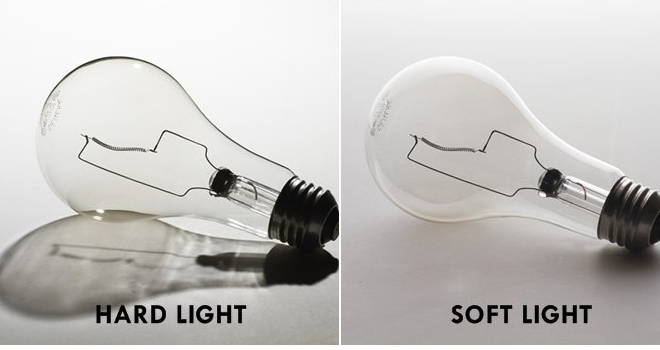
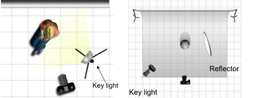
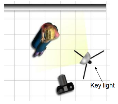
Be experimental with choosing different apertures settings and creative with lighting set-up; key light, reflected light, back light etc. and we will show you various lighting arrangements too.
The New Objectivity –Albert Renger Patszch
a specific attitude to photography and the advantages of the camera as a way of seeing called…
The New Objectivity (Neue Sachlichkeit).
Research :The types of subjects he preferred to photograph
Research : The ways in which he explored the formal elements in his work e.g. form, light, rhythm, line, texture, repetition etc.
His famous book ‘The World is Beautiful’
Other photographers at the time who were similarly interested in objectivity
Contemporary photographers who have been influenced by the idea that ordinary objects and scenes can be photographed to reveal their beauty.
Historical context
There are numerous reasons why some photographers in the 1920s (along with other artists) began to represent the world with “objective, sober eyes”:
a response to the chaos of the First World War and a rejection of the culture leading up to it
a rejection of the emotional and spiritual concerns of Expressionism and an interest in the rational and political
a response to rapid industrialisation in Europe and America
a response to the particular qualities of the camera and a move away from painterly effects like soft focus
Karl Blossfeldt
Never formally trained in photography, Blossfeldt made many of his photographs with a camera that he altered to photograph plant surfaces with unprecedented magnification. His pictures achieved notoriety among the artistic avant-garde with the support of gallerist Karl Nierendorf, who mounted a solo show of the pictures paired with African sculptures at his gallery in 1926 and, subsequently, produced the first edition of Blossdeldt’s monograph Urformen der Kunst (Art forms in nature), in 1928. Following the enormous success of the book, Blossfeldt published a second volume of his plant pictures, titled Wundergarten der Natur (The magic garden of nature), in 1932. The clarity, precision, and apparent lack of mediation of his pictures, along with their presentation as analogues for essential forms in art and architecture, won him acclaim from the champions of New Vision photography. His work was a central feature of important exhibitions, including Fotografie der Gegenwart and Film und Foto, both in 1929.
Blossfeldt’s work adheres to the rules of TYPOLOGIES
Anna Atkins
In October 1843, the botanist and photographer Anna Atkins (1799–1871) wrote a letter to a friend. “I have lately taken in hand a rather lengthy performance,” revealed Atkins. “It is the taking photographical impressions of all, that I can procure, of the British algae and confervae, many of which are so minute that accurate drawings of them are very difficult to make.”1 Atkins proceeded to inquire whether a mutual acquaintance, also interested in aquatic plants, would care to receive a copy of her recently completed book, Photographs of British Algae: Cyanotype Impressions.
Atkins learned of photography through its British inventor, William Henry Fox Talbot. Only months after Talbot patented his most successful photographic process, in 1841, Atkins and her father, a respected scientist, decided to replicate the “talbotype” at their home. “My daughter and I,” Atkins’s father wrote to Talbot, “shall set to work in good earnest ’till we completely succeed in practicing your invaluable process.”3 Ultimately, it was a different photographic process—the cyanotype—that captivated Atkins. Developed by her friend and neighbor Sir John Herschel, the cyanotype process produced blue-and-white prints that Atkins prized for their sharp contours and striking colors. Atkins added hundreds of new plates to Photographs of British Algae throughout the 1840s and early 1850s, all the while refining cyanotype chemical solutions and exposure times.
Contemporary Examples of Formalism
Mandy Barker
Sea of artifacts by Mandy Barker
Matthew Brown (ex-student)
Here is a selection of images made by Matt Brown last year as part of his Personal Study: Bouley Bay.
Have a look at his blog here for more ideas around his research, artists inspirations and further experimentation.
Entwining image and object, the work of Darren Harvey-Regan (b. 1974 Exeter) often sees a hybridisation of the conventions of photography and sculpture. As quietly humorous as they are frustrating his works challenge the viewer to distinguish where representation ends and the object begins. “The presentation of photographs in interaction with objects serves to highlight the inherent tensions within representation; between the photograph as an object and the image of the world it contains. In this way, I consider the photograph as being something not only to think about, but to think with.”
01.tif
“As a medium reliant on how the natural world appears to it, can a photograph ever be truly abstract? Yet what process is more abstract than collapsing mass, depth and time into a single surface?” – Harvey-Regan
In geology an ‘erratic’ refers to a rock that differs from its native environment, having been carried and deposited there by a long-vanished glacier. Similarly Darren Harvey-Regan in his latest series executes both the photographic and physical act of lifting something out of its context, playing on overlapping appearances and processes.
The Erratics (Exposures) presents images of natural chalk rock formations eroded by wind and sand. Using an old large format field camera, Harvey-Regan sought out the monolithic chalk forms of Egypt’s Western Desert, a vast natural parallel to the singular studio-bound objects that frequently recur in his practice.
Both The Erratics (wrest)and (chalk fall in white) use sculptural compositions made by the artist from chalk collected from the rock falls along England’s South Coast. By carving smooth planes and shapes into rough rocks, Harvey-Regan works with and against perception of its natural forms. In the photographic works – (wrest) – the chalk is shaped towards the two-dimensional image surface of the print, while in the installation (chalk fall in white), the perception of a flattened image surface is created within the three-dimensional forms themselves.
Harvey-Regan uses art historian Wilhelm Worringer’s essay Abstraction and Empathy as both a background for the work and as a means to consider the nature of the photographic medium. For Worringer, ‘empathy’ describes our need to connect to the visible world, identifying with it and representing it. Conversely, ‘abstraction’ is proposed as a means of coping with the overwhelming phenomena of the world by extracting things from their place in space and time whilst distilling them to purified line, form and colour.
Both abstraction and empathy are captured in these works and their photographic process. The forms exposed in their natural surroundings in Erratics (Exposures) remain curiously abstract while tending more towards empathy, while forcefully sculpted objects in Erratics (Wrest) are balanced on the edge of the organic and abstract.
Inspired by minimalist sculpture and painting, these simple but effective still life studies encapsulate the formal elements . Artists such as Giorgio Morandi have a clear influence here…and again there is a strong connection between painting and photography, historically and traditionally.
1. The Stack
2. Using light and paper / tracing paper to create shadows and silhouettes
3. Print out initial images and re- appropriate / cut-n-paste
4. White / monochrome
5. Splicing two images together – use either printouts or Photoshop
6. Conceal and reveal – light and shade
What you must do…
Collect a group of objects that you think combine well. Consider shape and size, colour, texture etc.
Then look carefully at what / how Mary Ellen Bartley groups, lights and photographs her objects. Aim to create a set of images by altering the layout, lighting, focus, composition etc.
Print some of the results off — and then rip, tear, cut-n-paste to create a photo-montage. Re-photograph this and develop the composition into a final outcome.
Create a blog post that introduces Mary Ellen Bartley and her approach.
Creative Developments
A closer look at ….Layering / overlays / multi-exposures and more…
A photomontage is a collage constructed from photographs.
Historically, the technique has been used to make political statements and gained popularity in the early 20th century (World War 1-World War 2)
Artists such as Raoul Haussman , Hannah Hoch, John Heartfield employed cut-n-paste techniques as a form of propaganda…as did Soviet artists like Aleksander Rodchenko and El Lissitsky
Photomontage has its roots in Dadaism…which is closely related to Surrrealism
Here are simple definition of photomontage and here is a more comprehensive review of the different historical and contemporary approaches to combining images together to form collages and composites. Read also the Art Story site here which has a good summary of photomontage
Some quotes from artists using photomontage…
The cutting and assemblage of the parts is applied here on a static plane. The effect is that of a real scene, a synopsis of actions, produced by originally unrelated space and time elements juxtaposed and fused into a reality. Laszlo Moholy-Nagy
[Photomontage] is my way of connecting with the word and I like the idea that I cam invent a reality that, for me, is personally more meaningful than the one that’s literally given to the eye Jerry Uelsmann
I’ve always made a distinction between collage and photomontage. Montage is about producing something seamless and legible, whereas collage is about interrupting the seam and making something illegible John Stezaker
The Art Critic 1919-20 Raoul Hausmann 1886-1971 Purchased 1974 http://www.tate.org.uk/art/work/T01918
You’re going to use your images from the studio object shoot and other material you have created recently for this…
Using your OBJECTS photographs to create experimental new images either by hand or using image manipulation software OR both!!!
The examples below were created using five images. The figure was cut out leaving an interesting negative shape and outlined. Other images could be slid underneath until connections and interesting compositions started to occur.
How to make a GIF in Photoshop 1. Create layer for each image 2. Window > timeline 3. Select > Create Frame Animation 4. Drop Menu > Make frames from Layers 5. Timeline > select Forever 6. File > Export > Save for Web Legacy > reduce image size to 720 x 720 pixels
A gif created using just three images.
A gif using 6 images.
Alwaysfollow the 10 Step Process and create multiple blog posts for each unit to ensure you tackle all Assessment Objectives thoroughly :
Mood-board, definition and introduction (AO1)
Mind-map of ideas (AO1)
Artist References / Case Studies (must include image analysis) (AO1)
Photo-shoot Action Plan (AO3)
Multiple Photoshoots + contact sheets (AO3)
Image Selection, sub selection, review and refine ideas (AO2)
Compare and contrast your work to your artist reference(AO1)
Evaluation and Critique (AO1+AO4)
Final Outcomes for Nostalgia Part 1
You must edit and save / export a range of images for printing to the PRINT FOLDER found here by Thursday 19th October
M:RadioDepartmentsPhotographyStudentsImage TransferYear 12 NOSTALGIA objects Oct 2023
Still Life Photos 1-3 images
Single Object Photos 1-3 images
Optional Extension Ideas
Photomontage Analogue 1-3 images
Photomontage Digital 1-3 images
Remember to include a range of sizes
A3 / A4 / A5 and black and white images too
Image Resolution and Sizing
Final Outcomes for NOSTALGIA Part 1
Remember to include a range of sizes
A3 / A4 / A5 and black and white images too
File Handling and printing...
Remember when EXPORTING from Lightroom you must adjust the file size to 1000 pixels on the Short edge for “blog-friendly” images (JPEGS)
BUT…for editing and printing when EXPORTING from Lightroom you must adjust the file size to Short edge for “high resolution” images (JPEGS) like this…
A5 Short Edge = 14.8 cm
A4 Short Edge = 21.0 cm
A3 Short Edge =29.7 cm
This will ensure you have the correct ASPECT RATIO
For a combination of images, or square format images you use the ADOBE PHOTOSHOP > NEW DOCUMENT + PRINT PRESETS on to help arrange images on the correct size page (A3, A4, A5)
You can do this using Photoshop too…
Set up the page sizes as templates and import images into each template, then you can see for themselves how well they fit… but remember to add an extra 6mm for bleed (3mm on each side of the page) to the original templates. i.e. A4 = 297mm x 210 but the template size for this would be 303mm x 216mm.
Half Term
Week 8
Mounting and framing final images
Making a Virtual Gallery in Photoshop
Download an empty gallery file…then insert your images and palce them on the walls. Adjust the persepctive, size and shape using CTRL T (free transform) You can also add things like a drop shadow to make the image look more realistic…
Friday 24th May = all landscape + Anthropocene images must be added to print folder ready for print order
Half Term
Friday 14th June = final deadline for Landscape / Anthropocene Project (includes display of work)
FINAL PRINTS
You must edit and save / export a range of images for printing to the PRINT FOLDER found here
M:\Radio\Departments\Photography\Students\Image Transfer\Yr 12 ANTHROPOCENE and landscape 2024
Natural Landscape Photos 1-3 images
Urban + industrial Photos 1-3 images
Anthropocene 1-3 images
Remember to include a range of sizes
A3 / A4 / A5 and black and white images too
Go to bottom of this blogpost to follow instructions on how to size and save images for printing from Lightroom and/or Photoshop.
ANTHROPOCENE
This unit will help you explore further opportunities with your landscape photography. We will spend time looking closely at this and discussing ideas with you…
What is Anthropocene?
How and why are photographers exploring this concept?
Use your skills and knowledge to date to tackle and approach this theme. ie: abstract, portraiture, identity, landscape, studio based photography etc. – YOU DECIDE!
The Anthropocene defines Earth’s most recent geologic time period as being human-influenced, or anthropogenic, based on overwhelming global evidence that atmospheric, geologic, hydrologic, biospheric and other earth system processes are now altered by humans.
The word combines the root “anthropo”, meaning “human” with the root “-cene”, the standard suffix for “epoch” in geologic time.
What are the 4 causes of the Anthropocene?
Signs of the Anthropocene
Agriculture, urbanisation, deforestation and pollution have caused extraordinary changes on Earth.
Consequences of the Anthropocene
These human actions cause, among other consequences, changes in the water cycle, imbalances and destructions in the marine and terrestrial ecosystems, the increase of extreme meteorological phenomena, the acidification of the oceans or the disappearance of the forests.
DISCUSS
Now watch this and discuss / compare the way in which various photographers have responded to this theme…
Blog Posts to make : CHECKLIST
Define “Anthropocene” and explain what it is.
2. Add a mindmap and moodboard of images, ideas and trigger points on your chosen genre ie: portraiture, studio (object or portraiture), abstract, landscape etc. You should aim to include a range of data, statistics, information, maps, documents, policies, pledges etc at this point to show a wide range of research methods and justification…
(These photographers should directly influence your final outcomes )
Make sure you describe in detail:
Why have you chosen this artist?
What interests you about their work?
How does the work relate to the theme of Anthropocene?
What are you going to do as a response to their work?
4. Organise and carry out your photo-shoots !!! You MUST complete a minimum of 2 PHOTO-SHOOTS (100-200 photos) . Responding to the theme of Anthropocene in your chosen genre.
5. Edit, select and develop your photographs and post contact sheets.
6. Produce a comparative analysis between one of your photographs and an image of one of your chosen photographers – discuss similarities and differences.
7. Develop your ideas through your images by editing, making decisions, reviewing and refining – selecting your collection of images or image as your final response to Anthropocene. Your final outcome could be an image, a collection of images, an altered landscape, a small zine, an exhibition in a virtual gallery, a projected image etc.
8. Ensure your write an evaluation that comments on your original intentions (what you set out to do) and how your realised those intentions. Is your outcome successful? Comment on strengths and successes.
Task : Constructed Seascapes
Take a look at these photographic images (click on each image to expand):
‘The Great Wave’, the most dramatic of his seascapes, combines Le Gray’s technical mastery with expressive grandeur […] At the horizon, the clouds are cut off where they meet the sea. This indicates the join between two separate negatives […]Most photographers found it impossible to achieve proper exposure for both landscape and sky in a single picture. This usually meant sacrificing the sky, which was then over-exposed. Le Gray’s innovation was to print some of the seascapes from two separate negatives – one exposed for the sea, the other for the sky – on a single sheet of paper.
This ongoing body of work consists of staged landscapes made of collaged and montaged colour negatives shot across different locations, merged and transformed through the act of slicing and splicing […] ‘Constructed Landscapes’ references early Pictorialist processes of combination printing as well as Modernist experiments with film […] the work also engages with contemporary discourses on manipulation, the analogue/digital divide and the effects these have on photography’s status.
The Great Wave … sunlight breaks through the clouds above the waves at Sète, France, 1856–59 Illustration: Gustave le Gray
Combination printing, creating seascapes by using one negative for the water and one negative for the sky at a time where it was impossible to have at the same time the sky and the sea on a picture due to the too extreme luminosity range. Combination printing was an early experiment of HDR photography where you expose for bright and dark areas of a landscape scene.
Contemporary approaches to views of horizons between sky and sea, see inspiration from Japanese photographer Hiroshi Sugimoto whose monochrome images are minimalist and spiritual in their expression.
If you intend to explore sea landscapes you must do contextual research in relation to the art movement of Romanticism – see below. Technically you must make images exploring diverse quality of light, expansive views and weather patterns at different times of the day. Make sure to use a tripod, cable release and apply exposure bracketing and experiment with HDR techniques in post-production. Other techniques such as panoramic images and Hockney ‘joiners’ and Typology studies are also appropriate.
Jersey west coast has unique identity and geography. For many it is place of refuse from work, school and where they go for relaxation, leisure, beach, surfing, walking. If we think about Jersey and an island surrounded by water and with a one of the fastest tidal moments in the world you can look at photographers who has explored the notion of sea or water in interesting ways.
Michael Marten: Sea Change Excellent use of diptych and triptych and exploring low vs high tides to see how it changes a landscape scene
Mark Power: The Shipping Forecats Intangible and mysterious, familiar yet obscure, the shipping forecast is broadcast four times daily on BBC Radio 4. For those at, or about to put to sea, the forecast may mean the difference between life and death. In The Shipping Forecast, Mark Power documents the 31 sea areas covered by the forecast,
Sea / Coast / Marine Environment In the Photographic Archive at the Society Jersiaise there are significant works by early Jersey landscape and architectural photographers such as Thomas Sutton
Remains of ruined coastal defence tower, Tour du Sud, La Carrière, St Ouen’s Bay, Jersey. Plate from Souvenir de Jersey, published 1854.
Other photographesr in the Photo-Archive who explored Jersey landscapes, topographical views, town, countryside, build-environments etc . Samuel Poulton, Ernest Baudoux, Albert Smith , Edwin Dale, AK Lawson, Paul Martin, Godfray, Frith (put in surnames first for searching online catalogue here.
Baudoux, Ernest. View of Victoria College, St Saviour, with boys standing informally outside
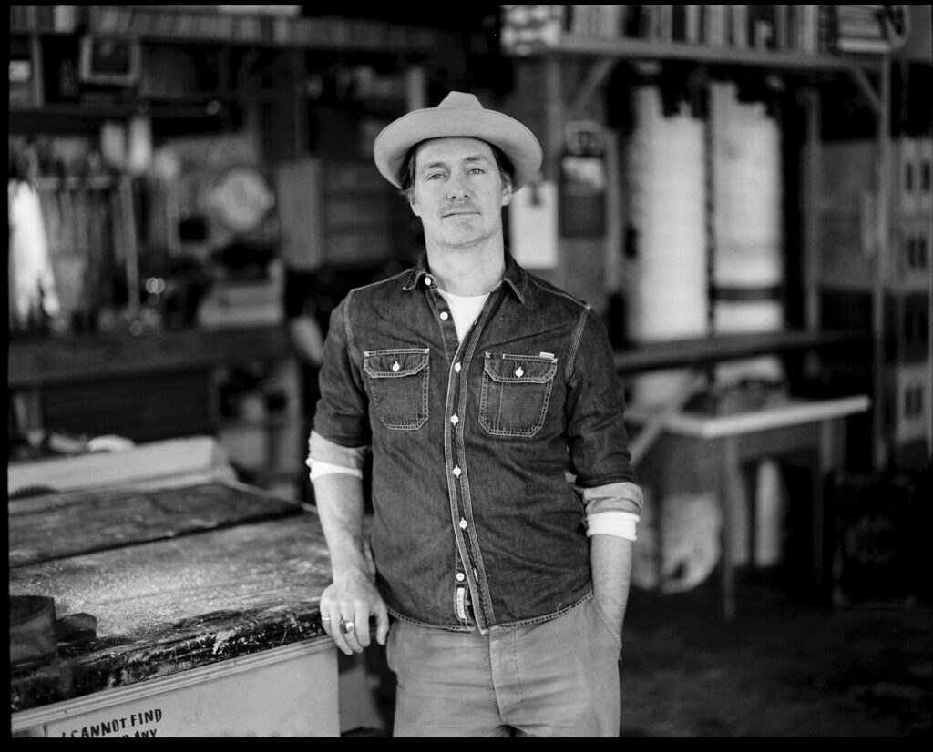
Think about creating landscapes that relates to your commentary, possibly Vilde Rolfsen’s work on Plastic Bag Landscapes…
Chris Jordan:Midway: Message from the Gyre Chris Jordan has been documenting an astonishing and disturbing effect of consumer waste: discarded plastic packaging and toys inside the stomachs of thousands of dead baby albatrosses.
Keith Arnatt (1930–2008) was a British conceptual artist. As well as conceptual art his work is sometimes discussed in relation to land art, minimalism, and photography. He lived and worked in London, Liverpool, Yorkshire and Monmouthshire. Apart from his conceptual works in 1960s and 70s Arnatt developed a set of images from a rubbish tip that developed from landscape based images to still-live of discarded objects.
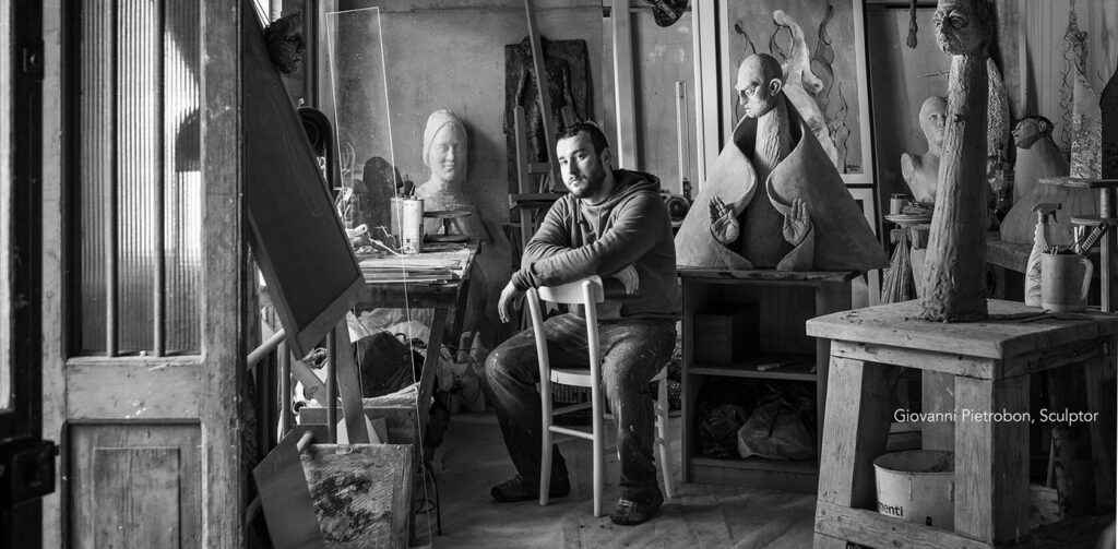
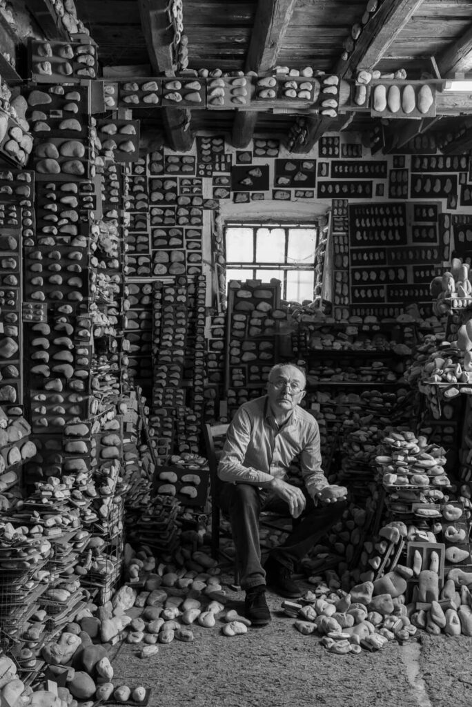
Miss Grace’s Lane, 1986-87, colour photographs, selection
Keith Arnatt, Pictures from a Rubbish Tip, 1988-89
Keith Arnatt, The Tears of Things, 1990-91
Pictures from a Rubbish Tip 1988–9 is a series of five large colour photographs by the British artist Keith Arnatt featuring close-up shots of rubbish that has been dumped at a local tip. In each photograph, the lens focuses upon select pieces of discarded food – such as bread, chicken bones and vegetables – that lie on clear and pale-coloured plastic bags. These bags both reflect and diffuse the surrounding daylight, highlighting the varying hues of the rubbish so that the scenes appear brightly coloured and partly abstract. Although the types of rubbish shown and their exact position within the compositions varies slightly, each is presented at an apparently fixed distance from the camera and this, as well as the similar lighting effects used across the five works, creates a sense of cohesion in the series.
Arnatt took the photographs in 1988–9 on multiple trips that he made to the Coleford Tip near his home in Tintern, Monmouthshire. He did not use any artificial light when shooting the frames, relying solely on daylight, and the artist employed an extremely shallow depth of field, sharply focusing the lens on the closest part of the featured object. According to the critic Mark Haworth-Booth, Arnatt ‘chose to place this very narrow plane of focus on each object’s nearest edge. This … Arnatt believes, puts the viewer in the position in which he himself was when he first noticed and picked up these half-buried objects’ (Mark Haworth-Booth, Keith Arnatt: XXI Bienal de SãoPaulo, exhibition catalogue, Bienal de São Paulo, São Paulo 1991, p.1).
According to the photographer David Hurn, Arnatt’s decision to present the rubbish close up and in bright but diffuse lighting is an attempt to conceal the image’s context so that its subject – a piece of rubbish – is initially unidentifiable as such. Hurn has stated that the series is
about looking – about the difference between knowing something and seeing something; the fact that we might know that this is a bit of orange or a cake, but when we see it taken out of context, photographed in a way we don’t normally see, it can look like a Turner. (Grafik and Hurn 2009, p.10.)
In this way, the discarded, mouldy food items can be seen as objects of beauty when presented in a different setting, especially when using framing techniques, colour and lighting and that enhance the visual appeal of the images. Furthermore, curator Clare Grafik has contended that in their framing and composition, Pictures from a Rubbish Tip reflect ‘Arnatt’s interest in seventeenth-century Dutch painting, particularly the still life genre and the vanitas tradition’ (Grafik and Hurn 2009, p.137). Vanitas paintings depict objects thought to symbolise the transience of life and the futility of earthly goods and pursuits, including books, fine objects and foodstuffs. In a similar way, by focusing on food items that have been discarded en masse, Pictures from a Rubbish Tip presents the wastage and excess that characterise modern consumption, although Arnatt shows these objects in a manner that simultaneously emphasises both their beauty and their decay.
Industrial-scale US cattle farms captured by satellite imagery. These images, discovered by Henner while researching satellite photographs of oil fields, look more like post-apocalyptic wastelands than acreage in America’s heartland.
Zed Nelson:The Anthropocene Illusion In just a few decades, we humans have altered our world. Our planet is crossing a geological boundary: from the Holocene into the Anthropocene. Humans have left the countryside for the city but the desire for contact with nature remains. So, we have become masters of a stage-managed, artificial ‘experience’ of nature. This project examines humankind’s fractured relationship with the natural world, revealing not only a phenomenon of collective self-delusion, but also a craving for a connection to a world we have turned our backs on.
Zed Nelson, Shanghai Wild Animal Park, Shanghai, ChinaZed Nelson
Lucas Foglia: Human Nature Today, nature both heals us and threatens us. As we spend more time than ever indoors looking at screens, neuroscientists demonstrate that time outside is vital to human health and happiness. Yet, we are vulnerable to the storms, droughts, heat waves, and freezes that result from climate change.
Human Nature is a series of photographic stories about humans and the natural world, at a critical time for both. Each story is set in a different ecosystem: city, forest, farm, desert, ice field, ocean, and volcano. The photographs examine our need for wild places in the context of the Anthropocene.
Diane Burko’s images of melting glaciers and dying coral reefs are not just pictorially impressive; they have strong emotional impact. (Carter Ratcliffe)
Diane Burko, “Postscript” (2019), mixed media: bleached coral mounted on wood, 50 x 25 inches
As a photographer how would you respond to climate change? Can a study of the environment and landscape of Jersey be an inspiration for a Personal Study?
Study latest issue: Photography+ Environment #14 from Photoworks that looks at the role of the photographer in documenting and confronting climate catastrophe. To explore this question, each writer and artist invites us to think about the relationship between photography and climate change, and between the photographer and their environment
Edward Burtynsky…nature transformed through industry
George Marazakis…humanity’s effect on Earth
Sebastiao Salgado…documentary photographer and photojournalist, respect for nature while also sensitive to the socio-economic conditions that impact human being
J. Henry Fair…uses pictures to tell stories about people and things that affect people.
David Maisel…radically human-altered environments.
Camilo Jose Vergara…documentation of American slums and decaying urban environments.
Andrew Moore…the effect of time on the natural and built landscapes.
Yves Marchand & Romain Meffre….modern ruins.
Yao Lu… contaminated landscapes – created from landfills and mounds of derelict rubble.
David T. Hanson… waste land.
Troy Paiva…”Urban Explorer” investigating the ruins of “Lost America”.
Obviously, you can also use past photographers we have looked at throughout the landscape unit, especially industrial and urban landscape photographers. (see below)
Alexander Apostol
Bernd & Hilla Becher
Donovan Wylie
Edward Burntsky
Frank Breuer
Gerry Johansson
Joel Sternfeld
Josef Schultz
Lewis Baltz
Noemie Goudal
Darren Regan Harvey
Keith Arnatt
ABSTRACT Approaches
You may focus on and wish to respond through the genre of abstract photography. Look back to the photographers from your first unit or discover new ones. Below are just some images to help you to engage in the topic.
OBJECT – studio lighting
You can also use your skills to produce an object based project. Looking at how objects might reflect the theme of Anthropocene. ie: single use plastics, disposable objects, waste, rubbish etc.
Mandy Barker
Barry Rosenthal – collection of discarded plastic objects.
Naomi White – plastic bags.
Sophie Thomas – found, discarded plastics/rubbish.
Steven Gallagher – plastic bag topology photography
In the final version, I changed the cover images to what was originally the first pages in the book. I felt that these images were more powerful in portraying my ideas as well as captivating the essence of my project.
I summed the topic of my project in one word being ‘Waste’ as it reflects the three concepts behind my work:
The ‘Waste’ featured in the images
The action behind humans throwing away the things they do not consider important.
The consequences of disposing items to ‘Waste’ away.
The title is written sideways to give a ‘scientific document’ feel.
I repeated the same pattern of images throughout the book, to give an organised aesthetic. The circle images are placed alongside their close-up comparisons to show the detail in the items depicted. I chose to make many of my images full scale, as they all have dark backgrounds. Black is used in a minimalistic style to emphasize the items, as well as being associated with darkness and negativity to reflect the topic of pollution.
I started my project with the intention of exploring issues of pollution and plastic specifically, taking inspiration from the photographer Mandy Barker and experimented in my first shoot by taking images with string infront of the lens looking at rules of manipulation. I then found the photobook ‘The Meadow’ by photographers Barbara Bosworth and Margot Anne Kelley which is what first interested me in photographing and exploring specific areas, as well as gathering objects and photographing them. I also discovered the photographer Chrystel Lebas and her photobook ‘Field Studies: Walking through Landscapes and Archives’ which is where I read about the changing environment. She compared her modern images to the photography of Edward James Salisbury in the early 20th century and walked in his footsteps, going to the same areas he did to explore how the environment had changed over 100 years. This is where I decided that the concept for my project would be looking at how the natural environment had changed over 90 years at the location La Motte. I found archival images from this area and thought i would build my photobook around them, comparing and contrasting them to my own images. I noticed Lebas’ influences from sublime ideologies by Edmund Burkina his book ‘Enquiry into the Origin of our Ideas of the Sublime and the Beautiful’,with her images being vast and other-worldly, which is an aspect I wanted to reflect in my own work. From then on, I did an additional five shoots where i went and took landscape images of La Motte and at the same time gathered natural objects that i found on the island and the beach i.e. rocks, seaweed, flowers. I did multiple shoots where I photographed these objects formally with plain background and edited them to reflect the work of early botanists where they used light sensitive paper to create photograms. I did this as i thought it would give my project and photobook a scientific appearance and reflect that of an investigation into a specific area. Towards my final shoots, I walked around La Motte and tried to find man made objects that I could photograph to perhaps represent how the natural landscape had changed.
What and where are you going to photograph and how you are going to take your images!!
Is it out and about, indoors, setting up your own lighting, collecting objects, photographing people, looking for abstract imagery etc.
Contacting Ronez quarry and gaining access to take photographs? Explore the industrial areas around La Collette – power station, recycling centre? The impact of farming on the land – plastic sheeting, poly tunnels etc, etc. Collecting washed up plastics from the beach. Asking family and friends to photograph them etc.
You may decide that you want to make a statement on the current situation in Jersey. Take images that may evoke discussions to do with over population, the housing crisis, social divides (rich/poor), securing National Park land etc, etc.
Open Cast Mining – Quarries: Ronez, St Peters Valley, Sand Quarry St. Ouens
Power Stations – La Collette, Bellozane Sewage Treatment
Urbanisation – St Helier: Grands Vaux, Le Marais Flats, Le Squez etc.
Mass Wastage – La Collette recycling centre
Disposable Society – La Collette recycling centre – refrigerator mountains etc
Land Erosion – farming industry: poly tunnels, packing sheds, plastic covered fields etc. Old Glass Houses
Over Population – poverty/social divides: Social Housing sites. Car Parks, traffic etc.
Industrialisation – La Collette area, Bellozane, industrial estates. Desalination Plant, German Fortification (WW2)
Altered Landscapes
Altered landscapes focus on the process of using photoshop, or physically, in order to change the original composition of a landscape photograph. This may include changing the colours of the image, or in general changing the composition of the photo itself. For example cutting and pasting certain elements or adding forms of repetition or echo to the photograph.
Examples of altered landscapes
“Dust Storm” – Tanja Deman (2010)
Fernweh series explores the concept of a modernist city through its extreme relations to the landscape. The images are placed on a blurred line between a past which reminds us of a future and a future which looks like a past. Scenes are referring to the modernist ideas and aspiration of a man conquering the natural wild land and subordinating it to the rational order, and the consequences of those aspirations, which switched into the longing for an escape from urban environments.
Noémie Goudal’s practice is an investigation into photographs and films as dialectical images, wherein close proximities of truth and fiction, real and imagined offer new perspectives into the photographic canvas. The artist questions the potential of the image as a whole, reconstructing its layers and possibilities of extension, through landscapes’ installations. Noémie Goudal is represented by Edel Assanti (London) and the Galerie Les Filles du Calvaire (Paris).
Part of “Restore to Factory Settings” series – Felicity Hammond (2014)
Part of “Geometric Reflections” series- Victoria Siemer (2015-16)
Joan Fontcuberta Orogenesis Derain , 2004
In Landscapes without Memory, an exhibition of forty large-scale works made between 2002 and 2005, Fontcuberta harnesses a piece of landscape-rendering computer software designed for the military, which creates photo-realistic three-dimensional models based on two-dimensional sources.
Fontcuberta uses software called Terragen to create photorealistic visualisations of landscapes, but instead of using cartographic data as this software is designed to use, Fontcuberta has replaced it with canonical images of landscapes taken from the history of art.
Gill is a British photographer, who mainly draws inspiration from his immediate surroundings of inner city life in East London and more recently Sweden with an attempt to make work that reflects, responds and describes the times we live in.
His work is often made up of long-term photo studies exploring and responding to the subjects in great depth.
Compare and contrast your work to your artist reference(AO1)
Evaluation and Critique (AO1+AO4)
Final Outcomes for Anthropocene + Landscapes
You must edit and save / export a range of images for printing to the PRINT FOLDER found here by ….
Natural Landscape Photos 1-3 images
Urban + industrial Photos 1-3 images
Anthropocene 1-3 images
Remember to include a range of sizes
A3 / A4 / A5 and black and white images too
File Handling and printing...
Remember when EXPORTING from Lightroom you must adjust the file size to 1000 pixels on the Short edge for “blog-friendly” images (JPEGS)
BUT…for editing and printing when EXPORTING from Lightroom you must adjust the file size to Short edge for “high resolution” images (JPEGS) like this…
A5 Short Edge = 14.8 cm
A4 Short Edge = 21.0 cm
A3 Short Edge =29.7 cm
This will ensure you have the correct ASPECT RATIO
For a combination of images, or square format images you use the ADOBE PHOTOSHOP > NEW DOCUMENT + PRINT PRESETS on to help arrange images on the correct size page (A3, A4, A5)
You can do this using Photoshop, Set up the page sizes as templates and import images into each template, then you can see for themselves how well they fit… but remember to add an extra 6mm for bleed (3mm on each side of the page) to the original templates. i.e. A4 = 297mm x 210 but the template size for this would be 303mm x 216mm.
Mounting and framing final images
Making a Virtual Gallery in Photoshop
Download an empty gallery file…then insert your images and palce them on the walls. Adjust the persepctive, size and shape using CTRL T (free transform) You can also add things like a drop shadow to make the image look more realistic…
Please refer to this resource to help you navigate your camera’s function and settings. You will learn how to apply these skills learning to various photo-shoots over the next few months…and you should aim to provide evidence of these skills throughout your coursework.
Remember to practice and experiment. Use your eyes and look. The more you look, the more you will see. How you see the world will determine what kind of photographer you will become.
A camera is only a tool, and it is down to you to get the best out of your equipment by becoming confident and comfortable
You must experiment with each of these skill areas as we move through our sequence of photo-shoots. Remember to include / produce a blog post on each that includes evidence of your experiments and successes…
Remember to use What / How / Why / When when describing and explaining what you are experiencing and achieving with each of these…
Using Auto-Focus
Using Manual Focus
White Balance
ISO
Aperture
Focal Length : wide, standard and telephoto lenses
Depth of Field
Show / fast Shutter Speed
Exposure and exposure compensation
Exposure bracketing
Ansel Adams and the visualisation of an image
Exposure Triangle : ISO – Shutter Speed- Aperture
Depth of Field
Camera function layout
Ensure you are using technical vocab too…use the helpsheet to guide your literacy
Exposure Bracketing
Many digital cameras include an Auto Exposure Bracketing (AEB) option. When AEB is selected, the camera automatically takes three or more shots, each at a different exposure. Auto Exposure Bracketing is very useful for capturing high contrast scenes for HDR like this…
…by taking the same photograph with a range of different exposure settings
You can use Exposure Compensation to quickly adjust how light or how dark your exposure will be using these controls…
Or set the amount of “bracketing” like this…
Then you can create your High Dynamic Range images by using this process in Adobe Photoshop…
Understanding Composition
The Rule of Thirds
One of the fundamentals of painting and photography, the Rule of Thirds is a technique designed to help artists and photographers build drama and interest in a piece. The rule states that a piece should be divided into nine squares of equal size, with two horizontal lines intersecting two vertical lines.