Walker Evans

Biography :

Walker Evans, was an American photographer and photo journalist best known for his work for the Farm Security Administration (FSA) documenting the effects of the Great Depression. He said that his goal as a photographer was to make pictures that are “literate, authoritative, transcendent”. Evans took up photography in 1928, around the time he was living in new York. His influences included Eugene catgut and .August Sandler. In 1930, he published three photographs in the poetry book The Bridge by Hart Crane. In 1931, he made a photo series of Victorian houses in the Boston vicinity sponsored by Lincoln Kirstein.

Walker Evans Photography :

Image analysis :

Walker Evans photography have a narrow depth of field to keep the man in focus. The pictures are in black and white which gives the pictures a dramatic and ominous feel to them.

Darren Harvey-Regan

Darren Harvey-Regan is a graduate of the Royal College of Art. His work has been in Exhibitions and Publications all over the world. His work focuses on photography but has an emphasis on the mediums relationship to language and to sculpture.

Image Analysis :

Darren Harvey-Regan’s photos are very bold and powerful and this picture in particular has a very strong contrast between the block and the shadow. This makes the object used stand out and look more powerful. The use of shape and line in this image makes the object appear more interesting to look at and gives the object a different composition.

How did Walker Evans’ work inspire Darren Harvey-Reagan?

Harvey-Regan first constructed a montage of Evans’s images to make new forms. He then sourced matching tools, cut them in half and re-joined various halves together, with the resulting physical objects being photographed to create his final work.

Comparrison :

Darren Harvey – Reagan :

Walker Evans :

with both walker Evans and Darren Harvey-Reagan you can clearly see that Darren was inspired by walker when getting into still life photography, walkers work is very much real life situations turned into still moments whereas Darren has used objects and slightly altered walkers way of work and created it his own by using non alive objects and different layouts within that category of work.

still life

What is still life?

  • A still life painting /image is a composition of inanimate objects such as, fruits, crops, flowers, items of prosperity, and household items.​
  • The items in question are usually filled with disguised symbolism and hold a deeper meaning, E.g. a burned-out candle to emphasize mortality, while a lit candle symbolizes light , truth, and knowledge.

The development of still life.

  • Still life began to develop in the 17th century from northern Europe and the growing prosperity of the European world. The new-found wealth from the age of exploration gave the wealthy new expensive (often perishable) imports they wanted to show off, so they would often commission a painting in an attempt to immortalize it.​
  • Unfortunately, These goods were often collected off the backs of the exploited minorities during the golden age of colonization and the height of the slave trade.
  • still life continues today not only through painting, but photography.

vanitas

Vanitas began in response to the prosperity in 18th century Holland. From the Latin word meaning vanity, vanitas are images of collections of objects (often fruits, flowers and expensive objects) that are saturated with hidden symbolism, often about morality towards material goods and how worthless they are. These symbols often include things like bubbles: how brief life can be and the capacity of spontaneous death, just like how a bubble pops.

Memento Mori.

Memento Mori is something within a still life portrait that symbolises death. similarly to the bubble, these could be objects such as burned out candles or skulls. The words its self means ‘remember you must die’ all in an attempt to display the novelty of the human life and its fascination with luxury items.

what kind of symbols and metaphors are presented in still life?

  • Skulls symbolise the certainty of mortality.
  • Flowers can symbolise life and growth, flowers can also symbolize innocence as well as impermanence
  • Mirrors display the soul In reflection.
  • Musical Instruments symbolise beauty and transience.
  • Silver and gold are luxury In still life paintings.

Walker Evans V Darren Harvey – Regan

Both these artist capture photograph’s with a dull/ mysterious meaning behind it. Both artist’s paid careful attention to choice of objects , composition, lighting and exposer. The photographs of Walker Evans told the story of American working-class life with an exacting frankness that was truly revolutionary for its time. He took many photographs of his selected objects and he approached them from different angles or using different cameras. Evan captured the image in the moment, rather than in the darkroom after the fact. Walker Evans was a famous renowned American photographer who was known for his black and white images showing the impact of the Great Depression. However, Darren Harvey is a more modern artist, interested in the concept that photographs do not exist just to show things, but are physical things that become objects themselves. He used a load of different tools and the montaged tools become both beautiful and bizarre objects, in which a ratchet wrench is combined with a pair of pliers.

They both took photos with great meanings , looking carefully at the light and the structure of their objects and the way they structed their photos. They both work in the same area and both have earnt many awards for what they do.

I tried to impersonate theses artists images with my own work and here they are;

I used a different Varity of colours and tools to try make my photos vibrant. I was careful with how I placed the backgrounds and how I angled the tools. There are different tones to these photographs’.

In conclusion

I think that this photo shoot went well with all the colour and different styles of backgrounds, however I think I could’ve made the photos more clear and lit up the room more or even in light room. Although I do like the lay out and how you can move all the colours and pictures around.

Formalism – Research

Formalism in photography emphasizes elements such as line, colour, shape, texture, and other aspects rather than the subject matter.

The seven basic elements to photographic art and formalism are:

Line – A geometric element that is made up of a moving point which extends along the path of the point.

Lines can be curved, straight or a combination of the two. Lines can be vertical or horizontal or somewhere in between. They can also be solid, dashed, interrupted, implied or psychological.

Shape – The visible characteristics which makeup a particular spatial form.

Shapes are two-dimensional and can be measured by height and width. Shapes can be the outline of an either familiar or an unfamiliar object.

Form – The shape and structure of something as distinguished from its material.

Form can be geometric (regular) and organic. Form is three-dimensional and has an overall height, width and depth.

Texture – The visual or tactile surface characteristics and how something appears and looks.

Texture is able to be smooth or rough, but there are other commonly used descriptions also used such as; soft, slimy, wet, hard, shiny, bumpy, etc. These are often presented in two dimensions, like in photographs.

Colour – A phenomenon of light or a visual perception which allows us to view the appearance of objects and light sources and be able to differentiate otherwise identical objects.

The three properties of colour are hue (description of a colour, e.g. blue, red, etc.), value (brightness or darkness) and saturation (intensity/purity of a colour). Light itself has no perceived colour.

Size – The relative extent of something, the overall dimensions or magnitude of it.

In a photograph, size is relative and can be an illusion. When an unfamiliar object is in the scene, it could be difficult to get an understanding of its size, however, familiar objects in the scene help us determine the scale shown in the photograph.

Depth – The direct linear measurement from front to back.

Most images have a foreground, middle ground, and background. Even a casual photo has a sense of depth due to visual cues. A stronger sense of depth in an image is when the delineation between those “grounds” is stronger.

FORMALISM

Definition: The Design, Composition and Lighting are dominant over Subject MatterThe photographer becomes a visual designer whenever a frame is captured.

The main components of formalism are:

Line: lines shown in photos, the directions/angels they go and how that effects the photograph

this imagine by Philipp Klinger is a great example of how intentional lines can effect the atmosphere of an image and demonstrates when lines are the leading formal element if an image.

Shape: acknowledging shape in an image is acknowledging and analysing the at first obvious features of an image.

this image by CRISTIANOGERARDI shows how shape can be used in creative ways to make an image more impactful and interesting.

Form:Form refers to when shape takes on three dimensions. Form is created by shadows and highlights on an object in the photograph.

this image by Juergen Roth shows how good understanding of how to capture lights and darks in a photograph will effect your ability to compose a convincing and interesting photograph.

Texture :the visual quality of the surface of an object, revealed through variances in shape, tone and colour depth.

Texture brings am image to life and add vibrancy to an image

Colour : is a very important aspect of an image in all cases but when it is the main focal point of an image it creates a very interesting a recognisable effect

as demonstrated in tis image by  Sarah Polger

Depth how much of your image is in focus. In more technical terms, depth of field is the distance in an image where objects appear “acceptably in focus” or have a level of “acceptable sharpness.”2

symmetry when two halves of an image hold the same weight and give a perfect balance between two sides of your photograph.

Still life selection and editing process + photoshoot

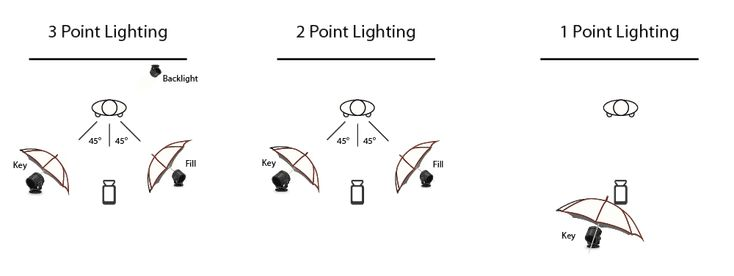
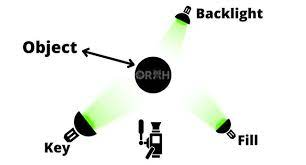
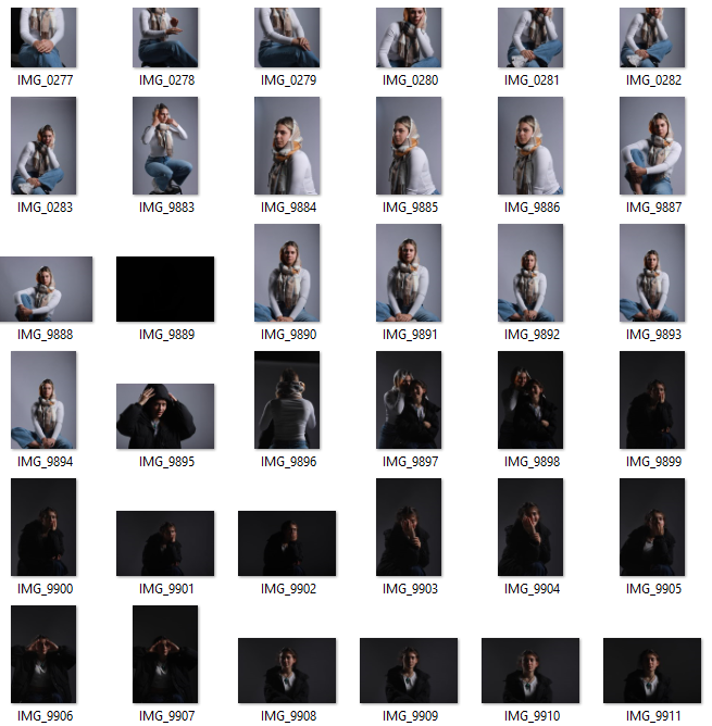
Here are most of the photos I took over 2 different photoshoots. I used multiple different camera setups, some with a top down view using multiple lighting set ups, others using an infinity curve with soft box lighting and some with the camera placed straight on with a powerful flashlight to capture striking shadows (requires a high shutter speeds to keep exposure levels at a normal amount). I took a few photos with a single subject with no background noise to make the subject more important, other photos have multiple images to create a chaotic and unorganised look, as if it wasn’t placed there on purpose.

Here are 5 unique images that where taken in different ways, using different angles, lighting and object setups. Keeping with the theme of nostalgia, I used objects that are from the past like the old violin, flower holder, books, old packaging, tower of pisa, ext. These objects all have a nostalgic effect on me due to there old, worn appearance. I kept the subjects in the centre of the frame to make them more important. For the camera settings, I used manual focus and exposure, so I can adjust the image to how I like it.

Editing and best images

For this Image I only really changed the colour grading to be more yellow for the shadows and added a vignette, I also slightly increased the contrast. Old camera photos where often very yellow because Photo paper and chemicals deteriorate over time and change their properties. The strong shadows makes it seem like it was taken in a dark room (it was). The violin is almost fully in frame, in the centre of the frame, making it the main subject and the most important one.

For this one I used the same camera setup and editing settings, but just adjusted the placement of objects. A flash light was used for these images (requires a fast shutter and small aperture) to increase the contrast.

For this one I did a similar thing to the one above (increasing the yellow in the shadows) and bumped the exposure up (+30). I also added some grain in adobe light room too replicate pictures taken a while ago with worse camera quality.

I used a top down camera setup and placed the pencils to point at the chapter, leading the eyes to the text. I edited it similarly again, but with a more dramatic vignette. Continuous lighting with 3 different angles to reduce the shadow intensity. There is a slight over exposure so to combat that I reduced the exposure and contrast In editing.

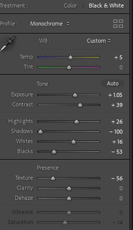
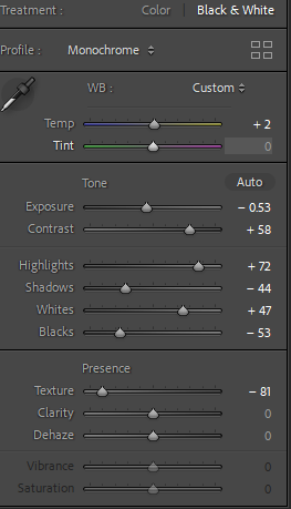
Here I added the B/W editing pre-set to these to images and bumped up the exposure for more dramatic lighting. For the top image, I changed the camera settings to have a low f-stop (aperture) So the hammer will be out of focus. This gives for a more dramatic image, as it appears less flat. I tried to make the bottom image almost have a comedic effect as the box is like a mouth eating a violin 💀.

formalism

What is formalism?​

Formalism is said to be “the design, composition and Lighting are dominant over Subject Matter. The photographer becomes a visual designer whenever a frame is captured”.

There are said to be 7 basic elements in photography which are:

1)Line-

lines are everywhere they connect shapes they draw you attention to objects in images

2)Shape-

 there are multiple definitions of the word shape “the visible makeup characteristic of a particular item or kind of item” is one I like best. shapes are all around in your images you will have loads of shapes.

3)Form-

form is very similar to shape however shape is 2 dimensional and form is 3 so you have that added depth to the image which shape doesn’t have. There are 2 main types of form which are organic and geometric organic is more natural and nature based shapes and geometric are usually harsher manmade shapes.

4)Texture-

texture is said to be the physically appearance of an object. You can have lots of different types of texture like matte glossy bumpy smooth and rough etc… texture is something you can feel. Texture can also change depending on different situations like the lighting.

5)Colour-

colour is said to be “a phenomenon of light (such as red, brown, pink, or grey) or visual perception that enables one to differentiate otherwise identical objects“. colour has three properties which are hue (description of the colour) value (brightness/darkness) and saturation (intensity of the colour).

6)Size-

size is often described as “physical magnitude, extent, or bulk: relative or proportionate dimensions’. Size in images can be seen either as an illusion or relative. The most used size options are small, medium, and large. There is something called overlap which is when you have multiple objects and their size causes them to block off the other objects.

7)Depth-

Depth can be described as “the direct linear measurement from front to back“. Depth is thinking about the size of the object but also the space around it. The only time you won’t have any depth in your image is if you have a white blank background.

Walker Evans and Darren Harvey-Regan

Walker Evans

‘Stare, pry, listen, eavesdrop. Die knowing something. You are not here long.’ -Walker Evan

Evans was an American photographer, capturing everyday, working class citizens.

Evan’s had many unique approach that were benefitted from his slight frame, allowing him to take many photos unnoticed, perfectly capturing things and people completely unaware. He was also a close friend of Ernest Hemingway who also ended up shaping much of Evan’s early style. He was one of the first to use portable cameras which got increasingly more modern with faster shutter speeds only further benefitting his style of quick snaps, expertly timed and framed. He actually began his career wanting to be a writer, which the literacy style stuck with him though all of his work as in himself he could not fully identify with the poor, rural farmers he portrayed in his work, so he often used literature to help understand and present his work.

Tin Building, Moundville, Alabama, Walker Evans, 1936.

Beauty of Common Tools – Walker Evans

Darren Harvey Regan

Beauty of the common tools – Darren Harvey Regan

Darren Harvey Regan is a photographer who was also a mixed media artist combing sculpture and photography. He wants to break the constraints of photography hence the mixed media. Many of his images are comedic and his aim is to get people to study the subjects of the photos. He is often linked to the style of formalism as his work is heavily focused around: lines, shape, colour and texture. The style he uses forces people to study each part of the image and look for meaning and reasoning behind the photo.

Darren Harvey-Regan – The Erratics

Analysing Regan’s style

Regan’s work tends to be black and white, with a wide grey scale. He heavily focuses on lines and textures in his work, for example the image above has a chalk on a stand adding further lines and direction to the photo. It also has a triangular shape carved out of it, which has a very different texture to compared the rest of the chalk as it appears smooth like the surrounding area where as the rest of the chalk looks very rustic with organic textures. The lighting is soft but well lit with sharp edges when the lighting changes in the image appearing very satisfying to the viewer.

Comparing Regan and Evans Work

Regan’s photo is o the left and Evan’s photo is on the right. There are obvious similarities between the two images, with them both being clack and white although this is reflective of the period of time Evan’s took his photos. There are other similarities like the subjects both being a tool and that it is on a plain white background. I believe the background is to get people to stop over looking an everyday tool and appreciate how interesting it is with the lines and patterns. There are differences like Evan’s photo has the tool on an angle like it had just been thrown on the floor, where as Regan’s photo appears well thought out and structured. There is the other big difference between the two images is that Regan’s photo has been edited as it is actually two tools merged together that you wouldn’t notice unless you actually looked at the photo due to the grey scale and similar shapes of the tools. While they are technically both photos, are Evan’s photo as Regan used Evan’s photos to make new collages and new experiments.
Edits and development –

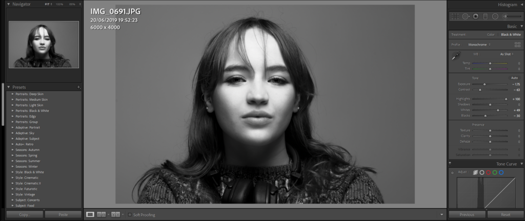
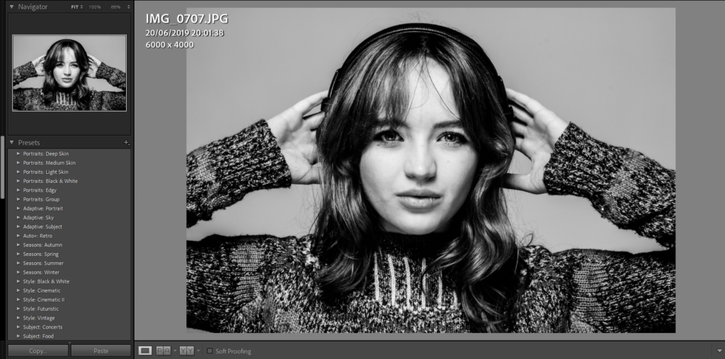
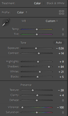
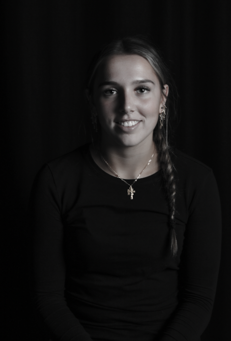
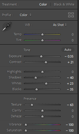
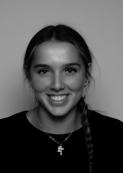
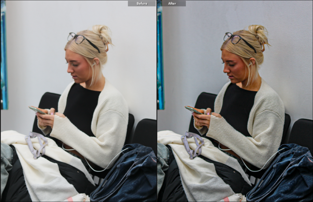
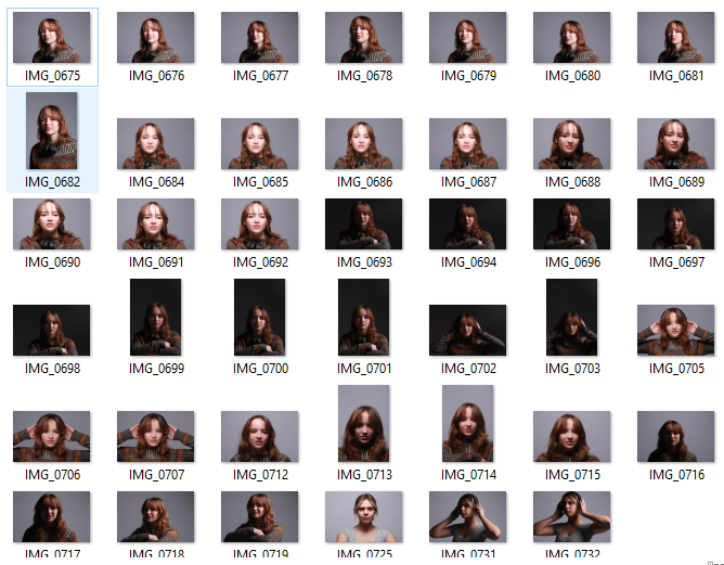
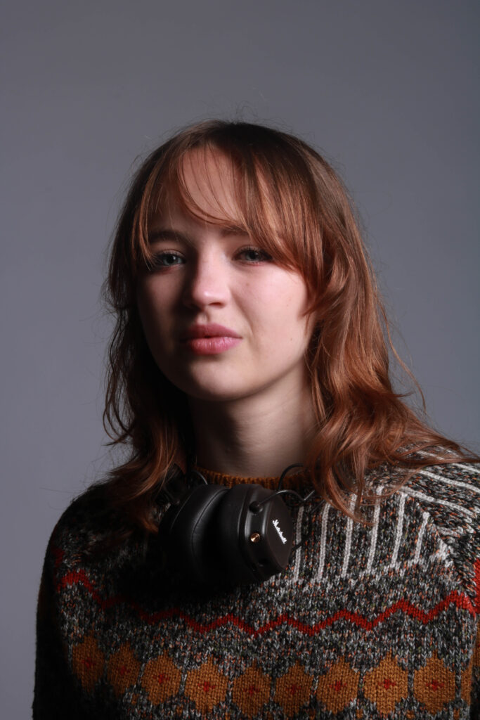
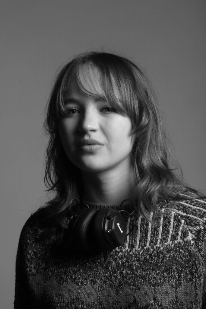
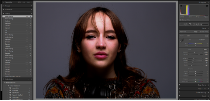
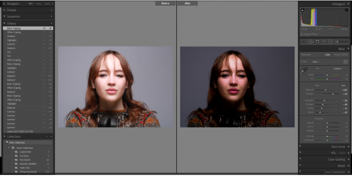
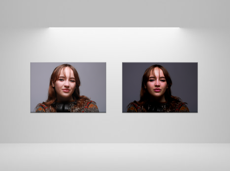
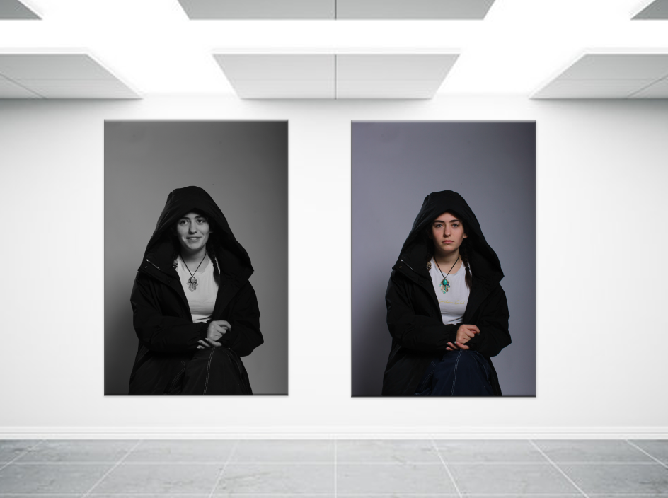
For my Formalism work I wanted to interpret what I saw in Walker Evan’s work where he used tools and almost ‘handy’ objects. I took a variety of photos and moved them to light-room to edit them slightly, just to change how the lighting effected the photo in certain ones.

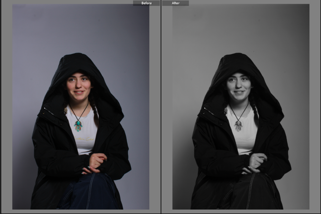
Here are some examples :

before :

after editing :

before :

after editing :

before :

after editing :

I edited the last two slightly differently adding more saturation to make the photos bright and more contrasting, while on the other one, I lowered the saturation to almost make the photos look more gloomy and dark.

For this photo, the original photo was slightly unclear so while I was editing, I increased the exposure and clarity on the photo to make it more clear while also adding highlights and shadows to give the photo more dimension making the photo looking almost more ‘clean’ and clear.

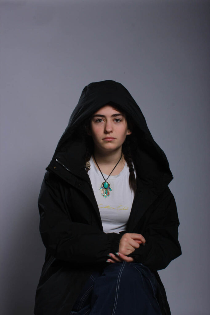
This photo was very dark before editing so I wanted to add better lighting that wasn’t produced in the studio. I also increased the saturation on the picture to give more clarity and to make the background colour ( purple ) more intense.

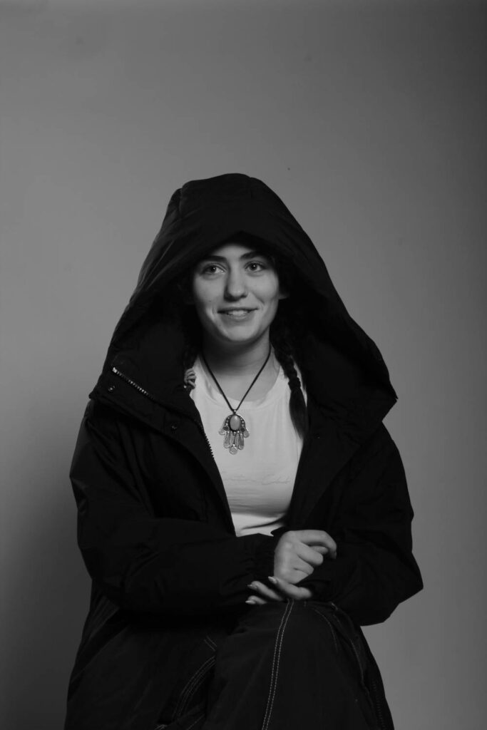
The use of brightening the photo was to make it more appealing to the viewer and more aesthetically pleasing as well. As you can see the shadows in the corner of the photo show depth and still give the kind of ominous feeling to the photo which I want to include in the photos I take as my own personal touch to them.

Overall :

overall, with help from teachers, I managed to improve the way I edited. At the beginning, I wanted to intentionally make the photos darker and less contrasting but towards the end I manged to keep the almost shadowy darkness but still adding highlights and keeping the picture bright and clear.

Just another Hautlieu Creative site