FORMALISM

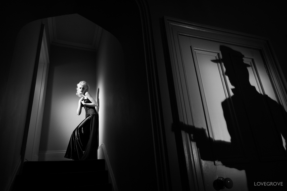
Definition: The Design, Composition and Lighting are dominant over Subject MatterThe photographer becomes a visual designer whenever a frame is captured.

The main components of formalism are:

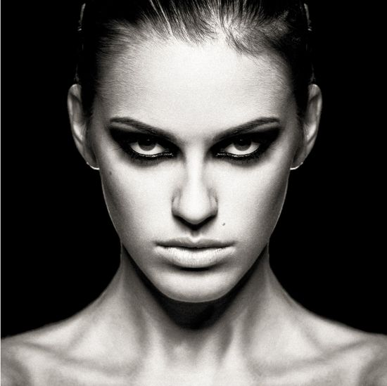
Line: lines shown in photos, the directions/angels they go and how that effects the photograph

this imagine by Philipp Klinger is a great example of how intentional lines can effect the atmosphere of an image and demonstrates when lines are the leading formal element if an image.

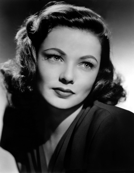
Shape: acknowledging shape in an image is acknowledging and analysing the at first obvious features of an image.

this image by CRISTIANOGERARDI shows how shape can be used in creative ways to make an image more impactful and interesting.

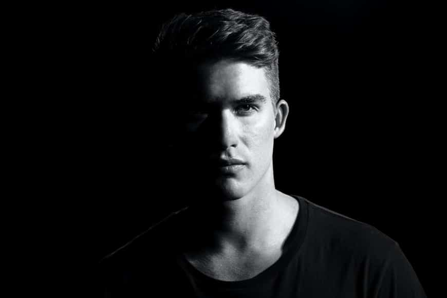
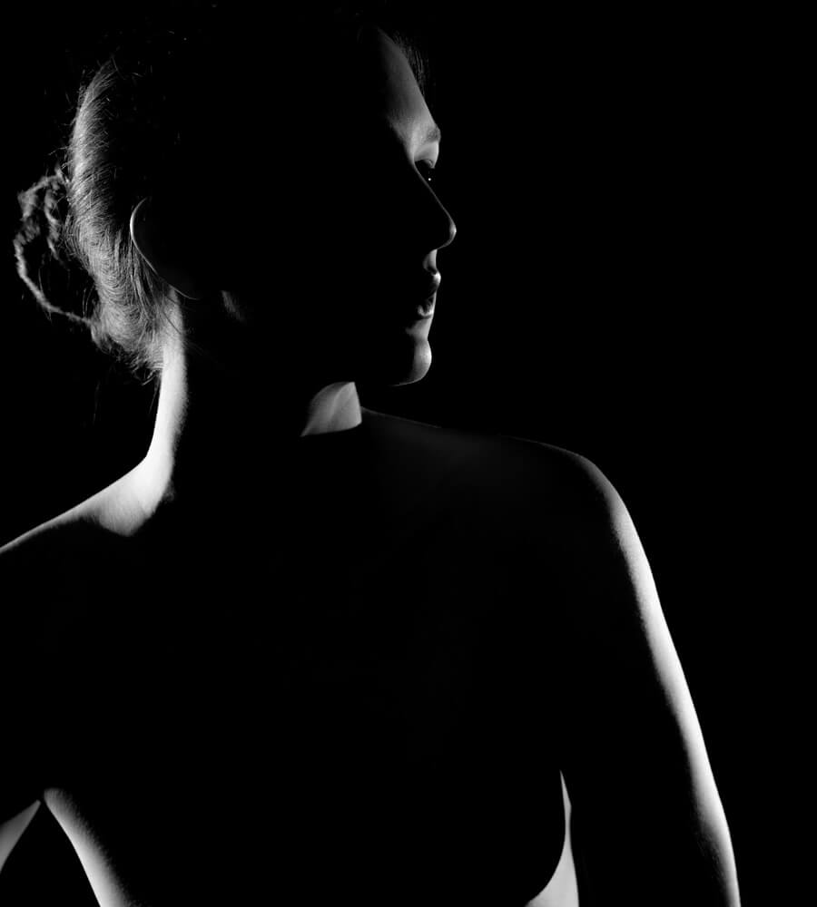
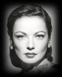
Form:Form refers to when shape takes on three dimensions. Form is created by shadows and highlights on an object in the photograph.

this image by Juergen Roth shows how good understanding of how to capture lights and darks in a photograph will effect your ability to compose a convincing and interesting photograph.

Texture :the visual quality of the surface of an object, revealed through variances in shape, tone and colour depth.

Texture brings am image to life and add vibrancy to an image

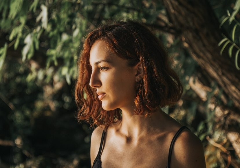
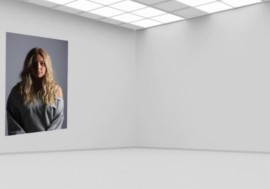
Colour : is a very important aspect of an image in all cases but when it is the main focal point of an image it creates a very interesting a recognisable effect

as demonstrated in tis image by  Sarah Polger

Depth how much of your image is in focus. In more technical terms, depth of field is the distance in an image where objects appear “acceptably in focus” or have a level of “acceptable sharpness.”2

symmetry when two halves of an image hold the same weight and give a perfect balance between two sides of your photograph.

Still life selection and editing process + photoshoot

Here are most of the photos I took over 2 different photoshoots. I used multiple different camera setups, some with a top down view using multiple lighting set ups, others using an infinity curve with soft box lighting and some with the camera placed straight on with a powerful flashlight to capture striking shadows (requires a high shutter speeds to keep exposure levels at a normal amount). I took a few photos with a single subject with no background noise to make the subject more important, other photos have multiple images to create a chaotic and unorganised look, as if it wasn’t placed there on purpose.

Here are 5 unique images that where taken in different ways, using different angles, lighting and object setups. Keeping with the theme of nostalgia, I used objects that are from the past like the old violin, flower holder, books, old packaging, tower of pisa, ext. These objects all have a nostalgic effect on me due to there old, worn appearance. I kept the subjects in the centre of the frame to make them more important. For the camera settings, I used manual focus and exposure, so I can adjust the image to how I like it.

Editing and best images

For this Image I only really changed the colour grading to be more yellow for the shadows and added a vignette, I also slightly increased the contrast. Old camera photos where often very yellow because Photo paper and chemicals deteriorate over time and change their properties. The strong shadows makes it seem like it was taken in a dark room (it was). The violin is almost fully in frame, in the centre of the frame, making it the main subject and the most important one.

For this one I used the same camera setup and editing settings, but just adjusted the placement of objects. A flash light was used for these images (requires a fast shutter and small aperture) to increase the contrast.

For this one I did a similar thing to the one above (increasing the yellow in the shadows) and bumped the exposure up (+30). I also added some grain in adobe light room too replicate pictures taken a while ago with worse camera quality.

I used a top down camera setup and placed the pencils to point at the chapter, leading the eyes to the text. I edited it similarly again, but with a more dramatic vignette. Continuous lighting with 3 different angles to reduce the shadow intensity. There is a slight over exposure so to combat that I reduced the exposure and contrast In editing.

Here I added the B/W editing pre-set to these to images and bumped up the exposure for more dramatic lighting. For the top image, I changed the camera settings to have a low f-stop (aperture) So the hammer will be out of focus. This gives for a more dramatic image, as it appears less flat. I tried to make the bottom image almost have a comedic effect as the box is like a mouth eating a violin 💀.

formalism

What is formalism?​

Formalism is said to be “the design, composition and Lighting are dominant over Subject Matter. The photographer becomes a visual designer whenever a frame is captured”.

There are said to be 7 basic elements in photography which are:

1)Line-

lines are everywhere they connect shapes they draw you attention to objects in images

2)Shape-

 there are multiple definitions of the word shape “the visible makeup characteristic of a particular item or kind of item” is one I like best. shapes are all around in your images you will have loads of shapes.

3)Form-

form is very similar to shape however shape is 2 dimensional and form is 3 so you have that added depth to the image which shape doesn’t have. There are 2 main types of form which are organic and geometric organic is more natural and nature based shapes and geometric are usually harsher manmade shapes.

4)Texture-

texture is said to be the physically appearance of an object. You can have lots of different types of texture like matte glossy bumpy smooth and rough etc… texture is something you can feel. Texture can also change depending on different situations like the lighting.

5)Colour-

colour is said to be “a phenomenon of light (such as red, brown, pink, or grey) or visual perception that enables one to differentiate otherwise identical objects“. colour has three properties which are hue (description of the colour) value (brightness/darkness) and saturation (intensity of the colour).

6)Size-

size is often described as “physical magnitude, extent, or bulk: relative or proportionate dimensions’. Size in images can be seen either as an illusion or relative. The most used size options are small, medium, and large. There is something called overlap which is when you have multiple objects and their size causes them to block off the other objects.

7)Depth-

Depth can be described as “the direct linear measurement from front to back“. Depth is thinking about the size of the object but also the space around it. The only time you won’t have any depth in your image is if you have a white blank background.

Walker Evans and Darren Harvey-Regan

Walker Evans

‘Stare, pry, listen, eavesdrop. Die knowing something. You are not here long.’ -Walker Evan

Evans was an American photographer, capturing everyday, working class citizens.

Evan’s had many unique approach that were benefitted from his slight frame, allowing him to take many photos unnoticed, perfectly capturing things and people completely unaware. He was also a close friend of Ernest Hemingway who also ended up shaping much of Evan’s early style. He was one of the first to use portable cameras which got increasingly more modern with faster shutter speeds only further benefitting his style of quick snaps, expertly timed and framed. He actually began his career wanting to be a writer, which the literacy style stuck with him though all of his work as in himself he could not fully identify with the poor, rural farmers he portrayed in his work, so he often used literature to help understand and present his work.
Tin Building, Moundville, Alabama, Walker Evans, 1936.

Beauty of Common Tools – Walker Evans

Darren Harvey Regan

Beauty of the common tools – Darren Harvey Regan

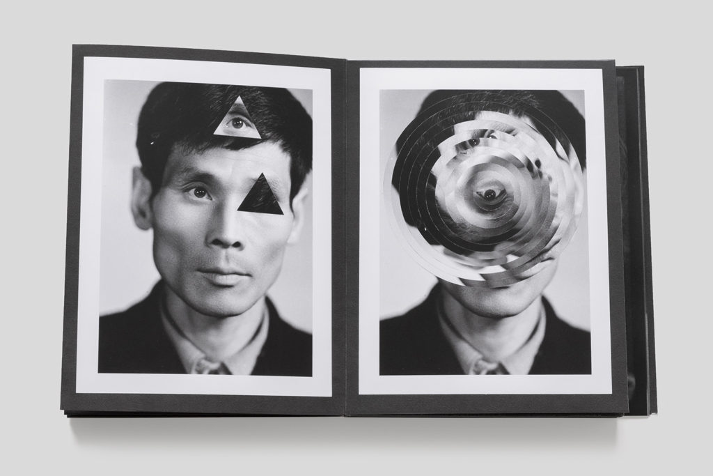
Darren Harvey Regan is a photographer who was also a mixed media artist combing sculpture and photography. He wants to break the constraints of photography hence the mixed media. Many of his images are comedic and his aim is to get people to study the subjects of the photos. He is often linked to the style of formalism as his work is heavily focused around: lines, shape, colour and texture. The style he uses forces people to study each part of the image and look for meaning and reasoning behind the photo.

Darren Harvey-Regan – The Erratics

Analysing Regan’s style

Regan’s work tends to be black and white, with a wide grey scale. He heavily focuses on lines and textures in his work, for example the image above has a chalk on a stand adding further lines and direction to the photo. It also has a triangular shape carved out of it, which has a very different texture to compared the rest of the chalk as it appears smooth like the surrounding area where as the rest of the chalk looks very rustic with organic textures. The lighting is soft but well lit with sharp edges when the lighting changes in the image appearing very satisfying to the viewer.

Comparing Regan and Evans Work

Regan’s photo is o the left and Evan’s photo is on the right. There are obvious similarities between the two images, with them both being clack and white although this is reflective of the period of time Evan’s took his photos. There are other similarities like the subjects both being a tool and that it is on a plain white background. I believe the background is to get people to stop over looking an everyday tool and appreciate how interesting it is with the lines and patterns. There are differences like Evan’s photo has the tool on an angle like it had just been thrown on the floor, where as Regan’s photo appears well thought out and structured. There is the other big difference between the two images is that Regan’s photo has been edited as it is actually two tools merged together that you wouldn’t notice unless you actually looked at the photo due to the grey scale and similar shapes of the tools. While they are technically both photos, are Evan’s photo as Regan used Evan’s photos to make new collages and new experiments.

Edits and development –

For my Formalism work I wanted to interpret what I saw in Walker Evan’s work where he used tools and almost ‘handy’ objects. I took a variety of photos and moved them to light-room to edit them slightly, just to change how the lighting effected the photo in certain ones.

Here are some examples :

before :

after editing :

before :

after editing :

before :

after editing :

I edited the last two slightly differently adding more saturation to make the photos bright and more contrasting, while on the other one, I lowered the saturation to almost make the photos look more gloomy and dark.

For this photo, the original photo was slightly unclear so while I was editing, I increased the exposure and clarity on the photo to make it more clear while also adding highlights and shadows to give the photo more dimension making the photo looking almost more ‘clean’ and clear.

This photo was very dark before editing so I wanted to add better lighting that wasn’t produced in the studio. I also increased the saturation on the picture to give more clarity and to make the background colour ( purple ) more intense.

The use of brightening the photo was to make it more appealing to the viewer and more aesthetically pleasing as well. As you can see the shadows in the corner of the photo show depth and still give the kind of ominous feeling to the photo which I want to include in the photos I take as my own personal touch to them.

Overall :

overall, with help from teachers, I managed to improve the way I edited. At the beginning, I wanted to intentionally make the photos darker and less contrasting but towards the end I manged to keep the almost shadowy darkness but still adding highlights and keeping the picture bright and clear.

STILL LIFE

Still life is a painting or drawing of an arrangement of objects, typically including fruit, flowers and objects contrasting with these in texture, such as bowls and glassware.

Still life photography is a form of professional photography that depicts inanimate objects or subject matters. Still life is a unique genre of photography. One thing that makes it so special is that often the subjects aren’t very interesting. The effect of this can make the photograph slightly a mystery and can tell its own story, sort of like a book as you imagine the way you want too.

Still life photography is important for several reasons. It can capture beautiful images that can be enjoyed for years to come. It can serve as a way to document and preserve history. Still life photography can be used to create art and has been a popular art subject for centuries.

Abraham van Beveren (Dutch, The Hague 1620/21–1690 Overschie) This photo presents the themes of wealth and high class which is shown through the lobster and the metal work reflecting on the lush fruit. This photograph can tell us many things but a main theme is wealth especially around the timing it was published.

Cookmaid with Still Life of Vegetables and Fruit c.1620-5 Sir Nathaniel Bacon 1585-1627

Sir Nathaniel Bacon did not paint professionally, although he was a skilled amateur artist. Very few works attributed to him survive, so the appearance of this work on the art market presented the Collection with a rare opportunity for acquisition. Furthermore, the subject matter, a cookmaid surrounded with lavish produce, more usually associated with Dutch and Flemish art, is highly unusual in England for the period and associated only with Bacon. Every item depicted is known to have been growing in England: Bacon himself grew melons on his Suffolk estate.

Fruits can symbolize prosperity, wealth, abundance, pleasure, fertility, and the fleeting nature of life, depending on the composition, colour, and presentation of the fruit. Although  fresh fruit, represents fertility, vitality, youth, and abundance. When the fruit is in a state of decay, however, it characterises the inevitable and undeniable mortality of our presence in the world.

As we are on the topic of symbolic meanings and metaphors. There are Vanitas

Pieter Claesz, Still Life with a Skull and a Writing Quill, 1628

vanitas is a symbolic work of art showing the transience of life, the futility of pleasure, and the certainty of death, often contrasting symbols of wealth and symbols of ephemerality and death. Vanitas remind the viewer of the shortness, fragility and uncertainty of death, which often include symbols such as skulls and extinguished candles. 

However, they can also include other symbols such as musical instruments, wine and books to remind us explicitly of the vanity (in the sense of worthlessness) of worldly pleasures and goods.

Although there are also light Vanitas which bring a more positive mood and outlook. Which although they are very different, they are actually similar within symbols and metaphors.

Still Life inspired – My photo

In this photo I used random objects and created an arrangement of the objects to create a meaning. The typical thing about still life is that the objects aren’t very exciting which makes it interesting. However my objects aren’t the typically used objects and don’t have a symbolic meaning. I also used an orangey-warm tone which created a significant and eye-catching shadow to make the photograph more interesting. The objects put together don’t explain the story behind them which is the beauty of still life, as it can be personal to you or how you imagine it to be. However, because I did not use dark lighting in the studio it contrasts and is different to the typical still life photographs, which is in my opinion less effective. Overall, it is still a still life photo but I would like to change some qualities to make it more like the professionals such as add symbolic objects and use natural or darker artificial lighting in the studio.

still life photoshoots and contact sheet

In this picture I rated, coloured and flagged my photos so that I could have an idea of what photos I liked most and so that I could edit the pictures that I liked without editing the unnecessary pictures.

In some pictures I used the copy-stand and in other i used an infinity screen.

For this photo I chose objects that I picked from the studio that portrayed a mysterious atmosphere. I wanted to give the photo more life so I added some techniques to the photo to reach its minimum peak. I kept the tint, temperature, contrast, highlights, shadows, whites, blacks, texture, dehaze and saturation untouched because I felt like the photo didn’t need them. I increased exposure to expose more the light in the photo, clarity to show more of the details in the photo, and finally increased the vibrancy to give the photo more colour. This picture was taken in an infinity screen with continuous light from the left and from a small light on the bottom of the infinity screen.

For this photo I wanted to create a warm and cosy tone to it. when I took this picture I looked at it and I really liked how it looked in general. I strongly believed that it showed the cosy feel to it yet it also was warm which, so I decided not to touch it and leave the picture just as it is . This picture was taken from an infinity screen with continuous light from the left and a small light on the bottom of the infinity screen.

Again for this photo I kept it untouched because I liked how it looked by itself. I wanted to have a photo that showed a slight off white look to it and was cool. I think that the photo naturally is cold and bleak so there was no need to edit it. This photo was taken in an infinity screen without the bottom light which gave it a cooler tone.

For this picture I wanted to play around with the white balance on the camera. I didn’t want the photo to have different lighting. I decreased the white balance to give the photo a more cool tone to it and finally to edit it, I increased the exposure the to make it lighter and cooler. This photo was taken from an infinity screen with a continuous light on the left.

For this photo I wanted to enhance the gold colour off the lipstick and also increase the white in the photo. I kept the temperature, tint, contrast, highlights, shadows, whites, blacks, texture, dehaze and saturation untouched because it did no good to the photo and didn’t help my aim with the photo. I increased the exposure to expose the brighter parts of the photo, clarity to show more off the texture in the photo and show the gold that the the original photo wasn’t showing and finally I increased the saturation to increase the saturation of the gold on the lipstick. This photo was taken from a copy-stand with continuous light coming from the sides.

For this photo, I wanted a homely and summery feel to it. When I took this photo I felt like I had already achieved what I wanted, without editing I think that it already had a homey feel to it so I left it unedited. This photo was taken from an infinity screen with a continuous light coming from the left

For this photo, I wanted to produce a clean and posh tone to the photo because I felt like the objects had that posh tone. When I took this photo I liked how it was very bright and illuminated the colours of the objects. I zoomed in the photo to show more of the details of the objects. Because I was happy with the photo unedited, I left the photo as it is and didn’t edit any of it. This photo was taken free hand with a black background and a white ‘floor’. The camera had a Flash setting so every time I took a photo, the light on the left flashed.

Again, For this photo I wanted to produce a clean and posh tone to the photo because I felt like the objects had that posh tone. When I took this photo I liked how it was very bright and illuminated the colours of the objects. I didn’t zoom in the camera lens, I kept my distance from the objects but made sure you couldn’t see the outside from the set up. Because I was happy with the photo unedited, I left the photo as it is and didn’t edit any of it. This photo was taken free hand with a black background and a white ‘floor’. The camera had a Flash setting so every time I took a photo, the light on the left flashed.

This is the set up I used to take the last two photos.

Formalism

Formalism describes the critical position that the most important aspect of a work of art is its form, the way it is made and its purely visual aspects, rather than its narrative content or its relationship to the visible world.

There are seven basic elements of photographic art: line, shape, form, texture, colour, size, and depth.

Line is a point that continues; it implies motion. Lines are either straight, curved, or a combination of the two. Lines can be solid, dashed or interrupted, implied, or psychological. They can be vertical, horizontal, or somewhere in-between.

The type and general direction of lines in your image convey meaning inside the photograph. Lines are everywhere in photographs. Lines surround us, and every photograph contains lines.

Shape photography is the two-dimensional appearance of objects as your camera captures them. When a line, or more than one line, closes or connects, a shape is formed.

The Merriam-Webster definition of “shape” that we are concerned with as photographic artists is:

-the visible makeup characteristic of a particular item or kind of item

-spatial form or contour

-a standard or universally recognized spatial form

What separates form from shape? Form takes shape from the two dimensional and brings it into the three dimensional. Form has overall height, width, and depth.

Just as with shapes, there are two basic types of form geometric and organic.

Geometric forms are the familiar sphere, cube, cone, cylinder, etc. We are also, of course, familiar with organic forms they are the objects that surround us in our three-dimensional world.

In photography, texture can be felt with both the fingers (the print) and virtually (with the viewer’s eye). Texture is the next part of our Elements of a Photograph series.

The definition of texture is the visual or tactile surface characteristics and appearance of something.

Texture in real life can be smooth or rough etc.

Texture in the photograph is similar to form in that it is revealed by variations in tonality and presented in two dimensions.

In a photograph, smooth objects might have reflections or specular highlights. Rough objects might have aggressive areas of light and shadow without reflections.

Texture can be elusive in a photograph, depending on the subject, the lighting, and the forms in the image.

definition of “colour” that we, as photographic artists, are concerned with is:

a phenomenon of light (such as red, brown, pink, or grey) or visual perception that enables one to differentiate otherwise identical objects

the aspect of the appearance of objects and light sources that may be described in terms of hue, lightness, and saturation for objects and hue, brightness, and saturation for light.

a specific combination of hue, saturation, and lightness or brightness

 a colour other than and as contrasted with black, white, or grey

Light itself has no perceived colour. But, send light through a prism or a drop of water and we can see that it is comprised of a literal rainbow of colours.

Colour has three properties: hue, value, and saturation.

Hue is simply the description of the colour (e.g., blue, red, yellow, etc.).

Value is the relative brightness or darkness of a colour.

Saturation is the intensity or purity of a colour. The purest colour is a hue with no white, black, or grey added to it.

Separate the different colours of the rainbow and we can see these varied colours elicit different emotional responses.

Size, the most elusive of these, is the topic of this sixth part of our Elements of a Photograph series.

The definition of size is the physical magnitude, extent, or bulk : relative or proportionate dimensions.

Size in a photograph is relative and can be an illusion.

Large, medium, or small. The camera, lens, and print can render large objects small, or small objects large.

Depth, one of the most compelling elements, is the topic of this final part in our Elements of a Photograph series. Including a distant horizon is not required to give a sense of depth to your image. Depth is provided by visual cues. Depending on the quality of the surrounding air or atmosphere, distant objects in a photograph will have less clarity and contrast than objects in the foreground. This aerial perspective is indicative of depth in a photograph. Where you place an object in a frame also offers clues toward depth. The higher an object is in the frame relative to the horizon (seen or implied), the greater is the perceived distance to that object.

Still Life

This is a mood board of still life. They are very traditional.

Throughout its long history, still life has taken many forms, from the decorative frescoes of antiquity to the high art of the Renaissance. Traditionally, a still life is a collection of inanimate objects arranged as the subject of a composition. Nowadays, a still life can be anything from your latest Instagram latte art to a vase of tulips styled like a Dutch Golden Age painting.

Creating a beautiful and successful still life image is an impressive feat, but just as painting a bowl of fruit is a good introduction for new painters, still life photography is a wonderful training ground for new photographers. It gives you an opportunity to experiment with light, materials, textures, and subjects in a controlled setting. Whatever your creative vision and artistic goals, still life is a great place to start.

Still life photography has opportunities to experiment with different styles, such as:

Assortment of glass containers with dried plant stems captured with still-life photography

Composition. First, play with your composition and test different layouts and arrangements of your objects. Consider composition styles like the rule of threes when composing your still life image. Tweak and adjust your layout as you go to refine your composition skills and identify what makes a photo pleasing.

Trinkets from around the world as still-life photographic art

Subject and materials. Compose your photo with diverse textures and materials. It doesn’t matter whether it’s a handful of random objects from your home or a curated collection of sterling silver candlesticks. Explore how shadows and light reflect off of various surfaces, and see how it affects your final composition.

Still-life image of plant on digital camera optical viewfinder

Different lighting. Experiment with different lighting, both in the studio and in natural light. Avoid shooting with the traditional overhead lights in your home, as light colours will mix and produce odd and unintentional shadows. Different light sources can subtly change the mood and atmosphere of an image.

Woman in a red-checkered shirt taking a still-life picture of denim shirt

Camera angle. Try moving your camera as well, and see how the composition changes. Shoot both with a tripod and with your camera in your hand. You might just find an even better angle of your subject than the one you had in mind. When shooting handheld, make sure your shutter speed is fast enough to avoid camera shake.

Still life photo of an assortment of fresh peaches on a dark background

Focus and depth of field. Experiment with depth of field. Consider focal length, and try using a prime lens or a zoom lens to mix things up. Focusing on one small point rather than having the entire frame in focus can change your composition dramatically. Many cameras are designed to focus on the human face, so try using manual focus instead.

Still-life picture of a professional photographer shooting in his studio

Add motion. While traditionally a still life is just that, “still,” you can add elements of motion to your still life photography. Reach your hand into the shot and move something mid-photo. Or slow down your shutter speed and catch motion blur with a spinning ballerina music box. It’s up to you.

History

The creation of still life painting in the sixteenth century, perhaps with religious motives, continued through current time. This may be because the freedom this art offers in placing the elements where the artist wants, which generates control on the structure of work. Still life works gradually included anything that did not move as well as those that are dead. In addition to creating still life work normally, artists also included elements of still life in other genres of work, such as portraits, in supporting roles. The still life has witnessed a transformative and interesting evolution from the bottom of the hierarchy of artistic genres. In France, still life photography came back in the late nineteenth century, when modernist painters discovered it as the perfect subject for the formal exploration of different styles, colours and compositions. 
There were different styles of still life, for example:

  • Product photography: used to showcase products, such as electronics, jewellery, and clothing.
  • Food photography: a subset of still life that often centres on depictions of food in an attractive way.
  • Flower photography: focuses on capturing the beauty of flowers.
  • Abstract photography: focuses on the shapes, colors, and textures of objects.
  • Table-top photography: a great way to get started in still life photography and can include any of the above types of photography.

HERMENEGILDO ANGLADA-CAMARASA, DAHLIAS AND OTHER FLOWERS, 1951

This still life painting shows joy. The different colour bouquet shows the happiness through its bright colours. It is flower photography focusing on the beauty of the flowers but comparing them to the beauty if life.

Timeline of still life photography

The English term “Still Life” originates from within the 17th century when still-life art was at the height of European popularity. Still-life has existed since the 17th century until the modern day but, in the 19th century, artists adapted photography as a new medium for still life art, to express there concepts. Still life became less popular at one point, but regained its commonness again. Even today, still life photography is still very popular within many photographers.

What is Vanitas?

Vanitas is a still-life painting of a 17th-century Dutch genre containing symbols of death or change as a reminder of their inevitability. This genre began in the 16th century and continued into the 17th but has since lost its popularity.

What is Memento Mori?

The phrase “memento mori” is Latin for “remember you must die.” It is a reflection on the impermanence of life and a constant reminder not to take your time on earth for granted and not to worry about things beyond your control. Memento Mori is an object kept as a reminder of the inevitability of death, such as a skull.

What kind of metaphors and symbols are used in still life and why?

From flowers to seashells, decoding the symbols in still-life paintings can reveal a hidden world of deeper meaning.

Fruits are some of the most ubiquitous subjects in still-life paintings over the centuries. Not only does a basket of fruit offer the artist a variety of colours and textures to utilize, but it also offers a variety of religious and mythical symbols.

Made famous by Dutch and Flemish artists of the sixteenth and seventeenth centuries, ‘vanitas’ still-life paintings express the transience of life and the futility of materialism. This tradition also provided a justification for painting beautiful and expensive objects instead of more overtly moralizing subjects.

A beautiful bouquet of flowers in full bloom can signify life, faith, growth, and power. Wilting flowers, on the other hand, serve as grim reminders that life, material goods, and beauty are fragile.

In ancient times, it was believed that a person’s soul was contained in their reflection. Mirrors have been included in a variety of paintings throughout history. They can represent either truth and self-assurance or vanity and distortion, the difference depends on who is looking at their reflection. A broken mirror is universally recognized as a bad omen.

Just another Hautlieu Creative site