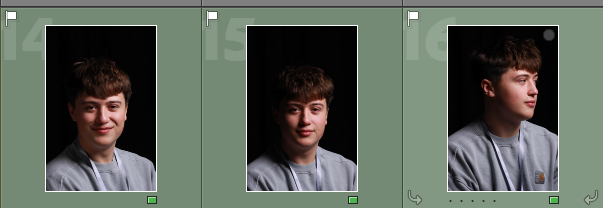
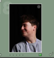
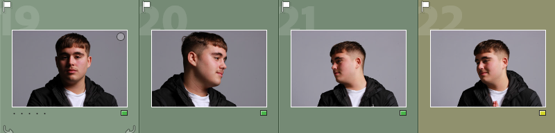
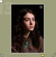
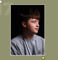
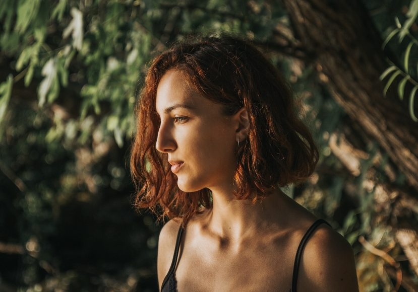
Definition: a type of portrait photography typically used for websites, press releases, publications, and social-media profiles.
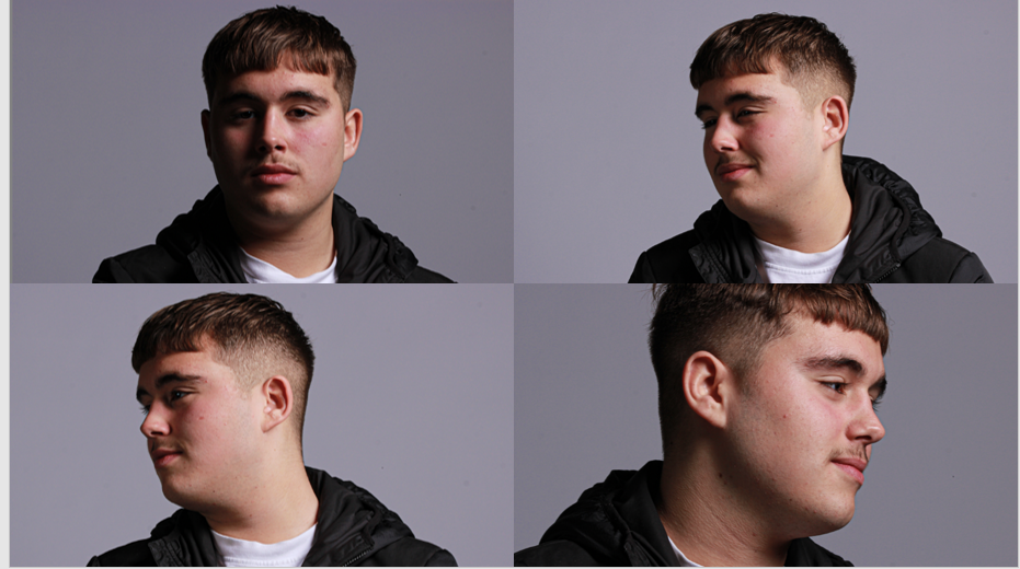
The term “headshot” or “head shot” just means that the portrait photo is cropped somewhere in the middle torso – so that the focus is on your face. The subject’s face should be the main focus, and the framing should be done in a way that draws attention to the eyes and facial expressions.
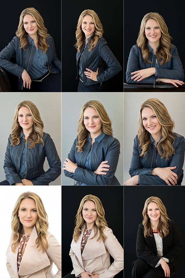
In headshots it’s important to consider:
- Lighting: soft, hard
- Framing: Headshots
- Focusing: focus on the eyes
- Expression: Explore different moods and emotions.
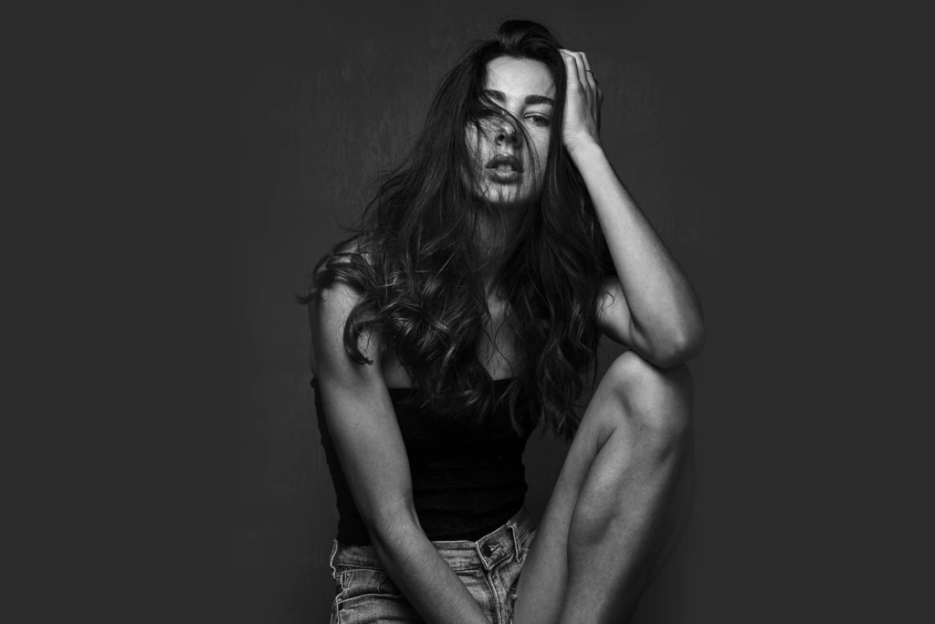
- Pose: Manner and attitude. Use hands too…
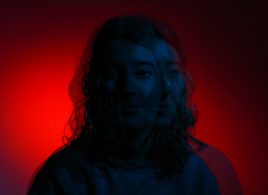
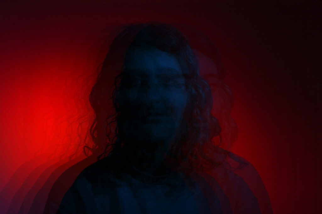
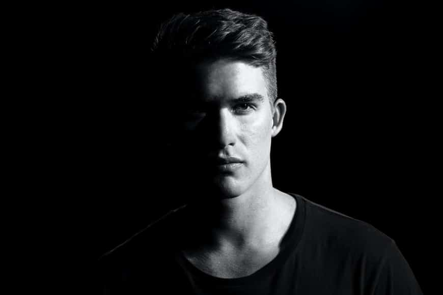
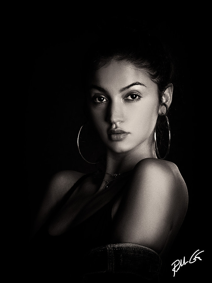
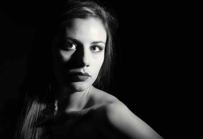
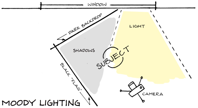
Soft and hard lighting:
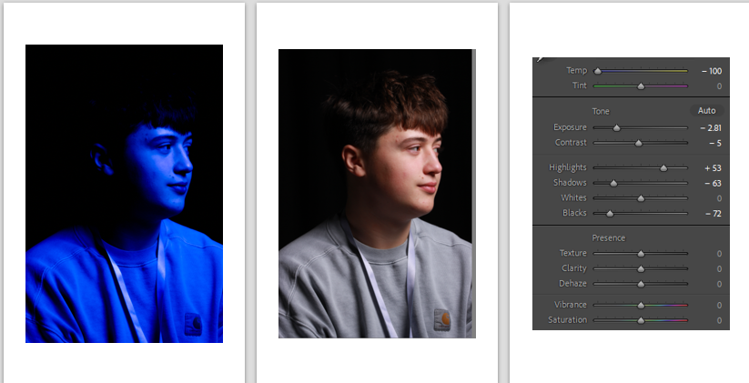
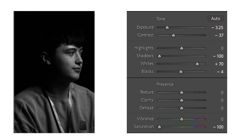
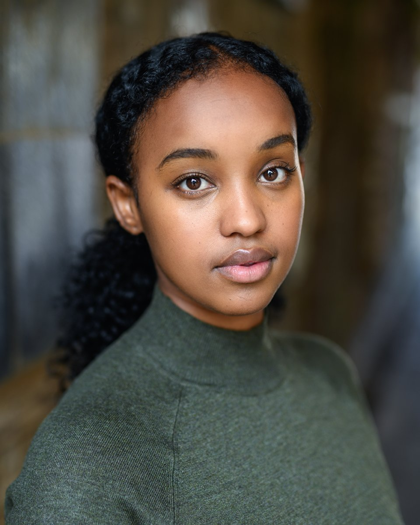
Soft lighting has a few hard shadows that’s bright yet balanced. The transition between light and shadow is a gradient instead of being bold and separate from one another.
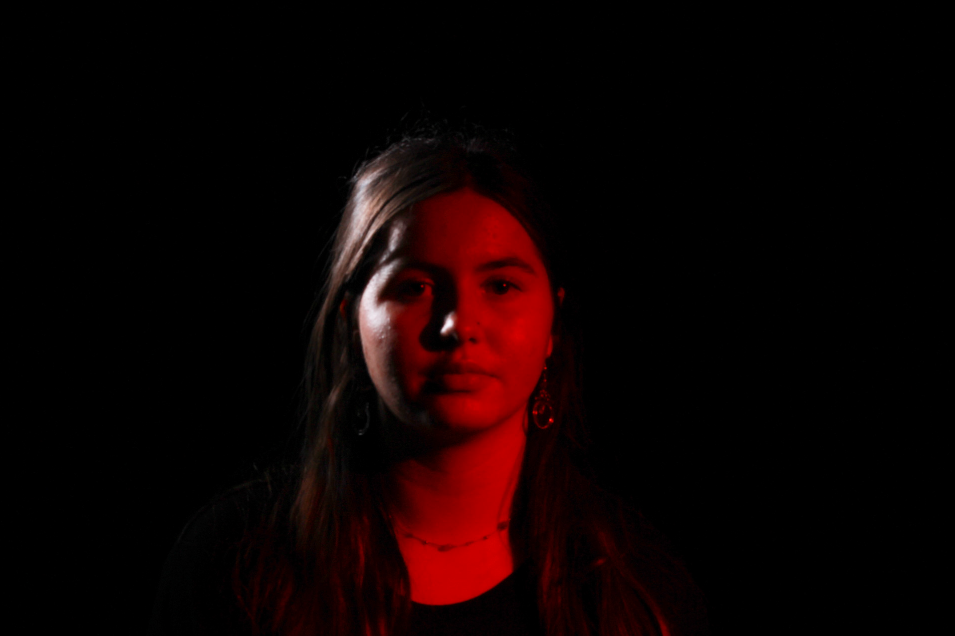
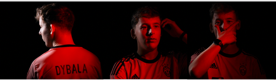
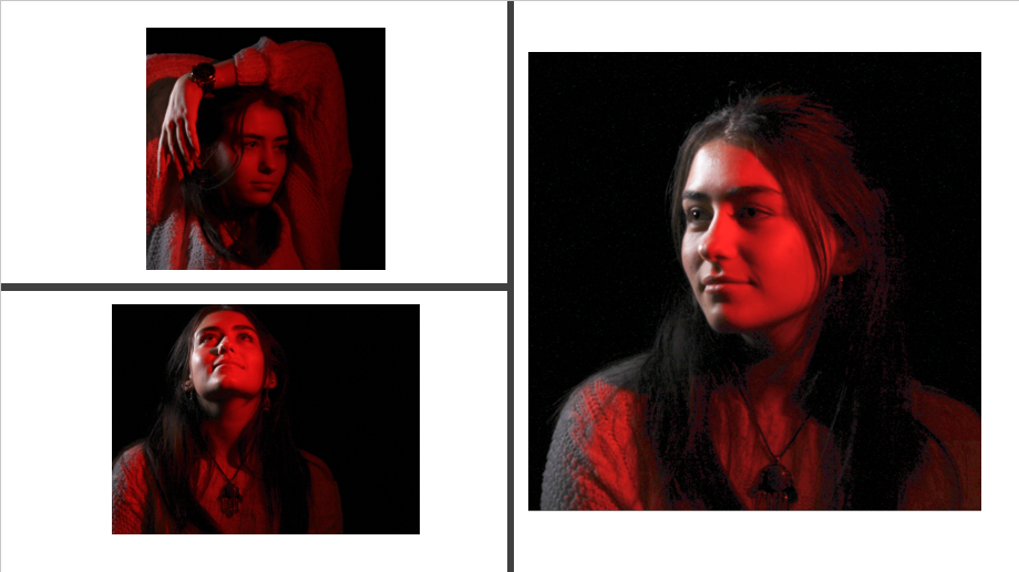
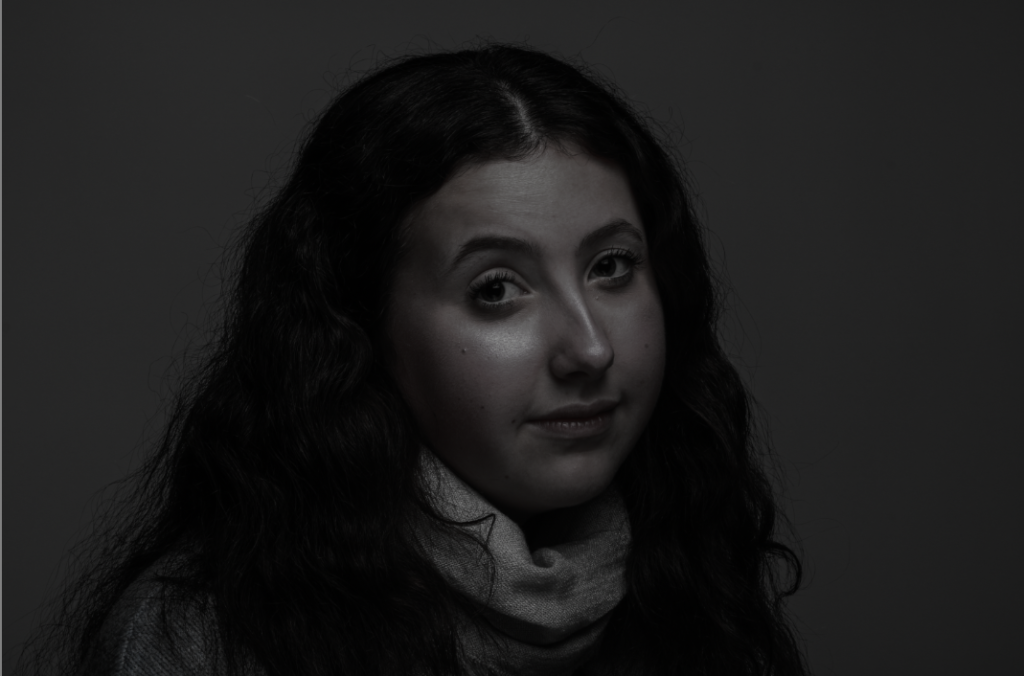
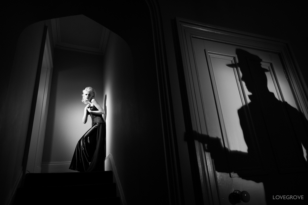
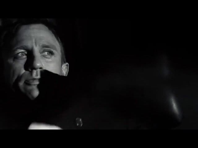
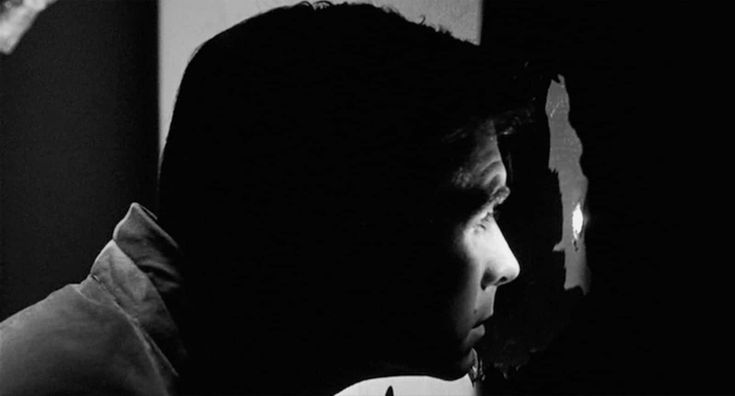
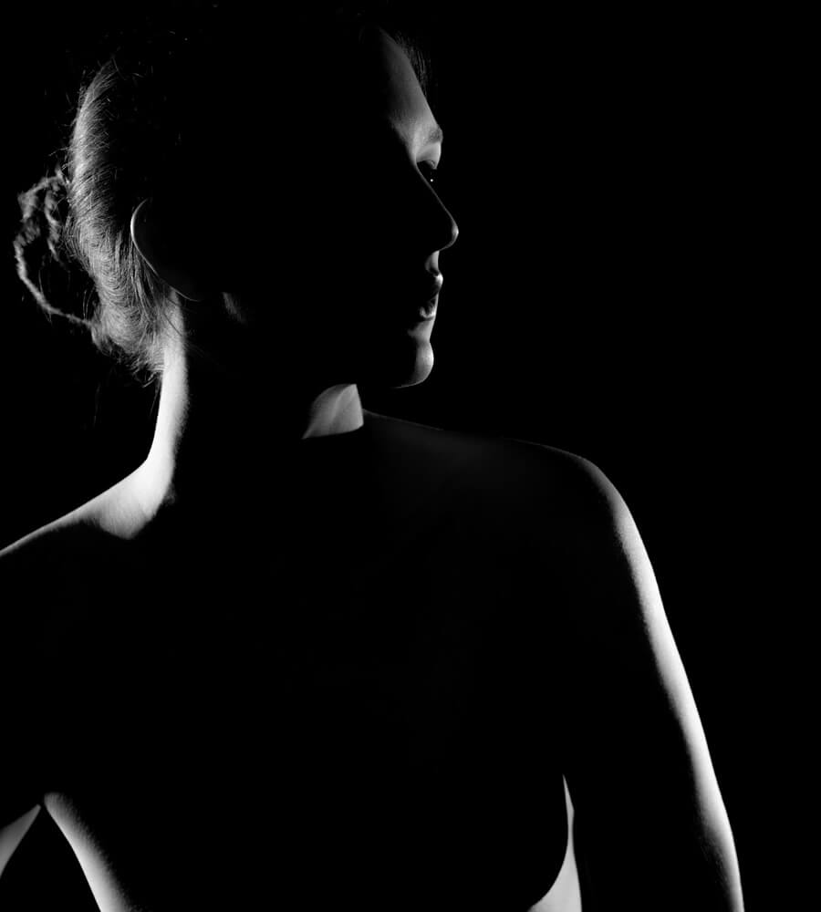
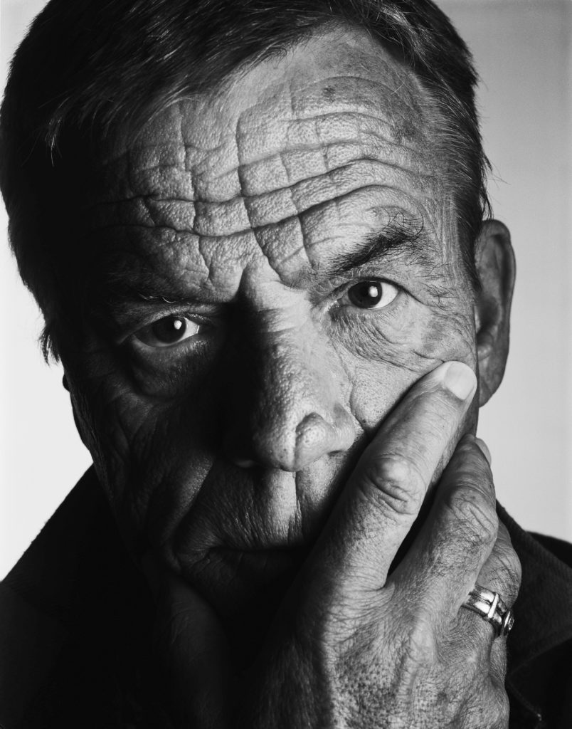
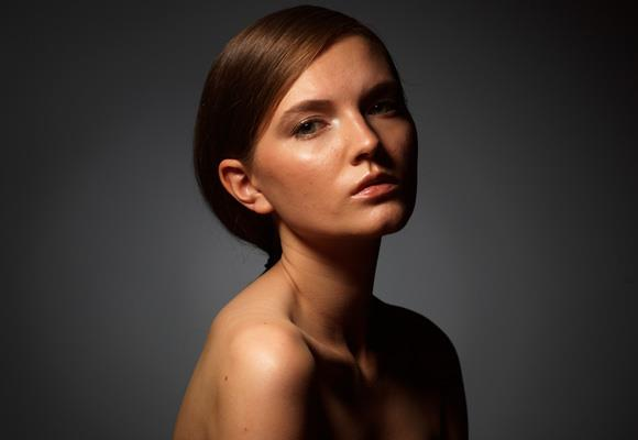
Hard lighting does not only emphasize facial features, it also create the dark and broody mood you want with a tone of mystery. Chiaroscuro and Rembrandt are good techniques to achieve this as they cast harsh shadows and draw attention to a specific part of a photo. In hard lighting, the transition between the light and the shadows is very harsh and defined.
Framing:
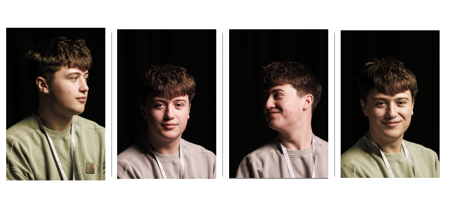
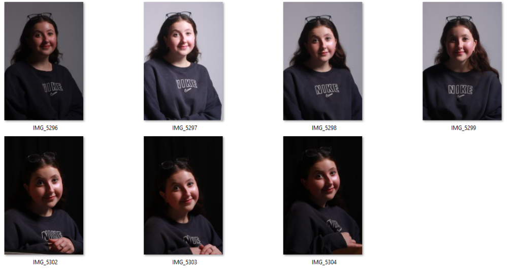
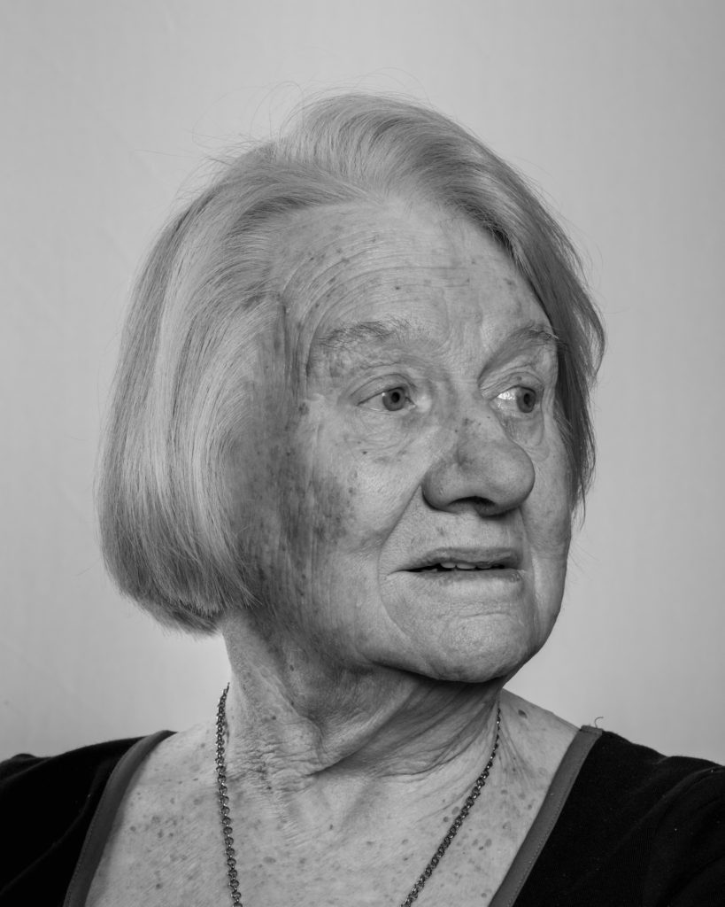
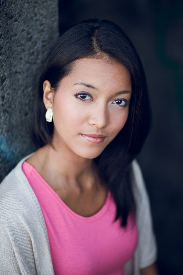
Rule of thirds is a good technique in framing the face in headshots so that the face is equally distributed across the image. For example, you should aim to align your eyes with upper-third line of the grid when cropping tight, and if you’re cropping wider, be sure that your head is positioned within the top third of the image. However if you are looking to be more creative you can alter this technique. The subject should look relaxed and confident by keeping their chin up and making eye contact.
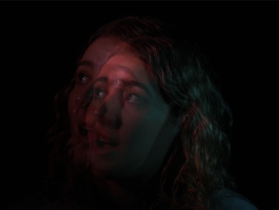
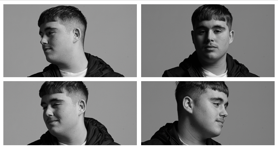
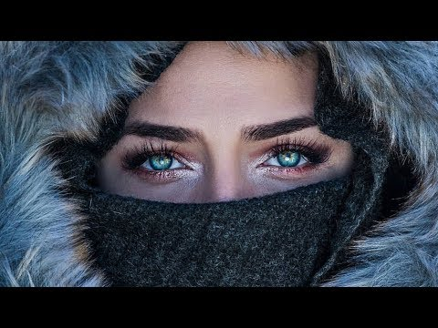
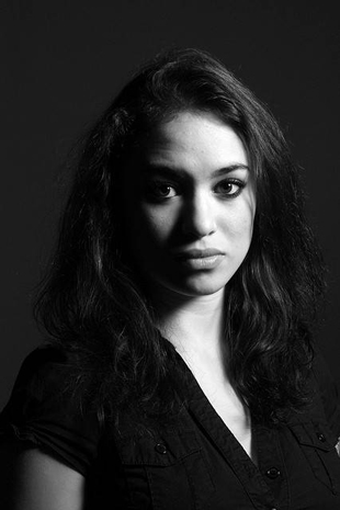
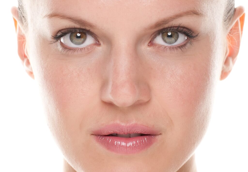
Focusing on the eyes:
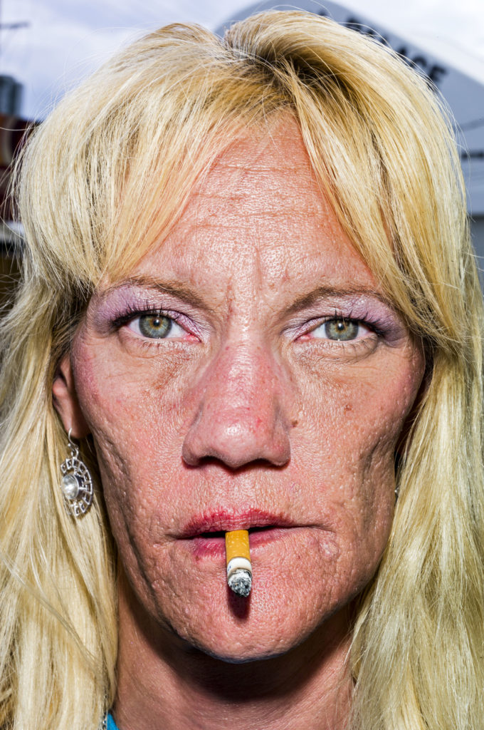
By placing your camera directly in front of your subject it allows fine-tune and focuses on the eyes, making them sharp. This way the colour and pattern in the eyes can be seen more as they are the most distinct part of a persons face. This makes the image more engaging for the viewer where they can look around the image more. Reflectors can help this.
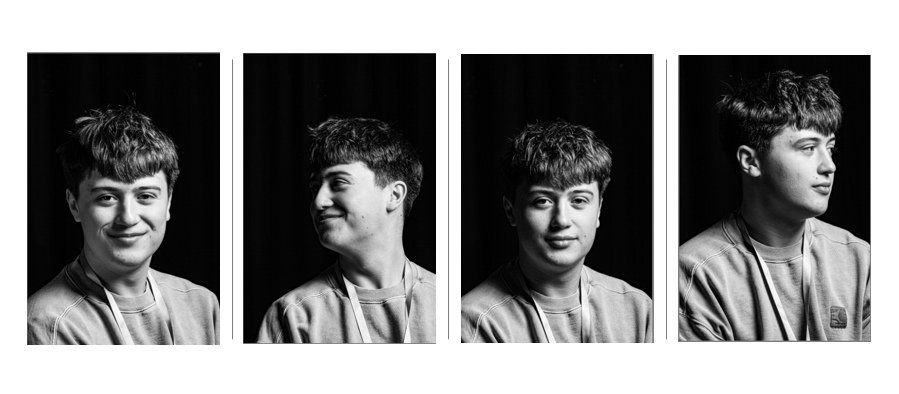
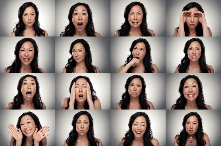
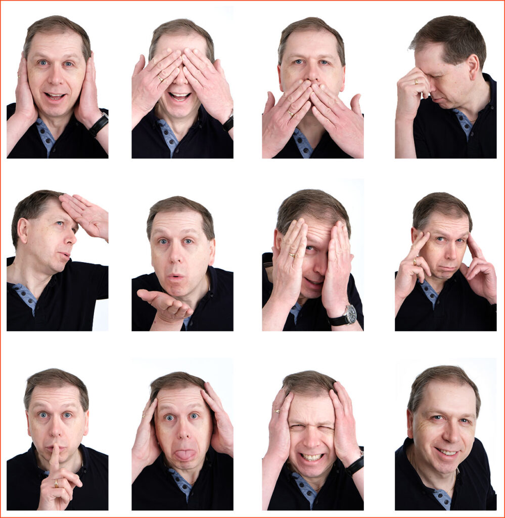
Expressions and emotions:
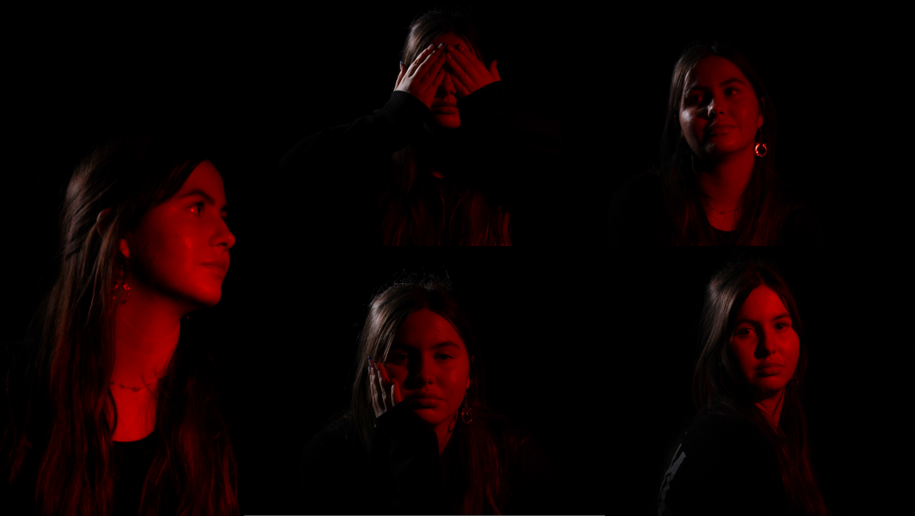
Exploring different expressions is important as it highly reflects the mood and tone of the image especially if paired with the appropriate lighting. You want to project confidence and competence to make others feel at ease. The face is the centre of attention so it is important to have a compelling expression, yet not to over-do it entirely as this may make the image unappealing.
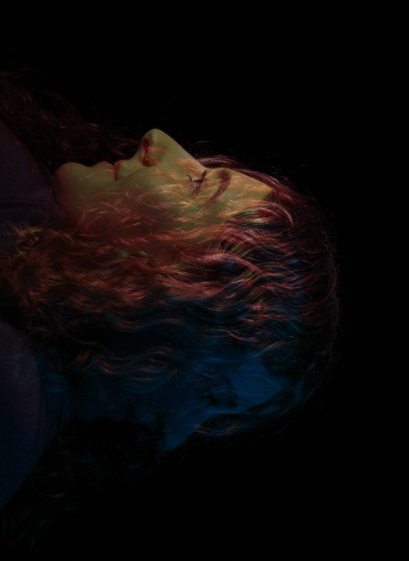
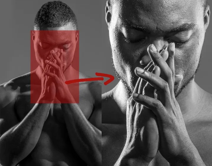
Posing:
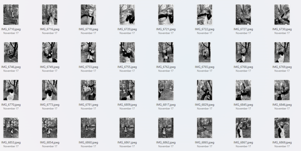
The pose performed in the image also sets the tone and mood for the image. This can act as a cue for an emotion out of the viewer too so that it makes them feel something. The hands are very useful in this as they can also conceal certain areas of the face and add to the emotion of the subject. For example, the Power Pose is a classic stance that exudes confidence and strength. Stand with your feet shoulder-width apart, place your hands on your hips, and tilt your chin slightly up. This pose will make you look assertive and in control – perfect for professional headshots.
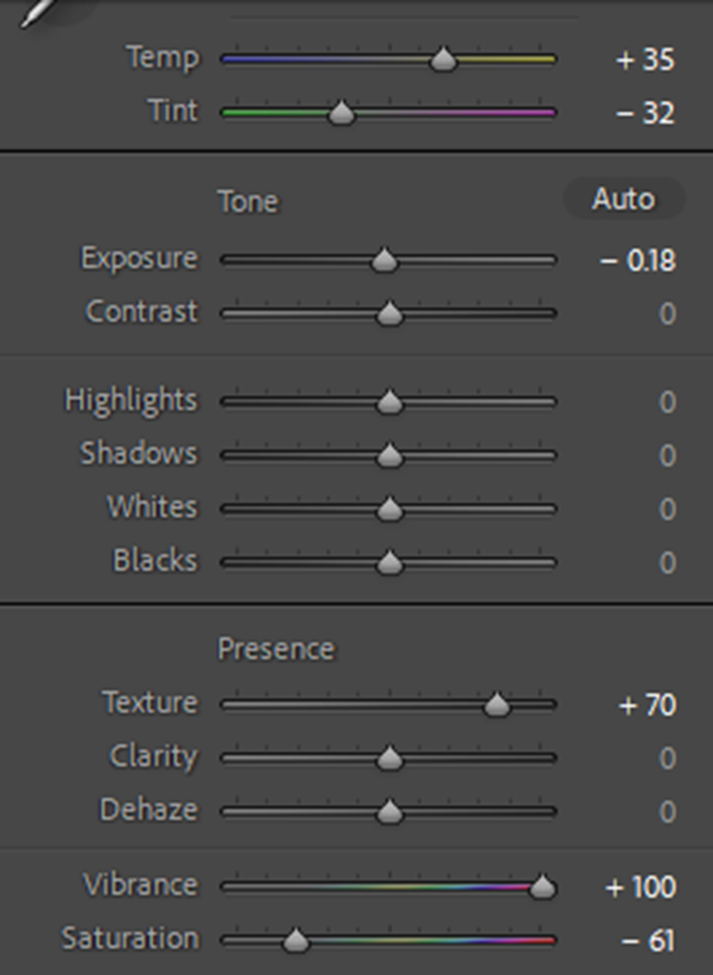
The camera settings I am going to use:
Camera settings (flash lighting)
Tripod: optional
Use transmitter on hotshoe
White balance: daylight (5000K)
ISO: 100
Exposure: Manual 1/125 shutter-speed > f/16 aperture
– check settings before shooting
Focal lenght: 105mm portrait lens
Camera settings (continuous lighting)
Tripod: recommended to avoid camera shake
Manual exposure mode
White balance: tungsten light (3200K)
ISO: 400-1600 – depending on how many light sources
Exposure: Manual 1/60-1/125 shutter-speed > f/4-f/8 aperture
– check settings before shooting
Focal lenght: 50mm portrait lens