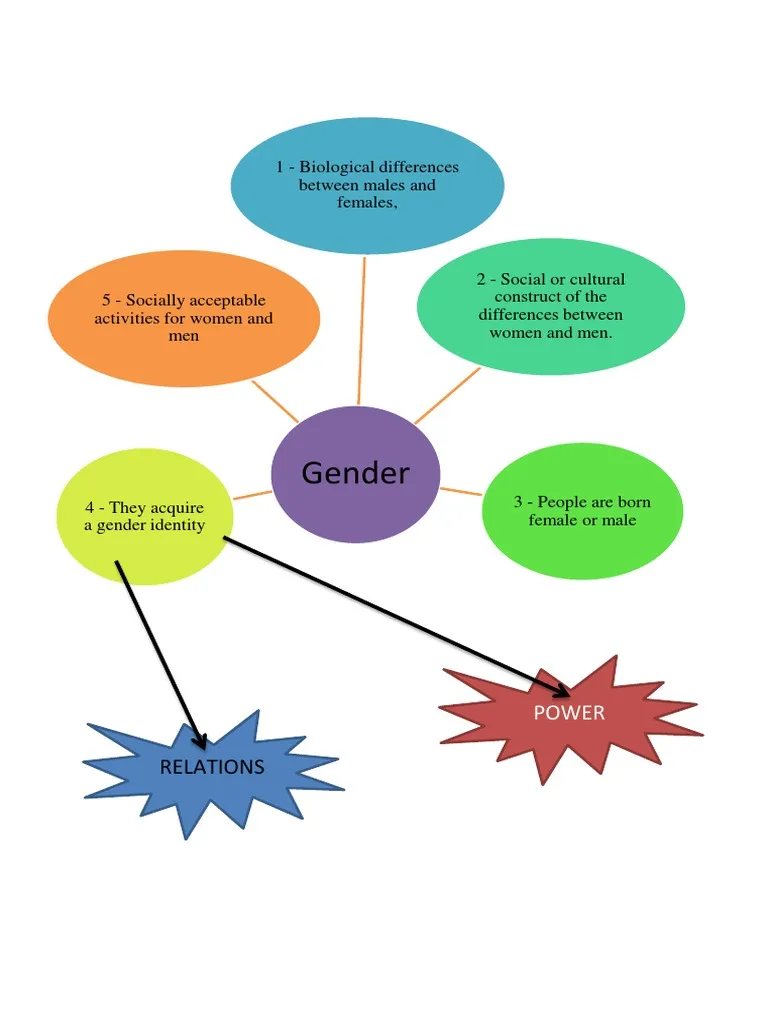
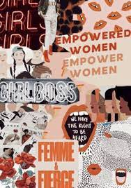
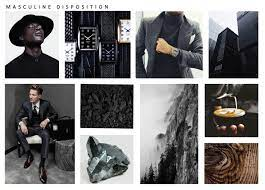
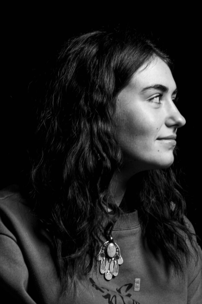
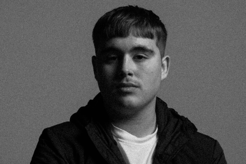
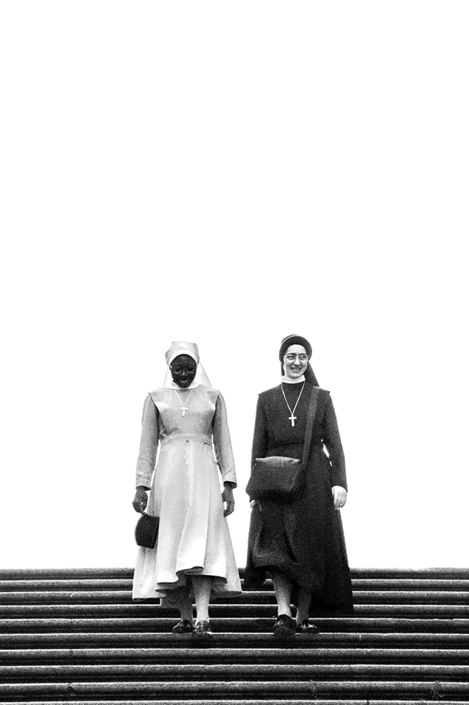
These images show the difference between masc and fem and shows you the ins and outs of both. They are both so different yet so similar which is the good thing about this topic is that you can mic and match the photograph’s and see what fits into masc and fem or neutral within these regions.
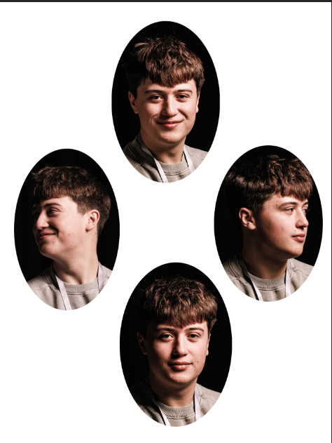
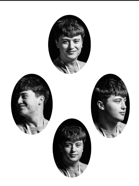
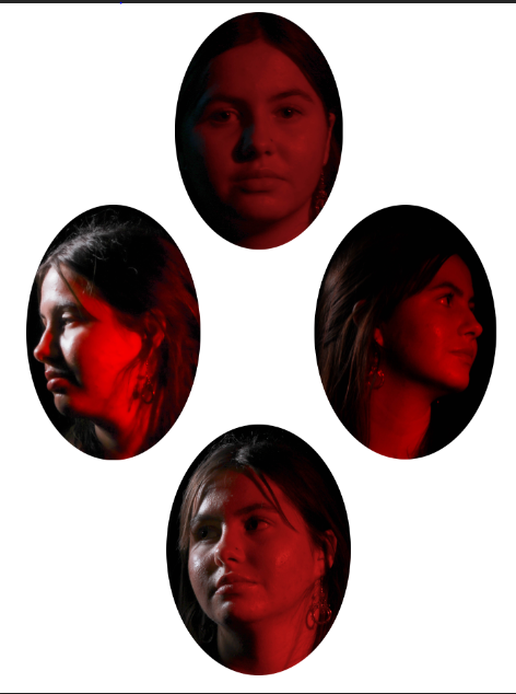
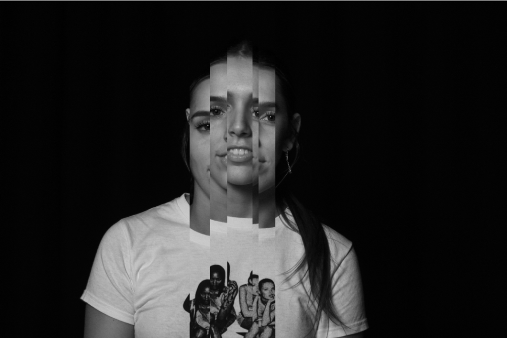
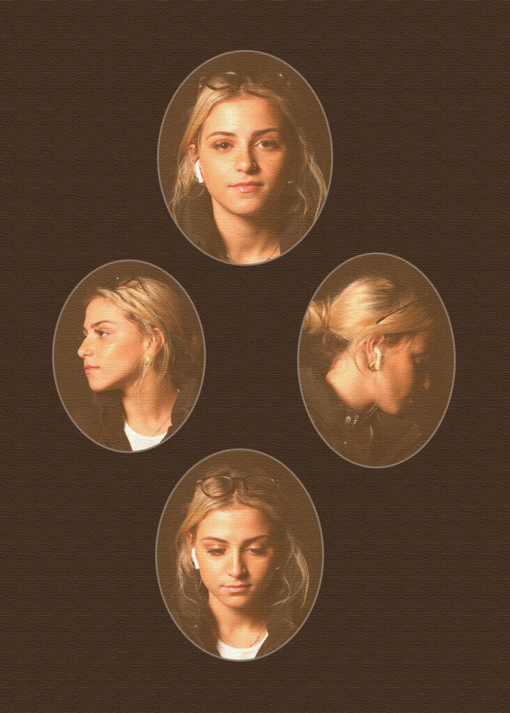
This is my first diamond cameo, I edited the actual photos of Lightroom then exported them over to photoshop and turned them into this diamond cameo.
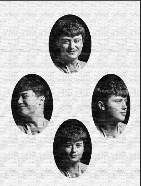
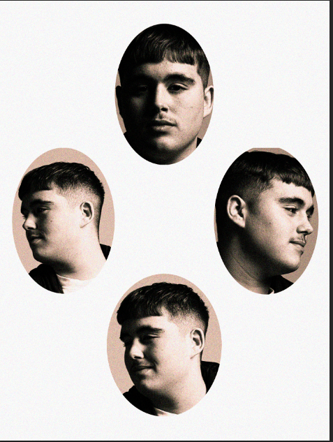
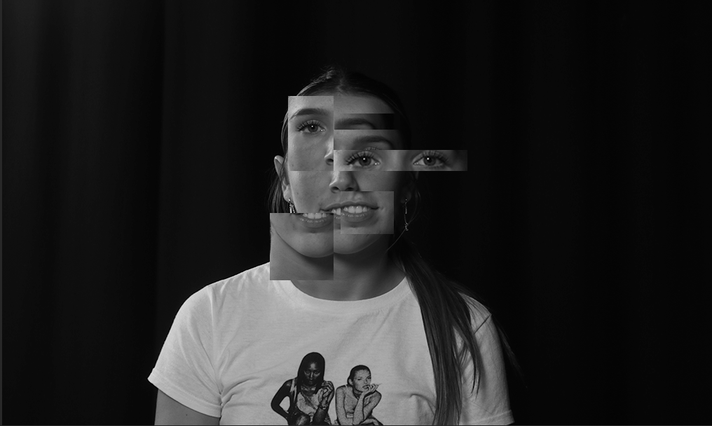
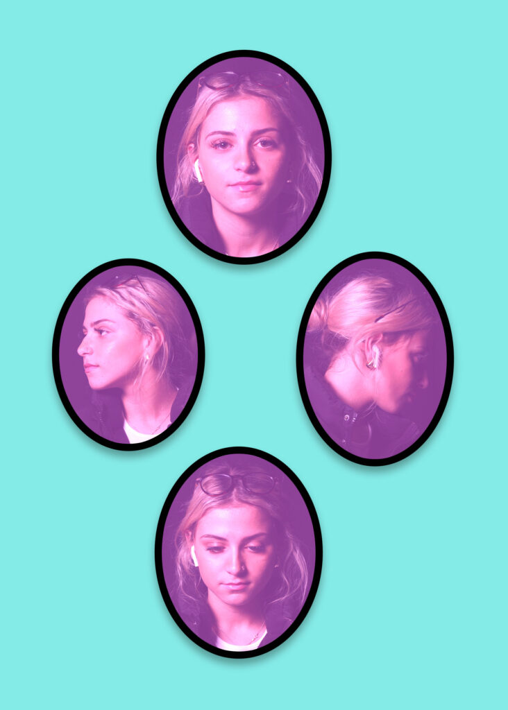
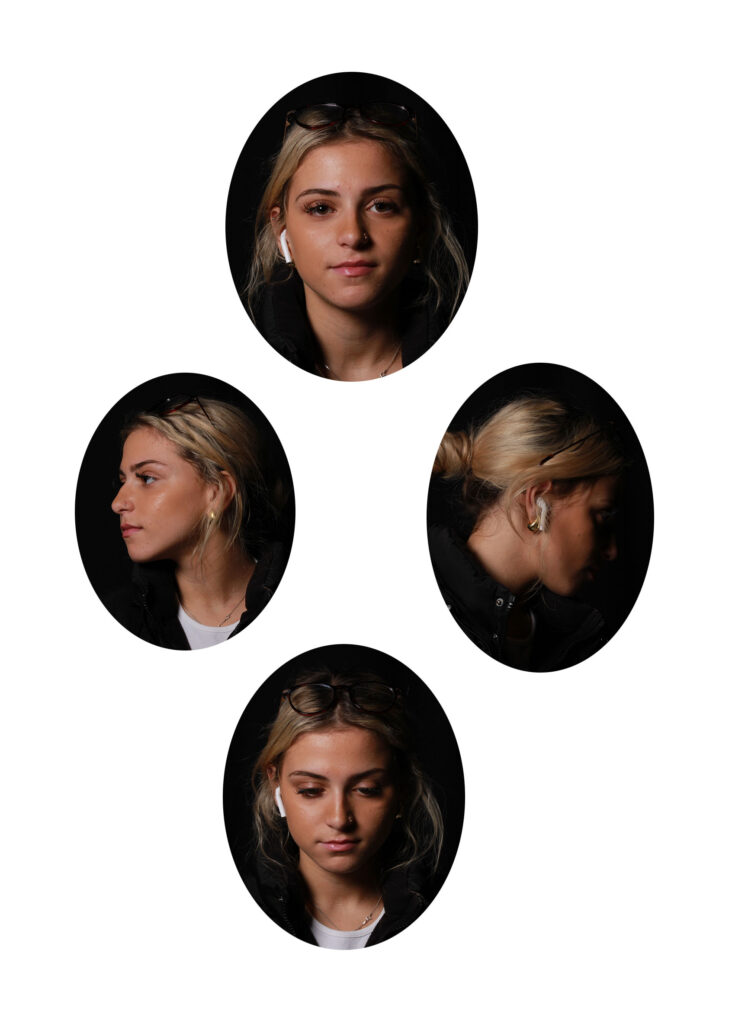
These were two more diamond cameos with the same image but edited differently and placed in diamond cameo form, in the second one I gave it a different texture to look more old and mysterious.
How I make my diamond cameos
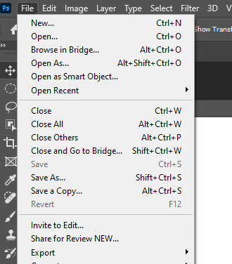
Firstly I go on to photoshop, and export my image I want to use off of Lightroom onto photoshop, by opening file.
Then once on file I select open.
Once I press open it gives me the images I have exported and I select one
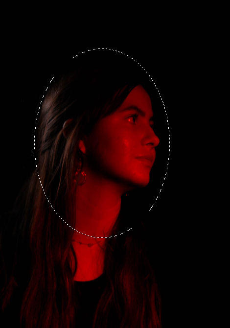
After that I press this button on photoshop, which allows me to make an oval shape.
Then I shape the oval around the face.
After that I select this button which cuts the oval shape and allows me to move it around and place it onto the blank page to create my diamond cameo. Then I do the same for all the images and place them correctly.
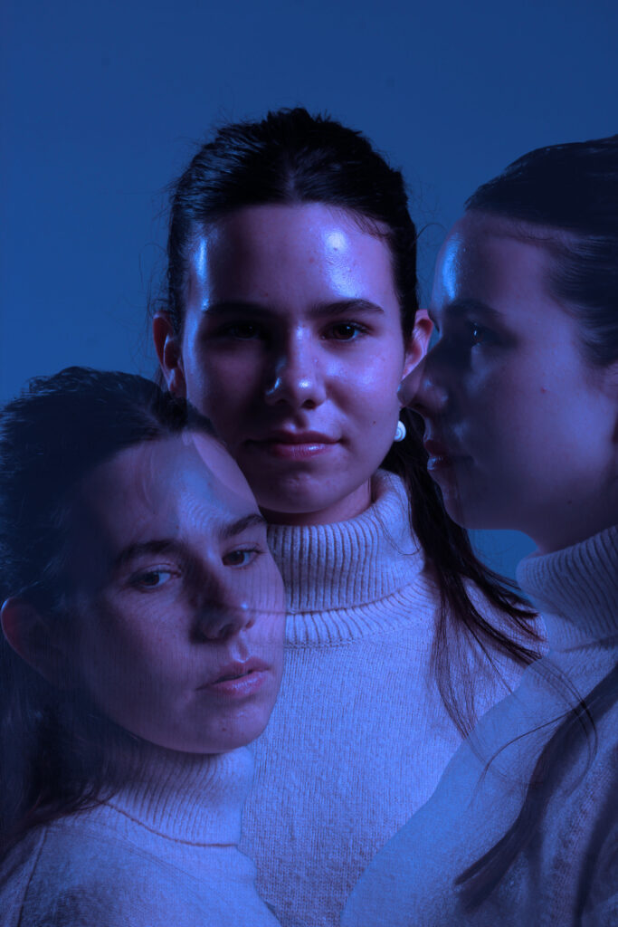
On the top left, I pressed file and open and then selected one of the pictures that I wanted to use. I left the picture as it was and then pressed file and open and chose my second picture.
With the second picture, on the left side I selected the object selection tool and pressed on the photo, precisely the subjects face. It selected the subjects face and then I pressed on it again so that it showed a pink outline.
After, I right clicked on my mouse and pressed layer via copy. it created a copy of the subjects face whilst still keeping the picture the same.
I pressed the move tool on the left side of the screen on photoshop.
I grabbed the copy of the subjects cut out face and dragged it to the top of the screen where it showed the first tab I opened which was the one where it had my first picture. The cut out was transferred to my first picture and I placed the cut out on the desired place.
I repeated the cut out process with one more of my pictures and dragged it to my first picture and placed it where I thought looked best.
As I placed my cut outs on the first picture, it created two layers, one layer for each cut out so overall I had three layers.
In each layer minus the first later, I put the opacity to 43% which is on the right bottom side of the screen to create a ghost like texture to the two cut outs.
I then I pressed on the background which is on the right bottom of the screen and pressed flatten image so that I could add some adjustments to the image.
On the right bottom side of the screen I pressed adjustments and pressed once on the blue mood adjustment.
Then I saved the image to a folder and that’s how I created this image.
Evaluation and Critique: I really liked the result of this image because I like how the editing gave the bland picture and ethereal and euphoria sense to it. I think that it is a creative example of a headshot example. Out of the three experiments, this image is my favourite one. However, I could’ve given the picture some texture to create more diversity within the picture. I could’ve experienced with more of the editing tools in photoshop. Overall I’m really satisfied with the picture.
Experiment 2:
Editing process:
I opened Adobe Photoshop.
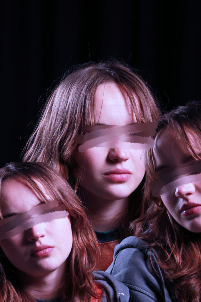
On the top left, I pressed file and open and then selected one of the pictures that I wanted to use. I left the picture as it was and then pressed file and open and chose my second picture.
With the second picture, on the left side I selected the object selection tool and pressed on the photo, precisely the subjects face. It selected the subjects face and then I pressed on it again so that it showed a pink outline.
After, I right clicked on my mouse and pressed layer via copy. it created a copy of the subjects face whilst still keeping the picture the same.
I pressed the move tool on the left side of the screen on photoshop.
I grabbed the copy of the subjects cut out face and dragged it to the top of the screen where it showed the first tab I opened which was the one where it had my first picture. The cut out was transferred to my first picture and I placed the cut out on the desired place.
I repeated the cut out process with one more of my pictures and dragged it to my first picture and placed it where I thought looked best.
As I placed my cut outs on the first picture, it created two layers, one layer for each cut out so overall I had three layers.
In each layer minus the first later, I put the opacity to 43% which is on the right bottom side of the screen to create a ghost like texture to the two cut outs.
I then I pressed on the background which is on the right bottom of the screen and pressed flatten image so that I could add some adjustments to the image.
On the right bottom side of the screen I pressed adjustments and pressed once on the moody blue.
Then I pressed the smudge tool on the left side of the screen and pressed the smudge tool again because it show two options, blur tool or smudge tool.
On the top left corner of the screen, I pressed on the icon that showed the side of the smudge tool and what type of smudge tool you are using and I selected ‘wet media brushes’ and kept the size to 50px and then from the wet media brushes file, I selected ‘kyle’s paintbox’
I smudged each pair of eyes that the image had.
I saved the picture onto a file and that was how I edited this picture.
Evaluation and Critique: I quite liked the finish product of this image. I like the colour and the overall effect it has. This picture shows a sense of loss of identity or not wanting be aware of what’s surrounding them. However I think the editing in this picture I simple. I wish that it was a more divergent image that had more unique editing. I could’ve experienced with the different tools in photoshop.
Experiment 3:
Editing process:
I opened Adobe Photoshop.
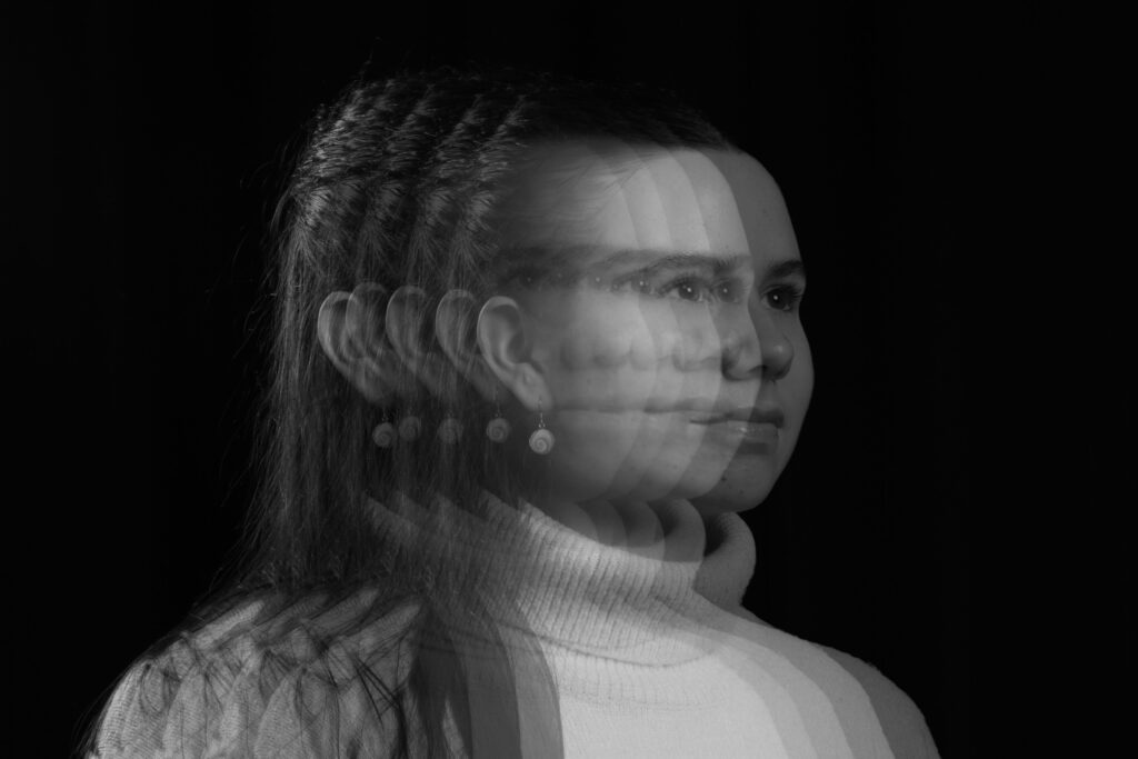
On the top left, I pressed file and open and then selected one of the pictures that I wanted to use. I left the picture as it was and then pressed file and open and chose the same picture.
With the same picture, on a different tab, on the left side I selected the object selection tool and pressed on the photo, precisely the subjects face. It selected the subjects face and then I pressed on it again so that it showed a pink outline.
After, I right clicked on my mouse and pressed layer via copy. it created a copy of the subjects face whilst still keeping the picture the same.
I pressed the move tool on the left side of the screen on photoshop.
I grabbed the copy of the subjects cut out face and dragged it to the top of the screen where it showed the first tab I opened which was the one where it the first picture. The cut out was transferred to my first picture and I placed the cut out on the desired place.
After dragging the first set of the cut out face, I did the same thing three more times, using the same picture as my first picture, just the face cut out, dragging the three set of cut outs to my first picture and placed it where I thought looked best.
As I placed my cut outs on the first picture, it created 4 layers, one layer for each cut out so overall I had 5 layers, including the first picture.
In each layer minus the first later, I put the opacity to 43% which is on the right bottom side of the screen to create a ghost like texture to the 4 cut outs.
I then I pressed on the background which is on the right bottom of the screen and pressed flatten image so that I could add some adjustments to the image.
On the right bottom side of the screen I pressed adjustments and pressed once on the neutral adjustment.
Then I saved the image to a folder and that’s how I created this image.
Evaluation and critique: I really like this picture, I like how I was able to create this motion like sense to the picture, making it look like I was able to capture the subjects movement in layers. I think that this picture is quite unique and detailed. However I could’ve experienced with texture or different colours instead of the usual black and white.
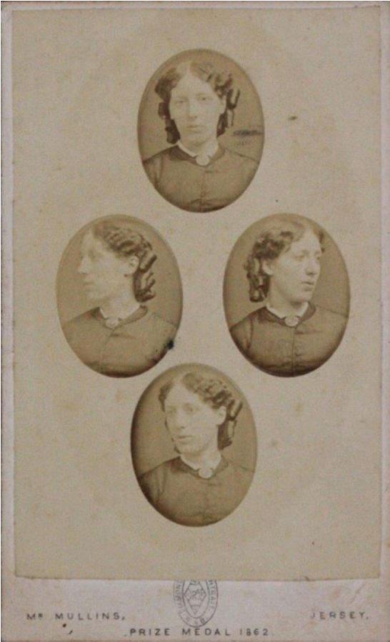
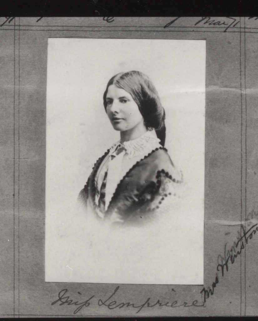
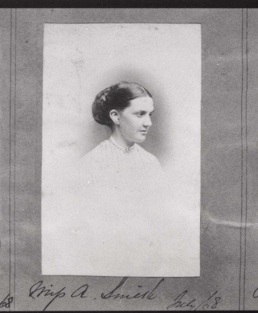
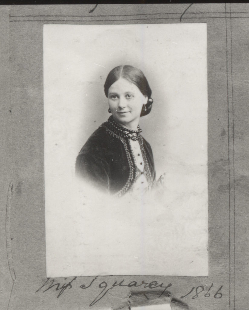
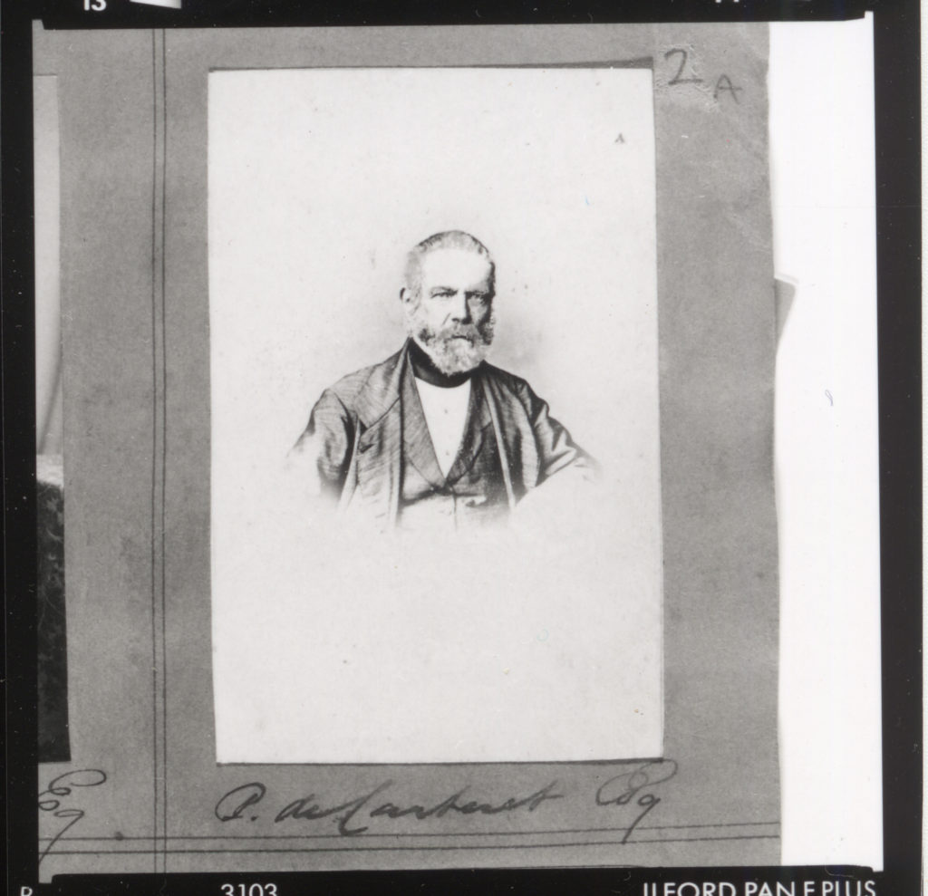
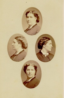
Henry Mullins – (1818-1880) was a photographer who, between 1850-73 Henry Mullins made over 9000 carte de visite portraits of Jersey’s ruling elite and wealthy upper classes. The collection that exists of his work comes through his studio albums, in which he placed his clients in an ordered grid with reference to mid-nineteenth century social hierarchies. Throughout his career, Mullins collaborated with numerous acclaimed actors, directors, and production teams. Not only did he provide stunning headshots, but he also worked on set, capturing behind-the-scenes moments and promotional images for various films and television productions.
Cartes de visite:
A cartes de visite was a thin paper photograph mounted on a thicker paper card. The size of a carte de visite is 54.0 × 89 mm and this is placed on a card sized 64 × 100 mm.
Henry was known for specialising in Cartes de visite, the photographic archive of ‘La Société’ contains a large amount of these (online archive being 9600 images). This archive has been described as the ‘first commercial photographic print’ this print was produced using egg whites to bind the chemicals of the photos and straight onto the paper. However, this method is very much avoided these days as more reliable methods have been discovered. Due to the photo being a result of exposure to light, an albumen print may be said to be a printed rather than a developed photograph. Traditionally small thin photograph mounted onto a thicker piece of card would be used for this but Henry Mullins used an album to display his work instead.
Many of these images contained the island’s most affluent and influential people, alongside officers of the Royal Militia Island of Jersey, for whom it was very popular to have portraits taken, as well as of their wives and children. The images of the officers document the change in generations as they do not look like the general person today, showing the fashion for long hair, whiskers and beards in the mid-1800s. Their appearance makes it difficult for the viewer to differentiate who is who as they were styled almost identically during this time.
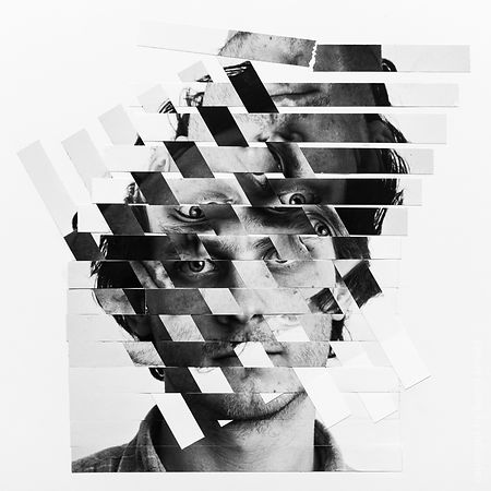
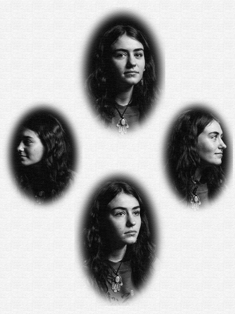
Diamond Cameo:
This layout of final images is called a Diamond cameo due to the diamond-like shape produced by the placement of oval images. I like this technique as it is more unique and more appealing and eye catching to the eye as you can see all format and possible sides of his face allowing you to see every detail rather than a normal layout of images put together.
Here are some examples of diamond cameos from other artists, I decided to also research some other artists cameos just to see if there are any other ideas or techniques that I could pick up or recreate to use in my own creations. I also have attached some images of Henry Mullins’ work on diamond cameos as I think his work especially captures a more rustic and meaningful message through his cameos. I hope to capture the effect of my models looking from different angles as I think this will really escalate my edit of my photography to the next level and get as close to Henry Mullins’ but with my own individual twist on it.
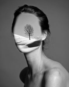
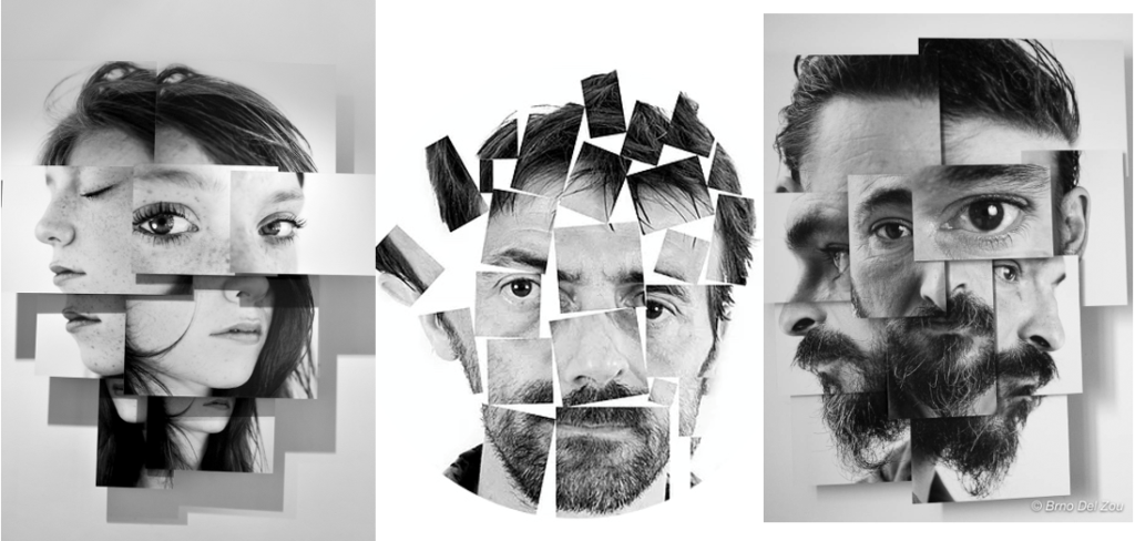
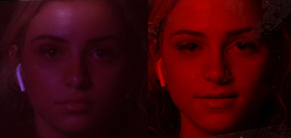
Photomontage is the process of changing photographs by rearranging and overlapping two or more photographs into a new image. This means that having a combination of several shots joined together creates an effect of creativity and imagination.
Examples:
Brno Del Zou – ARTIST INSPIRATION
Brno Del Zou is a French photographer, sculptor and artist, born in 1963. In his work, he takes pictures of faces and bodies at various angles and combines the different photos into one. The result is a combination of several prints, leaving a distortion to the face or body.
Examples of his work:
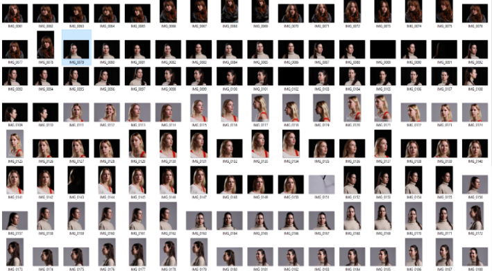
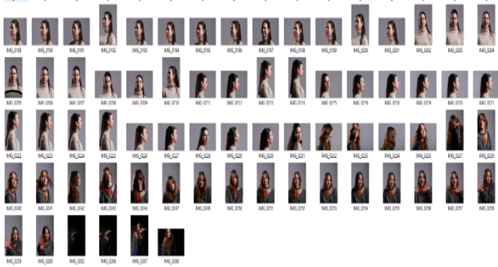
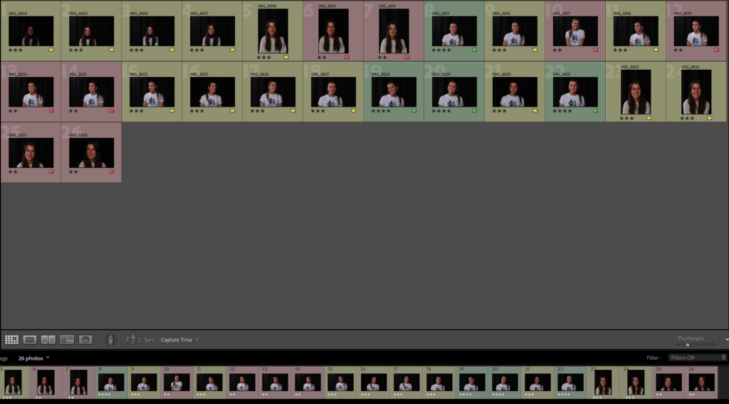
My Contact Sheet:
My edited photos:
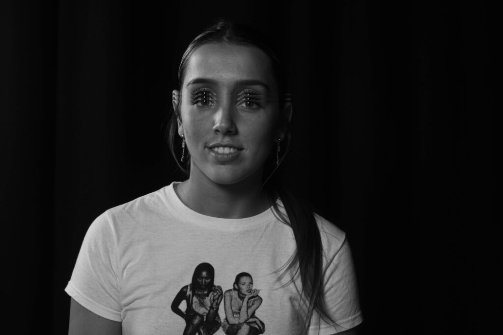
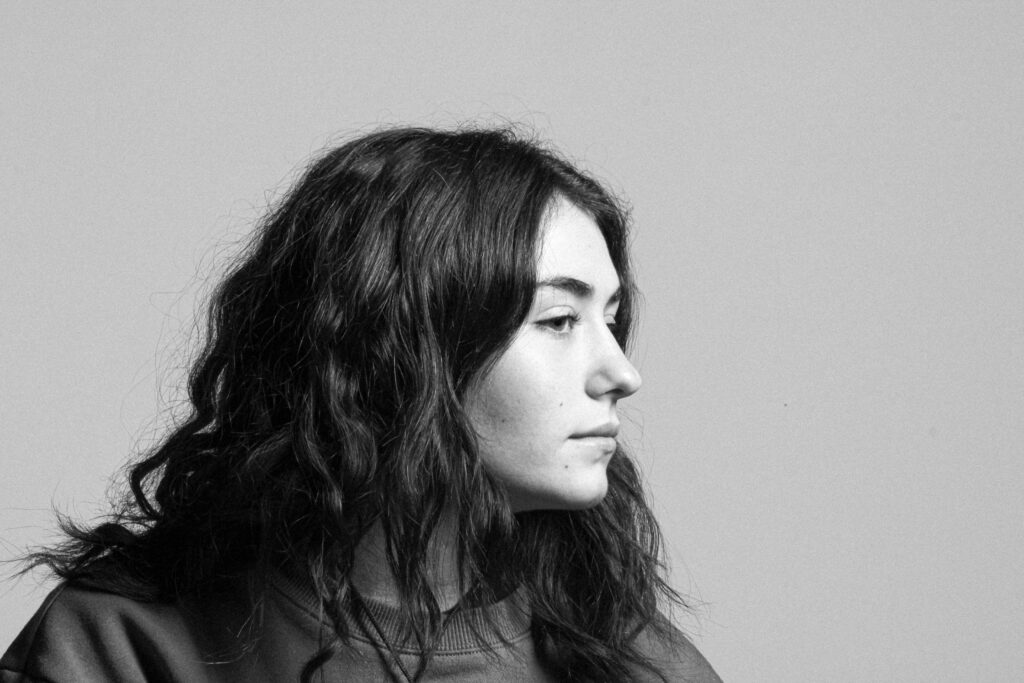
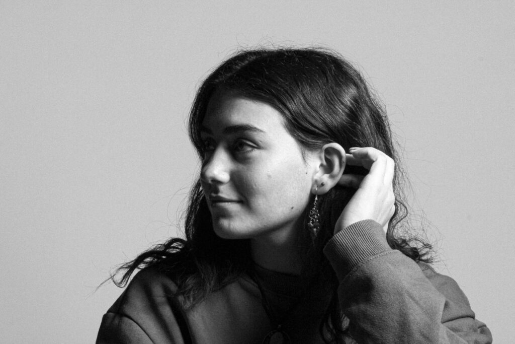
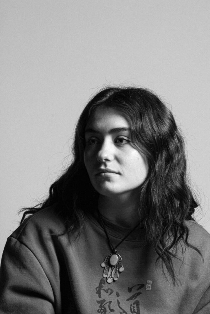
For these photos, we went to the studio and experimented with different facial angles to figure out which one worked better with montaging. I used the same image but edited them in different ways to experiment. I used photoshop to edit these images, and I also then produced them in black and white which makes the image more interesting due to the contrast.
I took inspiration from Brno Del Zou because I really like the artistic effect of his work, and I wanted to try it myself.
I think my final images were really successful because they look similar to the artist’s, and her face is changed around to seem distorted.
With Juxtaposition, A comparison can be made of my attempt images to same type of headshot Style, Henry Mullins took in his photos.
Using the same angles I was able to recreate some of his photos.
Comparisons:
Using the lighting techniques I learnt prior I was able to add more detail to these headshots. In conclusion I like how these images compare to the originals and believe I have replicated these images well.
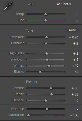
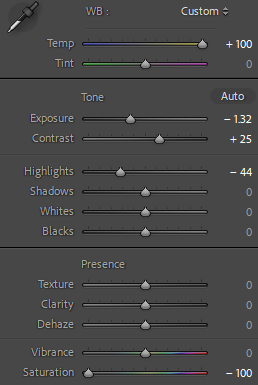
For my edits I wanted to recreate the diamond Cameos Mullins did during his later work. Playing around with the saturation and tone of the image I was going for the Old-timey looks his images had on his Carte-de-visite’s.
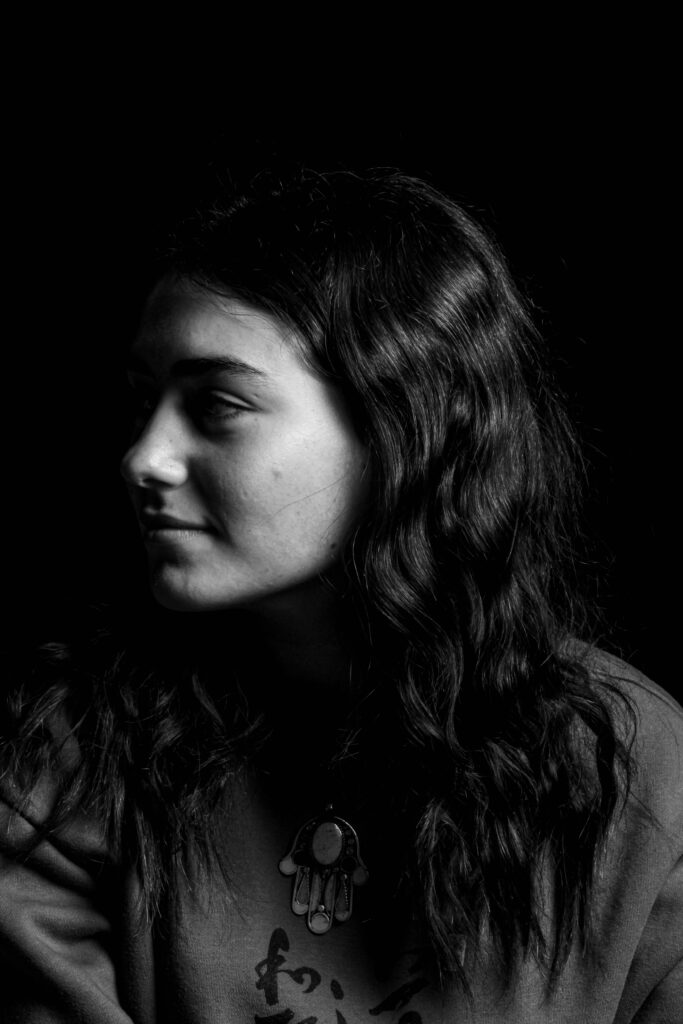
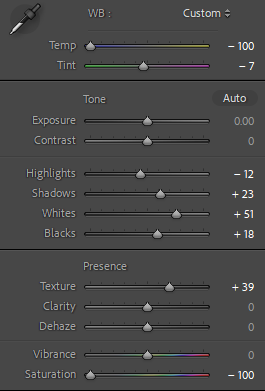
Edit settings:
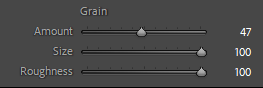
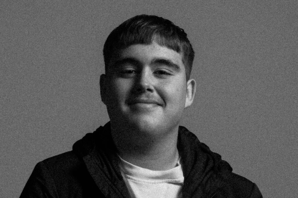
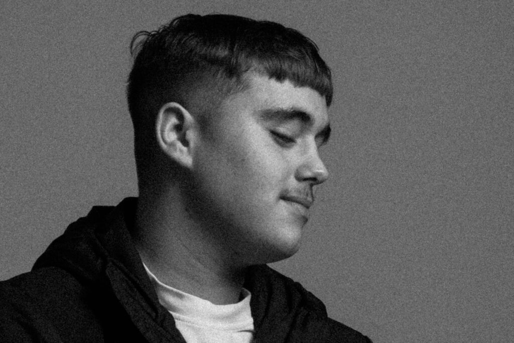
Going for a grainy effect, I tried to replicate the vintage aesthetic of Mullins photographs with the following settings:
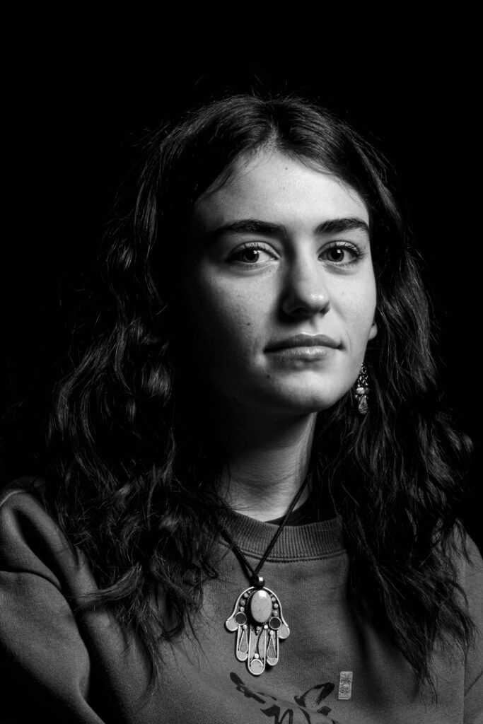
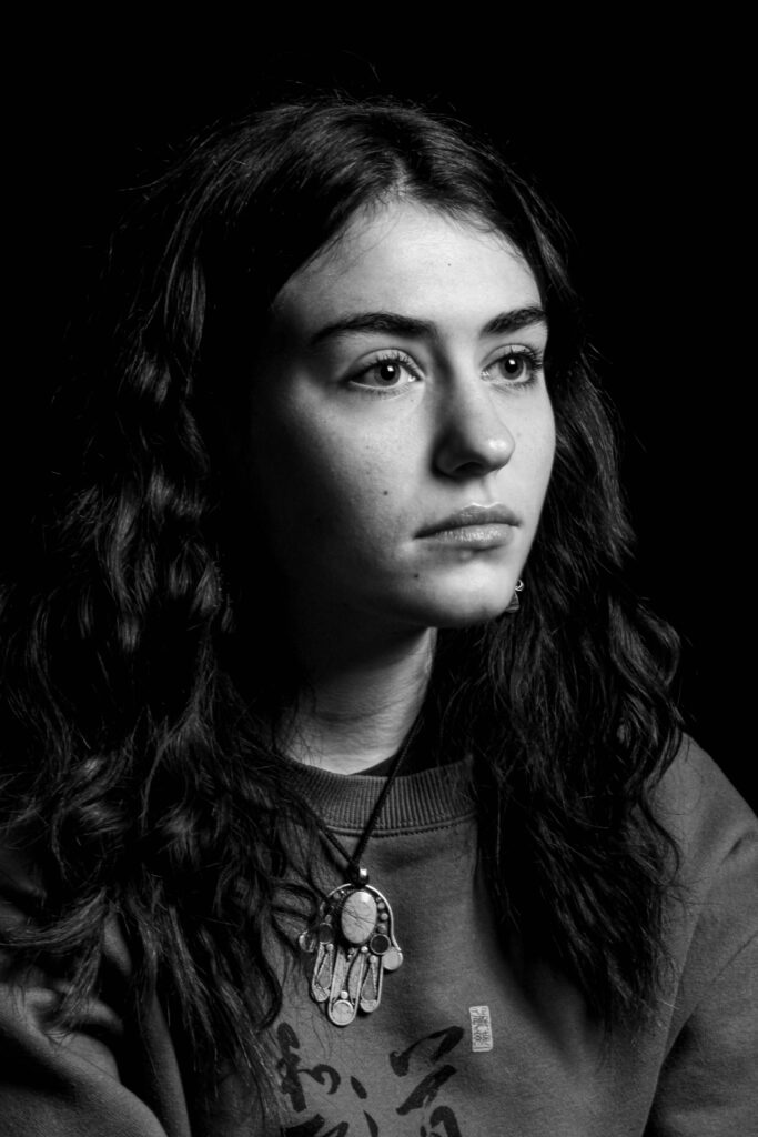
Using from what I have learnt from my studies into studio lighting, I enhanced the shadow on my Chiaroscuro lighting with these edited images.
Since Mullins photographs were taken pre-colour film, I decided with my edits to have a low saturation to have that same visual composition of his images.
(Further use of studio lighting, here I used Rembrandt and made it more prominent with white settings)
Going for a very old looking photo, I attempted this by Increasing the size and roughness of the grain. Additionally by adjusting the exposure and contrast, it made a more brighter image and tonal difference amongst the light and dark parts of the Image.
(Using Rembrandt lighting again, I used grain to give it a more prominent appearance).
Diamond Cameo edits:
Using the eclipse tool, feathering and a use of alternative backgrounds, I edited my images further with photoshop.
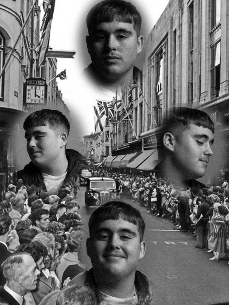
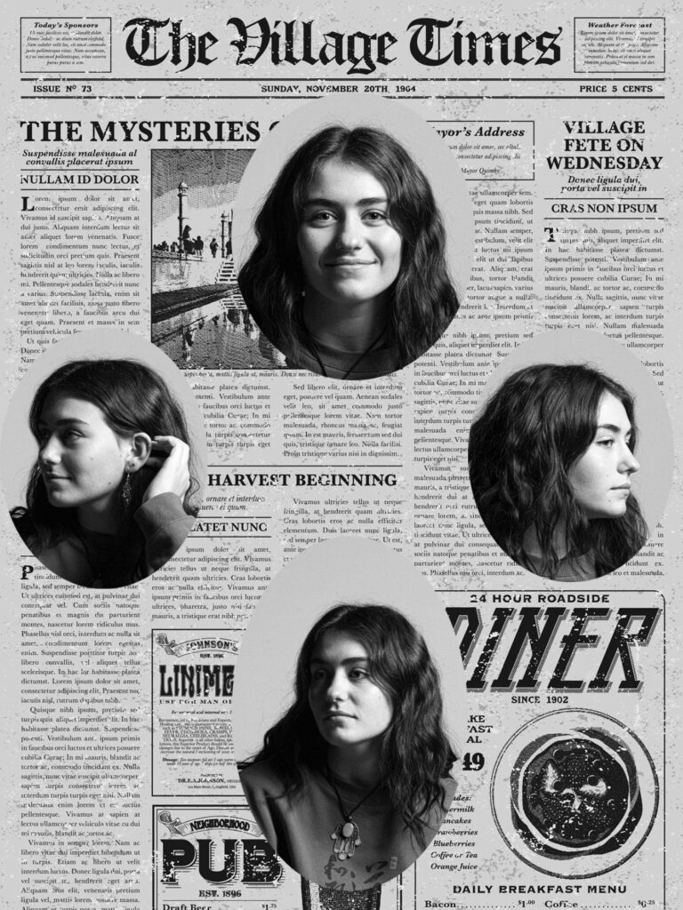
Sticking to the idea of Diamond Cameo, I experimented further by alternatively adding a background of an old photo of Jerseys king street.
With This Diamond Cameo, I matched the background image of my photos to an old image of a newspaper I found. To me this creates an interesting composition as the headshots almost merge into to the newspaper.
Going for that old card effect, I used photoshop textures to make this image more interesting with its visual composition.
Juxtaposition is placing two images together to show contrast or similarities. Juxtaposition is a powerful technique in photography, which essence is to place contrasting elements in the same frame and tell the viewer their story. The juxtaposition in your photography can combine such contrasting things as new and old, man-made and industrial, light and dark, or two different emotions.Juxtapose images according to shapes, colours, repetition, object vs portrait.