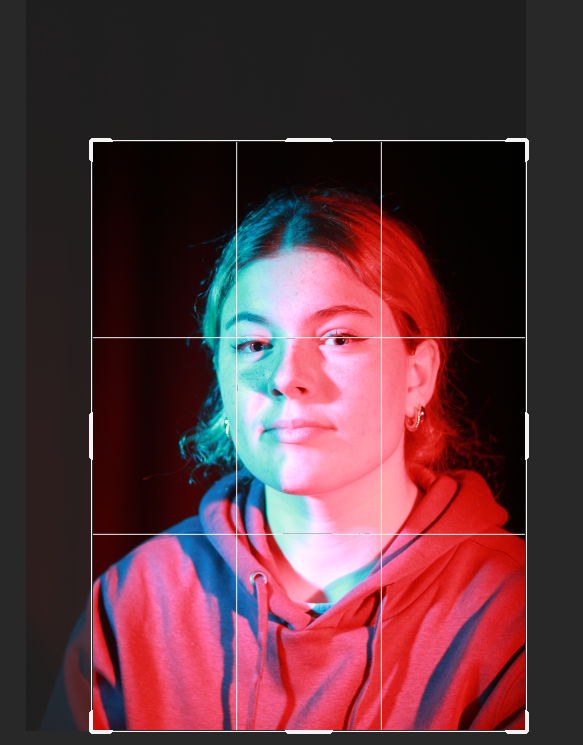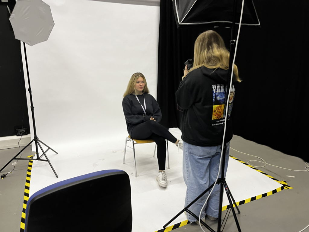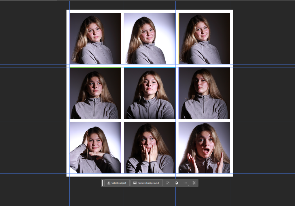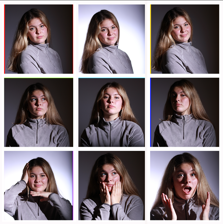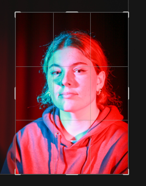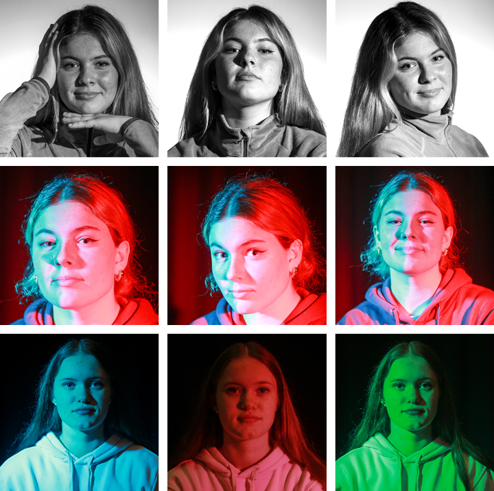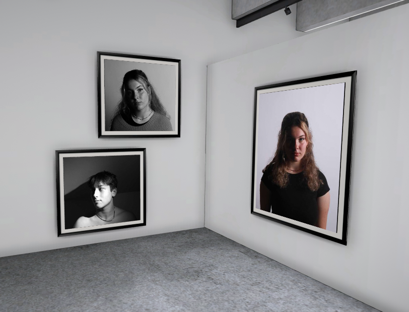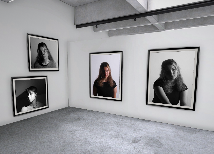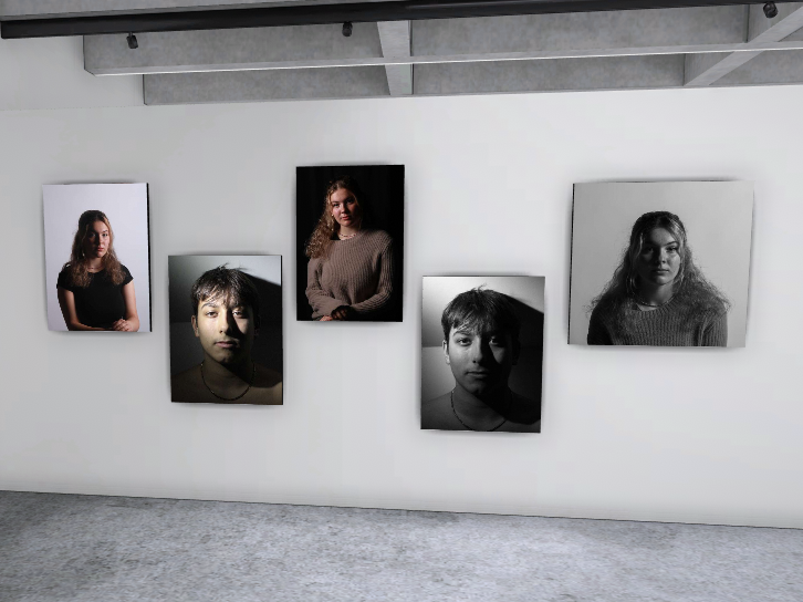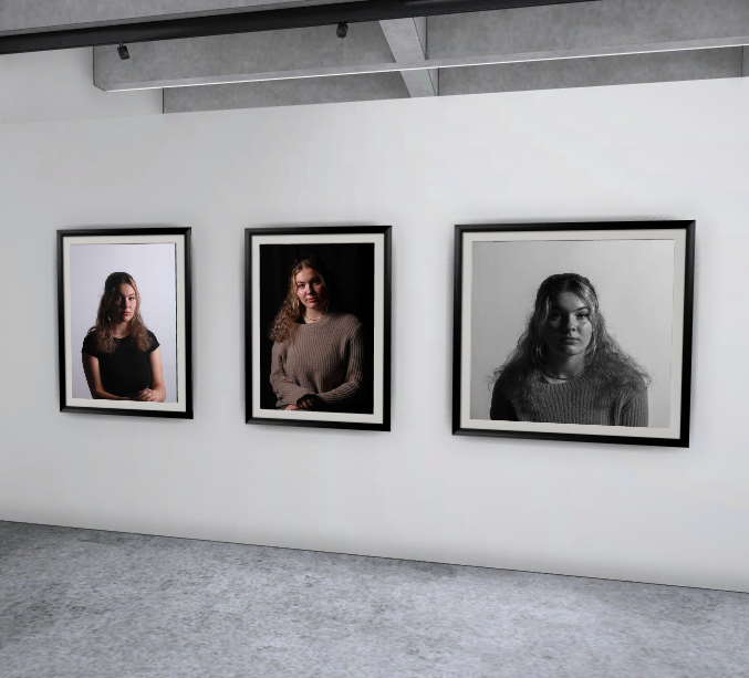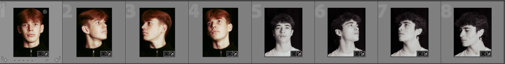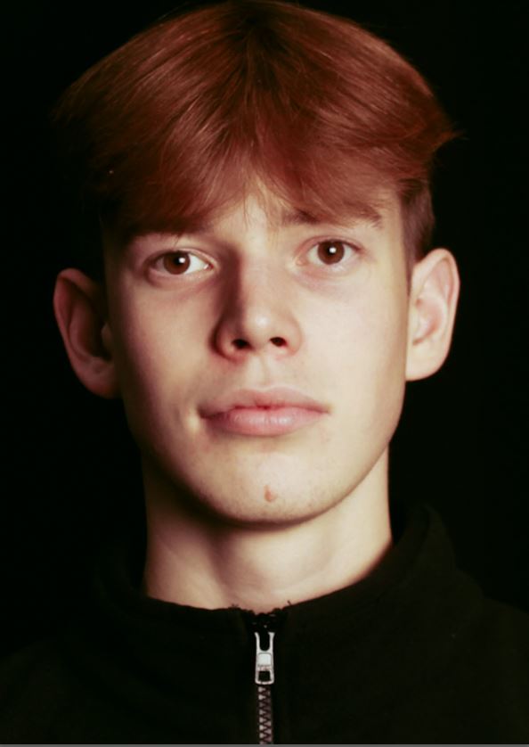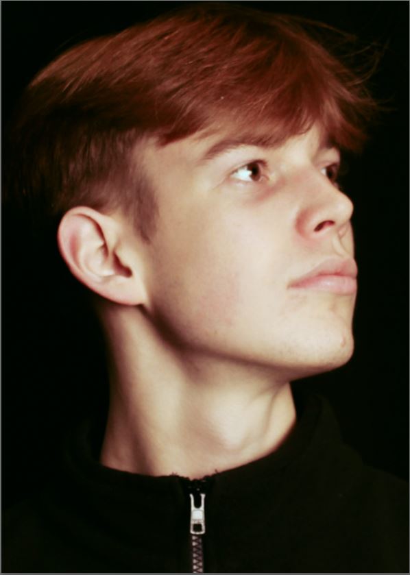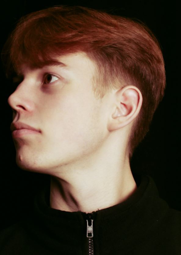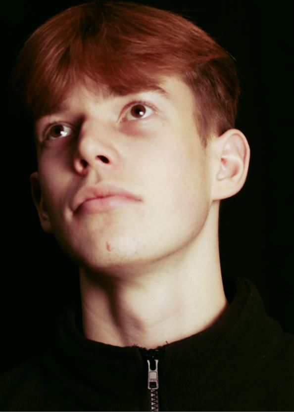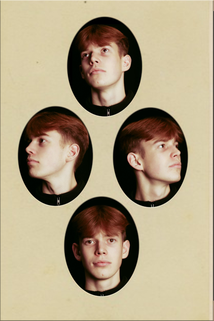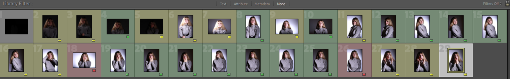
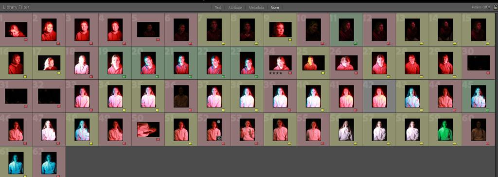
These are my contact sheets for this shoot, I picked my best shots by making the best shots green and the worst red. I was looking for photos that the lighting was already good prior editing and were well composed.
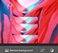
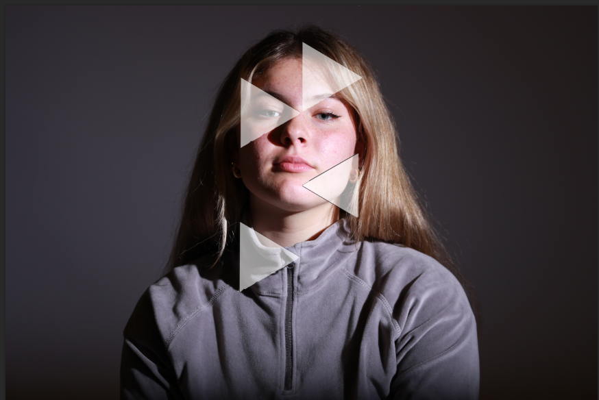
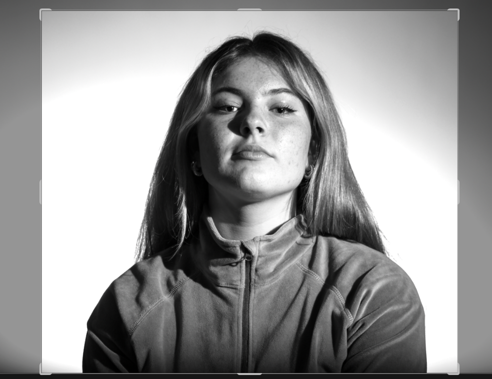
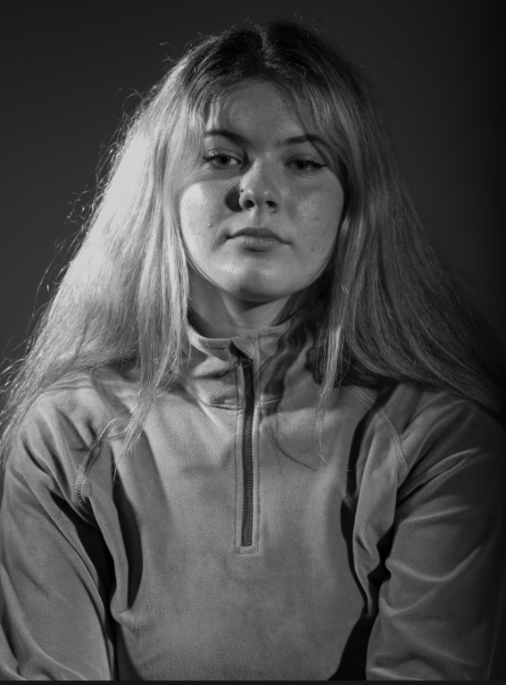
Edit One
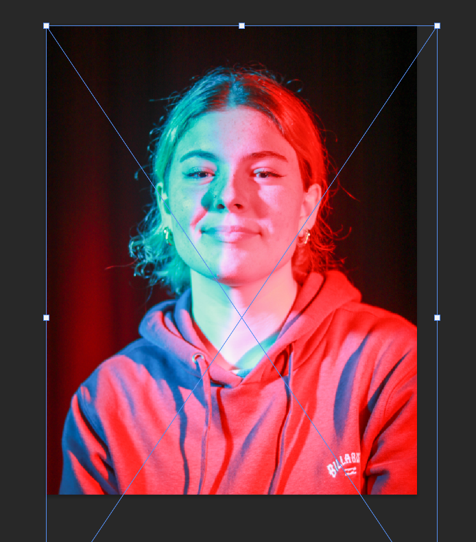
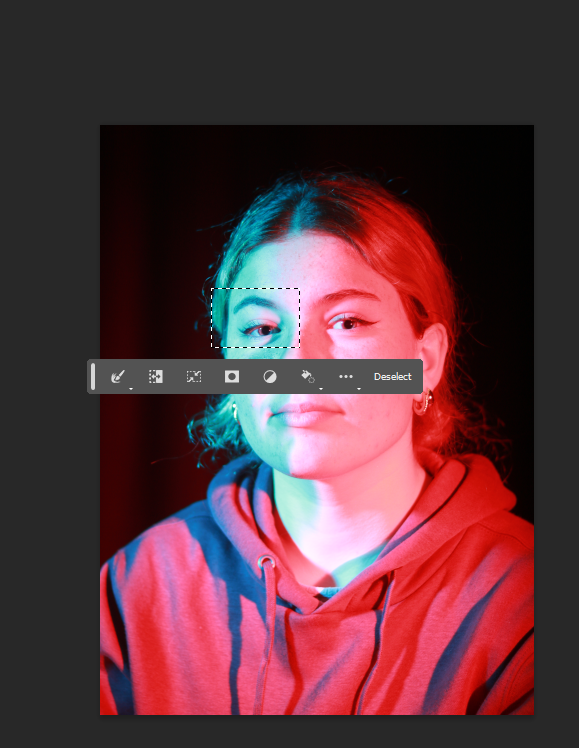
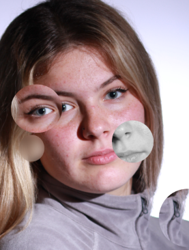
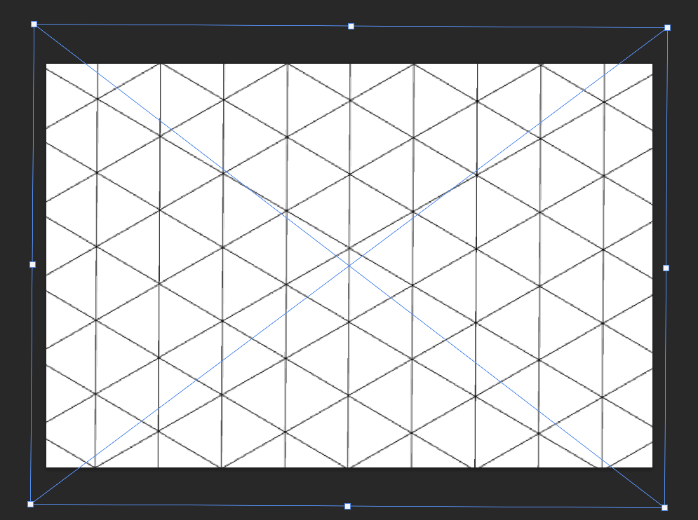
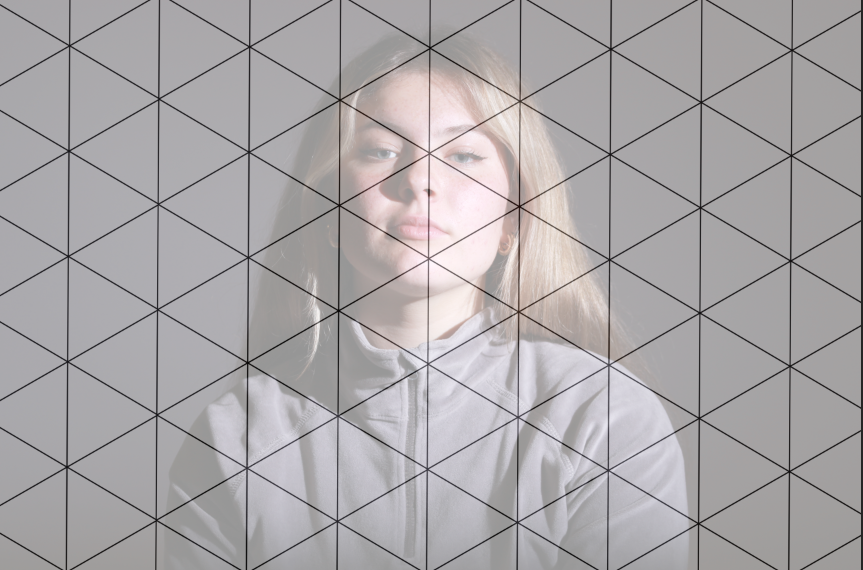
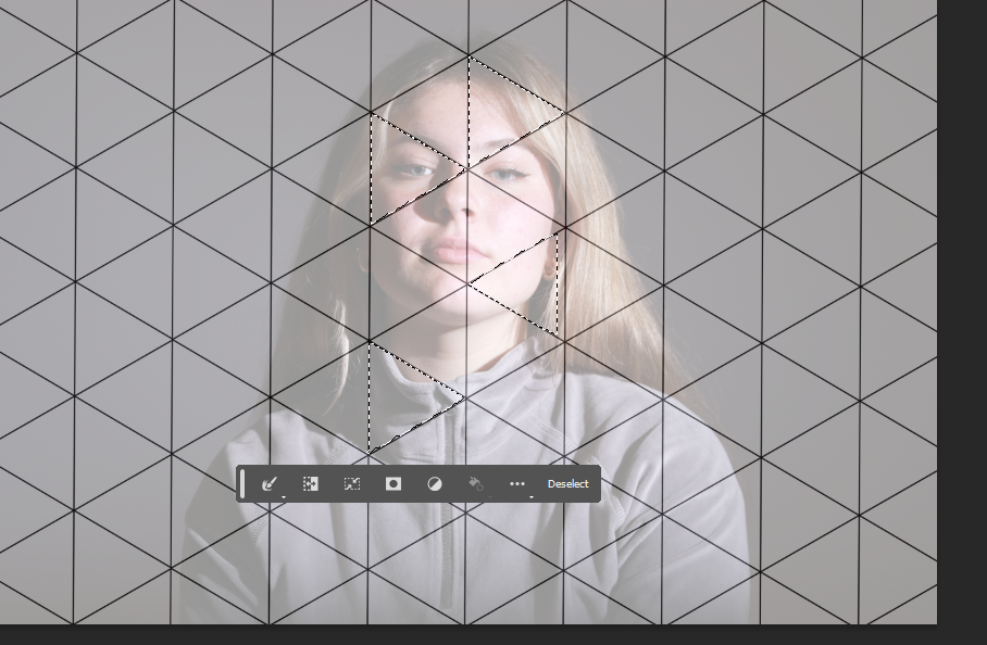
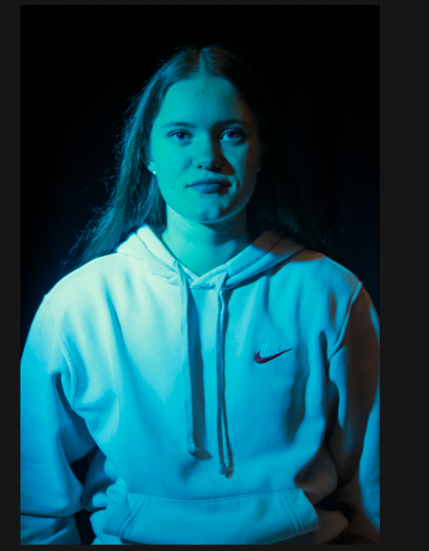
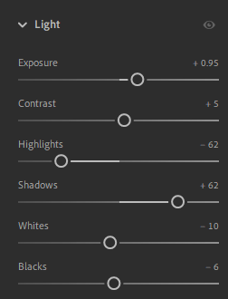
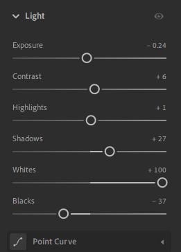
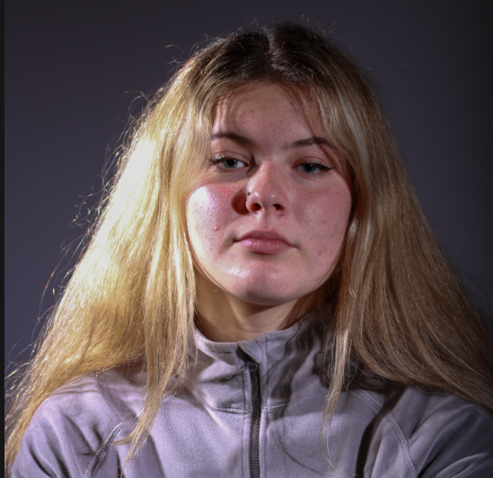
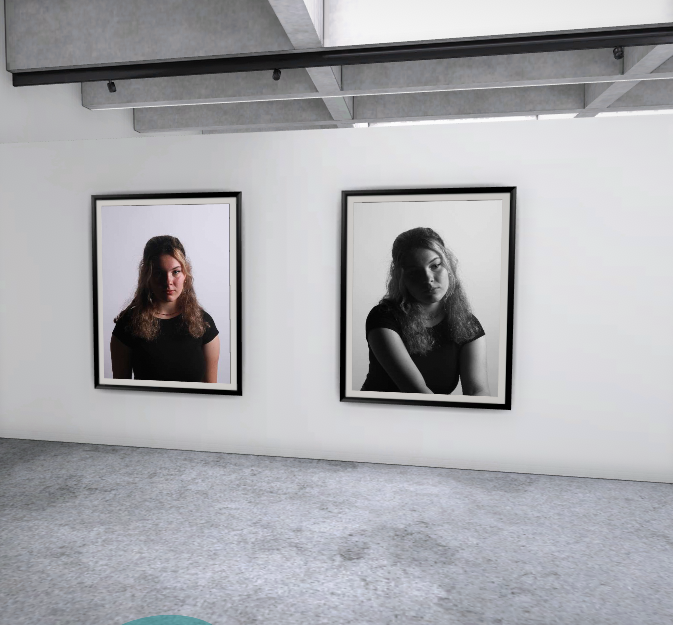
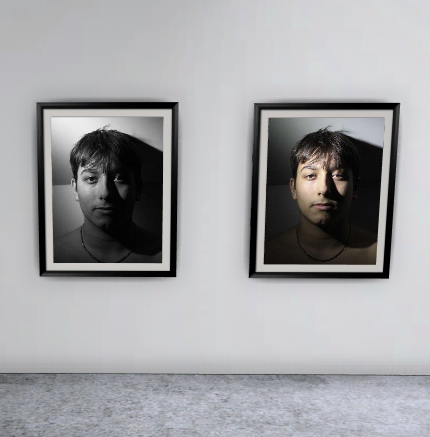
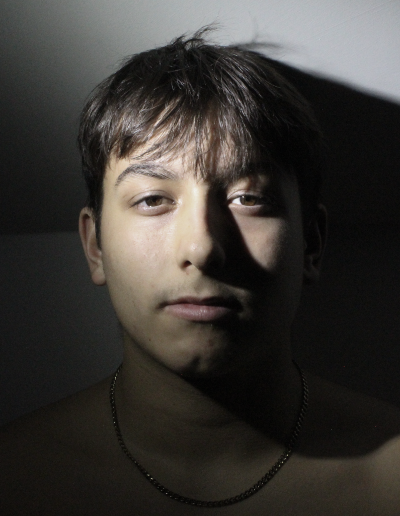
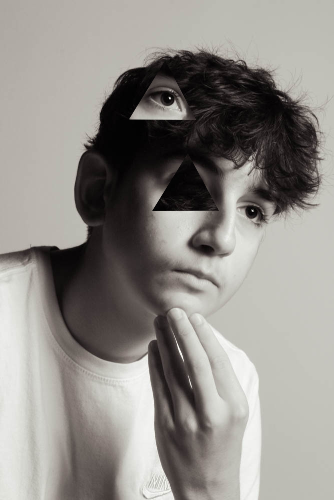
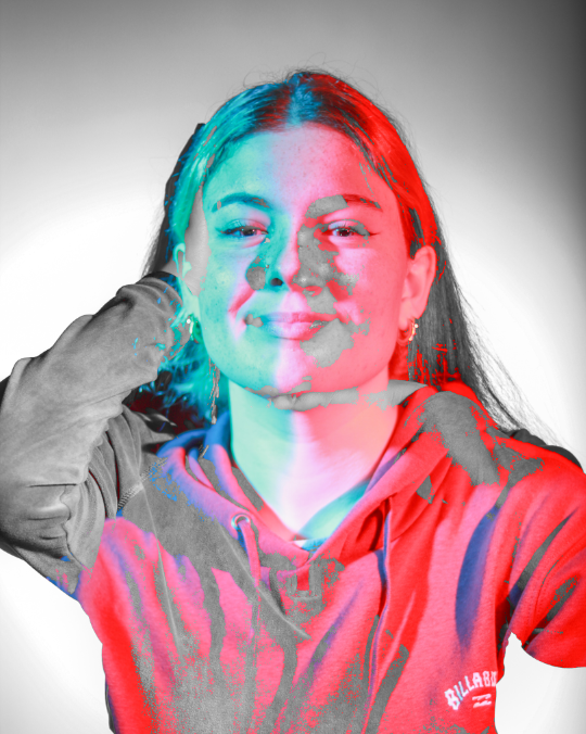
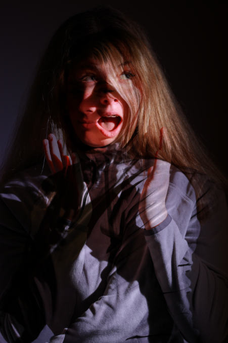
I started by opening one shot on photoshop and dragging a second shot on top of the image, for this one I chose completely contrasting shots, one is black and white and one was taken with coloured gels.
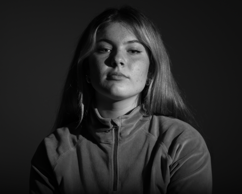
The next step was to adjust the blending layers so both shots were visible creating the unusual multi exposure effect.
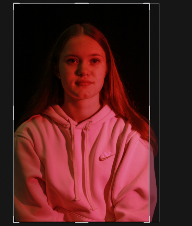
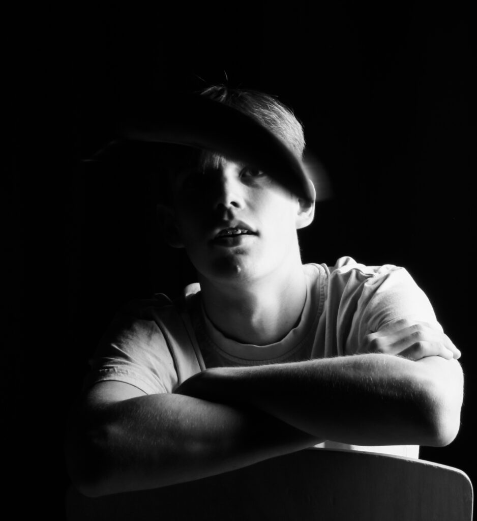
Edit Two
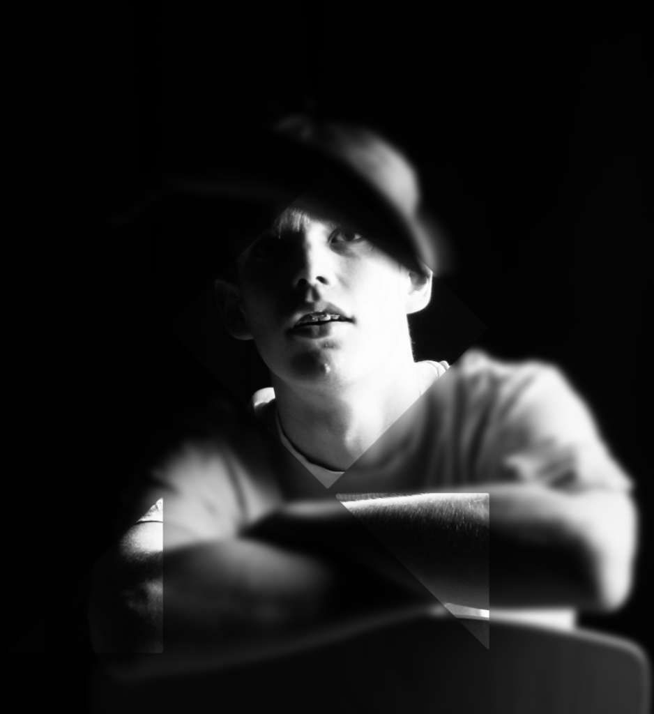
Edit Three
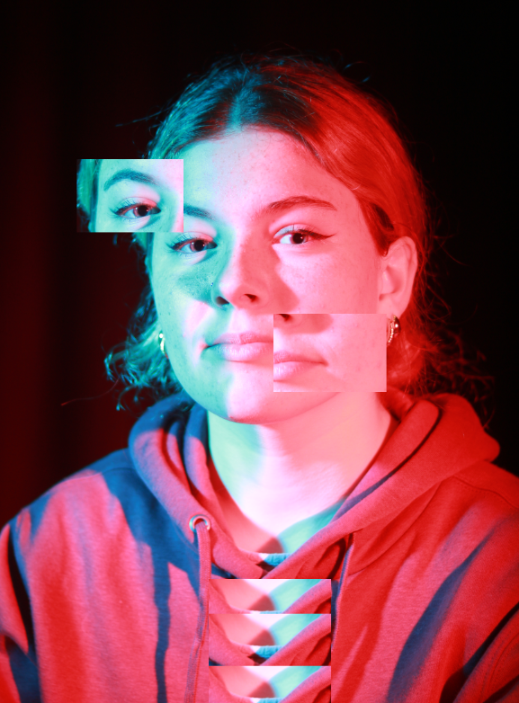
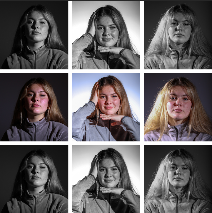
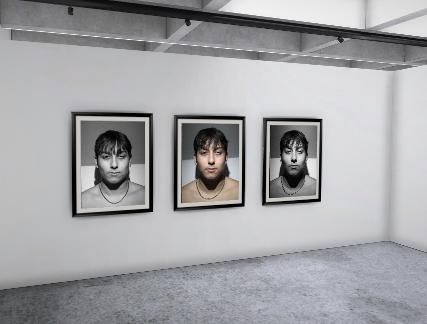
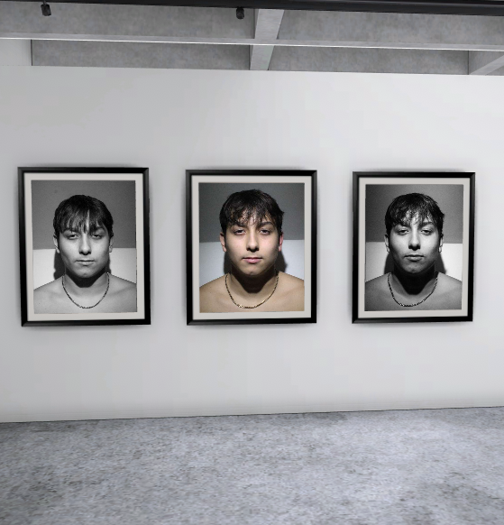
Final Outcomes
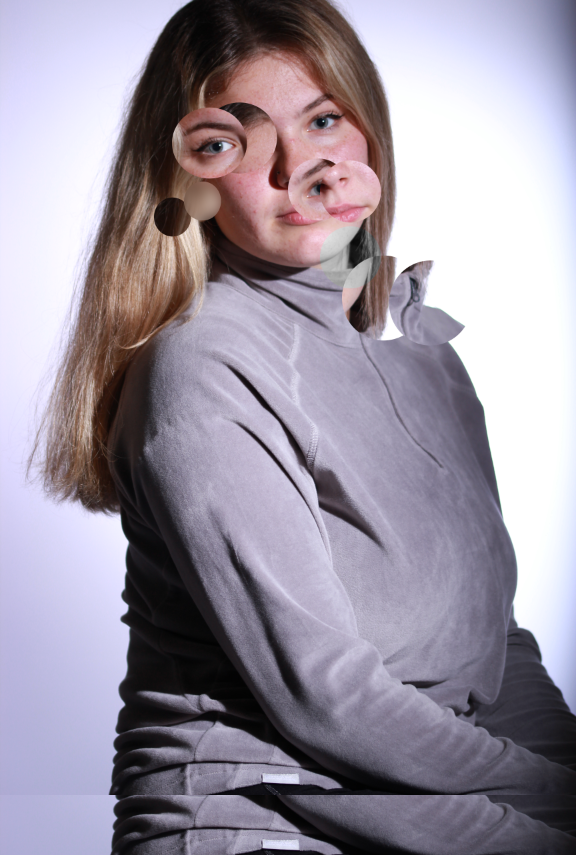
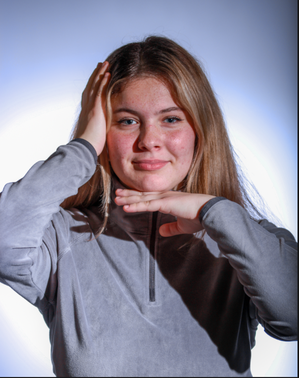
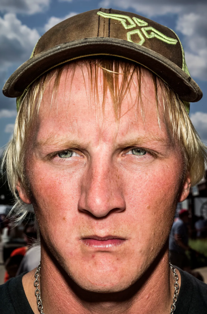
These are my final outcomes for editing using double exposure, while this is a technique that can be achieved by using a slow shutter speed on the camera I wanted to actually to try and merge two images together using photoshop. The results are quite interesting and like the previous editing of this project I chose too try three quite different edits within the technique I was trying.
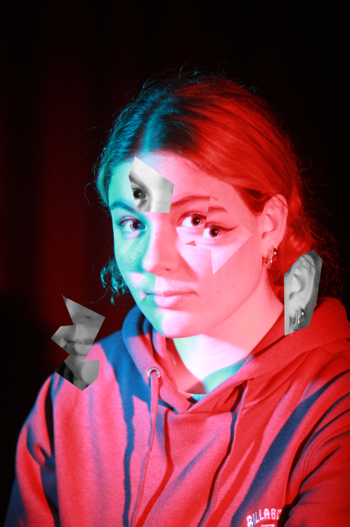
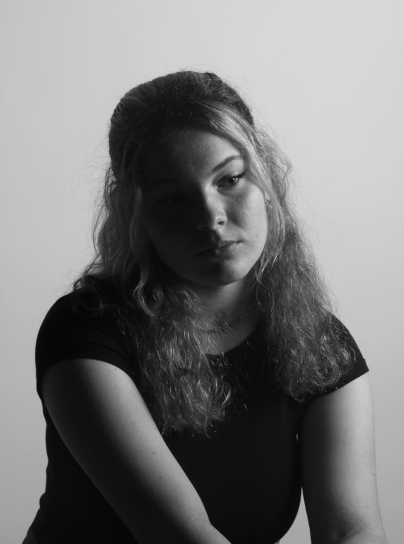
Best Shot Evaluation

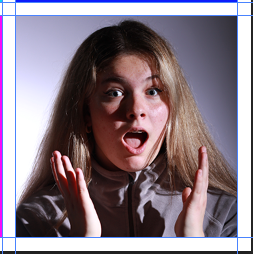
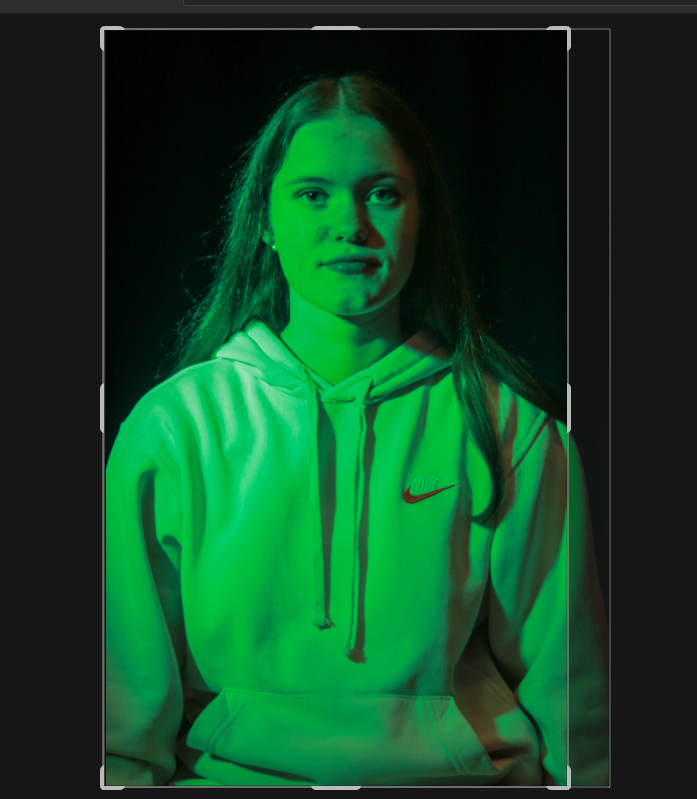
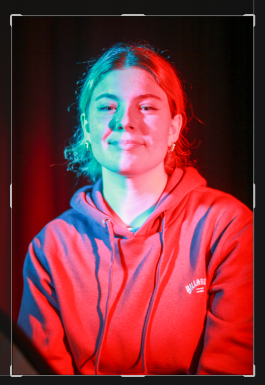
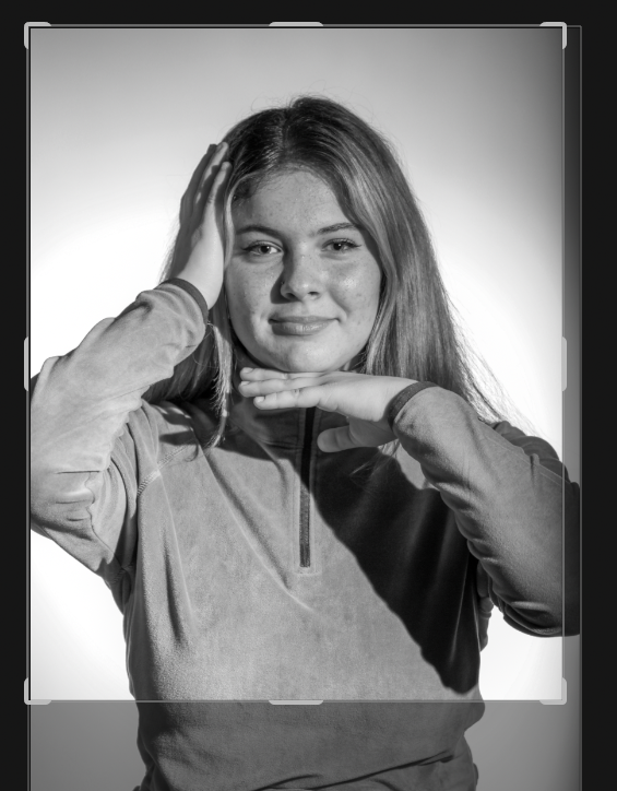
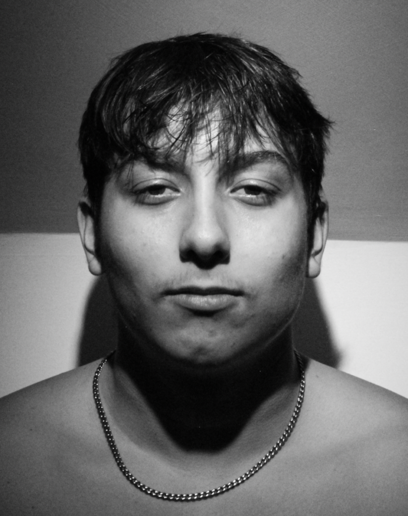
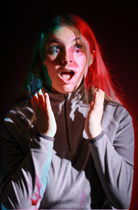
This is my favourite edit, I love how the colours blend together and let the black and white image poke through beneath the top layer adding depth. The two images have combined to look like one as the bottom layer has the models arm in the shot which I made sure lined up with the top layer fading into the bottom layer. The bottom layer which is the black and white layer has also lined up with the top layer so the models hand is under the colourful layers chin creating lines of grey in amongst the bright colours. The black and white image creating a sort of patchwork appears like the image is pushing thought the top layer. I love how unusual the image looks but for two completely different shots they combine very well looking intentional and focused. It is a playful result of using this editing technique which can create so many different outcomes and styles, however I love how the image isn’t as it first appears and in fact the more you look at it the more details emerge. I think it askes the viewer to look deeper into the photo and while it doesn’t have a deep meaning I aim for it to teach people to not just glance at things and in fact learn form everything you can and that allows you too as it isn’t always as it seems.