What is Femininity?
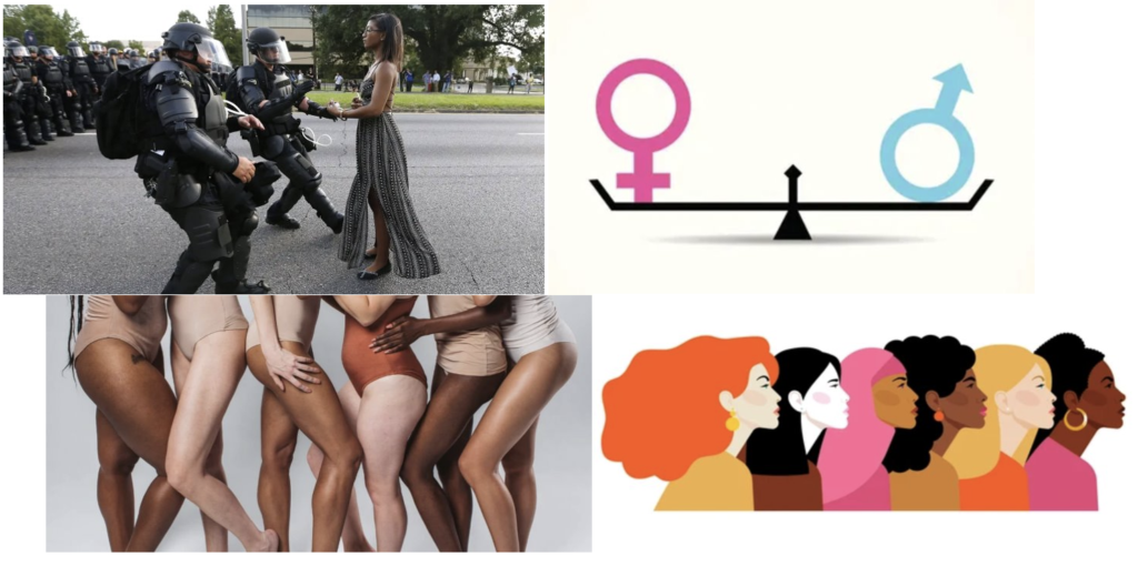
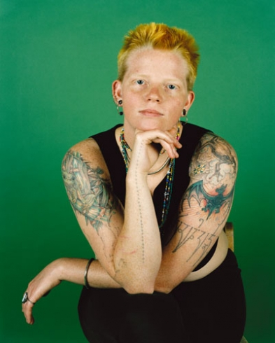
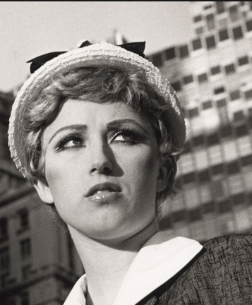
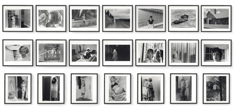
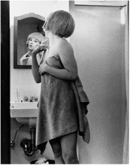
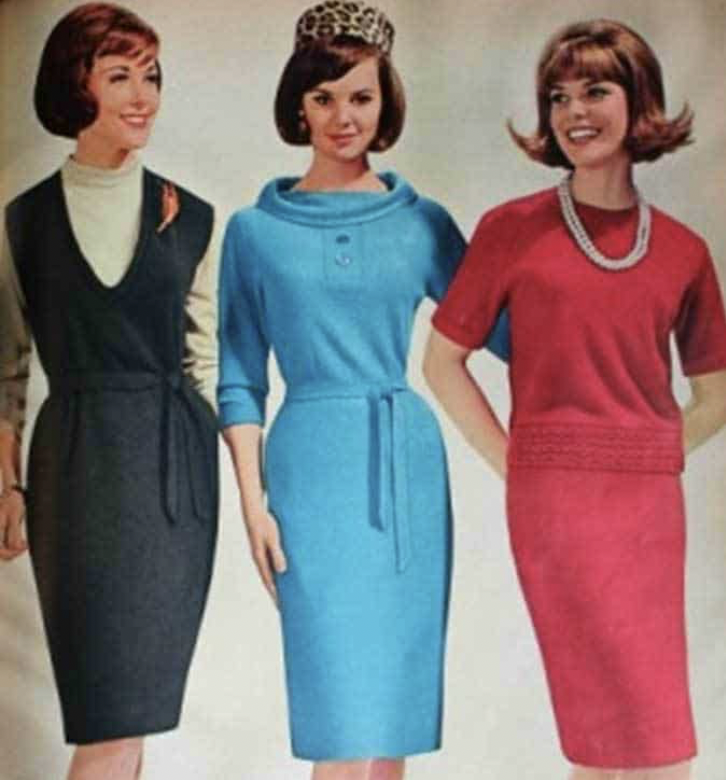
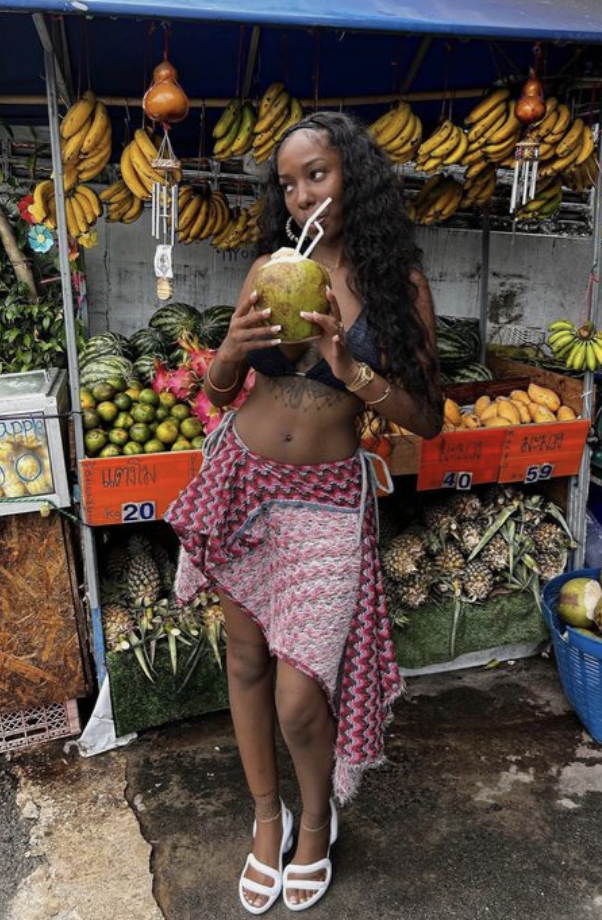
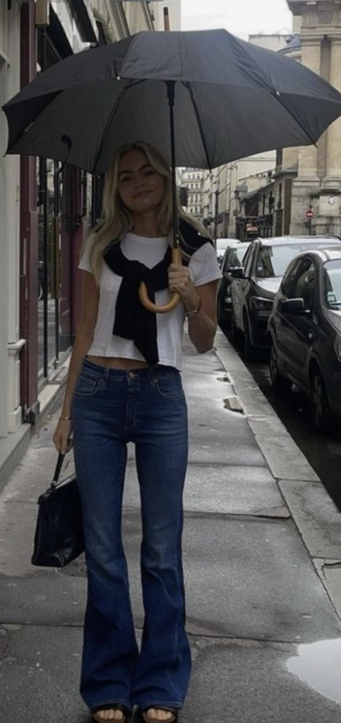
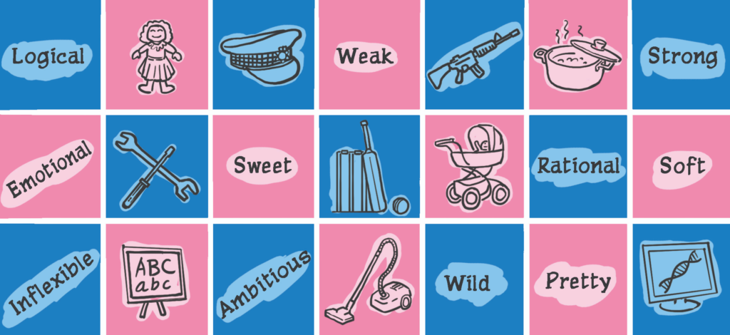
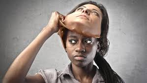
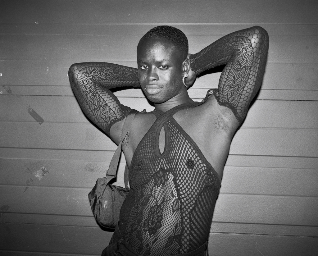
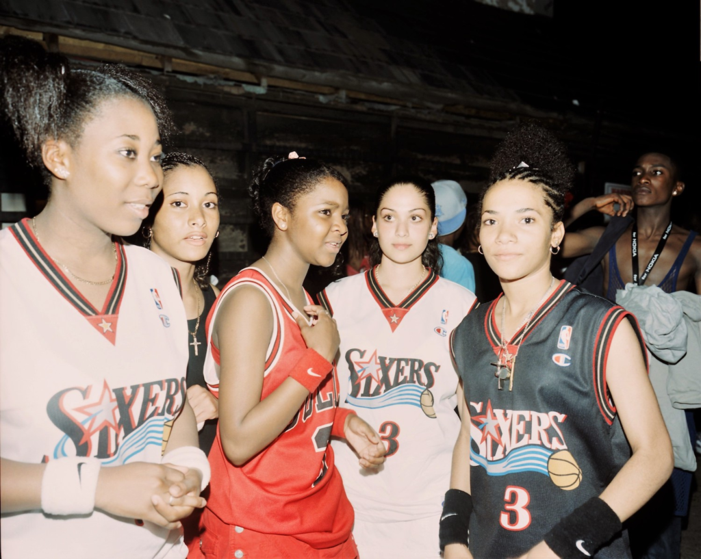
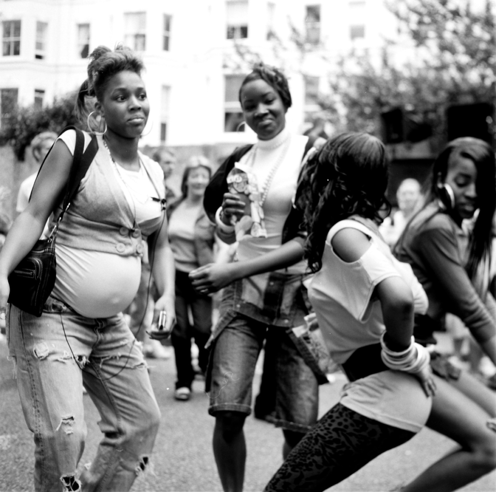
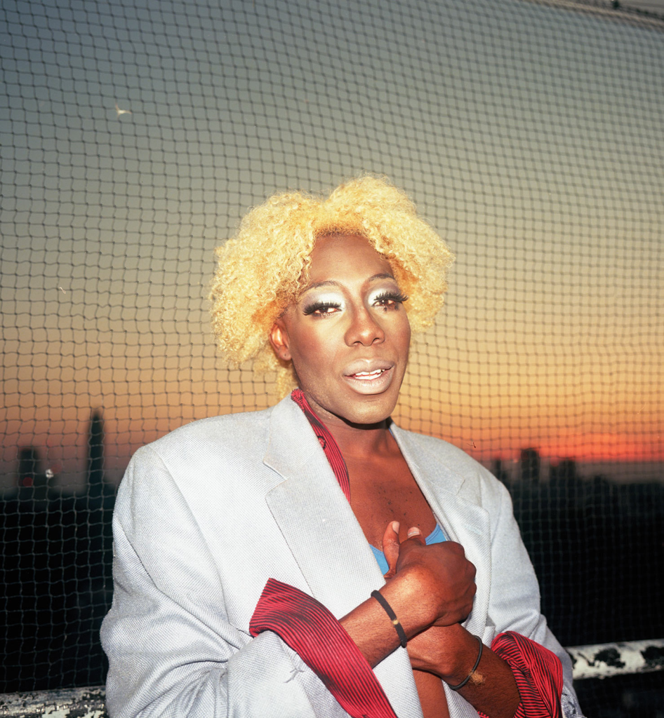
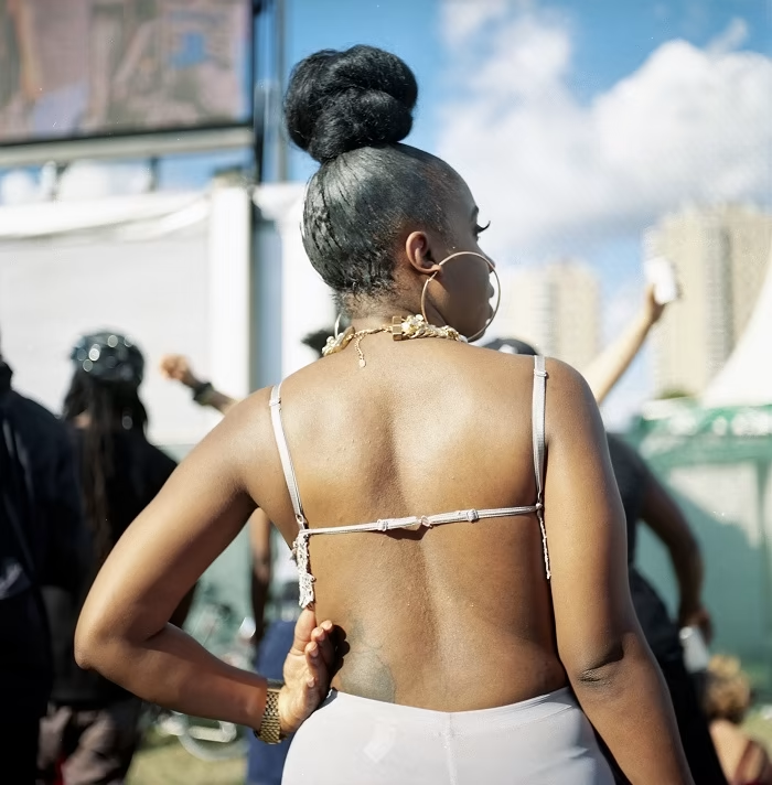
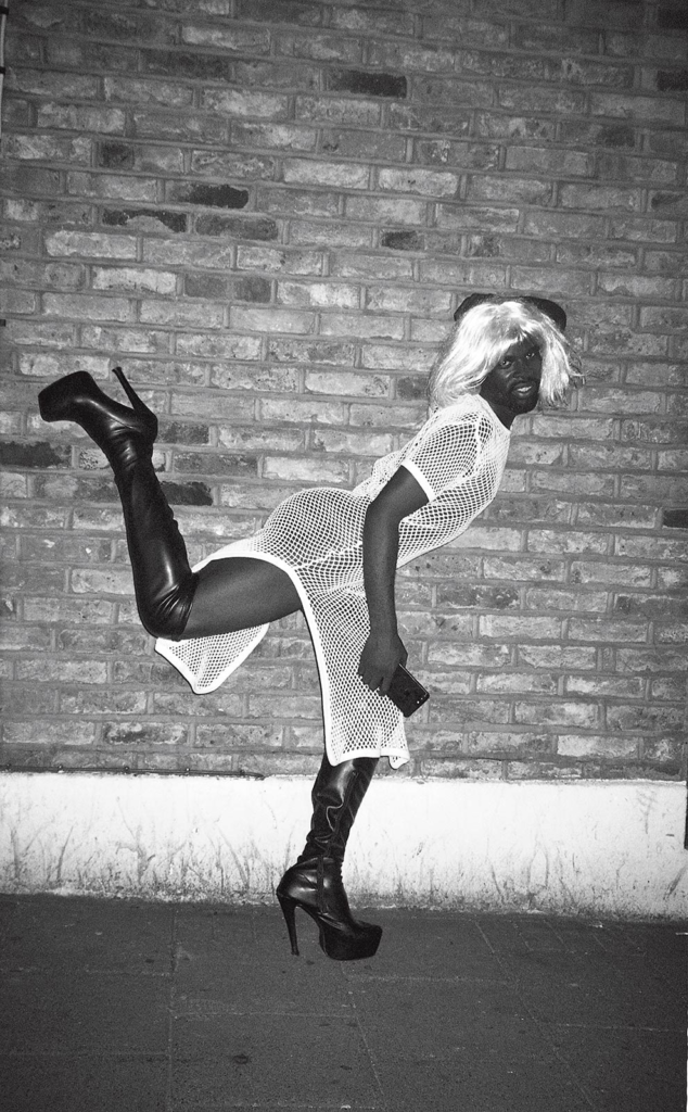
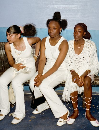
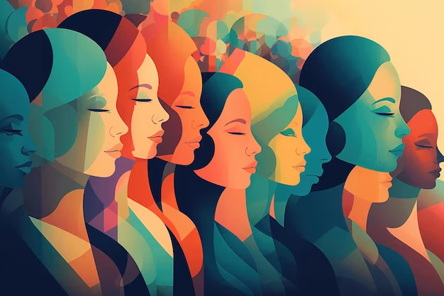
Femininity is a set of attributes, behaviours and qualities, typically associated as characteristics of women and girls. These include traits like nurturing, intuition and grace. Femininity creates stereotypes for the ways a woman should both behave and look. The societal expectations for a ‘feminine’ appearance include long hair, softer features and clothing choices like dresses and skirts. Traditional femininity sets societal expectations and standards to create toxic femininity. Toxic femininity can create societal pressures for women due to the enforcement of unrealistic beauty standards and behaviours. This causes some women to feel judged, constrained and pressured to fit these expectations, possibly even causing them to experience struggles such as isolation, anxiety, and hiding their true identity. Additionally, Femininity is highly impacted by what is seen on social media, on television and in magazines.
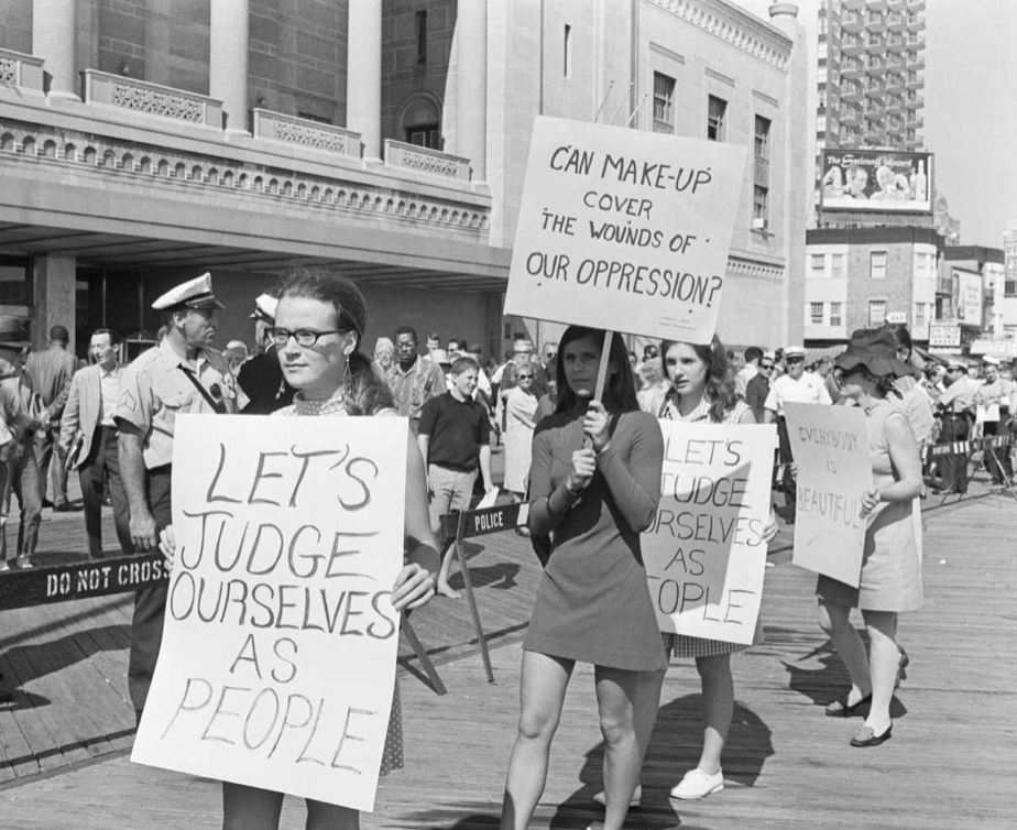
Perceptions of femininity have changed over time…
1950s
1960s
1970s
Women’s Liberation
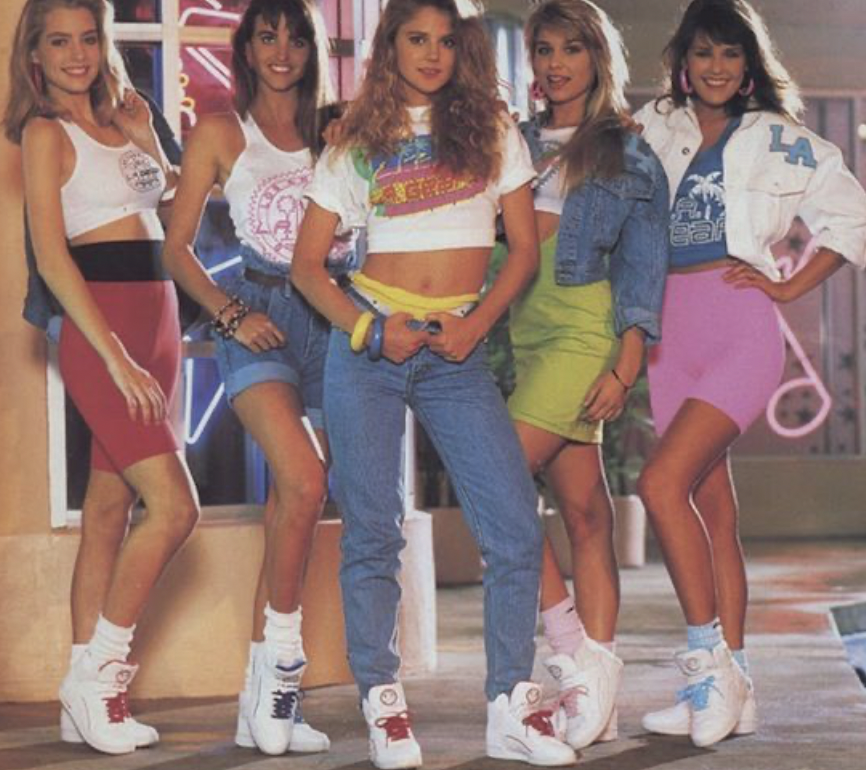
1980s
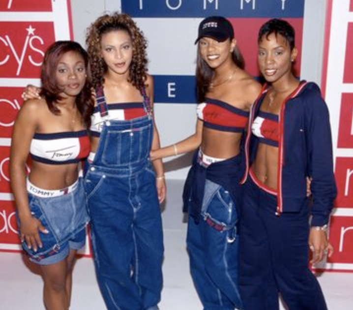
1990s
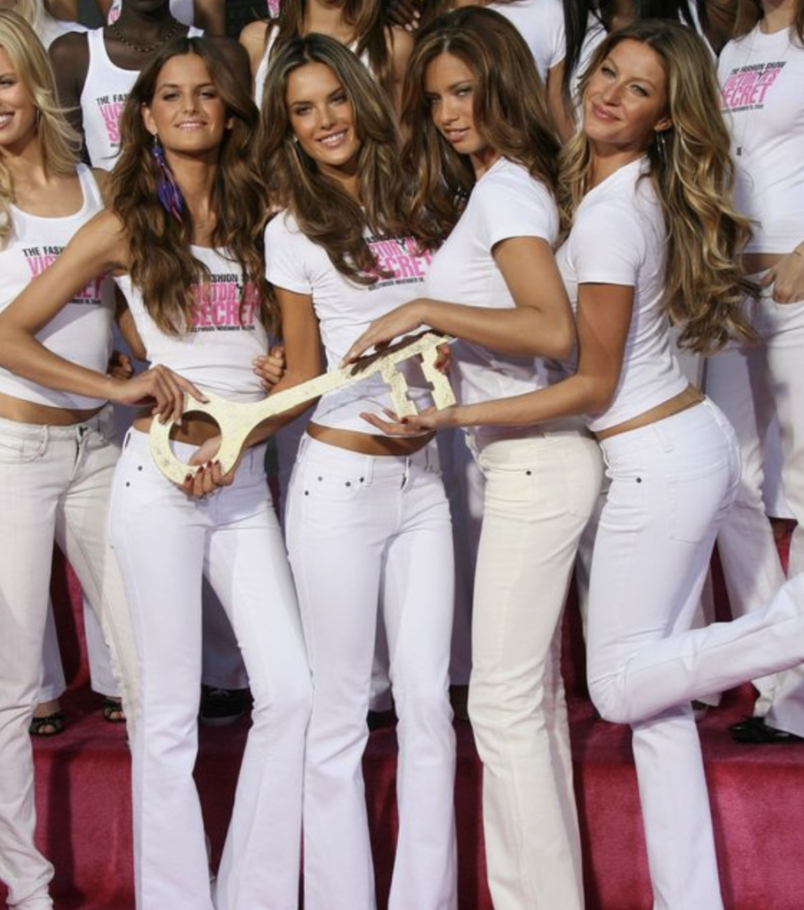
2000s
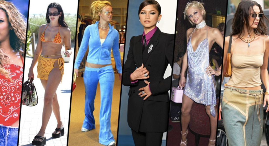
2010s
This day
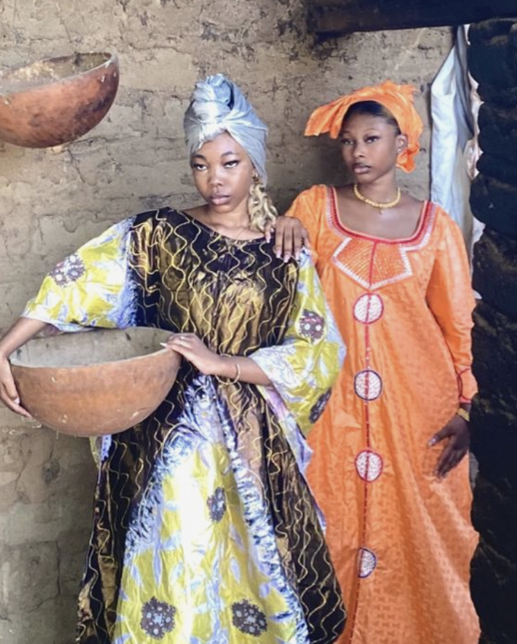
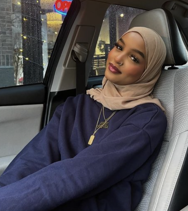
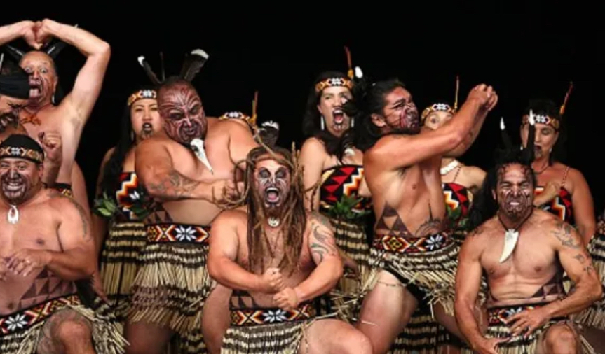
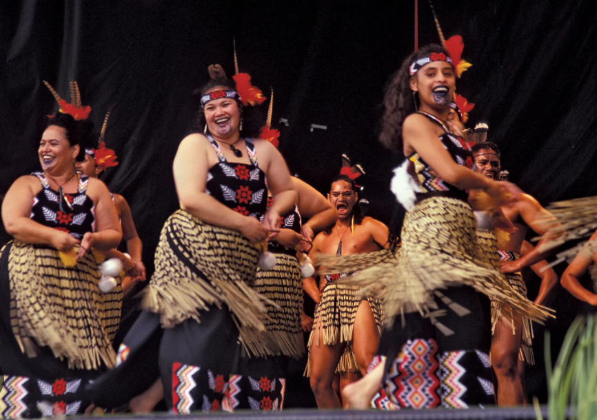
Femininity appears different in different cultures…
What is Masculinity?
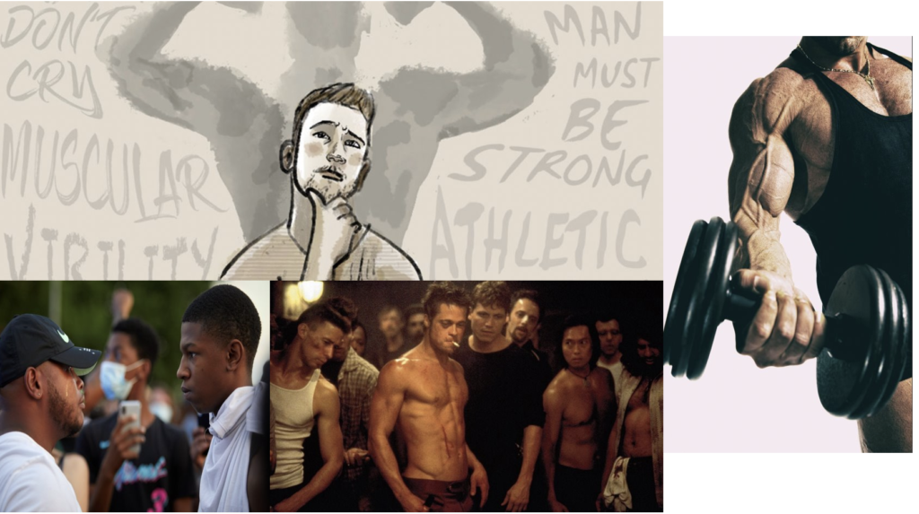
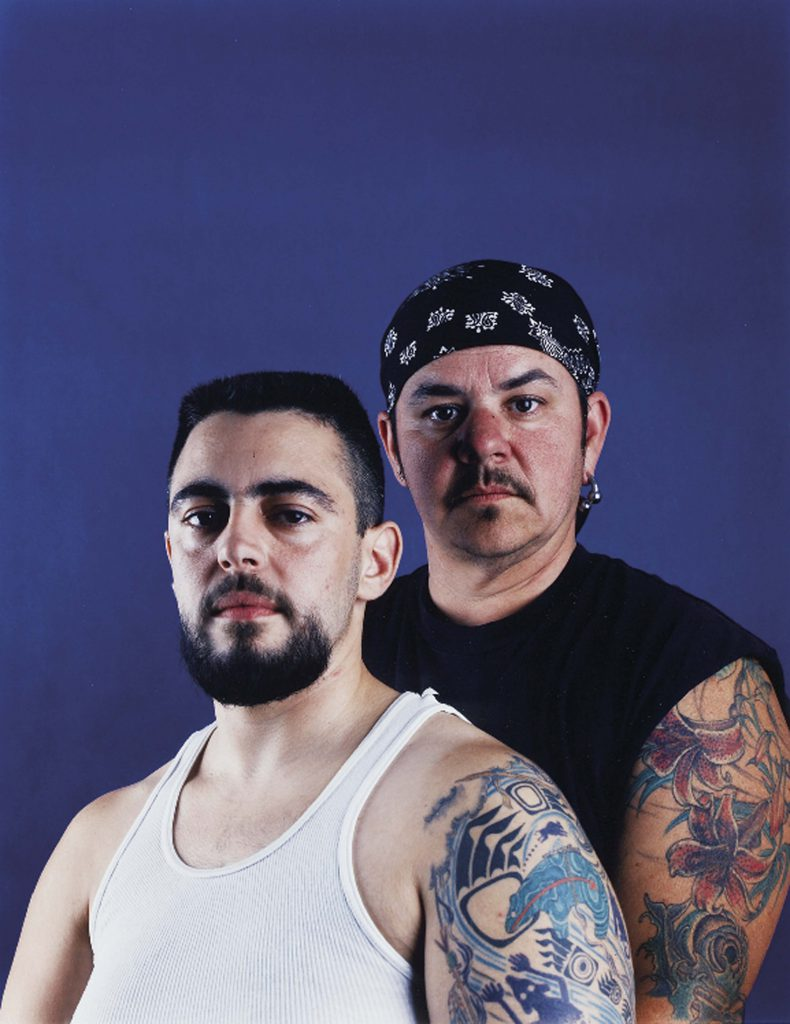
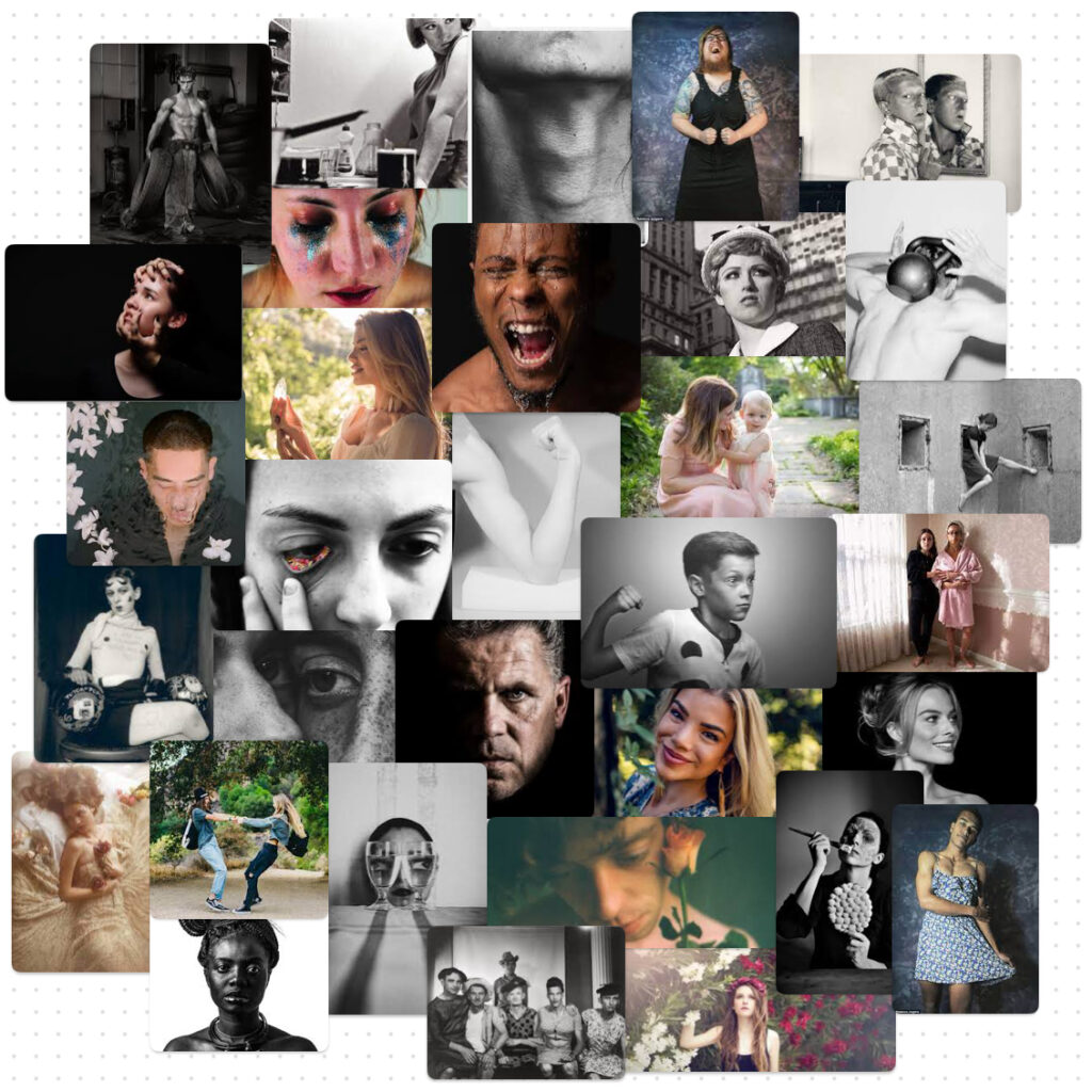
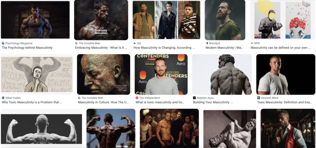
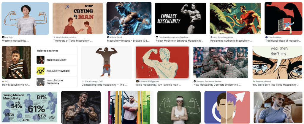
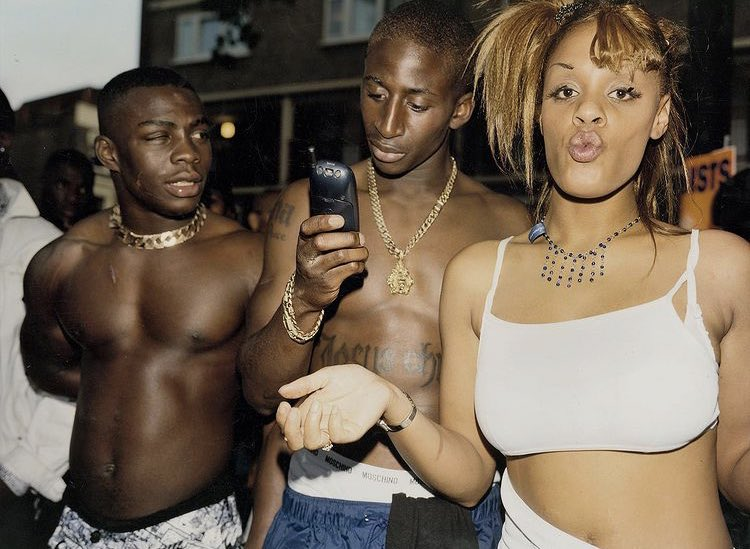
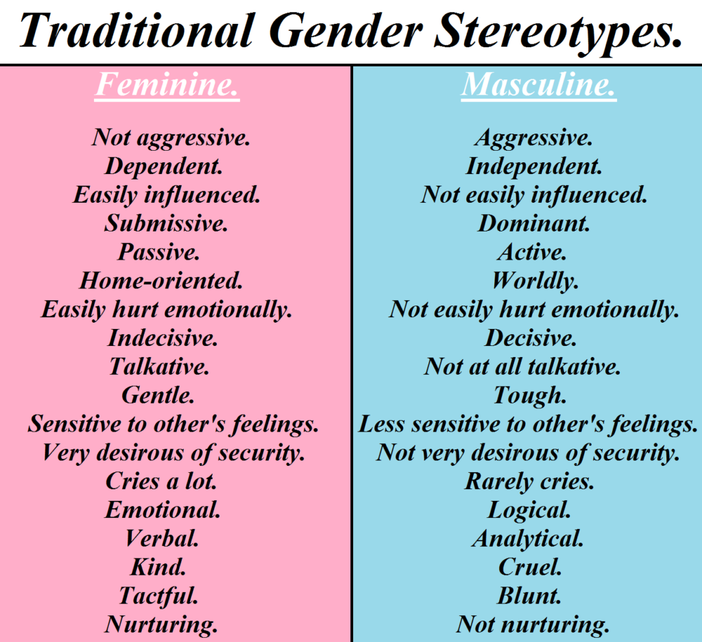
Masculinity is a set of socially constructed characteristics, attributes and behaviours generally associated with males. It constructs the ways in which a man is meant to act and look to fit societal standards. Stereotypically, a male has sharper features and shorter hair than a woman, as well as being more muscular and independent. This harsh stereotype is created by toxic masculinity expectations, similar to toxic femininity but less spoken about. Societal expectations encourage men to show strength and stoicism, concealing their emotions and hiding vulnerability. Men are also expected to perform roles like protecting, leading and providing. As a result, the pressure to be ‘masculine’ leads to challenges with mental health for men as they feel that they have to internalise their feelings rather than openly speaking about them.
Search results for ‘Masculinity’:
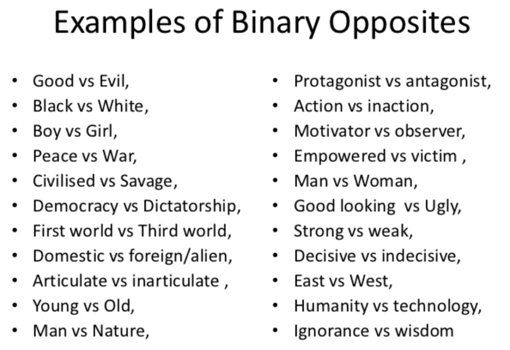
Binary opposites
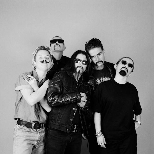
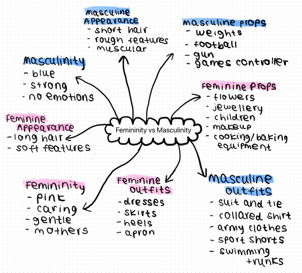
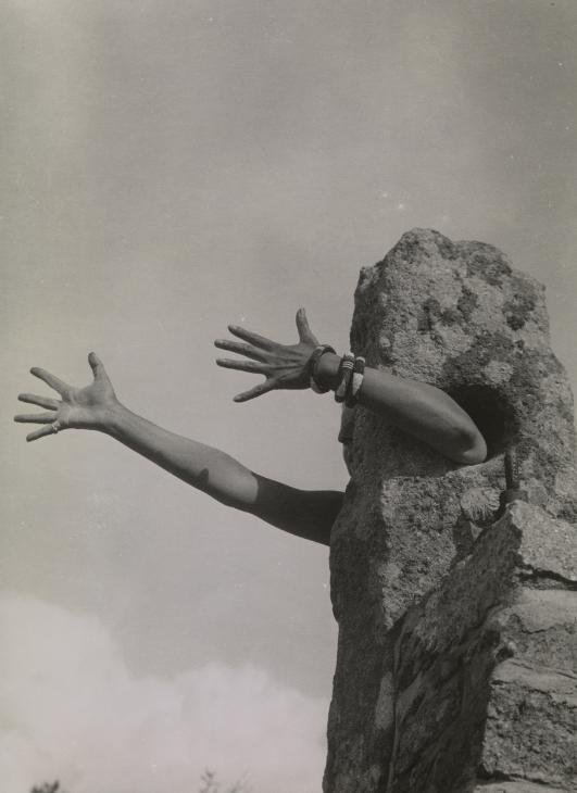
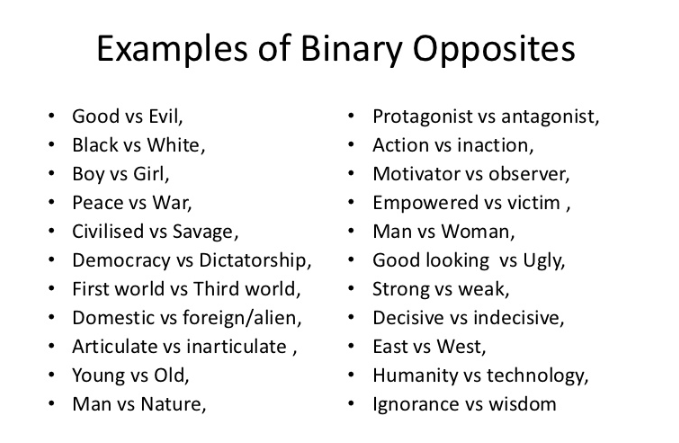
Femininity vs Masculinity is a Binary Opposite. Binary opposition is when two mutually exclusive terms or concepts are put together to create a contrasting effect. These two terms are defined as opposites, although they relate to each other. Binary Opposition is often used in photography to emphasise contrast, creating visually striking photographs. The most common examples of binary opposites shown in photography include light and dark, rough and smooth textures and bright and dull colours.
Femininity vs Masculinity Mindmap
Ways how identity can be influenced
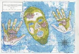
Identity is defined as the characteristics, beliefs, experiences, appearance, personality traits and qualities that make up a person. It can be influenced by a variety of things such as someone’s social environment, cultural background, personal experiences, family upbringing, gender and sexuality, economic background, religion and even what they are exposed to by media. Identity is dynamic and changes over time as people change and grow older.
Gender Identity
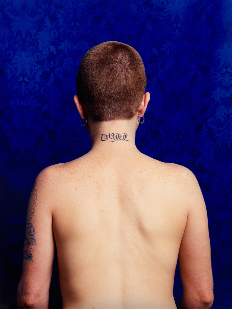
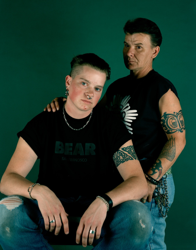
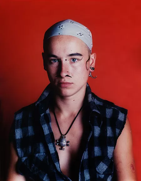
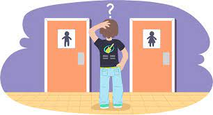
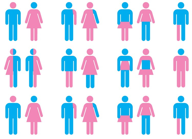
Gender Identity is how a person describes their gender. For example, some people may not see themselves as a male or female so they identify as non-binary. This is the result of someone’s inner feelings and possibly the lack of confidence or even social factors.
Cultural Identity
An example of cultural identity is the Māori people, the second largest ethnic group in New Zealand. This group originated from East Polynesian people who canoed to and settled in New Zealand, developing their own distinctive culture. They’re well known for their cultural tattoos called Tā Moko, most commonly on their face for men and chin for women.
Social Identity
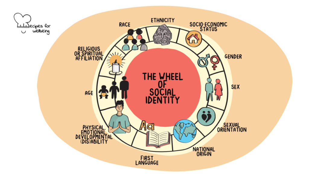
Social identity refers to how a person categorizes themselves or others. Examples of this are race, ethnicity, religion, sexual orientation, gender, socioeconomic status and (dis)abilities. These categorizations are often assigned to us or are something we are born into.
Geographical Identity
Geographical Identity refers to ‘an individual or group’s sense of attachment to the country, region, city or village in which they live’. This is affected by the characteristics and stereotypes in which a place is associated.
Political Identity
Political identity is how a person or group thinks of themselves in relation to the politics and government of a country. Examples of Political Identity include identification with a political party and positions on specific political issues, such as gender equality.
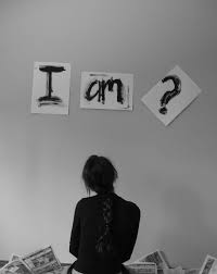
Lack of/Loss of Identity
The loss of identity refers to a range of experiences in which an individual may feel disconnected from their sense of self, purpose or values. This can be the result of major life changes, trauma, metal health issues and societal pressures. Additionally, loss of identify can be the cause of mental health issues for some people.
Stereotypes
A stereotype is a generalized image, belief or set of characteristics that people believe represent a particular type of person or thing. Examples of stereotypes that influence Femininity vs Masculinity are:
- Men should not cry
- Women are too emotional
- Women are mothers
- Men are providers
- Men are strong
- Women are weak
Prejudices
Prejudice is most often defined as ‘unfriendly feelings directed against an individual, a group or a race’. An example of prejudice is being homophobic. This is when people show dislike towards gay people. Additionally, being prejudice towards gay people may be based on religious beliefs or just irrational fear. Another example of prejudice could be racial prejudice, which is when others may look down on a certain race.
Identity Politics
Identity politics is a term used to describe people of a particular race, religion, gender, social background, nationality, social class or another identifying factor and how they are more or less vulnerable to oppression. Some social groups are more likely to be presses, such as women, sailed people, ethnic minorities or sexual minorities due to them having less power or privilege. On the other hand, some social classes are less likely to be oppressed such as white people or men are they are seen to be more powerful and privileged.
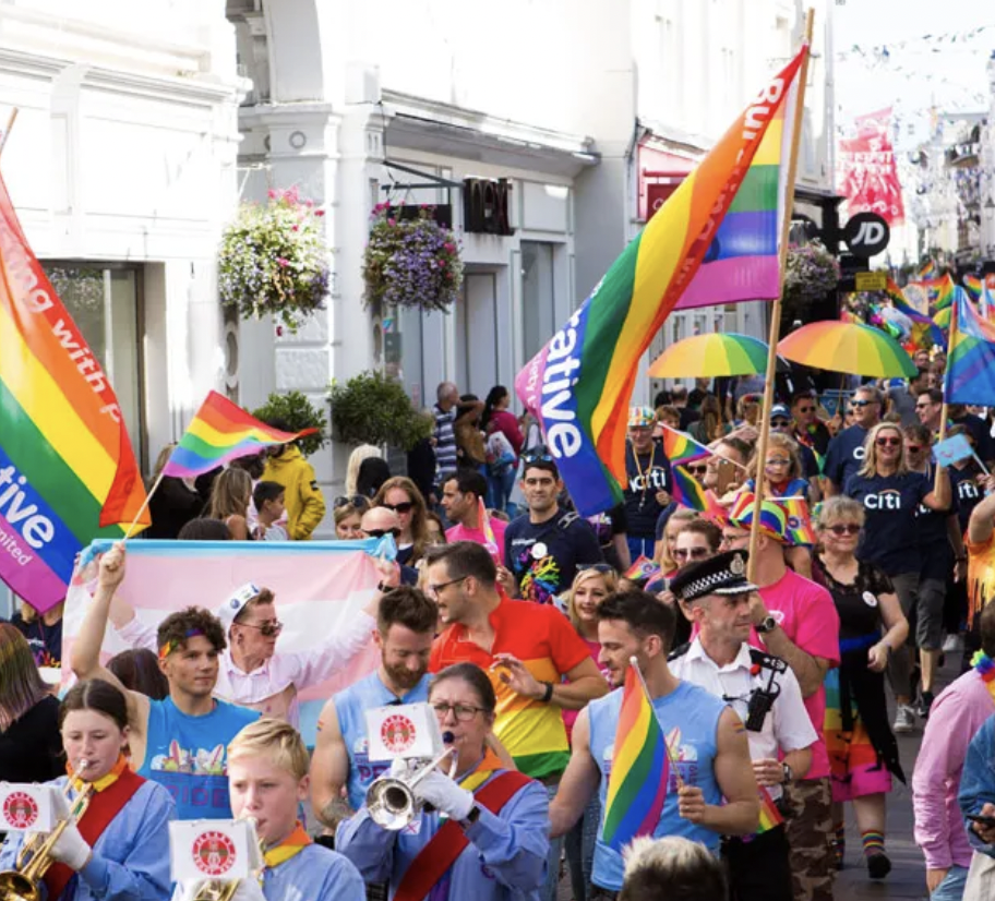
An example of identity politics are LGBT Movements as they promote self-affirmation, dignity and equality for people within the LGBT social group.
A positive example of identity politics is the fact that, in construction, it is very popular now to make the building inclusive and accessible for the people who use it. This is good because it allows people with disabilities, such as having a wheelchair, to be able to use the building just the same as other and move around it easily.
Culture Wars
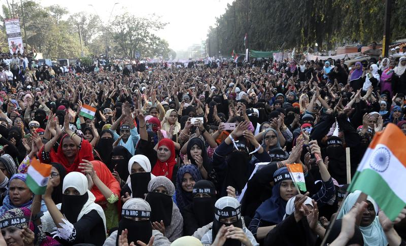
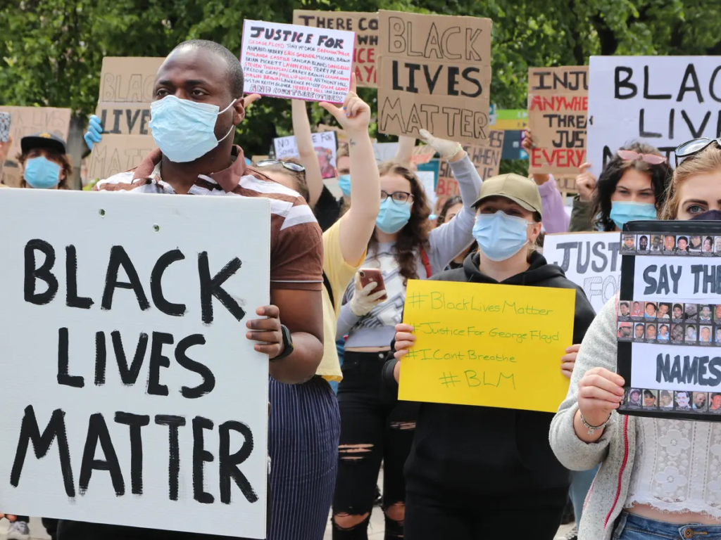
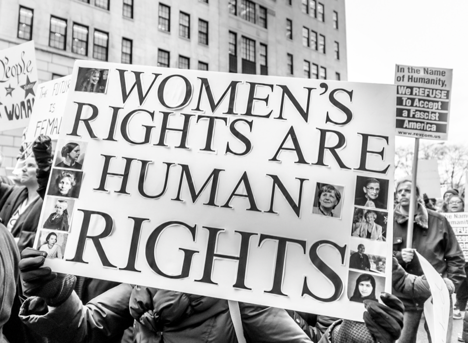
Culture Wars are conflicts between social groups who struggle for dominance of their values, beliefs and practices. Culture Wars commonly refers to topics in which general societal disagreements are seen. An example of a culture war is the Feminist Movement, where Women battled for equal right against men through protesting and political campaigns.
