Environmental portrait photoshoots:

Photoshoot 1:

Photoshoot 2:

For these 2 photoshoots, I made the mistake of using my phone as a camera. Therefore the quality is not as detailed and the subject isn’t as focused as they would’ve been if I used a Digital Camera. I do like these images because both of these photoshoots provide portraits of people within different social environments. Photoshoot 1 is of my work colleague playing chess, and naturally posing for the camera. The subject is aware he is being photographed, but I could’ve improved these photos by making sure the subject was looking directly at the camera and making a connection with the viewer. In these photos, the subject is the main focus as he is the only person present, making it clearer to the viewers about what is happening. Photoshoot 2 is purposely a lot different, as the subject was not aware he was being photographed. Also, in these photos there is more than one person present, making the ‘subject’ not fully focused on. Although, it is clear to viewers that the DJ is supposedly meant to be the main focus of the image. I also should’ve tried to make the subject more centred, and as we can see the photos were taken on an angle so this made it difficult to include more of the background. The lighting also affected these images because we were in a dark environment, with only artificial and coloured lighting. The low light helped create a sense of gloom and mystery. Some of these images appear to be more blurred than the others, and this is because it was difficult to get a still, focused shot of the DJ when he was not aware of the photoshoot at that moment. This subtracts the effect from the images, as it looks as though the photos were not planned out or thought through enough.

Photoshoot 3:

Photoshoot 4:

Photoshoot 5:

Photoshoot 6:

Photoshoot 7:

Photoshoot 8:

Photoshoot 9:

Photoshoot 10:

Photoshoot 11:

Photoshoot 12:

Photoshoot 13:

Photoshoot 14:

Extras:

Overall, I did around 15 photoshoots altogether. I used different people in different environments to create stories behind the images. My favourite photoshoot I did was photoshoot 7. I like these images because it is clear what environment the subjects are linked to, and also in some there is only one subject and in the rest there are 2, therefore it adds contrast. I also like photoshoot 8, because the subject is looking directly in the camera with a serious and dead facial expression. This creates a mood of frustration for the viewer.

Environmental Portraiture

Environmental Portraits depict people in their working environments or environments they are associated with.

They are portraits which are taken in the subjects natural surroundings, such as their home or workplace, that illuminates the subjects life and surroundings.

I think the portraits are unique and interesting, because they aren’t photographed in a studio, they are in the subjects particular environment, which relates to the person. Also, they engage the viewer creating a meaningful story behind the photo as we learn something about them.

Alys Tomlinson

Alys Tomlinson is a British photographer. She has published the books Following Broadway, Ex-Voto, Lost Summer and Gli Isolani. For Ex-Voto she won the Photographer of the Year award at the 2018 Sony World Photography Awards.

Alys grew up in Brighton and studied English Literature and Communications at the University of Leeds. After graduating, she moved to New York for a year and was given her first commission for Time Out, before returning to London to study photography at Central Saint Martins College of Art and Design. She recently completed a part-time MA in Anthropology of Travel, Tourism and Pilgrimage (Distinction) at SOAS, University of London, which ties in with her long-term, personal project about pilgrimage.
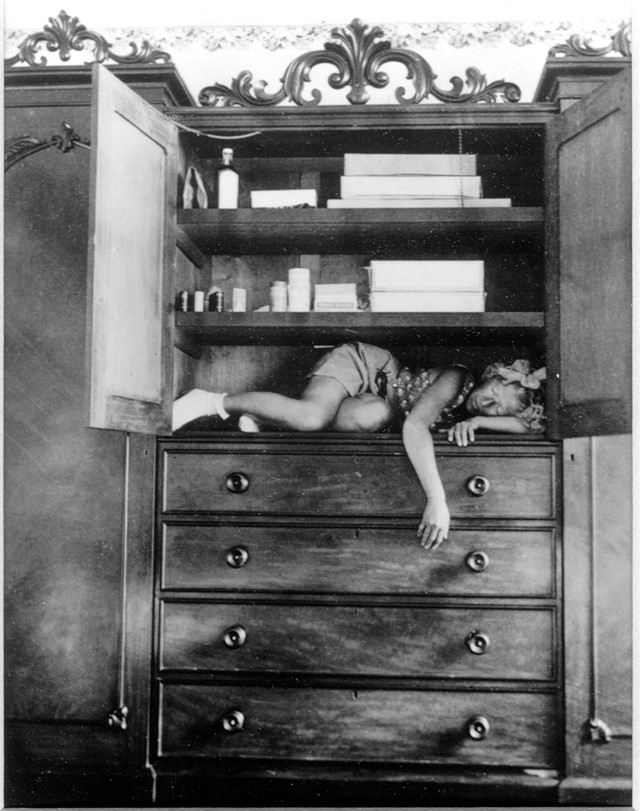
Alys Tomlinson’s work is very minimalistic and vey detailed, the backgrounds are filled with details and different surroundings which makes the photo stand out a lot more, if I were to compare this artist to jimmy Nelson I would say that nelson made the models more detailed whether it was to do with their culture, they made the background quite plain and simple to add more contrast to the person however Tomlinson made sure to do the opposite of that, she made the model look more simple but added a detailed background whether the model was standing in front of trees, houses or fences. I really like what Tomlinson has done to the photo making it black and white which makes it more modern effect can also effect the mood of the photo some would say they look quite sad as most of them aren’t smiling and are looking the camera with natural look. Another thing that I quite like that Tomlinson has done is that in a few of her photos she has blurred the background so that the focus is on the model and the model only. However the ones where the background isn’t blurred still looks good although there is less in the background, which makes the model instantly pop out.

PHOTO ANALYSIS.

This photo looks very different to the artists other photographs since the model is standing quite far away from the camera. which helps us visualise her surroundings, but the model looks very unusual which draws attention to the viewers as to why she may be standing in the middle of the woods, it almost creates a background story to the photo as if the model was lost or maybe they were forced to stand there. The model creates a mysterious energy, as well as the photo being black and white, this makes the mood and tone so different almost as if there is something out in the woods that’s making a lot of noise, it doesn’t seem like a peaceful environment, possible water running or the trees swaying in the wind.

environmental portrait photoshoot – town

For this photoshoot, me and my colleague both walked around St.Helier and took photos of a variety of different people, with different jobs and environments. For example, some was of local shops like IKeys, others were builders in their building site. We also took a few of people playing sports like basketball and of some random people going about their day.

This is one of my favourites from this photo shoot. Its of 2 guys who we asked to take some photos of. We captured them from many different angles and this ones my favourite because they are acting as if the camera was not even there presenting them in reality. There body and faces match the rule of thirds, making the picture not feel awkward, with things seeming in place. I think cigarettes always add character and the fella suggested it so we went with it.

For this portrait, after a basketball game I took photos of my mate under a hoop, staring into the camera, while i was standing on the viewing platform at the top. Its quite intimidating but the hoop in the way keeps a distance between him and the viewer. I got him to hold to basketballs to connect him to his environment more.

Arnold Newman

“You don’t take pictures with your camera. You take pictures with your mind and your heart.” – My favourite Arnold Newman quote.

” The Portrait is a form of biography. Its purpose is to inform and to record for history” – Arnold Newman

 Arnold Newman was born on March 3, 1918, and passed away on June 6, 2006. Newman was an American photographer who was greatly known for his exquisite environmental portraits of mainly artists and politicians.

EXAMPLES:

However, he was also greatly known for his still life images which were described as ‘Abstract’.

EXAMPLES:

The first ever environmental portraits were created by Arnold Newman. Newman was seen to have ‘pushed the boundaries’ of traditional portrait photography during the middle of the 20th century, he began taking environmental portraits in the 1940s and became increasingly popular due to his new and different approach to taking photography. He included a variety of people such as famous people, workers, composers, political leaders and scientists. He began shooting photos for Look and Harper’s Bazaar, this skyrocketed his photography career of capturing his subjects at home or working.

I particularly like this photo Arnold Newman took of Carl Sandburg and Marylin Monroe on January 20th, 1962 because I think It creates a realistic photograph of a scene of conversation and friendship. From my research I found out that Marilyn complained about her sleep disorders at that evening, and this photo demonstrates Carl Sandburg showed her exercises that she should do before she goes to bed. Arnold Newman capturing this moment as a part of environmental photography shows that you do not need the backstory of a photo I understand the meaning of the photo, In this instance it represents conversation, possible concern and friendship.

My favourite thing about Arnold Newman and his work is how raw his images are. It truly captures the reality of people’s environment and how real he kept it whilst photographing them. The people in the images are not necessarily ‘posing for the camera’ and instead, they are doing their usual duties in their e.g. workplace. This is something I hope to replicate in my photos as I want to recreate people truly in their environment and not necessarily ‘posing’. I hope to compile a various amount of images where some subjects are still in their environment but also looking directly at the camera and some of my subject in other photos not looking directly at the lens and instead looking at and doing what they do in their ‘usual environment’. I think that this would create a good variation of photos and help them differ. They can then fit into similar categories of multiple famous photographers I can take inspiration from.

Introduction to Environmental Portraits and Environmental Portraiture Photoshoot Planning

Mind map Plan For Photoshoot

Environmental portraiture is a photograph in which shows a person in their natural environment.

I have written down a few ideas of what type of settings I’d like for my photos, I’ve been inspired by Mary-Ellen Mark’s work so I plan to add elements of her own style in my work such as making some of my images in black and white to make my images more abstract which will make them more interesting.

I also plan to take photos of people in their familiar environments, for example, inside their homes or on a childhood street.

Environmental photographers

Letizia Battaglia was an Italian photographer and photojournalist. Although her photos document a wide spectrum of Sicilian life, she is best known for her work on the Mafia. 

Another example of a photographer that takes environmental photos is Henri Cartier-Bresson. He was a humanist photographer influenced by surrealism. His work had helped establish photojournalism as an art form.

As seen in both of these photographers’ work, environmental portraits are photos that capture people in their everyday lives/environments and almost tells the story of how they live or work by their surroundings and maybe clothing.

We use this genre of photography to try and capture the personality, identity, soul, and emotions of a person by using the background, atmosphere, poses and lighting. They capture a part of a persons life and tells a story about their backgrounds and how they are living their lives.

Environmental portraiture photoshoot

I identified my best images out of my photoshoot and colour coded them on the basis of which ones I was definite on using and the ones I was unsure about. When I had similar images that I struggled to decide between, I compared them closely and then flagged the one I believed had more detail and had a more aesthetic composition.

This was my favourite image. It looks very candid and natural as she is mid-laugh which tells a lot about her character. I had many photos similar to this image but I felt the way her hair was blowing looked best like this. She is holding books in her hand which tells us she is still in education, and the smile suggests she is enjoying her time. I wanted to photograph her like this as it is a place she comes to everyday to spend time with her friends at school which is an important aspect of her life. I put this image into black and white because I think it looks a lot better this way.

Similarly, I like this image for the same reasons, but I increased the saturation to enhance the colours around her as I feel that the bright green compliments her hair and the environment around her. I used natural lighting as this was outside on a bright day as I thought it would look best. I used my mobile phone to take these images as it was in the moment.

The leaves all coming together and overlooking her and in a twisted way behind her adds more to the image and fills up the background which I really like. Because she is wearing black, the colour of the nature brings more life into the image. I feel that this makes her stand out more because she is the only part of the image that is more dulled down, showing contrast. The bench she’s sitting on has a lot of texture due to the brown paint being rubbed off which shows how many other people sit here on a day-to-day basis, maybe even with her.

This image has a relaxed expression and posture, she almost seems bored. I think this reflects her outlook onto school as a place she finds boring as she would rather be out with her friends instead. I really like the way she is sat on the stairs and leaning over because it’s quite unique. The background has been blurred as she is the focal point of the image. The blue that she is wearing stands out from the neutral and plain colours as it is contrasted.

I took this image of a science teacher at school. She’s smiling which tells me that she really enjoys taking part in experiments but also teaching younger people who may aspire to have a job like her in the future. She has set out test tubes and beakers with different colours inside for her students to learn as she demonstrates the experiment in the image. I wanted to photograph her because she is in an environment which could inspire people of younger ages to have a job like this in the future.

You can see the colourful posters on the wall which she uses to engage her students in her lessons. As she is wearing a lab coat, this gives the image authority and tells us that she knows what she is doing. The equipment spread across the table gives the image texture and details to search around the image with, jumping out from the off-white walls which makes them appear more.

I used vignette on the corners of the image as I felt that this will point her out more to the viewer. I like the way she is towards the side of the image as we get a large perspective on the view of the classroom.

I really like these three images I took of a family member at work. She is an occupational health worker where each day, she has people of all backgrounds, lifestyles and jobs come and see her. She analyses whether they are fit for work or not, checking their hearing, lungs, blood pressure, etc. She works very hard to make sure people feel comfortable during this regardless of who they are. When she is not doing these tests, she is on the computer in meetings, setting up clinics or emailing.

I wanted to photograph her because I feel like she plays a very important role in other peoples lives which goes unnoticed, so I wanted to capture that.

The way she is wearing a mask, gloves and a plastic apron shows that she is experienced in this and is prepared, knowing exactly what she is doing. The shifted keyboard on the desk behind her tells me that she has been busy typing, organising all the appointments. I also feel that in the 2nd image, the use of the yellow disposal tub makes the photo more interesting because we can see exactly what it is she does when she is mid-preparation. You can see in the background there are many cabinets and file cupboards in dull cupboards which don’t look enticing at all, suggesting that is the worst part of the work as they have all colour taken out of them in comparison to the rest of the room which is more saturated.

Environmental Portraiture

“An environmental portrait is a portrait executed in the subject’s usual environment, such as in their home or workplace, and typically illuminates the subject’s life and surroundings”.

Throughout history, Environmental Portraiture has been an admired by artists and photographers. It is seen to be a form that addresses social and political issues relating to its natural or urban environment. The purpose of ‘Environmental’ portraiture is to illuminate the subject’s life and surroundings. The images are taken to instead appreciate a story or backstory to the person or the job/ activity they may be doing.

Key Features

  • formal (posed) – This is when a person is sitting or standing in a fixed position in a particular way to convey something
  • head-shot – only the head face and occasionally shoulders
  • half body – Only half of the body is on show, usually down to the torso
  • three quarter length – Only three quarters of the body is shown, usually up to knees / full length body shot

The angle of a photo can really influence the outlook . The impression of a photo can change depending on the angle that the person is is captured from, an example of this could’ve been from the side, diagonally above, or directly above. These angles are named high angle, low angle and canted angle.

  • The colour of the photograph can also be either black and white or colour. The difference between these two can completely change the impression of the photos taken. For example, a black and white photo can infer a more emotional impression of the portrait and add imagination, drama and mystery. However, a black and white image could also do the opposite and infer a less emotional and possibly a more formal, aged impression. The different shadows and effects on a black and white image could be used to juxtapose each other within a composition for a more dramatic effect.

However, a coloured picture can be used to guide the person looking at it, where you want them look and brighter colours can be used to highlight a focal point, where duller coloured can show less important elements. Coloured images can also influence how they feel about what they see and have a better idea of the message the image is trying to convey.

Artist Reference and Case Study

Vanessa Winship 

Vanessa Winship is a British photographer born in 1960 who works on long term projects of portrait, landscape, reportage and documentary photography. These personal projects have predominantly been in Eastern Europe but also the USA.

She uses black and white photographic film in natural light. For her work in a reportage or street style she has used a 35 mm hand-held camera, for her landscape work she has at times used a medium format camera and for her portraiture work she has at times used a 5×4-in large format camera. She says of the difference between using 35 mm and large format that “Each methodology makes for a different relationship with my subjects [and] both have their own beauty for me”.

In her series Sweet Nothings she has been taking photographs of schoolgirls from the borderlands of Eastern Anatolia. She continues to take all photographs in the same way; frontal and with enough distance to capture them from head to toe and still include the surroundings. Personally, I like her work because she is bringing political and realistic portraits to keep them natural. Environmental portraits are also to associate with the people being photographed and they tell a story of the people by using the background. This is a good way to make a photograph political which links to Vanessa’s work since she is a documentary photographer.

Winships work focuses on cultural diversity and lifestyle from using environmental portraits.

My emotional response to these portraits definitely varies depending on what aspect I focus on. Overall the photo reminds me the different cultural habit and lifestyles I forget exist in the world. In this album of images, she also uses young children from head to toe in the frame. She may be portraying the vulnerability and innocence of the children by showing them in as it looks school uniform and their height. She also uses a series of two children to portray connection and family. This makes her photos unique and reminds me that family is important and valued everywhere in the world.

These photos were taken in black and white possibly to make them look older and vintage which links to the theme nostalgia. As they are children as well this links to the theme as well. She uses natural lighting with a clear sense of shadowing. She may of used black and white to emphasize the depth of shadows. Especially in the middle one which seems to look like a school in the background which tells us they are educated.

As I can see, the two people are normally physically touching which gives off a sense of warmth and connection. However, this contrasts to the interaction they are giving with the camera as they are not really showing an emotion. They are numbly staring at the camera which doesn’t tell us a lot on how they are feeling. Overall the physical touch gives off a growing up in a family and caring lifestyle. However majority of her images are in black and white which ultimately make the images feel nostalgic which also links to the fact they are children, although it would be interesting to see the background, colours to be able to tell the weather and what time of day for the outside for pathetic fallacy. On another note, I like how the picture is a head to toe frame of the children and how there is more than one.

Just another Hautlieu Creative site