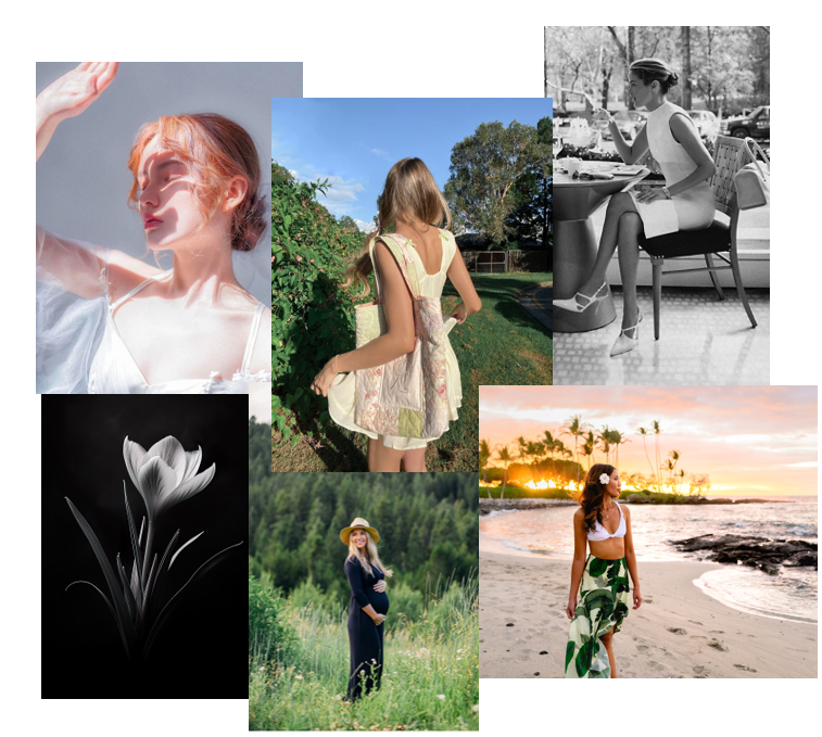
Femininity:
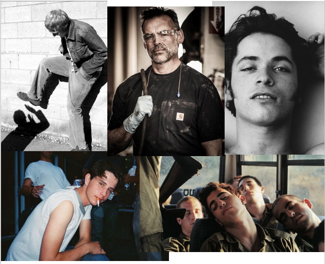
Masculinity:


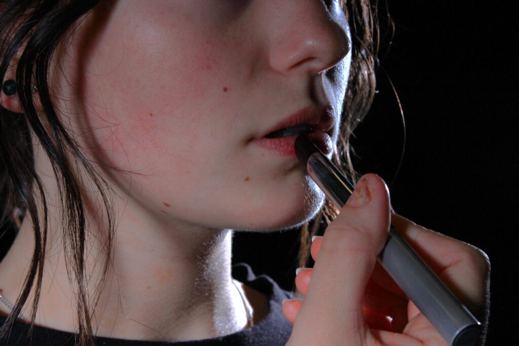
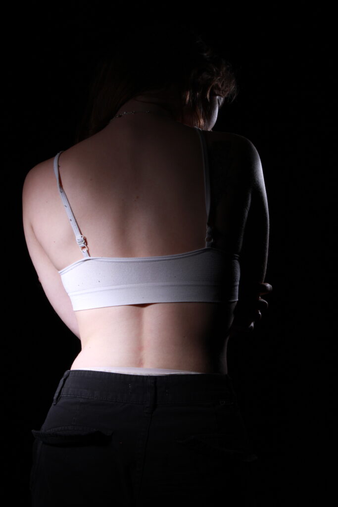
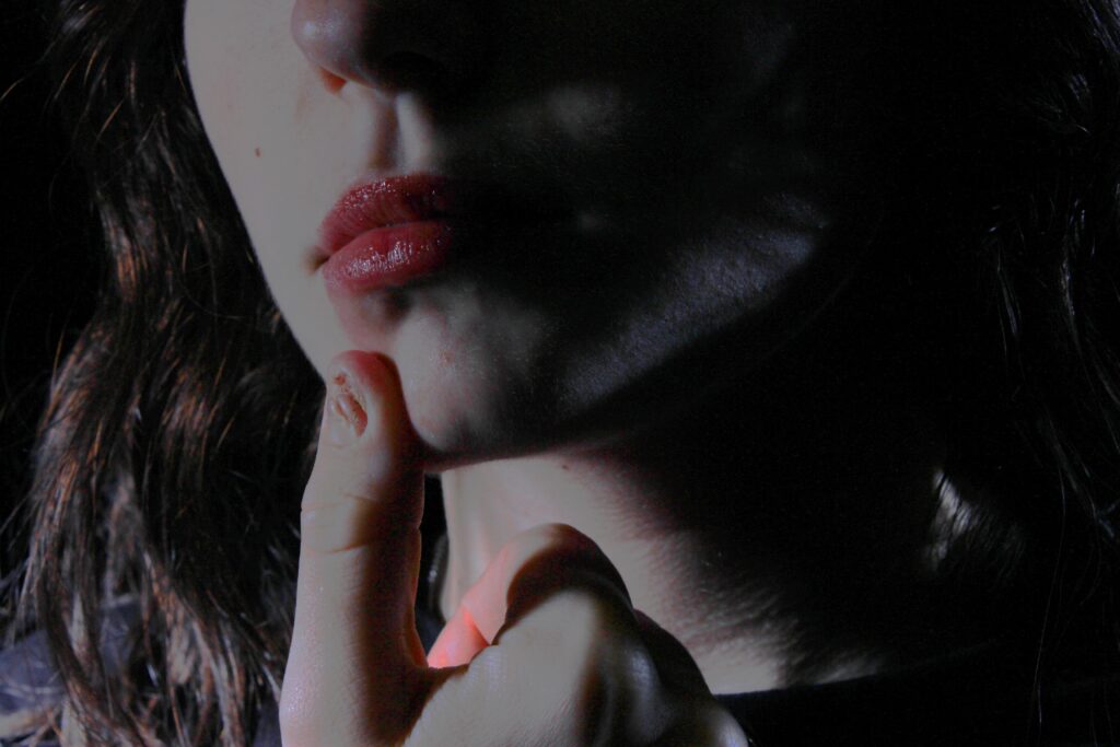
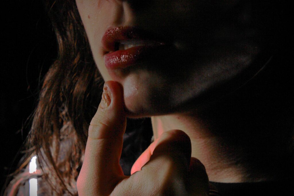
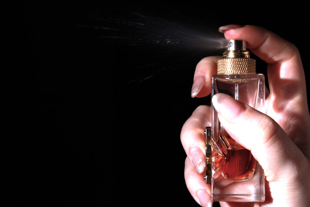
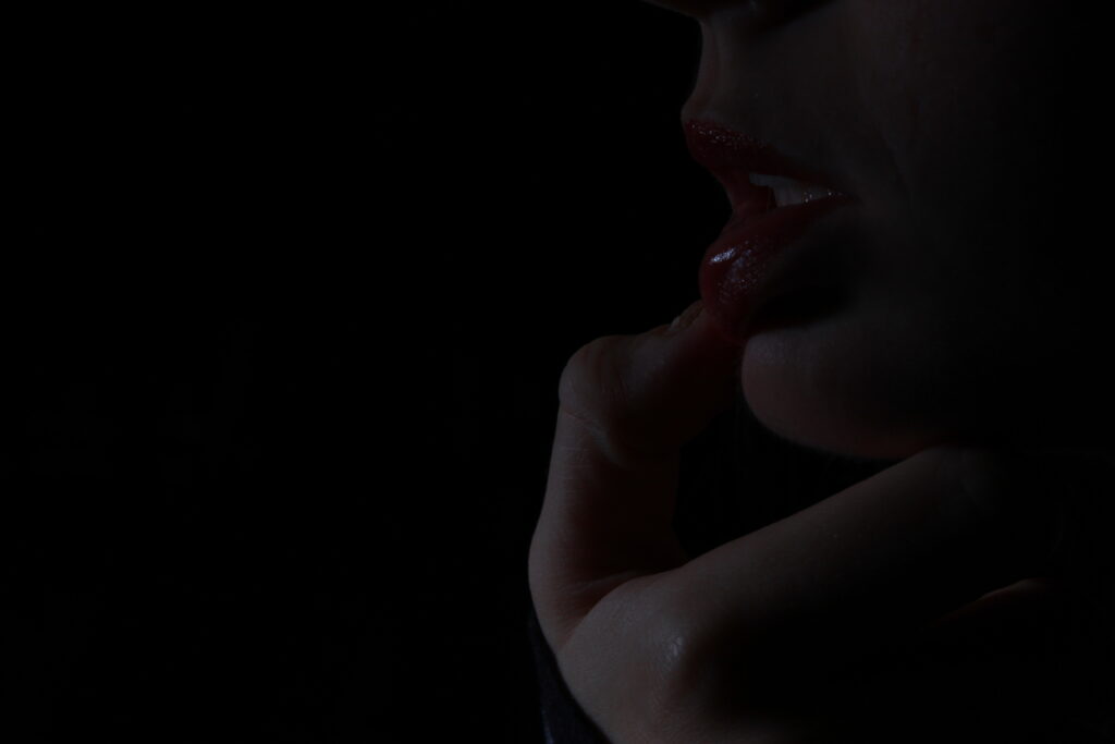
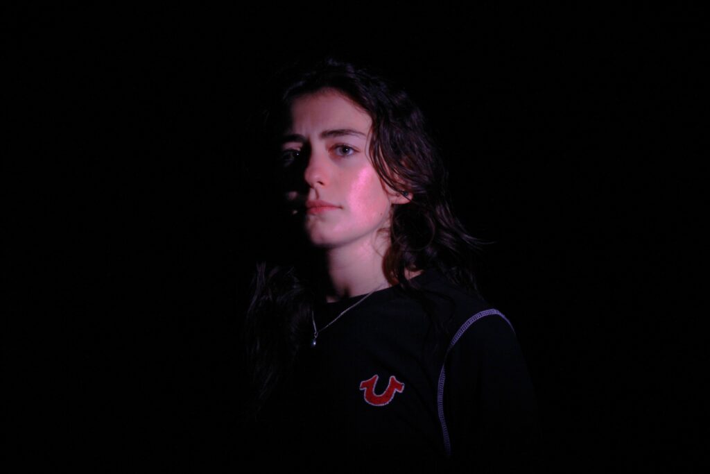
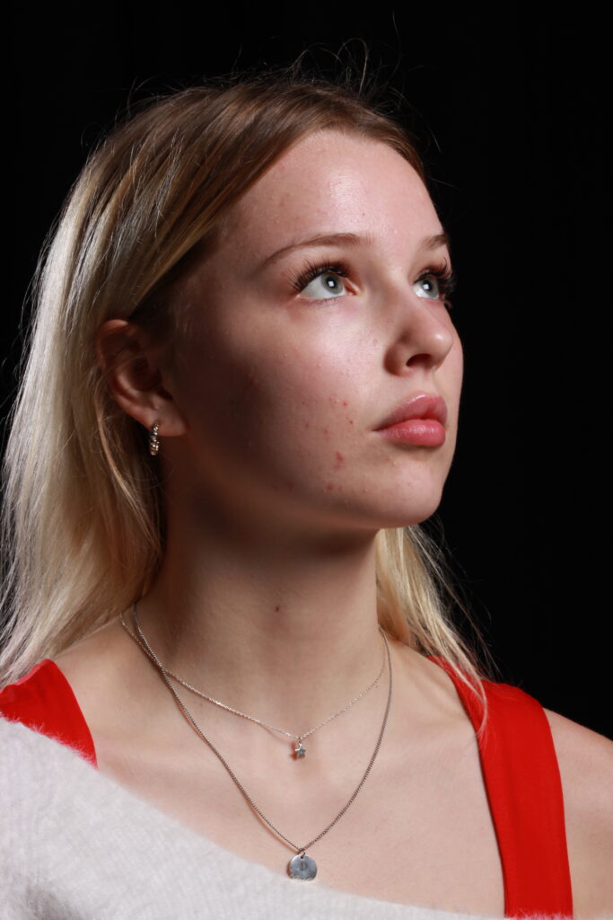
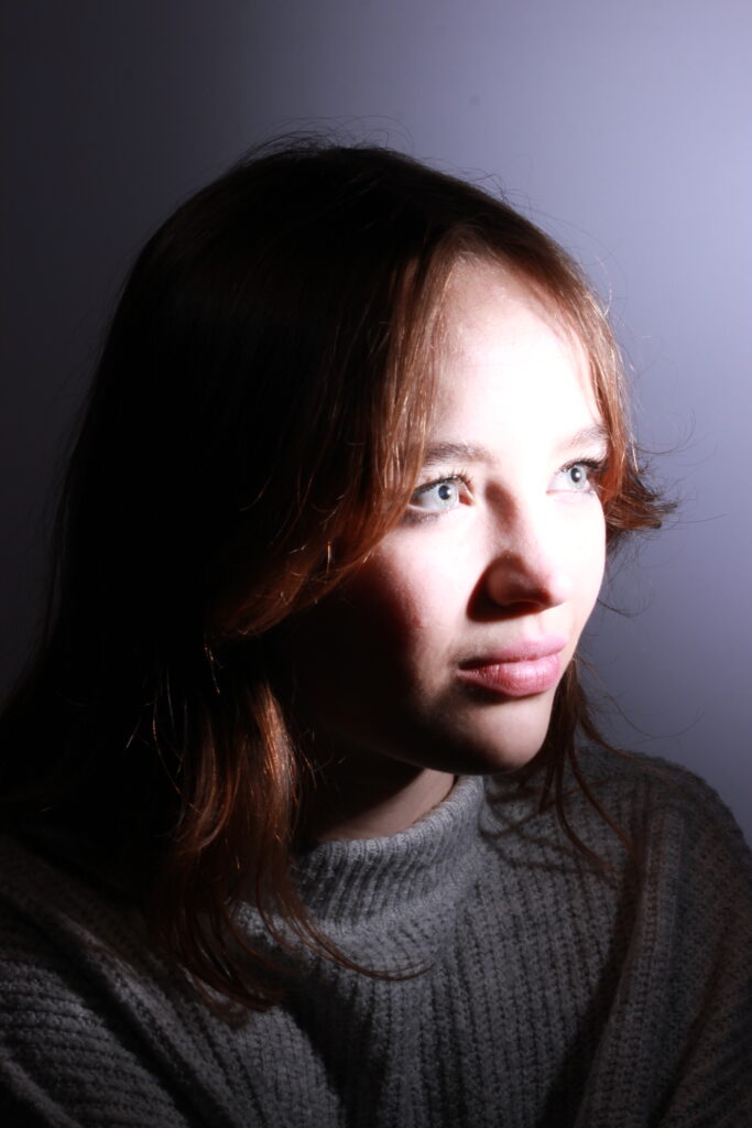
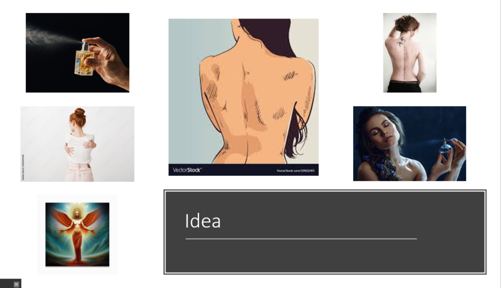
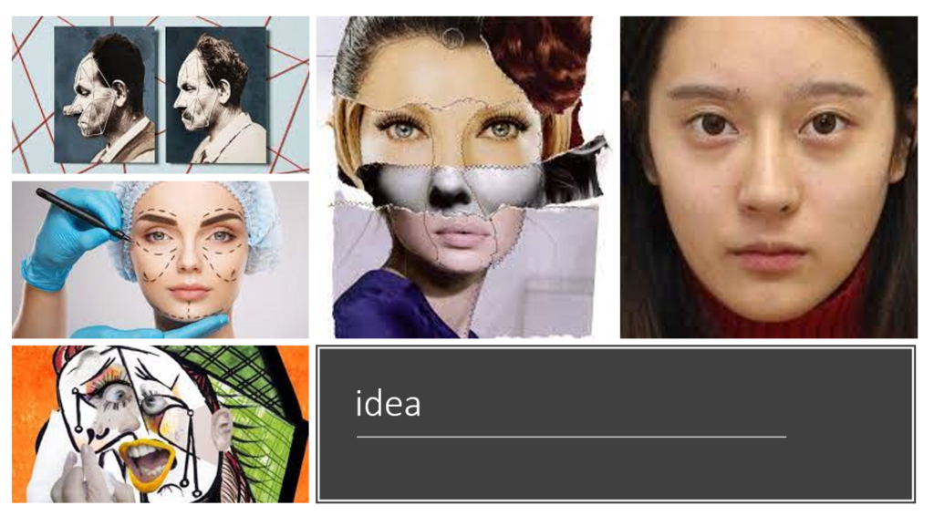
i will use these images to create abstract editorial images, these are the raw photos i have chosen from the photoshoot the move forward with
Cindy Sherman works with female stereotypes and invents personas and tableaus that identify the nature of females. She does this by creating images that assumes gender roles like a photographer, model, makeup artist, hairdresser and stylist. Whilst also portraying a career girl, a blond bombshell, a fashion victim, a clown, or a society lady of a certain age. For over 35 years she created eloquent and provocative body of work for our visual culture.
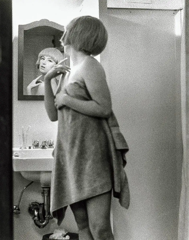
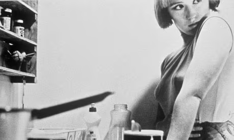
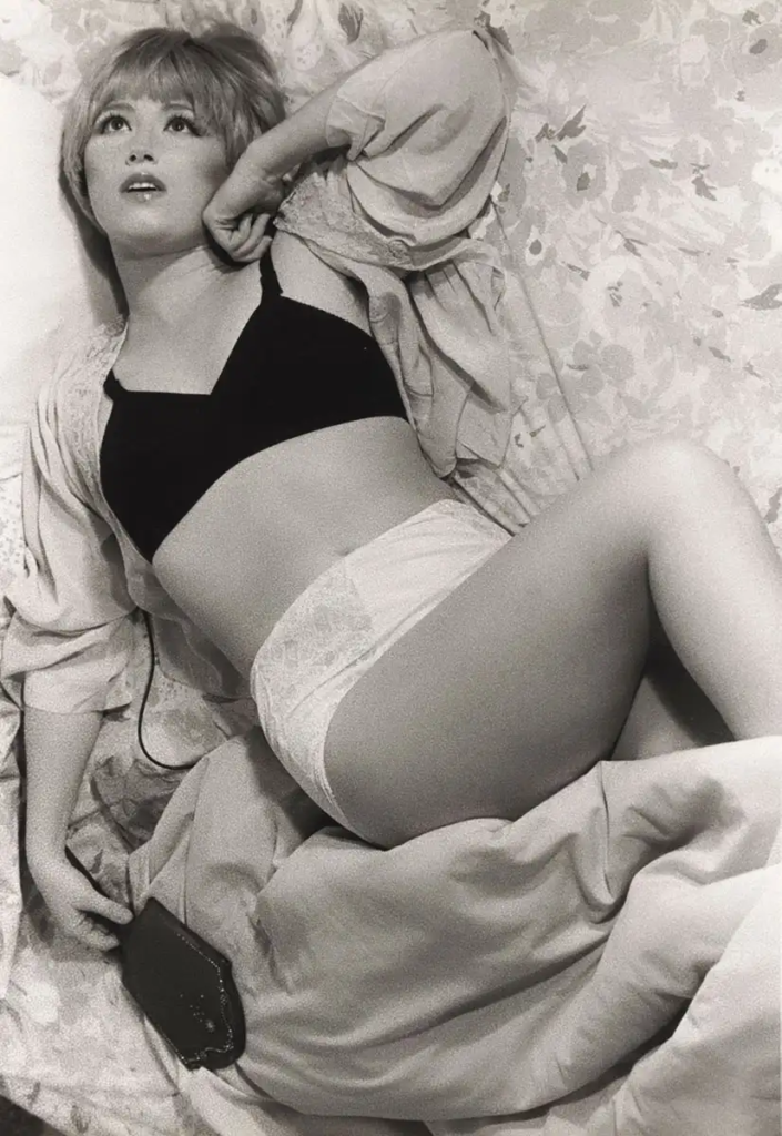
Sherman’s photography is a depiction of the different ways culture defines “woman.” Her art plays on the feminist idea that gender arises exclusively within culture and deconstructs dominant gender ideologies, representing the underside of popular culture’s definition of “woman.”
She rose to fame in the international art world with her series of black-and-white photographs, “Untitled Film Stills” (1977–80), which advanced the concept of narrative photography.
Renowned for her depictions of female stereotypes, Sherman has played with masculinity and gender expression before. In a series referred to as “Doctor and Nurse,” Sherman became both a male and female character, embodying stereotypical mid-century professional archetypes.
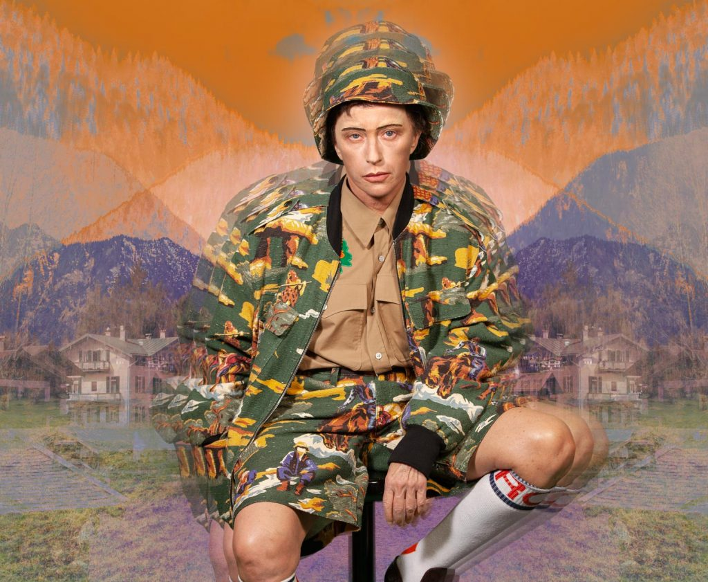
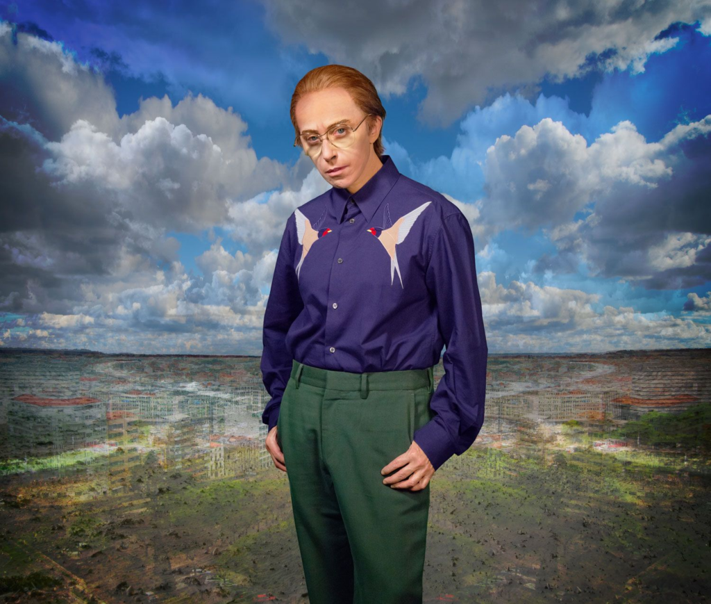
Absurdist femininity

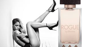
the photos i want to create are intended to mock the sexualisation of women in these advertisements

Cindy Sherman
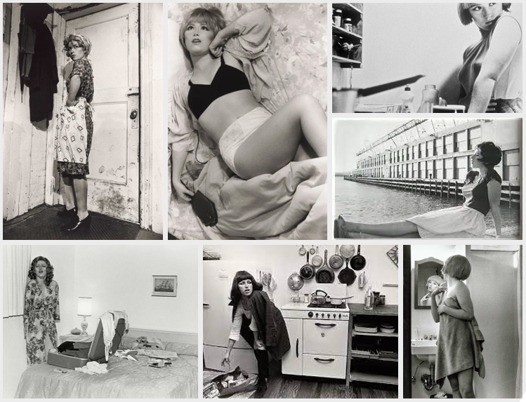
Cindy Sherman is an American Artist, born in 1954, whose work generally consists of self portraits where she photographs herself in a variety of contexts and as different characters. Sherman often portrays herself as stereotypical women in her photographs, resembling scenes from 1950s and 1960s films. Shortly after moving to New York at the age of just 23, Cindy Sherman produced her ‘Untitled Film Stills’ (1977-1980) where she dressed up as imaginary characters in various settings. Some of these characters include the unhappy housewife, the jaded seductress and the jilted lover which are all mainly based off of those from mid 20th century B movies. Cindy Sherman mentioned “I wanted them to seem cheap and trashy, something you’d find in a novelty store and buy for a quarter”. This shows that her images were often taken and made to mimic advertisements and promotions for movies at the time. These film stills remain her best-known works and, once released, they immediately became a point of discussion for feminism, postmodernism and representation. Sherman works in series and most of her work have recurring themes. Additionally, she had an exhibition made for her work in 2012 at the Museum of Modern Art displaying work from throughout her career. Finally, a quote I find interesting from Cindy Sherman is “None of the characters are me. They’re everything but me.” because it explains that in every photo and as every character she dressed up as, she never showed her true self which creates a sense of mystery. This also adds to the sense that women in media are often portrayed as someone else, rather than who they really are, therefore, the things you see in the media are often fake and just for show.
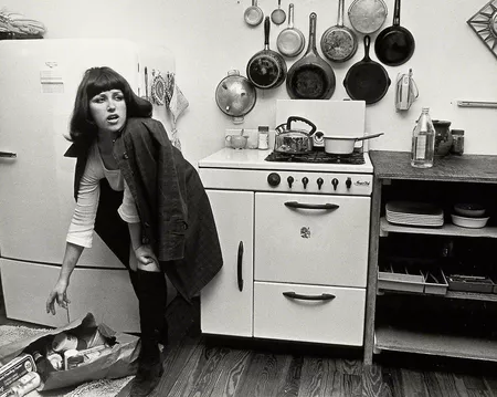
This is one of Cindy Sherman’s photographs where she appears to be dressed up as a house wife. This impression is caused by the fact that she is in a kitchen and appears to be unpacking her food shopping. Due to the photo being monochrome and slightly pixelated, you can tell it was taken on an older camera which also indicates how its inspiration would have come from the time when women were less superior to men. The character she is imitating in the photo, an house wife, almost looks as if she is looking at someone, perhaps her husband, and appears fed up or annoyed. I personally admire this photo because I believe that it definitely tells a story and relates a lot to toxic feminism (the belief that woman have to look and act a certain way, usually doing jobs around the house and looking after her family). Additionally, I find it admiring how Cindy Sherman would set up the camera and photograph herself, instead of someone else, which is something I would like to try for my own photoshoots.
Claude Cahun
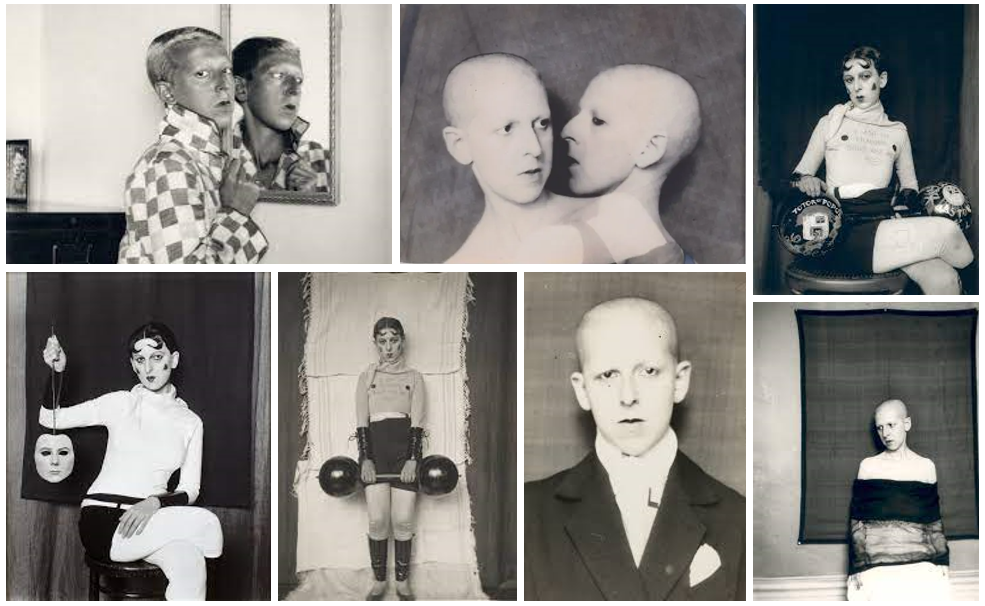
Claude Cahun, born Lucy Schwob, was a French artist, photographer, surrealist and writer. They were born in 1894 in Nantes, France and died in 1954 in Jersey Channel Islands. Cahun is best known for their self portraits and photo montages where they explored themes of identity. They were associated with the surrealist movement and were an activist who challenged traditional societal norms and gender roles throughout their work. Cahun moved to Jersey in 1937 with their stepsister and lover Marcel Moore. Claude Cahun was later imprisoned and sentenced to death for resistance during the Occupation in 1944. Although Claude Cahun survived, most of their work was destroyed by the Nazis. Cahun’s work is represented within the Jersey Heritage Trust collection and they have become and important figure in the history of queer and feminism art.
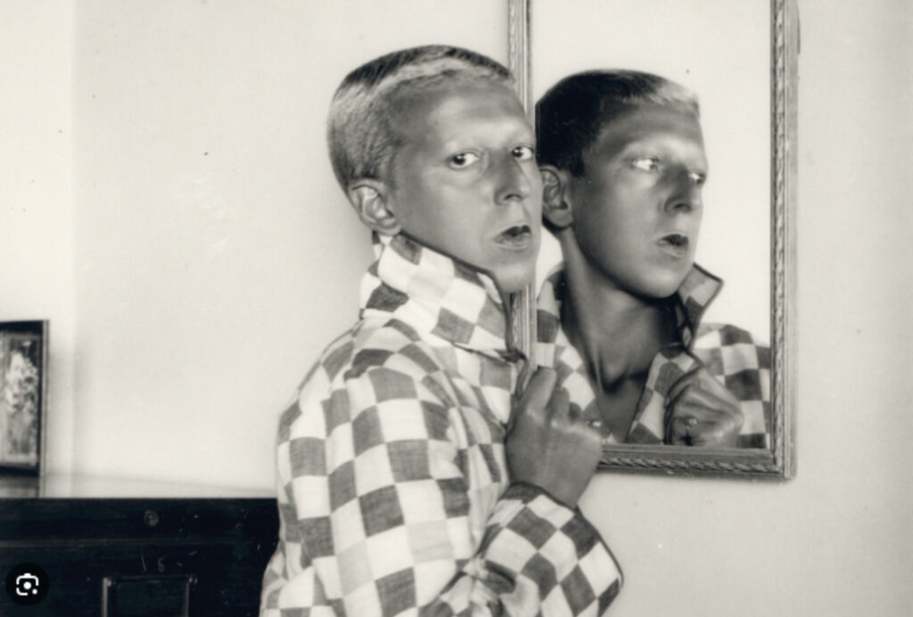
This photo of Claude Cahun, in my opinion, is one of her most important photographs that appear to question the societal norms of being female. Not only did she change her name but she also shaved her head to challenge gender roles and express herself for who she is. In this photo, Claude Cahun is presented in a very masculine way, however, there are also hints of femininity which makes you question whether you are looking at a male or female. Either way, she appears confident with who she is by her facial expressions and appearance within the mirror but also slightly constrained with the collar of the jacket hiding herself. This gives off the impression that she feels like she can’t fully show her true identity, the reflection in the mirror. Additionally, this may be highlighted by the fact that her gaze is directly towards the camera but in the mirror she is looking the other way because her true identity can’t be shown to society. I personally admire this photo because it seems to be very thought out and gives off many different impressions, making the viewer really have to think deeply about it.
Comparison
Overall, Cindy Sherman and Claude Cahun’s work relate to each other through the fact that they explore female stereotypes and take selfies rather than photos of someone else, however, Claude Cahun appears to go against these stereotypes where Cindy Sherman tries to oblige to them. Similarly, both the artists explore identity as Cindy Sherman dresses as different characters and never herself but Claude Cahun shows hints of their identity through their characters and appearance.
Both Masculinity and femininity are how you identify and how people recognise you to be. This is shown in your attitude, behaviours, and characteristics, but also in your gender identity. The terms ‘masculinity’ and ‘femininity’ are binary opposite, this means the related terms have opposite in meaning. Some examples of this which I think are interesting concepts are: young vs old, man vs woman, ignorance vs wisdom, and action vs inaction.
Femininity
Femininity is typically associated with girls and women. We perceive them to dress in feminine ways and have typical characteristics, behaviours, and attitudes generally associated with girls and women, such as being nurturing and polite.
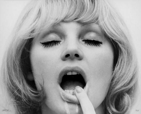
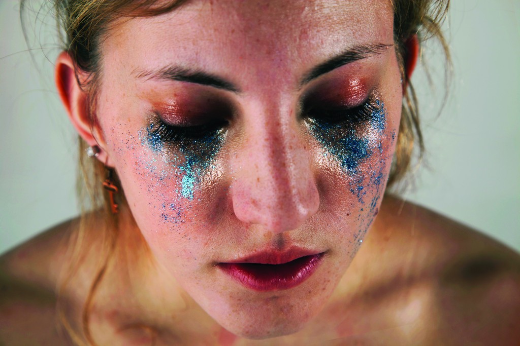
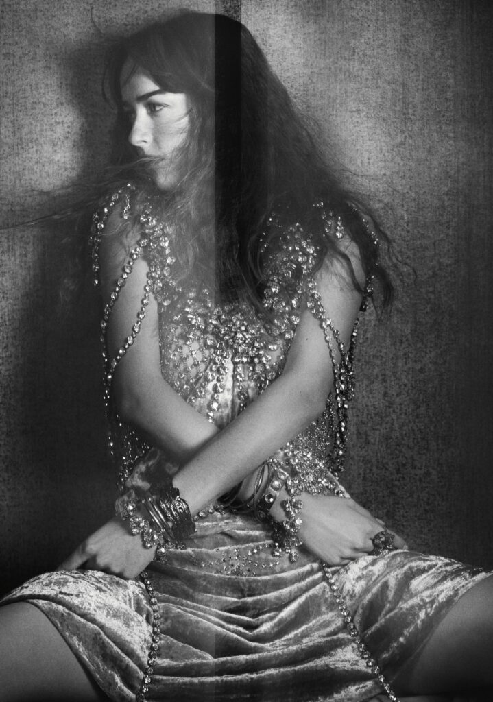
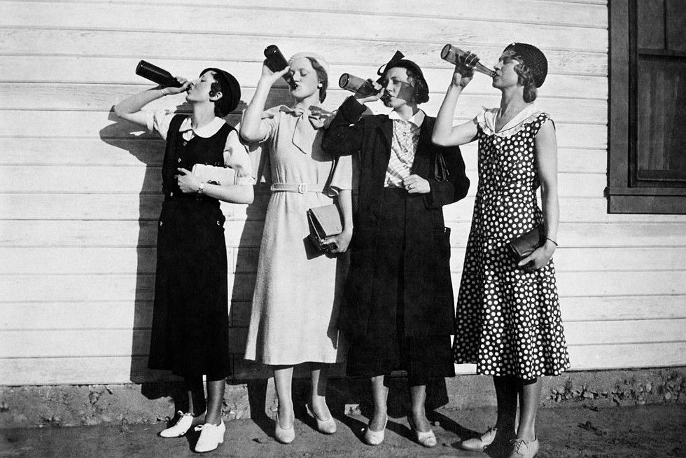
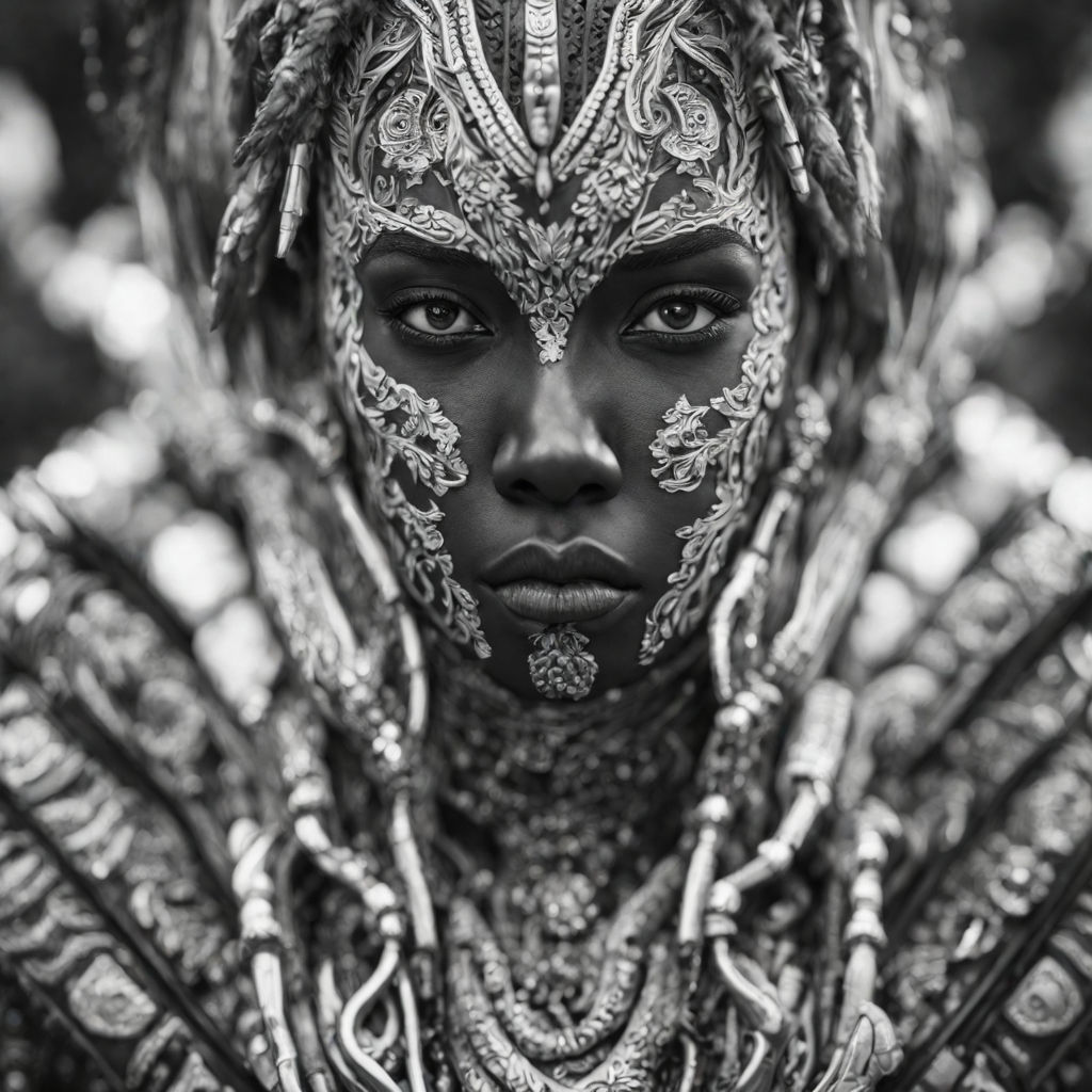
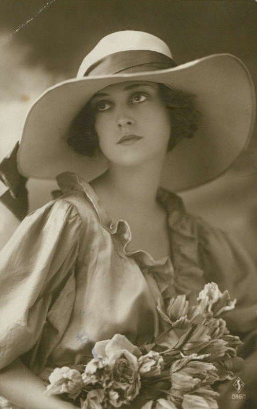
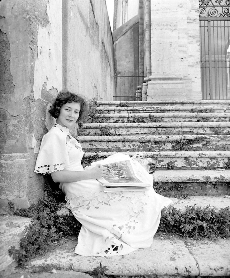
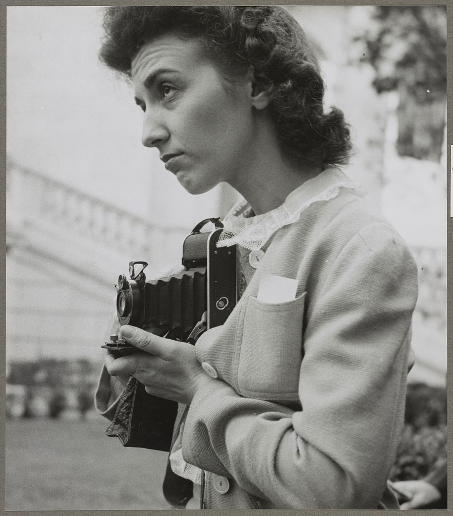
Femininity now & then
Femininity today is called modern feminism, and we would associate it with these qualities: independent, strong, confident. Traditional feminism is more focused on women fighting for their rights against men. We would associate them to be a stay at home wife or mother where they would do the cooking, laundry, and looking after children.
Masculinity
Masculinity is attitudes and behaviours that signify maleness, but can also be what we recognise masculine is. Toxic Masculinity is where men have cultural pressures where they think they have to behave in certain ways and show behaviours and traits that are controlling and entitled.

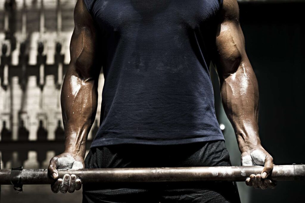
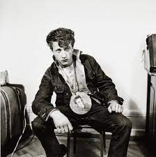
Identity
Identity can be associated by with gender, culture, social, geographical, political, stereotypes and prejudices.
Culture identity is what we recognise to be shared characteristics between a group of people whether that is religion, language, cuisine or social behaviours.
Identity Politics
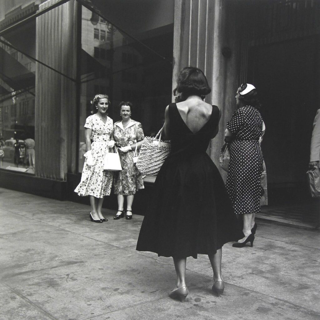
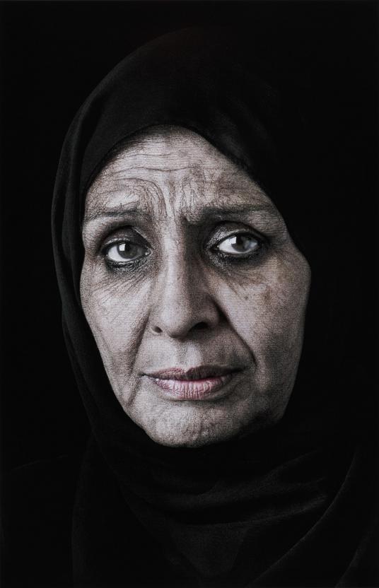
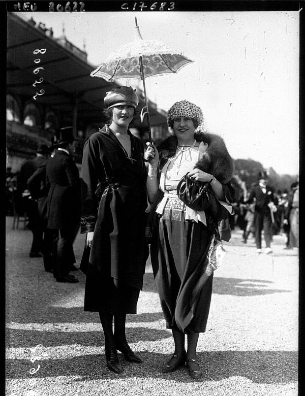
Gender, age, ethnicity, culture, social groups, are all examples of identity.
Identity politics is a term that describes politics which is based on a particular identity such as religion, race, gender, social background, class or another identifying factor form. Identity politics aim to eliminate negative behaviours towards particular groups/identities or rectifying injustices suffered by a group of people. Many social issues over the past few years — same-sex marriage, police shootings of unarmed black men, trans people in bathrooms, the fluidity of gender and trigger warnings — are all typically the kinds of issues people mean when they refer to identity politics.
Different political identities:
The groups most commonly associated with identity politics in today’s political environment center on:
An interesting reference point in this regard comes from Joe Biden’s 2020 campaign website, on which he listed 19 different identity groups for which he had specific plans. These included:
Others would point out that White conservatives or political liberals can also constitute political identity groups.
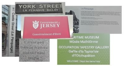
Identity Politics can also be seen in Jersey, through the local identity / language of Jèrriais. Jèrriais is the traditional language of Jersey, which is closely related to French.
It is very important to the locals of Jersey because it is a part of their heritage. Jèrriais used to be Jersey’s first language and was used during the occupation as people could speak Jèrriais without the Germans understanding, this is why it was very important. Jèrriais was used until the 19th century as a first language for the majority of the population of Jersey; even as late as the beginning of the Second World War. The reason for the decline in using this language is due to the fact that Jèrriais was banned in schools just after WW2. “There was a feeling that English was the future. It was socially desirable to bring up English-speaking children. Speaking anything but English marked you out as a peasant. People were made to feel ashamed. They were ridiculed. There was a perception amongst native Jèrriais speakers that this is our language but it’s a thing of the past. And we’ll die with it.” Jèrriais was then called ‘farmers language’ and anyone who used it was called poor or a peasant.
Before the 1960s, the majority of schoolchildren no longer spoke more than a few words as there was no Jèrriais education in schools, and by the 1980s and 90s, the language had almost completely disappeared from everyday use. Since then, a coordinated campaign has been made to bring the language back since it declined. Over the last decade, the development of an education programme has improved, which means all Jersey children can learn the language at school. By teaching Jèrriais to children we can make sure it has a future and stays a language. There are very few parents able to teach their children the language, so it’s important that it’s taught at school.
Although Jèrriais has slowly become forgotten, and few people use it as an everyday language, there’s still elements of Jèrriais all around the island. For example, it is reflected on street signs all around the island to increase the language’s visibility. This is highly linked to identity politics as people are campaigning to try and bring this language back, to allow people to communicate with a choice of English or Jèrriais. Locals think that having the choice between languages would increase a sense of belonging as an island and bring people closer as they would then have the opportunity to have something in common which is unique and only locals would be able to speak and understand the language fluently.
Culture wars are types of conflicts between groups that have different cultural ideals and beliefs. The term is commonly used to describe contemporary politics in western democracies with issues such as abortion, homosexuality, transgender rights, racial viewpoints and other cultural conflicts based on peoples views and values. Some people claim that culture wars do not describe real behaviour, or that it describes only the behaviour of a small political elite. Others claim culture war is real and widespread, and even that it is fundamental to explaining Americans’ political behaviour and beliefs.
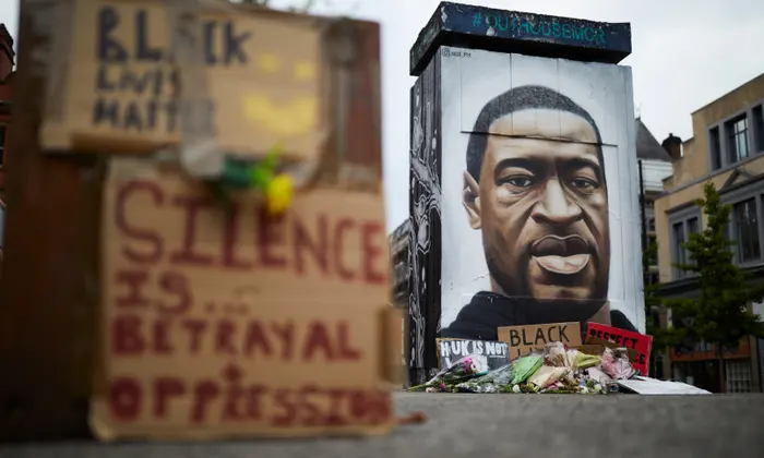
One example of a culture war is the Black Lives Matter movement, a political and social movement that seeks to highlight racism, discrimination, and racial inequality experienced by black people, and promote anti-racism. This first emerged in the Us in 2013. While the movement spread beyond the US over the following years, what really transformed it into a global phenomenon was the murder of George Floyd at the hands of a Minneapolis police officer, Derek Chauvin, in May 2020. An estimated 15 to 26 million people participated in the 2020 Black Lives Matter protests in the United States after the death of Floyd, making it one of the largest movements in the country’s history. Black Lives Matter protests have been overwhelmingly peaceful; when violence does occur, it is often committed by counter-protesters. Despite this, opponents often try to portray the movement as violent.
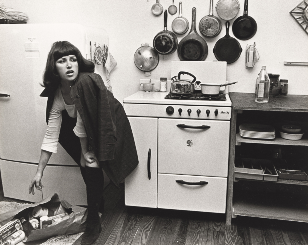
Cindy Sherman
Cindy Sherman is an American photographer, born 19th January 1954 in Glen Ridge, New Jersey, United States, whose work consists primarily of photos which depict herself in many different contexts and as various different imagined characters. Sherman usually inserts herself into a dialogue about stereotypical portrayals of women in her photographs, which resemble scenes from 1950s and 1960s films.
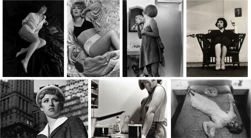
Sherman has played with the visual and cultural codes of gender and photography. Shortly after moving to New York, she produced her Untitled Film Stills (1977-1980) starting when she was 23, where she dressed up as imaginary characters and photographed herself in various settings. These around 70 Film Stills immediately became a point of discussion for feminism, postmodernism, and representation, and still remain Sherman’s best-known works.
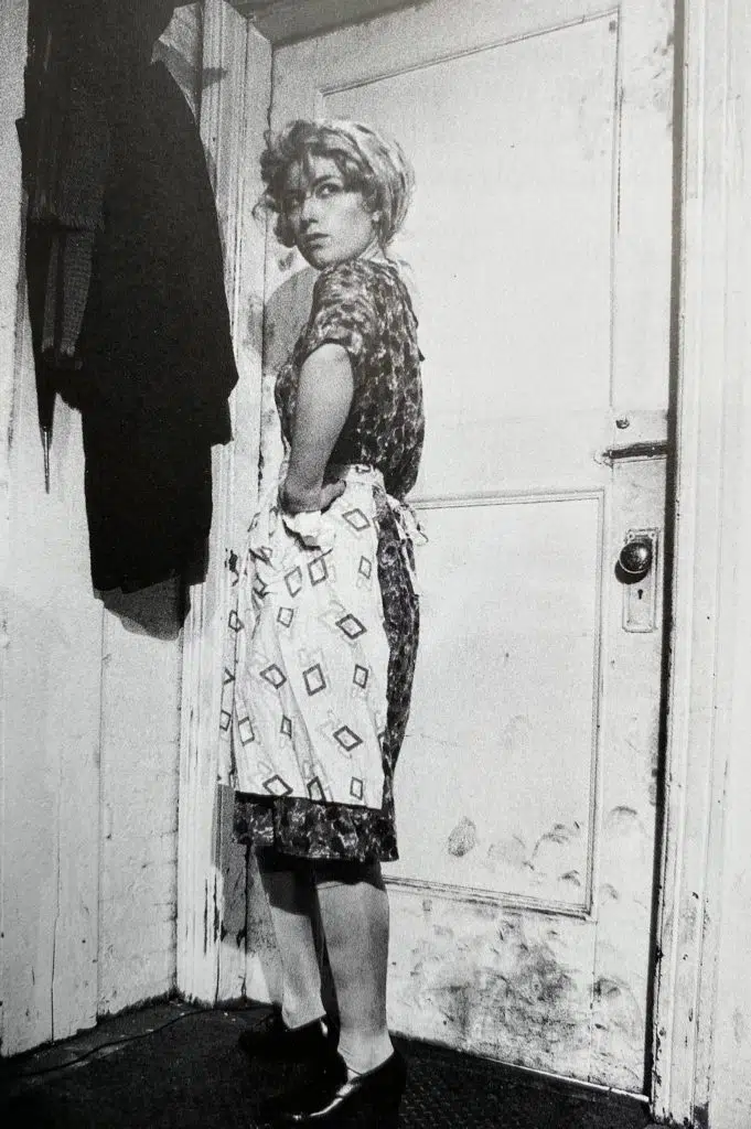
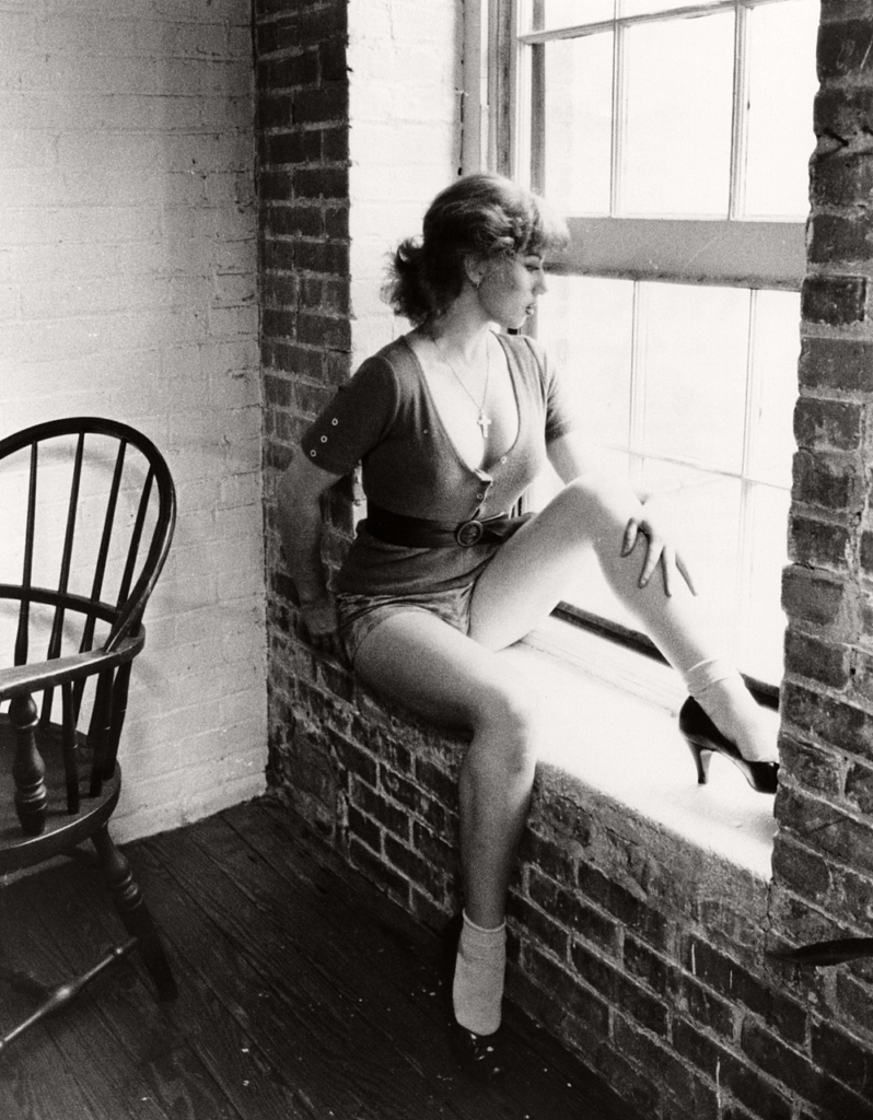
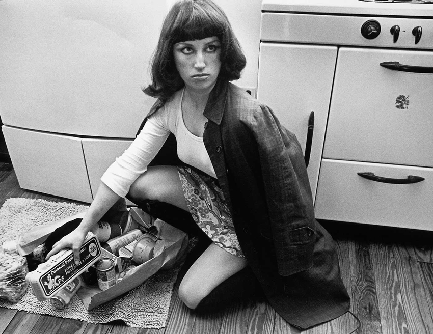
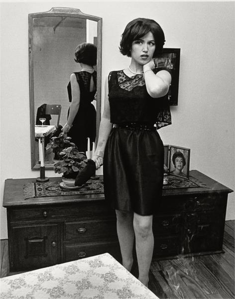
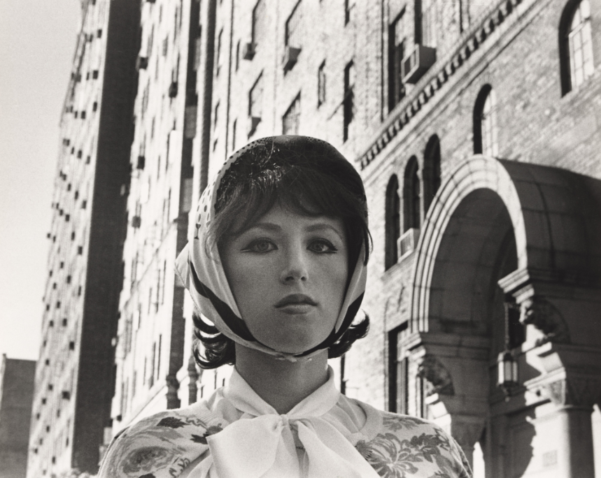
The Untitled Film Stills she produced seem to deliberately rely on female characters and caricatures in movies, and she used cinematic conventions to stage these photographs. Sherman was always interested in experimenting with different identities, she explained, “I feel I’m anonymous in my work. When I look at the pictures, I never see myself; they aren’t self-portraits. Sometimes I disappear.”
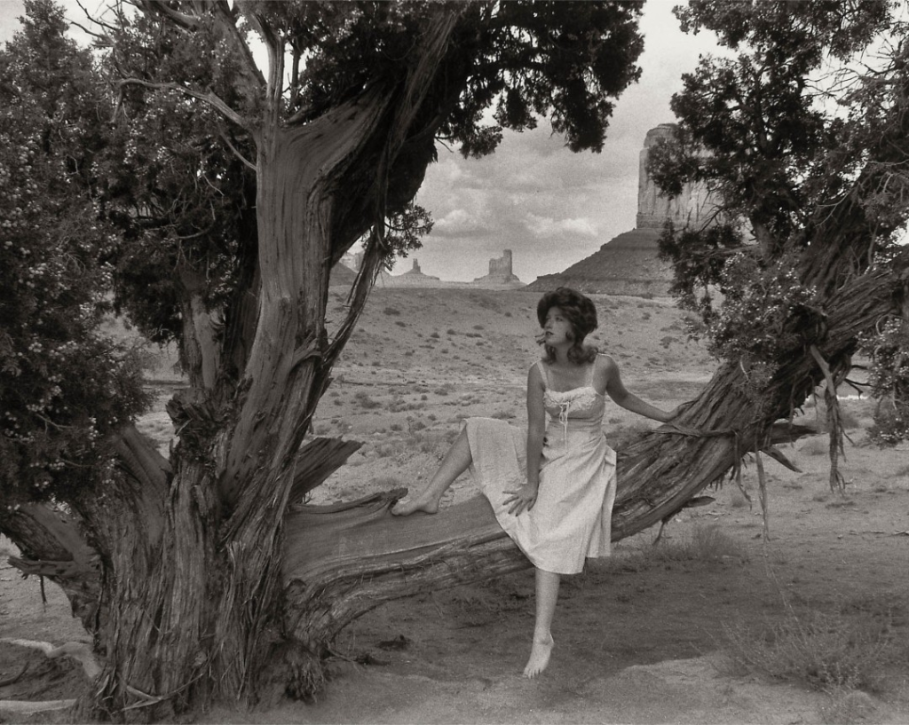
This is a film photo by the photographer Cindy Sherman. There is one subject in this photograph. The focal point is Cindy Sherman by herself in the foreground sitting outside in a light dress on a tree branch and slightly to the right of the middle, which shows me the composition follows the rule of thirds. In this image, the lighting appears to be natural daylight on a cloudy day. The midground and background features a barren desert-like landscape, with occasionally a large rocky structure, stretching far into the distance. No aspects of the photo are overexposed or underexposed, and the contrast appears to be not too strong. The depth of field is sharp so I believe the aperture is f/11, as the background and midground is clear and not blurry. The shutter speed appears to be 1/125, and the image is slightly grainy, so I believe the ISO is around 6400.
Justine Kurland
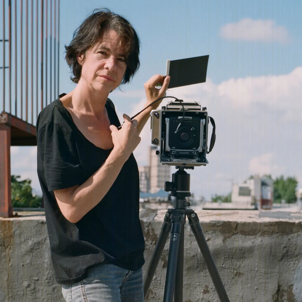
Justine Kurland was born in Warsaw, New York, in 1969, she holds a BFA from the School of Visual Arts and an MFA in photography from Yale University. She is best known for photographing subjects in American wilderness landscapes, ‘girlhood’ and her strongly narrative work is influenced by nineteenth-century English picturesque landscapes and the utopian ideal as well as genre paintings, the photographs of Julia Margaret Cameron and Mathew Brady, and illustrations from fairy tales. Kurland has used staged tableaux to explore the social landscape of girlhood, life on communes, and life in the wilderness. She collaborates with her subjects, who are real people rather than models, in selecting locations and then talks to them about the scenes and scenarios she would like them to respond to and interpret for the camera.
Kurland’s photographs are held in museums including the Museum of Contemporary Photography, the Solomon R. Guggenheim Museum and the Whitney Museum of American Art.
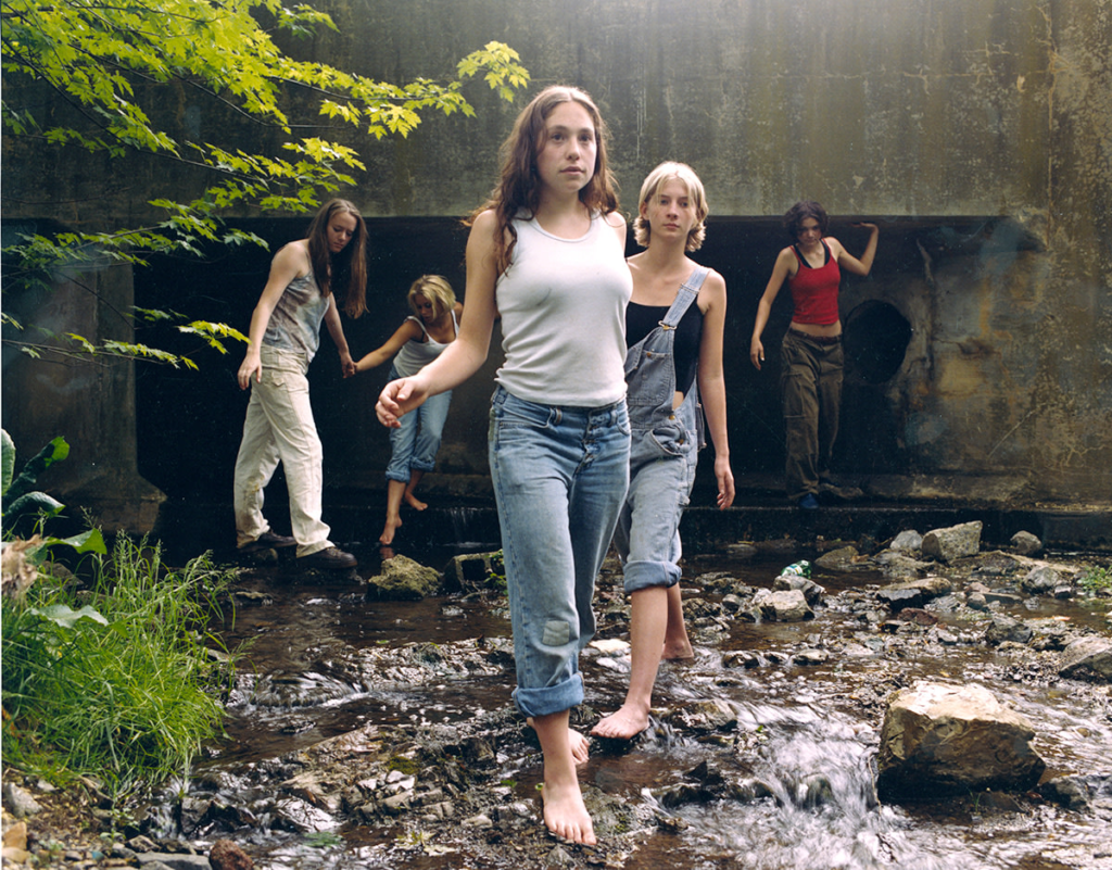
In this image you can see a friend group of girls hanging out. This imagine represents femininity/girlhood by using the group of girls innocence as a reflection of themselves exploring places, with no worries in the world.
