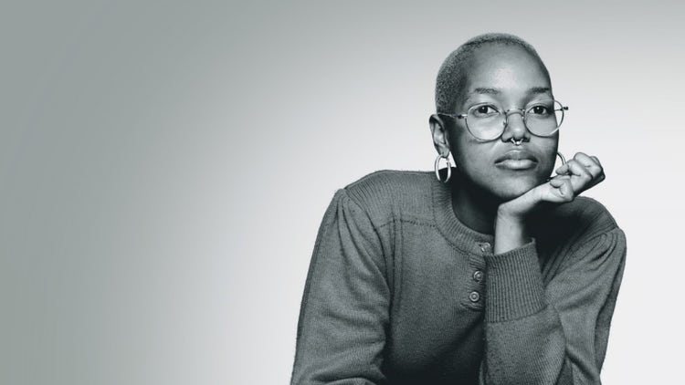
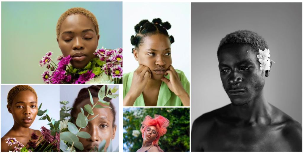
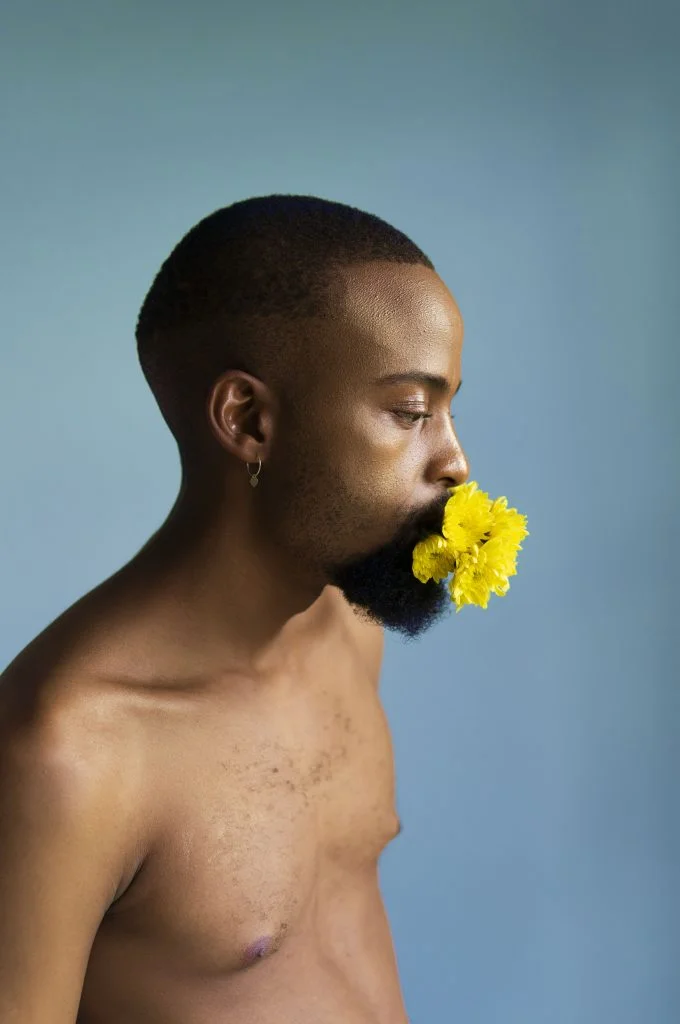
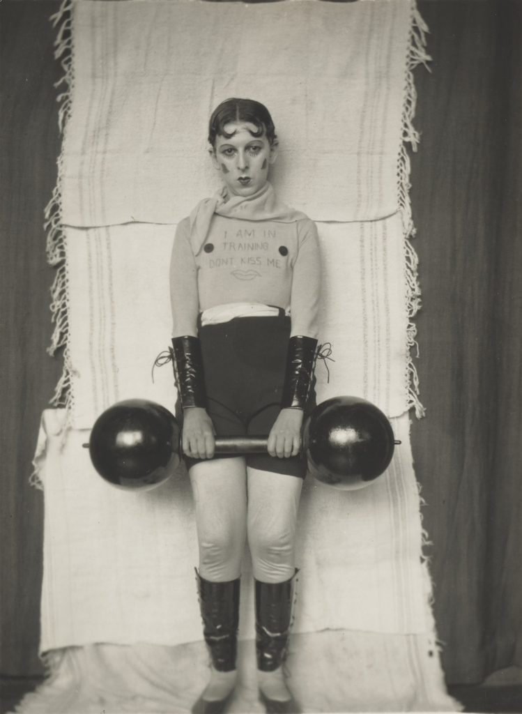
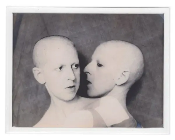
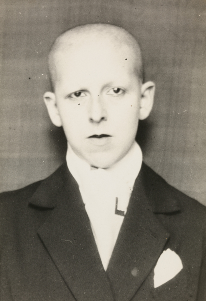
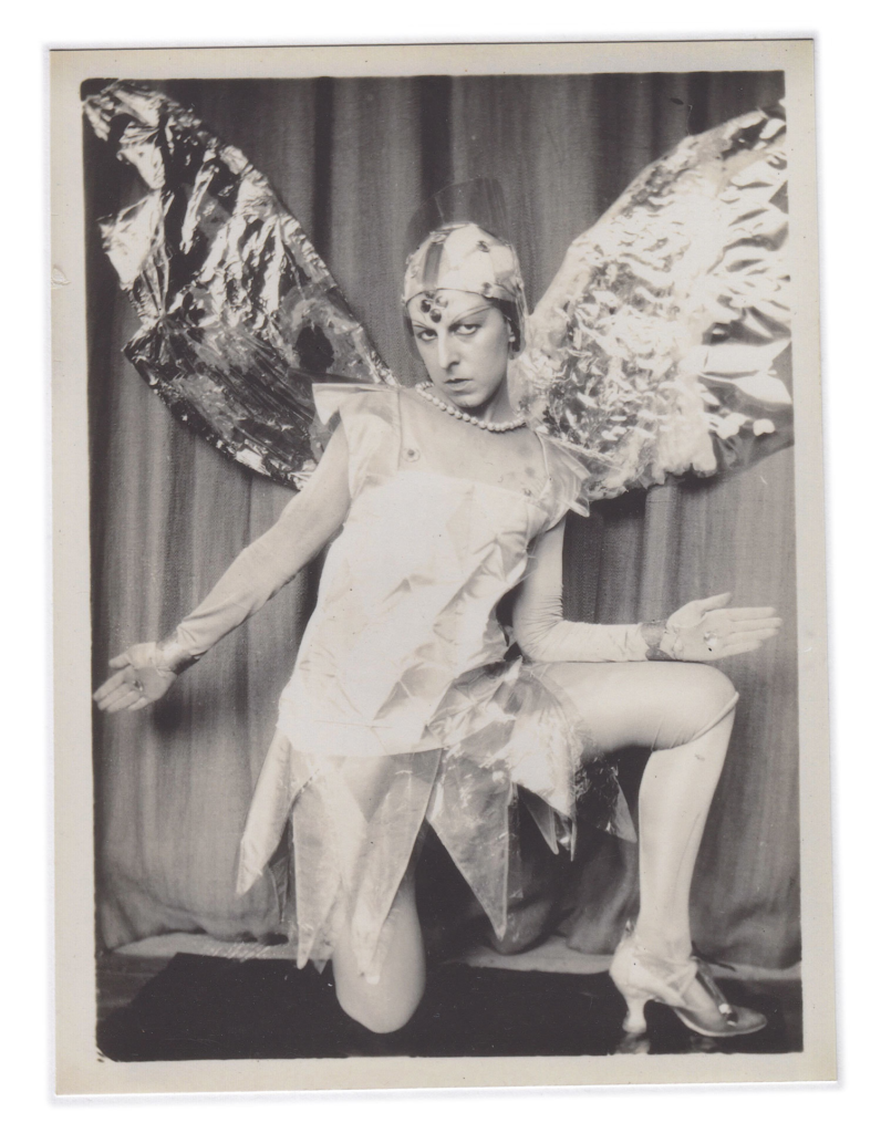
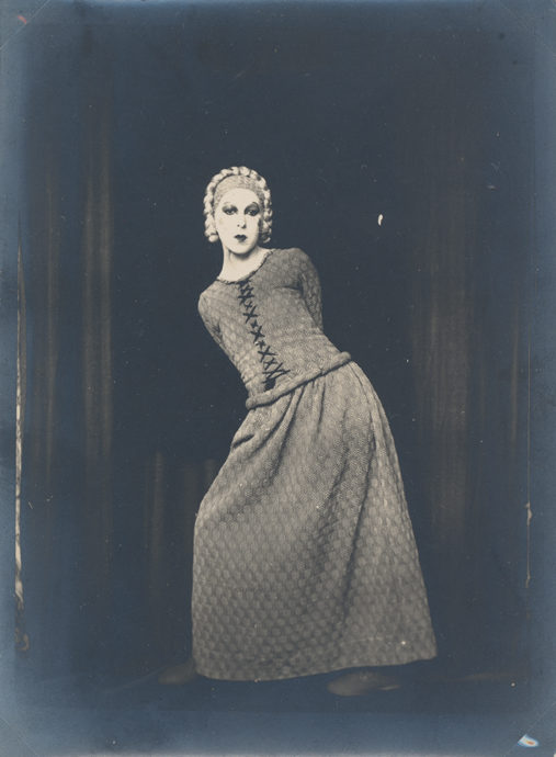
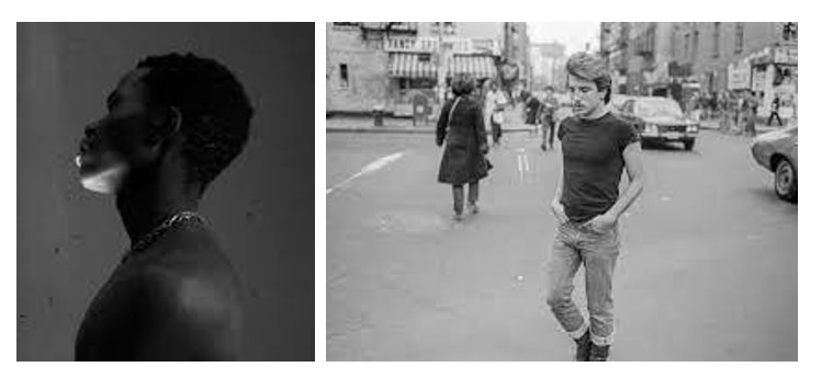
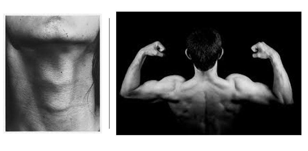
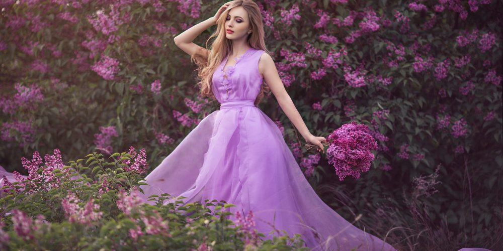
Rembrandt lighting is a technique named after the Dutch painter Rembrandt. Its the chacterised by a small triangle of light on the subject cheeks opposite the light source, creating a dramatic and shadowy effect. Its often used in portrait photography to add depth and dimension to the subjects face.
Why use Rembrandt lighting?
Many Photographers use Rembrandt lighting because it creates a dramatic and artistic effect in portraits. it involves positioning the main light, source at a 45-degree angle to the subject. creating a triangle-shaped highlight on the cheek opposite the light source. This technique adds depth and dimension to the subjects faces, accentuating their features and creating a sense of mood and atmosphere in the photograph.
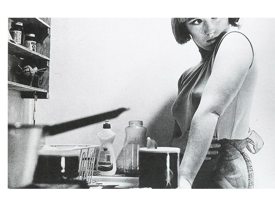
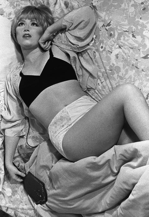
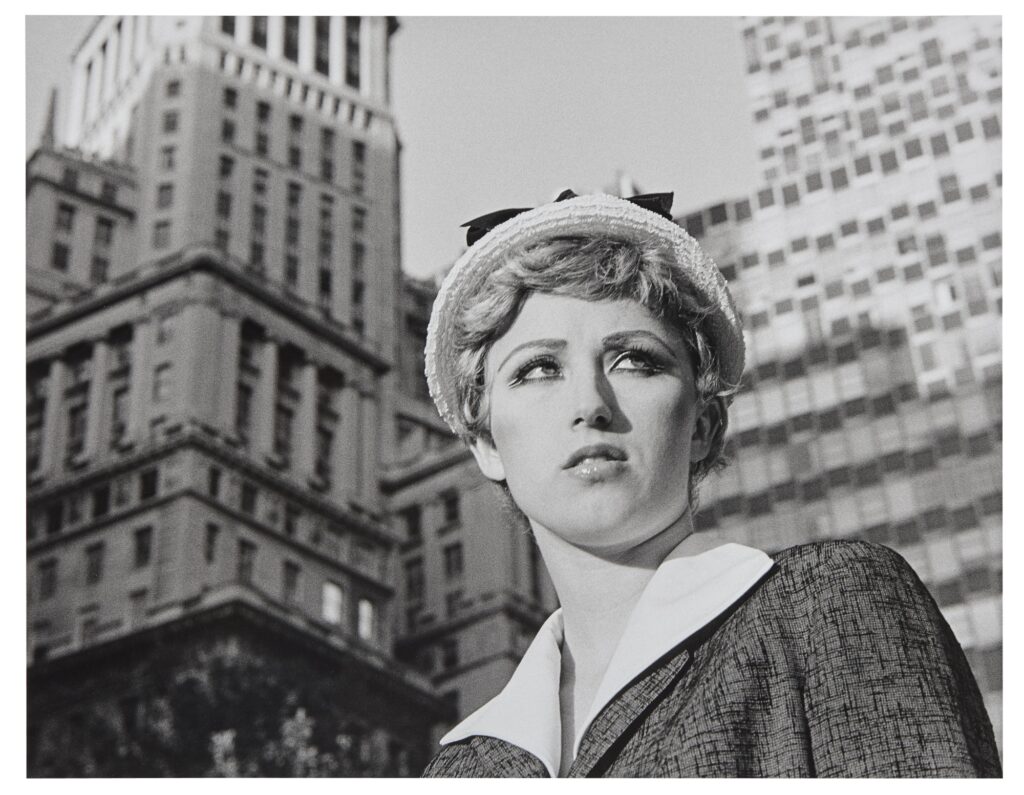
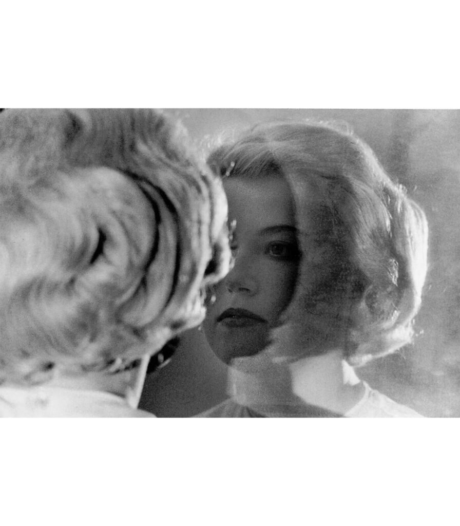
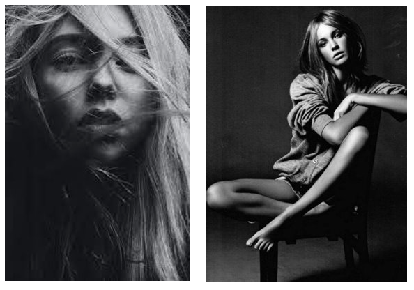
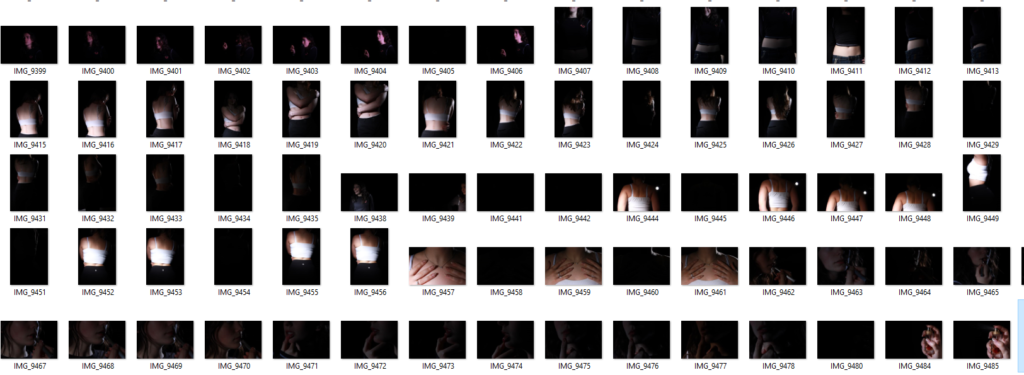
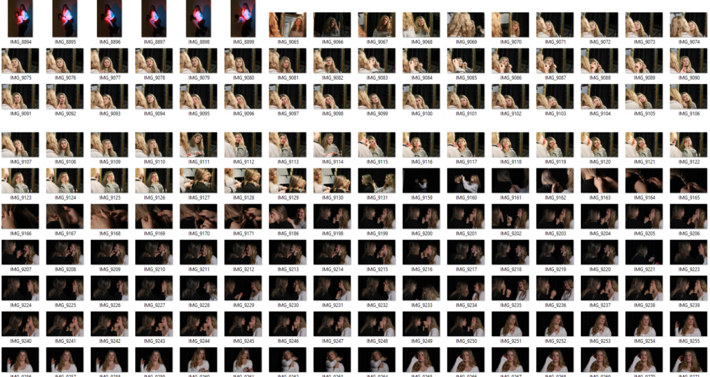
These are the photos I want to use for the Studio Portrait topic. They show a variety of different lighting techniques, like Rembrandt lighting, Chiaroscuro and butterfly technique and I think they portray my skill well overall.
Rembrandt lighting –
Rembrandt lighting is where there is a little triangle of light on the cheek ( under the eye ) of the model in the photo. This appears when the features of the model in the photo block a certain amount of light from reaching the side of the face where the light is not facing which created the triangle patch of light on the face.
Chiaroscuro lighting –
Chiaroscuro lighting is when there is only a slight patch of light that hits the face of the model in the photo. This happens when the light that hits the face comes from an angle which doesn’t disrupt the shadow on the rest of the face. This causes an orb like light hitting the face darkening everything else around it.
Butterfly lighting –
Butterfly lighting is where the light hitting the face causes there to be a butterfly shaped shadow below the tip of the nose. This happens because the light that hits the faces comes from above the models head causing the little shadow below the nose.
Editing ( photo 1 ) –
The end result I want to see in this edit is a brighter contrast between the shadows and the highlights. The lighting technique used in this photo is Rembrandt lighting as you can see the triangle of light on the far side of the face caused by the shadow of her nose.
In this edit, I obviously enhanced the highlights in this photo and changed the shadow as needs be to create a better contrast between the two. The clarity has also been brought up to show enhancements in the detail, especially in the hair.
Editing ( photo 2 ) –
For this photo, the main thing I want to do is add some light into the photo to give some contrast because currently, the photo is very dark and not well lit at all.
In this edit, I increased the saturation in the photo which is where the coloured ‘aura’ cam from surrounding the outline of me. While I did the saturation, I made sure to keep the vibrancy down to avoid having neon colours lurking in the photo. I enhanced the shadows while controlling the highlights to give a smoother transition from light to dark in certain places in the photo.
The Lighting technique used in this photo is chiaroscuro as there is only light on one side of my face instead of seeping onto the other side.
Editing ( photo 3 ) –
There is not a lot of editing I want to do to this photo but I am going to shadow my face slightly just to give more definition and dimension. Also, I am going to add a black and white hue to the photo too enhance the definition even more.
The lighting technique used in this photo is Rembrandt lighting as you can see the triangle shape patch of light on the left cheek.
In this edit, I did focus on shadows and enhancing the light for highlights. But I also enhanced the clarity, because for me, in the wrong lighting, my freckles blur and are not as defined and I want to include those in the self portraits of me.
Editing ( photo 4 ) –
For this photo, I want to give it some depth so that it looks more like a headshot photo. With that, I will have to focus on highlights and texture as well to make sure the photo keeps its detail.
With this edit, I was highly inspired by the iconic Marilyn Monroe photos that are highly saturated and very dimensioned. I added highlights on points where the natural light hit the skin and shadows where the saturation had taken away the natural ones.
Evaluation –
If I was to re do these edits, what I would do differently would be that I would focus more on how the edits may effect the photo as a whole and not just doing them quickly and without too much thought. This would improve the edits all together and boost my confidence editing and changing the original photos.
Rembrandt Lighting is characterised by the triangle of light under one eye. It uses one artificial light at a 45 degree angle to create shadows over a persons face.
Origins
Rembrandt Lighting is named after Dutch artist Rembrandt Harmenszoon van Rijn who painted portraits during the golden age. He ranged from self-portraits to animal studies with around three hundred portraits and two thousand drawings and solidified his reputation as one of the greatest etchers during his lifetime (1606-1669).
His interpreted biblical scenes were highly praised as well as representing emotions and attention to detail. He was an influential artist but not without his fair share of personal troubles which is reflected in his collection of self-portraits. He had many teachers who influenced his style of painting, mainly: Jacob van Swanenburg, Pieter Lastman, Jacob Pynas and Joris van Schooten.
Set up
A flashlight is set up at a 45 degree angle to cast shadows over the face. The angle of this light will illuminate one half of the face but not the other which creates the triangle associated with this lighting style. The nose will cast a sharp shadow while the rest of face will have lighter shading which is part of what makes this such a unique and interesting technique. This works best for headshots so the camera needs to be close to the face with a 55mm lens.
Examples
Butterfly Lighting
What Is Butterfly Lighting?
This lighting technique uses an overhead light which casts a butterfly like shape under the nose. Also known as ‘paramount lighting’ and ‘glamour lighting.’
Origins
This lighting technique earned the name ‘Paramount lighting’ from its common appearance in classic Hollywood. Paramount used this technique for every corporate image in the early days of Hollywood earning it the name. It makes the model look slimmer by highlighting cheekbones and creating shadows under the neck and also evens the face and hides wrinkles giving it its other name ‘Glamour lighting’.
Set up
The type of light can vary massively for this lighting technique however the light is always higher than model looking down on them. This ensures the shadows are under the nose, jaw and cheekbones since they are further forwards and will catch block the light.
The camera needs to placed slightly lower than models face and not above. The model needs to be in front of the backdrop so that there isn’t a shadow over the backdrop.
Examples
Chiaruscuro
What Is Chiaruscuro Lighting?
Chiaruscuro is Italian for ‘lightdark’ which is defined by a bold contrast between light and dark. Also known as ‘split lighting’.
Origins
It first appeared in renaissance paintings in Italy and Flanders however didn’t fully develop until it was associated with Baroque art. It began with drawing on coloured paper and gradually working towards whites or building up darker shades in a gradient.
It is used often in art to create a sense of volume or three-dimensional objects and in photography and cinema is typically black and white for additional emphasis.
Set up
The first of these techniques uses the flash to bounce off of white surfaces to create a soft effect. The second two use only one key light and occasionally a reflector to bounce light back onto the model.
Examples
Stylistically these types of images are typically black and white for additional contrast between the white light and the black shadows. Using light this technique can also showcase silhouettes which have interesting shapes and are unique to this type of lighting.
Loop Lighting
What is Loop Lighting?
A style of lighting where a round shadow is formed under the subjects nose, similar to butterfly.
Set up
The key light is set up at 45 degrees from the persons face and raises just above the eye line. This height creates the nose shadow similar to butterfly and the angle is similar to Rembrandt. This means that similar shadows are casted to the side of the face but not as extreme as Rembrandt so there is no defined triangle.
Types of Light
Why do we use Studio Lighting?
Studio Lighting is controlled, artificial light to achieve a specific outcome and/or style. The light will be consistent across the whole photoshoot unless deliberately changed. It also reduces the amount of post-production editing to be done. When the environment is consistent and created in a way to achieve a specific look there shouldn’t be much if any editing after because any issues can be adapted on the spot.
What is fill lighting?
A fill light is used to expose details lost in shadows. This is the secondary light in a 3 point lighting set up. It is typically set up in the opposite direction to the key light to fill in the shadows.
How do the 3 points of light differ?
this involves just one point of light known as the key light. This is the simplest type of light placement. This technique will cast dark, ominous shadows and brings drama to an image.
two points of light are typically set up at 45 degrees from the subject to illuminate the image with the key light and fill in shadows with the fill light. This softens shadows which solves some problems with one point lighting that the shadows are too dark or prominent.
Three points of light are the key light, fill light and backlight. This is used to fully illuminate a subject in a pleasing way with minimal shadows.
Studio Photoshoot
For this photoshoot we tried two set ups. First was standard Rembrandt lighting which makes up the first half of these images. They turned out really well however we didn’t have a second light on the background to make it white so it was a grey instead because the flashlight wasn’t bright enough to reach it. The second set up switched the flashlight away from the people and onto a reflective surface which still illuminated the face but didn’t reach far enough to shine any light onto the background so it was black. This one was more difficult since a lot of the time there wasn’t enough light on the face.
Occasionally we used a smaller reflective surface under the face also to lighten the eyes since they sit back in the sockets and are usually slightly overcast with shadows.
The camera was a 55mm lens at a close distance to the models. They were sat on a stool at a slight angle towards the light with their heads turned towards the camera so they weren’t front on or sat in an awkward positions.
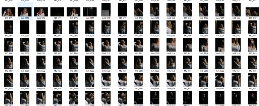
When I was sorting images I was checking that the photographs were in focus first of all. Second I was checking the placement of the model and their pose. I could crop out background to centre the person but when half the face is out of frame there’s nothing I could do. I had to make sure that they weren’t awkward also. In lots of portraits its obvious that they don’t want to be there and aren’t comfortable in front of the camera yet so they wouldn’t hold eye contact or weren’t posing in an interesting or meaningful way.
I started by flagging all focused images and marking down all the unusable ones. I then went in and used stars to rate the quality of each one. I mainly only used 4/5 star images to edit. Using green I marked all the images I considered editing and purple for the ones I wasn’t going to use.
Images
Using the same three images I also tried black and white:
Next time I will also experiment with hands and props. I tried to photograph fingers twisting hair etc but I wasn’t directing the models very well so the hands were out of shot, obscuring the face or just looked out of place. I would like to experiment with props especially when we move into full body portraits because it will give the model something to do leading them to pose easier and fell less uncomfortable. Props will also bulk up the frame a bit whereas a single person in fame could look small with some props it will create more interesting shapes and fill out space a bit more.
Studio Photoshoot 2
We used a three point lighting set up for this photoshoot. We had the key light at 45 degrees, a fill light behind and a reflector to bounce from key light.
We used flash light which occasionally didn’t go off leading to a few black shots in the photoshoot but on the whole I think these came out well. I think I’ve gotten better since the first photoshoot as I have more experience and practice. As I take more photos I will get better at directing the subjects and arranging the lighting.
As I was going through these images I was making sure that they were in focus and sharp. I used a 55mm lens at varying distances from the subjects to either get headshots, half body or full body. The subjects were all sat on a stool which was taller than the chair I was sat on so that they were framed easier and looked more important. Mainly we used three point lighting with the key light at an angle, the reflector under the eyes and a fill light on the background to make it white.
Images
This Image used butterfly lighting which created a shaped shadow below her nose and defined her cheekbones. I think this image could have benefited from not using the fill light and defining the nose shadow more. I think making this portrait black and white helped since the shadows became more defined since they’re the opposite of the whites. We drew the blinds behind her face so that the background was pure black and the key light could be directly on her face. The reflector was below her eyes to lighten them.
I used Chiaruscuro lighting for this image where the key light was pointed away from the subject and towards the reflector. This made the background black and created an overall darker Image since there was less light on the subject. In addition we kept the fill light to illuminate the hood from behind to create the outline to the left.
This portrait used just the key light and the reflector. The key light was turned away from the subject and pointed towards the reflector so that the light was too weak to reach the white background making it black. The little light that was bounced back at the subject illuminated half the face in a Chiaruscuro technique.
I framed this portrait in landscape instead of portrait because she was wearing a bulky coat which I wanted to be fully in frame. I used loop lighting with both sides illuminated creating a dark stripe down the subjects face. This stripe obscures her eye and creates a moody look. The fill light is to the left of her face which breaks up the shadow while the key light is reflecting to light up her right.
This image was made with Rembrandt lighting to create a triangle over her cheek. I kept this image in colour because I like the difference from all the previous portraits and I think all the colours worked well together. The portrait was also lit much brighter than the previous few so it didn’t look as moody and so wouldn’t fit black and white because it would need more prominent shadows to avoid looking grey.
Presentation
I plan to group three black and white images into a triptych and keep the other two separate. This is because I think all three are similar and compliment each other well.
Final Images
I tried two arrangements using just the three portraits: one vertical, and one horizontal. The vertical arrangement makes the centre portrait look too big in comparison which is disproportionate especially since the landscape ones have wider framing and make the subject look even smaller in comparison. I do think that the smaller gap between the images looks better though. The horizontal arrangement is better proportion wise however in this one makes the centre portrait look squished.
To combat these issues I created a grid with all four. Initially I wasn’t sure about this arrangement since the hooded image doesn’t have a face and mightn’t of fit with the others. All of them use a different type of lighting however I think these portraits sit well together anyways because they all use the same editing and the same subject. None of the images look squished or too big because there is one landscape and one portrait frame on each level which evens it out.
Virtual Gallery
I downloaded a blank virtual gallery background off of google after setting filters for a large size so that I could edit on it photoshop. I then opened up the images on top of it and changed their perspectives if needed. I added a drop shadow bellow the images to match the backgrounds lighting.
Evaluation
Each time I used the studio I think the quality of my photographs increased. This is why all the final Images are from the second photoshoot as opposed to a mixture with the first since the quality of each portrait was overall better. I tried each type of lighting and there was at least one good example for each although next time I will focus on Rembrandt to get a sharp, large triangle because I only got small soft triangles. By experimenting with the position of the key light I managed to create two completely different styles of portrait; the black and white one where the key light is pointing away, and the coloured one where there is lots of bright and directed lighting.
I need to try and get more light into the eyes by using a reflector because they look quite dark in some of the images. To do this I will use a reflector close under the eyes and pointing at an angle as opposed to being completely flat. This will bounce lots of light up into the sockets which sit slightly back in the face and therefore don’t usually get well illuminated. I would also like to get more creative with my portraits because a lot of these images are rather basic with plain white light and deadpan angles.
In most cases we can make use of natural or available / ambient light, but we must be aware of different kinds of natural light and learn how to exploit it thoughtfully and creatively;
intensity of the light
direction of the light
temperature of the light (and white balance on the camera)
making use of ‘the golden hour’
Using reflectors (silver / gold)
Golden hour- Seen as the best time to shoot, because the lighting is warm and soft, which enhances shots of landscapes, nature and more.
Artificial/ Studio Lighting
Using artificial lighting can offer many creative possibilities;
the size and shape of light
distance from subject to create hard / soft light
angles and direction, high, low, side lighting, filtered light
camera settings : WB / ISO / shutter speed etc
reflectors and diffusers
key lighting, fill lighting, back lighting, 1,2+3 point lighting
soft-boxes, flash lighting, spot lights and floodlights
Rembrandt lighting, butterfly lighting, chiarascuro
high key and low key lighting techniques
backdrops and infinity curves
long exposures and slow shutter speeds
Rembrandt Lighting
Rembrandt lighting is a technique for portrait photography, named after Rembrandt Harmenszoon van Rijn, the great Dutch painter. It refers to a way of lighting a face so that an upside-down light triangle appears under the eyes of the subject.
In Hollywood in the early 20th century, the legendary film director Cecil B. DeMille introduced spotlights to create more realistic effects of light and shadows into the ‘plain’ studio lighting setup that was generally in use. Rembrandt lighting is one effect that was created by this, and it became widely used in promotional photographs of film stars showing them in a dramatic and eye-catching way. An example of these film stars is Marylin Monroe and Keanu Revees;
Why use Rembrandt Lighting?
Rembrandt lighting is used to create shadows and contrast, and the ‘triangle of light’, beneath someone’s eye. This causes an element of drama and psychological depth onto the individual, who’s photo is being taken. Rembrandt lighting is an effective device to draw the eye. However, you can do this in many ways in photography, such as depth of field, leading lines, negative space etc. In portraiture, the eyes of your subject are nearly always the main point of focus. The triangle of light, placed just below the eye on the shadow side of the face, will increase the emphasis and the viewer really will be ‘drawn in’ to your image.
How to create Rembrandt Lighting set up?
Light: Lighting styles are determined by the positioning of your light source. Rembrandt lighting is created by the single light source being at a 40 to 45-degree angle and higher than the subject. Use cans use both flashlights and continuous lights.
Lens: Use a 35mm or 50mm if space is at a premium, or if you’re looking at including more of the subject than just the head and shoulders. A 50mm works really nicely for portraits and will give a nice depth of field if you’re shooting at a shallow aperture. But a 35mm will give you a wider point of view and is great to fit more of the body in of your subject.
Examples of Rembrandt Lighting
This photograph is using Rembrandt lighting, with hard lighting.
This photograph is using Rembrandt lighting, but now with soft lighting.
Butterfly Lighting
Butterfly lighting is a type of portrait lighting technique used primarily in a studio setting. Its name comes from the butterfly-shaped shadow that forms under the nose because the light comes from above the camera. You may also hear it called ‘paramount lighting’ or ‘glamour lighting’.
What is Butterfly Lighting used for?
Butterfly lighting is used for portraits, because it is a lighting that flatters almost everyone, as it can highlight cheekbones and create shadows under them, as well as under the neck, which makes the model look thinner. This makes it the most commonly used lighting setups. This lighting has also been used for famous stars, from classic Hollywood and that’s why it’s also called Paramount lighting.
Lighting: Butterfly lighting requires a key light that can be a flash unit or continuous. If continuous, it can be artificial or natural. In other words, you can use strobes, speed lights, LEDs or even the sun. A butterfly lighting effect refers to the setup and not to the quality of light – it can be soft or hard light depending on the effect you want. If you want to create a soft light, you’ll need to use modifiers. A beauty dish is perfect for glamour photography as it distributes the light evenly and smooths the skin. You can also use a softbox or an umbrella. Instead, if you want to have hard light, you can leave the light source as it is. Alternatively, you can use grid spots to direct it and create different effects.
Experimentation: Once you have the key light set up, it’s time to fill the shadows. You can use a reflector to bounce the light back up and soften the shadow under the chin and the one from under the nose. To do so, position the reflector under the subject’s face. Start at waist level and see how it looks. If the shadows are still strong, move it closer to the face and so on. Experiment with different positions to achieve different effects. You can also change the colour of the reflector. A white one will give you a neutral tone, while a golden one gives a warming overcast. Once you’re happy with your butterfly lighting, direct the model to have a striking fashion pose or whatever the desired pose or expression you’re looking for. Just keep in mind that the subject’s face needs to be towards the light in order to have the butterfly shadow under the nose.
Examples of Butterfly Lighting
Chiaruscuro
Chiaruscuro is a visual element of art, which is defined as a bold contrast between light and dark. It is called chiaruscuro, because it is an Italian word meaning lightdark. A certain amount of chiaroscuro is the effect of light modelling in painting where 3-dimensional volume is suggested by highlights and shadows. It first appeared in 15th century painting in Italy and Flanders (Holland), but true chiaroscuro developed during the 16th century, in Mannerism and in Baroque art. Dark subjects were dramatically lighted by a shaft of light from a single constricted and often unseen source was a compositional device seen in the paintings of old masters such as Caravaggio and Rembrandt.
Chiaruscuro in Film
Film noir, which is French for Black Film, is a cinematic term used primarily to describe stylish Hollywood crime dramas, particularly those that emphasize moral ambiguity and sexual motivation. Hollywood’s classic film noir period is from the early 1940s to the late 1950s. Film noir of this era is associated with a low-key black-and-white visual style that has roots in German Expressionist cinematography, while many of the prototypical stories and much of the attitude of classic noir derive from the hardboiled school of crime fiction that emerged in the United States during the Depression.
Chiaruscuro in photography
Chiaroscuro lighting uses one key light and a variation using a reflector that reflects light from the key light back onto the sitter.
Examples of Chiaruscuro
The photograph on the left is the Flagellation of Christ is a painting by the Italian Baroque painter Caravaggio, now in the Museo Nazionale di Capodimonte, Naples. It is dated to 1607. This painting uses chiaruscuro lighting. The photo on the right also uses chiaruscuro and is by Johannes Vermeer and is called The Girl with the Pearl Earring, 1665.
These two images are examples of chiaruscuro lighting being used in a film.
These three images are examples of chiaruscuro lighting being used photography.
‘Chiaroscuro’ is an Italian term for lightdark as this lighting technique creates a bold contrast between light and dark. This can also be defined as a high-contrast lighting technique that utilises a low-key lighting setup to achieve contrast between the subject and a dark background. This form actually originated in paintings during the 15th century in Italy and Holland (Flanders), yet this was truly developed a century later in Mannerism and Baroque art.
Today, it is prominently used in film-making due to the striking and dramatic images this technique produces. This form of lighting adds a sense of mystery to the characteristics of the subject, making their features become framed and draw attention to the viewers eye in places they would not normally see.
Caravaggio and Rembrandt used this in their paintings where dark subjects would be dramatically shined on by a shaft of light.
In film, this is typically referred to ‘film noir’ (French for black film). This was used to describe stylish Hollywood crime dramas, particularly those that emphasize moral ambiguity and sexual motivation, lasting from the early 1940s to the late 1950s. This is associated to German Expressionist cinematography due to the low-key, black and white visual that it produces. The drama and mystery that the lighting unfolds reflected the aims of the Hollywood crime dramas.
THE SET UP:
In photography, these are produced by using one key light and a variation using a reflector that reflects light from the key light back onto the sitter. The reflectors colour can be changed to produce a different tone onto the subject.
Using flash, there are a range of possibilities as, depending on how you want the images produced, you can create images in low or high lighting scenarios through:
flash “bouncing”
fill-in flash
TTL / speedlight flash
remote / infra-red flash (studio lighting)
fast + slow synch flash
light painting c/w slow shutter speeds
For example, flash “bouncing” softens the effects and creates a larger fill area. This must be done on white walls or ceilings as the flash is directed either to the side or above the subject.
These are all the photos I have chosen to edit, because they are my best photographs of environmental portraits. These are my best photos, because they have the most interesting environments and have the best composition. These are also my clearest and least blurry photographs, as the camera was focussed when taking them.
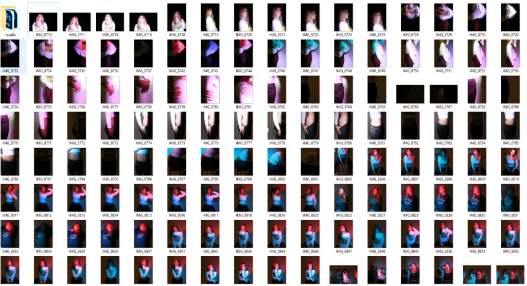
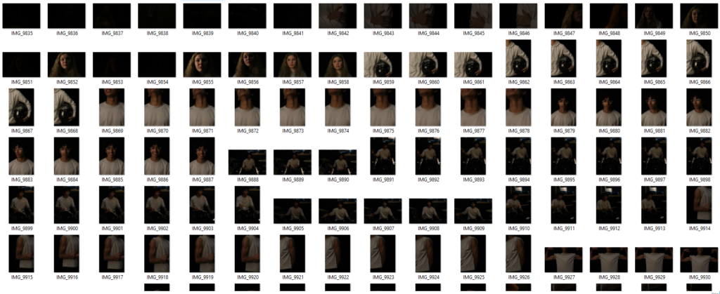
These are all the photographs I have taken for environmental portraits and the photos highlighted green are my best photos, which have been edited.
Edits
I edited this photo to make it more vibrant and to make the individual stand out more and be the main viewpoint of the photograph, by blurring the background. I edited this photo by increasing the contrast, shadows, whites and vibrancy, while decreasing the exposure, highlights, blacks, clarity and dehaze.
I also created a black and white version of this photograph, so it had more contrast and black and white tones.
I chose to edit this photo, because it has the best composition and the individual is using her hands to pose, which adds an element of her character into the photograph.
I edited this photo to make it more vibrant, so it attracts the viewers eye and makes the environment for this environmental portrait more interesting. I did this by increasing the contrast, shadows, texture, clarity and vibrancy, while also decreasing the blacks and the dehaze.
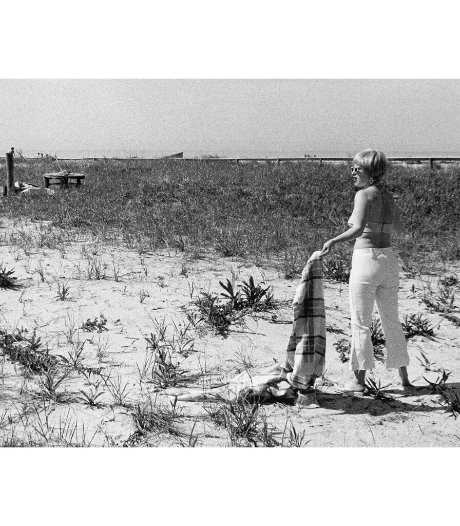
I chose this photograph, because it has an interesting environment, which we can learn a lot about the individual through.
I edited this photograph, to make it brighter and more vibrant, by increasing the contrast, texture, clarity and vibrancy, while decreasing the highlights, shadows, whites and blacks.
I chose to edit this photo, because it has an interesting environment, which we can learn a lot about the individual through. We can also perceive from her pose and smile that this is her natural environment as she feels comfortable in it and is also happy in this environment.
I edited this photo to make it brighter and more vibrant, by increasing the exposure, contrast, highlights, texture and vibrancy, while decreasing the shadows, whites, blacks and clarity.
I also edited a black and white version of this, so that the two individuals would be the main viewpoint and focus of this photograph.
I chose to edit this photo, because I was experimenting with having more than one person in my environmental portraits. I also chose this photo, because the two individual used their hands to pose, with them on their laps, which presents to the viewer about their personality.
I edited this photo to give it a more warm lighting, so the photograph was more clear and in focus. I did this by increasing the contrast, shadows, whites and vibrancy, while also decreasing the exposure, highlights and blacks.
I edited this photo to also give it warmer lighting, so the photo and the individual were more clear. I did this by increasing the exposure, contrast, shadows, whites and vibrancy, while decreasing the highlights and blacks.
I chose both of these last two photographs to edit, because they had good composition and had an interesting environment. I also chose this last photo, because of the use of the prop, which shows that this individual is in this environment that much, that he even comes here on his birthday.
Conclusion
In conclusion, I think this photoshoot went well, as I experimented with taking environmental portraits of one person, or with more than one person. I also experimented with different poses using the individuals hands and I experimented with props. I also experimented with editing black and white pictures.
Butterfly lighting is another technique of lighting in portraiture. It gains its name from the dark shadows surrounding the cheekbones on the face alongside the butterfly-shaped shadow underneath the nose. You may also hear it called ‘paramount lighting’ or ‘glamour lighting’ as this can be seen to be used within cinema or fashion magazines for example. This type of lighting is extremely flattering to the face, from the shadows underneath the cheekbones making the apples of the cheeks highlight and stand out more, which explains why it is used in these instances.
Used especially to photograph Hollywood classics, this technique can make the eyes look larger and the subject look slimmer.
The butterfly lighting was first used by Josef von Sternberg in the 1930s. He was a Hollywood director who is most known for his work with Marlene Dietrich. Sternberg used butterfly lighting to create a sense of mystery and allure around Dietrich’s character. This kick started butterfly lighting’s use in portraiture.
THE SET UP
Butterfly lighting requires a key light that can be a flash unit or continuous. If continuous, it can be artificial or natural. In other words, you can use strobes, speed lights, LEDs or even the sun so it is a very flexible form of lighting. As long as the light is coming from behind the photographer, above the subjects head then it will produce these results. The subject must be towards the light to capture this effect.
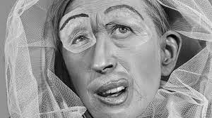
This technique can produce hard or soft light depending on how you want your results. To create soft light, you can use modifiers such as a beauty dish. This distributes the light evenly across the face and smooths the skin alongside any imperfections. Alternatives to this is a soft box or an umbrella. However, if you wish to create hard light you can either leave the light source as it is or even use grid spots to direct it to create different effects to make it even more creative.
Once you have decided what you are aiming for, you can use reflectors in order to bounce the light back up and soften the shadows under the chin/nose so they aren’t extremely harsh. By placing the reflector of your choice under the subjects face, you can identify whether the shadows are still too strong and move it closer, or further away if they are too weak and experiment with it.
The colour of the reflector will achieve different effects as it can change the tone of the subject’s face. For example, a white one will create a neutral tone whilst the gold one will give a warming overcast.
There are three main types of lighting: Rembrandt, Butterfly and Chiaruscuro. They each include different forms of direction, intensity and temperature of lighting which alters the size and shape onto the subject. Also, different toned reflectors can be used to change the temperature or direction of the light.
REMBRANDT LIGHTING
Rembrandt lighting is typically used in portrait photography and gained it’s name from Rembrandt Harmenszoon van Rijn, the great Dutch painter.
It consists of using one light and one reflector (or two lights), instantly creating shadows and contrast. This specific technique creates a triangular shape under the subjects eye which increases the emphasis of drama to the viewer. This draws them in because the eyes are the main focal point in portraiture and something that can take on many forms and show emotion.
This makes a more appealing image as it has a creative side to it – it isn’t just general light on the face and exposes the features of the face more.
The set up used.
Creating a Rembrandt lighting set up:
The lighting depends on its position to the subject. In this case, it must be 40 to 45-degree angle and higher than the subject. Flashlights and continuous lights are the correct ones to use.
Depending on how much of your subject you are aiming to shoot, you should use a 35mm or 50mm if you’re looking at including more of the subject than just the head and shoulders. However, 50mm will give a nice depth of field.
Arnold Newman was born March 3, 1918 in New York City. He studied art under a scholarship at the University of Miami, from 1936 to 1938. He died in New York City on June 6, 2006. Newman was generally acknowledged as the pioneer of the environmental portrait, he is also known for his still life and abstract photography, and he is considered as one of the most influential photographers of the 20th Century.
Newman began his career in photography in 1938 working at chain portrait studios in Philadelphia, and immediately began working in abstract and documentary photography on his own. Newman is often credited with being the first photographer to use so-called environmental portraiture, in which the photographer places the subject in a carefully controlled setting to capture the essence of the individual’s life and work.
Newman is often known well by being the photographer who articulated and who consistently employed the genre of environmental portraiture; a well known example being his portrait of Igor.
Arnold Newman, Igor Stravinsky 1946
Newman normally captured his subjects in their most familiar surroundings with representative visual elements showing their professions and personalities. Newman’s best-known images were in black and white, although he often photographed in colour. His 1946 black and white portrait of Igor Stravinsky seated at a grand piano became his signature image. It shows the reality of what Igor Stravinsky does. The image is simple but shows depth and feeling towards his interests. The most important parts to this image is him, and his piano. His facial expression is serious, which could suggest how seriously he takes playing the piano. The way the piano is much bigger than him, and the fact the lid of the piano looks like a music note, may suggest how much music plays a big part in his life. Black and white represents death and life.
This picture is also in black and white. The image is focused on his face with a blurred background making his facial expressions stand out. The use of shadows could represent hidden meaning. The contrast from shadow to light show the dark and light side of human life.