The theme for the final exam in photography is ‘Union’..
What is the simple definition of union?
1. : an act or instance of uniting or joining two or more things into one. especially : the formation of a single political unit from two or more separate and individual units.
I am going to start my project based around feminism and girlhood.
What do the terms mean by feminism and girlhood?
Feminism in Photography focuses on challenging gender stereotypes and how women are portrayed.
It includes:
Reclaiming the female gaze, where women are shown from their own perspective, not just as objects for male viewers/pleasure.
Challenging gender roles and depicting women in complex ways rather than just sexually.
Body politics, exploring themes like body image and how we are depicted compared to men.
Famous feminist photographers’; Cindy Sherman, who focuses on issues like identity and self-representation.
Girlhood refers to the period of a girl’s life, focusing on her experiences, development, and social identity as she grows up. It’s not just about biological growth but also the social expectations, challenges, and roles associated with being a girl in society.
The term often explores themes like:
Social conditioning, where societal norms influence how girls are expected to behave, look, and interact.
Gender identity, examining how girls develop their understanding of themselves and their place in the world.
What’s the history behind this concept?
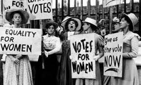
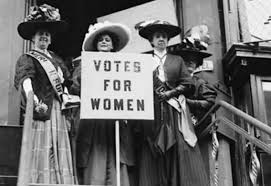
Historically, girlhood was defined by unspoken societal roles, with girls primarily prepared for domestic life as wives and mothers, often with limited education (cooking and cleaning for their husbands and kids, stay at home mums). In the late 19th and early 20th centuries, feminism and the women’s rights movement began challenging these traditional views, advocating for girls’ education and opportunities outside the home, you could even start to think about the suffragists were by they were the ones who fought for women to have the right to vote, pushing back against old-school ideas about what women could and couldn’t do. They made a huge impact, and their efforts set the stage for today’s movements that focus on empowering girls and women, helping them claim their rights, get an education, and have a voice in the world. Here are some images from the suffragists protest.
Feminism is still a big fight in today’s world, with protests and social media being powerful tools for change. A good example of this is the #MeToo movement, where women can share their stories about sexual harassment or assault online. By speaking out, they not only help others who might relate but also inspire more people to come forward and raise awareness about these issues.
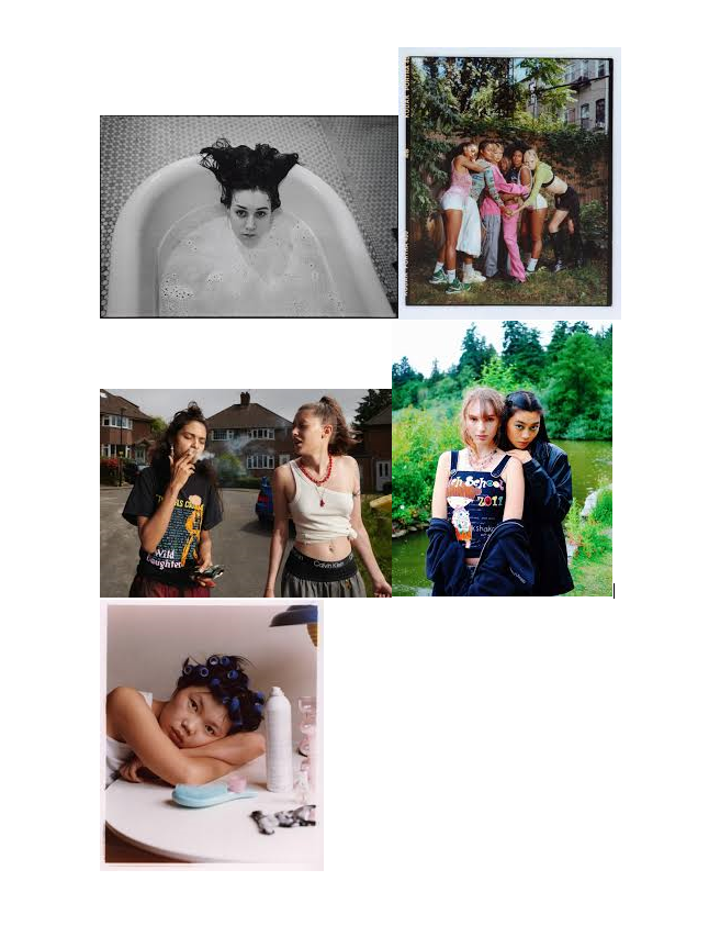
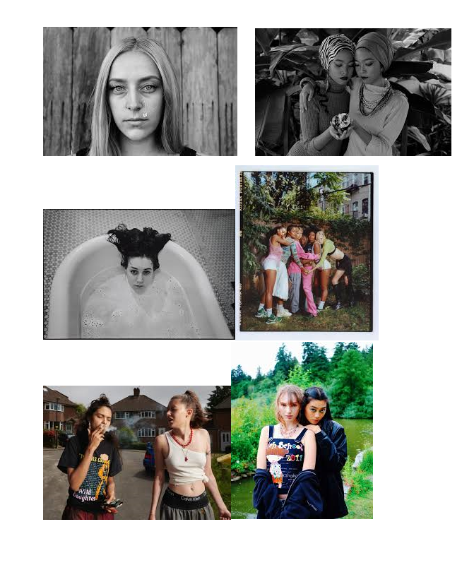
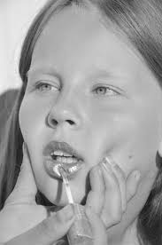
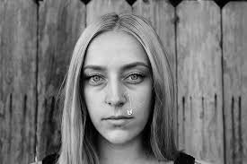
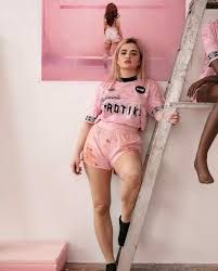
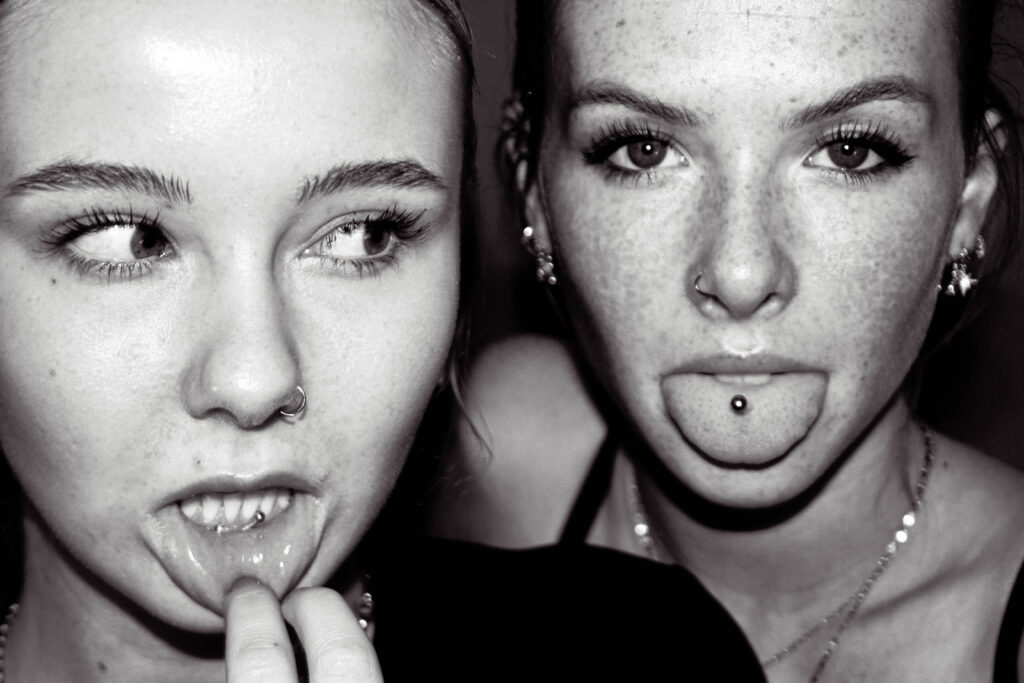
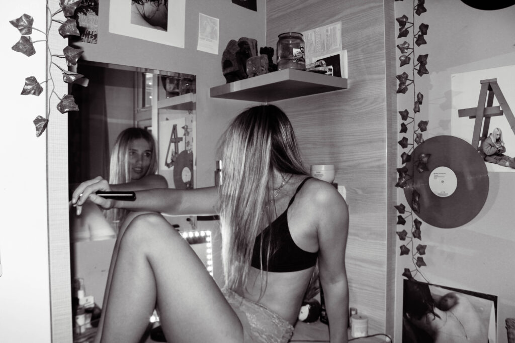
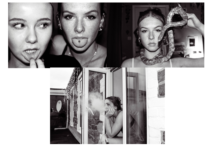
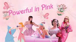
I want to create images like these..
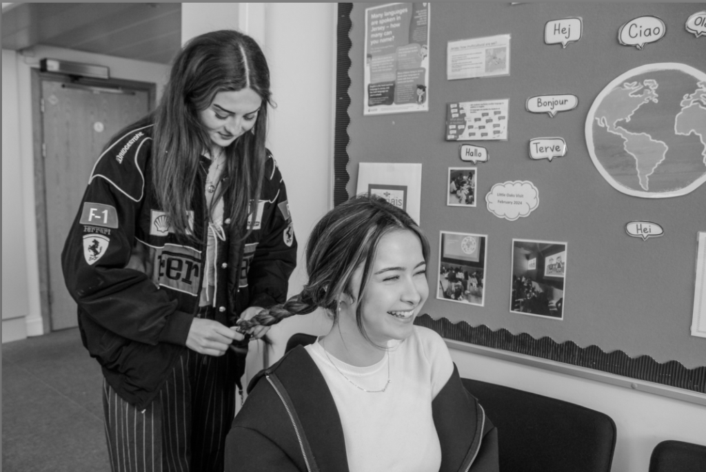
These images all show how girls are portrayed and grown, not just by men but by women too. I want to try and challenge these ideas and try put a stop to this as it shouldn’t be seen as the norm anymore and we should be moving forward as a society. This is why I have chosen to girlhood and fermium for my union project as we can all be seen as a group/union and we all need to stick together as one.
Photoshoots
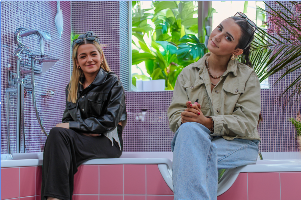
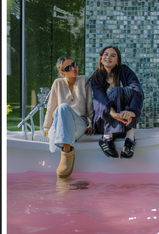
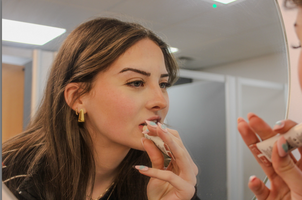
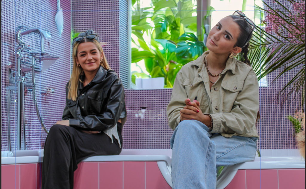
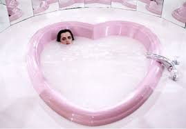
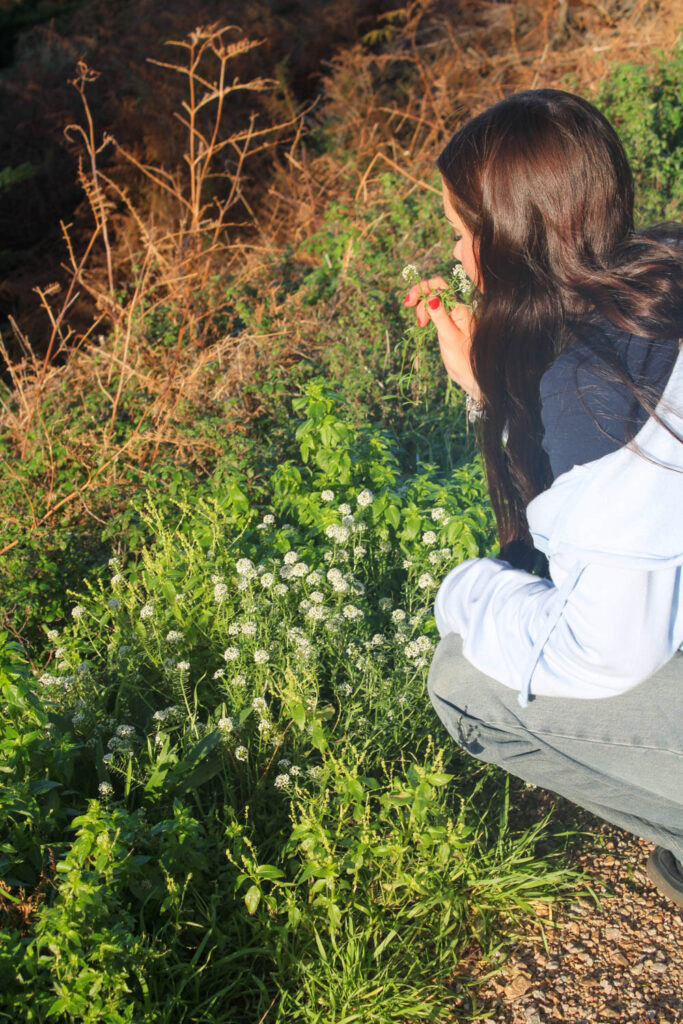
For my photoshoot plan/idea, I am going to start to have a think about these areas. bathroom/bathtub The bath feels like freedom to me, candles, bubbles and relaxing.
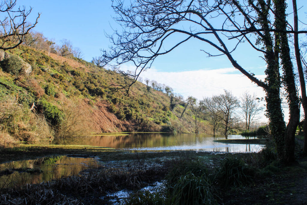
Les Quennevais Park: A simpler, more personal place. I imagine shots of a model sitting on a swing, walking barefoot in the grass. These moments feel real—like when we’re alone with our thoughts, reflecting on who we are.
Woods:
This gives the feel of girlhood back in the day, with there camping and swimming in lakes. I want to capture every element I can for my project
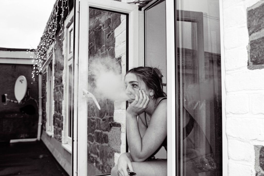
The Look & Models: I want the models to feel like themselves—natural and effortless, something that doesn’t feel too forced. I’d love to include different women of various ages, body types, and backgrounds because femininity looks different on everyone, and that’s the beauty of it.
Vibe & Feel: I want the photos to feel like a conversation—gentle but empowering, vulnerable but strong. I’d play with natural light, capturing both quiet, intimate moments and bold, freeing shots. It’s about showing the different sides of being a girl and a woman.
In the end, this project is about connection. Between women, between ourselves, and between our past and present. The locations, the models, the light—all of it should tell a story of unity, growth, and strength.
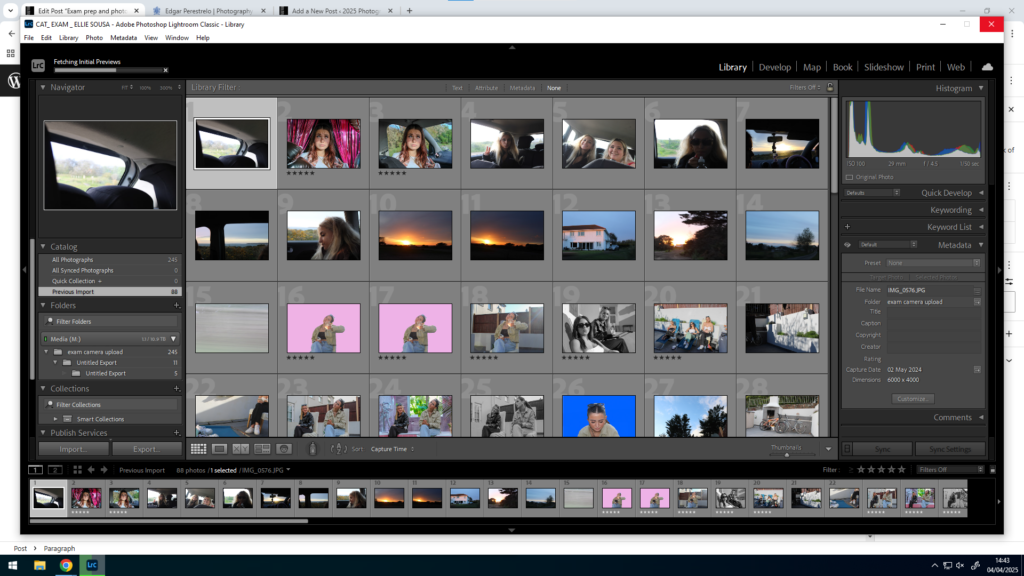
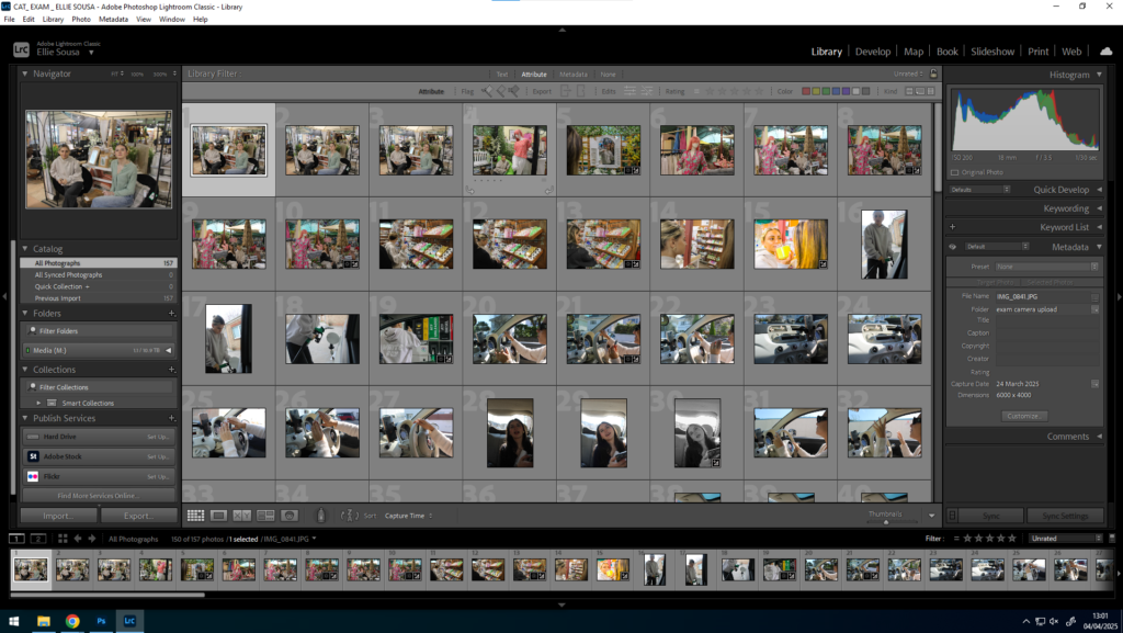
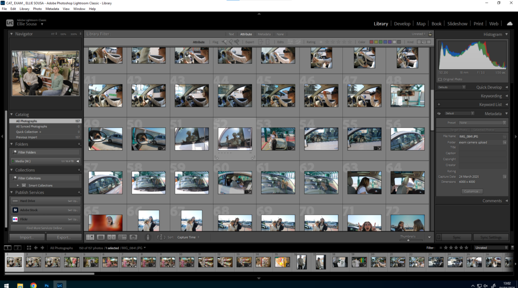
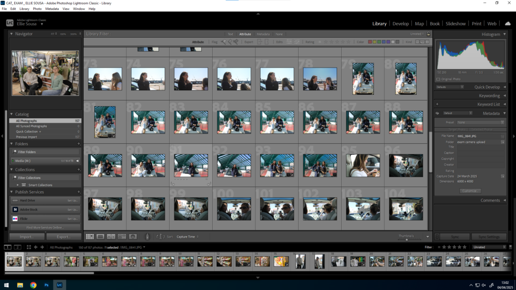
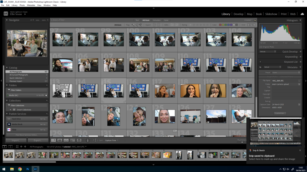
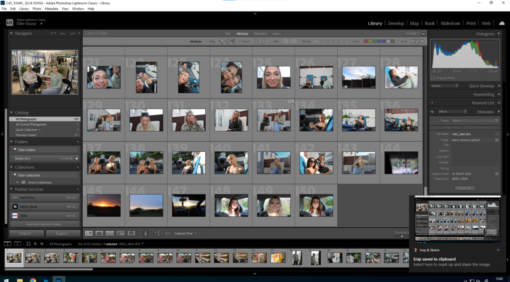
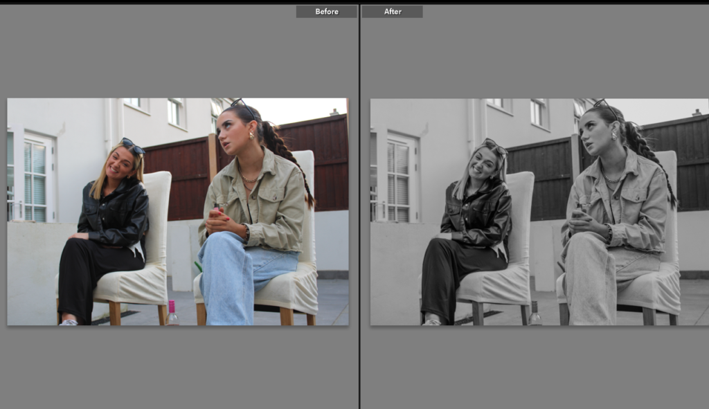
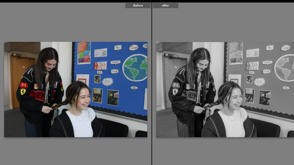
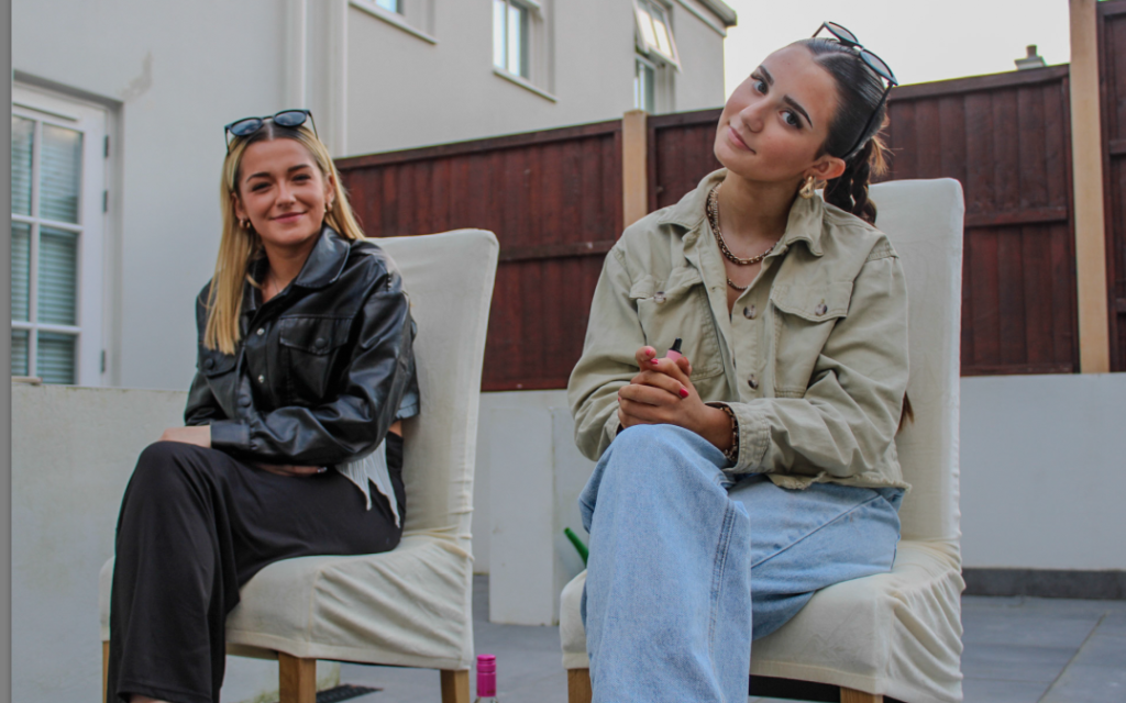
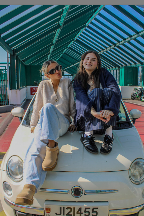
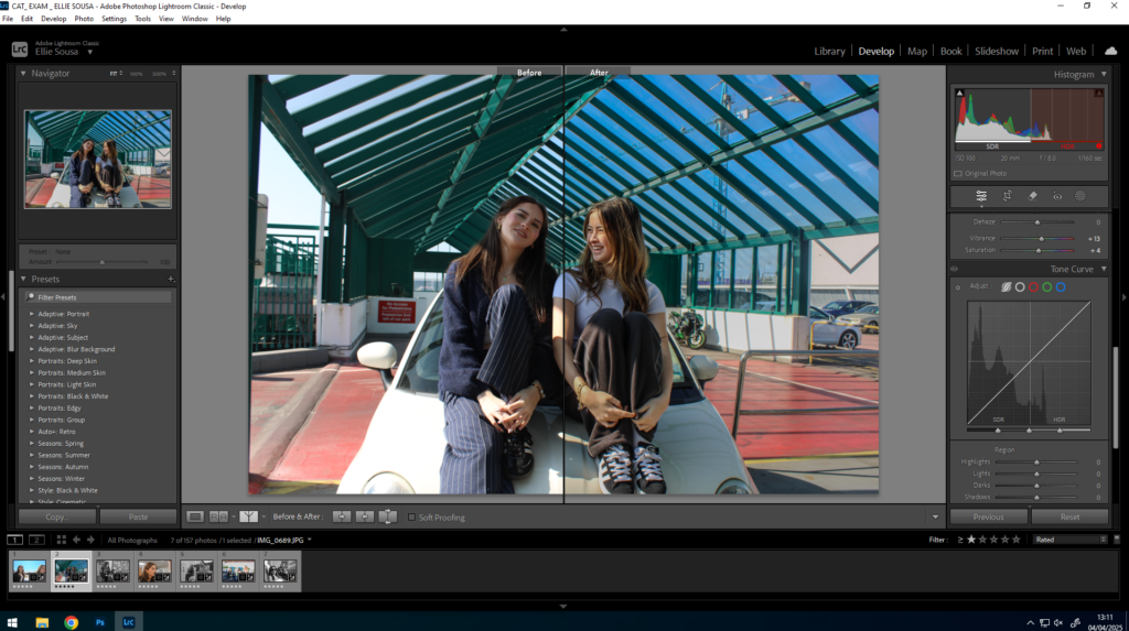
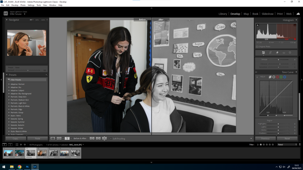
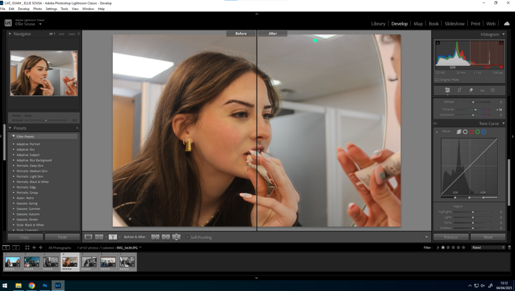
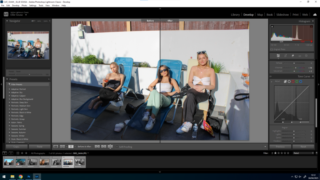
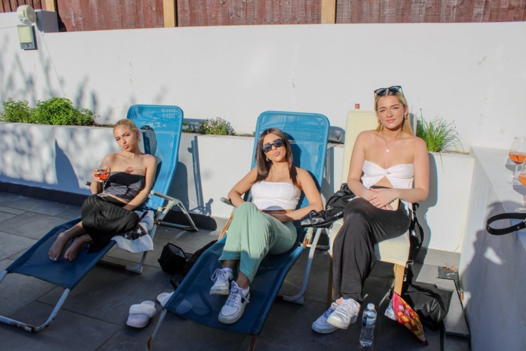
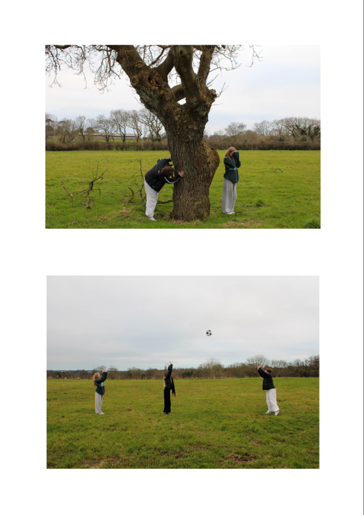
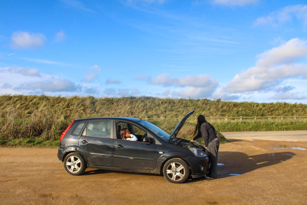
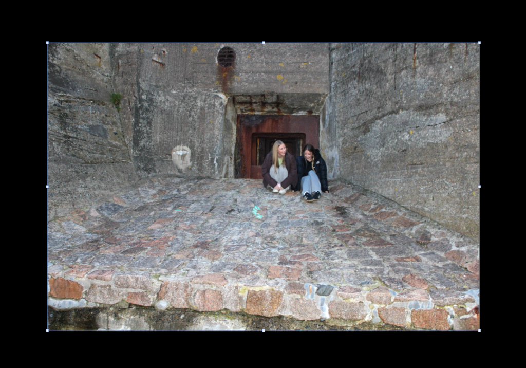
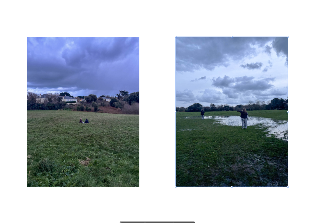
For these images I went to various different places, such as Corbiere, my garden, garden centre, car park, mine & my friends car and the beach. I took a range of different images and ill upload some before & after.
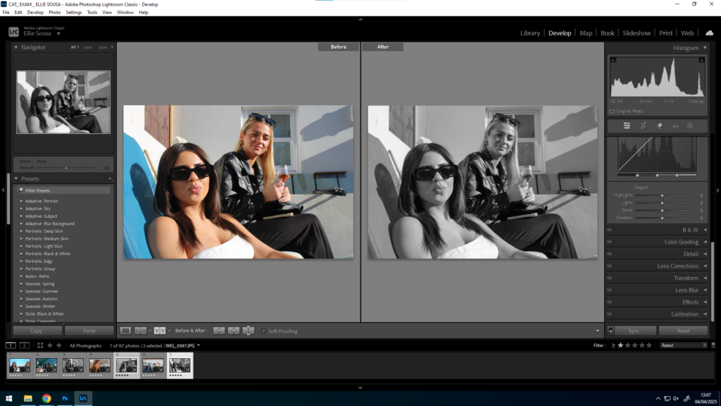
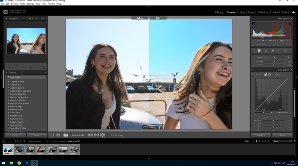
Here are some of my favourites images that I developed and edited using light room and Photoshop.
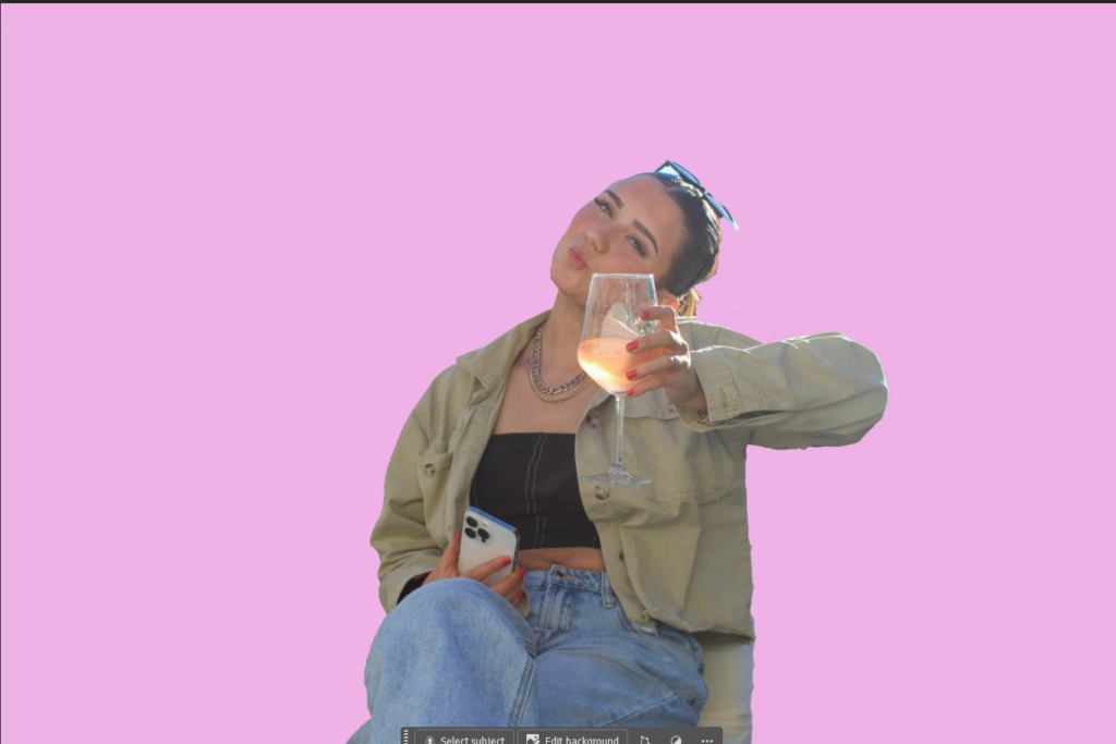
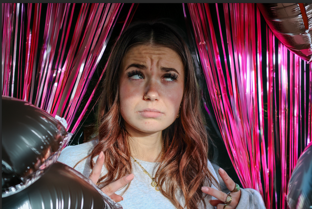
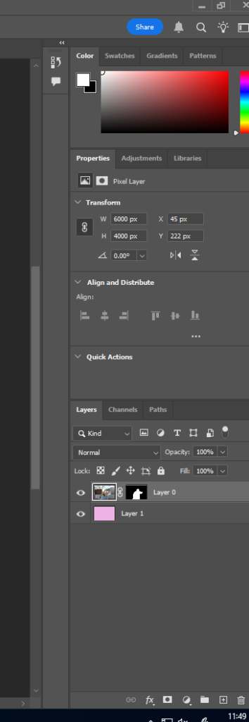
Image 1 – Large. For this image I used photoshop and cut out the whole background, made it all pink then went in the rubber to tweak any imperfection’s. G1
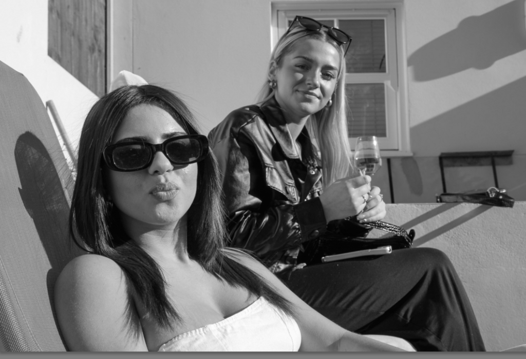
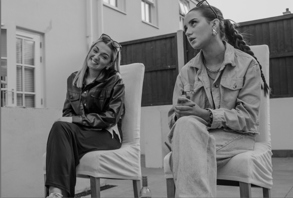
Image 2 – Small. For this image I used Lightroom to adjust/ tweak any minor issues with the image. I then changed the image into black and white. G2
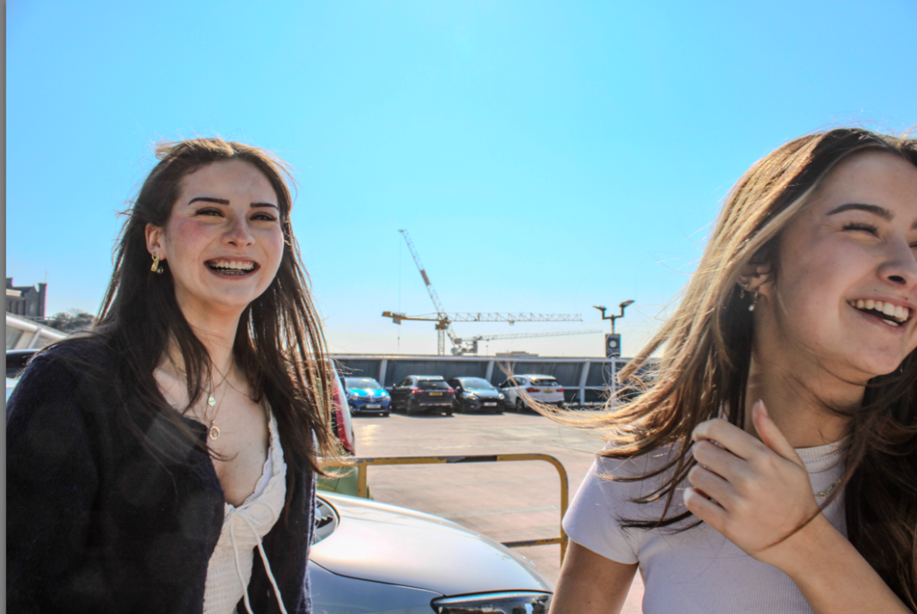
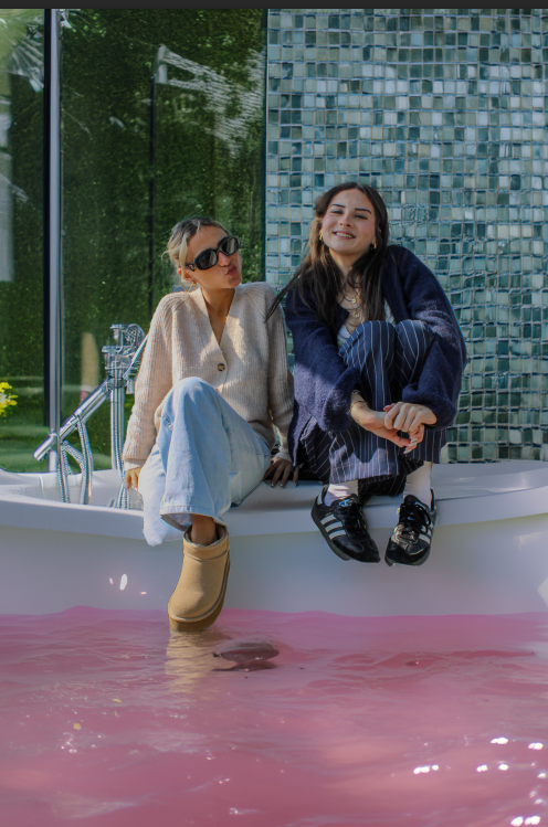
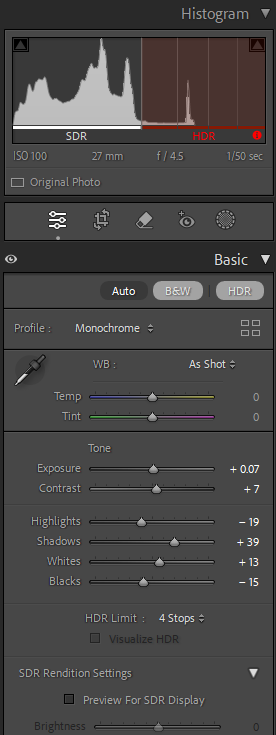
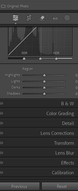
Image 3 – Medium. For this image I also used Lightroom and i included HDR for a better/ vibrant approach. G3
Image 4 – Medium. I used Lightroom for this image and tweaked out any imperfections. G3
Image 5 – Small. For this image I used Lightroom to adjust/ tweak any minor issues with the image. I then changed the image into black and white. G2
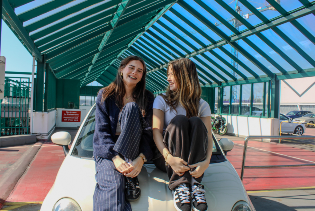
Image 6 – Medium. For this image I used Lightroom too. G3
Image 7 – Large. For this image I used photoshop and got a background and places it behind the two girls. G1
Image 8 – Medium. For this image I used Lightroom and HDR. G3
Image 9 – Medium. For this image I used photoshop and got a background and places it behind the women. G1
Image 10 – Large. For this image I used photoshop and got a background and places it behind the girls. G1
Image 11 – Small. For this image I used Lightroom to adjust/ tweak any minor issues with the image. I then changed the image into black and white. G2
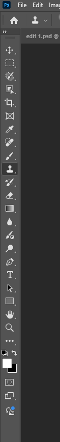
Here are the tools that I used to create my final images for Lightroom and photoshop.
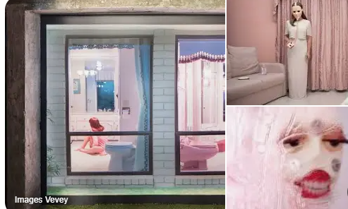
Juno Calypso is a British photographer and visual artist renowned for her dramatic, sexualised self-portraits that are feminine explorations of loneliness, beauty, and the complexities of human relationships. Her genre combines elements of art, surrealism, and filmmaking, and as such, she is the perfect reference guide for photographers interested in experimenting with staged photographs and edited images, you never actually understand what she is trying to uncover.
Calypso’s photography is identifiable due to her distinctive aesthetic choices and the way she edits her images. Some of the most significant visual elements are:
Pastel and Neon Colour Schemes – Her images often feature pale pinks, greens, and blues, which create a nostalgic atmosphere.
Cinematic Lighting – She is careful with her lighting to enhance mood, often adding soft glows. A lot of her shoots are staged in retro-like environments, such as old hotels, beauty salons, or home situations, adding to the glamorous feel of her photographs.
Themes in Her Photography
Juno Calypso’s work goes beyond the visual, discussing deeper themes with regards to modern womanhood and self-discovery, which is what my project is all about.
Construction of Femininity – Through makeup, wigs, and staged photographs, she investigates how femininity is created and performed in society and she somehow finds a way to relate it all to girlhood just because of her images.
Isolation and Artifice – Her models (often herself disguised) are presented as isolated, artificial figures, raising questions about beauty standards, self-reflection, and personal space. She makes her self look fake, almost giving element’s of hyperreality.
Surrealism and Satire – Her work often has a satirical or eerie undertone that leaves the observer questioning whether they are observing things as they truly appear or why they are the way they are.
Exam start
Union and Connection – While Calypso generally presents individuals isolated, she also examines tension between connection, especially in social or romantic relationships. Her photographs sometimes present the concept of union as she relates many different “strange” you could say perspectives and real life ones too.
Conclusion
Juno Calypso’s photography is a masterclass in marrying substance and beauty. Whether you adore her surreal storytelling, her powerful use of colour, or her contemplative themes, learning from her can be an excellent means of elevating your photographic aesthetic to the next level. Adopting her technique of staging, lighting, and performance can lead you to create powerful and captivating images that make an impact on real life and photography too.
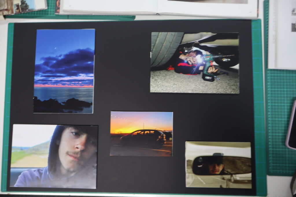
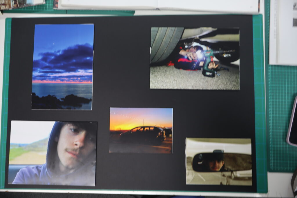
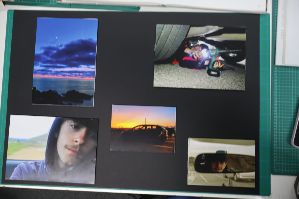
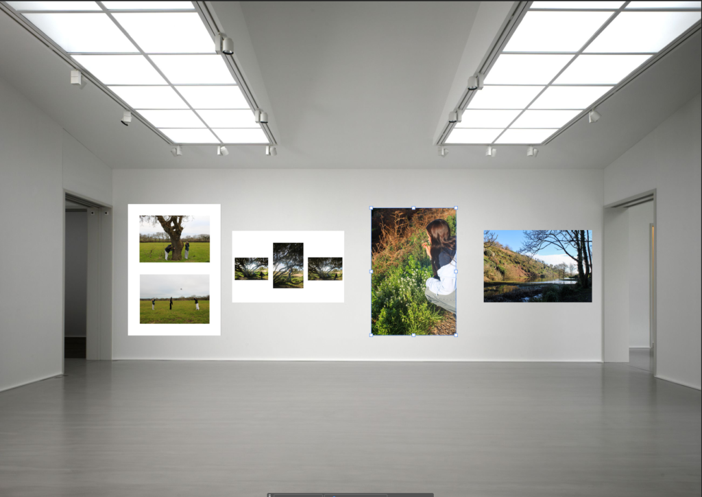
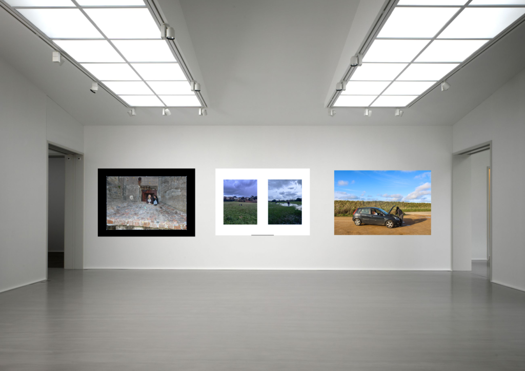
I have decided to do some final mounting as well as my photobook. I have portrayed my images in two separate layouts.
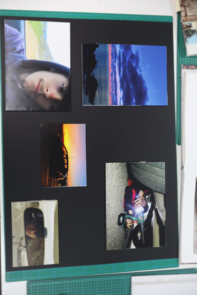
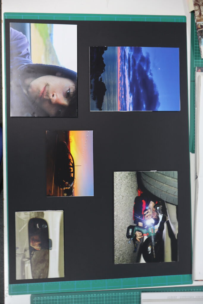
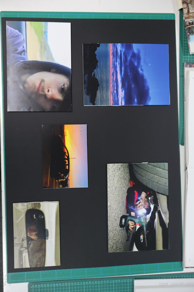
The first layout includes images of mainly cars, with some landscape images, it acts as a breakup blackboard. Having some more personal close up shots as well as some further landscape images it provides a wide variety of images from different aspects.
My second blackboard consists of more fun related images, of the group engaging in some more personal activity’s rather than there main hobby that brings them together. This provides a different outlook on the people that I have photographed.
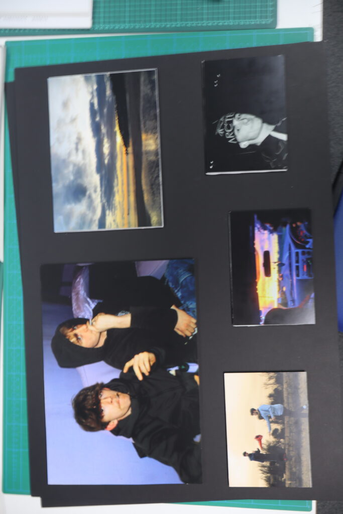
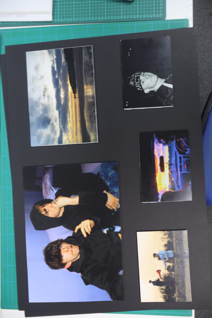
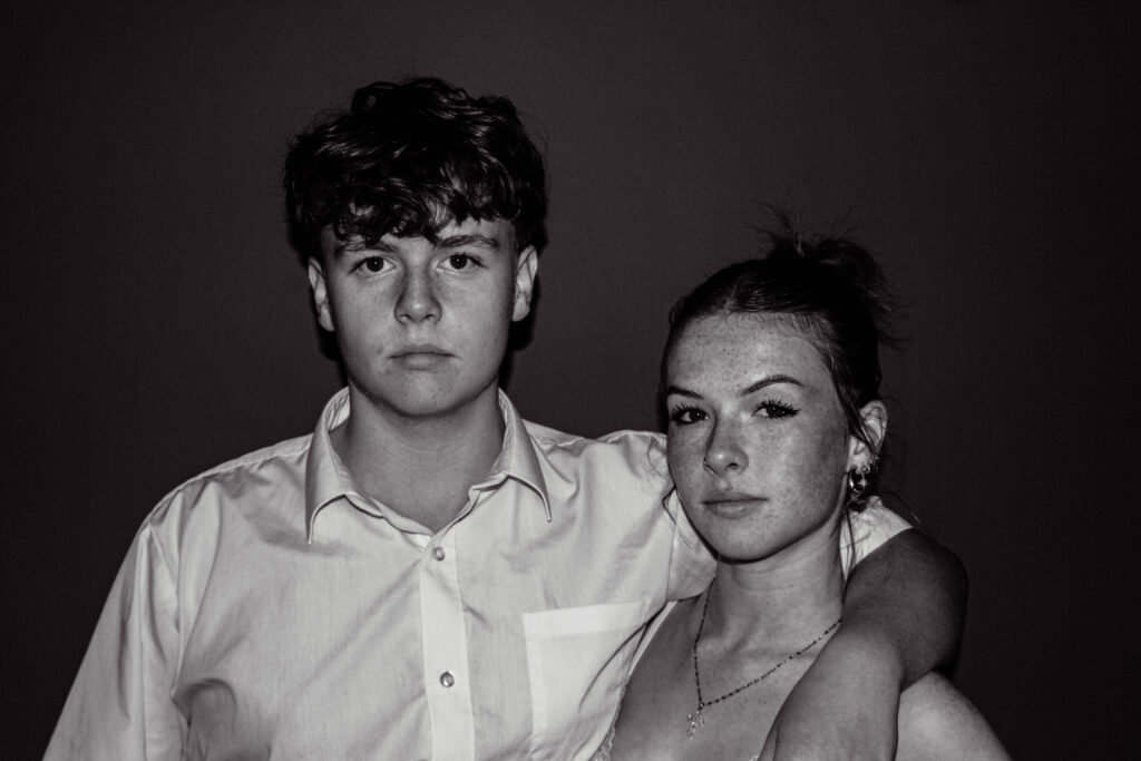
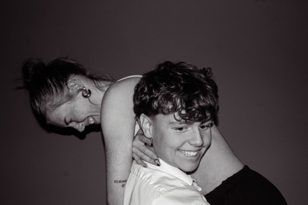
For my mounting mock exam, I first wanted to group my photographs. I had a total of 9 final prints, grouped into a 4, a 2, and a 3. I was very careful about the photos and their group, didn’t want an anomaly in a group, since I want my photos to look professional and put together, even when being mounted.
Group 1 :
These 3 photos were grouped together due to their nature, I thought all 3 fit a description of ‘teenage dirt bag’. Their rough nature and daring symbolism depict a small glimpse into a teenager life in this day and age, so I thought the grouping of these photos would work well together.
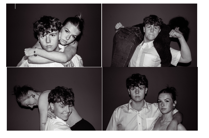
Group 2 :
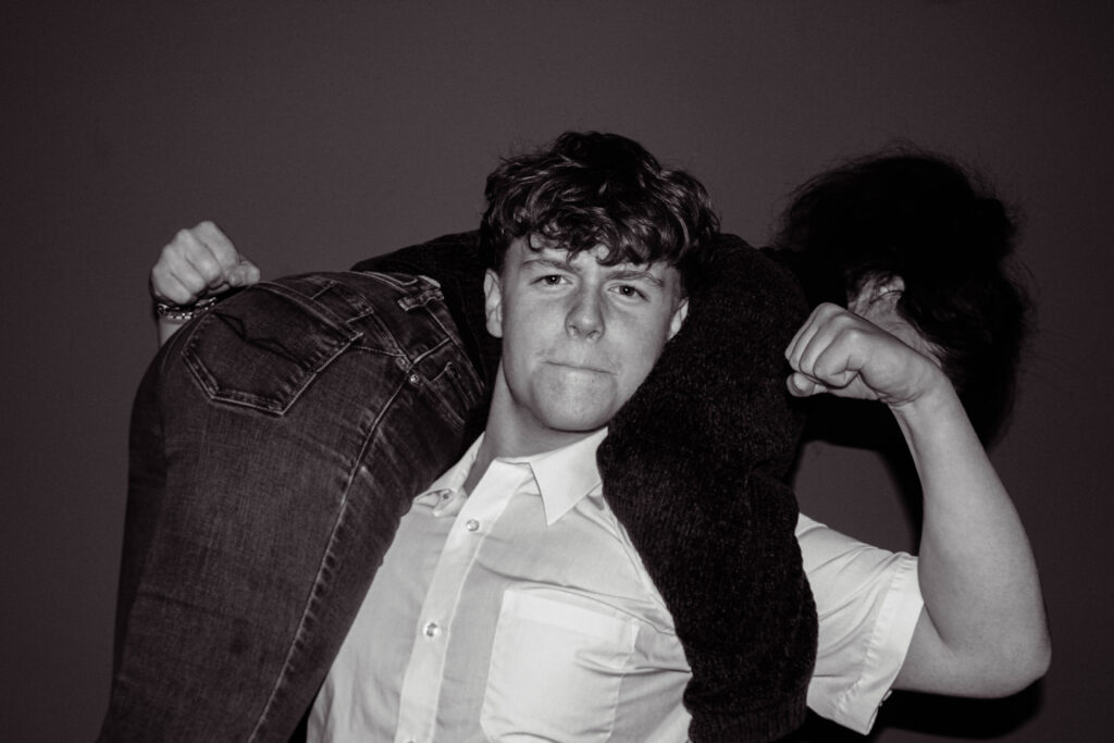
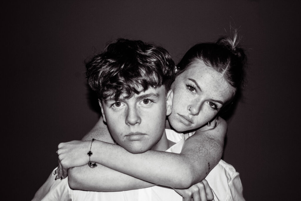
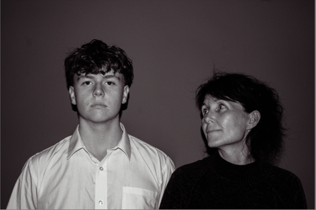
With this group of 4 photos, the link between was family. all 4 photos has the inclusion of my 15 year old brother, these photos depict family and union through touch and emotion, shown through the sitters in the photo.
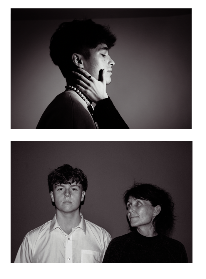
Group 3 :
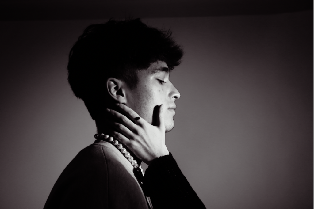
With this last group of photographs, they were kind of my red herrings of my shoots. Since both photos are headshot portraits, I thought they went perfectly together anyway. Even with different symbolism and background thoughts to each photo, I thought side by side they looked really well.
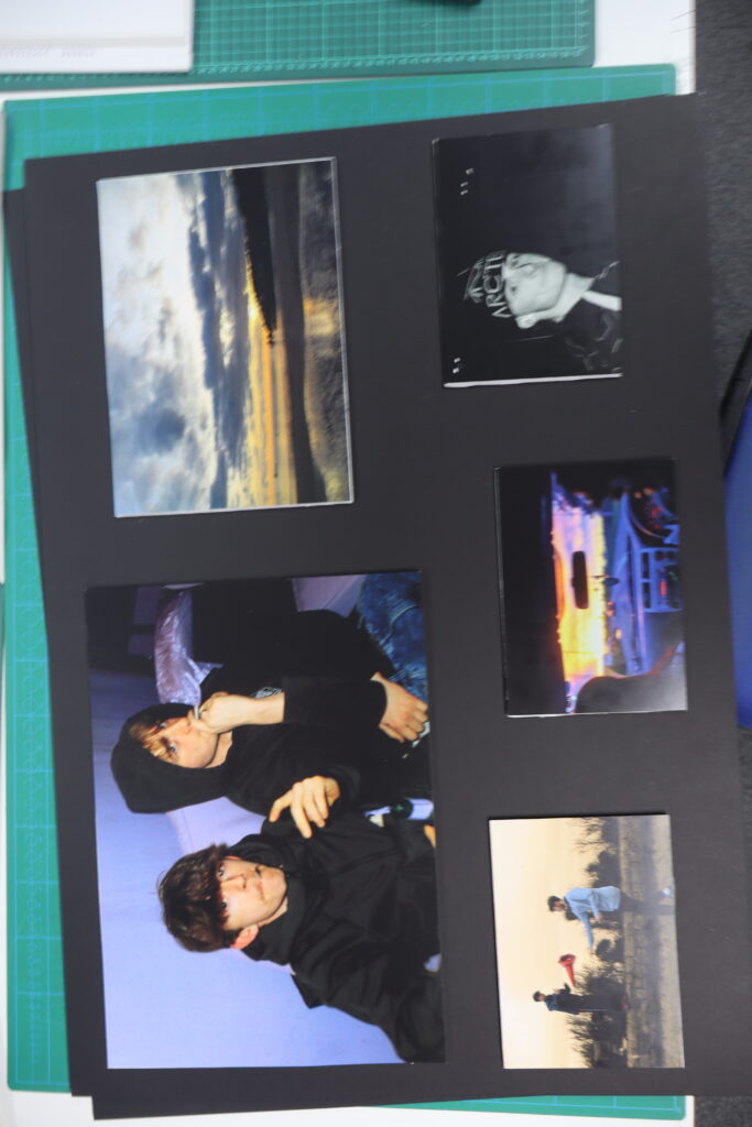
Layout overall –
Group 1 –
The thought behind this layout is the close up and far away contrast. While having 2 of 3 photos being close up headshots, while one being from a distance, I thought instead of alternating, just to do top and bottom. The bottom photo, in my opinion, is more impactful, while the other two help show the story. The bottom photo includes emotion, blank staring and an emotionless face, so I thought that could be the focal point of this board.
Group 2 –
With the layout on this group of photographs, because some of the photos are similar I thought to put them in opposite corners of the layout. This gives my work dimension but also comfort through the known. The contrast between each person in the layout go very well together, the difference in the photos work simultaneously together.
Group 3 –
For the last group layout, I thought that having a male, love interest, as the initial photo, it tells a smaller story, an explanation where as teenagers, our family ( bottom photo ) is always there, but we choose the temporary fix ( top photo ) as main priority, even over friends and family.
I mounted my images using white foam board, as well as black card. I experimented with different coloured backgrounds and different layouts.
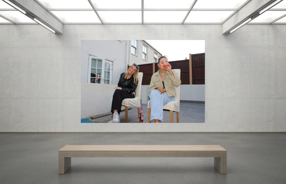
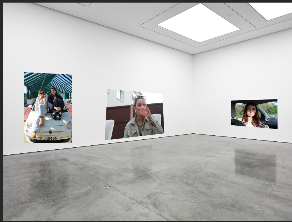
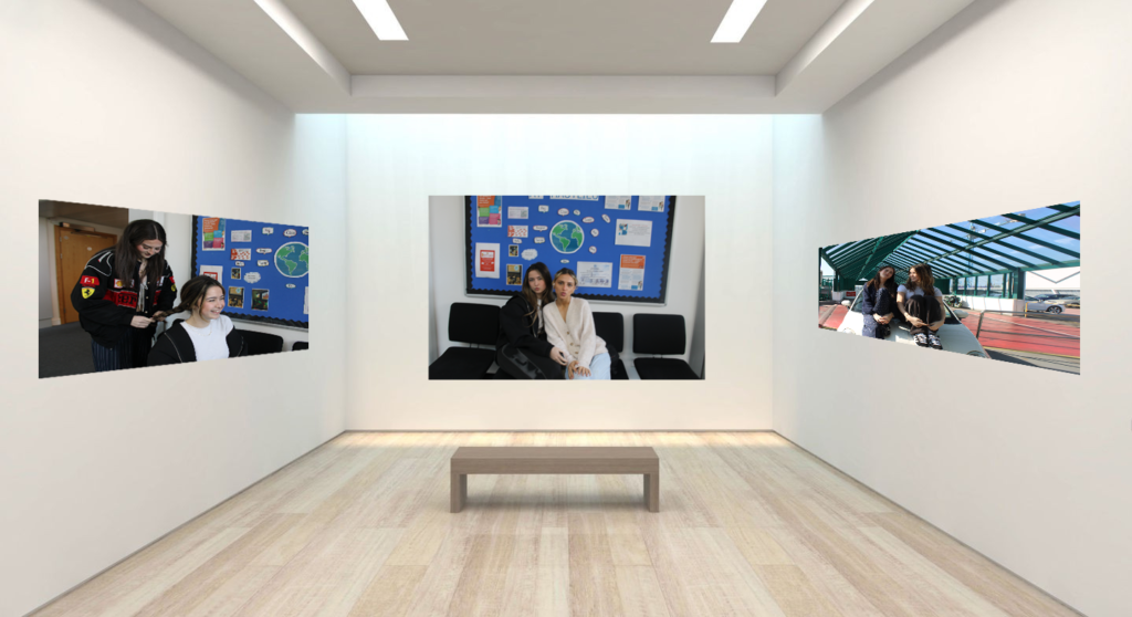
Virtual Gallery
Evaluation
I think the mounting of my images went well, because I was able to experiment with multiples different layouts, with different amounts of images. I also experimented with different coloured backgrounds. I was also able to group images together that compliment each other, so that I could improve the layout and compositions of my mounts.
For my final photography project, the theme of Union I’ve decided to merge the idea of feminism and girlhood. I’ve always been inspired by how women and girls are connected to one another and the strength that comes with understanding these connections.
I would like to know more about how we take care of each other, both in our day-to-day lives. I believe that girlhood is beautiful, strong, and complicated, but also often oversimplified or misinterpreted, mostly by men and so I’d like to reach towards the many different layers of what it means to be a girl today as I believe being a girl in todays society is very difficult.
I’d like my photography to point to the power of women’s solidarity, how girls are lifting each other up to resist stereotypes, fight for equality and are there for each other. I want to demonstrate that girlhood is not about being “girly” but rather, it’s about claiming your identity, standing up for your friends, and drawing power from the community of other women and girls. The concept of union in this work symbolizes how we, as women, unite to advocate for each other’s voices and experiences which could be for misogyny, rape, assault and many issues women have to deal with today.
I plan to capture true interactions between girls that vulnerability, intimacy, and strength that comes from being together. I want to show the quiet acts of support, as well as the noisier. I also want to employ colour, light, and composition to express the intimacy and solidarity of these relationships, emphasizing the depth of feeling that exists, in some places such as the beach ,bathroom and narrowing down to a school bathroom too.
Cindy Sherman is also one of my biggest inspirations for this project since her work often concerns issues of identity and the performance of femininity and women’s roles. Her self-portraits made me think more about the representation of girls and women in the media and how we can resist those images through our own representation. Like Sherman, I am interested in reclaiming and redefining girlhood and femininity in my images to try and make this die down as women struggle voicing there opinions.
What I try to do through this project is create work that inspires audiences to reflect on the strength of women’s and girls’ solidarity. I’m trying to show that if we support each other and hold each other up, we’re not just stronger but we are unstoppable. I want to represent the depth and power of girlhood and the power that comes from finding common ground in it.