Photo shoot Info:
Taking inspiration from Eugene Smith’s ‘Country Doctor’, My photoshoot consists of a documentative series of images. I wanted to edit my images to look in the same way, to achieve the same composition.
First edits:
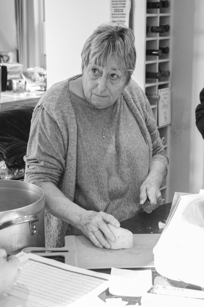
Overall, I like how this image came out. How I framed the shot is good, as it provides a clear shot of the subject and allows the viewer to create assumptions on the type of role my nan plays in the farm. In addition to this, the arrangement of items on the work desk in front of her creates an interesting Mise-en-scene which leads the eye around the images content. What I would improve however is trying to get a clearer quality of image, by having a higher aperture next time, it wont create as much of a motion blur on parts of her face and hands.

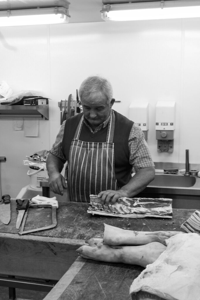
Like the previous image. I am fond on the outcome for this photograph. Using a mid-body shot, I think I created an interesting Mise-en-scene of my subject performing his task in a documentative style. With the arrangement of him handling the packaged meat and dressed in his work apron I think these combined to make the Mise-en-scene standout more. How I would improve is by having a lower exposure as the brightness behind him supresses more of the environment of the butchers kitchen.


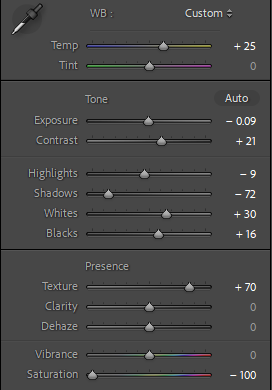
By altering the temperature as well as some other elements like texture and dehazing, I think I was able to improve on this image, making it seem more contrasted then it did before. Like the other images, I have lowered the saturation to create the old uncoloured-film effect photographers had before its invention. To improve, I will use a larger aperture like F11 or F16 to reduce the motion blur. To me, this image provides a good example of identity for my aunt, as through her facial expressions, a viewer can connote she finds joy in her work.


I like how this image came out as, to me, it captures what I was hoping for in comparison to the ‘Country Doctor’ by Eugene Smith. by editing it, I made it more brighter as it was a low exposure. With the use of the components of the environment: such as the hose, pig and the trees in the background. These all combine to create an interesting composition of a day in the life on the farm. Additionally this goes to show my cousins portrait of one of her roles on the farm, furthermore it can be said to challenge the traditional roles given to men and women on a farm as usually the dirty work of feeding the pigs and etc is a ‘Mans job’.


For this image, I believe it already had a nice amount of light. Working of that I played around with the texture and clarity as well as shadows and white to black balance to make it stand out a lot more once I had lowered the saturation. I find that this image connotes a lot of Identity about the farm as the butcher statues weathered appearance shows how long they’ve spent as a local business.


Taken together, these pictures go to show another part of the process of working on a butchers farm, captured in a documentative style. With a large view into the environment we can see the type of activities the business gets up. With the arrangement of utensils on the table as well as the meat it helps to provide that aesthetic needed to produce an interesting composition. This can also go onto provide information on how masculinity is shown. Being very hands on with the job, it represents a traditional sense of a masculine role. When combined, with other images of my aunt and cousin, for example it creates a diverse image of a workplace not overly male-dominated, which is stereotypically expected when one thinks of a butchers farm.


Conclusion:
In conclusion I like the outcomes of these images and will make further edits to them soon in my practice exam. Taken together, and some other a companying photos, I find that these images can be seen to take inspiration from my artist reference, Eugene smith and his gallery of images in ‘Country Doctor’.


