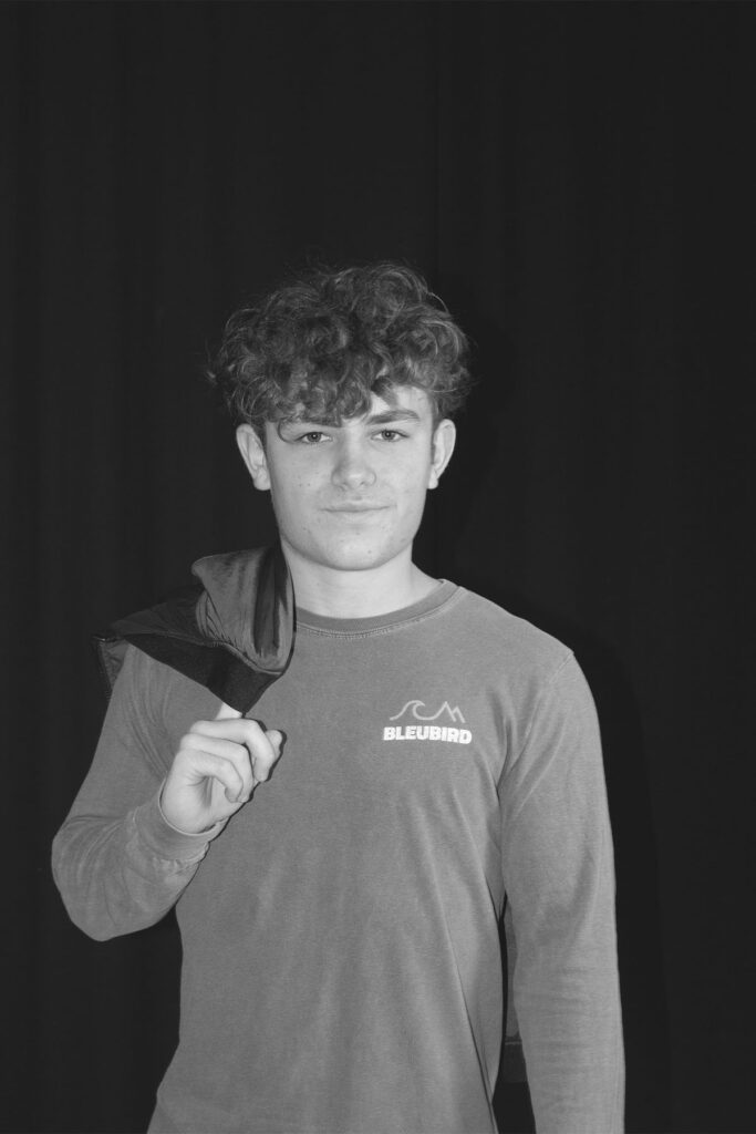
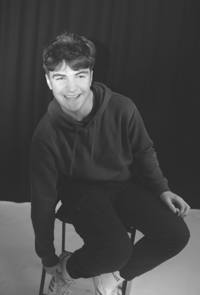
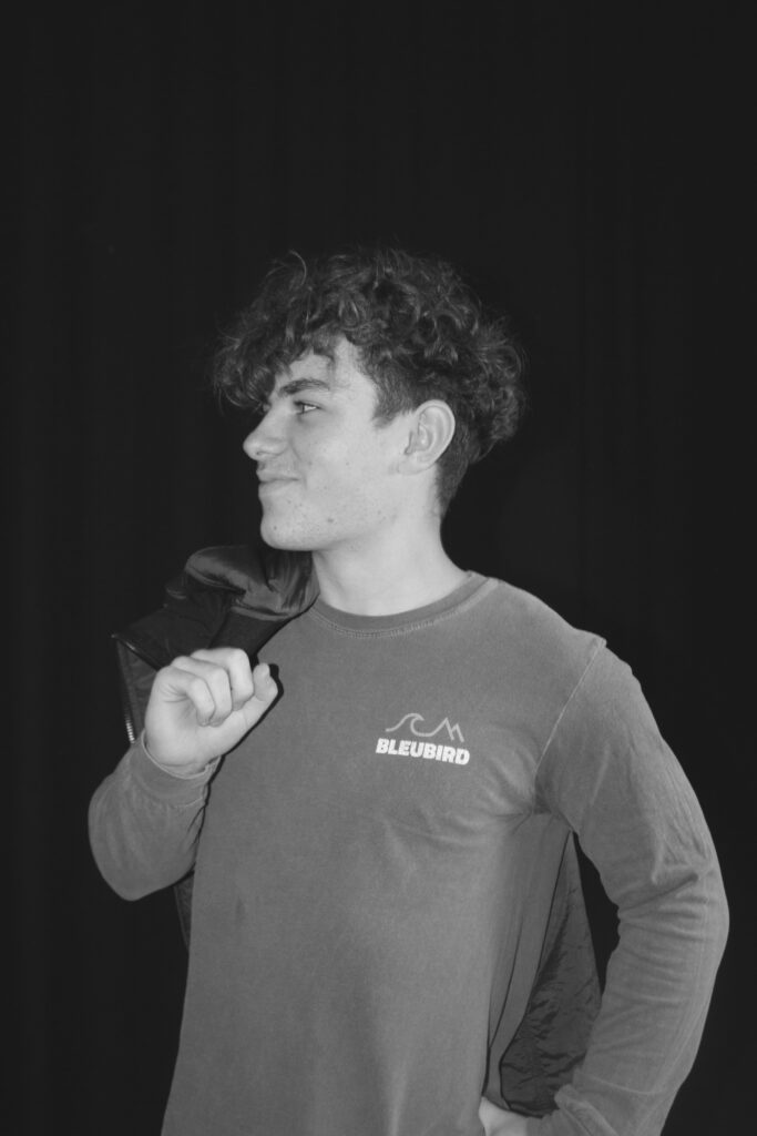
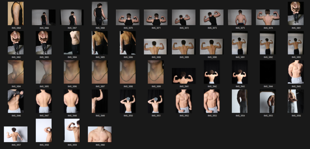
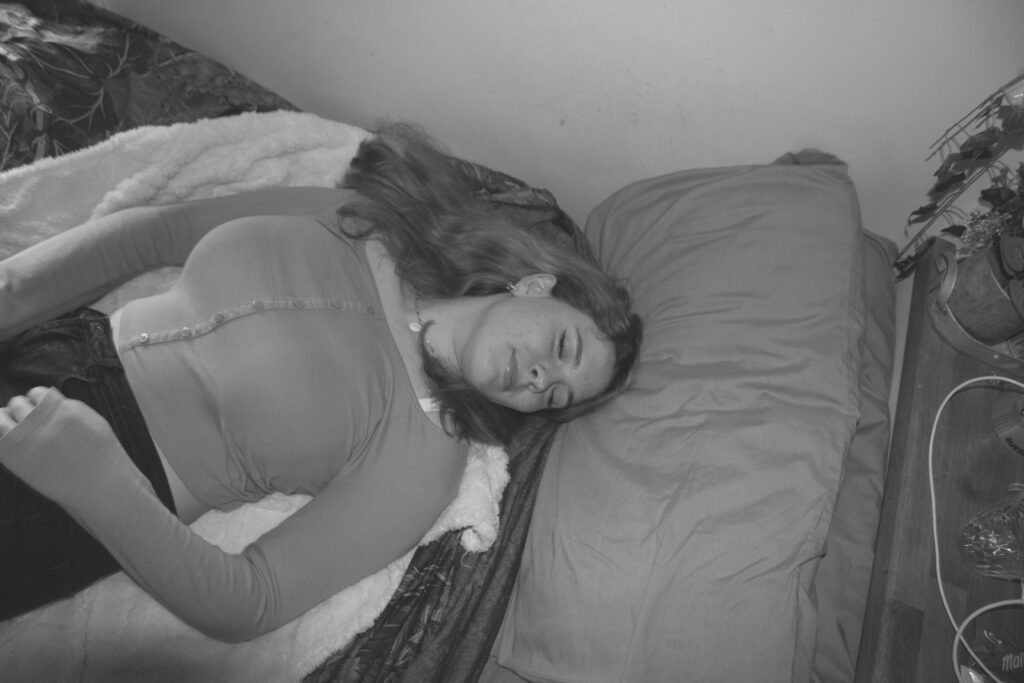
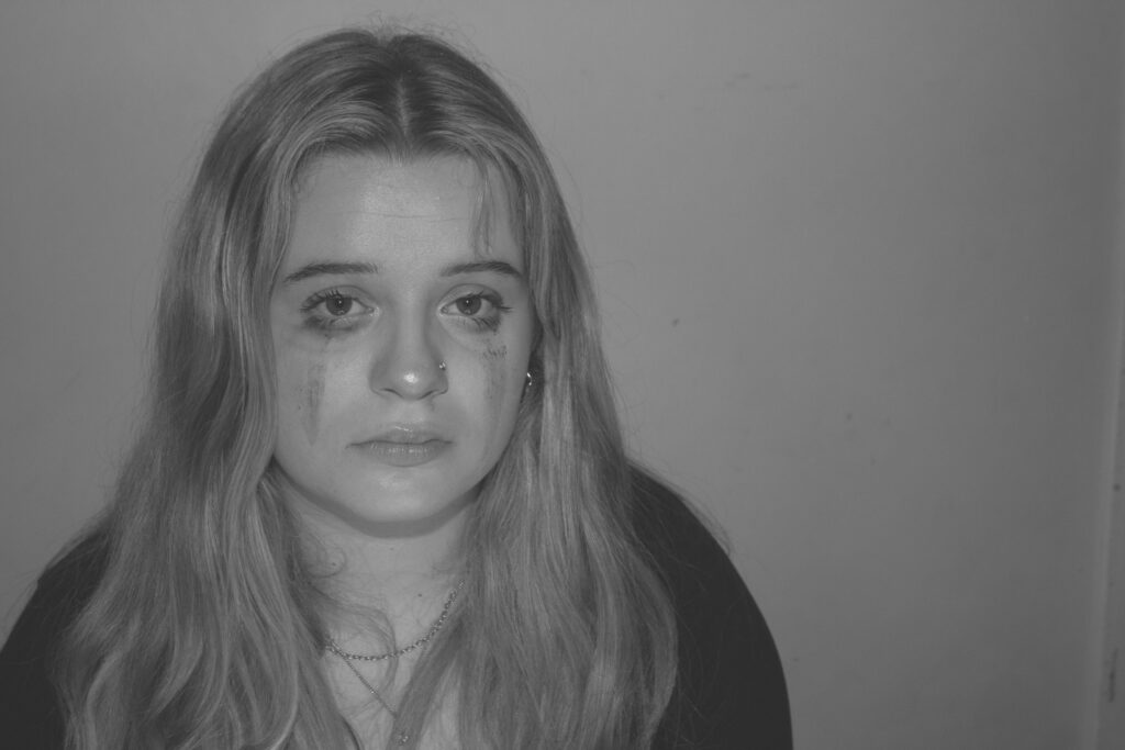
Rembrandt lighting

The term Rembrandt lighting is relatively new. The term was originally coined by 20th century filmmaker Cecil B. DeMille when he made the film The Virginia Warriors. As the story progressed, he borrowed several spotlights to recreate a lighting scheme in which the actors’ faces were half illuminated.

Rembrandt lighting is a technique using one light as well as a reflector or two separate lights. It is a popular as it gives an image a dramatic look as well as a natural look. it is recognisable through the lit-up triangle on the subjects unlit side of their face.

My photoshoot:

Best photos:

Editing:

I chose to edit this photo as it has a clear Rembrandt lighting. I made slight changes to the tone of the photo to add a higher level of contrast so that the triangle would be enhanced. I then went on to removing the colour by decreasing the saturation and vibrancy to -100.

Before and after:

Next I cropped the photo to remove some of the background to ensure the model was the main focus of the photo rather than the space around.

Finally I increased the sharpness to cause the photo to be more detailed and sharper so that the shadows were more contrasted.

I decided to add vignette to the photo to draw the viewers eyes to the model.

Final edit:

I think this edit is successful as there is a clear triangle under the models left eye which shows that it is a Rembrandt inspired photo. I also think the black and white makes the highlights brighter and the shadows darker which enhances the contrast between them, this is especially useful for the triangle under the eye and it makes it clear. By cropping the photo and adding the vignette effect the focus of the photo is drawn to the centre, the model.

Edited Rembrandt photoshoot

I colour-coded all my Rembrandt photos into one colour so they were clear to point out and to easily assess which ones were the best compared to the worst.

REMBRANDT EDITED IMAGES:

I created a virtual copy of the original image so that I could create a black & white version too. I cropped the background as there was a lot empty space surrounding the subject and I didn’t want this to make the viewer’s eyes wonder to the background. I really like the way the light has created a warm tone on one side of her face and given me that ideal triangle underneath the eye. I used a gold reflector to do this which I think has worked quite effectively.

Original image:

MY SECOND IMAGE:

I really like this pose as she looks very relaxed and calm leaning on her chair. I had similar photos to this but I found that this one was better because I liked the way her head was positioned more. The light has given her a warm tone and this lighting has worked very well. I also like the way she is not entirely central and more to the side as this makes it different from a standard image. There is a lot of light brought into her eyes as I got someone to hold a reflector for me to bounce the light onto her face.

Original image:

MY THIRD IMAGE:

I really like this image as I didn’t have to do much editing, I really like the expression and where her hand is placed as I feel it makes her more connected to the viewer. I chose to put it in black and white because I felt that it just looked better. I also really liked the way she is looking up into the camera as its a more powerful way to use the eyes.

Original image:

MY FOURTH IMAGE:

I really liked this image because it has an element of Chiaroscuro lighting in it alongside Rembrandt due to the split lighting however there’s a clear triangle of light below the eye which I think has worked effectively. To improve this, I could use a reflector when taking the image to bring more light into her eyes as it is quite dark. The position she is in looks very relaxed and natural as she is resting on her hand.

Original image:

The final images:

Butterfly Lighting 

Butterfly lighting is a technique where the light source is placed directly above and slightly in front of the subject’s face, creating a small butterfly-shaped shadow under the nose. This happens because the lighting in the shot comes from above the models head. The technique is achieved by placing a light source at a 45-degree angle to the subject, slightly above eye level.

Butterfly lighting is primarily used in a studio setting. Butterfly lighting is mostly used for portraits, as it is flattering on everybody. It can either be a very harsh light or soft depending on the type of photo you want to achieve.

Here are some examples:

My photoshoot:

For my photos the Chiaroscuro photos are coloured yellow, the Rembrandt photos are red and the butterfly photos are coloured green

For this photo I didn’t edit it that much because the original photo perfectly displaced the butterfly lighting technique already so all I did was change the colour of the photo to a bit darker to match the dark backdrop.

For this photo I changed it to black and white to display the butterfly shadow under her nose and really show it off. Black and white was the better option for this photo as the model has dark hair and had a grey jumper on so by changing it to black and white demonstrates the darker features more effectively in this photo.

For this photo I edited the highlights and saturation of the photo as it looks like a happy photo as she is smiling so I turned up the whites, clarity and the saturation of the photo because I wanted to make the photo look more colourful to make it look vibrant and happy.

 Chiaroscuro lighting

Chiaroscuro is a high-contrast lighting technique that uses a low-key lighting setup to achieve contrast between the subject and a dark background

Chiaroscuro is Italian for light/dark and makes the use of strong contrasts between light and dark, usually bold contrasts affecting a whole composition. In these photos the shadows are very harsh while the light is bright. There is a very obvious contrast of lighting in these photos.

here are some examples:

My photoshoot:

For my photos the Chiaroscuro photos are coloured yellow, the Rembrandt photos are red and the butterfly photos are coloured green

For this photo I edited it to black and white because I think it looks better than to when it was in colour. i changed the shadows and the blacks the most to make the darker side of my face look harsher but also cleaner so it is a prominent split between the middle of my face.

For this photo I took inspiration from the example photos by making one side of her face very dark and not prominent compared to the light side of her face to make it look light and vibrant I changed the texture and clarity to get rid of the highlights on the darker side of the photo.

Camera Handling Skills

In photography, I use a DLSR Canon camera to take photos, because it ensures they all have good quality and there are various different ways I can adjust my images. This camera is extremely beneficial for photography as it allows me to change the shutter speed, ISO and aperture.

  • The shutter speed is the length of time from the moment the shutter opens and this then allows light into the camera. A fast shutter speed will create a short exposure, whereas as a slower shutter speed will create a long exposure. This is because the shutter is open for a longer period of time which allows more light into the camera.
  • The aperture is the opening of the lens’s diagram through which light passes through. Having a smaller aperture creates a sharper image.
  • The ISO ( International standard organization) is an image sensitivity in a numerical value. Having a higher ISO can lower the quality of your photo and degrade is which will cause your photos to be grainy or “noisy”.

We used this app to begin experimenting with different apertures, shutter speeds and ISO, which was helpful because it allowed us to decide which ones look best for each specific photo. We then could apply these skills to when we actually use the cameras, which saves time and we could identify which ones would benefit the photos most.

Aperture

Aperture controls the size of the lens opening which allows light into your camera.

Opening the lens more or having a low f-stop number (e.g. f/1.4) blurs the background/foreground around your subject. This is known as a shallow depth of field.

Keeping the lens more closed or having a high f-stop number (e.g. f/16) keeps the photo sharp throughout. This is known as a wide depth of field.

Shutter Speed

Shutter Speed is the amount of time the shutter is open to expose the image sensor to light.

Slow shutter speeds expose more light to the image sensor so still objects will have more detail and moving objects will appear to have more motion/be blurry.

Faster shutter speeds means less light is exposed to the image sensor and moving objects appear more still.

ISO

The ISO of a camera selects how much light the image sensor detects.

Too much light on a sunny day can cause overexposed shots so a lower ISO would be preferred.

Too little light in a shady room or day can cause grainy images.

The general rule is to use the lowest ISO possible to get the most detail possible.

Exposure Meter

The Exposure Meter is your final check before you snap a shot. It shows you how well your aperture, ISO and shutter speed are working together.

It is used as a guide to show exposure.

White Balance

White balance is the ratio of blue light to red light in an image which refers to the concept of colour temperature.

White balance is measured is Kelvin(K). Higher values of Kelvin contain more blue light whereas lower values of Kelvin contain more red light.

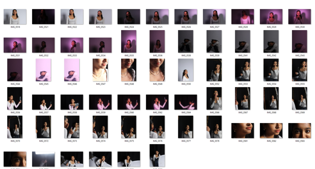
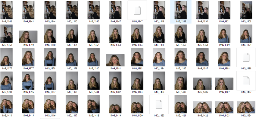
studio lighting techniques contact sheet

Rembrandt-

for this shoot I wanted to create Rembrandt lighting in the best possible way in my ability, I did this by making sure I had the lighting on point and making the shadows I needed to make around the face. And these are the photos I came up with.

4-5 star photos (best photos I came up with)-

3-4 star photos (decent photos I came up with)

1-2 star (worst photos)-

Butterfly lighting– I judged these based of the lighting on the face and how well the butterfly effect was created on the subject.

4-5 star photos (best photos I came up with)-

3-4 star photos (decent photos I came up with)

1-2 star (worst photos)-

conclusion-

in conclusion I think that there is a lot of room for improvement when it comes to taking my photos as there is only a handful that I think show off the lighting technique to its best. I think if I was to do this photoshoot again I would take a lot more photos and keep adjusting the lighting until its perfect.

Rembrandt Lighting

Rembrandt lighting is a technique utilizing one light and one reflector or two separate lights.

It can be described as a low-key lighting technique. It is lighting particularly for light/dark contrast to emphasize volume and specific areas.

Rembrandt lighting is characterized by an illuminated triangle under the eye of the person, particularly on the less illuminated side of the face. It’s a popular technique because it creates images that look both dramatic yet natural.

THE ARTIST HIMSELF

Why was Rembrandt important?

Rembrandt Harmenszoon van Rijnprolific was seen as a painter, draftsman, and etcher, Rembrandt van Rijn is usually regarded as the greatest artist of Holland’s “Golden Age.” This technique was made during the Renaissance period, but Rembrandt then pushed t even further and used dramatic lighting to lure out the ‘psychological depth’ of his models.

How to Do It

1. Use a Spot Meter for Precise Control of Focus Point

2. Experiment With Multiple Light Sources

3. Practice With Models or Yourself

4. Practice Placing the Inverted Triangle of Light

5. Shoot It Raw To Make the Most Of Lighting Contrast

6. Occasions and Models Suited to This Lighting Type

Studio Photography Using Rembrandt Lighting

Camera settings I used:

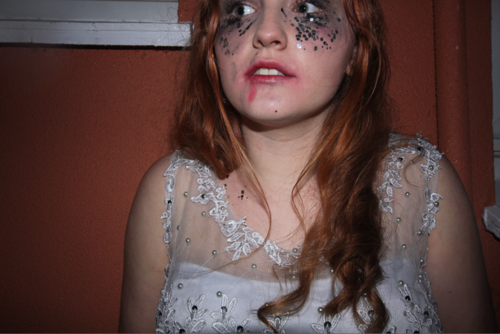
This photo was my favourite photo from my collection of Rembrandt photos I took of this model.

  • I first of all cropped this image to dispose of any extra space in the background. Cropping this image helps the photo to increase in detail as the person looking at it is able to focus more on the important parts and the focal points such as the eyes or the mouth etc.
  • The pose I asked my model to do is to look shocked into the camera, she did this by widening her eyes, opening her mouth and covering her face and mouth with her hands. This emotion in the photo portrays shock, surprise or fear.
  • I then edited this photo further than I usually do with my images. I first edited the highlights, texture, clarity etc.
  • I then went into further editing on Photoshop and edited the colour, saturation and luminance. I increased the colour purple fully up and then the saturation colours orange, green and purple. I then increased the luminance of red slightly and then blue completely.
  • This further editing with colour added extra dimension to this photo, the background colour has slightly changed and the photo is slightly more vibrant but still maintains its shadows and darker parts of the face and hands.

For these headshots I took photos of a new model. I focused mostly on different facial expressions than different positions. I asked my model to be herself and act natural to be able to take more personal photographs. I edited these in adobe photoshop. I can really see the Rembrandt triangle shown here on my models left cheek.

This photo is my favourite photo I’ve taken in my first photoshoot. This 1/4 body shot perfectly represents Rembrandt lighting, this is because there is a triangular shape on my models left cheek. I made this triangle on a 45 degree offset from the subject, about 5 feet away. The triangular shape truly demonstrates the Rembrandt effect and how it shows an image to look professional and high detail. I have highlighted the triangle created to clearly show the technique I have used.

these are my two images after cropping them to capture only the model and less of the background. This is to help improve my image’s quality as there is less of a backdrop.

I edited these two photos to create a coloured background. The first I created a more pink background and maintained the colour of her face and body. I did this by increasing the luminance This helped to experiment with different backgrounds and how these can improve my photos. These are the editing tools I used to edit the photos above.

Further Editing Settings

I then took these half body shots. In the first photo I told my model to look straight at the camera and pose naturally. This creates a perfect position to capture a portrait of my model and experiment with different lighting techniques. I like how she is looking directly at the camera, due to my lighting techniques and correct camera settings, these photos did not need a large amount of editing.

I then used another model to help with my portrait experimentation. I was able to capture Rembrandt lighting on my model on the right. However, my model on the left is missing the clear triangle on her cheek. To improve these half body shots, I would attempt to capture clear Rembrandt lighting techniques on both of my models to elevate these images even further. These photos are black and white, this helps with creating more mystery and dimension into my images, I think this black and white effect In Lightroom has really made these photos more effective and look much better. These are the editing tools I used to create this black and white effect:

I then took photos of a new model, these photos were taken originally very dark, this was due to a incorrect exposure. Exposure is the amount of light that gets into your camera and produces the picture on the image sensor. To improve these photos, next time I need to widen the aperture, extend the shutter speed, and boost the ISO. However, I needed to edit these on photoshop instead, I increased the exposure, highlights and whites to help the quality of the photo increase and make it brighter. This was a challenge for me as I found it difficult to maintain the high quality of her features and textures etc, whilst brightening up the photo.

Butterfly Lighting

What is butterfly lighting ?

Butterfly lighting is a portrait lighting pattern where the key light is above the photographers camera to ensure that the light is pointing down on the subjects face. This creates a shadow under the subjects nose and creates an illusion of a butterfly under the nose.

Butterfly lighting is when there is a shadow on the face just below the nose shaped like a butterfly. It is a technique used by many photographers to achieve a very elegant and sophisticated image.

Why do photographers use it ?

Butterfly lighting is used for flattering and glamorous portrait photos. The lighting is usually soft on the face and an advantage of using this type of lighting is that it can be used on almost all faces and it is extremely easy to set up.

As you can see from this image of the setup, the lighting is placed above the camera with the subject in front of the camera facing forward. There is also a reflector underneath the models face which reflects the lighting upwards and helps to create the butterfly shadow underneath the nose. There is a plain backdrop behind the model to enhance the models face and to ensure that the model is the main focus of the photo. For Butterfly lighting you can use any coloured background as it doesn’t matter as long as there is a shadow underneath the nose of the model.

Butterfly Portrait Mood Board

Edited Portrait Photos

my Portraits

Portrait photography, also referred to as portraiture, is a type of photography in which the subject is one or more people and the aim is to convey something about the subject’s identity, personality, or story.

Basic Lighting

Rembrandt Lighting

Rembrandt Lighting is a technique for portrait photography named after Rembrandt Harmenszoon van Rijn, the great Dutch painter. It refers to a way of lighting a face so that an upside-down light triangle appears under the eyes of the subject.

Butterfly Lighting

Butterfly lighting is a type of portrait lighting technique used primarily in a studio setting. Its name comes from the butterfly-shaped shadow that forms under the nose because the light comes from above the camera. You may also hear it called ‘paramount lighting’ or ‘glamour lighting’.

MY FAVOURITE PHOTO:

Personally I really like this photo as its not too simple but not too much, I made the model use a prop and had an idea of using something to make their smile wider, This added colour and perception to the photo, I made the photo black and white but made sure that some colour was still shown as I didn’t like how bright the original colour was, this photo makes me feel very happy as the model is very smiley and the photo isn’t black and white, colour makes the photo look more powerful. I really like how they turned out however if I could I would have liked to not get the chair into the photo to make it more mysterious. I do really like how we used a prop as it adds effect to the photo and its isn’t seen as basic and boring like some of my other photos although sometimes simple is better and too much details can ruin it.

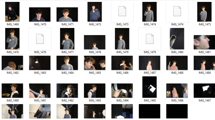
Studio Lighting/contact sheet – George Blake

These images are from studio lighting portraits:

My Intention with these shoots was to play around and experiment with the Rembrandt, Butterfly and Chiaroscuro lighting techniques.

Recreating these, in the studio we used a DSLR camera, with a flash adapter, additionally with a reflector to try out with.

camera settings:

Studio set up:

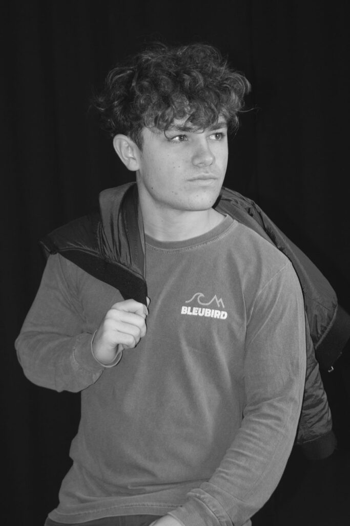
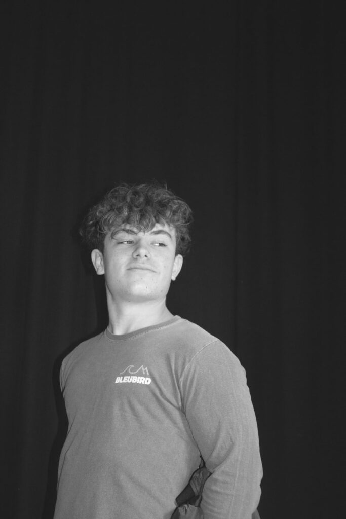
Rembrandt –

5 – 4 star rated photos:

(These are also white flagged – meaning they consist of photos that are taken clearly and match the Rembrandt light triangle).

These photos, capture the visual elements of Rembrandt, with the light positioned at a 45 degree angle and Rembrandt light triangle present on the cheek.

3 – 2 star rated photos:

(These are also white flagged – meaning they consist of mostly clearly taken photos or just didn’t fit the look I was going for, such as not containing a clear indicator of the light triangle or too poorly exposed).

These could improve, by altering the exposure on the camera or by repositioning the light to create a starker contrast of the triangle.

2 – 1 star rated photos:

(These are black flagged meaning they do not appeal to what I was aiming for during this photoshoot).

These, to me didn’t fit the look I was going for, therefore this is why I have given them a low rating.

Butterfly –

5 – 4 star rated photos:

(These are also white flagged – meaning they consist of photos that are taken clearly and match the Butterfly lighting effect).

These images, best represented the effect of butterfly lighting as shown with the shadow casting on the top lip.

3-2 star rated photos:

(These are also white flagged – meaning they consist of mostly clearly taken photos or just didn’t fit the look I was going for).

These images were clearly taken but did not fit what I had In mind.

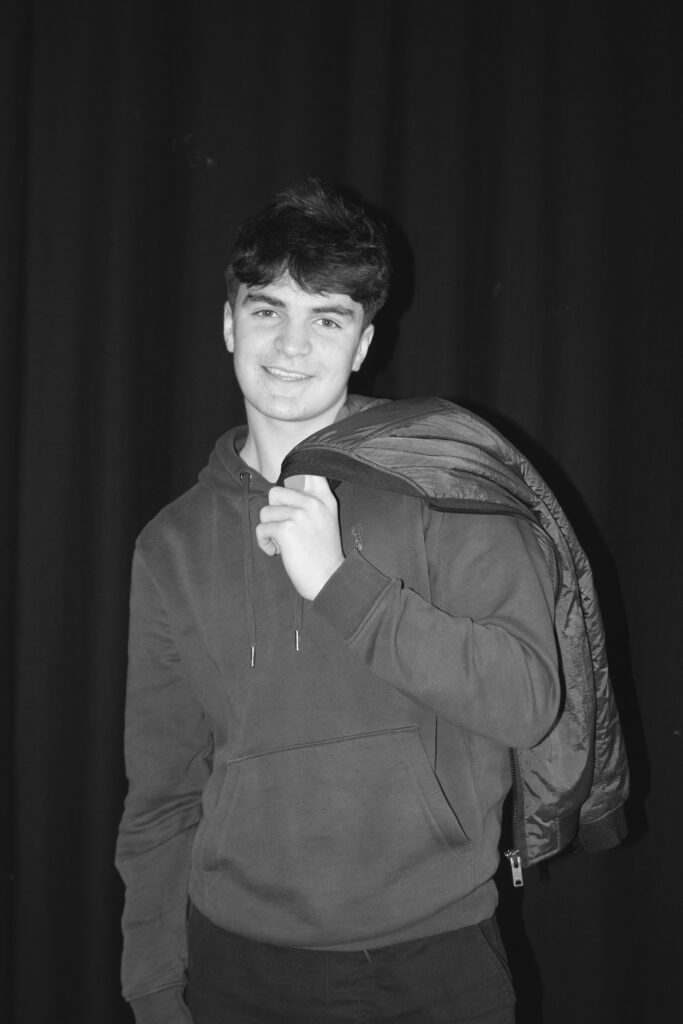
Chiaroscuro –

5 – 4 star rated photos:

(These are also white flagged – meaning they consist of photos that are taken clearly and match the tonal contrast of Chiaroscuro lighting).

These are my best of the shoot, the contrast with tones, and balance of colour most represent examples I’ve looked at.

3 – 2 star rated photos:

(These are also white flagged – meaning they consist of mostly clearly taken photos or just didn’t fit the look I was going for).

The poses to me created to much brightness, which isn’t what chiaroscuro is.

2 – 1 star rated photos:

(These are black flagged meaning they do not appeal to what I was aiming for during this photoshoot).

The exposure for this image was too low.

Conclusion –

In conclusion, I think these shoots turned out well, in terms of the visual composition they are inspired from and recreated to fit the techniques to a decent standard. I would improve by experimenting more with the light and try to get better at Rembrandt. as that proved the most difficult to create.

Just another Hautlieu Creative site