PHOTOBOOK: Mon-Wed + MOCK EXAM
Follow these steps:
You want to aim for a draft layout before the Mock Exam begins, then use the two days allocated to fine tune final layout and design.
Draft Layout of Photobook.
1. Write a book specification and describe in detail what your book will be about in terms of narrative, concept and design with reference to the same elements of bookmaking as above.
Narrative-
Narrative: – Describe in:
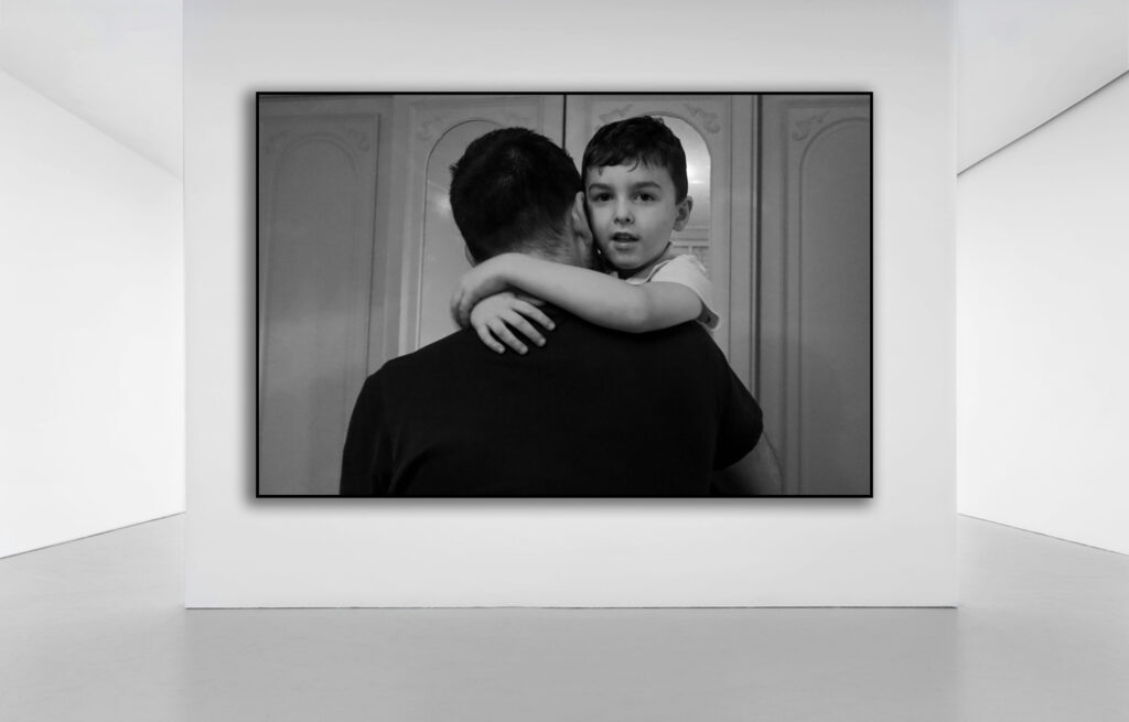
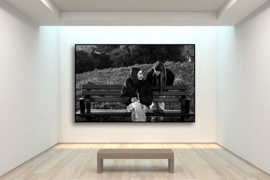
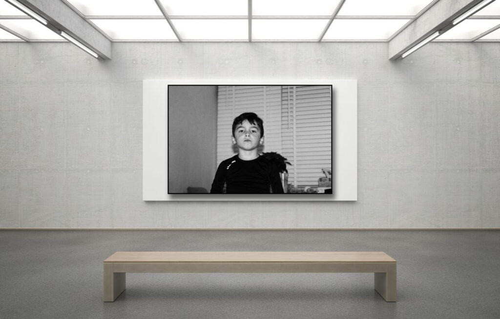
- 3 words – Female Gender Stereotypes
- A sentence– The importance of stereotypes forced upon women in the past and present day and how it affects society and young adolescent girls.
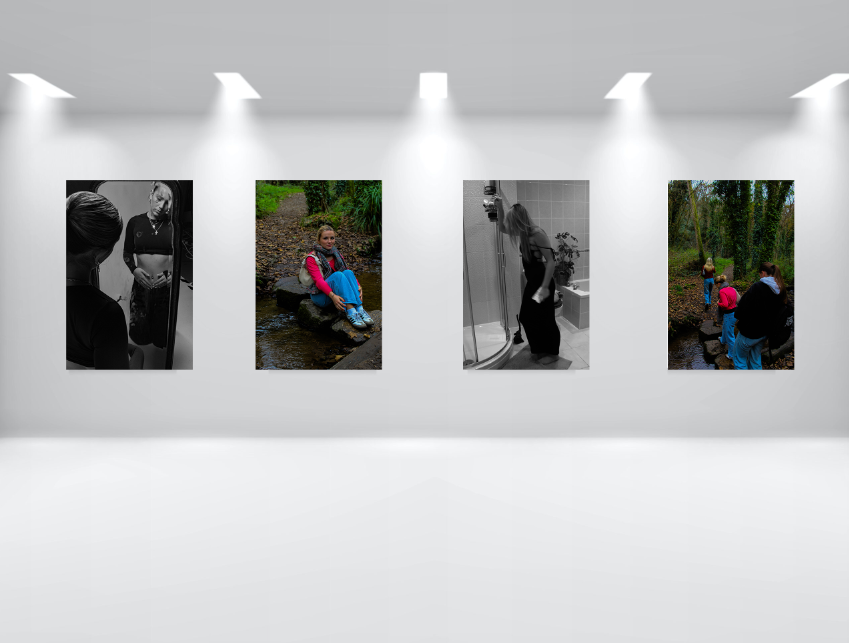
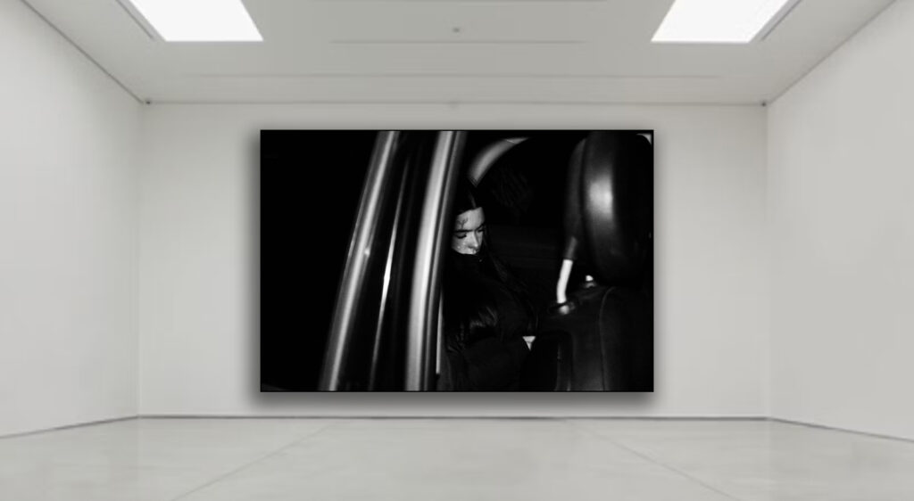
- A paragraph– The topic I would like to explore is girlhood and femininity. I will be focusing particularly on older teenagers at the age of 17-19 and the struggles of moving from adolescence to adulthood and the hardships young women face. I like this topic as it is a current topic which is faced globally, and I feel it is a topic which I will enjoy expressing my opinion on and it is an important topic which needs embracing by young people especially. I would like to initially explore how the media portrays women in positive and negative ways and how it creates derogatory and unrealistic stereotypes of women. Gender Identity and roles is a topic I wanted incorporate and the stereotypical themes and personality traits a woman is expected to have. I find this topic interesting as expectations and views on women are changing but not particularly quickly. By focusing on multiple branches of femininity and youth such as empowerment, stereotypes, different eras, I would like to cover different aspects of women, femininity gender stereotypes, identity and rights. The idealised view of women is the key part to my chosen topic, and I feel I can expand on this by including both positive and negative viewpoints.
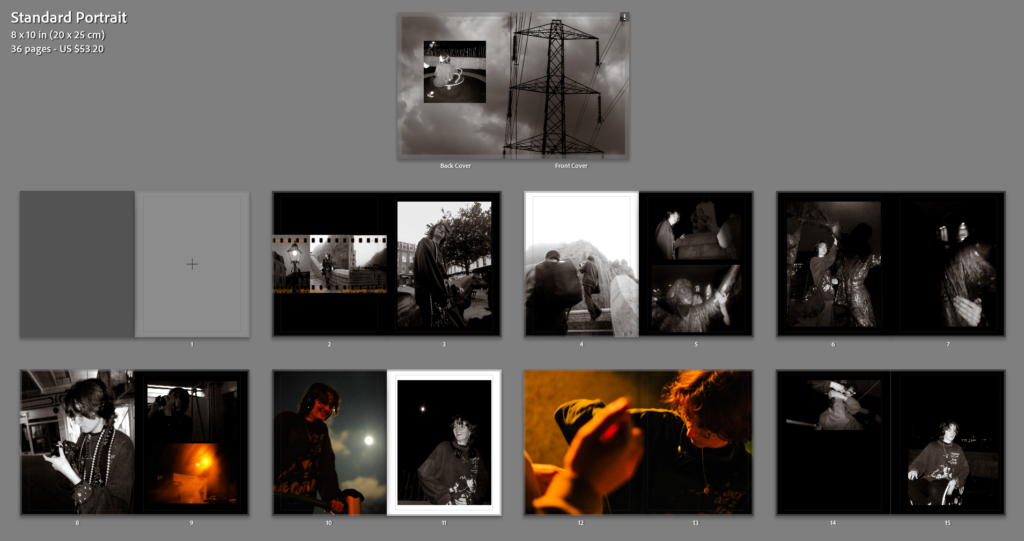
- How you want your book to look and feel– I would like my book to be a hard cover rectangular/ squared book with a clean sleek feel to it. I would like it to be relatively large (around A4) this is to create a book which is not too difficult to read and so that my images are not too small to see the details and understand the message behind them.
- Paper and ink
I am using a magazine layout style book which will have thinner paper for my book to have a more magazine feel to it rather than a book feel. This will be thinner paper inside which magazines and newspapers typically have.
- Binding and cover
This front cover will be a soft/paper back front cover due to it being a magazine and not a book.
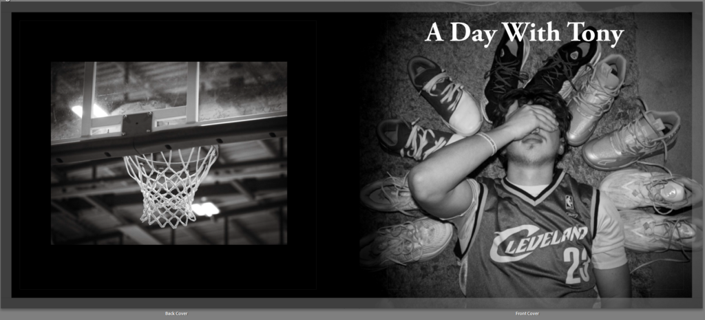
- Title – My title will be something to do with the male gaze. I would like the title to just plainly be ‘The Male Gaze’ but I feel this title may be slightly too basic and not capture an audiences attention as quickly. However I also like the idea of ‘Through his Eyes: Exploring Femininity and Stereotypes, I really like this title as it is including the male gaze in a way of not directly saying Laura Mulvey’s idea of the male gaze but instead saying it in a less direct way. The next part of ‘Exploring Femininity and Stereotypes’ also is a short way or explaining the project I am exploring. However this second section may make my title slightly too long, however I really like this title but could also shorten it to ‘Through his Eyes’ as a large title and then accompanied and anchored with the subheading of ‘Exploring Femininity and Stereotypes’. Here are some other ideas for title names:
- – The Male Gaze
- – The Gaze
- – Gazing
- – Through their eyes
- – Through His Eyes: Exploring Femininity and Stereotypes
- Design and layout
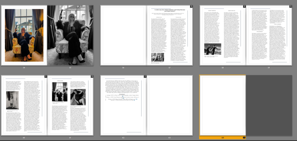
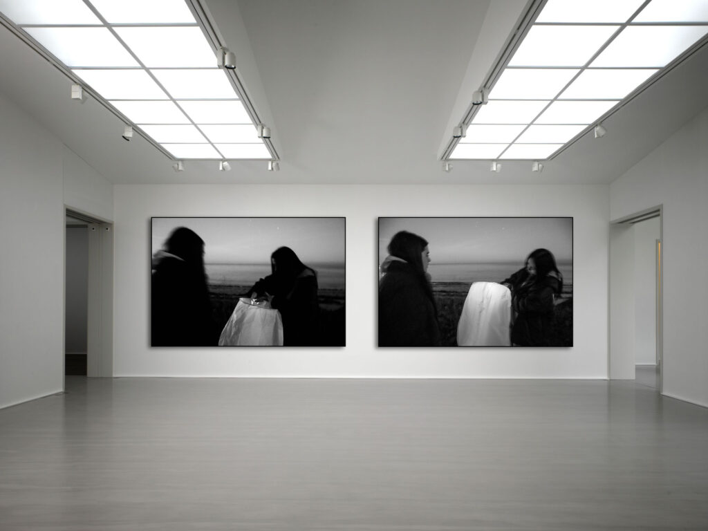
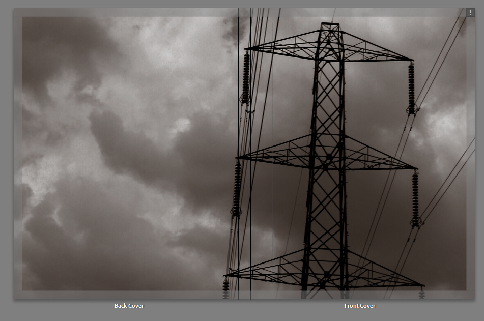
I am going to have a book with a main front cover, a first front cover with a magazine interpretation of a 1960s/70s magazine., using Cindy Sherman inspired images. I am then going to have a magazine cover of a modern day girls magazine with promotional images of products inside, I will then have a final magazine cover from a modern day women’s empowerment magazine with Helmut Newton inspired images inside.
- Editing and sequencing
I am going to create this book on Adobe Lightroom and It will include images that are edited by using black and white filters and also editing resources provided by Lightroom to make my images bolder and higher quality. I will also be editing a section of images on Adobe Photoshop, which make the images look like promotional images with brands such as Gucci, Charlotte Tilbury promoted inside the book, I have also edited the magazine covers on Canva in order to create realistic magazine covers from software specialising in covers, this has helped to increase the value and complexity of my work to make it more realistic and believeable.
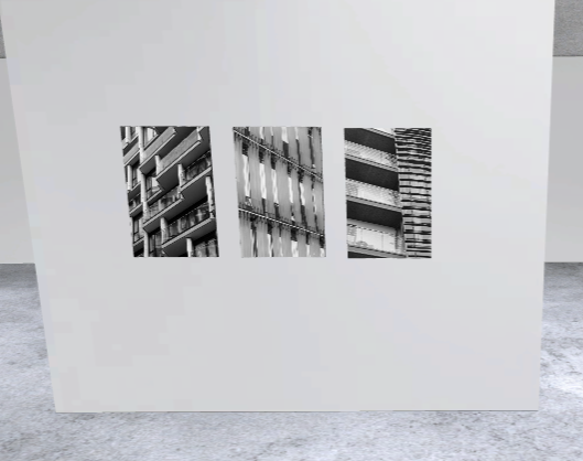
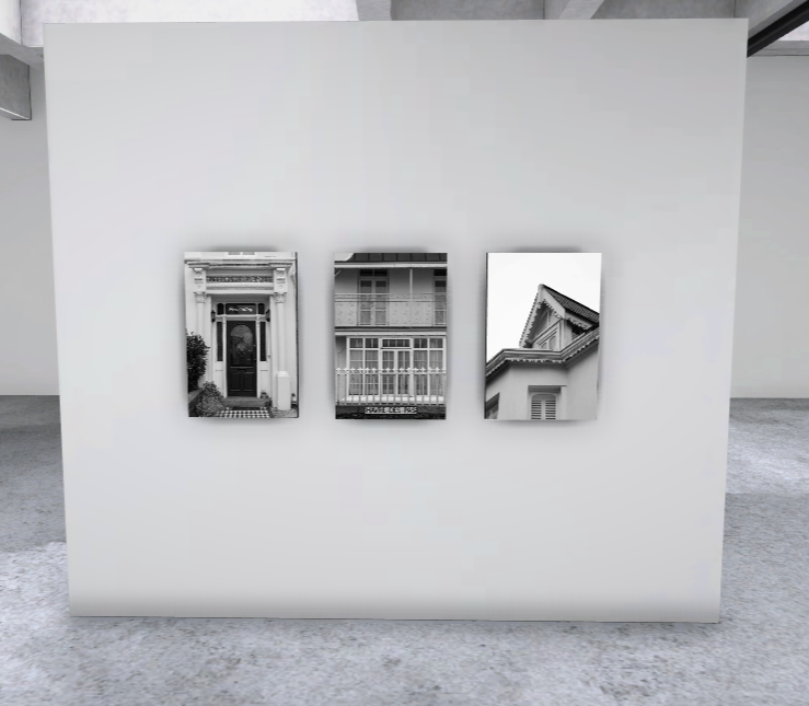
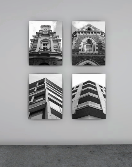
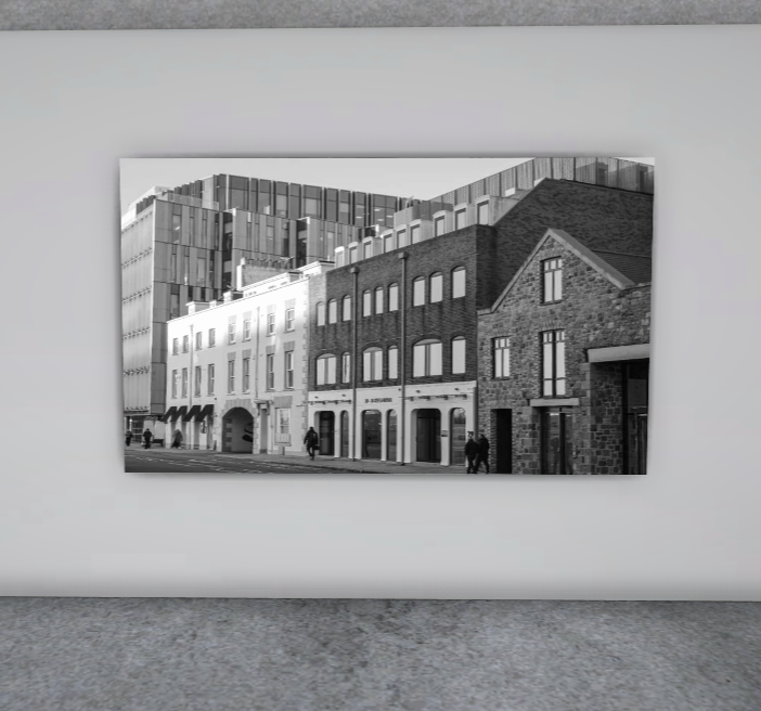
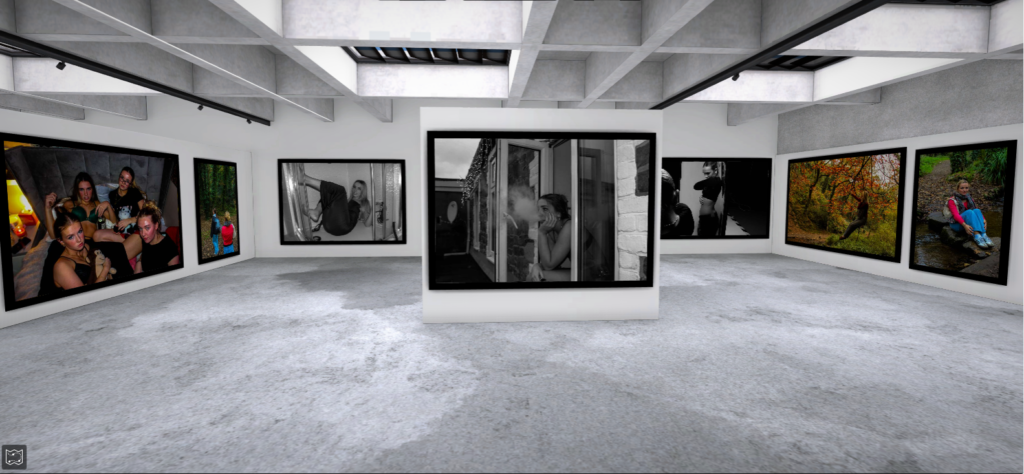
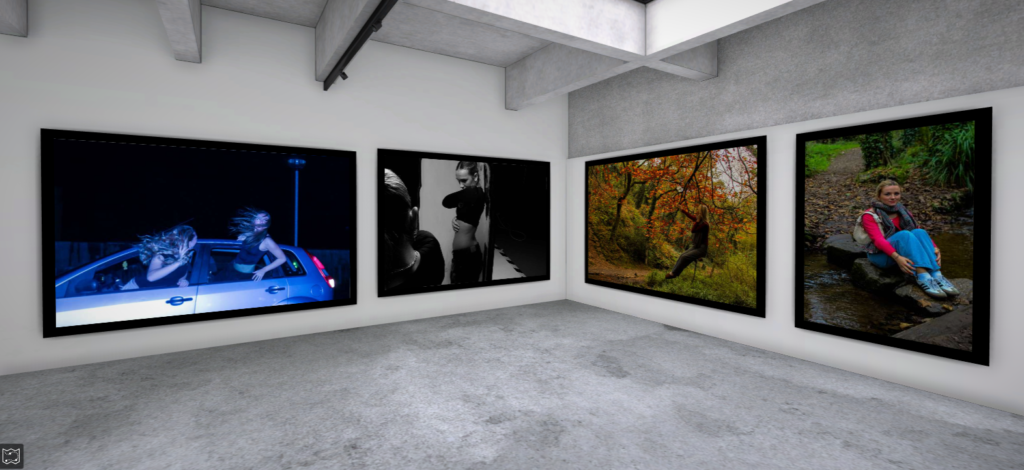
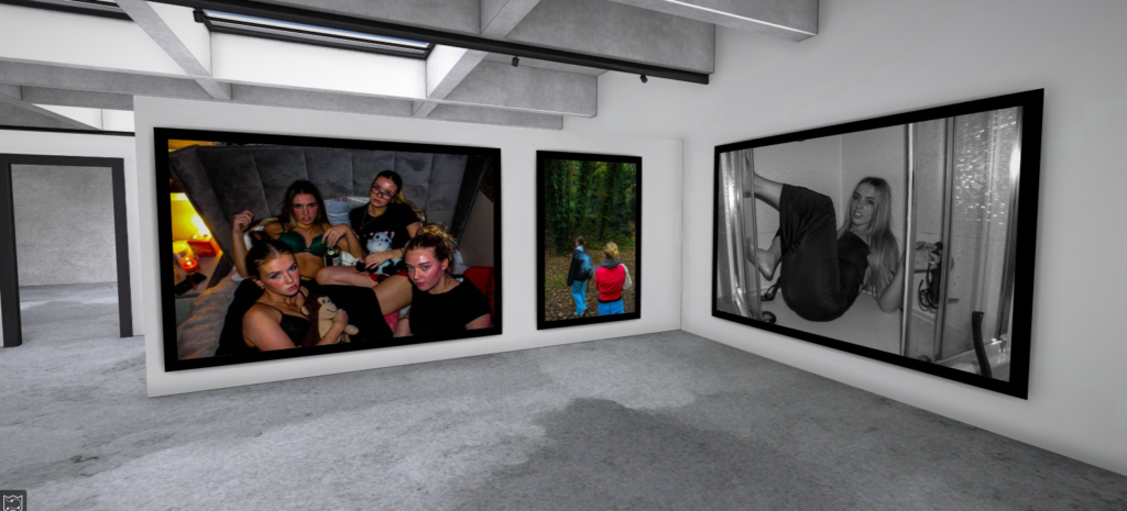
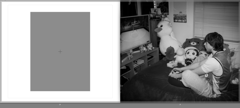
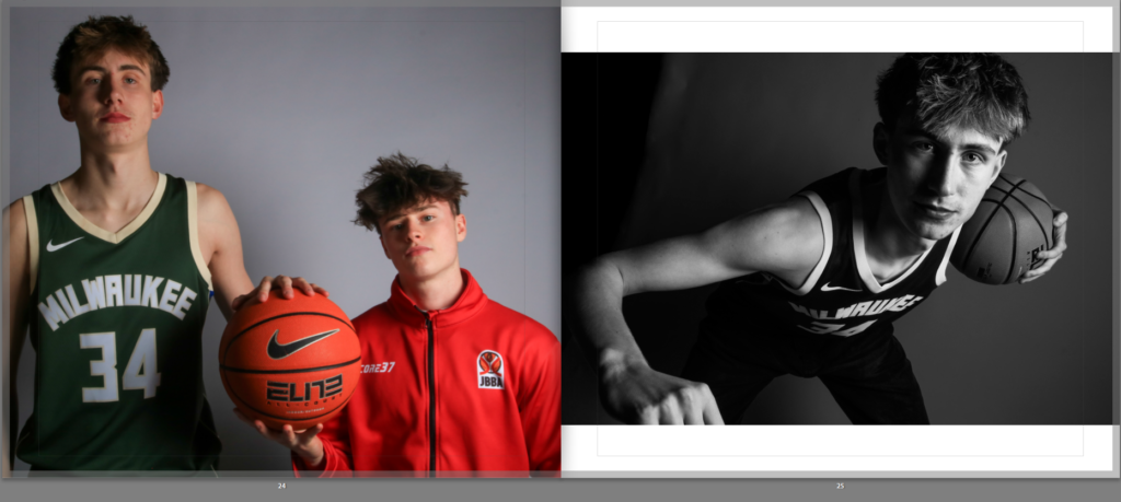
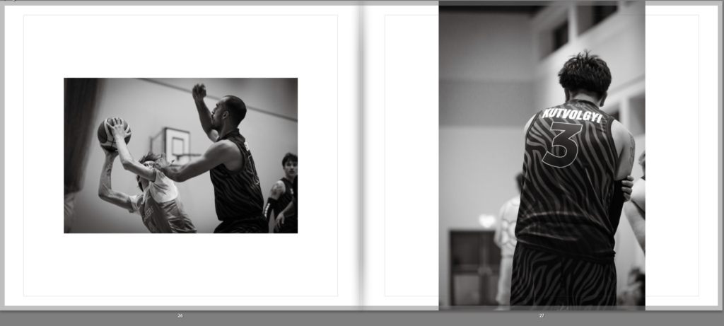
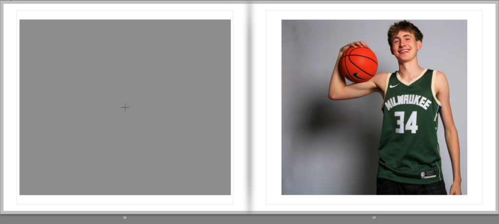
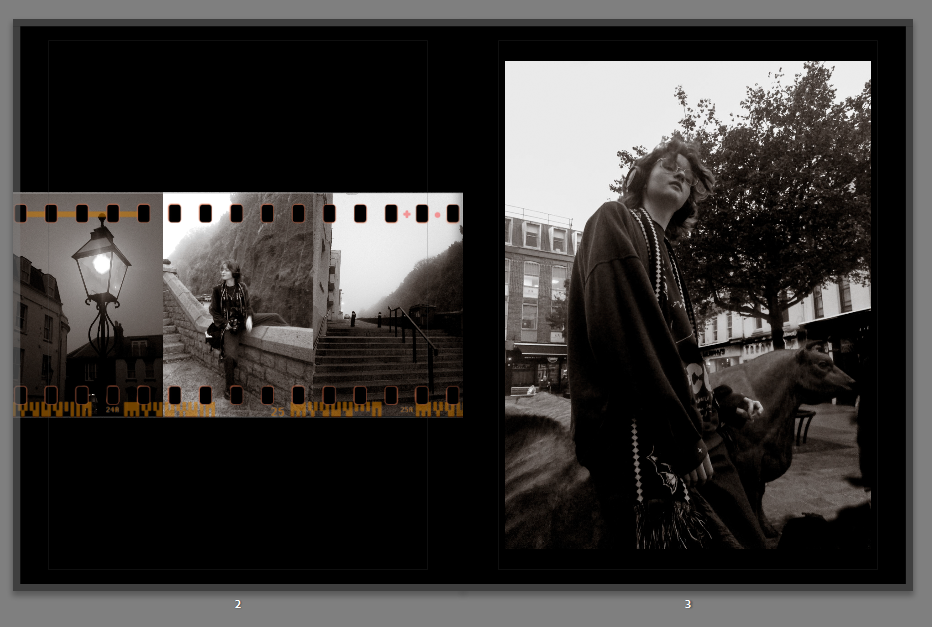
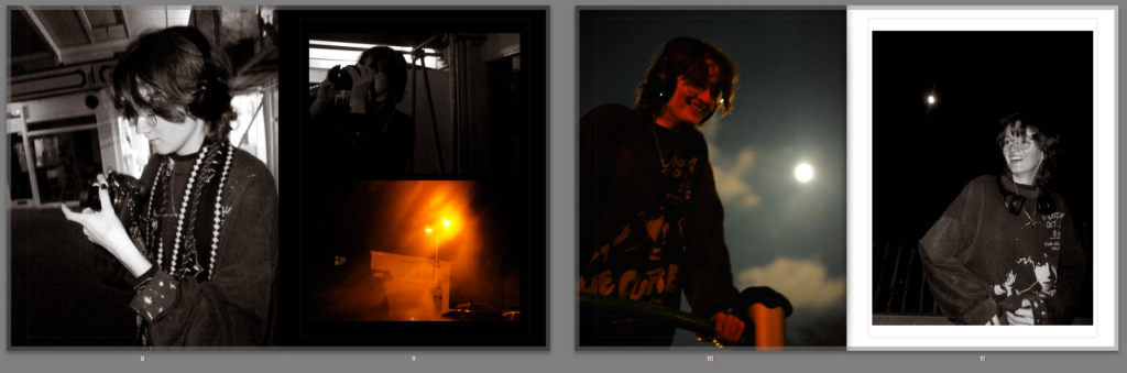
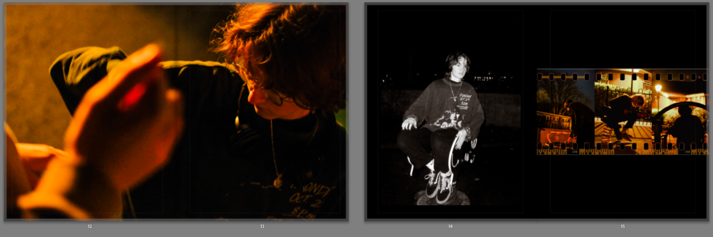
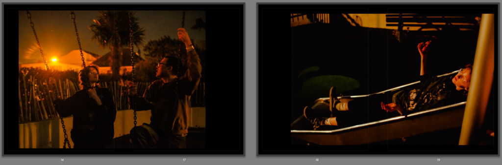
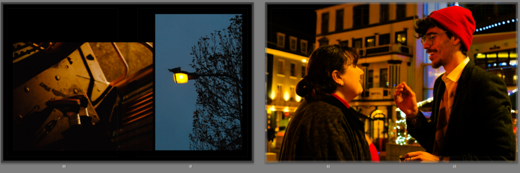
- Images and text-I would like my images to take up the whole page so that they are large enough to see, however this may be a struggle as many of my images are portrait and many of them landscape. This may means that my e.g. portrait images would not be able to fit the page completely. However, any portrait images could have a small white border around them, but still take up the majority of a page, or vice versa. I do not think that I want more than 1 image on a page, however when it comes to my second section and I am focusing on the fashion and beauty industry pushing beauty products onto young girls in order to make them want to be beautiful and purchase their their products.
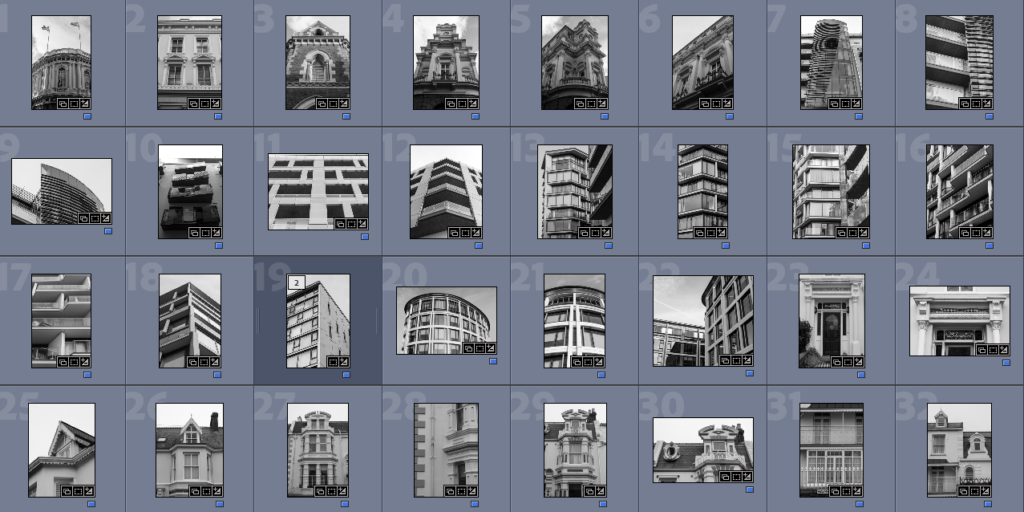
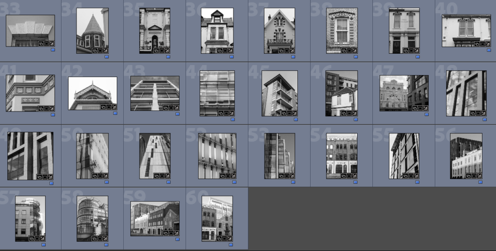
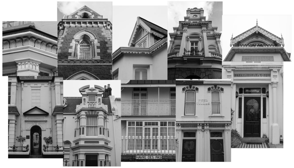
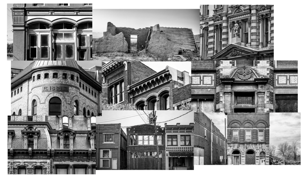
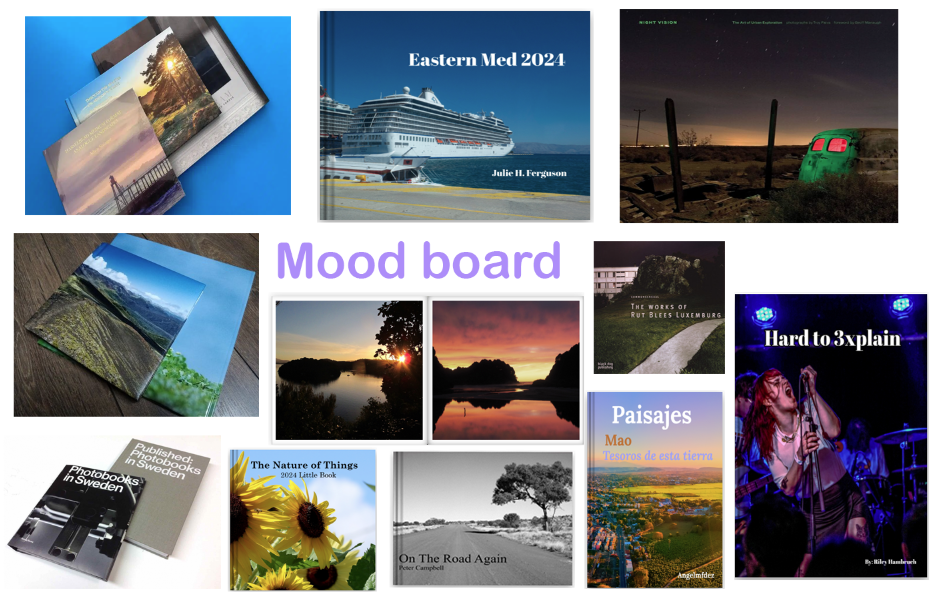
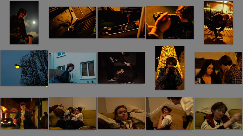
2. Produce a mood-board
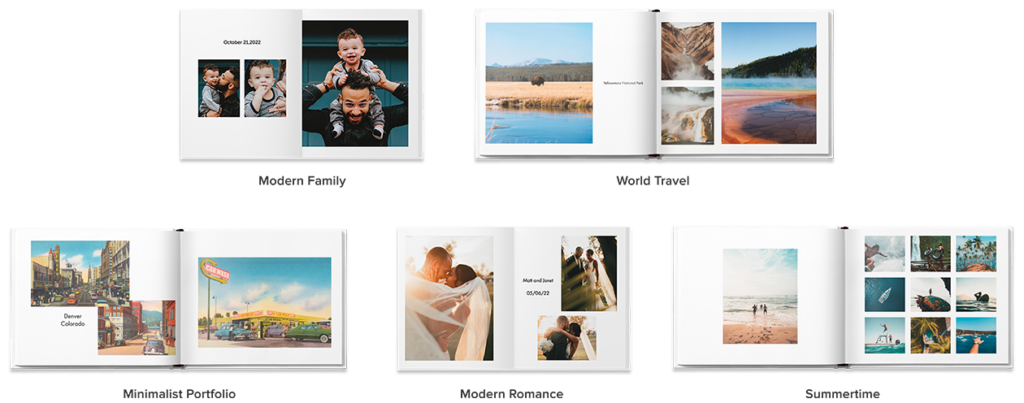
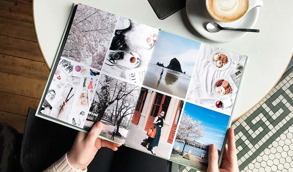
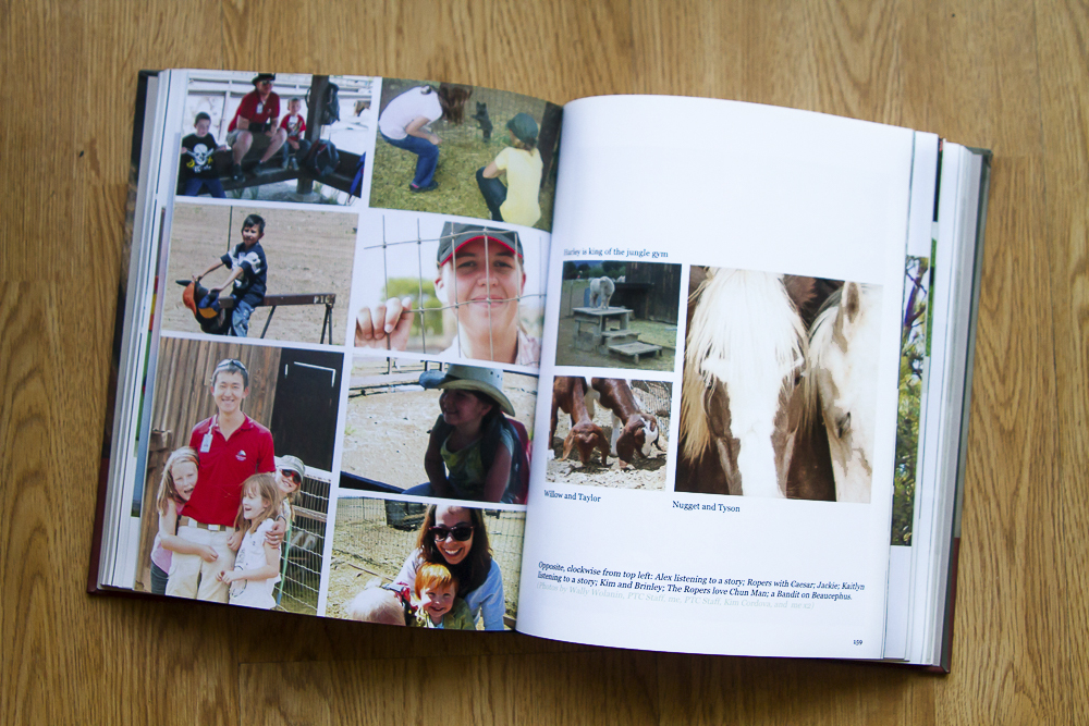
Here is a mood board of the Blurb Inspired photobook I have seen. I would like my images to be presented in a clean, sleek way which makes the book easy to read and enjoyable. I like his layout of clean white lines to separate images as I think it makes the page look less busy and does not clash with other images which decreases the quality of the book.
9. EVALUATION: Upon completion of photobook/ film and presentation of prints make sure you evaluate and reflect on your learning and final outcomes. Comment on the following:
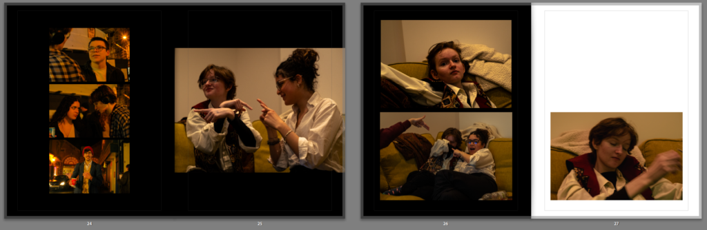
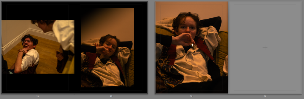
I believe my final photobook was extremely successful. However, to improve I believe my experience would’ve been a lot easier with more preparation In prep for my next mock exam and the final exam, I must remember to complete small details which should not be left until the final 3 day exam, as this will waste time and may prevent ,e from finishing all my tasks. Unfortunately I was not able to print my book to Blurb on the final day of the mock exam, and instead had to order it the day after, this can not happen in my real exam and must be completed within the time limit. However, this mock has taught be to work more efficiently with time and pay attention to the blog posts, planning and prep hat needs to be done in the weeks leading up to the final mock. I believe that however, I worked well under the pressure and solved any issues which resulted. For example, my images were not of a high enough quality to be posted onto my book, this was an issue I had to overcome, and attempt to find images of better quality which would not result in low quality and blurry images in my final book. Another issue I also faced is my final complete blog post with all screenshots and aspects of my mock process was unable to saved and erased from the blog, the outcome of this has been a highly less detailed analysis of my work completed on the mock date, however, with extra work and more explaining I will be able to overcome this by attempting to replace any screenshots that were erased and attempting to find clear pictures that I can use to input into my analysis blog post. I also need to beforehand, work on a practice book on Adobe Lightroom, where I can experiment with photo layouts and what kind of layout will look clean and effective to help my images be presented in the best way possible.
5. Print a set of small work prints (4 to one A4 page) on the Laserjet, cut them up in guillotine and lay them out on the big white table for editing.
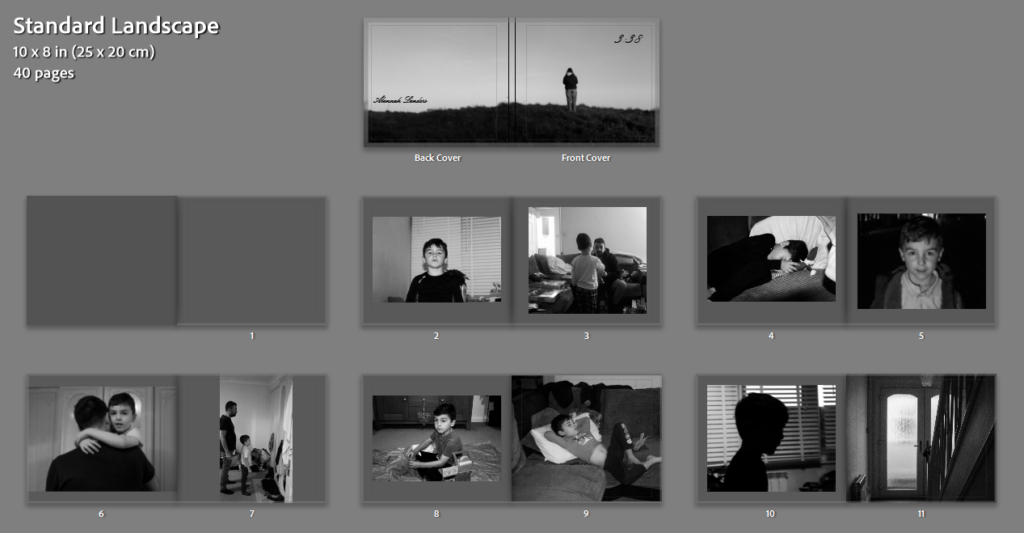
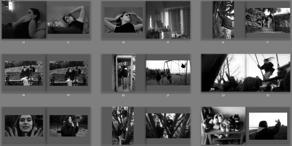
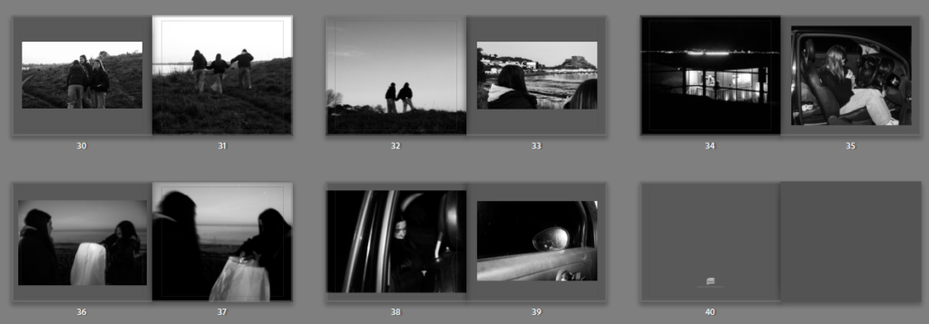
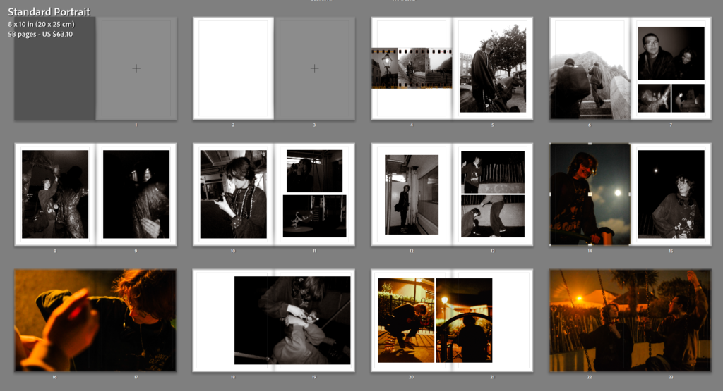
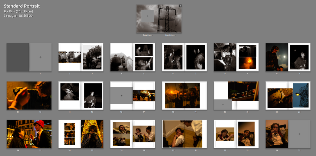
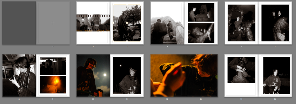
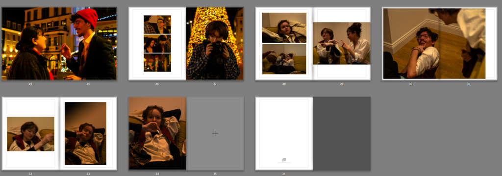
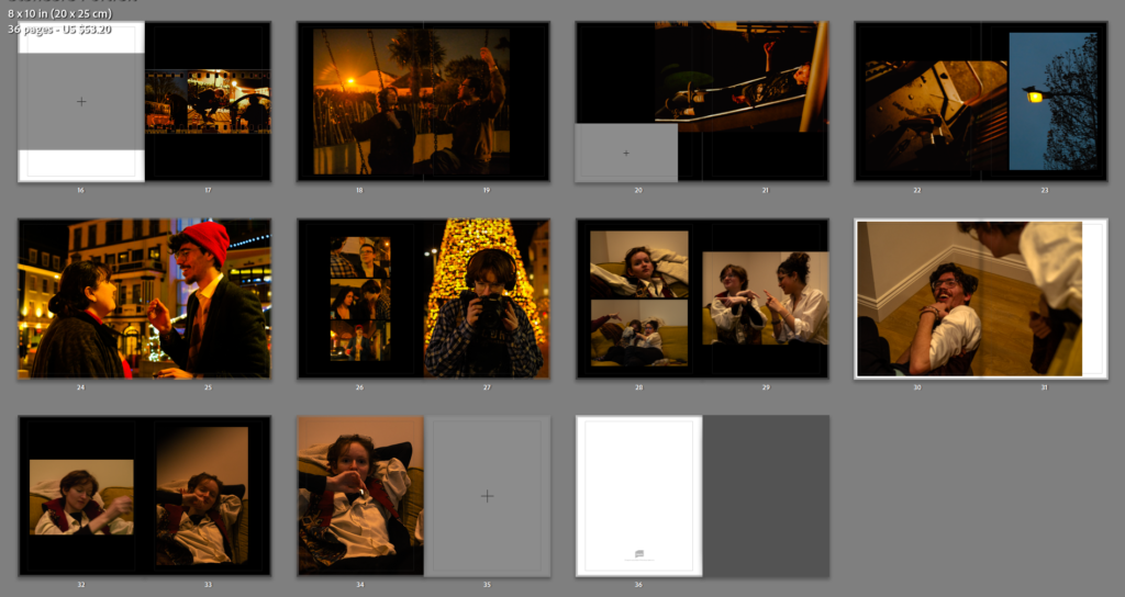
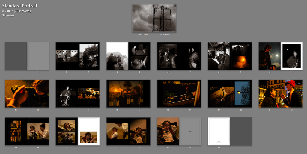
6. Decide on format (landscape, portrait) size and style of your photo-book. Begin to design your photo book, considering carefully, narrative, editing, sequencing, page spreads, juxtaposition, image size, text pages, empty pages, use of archival material etc.
I would like for my book to be around 30-40 pages long, like a usual conventional magazine and I would like for there to be sections dividing up my photoshoots, I will be adding my essay to the back of the book and I will be including a contents page to the beginning of my book.
7. Add your illustrated essay at the end of your photo book, including title, any captions (if needed), bibliography, illustrations of artists work (incl data) and images of your own responses. Think carefully about font type, size and weighting.