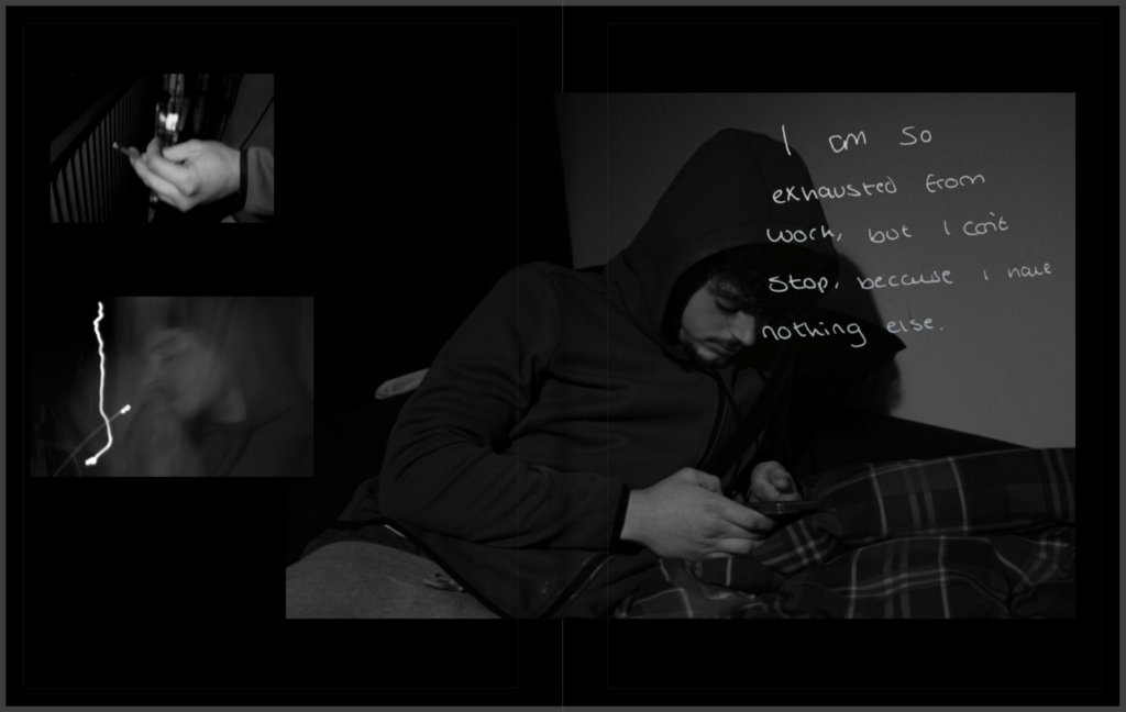
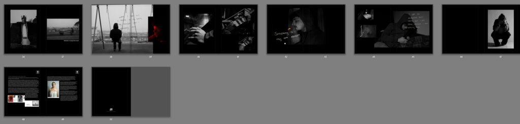
For my final layout, I decided to use black mount board/ card as I felt it well supported my images due to their vibe and tones. The black card allows the images to stand out against each other and makes the layout look cleaner overall, especially with the black and white edited images. I am very happy with my photographs and narrative, which created my photo book.
The theme for the final exam in photography is ‘Union’. To start with my investigation, I began by reading through the entire exam paper as this provides me with starting points to gain inspiration from before I fully research different interpretations of the theme. I annotated and underlined key pieces of information and the names of any movements or artists so that I could research them later on.
I also used the other exam inspirations for different courses such as Fine Art as this could give me an idea of what else I could incorporate into my work and the different ways that artists inhabit this theme in their work. I used this as my starting point when creating my mood board.
Mood Board:
ReligionHuman connection e.g friends/family/strangersLeading lines e.g veins, branches, lanes, websObject connections Team sportsMaps or checkpointsPolitical activism e.g challenging misogyny and sexist views Different movements e.g Cubism
These are just a handful of the suggestions within the exam paper that I found may inspire me. From here, I have already started to think about some different ideas that I want to do.
The word ‘union’ is defined by:
‘a society or association formed by people with a common interest or purpose.’
Once I had defined this term, I began to think of ideas of my own. Some of these ideas were:
Environmental portraiture in the workplace in relation to trade or work unions
Cubism in photography
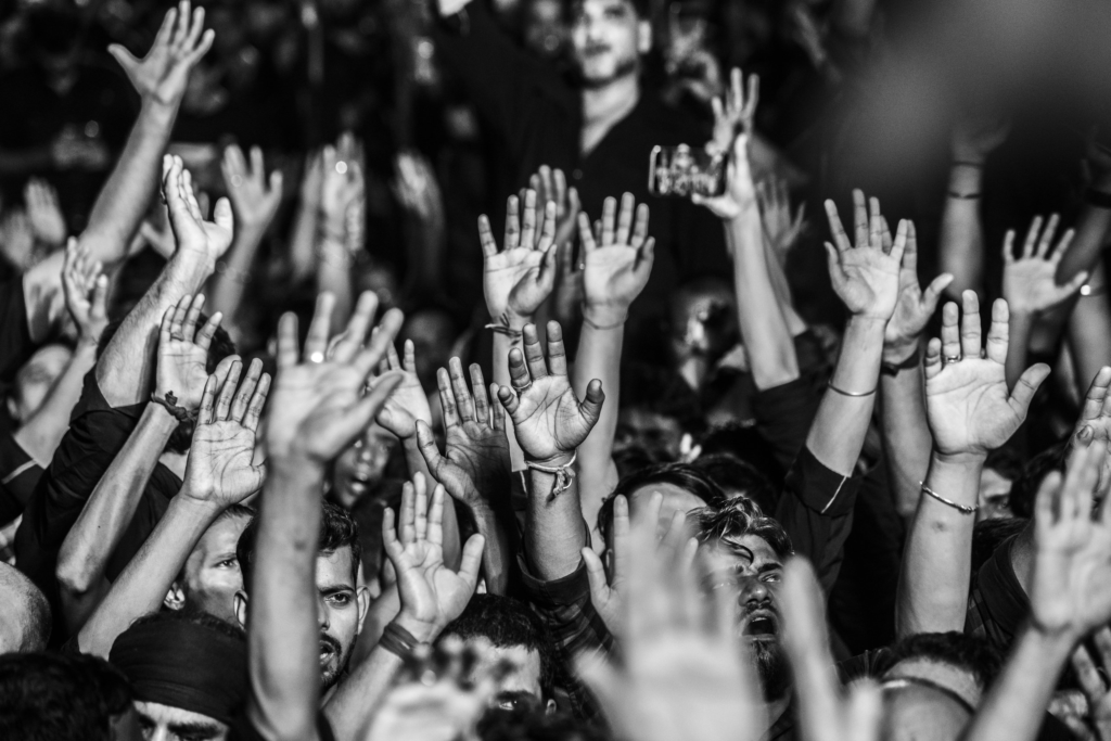
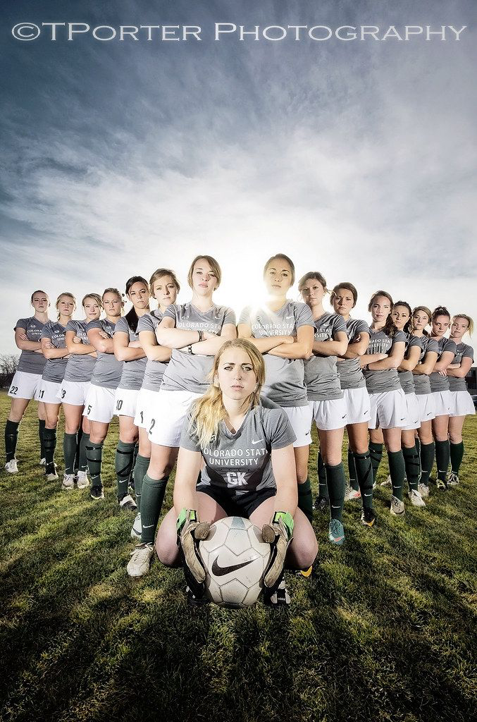
However, one of my favourite ideas I have been inspired by is political movements surrounding feminism and the like. Being a young person, I have always sought importance in keeping myself informed about the different injustices and movements within society because I understand that it is key that I am aware to these things in society. However, growing up in a world as a young girl has meant that I have acknowledged the inequalities between man and woman in society and have experienced the repercussions of normalising these issues.
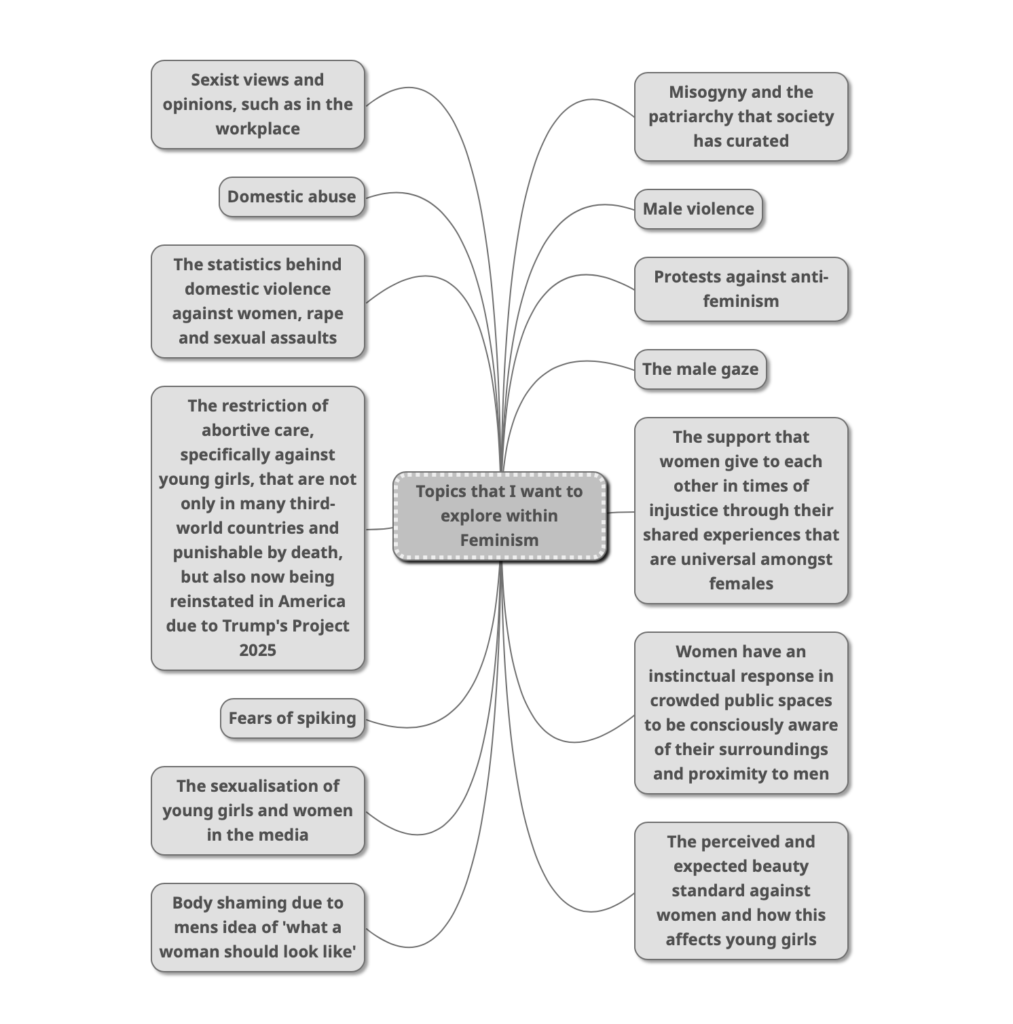
Because this is a topic that is important to me as a feminist myself, I want to explore as many issues as I can that are highlighted within feminism within this study. These consist of:
What is Feminism?
Feminism is the advocacy for women rights in society in accordance to gender equality. A common misconception is that feminism is concerned with ‘girls being better than boys’ however this movement strives to remove the barrier between male and female in political, economic, personal and social contexts. A core value of feminism is the position that modern society is infiltrated with patriarchal viewpoints, this being where the male point of view is prioritised due to predetermined stereotypes. This movement is centred around fighting against these close-minded views that women shouldn’t receive the same personal, educational and professional opportunities than men do.
Feminist campaigns originate back to late 18th-century Europe, pushing for women’s equal rights such as the right to vote, earn equal pay, run for governmental office, the right to education, owning property, equal marital rights and maternal leave. These are just a small handful of what the feminist movement has pursued over many years, however this must still be driven to combat the stereotypical views that women equate to lesser than men. This movement was fundamental in ensuring women and girls gain access to contraceptives, legal and standardised abortions, as well as the protection from sexual assault, sexual harassment, rape or domestic violence.
However, these implementations of societal change stem from major historical battles that women have faced for hundreds of years, and are currently still having to be fought for in many third-world countries. For example, there are 24 countries across the world where abortive services are entirely prohibited, according to TIME magazine.
In these third-world countries, this may be due to the undeveloped nature of their medical systems. However in a more familiar and Western world, the U.S Supreme Court overturned Roe v. Wade in 2022, which was a landmark in history that granted women in each state of America access to suitable healthcare surrounding their pregnancy freely to the choice of their own. This removed every woman’s constitutional right to abortion rights in America, and handed it to each state to make a decision of their own. After existing for nearly half a century, this jeopardises many young girls and women’s lives, practically taking a step backwards and undoing all of the work that feminists of the past had strived to complete.
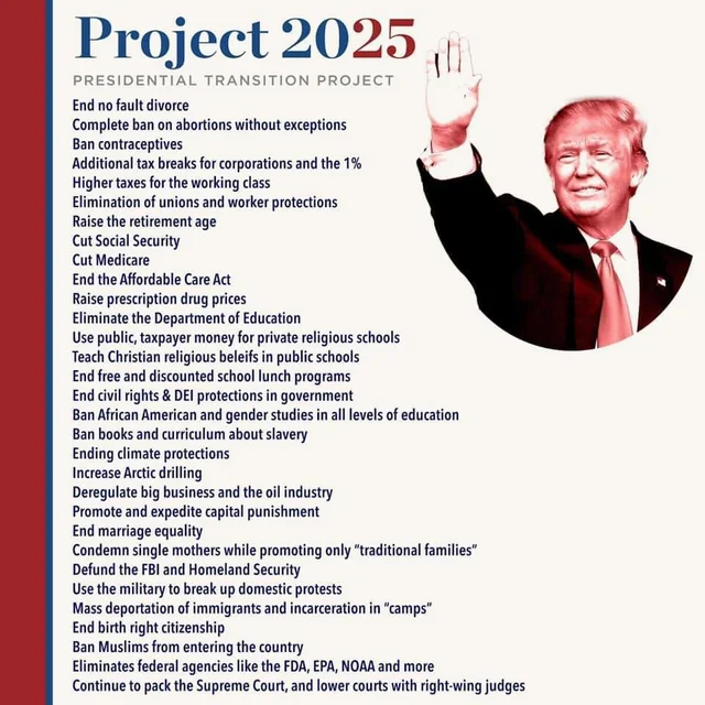
Roe v. Wade was initially passed in 1973 allowing the entire right to an abortion during the first three months of pregnancy, however this has been eroded over the years. For example, Texas – a very republican state which majorly agrees with the pro-life movement – passed a law in 2021 allowing the people to sue clinics and doctors for carrying out an abortive procedure after 6 weeks. Now that Donald Trump has been re-elected as president, one of his plans have begun within his Project 2025 campaign which concerns bans on contraceptives and abortions with absolutely no exceptions. This is entirely dangerous and harmful to the millions of young girls and women across the country who could be put in life-threatening situations without simple access to these services.
With the inability to terminate a pregnancy, this could result in numerous deaths as the mother could die from giving birth – whether this may be from not being developed enough to carry to term or the body straining, rape victims being forced to birth their assaulters baby, not being able to provide for the child due to financial instability or pay the extravagant prices of hospital bills due to the lack of free healthcare, not having a support system in place, or just simply not feeling ready to have a child.
Historical events:
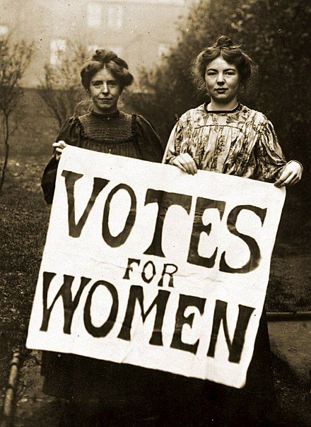
The Suffragettes:
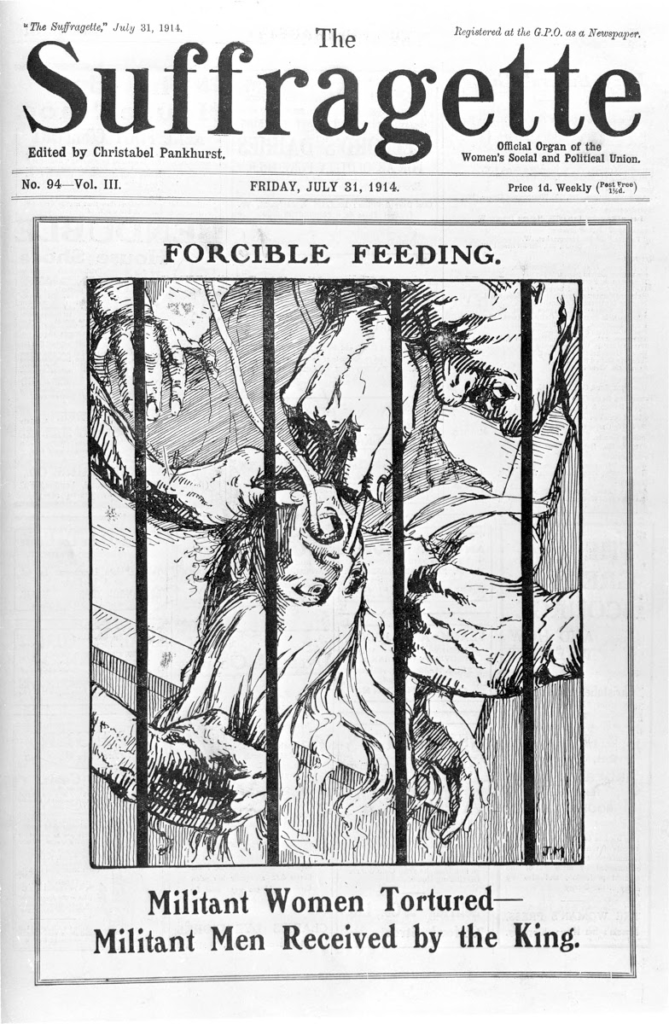
The Suffragettes dominated the feminist movement for several decades, and are a notable period of time of activism for the rights of women. These women were members of an activist organisation in the early 20th century, fighting for the right to vote in the UK.
Annie Kenney and Christabel Pankhurst of the WSPU in 1906.
Within this campaign, there was a divide in the choosing of tactics and strategy in making their voices heard.
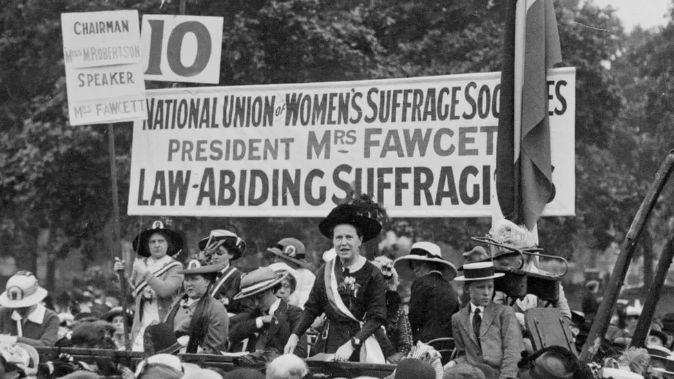
The Suffragists: NUWSS:
The suffragists sought to achieve women’s suffrage (the right to vote) through deep debating and campaigning through non-violent marches and petitions. This was led by Millicent Fawcett who was the head of the National Union for Women’s Suffrage Societies (NUWSS). This was an organisation, founded in 1897, however was merged with other organisations dated back to the 1860s. This consisted of primarily upper- and middle-class, however there were many women representing the working-class too. This was a limited representation as the working-class would be restricted on the time they would have to attend these protests as this would result in the loss of money when it was already difficult to gain a living in the first place.
Many women who were interested in this movement sent delegates to the NUWSS to then report back the benefits to those who were being represented, many of these women were textile workers, sweated labourers and those who worked in mines. By 1914, the NUWSS had over 100,000 members throughout the country with over 500 branches. Some of these methods of constitutional seeking for change consisted of:
Public meetings
Organised petitions
Wrote letters to politicians
Published newspapers
Distributed free literature
‘Suffragist Millicent Fawcett will be the first woman to have a statue in Parliament Square.’ – BBC Bitesize.
The Suffragettes: WSPU:
With the lack of progress with the NUWSS being disappointing, Emmeline Pankhurst and her daughters formed the Women’s Social and Political Union (WSPU) in 1903. Instead of taking a peaceful approach like the suffragists of the NUWSS, the WSPU decided to use a confrontational manner out of irritation of resistance to change by the government – a male-dominated field at the time. This direct advance was referred to as militancy, leading to these campaigners being called the ‘Suffragettes’ instead of Suffragists. This adding of the suffix ‘ette’ was purposely applied to belittle those taking more dramatic action, portraying the idea that these women were lesser than those acting in a peaceful way. However, this insult stuck and was used by the members of the WSPU themselves. This radicalised approach resulted from a culture of women who had already campaigned tirelessly without seeing results.
The Pankhurst family who formulated the WSPU led the way for the new struggle, and due to them being at the forefront of campaigns they were arrested numerous times, being imprisoned and committing to numerous hunger strikes. The Suffragettes These tactics implemented shocked society due to a large number of these women having well-connected families in middle-class society, with this being reinforced by the traditional stereotype that women should be family-orientated, delicate and nurturing – this was seen as scandalous.
Initially, these tactics were employed to cause disruption and some civil disruption, for example 60,000 people gathered in October 1908 as a ‘rush’ on Parliament – this was intending to invade the House of Commons. However, this was just the beginning, as the lack of government attention resulted in:
Ruining male-only clubs and golf courses
Hunger strikes
Handcuffing themselves to railings/buildings as public displays of resistance
Planting bombs
Burning public buildings and unoccupied politicians homes
Disrupting political meetings, the postal service and the 1911 census (this recorded the details of over 36.3 million men, women and children)
Smashing windows of private property and government buildings
Attacking Church of England buildings
Holding illegal demonstrations
Heckling MPs
This is just a fraction of the disruptive strategies that the Suffragettes used to make themselves known and heard.
The Suffragette Newspaper
The Suffragists would not co-operate with the Suffragettes as they did not agree with this form of direct action, and believed that non-violent methods were more suitable. Whilst their civil disobedience allowed them to be the main focus of the country at the time, meaning that no politician could ignore them, this meant that the NUWSS’s actions were often overshadowed by the actions of the WSPU. Many historians still argue over which side of the movement furthered the campaign.
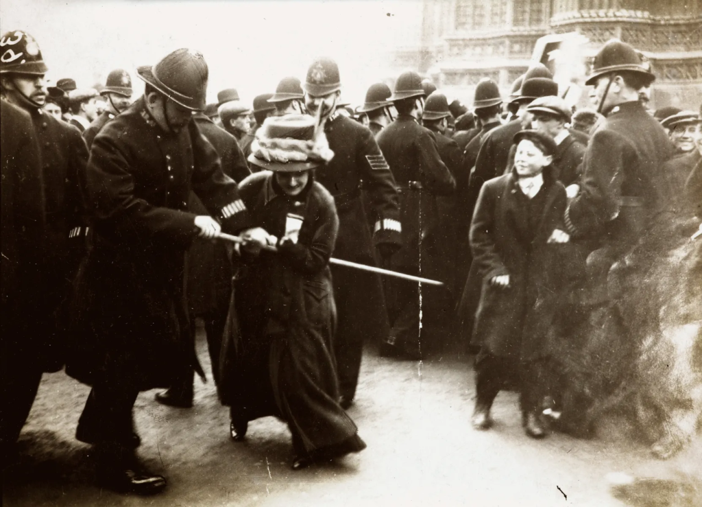
Black Friday:
A notable point within the Suffragettes is Black Friday. In the 1908 election campaign, a member of the Liberal Party named Herbert Henry Asquith promised to pass a law that included women’s rights if elected as Prime Minister. With the support of the Suffragettes behind him, he was elected. However until 1916, this actually resulted in Asquith refusing to reform the right to vote, leaving the women with empty promises and anger.
In response, the WSPU organised a march to highlight the issue with his refusal, however the women were met with violence by policemen and male bystanders. This meant that hundreds of women were badly hurt, even resulting in death.
‘Public conscience must be aroused, and it can only be done by attacks on public property. When women’s bodies were battered on Black Friday that was alright but when a few windowpanes are broken, that is all wrong.’ – Emmeline Pankhurst, 2 years later in a newspaper.
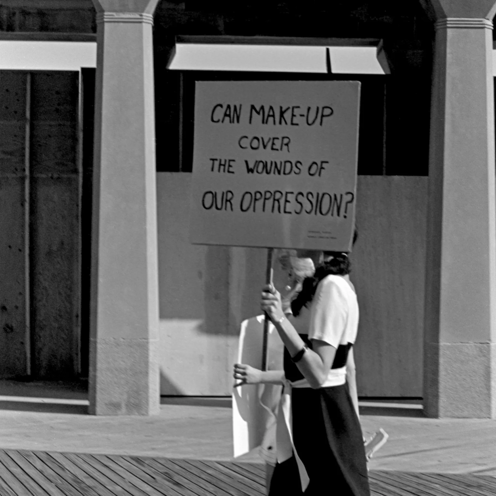
The concept of feminism is still fought for in modern society through protests as well as the use of social media. A great example of this is the #MeToo movement where women can come forward online about sexual harassments or assaults and tell their story in hopes to help those who relate or inspire others to come forward about it. This has also involved celebrities too, highlighting to the world that these people are not untouchable and many of them do awful, inhumane things and expect nothing to occur due to their wealth and fame. This is also extremely useful for those who have reported their assaults but have lost their case.
A predominant issue within modern feminism is the focus of misogyny which has been widely practised for thousands of years, this being a dislike of, contempt for, or ingrained prejudice against women or girls, being a partial form of sexism that women should be kept at a lower status than men. This concerns male violence and domestic abuse against women, where approximately 1/4 women (23% or 2.2 million) have experienced violence by an intimate partner since the age for fifteen in the UK. A notable addition to this is the fact that in the event that the England football team wins or draws, the occurrence of domestic violence increases by 26%, and when they lose the percentile increases to 38%.
The feminist movement has been growing strong for hundreds of years, and is still rife in modern society.
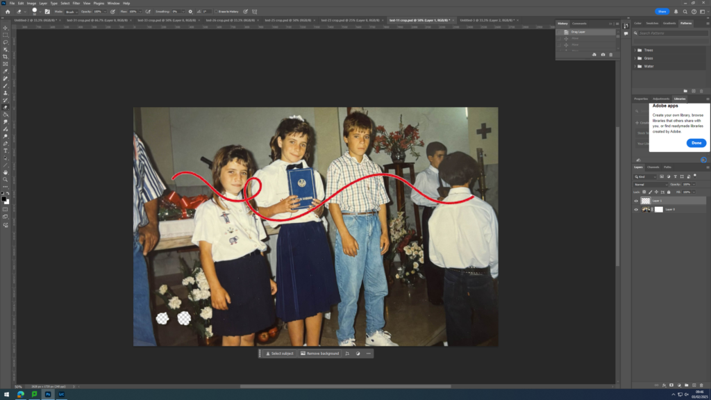
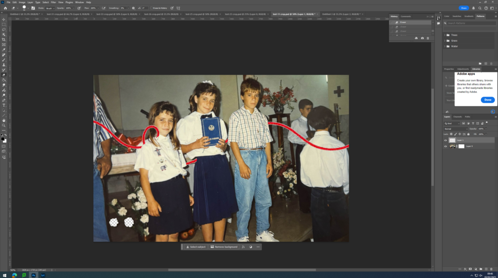
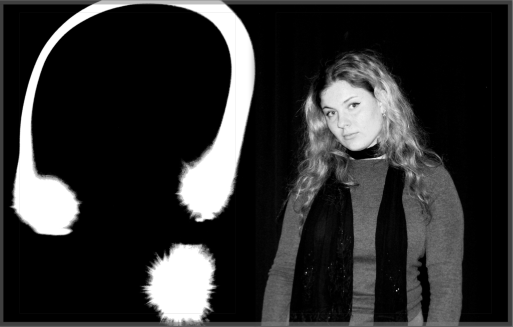
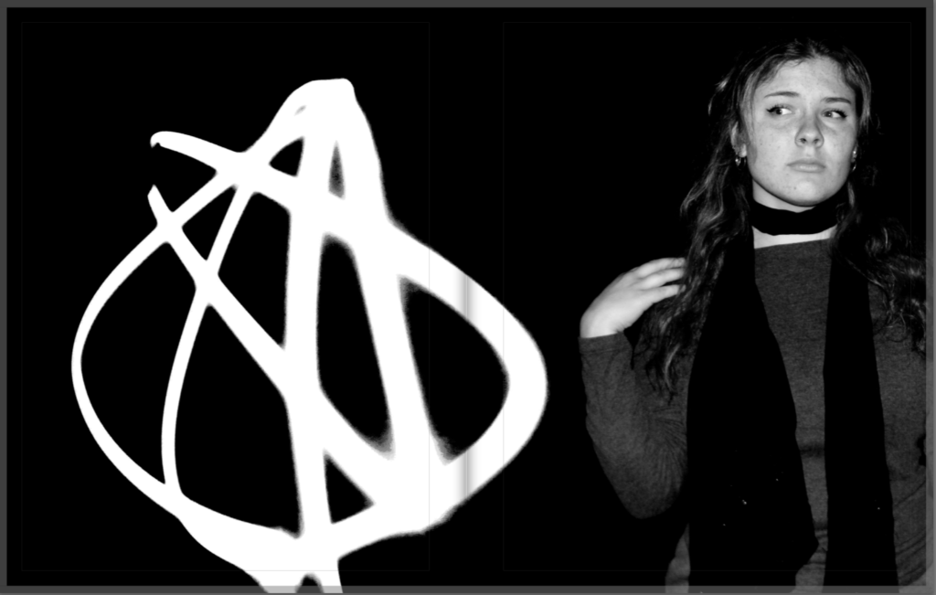
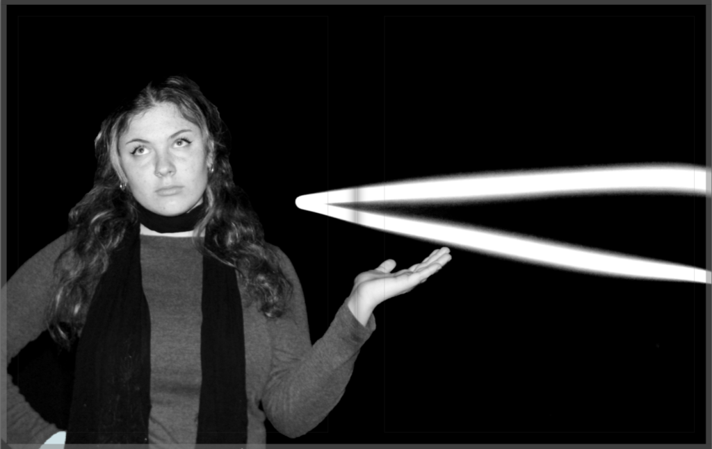
For this editing, I searched red line/ stitch on the internet and found an image that I was satisfied with and uploaded it onto Photoshop. In Photoshop, using the objection tool on the left, i selected the red line and moved it to the tab where the image, seen above, was. I placed the red line on top of the people seen in the image and decided if i need to make the line bigger or smaller or where the line needed to be positioned.
I selected the layer which the red line was on and used the rubber tool seen on the left side, to rub out the parts of the red line I did not want to be seen. I wanted it to look like the red line was going through the people seen in the image. As if they were connected by the red line, the ‘bloodline’.
Update 1:
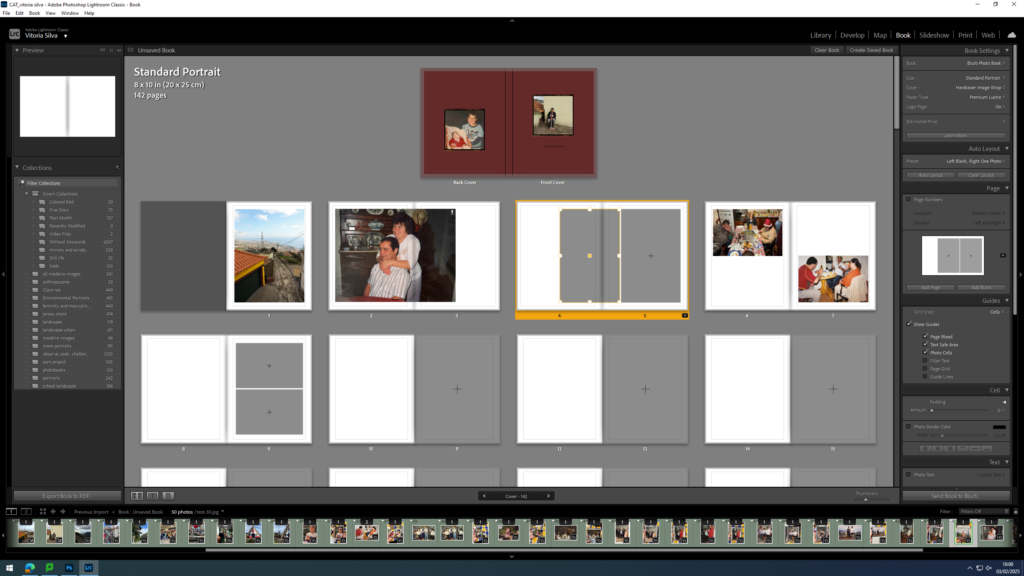
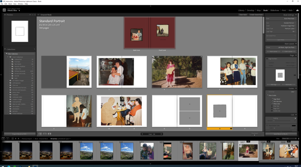
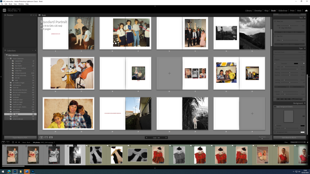
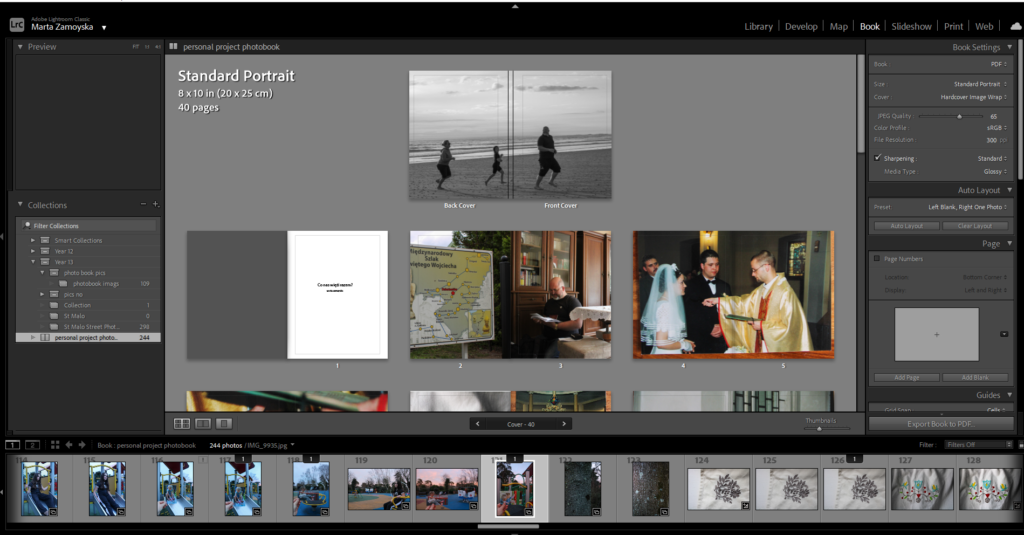
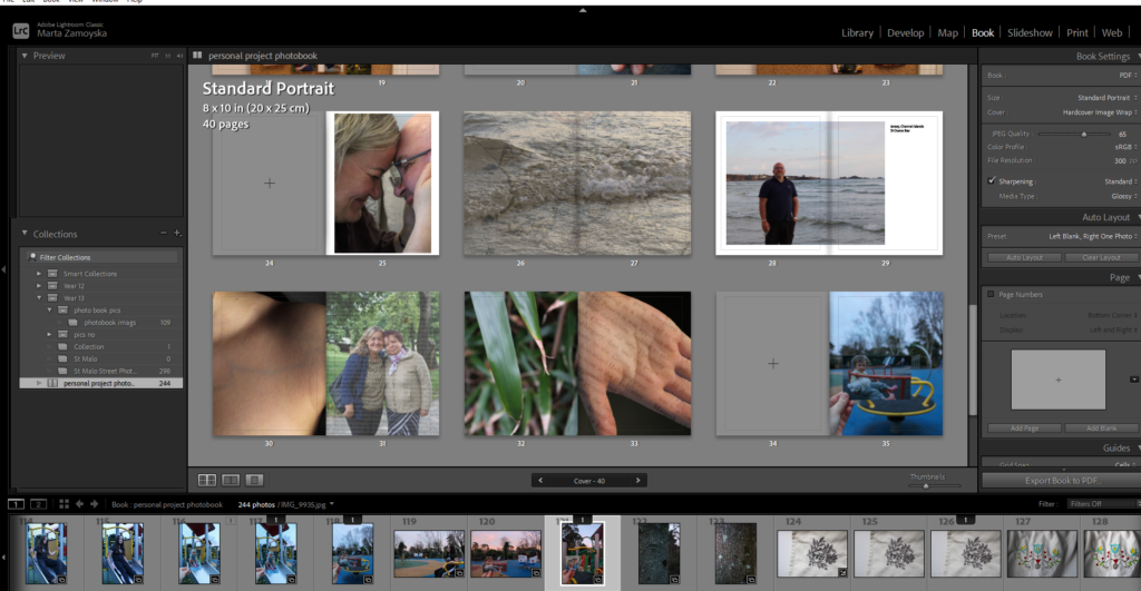
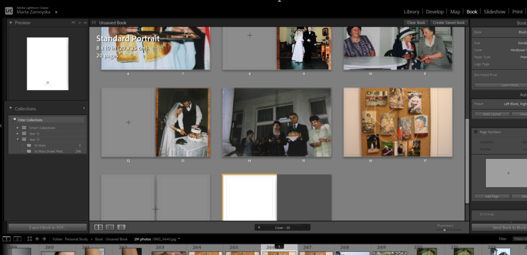
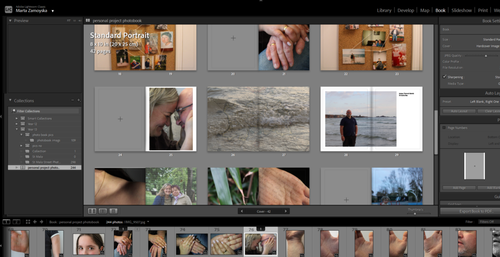
This is the first update for the photo book I have. In this update I had the front cover done and started adding images onto my book.
Update 2:
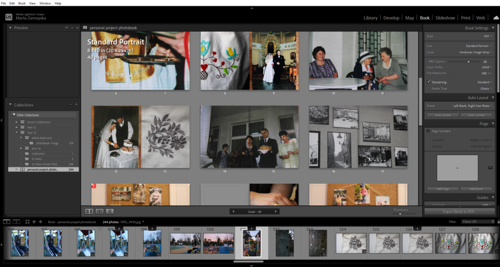
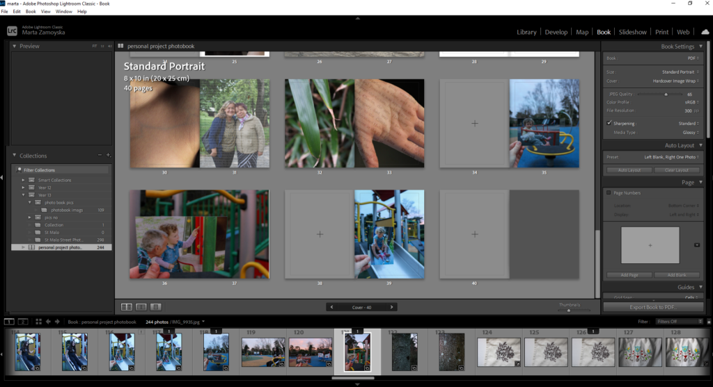
In this update, loads of things were changed. Photos was changed, structure of the book was changed. This is also where I started playing around with picture framing and positioning.
Paper editing:
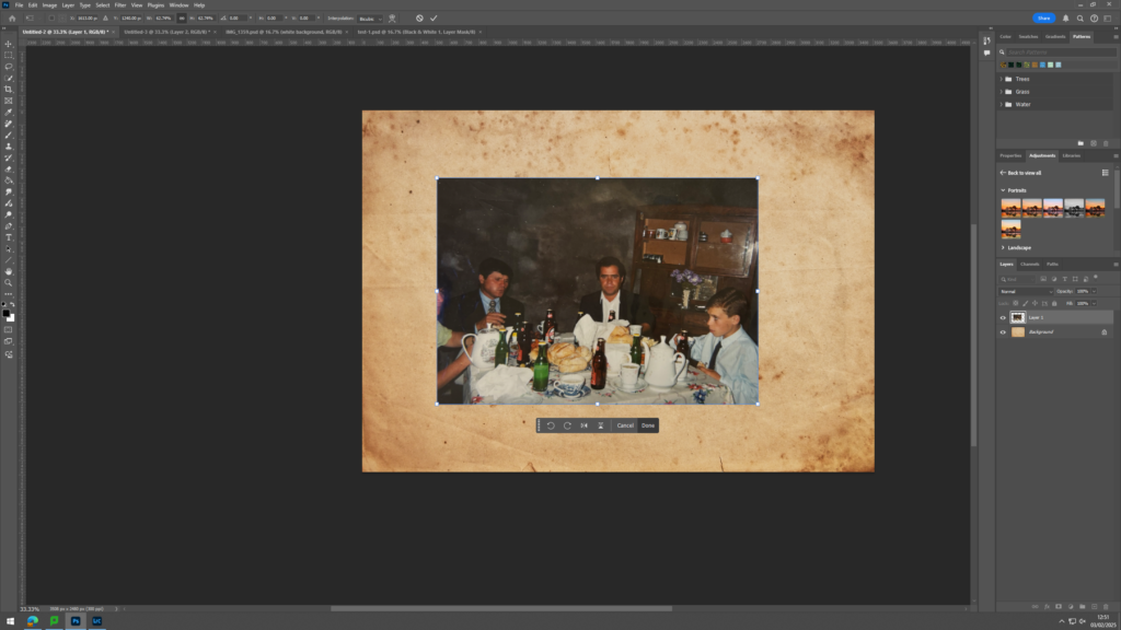
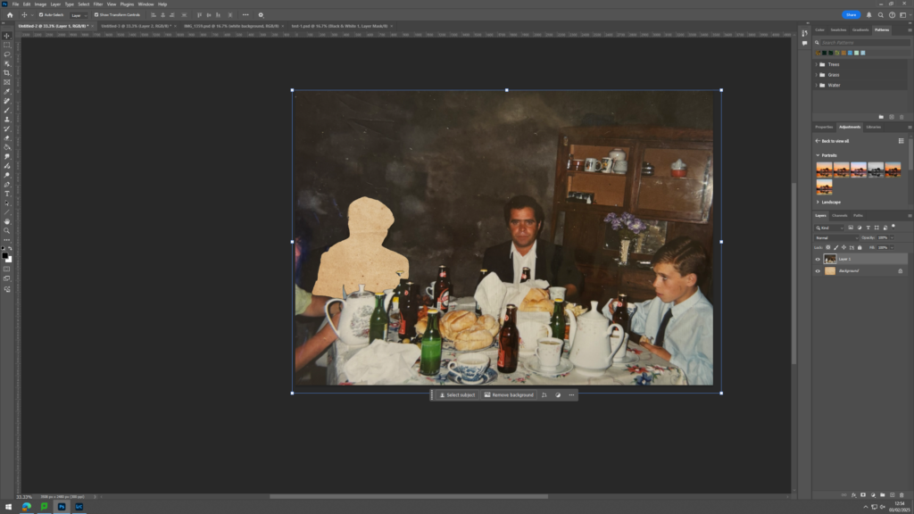
For this image, I searched in the internet for a yellow and old paper and uploaded the image that I was satisfied with onto Photoshop. After the image was uploaded onto Photoshop, I copied the image that I wanted to edit, found in my documents, onto Photoshop and applied the image on top of the paper, creating a second layer in Photoshop.
pressing the layer where the image is in and using the objection tool on the left side, I selected a person from the image and cut them out. I moved the selected section from the image, away from the image to reveal the old, yellow paper under it.
I moved the selected section from the image, away from the image to reveal the old, yellow paper under it. This was all I did for this edit.
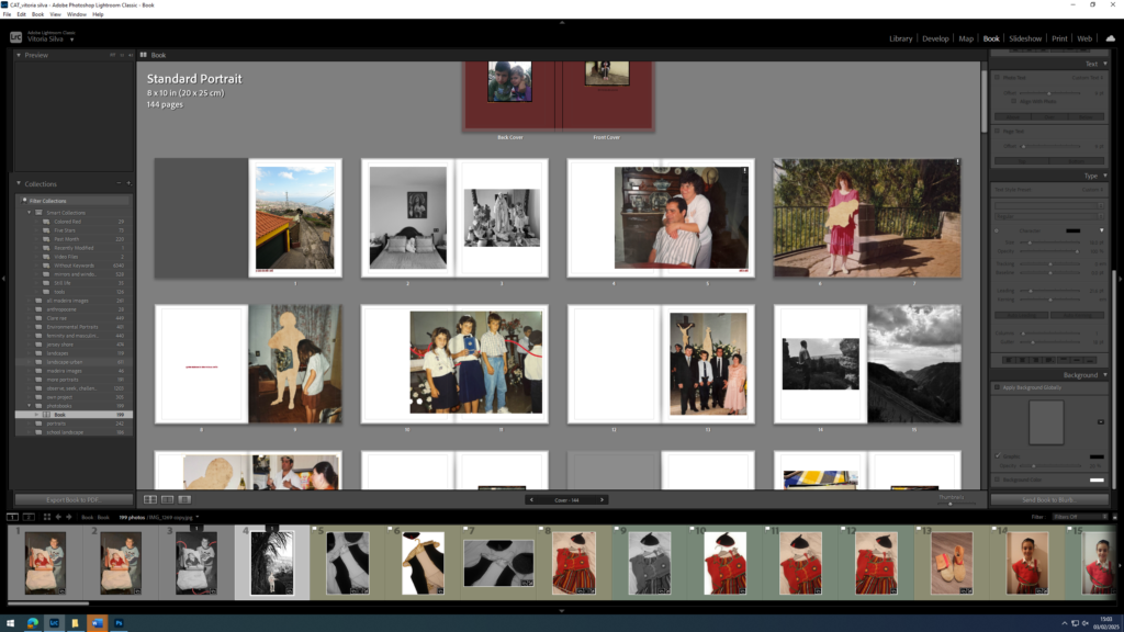
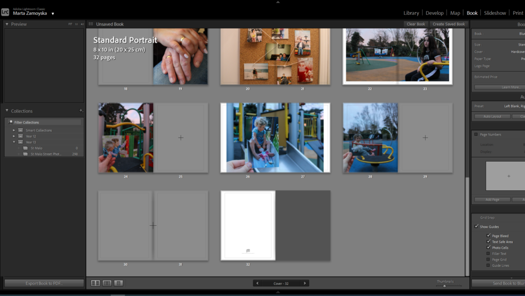
Update 3:
In this update, I started adding text to my images and playing around with the color of the text. This is also where I was trying to figure out where to put my text and how to smoothly add text in my book. I also started to add more images in my book and different frames to my images. I also started to figure out whether I wanted to have images that have a border of full bleed.
Update 4:
In this update, I started to be happy with the structure of the book and kept it constant throughout the book. I figured that I would start with a house of my grandparents and then and image of them in the next page. I also did this when I introduced images of my parents. After showing an image of my parents further into the book, I added an image of our house. This is where I started to find a more stern structure in my book and used different techniques like juxtaposition and match cut.
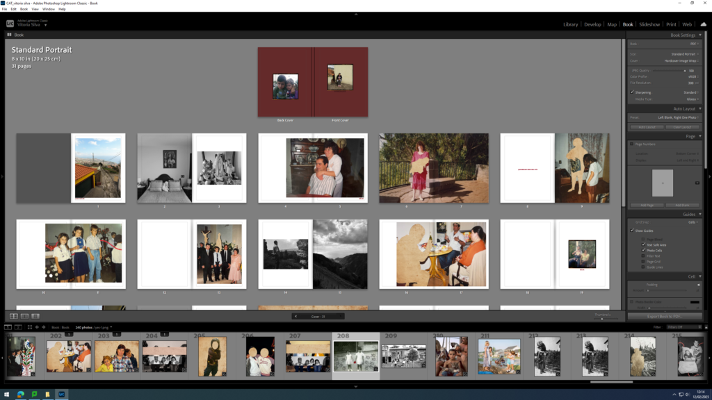
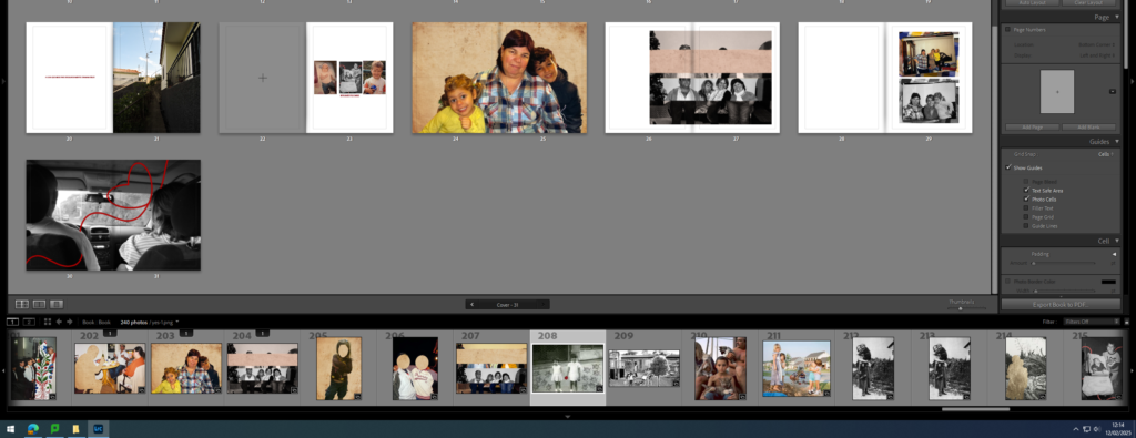
Full overview of final Photo Book:
Conclusion and evaluation:
In conclusion, I think that I did really well in terms of editing. I was clear and strong with my editing and even showed repetition within my editing to show a clear inspiration found because of my two artist I studied. The use of red lines and aged paper was a clear inspiration from Carole’s work and the nostalgic editing seen in some of my images implies a clear understanding and innovation towards Jo’s work.
My overall editing was simple but effective. I didn’t do a big amount of editing in my images but I did enough to enhance my images and show inspiration.
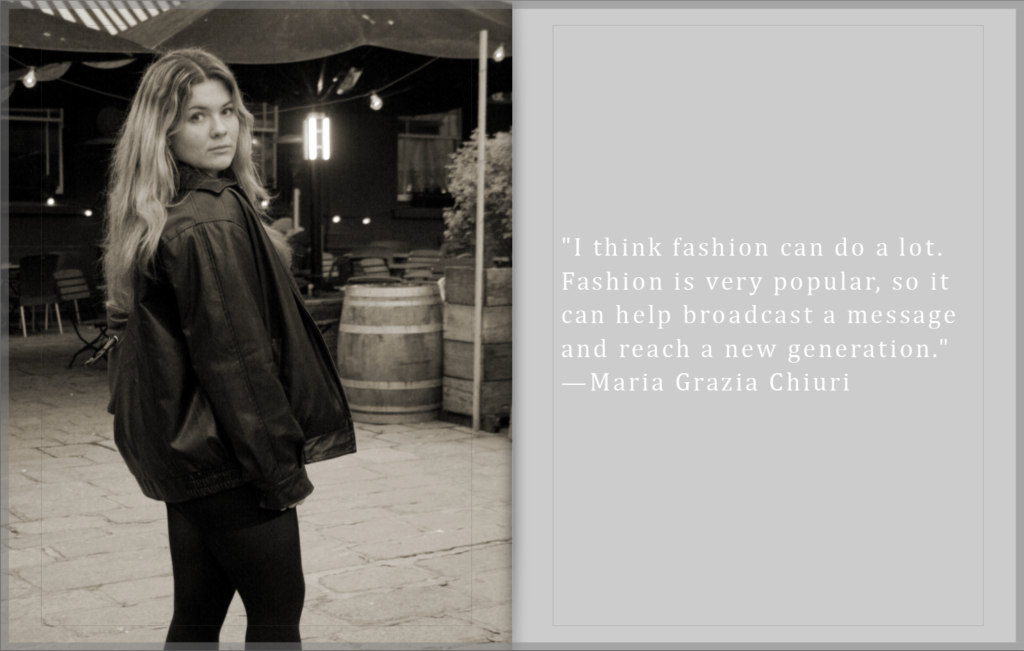
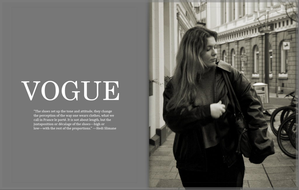
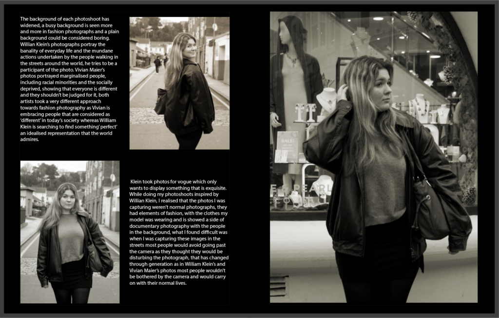
Here is the final product of my photo-book ,I believe that this turned out quite nicely and even though it wasn’t what I had originally planned it have some better features added. Originally I wanted to make this photo book look more like a magazine with boxes of writing and the. Pictures next to it, however it was quite difficult to figure out what to write in those boxes, therefore I replaced those pages either a blank page filled either one single word or a quote from a famous individual known in the fashion industry. I also changed the colour of the background to make it less boring and more different, I did get his inspiration from previous fashion magazines found online.As you can see I changed the background colour from white to black on some of the pages and this was so that I could add the light drawings in and make them look like they are floating and blending in, it helps to make the magazine less tacky. I really like the idea of putting quotes in the magazine as it does help to add a narrative and a perspective to the magazine. It almost adds a character and should be seen as an inspiration to others who read it . One thing I did struggle with was the front cover as I had edited it in photoshop adding a vogue sign in it to help make the magazine and then the whole edited picture didn’t fit in the book layout ,so I had to re edit it and move it around to make it look right. I also added my essay in my final book layout as it helped to add a magazine look, most magazines have pages of writing written in columns and I thought it would look better with the essay added at the end . Overall, I do feel like if I had captured few more pictures, it even some candid pictures it would have looked a little bit better and more interesting, thought I am quite pleased with the outcome even if there is room to improve.
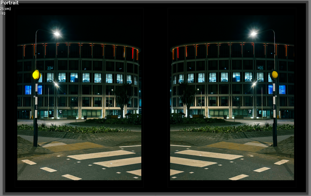
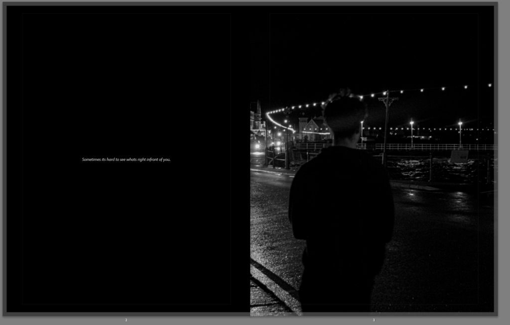
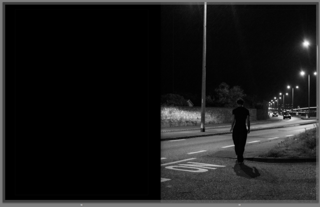
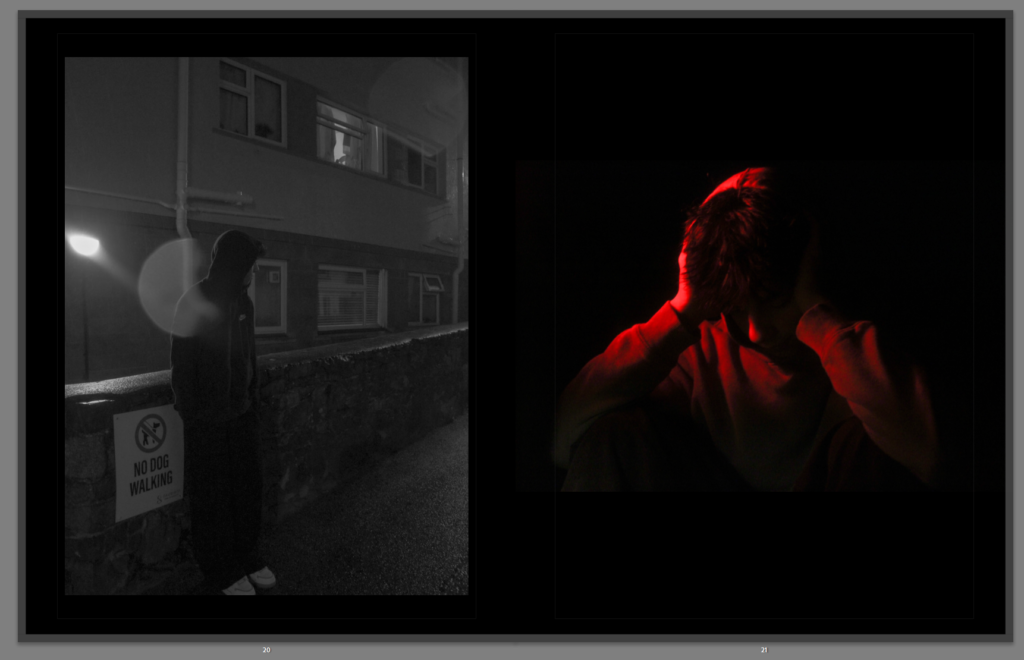
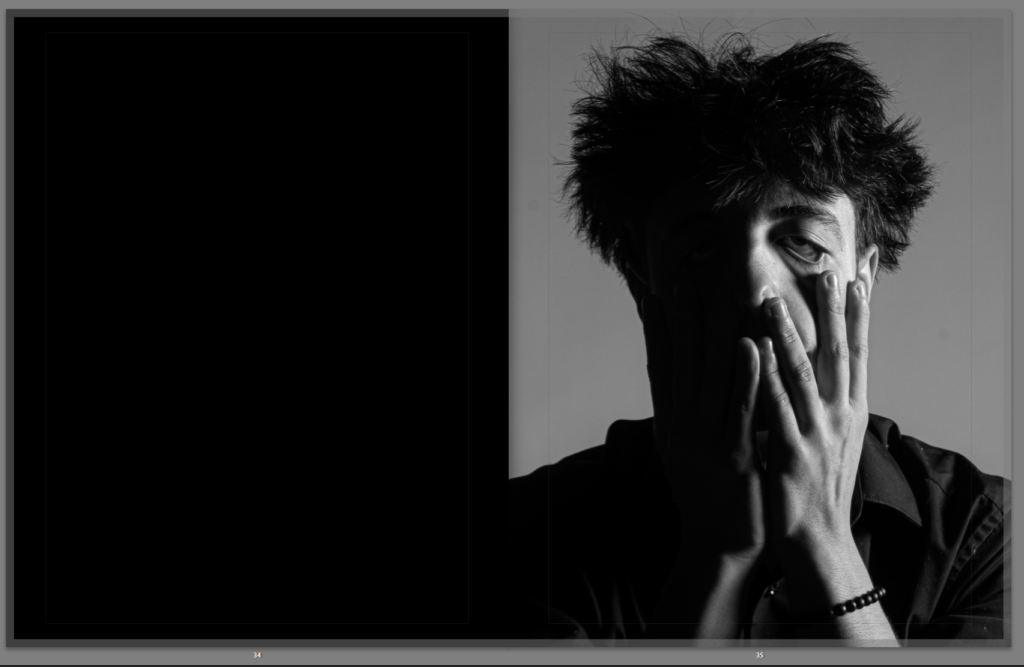
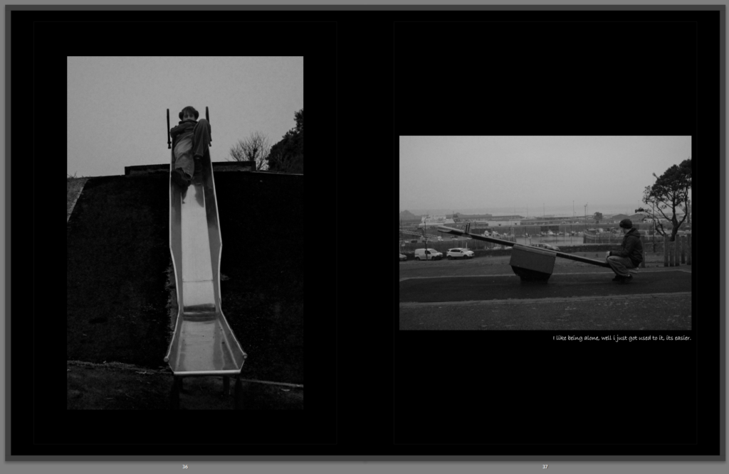
I wanted to create a double page spread for this photo because I feel like it deserves a whole page and it wouldn’t have as much emphasis on only one page.
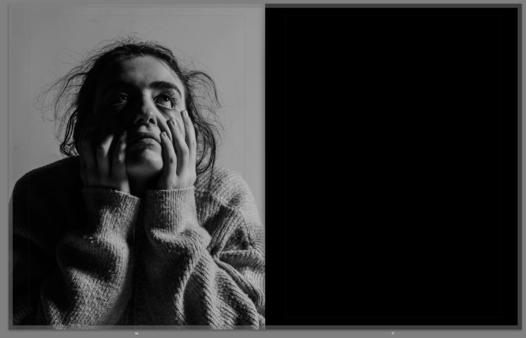
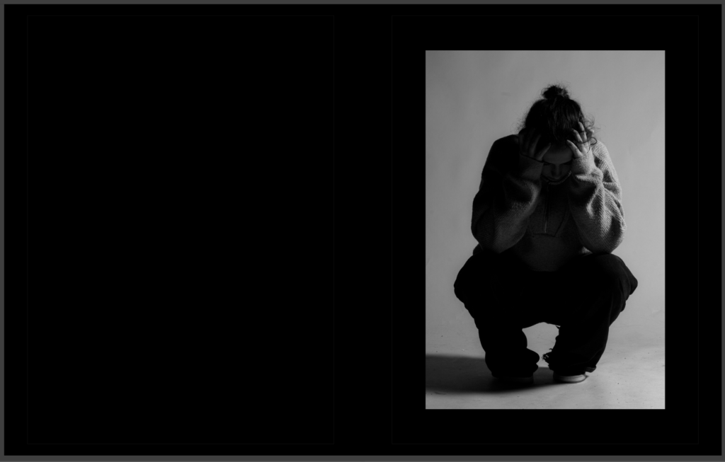
I like the way this portrait image has a whole page to itself as the image feels lonely and isolated so it works well on its own page.
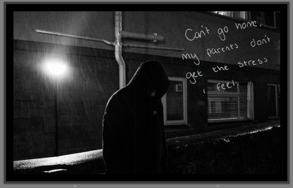
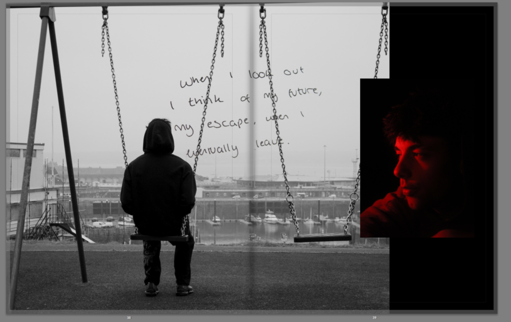
This image here was originally a full page spread, however there was a bit cropped out which affected its composition so I slightly narrowed it so there is a bit of black on the left and the composition isn’t affected now
Left photo Flipped
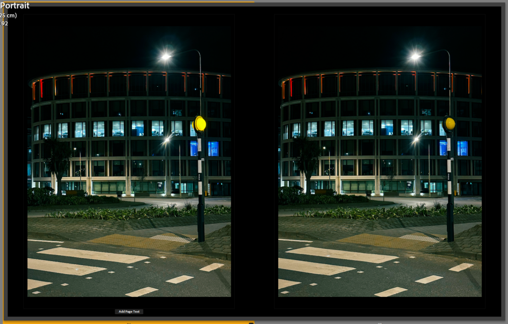
I didn’t know what photo to put on the left but i felt it needed a photo there so I realised I had the same photo of the building but with the beacon light on so I applied the exact same edits I did to the original photo and put it on the left and I think the photos work well together. I tried experimenting by flipping the photo on the left , however I did not like it as much so left it how it was.
Designing the front and back cover
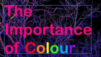
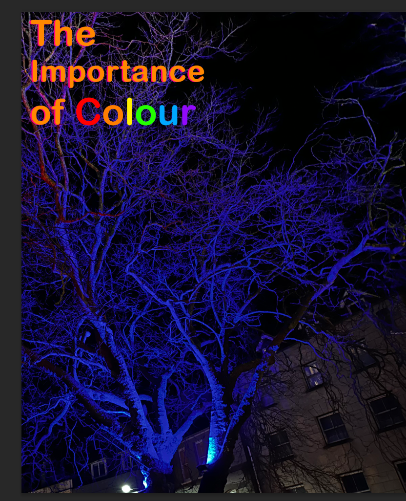
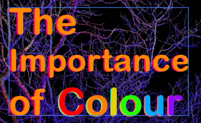
I went into photoshop to design the text for the front cover, I was originally going to make all the text rainbow but I really like this pink and think it contrast well with the blue trees on the front cover and having just the word ‘colour’ in rainbow works so much better and provides meaning/emphasis to the word colour. I chose Arial rounded MT Bold as it is my favourite font and it is really smooth and simple as I don’t feel my photography book needs a really over the top serif font
I tried positioning the text on the right but I wasn’t really a fan of it and think the front cover composition would look way better with the text on the left
I was going to add a glow but whilst I was experimenting with It and the composition I made a copy of the text, then I thought what would the text look like if I made it the colour #F80 (#FF8800)? as I really like using this colour and I use it a lot on my website and other personal projects. It would also contrast really well with the blue on the trees, so I placed it on top of the original pink text and it made this really nice drop shadow effect which I really love. Now I just need to come up with something for the text ‘Colour’ but I have this idea to do the drop shadow effect but with the colours reversed.
After a lot of attempts of adding a drop shadow to the front cover I experimented by adding a gradient one and I eventually settled on a rainbow one (seen below) as the other ones didn’t work as well.
This is the end result of the front cover and I am very pleased with how it turned out.
The essay at the end of the book
I began transferring the essay into the book and I think it looks good with the white text on black paper, I also changed the colour of some words which mention colours as it fits the theme of colour, it also looks good and makes the essay more engaging to read.
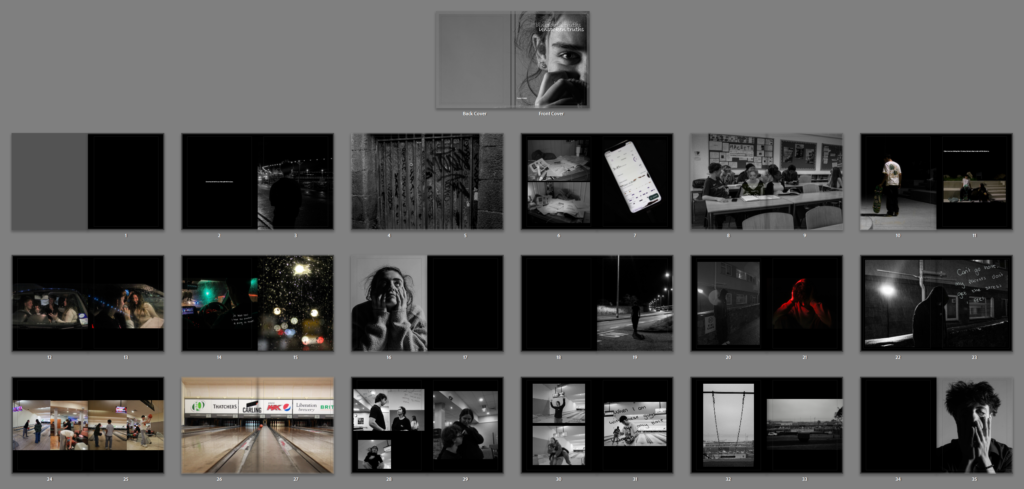
This is my full complete photobook, I kept the layout throughout it similar as it gives a symmetry and sequence throughout the whole book having everything relate. I kept all the pages background black as it went well with the theme giving a dark depressing affect as well as contrasting well with the majority black and white images.
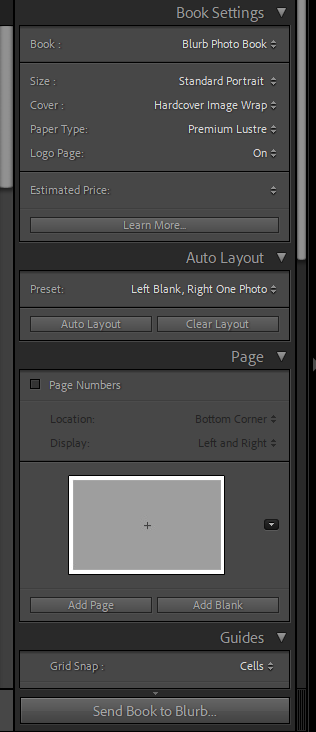
In terms of my layout and design for my photobook, I will be using these certain settings to produce my book.
When laying out the pages in my photobook, I focused on including a range of different shaped and sized images to differentiate the layout more. For the front and back cover I put a double page spread in monochromatic colouring differentiating to the rest of my photo book.
Inside the photobook I tried to include a range of archival imagery as well as contrasting to modern images showing changes and connections through family, people, nature etc. relating to the tile of my essay “Co więźi nas razem?”.
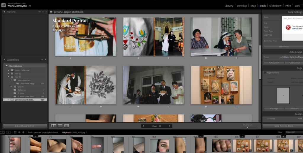
For the book settings I decided to choose standard portrait as it would fit the rest of my photobook and premium lustre for my pages so that it presents good quality of my images.
For the photobook’s setting, the layout allows for a balance, giving space to showcase each image while maintaining an neat structure. My chosen paper type enhances the colors and details of my photos, giving the photobook a professional and polished feel while maintaining the warmth and depth I want to convey through my family’s story.
When laying out the pages, I made sure to include a variety of image sizes and shapes, which helps break up the design and adds dynamic visual interest throughout the photobook. I wanted to differentiate certain pages, so for the front and back covers, I chose to create a double-page spread in monochromatic tones, setting them apart from the rest of the photobook. This design choice offers an introduction and conclusion to the book which creates a sense of continuity while still maintaining an artistic flair.
Inside the photobook, I deliberately contrasted archival imagery with modern photos. This juxtaposition not only highlights the passage of time but shows the connections and changes that have occurred within my family, nature, and the people who have shaped my journey. The theme of change and continuity resonates with the title of my essay, “Co więźi nas razem?” (What Bonds Us Together?), as it reflects on how family ties remain strong despite the changes in time, environment and culture.
1. Write a book specification and describe in detail what your book will be about in terms of narrative, concept and design with reference to the same elements of bookmaking as above.
Title: Co więźi nas razem? (What Bonds Us Together?)
Through this visual narrative, I aim to reflect on how identity, heritage, and human relationships remain intertwined despite the changes that time and history impose.
The title, Co więźi nas razem? (What Bonds Us Together?), reflects the question of the photobook: how family, place, and shared experiences create enduring connections, even as these elements evolve. The book reflects both the continuity and change within the familial and cultural landscapes, particularly focusing on the journey of my family and the lasting imprint of Eastern European identity.
The photobook is an exploration of how physical spaces like the landscapes of Poland, and human connections, such as those within my family, shape who we are and continue to influence our identity, even across generations. The archival imagery will be complemented by new photographs that bring these themes into the present offering a perspective on how our family’s history and identity continue to play out. The layout of the photobook is carefully designed to complement the narrative, offering a visual flow that guides the reader through the history, changes, and connections within the story. The design will emphasise contrast between past and present, between Eastern European heritage and my own personal experiences.
I’ve chosen to mix image sizes and formats throughout the book, ensuring a dynamic design that offers visual variety and engagement. Larger images will be used for more impactful moments perhaps significant family events or key images that highlight important moments in history while smaller images will be used to create a sense of intimacy and to allow the viewer to explore the subtle details of family life and heritage.
For the front and back cover, I have opted for a striking double-page spread in monochromatic colors. This design sets the tone for the entire book, differentiating the opening and closing pages from the rest of the book, creating a visual bookend that reflects the timeless nature of family bonds. The monochrome coloring provides a sense of nostalgia while also creating a cohesive introduction/ conclusion. The book will be produced in a standard portrait format as this fits with the narrative’s need for a structured layout while offering space for the photographs to breathe and take centre stage. It is ideal for presenting both large images and smaller, more intimate shots that maintains a balanced flow from start to finish. The content of the book will follow a carefully structured narrative, beginning with the exploration of my family’s roots in Eastern Europe and their migration to new places. The archival images will serve as a starting point, providing historical context and visual documentation of my family’s early years. These images will be paired with personal stories or reflections to create a deeper understanding of the historical backdrop and the personal connections within the family.
The middle section of the book will transition into a more contemporary exploration of how these familial connections continue to influence my life today. New photographs will document my experiences, juxtaposed against the archival images to create a dialogue between past and present. This section will also explore the broader concept of human connections to different places both in terms of physical relocation and the emotional ties we have to our cultural heritage.
The final section will serve as a reflection on the concept of home, belonging, and identity, asking how these ideas have evolved through the generations. The book will conclude with a series of images that encapsulates the themes of continuity, connection, and the enduring ties between family and place.
Narrative:What is your story? Describe in:
3 words: Heritage, Connection, Legacy
A sentence:
This photobook tells the story of my Polish heritage, exploring the deep bonds between my family and Eastern Europe through a blend of archival images and contemporary photographs, reflecting the lasting impact of place and identity.
A paragraph
This photobook is a visual exploration of my Polish heritage and the connections that link my family to Eastern Europe. Through a curated mix of archival images and modern-day photographs, the book reflects on the historical journey of my ancestors, their migration, and the lasting influence of their roots. The narrative delves into how human connections to different places shape identity and family, focusing on the bonds that remain strong despite time and distance. By connecting past and present, the story speaks to the timeless nature of family, culture, and the ways in which our heritage continues to shape us.
Design:
I want my photobook to have an intimate feel, something that invites the reader to slow down, reflect, and engage with both the images and the story. The design should feel like a bridge between the past and present, combining historical richness with a contemporary perspective. The book will have a sense of timelessness. It should feel personal yet polished, allowing for an immersive experience.
I’ve chosen premium lustre paper for its balanced finish, sleek, yet not too glossy. The lustre finish will ensure that the colours in both the archival images and contemporary photos are vibrant and true to life, while softening contrast for a more cohesive feel. The ink used will be high-quality, ensuring that both black-and-white and color images maintain their depth, sharpness, and warmth, creating a consistent aesthetic throughout the book.
The book will be in a standard portrait format, which will allow for a clean and structured layout. The format is ideal for balancing image sizes and offers ample space for creating a cohesive narrative flow. The size will be large enough (around 10×12 inches) to showcase the richness of each photograph while maintaining a manageable and approachable feel for the reader. The portrait orientation suits the vertical nature of many of the images I plan to include, making it easier to highlight the details and compositions within each shot.
For the binding, I chose a sturdy, hardcover binding. This choice not only makes the book feel substantial but also ensures the longevity which allows it to be a keepsake. The cover will be minimal and striking, with a monochromatic design that contrasts with the vibrant, rich images within. The title, Co więźi nas razem? (What Bonds Us Together?), will be elegantly embossed inisde the book in the second page on the right, in a subtle, classic font, to keep the focus on the narrative and image.
The book will end with a reflective section on identity and belonging, exploring the broader theme of human connections to places. Each section will flow seamlessly into the next, with the layout providing a visual progression from past to present.
Design and Layout: The design will be clean and minimalistic, allowing the images to speak for themselves. I will use a variety of image sizes and placements to create dynamic pages that feel balanced yet engaging. Larger images will draw the viewer’s eye to moments of significance, while smaller, more intimate images will create a sense of intimacy and allow for reflection. For visual contrast, The pages will also be spaced thoughtfully to avoid overcrowding, ensuring the book has an airy, organized feel.
The editing process will involve sequencing being crucial in guiding the reader through the narrative, alternating between archival and modern images to show the interweaving of the past and present. The flow will not only make sense chronologically but will also emphasize thematic connections such as family, place, and continuity. Each image will be paired with text or captions when necessary, ensuring the context and connections are clear.
Images will take centre stage with minimal text to allow the photographs to truly speak for themselves. Where appropriate, short captions or reflections will accompany the images, providing context or insights that deepen the understanding of the story. Some of the archival images may include small annotations to give additional historical context or personal details about the family members in the photographs.
I believe my final photobook was extremely successful. However, to improve I believe my experience would’ve been a lot easier with more preparation In prep for my next mock exam and the final exam, I must remember to complete small details which should not be left until the final 3 day exam, as this will waste time and may prevent me from finishing all my tasks. Unfortunately I was not able to print my book to Blurb on the final day of the mock exam, and instead had to order it the day after, this can not happen in my real exam and must be completed within the time limit. However, this mock has taught be to work more efficiently with time and pay attention to the blog posts, planning and prep hat needs to be done in the weeks leading up to the final mock. I believe that however, I worked well under the pressure and solved any issues which resulted. For example, my images were not of a high enough quality to be posted onto my book, this was an issue I had to overcome, and attempt to find images of better quality which would not result in low quality and blurry images in my final book. Another issue I also faced is my final complete blog post with all screenshots and aspects of my mock process was unable to saved and erased from the blog, the outcome of this has been a highly less detailed analysis of my work completed on the mock date, however, with extra work and more explaining I will be able to overcome this by attempting to replace any screenshots that were erased and attempting to find clear pictures that I can use to input into my analysis blog post. I also need to beforehand, work on a practice book on Adobe Lightroom, where I can experiment with photo layouts and what kind of layout will look clean and effective to help my images be presented in the best way possible. An aspect of my work I am glad I included was a small paragraph demonstrating my intention for each magazine at the beginning of the book, this sort of contents page has helped to escalate the quality of my book and helped the reader to understand my intention of female gender stereotypes over time. I have focused mostly on the contextual and conceptual side of my work and focused more on a storyline of work and demonstrating a feminist viewpoint and both critiquing and praising the works of photographers through time. I also referenced both of my inspiration photographers Cindy Sherman and Helmut Newton in my book through my essay. I incorporated their work into a paragraph of analysis on their work and their intention. I then focused a paragraph on image analysis of their work and how I can relate it to my own, I then also compared a theorists with their work and highlighted the differences and similarities of their work, alongside the positives and negative of their viewpoints. I also incorporated my two inspiration photographers by including a photoshoot each in my book of images inspired by their work, this has helped my work be more relatable to the analysis I have completed on their work, and how modern day photography can relate to their work, without provocative and negative stereotypes of women.