To create my zine with images from the harbour and the Maritime museum, I opened InDesign selected the amount of pages I needed then made the measurements width: 148mm, height: 210, pages: 16, orientation: portrait, columns: 2, column gutter: 5mm, margins: top, bottom, inside, outside: 10mm, bleed: top, bottom, inside, outside: 3mm.
I ma using this zine to create a story with my images taken from the photoshoots. My photos will all link in with each other and I am going to pair certain photographs together which relate to each other.
I printed out the images that I wanted to use for the zine, in small, to make a mock up zine. Unfortunately, the printer had some issues with colours but it still allowed me to make a plan for the zine. I placed the images in the order that I thought would work well together.
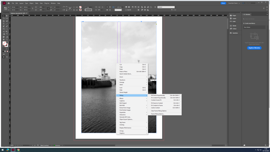
I started by using the rectangle frame tool to draw out the size I wanted to import my image to and where on the page I would like it.
Once this was done, I used the short cut, ctrl D, to select my chosen image. I then needed to go into fitting and decide which setting made my photo fit the best, without it cropping and without it going over the border.
for my first image i wanted to create a combination of both colour and black and white using harsh lines and shapes to truly demonstrate what i intend illustrate throughout the zine
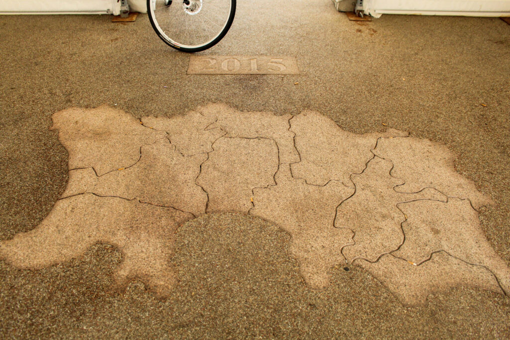
in this image i wanted to create the impact of an optical illusion
My focus for this zine was not to tell a story with word but in fact let the images speak for themselves using vivid colours, sharp lines and complex editing to create interesting images. i intended to create symmetry with in the layout and images in order to create optical illusions and a sense of da-ja-vu when viewing.
I started with the front cover being one of the ex-captain’s of the harbour as he is one of the main reasons for all of these boats and workers being able to be here.
We are going on another photography trip and during this trip we will be doing another 2 photoshoots, one at Victoria Pier and the other to La Collette Yacht Basin. Additionally, we will be visiting the Jersey Maritime Museum. My plan for these photoshoots are the same as the previous 2, however I would also like to try and get more Abstract shots.
Image Selection
Image Sub-Selection
Edits
People
Edit 1
Edit 2
Edit 3
Edit 4
Edit 5
Edit 6
Here I used the brush tool to increase the exposure and highlights in this area so that the boat is more visible.
Edit 7
Abstract
Edit 1
Edit 2
Edit 3
Edit 4
Edit 5
Edit 6
Edit 7
Edit 8
Edit 9
Edit 10
Edit 11
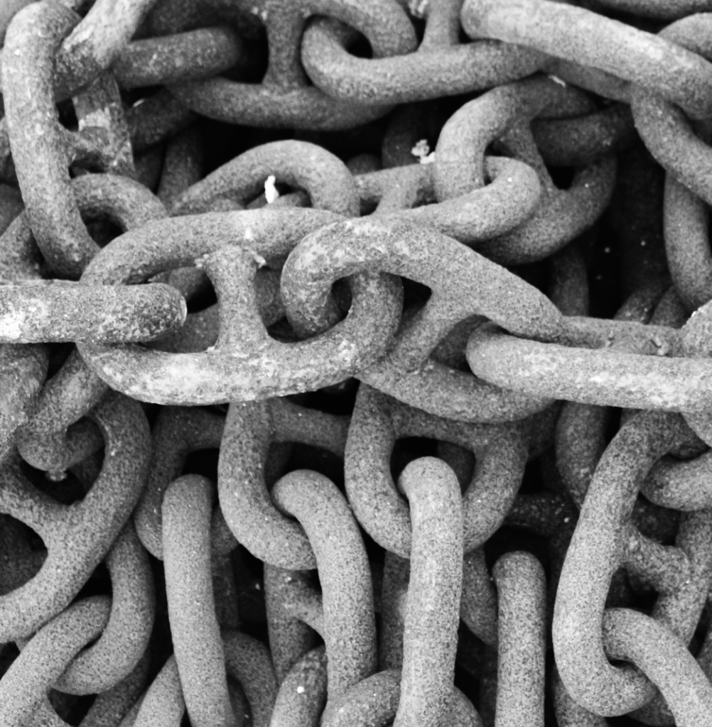
I then put this image in B&W and increased the contrast as I think it looks more effective and best highlights the details in the rope.
I wanted my cover page to be in black and white so that I could tell a story through my work, having the last page being in colour. Almost like watching a film turn to colour. I have also chosen this title because I think that my story portrays Jerseys trade and the way people communicate to carry that out.
Page Spread 1
I want my first page spread to keep with the black and white theme like a story line. I wanted to include 2 images for contrast between modern and old ways of trade and fishing. I also wanted to include some text as an almost introduction to portray the story that I am trying to tell.
Page Spread 2
I wanted to have a page with just images to leave some things to peoples imagination before I add some text explaining what I am portraying. I wanted to allow people to have their own guess, but I have already interpreted in their minds a nostalgic/historic feeling due to the black and white elements and old brick building’s which have connotations of history.
Page Spread 3
I wanted my next double page to ease into colour, using a colour popping image to smoothly move into a modernist time. I wanted to still include some text to be able to explain the contrast and my reasoning why. I wanted my image to be big so that it would mostly catch someone’s eye.
Page Spread 4
I wanted to continue with the text to further explain and give people some facts about changes within the harbour to make it what it is today. I also wanted to include signage that says ‘goodbye’ because I wanted to shift peoples gaze and thoughts onto a different element of the harbour.
Page Spread 5
I wanted this page to have a massive contrast, a massive jump in time scale. I have included a lot of text so that I can really explain what I am doing and give a true meaning of out harbour today and why these things are so important.
Page Spread 6
I wanted my last double page to include only images. I wanted to leave things to the imagination.
Last Page
I wanted my final page to be a landscape side image. I wanted people to have to move my zine to see it in the way that they want.
I had a gorgeous image of the steam clock down at the harbour. Where there is a load of negative space in the top left corner which would be nice to put the title in. I bleed the image over the border to completely fill the page as it is one of my best photos as well it was an obvious choose to go as the cover page.
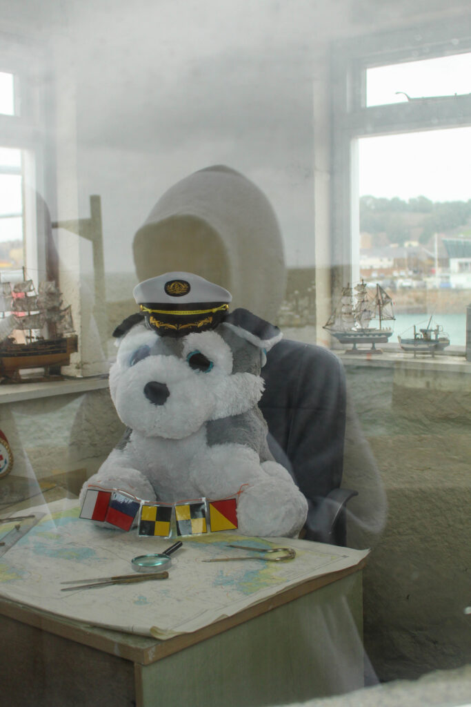
I tried to place this portrait next to the image of the dog, keeping the image of the dog small as to over shadow the meaningfulness of the portrait.
However, this didn’t work so I mover the dog to the next page. I toyed with the idea of putting a quote in the blank page, but I like the way all the focus is on the portrait.
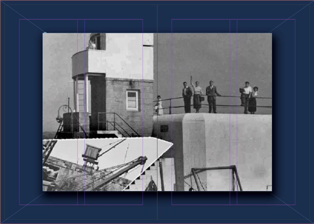
For this one I spread this one I spread the image over two pages to highlight the in focus part of the photo, I tried to bleed the image over the edge. However, it cropped it too much and didn’t seem quit right, so I kept the white border.
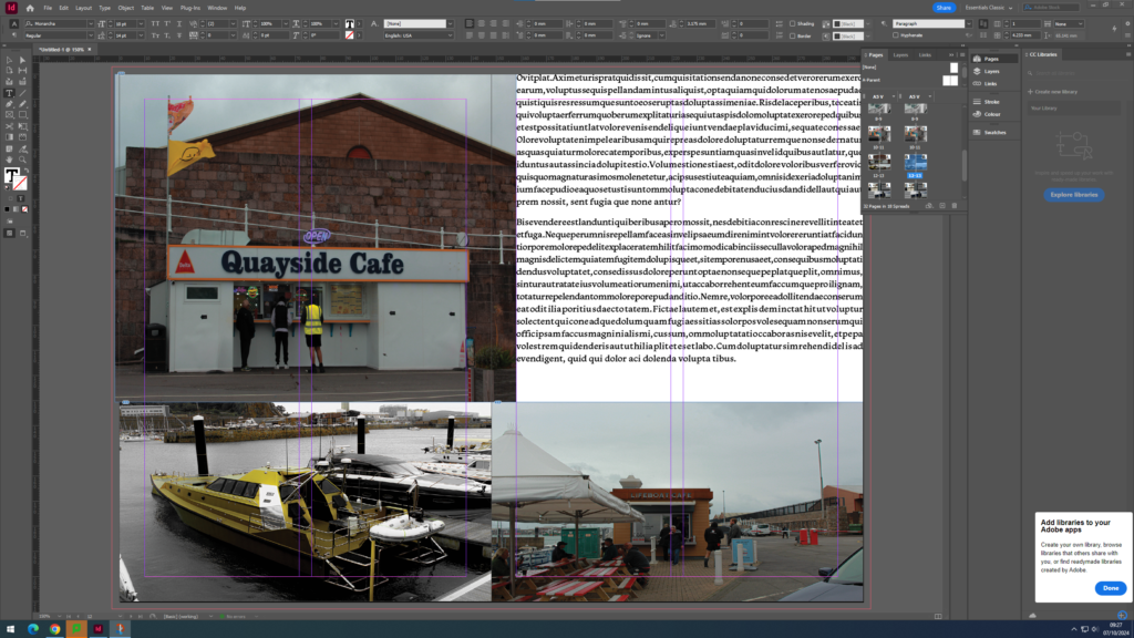
I decided to try placing two images on one pages, as seen below. on the page can be see a pair of waders and a tied off cleat.
I then decided I hated this and removed image of the cleat completely. I then shrunk both images and lined then up on each page so they were then centred.
However, having both images small and centre looked an little clunky so enlarged the image of the waders.
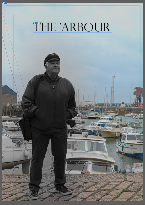
Title
I wanted to keep the title simple. I settled on ‘St Helier harbour.’ This was an nice choice as it is broad and covers all images.
I lined the title up so it sat in the centre of all the negative space I placed it on its side so it ran upwards with the chimneys and the mast. and placed my name underneath.
I chose a font that was reminiscent of a typewriter as it sat nicely with the angles on the front cover image.
A sentence – To show how much the harbour has changed.
A paragraph – To acknowledge how much Jersey’s harbour has changed over the course of many years, as well as express the importance of the various industries working in this area that help with the economy of the Marine Environment.
NARRATIVE:How will you tell your story?
I will tell my story by taking relevant and meaningful photographs of the harbour architecture, local shops and workers, and items that symbolise the harbour and the modern changes to it.
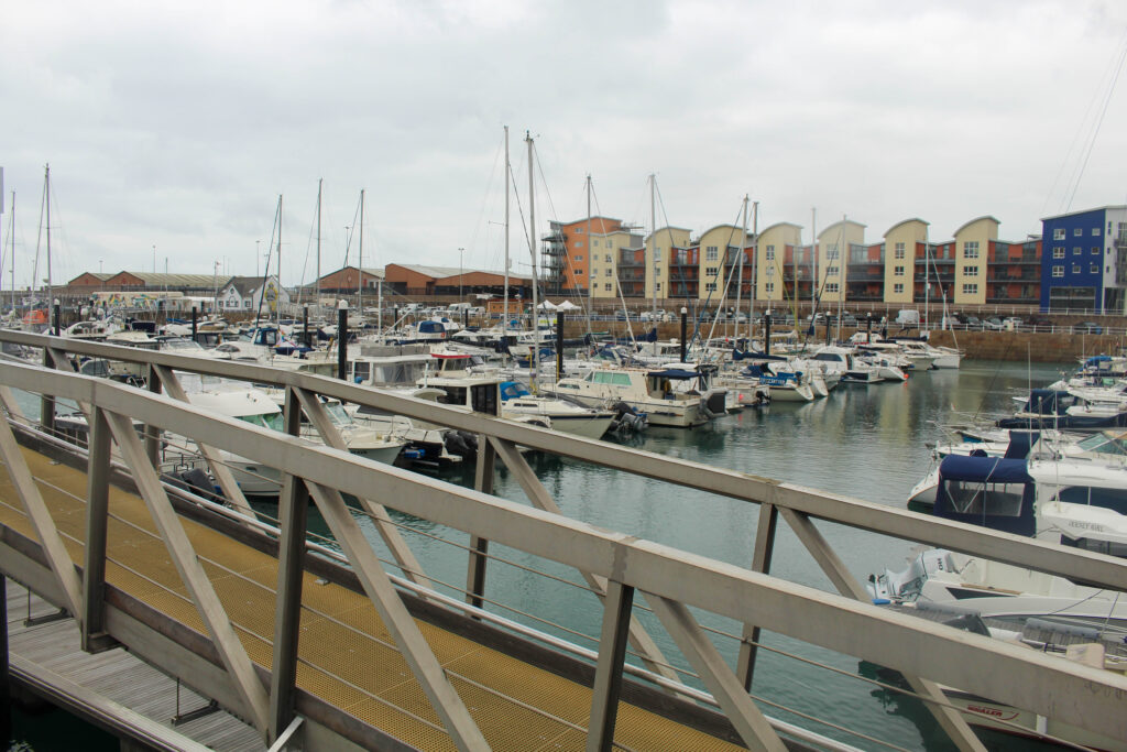
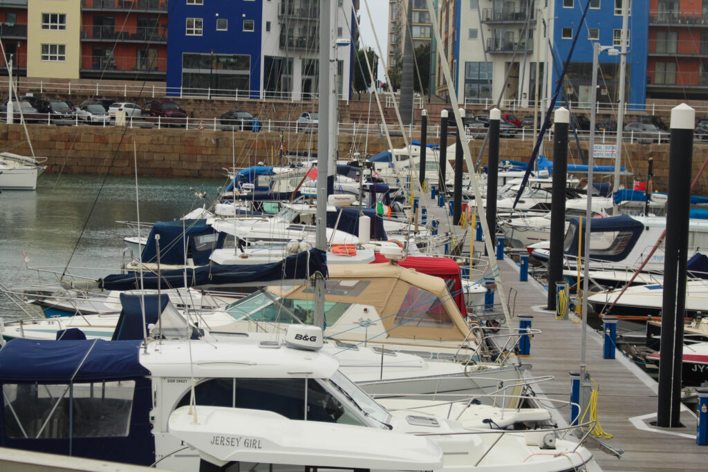
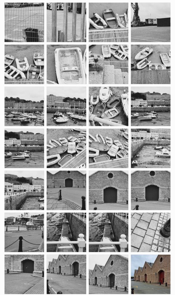
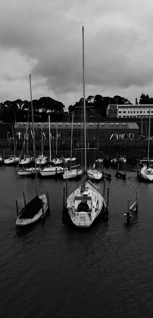
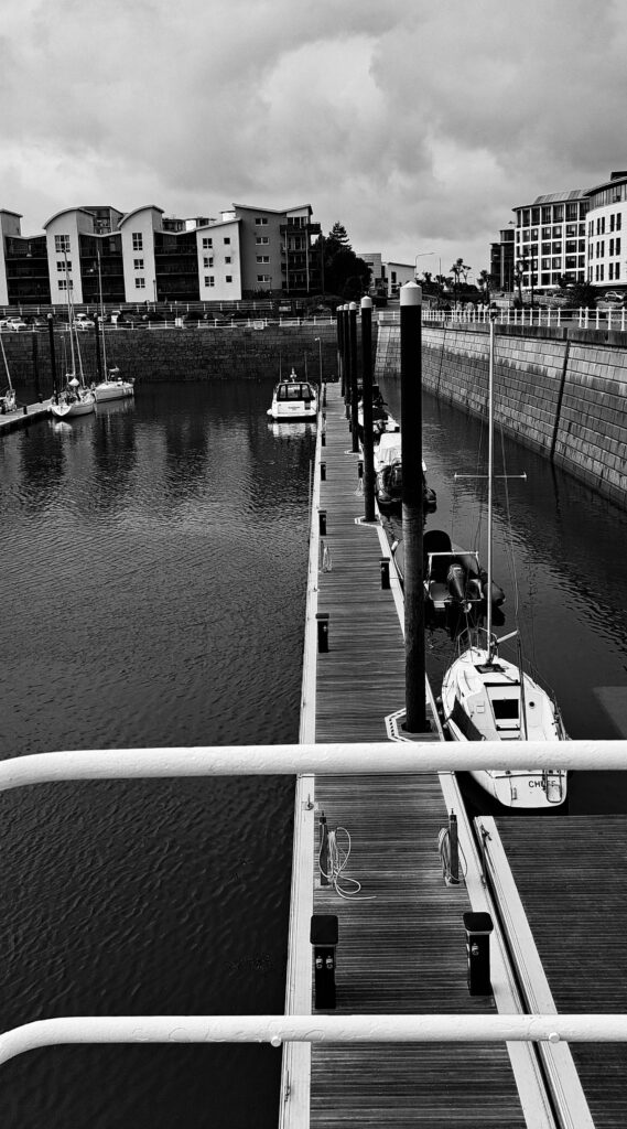
We explored all around St Helier Harbour, including the three marinas, the steam clock, maritime museum and more. Our aim was to explore the harbour and capture all the different elements and aspects of it.
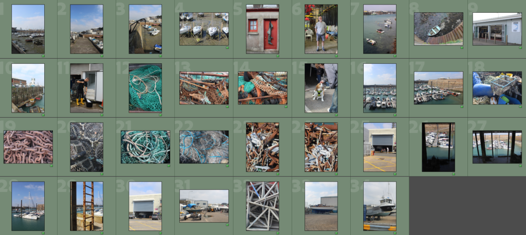
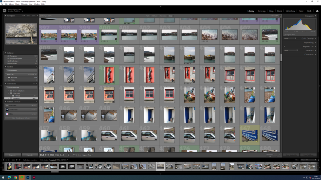
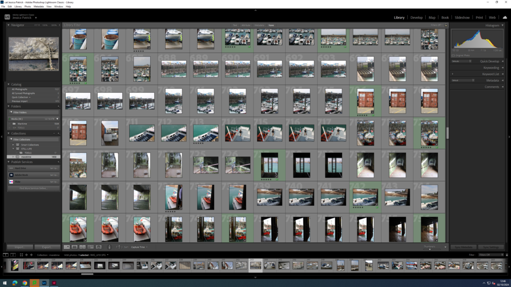
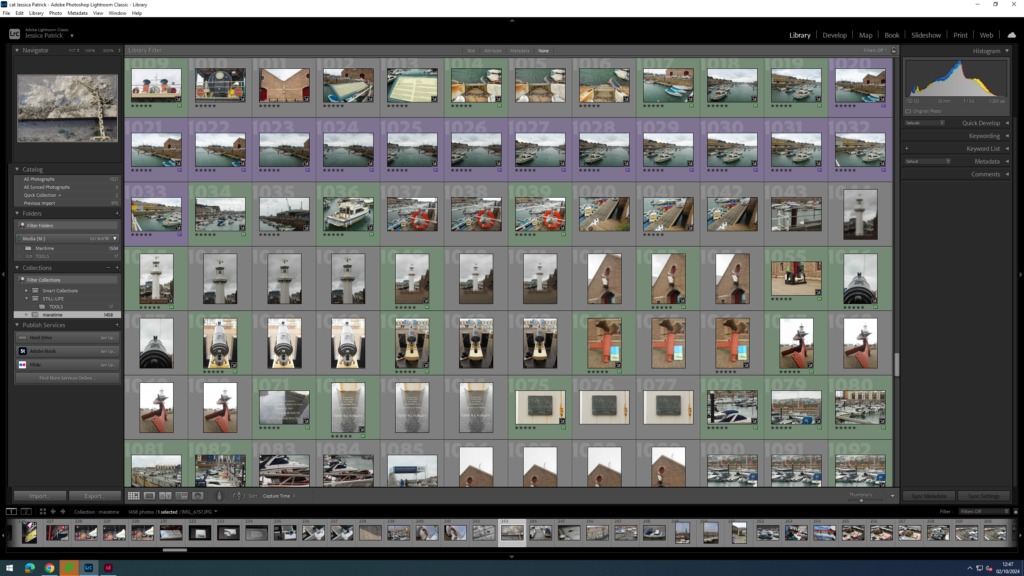
Contacts Sheet
The images which are highlighted green are the images I have chosen to edit in this photoshoot, because they present lots of different aspects of the harbour and have the best composition and layout and are my best photos.
Edits
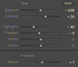
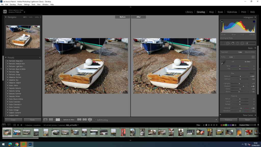
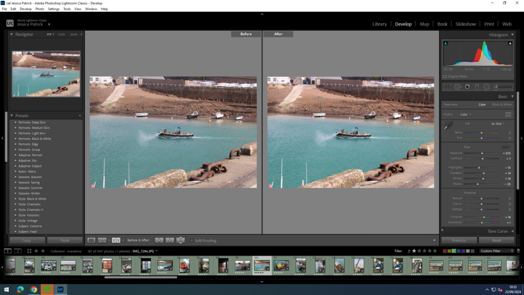
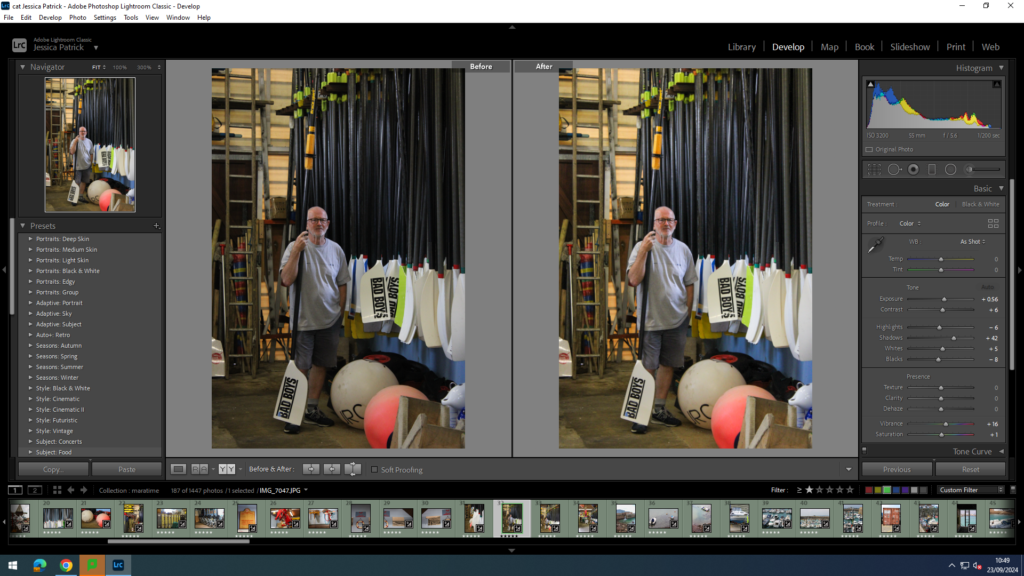
I edited this image by increasing the exposure, contrast shadows, whites, vibrancy and saturation, while decreasing the highlights and blacks. I did this, so that the image would be brighter and more vibrant, so that the boat was more bright white, and so the sand was more coloured.
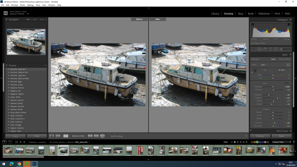
I edited this image by increasing the exposure, contrast shadows, whites, vibrancy and saturation, while decreasing the highlights and blacks. I did this, so that the boats would be brighter, as well as the sea in the background being more blue and vibrant.
Then, I made a virtual copy of the edited image and increased the contrast, highlights and whites, while decreasing the blacks and shadows. I did this to create more contrast between the different shades of grey throughout the image.
I edited this image by increasing the contrast shadows, whites, vibrancy and saturation, while decreasing the exposure, highlights and blacks. I did this, so that the image was slightly brighter and more eye capturing.
I edited this image by increasing the exposure, contrast shadows, whites and vibrancy, while decreasing the highlights and blacks. I did this so that the image would be brighter and more vibrant.
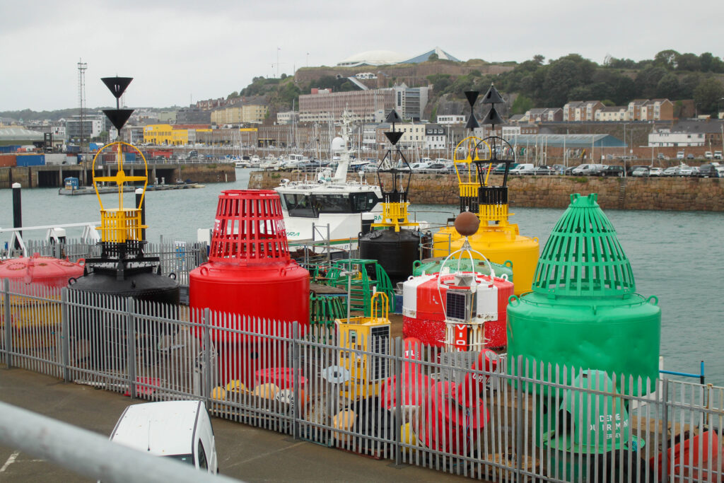
I edited this image by increasing the exposure, contrast shadows, whites, saturation and vibrancy, while decreasing the highlights and blacks. I did this, so that the boat was more vibrant and saturated, so it stood out more. I also wanted the yellow colour of the boat the be more saturated.
I edited this image by increasing the exposure, contrast shadows, whites, saturation and vibrancy, while decreasing the highlights and blacks. I did this, so the sea was a nicer blue, as well as the blue on the boat.
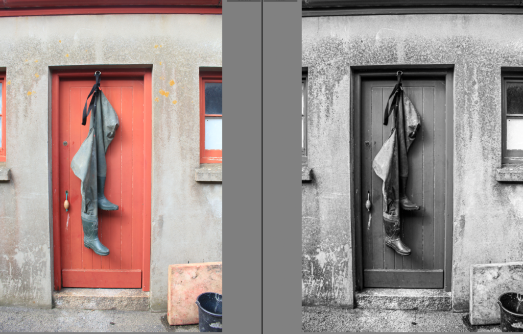
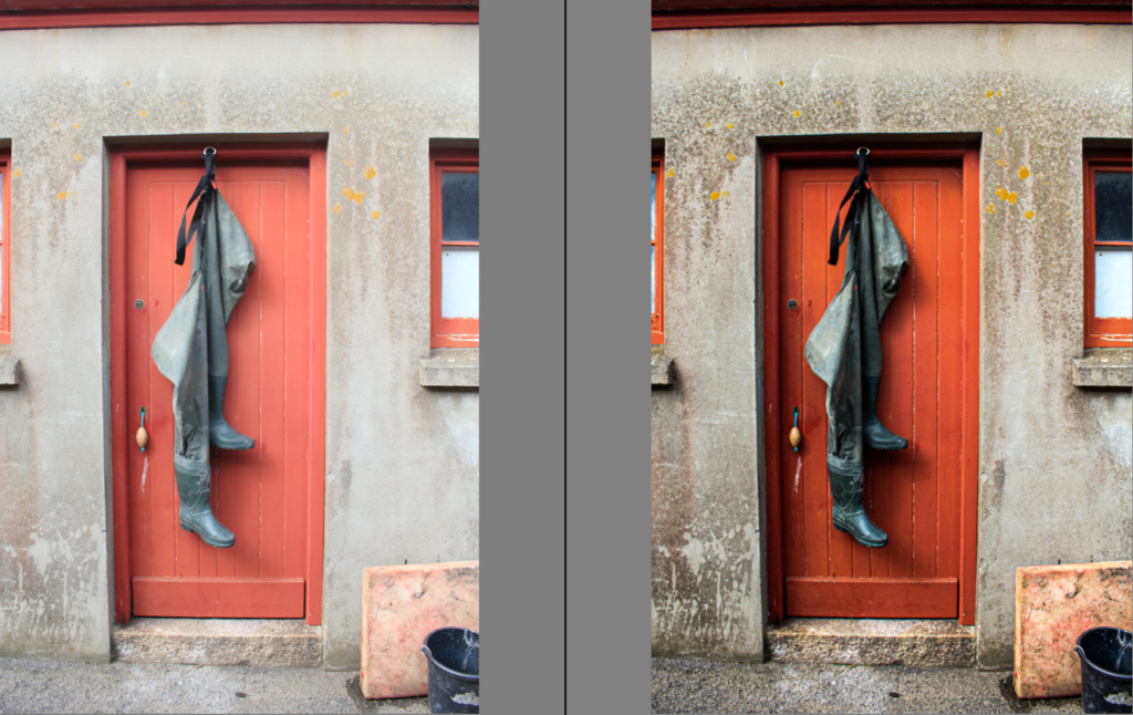
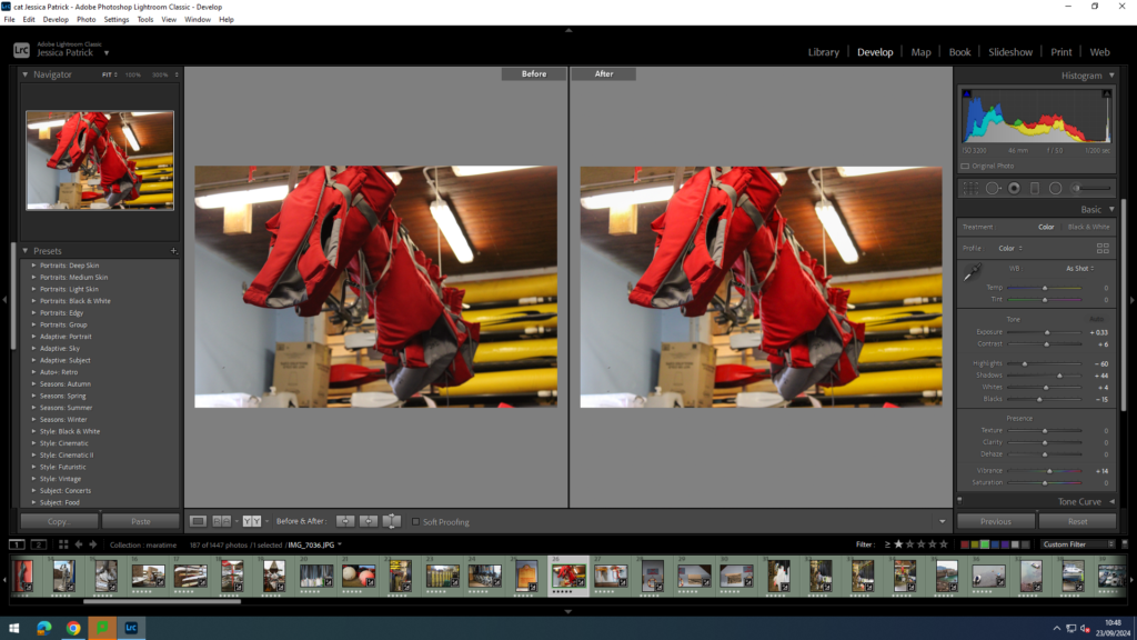
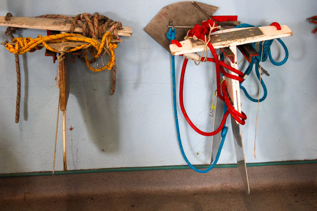
I edited this image by increasing the exposure, contrast shadows, saturation and vibrancy, while decreasing the whites, highlights and blacks. I did this, so the red door was more vibrant, along with the green boots, so they would compliment each other more, as they are complimentary colours.
I edited this image by increasing the contrast, shadows, white, vibrancy and saturation, while decreasing the exposure, highlights and blacks. I did this, so that the tin man was brighter, as well as the rust, so it created more texture and contrast.
I edited this image by increasing the exposure, contrast, shadows, white, vibrancy and saturation, while decreasing the highlights and blacks. I did this, so that the image would be slightly more exposed.
I edited this image by increasing the exposure, contrast, shadows, white, vibrancy and saturation, while decreasing the highlights and blacks. I did this, so that the image was more exposed and more vibrant.
I edited this image by increasing the exposure, contrast, shadows, white, vibrancy and saturation, while decreasing the highlights and blacks. I did this, so that the image was slightly more exposed and the water brighter and more vibrant and saturated.
I edited this image by increasing the exposure, contrast, shadows, white, vibrancy and saturation, while decreasing the highlights and blacks. I did this, so that the image was slightly more exposed and the water brighter and more vibrant and saturated.
I edited this image by increasing the exposure, contrast, shadows, white, vibrancy and saturation, while decreasing the highlights and blacks. I did this, so the yellow boat was more vibrant and saturated, so it popped more.
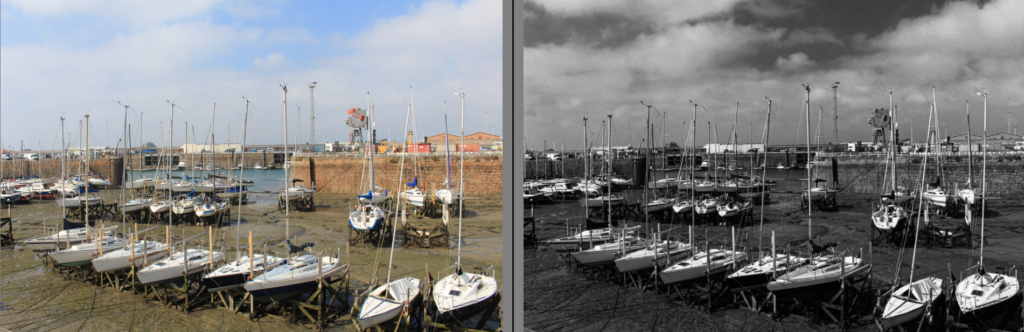
Then, I created a virtual copy and made it black and white. I also increased the contrast to the max and adjusted the highlights, blacks, whites and shadows. I did this to create more contrast and light and dark tones in the image.
I edited this image by increasing the contrast, shadows, white, vibrancy and saturation, while decreasing the exposure, highlights and blacks. I did this, so the complimentary colours (green and red) are more vibrant and therefore compliment each other even more.
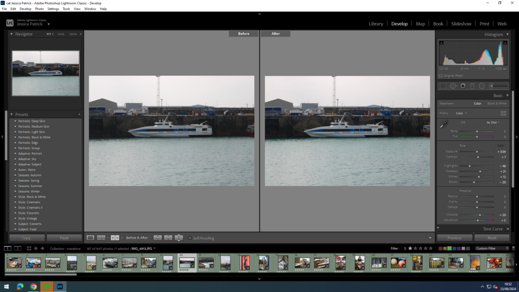
I edited this image by increasing the exposure, contrast, shadows, white, vibrancy and saturation, while decreasing the highlights and blacks. I did this, so that the image would be brighter and more exposed, so it was more visible.
I edited this image by increasing the contrast, shadows, vibrancy and saturation, while decreasing the whites, exposure, highlights and blacks. I did this, so the image would be less bright.
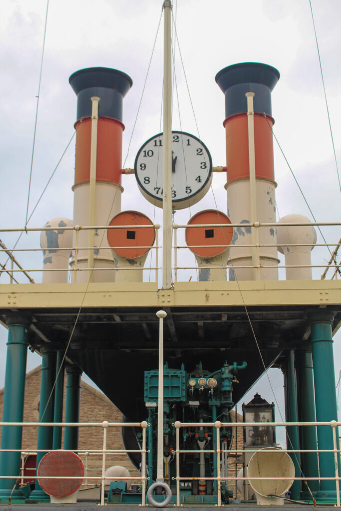
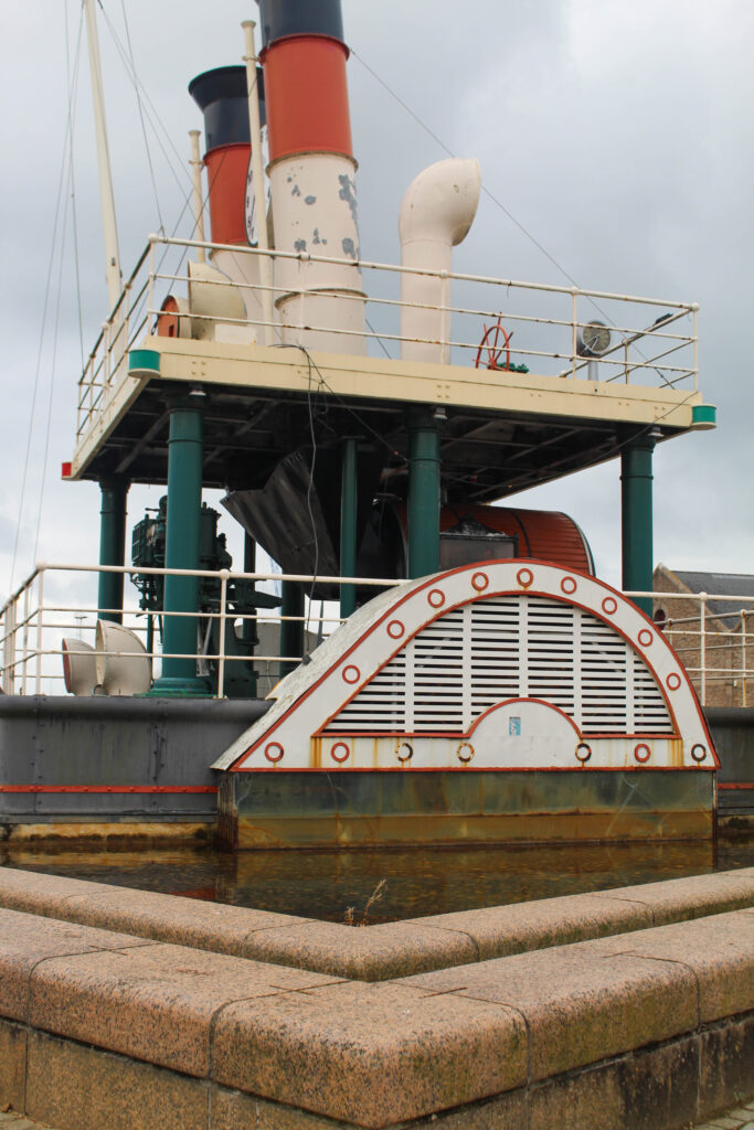
I also made a black and white copy of a similar image and increased the contrast, shadows and whites, while decreasing the highlights and blacks, so that I can create more contrast between the dark steam clock and the bright sky.
I edited this image by increasing the contrast, shadows, white, vibrancy and saturation, while decreasing the exposure, highlights and blacks. I did this, so the image would be more vibrant.
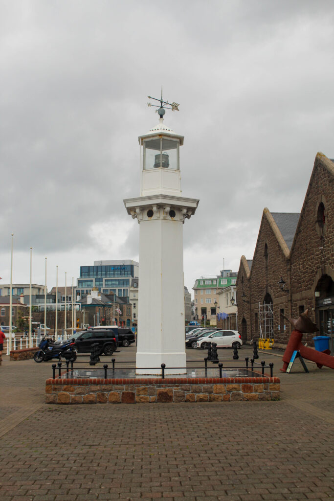
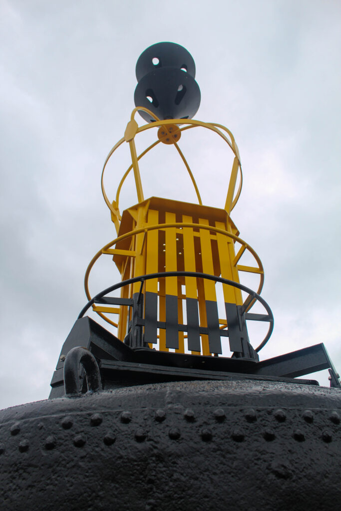
I edited this image by increasing the exposure, contrast, shadows, white, vibrancy and saturation, while decreasing the highlights and blacks. I did this, so the lighthouse would be a brighter white, instead of dull.
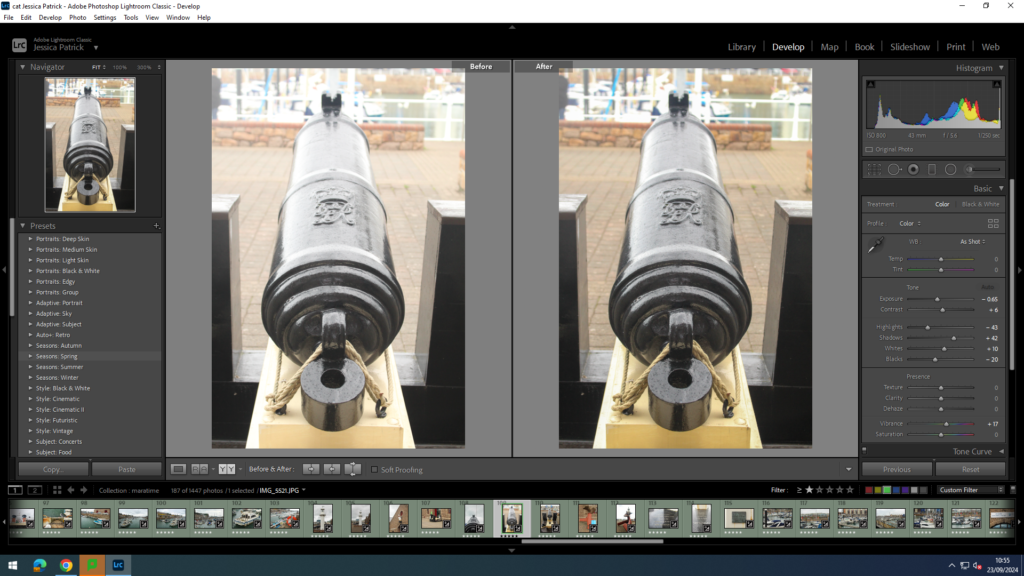
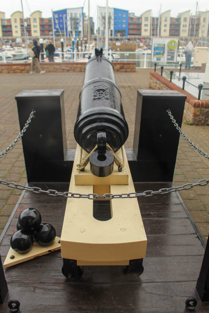
I edited this image by increasing the contrast, shadows, white and vibrancy, while decreasing the exposure, highlights and blacks. I did this, so the cannon was more visible.
I edited this image by increasing the contrast, shadows, white, vibrancy and saturation, while decreasing the exposure, highlights and blacks. I did this, so the image is more vibrant and saturated.
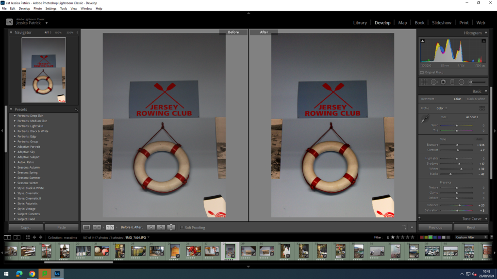
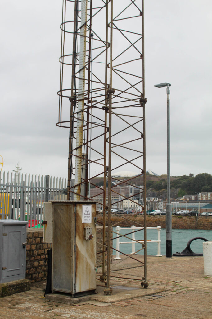
I edited this image by increasing the contrast, shadows, white and vibrancy, while decreasing the exposure, highlights and blacks. I did this, so that the writing in the image is more visible.
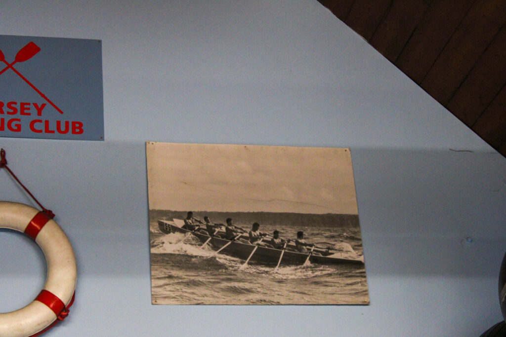
Jersey Rowing Club
The Jersey Rowing Club has a long and celebrated history dating back to the early 1960s and was officially founded in 1971 when the sport of rowing was growing fast in the Island because of the popularity of the Sark to Jersey Rowing race, which started in 1967.
The club is based in the Old Lifeboat Station at the bottom of Mount Bingham, where there is excellent boat storage facilities and direct access to the water.
The JRC runs a full race calendar of coastal and bay events ranging from 8-15km, to the great endurance races 27km Gorey to Carteret, the 26km Sark to Jersey and the 48km Round Jersey.
They have close relationships with both Guernsey and French rowing clubs and are looking to include both the Herm weekend and Cherbourg regatta into their future events calendar.
I edited this image by increasing the exposure, contrast, shadows, white, vibrancy and saturation, while decreasing the highlights and blacks. I did this, so the image is brighter and more vibrant.
I edited this image by increasing the exposure, contrast, shadows, white, vibrancy and saturation, while decreasing the highlights and blacks. I did this, so the boats are more saturated.
I edited this image by increasing the exposure, contrast, shadows, white, vibrancy and saturation, while decreasing the highlights and blacks. I did this, so that the ores and the blue background would be more vibrant and saturated.
I edited this image by increasing the exposure, contrast, shadows, white and vibrancy, while decreasing the highlights and blacks. I did this, so the image would be brighter and more vibrant.
I edited this image by increasing the exposure, contrast, shadows, white, vibrancy and saturation, while decreasing the highlights and blacks. I did this, so the image would be brighter.
I edited this image by increasing the exposure, contrast, shadows, white, vibrancy and saturation, while decreasing the highlights and blacks. I did this, so the image would be brighter.
I edited this image by increasing the exposure, contrast, shadows, white, vibrancy and saturation, while decreasing the highlights and blacks. I did this, so that the image would be brighter and more vibrant.
Then, I created a virtual copy and created a back and white version. I increased the contrast, highlights and whites, while decreasing the blacks and shadows, so that I could create more contrast and light and dark tones in the image.
I also took the same photo, but from further away. I edited this image by increasing the exposure, contrast, shadows, white, vibrancy and saturation, while decreasing the highlights and blacks. I did this, so the image was brighter and more vibrant.
Final Images of the rowing club
Final Images of Jersey Harbours
Evaluation
In conclusion I think this photoshoot went well, because I explored and captured all different areas and angles of the harbour. I was also able to obtain portraits at the rowing of Michelle, who is part of the rowing club. I think capturing portraits as well as landscapes really allowed me to explore all the different elements of the harbour.
I also think the editing of my images went well, because I was able to slightly adjust the images to make them more bold and vibrant. I was also able to experiment with creating black and white images, so I could create more cool tones and contrasting images. However, next time I would like to experiment with cropping and photoshop a bit more, because I ran out of time to experiment fully in this topic.
Analysis of top 3 images
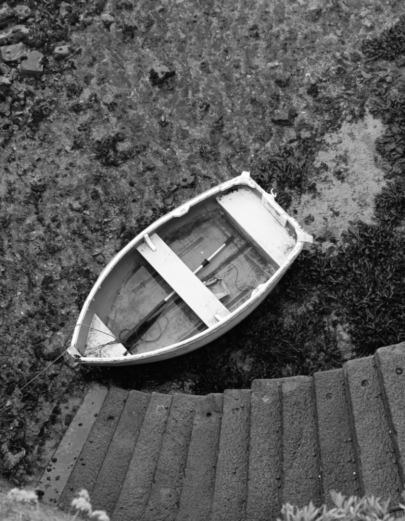
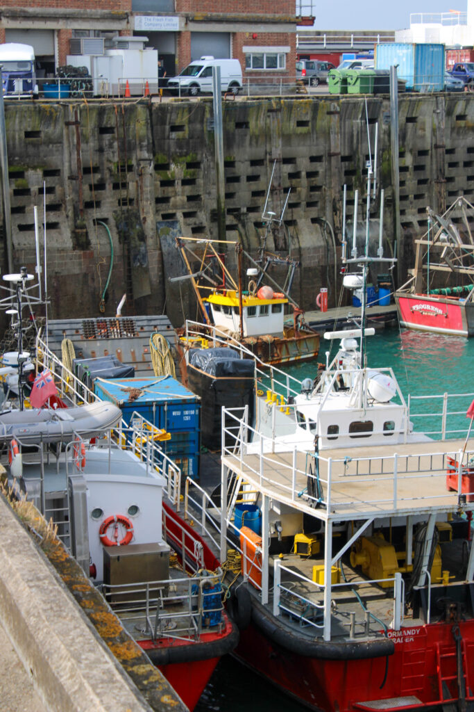
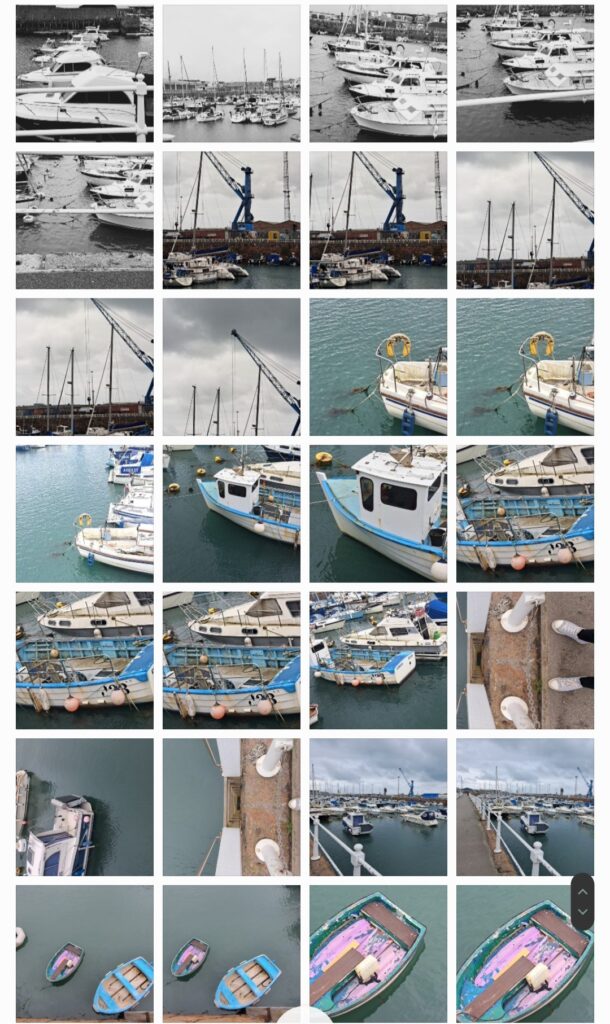
This boat is a boat that is docked at the harbour, next to the fish shop, where they keep all different types of fish, so they can later be sold and eaten by people. This fishing boat is used by the fisherman and they go out into sea and use the nets on the side of the boat to catch fish, crabs, lobsters etc.
Some people (vegetarians for example) may not appreciate this image, because they believe that capturing fish to kill them and eat them is morally wrong. However, I like to eat fish, so I appreciate this image, the boat and the work the fisherman do capturing these fish.
The type of lighting used in this image is natural lighting, because the image was taken outside in the daylight. I had no control over the composition, or the layout of the boat, or the upward angle of this image, because we could not go lower onto the deck, so had to take this image from above. However, I did have control over my distance from the boat, because I could move left or right along the top deck. However, I quite like the upward angle, looking down onto the boat, because it allows everything that is on the boat to be visible.
Camera Settings:
F stop- f/5.6
Exposure- 1/200secs
ISO- ISO-100
This image is quite saturated and contains both warm (yellow) and cool (blue/green water) tones. This image also contains a few red/ rust colours, which compliment the green water very well and create harmony in the image, as they are complimentary colours. There are also light and dark tones, which create contrast in this image, as the deck of the boat is dark and the yellow colour contains more light. There are also lots of visible textures on this boat, including the rough fishing nets hanging over the side of the boat. The vibrant, saturated colours in this image lead the eye to the boat, causing it to be the main viewpoint of this image.
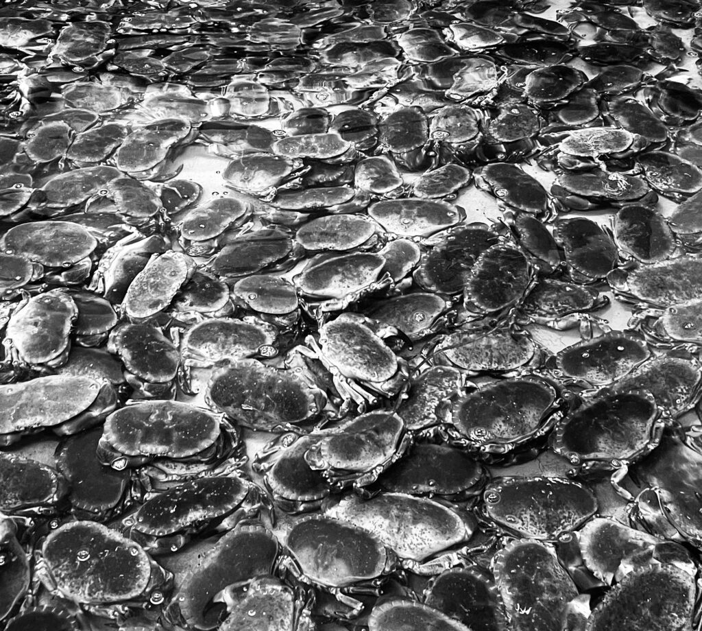
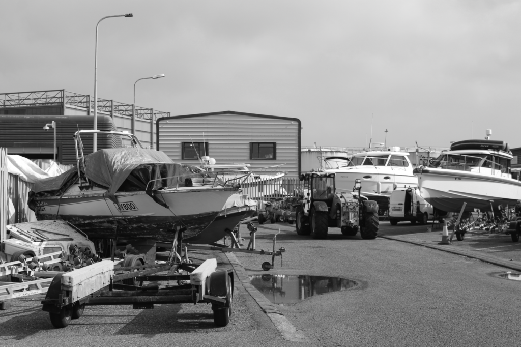
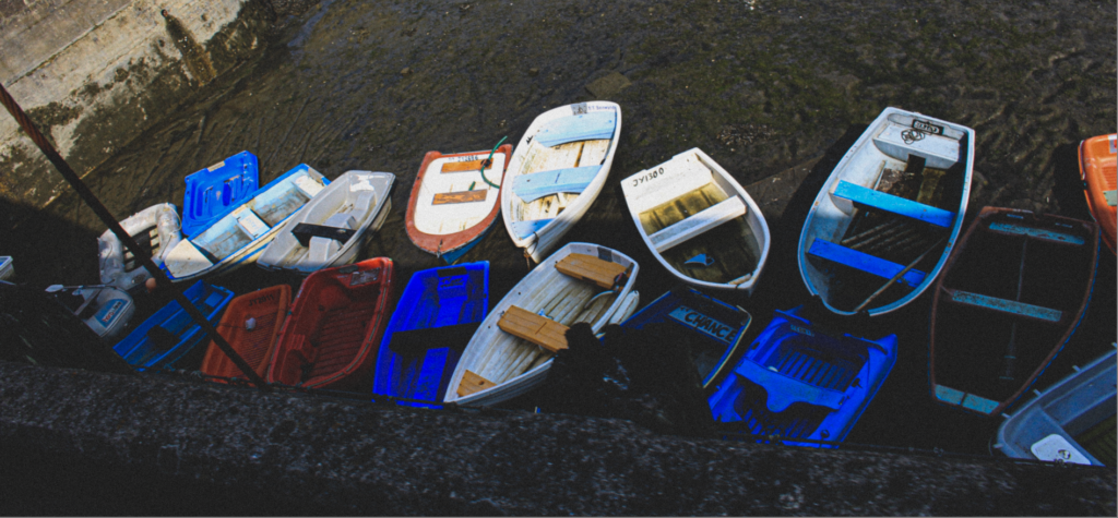
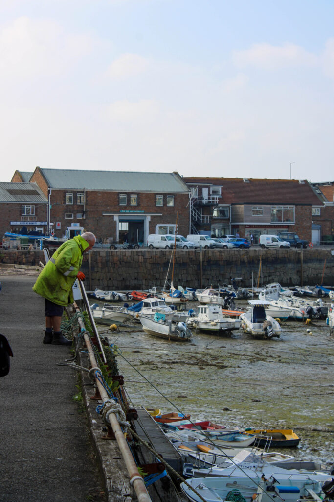
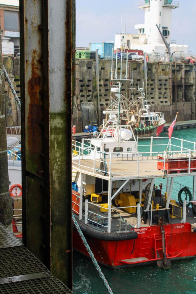
This image is of boats docked at the harbour, while the sea is out, so they are rested on the muddy, wet ground. Jersey citizens own these boats and pay money to dock them at this harbour. They may use these boats to go fishing, live on, or just to go out on a nice Summer’s day.
The type of lighting used in this image is natural lighting, because the image was taken outside in the daylight. I had no control over the composition, or the layout of the boats, because I could not manipulate the position and layout of these boats in the foreground. However, I could manipulate the angle of this image, because I was able to move left to right along the side of the harbour when taking this image. I could also manipulate the distance I was from the boats, because I was able to zoom in and out on my camera. I also like the angle and distance of these boats.
Camera settings
F stop- f/10
Exposure- 1/200secs
ISO- ISO-100
This image is in black and white, so is vey cool toned. It also has lots of light and dark tones throughout it, as there are lots of different shades of grey running through the image. There are lots of patterns of repetitive shapes throughout the image and lots of repetitive forms, because of the pattern that the boats present, because the boats are laid out exactly the same next to each other and are very similar looking boats. This gives the image a good composition and layout within the frame. The boats in the foreground are the main viewpoint in this image, but I think the sea in the distance in the background keeps the image more exciting and less boring.
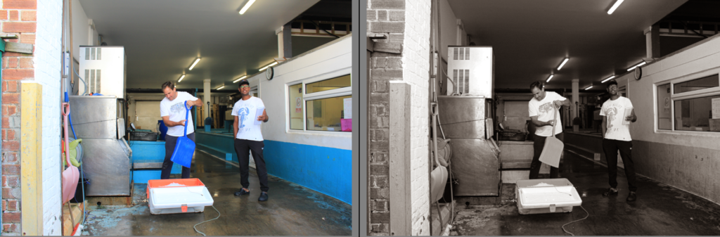
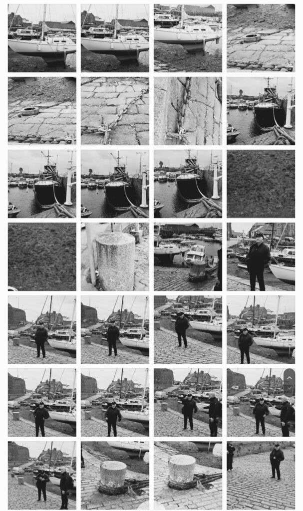
This image is of Michelle, who is apart of the Jersey Rowing Club, which is a club of rowers, who take part in competitions across the Channel Islands and France. The location of the image is at St Helier Harbour, in there stock room (where they keep all their equipment eg ores).
The lighting used in this image is artificial lighting, because this image was taken inside. I had complete control over Michelle and some of the equipment in this portrait, so I asked Michelle to hold an ore and stand next to the other ores. I also had control over the distance I stood from him and I could zoom in and out on my camera.
Camera Settings
F stop- f/4.5
Exposure- 1/200secs
ISO- ISO-3200
There are many different colours in this image, including pink, blue, brown, green, orange, yellow etc, but the main colour in this image is white, which is very bright and vibrant, while the other colours are also vibrant and saturated. There are mainly light tones in this image, because the colours are so saturated and the white is so bright. The row of ores also create a repetitive pattern in the image, with a leading line, which leads the viewers eyes to the main viewpoint of the image, which is Michelle, who is stood more in the background. This creates a sense of depth in the image.
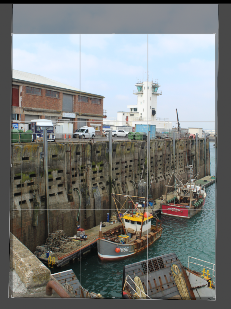
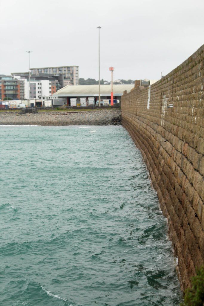
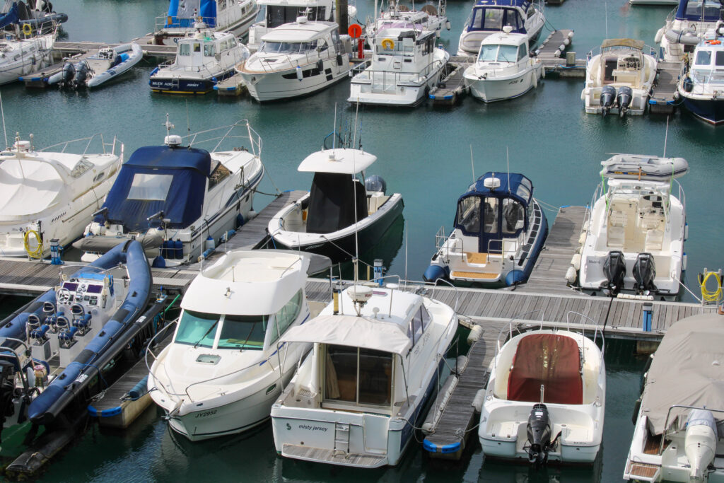
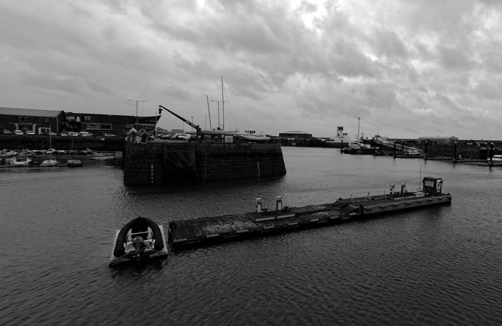
This photoshoot took place around St Helier Marina, pier road, the Old Harbour, Albert Pier, and the English and French Harbours.
Analysis
Overall I think this photoshoot went well. I managed to capture detailed images of various architecture and a few people at work, as well as various areas of the marina like Albert Pier.
However, I wish I had taken a few more images of the harbour and people at work in order to further develop my ideas and give me a larger variety to work with to tell my story.
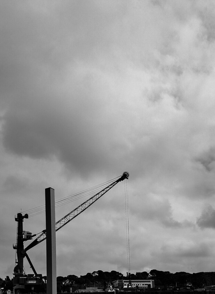
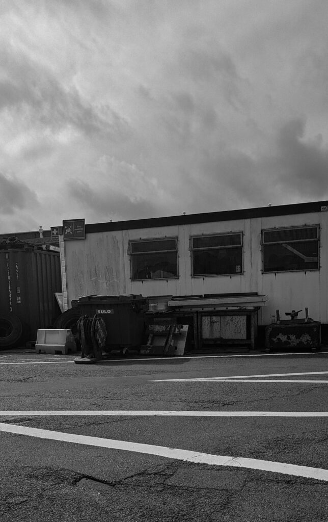
I chose to analyse these two images because they show my experimentation with different camera angles, such as deadpan, as well as link well with the theme of modern advancements of the harbour. Both images were taken with natural lighting from the sun in the same weather conditions. Both of them show a range of tones, the architecture in the images is almost completely black compared to the almost white clouds which creates a nice contrast and allows each subject to stand out.
I have related back to one of my inspirations, Ansel Adams, because his work is very dramatic and tells some sort of a story. His work also consists of very detailed and textured images. I wanted to incorporate these elements into my own work because I feel it links back with how drastically the harbour has changed over the years due to modern advancements.