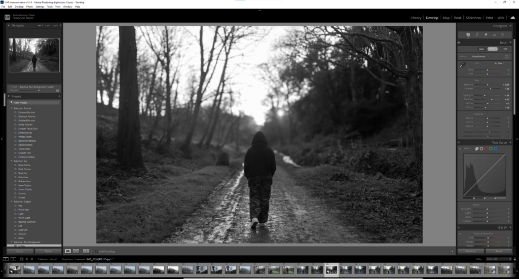
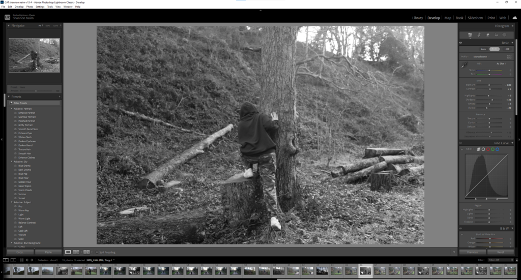
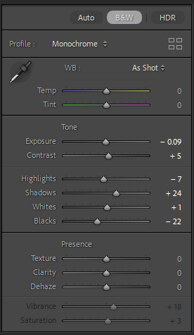
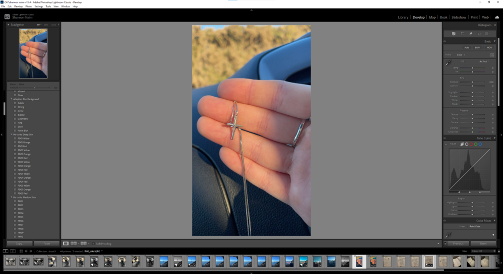
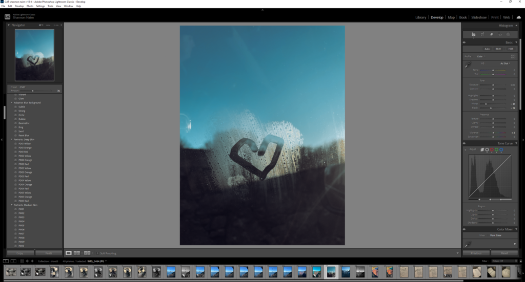
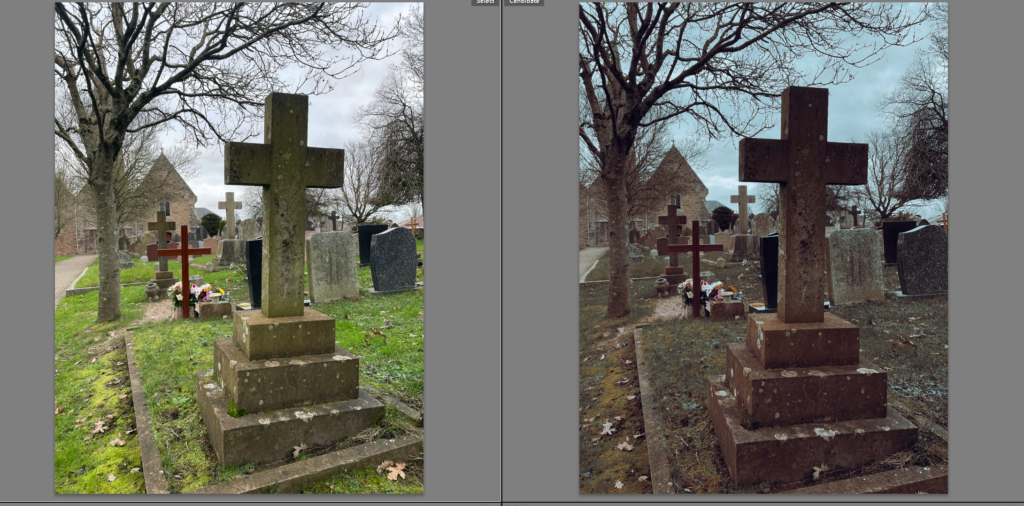
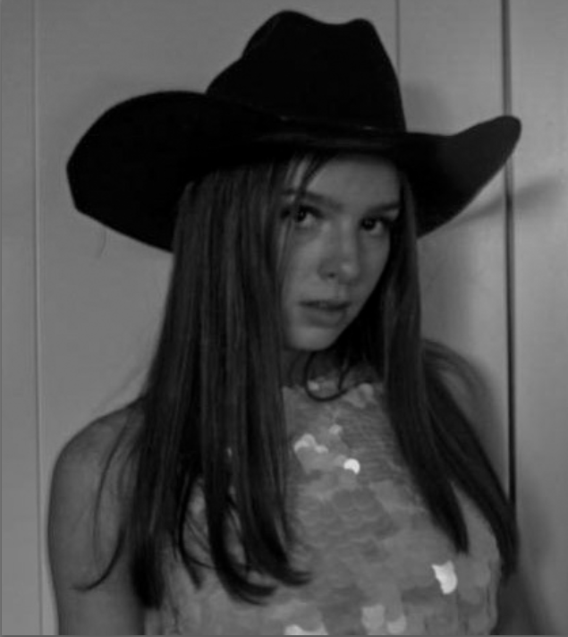
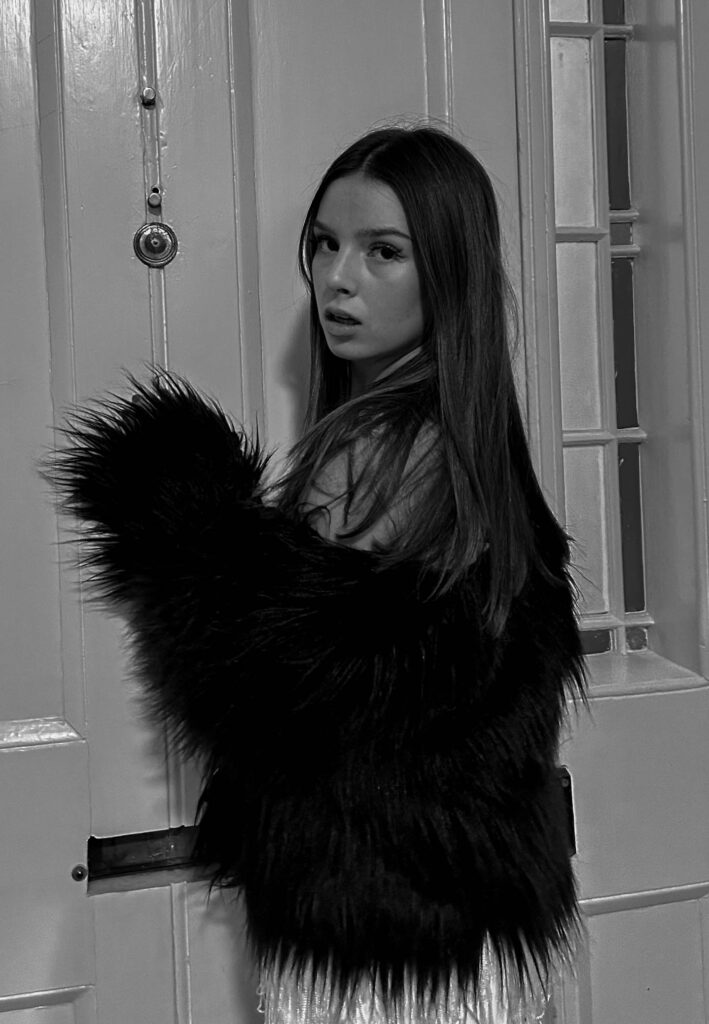
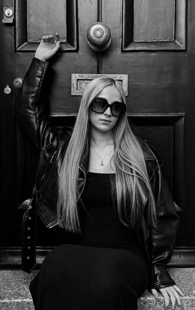
I took the original image and changed it into black and white to create a more dramatic and moody atmosphere. By removing the colour, I tried to emphasize the shadows and contrasts, which helped in adding a sense of darkness and confusion. Through my editing, I enhanced these elements to give the image an intense, almost unsettling feel, giving a sense of uncertainty and confusion.
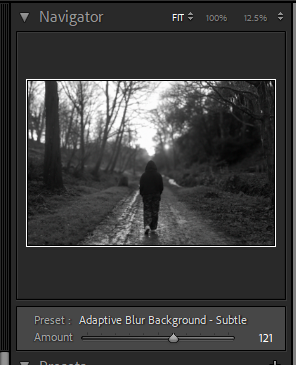
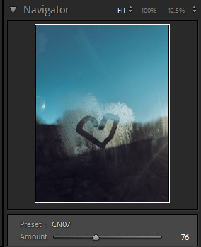
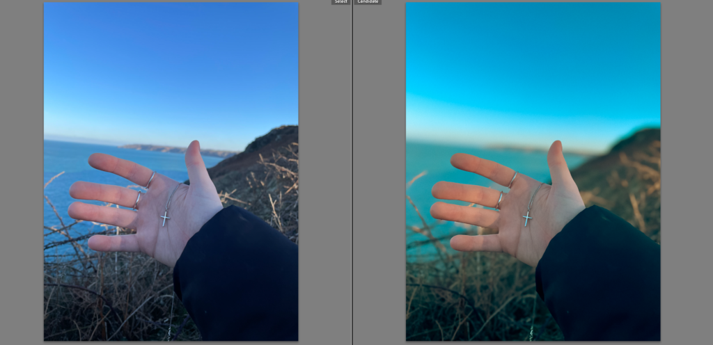
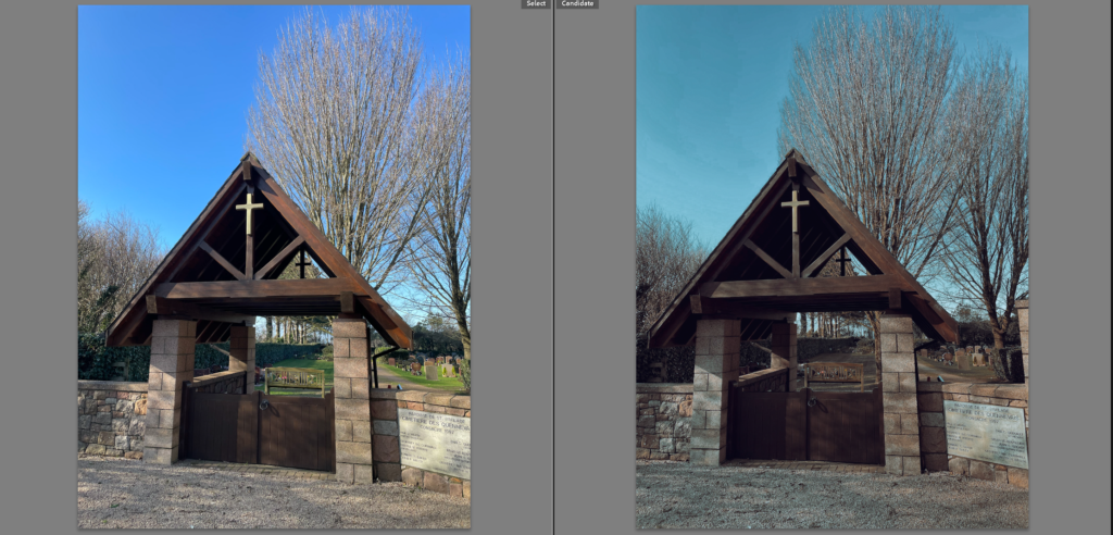
Here are the slight changes I made to the image.
EDIT 2
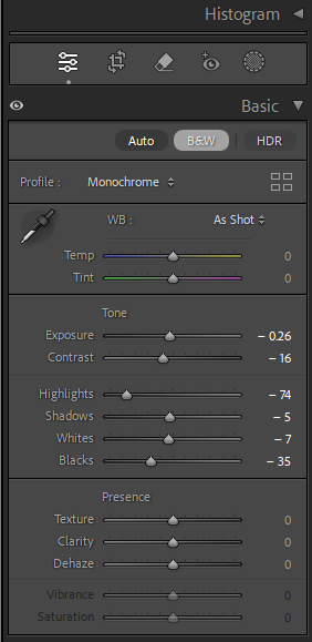
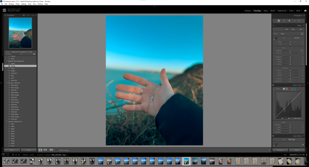
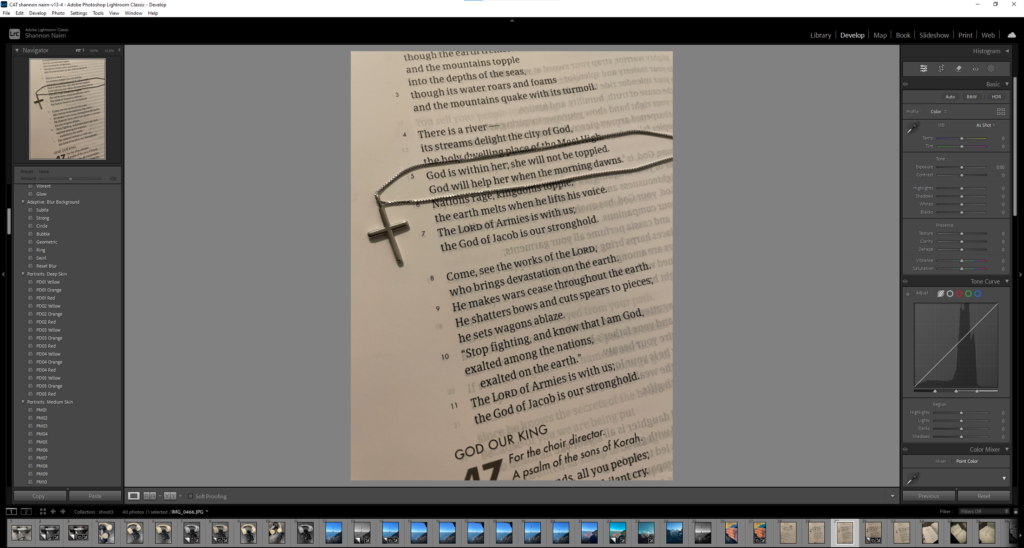
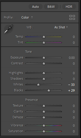
lightroom editing
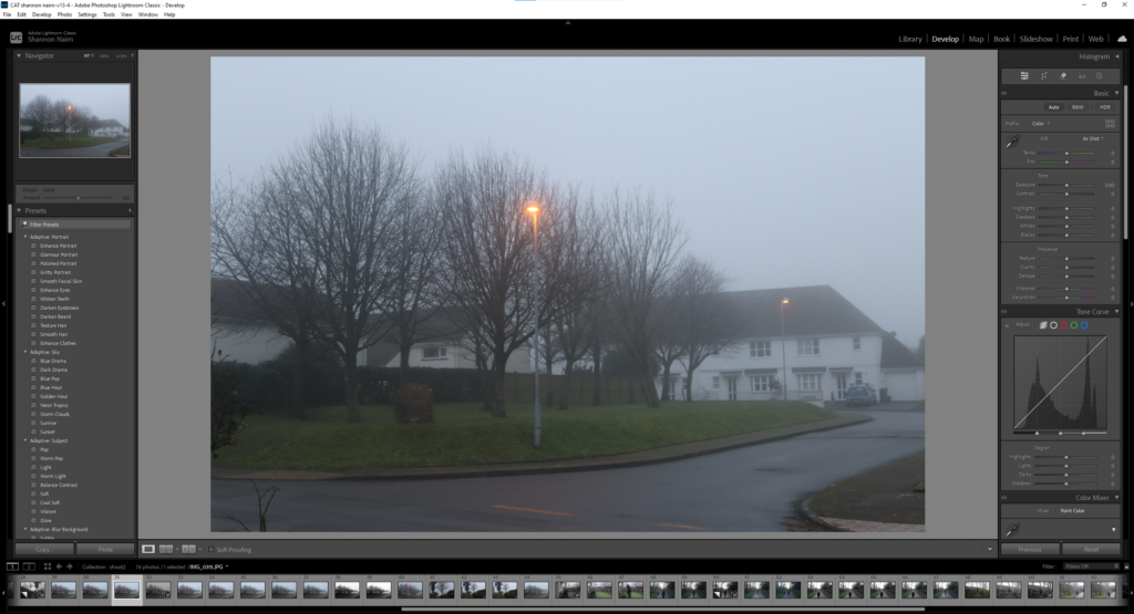
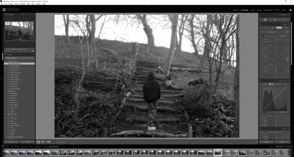
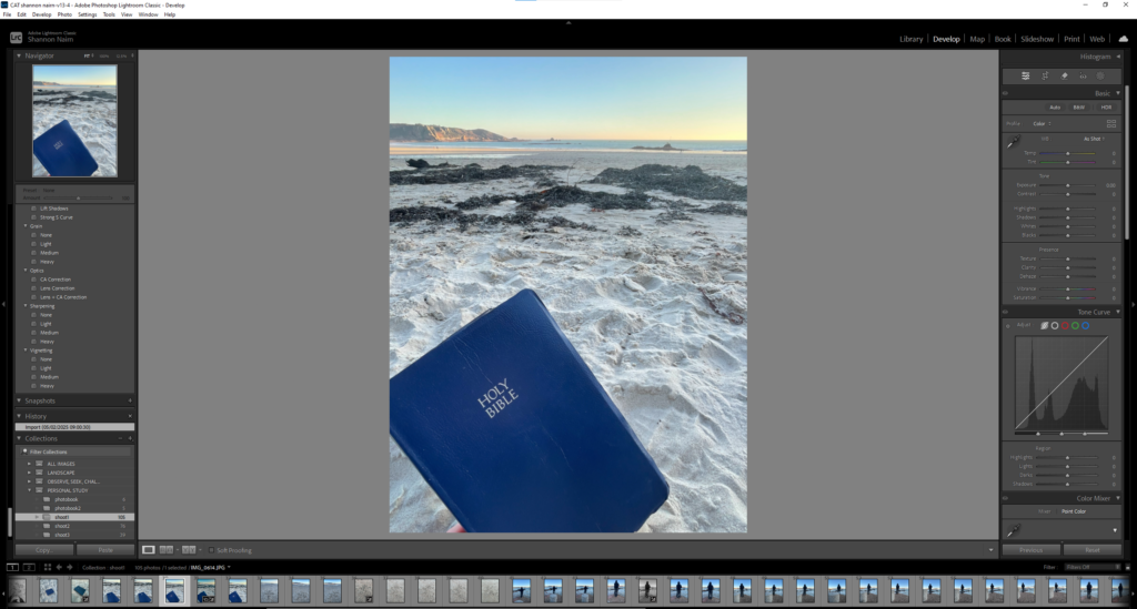
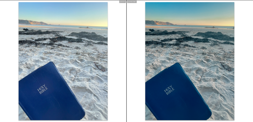
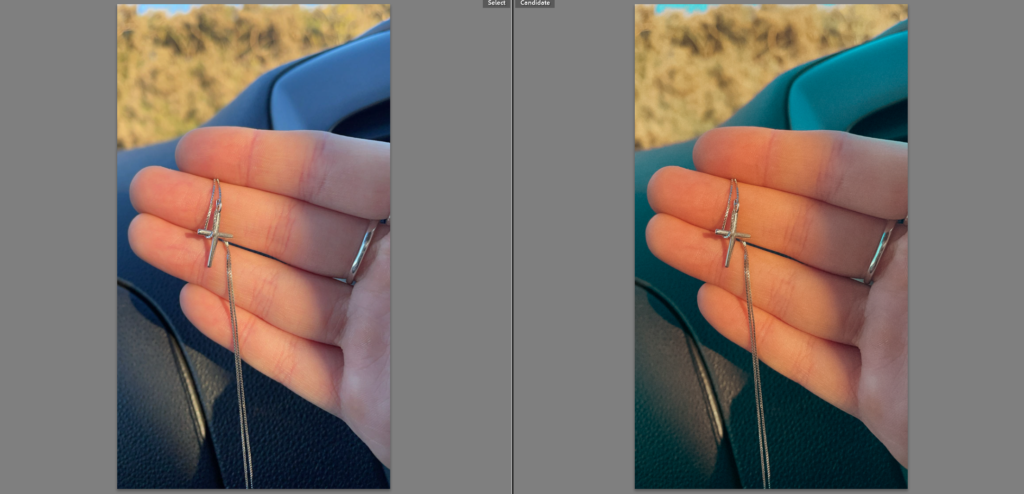
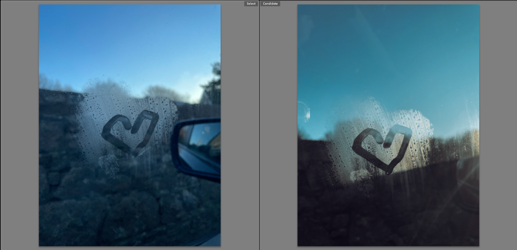
Here is the original image ^
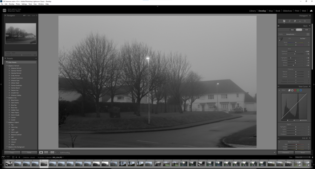
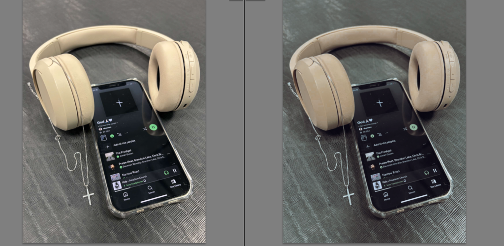
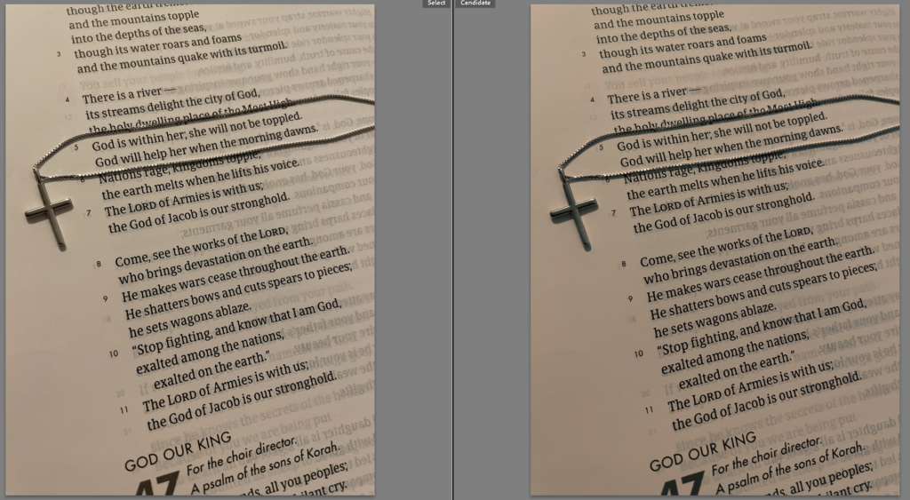
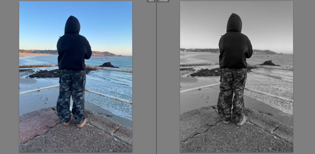
Again here, I took a different image and changed it to black and white to give off a more ominous and mysterious mood. By taking away the colour, I highlighted the contrasts and shadows, which expressed the sense of unease. Through some extra editing, I amplified these dark elements to create a feeling of uncertainty, adding a dramatic and intense effect to the image. I also added a blur on the images to show the confusion and representing being lost.
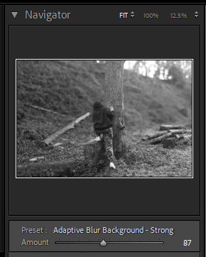
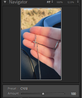
Virtual copy
Created a double to keep the original image and still be able to edit and play with the copy.
A sentence – I want to represent my journey to finding my faith and the emotions that come with it.
A paragraph – I would really like to use documentary photography to represent in detail the journey of finding my faith using hidden messages and drawings to show the emotions I had felt in specific moments.
My Photobook Design
How you want your book to look and feel – I want my book to look ominous and eye catching, something that would really grab the readers attention and make them want to properly look through and understand the stories behind my images. To make this happen I am planning on using one of my darker images to give that feel. I would like it to feel somewhat lightweight with a nice smooth feel to it.
Paper and ink – I am going to be using black & white images in the first half of the photobook therefore I wanted the paper to be black to make sure the photos looked well and fit the book. for those black pages I used white text to make sure it was visible. However for the second half of the photobook, it was all light images so I used white paper this was also representing the light at the end of darkness for these pages I used black text to make it stand out.
Format, size and orientation – With the sizing of my images, every image within the photobook was A4 and filled the whole page. The orientation of all images within the book were portrait images.
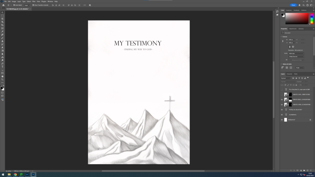
Binding and cover – For my photobook I decided on a hard cover I chose this as for me it seemed like the best fit and it was the most aesthetically pleasing. For the actual look of the cover I had used an image which I created to represent my faith and made it an image wrap going around the whole cover to create a mysterious effect so that it draws the readers attention closer and making them want to open the book and look through it.
Title
For the title I had a few ideas, I originally came up with calling it “chosen” I had originally decided on this as it was relevant to the fact that I feel chosen by God. However I then also decided that I also liked the name “ichthus” This one has a lot of meaning, in Greek this word means ‘fish of Jesus’. It has more hidden meaning than just that, each letter stands for something individually. the overall meaning is ‘Jesus Christ Son Of God Saviour’ I felt this would have been a really good title for my photobook as it represents what my photobook was about and the story behind it. In the end I decided to call it ‘Captured by the Spirit’, I decided on this as it not only incorporates the fact I captured the images with my camera but also the fact that the Holy Spirit had entered me almost as if it was representing the fact it captured my life. I really liked the fact it was representing two things at once, one being the literal camera capture of photographs and the other being the metaphorical capture of being taken by the faith.
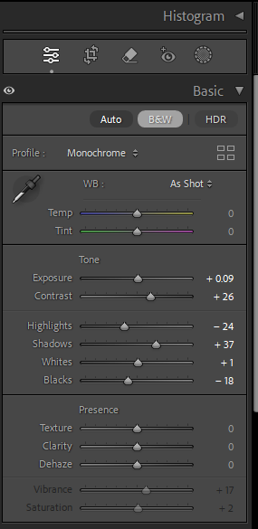
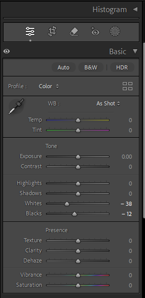
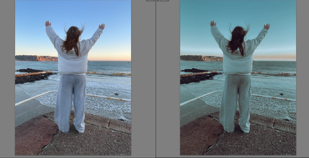
Editing and sequencing – for my images I am going to edit them according to which side of the photobook they are going in, for the first half of the photobook the images are going to be in black & white to represent the confusion and uncertainty of life before finding faith so for these images I will edit them with a higher contrast, less whites and emphasizing the blacks and darker parts of the images whilst having the black & white filter on them. Whereas for the second half of the images they will not have a black and white filter they will have a bright enlightening filter (N7) representing the light, peace and joy life brings after finding faith.
Images and text – For my images I have half and half to create the storyline, the first half of the photobook I have made all of the images black & white to represent the darkness of being lost before finding faith. Then the second half of the images in the photobook were in full colour with a lot of calming and cool colours to represent the joys and peace after finding faith and the feelings it brings with it. For my photobook I have decided to use a bible verse as a quote every once in a while throughout the photobook.
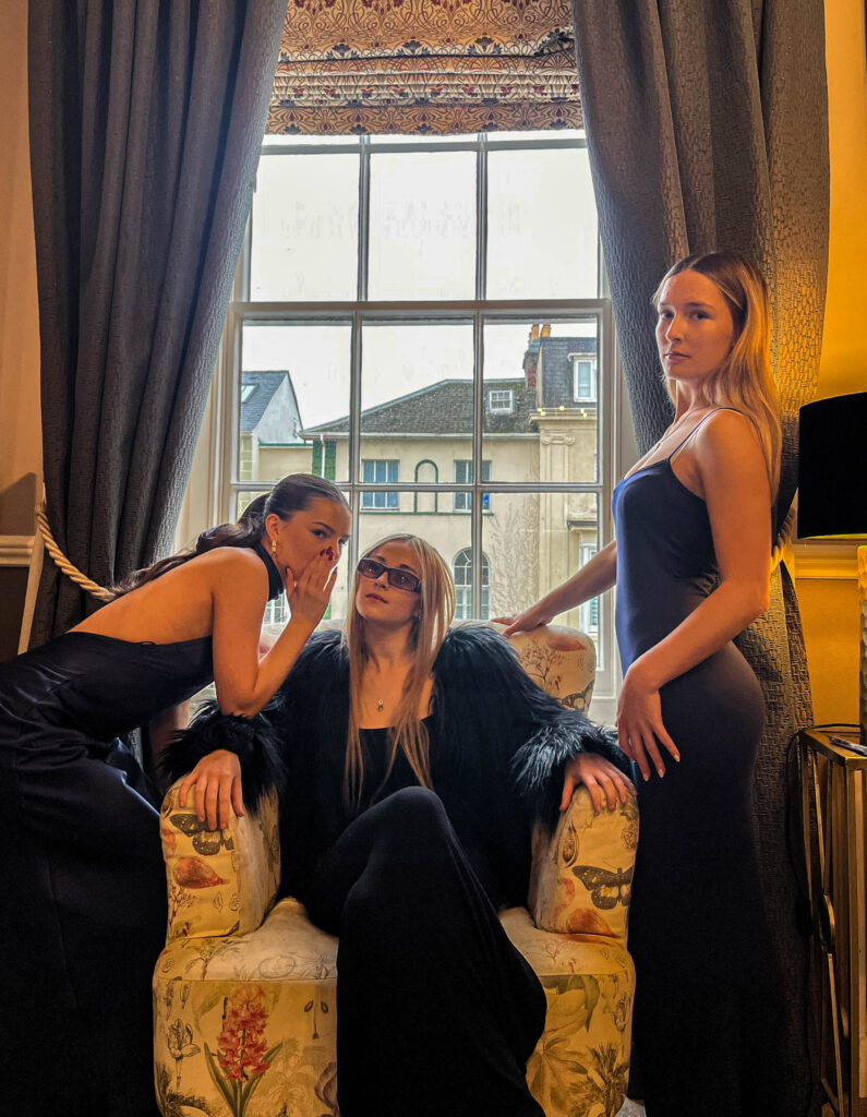
For my personal study project I have chosen to explore the theme of faith and religion through documentary photography. As I had grown up in a completely atheist household finding my way in faith is very special to me and has been an incredible journey as it’s one I’ve had to navigate by myself. Within this project I aim to present my journey with faith and how it has changed my life but to also represent how much things can change and the emotions surrounding these changes before and during my walk of faith. I intend to create a series of both landscape and portrait images of both myself and anything to do with the events in which I attend as a Christian.
Photoshoot one & two –
Concept –
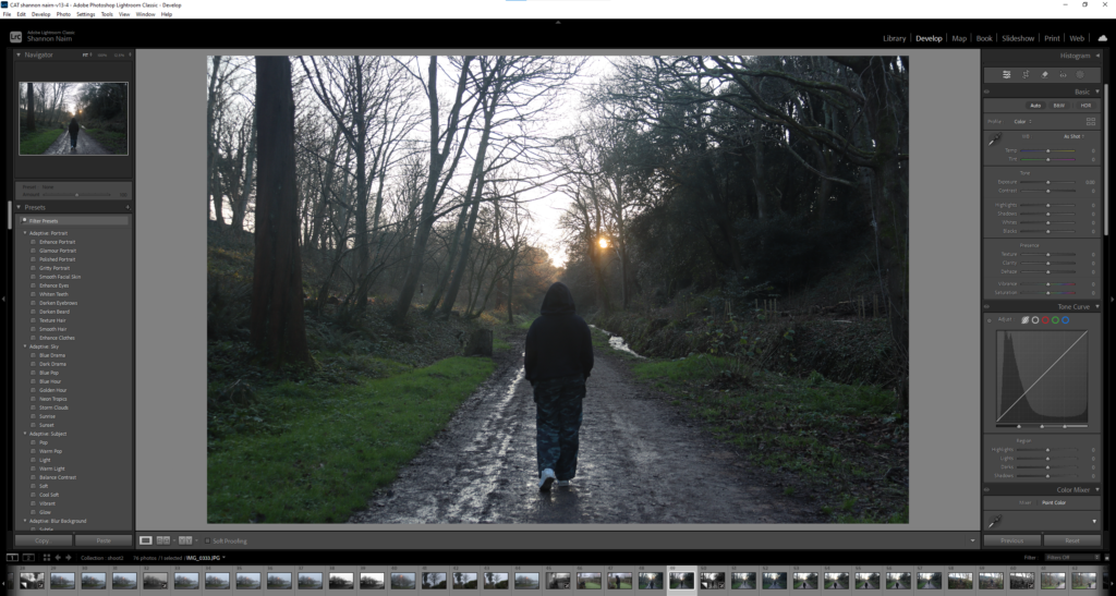
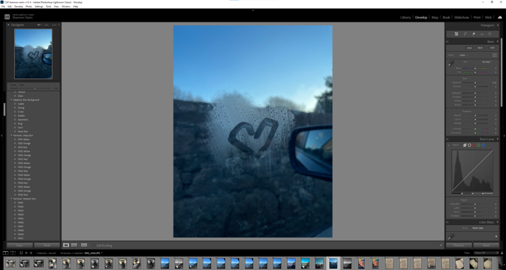
For my first photoshoot I want to explore the feeling of being lost in the dark and confused while trying to find my way before finding my faith. To capture this I plan on using a low-light setting perhaps on a day when its quite gloomy, foggy and I would go to a forest or somewhere dark to show the confusion and lost emotions. Ill experiment with shadows and dramatic contrasts to create a sense of isolation and searching. This photoshoot will represent the emotional struggle and uncertainty before finding clarity and faith.
Location –
I went around the Island to different Locations, some of the images were taken on St Brelades beach while others were taken at St Peters reservoir and I had even taken some near my house and some from random nature walks on the island.
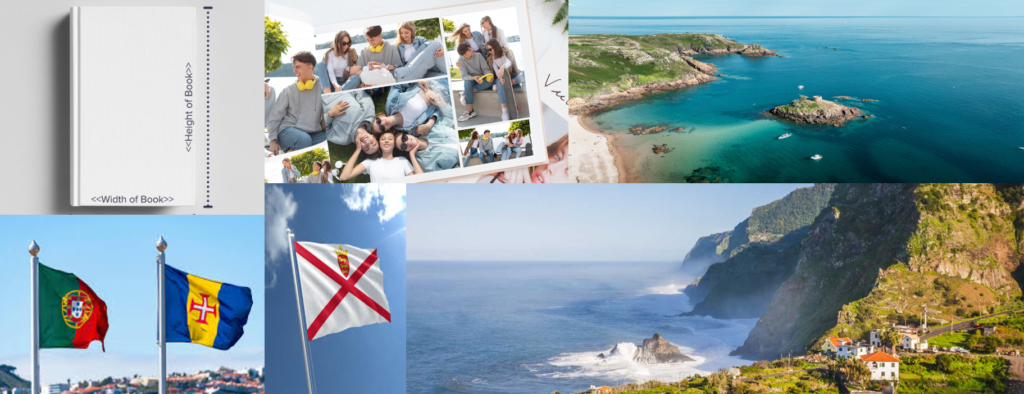
A sentence – My book will show two different cultures with family and friends from both those cultures.
A paragraph – In my book there is going to be a mixture of photoshoot from Jersey, where I was born and where my parents and whole family are from which is Madeira. I’m going to show how jersey looks and who I love spending time with and then i’m going to do the same in madeira.
Design: Consider the following
How you want your book to look and feel
Paper and ink – My pages are all going to be white since my photographs are all in different tones and shades so with a white background it makes the images stand out more.
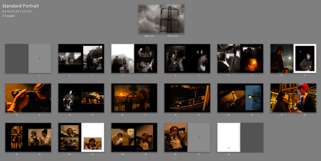
Format, size and orientation – standard portrait 8 x 10 in (20 x 25 cm)
Title – Paraiso
2. Produce a mood-board of design ideas for inspiration. Look atBLURB online book making website, photo books from photographers or see previous books produced by Hautlieu students on the table in class.
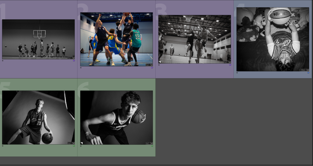
Here are my final images that I will be printing and placing on a board to present my Images. I chose these images as I think they are some of my strongest and there is a lot of variety. I will be printing the black and white studio photos in A3 and the rest in A5.
Evaluation
Overall, I believe that my personal study on the difficulties of being an athlete was successful. I was able to use my knowledge of different portrait lighting from past areas of study , especially with Rembrandt lighting, to create many interesting shots in the studio. Manipulating light also bring attention to detail in areas of the photograph that I would like, further enhancing the final images from the studio. Outside of the studio, I believe my photoshoots with Tony helped add a story to my personal study, creating a deeper meaning to it all. It also helped me form a photo book that wasn’t bland and had some story to it. However, I only had a limited number of photos to use with tony in it so next time I will improve by taking more photoshoots, as well as having more of a variety of images to chose from, making it easier to create a meaningful photobook. My documentary photos on the court where my some of my strongest, as I wasn’t afraid to get close to the side court. But ,unfortunately, my photos where saving as a compressed format in the camera, making a lot of them unusable for the photobook. Edited photos was also slightly lacking in my personal study since It was difficult to find artist reference for a lot of my documentary photos on the court. I also believe I could of done more photoshoots, especially with some relating to Tom Wood, an artist i rigorously analysis and didn’t use as much as I originally planned.
Despite these setbacks, my in-depth research of a wide variety of photographers, as well as photographic methods helped me create a good starting base to create a well formulated personal study.
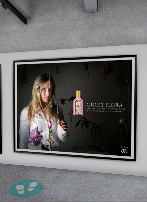
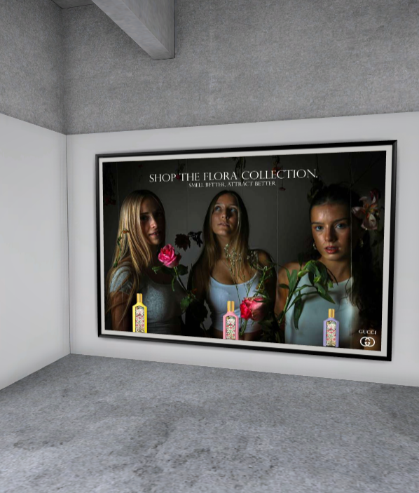
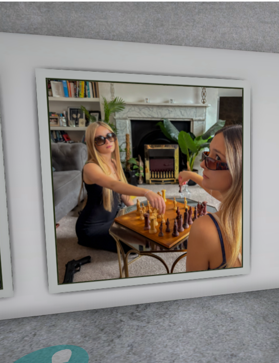
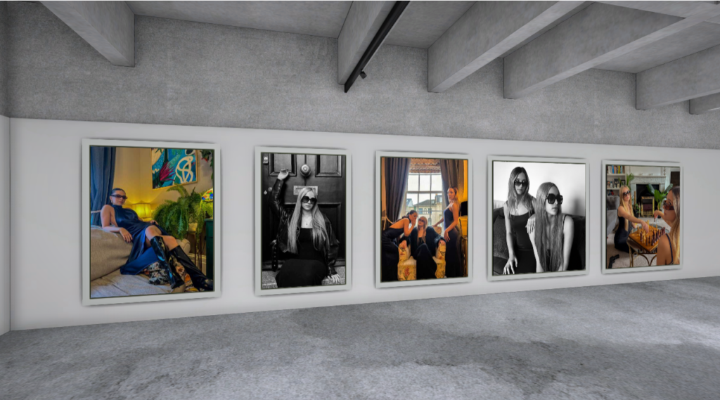
When creating my virtual gallery I like to first begin with choosing a good, strong empty gallery image which will display my images to their best quality and will look good whilst being displayed, I like to have a white wall image which shows light onto the pictures as if they are in a real gallery, whilst being displayed on black canvases.
My Chosen Images:
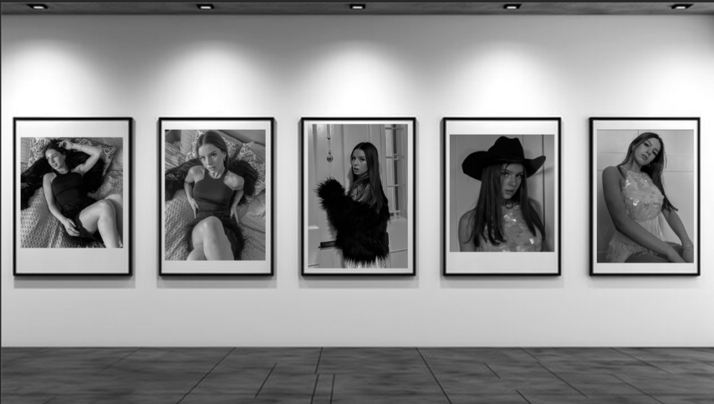
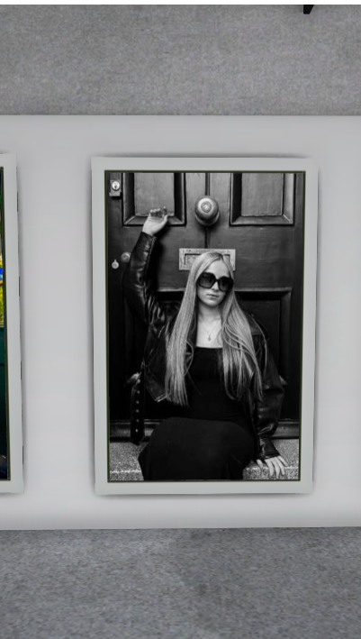
I then chose my best images from my first photoshoot that I wanted to be displayed in order to show off my work in the best way possible and show the best images from this shoot to be put into a virtual gallery. I chose these 4 images specifically as I feel this amount of pictures fitted the layout of my chosen virtual gallery the most.
Creating Virtual Gallery:
I first started by importing a virtual gallery into Adobe Photoshop and positioned it to fit the shape well. I then imported my 5 images and fitted them to the best scale on these evenly sized picture frames. I quite like how the images do not completely fi the frames as it shows each image is different and displays them all in a way that is not too boring on the eye and stays interesting and different when viewing each different picture.
Shadows and Perspectives:
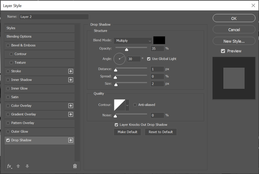
For this specific chosen empty gallery image, I did not have to work on my chosen perspectives such as tilting them as if they are on e.g. a side-on wall facing inwards, as all 5 images are facing forwards. This means that instead I had to focus on the shadows that would occur if these images were to be on a wall. For this i used the drop shadow icon. To achieve this..
I first double clicked my chosen layer which contained the image I wanted to create a shadow for first…
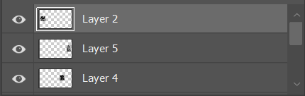
LAYER 2 SELECTED TO ADD DROP SHADOW
Then appears the layer style tool bar which allows me to add my drop shadow my clicking the ‘drop shadow’ icon at the bottom.
LAYER STYLE TOOLBAR
I am then able to choose the opacity, distance, spread, size and angle in which I want my shadow to be. I need my shadow to be below the images as this is the perspective that is created when an image is presented on a wall facing forwards.
DROP SHADOW TOOLBAR.
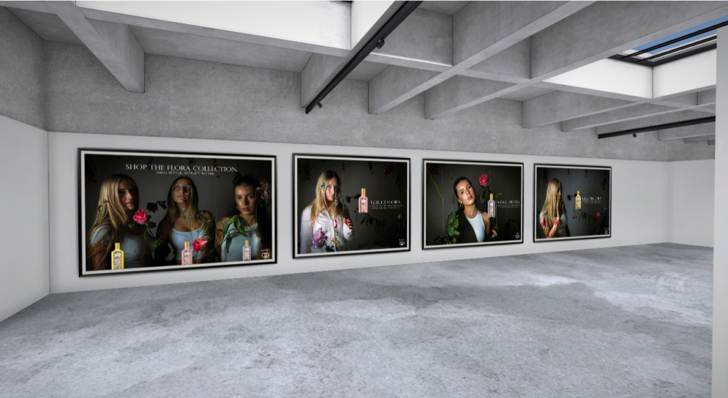
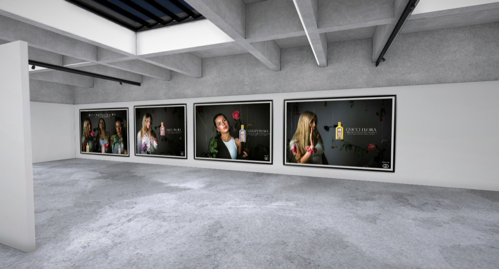
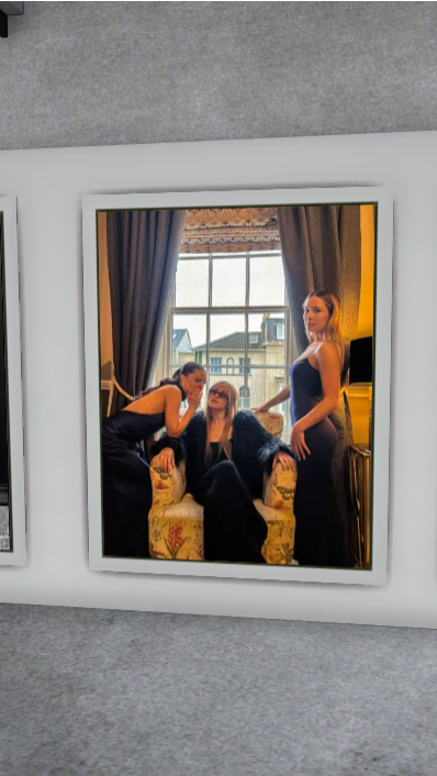
Here is my final first outcome of a virtual gallery of my images, feel this is a good first virtual gallery displaying 5 images from the first section of my book. This is the photoshoot is used to represent a 1960’s/1970’s women’s fashion and lifestyle magazine which is used to influence the styles and choices day-to-day, of women that were living during this period.
My Next Virtual Gallery.
My Chosen Images.
These are my 4 chosen images for my virtual gallery, I feel these images are the strongest from the second section of my magazine which is a photoshoot dedicated to my modern day girls magazine section of my magazine. This section is demonstrating a magazine targeted at teenage girls and younger adults and the unrealistic beauty standards that are forced upon them. I decided to create my virtual gallery on Artsteps this time, in order to create more variety in my virtual galleries and show different methods of presenting my work. I found using Artsteps particularly confusing, but after getting an understanding of how it works, I was able to figure out the instructions and way to create this gallery.
IMAGE OF GALLERY BEFORE PHOTO INPUT.
PROCESS OFADDING MYIMAGES
My Final Outcome:
My Next Virtual Gallery.
My Chosen Images.
These are my 5 chosen images for my virtual gallery, I feel these images are the strongest from the third and final section of my magazine which is a photoshoot dedicated to my modern day women’s magazine section of my magazine. This section is demonstrating a magazine targeted at women who may be transitioning into older age, or who may just be struggling with body image. It is a magazine which is highlighting the unrealistic beauty standards that are forced upon them in today’s age and how they are toxic and must be overcome. I also used Artsteps again for this virtual gallery in order to gain more confidence with using the software, for future purposes, such as my exam.
IMAGE OF GALLERY BEFORE PHOTO INPUT.
PROCESSOFADDINGMYIMAGES
My Final Outcome:
Overall, I feel this process of creating virtual galleries has been successful for trying out new software and attempting to display my images in the best way possible. However, overall I feel I prefer to edit, input and display my images in Adobe Photoshop, and I feel for my exam work, this will be the best way possible to create my virtual galleries, although I think these three galleries have been mostly successful.
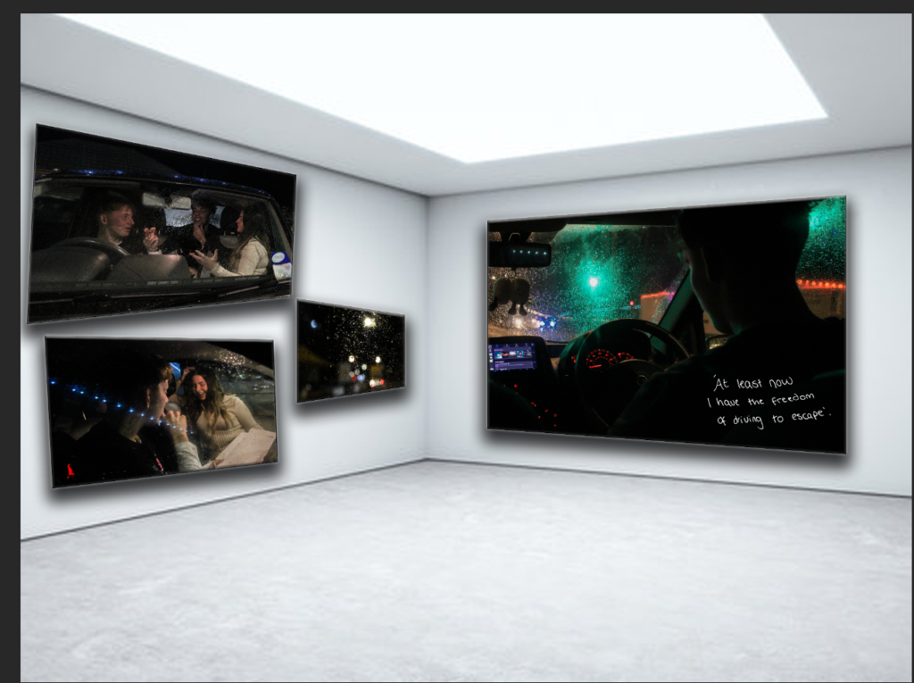
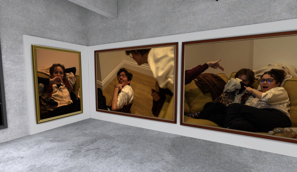
Throughout my gallery I presented it with similarties to my final photobook but also a little different I added all similar images together and not my images just what I would say our my best. This is the first part of my virtual gallery, I really liked these photos but the two of the people in the car without the writing werent my favourite, i liked that they showed inside of teenage life and laughing a different side of what some people might see the fun with being a teenager and with your friends. the distraction from other things. The over photos are just of the weather to even give a juxstaposing affect and Pathetic fallacy, even though the images seem to be happy and rain reflect sadness its because even though they are happy there is the dark truth inside of how they really feel and you cant always get away from it.
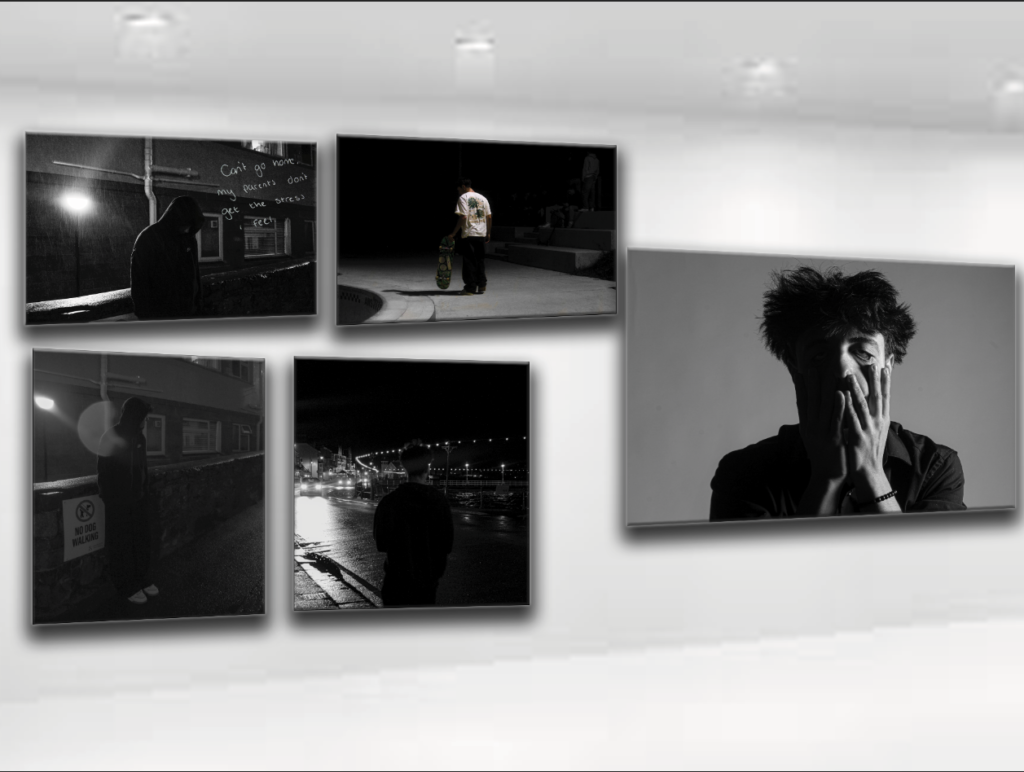
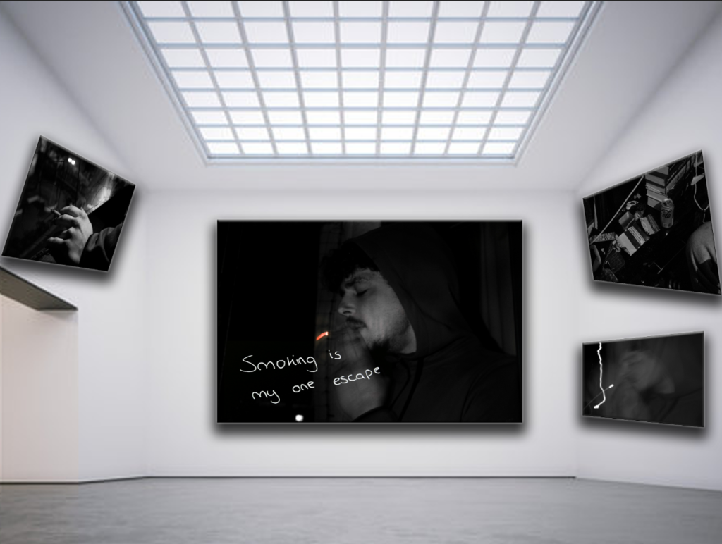
Again all these images have a similar relavance to eachother, as rhey are all the same guy, it goes well together even though i did not present it like this in the book, because as you can see its mainly his back turned or hiding his face in usally dark or sad places, only really one not is the skating photo this demonstrates more of the depressed and sad side of being a teenager, and shows teir escape, with doig certain activites even if that incudes walking alone at night, just to get air and escape. The arge photo next to all the images,of his face is a symbolic resembolince that life is tiring and drags on sometimes, yes life is actually eautful but just bein a teenager isnot an easy aspect but fight through it. I like these imaes because i think they show skills ofphotography especially the one of his face with the lighting, i also think the affect fromall of them is powerful and somehow says a lot even in a silent photograph.
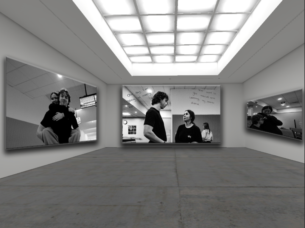
This was more of my romantic side, another side of teeage life i think is overlooked, how watching the love in our lives be twisted by who we see like our parents or social media, but a usual quote iven to teenager is that ‘you dont know what love is your too young’ or ‘its never going to last’ and i think thats not true and there is another side to it sometmes you can find love and jst beause we are young doesnt mean that we dont know what ove is or that it doesnt exist, of course there are twisted and cmplicated sides to it but it still exisits in our lives. i like how these images correspond and contradict with eachogher, showing the loving side and the complicated sides, things even we worry about at our age even though we shouldnt have to.
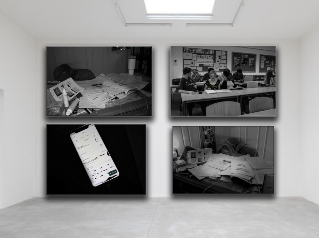
This area of my gallery is of school, the rough effort side of school and what actually goes on. I especially like the two photosof the messy desk, i like the ffect of a spotlight on the photos almost like its a crime scene or a scary movie, which demonstates what it is, its a crime scene of the mess school makes all the work andeffort teenagers and students put into school.
This was the last few photos which I also really liked as they show a darker side to teenage life and also the fact that not all teenager have the easy life of school until their 18 and some have to cut it short and head straight into work to support their families lives and grow up a little too quickly, mainly i wanted to demonstarte all sorts of sides from what teenage life is like for everyone best i can. I also just genuinly really liked these photos as i think they give apowerful affect, i think the lighting on his face isnt the absoloute best but i like how they all link together.
Overall, I believe my personal study was successful in what I was aiming to achieve through ‘snapshot aesthetic’ photographs of my friends and different locations. I displayed my photos within my photobook as a combination of similar photos and juxtapositions- telling a story through monochrome photos which gradually become a more colourful array with a warm tone and the occasional contrasting cooler toned image. Something I could have done to improve my project was to be more organised before the exam, as I still had unedited photographs and was not able to finish my photobook layout during the exam, this I will take into account during the exam project.
My photo book its based on youth culture and identity. For this I took pictures at different parties and events that I went to and took snapshot images of my friends enjoying themselves and being authentic at these events. The story of my phonebooks starts off at a party and throughout these parties are separated with a filler image of one of my friends being hungover and drunks after the party by themselves. The first filler image however starts off with me and my friend having fun in a car symbolising that these parties and events are fun at first but continuing throughout the book the filler images are darker and makes you stop romanticising these parties. My books final images is a girl using a vape outside her window, this image is last in the book because it shows the aftermath of all the parties and that is isn’t fun when you wake up in the morning and it looks like she is thinking and regretting the night before.
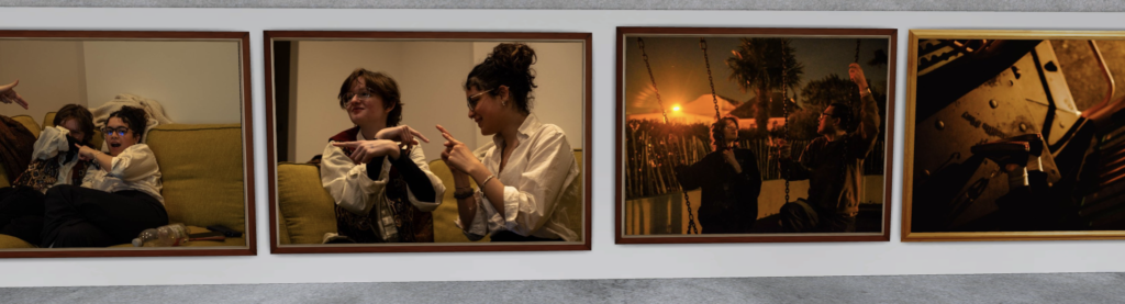
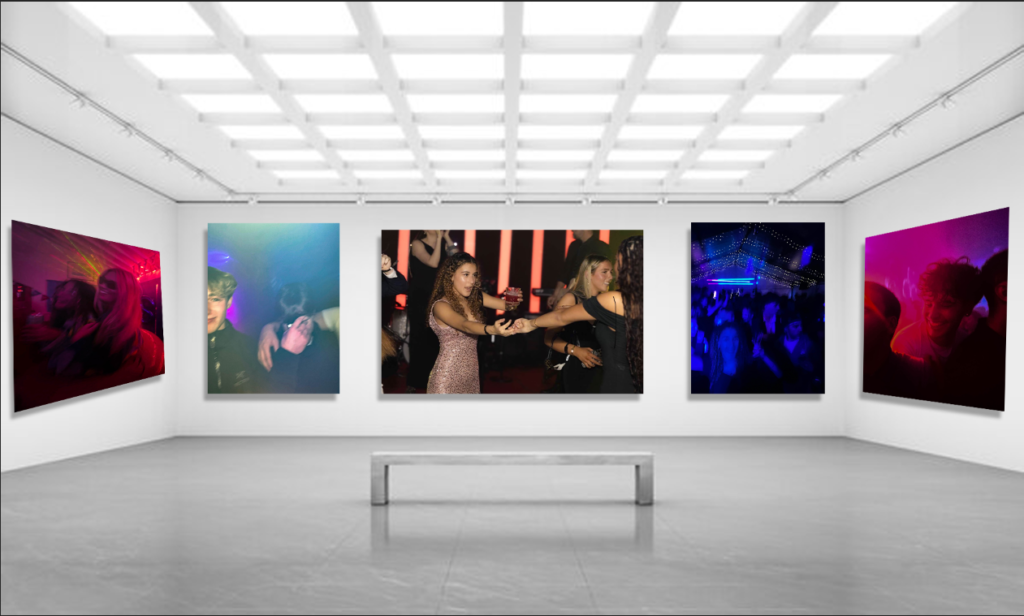
My virtual gallery includes my favourite images of my nightlife photos. Overall, I think my favourite images are the far left and right ones. These two images I think go well together and I like the way they are presented in my photo book, as I used them twice, on the front cover and then in the book. The middle image is in the middle because its the biggest image of them all and also is the image with the most going on, you can see a live band in the background and also the girl holding hands dancing with another, It shows what my book represents.