Contact Sheet:


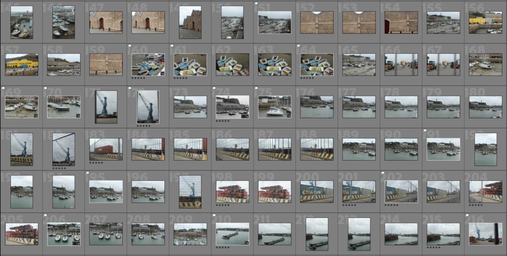

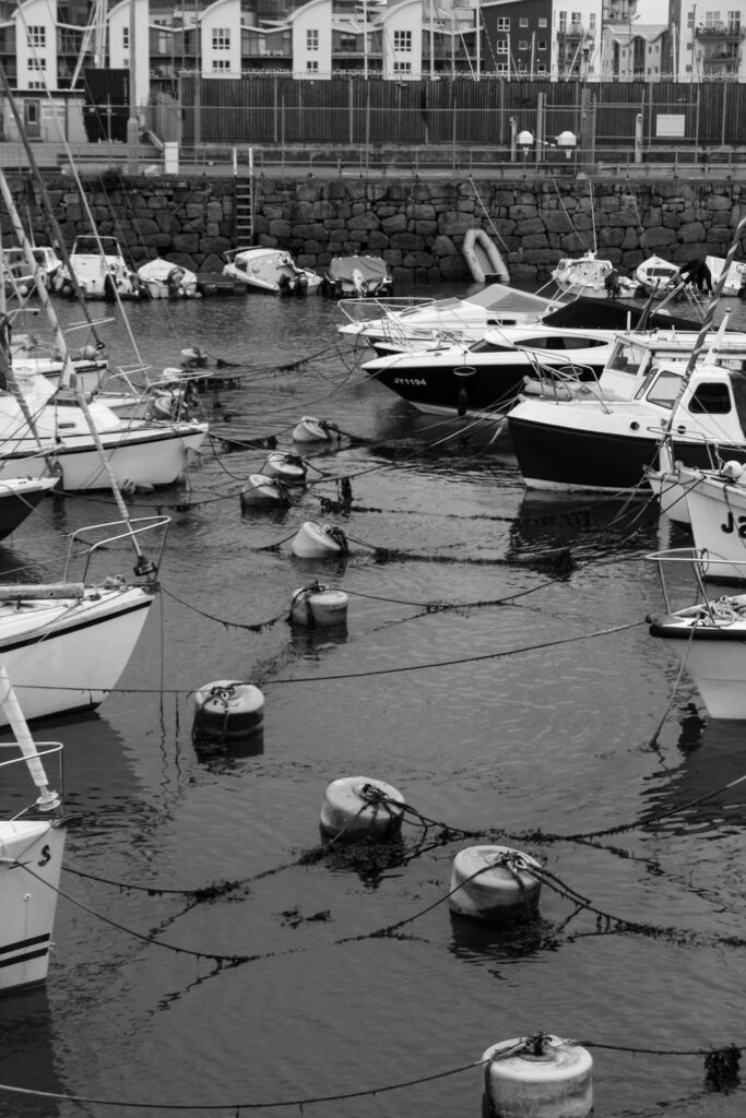
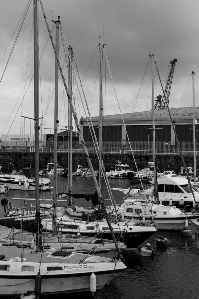
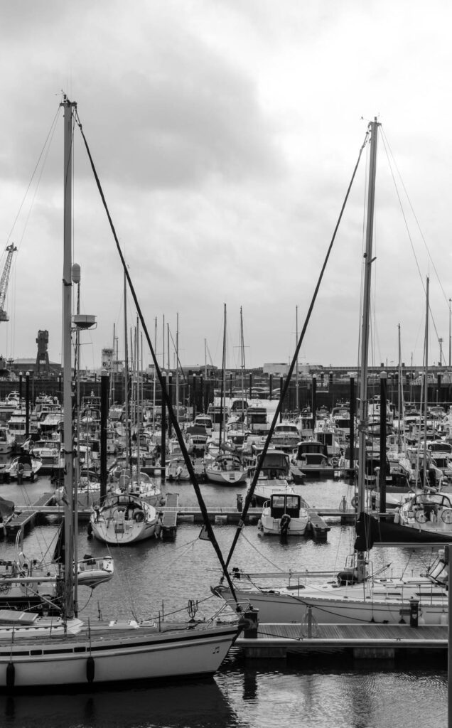
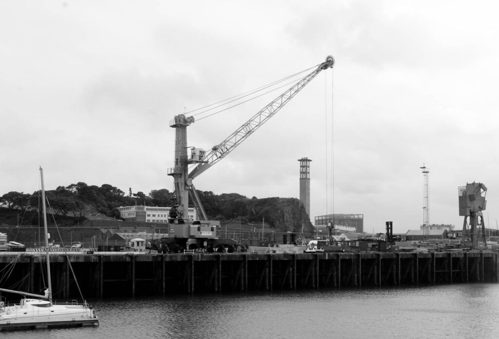
These images are my final selection, the photographs that are highlighted yellow
Final Selection:


Final images:


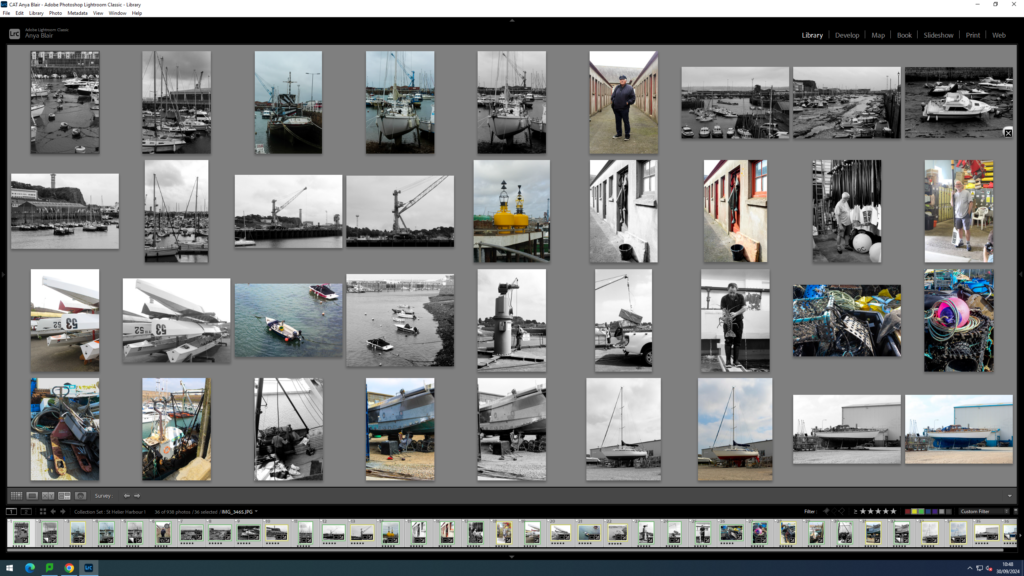
Contact Sheet:


These images are my final selection, the photographs that are highlighted yellow
Final Selection:


Final images:


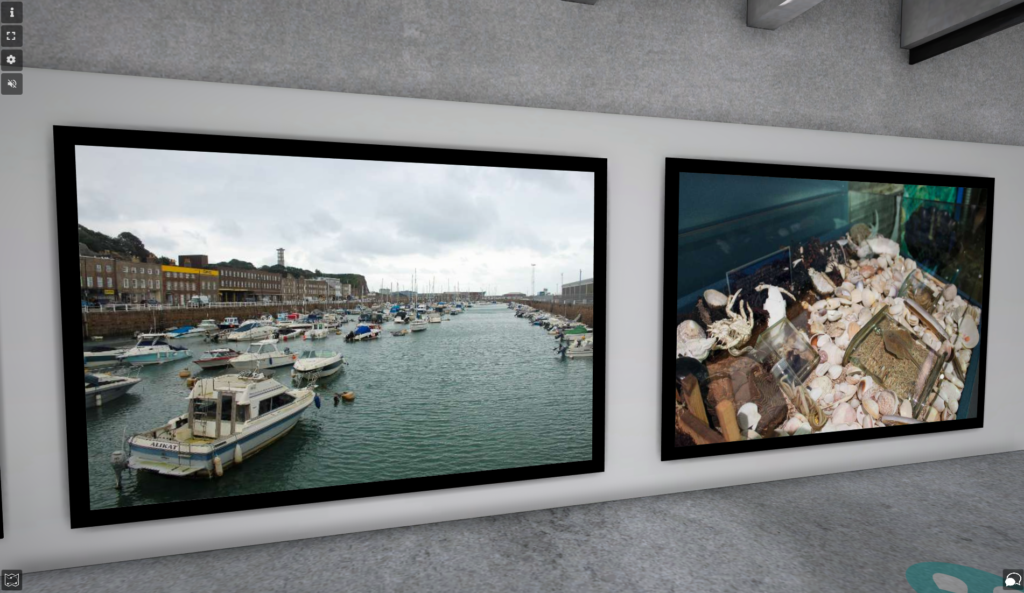
I used ArtSteps to create my virtual gallery. I used the images that I have used for my zine, because they are my best images.
How?
First, I went onto ArtSteps and selected my chosen gallery. Next, I had to import my chosen images in.

Then, I placed my images where I wanted them in my gallery ad made sure the distance and height of the images were equal.

Finally, I added frames to all the images. I hose black frames, but there was lots of different frames, which I also experimented with.

Final Virtual Gallery


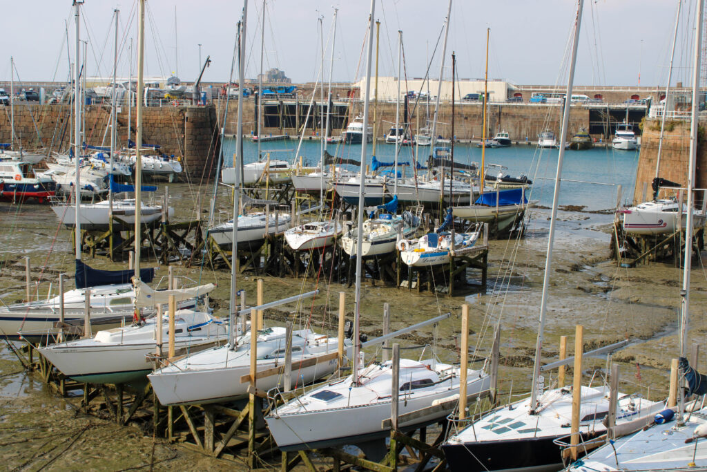
Mood board of Final Images




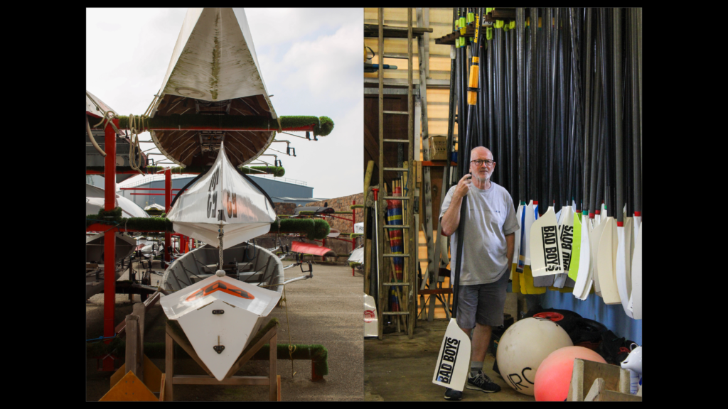
Final Digital Zine Layout




Final Paper Zine


Evaluation
Research- For this topic I started with my research on cod fisheries, Jersey Harbours in the past and present. I did this by using the links on the blog and doing my own personal research. Then, I experimented with a mood board of what I had learnt and I created a mind map of what I had learnt as well. I think this was a beneficial way of conducting my research, because I had easy access to the links on the blog, which were specifically about what we needed to know, but I’m also glad I conducted my own research, because it allowed me to find out a few extra bits of info that were not provided on the blog. If I were to do this again, or ever wanted to add to my research I would use books for my research as well as just the internet, and I would research certain passed photographs of the old harbours, as well as the photographers that took them. I would do this, because I enjoy doing artist research, but this is the only topic I haven’t done it for.
Photoshoots- For my photoshoots we went and visited St Helier Harbour and the Maritime Museum. For the first photoshoot, I didn’t obtain a wide spread of images, because I only took photos of the harbour and the boats. I found this photoshoot quite boring, because I was taking images of the same thing all day long. However, I enjoyed the second photoshoot a lot more, because I didn’t only take images of the harbour and the boats, but we visited the maritime museum to take photos, as well as the fisheries. I found these much more enjoyable, because I found them a more fun topic and thing to photoshoot, because their was lots of different interactive things in the museum and the fish were very fascinating to look at and photograph. However, I didn’t think the museum photographs were very good, because they weren’t as visually appealing, but it was very fun to take them. If I were to do this again, I would visit other harbours, not just St Helier, because I want to get a wider range of images, as the other harbours may be completely different.
Editing- I used Lightroom to edit my images and I used a rating and colour system to decide which images I wanted to edit. I experimented with coloured images, as well as black and white images, to create contrast. I also experimented with creating different panoramas, as well as experimenting with my cropping and colour popping. I thought my experimentation of editing was very good, because I discovered what looked good with my images, and what looked not so good, like the colour popping. If I were to redo this, I would try and narrow down my images to maybe 10-12 for each photoshoot to edit, just so I don’t post too much editing on the blog, and so I don’t run out of time.
Display of Final Images- I displayed my final images in very different ways, having my best images flood through the whole thing, instead of just at the beginning, middle or end. I also presented my images solo, in pairs, or in thirds, depending on whether the images had a relationship with each other, were similar, or were my best images. eg. best images go solo. I think this worked well for me, because I was able to experiment with my presentation, and I was able to present a relationship between my images.
Paper Zine Mock up and Mood Board- Firstly, I selected my best 16 images, and made a mood board out of these images. Then, I printed them off, and laid them across the table and experimented with the layout of my images, until I found the right one. Then, I made a 16 page booklet, by folding 4 pieces of plain paper in half and sticking my images to them in my chosen order with masking tape. This worked well for me, because it was easier and quicker to experiment with my printed images on paper, instead of on the computer, because I could visually see them laid out next to each other in my booklet. However, next time I would spend more time choosing which images I wanted to use and experiment with my layout more, because in the end I swapped out images and changed the layout completely.
Making My Narrative- First, I started using;
This helped me figure out the narrative of my zine, so I could present it in the best way possible. This also helped me come up with my title for me zine. Then, I wrote about my zine, explaining the narrative.
Experimenting with the Archive- I experimented with old images of the harbour, from google and the JEP archive, because I was experimenting with comparing the harbour from the past and the present, as well as showing how the harbour has progressed and developed. However, I did not end up using the archives for my zine, because I wanted to include more of my own images, to show off my own work. If I were to redo this, I would spend more time experimenting with the archives and look through all of them to see more images of the old harbour.
Zine Experimentation- I experimented a lot with my zine on InDesign, by experimenting with my images, their layout, my typography, size, colour and font of my text, my title, and what text I should include. I think experimenting thoroughly benefited me, because it allowed me to see lots of different versions of my zine, so I could chose which was the best and end up with my best outcome.
Final Zine- My final zine came out well, because of all the research, editing and experimentation I was able to do. I used many different forms of experimentation, like Lightroom editing, photoshop, paper mock ups and on InDesign. I also used many different forms of research, like using the links on the blog, doing my own research and using the information offered to me at the maritime museum. All of this put together allowed me to produce the best zine I possibly could. Next time, I would want to experiment with making more than one zine if I had the time. I would also like to make a zine, which involved text on the inside, because this one didn’t.
What are the differences between photographs that are mirrors and photographs that are windows?
Photographs that are “mirrors” tend to be Romantic, expressionistic and suggestive, shot close to the subject or with a narrow angle of vision. They lean toward abstract simplicity, even a Platonic sense of types and essences.
“Mirrors” were images meant to mirror the photographer’s own sensibility. Some words I can associate with mirror images are:
“Windows” tend to be realistic, descriptive, taken at greater distances or with a wider angle of view. “Windows” were photos meant to act as a window for the viewer to see something that is primarily factual and external to the photographer’s own sensibility. Some words I can associate with window images are:
The exhibition Mirrors and Windows, an exhibition of American photography since 1960, opened at The Museum of Modern Art, New York in July of 1978. The curator, John Szarkowski‘s attempted to categorise photographers whose work largely sought to see outside themselves. Szarkowski wrote in the catalogue essay that accompanied the exhibition:


“The two creative motives that have been contrasted here are not discrete. Ultimately each of the pictures in this book is part of a single, complex, plastic tradition. Since the early days of that tradition, an interior debate has contested issues parallel to those illustrated here. The prejudices and inclinations expressed by the pictures in this book suggest positions that are familiar from older disputes. In terms of the best photography of a half-century ago, one might ay that Alfred Stieglitz is the patron of the first half of this book and Eugene Atget of the second. In either case, what artist could want a more distinguished sponsor? The distance between them is to be measured not in terms of the relative force or originality of their work, but in terms of their conceptions of what a photograph is: is it a mirror, reflecting a portrait of the artist who made it, or a window, through which one might better know the world?“
– John Szarkowski, 1978

Eugène Atget (born February 12, 1857, Libourne, near Bordeaux, France – died August 4, 1927) was a French commercial photographer who specialized in photographing the architecture and associated arts of Paris and its environs at the turn of the 20th century.
Very few biographical facts are known about Atget. The Atget family (originally Atger) were saddlers and carriage-makers who had moved from Provence to the Dordogne River region after the Napoleonic Wars. When Atget was five his father died; his mother died soon afterward. He went on to act for several years in itinerant troops that barnstormed the lower levels of the theatrical audience in the provinces. By the late 1880s, when Atget was in his early 30s, he had become interested in photography. The earliest known photographs by him seem to have been made in the north of France. These works depict rural scenes, plants, and farming technology and they were presumably made as studies for painters and illustrators. By the early 1890s, Atget was working in Paris, but it was not until late in that decade that he changed the focus of his photographic business to concentrate on the city of Paris – a subject that proved of inexhaustible interest, and one that continued to nourish his mind and enrich his work for the remaining 30 years of his life.

Hilla Becher was a German artist born in 1931 in Siegen, Germany. She was one half of a photography duo with her husband Bernd Becher. They began collaborating together in 1959 after meeting at the Kunstakademie Düsseldorf in 1957. Bernd originally studied painting and then typography, whereas Hilla had trained as a commercial photographer. After two years collaborating together, they married. For forty years, they photographed disappearing industrial architecture around Europe and North America. They won the Erasmus Prize in 2002 and Hasselblad Award in 2004 for their work and roles as photography professors at the art academy Kunstakademie Düsseldorf.
Lime, an important building material since ancient times, is used in the production of mortar and cement. Here, the Bechers focused their attention on six towering brick chimneys that look as much like sprouting asparagus as utilitarian structures. The artists chose a similar view of lime kilns for the cover image of Anonyme Skulpturen (1970), their ambitious first publication. The book presents comparative sequences of different industrial forms, from kilns and gasometers to cooling towers, blast furnaces, and winding towers.
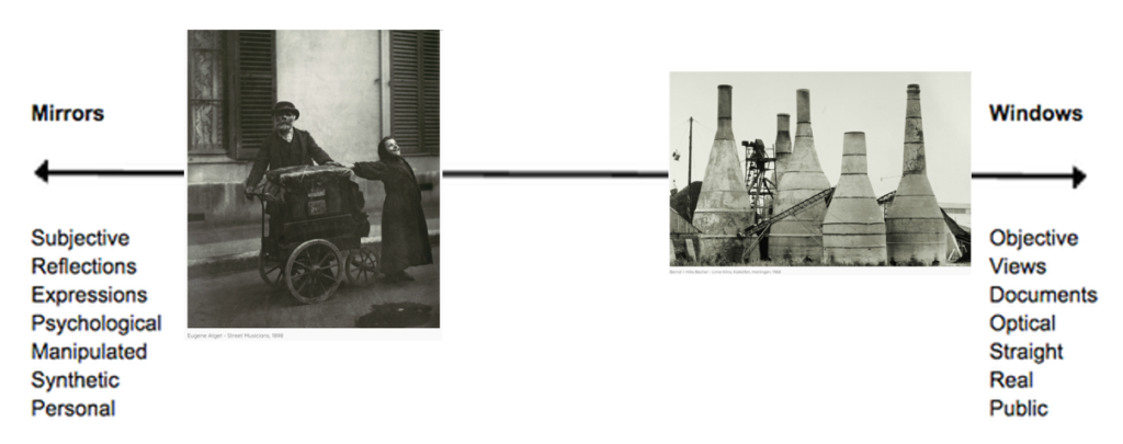
Within the Mirrors and Windows spectrum, I would place the two images above in these places as I believe they have contrasting purposes. The image by Eugene Atget is placed in the mirrors section because I feel it reflects more about the artist rather than through the exterior world is explored in all its presence and reality. This is because I found that he decided to “concentrate on the city of Paris – a subject that proved of inexhaustible interest, and one that continued to nourish his mind and enrich his work for the remaining 30 years of his life“, which tells me that he had a passion for this type of photography and wanted to pursue it further after experimenting taking photographs of Paris. I believe it tells the viewer a story about what life was like in those days, through the use of the mini carriage, which I assume was used for carrying things. It also gives us an insight on his passion as it is said that he enjoyed photographing images that could be made for studies. However it is not completely on the left side as I do believe it also has elements of a window image, this is because Atget has clearly used two people as his main subject in the image, rather than himself or something that reflects himself, showing that the photo is objective and real. The image in the windows range taken by Bernd and Hilla Becher, is placed in this position on the scale as its main subject is a building, which can often be associated with being very subjective as it documents a building that was considered important in the 1970s. This fits into the window category successfully as by photographing a building, it is clear to me that this was not staged because the building reflects history and cannot be moved.
What are the differences between photographs that are WINDOWS and MIRRORS.
“Mirrors” were images meant to mirror the photographer’s own sensibility. “Windows” were photos meant to act as a window for the viewer to see something that is primarily factual and external to the photographer’s own sensibility.
A mirror image would reflect the photographer. The photographer may be in the image, and it will reflect the photographers actions, displaying a clear meanigning.
A window image would be up to the viewers subjectivity, something that just sees straight through the camera lens without anything added.
“The two creative motives that have been contrasted here are not discrete. Ultimately each of the pictures in this book is part of a single, complex, plastic tradition. Since the early days of that tradition, an interior debate has contested issues parallel to those illustrated here.” – John Szarkowski, 1978
Key Words
MIRRORS: tableaux, subjective, romanticism, fiction, staged, personal, reflective, manipulated…
tableaux
A group of models/humans/motionless figures representing a scene from a story or from history.
subjective
Something based on personal feeling, influenced by tastes and opinions.
romanticism
A movement in the arts and literature in the 18th century.
fiction
Something that is invented or is untrue.
staged
Planned, organised or arranged in advance.
personal
Belonging to or affecting a particular person rather than anyone else.
reflective
Relating to or characterized by deep thought, portrays a persons feelings or has a larger insightful meaning.
manipulated
Handle or control in a skilful manner, controls or influences a person.
WINDOWS: documentary, objective, realism, candid, public, straight, optical, views…
documentary
Consisting of facts or based on facts. Using pictures to provide a factual report.
objective
Not influenced by personal feelings or opinions in considering and representing facts.
realism
Rejects imagination and creates fact, a close observation of outwards appearance’s.
candid
Truthful and straightforward. A photo taken straightforward, maybe without the models attention that it was even happening.
public
Concerning people as a whole, perceived or portrayed in an open view.
straight
Photography that attempts to depict a scene or subject in sharp focus and detail.
optical
Utilizing light, straightforward.
views
The position in which the camera sees the scene.
Upload your chosen image and describe why the image is either a mirror or a window, or both.

I think that this image is a window. Due to it being documentary, it shows a factual story with the use of raw actions. I think it also connotates realism, something that is not subjective, its straight. It has a clear view using a clear optical lens. This image also seems very candid, like the models didn’t even know it was being taken.
Although the image could also be a mirror because, of its use of romanticism. And the way it looks almost staged and planned with the use of motionless characters (tableaux).
My story will be seen as something that has a mixture and comparison of past and present. It might also show some form of the future in the St Helier harbour. This is to manipulate a realisation towards the audience for them to actually realise how quickly the time is passing and how quickly Jersey, more specifically, St Helier harbour, is evolving.
I will have my own produced images with a comparison and incorporation of mixture of images from the Archives and will also get the future images from a folder my teacher has provided me which shows a variety of future lookalikes that St Helier harbour may become.
At the beginning of my zine, I will have an introduction of the history, facts and more about the St Helier harbour. The first couple of pages will consist of landscapes of the St Helier harbour (present). Then I will have some past and present images, using the archive images and my own picture to compare. In this group of images, I will have the year it was taken and where. Then using some picture from the archive, I will incorporate the past people or objects from the past pictures and place them on my own, present images of St Helier harbour. These images will be placed on one side of the page and the next page won’t have any images because I will put a poem about St Helier harbour or sayings that people have said about St Helier harbour
I plan to have my font-types quite antic tone to them with words that change colors depending on the image that is shown (black and white or colored). The cover of the zine will be black and white with an image that indicates what the zine will be about. The text will be shown vertically on the right side of the cover on the middle. These words will be black and white

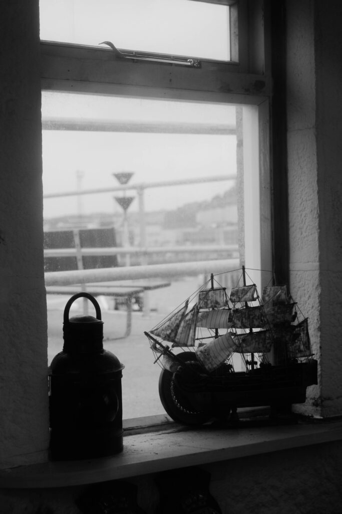


Cover Page

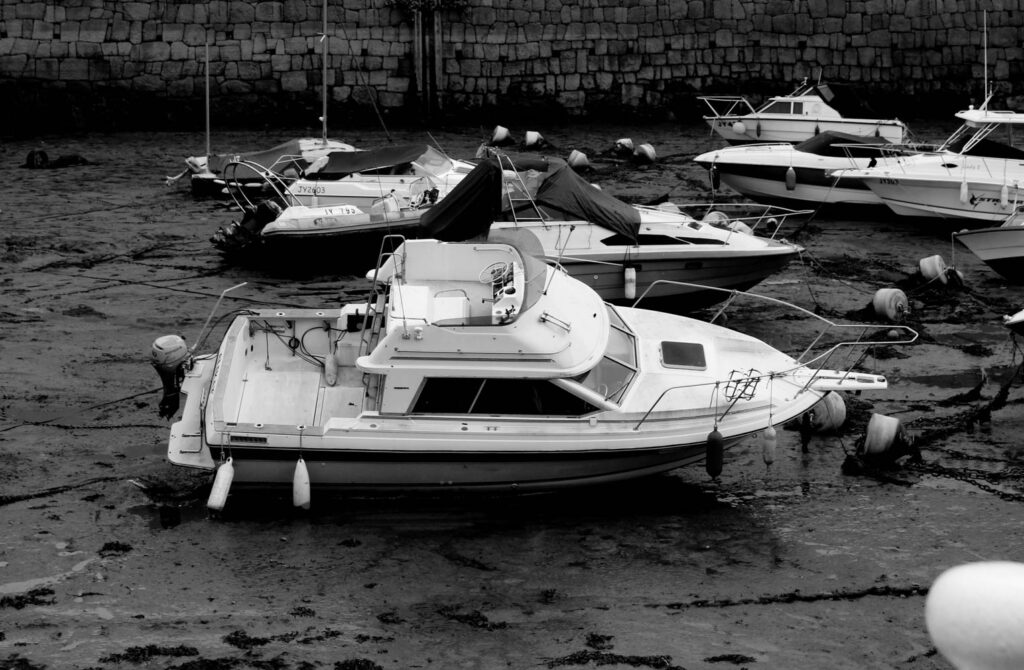
The reason I have chose this title is because of its strong connotations, the way that trade and communication flow together, like they are dependant on one another. I chose a black and white image o give a historic feeling, a visual element that makes you think something is old. I have relied heavily on contrast due to want to expose the granite wall and portray all of its cracks to exclaim how old it is.
I took this image in natural daylight, to portray it naturally rather than making it look unnatural by using things like a flash. The colour balance of the image is very cold and dark. There is a lot of texture within this image to show how the wall has changed throughout many years, creating a very 3D image. The 3D elements lead the eye to all the white and bright areas, due to there high contrast to the darkness of the image. I think that there is harmony with the image and the font of the title, due to the title being written in black and outlined in white, a bit like the image is, mostly black but that’s what pulls you to the white element’s. This image has a context with the light on the pole which lets traders know when the ports were open, green for go and red for stop, like a traffic light. The essence of my work was to create a historic meaning, making people think way back to the 1900s, while still allowing room to change the essence to something more modern.
Page Spread One

I chose these images so that I could stick with the black and white theme, and I wanted to leave some room for text so that I could explain my ideas, like an intro.
These images were taken in daylight, on a cloudy day. This gives a natural effect due to having a high level of control as the sun wasn’t exactly beaming. The images are quite short and sharp, they get straight to there point. I don’t think the images are either warm nor cold, I would describe them as very neutral, almost numb, just black and white. The images are quite 3D and textured allowing you to see the use on the boats, and the grainy sand. They both have a simple layout with the centre of the image being what you look at. They both have a similar historical context in the sense that they’re both used boats. The conceptual meaning behind my work on this page spread, was to gain historic value by adding text, to make peoples eye go toward the images, let them think about the image, and then get told the ‘answer’ within the text.
Page Spread Three

I am still keeping with the black and white historic theme, but slowly adding more shading to make a smooth transition to colour.
These were all taken in natural daylight, but you can see between the pier and the boat how the sun moves, going from a lit up area and dark skies, to a dimly lit area and a bright sky. The sun didn’t really give me a good level of control within these images, as the sun was behind clouds but still really bright making it difficult to evaluate what ISO to use. All these photos were taken on a very wide angle, some zoomed all the way out and some zoomed all the way in. For example the brick buildings were taken from very far away and all the way zoomed out in order to be able to fit all of the buildings into one landscape shot, whereas the image of the boat was taken very far away but very zoomed in to make the boat the main subject of the image. The images contain a lot of panning so that I could capture a wide area of space. There is a lot of tonal range within the three images, they contrast each other with there bright whites and dark blacks, giving them all a similar tone but also so different.
Page Spread Four

I have used colour popping to transition my images into colour and create a less historic feel, moving towards modernism.
This image was taken in daylight, with the sun coming from behind my camera lens. The image has a high tonal range, with a lot of blacks and whites but then also a pop of red, this creates a warm autumnal feel. I took this image in a portrait way with a small angled lens, due to already being very close to the object. The image has a sharp depth of field, focusing on the colour, and text, with main anchorage points. The image is mildly textured, with the anchor showing a lot of historic elements, but the board which explains the anchor is very smooth and minimal. I have used a clear organisation of visual element’s. I have selection cropped the image to create a clear element. This image has a high amount of historical context, with a lot of explaining that context but also justifying it by using the anchor. My idea behind my image was actually to just create anchorage by using an anchor, to create a meaning and dealing with text and imagery.
Page Spread Five

This image is colour popped again but creates some more brighter colours to crate a more intense shift into modernism.
This image was taken in daylight, you can see this through the reflection/glare on the water. It creates a more florescent atmosphere compared to all the other images in black and white. This image was taken in a very wide angle, taken very very far away but is also very zoomed in to really shift focus onto the signage. I think that by using colour popping within the image it has created a simple colour accuracy, something that flows, how the simple light greys go with the whites and the darker greys and the blues. By colour popping the blue it has also slightly coloured the sea, creating a smooth background with not much texture. There is a pattern and repetition of the blue within the sea and within the sign. There is strong containment within the frame, the sign being just the main thing, and an easy view of how everything else is outside of the frame, in the background. There is a wider narrative to this image, the sign says thank you for visiting creating a story that someone has gone to the harbour and got on a boat.
Page Spread Six

The is my first page spread with images that are all in colour, and it also has the most text out of all my images.
Both of these images were taken in natural daylight, but I love the contrast between them where you can see how the sun shifted throughout the day. I had a high level of control when taking these photos, which you can see through the bold bright crisp colours within my images. There both very focused photos, with signage which creates a pathway for me to write facts about the images. This page spread really all flows together. They both have quite a bright tone, with bold whites. The ferry speed image is a lot more textured than the pier sign, this is to portray all the wear and tear of trade, and how active trade still is over here. There is a lot of space within my images, creating a 3D open context, by not bombarding people with a million things in there face I have created a calmer environment where people can really use their brains and get there minds wrapped around the meanings of my page spread. I wanted to create something that showed how bustling the harbour and trade still is , without throwing it in peoples faces.
Page Spread Seven

This page spread is very minimal, to leave something to be subjective, rather than bombarding people with text.
The use of daylight and colour popping and also a white background creates a major contrast, a massively bright image that gave me a good level of control to make the whole images vibrant and pop but without looking messy or childish. I think the light reflects the distance in which the images were taken from, a up-close image which is reflected from a glare on the sign, or a further away image which is reflected by the length. There is a lot of patterned repetition within the images, repeated use of colour and anchorage. This creates a conceptual feeling or modernism, allowing me to create that smooth shift from black and white histories.
Page Spread Eight

I have laid out three images so that there us no text bombarding again, leaving this to be seen and interpreted.
These images were taken in three different instances of daylight, as you can see the shift of the sun between them, it creates a contrast of our stormy harbours. In this page spread I have included imagery of the riches, a golden boat and also a description of images that include simple trade. By using a café you are creating a trade, which shows just how alive it still is as these cafes are in use every single day. I used a layout which creates harmony between the three images.
Last Page

I have put this image sideways to crate a more out of the ordinary zine. A zine is basically a silly magazine, something that doesn’t really need to be formatted to influence and attract an audience, it is very informal.
This image is very technical it manipulates the brain by the use of texture and detail, but portraying hoe historic this is but also how real it is. It makes you think about what would happen if trade went under, us as a small island would be in the dark and have nothing. A lot of people see the harbour as something that is aged and old, although it is that it us important to incorporate how it is still vividly in use every day.
Overall Evaluation
Overall I think all my planning and work that went into my zine made it turn out to have the exact narrative I planned. I wanted my zine to be a timeline and I think that I have created that through the use of key things like conceptual feelings and colour popping. Although I did miss a photoshoot day I think that my other photoshoot made up for that, and gave me all the create tools that I needed to create a timeline narrative about trade in st heliers harbours.
What is the windows and mirrors theory?
“Most of my likeness [daguerreotypes] do look
unamiable; but the very sufficient reason, I fancy,
is because the originals are so. There is a wonderful
insight in heaven’s broad and simple sunshine. While
we give it credit only for depicting the merest surface,
it actually brings out the secret character with a
truth that no painter would ever venture upon, even
if he could detect it.”
(Holgrave in Nathaniel Hawthorne’s The House o f the Seven Gables, 1851)

we approach the photographs in the show either as mirrors, reflecting the photographer’s consciousness and concerned primarily with self- expression, or windows, openings onto the external world concerned primarily with exploration.
The idea of photographs functioning like windows makes total sense. Like a camera, windows frame our view of the world. We see through them and light enters the window so that we can see beyond. Photographs present us with a view of something. However, it might also be possible to think of photographs as mirrors, reflecting our individual view of the world, one we have shaped with our personalities, our subconscious motivations, so that it represents how our minds work as well as our eyes. The photograph’s surface reflects as much as it frames. Of course, some photographs might be both mirrors and windows.
Windows
a window in photography is an objective view of the world around this could include documentary, realism, candid, optical photography.
With window photography it is difficult to infer much about the photo and requires little to no creativity to create.

this would be considered a window photography because it is an honest, unedited, unfiltered view of the world around.
Mirrors
A Mirror is a reflection of the photographers subconscious and conscious self expression.
“Mirrors” were images meant to mirror the photographer’s own sensibility.

this image is very subjective and clearly the photographer is trying to communicate a deeper message than is objectively presented in the image
Cross-Over
of course in some photos there is cross over between the two contrasting approaches to photography where the photo at first seems objective and could be considered a Window to the outside world but upon deeper inspection the could also be considered Mirror because of the subtle inference and and underlying themes.

when first approaching this image i believe it to be an objective photo taken of perhaps and football pitch, with the chalk lines framing the photo but upon further research i discovered this is a image by Richard Long and is named– A line made by walking, England 1967, this image was created through longs performance after of walking in a line over and over and and killing/treading down the grass bellow his path and then documented through photography. so in fact despite its appearance this image is quite subjective.
I believe it to be a combination of both approaches.
General layout:

Measurements:
Create new document
width: 148mm
height: 210
pages: 16
orientation: portrait
columns:2
column gutter: 5mm
margins: top, bottom, inside, outside: 10mm
bleed: top, bottom, inside, outside: 3mm
Paper plan:
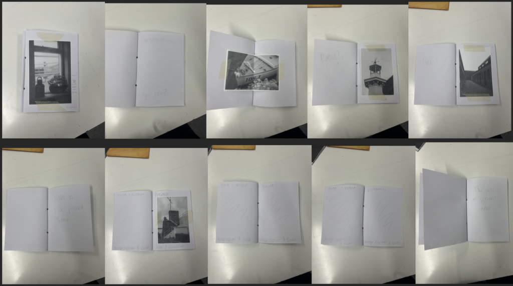

This was my first ever mock plan. I liked the Sequence of the photos however I didn’t really like the Layout of it and the fact that there was too much images to produce so this plan was rejected.
Indesign plan:
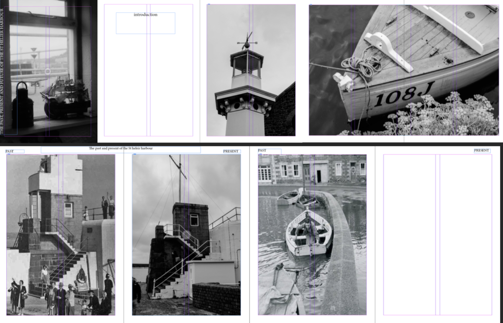
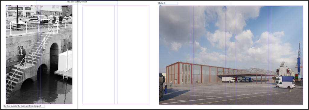
I liked the layout more and the features however the fonts and writing weren’t what I was looking for and there was too little images so I wanted to incorporate more images so this plan was rejected.
Actual Indesign plan:
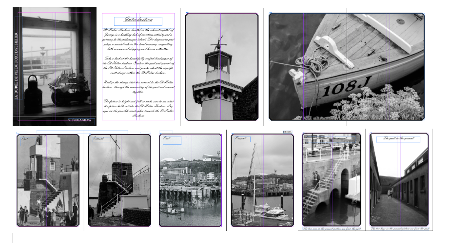
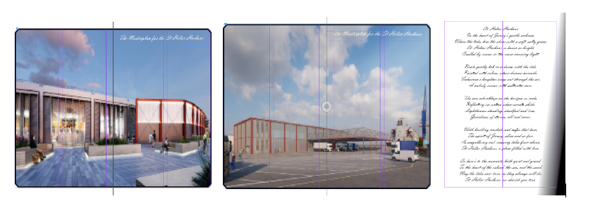
I loved everything about it, I liked the layout the sequence of images and most important the fonts and placement of the text. The design of the zine was also something that I was extremely proud of.
What are the differences between photographs that are WINDOWS and MIRRORS?

“Mirrors” are photographs through which a photographer is trying to tell us how he feels about himself. “Windows” are those in which he is trying to tell us how he feels about the world. Although both are expressive, they can be subjective due to the fact a photo can be both. “Mirrors” were images meant to mirror the photographer’s own sensibility. “Windows” were photos meant to act as a window for the viewer to see something that is primarily factual and external to the photographer’s own sensibility. Keep in mind that Szarkowski stressed this was not a very strict dichotomy.
In metaphorical terms, the photograph is seen either as a mirror – a romantic expression of the photographer’s sensibility as it projects itself on the things and sights of this world; or as a window – through which the exterior world is explored in all its presence and reality.”

The exhibition Mirrors and Windows, an exhibition of American photography since 1960, opened at The Museum of Modern Art, New York in July of 1978. The curator John Szarkowski’s attempted to categorise photographers whose work largely reflected the subjectivity of the artist in comparison with those whose work largely sought to see outside themselves. Szarkowski wrote in the catalogue essay that accompanied the exhibition:
“The distance between them is to be measured not in terms of the relative force or originality of their work, but in terms of their conceptions of what a photograph is: is it a mirror, reflecting a portrait of the artist who made it, or a window, through which one might better know the world?”
— John Szarkowski, 1978
This quote explains the difference between mirrors and windows, but also states that there is a range of where they can be within mirrors and windows. In fact, an image can be both and it is not a strict dichotomy.

Eugene Atget 1898

Nan Goldin – Nan and Brian in bed, NYC. 1983
I would personally place this images within this range;

For the ‘ window’ image, I personally would say it fits more of a window, as the image is of street musicians in 1898. This image does not link to the photographer, instead the photographer is making the image about what he can see, rather than what is behind the camera. I would say it documents, is real, public and objective. However, for the ‘ Mirrors’ image, I would personally say it fits more of the mirrors side, as it is an image of the artist himself, and another. Its very personal due to them being in bed and shows who they are through expressions such as smoking and lying in bed. It is very subjective as it is showing a lifestyle, and everyone’s life style is different. Whereas, in contrast to windows which is very objective and documentary.