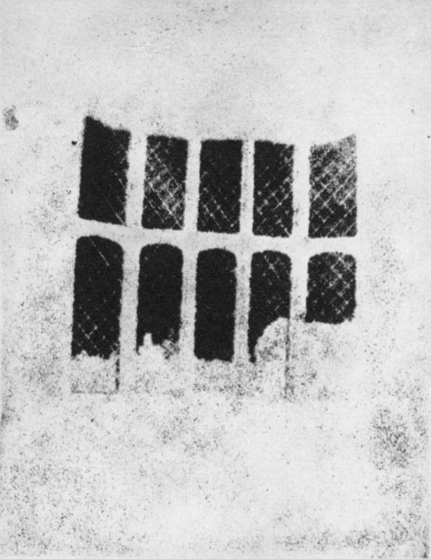
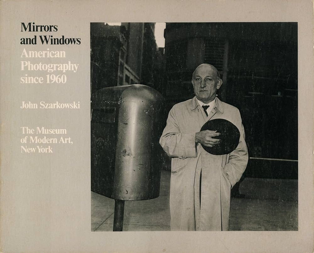
Photography, in the early 19th century, has evolved into a profound medium of expression, allowing both documentation and artistic interpretation. Among the earliest methods, Daguerreotype and Calotype stand out for their distinct approaches. The Daguerreotype, introduced by Louis Daguerre in 1839, produced a unique, highly detailed image on a silver-coated copper plate. This process emphasized precision and clarity, often resulting in strikingly lifelike portraits. In contrast, the Calotype, developed by William Henry Fox Talbot shortly thereafter, utilized paper coated with light-sensitive chemicals, allowing for multiple prints from a single negative. This method, while less detailed than the Daguerreotype, embraced a softer, more ethereal quality, capturing a broader range of tones and textures. According to John Szarkowski, photography can serve as both a mirror and a window to the world. He argues that it reflects personal perspectives while also providing a glimpse into reality. One notable quote from Szarkowski states, “The photographer is not only a recorder but also a maker of meaning.” I agree with this assertion, as it highlights the dual role of the photographer—balancing subjective interpretation with objective representation, which is crucial in understanding the complexities of photographic imagery.
Photographs as Mirrors
When we consider photographs as mirrors, we recognize that they often reflect the photographer’s perspective, emotions, and identity. Each image is imbued with the subjective experiences of the photographer, revealing personal truths and cultural contexts. For instance, a portrait taken by a photographer may not just capture a person’s likeness but also convey their inner thoughts, feelings, and social environment. The choices made in composition, lighting, and subject matter contribute to this reflection, allowing viewers to glimpse the photographer’s worldview.
Moreover, photographs can serve as mirrors for the audience as well. When we engage with an image, we project our own experiences and emotions onto it. A photograph of a serene landscape might evoke memories of a peaceful vacation, while a candid shot of a bustling street can remind us of our own experiences in urban life. This personal connection creates a sense of intimacy, enabling viewers to see aspects of themselves reflected in the image. In this way, photographs not only depict reality but also invite introspection and self-discovery.
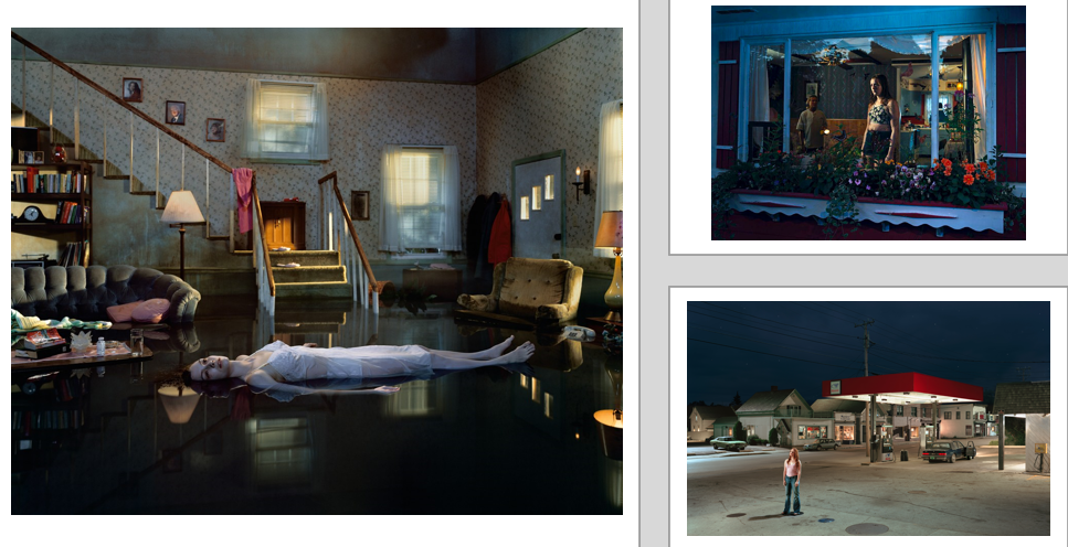
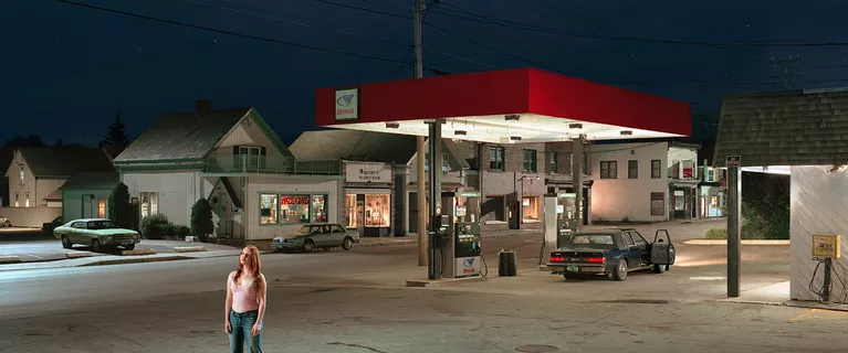
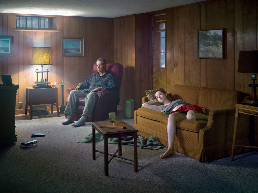
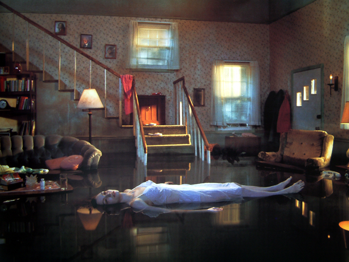
I chose this photo by Gregory Crewdson as a mirror image. Gregory Crewdson’s photograph of a girl floating in water in a house at twilight serves as a profound mirror, reflecting viewers’ inner emotions and subconscious thoughts. The surreal and haunting imagery invites introspection, prompting personal connections to themes of vulnerability, isolation, and nostalgia.
The floating girl, suspended in an otherworldly scene, evokes a sense of helplessness and tranquility simultaneously. This juxtaposition allows viewers to project their own experiences and feelings onto the image, creating an intimate dialogue between the artwork and the observer. The stillness of the water, combined with the twilight setting, enhances the emotional weight of the photograph, suggesting a moment of transition and uncertainty.
John Szarkowski’s quote, “What a photograph is is a thing that has been touched by light,” underscores the essential relationship between light and photography, emphasizing how light influences the perception and emotional resonance of an image. In Gregory Crewdson’s photograph of the girl floating in water in a house at twilight, this concept becomes particularly relevant.
The interplay of light in Crewdson’s work is critical to its emotional impact. The twilight setting creates a soft, ethereal glow, enveloping the scene in a dreamlike atmosphere. This manipulation of light not only enhances the visual appeal of the photograph but also evokes a sense of mystery and introspection. The way light reflects off the water and the girl’s figure adds depth to the image, creating a delicate balance between reality and surrealism.
By emphasizing that a photograph is shaped by light, Szarkowski’s quote suggests that the viewer’s experience is fundamentally influenced by this element. In Crewdson’s photograph, the haunting quality of the twilight and the reflective surface of the water serve as metaphors for emotional vulnerability and the subconscious. The gentle illumination invites viewers to explore their feelings of isolation and uncertainty, allowing the image to function as a mirror of their inner lives.
Conversely, Jed Perl, in his critique of staged photography, argues, “The carefully constructed tableau can create a distance between the viewer and the subject, leading to a sense of artificiality.” This comment suggests that while staging can evoke certain emotions, it can also risk alienating the viewer from a genuine connection to the subject. Perl’s perspective raises an important point about the potential limitations of Crewdson’s approach: the meticulous staging may create a barrier that can detract from the immediacy of emotional engagement.
While Perl’s critique highlights a valid concern regarding the artificiality of staged photography, it is essential to consider that Crewdson’s work deliberately embraces this quality as a means of exploring deeper emotional truths. The tension between reality and artifice is central to understanding the complexities of human experience. By crafting an overtly staged scene, Crewdson invites viewers to question the nature of their own perceptions and the narratives we construct around them. The photograph does not merely reflect a moment in time but serves as a catalyst for exploring broader themes of existential uncertainty and the search for meaning in modern life.
Photographs as Windows
Conversely, photographs also function as windows, providing viewers with glimpses into lives and experiences beyond their own. This capacity to capture and communicate reality enables photography to serve as a powerful documentary tool. For instance, photojournalism can illuminate social issues, such as poverty, conflict, and environmental challenges, by presenting stark visual narratives that demand attention. Images from war zones, refugee camps, or communities affected by natural disasters offer insights into human suffering and resilience, fostering empathy and understanding.
Furthermore, photographs can transport viewers to different cultures, places, and moments in time, enriching their understanding of the world. A photograph of a traditional festival in a remote village can introduce viewers to customs and practices they may have never encountered, broadening their horizons and challenging preconceived notions. This ability to act as a window into diverse realities underscores the importance of representation in photography; it is essential for capturing a wide array of experiences to foster a more comprehensive understanding of humanity.
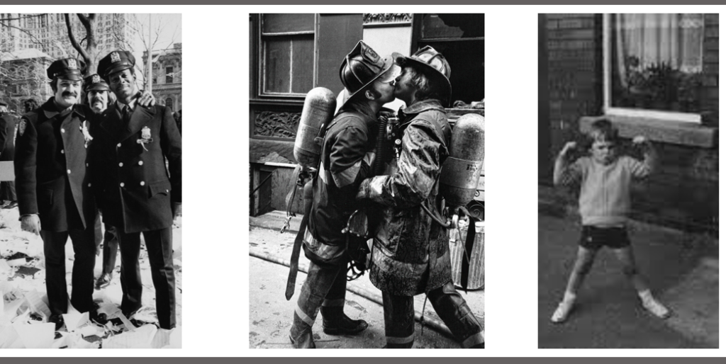
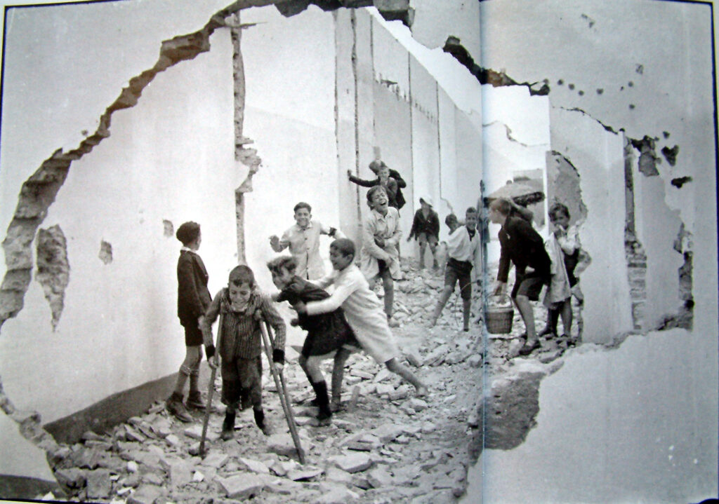
Henri Cartier-Bresson’s photograph of children fighting alongside another child on crutches exemplifies how photography can function as a window, offering viewers a glimpse into the realities of childhood experiences and social dynamics. These images encapsulate moments that reflect broader themes of conflict, vulnerability, and resilience, allowing viewers to engage with the complexities of human life.
Cartier-Bresson is renowned for his ability to capture the decisive moment—those fleeting instances that reveal deeper truths about society. The photograph of the children fighting captures a raw, unfiltered moment of childhood aggression, embodying the spontaneity and intensity of youthful interactions.
John Szarkowski once said, “The camera is an instrument that teaches people how to see without a camera.” This quote highlights the camera’s power to reveal the ordinary in extraordinary ways, allowing viewers to observe and reflect on life’s complexities. Cartier-Bresson’s photographs exemplify this idea by portraying unembellished moments that prompt viewers to consider the social and emotional realities of childhood. The authenticity of these images fosters a connection with the viewer, inviting them to engage with the subjects’ experiences without the interference of artistic manipulation.
Conversely, Jed Pearl critiques the notion of realism in photography, asserting that “the great danger of realism is that it can lead to a kind of banality, reducing the subject to mere documentation.” This perspective raises concerns that while Cartier-Bresson’s images capture real moments, they may lack the emotional depth or narrative richness that elevates them beyond mere observation. Pearl’s critique invites a critical examination of whether these photographs truly convey the complexities of childhood or simply document fleeting instances.
While Pearl’s concern about the potential banality of realism is valid, it is essential to recognize that Cartier-Bresson’s mastery lies in his ability to elevate everyday moments through his keen observational skills and timing. The spontaneity of the children fighting and the vulnerability of the child on crutches evoke emotional resonance that transcends mere documentation. Rather than reducing the subjects to banal representations, these images challenge viewers to confront the realities of childhood, prompting reflection on the joys and struggles inherent in growing up.
In conclusion, Cartier-Bresson’s photographs function as a window into the lives of children, revealing their complexities and vulnerabilities. Through objective expression rooted in realism, these images invite viewers to engage with the social and emotional dimensions of childhood experiences. By juxtaposing Szarkowski’s perspective on the camera as a tool for observation with Pearl’s critique of realism, we gain a nuanced understanding of how Cartier-Bresson’s work transcends mere documentation, ultimately enriching our perception of the human experience.
In conclusion, the discussion surrounding how photographs can serve as both “mirrors” and “windows” of the world reveals the nuanced interplay between personal expression and social commentary in visual imagery. John Szarkowski’s theory underscores the idea that photography is not merely a record of reality but an interpretation shaped by the photographer’s vision, making the medium a powerful tool for conveying deeper meanings. Conversely, Jed Pearl critiques this approach, cautioning that a focus on realism can sometimes result in a banal representation of subjects, stripping away emotional depth.
The contrasting images of children fighting by Henri Cartier-Bresson and the girl floating in a house at twilight by Gregory Crewdson exemplify the dual nature of photography. Cartier-Bresson’s work embodies a moment of raw, unfiltered reality, portraying the chaotic energy of youth in a way that reflects the objective social dynamics of childhood. This image serves as a window into the public sphere of childhood interactions, while also acting as a mirror reflecting the viewer’s own experiences with conflict and camaraderie.
In contrast, Crewdson’s photograph, while rooted in a staged narrative, invites subjective interpretation through its dreamlike quality. The floating girl evokes themes of isolation and vulnerability, highlighting the private struggles that often lie beneath the surface of everyday life. This image embodies a blend of realism and romanticism, as it invites emotional engagement while also challenging perceptions of reality.
Both images explore the tension between objectivity and subjectivity, realism and romanticism, factual representation and fictional narrative. Cartier-Bresson’s photograph is more grounded in factual depiction, reflecting the public aspect of childhood, whereas Crewdson’s work leans towards the subjective, exploring the intimate and private realms of human experience. Together, they illustrate how photography can simultaneously reflect personal perspectives and provide insight into broader social contexts, ultimately enhancing our understanding of the human condition. Through this lens, photographs indeed become both mirrors and windows, enriching our engagement with the world around us.

