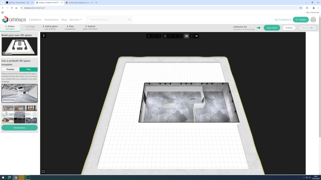
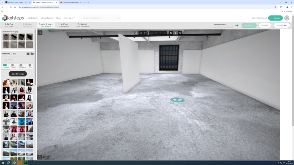
First, I chose which studio I wanted to use for my virtual gallery.
Next, I dragged my images into Artsteps from my documents.
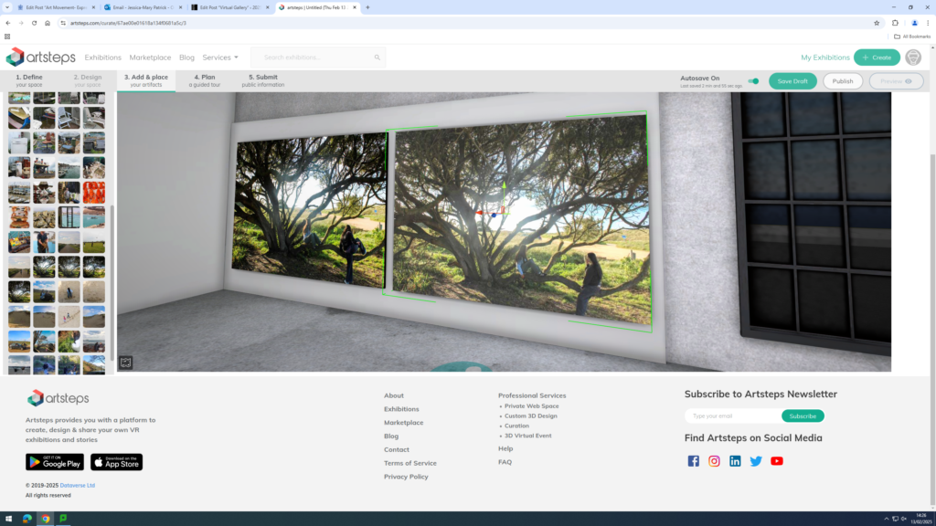
Then, I placed my images where I wanted them in my studio.
Finally, I chose which frames I wanted on my images. I chose the dark brown frame, because I thought it best suited my images.
Final Virtual Gallery
Evaluation
Overall, I think my photoshoots went well, as they displayed the themes youth and identity well, by presenting different activities, which abided by or opposed stereotypical norms. I also presented my youth and identity in particular, as I displayed activities I enjoyed doing in my youth and activities I still do and enjoy now.
I also think my virtual gallery is aesthetically pleasing, because my images go well together and have been displayed well together, similarly to my photobook. I have also used my best images, which I have used in my photobook in my virtual gallery as well.
Overall I’m happy with my photobook and the layout of it and I have specifically designed the book so that it tells a narrative of memories that were important to my Grandad. The front cover of the book is also important because it shows how the book is about happy memories and nice places but it is also quite sombre as he’s no longer here which contrasts with the narrative really well.
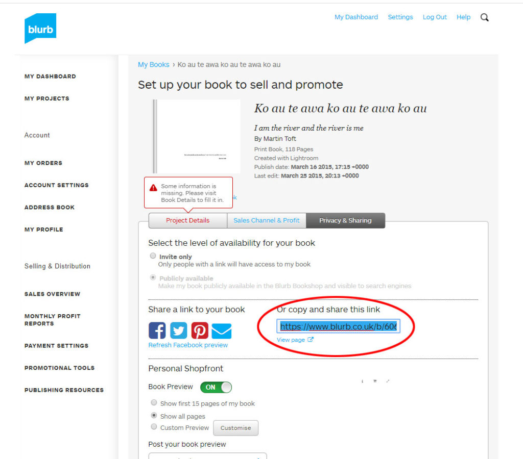
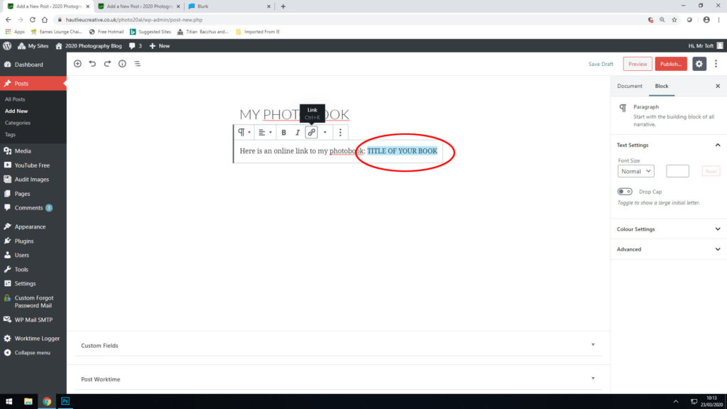
Your final blog post should be an online link to you BLURB book with an evaluation. If you have already written an evaluation as part of another blog post on your book design then add the online link to that blog post and change the date to make sure it sits at the top.
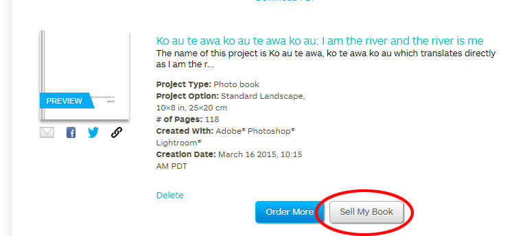
Log into your blurb account and click on Sell my book
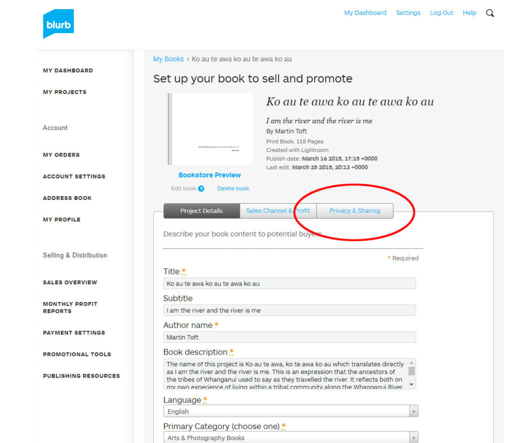
Click on Privacy & Sharing
Copy link circled in red above.
In your Photobook blog post with your final layout and design, at the very top, type title of your Photobook and copy in link from Blurb using Link button above.
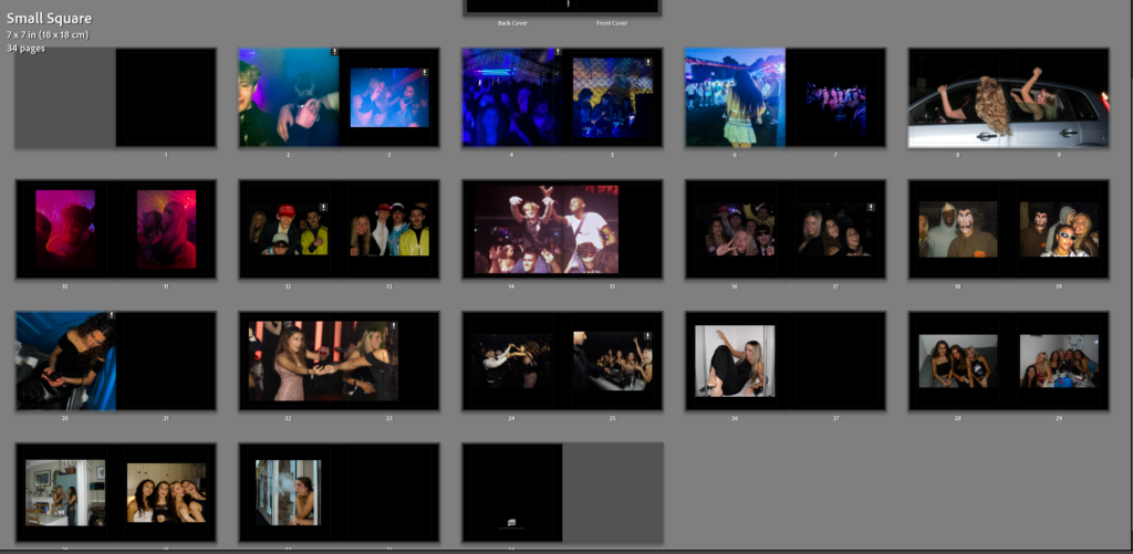
I firstly, started off by creating a book with all my images and putting them in the order that I wanted them to be in. I used the type of colours and tones in each photo to match the photos together and some double page spreads for the bigger landscape images and then filler images on one page.
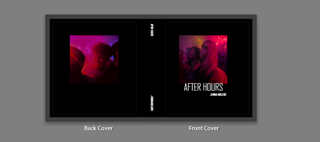
I changed the whole book colours and background colour to black as it looked better than the original white colour with my images that are darker and taken at night time, and it also fit with the title of my book ‘After Hours’ better.
I put the title under the picture on the front colours and then put the title and my name down the spine of the book. I didn’t want my name on the front cover because I like the minimal look of the front cover with just the picture and the title.
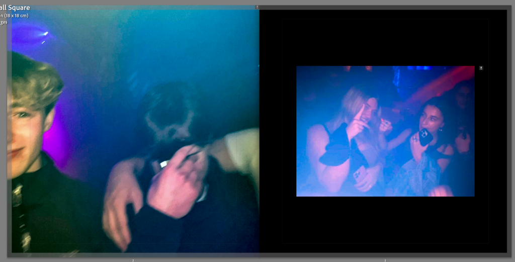
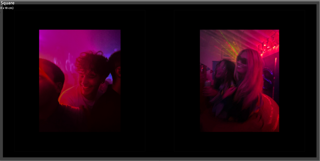
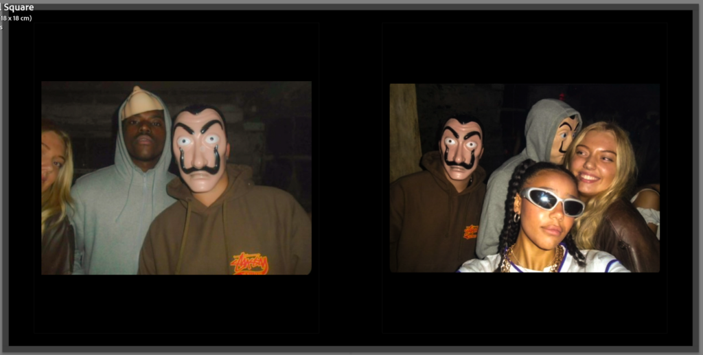
These two images were taken on the same night with similar lighting and contrast. I also put these two together because there is a blonde and brunette boy in one image and then in the other a blonde and brunette girl and I liked the contrast of it and it also matching the front cover images with the juxtaposition of the images with boy and girl linking to my theme of identity.
These two images I put together of a girl at a festival and then in the second image its that same girl with a group of her friends. I made sure both of the lighting in the images were blue and the previous images before it had that theme of blue.
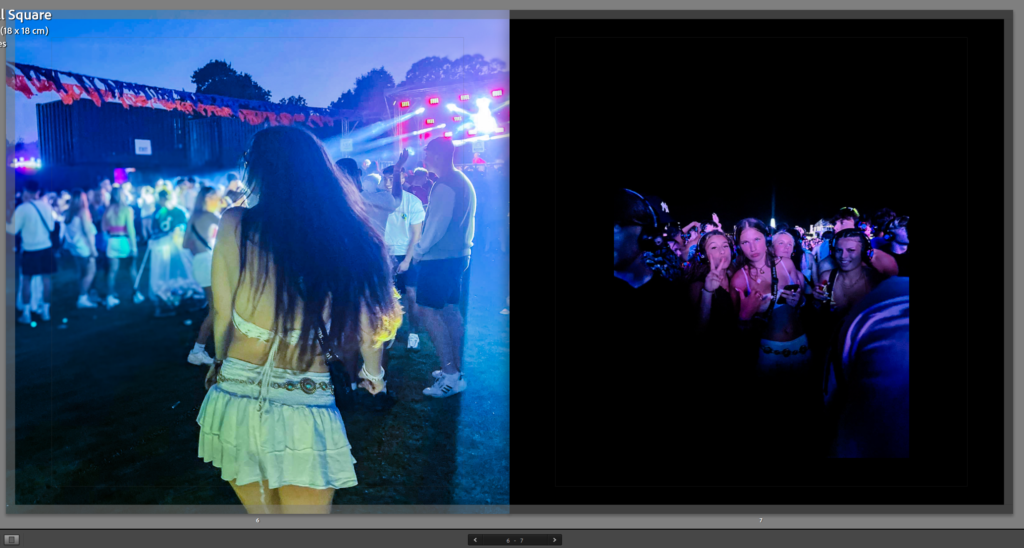
For this picture I used as a filler image to separate the night from the next one. This picture is a double page spread where it is spread across two pages. This is because it is a larger landscape image and I liked it spread across two pages.
These two images I put on the front cover as well as in the book so that you could look at them together properly. I liked these two together because of the juxtaposition with boy and girl doing the same movement and the same type of photo. I also put these two together because of the colouring with them, the pink and purple tones of both images I think contrasts well with the black background.
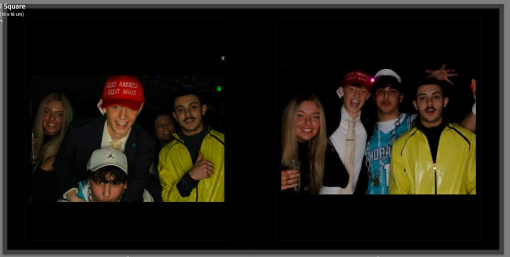
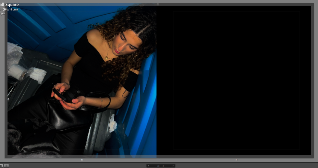
For this image I put two pictures together of the same night because I liked the way they it looked like they were taken at a Photo Booth so that’s why I put them together.
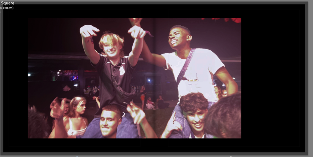
This image is a double page spread of my friends at a festival on each other’s shoulder singing. I like the way this image isn’t central of the two pages and is more on one page than the other.
These two images also taken at the same event is put together because I like the contrast of the boys and girls in one picture together and the girls separate from the boys in the other. I also like the Photo Booth look in these images swell
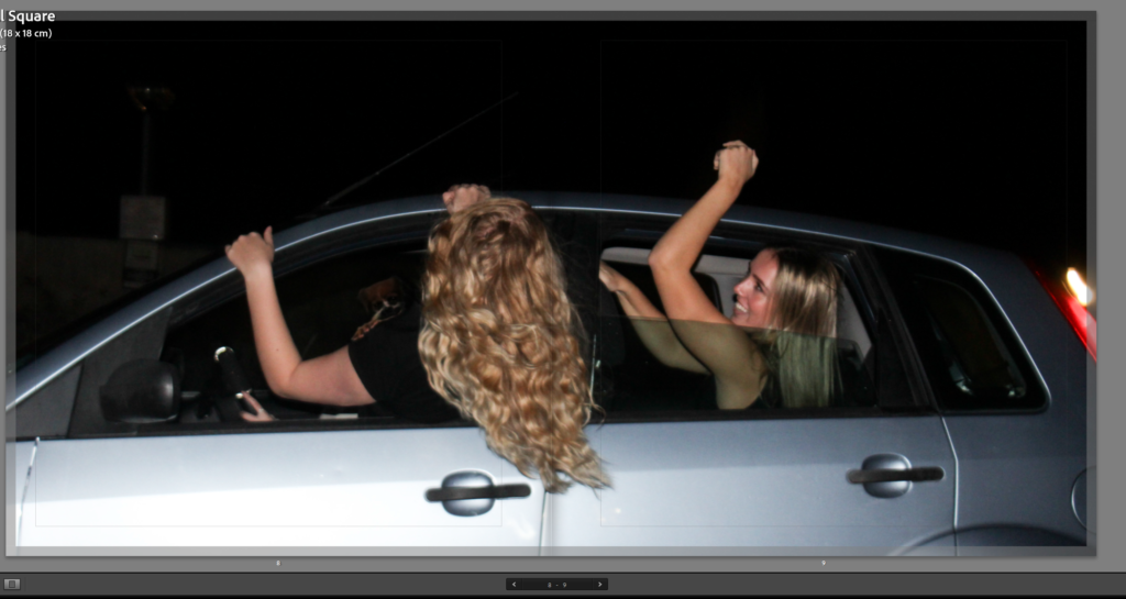
These two pictures were taken on a digital camera and the pictures were already how I wanted them to look in my photo book. I chose these two to put next to each other because they were taken at the same event.
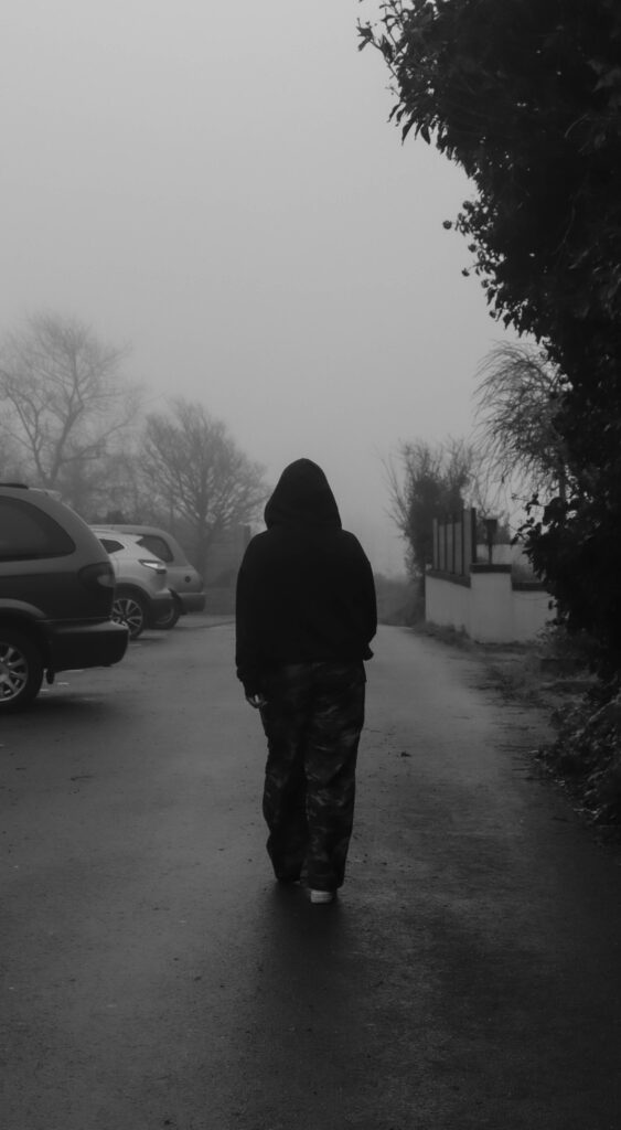
This image is a filler image for my photo book to separate the end of a night from another one. I chose this one because it is rough and it doesn’t romanticise going out like how the party pictures do.
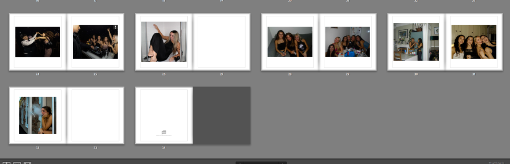
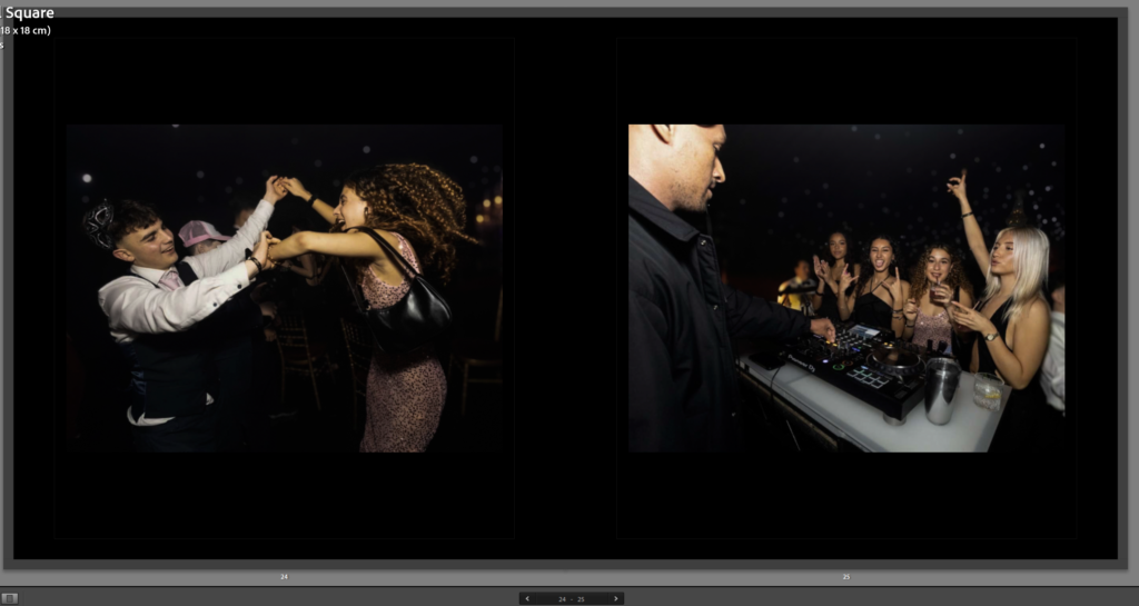
These three pictures, one a double page spread then the other two on the two pages are all taken at the same event. I put these pictures together because they all focus on the same girl throughout the three images. The double page spread of her dancing with another girl and a live band in the background, then the other two images of her dancing with a boy laughing then a group picture with the girls at a DJ stand.
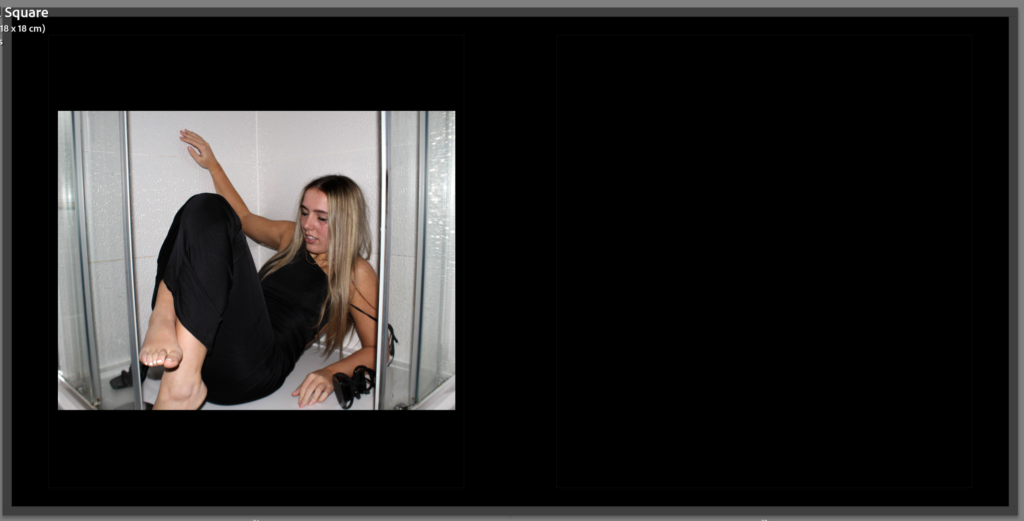
This filler image of a girl drunk in a shower. I put this on one page with a border around because I liked the way it looked how it is smaller and makes you look at the image followed with a blank black page next to it shows that its the end of the night and a filler image.
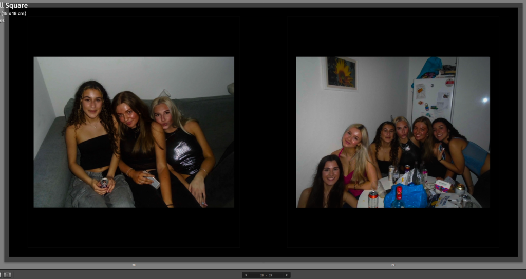
These two images taken in the same are of a group of girls at a party, one taken on the couch and then the other around a table.
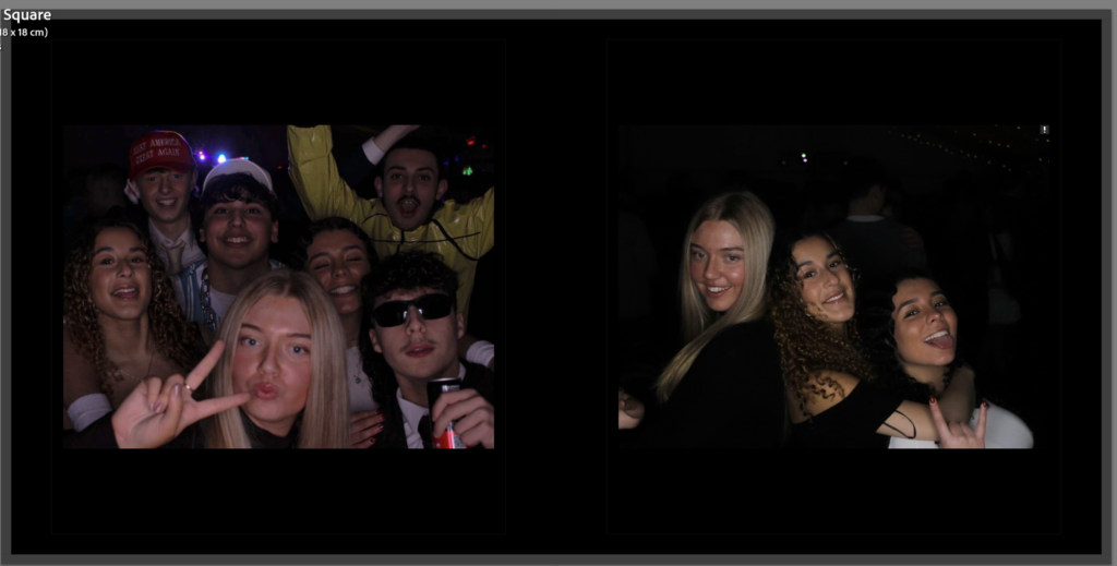
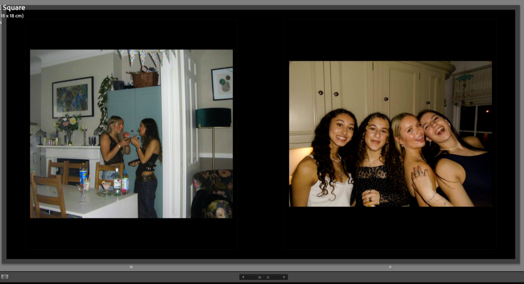
These two images are taken at a girls night. The first image of two girls having a debrief and talking in a corner, they could be gossiping. The other image of a group of girls smiling for the camera enjoying themselves.
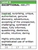
This is the final image in my photo book of my friend sat outside a window vaping. this is the final image because it looks like she is contemplating the night before, regretting her actions and thinking about what happened the night prior.
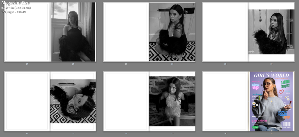
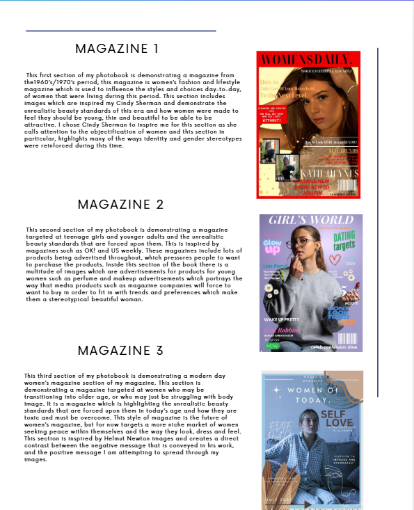
When creating my photobook unfortunately all of my screenshots were deleted, I had previously recorded screengrabs of the progress I had made throughout the 2 days of my mock and the days leading up to the mock, however I am able to provide a walkthrough of the making of my book as best as possible. I have screenshots of my book when the images were firs placed inside and my final layout. I can attempt to explain my process and decisions made with the pictures I can find. In my photobook, I wanted to display my photographs in a way which was interactive and interesting to the viewer, I also wanted to produce images that shined light on certain elements which would usually go unnoticed and unhighlighted due to it being a controversial or ignored topic. I wanted my book to have a clear and planned out structure of a front cover, inside front cover, contents page, 1st magazine cover, 1st set of images, 2nd magazine cover, 2nd set of images, 3rd magazine cover, 3rd set of images, essay, back inside cover and back cover. I chose for my 3 sections to be placed in this clear and effective structure, so that my viewer can understand what is in front of them and what message I am trying to convey.
Mock Best Criteria:
Here is the best level of criteria I was referring to throughout my Mock in order to maintain which grade I was aiming for, this helped me when setting my goals and attempting to complete my work to the best quality and calibre I could for the best grade I could achieve.
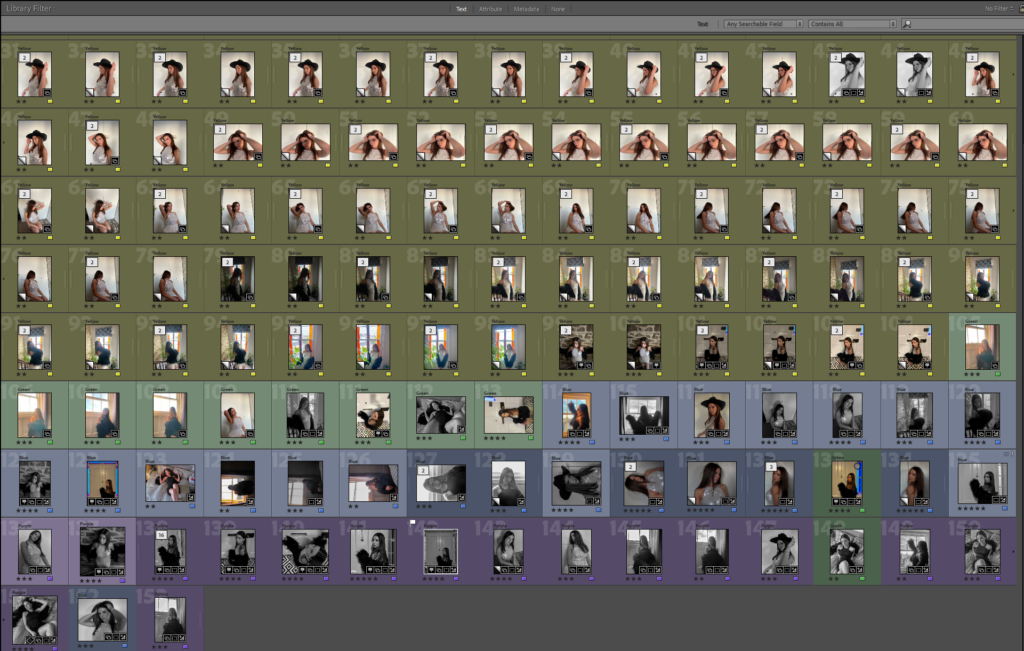
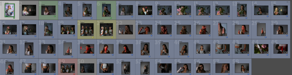
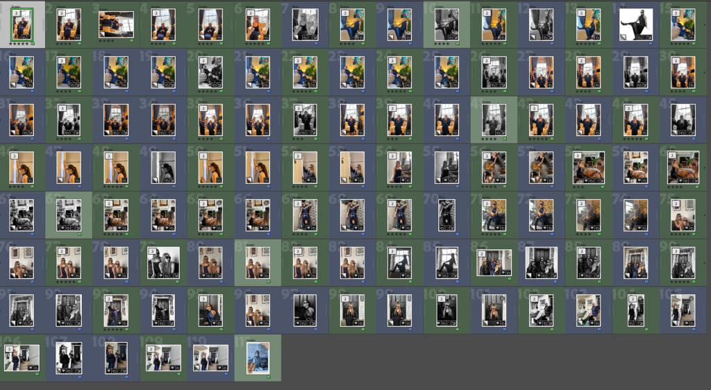
Here is the categorisations of images I used when choosing which images to include in my photobook. I chose to have green labelled images displaying work I liked and would possibly like to include in my photobook, however these images may need improvements such as editing or cropping before being included in my book. I also created blue images which display images that I think need to be included in my book and are ‘basically perfect’ however, I had too many blue images for my book, so I had to decided on my ‘best of the best images’ and create a new category of purple images that I knew were being included in the book in order to easily identify them when including images.
First Front Cover Idea:
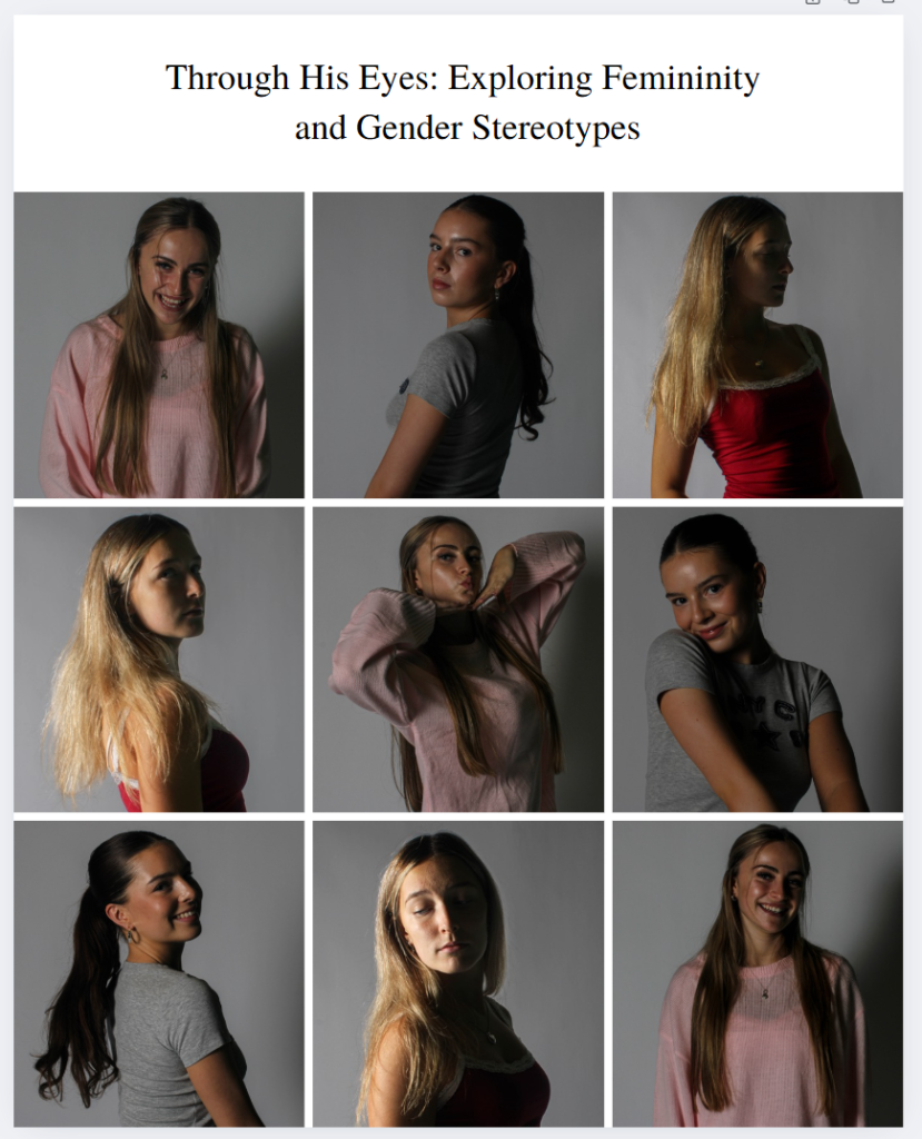
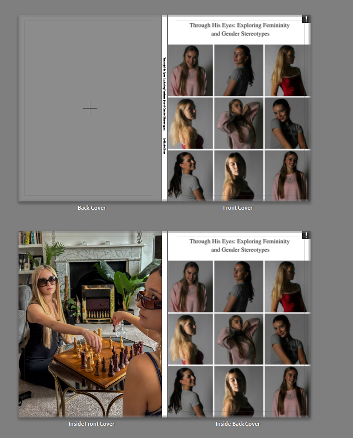
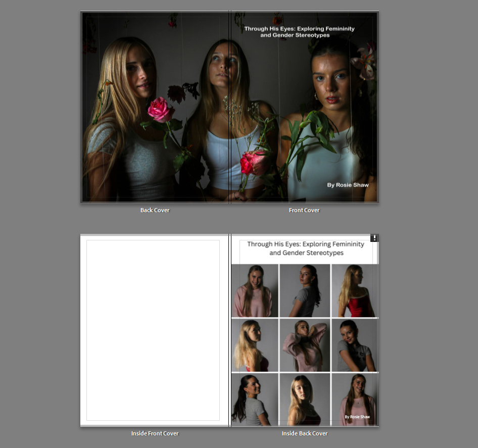
I first chose to have my front cover as a montage of 9 images using my 3 chosen models throughout this project, this was to show them expressing their natural personalities and how they express themselves. This was also to show a more natural and positive light onto women and show them being happy and content in their natural state. I also decided to pair this with my title of ‘Through His Eyes: Exploring Female Gender Stereotypes, however, after careful consideration me and my teacher decided that this front cover would not be effective for my book and is too ‘different’ and not suitable for displaying what my work inside the book is about, it also does not give the audience a taste of what is going to be inside the book as none of these images can be seen displayed in the book, we also decided that the font was too much of an old-fashioned vibe and did not fit with my aesthetic. I instead decided to include this image into the back of the book as an inside back to my back cover as a small overview of the book when the viewer comes to the end of the book, after reading my essay.
Second and Chosen Front cover:
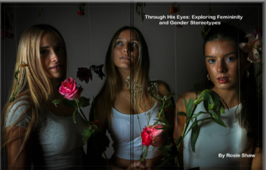
I then decided to replace this image with this front cover which is one whole image which stretches over to the front and back cover and still incorporates my 3 chosen models, but also gives the audience a taster as to what is going to be inside the book, I feel this was the correct decision to make. I also decided to change the font to a more modern day and casual font for the title, to show an impression of when it was made and that although it has many elements including the past, it is focusing on the present day and the changes and positive elements which must develop in order to support women through both the media and in general life. This large title is also accompanied by a subheading at the bottom of ‘By Rosie Shaw’ as an indicator that this is my photobook, which is also in the same font.
BEFORE EDITING AND WORKING ON LAYOUT:
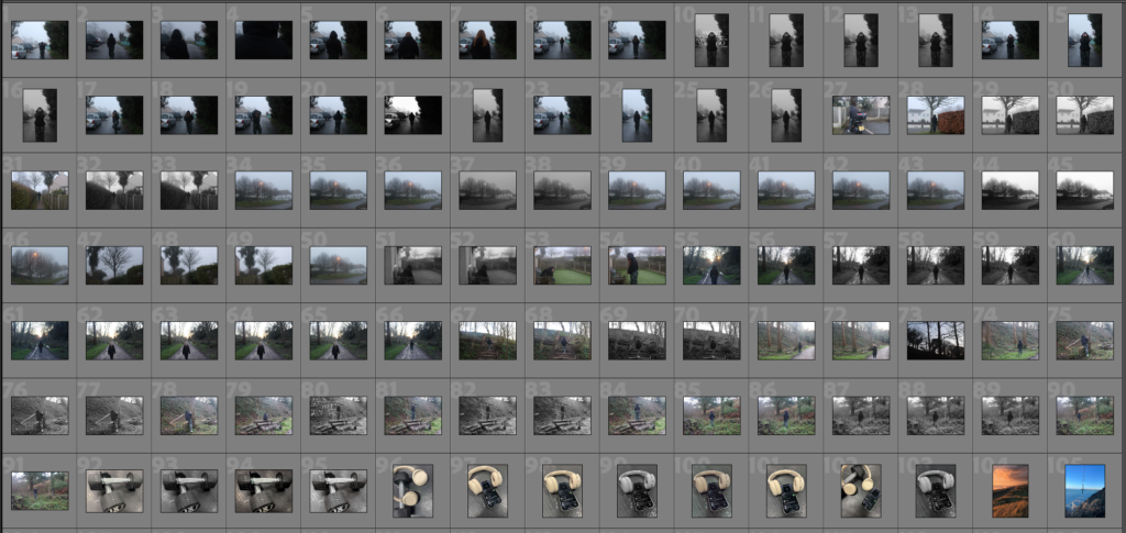
Here is the initial layout of images in my Adobe Lightroom, after creating a folder named ‘book’ in my Lightroom and compiling all the images I would like to use and doing some final editing on the images, I chose my final images I would like to use in my book, I then pressed the create book icon and it compiled these images into this order for my book. This initial order was messy and did not have a strong layout that I could use for my final book. So, on the second day of my exam, I chose to start editing these images to fit the book and creating my magazine covers to be included into the book.
Front Cover, Inside Front Cover, Inside Back Cover, Back Cover:
I chose to have this image as my front and back cover (as explained above) in order to have a high quality and strong photograph of my 3 models across a front and back cover spread as It is a strong image that helps the viewer to see what Is going to be inside the book and what kind of images they are going to see. I like this photo because it comes across as mysterious and interesting and will make the viewer want to see more. I feel the most interesting element to this photo is my models, but also the flowers around them and this feeling of femininity, gentleness and happiness that is radiating from this, however this is in contrast with a dark and mysterious background accompanied with light highlighting my 3 models from the background and helping them to stand out from this dark backdrop. For my inside front cover, I wanted to maintain a traditional white cover which appears in most books before introducing my contents page. For my inside back cover, I chose to include my initial idea for my front cover so that this cover did not go to waste and so that I had a final overview for my book, I feel this adds a final bit of interest for the viewer.
Contents Page:
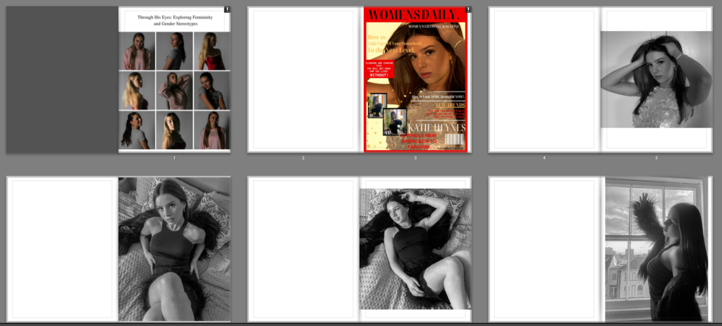
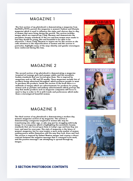
I chose to have a contents page in my book/magazine as I felt without it my magazine may come across as jumbled up or confusing which is not the approach I wanted to have. I created this contents page on the first day of my exam using the Canva app, this app helped me to create 3 headings and 3 paragraphs accompanied by an images for each which are my front covers slightly smaller next to them so that It is clear what each front cover and photoshoot was about and why they are placed in this order. I feel this added a potentially more BOOK like feel instead of a MAGAZINE feel to my magazine, however, I feel that my magazine does have many book qualities and is a slight hybrid of both book and magazine styles. I really like my chosen layout for this book and I feel it added a more luxurious feel to the book which helps my book stick out from others as a clear walkthrough of contents is provided for my readers.
Cover 1:
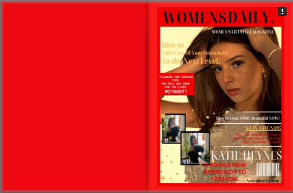
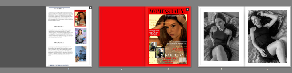
I decided to have a bright red background for the blak page before the magazine cover and surrounding it. This helps for hr cover to stand out and also to indicate that this is the first section of the book and makes the reader interested to see the contents of the book. I also feel that the contrast in bright colours such as red and yellows used in the front cover, with the black and white images inside works well for the approach I wanted to go for of women and girls being exploited and it being covered up with bright flashy colours in order to conceal these secrets and deep meanings that producers do not want audiences to pick up on.
Photoshoot 1:
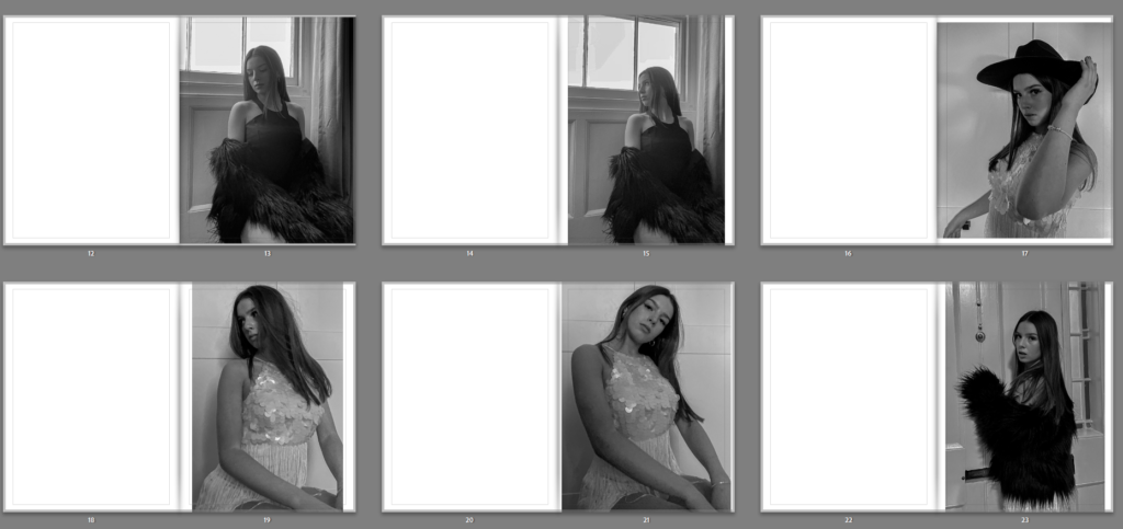
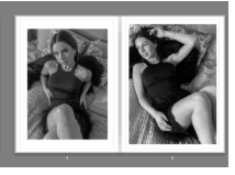
Here is a (low quality) insight to my first photoshoot images that I chose to include in my book and the specific layout I chose so that the images did not clash with each other, I feel this is least favourite photoshoot, although it is a good, strong start to my book, I feel the other photoshoots include stronger and more interesting images, however I do like these images and how they relate to Cindy Sherman’s work. I also chose these images to go first as this is the oldest style of images that I was inspired by.
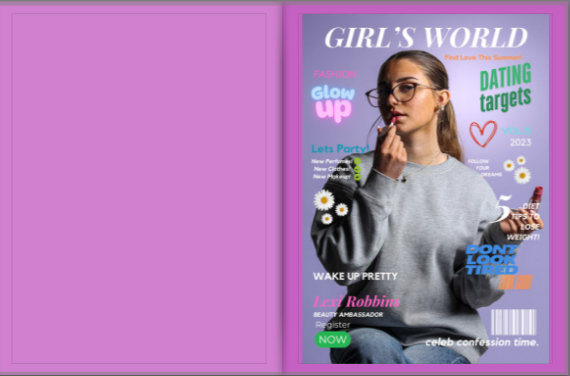
Cover 2:
This second magazine cover I particularly like as I think it is the most realistic and really makes the viewer want to turn the page. I chose have a plain purple page and have this colour also as a background for this magazine cover. I created this magazine cover in Canva and feel that my colour choses display a seemingly light-hearted bright girls magazine for promoting fashion and beauty products.
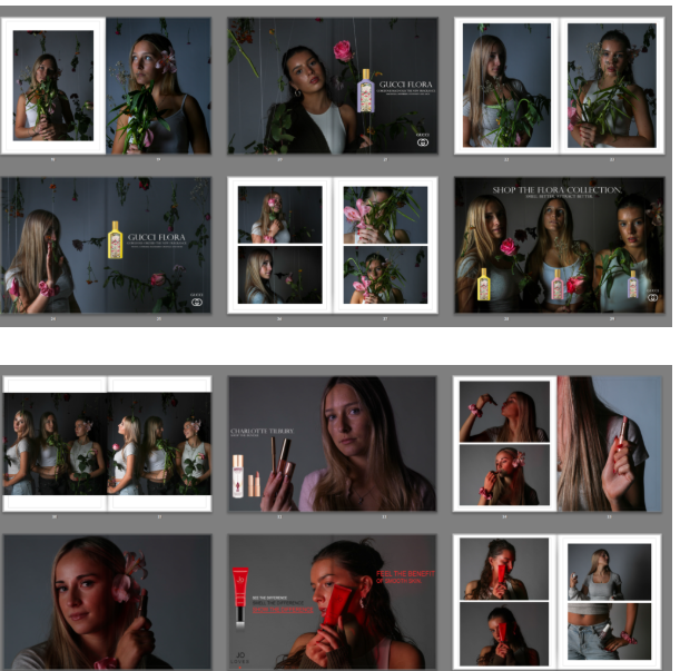
Photoshoot 2:
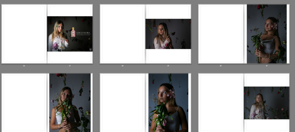
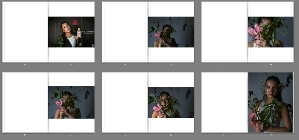
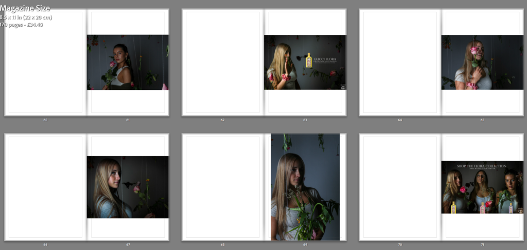
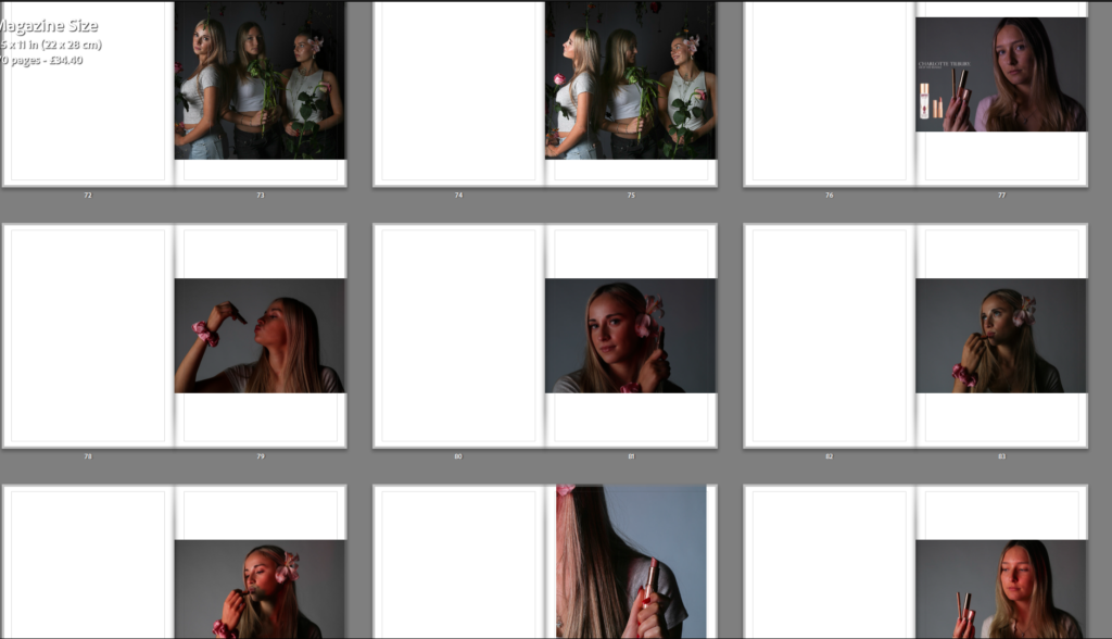
I really like this middle section photoshoot for my book as I feel these are my highest quality images which I took in the school’s lighting studio. I also edited these images in Adobe Photoshop and added small products into my images alongside logos and captions such as ‘smell, attract better’ in order to display this hidden meaning of the urge to be attractive that pushes women and girls in this generation to be as pretty, attractive and appealing as they can be in order to ‘fit in’. I like the attention to lighting in this photoshoot and how images with e.g. a red product, displays a red light onto my model, or a product with a pink product, displays a pink light onto my model, I feel that this makes my photographs look more professional and visually pleasing for a viewer.
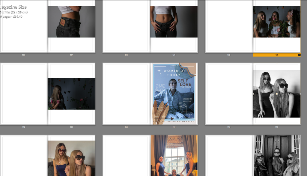
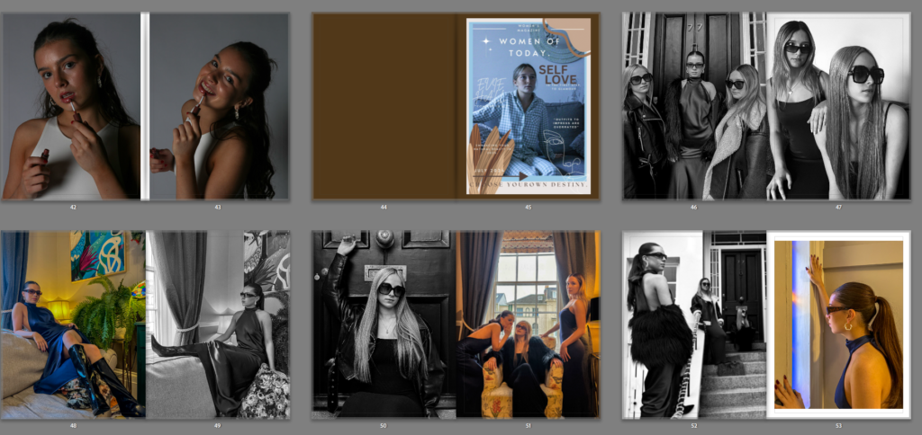
Cover 3:
This cover is my second favourite out of the entire book, I particularly like the colours and decoration associated with this front cover, however, I dislike the shade of brown chosen for the page alongside it and the background of the image. This is because of the darkness accompanied with the light colours of the cover. However, the heading of ‘self love’ is the same colour as this page which helps it tie into the theme of the cover, however I feel a more lighter and inviting shade would be less harsh on the eyes and create a more easy-going and light-hearted shade of cream, to still tie into the themes.
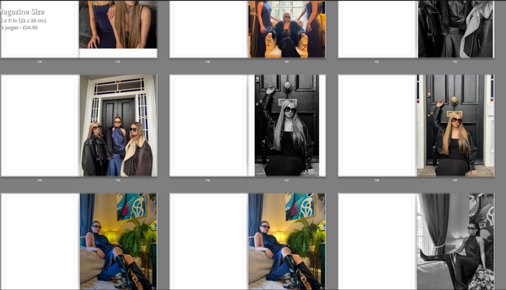
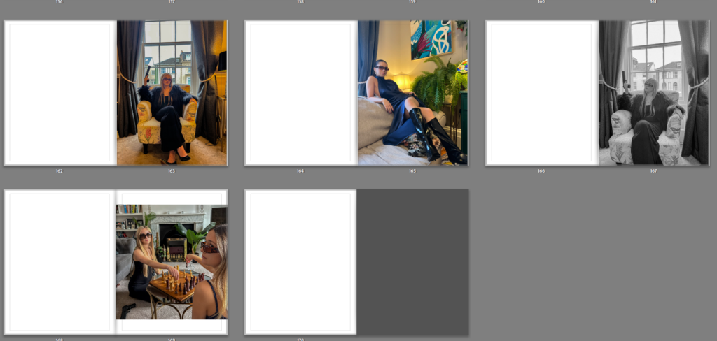
I really like this final section photoshoot for my book as I feel these are a more interesting, formal aspect to my work which displays Helmut Newton inspired images, I took these at a friends house and decided to use grand furniture and bright colours in order to display themes of setting and objects that Helmut Newton did also. I also chose to have similar costume for all my models which was long black/navy dresses which is an aspect I feel paid off in these images, I also used sunglasses on my models to seem more traditional and higher class. I feel the editing of these images also helped with making them look more striking and eye-catching like Helmut Newton’s work is. I like how there is a mix of black and white images with coloured images which help to tie in the other two photoshoots as one was all black and white images and the other was all colour images. I feel these more dramatic and tableaux style images is a good end to my book and differ very much from my second photoshoot and its modern twist as this photoshoot focuses more on previous work by famous photographers like Helmut Newton.
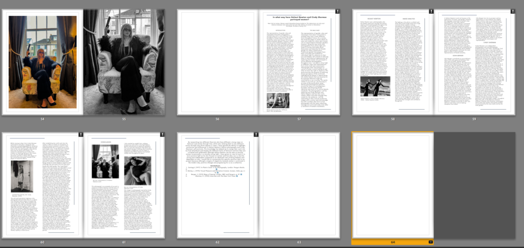
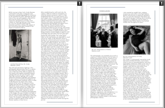
In my final pages of my book, I have displayed my essay. I chose to have 1 blank white page separating this essay from my photographs to show that the photoshoot has ended and the essay has begun. My title of ‘Through His Eyes: Exploring Femininity and Gender Stereotypes- is displayed largely at the beginning of the essay at the top of the page to display that it is my essay. I used headings for each paragraph to indicate what it is about and I also used photographs of both photographers work such as Cindy Sherman and Helmut Newton, and also my own images to show examples of images I have made in response to these photographers, I also included my bibliography in my essay to show all the references I used throughout my essay such as quotes and information from the internet and websites. I really like how my essay was displayed and I feel that the layout matches the contents page which is a nice touch to my book and shows a theme throughout. Here is an example of how my layout of my essay is similar to my contents page.
ESSAY LAYOUT
CONTENTS PAGE LAYOUT
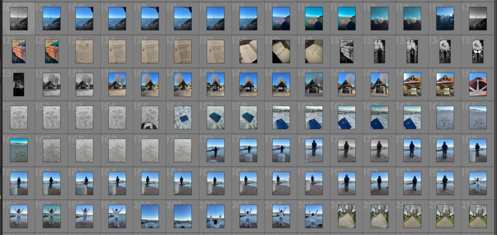
AFTER EDITING: Here is a full final layout for my photobook.
Overall I am really happy and pleased with how my project turned out including the photos/final images/ photography book as I think it all looks really good and it all turned out in the end way better than I expected.
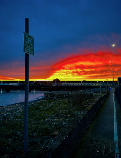
My 5 final/favourite photographs
Final photo Evaluation
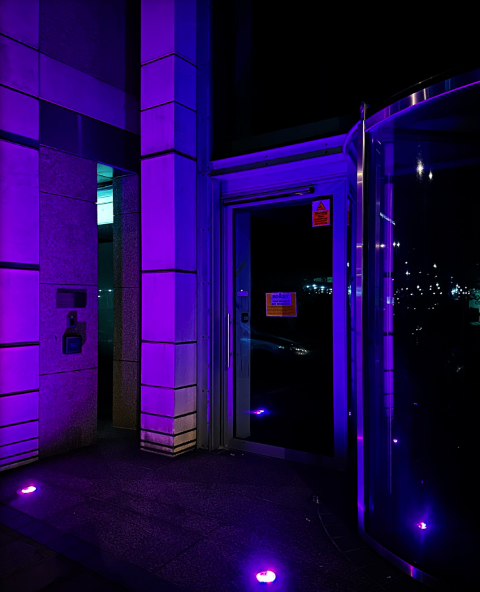
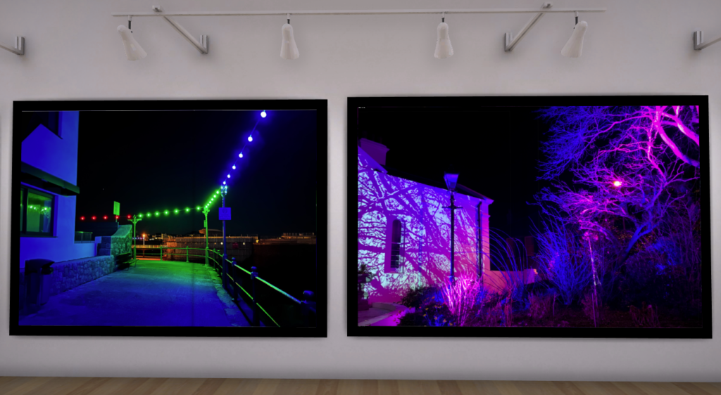
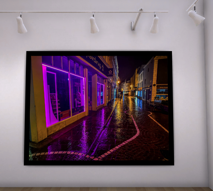
Out of my images I would say this is my final and most successful as the coloured lights make the area more beautiful especially as the lights make the building and floor more colourful. It also has a big impact if they were replaced with cold white lights like the ones along the avenue it would look no ware near as nice and instead be more cold and dull.
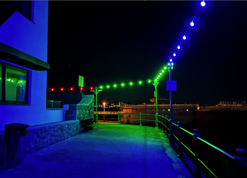
It is also like my artist inspirations I chose like in the photo below by Benoit Paillé where he uses colour to illuminate the floor, which makes it look vibrant and beautiful like how the coloured lights in my photo make the floor all colourful and beautiful. As well as Will Lakeman’s photos like in his series ‘lurking in darkness’ which was a great inspiration of mine, such as the photo below where the red light from the sign illuminates a nice red glow on the building and ground which looks beautiful and add colour and vibrancy to the photograph.
Benoit Paillé – ‘Surreal Mexico’Will Lakeman – ‘Lurking in darkness’
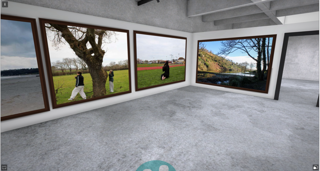
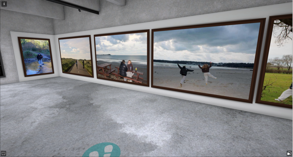
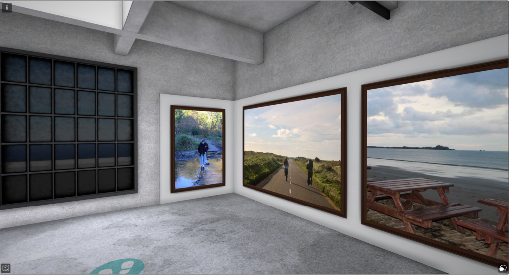
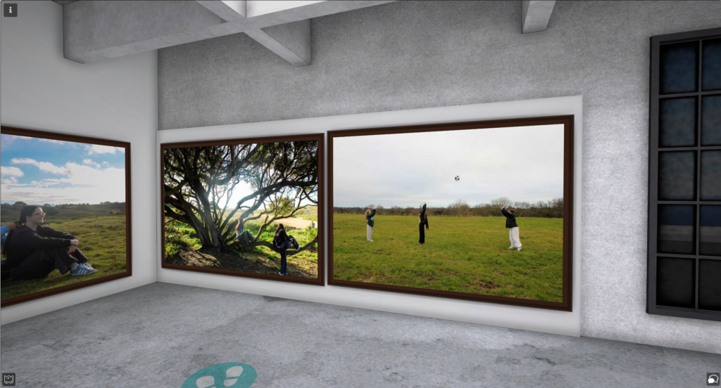
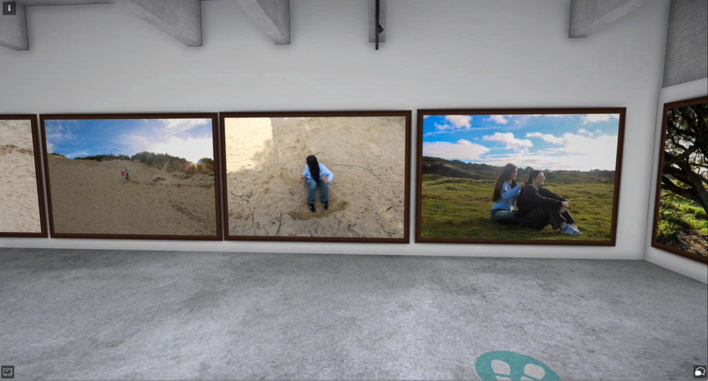
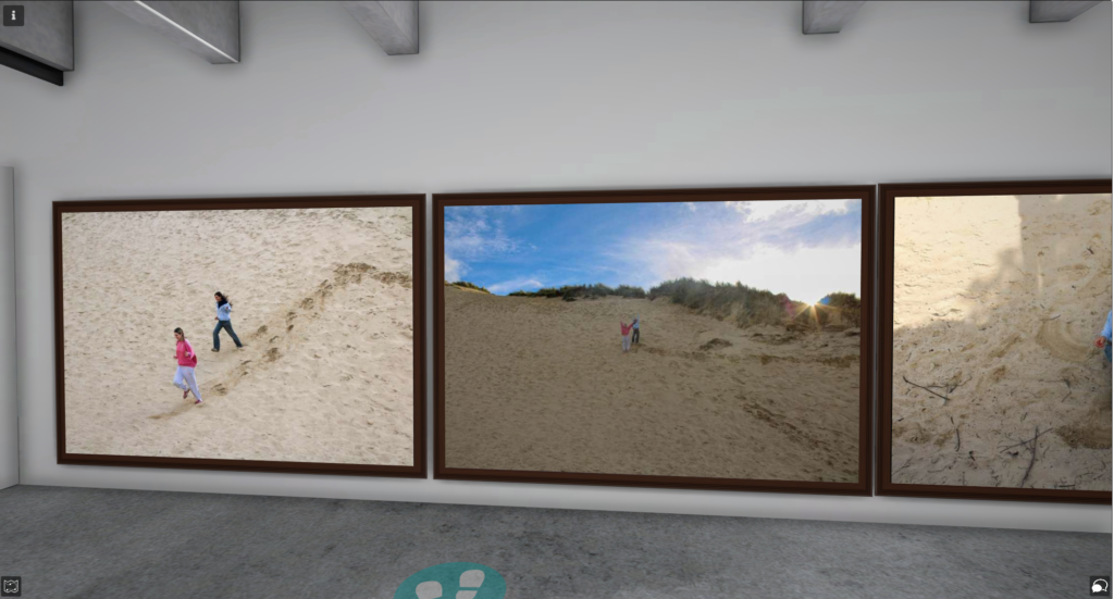
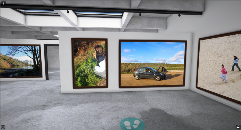
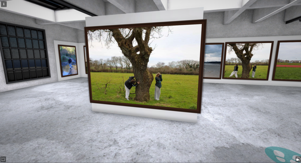
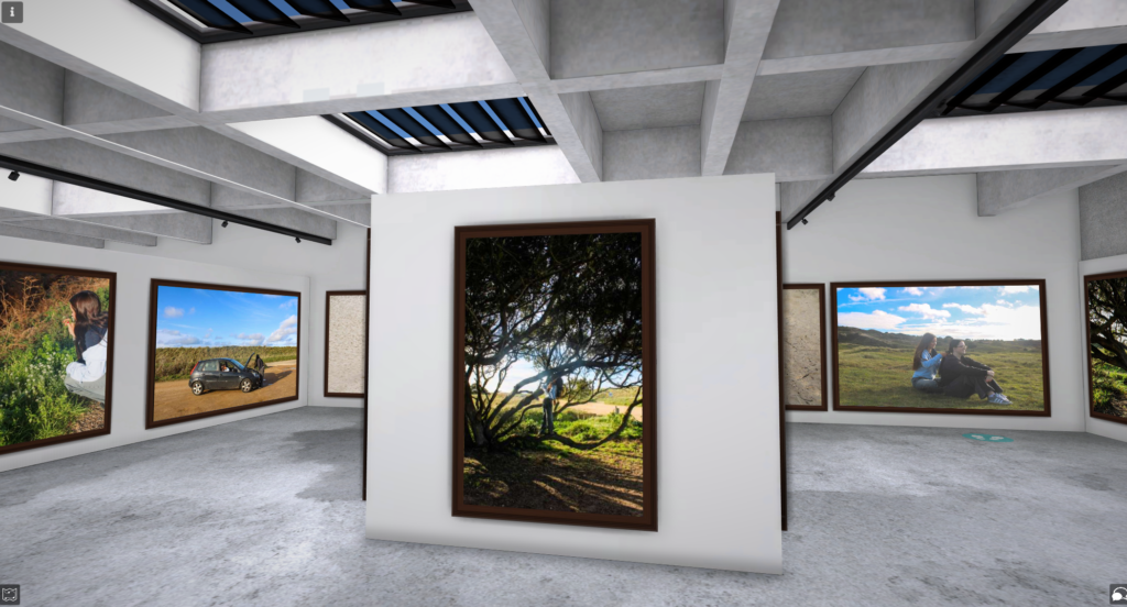
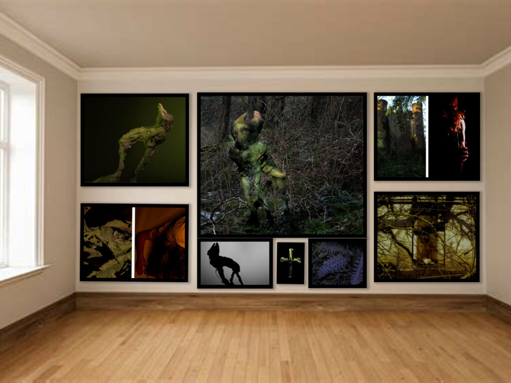
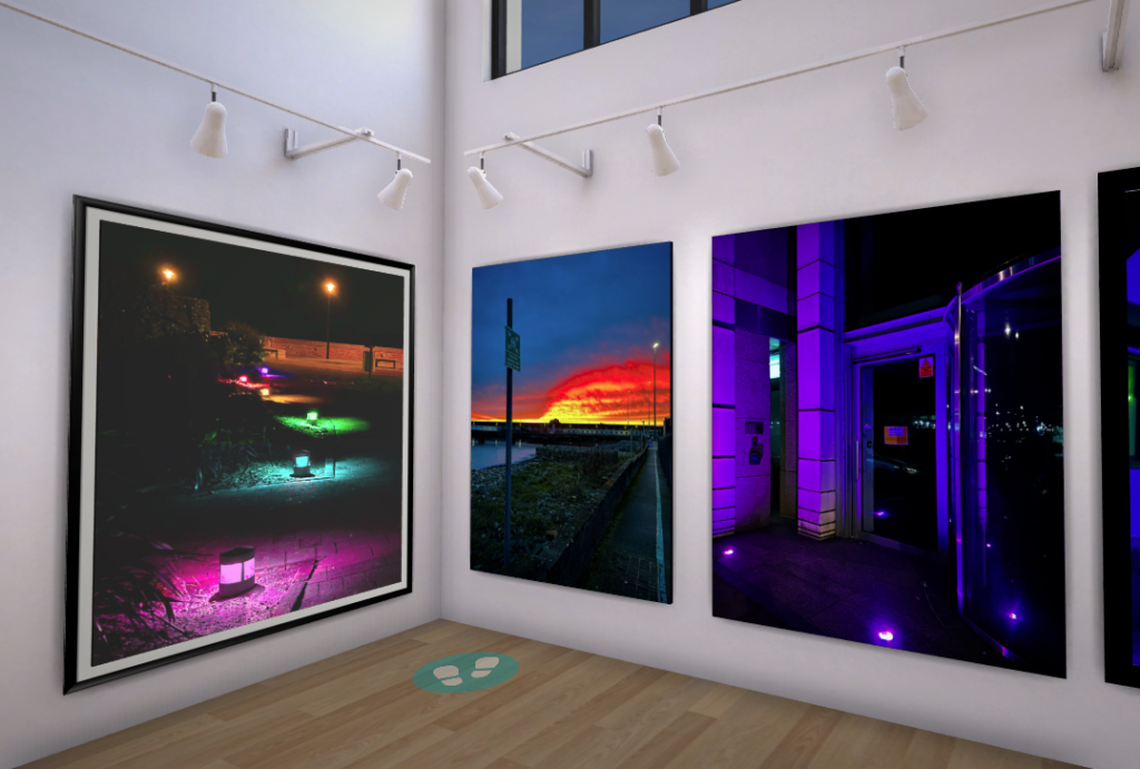
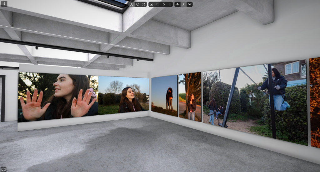
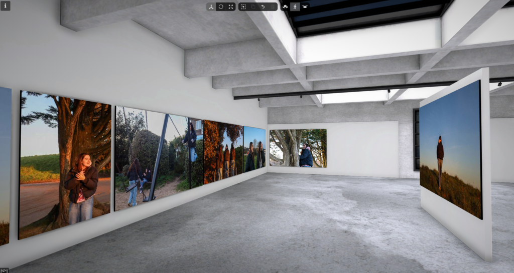
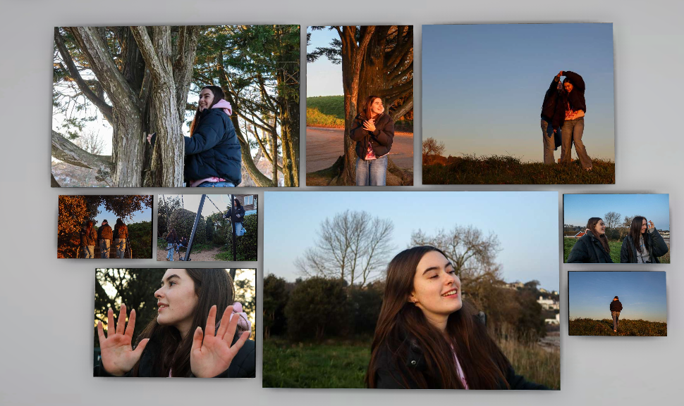
Virtual gallery
Below is my Virtual gallery I created to showcase my final and favourite photos from the project.
Overall, I think my project turned out well. I managed to stick to the photoshoot 1 idea from when I first planned this project which was a focus on gender stereotypes where id photograph teenagers in their natural environments and explore the activities they engage in. However, I was unable to carry out the other photoshoots I planned. This meant that my project only had one focus which was female teenagers as that’s where most of my images were from. I did manage to take a few photos of males however this was only a small shoot and didn’t end up being in my photobook.
I think the photoshoot I focussed on turned out quite well. I was able to show natural moments in the lives of the subjects by focussing on taking images in the moment and minimising the amount of times I would tell the subject how to pose. I think this worked well as it makes the images a lot more natural and less staged. One thing I really liked about this shoot was the time of day I decided to conduct the shoot. as it was late afternoon/early evening, the sun was beginning to set which made my photos have very good lighting and have a warmer tone which I think makes the images look more appealing to the viewer and brings across a sense of happiness.
In terms of inspiration from the artists I focused on, I think I did well when making my images link quite closely with Justine Kurland in particular. In one of my photoshoots, it focussed on group of my friends who were all girls. This already links with Kurland’s work as she also takes images of groups of girls. The settings of hers and my work could be seen as fairly similar as I also used places such as fields to take my photographs and got the subjects of the images to engage in activities such as tree climbing. In terms of Cindy Sherman, as a large majority of my images surround females I am able to compare mine to hers as a similarity. I believe that, like Kurland, my images would be seen as mirrors as I am reflecting my life through the use of my friends. in comparison to this idea, some of my other photoshoots could be seen as windows as I photograph the subject engaging in activities that is normalised for them (for example dancing) and so this would be a window as its taking a look into someone else’s normal activity that I don’t relate to. One of the photoshoots that focuses on one of my friends dancing links to Cindy Sherman and the idea of female stereotypes as dancing could be considered a female stereotypical sport (especially in the past).
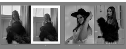
Here are two of my favourite images as I feel they both have really good composition and really capture the emotions of the images rather then just what is shown it really brings out the deeper meaning of the storyline.