With the theme for the final exam being Union, I initially began thinking of ideas by reading through all pages of the exam paper, including features of fine art for example, because this would enable me to fully explore and utilise the information given to me so that I could easily find different movements and artists who inhabit this theme in their own work.
From here, I was able to use search engines to research what I had learnt, beginning with different artistic movements such as Cubism to gain visual examples of what I could gain inspiration from and actually see if I liked the aesthetic components of these images. What helped me here was annotating the exam paper with my own ideas that I had began to formulate because this would let me fully evaluate them all at the end of my research to the concept which I felt most suitable for Union.
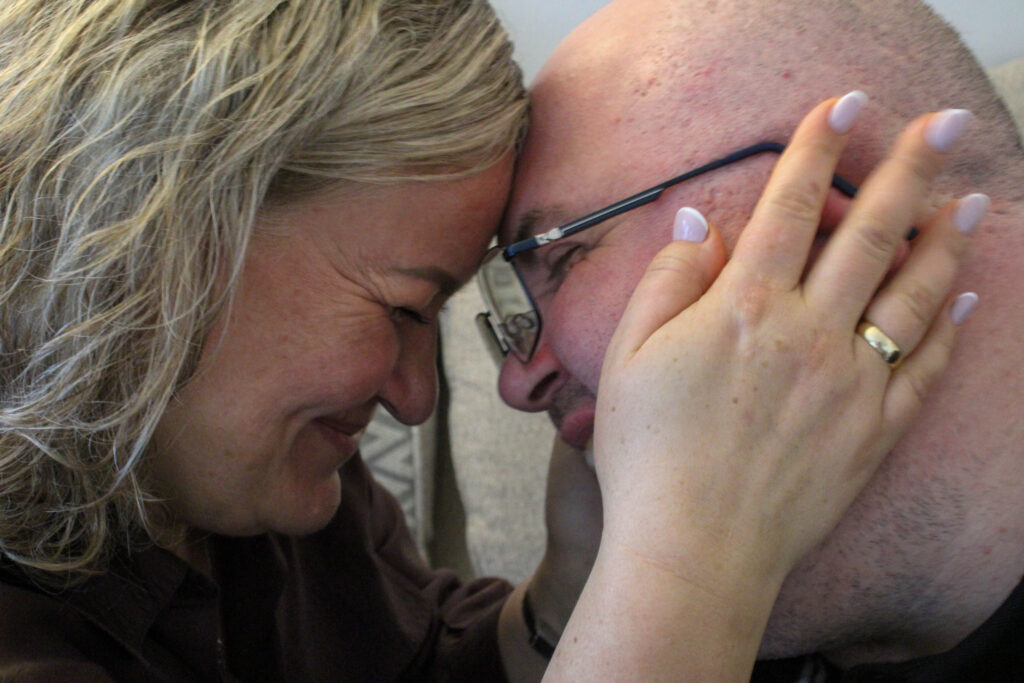
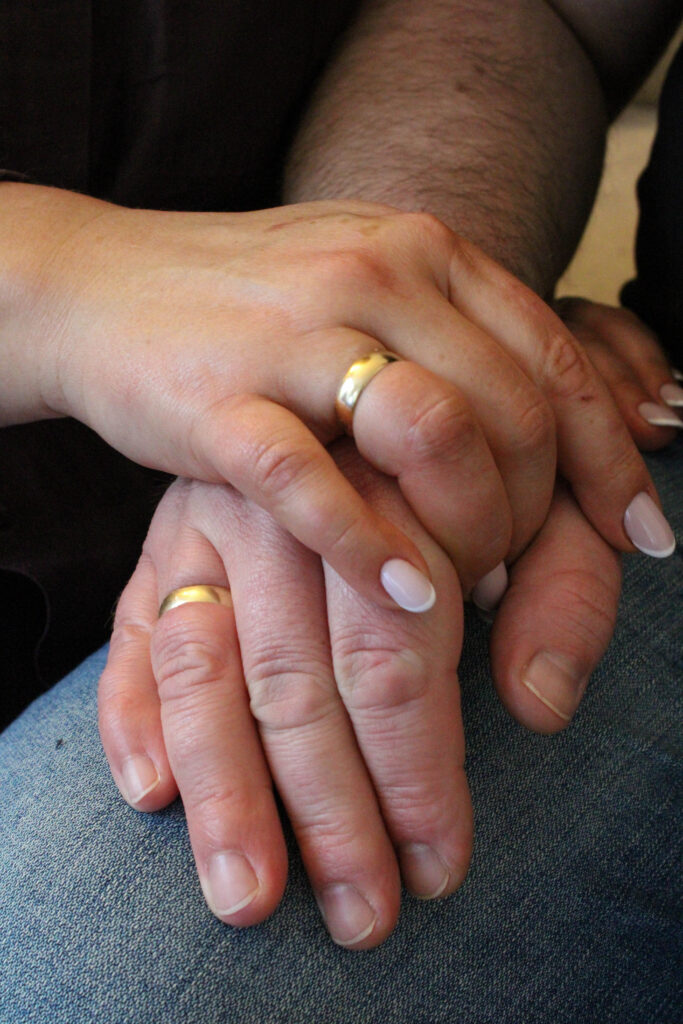
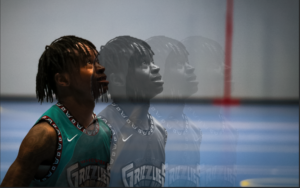
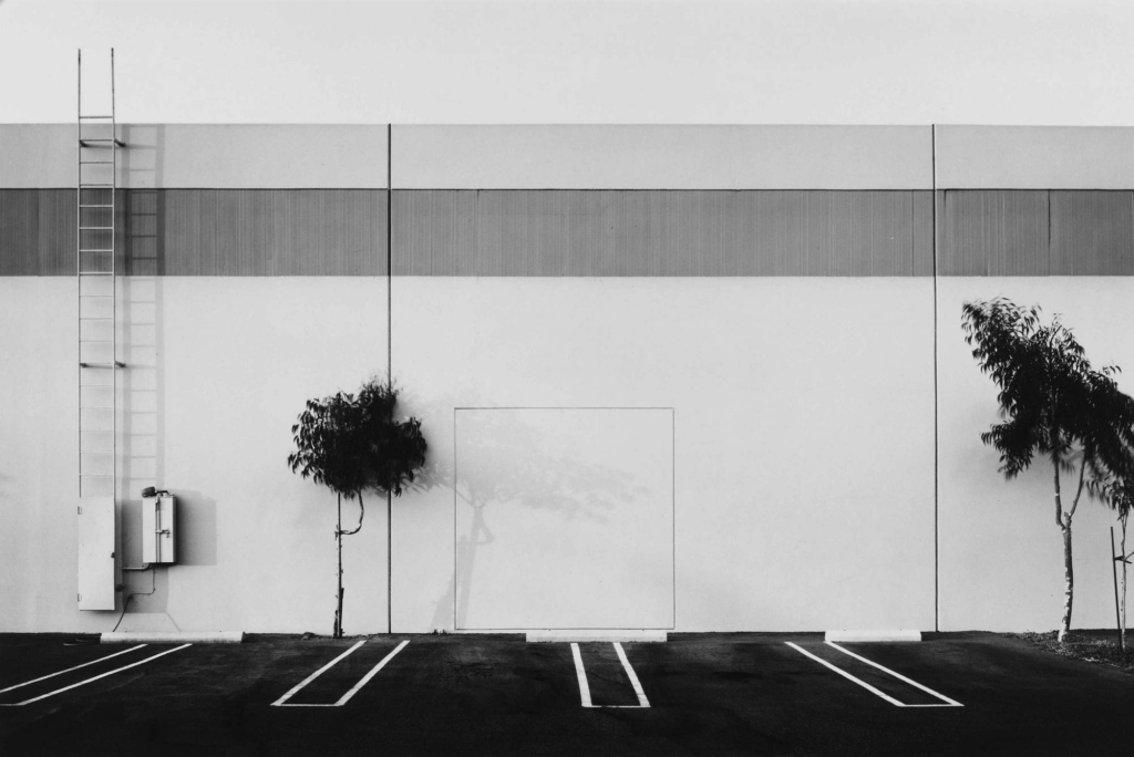
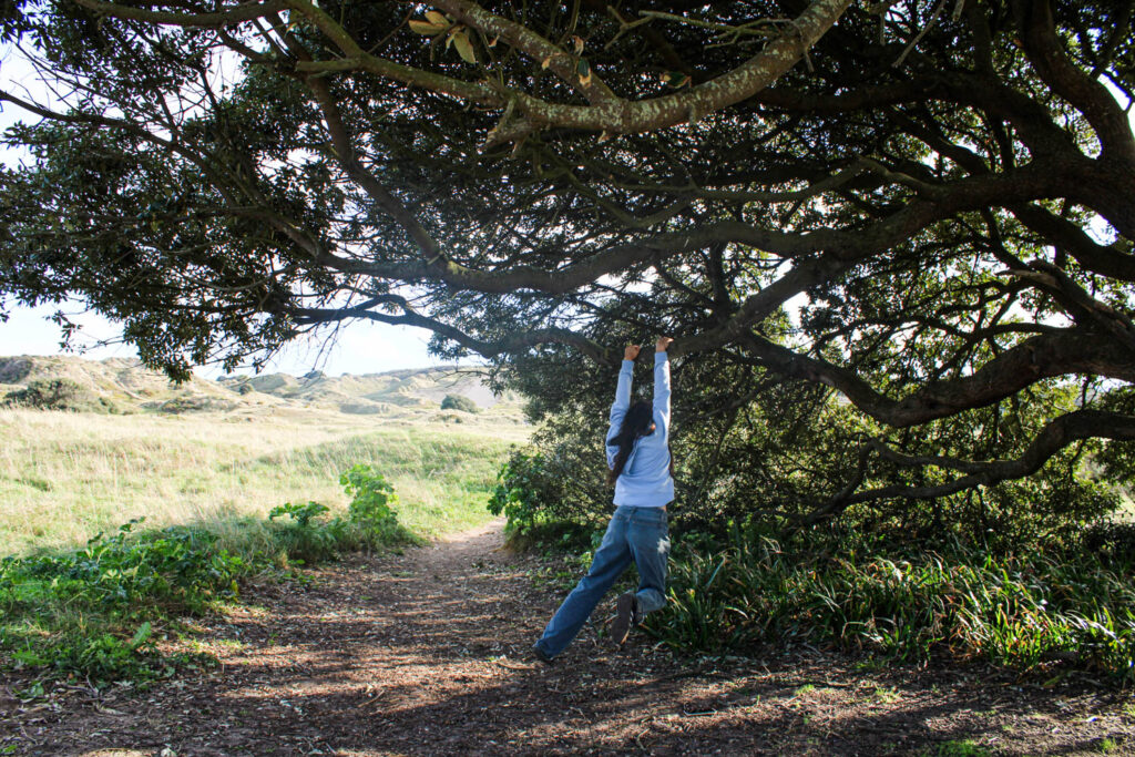
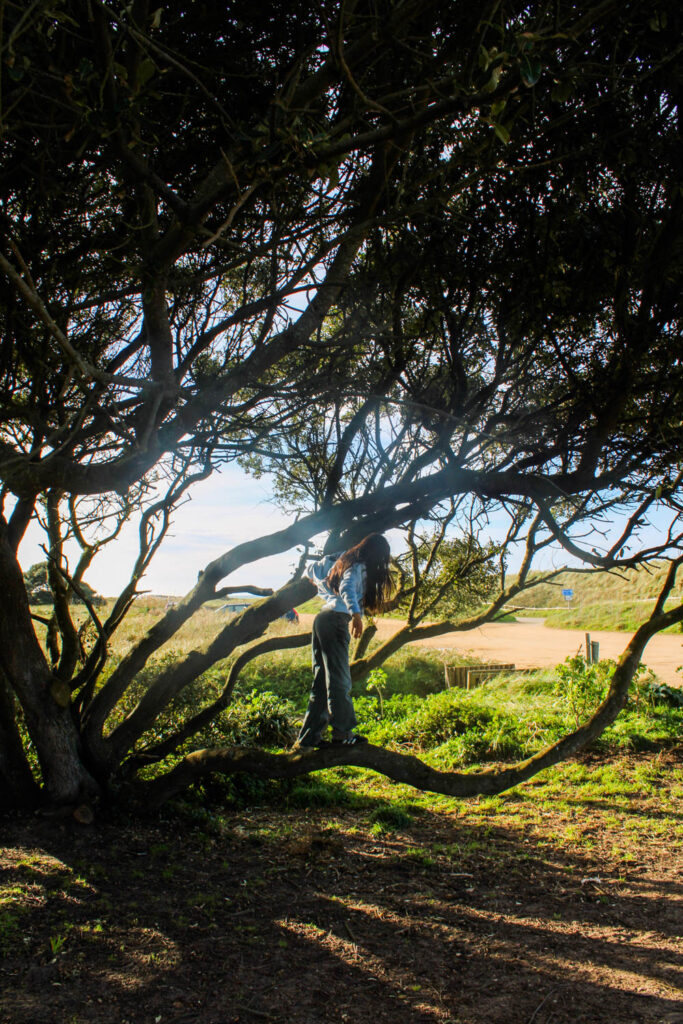
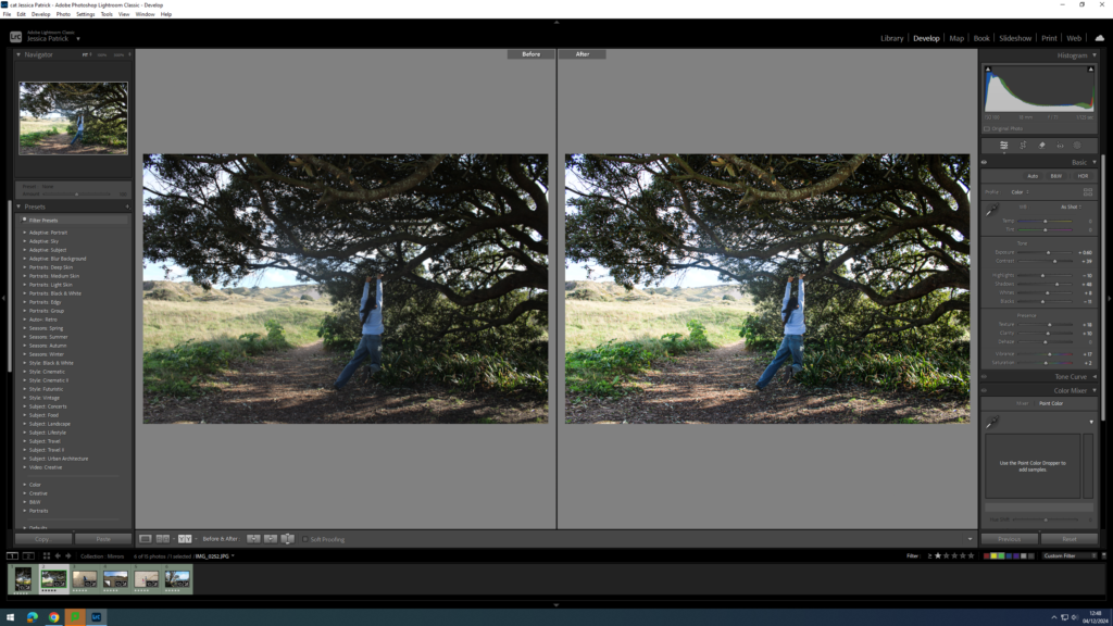
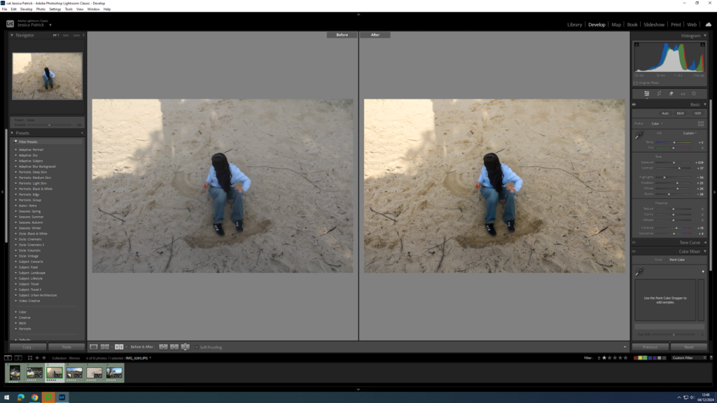
I didn’t want this personal study to be similar to any of my other photographic responses because I wanted to ensure my portfolio would have versatility, a range of different methods from objectivity to subjectivity. The specific idea which really drew me in was looking at different societal movements which we have as this is an excellent depiction how the minimal representation of people and important constructs brings people together to have their voices heard in fighting against repression, here being the Feminist movement. Whilst this is greatly a global and universal political movement that has been present for decades, I wanted to use this movement as inspiration as it is important to me, being the fact that I am an 18 year old girl who is actively affected by actions fought against by this movement in partner with billions of young girls and women across the world. I feel almost as if it is my duty to interpret this in my work as it is incredibly relevant to me and something I do feel passionate about which will in turn allow me to create effective images. I wanted to include aspects of tableaux photography by curating staged scenes to represent truthful and real events that happen more frequently than society realise due to the normalisation of objectifying the female sex. So, in terms of my previous research on Mirrors and Windows, I find this body of work will be categorised as both due to its documentation of real and truthful stories captured by millions of women every year, however I will be using staged scenes in order to create this whilst also having a personal connection to my images due to this being extremely relevant in my day to day life due to my preconceived perceptions of the world in relation to feminism as well as having first-hand experiences being female regardless of my young age. I would also still like to create subjective images in accordance to my objective ones to visually display inner thoughts and feelings surrounding the issues that Feminism attempts to tackle.
Statement of Intent:
My main subject within the Feminist movement is going to be shooting people, specifically women and young girls as this is the focal point of the movement making this the best way to represent the hundreds of issues addressed here. I want to use dynamic angles to do this, being low or diagonal with a strong contrast in my lighting as this will create solemnity, seriousness and drama to encapsulate the importance of this topic. This will take place in domestic environments as well as external scenes:
1. Domestic Scenes:
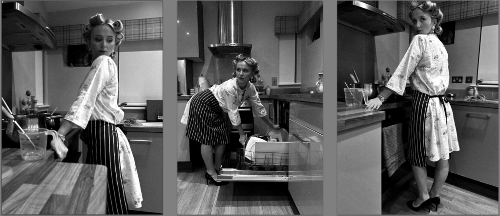
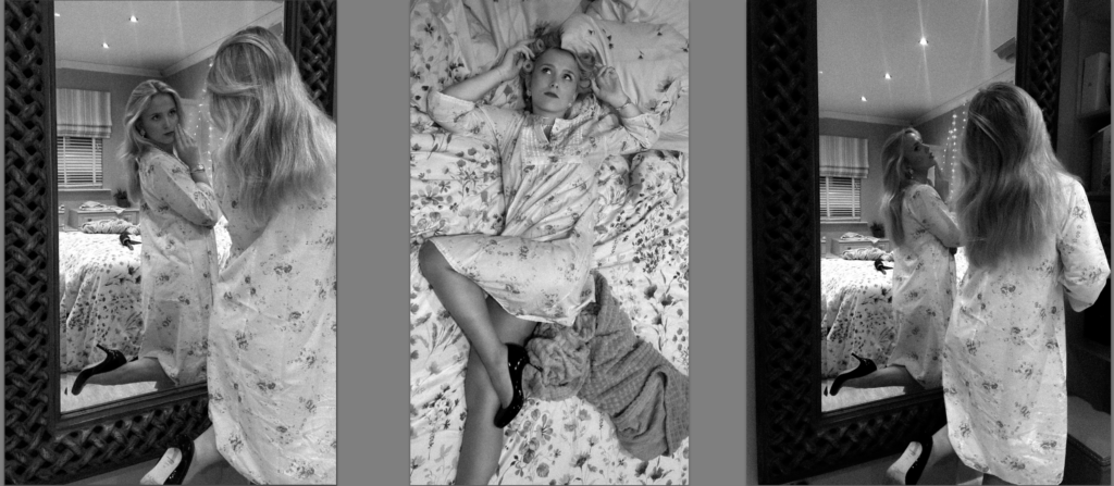
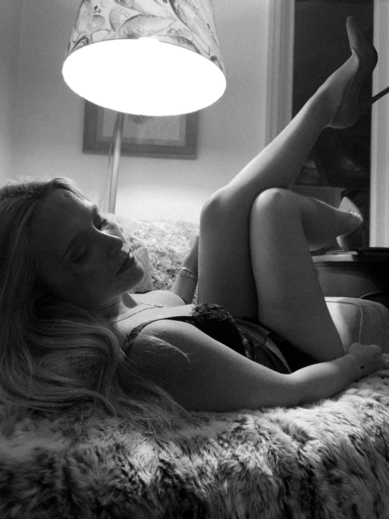
I will be shooting inside my house and my friends house, creating staged scenes, in order to represent domestic abuse, misogyny and male violence that happens behind closed doors in domestic relationships. With domestic abuse being rarely reported due to fear and the entrapment of women, whether this could be due to family connections, separation from close friends and immediate family or financial assets being tied together, 1.5 million cases of reported domestic abuse-related incidents were gathered in England and Wales in the year ending March 2022 (1). I also want to portray this because it could happen to anyone, and not be realised until the person is too far into the relationship to leave, as this abuse tends to begin emotionally and psychologically before it grows into something much bigger and more controlling, meaning this could be something that has occurred to the woman sat next to you on the bus on a Monday morning, or simply the person serving you as a cashier in a shop. The point is that this topic is universal and kept behind closed doors, so this representation creates the hope that it can influence others to come forward and break out of these toxic situations, forcing realisation that it is entirely unacceptable to be treated in such a demeaning manner and it is not ‘love‘ to fear the person who should make you feel the most safe.
Before artist references and inspirations, I began to create photoshoot ideas to represent domestic abuse:
- How domestic abuse rates rise 26% when the England football team wins or draws, and increases a 38% when his team loses. I wanted to utilise this by using different depths of field with a female crying or looking distressed next to the tv with a football game on. In the background I could vary my depths of field and experiment, putting a can of beer in the background for the viewer to infer that they are afraid of the results of the match.
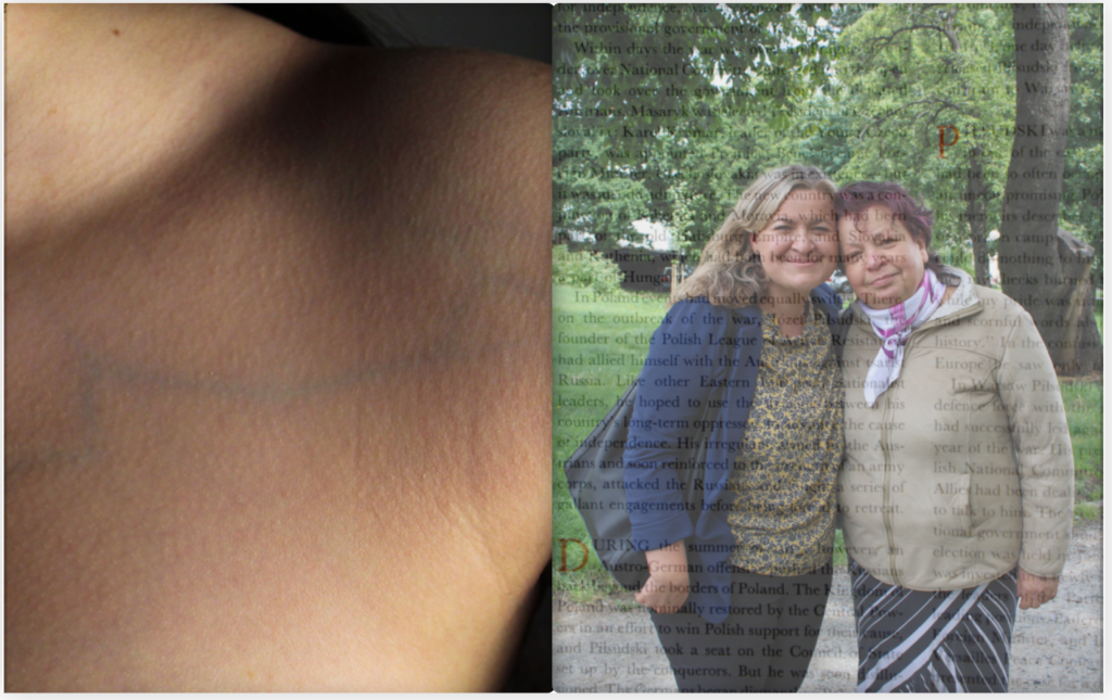
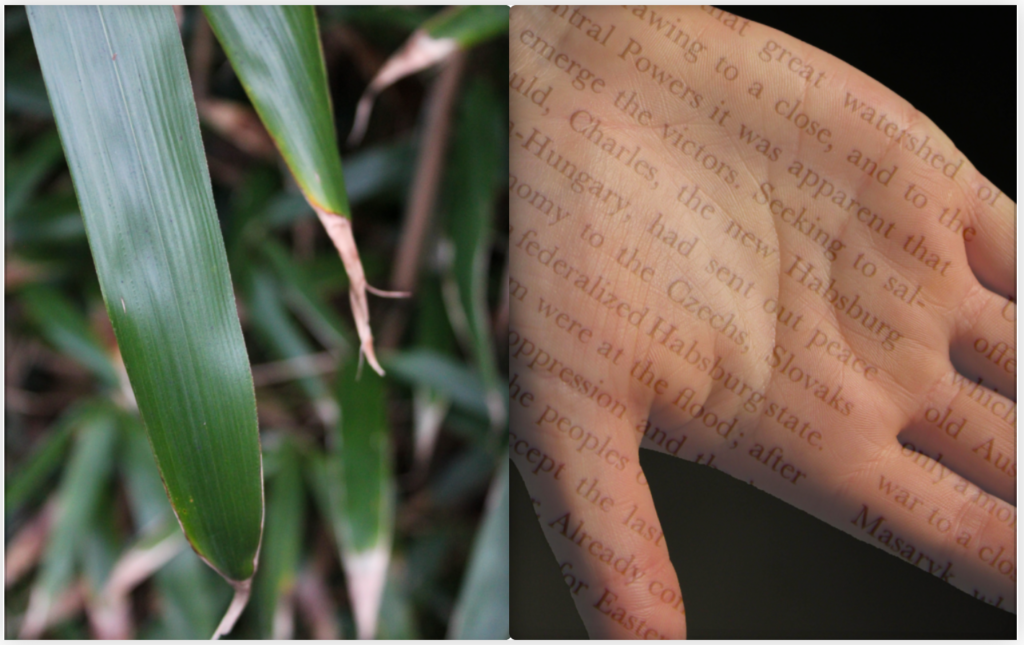
- The uniting of women in their trauma, for example the support received once telling friends and family what they have endured or even getting a friend to document the actions of their abuser by using phones to photograph bruises and fingerprint marks.
- The fears of spiking, this being an issue that is rife in nightlife by women having things put into their drinks to be taken advantage of and objectified. To do this, I will be staging a party scene in the background and using Photoshop to experiment with different colours to create strobe lights. Of course this would be more realistic in an actual club or party because I would have true lighting, however this would be incredibly difficult because there would be very poor lighting conditions and I could risk damaging the camera depending on how busy the location is. Here, I am going to use still-life images of a glass of wine and putting a small piece of a Vitamin C tablet inside as these fizz when wet, to give off the perception of a foreign body being placed in someones drink without their awareness. As well as this, I would like to create images of a ‘feminine’ hand over the top of the glass as when I go out, my parents automatically remind me to watch my drink and be protective of it to minimise the risk of this happening to me.
2. External Scenes:
My main idea behind using the external environment to create images in this topic is to show the political side of the feminist movement. Within this, I will be creating signs similar to the ones I have seen in the media, and putting them into the sky to photograph them as this is a simple way to show the activism and advocation that has been going on within the feminist movement for hundreds of years beginning with the Suffragettes. I will also be shooting images of fists in the air as this is commonly associated for standing up for what is right and is the forefront symbol of empowerment.
By using outdoor environments, it makes sure that my images are still in touch with the wider applications and impacts that this movement has instead of just looking into the internal pressures that women have from misogyny and sexism. I don’t think I will be shooting images within the studio because I would like to keep the aspect of realism in my work, ensuring that the images produced are raw and relative to real-life. If I do shoot images in the studio, this runs the risk of them not looking as realistic and truthful even though I am using staged environments which won’t allow my images to be as effective.
The other photographic responses I have began to formulate on my own are:
- The idea of sonder– being the realisation that every individual a person sees has a life as full and as real as their own. This is in relation to the domestic abuse many women face in silence and alone behind closed doors, and how this could happen to anyone at all. My idea to represent this concept is to have one girl or women staring into the lens of the camera out of a crowd of people moving around her, symbolising a cry for help, in town for example. For this, I can use a slow shutter speed to create a motion blur around the subject to symbolise almost being ‘forgotten’ about in their private fight. This can also be experimented with to be inverse of the male gaze in the public eye, being due to women purposely keep aware of their surroundings as an instinctual response due to past experiences and the knowledge of the high levels of attacks in public areas on women.
- The concerns of pregnancy at the hands of abortion bans in many countries, such as Donal Trump’s beginning of his Project 2025 plans which could lead to the deaths of many young women and girls for numerous reasons is a more modernised problem that the feminist movement is striving to battle against. For this, I am going to purchase pregnancy tests and drop them onto the floor of public toilets or place them onto the basin on the sinks and shoot from high, overhead angles, such as standing over the adjacent cubicle, to connote emotions of fear and worry. I will use high contrasts and a lower exposure to make the image have a heavier feeling.
- I want to use this ‘birds eye view’ in public toilets again using a high angle, with a girl inside the toilet looking distressed and concerned as if they are hiding or having fears about their current situation. There are typically notices on these toilet doors of JAAR – standing for Jersey Action Against Rape which I think would be very effective as I can utilise this to make the concept of the image more explicit. I will also shoot images of these notices in a more dead-pan aesthetic, being straight on, as this are very relevant to the movement in giving women support systems.
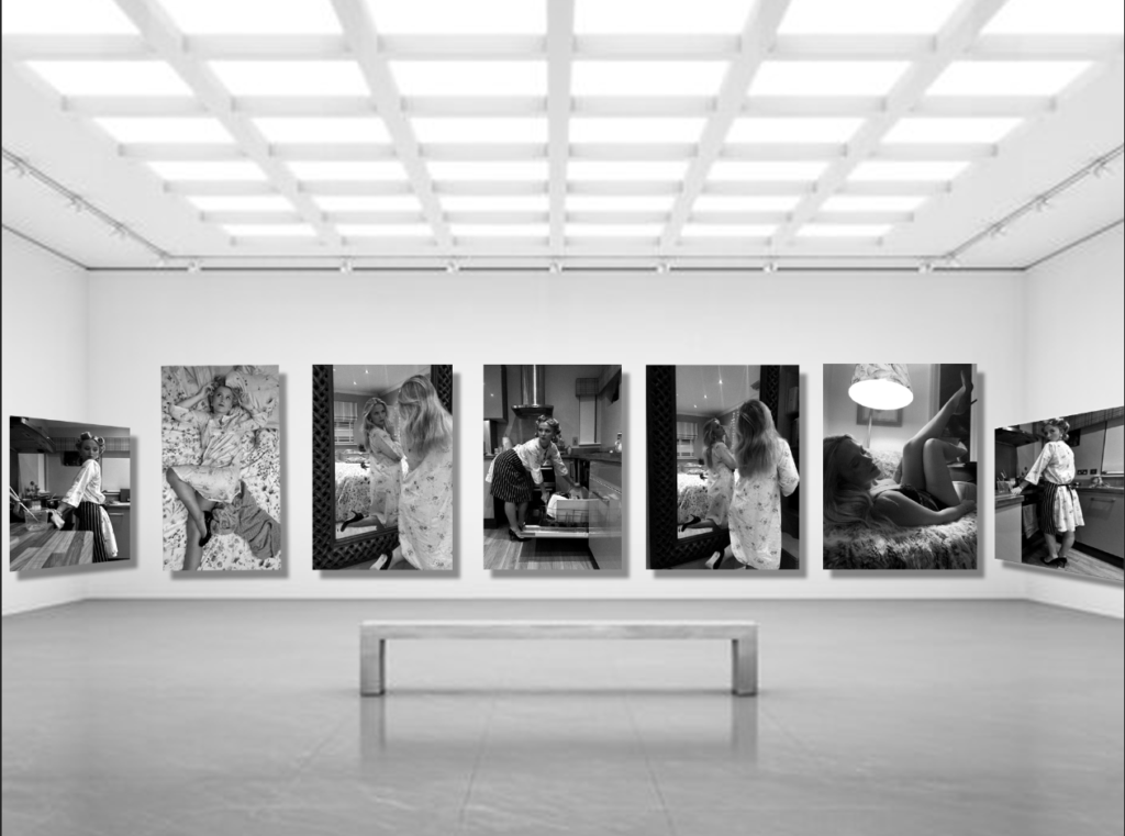
My final piece will consist of a photobook as in my previous personal study exploring the hardships of growing up with a family member suffering with extreme symptoms of a mental illness, I found that this was incredibly moving because I have entire control over the aesthetics and colour palette which are important in connoting different emotions. I feel that this will be the best way to represent such a heavy topic again with the Feminist movement. However, I don’t think this time I will use accompanying text as I want the images to speak for themselves and I don’t want them to be overpowered by textual information, all of the images should speak for themselves.
My biggest motivator in using this for my study in the theme of Union is the relevancy to my everyday life, these are vital and key concerns that I have to be aware of in order to be safe in society, especially when getting into relationships and going out during nightlife as there are so many incidents that happen to millions of women everyday. Having this knowledge and education is important to me because it means that I will be able to prepare myself in the case of something occurring and know where to access this support in a time of need, as well as having an instinct to prepare to defend myself in these cases.
My second reason for this is that I myself perceive myself as a feminist because I’m extremely passionate about being an activist for this inequality. This impacts my family, friends and millions of young girls and women across the world and without having a voice and standing up, nothing will change at all. All of these sub-categories within the feminist movement must be addressed because the ignorance of this could even lead to millions of deaths, and already does. Without preserving women’s rights, history will revert. My hopes in doing this is to display how important it is to be educated and aware of these things, and that they well and truly can happen to anyone even if you think it might not be you. These issues are closer to home than they are perceived and I hope to bring them to light to show that this is the reality of the world, and its important to use your voice to project what is wrong to make a difference.
References: