Overall I believe that this has been a very successful project. I have created and studied something and have consequentially ended up with my name on a book filled with my photos. My photos have links back to artist references, such as Josef Sudek and Keith Dotson. I had also chosen to take inspiration from Rinko Kawauchi for some images. On the whole I am pleased with my work and with what I have produced.
PHOTOBOOK
I am exceptionally pleased with how my photo book turned out. I do wish I had more images that integrated with each other better. I had also chosen to have someone check over my spelling as I had found a grammatical error on the front cover. However, as for the overall layout, the images fit quite well with the poems I have chosen to sit between them.
To what extent have cindy sherman and Claude Cahun explored the male (photographic) gaze in their work?
“In their traditional exhibitionist role women are simultaneously looked at and displayed with their appearance coded for strong visual and erotic impact so that they can be said to connote to-be-looked-at-ness”
-Laura Mulvey
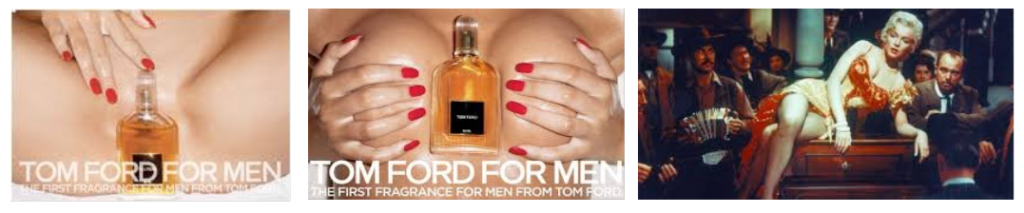
The male gaze. The term the male gaze is referring to Laura Mulvey’s feminist theory where she discussed how women are seen as objects for men’s visual pleasure. This is present within society however it is magnified through the media. A prominent example of it would have to be Marilyn Monroe specifically in River Of No Return from 1954 where the first few shots of her in the saloon focus purely on her body and then her seductively resting on the piano. Similarly, Tom Ford’s advertisement for their first male fragrance in 2007 featured a woman’s bare chest with a perfume bottle in between her cleavage and another with a perfume bottle placed in front of her groin. Its clear that the male gaze has been evident and used for many years and has not appeared to stop.
However, artists like Claude Cahun and Cindy Sherman challenge these harmful stereotypes and portray a different perspective of the female experience. Cindy Sherman focused on identity, gender roles, and stereotypes. Similarly, Claude Cahun questioned identity and gender but they used aspects of surrealism in their work. I believe that their work and their message are still important, relevant, and still needed. I am exploring similar themes within my own work as I believe it is important to highlight the issue of the male gaze. I’m planning on showing this by creating cracked effect for the models faces. I want to use some of the usual conventions similar to what Cindy Sherman created however by creating this cracked makeup on my models face I’m hoping it can show her she is breaking from within and the objectification she’s facing is ultimately breaking her.
I believe feminism is such an important topic as the patriarchy affects everyone in society. Feminism tends to have a bad stigma around it which could be due to the lack of education around real feminism. Society has tainted the message of feminism many people think it centred around wanting women to be superior to men which is not the case. The first feminist movement (which can be considered the first wave of feminism) took place during the 19th and early 20th centuries. It was centred around women’s suffrage and giving more opportunities to women as during that time women were seen as inferior to men, they weren’t able to have their bank accounts, they weren’t allowed to vote even after that law was lifted the only women who were married could vote as well as women of colour were still unable to vote whether they were married or not. There have now been around seven waves of feminism each one carrying on the previous message but improving it through new ways. For example, the main difference between third and fourth-wave feminism is fourth wave wants to focus more on technology and social media so spreading your knowledge and fighting through social media. However, very recently it appears that as a society we seem to be back peddling as of January 20th, 2025 Donald Trump is president of America once again and has been vocal about his opinion surrounding abortion rights. Women finally got the right to have control over what happens to their bodily autonomy in 1973. However, since President Trump has been elected people are scared that once again we will have these rights stripped away from us.
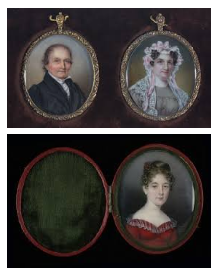
Due to this, we may see a resurgence in feminist art. It is said that feminist art started in the late 1960’s to the 70’s it was created to highlight and display the inequalities and the challenges that women were having to face at the time. Art was originally a male-dominated area as historically women were supposed to be caregivers, mothers, etc… Women didn’t often get the chance to attend art schools as men did. They also were not allowed to partake in more taboo styles of art like nude portraits as it was deemed inappropriate for women. In order for women to be able to create art they often had to be wealthy and get taught by other male family members. A great example of this would be Anna Claypoole both Anna and her sister were the first women elected academicians of the Pennsylvania Academy of the Fine Arts.
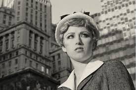
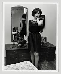
A photographer who was renowned for their work centred around feminism and the male gaze would be Cindy Sherman. She rose to fame during the mid to late 1970’s with her “Untitled Film Stills” where she produced 70 black and white stills centred around her portraying these different characters. She produced a depiction of a working woman, a housewife, etc… This can be linked to Judith Butler’s ideas of Gender performativity where she discusses how gender is based on repetition and rituals within society. The idea that gender is not fixed but is unstable and the notion of gender that gets pushed on people during infancy is in fact a myth. Similarly, Cindy Sherman discusses how she took inspiration for her work from the phrase “male gaze” as she felt that the media only portrayed women from a heterosexual viewpoint and it tended to reduce women to being objects. You can see how this impacted her work as she tried to challenge these gender-driven stereotypes by not romanticizing or glorifying them and instead exposing them. She does this very successfully, her images tend to be quite simple and she is always the model which I believe makes it more effective as she always has the same quite flat and unreadable expression on her face in all the photographs making them appear a lot more superficial as you can not tell how the model/women within the image is feeling. I also think by Cindy Sherman being both the model and the photographer for her pictures I believe makes them more impactful as she has all the power in the situation, she isn’t affected by the male gaze which will often occur subconsciously or not because it is so heavily ingrained into society but because she can control every aspect she tried to prevent that.
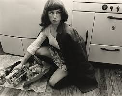
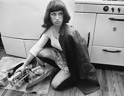
For example, in image no. 10, Cindy is playing the ‘role’ of a traditional 20th century housewife. She is depicted crouching on the kitchen floor alongside a broken, spilled shopping bag. What Sherman achieves through this comment on female stereotypes is nothing less than protesting the traditional roles of women in that time period. Women in this era were restricted and categorized to act and be a certain way; cooking and cleaning for the kids and husband, and overall being the invisible ‘caretaker’ to what would’ve been an ungrateful family. This concept is solidified in her lack of direct address, her melancholic, distant gaze leaves the audience questioning her real personality; who she is behind the ‘role’ of a housewife. Visually you can tell she was inspired by the 20th century from her outfit to her hair and makeup which is effective for creating the atmosphere of the role she is meant to play as being a housewife was one of the only roles for women during the 20th century until a little later when the suffragette movement started to grow and women started to get into more occupation fields but it was only around 20% of all women at the time who were working.
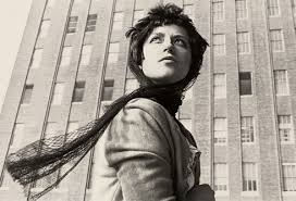
Similarly, Claude Cahun is a great example of an artist who challenges harmful stereotypes and creates thought-provoking feminist photography. Even before creating they started to explore art and photography Cahun started to push the boundaries with feminism and gender during their childhood Claude Cahun delved into the idea of being non-binary and going by they/them pronouns which clearly influences their work today through their differing characters some presenting more masculine some more feminine. They tended to focus on gender and more specifically the fluidity of gender. Claude Chaun’s work is contradictory to Cindy Sherman’s work focuses on the stereotypes to challenge them instead Claude Cahun uses elaborate props and fashion to convey new a different ideas about gender. It is evident within their work that they stray far away from the male gaze all of their work appears to be quite androgynous and doesn’t fit the beauty standard. However, like Cindy Sherman all of Claude’s work are self-portraits so they’re taking away the power from the audience by being in control.
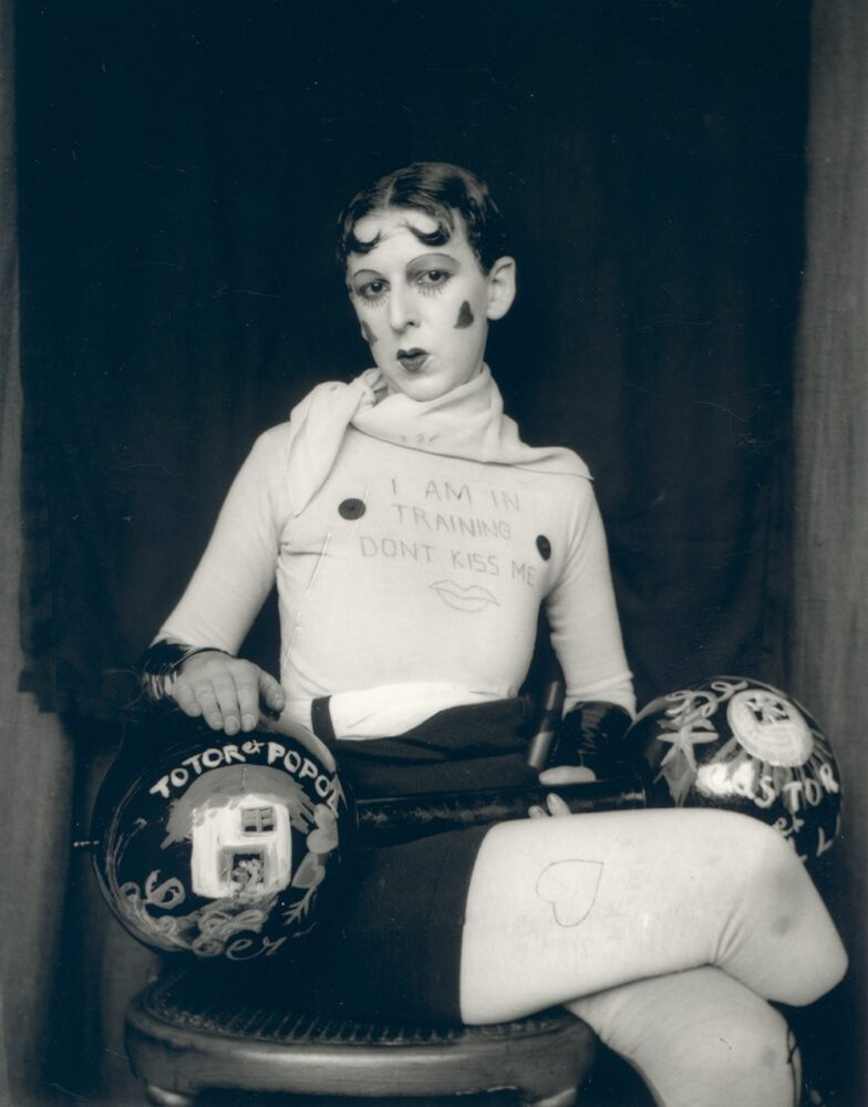
For instance, the image ‘I am in training don’t kiss me’ holds the title as one of Cahun’s most famous pieces of work. In the picture they have short hair, evident in how Claude makes a point of distancing herself from the male gaze and alongside it, the stereotype that women must have thick, long hair in order to be deemed attractive by society. Similarly Cahun appears to be holding a pantomime barbell which continues to challenge stereotypes as its often said that women should be dainty and delicate and not strong, powerful and capable to do the same things as men. Additionally, Claude’s facial expression holds power and significance. Specifically, in the direct address to the audience, Cahun comes across as very intimidating and, as a result, holds power over the viewer, positioning herself at a higher status. In addition, they wrote the title of the picture on their shirt which emphasises their message of “don’t kiss me” demonstrating that they don’t want to be sexualized through her photo.
Ultimately, both Claude Cahun and Cindy Sherman have created incredible work which pushed against boundaries, challenged stereotypes, and helped advocate for change. Claude Cahun has effectively helped push the boundaries of gender and gender performativity, and Cindy Sherman challenged the harmful stereotypes which often suppress women. An aspect of both of their work that I am interested in exploring is their use of facial expressions in their photos. Both Cindy Sherman and Claude Cahun use quite deadpan facial expressions however, unlike Cindy Sherman, Claude Cahun uses direct address, which I find comes off as very powerful and demanding, so I would like to experiment with that within my work.
For my final photography project on UNION. I’ve decided to explore the topics of femininity and girlhood, taking inspiration from Cindy Sherman. Sherman’s photography really resonates with me because she challenges traditional ideas of women and what we’re meant to do in society. Her ability to show the complexity of womanhood—strength and vulnerability—will be a huge influence on how I approach my project.
Cindy Sherman was born in 1954 and started taking painting classes, but she got frustrated and disliked it so she moved on to photography as a way of expressing herself and challenging the conventional standards of women. My favourite aspect of her work is that she poses herself as the model for her photographs. She dons different costumes, makeup, and props. She completely transforms herself to tell a tale. Sherman has explained, “I was closely duplicating other art, and then I realized that I could just use a camera and spend my time on an idea instead.” This shift to photography allowed her to express herself and explore concepts of gender, identity, and cultural expectations in a more individualized and focused way towards herself.
Sherman’s photography is not so much about depicting women in stereotypical positions—she turns them on their heads and confronts us. In a lot of her work, she plays with tension and unease that so frequently come with womanhood. To cite an example, in one of her most famous photographs, she is dressed up as a 1950s housewife, but the way she stands and the expression on her face create a feeling of unease. The photo seems to be innocent at first, but the tension in the scene is apparent once you take a second look. This tension between what is done with and what is actually done to women is something I personally would like to address with my project.
I would like my final project to show the unease and vulnerability that comes with girlhood and femininity. I’m going to be employing self-portraiture, like Sherman, to describe what it is like to be a growing-up girl in contemporary society. I’m going to attempt to convey a sensation that is raw and unfiltered, such as when we’re alone in our own minds, or with the tension of having to meet up with society’s expectations. It’s about portraying girlhood as not necessarily simple—its complicated, confusing, and sometimes clumsy, but it’s also full of strength.
Sherman has had a deep influence on photography and art, specifically on how we perceive women and femininity. She prompted artists to move away from standard, two-dimensional depictions of women and create more complex and nuanced images. Her work opened up a conversation about gender and identity that still influences photographers today. By doing my project, I hope to continue that dialogue and prove that being feminine is greater than what’s expected of you by society—about all of the various different experiences that all add up to being a girl.
I desire to utilize New Jersey’s environment for my project in order to portray various views of femininity. From awkward moments outside to more powerful images in urban settings, I hope to have a body of photographs that represent both the awkwardness and strength of girlhood. I would like to focus on how women support each other and how we can find strength even in awkwardness. My goal is to create photographs that prompt individuals to reflect on what it really means to be a girl or woman, and to challenge the stereotypes which so easily define us.
Ultimately, I want my project to capture the complexities of girlhood and show the strength that exists in embracing our own uniqueness. Cindy Sherman’s work has prompted me to look deeper into these issues, and I’m thrilled to make my own images of the strength and vulnerability of girlhood
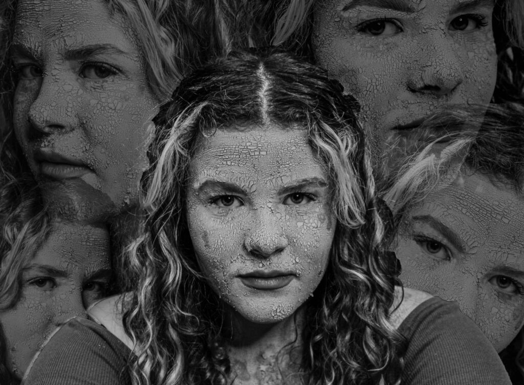
I’ve decided to do more of an experimental edit. I want to try and create a chaotic feeling.
to create this I have used a image of the model where she is looking directly at the camera and in the middle of the shot. Then I’ve taken some of the other photos where she is looking in different directions and cut them out of their photo and added them to this one. I also realised that I would need to do the same to the original photo otherwise it would be covered by all the others surrounding it.
I found that the image looked a lot better with the surrounding photos with lowered capacity as I wanted the main/middle version of the model to be the one that stands out. Then all I needed to do was add the resat of the images and arrange around the image.
Photoshoot 2- experimenting
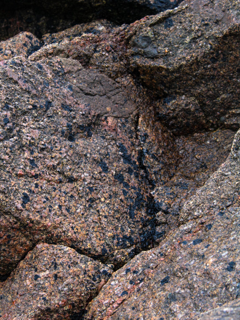
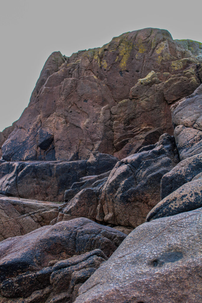
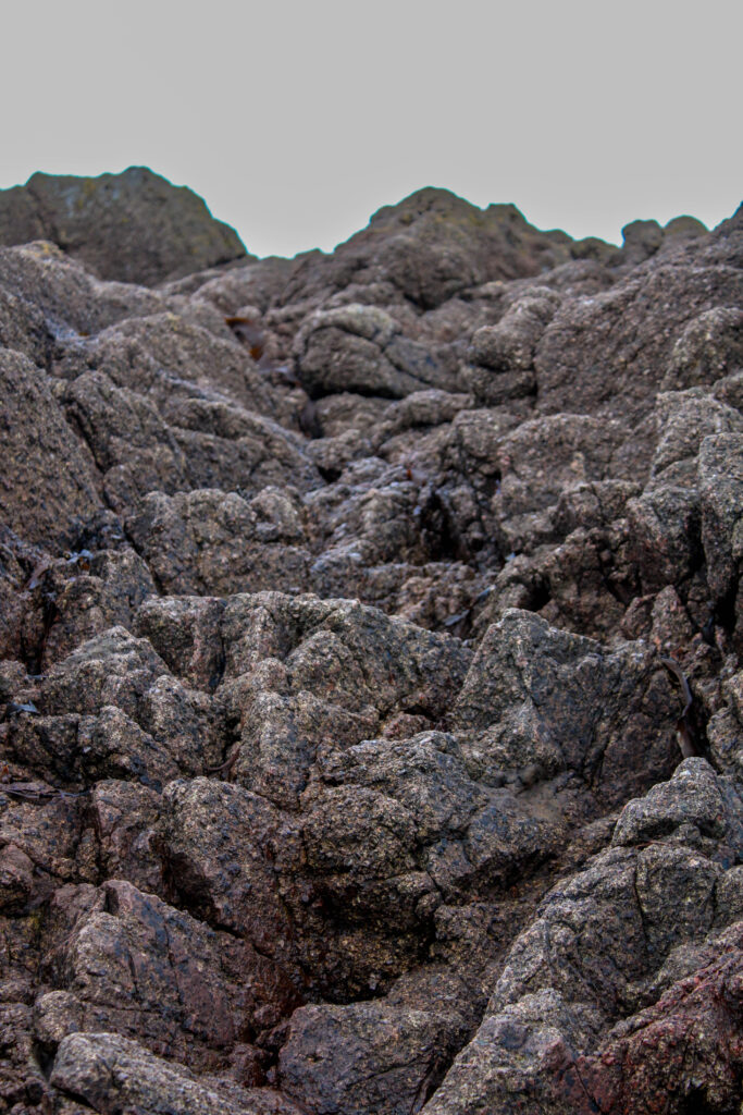
Binary opposites its referring to the idea of having two things that are vastly different and contrasting for example light and dark. So for my work I liked having the beauty from the model but also the natural aspects from the rocks which contrasted the man made structures behind.
I experimented with these photos by using AI. I tried to edit the background and replacing it with something new and more stereotypically pretty the first image I used one of my own photos and placed in behind the rocks whereas for the second two images I used AI.
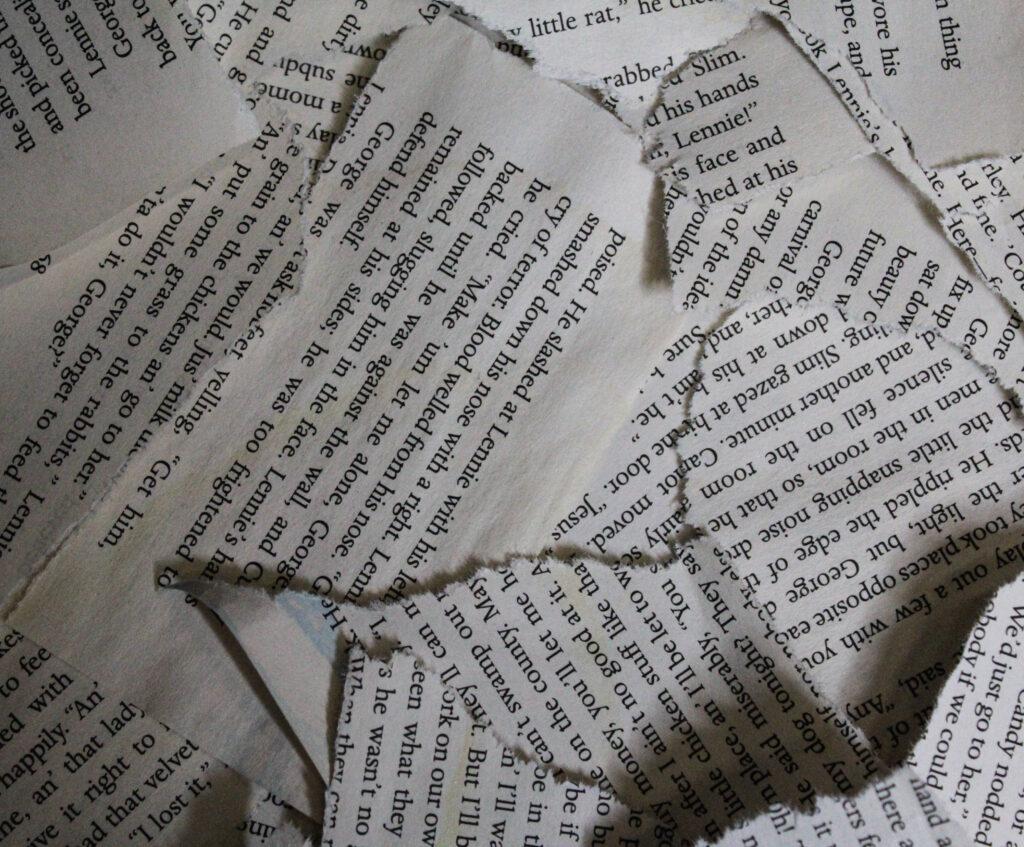
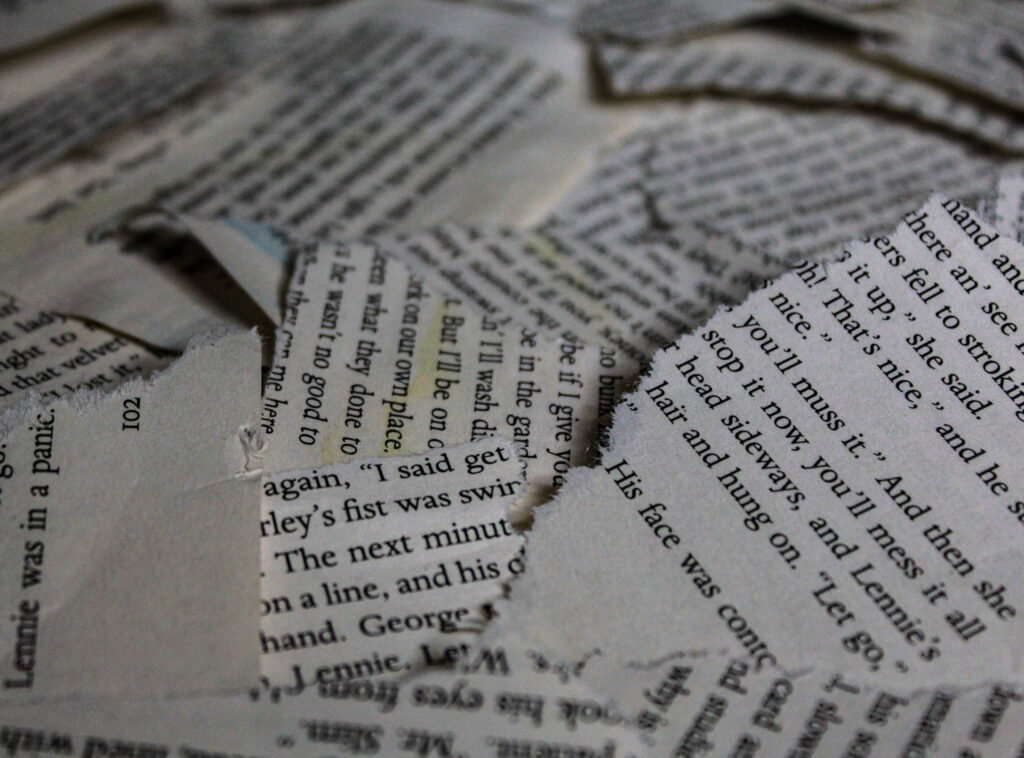
For this photoshoot I went into the studio, as I felt like my photobook would need some other images to add contrast; this is because most of my photos are portraits so by adding these additional filler images it will make my book appear less repetitive and more engaging.
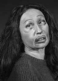
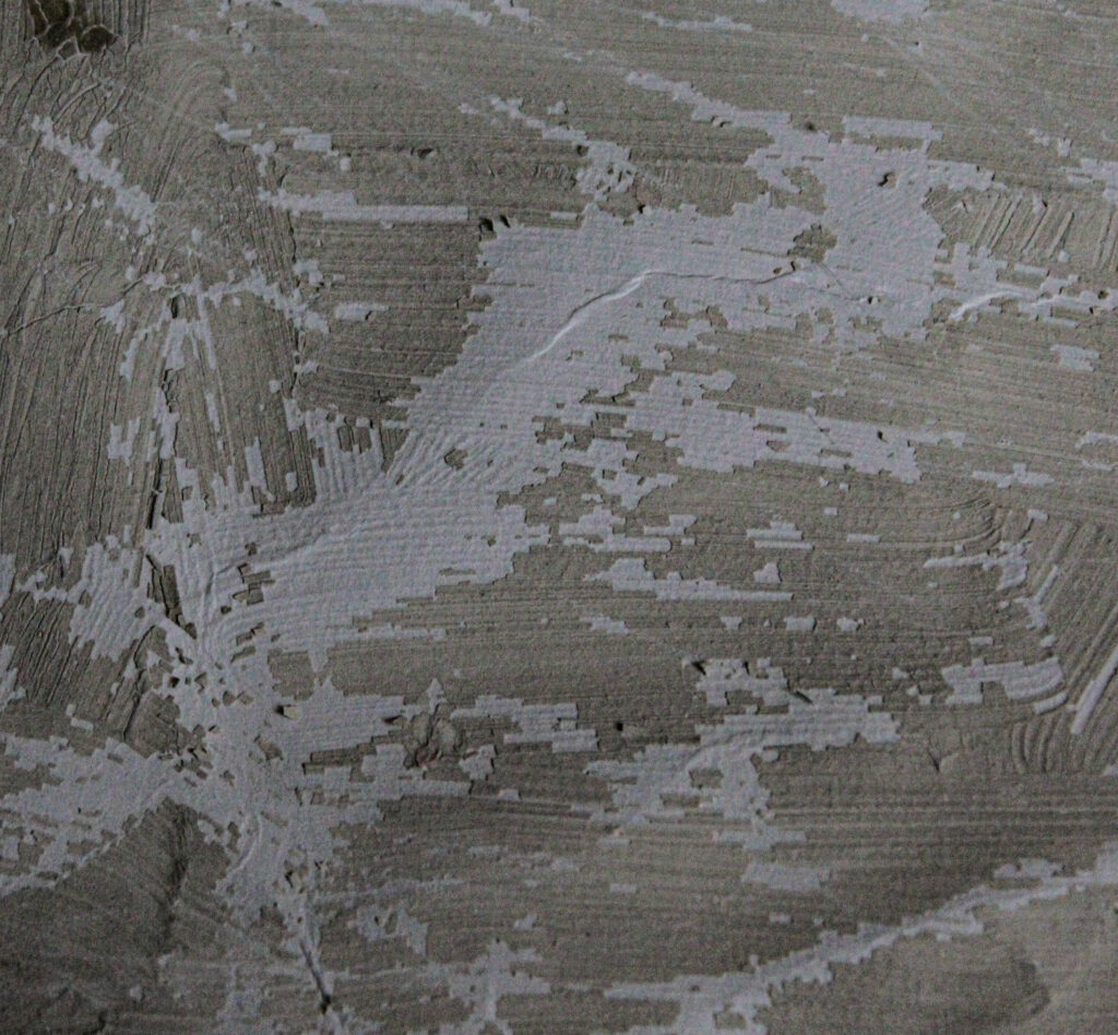
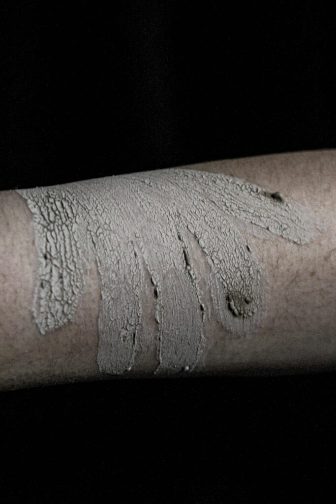
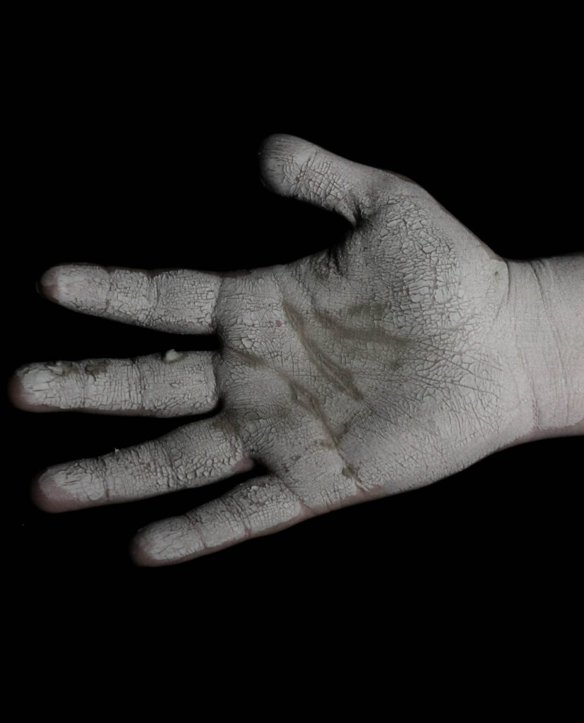
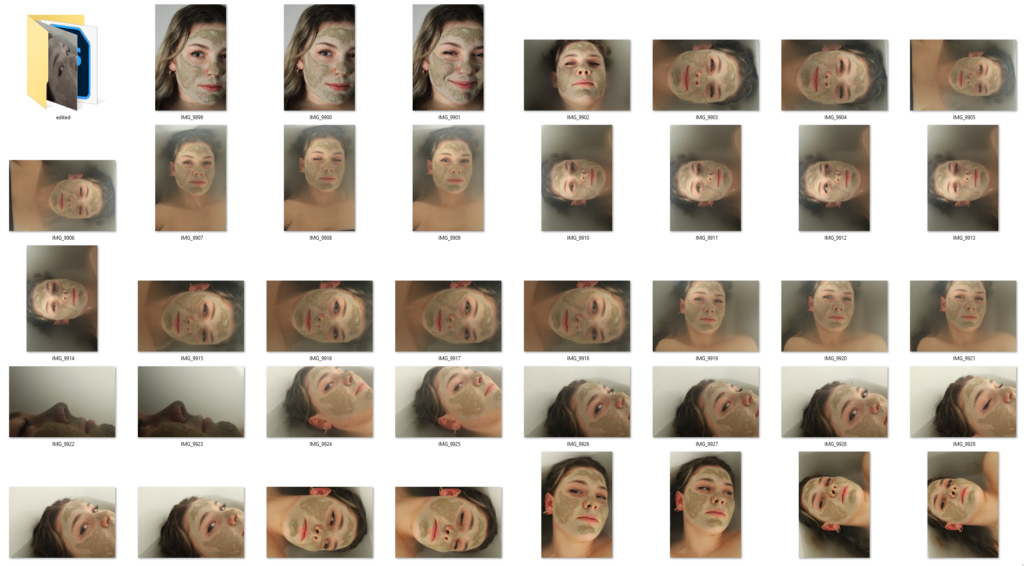
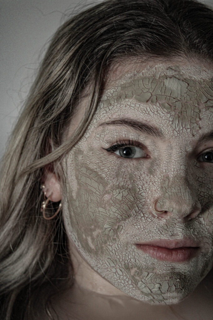
I chose to use some ripped-up book pages and a piece of card with the face mask to create a cracked look on the model’s face. I did this to try and symbolise destruction and loss, just like I did with the models; to amplify and carry on with the ‘narrative’ that I am trying to tell whilst also using an alternative and more abstract way of showing destress, vulnerability etc…
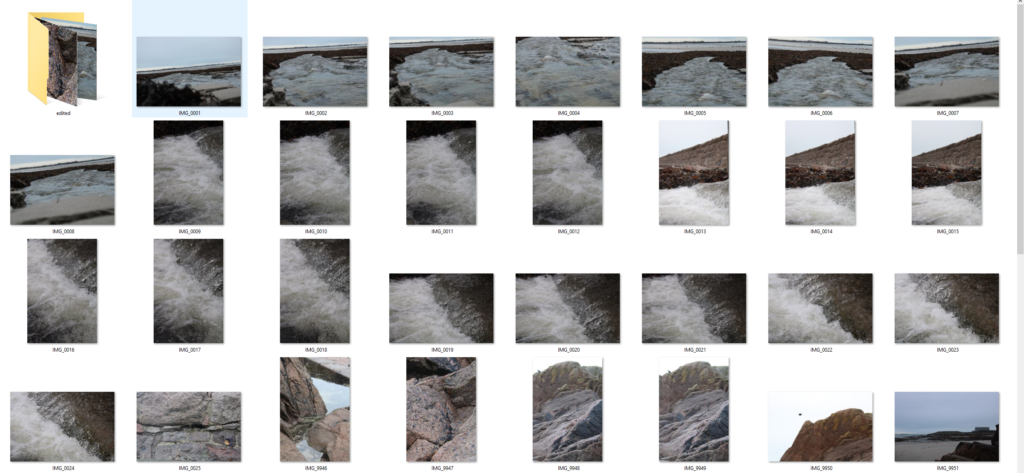
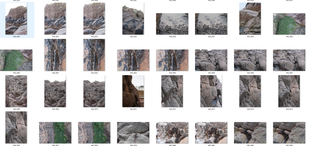
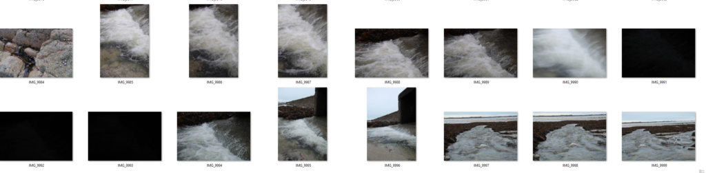
Contact Sheet 1
Contact Sheet 2
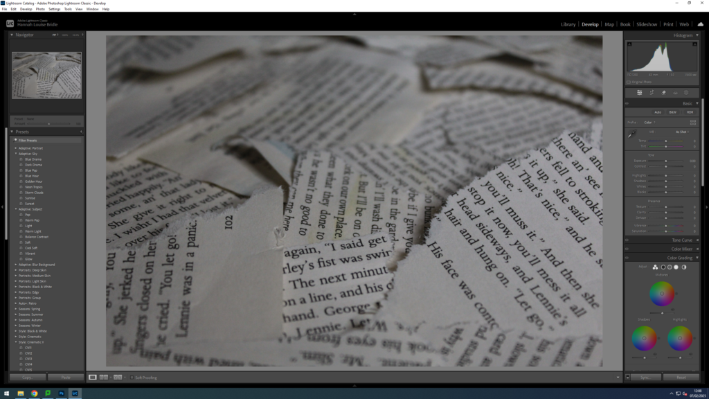
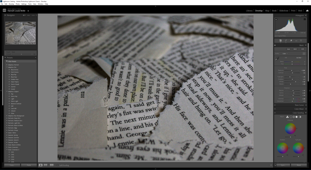
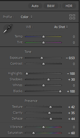
Editing
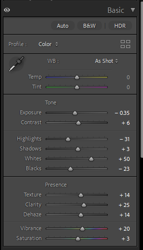
The editing for these photoshoots was rather simple and fairly similar. The main aspects that I wanted to enhance and change was the highlights ,shadows, blacks and whites. I found this works best as it makes the image look sharper, the edges of the paper are a lot more emphasised this way. However, I did decrease the saturation slightly as a key aspect of my book I wanted was the further into the book you got the more desaturated it gets.
Similarly with the other set of photos I adjusted the whites, blacks etc… However, with some of the picture of the rocks you could see the sky and more of the background compared to the other photoshoot. This meant that I had to adjust the brightness for the background using the masking tool.
Final Images
Final Images
Evaluation
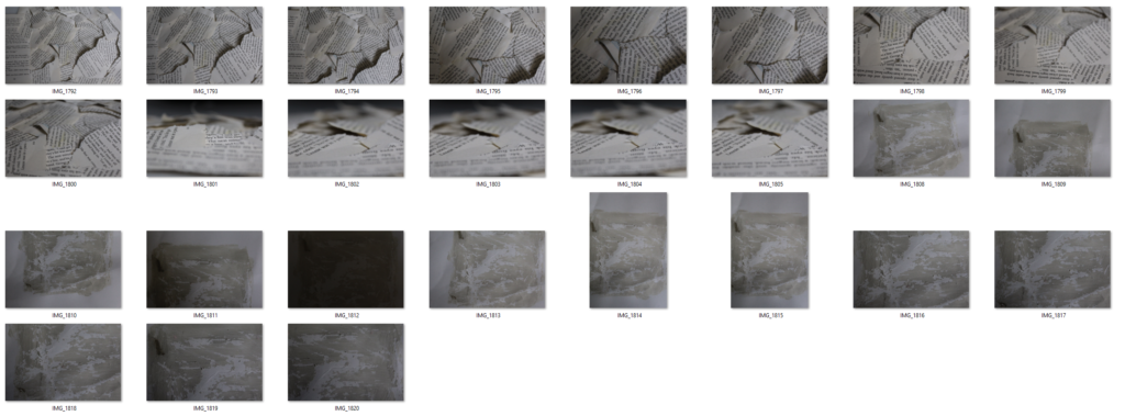
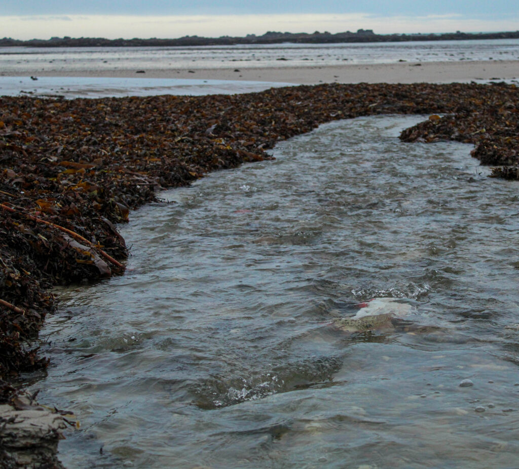
Overall, I’m quite happy with the pictures of the rocks because some of them were close-ups, meaning you can see many details in the different colours and textures. This is going to be very useful in my photobook as it’s adding a lot more variety. I also find that they link and can be related to the cracked ‘skin’ that I used on the models. However, for the picture of the water I wish I had used a faster shutter speed in order to get a clearer image of the water running as the ones I got came out slightly blurry due to the speed of the water and the lower shutter speed which I used.Similarly, I’m happy with how the book pages and the piece of card turned out. I tried to get multiple different angles when photographing the book pages, experimenting to see if I could create more depth within the photos. Which I think I successfully achieved by taking some of the photos from a lower angle additionally by using the lower angle it reveals more layers and textures which you couldn’t see from the higher, birds eye view which I also used.
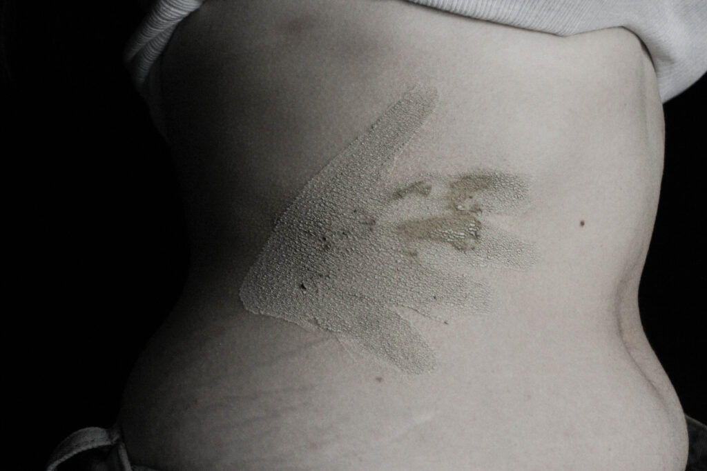
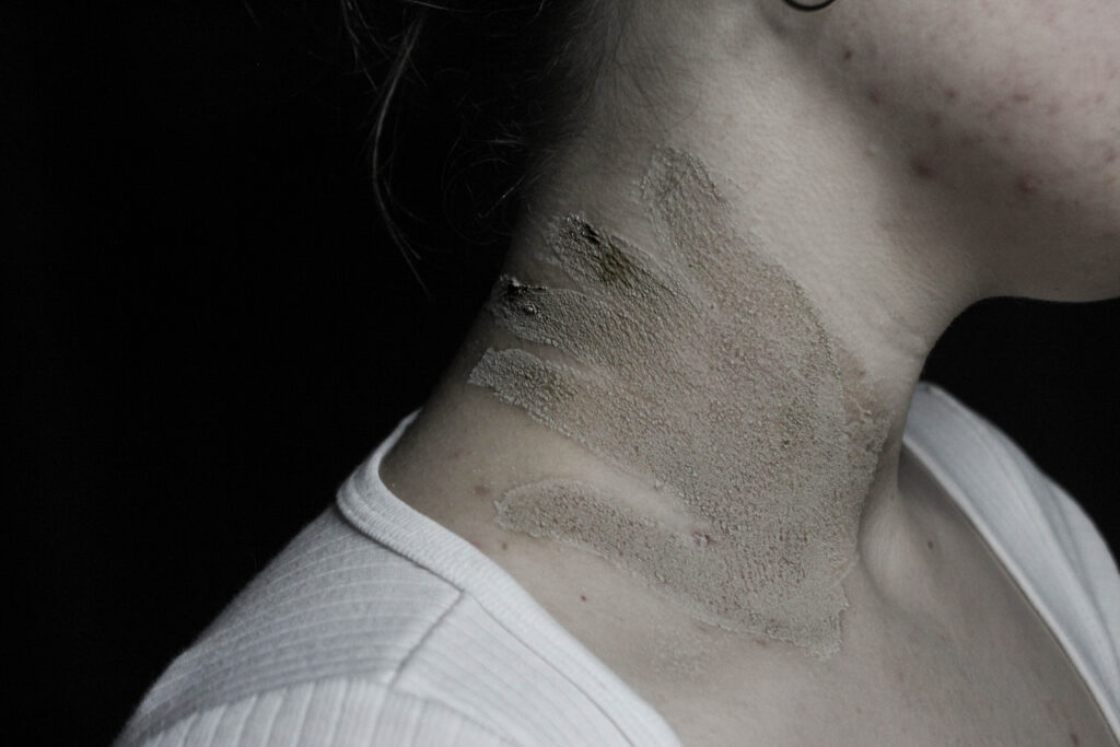
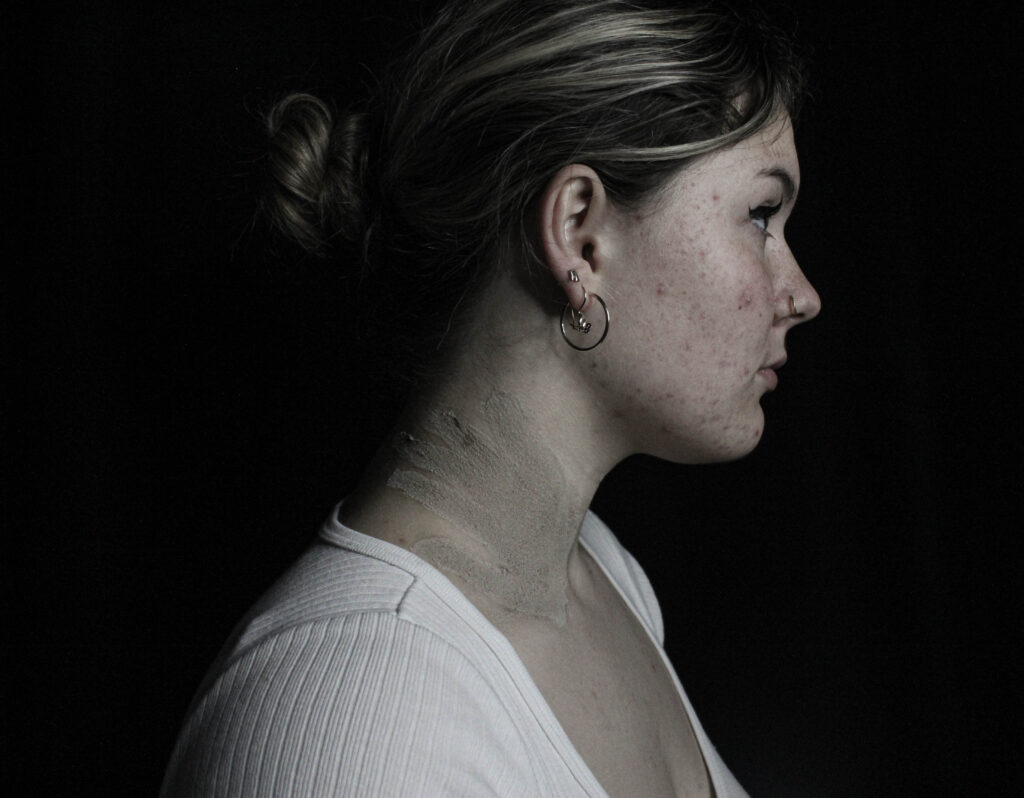
For this photoshoot I wanted to focus specifically on sexual assault and harassment. I did this through creating handprints on the model. This was actually inspired by a movement originating in 2020 where sexual assault victims would paint a red handprint on their body where they were touched without consent and share their story/experience as a part of the hashtag ‘DenimDay’.
Contact Sheet
Editing
When editing something I wanted to focus on and emphasise was the darkness of the photos. I knew I wanted to place these images towards to back of my book which is where the more dramatically lit and intense photos would be found. This meant that I had to increase contrast, blacks and shadows in the photo however by just doing that it lost a lot of the details so I then increased the high and highlands to help make sharper lines.
Final Images
Evaluation
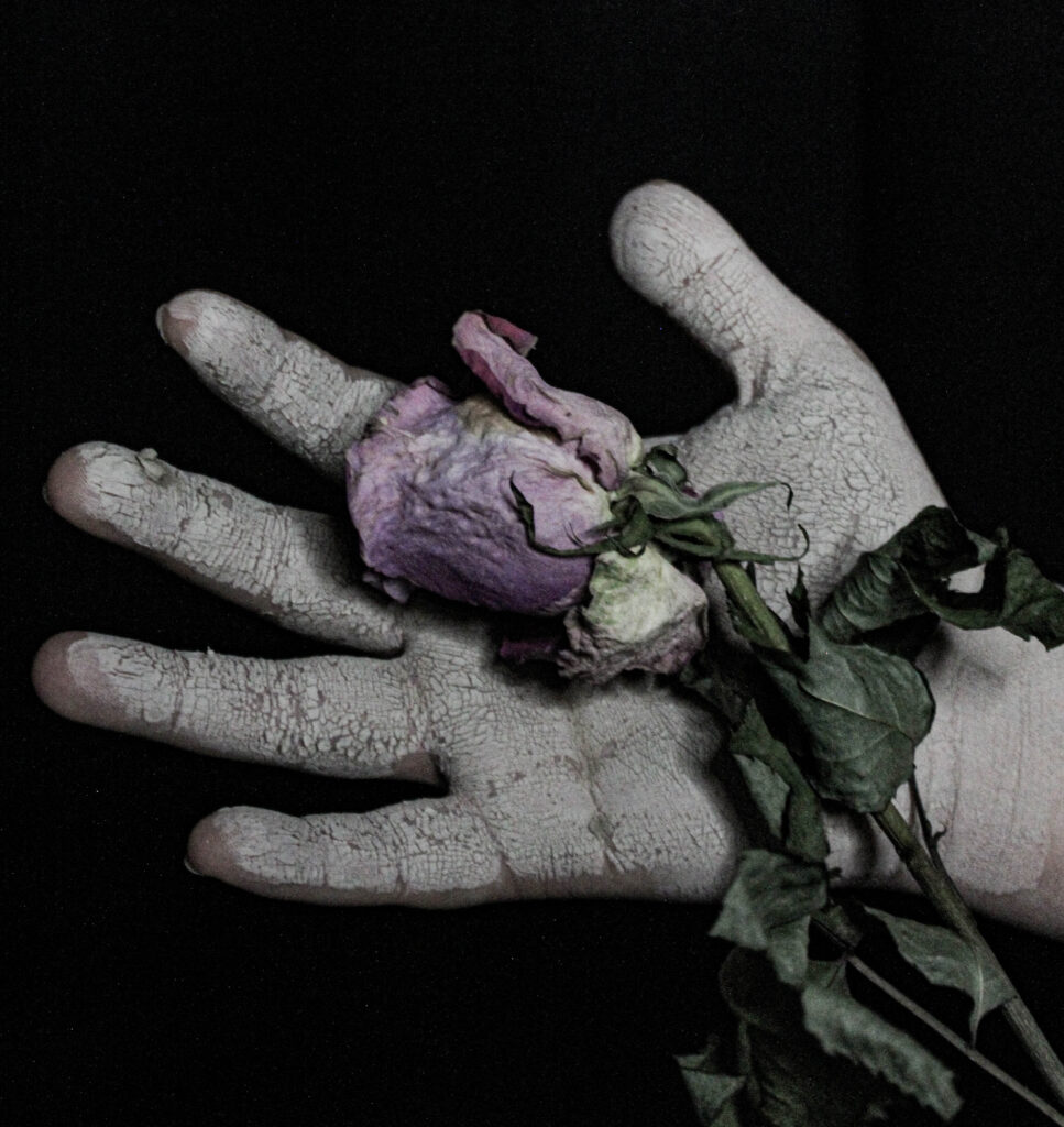
I’m extremely pleased with how this photoshoot came out. From a technical point of view potentially they could have been better by increasing the exposure in order to brighten up the picture. However, by doing that I felt it lost part of the intensity of the photo. The picture of the hand with the aged rose I think is my favorite from this shoot I used the rose to try and symbolise how objectification doesn’t only affect you internally but can start to manifest and affect other aspects of your life in the way you see things or interact with things.
The theme for the final exam in photography is ‘Union’..
What is the simple definition of union?
1. : an act or instance of uniting or joining two or more things into one. especially : the formation of a single political unit from two or more separate and individual units.
I am going to start my project based around feminism and girlhood.
What do the terms mean by feminism and girlhood?
Feminism in Photography focuses on challenging gender stereotypes and how women are portrayed.
It includes:
Reclaiming the female gaze, where women are shown from their own perspective, not just as objects for male viewers/pleasure.
Challenging gender roles and depicting women in complex ways rather than just sexually.
Body politics, exploring themes like body image and how we are depicted compared to men.
Famous feminist photographers’; Cindy Sherman, who focuses on issues like identity and self-representation.
Girlhood refers to the period of a girl’s life, focusing on her experiences, development, and social identity as she grows up. It’s not just about biological growth but also the social expectations, challenges, and roles associated with being a girl in society.
The term often explores themes like:
Social conditioning, where societal norms influence how girls are expected to behave, look, and interact.
Gender identity, examining how girls develop their understanding of themselves and their place in the world.
What’s the history behind this concept?
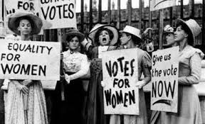
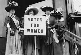
Historically, girlhood was defined by unspoken societal roles, with girls primarily prepared for domestic life as wives and mothers, often with limited education (cooking and cleaning for their husbands and kids, stay at home mums). In the late 19th and early 20th centuries, feminism and the women’s rights movement began challenging these traditional views, advocating for girls’ education and opportunities outside the home, you could even start to think about the suffragists were by they were the ones who fought for women to have the right to vote, pushing back against old-school ideas about what women could and couldn’t do. They made a huge impact, and their efforts set the stage for today’s movements that focus on empowering girls and women, helping them claim their rights, get an education, and have a voice in the world. Here are some images from the suffragists protest.
Feminism is still a big fight in today’s world, with protests and social media being powerful tools for change. A good example of this is the #MeToo movement, where women can share their stories about sexual harassment or assault online. By speaking out, they not only help others who might relate but also inspire more people to come forward and raise awareness about these issues.
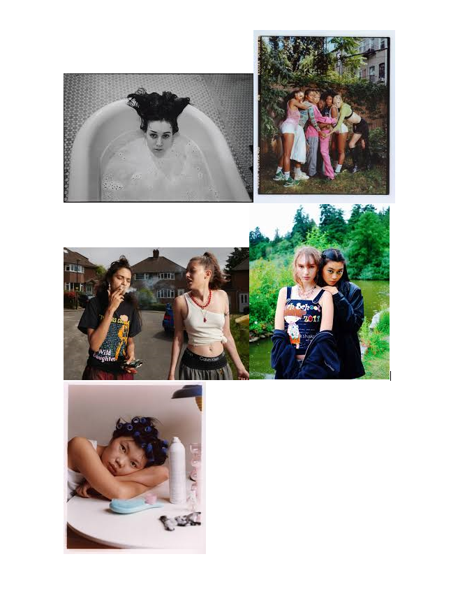
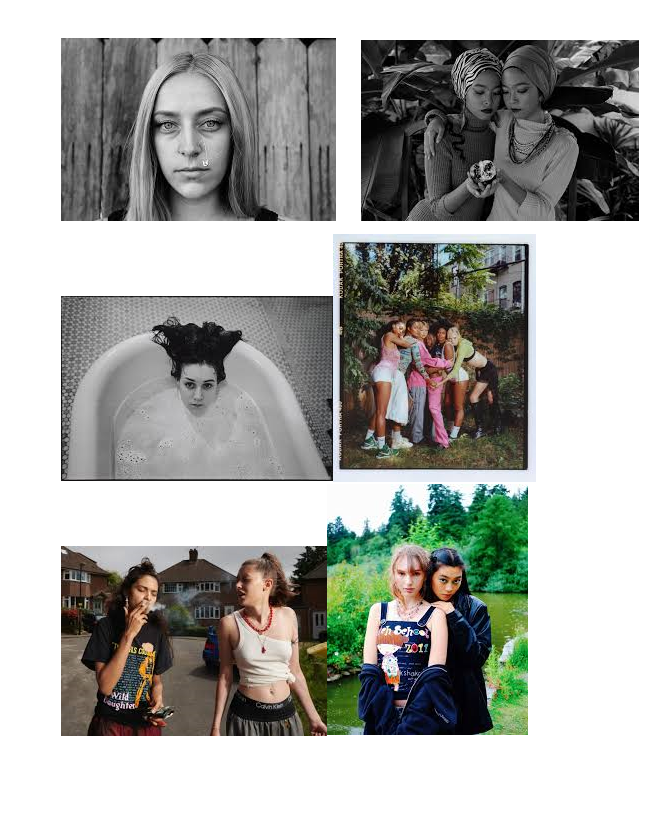
I want to create images like these..
These images all show how girls are portrayed and grown, not just by men but by women too. I want to try and challenge these ideas and try put a stop to this as it shouldn’t be seen as the norm anymore and we should be moving forward as a society. This is why I have chosen to girlhood and fermium for my union project as we can all be seen as a group/union and we all need to stick together as one.
Photoshoots
For my photoshoot plan/idea, I am going to start to have a think about these areas. bathroom/bathtub The bath feels like freedom to me, candles, bubbles and relaxing.
Les Quennevais Park: A simpler, more personal place. I imagine shots of a model sitting on a swing, walking barefoot in the grass. These moments feel real—like when we’re alone with our thoughts, reflecting on who we are.
Woods:
This gives the feel of girlhood back in the day, with there camping and swimming in lakes. I want to capture every element I can for my project
The Look & Models: I want the models to feel like themselves—natural and effortless, something that doesn’t feel too forced. I’d love to include different women of various ages, body types, and backgrounds because femininity looks different on everyone, and that’s the beauty of it.
Vibe & Feel: I want the photos to feel like a conversation—gentle but empowering, vulnerable but strong. I’d play with natural light, capturing both quiet, intimate moments and bold, freeing shots. It’s about showing the different sides of being a girl and a woman.
In the end, this project is about connection. Between women, between ourselves, and between our past and present. The locations, the models, the light—all of it should tell a story of unity, growth, and strength.
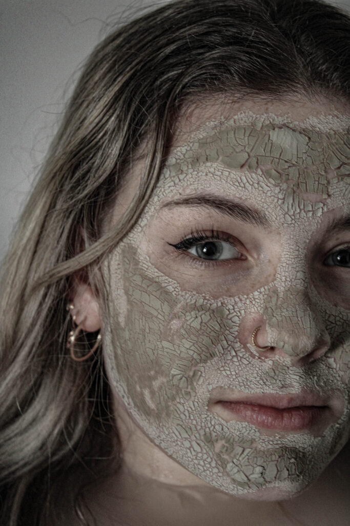
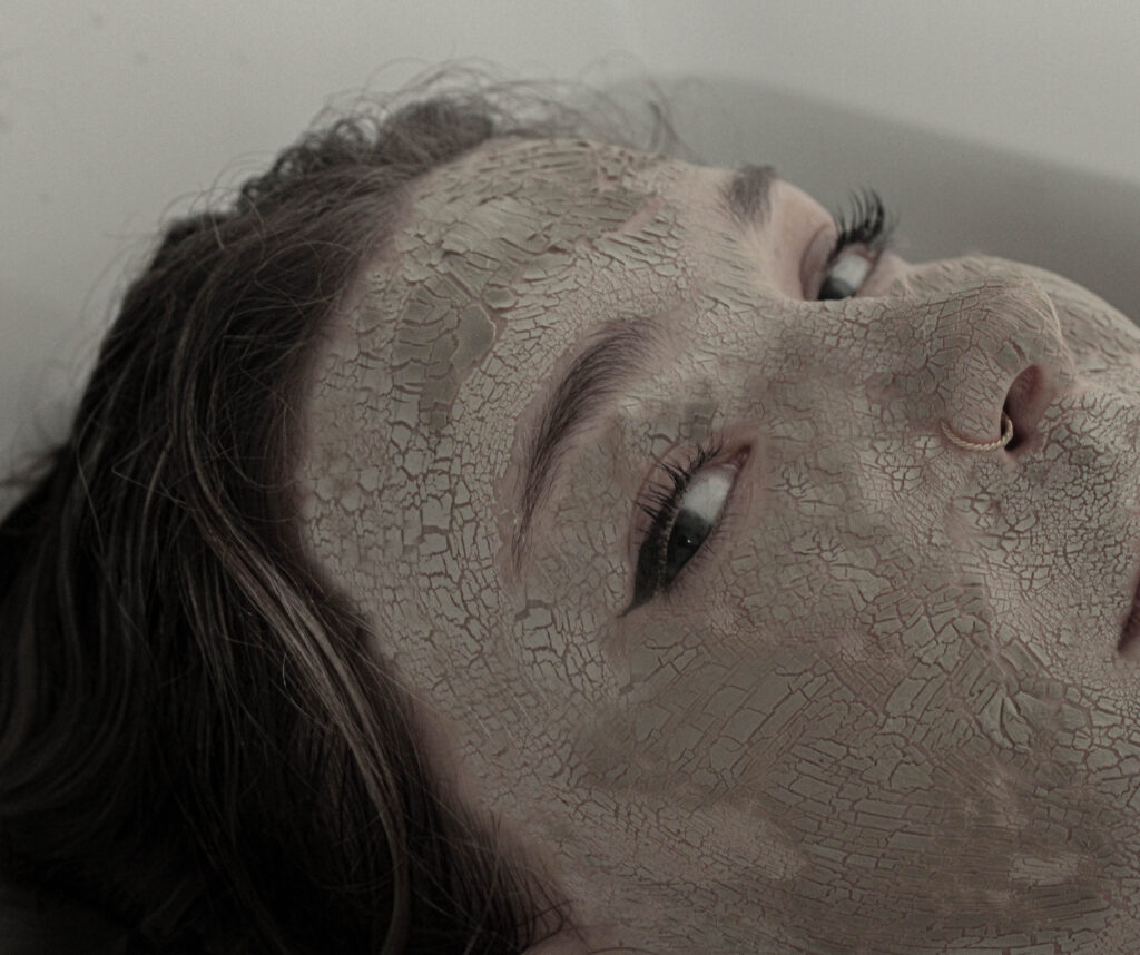
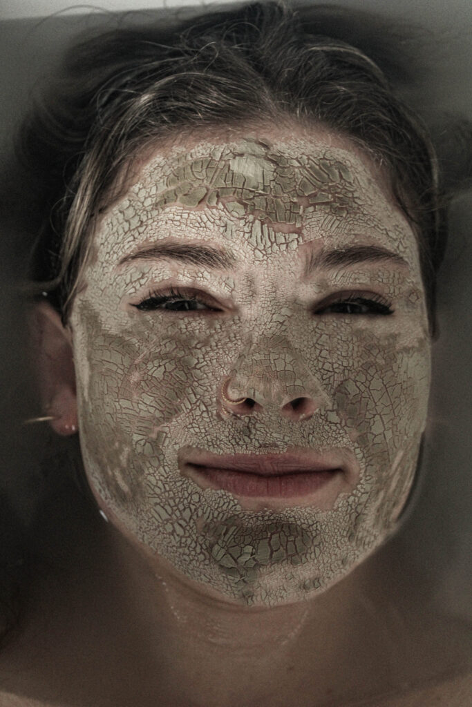
For this photoshoot, I took inspiration from milk baths. I wanted to do this because they often represent purity and tranquillity. I try to create a similar effect in all my photoshoots by having this contrasting meaning of the broken and dispirited. I will use makeup to give texture to the model’s face, and then either the clothes I put the model in or, in this case, the background suggests concepts such as purity. I like adding these calming and dreamy aspects the pictures to emphasise the damage being done.
Contact Sheet
Editing
For these images when editing the one thing I do like to pay attention to and focus on would be the texture. For the concept of the story I’m trying to tell the cracking of the model’s face is a key component. Therefore, I like to make sure it’s as effective as possible. To emphaise this the key things I like to do is increase the contrast, shadows, highlights, and texture. I’ve found that increasing the shadows and highlights significantly amplifies both depth and details which is what I want.
Final Images
Evaluation
Overall, I’m not too happy with how the photo shoot came out I think I would have worked better using a bigger bathtub to have more space but I had to work with what I had access to. However, I do like the photo from the side angle where it focuses closer up to the model’s face I think it’s a little bit different compared to my other photos where they were all full face shots. I think what I could have done during the photo shoot to improve would have been to give my model more direction in terms of facial expressions and posing as I do like the photo where the model appears to be slowly submerging into the water facing straight towards to camera however I believe it would have worked much better if she had more of a deadpan facial expression.