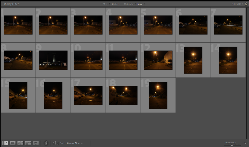
Category Archives: Uncategorised

Filters

Author:
Category:

Rise to Recovery

Photoshoot 1

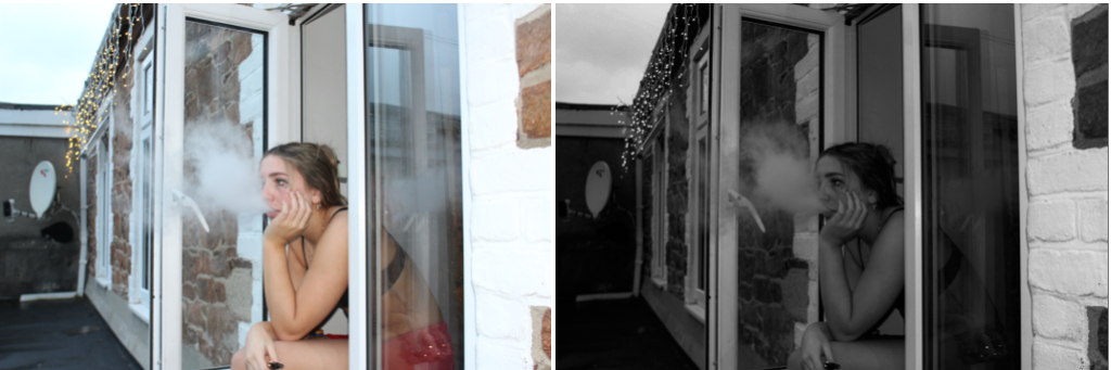
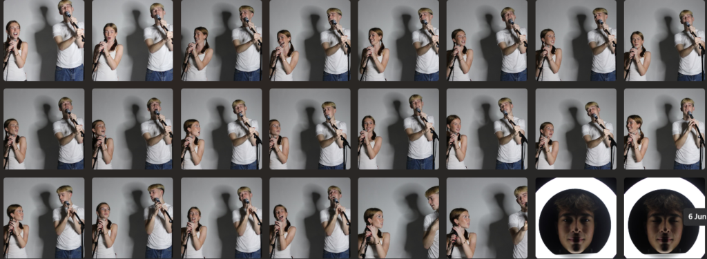
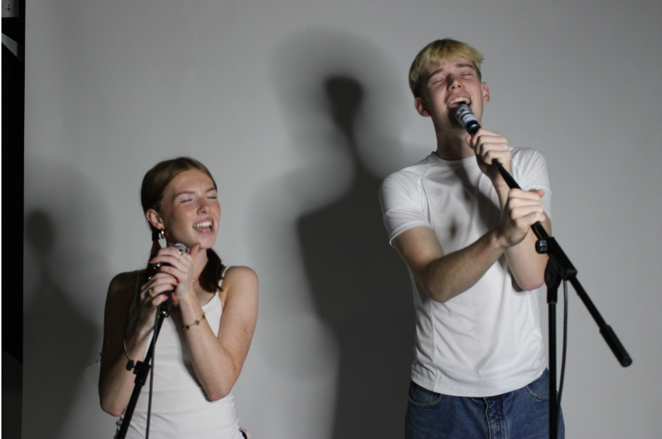
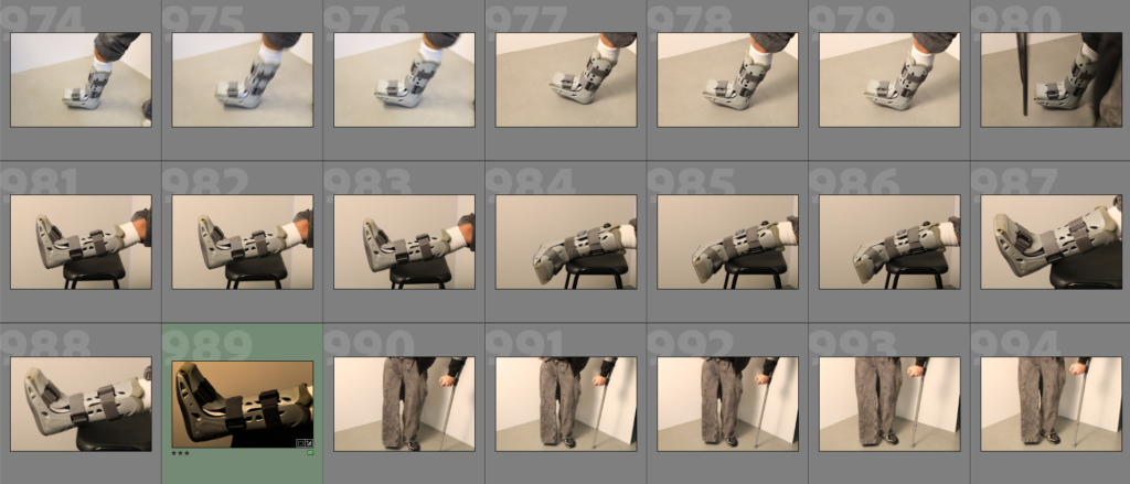
For my first photoshoot, I went into the studio and took multiple photos of my friend who has tore her posterior talofibular and anterior talofibular ligaments so she is in a boot. But that helps out my theme as my theme is all about injured players who used to play everyday but now have to go back to normal day to day life in their cast/crutches.

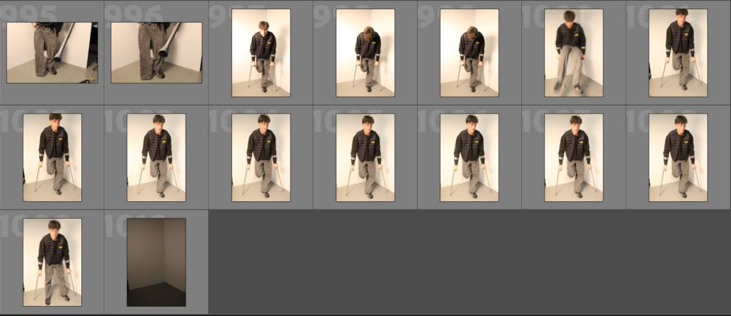
I also used my other friend who deeply loves basketball, and let him use a pair of crutches and he had his leg behind him like he almost, ‘doesn’t have a leg, or its broken and he’s just holding it behind’. I also took a lot of photos of my friend just talking to someone else whilst on the crutches because I wanted him in the moment just looking like he doesn’t know.

Photoshoot 2

Hoops ‘n’ Dreams

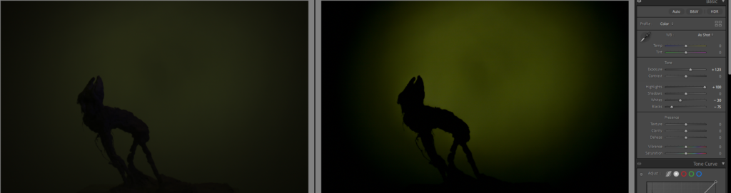
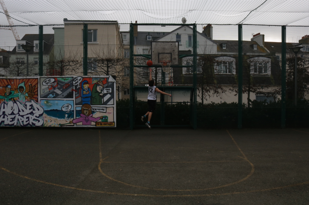
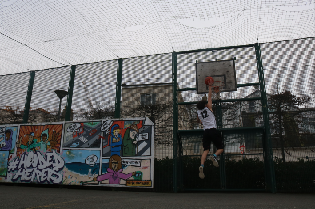
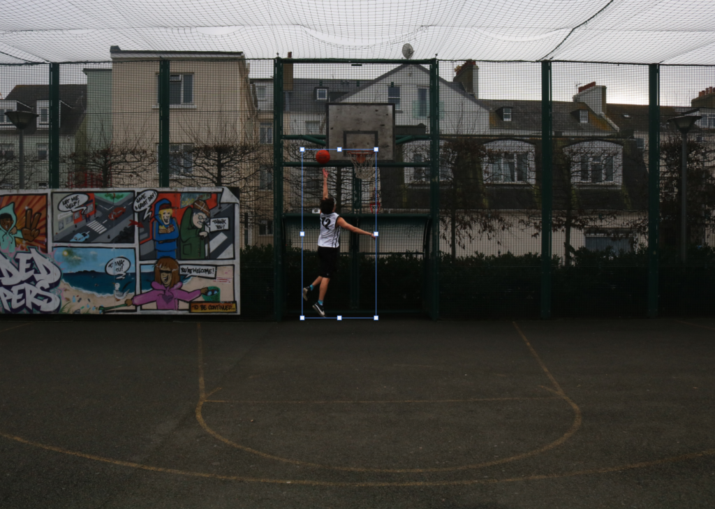
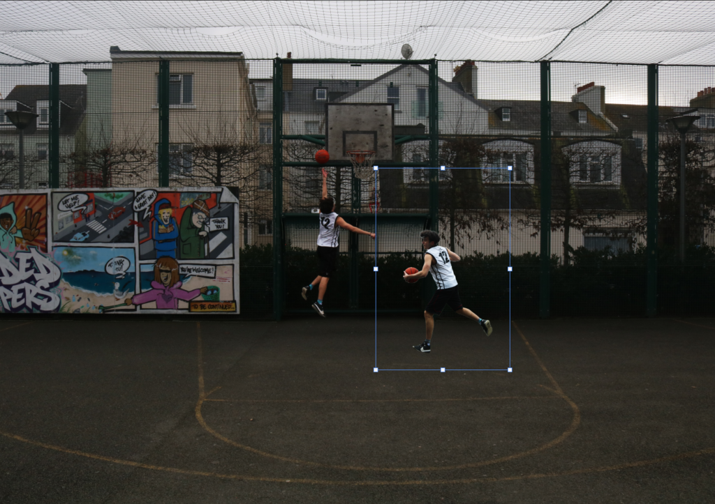
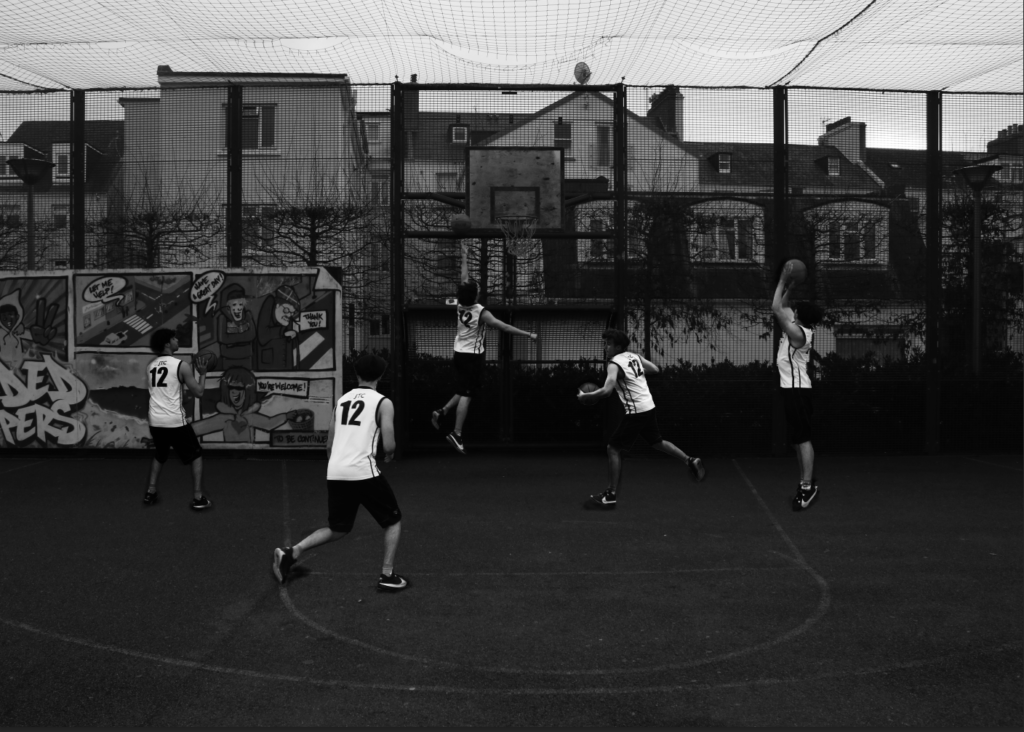
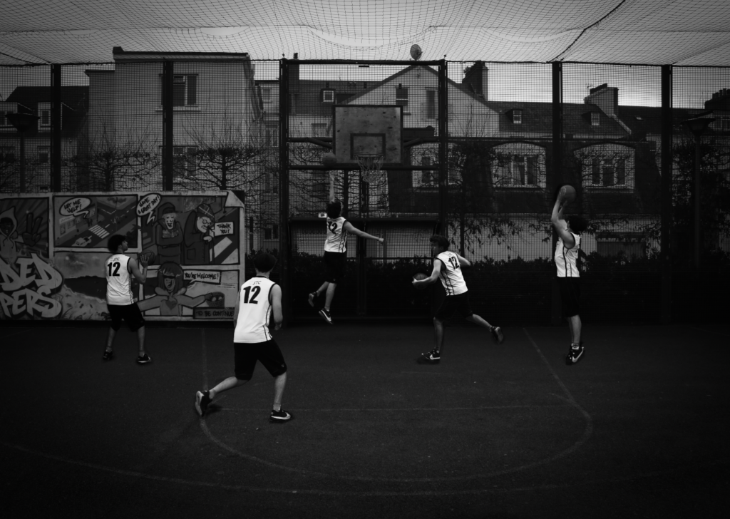
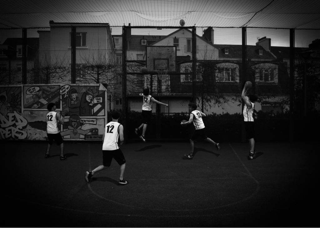
For my second photoshoot which is my main photo ideas, I chose the idea with one of my teammates who struggles a lot with injuries. I have an idea of him and how is daily struggles that lead to loneliness and sadness having worked and trained all his life to play basketball, but due to having constant injuries involving breaking his ankle 3 times, and currently he has a broken wrist from basketball. He can only watch our games, support the team and can’t train anything like he used to at his full potential and intensity.

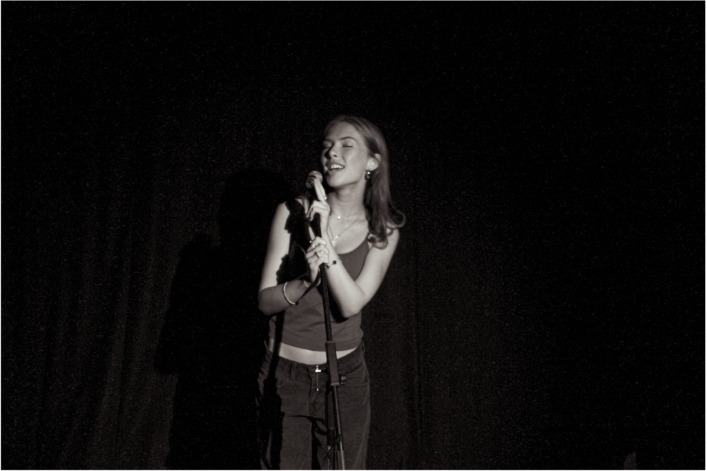
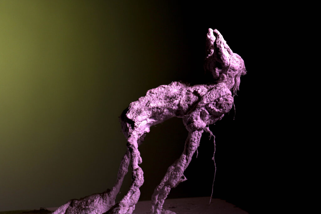
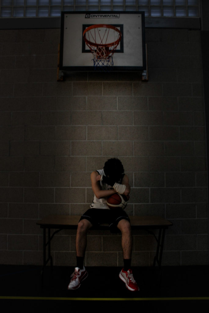
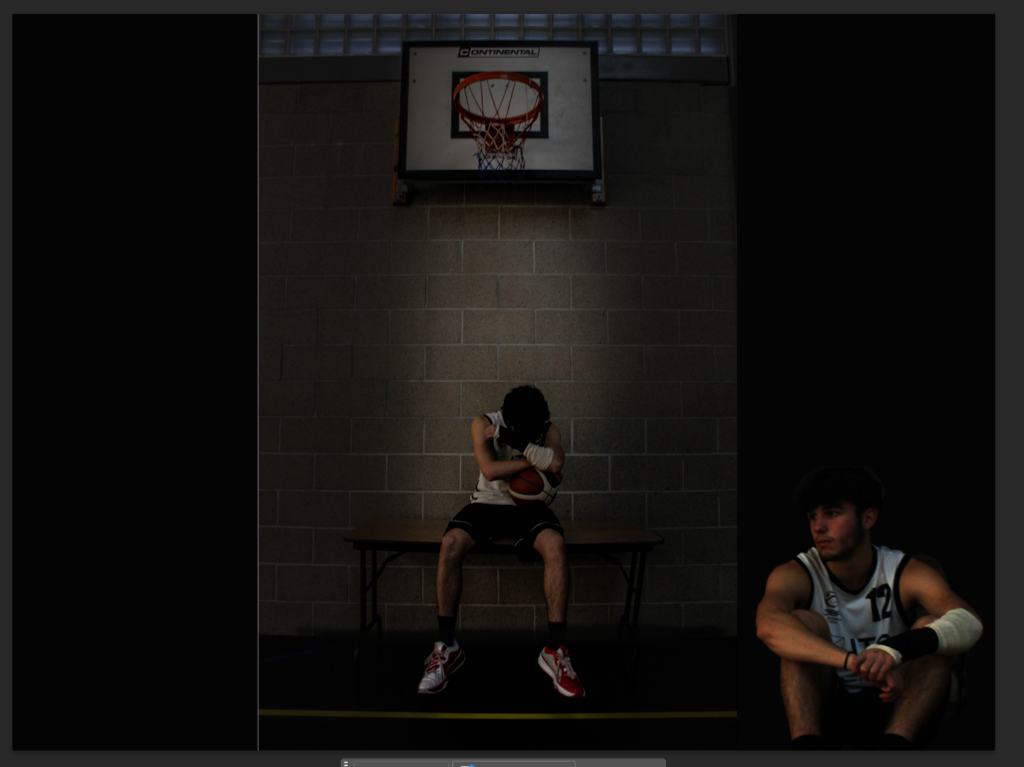
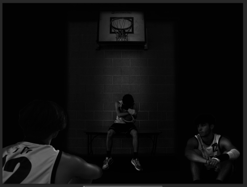
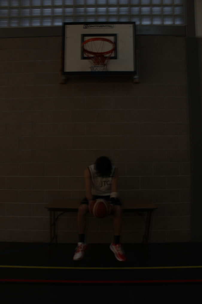
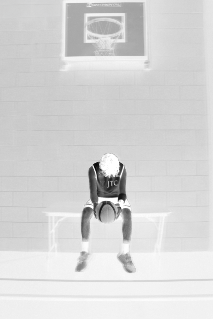
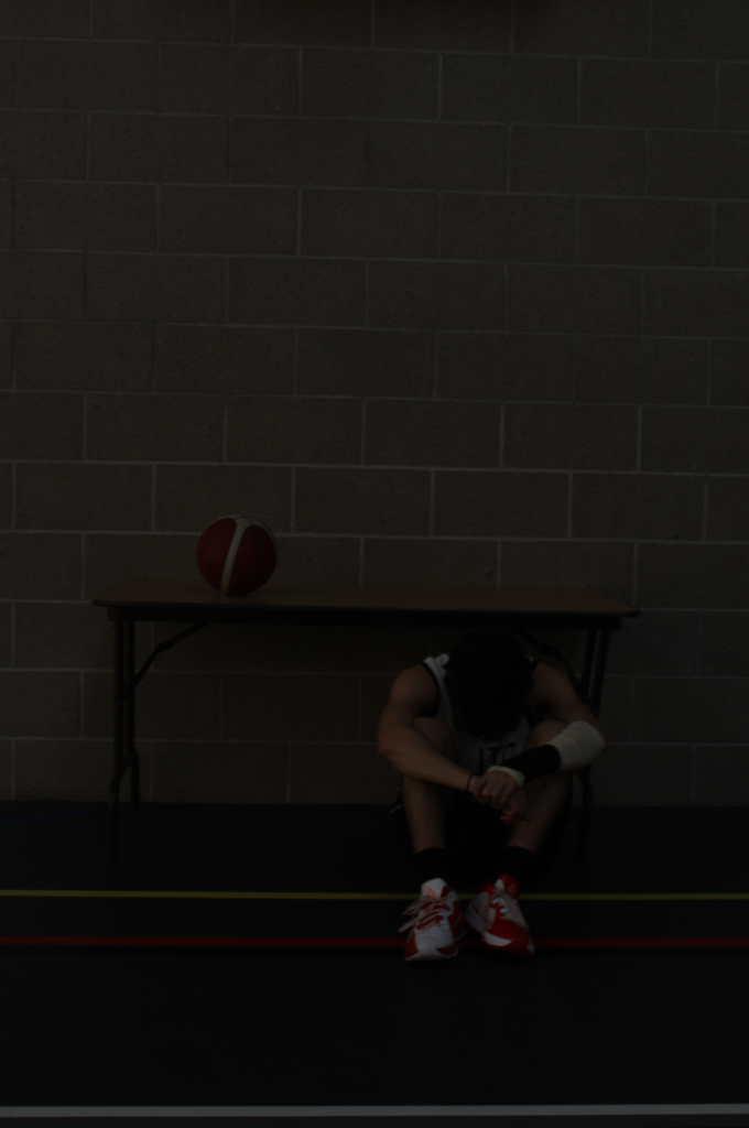
Many of these photos, I had an idea of how a few people are playing basketball, whilst he is just watching from the side of the court, looking sad and an idea of ‘what if’ (I didn’t get injured), or (where would I be at today without injuries). I really love this photo of him just holding a basketball with a cast on his wrist sat on a table below a basketball hoop with no emotion in his face/looking down at himself.

Additionally, a large factor involved in his backstory is that despite him owning many basketball shoes, Jerseys, shorts and skills, he is unable to use them anymore at this current moment because of his injury. As a result of this, he continues to wonder, ‘why did I train so hard to just constantly get injured.’

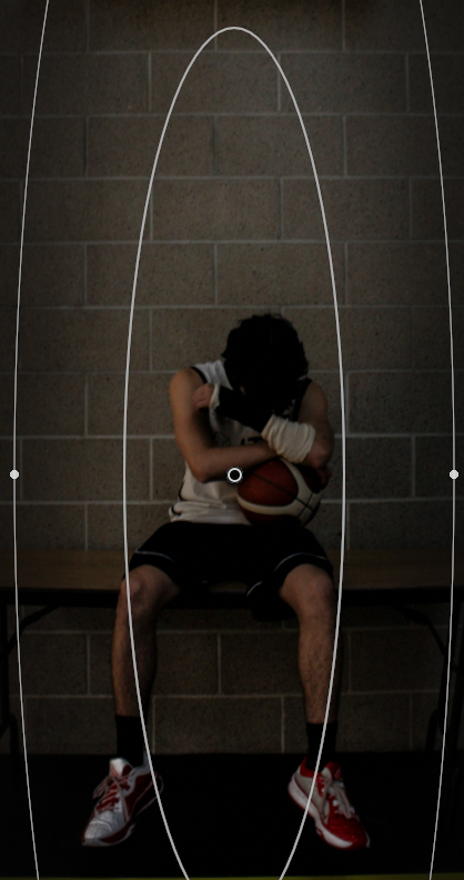
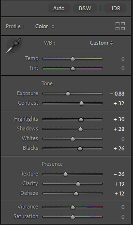
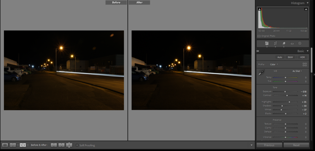
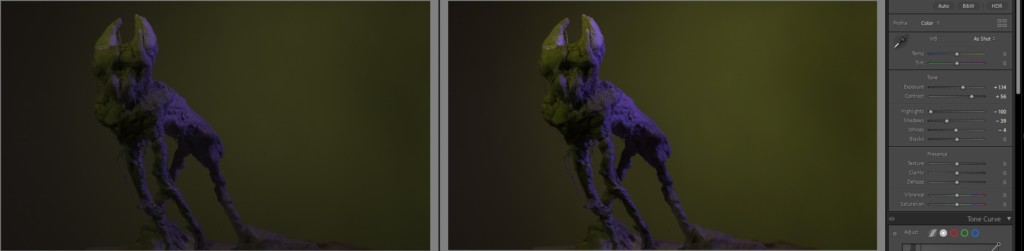
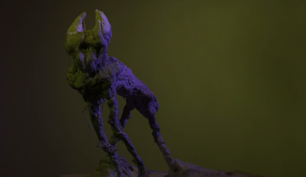
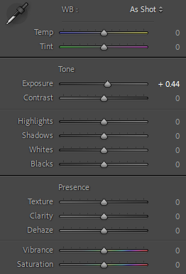
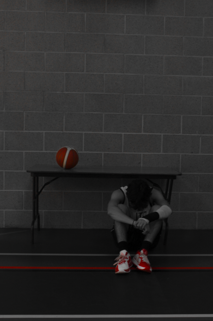
For my edits, I only changed the Clarity which makes the photo look more textured instead of smooth, because I felt like, the use of the concrete walls, old-styled table and basketball hoop matches his leg hair/muscle outlines and bone outlines to also not just show loneliness but to show the masculinity as well. I also added a radial gradient to help make a fake ‘spotlight’ over my subject to show light shining down on him making him the main focus point in the photo, to allow the viewer to see his emotion and expression.

I also have the idea of a team all doing a group huddle with their hands all together celebrating as a team, or getting ready to go into the game/half time. With Bruce (my subject) on the bench not with the team feeling sad and lonely again wishing he was part of the team and could play. I can achieve this by going to Langford or Beulieu courts which have basketball games every week and set it up with the players and my subject.

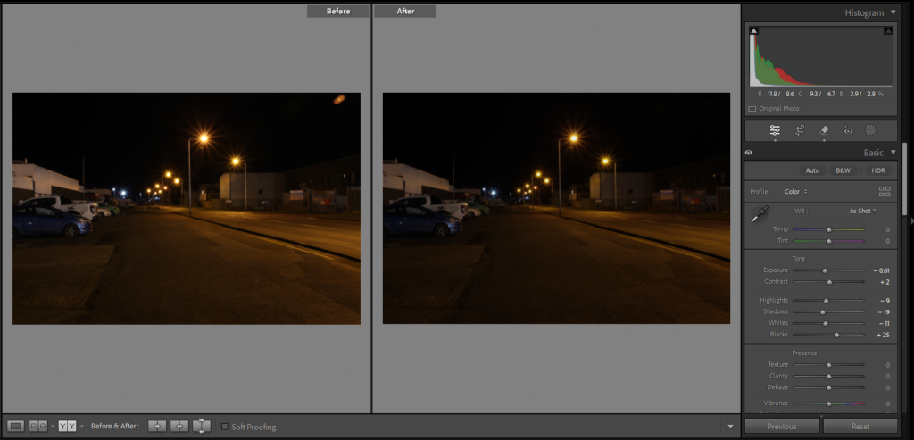
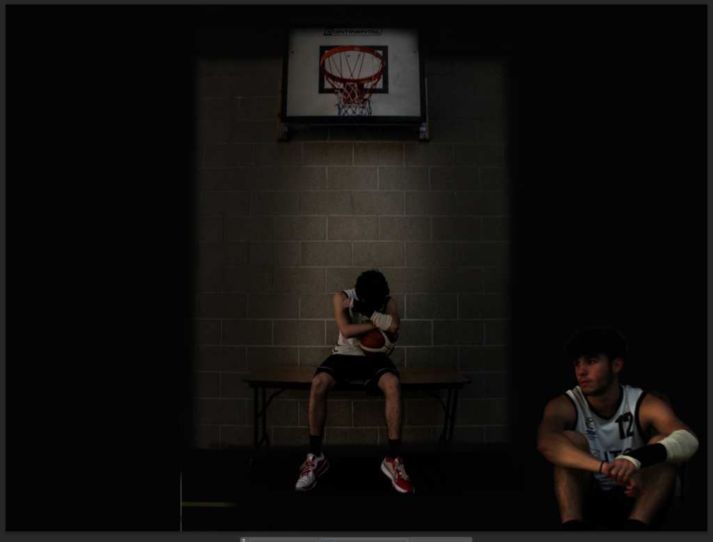
Another photo I took was this photo with the placement I got my subject to be sat in looking sad, holding his wrist, whilst the other people are playing together shooting around.

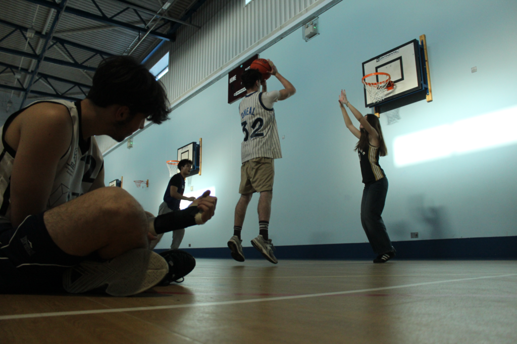
I then decided to make the left side of the photo in black and white with his arm in black and white as well to show difference as well.

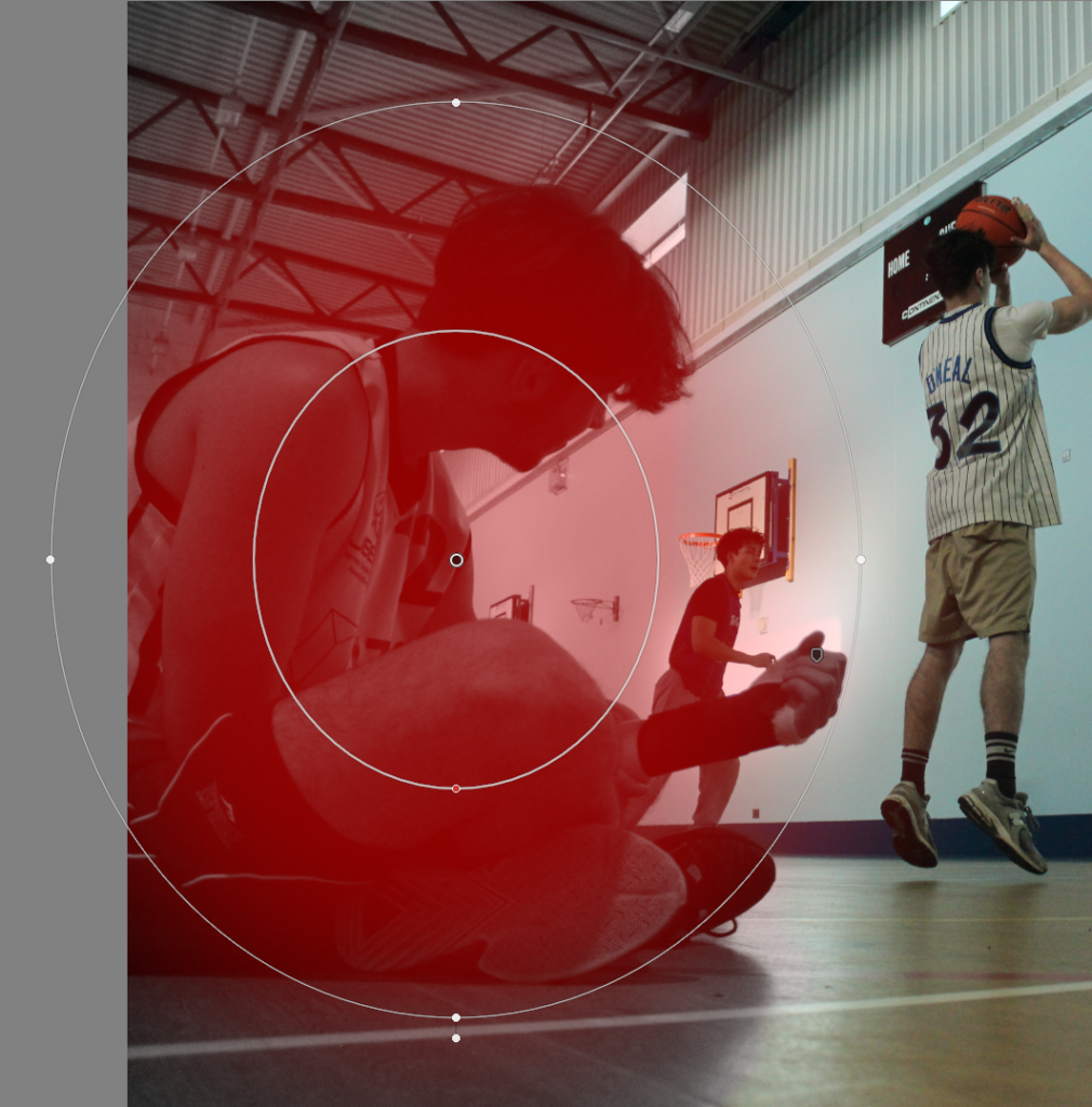
I did minimal edits to the exposure and then added a radial gradient over my subject and used the brush tool to make the background black and white as well.

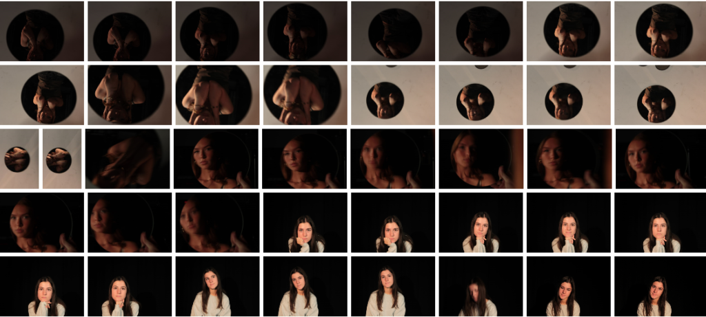
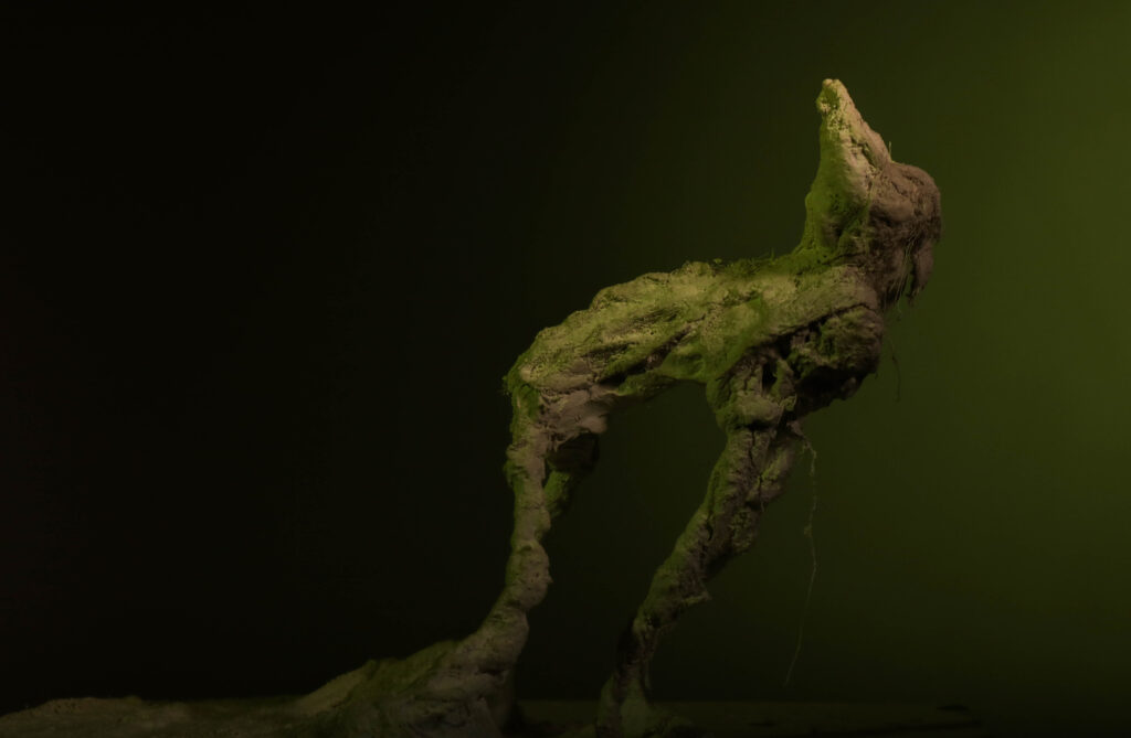
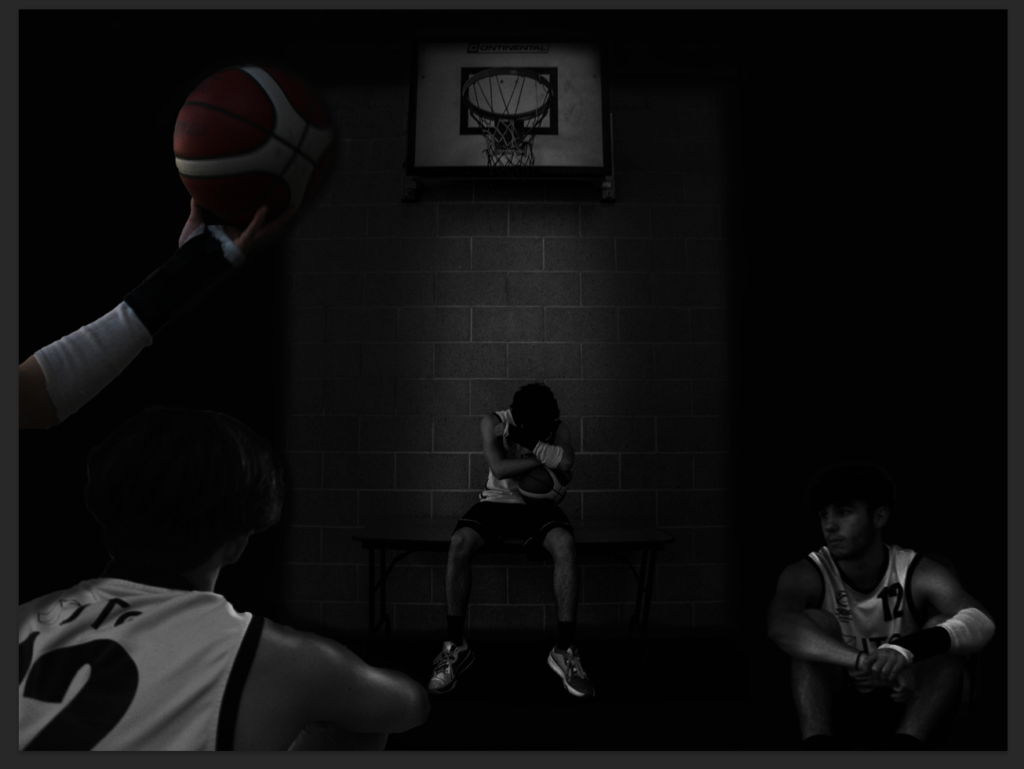
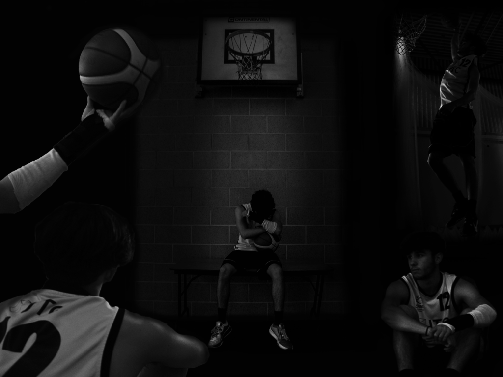
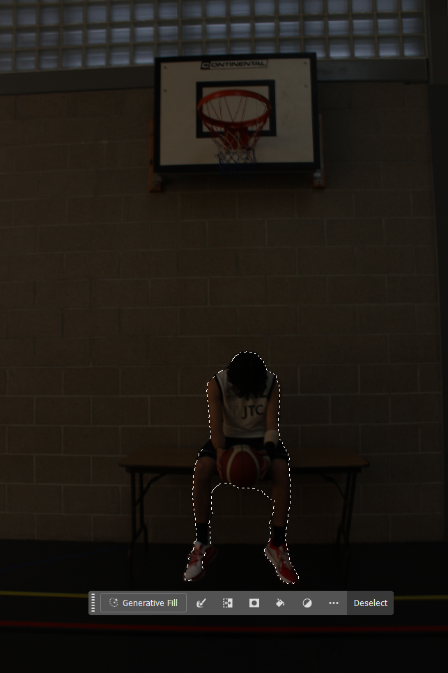
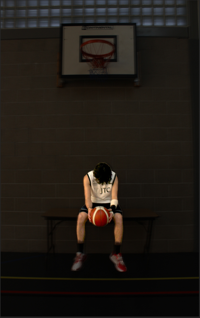
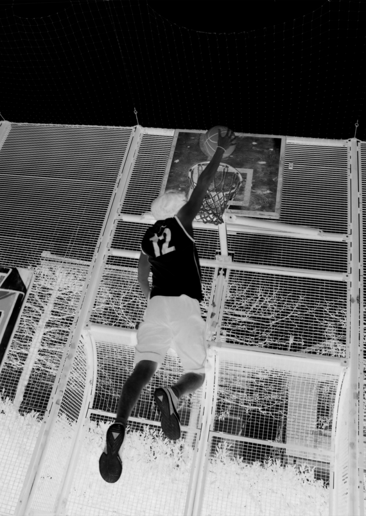
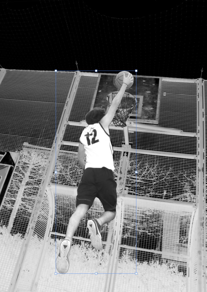
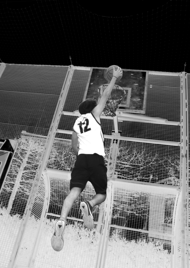
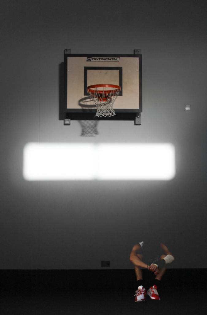
I have started a multi-exposure photo edit using photoshop, with a lot of different photos of Bruce all in different angles or places with the main photo of him sitting on the table looking down under the hoop.

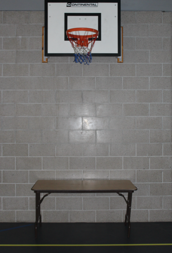
I Started with this photo of my subject in the middle of the page. I chose this one because there is a hoop above him and with the light shining on him it helps show he is the main subject and could be used as the front cover for my story book. I then decided to crop off the two sides of the walls and replace it with a black background.

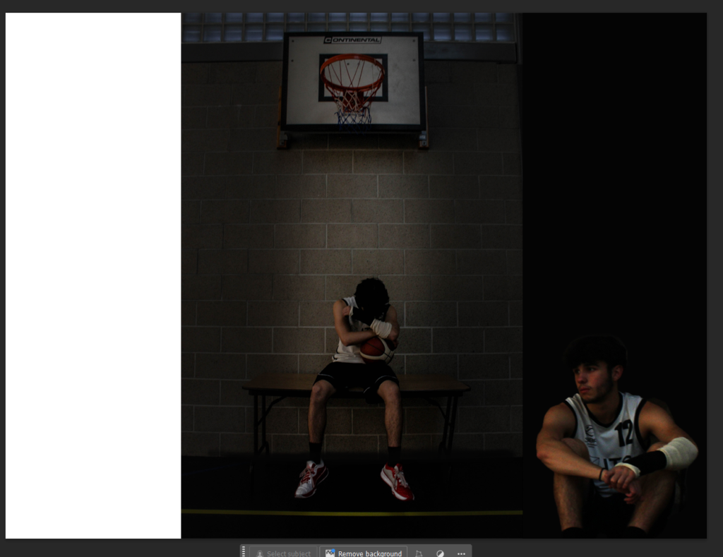
Then did it on both sides and imported another photo of Bruce sat down and removed the background off of him. Then created a light shadow/black outline around him to make him suit and blend in with the black background.

I then used the brush tool on photoshop and drew on the sharp edges from the black backgrounds to the main photo, the line in-between I didn’t want it to look sharp and also drew over the yellow line at the bottom and the top blue squares which I didn’t want in my photo.

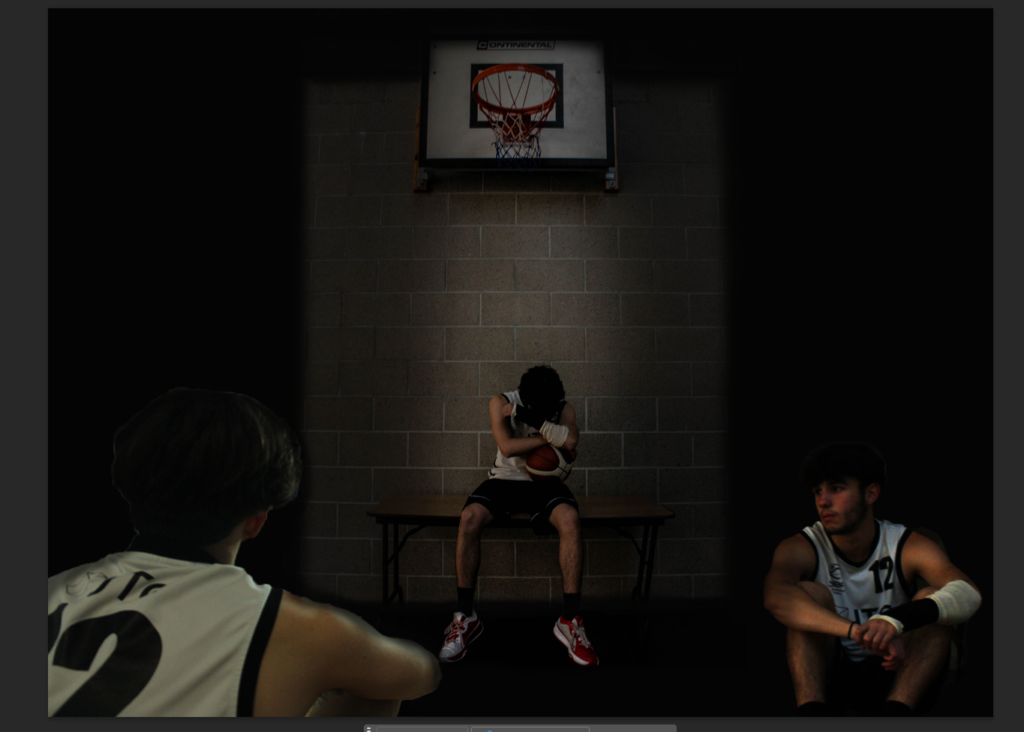
Then I imported another photo of my subject but this photo was him with his body and face turned away from the camera so you can see his Jersey and number, and his arm resting on his knee. I also put him bigger than the other photos because I feel like for the best multi-exposure photo edit, all of the individual photos need to be different sizes and in different directions/places.

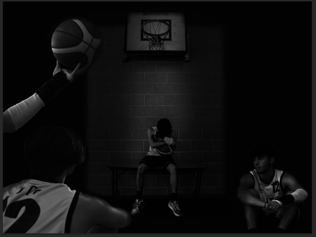
I then made the photo black and white because I want to show the theme of sadness/loneliness and the black and white overlay, really persuades the end photos and the sadness behind injuries in sport.

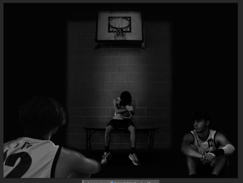
I then changed the lighting, brightness, exposure and contrast on each photo of Bruce. I chose to increase the brightness but also increase the contrast. So, his jersey stands out more, his wrist cast also stands out more, and overall it makes the whole photo darker but the subject stand out more and is better for a main cover as I want the viewers to focus on him.

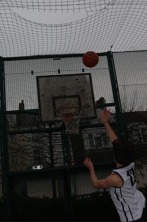
Next, I imported this photo of his arm when he took a layup shot. I like this photo because it’s not his body or face and so there is no emotion through it, but, with his arm and wrist all covered up and in a cast, it shows the pain and struggles he has to deal with just to play again.

I then made it black and white to match the other photos and again increased the brightness which increased his arm sleeve brightness and the lighter parts on the ball. But, also increased the contrast so the whole arm/fingers/ball stands out compared to the dark/black background.

I next needed one last photo to take up the top middle/right space of my multi-exposure photo cover. But, I chose this photo of Bruce my subject going for a dunk before he had the injury with no cast on. But, I am not too sure how I want to implement the photo background involving the actual hoop he was dunking on and so I tried using the rubber tool and rubbed out an area of the black for the background to be seen but I will redo it and either involve a shape as the background or use the rubber tool again but make it look less random.

I also increased the brightness and contrast for this photo as you can see his jersey has very bright parts on and his knees/legs are very reflective and have bright areas too.

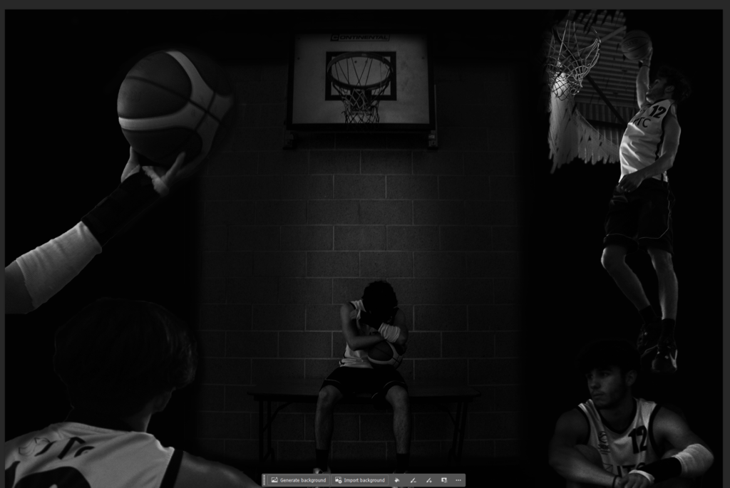
What I will do next, is fix the background of the top right photo of my subject, either using shapes or I will use the rubber and properly draw out a background. I could also try merge the brick background from the middle into the black sides as they look good together but they are still very opposite and don’t quite blend well yet.

I fixed the top right photo keeping the background around him dunking in the full photo because I like how it looks, cutting out the outsides of it though and the bottom of it just above my bottom picture of Bruce.

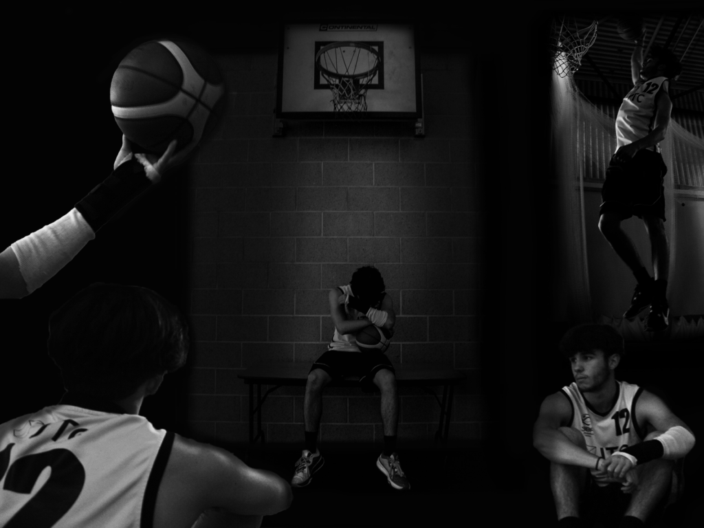
I also increased the brightness of each image as I felt like they were all too dark and now you can see them all clearer, especially the top right photograph, and you can see more emotion in Bruce’s face in the bottom right photograph.

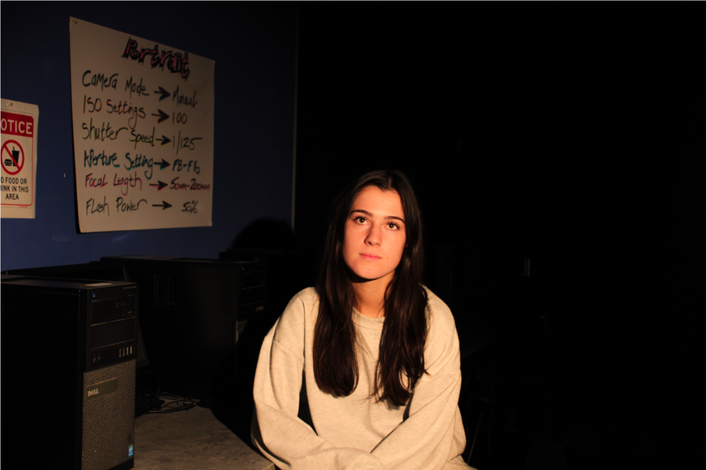
‘In the Shadow of the Hoop’

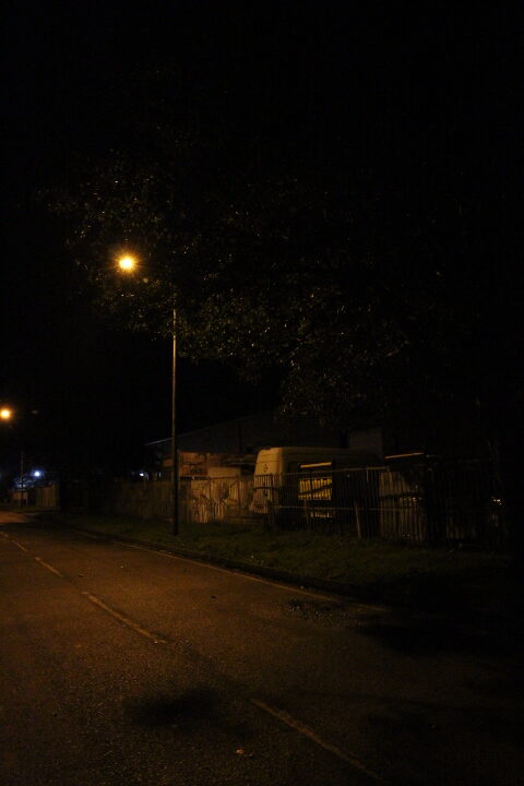
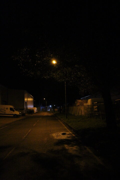
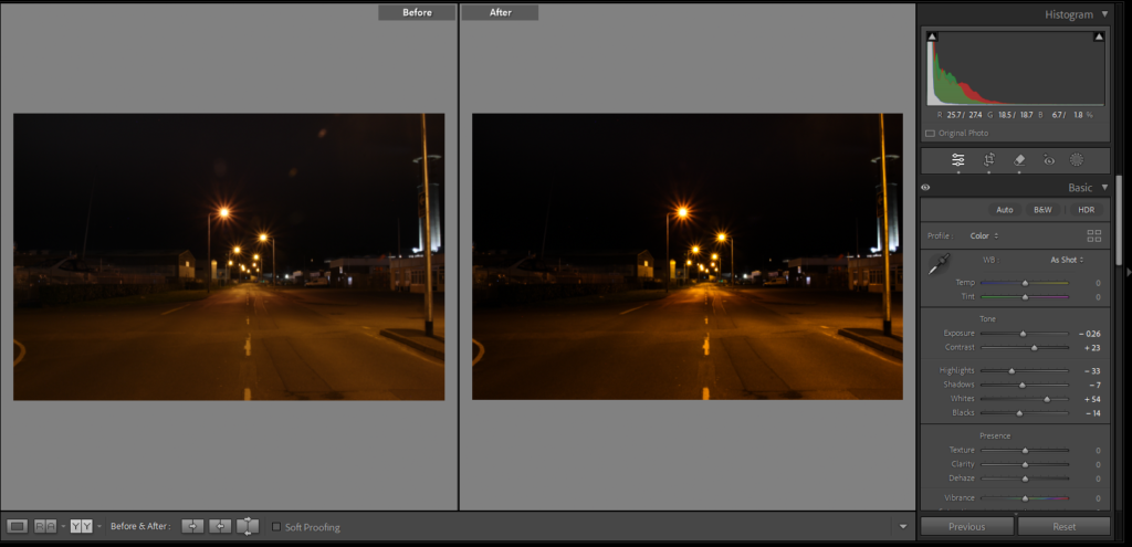
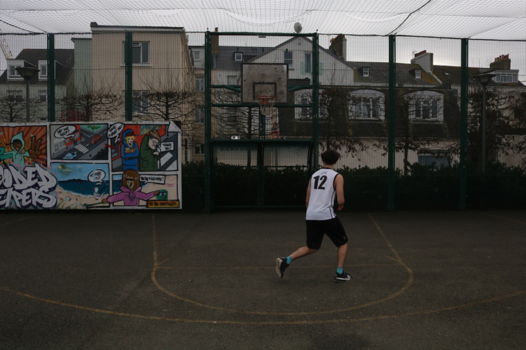
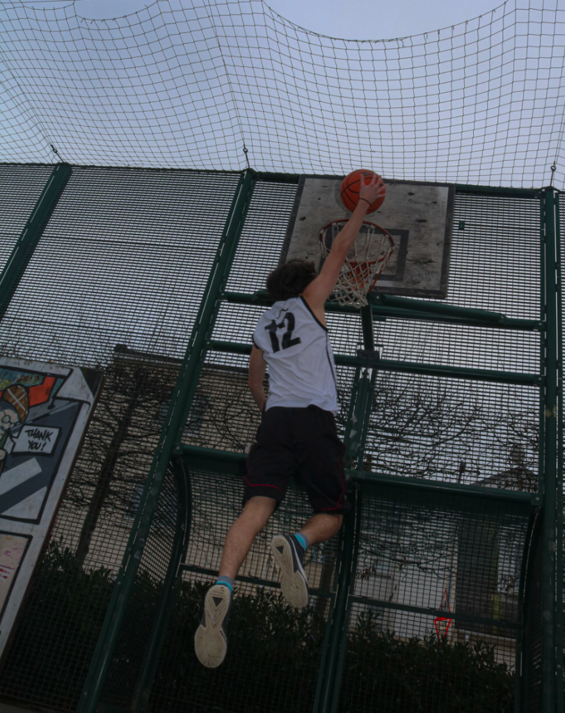
I have done another small photoshoot at Millennium Park with my Subject Bruce. I chose Millennium Park because this is where he started playing basketball on an outside court with restrictions such as a net above the court which doesn’t allow high shots. Bad grip on the floor which is tarmac which has also caused past injuries to him.

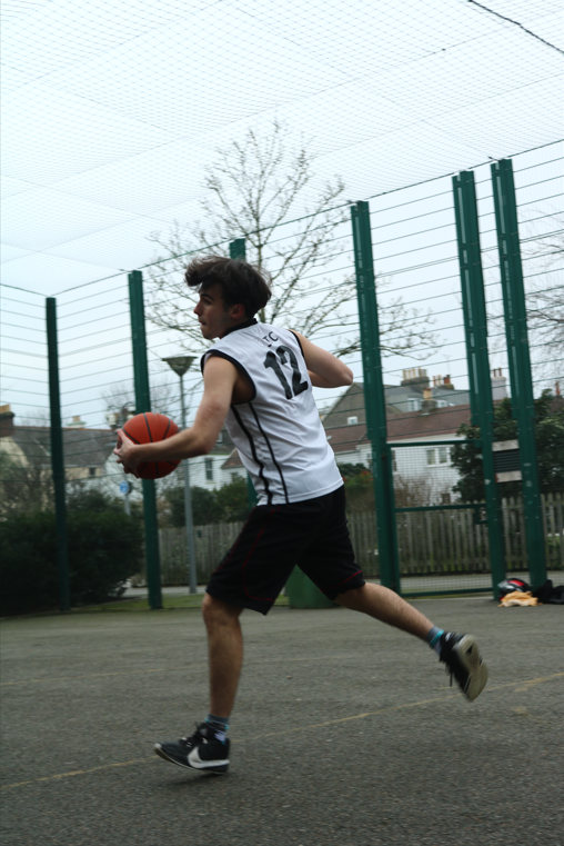
For the beginning of my photoshoot I used Sports Mode on the camera with these settings.

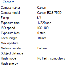
It made my photos have Low ISO and low F-stop with a very fast Exposure time. The reason for these settings are set to that are because my subject is moving whilst shooting the basketball and so I have to capture him in frame and the ball moving in the air.

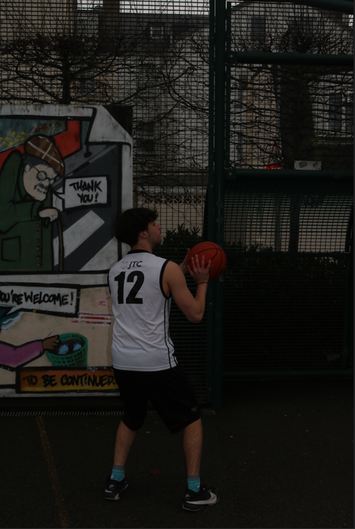
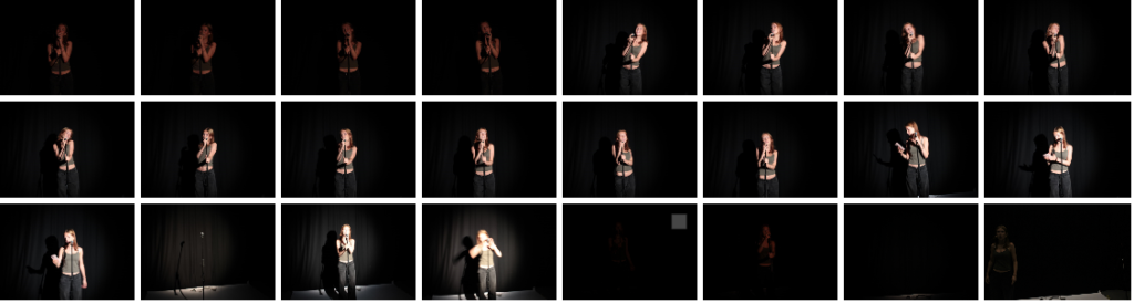
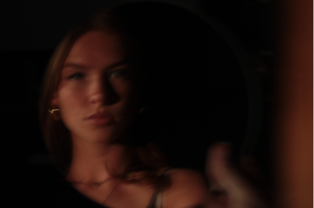
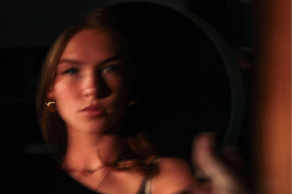
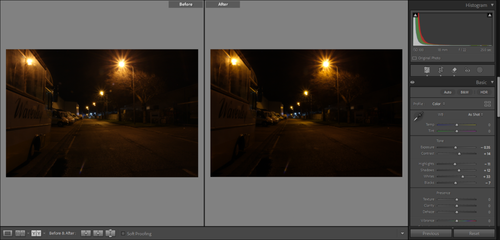
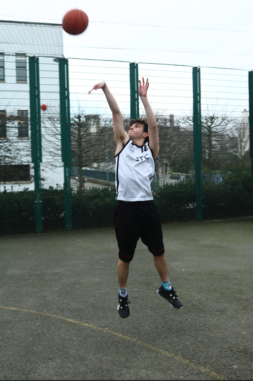
For these photos I used portrait mode with these settings.

Twelve Back

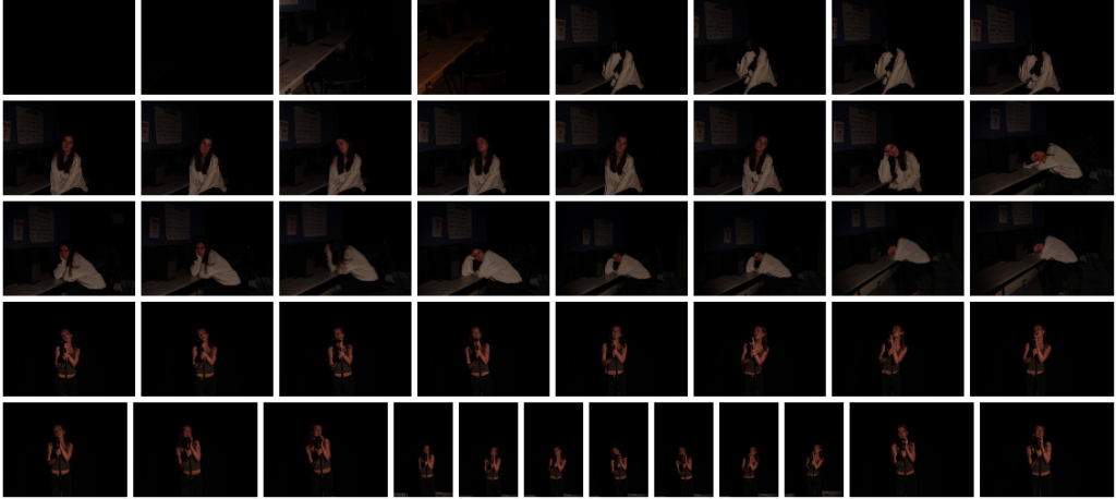
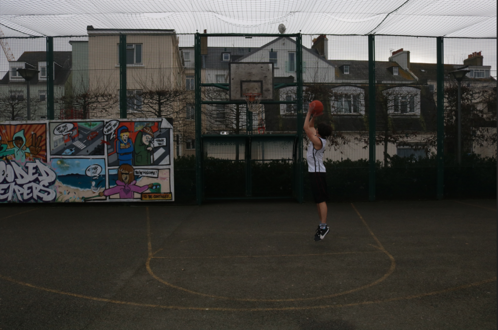
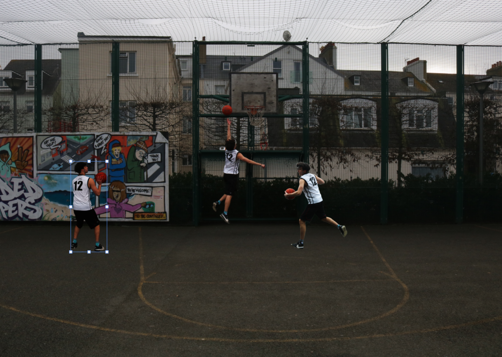
I am starting a multi image photograph with a lot of different photos of Bruce (my subject), playing around the court taking different shots or doing different moves.

I started by cropping the left side of the image to make it more central and added brightness and contrast onto Bruce making his jersey and the ball and even his arms and legs stand out more.

I then added another photo of Bruce doing a spin move with the ball, I removed the background around him so its just his figure and I also increased the brightness and contrast on him too, to stand out more for the overall image.

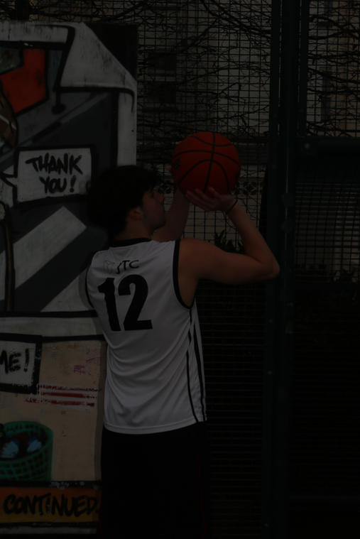
I then added another photo of my subject, but what I really like is how his jersey is white so it stand out a lot when I increase the brightness and contrast of him and also how the number 12 from his jersey is showcased all around in the photo and that is what the overall photograph will be called.

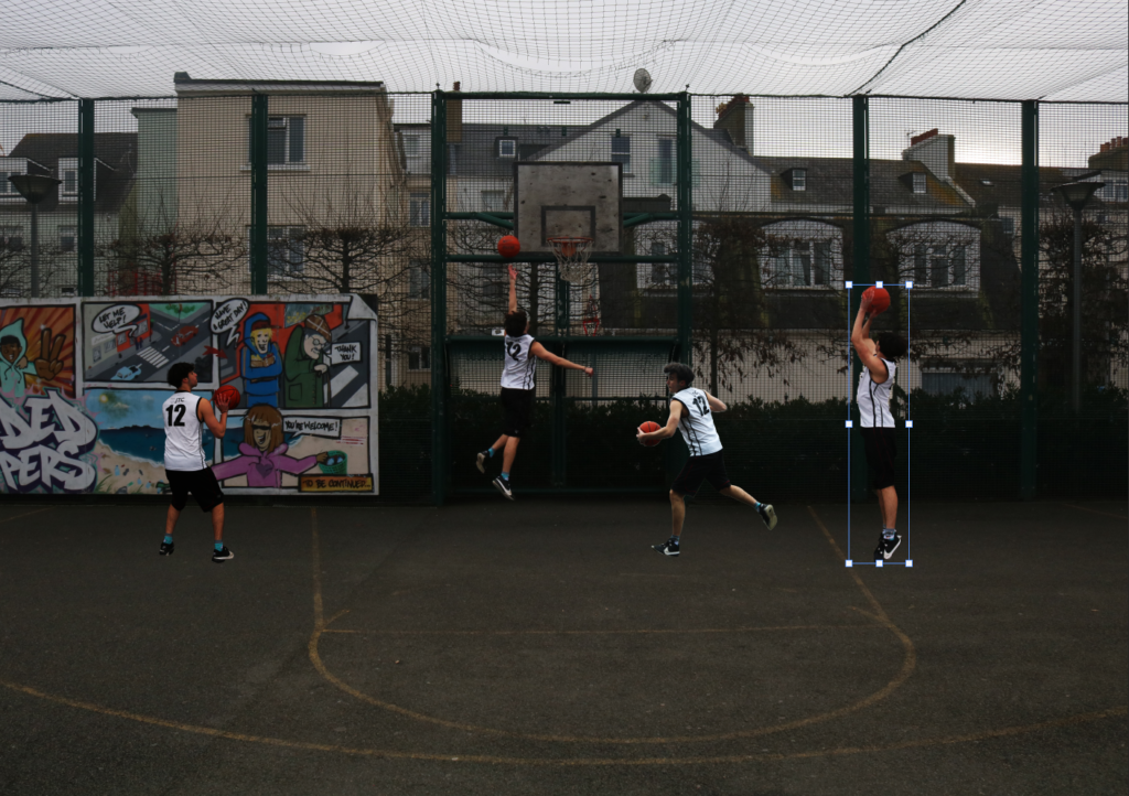
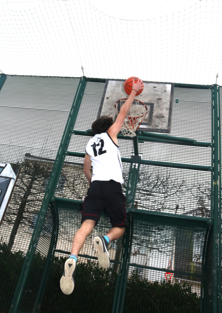
Next I added this photo of Bruce taking a jump-shot with him in the air, I raised him up because he was in the air whilst shooting and I will need to add a shadow below him to make him seem more ‘in the air’. I also added more brightness and contrast onto him to match the other images.

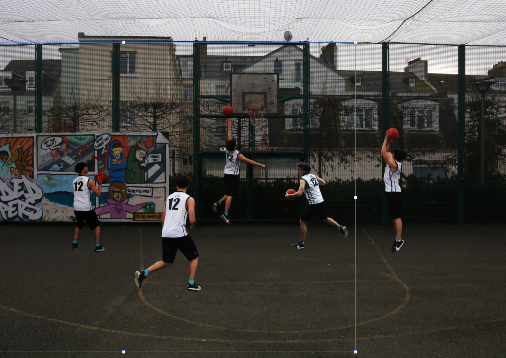
I finally added this last photo of Bruce next to the free throw line with his number 12 fully showing to the camera, with increasing the contrast and brightness as well so he stands out the most.

I then decided to make the whole image in black and white which helped with the different brightness from each photograph of Bruce and I when I add shadows to each photo of Bruce it will look better.

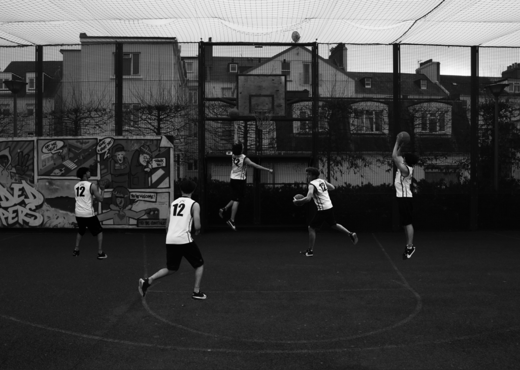
This is the end photo I created on Photoshop with the shadows involved as well but I wanted to add a Vignette around the whole photo which I did in Lightroom creating this.

In this photograph you can see my idea with the shadows under Bruce/my subject. But, the drawing shadows I made, I don’t like so I will try Photoshop Generative Fill to create shadows.

This is my overall final photo of Bruce my subject playing basketball around Millennium Park Court and I am calling it Twelve, Back.

Another Photo edit I have created was an inverted photo of my subject, starting with this photo.

I liked this photo because it is a little blurry with the hoop, my subject and the ball all fuzzy and out of focus. But, what I did is I used another photo where my subject is sat in the same position doing the same pose, but in focus, then selected his outline, copied it, pasted it over the fuzzy out of focus photo over the top.

It looked better because my subject was in focus but the background and environment was all blurry and fuzzy, creating a main focus.

I then cropped the image to be more central and in the rule of thirds with the hoop and my subject on the lines. But, I also increased the brightness, contrast and exposure so he is more lighter and brighter than the background so he is the main focal point for the viewers.

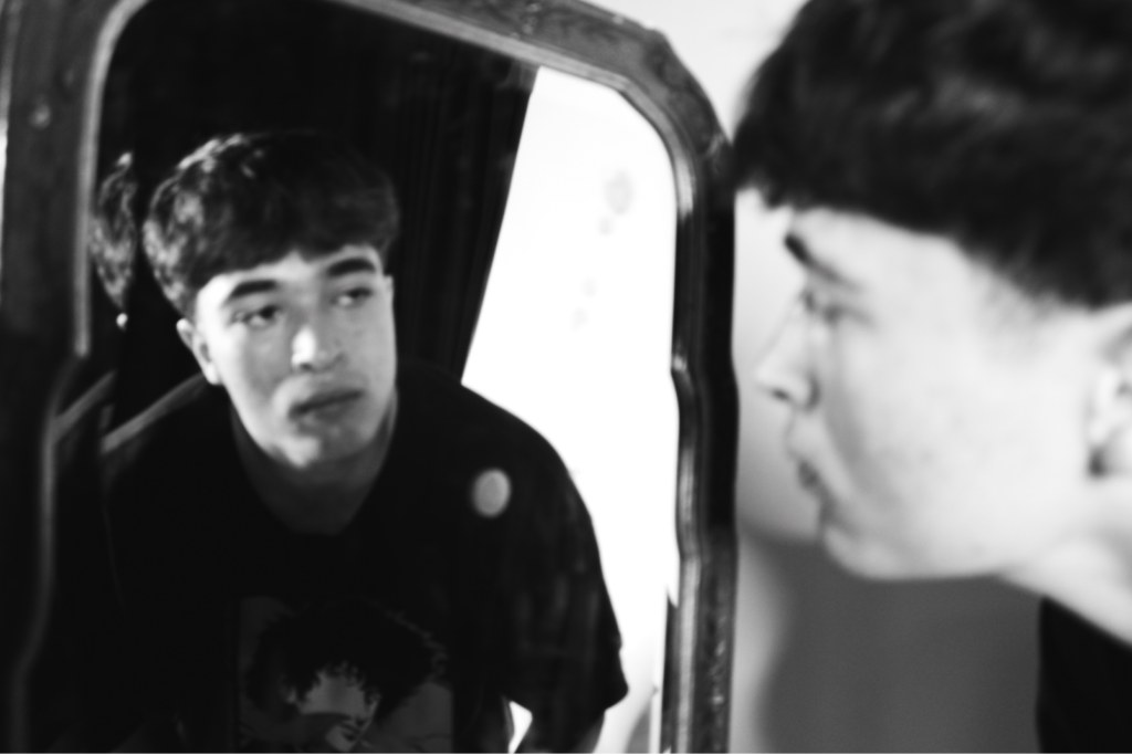
I then added an inverted filter over the top of the whole image creating this black and white overall photograph with my subject darker in the middle showing the sadness looking down at himself, holding the basketball, not showing his face, sat under the hoop.

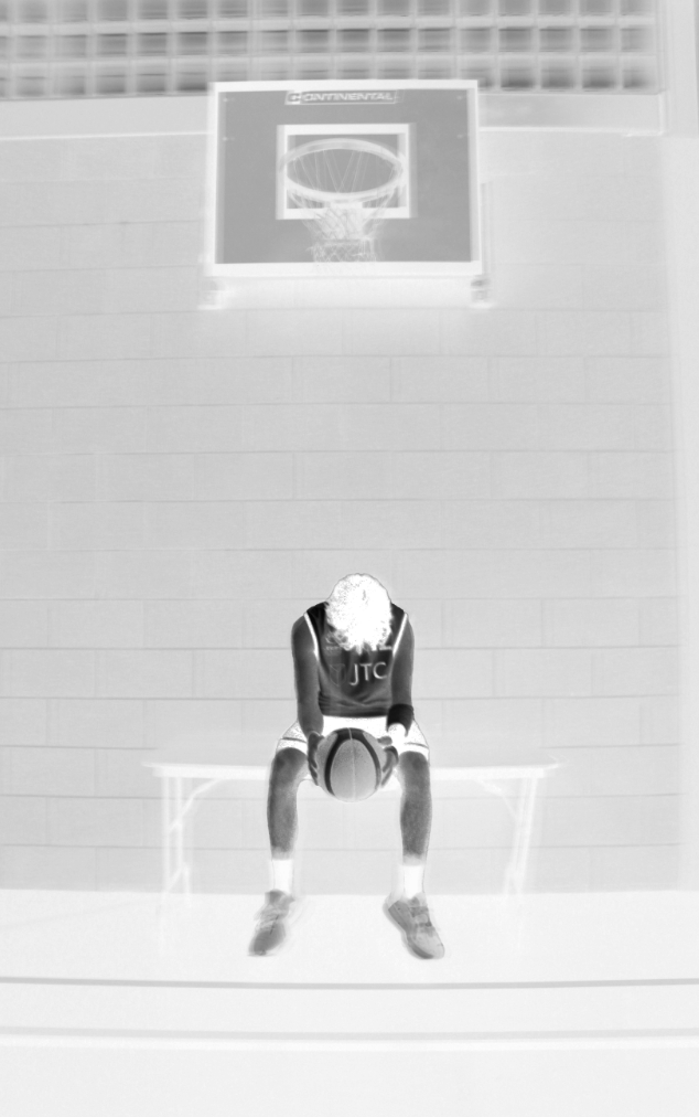
I decided to keep his shoes up to his socks still blurry and rubbed out with 50% opacity rubber tool, the top focused layer because I don’t want the viewer focusing on the bottom half of the photo, only my subject in the middle sat on the table under the hoop, with the backboard also a bit darker then the rest which also stands out but not as much as my subject as that is the main view for this photo.

I then didn’t like the top of the photo with those glass squares, so I cropped the photo down to the top of the backboard which created this photograph.

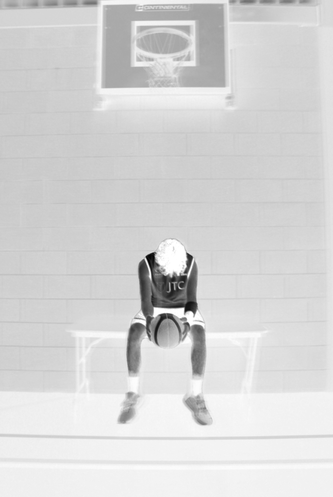
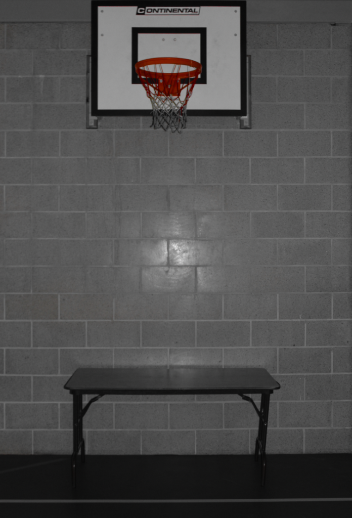
I then used generative fill on Photoshop 2025, to replace the top with fake brick layers/get rid of the darker areas and be grey instead, resulting in the final image.

This is my overall photograph for it, but what I might do next, is actually keep it un-cropped like the photograph with the glass panels, but then use generative fill to just replace them with grey bricks so the photo still looks far away and long with the hoop on the wall above him.

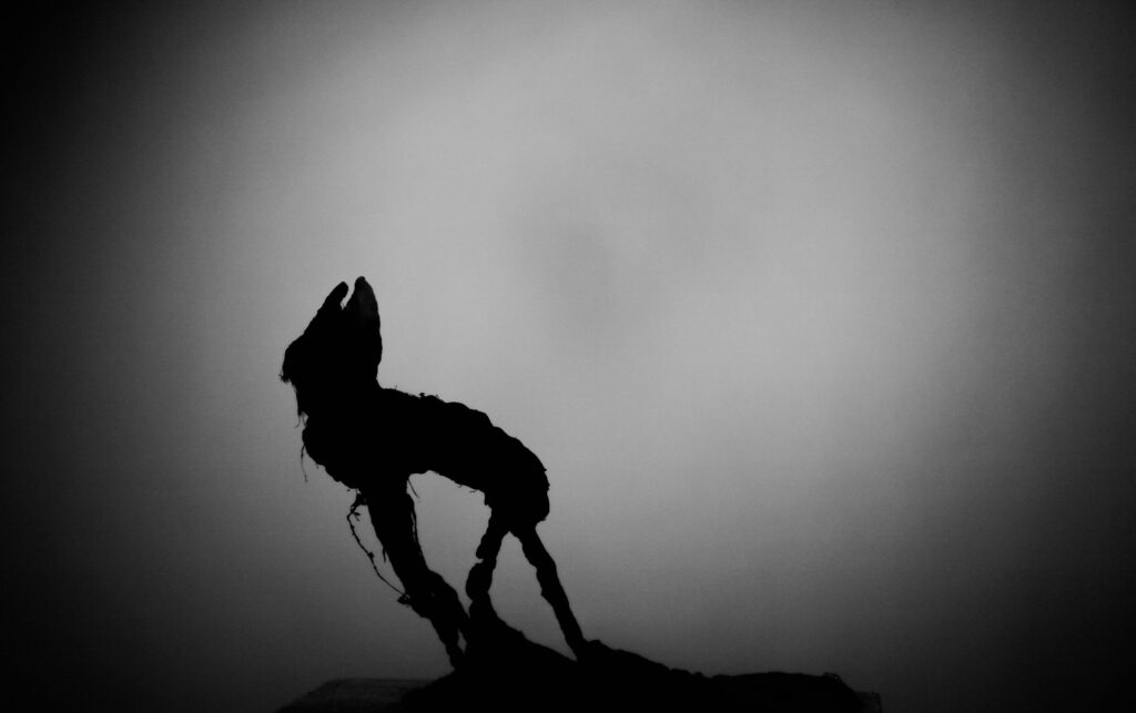
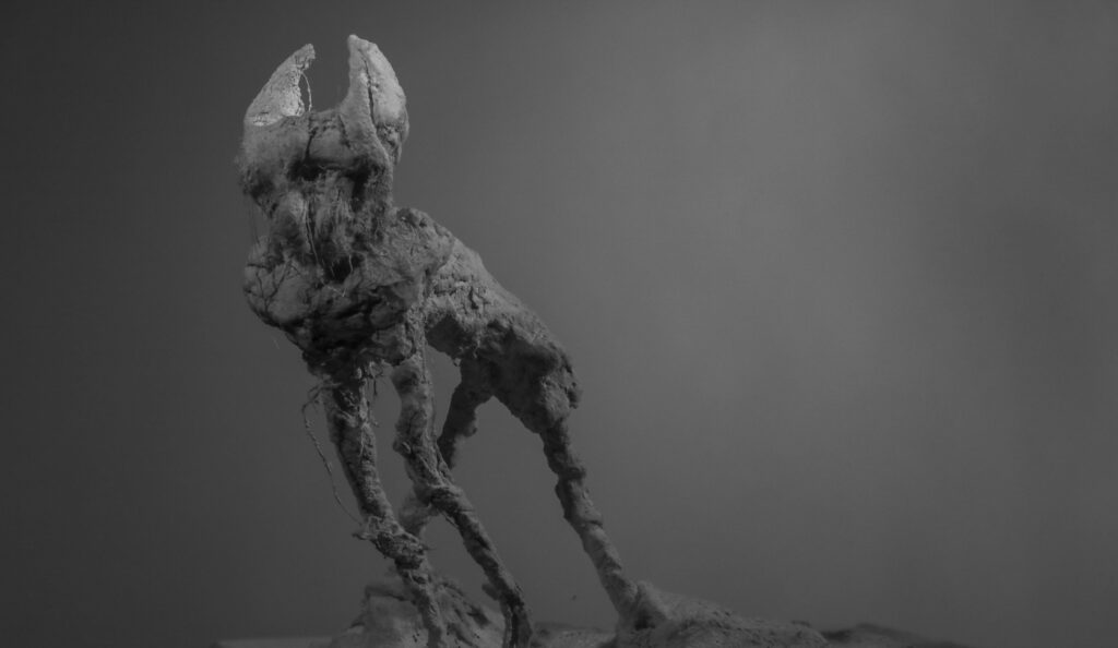
I also did a plain black and white photo of my subject sat under the hoop, showing sadness emotion but without his face being seen, instead being covered by his cast on his wrist. I will next photoshop the top part again getting rid of the glass panels to make the photo more focused on him and the hoop.

Then I will create a photo of my subject under the hoop like the one above, but instead it will all still be in black and white, apart from his wrist/cast. This will be in Red, to show the focus point, and show more emotion through the photo such as anger and the frustration he has to deal with, from getting injured constantly and not being able to play but only to watch from afar.

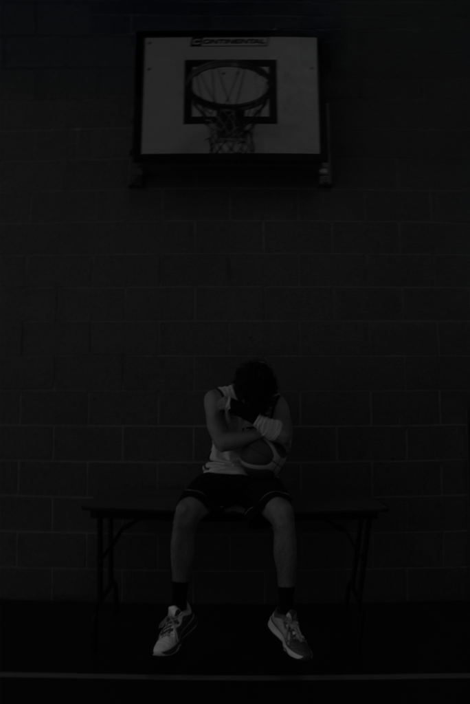
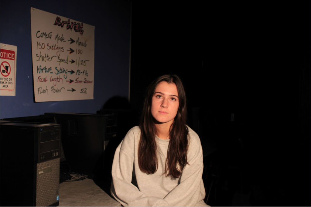
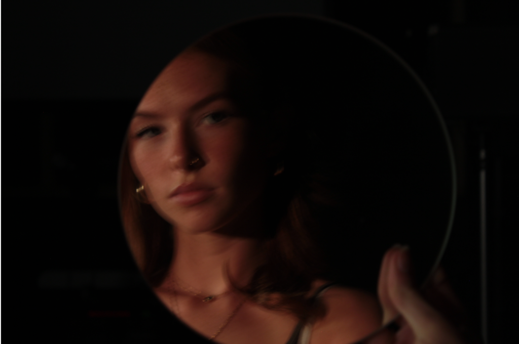
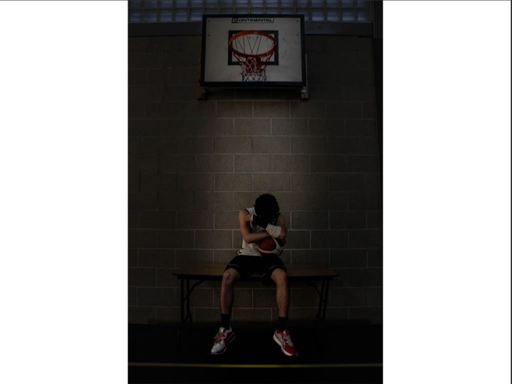
I chose this environment because it is closed off with no natural lighting, I also positioned my subject Bruce to be against the dark brick wall which is cold and can help pursue the sadness and loneliness of my subject. Finally, with him covering his face with his injured wrist with the cast on, makes the viewer concentrate and think more about what emotions and feelings he is going through. It also resembles how he couldn’t be involved in the action on the real court, instead he was sat down on a table under a redundant hoop away from the other people playing.

Another aspect of this image is how my subject in his training gear, whilst not being able to train, shows his dedication, passion and optimism for the sport, that he will hope to play once again. But it is too painful to watch other people running and jump around, whilst he can’t participate.

I started editing this photograph of my subject attempting to dunk a basketball. I managed to capture this action shot mid-jump because of my knowledge of basketball, I can anticipate when the perfect snapshot would be.

I started by increasing the brightness on my subject and the overall image whilst lowering the contrast overall as well. I did this because I wanted to use the inverted filter again, so he would have to stand out brighter, to match my cover photo of my subject sat on the bench in a white invert.

I tried both inverts with my subject in black with the black objects in white, and the black in white. I preferred the black overall inverted photo because it is opposite to the front cover, which tells the viewer how he started in injury and has to recover, and at the end of the photobook, it will be this darker inverted photo of my subject jumping and playing fully again because he is fully recovered.

I then wanted to try the other side of the invert, with my subject in white with his shorts and the number still staying in black. I did this by adding another layer of him over the top and just inverting him. But, I felt he was too bright, so I decreased the brightness and contrast on the copied layer to separate him from the background better resulting with this final photo.

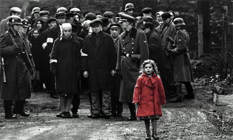
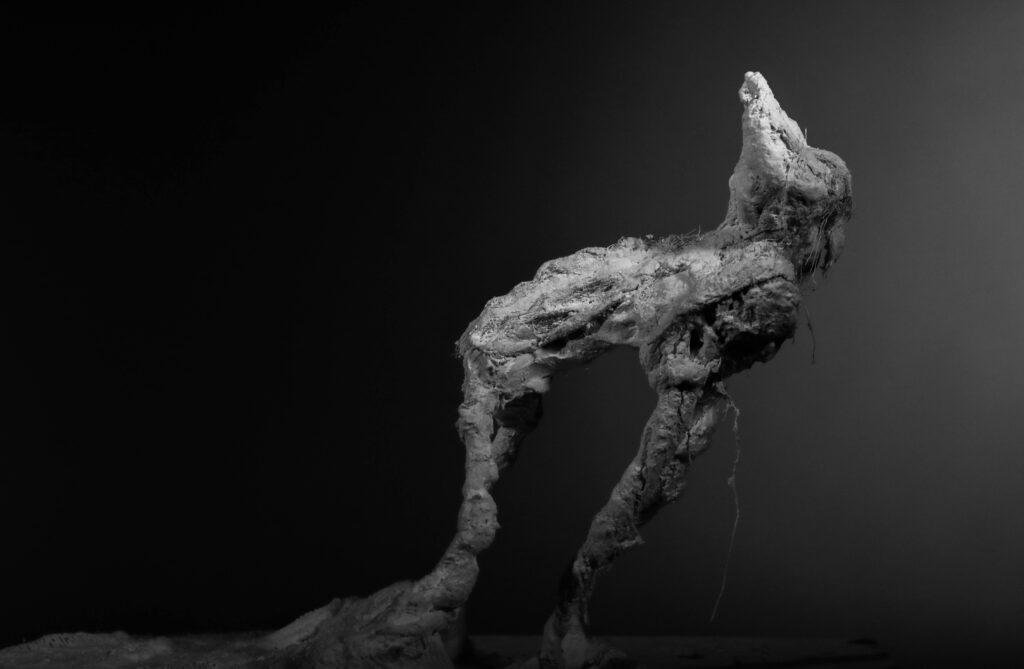
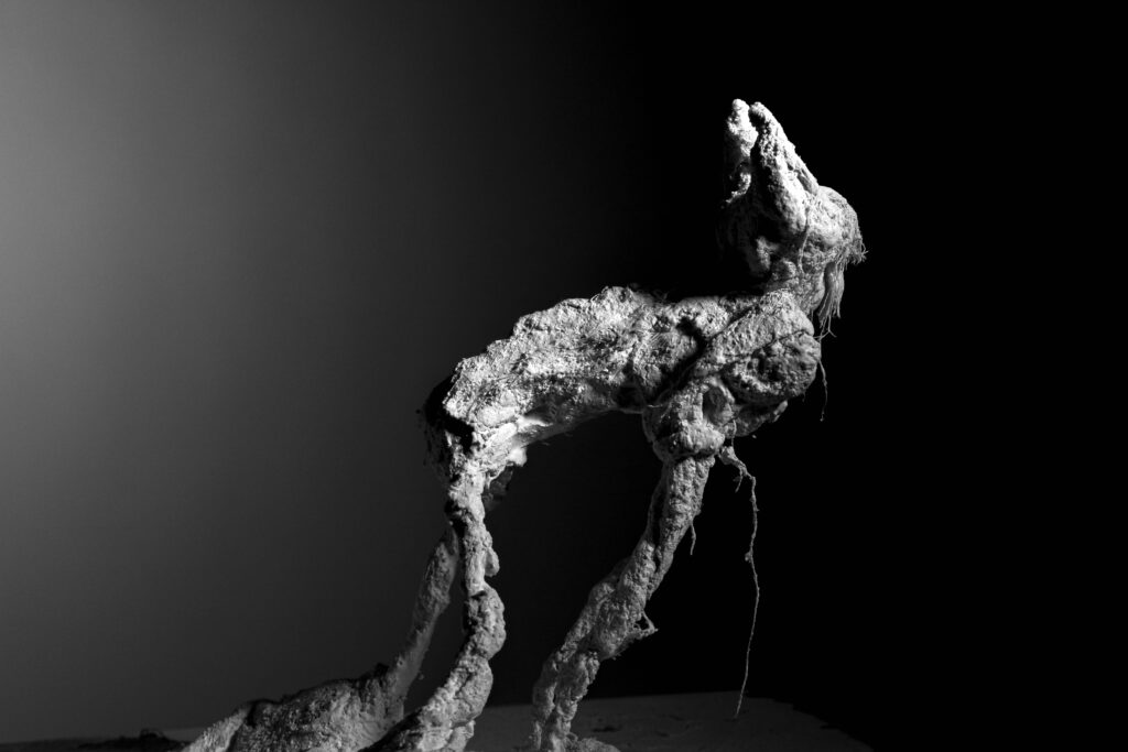
I created this image of my subject who I positioned centre, underneath the basketball hoop, sat on a bench hiding behind his cast, hiding his face. I made the photo in black and white to show the emotion through this photograph, with it all in black and white to show isolation and sadness, but with the cast in red to show frustration because he has all this anger from these injuries and that he can’t play because of them. Also, I related it and got inspiration from Schindler’s List, which in this movie, it is all made in black and white, apart from one singular thing, which is this young girl’s red coat. This created another sense for the movie to stand out and point out the struggles they all have to go through and later you see the girl in her coat dead. I matched the red cast to her dress to show the main focus point about his injury and the reasons behind it, like how it tells the viewer the struggles and sadness, he has to go through with the injuries.

I created this photo from using the plain background of the hoop, then cutting out separate photo of my subject sat down, crossed arms and lowering his head. I layered him twice, one on top of the other and then used the ‘Hue’ mode to make him transparent, and the other layer using lighten mode to make the whole two photographs of him brighter.

Photoshoot 3- the present in social media

So far, I think this has been my favourite photoshoot overall because it was fun and creative, and it shows a clear connection between the female subjects. In this photoshoot, I focused on the reality of party life, creating a mood of intimacy between the girls. I also tried to include a theme of depression through the impact of social media and how it affects girls when they’re with friends/ going out.

I have chosen my few favourite images out of the whole photoshoot, and edited them to portray the narrative I was aiming for. I wish for these images to convey sensuality and intimacy between the girls as we see they are closely positioned together.

For these images, I wanted to present a depressing, lonely feeling as the subject appears to be drunk and dejected. I wanted to present the subject as drunk so it reflects the rebellious side of teenagers, yet the impact it has on emotions. I really like the contrast between the light and dark shadows because it creates an exaggerated texture, which evokes the emotions within it.

As you can see, I have edited various photos which represent different stories and feelings. I decided to edit these photos in three different ways: Black and white, coloured and blue toned. This is because the tone of the photograph depicts the mood of the scenario. For example, the coloured photos show the subjects drinking as a group, representing a close feminine relationship. Whereas, the black and white images represent a depressing mood and could suggest that the subject is drunk and feels like this. Finally, the blue toned images represents the subjects having fun and shows the freedom they have.

Windows and mirrors photoshoots –

Photoshoot 1 – For this photoshoot, I want to lean more towards the mirror photography idea. By asking partners to photograph me and me photographing them. I want my photos to be unique and have some personal twist on it, whether that is certain poses or lighting that I use. I could use different angles of lighting or angles on the camera itself to show my world through a camera lens. I also want to develop my idea while photographing to let the ideas flow as they come

Cindy Sherman has inspired me to tap into the femininity and masculinity topic we went over last year. I loved this topic and as Cindy loves to show the different perceptions people have that you may not see. She photographed herself and showed who she was through her own eyes and therefor through her camera lens.

For this photoshoot, it worked so well to show the windows part of the topic, I didn’t want to focus too much on this part of the topic but thought it would work well to show the other side to mirrors, almost to emphasize my mirror photoshoot itself.

The use of my staged photos worked so well, showed emotion and friendship through window photography and almost another life, staged and filtered but real in itself.

Even though some of my photos didn’t turn out the way the way I wanted them too, I feel like they show a story. An outside view of made up people, can show lives that happen, maybe behind closed doors.

The lighting we used was a small spotlight in a lit up room to emphasize what I want the focal point of my photos to be. We played around with lighting slightly, using ring lights and normal room lights before settling on the spotlight.

Final Photo edits –

Photo 1 –

Initially, I wanted to focus on the highlights and and lowlights of this photo, with the use of shadows created by the single spotlight we used to capture the photo, the use of natural contours extenuate the highlights alone so the use of focusing on the highlights level out both ends of the scale.

For this photoshoot, I wanted to add a black and white filter on top of the photo to add almost a sense of nostalgia to the ‘window’ photos, to help portray the life beyond the camera lens.

Final edit –

Photo 2 –

With this photo shoot, the edits will pretty much be the same.

Changing the highlights and shadows to suit the photo dynamic again and putting a simple black and white filter over the edits.

Final photo –

Photo 3 –

Final photo –

Photoshoot 2 – For this photoshoot, I wanted to focus most on mirror photography, the use of actual mirrors and almost ‘selfie’ looking photos I think is how I want to do this photoshoot. I feel like that can be very powerful for this topic.

The use of microphones for window photography worked really well in my last photoshoot, so I want to include that in this shoot as well. I wanted to interpret this into my shoot but almost change it to mirror by photographing myself.

This photoshoot went so well, the portrayal of window and mirror photography came out so much clearer in this photoshoot.

The use of singular spotlights enhanced the focal point of my photos. The focus of a singular person works well with both mirror and window photography. The use of warm lights emphasizes warm toned skin making the photos untied.

This photoshoot will be used a lot more for my mirror side of this topic. The use of actual mirrors and reflections are a very blunt and obvious way of portraying this ‘mirror’ photography.

Final photo edits –

Photo 1 –

This edit, I wanted to focus on the warm tones and cosy feel for it, extenuating warm tones through deep skin filters in a yellowy red tone. I also focused on the exposure and shadows as well, to give amore focused look at the focal point of the photo, the model.

Final photo –

Photo 2 –

I loved how this photo turned out, already using a red sheet cover for the red hue, I wanted to include a little more light to the highlights in this photo, without drowning out the warm almost intimate vibe.

Final photo –

Photo 3 –

Doing a similar thing to the previous photo, I focused on calming down the red hue but not loosing the important highlights and shadows in the process. The blur on the photo gives a sense of uncertainty which is something I think is really important in mirror photography for me.

Final photo –

Photo 4 –

I wanted to bring back the black and white for this photo, just because I liked the vintage approach. Highlighting and lowlighting where needed and focusing on sharp lights from the studio.

Virtual gallery –

Personal Study: Photoshoot #1

Contact Sheet

For this first photoshoot, I visited La Collette during the night-time to capture the isolated streets illuminated by the artificial lighting (lampposts). I aimed to recreate the glowing effect, usually seen in Pierre Putman`s work, but the lack of mist and fog on the night of the shoot I was not able to strongly achieve this. Another challenge/problem which I encountered while taking these images is that my camera was on a low resolution setting, which impacted the overall quality of my images. I plan on going back to La Collette as it is a perfect location to get images similar to Pierre Putman`s another night, making sure that my camera settings are finely adjusted for high resolution images and hopefully capturing the glowing effect of the artificial lighting under more foggy conditions. This will allow me to produce even stronger and more effective images for my personal study

Image Comparison

When comparing this image with Pierre Putman`s image, there are some clear similarities, like the focus on the time of day (night-time) and capturing the lampposts to create mood in the photograph. Going to La Collette was a good idea, setting wise as Pierre Putman`s image is taken in a urban setting and when looking at my image and his, the area looks extremely similar, almost identical. Like Putman, my photograph focuses on the quietness and emptiness of a isolated street lit up by lamp-posts, highlighting the contrast of light and shadow. However there is a huge difference in my image and Putman`s image which is the weather. In most of Putman`s photographs the mist which he captures, intensifies the glow from the artificial light creating a cinematic glowing beam look. This is what makes Putman`s image stronger in comparison to mine as my photograph lacks mist and the glow from the artificial light, due to the clear conditions during this photoshoot. Another aspect of my image which I think makes it a weaker image is the car found on the left of the image, the cars being in the image takes away from the emptiness which I aim to capture with my photoshoot.

Photoshoot #1 Retaken:

I went back to the same location and retook these images. here is how they turned out:

Initial Contact Sheet

Final Selection Contact Sheet

Before & After Editing

Image 1
Image 2
Image 3
Image 4

Final Selected Images

Samiksha Chaudhary

Samiksha Chaudhary believes objects function as memory keepers and he found himself reliving these memories through photography. This all began in lockdown when Chaudhary found himself stuck in Mumbai, whilst his parents were back home at Calcutta. Chaudhary found this time lonely as he missed his parents, therefore he aimed to revive and relive little moments which were created by these objects. He released a set of photographs taken of these objects as part of a bigger collection which he previously shot during 2019 whilst being at home with his parents. Chaudhary found photography to be a way of tracing back memories all the way to his childhood. It was also a way to feel closer to his parents and a way to hold onto old memories. Each of his unique objects tells a story which takes him back to his home. Chaudhary wishs to capture the object’s value to his personal history, rather than the value of them.These objects create a mental map to his childhood and they are also a way of knowing his families history. With the objects laid out they all tell a story. They capture a lifetime within them, not only his own but also that of his parents and relatives.

“A wedding gift, this wooden doll, my mother told me, held a small vial of perfume. The showcases in our home, when I was growing up, were always full of such curios – some inherited, some received as gifts or others collected patiently, one item at a time, by my parents (mostly Maa),” – Chirodeep.

This is a picture of the silver bowl that originally belonged to Durgamoyi Roy, his mother’s maternal grandmother and was a gift to his mother to celebrate seeing her great-grandson for the first time. The bowl, probably 100 years old now, has been with his parents for as long as he has been around and continues to exist as a daily use object at his home.

The safety pin is the last surviving piece from a set of a dozen of such pins was used to keep his diaper in place as an infant.
“Maa got the stone elephant and the ivory lion from Thamma. The elephant, in all likelihood, originally belonged to her mother. I can’t remember how it broke but trust my mother to painstakingly put it back together. The lion, I knew, was no plaything.” – Chirodeep.
“The sand clock, an object of immense fascination for me, was a gift to my parents from my mama, Dilip Ray and my aunt Eva.” – Chirodeep.

How will I respond?

To respond to this photographer I plan to photograph old objects which hold meaning to my relatives, specifically my grandmother. I will take these photographs on a plain background

Helmut Newton.

Helmut Newton was known as one of the most influential fashion photographers of the 1980s alongside Irving Penn, and Richard Avedon. I think that his work is the perfect comparison for the world I would like to similarly replicate. This is because I like the style of it being old and black and white. I like how they style is elegant and the women are dressed in predominantly black. As he was a very favour fashion photographer, I think that these images relate well to the topic of women being represented in the media and industries. Helmut Newtons work focused on themes such as power and gender and Newton’s work frequently explored themes of power, dominance, and submission, with women depicted as both powerful and vulnerable. Something that makes me fascinated with his work is the fact that Newton’s style often featured strong, dominant women in exaggerated, high-fashion settings. His images were characterized by a high contrast, stark lighting, and a sense of voyeurism.

The theme of femininity and gender that I am focusing on ties into his work as Helmut Newton’s work represents women as powerful, enigmatic, and seductive figures. The stereotype “femme fatale”, represents these women as they are radiating both allure and danger. The idea that women are superhuman and dominant is shown in his work as their outfits and roles in the photographs demonstrate authority and positions of power. I like the fact that the women are in smart, business attire or dresses, this particularly contrasts society’s views as they are defying usual stereotypes of women. Although, his work is meant to explore women from a female perspective, yet his photographs are sometimes seen as reinforcing women as an object of desire.

I want my models to be seen as women of power and show the power dynamics of society and not seeking male dominance in their lives. I want my models to also defy usual beauty standards an instead show their strength and unity as a whole.

Photo Analysis.

Technical:

The lighting in this photo is a black and white dark toned image which has a high contrast which creates a striking atmosphere. The shadows are harsh and strong with the highlights being white and brighter. This creates a high contrast and bold impression. This also helps to emphasize the characters and people included in the image which also creates intensity to the image. This image uses sharp edges and back-lighting which creates a cinematic feel to the image, as if it is a snapshot. However, as this image is outside, natural lighting will have also been used to show an authentic feel to the image as it is using the sun along with stage lights. The main lighting component to the photo is the contrast in shadows and how shadows are used to outline the characters. In this photograph the two women are highlighted as the focal point in the image due to the sharp shadows and dark dresses which have a strong and powerful style to them.

Visual:

This image includes a sense of symmetry and geometric framing. This is due to the way the two women are stood in a specific place which is known as deliberate positioning. The background of this image is also very minimal and includes mostly sky with a few buildings and ground towards the lower half. This creates an easy way for the audience to immediately look at the subjects instead of the background. Shadows also accompany the focal point of the women by emphasising their bodies and in this image, possibly promoting the outfits the women are wearing. The female form is a main part of Newton’s work and it is displayed in this image as there is emphasis on the shape of these women’s bodies and they display an idealistic and stereotypical body to please the male audience. The lighting of this images, highlights the bodies of the women and their sculptural beauty. I like how cinematic thus image is as it looks like a quick shot taken out of a movie, as the women are mid motion, this creates a cinematic and narrative impression.

Contextual:

The main contextual element to Helmut Newton’s work is exploring gender roles and sexuality. Helmut’s work has been previously critiqued for objectifying women. However, In my chosen image, I believe the women are shown as being dominant and in control. I like how his work is challenging social norms and how he sees his photography as an opportunity to push himself to the extremes in order to convey his message. During the time this image was made, political and social issues were being faced globally. Women were fighting back for rights and equality and feminists were also challenging the patriarchal gaze. In this image, I believe the two women are challenging the idea that women should only be seen as passive objects of male desire. As Helmut Newton is also a fashion photographer, people, predominantly women, were used to promote outfits by creating a specific mood and impression though a story by the model and location. In this image, the women are in high- quality, high-fashion outfits, whilst portraying their strength and confidence through art.

Conceptual:

In Helmut Newton’s work, he focuses on the exploration of power, and gender, however, this message is executed in multiple ways that differ him from other fashion photographers. Helmut Newton orientated much of his work around nudity of women. This was to challenge traditional women forms and exploration of desire, dominance, and control. In this image, the concept and meaning behind it, explores ‘the perfect woman’ as both of the women are young, confident and beautiful and uses boldness to highlight their power over a traditional angelic woman. This image is an example of Helmut Newton, ‘pushing boundaries’ and makes the viewer question whether the women are being celebrated or objectified. This image has a very cinematic feel to it and resembles a scene from a thriller or action movie due to the ambience created through the lighting. This is a narrative quality in his work which implies an unwritten story behind the image and there is a message or conflict beneath the image. This essence of mystery intrigues the viewer and differs Helmut Newtons work from other contemporary photographers.

How Does He Link to My Work?

In my personal study I am focusing on the ‘male gaze’ and the representation of women in the media. The idea of ‘the male gaze’ comes from Laura Mulvey in 1975. This is the way the visual arts, including film and photography, depict the world from a heterosexual male perspective. I chose this specific photographer to tie into my topic as Helmut Newton photographs predominantly women and positions them as subjects of male desire. The way the women are posing in his images is used in a strategic way in order to emphasize their bodies and for the model to captivate the traditional heterosexual male viewer. Helmut’s work also features women displaying themes of power and control, the women are shown as empowered instead of vulnerable. This use of power dynamics intrigues the viewer and is used to attract the male gender, in order to get them to buy their products and they may e.g. attract a woman similar looking to the model. The costume of heels paired with lingerie or small pieces of clothing ties into being a part of ‘the male gaze’ as women are simply posing in almost no clothing just to attract males to the products. However, Helmut Newton’s work also complicates the male gaze as the women are not submissive and vulnerable, but powerful and in control, which contrasts the traditional male gaze, as the woman are aware and complying with it. This has sparked debates about whether Newton’s photography reinforces the male gaze or offers a more nuanced representation of female sexuality.

Articles.

This subject has been explored multiple times by many high-profile newspapers and reports. Laura Mulvey did not undertake empirical studies of actual filmgoers, but declared her intention to make ‘political use’ of Freudian psychoanalytic theory (in a version influenced by Jacques Lacan) in a study of cinematic spectatorship. Such psychoanalytically-inspired studies of ‘spectatorship’ focus on how ‘subject positions’ are constructed by media texts rather than investigating the viewing practices of individuals in specific social contexts. Mulvey notes that Freud had referred to (infantile) scopophilia – the pleasure involved in looking at other people’s bodies as (particularly, erotic) objects. In the darkness of the cinema auditorium it is notable that one may look without being seen either by those on screen by other members of the audience. Mulvey argues that various features of cinema viewing conditions facilitate for the viewer both the voyeuristic process of objectification of female characters and also the narcissistic process of identification with an ‘ideal ego’ seen on the screen. She declares that in patriarchal society ‘pleasure in looking has been split between active/male and passive/female’ (Mulvey 1992, 27). This is reflected in the dominant forms of cinema. Conventional narrative films in the ‘classical’ Hollywood tradition not only typically focus on a male protagonist in the narrative but also assume a male spectator. As the spectator identifies with the main male protagonist, he projects his look onto that of his like, his screen surrogate, so that the power of the male protagonist as he controls events coincides with the active power of the erotic look, both giving a satisfying sense of omnipotence’ (ibid., 28). Traditional films present men as active, controlling subjects and treat women as passive objects of desire for men in both the story and in the audience, and do not allow women to be desiring sexual subjects in their own right. Such films objectify women in relation to ‘the controlling male gaze’ (ibid., 33), presenting ‘woman as image’ (or ‘spectacle’) and man as ‘bearer of the look’ (ibid., 27). Men do the looking; women are there to be looked at. The cinematic codes of popular films ‘are obsessively subordinated to the neurotic needs of the male ego’ (ibid., 33). It was Mulvey who coined the term ‘the male gaze’.

you must contextualise his work with feminism, with specific reference to the ‘male gaze’ and his representation of women in his photographs. Apply your knowledge and understanding of Laura Mulvey’s ‘Visual Pleasures’ essay and Judith Butler’s; ‘Gender Trouble’ you have studied in Media. You also need to find some specific articles/ reviews done around his work written by other critics, feminists etc. I’ll help you with identifying these. This has sparked debates about whether Newton’s photography reinforces the male gaze or offers a more nuanced representation of female sexuality.

Manny Robertson Artist Case Study

Manny Robertson is a photographer, artist, and visual storyteller, known for his work that often intersects with themes of fashion, portraiture, and conceptual art. He is recognized for his distinctive approach to photography, often combining elements of storytelling, emotional depth, and visual experimentation to create compelling and thought-provoking images. His photography often features bold compositions, dynamic lighting, and a blend of contemporary and classic aesthetics. He uses photography not just as a medium for capturing moments, but as a tool for expressing broader themes, including identity, transformation, and the human experience. Manny Robertson’s style and artistic vision place a strong emphasis on visual communication, and his work can be described as both cinematic and introspective, with a focus on the emotional and psychological states of his subjects. The emotional resonance of his images is often paired with a sharp attention to detail, making his photographs both visually striking and conceptually rich. Like many contemporary photographers, Robertson explores the concept of identity, both in terms of how individuals present themselves and how they are perceived. His portraits often convey a sense of vulnerability or introspection, encouraging viewers to engage with the emotional undertones of the images.

Manny Robertson’s series called “Embroidered Metropolis” was created to represent how dark emotions like Depression can attach and fuse themselves to people like masks of sorts. Using a robotic aesthetic inspired by the film Metropolis, to distinguish between normal feelings (colour) and the emptiness of the others (black+white), whilst using thread to act as both robotic attachments, and the struggle of dealing with said affliction.

Manny Robertson’s photography often explores themes of identity, transformation, and the complexity of human emotions, which makes his work particularly suited to the theme of disguise in photography. While his approach is varied, several key elements in his work resonate strongly with the theme of disguise such as the exploration of masked identities. Robertson’s portraits often feature individuals who appear in altered versions of themselves, where their outward appearance might be drastically changed through editing and manipulation of light. For example, he makes a cutout of the person’s face which comes slightly off their actual face and is held together by stitches. This alteration acts as a disguise, hiding or distorting the person’s “true” identity. In this sense, the subject’s outward appearance becomes a mask, revealing a version of themselves that may not reflect their inner identity. By playing with visual transformations, Robertson challenges viewers to question the authenticity of appearances, a core aspect of disguise.

Beyond the visual aspects of disguise, Robertson’s work often delves into the psychological layers that people wear, whether consciously or unconsciously. His subjects may not be physically disguised, but the emotional or psychological “masks” they wear are evident in their expressions or body language. This emotional veil can be interpreted as a form of disguise, where the subject’s true feelings or inner self are hidden behind a curated exterior. Robertson’s photography invites viewers to consider the emotional disguises we wear in daily life, and how these layers can either protect or distance us from others.

He said his series ‘Embroidered Metropolis’ was inspired by the film Metropolis, and this series of portraits were created to “… represent how dark emotions like Depression can attach and fuse themselves to people like masks of sorts. Using a robotic aesthetic…to distinguish between normal feelings (color) and the emptiness of the others (black+white), whilst using thread to act as both robotic attachments, and the struggle of dealing with said affliction.” 
(https://chantellegracephotography4.wordpress.com/2020/04/20/assignment-four-photographer-research/)

statement of intent- eddy

  • What you want to explore?
  • Why it matters to you?
  • How you wish to develop your project?
  • When and where you intend to begin your study?

statement of intent:

what do you want to explore?/why do you want to explore the topic?:

the topic I want to explore is landscapes, but more specifically how its effected us how we have effected it and are absence in are innovation to help preserve are planet. I believe I will be able to make images that portray the messages that I’m exploring for my personal study by capturing images that show we’ve effected the for mainly are personal benefit without giving thought to the things there before us. The reason I want to explore this personally is because although its spoken about its not paid attention to enough to the point where everyone is doing their best to change the world positively, which is why I believe that it would be an interesting subject to do my project around as its something different. This project will allow me to not only learn more about this topic and enhance my skill with taking landscape images. My aim for this project is to produce a piece of work that can educate not only myself but others as we all live in the same bubble on the importance of what we are doing to the landscapes around the island but also the world and how we should be more ethical with what we do and if its all necessary. I believe by using photography I will be able to portray the message that I want to push as how else is better to see how we effected the landscape by showing people images.

how do you wish to develop your project?:

I will develop my project by making sure I take images in specific places such as through out town and some other more rogue places throughout the island and certain weather conditions that make the image look more appealing such as foggy weather or rainy days, but obviously this isn’t something I can rely on but would make the image more aesthetically pleasing. Certain techniques I would like to use would be long exposure panoramic shot as this will help me focus on the smaller elements in the image as well. to further enhance my photos to make them even better I will edit them to look more how I want them to which means some photos will consist of more warm colours popping in the image, then some would feature a more cold atmosphere in the image.

with the combination of my knowledge of the topic and using my photography skills, my intention is to create a series of images that show you the landscapes in multiple different angles view points and perspective. this will also help me show if we have really changed the landscape for the better which is going to help me link it to the idea of are the majority of people happy with their living conditions and the location they live? and if the answer is no why we destroying land for people to be unhappy?

when are where do you intend to begin your study?:

For this project I intend to begin my study by taking lots of images that are inspired by the artists i studied such as Rut Blees Luxemburg and Edgar Martins. would probably start my project by taking images throughout the night around town and possibly around the island trying to replicate some images from the artist I have studied and some photos from my own creativity, this is because I believe that it will be able to successfully show what I’m trying to portray by doing this sort of photoshoots. For example i would like to take images of things that represent damage to the environment and things that in my opinion that are wasted on the island. more specifically things such as abandoned places and things such as deforestation, industrialization and air pollution and overpopulation. which i believe some of these to growing problems in Jersey such as overpopulation which in hand has led to more industrialization around the island to provide for a growing population.

My Photoshoot Plan

I’m going to take photos in my grandads favourite locations when he used to come and visit the island, I’m taking images of the scenery and then taking restaged images using my dad as the subject so re creating images that were taken years ago in the specific locations

Mind Map

This clearly shows where I’m going for my photoshoots and what I’m taking photos of. This is my photoshoot plan for my final piece, I’m going to use images that I’ve taken from my grandads favourite places when he used to visit the island and also re stage images using my dad in the photos. Originally I was going to take photos of still life and change them into black and white but I couldn’t think of a way to link the images together so the idea changed.

The locations I’m going to go

I’m going to go to 5 different locations for this photoshoot St Brelade’s bay, La Mare Vineyard, Gorey Pier, St Ouens bay and Corbierre lighthouse. I’m going to these specific locations because these are the places where my grandad loved the most when he visited and where his favourite places on the island where.

When and Why

I’m going to these locations when the lighting is at dusk when its not dark outside but the sunlight is starting to fade and when the sun is setting to get the light perfect for the shoots I’m trying to achieve. I’m going to these locations because they were the most important to my grandad and they hold memories that are the most powerful to recreate, I’m going to use my dad as the subject for the images to replace the space in the images where my grandad was.

Concept

My concept for the photoshoot is to go to these specific locations but then to also take the restaged images and edit them in photoshop and change the opacity of the images and my dad to show that he was fading away and that he isn’t really there in the images like it was his ghost coming back in the image.

Studio lighting – the crooked fairy

when considering my favourite image from my rear screen experimentation I noticed I could create a similar effect with studio lights and coloured gels

photoshoot

studio set up

using two flash lights with varying different coloured gels, with the intention of creating harsh shadows and interesting lighting combinations. this photo is less about story telling and more aimed to present a clear and impactful image of the creature

editing process

favourites