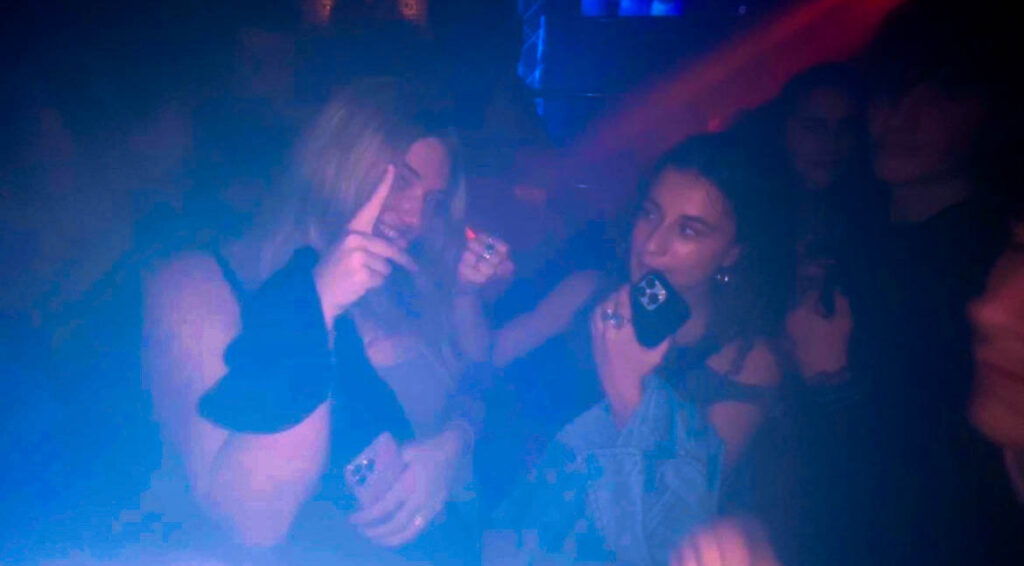
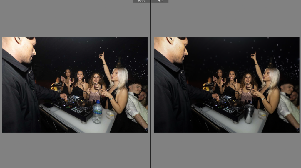
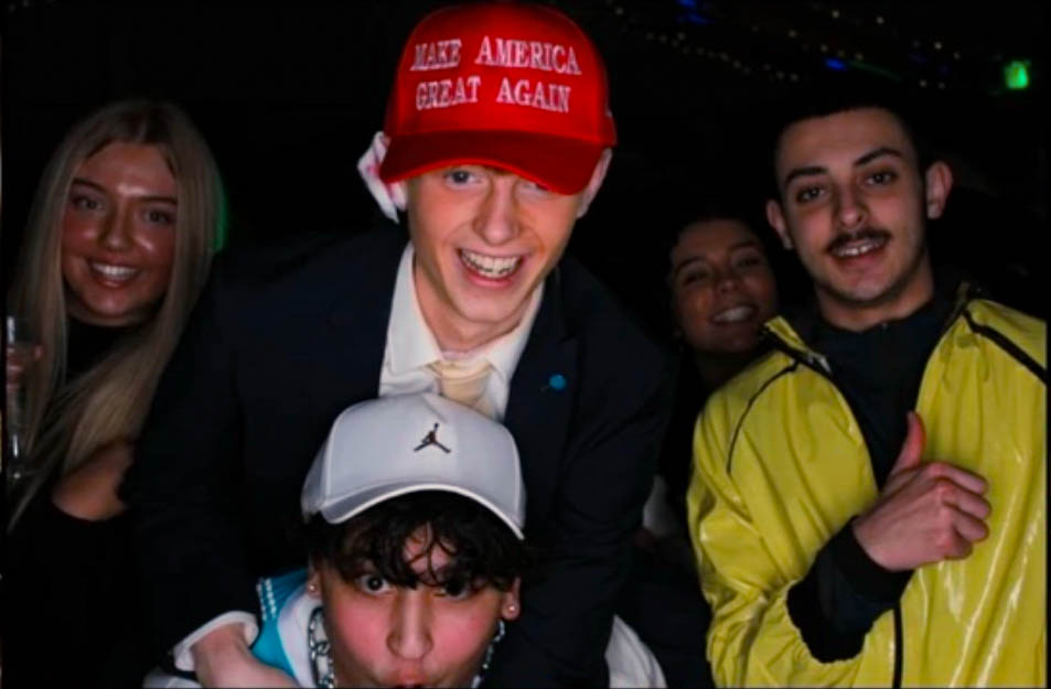
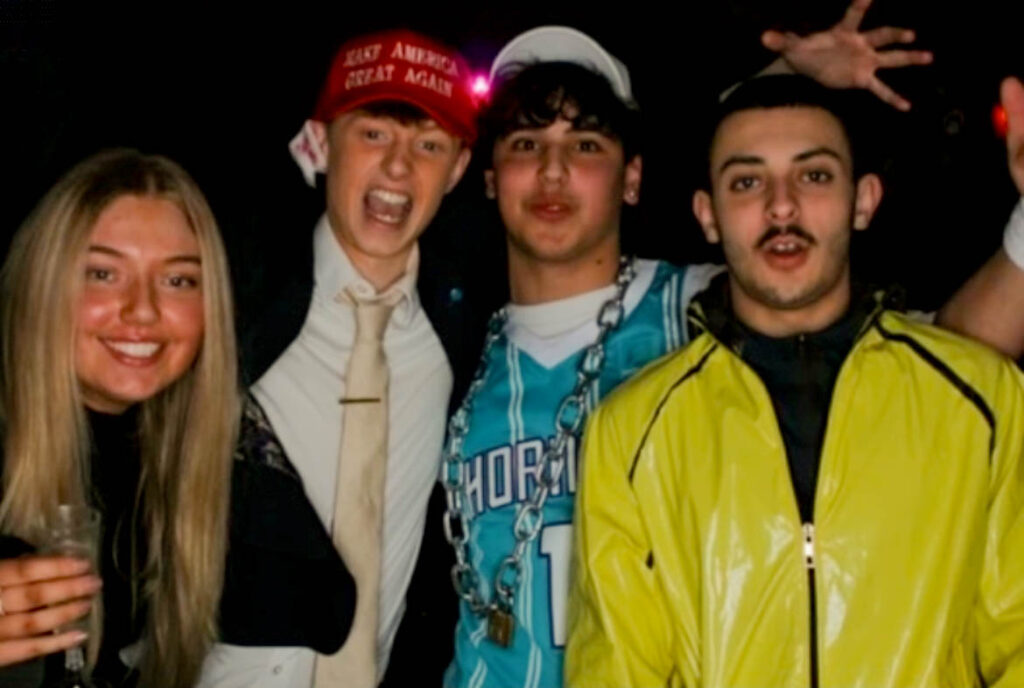
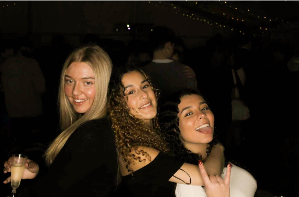
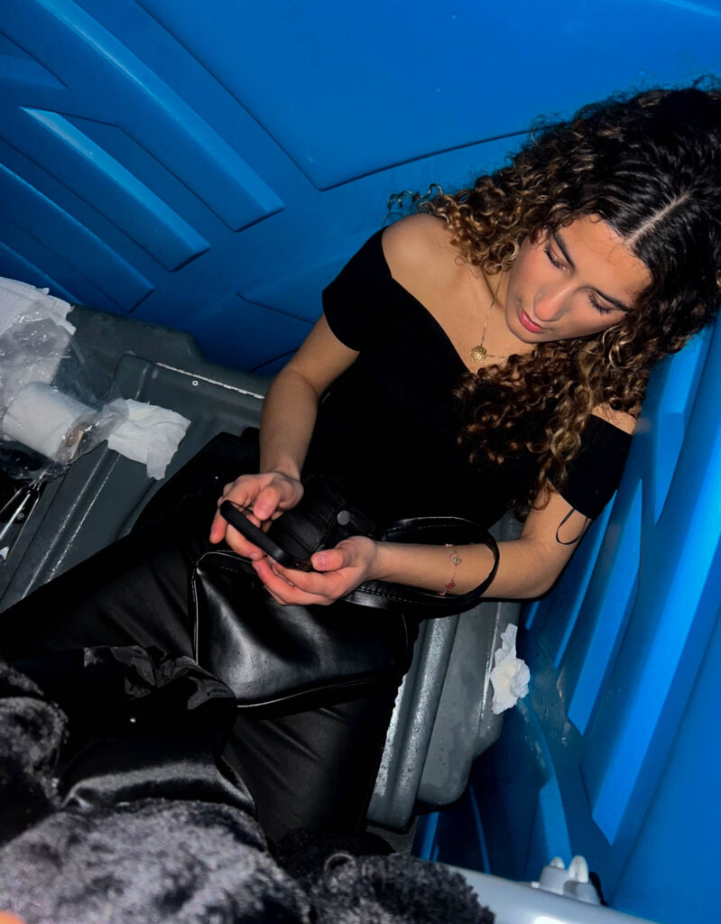
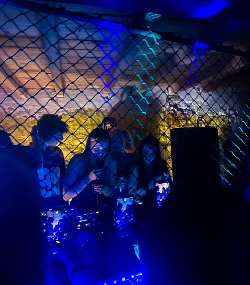
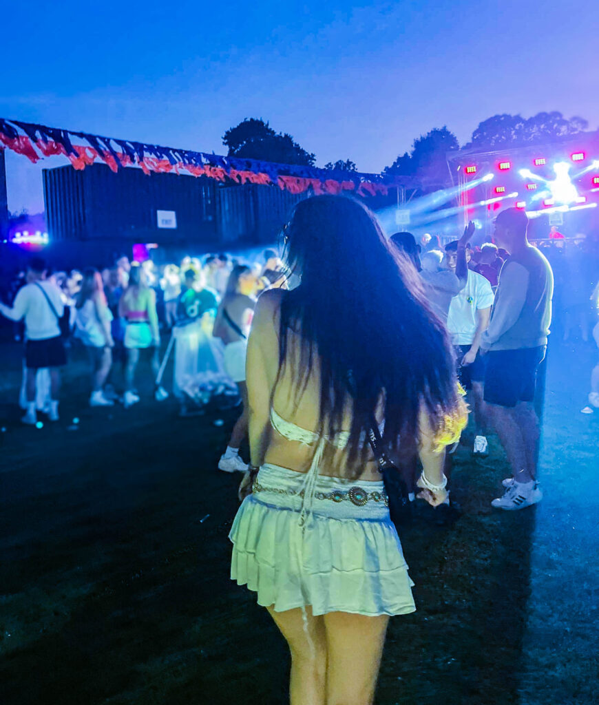
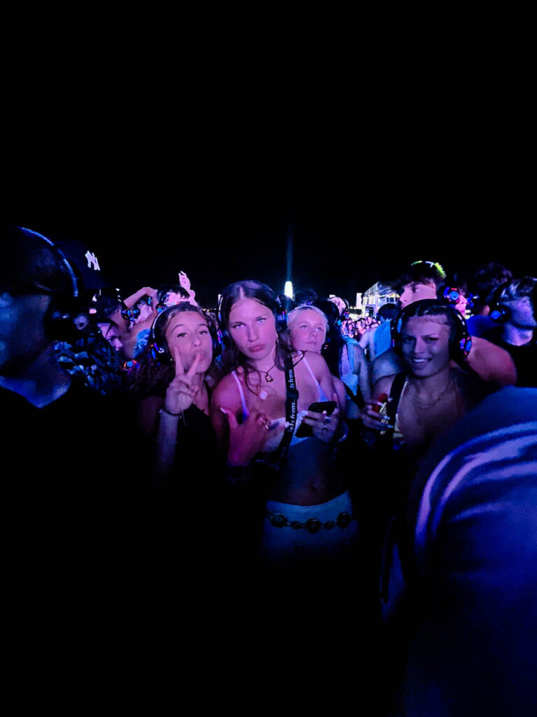
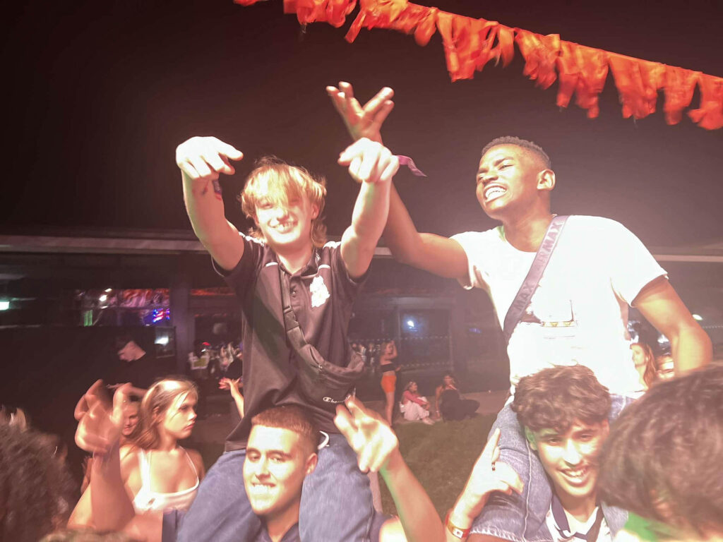
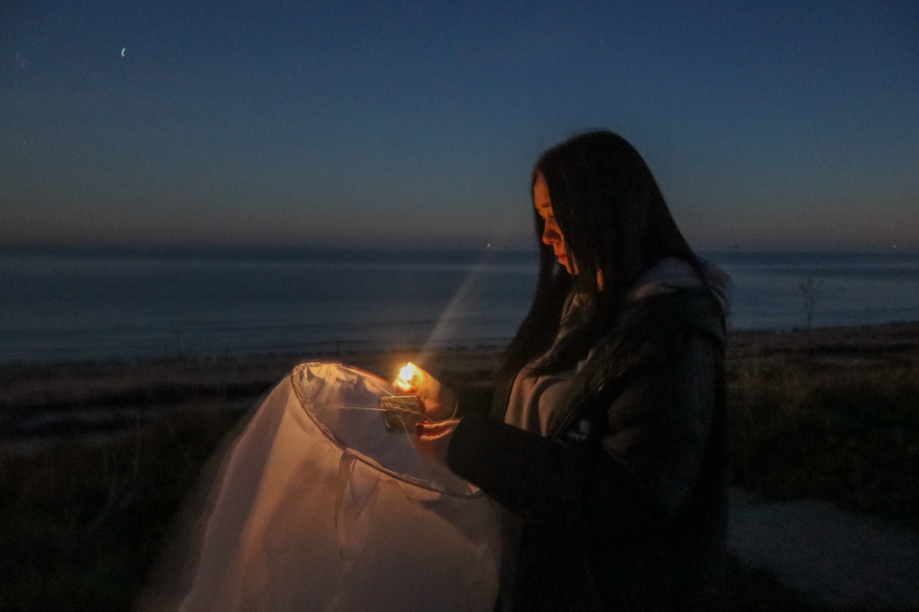
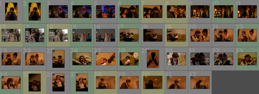
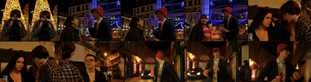
For these photos I took pictures of different parties that I went to previously and selected some that I could use in my final photobook. All of these images are snapshots and were taken quickly with me not thinking about taking the photo and what the final result would be. I have edited these images in a way where the colour is bright and vibrant with lots of contrast.
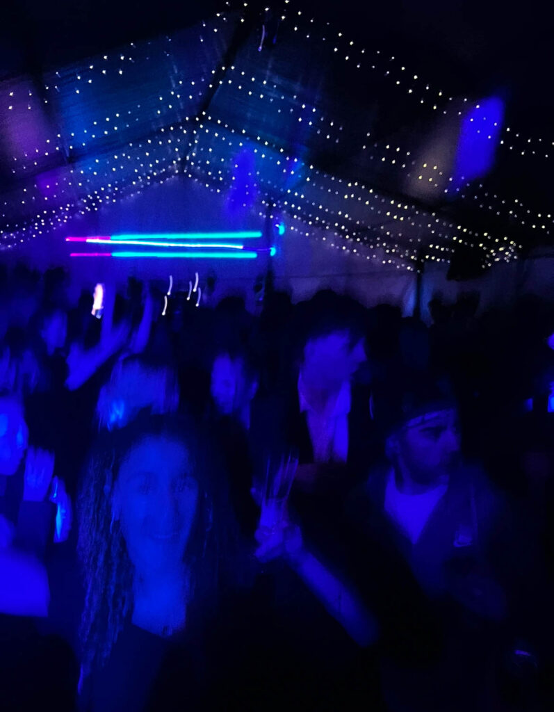
This photo I am planning to use as the front page of my photobook. This is because it is a subtle picture without any strong character or thing catching your eye, everything in the image is blue so there is nothing standing out and catching your eye so it is a subtle way to start off the book.
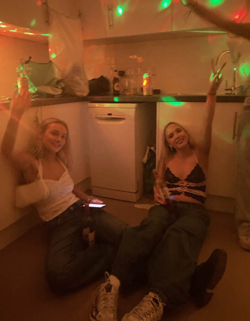
These images I have paired together because they were taken at the same party and the lighting is originally very similar as they both have a yellowish tint and red and green disco lights in the background. I edited these so that there was a darker tint and increased contrast with the people and the background
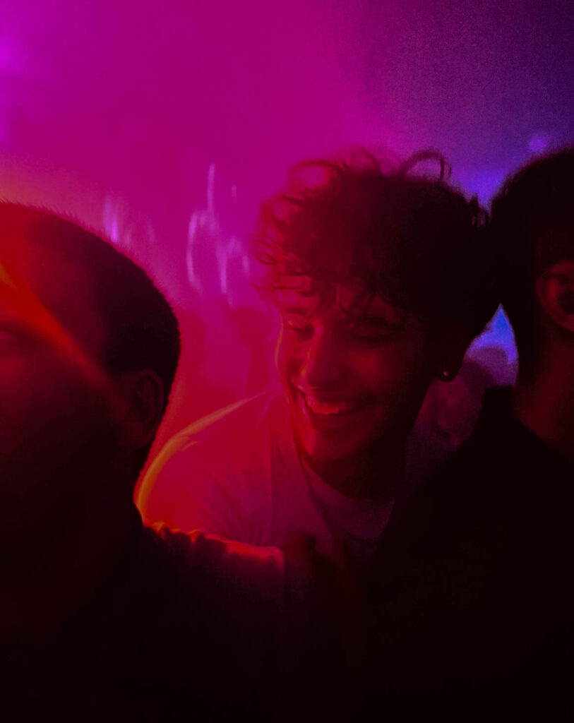
These images were also taken in the same night. I have chosen to put these two together because the lighting is dark with strong colours in both images. I have increased both the vibrance, saturation and clarity of both these images so that they are really stand out a lot and show a lot of exposure within the image.
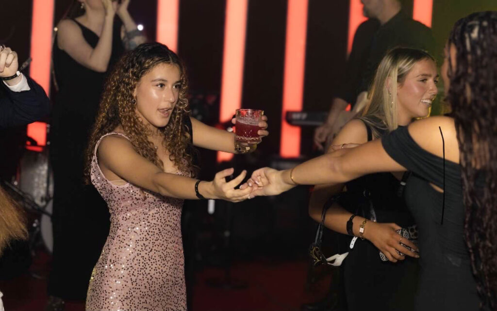
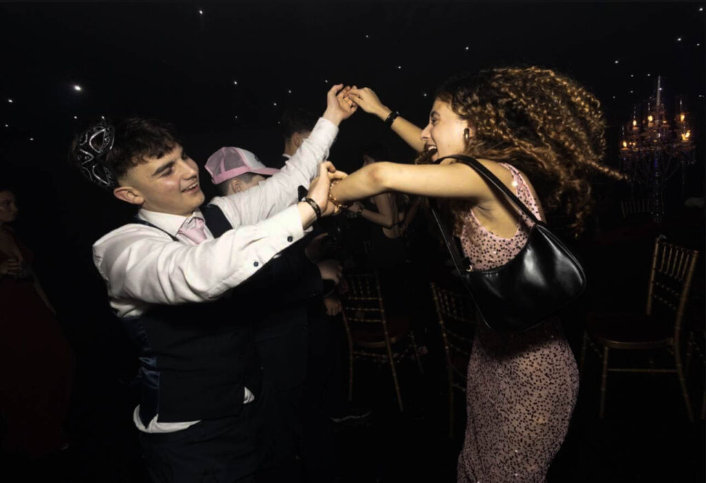
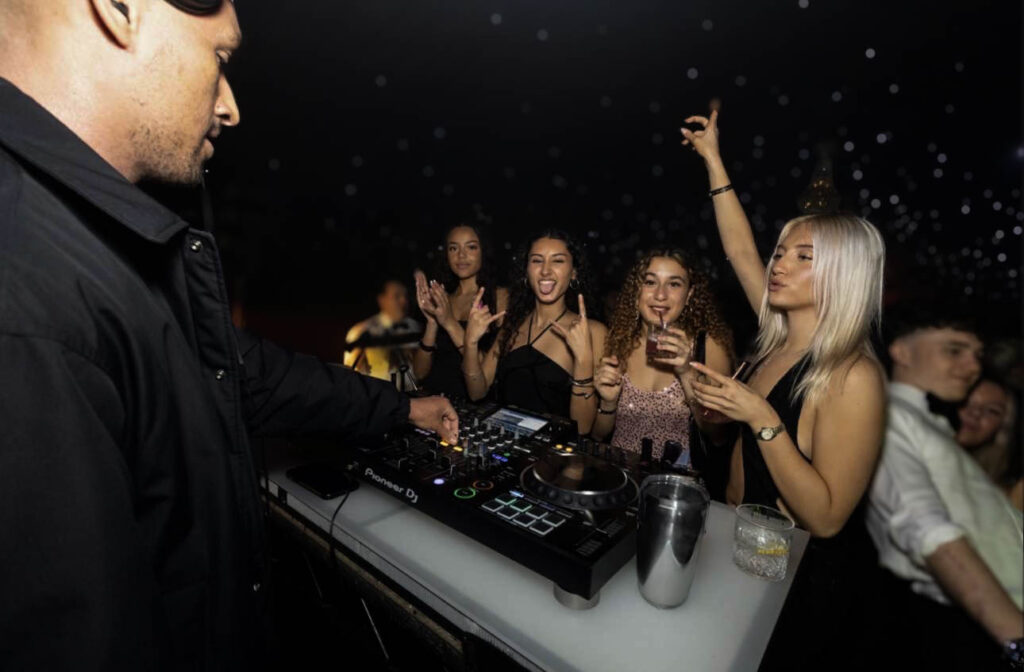
These images are taken of my friends at a party. The main focus in these images is my friend in the pink dress. She is in all three photos and they all show the different people she has been talking and dancing with, showing the very social aspect of a party. I haven’t edited these images much apart from the blurring with the strong blur effect on Lightroom and I made the images look darker but with more contrast and a warmer tone with the tint and also a filter on the first photo. For one of these images I used AI on Lightroom to remove a water bottle and replaced it with a metal cup which looks much better than the water bottle which I feel ruined the photo.
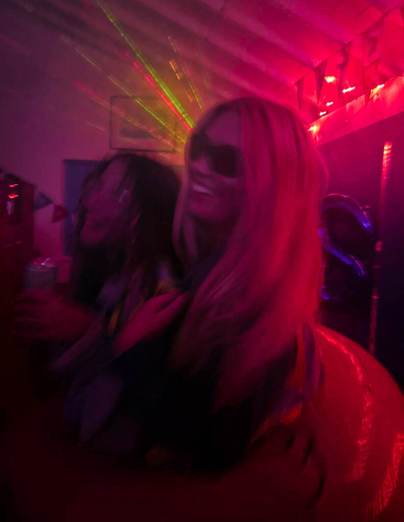
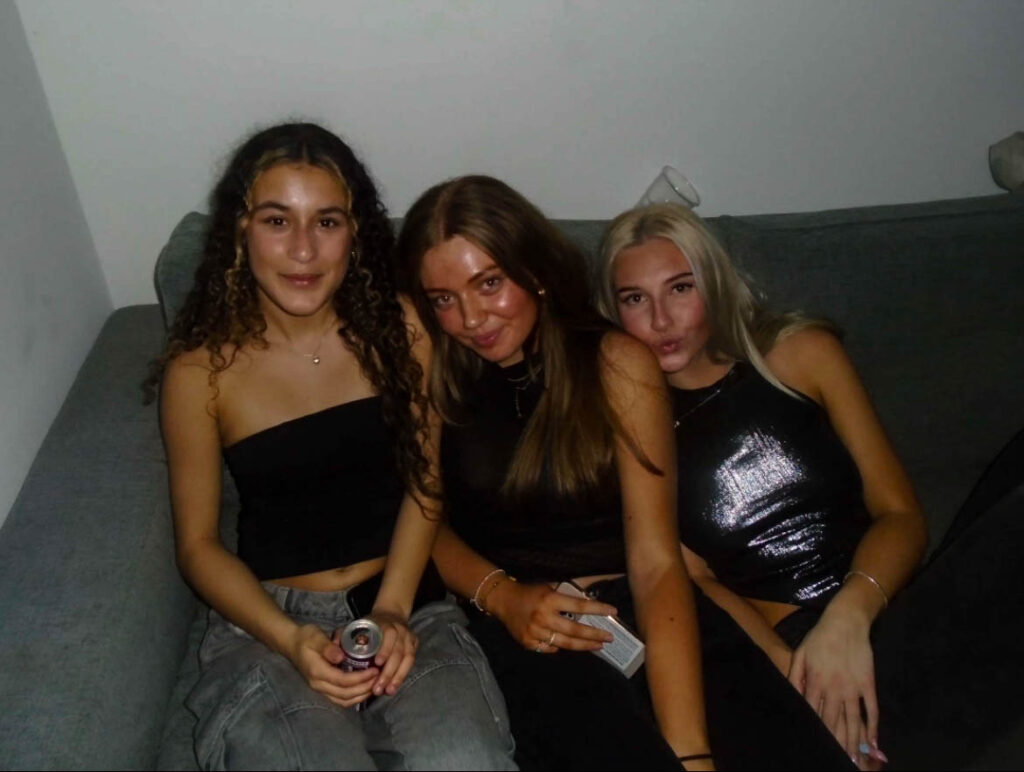
These images are at two different parties but I think they go well together because of the similarities of both images, like the fact they are both laughing and the type of photo is just very similar in general. Originally the image on the right was green but I edited it to pink as the green was not a nice tone and I prefer the pink, because it’s as if the photos were taken at the same time and place. They also look better as a pair this way.
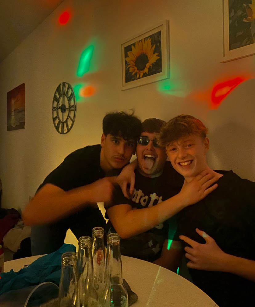
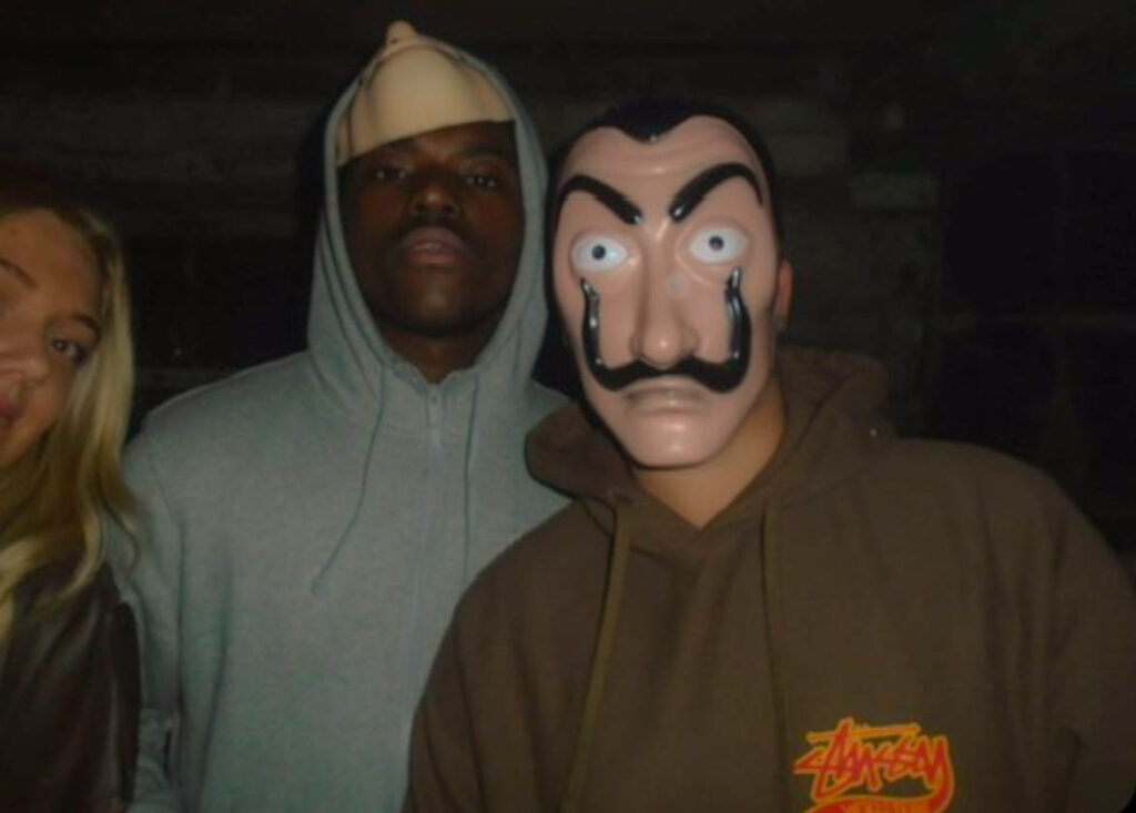
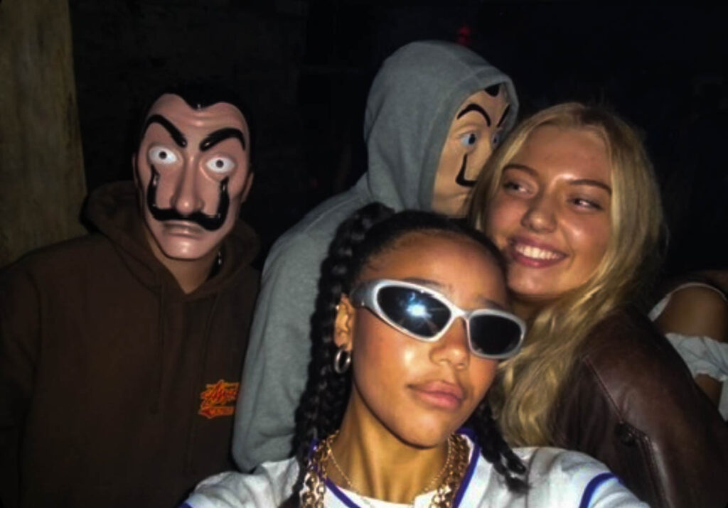
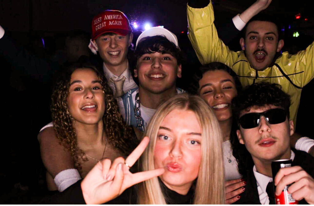
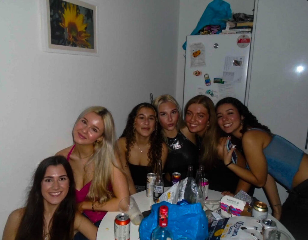
These images of me and my friends were taken on two different types of cameras. The top two photos were at a Halloween party where we were all dressed up, these were taken on a small digital camera. I like the way these came out because I like the exposure on them and the neutral colours. The other 4 images were taken on a photobooth camera at another party I went to with my friends. These images are colourful in themselves so I didn’t add any fake lighting colours to them. I turned the exposure up for all of them to make it brighter and look clearer so all the colours stood out without adding any unnatural ones.
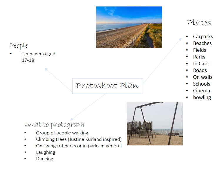
For the first photoshoot I am planning to get a group of friends to drive to a location where we can take photographs in a outdoor setting with good lighting. I will use the school camera to insure I get good quality images rather than using my phone. I am planning to go at a time where the sun is setting but the lighting is still good for images. I also will try and get images in the dark as well after the sun has set.
Teenage Stereotypes
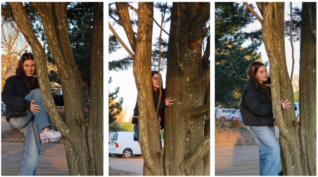
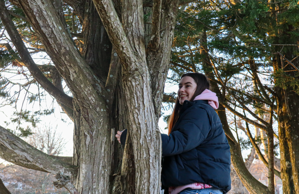
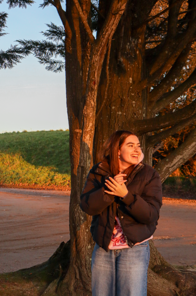
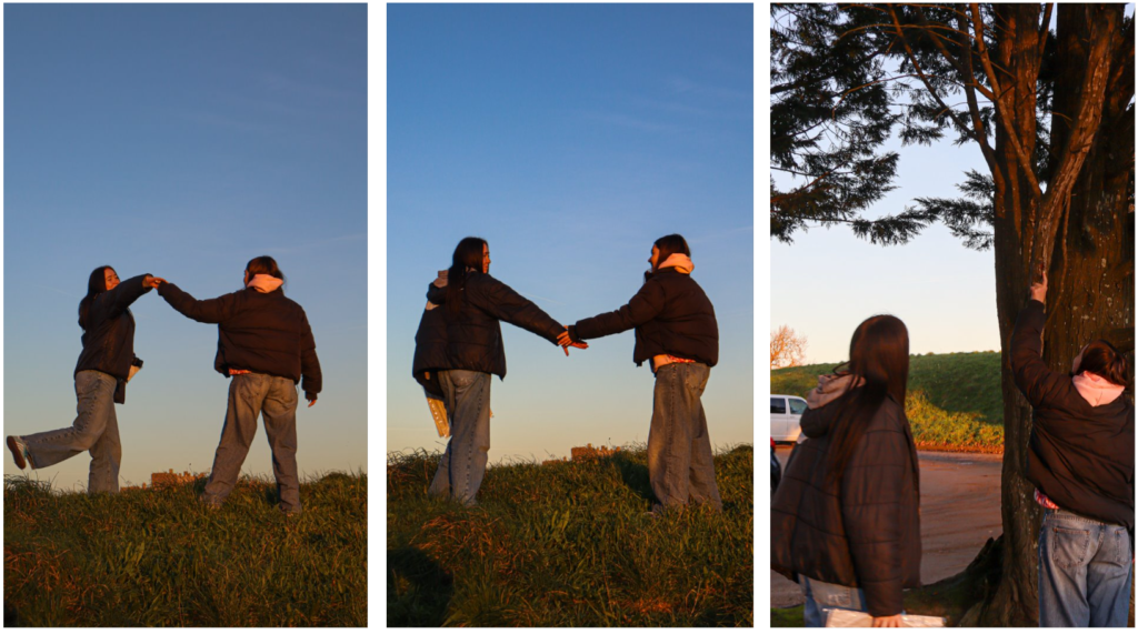
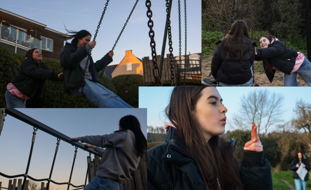
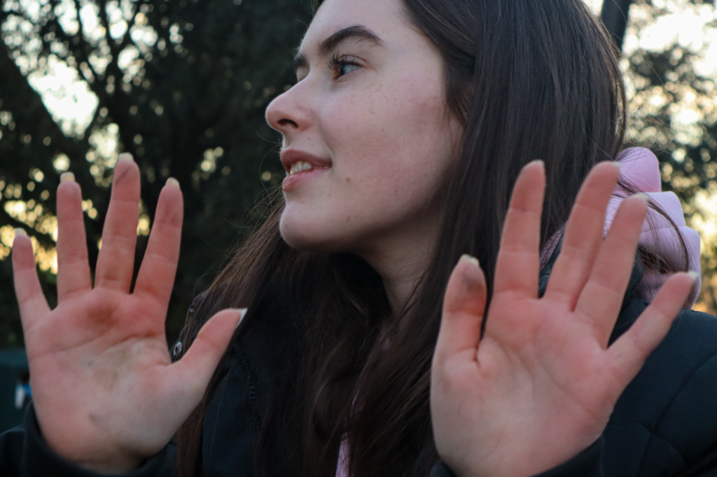
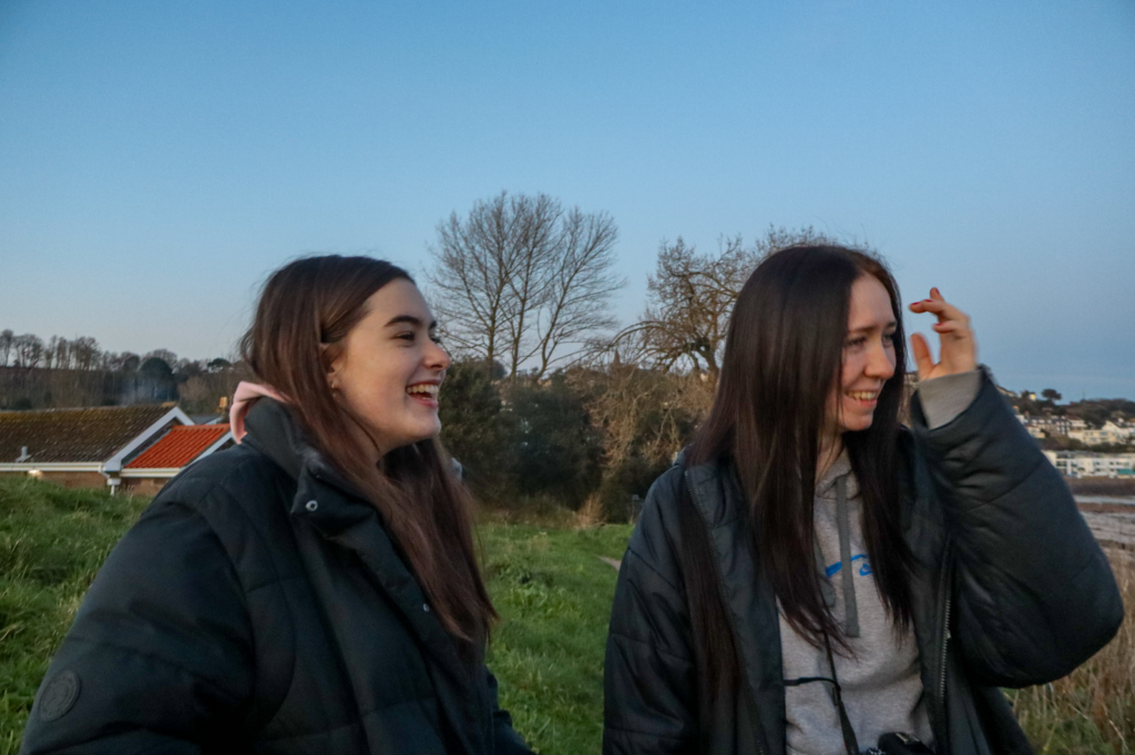
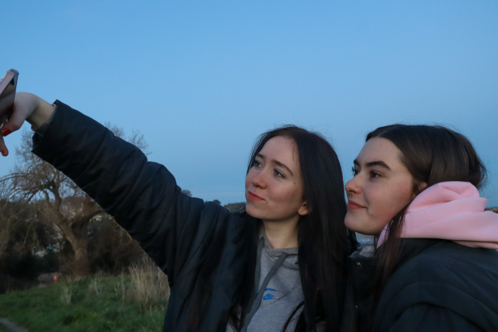
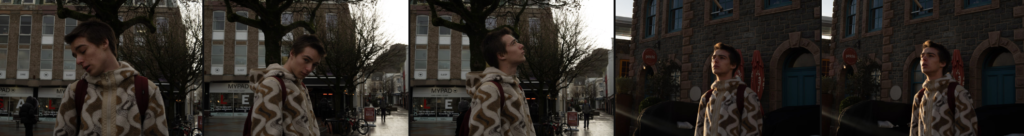
This photoshoot was based in Gorey at around 4-6pm where I took images in a carpark, park and on grass fields. I got a few images which included a group of individual but most images tended to focus on one person as the model. My images also aimed to be inspired by a few of Justine Kurland’s photographs by making the photo based in trees, grass areas and open spaces. The lighting in the images work really well to create a warm and happy feeling to the images. the use of the sunset creates a soft tone and makes the lighting of the images a lot better.
This image above is also one of my favourite images as it brings a sense of happiness to the image and I also really like how the lighting turned out. I think this link really well too teenage stereotypes as it explores the theme of friendships and you are able to see the enjoyment being shown by the face expressions.
1. Research a photo-book and describe the story it is communicating with reference to subject-matter, genre and approach to image-making.
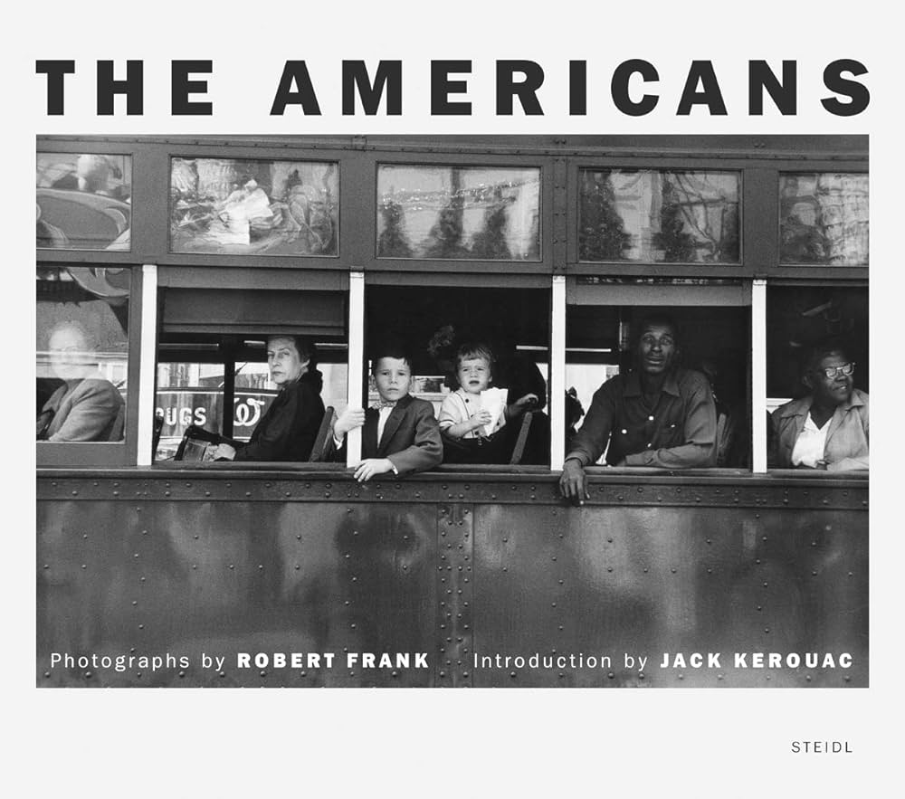
‘The Americans’ – Robert Frank, Published 1958.
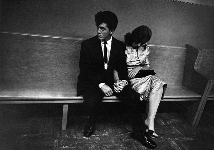
“The Americans” is Robert Frank’s vivid firsthand reportage from the contradictory and out-in-the-open society of America in the 1950s: alienation, social rifts, and chasms between the American dream and reality. Here indeed is the documentation of life, through unpolished, often unorthodox images, with grainy, blurred compositions and odd views where even the emotional intensity is powerfully felt in the visual representation. A documentary style mixes personal vision and brutal facts: an aesthetic deprivation in full strength with a critical, nuanced view of America.
2. Who is the photographer? Why did he/she make it? (intentions/ reasons) Who is it for? (audience) How was it received? (any press, reviews, awards, legacy etc.)
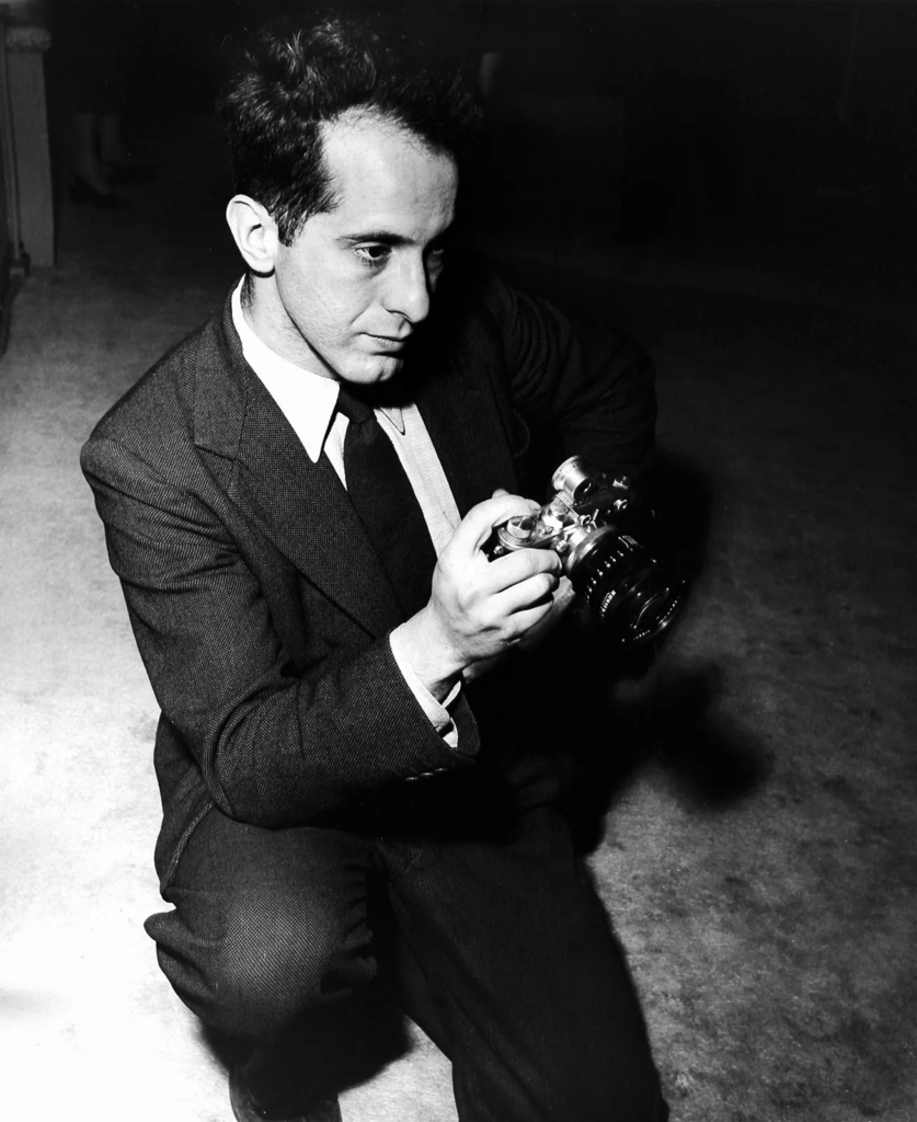
Robert Frank, 1924 – 2019.
Robert Frank created The Americans for a personal, critical view of American society, a reaction to the gulf between glamorized imagery and lived social realities. He was intent on assaulting the conformity of 1950s America, with a special focus on the racial and economic disparities that he believed the country bred. The book was targeted at just about anyone, but especially the people who were in doubt about what postwar America stood for. Reaction was mixed at first: some hailed its innovation, while others spurned it as a false view of America. Over the years, it became one of the most talked about works in the picture world, transformed the documentary photograph, and made Frank’s name as a pioneering visual artist.
3. Deconstruct the narrative, concept and design of the book and apply theory above when considering:
Book in hand: how does it feel? Smell, sniff the paper. -A book smells like a delicate blend of fresh paper, ink, and time—an earthy, nostalgic scent that mingles the crispness of the new with the mustiness of the old.
Paper and ink: use of different paper/ textures/ colour or B&W or both. -In The Americans, Robert Frank uses black-and-white photographs printed on textured paper, enhancing the raw, gritty realism of his documentary style.
Format, size and orientation: portraiture/ landscape/ square/ A5, A4, A3 / number of pages. –The Americans is a large, landscape-format book with 83 photographs spread across 128 pages, allowing Frank’s images to have a wide, immersive impact.
Binding, soft/hard cover. image wrap/dust jacket. saddle stitch/swiss binding/ Japanese stab-binding/ leperello – The Americans has a hardcover binding with a dust jacket and uses Swiss binding, allowing the book to open flat and display its photographs with durability.
Cover: linen/ card. graphic/ printed image. embossed/ debossed. letterpress/ silkscreen/hot-stamping. -The cover of The Americans is made of cardboard with a printed image and embossed title, reflecting the raw, simple aesthetic of Frank’s work.
Title: literal or poetic / relevant or intriguing. – The title The Americans is literal, referring to the subjects of the book, yet intriguing as it suggests a deeper exploration of the complexities and contradictions within American society.
Narrative: what is the story/ subject-matter. How is it told? -In The Americans, Robert Frank tells a story of postwar America through raw, black-and-white photographs that capture moments of alienation, social tension, and vulnerability, offering a critical and fragmented view of the nation’s complexities and contradictions.
Structure and architecture: how design/ repeating motifs/ or specific features develops a concept or construct a narrative. –In The Americans, Robert Frank uses a deliberate structure of seemingly unconnected, yet thematically linked, images to create a visual rhythm that reflects the fragmentation and diversity of American society, with repeating motifs such as shadows, reflections, and isolated figures reinforcing the themes of alienation and social disconnection.
Design and layout: image size on pages/ single page, double-spread/ images/ grid, fold- outs/ inserts. – In The Americans, the design and layout feature a mix of single-page and double-spread images, with varying image sizes that create a dynamic flow, while the use of sparse grid-like arrangements and occasional full-bleed photographs enhances the emotional impact, allowing the viewer to experience the narrative in a way that emphasizes both intimacy and expansiveness.
Editing and sequencing: selection of images/ juxtaposition of photographs/ editing process. -In The Americans, Robert Frank’s editing and sequencing of images carefully juxtapose moments of stark contrast, such as joy and despair, to highlight the tension and complexity of American life, with each photograph chosen for its ability to convey a deeper narrative, while the overall sequencing creates a rhythm that intensifies the emotional resonance of the book.
Images and text: are they linked? Introduction/ essay/ statement by artists or others. Use of captions (if any.) -In “The Americans”, Robert Frank links images through sequencing rather than captions, allowing the photographs to speak universally, while Jack Kerouac’s poetic introduction provides a thematic frame, inviting viewers to interpret the fragmented reality of post-war America on their own terms.
UNDERSTANDING PHOTOBOOKS: NARRATIVE, EDITING, SEQUENCING, DESIGN, FORM, FUNCTION
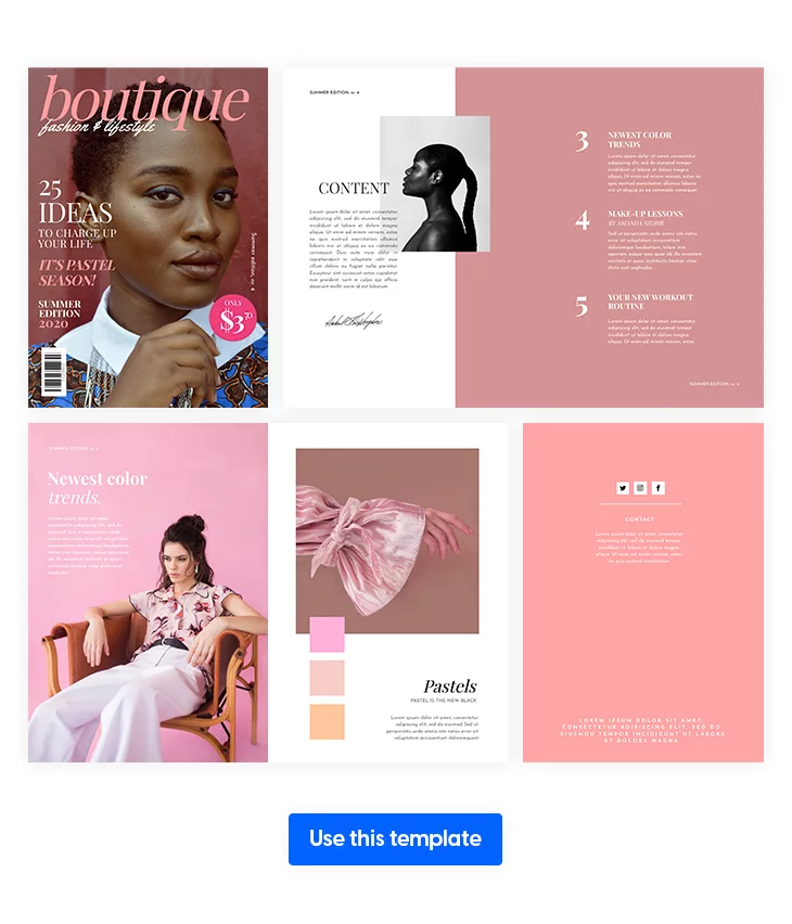
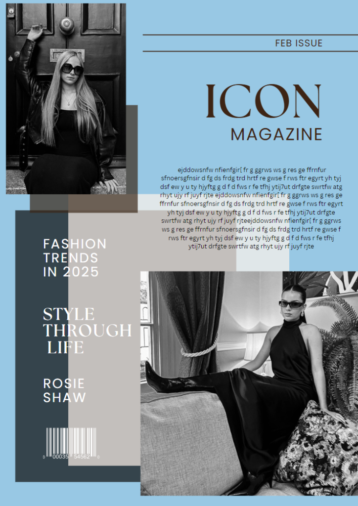
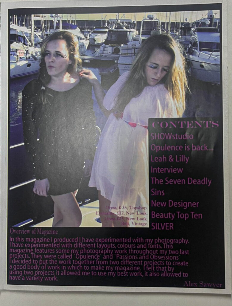
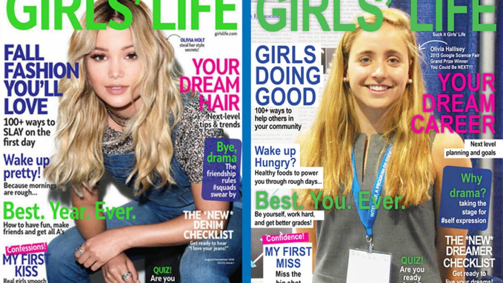
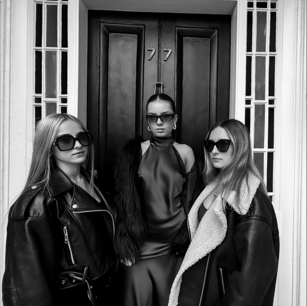
I have decided to create a magazine page to experiment what my images would look like in my book if I were to create a magazine style book.
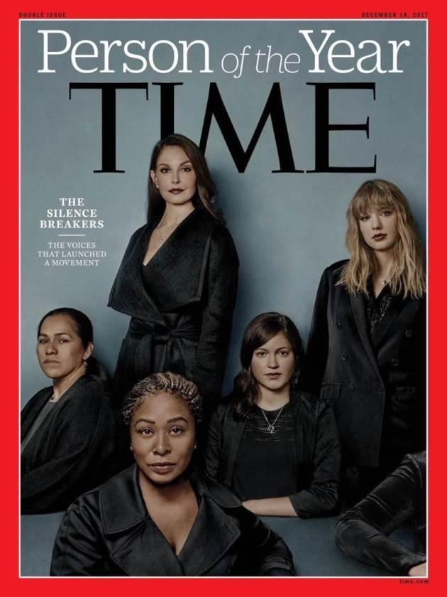
I have researched on many previous students’ work that have revolved around women’s’ equality, beauty and fashion magazines and Cindy Sherman’s entitled film skills. By researching these different themes of femininity in photobooks I am able to choose the specific layout and style of book that will compliment my work of the juxtaposition between fashion magazine modelling and how it undermines, humiliates and sexualises women, BUT also how feminist movements and support is helping to shift these stereotypes.
EXAMPLES:
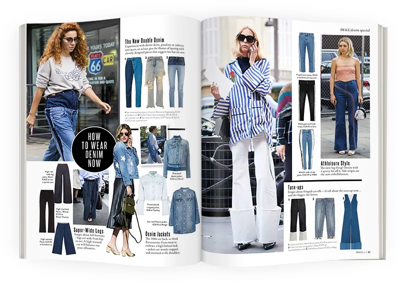
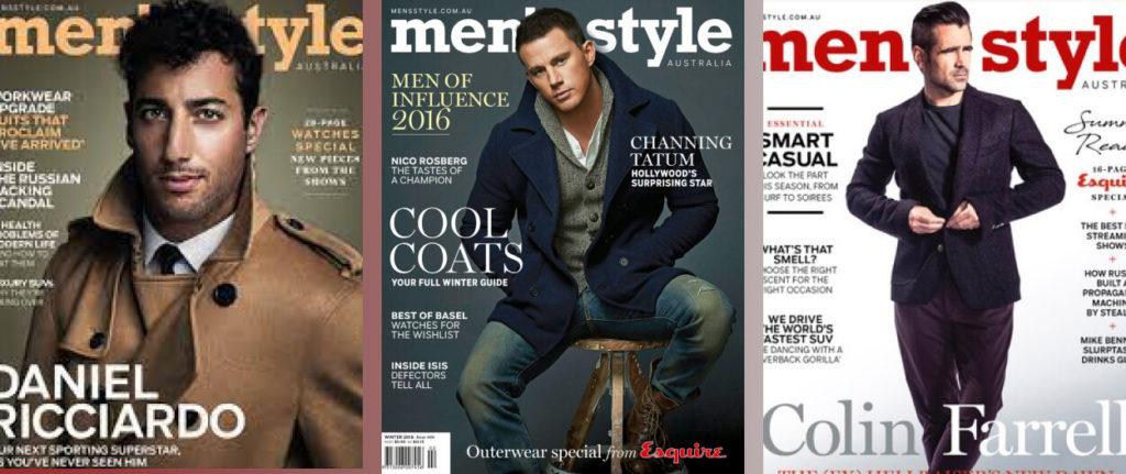
Here are some layout examples of modern day fashion, celebrity and gossip magazines. However has my images vary in themes styles and eras, I am struggling to figure out a way that can differ my photoshoots and their different meanings.
TEMPLATE:
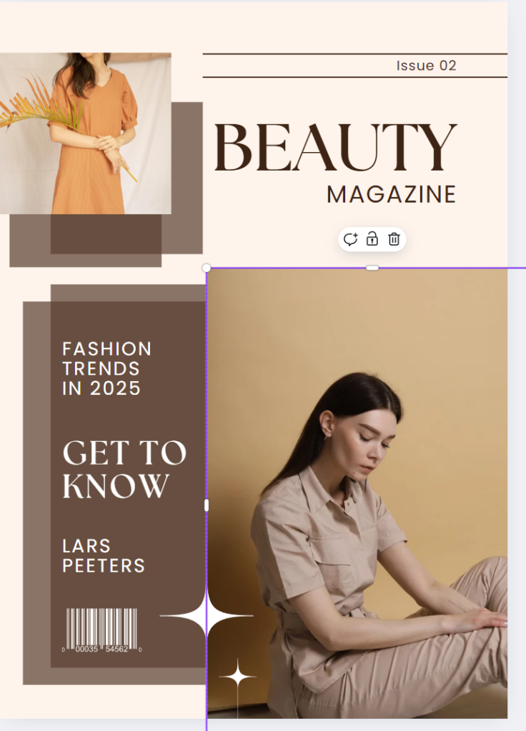
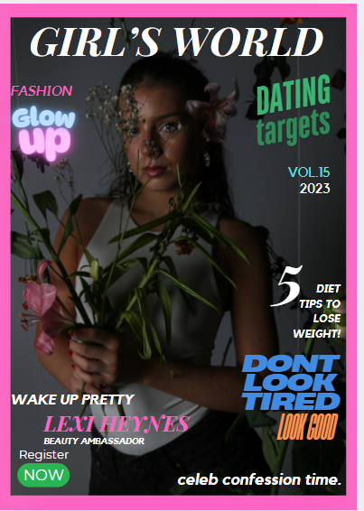
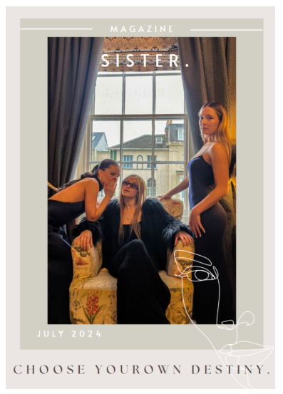
MY MAGAZINE:
EXAMPLE OF AN AIM:
This is an example of a magazine that could be a usual, mainstream fashion magazine which has women empowerment, but is also slightly stereotypical by including celebrity gossip and ‘style tips’ as opposed to women’s stories and empowerment about a ‘new wave of beauty’ and how being natural and yourself is not ‘not beautiful’.
PAST STUDENT WORK INSPIRATION.
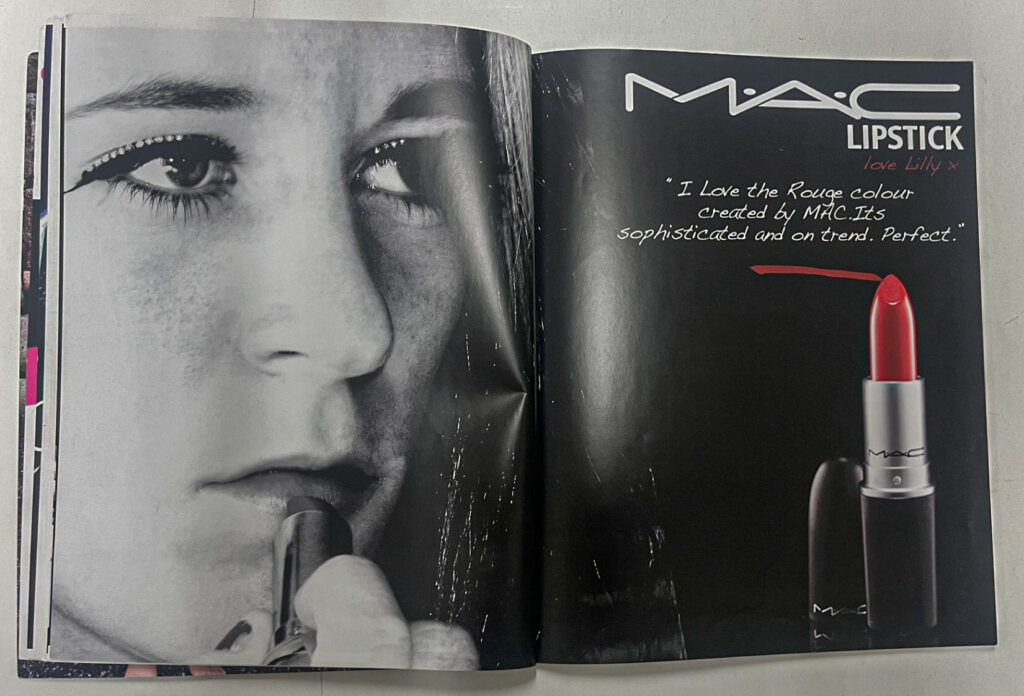
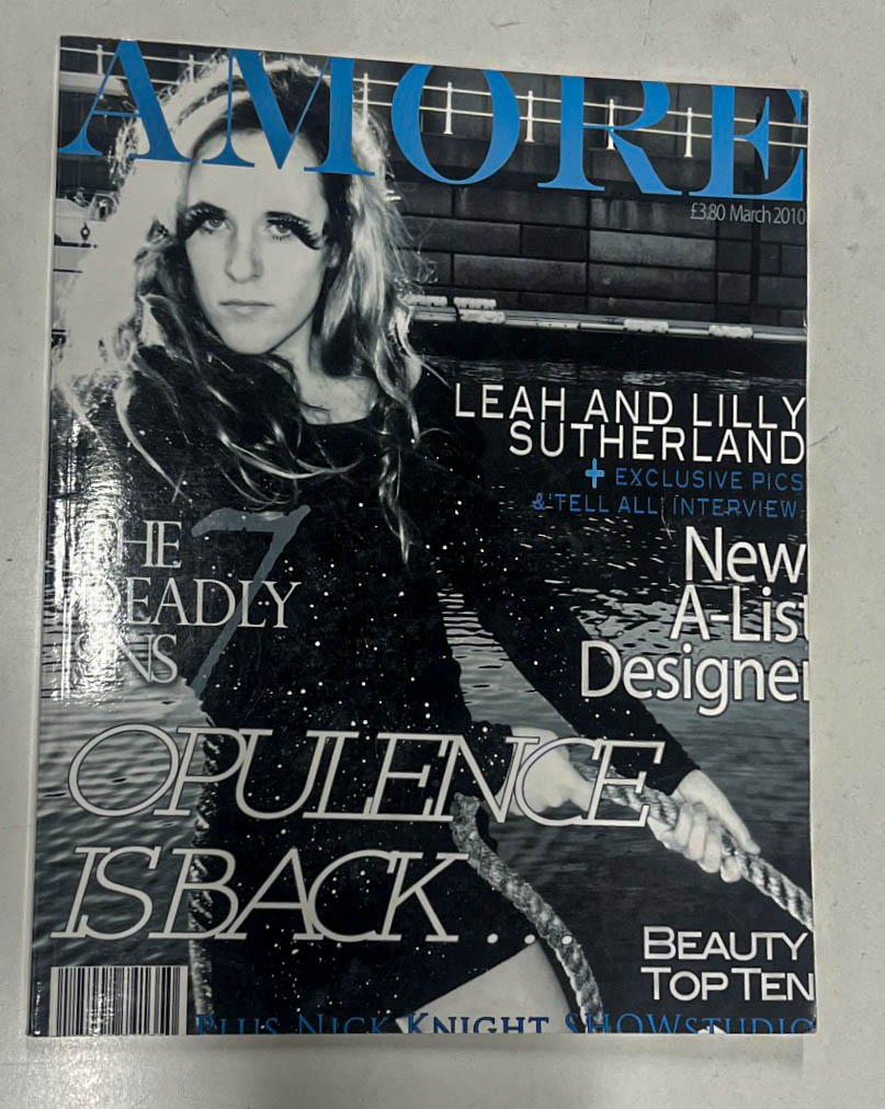
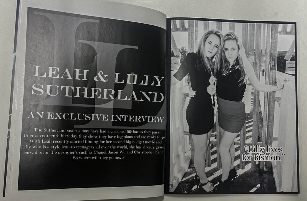
By researching this style of photobook I have gained ideas on layout content and photographs. This past student’s work is very similar to what I would like to create apart from few minor details. I would like my photobook to include at least 3 different magazines inside. This past students work of ‘Leah and Lilly Sutherland’s’ work has helped me to direct the type of work I would like to create in progress with my personal study project. They have incorporated fashion into their photography and used well known brands such as Mac and Dior to impersonate promoting these brands through modelling. This is particularly inspiring for me and has shown me ideas on how to layout my images for my middle section of my photobook which will include a magazine for promoting products through the objectification of women and stereotyping them into believing they must look good, smell good and please the male gender in order to be attractive and successful.
LAYOUT IDEAS:
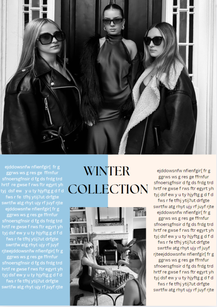
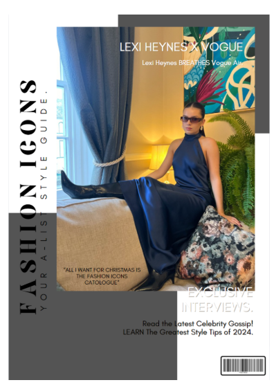
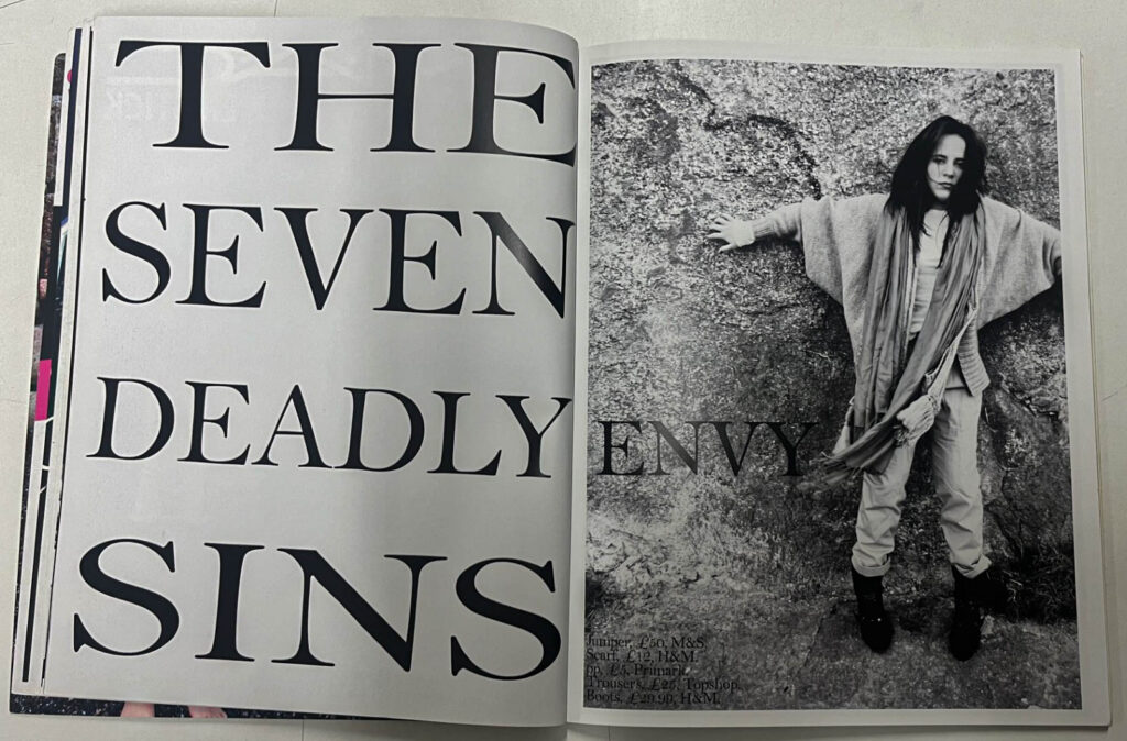
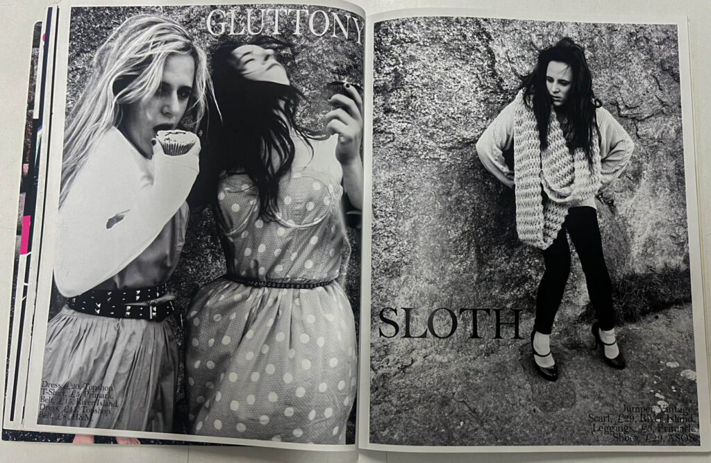
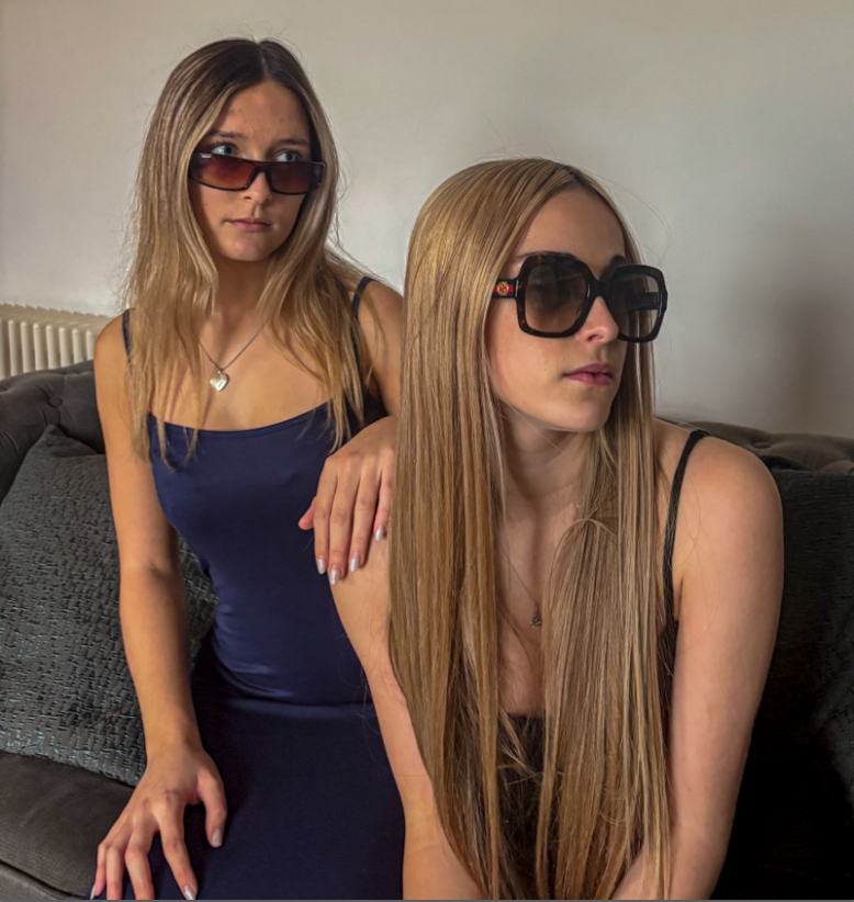
I would like my photobook to include 3 different viewpoints and interpretations of magazines. This would show the viewer the types of negative and positive messages that are shared in mainstream media and highlight the key difference between them. The front cover would differ from the magazine. I would like my first magazine to have its own front cover style first page and include photographs from the photoshoot which relates to that era and style of photographs. I would like my second section to also then have a magazine style front cover and include images hat are edited in photoshop to example articles and spreads in media products that pressures and create negative imagery for young people to want to spend their money on in order to fit the demographic of the young beautiful idealistic woman. The last magazine will also have a magazine style front cover and then include images that are simply displaying fashion and do not dehumanise or objectify women and instead show them as having possession of power and authority.
Front Cover Idea.
The front cover would be a basic cover not related to either of the three magazines but more an overview of the general message. Most likely I would like to include images that I have taken in a previous photoshoot of my 3 models. These images show women showing their natural personalities. These images show my 3 models that are used within the book in their normal clothes displaying whatever behaviour they feel at the time of being photograph. I believe that this shows a more authentic natural display of these women and how they stay positive and strong regardless of the hardships and difficulties they face.
First Magazine Interpretation Idea.
One would be portraying a negative, dehumanising style of magazine that is forcing negative stereotypes on women and how they should be this, beautiful and attractive at all times in order to please the male gender. This style would be from my Cindy Sherman inspired photoshoot and display a more ‘old fashioned’ way of portraying women. This is to show how time began with media’s portrayal of women and how women directed magazines raised women to think and act.
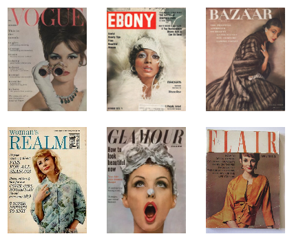
Here are some examples of women’s magazines which influence women to have negative views of themselves and also influence men to have patriarchal unequal views on their wives, girlfriends and women as a whole.
Examples of traditional newspapers from within this time period:
Here are some quotes I could include in my front cover in this magazine and also throughout my images of the first section.
How to look beautiful now.
How you can be more beautiful in 1958
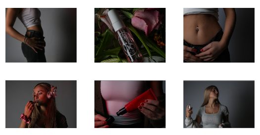
Examples of the type of images to be included in section 1.
Second Magazine Interpretation Idea.
The next magazine style would be a more modern day ‘gossip magazine style which portrays women in a typically less human way but also still focuses on gossip, drama and invading peoples personal lives, whilst also promoting fashion and style products. I would like this magazine to focus on a slightly younger girls and how gender expectations and stereotypes are used to convince girl to purchase goods and products such as makeup, perfume and clothing.
Examples of traditional newspapers from within this time period:
In Touch Weekly
Us Weekly
Closer
Women’s Health
OK!
PEOPLE Magazine
Here are some quotes I could include in my front cover in this magazine and also throughout my images of the second section.
Get slim detox diet
Makeup to cover all those insecurities
Smell better, attract better
Longer, leaner, legs- dress to look taller
Dress to impress the boys this summer
Win a full makeover to WOW your boyfriend
Examples of the type of images to be included in section 2.
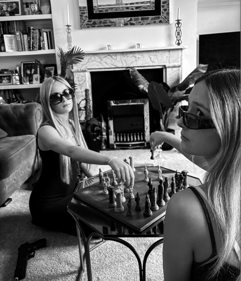
Third Magazine Interpretation Idea.
The next magazine style would be a more modern day women’s empowerment style magazine which displays women as strong and powerful. This section will target a niche market and display women in the way they should be which is inspirational. This is to highlight the future of advertising and how it should be in order to motivate and encourage women to celebrate themselves.
Examples of traditional newspapers from within this time period:
Vogue
Professional Women’s Magazine
Rebellion
Women
Power
Here are some quotes I could include in my front cover in this magazine and also throughout my images of the third section.
Break your silence
The fresh faces of feminism
Share your voice. Stand up
Examples of the type of images to be included in section 3.
Here is an example of a more empowering magazine. This magazine would be about empowering all forms of femininity, beauty, and individuality. By encourage women to be confident, smart, and independent. This differs from mainstream media products and targets more of a niche market of women who are seeking inspirational and empowering content.
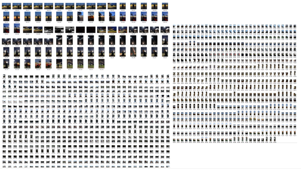
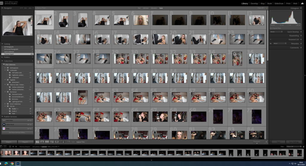
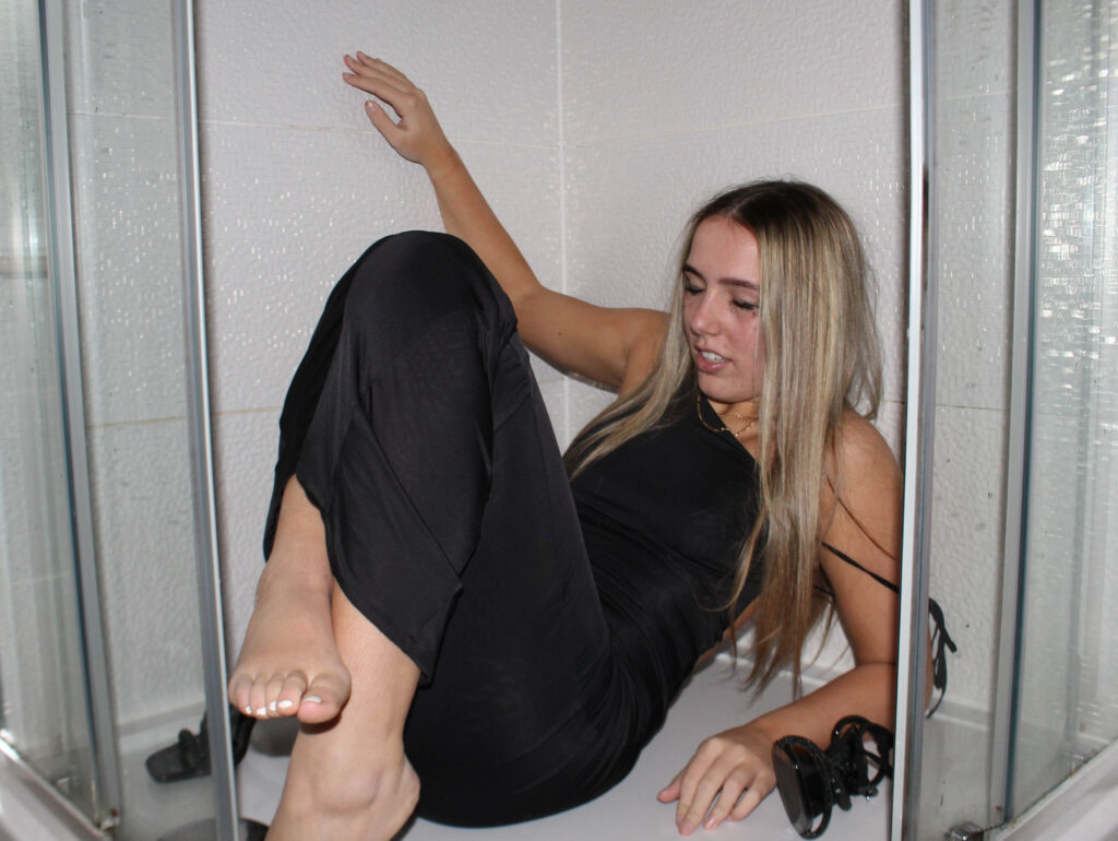
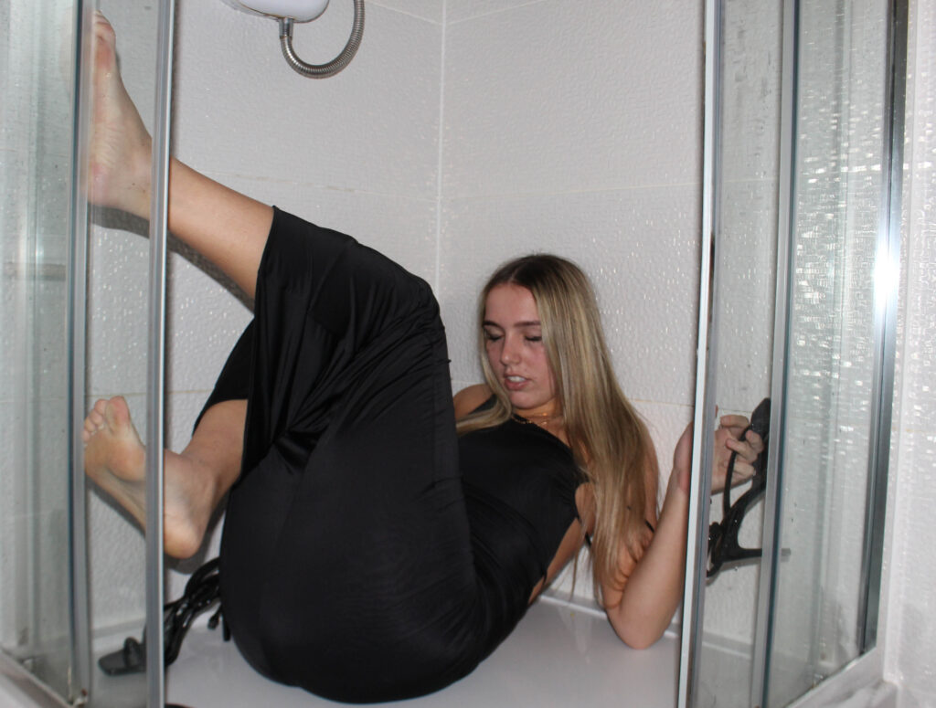
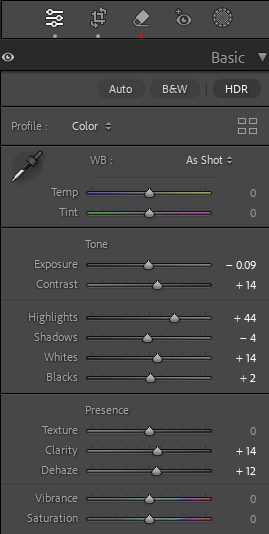
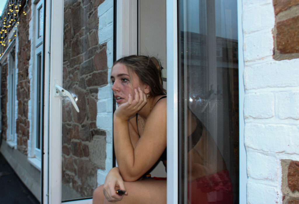
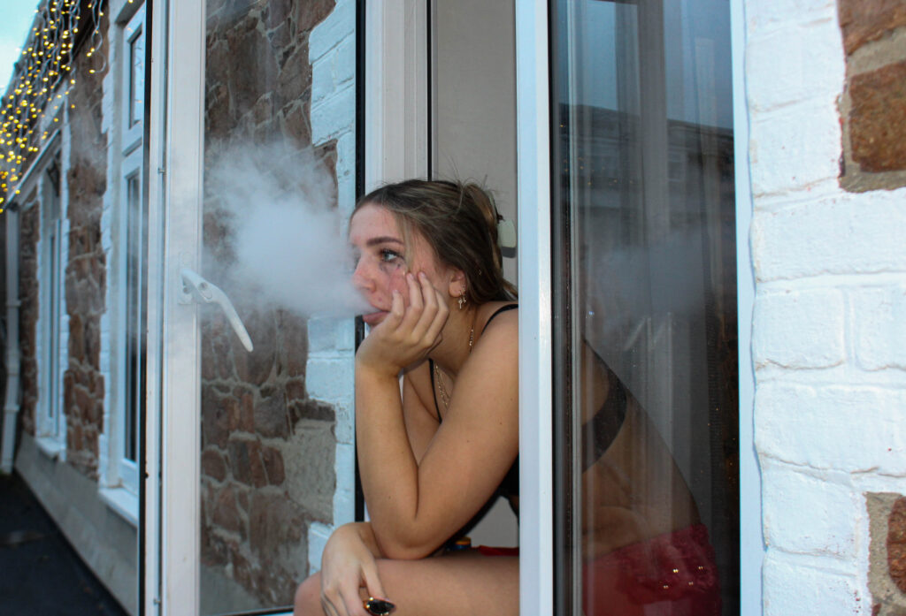
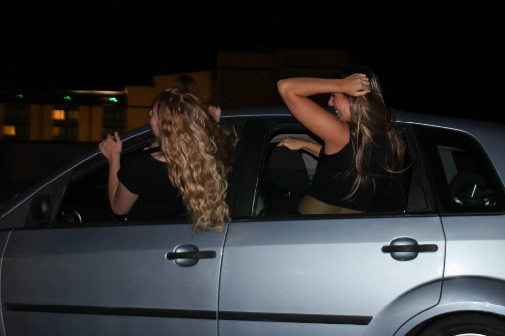
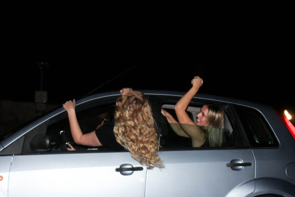
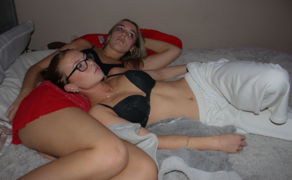
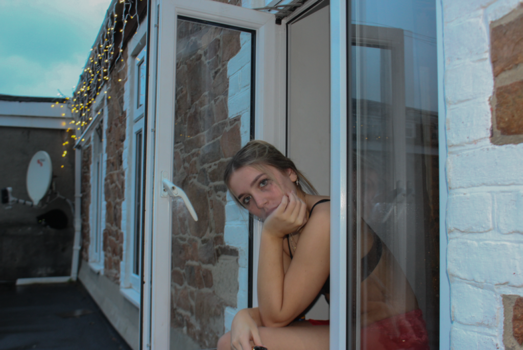
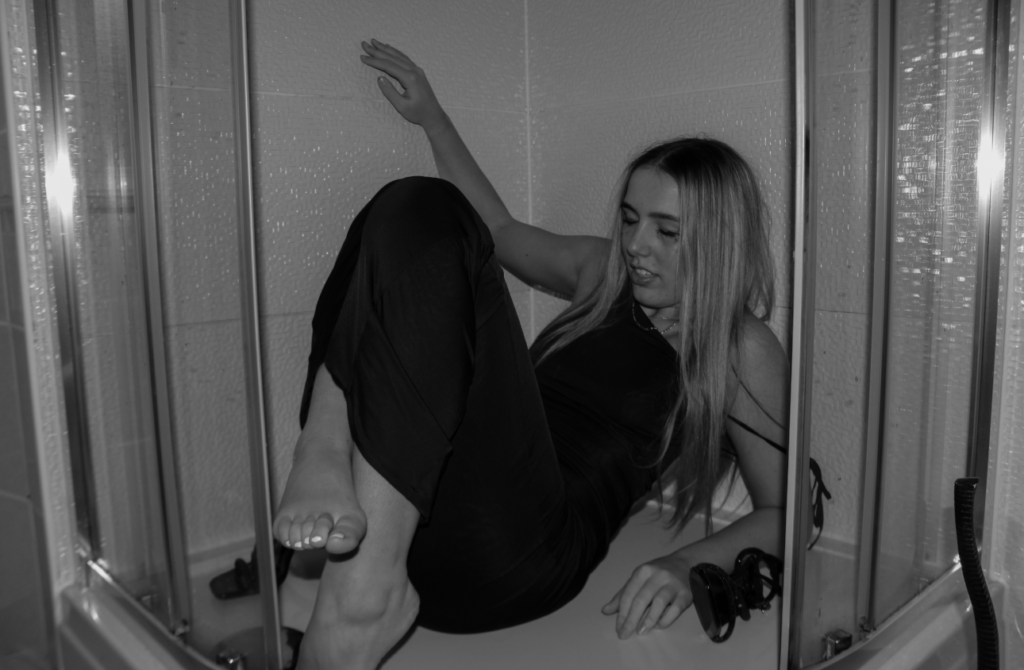
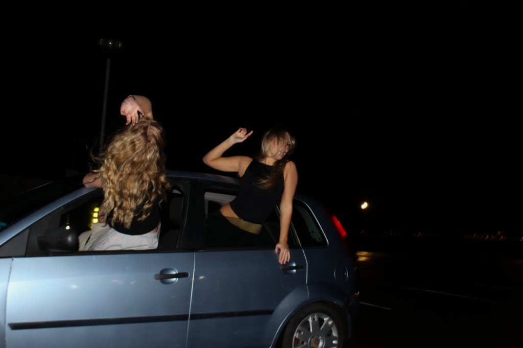
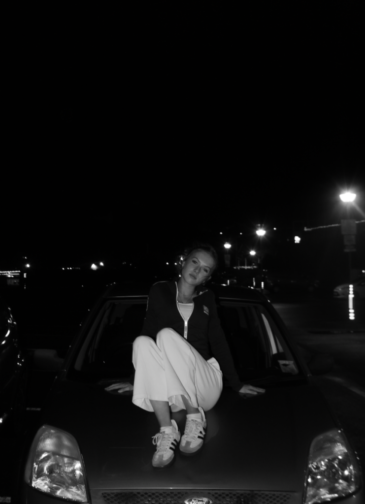
For my first photoshoot I took about 200 images in total where they are all set up. My first photoshoot I went out with my friends and took some images at different places and in different outfits. For the first photoshoot I had my friend dress up in a nice outfit and look drunk in the shower. My second photoshoot was her with a vape, using it looking hungover out the window, I will use these images at the end of the photobook. Lastly we took images of us hanging out of the window of a car. This is because I want my final project to have a break from the party images and have a moment where its just teen girls having fun in a car, which I will use as a filler image. I edited these images all in a similar way with high exposure and strong white and dark colours so they have lots of contrast and look vibrant and powerful instead of boring and soft
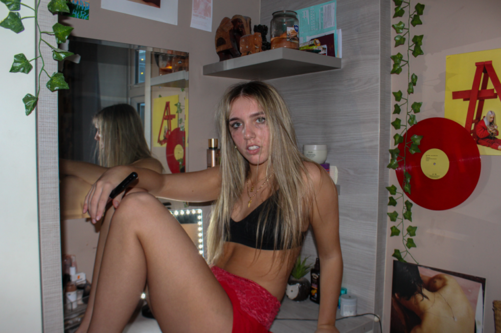
To evaluate, the images above are the final images I will be including in my photobook from photoshoot 2. This is because they visually portray the core themes femininity and youth, while showing a realistic side of growing up as a girl and the stereotypes that follow. Each image was carefully selected to evoke different emotions and interpretations of girlhood, in attempt to show my personal experiences through the camera. My images serve as a metaphor for the different struggles and also the highlights of femininity and youth, while also reflecting the broader elements that come with it, such as the basic stereotypes.
I believe this photoshoot was successful, there are factors I think were executed well yet there are things I wish I did differently and will aim to improve these for my next shoot.
What I think went well:
Clear plan of what I wanted to achieve / how I wanted my images to turn out e.g. the overall mood, the setting and the purpose behind them.
Locations – the use of different environments helped reflect different elements of girlhood. The images taken outside help contribute to the ‘teenage runaway’ narrative.
Clothing – models were dressed appropriately to align with the themes. The colour red and the use of minimal clothing reinforce stereotypes of youth and the idea of being a typical teenage girl.
What I could improve on:
Subject expression – the expression on my models was sometimes slightly off. The viewer could pick up the wrong idea of what I was aiming to achieve.
Camera settings – in some images the lighting and exposure were poor. In some images they were too light and in some they were too dark which made my editing process more difficult to produce high quality images.
Timing of my shoot – I think some images would look more effective if there was natural daylight included, rather than artificial lighting. I think this makes it look more staged.
Overall, I think my photoshoot and experimentation was successful, as I captured several scenes with a range of locations and lighting to create unique outcomes. I took mixed inspiration from my two artists that I have focused on and replicated similar factors in the way my models are presented as well as the use of similar props and clothing to the artists. From here, I will continue to develop my project by taking two more photoshoots, where I will focus on more influences on youth and femininity. I plan to research more about Ramona Wang and Roberta Tocco, as they aren’t my main artist focus, then develop a photoshoot inspired by them alone. In my upcoming shoots, I aim to capture contrasting relationships between females to convey a similar idea to Wang and Tocco, while also challenging typical assumptions and stereotypes about teenage girls.
1. Research a photo-book and describe the story it is communicating with reference to subject-matter, genre and approach to image-making.
2. Who is the photographer? Why did he/she make it? (intentions/ reasons) Who is it for? (audience) How was it received? (any press, reviews, awards, legacy etc.)
3. Deconstruct the narrative, concept and design of the book and apply theory above when considering:
Book in hand: how does it feel? Smell, sniff the paper.
Paper and ink: use of different paper/ textures/ colour or B&W or both.
Format, size and orientation: portraiture/ landscape/ square/ A5, A4, A3 / number of pages.
Title: literal or poetic / relevant or intriguing.
Narrative: what is the story/ subject-matter. How is it told?
Structure and architecture: how design/ repeating motifs/ or specific features develops a concept or construct a narrative.
Design and layout: image size on pages/ single page, double-spread/ images/ grid, fold- outs/ inserts.
Editing and sequencing: selection of images/ juxtaposition of photographs/ editing process.
Images and text: are they linked? Introduction/ essay/ statement by artists or others. Use of captions (if any.)
UNDERSTANDING PHOTOBOOKS: NARRATIVE, EDITING, SEQUENCING, DESIGN, FORM, FUNCTION
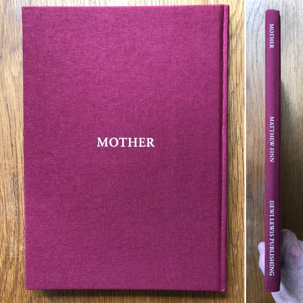
Mother- Matthew Finn.
INFORMATION:
HARDBACK= 280MM x 200MM
ISBN= 978-1-911306-14-6
PAGES= 96 PAGES
LANGUAGE= ENGLISH
PUBLISHER= DEWI LEWIS PUBLISHING
PUBLICATION DATE= NOVEMBER 7, 2017
DIMENSIONS= 11.46 X 0.63 X 9.45 INCHES
ITEM WEIGHT= 1.6 POUNDS
INDIVIDUAL PHOTOGRAPHER MONOGRAPHS= BEST SELLER RANK NO. 3195
PORTRAIT PHOTOGRAPHY= BEST SELLER RANK NO. 5823
Matthew Finn Qualifications.
MA Photographic Studies (University of Westminster)
BA Photographic Studies (University of Derby)
Matthew Finn Teaching.
BA (Hons) Photography at Arts University Bournemouth
BA (Hons) Photography at Lincoln University
BA (Hons) Photography at University of Wolverhampton
MA Fine Art at University of Wolverhampton
Matthew Finn Awards.
Jerwood/Photoworks Award- 2015
1. Research a photo-book and describe the story it is communicating with reference to subject-matter, genre and approach to image-making.
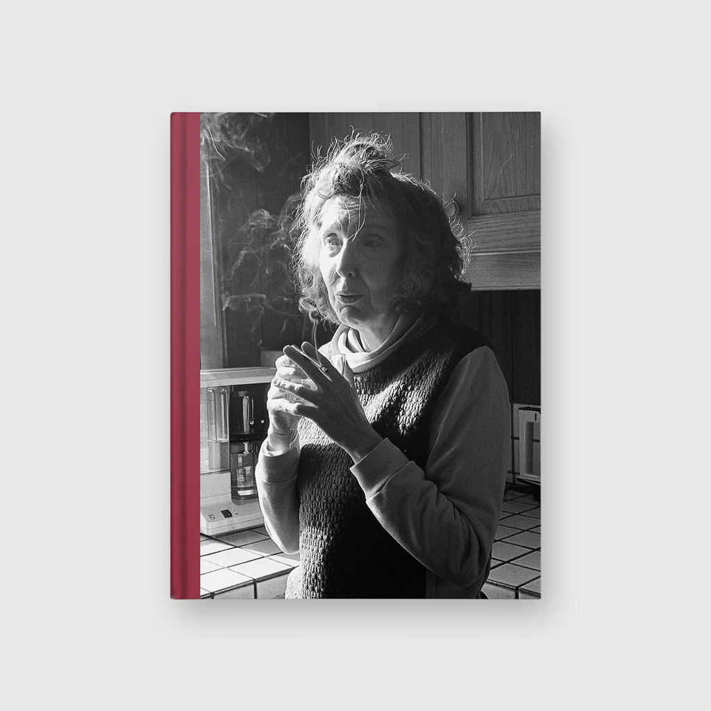
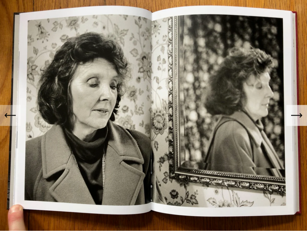
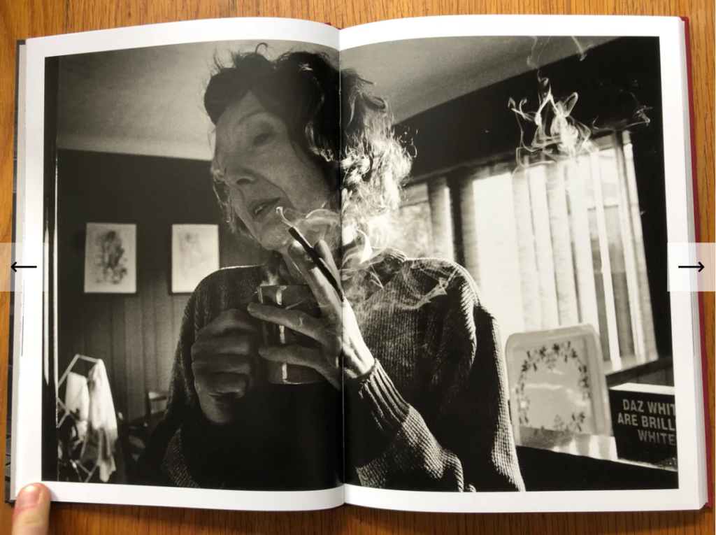
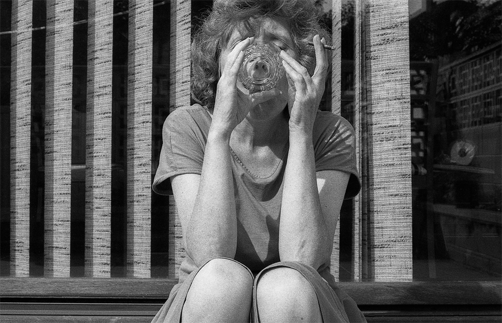
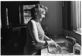
This book is a representation of Matthew Finn’s mother, Jean. He decided to photograph her in her home in Leeds in order to record and document her life as she ages and lifestyles change. The photos are reflecting a meaningful and touching overview of parents dealing with loneliness, old age and death. The bond between mother and son is also displayed throughout as relationships change and evolve through time. The quote “For my mother and I, this switch of roles was quick. Diagnosed with mixed dementia two years ago, she fell silent and our collaboration was over. I no longer exist to her and she cannot recognise herself. What remains are these pictures” demonstrates how mental issues and illnesses can both affect the person but also those closest to them. Adaptation to lifestyle changes cause emotional damage and this book was created to explore and spread a message about the fragility of life and how domestic changes affect a child. Creating images of his mother became a routine and a comfort to Matthew Finn as a way to appreciate and remember his mother throughout difficult times in their life. Small aspects of his mothers personality and style are repeated throughout such as her hair and significant clothing she treasured. The feeling of needing to protect and support his mother is reflected throughout. After being diagnosed with dementia, his images were no longer able to be captured, so this book is used as a way to reminisce and remember his mother as her true self before illness. The quote “I’ve lived a good life” demonstrates how no matter what hardships and obstacles his other has faced, she is still grateful and positive about the life she has lived.
2. Who is the photographer? Why did he/she make it? (intentions/ reasons) Who is it for? (audience) How was it received? (any press, reviews, awards, legacy etc.)
I chose to research this specific photobook as I believe it contrasts the work I am currently studying of Helmut Newton. My chosen photographer of Helmut Newton, demonstrates high-quality, glamourous fashion images used to promote clothing and products, whereas in contrast, these images focus on the documentation of the life of the older generation and highlight the not so glamourous and idealistic aspects of life. The models displayed in Helmut Newton’s images are photographed for fame, money and attention, whereas Matthew Finn’s mother was photographed as to be photographed is to be appreciated, to be seen and wanted which is an activity where his mother could feel needed and was able to express herself by taking role in what looked good and what she didn’t like. I find it very interesting that Matthew Finn did not mean for his project to become so meaningful and important to him as when he began photographing his mother he believed he created the book “Because she was there! I was about 16 in 1987. I’d just become seriously interested in photography and needed people – things – to take pictures of,” I find this particularly inspiring as something so basic as needing someone to photograph became a popular and touching lifelong project which highlights moments of hope, struggle and frailty are conveyed through Finn’s unceasingly compassionate filial gaze. The photographs are not portraits in the usual sense of the word, yet they are an account of a life, a deeply humanistic response to a set of human circumstances. Whilst viewing this piece of art the audience is able to join the photographer and his mother on a journey of life and how his mother has aged and how some particular habits never die out. These images may relate to viewers and help to consider the meaning of life an dhow their own parental figures have a larger and more significant role in their life than they’d think. By sharing these images, Matthew Finn is displaying only one journey of a single, aging parent in Britain, which represents a certain social class and culture. However, In reality multiple social classes, ethnicity and types of people all still deal with grief, loneliness and solidarity throughout life, especially in such a crucial stage of life such as motherhood.
Photo-Layout.
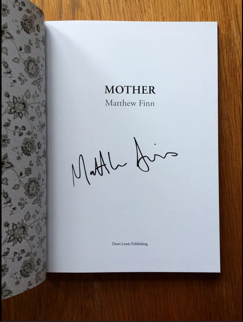
Matthew Finn’s book layout consists of a hardback book containing a beginning page of wallpaper from his mothers home. This beginning page creates an immediate homely, calm feeling of a mothers comfort and how even though he no longer lives in that house, the wallpaper will immediately remind him of childhood nostalgia and looking back. It is then followed by the title of the book ‘Mother’ and the photographers name “Matthew Finn”, followed by a signed signature personally by the author and the publisher in a small font below.
Evidence of ‘mothers wallpaper’ pages and title page.
The book then continues to a small 2 page explanation of touching moments in his mothers life such as different times he has taken images of her over the 30 years and how this project was not carefully ordered material but in fact a need to create stability and a ritual that he was not able to abandon. This essay helps to introduce the reader into the images there are going to view and provides an overview to the love, loss and hardship his mother faced throughout the period of 30 years he photographed her in her home. By doing this, the reader will feel a sense of familiarity and care for the mother and sympathise or empathise with the emotions and struggles she faced, alongside the happy and positive moments she shared with her son.
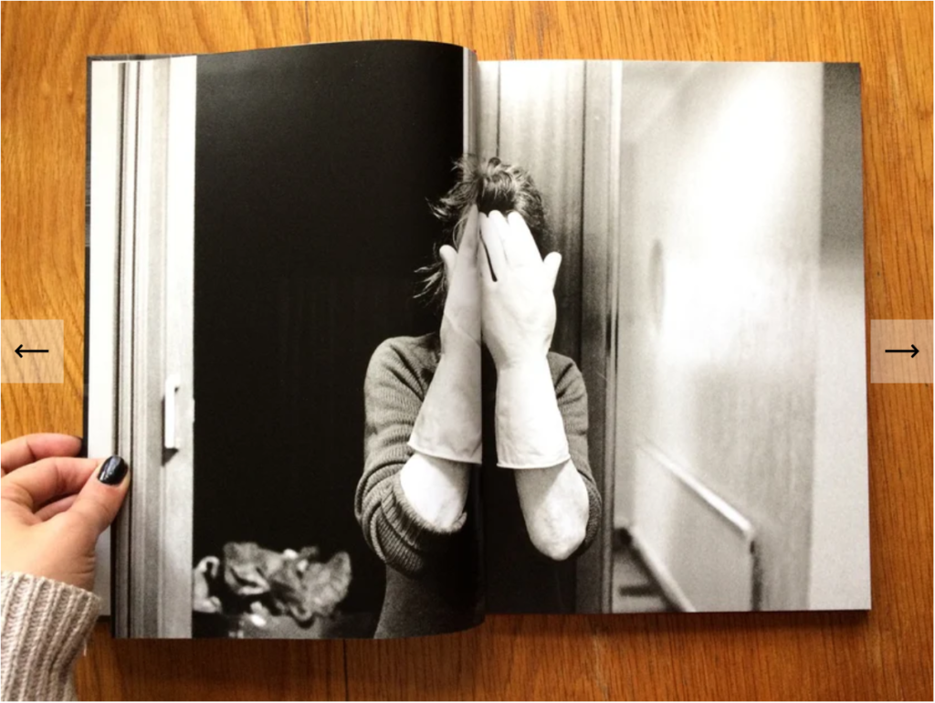
His book then consists of around 90 images of his mother which are displayed as single images, double page images and occasional images with a white border around them. However, these three formats create a theme throughout the book as all the images are presented similarly but differ slightly.
Matthew Finn’s ‘Mother’ Image layout.
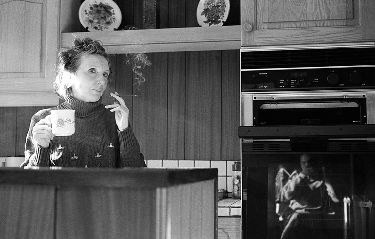
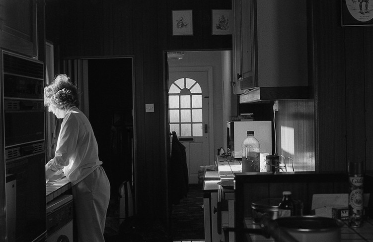
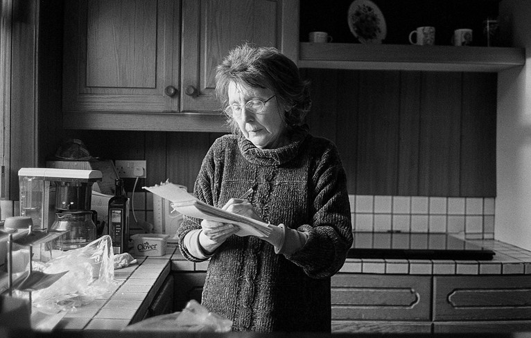
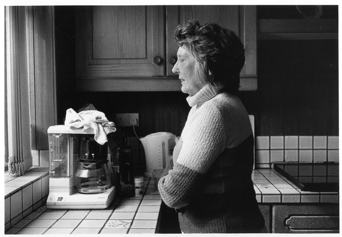
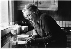
I can see this because in some images she is looking and posing or the camera whilst smoking, talking, writing, drinking cooking or cleaning. This demonstrates her daily duties in her life and her routine in life at her household. and in others she is mid-motion and not looking at the camera.
Example ofHumanPhotography.
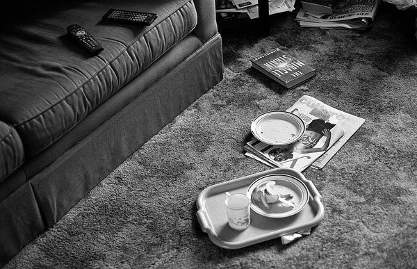
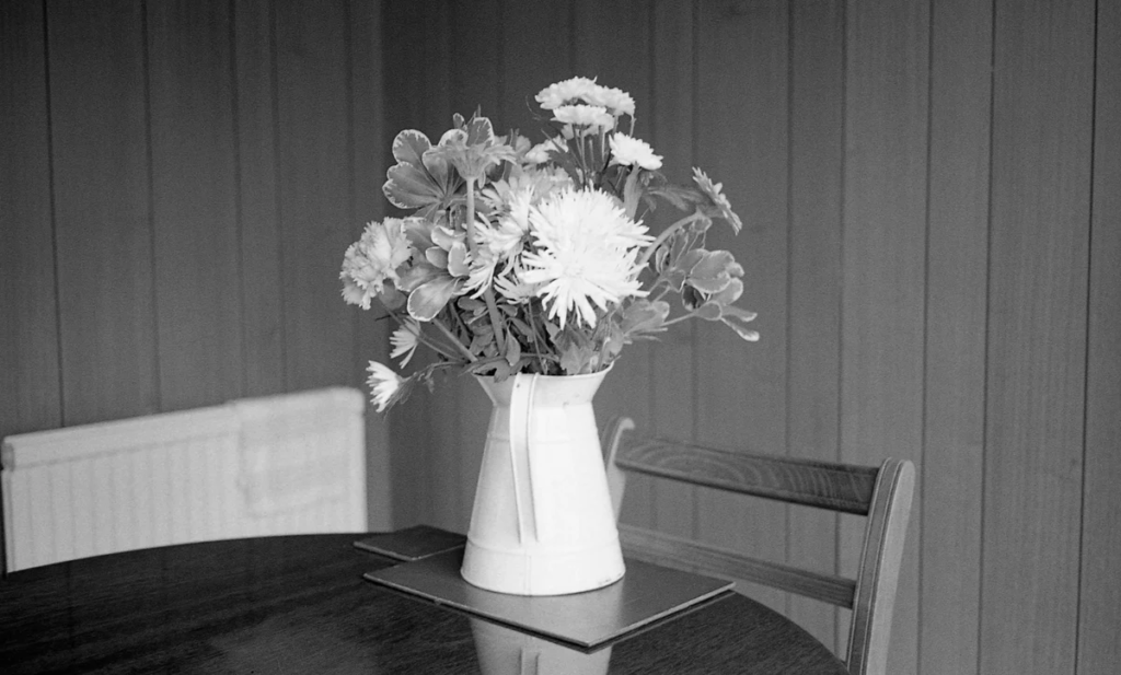
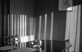
The majority of the images are of the woman herself, however, some of the images are of her possessions and objects in her home such as picture frames, her sofa, tables and rooms. These images are to show her possessions and how they have meaning and purpose in her life as memories and comfort items.
Example ofObjectImages.
The title ‘Mother’- is a straightforward, to the point title highlighting who and what the book is about. The word mother immediately displays to the reader that the person is a parental figure who is an important part in the artists life. The narrative is a story of his mothers life throughout the 30 years and how her physical appearance has changed and how she can been affected by old age and illness. The photos have a trend of candid or documentary photography styles. The structure consists of a concept and narrative of basic everyday life, but instead romanticises a comfort with everyday routine and how her life goes on despite outside events. All the photos are in black and white which is a trend amongst them all as it shows they are all equal and of equal matter. It also shows a more solemn and dismal view as the dark tones show a sense of loneliness and sadness which the mother experiences. Although the images are taken along 30 years the editing of black and white are all similar although technology has evolved massively over time.
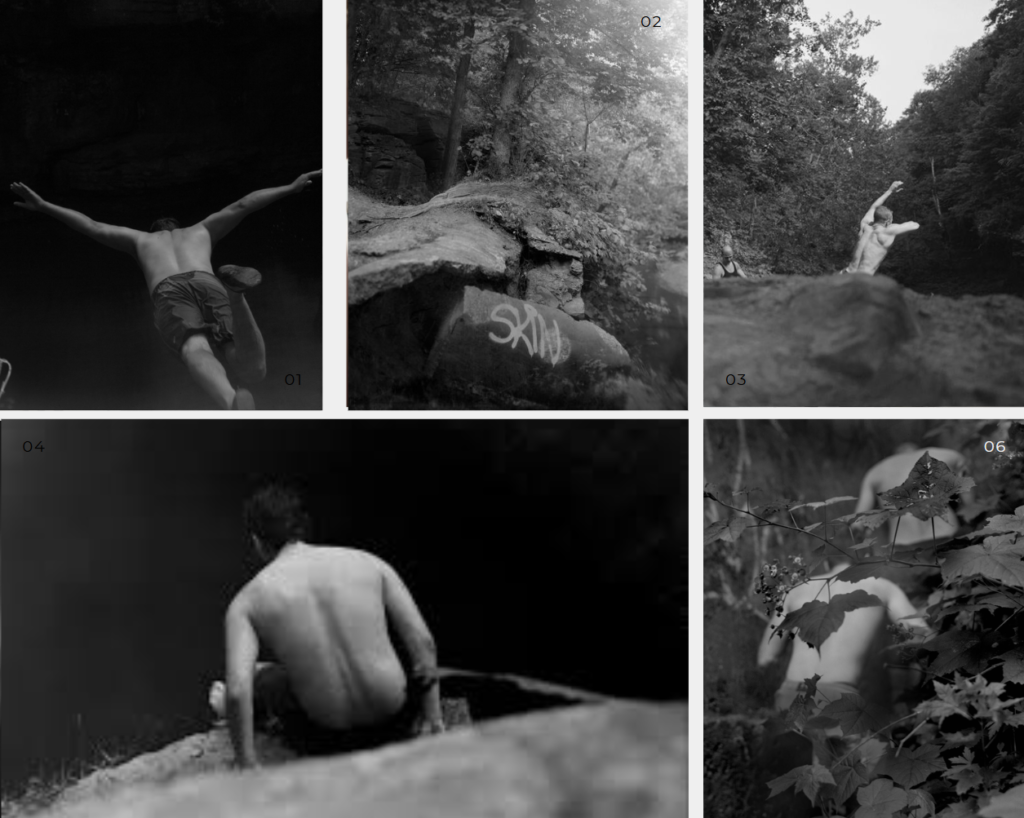
The book I have chosen to look at is called “half- story half-life” it seems to create a story based on perhaps masculinity and the teenage youth among boys, trying to discover their identities and bonding with one another as friends. All the images are set in a forest Using documentary style photography to create a story as although they know he is there taking photos the images are not staged as such and are just showing the adventures of the teens. I feel the story could be representing the fact they might be trying to escape reality, showing that they are care-free and just enjoying life hanging out in a forest. I also got the impression that it could perhaps also represent how males/teen boys tend to be more risk taking hence why some of the images show the boys jumping off cliffs into a natural lake. In almost all of the images the boys have no clothes on the top half of their body which also shows their muscles which could be relating more to the masculinity side of things showing again their strength and more risk taking behaviours that females arguably don’t have as much of.
Some of the images from this book:
2. Who is the photographer? Why did he/she make it? (intentions/ reasons) Who is it for? (audience) How was it received? (any press, reviews, awards, legacy etc.)
The photographer of the book is called Raymond Meeks. Raymond Meeks is a photographer who was born in Ohio in 1963, he has been recognized for his books and pictures centered on memory and place, the way in which a landscape can shape an individual and, in the abstract, how a place possesses you in its absence. His books have been described as a field or vertical plane for examining interior co-existences, as life moves in circles and moments and events, often years apart that unravel and overlap, informing new meanings. Raymond Meeks lives and works in the Hudson Valley, New York. He gains inspiration by book narrative and collaboration with writers of poetry and short fiction and the merging of image and text. Half story Halflife, his recent body of work, is a visual biography of the post-teen age, in a specific time of the year, that leads from blizzards on unknown paths to leaps into darkness. The audience in which Raymond Meeks targets with his photo-book is summer dwellers (which is people who enjoy summer and make the most of it). Raymond Meeks’ photobook named “half-story half-life” was big among those especially youth who were also adventurous and could relate to the images within their own lives. Here is what Raymond Meeks said about what he had gained whilst and after creating this photobook “It was ritual. I was raised Catholic, so these rock outcroppings to me were like altars. These bodies leaping into the dark void almost became like this sacrament. I feel like each generation has to pay for the sins of the previous generation. They were almost offering up their bodies and it’s the process of evolving by way of ritual, that process of coming of age, something that’s been going on at this specific place for as long as people can remember” This quote actually somewhat relates to the study that I am doing as he also bases his personal faith around the images he takes and find references to how he was raised as a catholic.
3. Deconstruct the narrative, concept and design of the book and apply theory above when considering:
Book in hand: how does it feel? Smell, sniff the paper.
The book I have felt quite heavy and the cover was smooth feeling. The smell of the book was also almost musky it smelt rather old even though it was actually fairly new. It also had that distinct paper smell.
Paper and ink: use of different paper/ textures/ colour or B&W or both.
The paper of the book was in between both thin and thick paper it had a gloss coating on the paper which gave it a smooth texture. Each of the pages were white paper ages whilst all the images were in Black & White which gave the book a nice contrast in colour.
Format, size and orientation: portraiture/ landscape/ square/ A5, A4, A3 / number of pages.
The book “Half-story Half-life” is an A4 sized photobook in portrait format. There are 144 pages in the book and of those 144 pages 142 of them are pages with images on them.
The book I am looking at has a Soft cover where small sections have all been folded and held together before being glued to the cover. The cover is a faint image from the book imprinted on both the front and back of the cover as it loops around.
The cover is a soft card with an image from the same photoshoot presented in the book that is enveloped on the cover on both the back and the front.
Title: literal or poetic / relevant or intriguing.
The title of Raymond Meeks’ photobook title, Half-Story Half-Life, could be described as a reflection on the fragmented nature of memory, personal experience, and storytelling, suggesting a blend of narrative and existence that is incomplete or in flux.
Narrative: what is the story/ subject-matter. How is it told?
The photobook captures teens cliff jumping. He went back over several summers to capture the youth doing these activities. It creates a story of youth and growing up. The images seem to symbolize the transition from adolescence to adulthood as it represents the youth jumping into the unknown almost like how the future is unknown showing how the teens are fleeting from youth and going towards adulthood and the uncertainties that come with it this is represented through the images of the boys jumping into the lakes off of cliffs and exploring a forest. It also represents the desire they have to move forward and the risks that come with it when they do that, as they take a leap of faith jumping forwards into the unknown of the water below its the same as taking that leap into adulthood not knowing what is yet to come. I feel the images can create many stories through them as another way I interpreted it was as if it was showing how males are more prone to taking risks. Almost as if the book was based around masculinity and representing male strength through the shirtless images.
Design and layout: image size on pages/ single page, double-spread/ images/ grid, fold- outs/ inserts.
The image sizes throughout the book varies. Meeks may have been doing this to create a bigger picture behind the layout as all the images are different sizes and are placed in different locations on the pages this could be trying to express how not everything in life is the same and out of order as nothing goes one direct way in life. and the stages of going through life can be different for everyone with different struggles etc. Every image in the book is a single-page spread, with most pages having one image to every two pages with the occasional two pages with an image each. With some pages being very empty this could perhaps be suggesting how nothing is yet complete and there are always gaps and areas yet to be filled in life.
Editing and sequencing: selection of images/ juxtaposition of photographs/ editing process.
Meeks has selected a variety of images for this photobook however they are all very similar and are all images of either the males exploring, walking around the forest or jumping off the cliff into the water. he keeps a very structed set of images he has chosen to follow the theme. Every image in his photobook is in a black & white aesthetic and the sizing of the images when laid out varies massively amongst the book. The images look reasonably edited while also being very natural and just kept to how he has originally captured them.